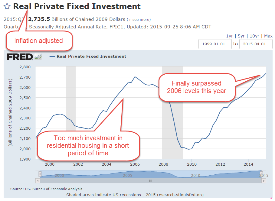
Global Portfolio

May 15, 2016

Picture the poor investor who leaves a meeting with their financial advisor followed by a Pig-Pen tangle of scribbled terms. Allocation, diversification, small cap, large cap, foreign and emerging markets, Treasuries, corporate bonds, real estate, and commodities. What happened to simplicity, they wonder?  Paper route or babysitting money went into a savings account which earned interest and the account balance grew while they slept.

For those in retirement, it’s even worse. The savings, or accumulation, phase may be largely over but now the withdrawal phase begins and, of course, there needs to be a withdrawal strategy.  Now there’s a gazillion more terms about withdrawal rates,  maximum drawdowns and recovery rates, life expectancy, inflation and other mumbo jumbo that is more complicated than Donald Trump’s changing interpretations of his proposed tax plans.

Seeking simplicity, an investor might be tempted to put their money in a low cost life strategy fund or a target date fund, both of which put investing on automatic pilot.  These are “fund of funds,” a single fund that invests in different funds in various allocations depending on one’s risk tolerance. There are income funds and growth funds and moderate growth funds within these categories.  For a target date fund, what date should an investor use?  It is starting to get complicated again.

Well, strap yourself into the mind drone because we are about to go global.  Hewitt EnnisKnupp is an institutional consulting group within Aon, the giant financial services company.  In 2014, they estimated the total global investable capital at a little over $100 trillion as of the middle of 2013. Let’s forget the trillion and call it $100.

Could an innocent investor take their cues from the rest of the world and invest their capital in the same percentages?  Let’s look again at the categories presented by the Hewitt group.  The four main categories, ranked in percentages, that jump off the page are:

Developed market bonds (23%),
U.S. Equities (18%),
U.S. Corporate Bonds (15%),
and Developed Market equities (14%).

The world keeps a cushion of investable cash at about 5% so let’s throw that into the mix for a total of 75%.   Notice how many categories of investment there are that make up the other 25% of investable capital!

In the interest of simplification let’s consider only those four primary categories and the cash. Adjusting those percentages so that they total 100% (and a bit of rounding) gives us:

Developed Market bonds 30%,
U.S. Corporate Bonds 20%,
U.S. Equities 25%
Developed Market equities 19%,
Cash 6%.
Notice that this is a stock/bond mix of 44/56, a bit on the conservative side of a neutral 50/50 mix.  Equities make up 44%, bonds and cash make up 56%.

I’ll call this the “World” portfolio and give some Vanguard ETF and Mutual Fund examples.  Symbols that end in ‘X’, except BNDX, are mutual funds. Fidelity and other mutual fund groups will have similar products.

International bonds 30% –  BNDX, and VTABX, VTIBX
U.S. Corporate Bonds 20% – BND and VBTLX, VBMFX
U.S. Equities 25% – VTI and VTSAX, VTSMX
Developed Market equities 19% – VEA and VTMGX, VDVIX

According to Portfolio Visualizer’s free backtesting tool this mix would have produced a total return of 5.41% over the past ten years, and had a maximum drawdown (loss of portfolio value) of about 22% during this period.  For a comparison, an aggressive mix of 94% U.S. equities and 6% cash would have generated 7.06% during the same period, but the drawdown was almost 50% during the financial upheaval of 2007 – 2009.

There have been two financial crises in the past century:  the Great Depression of the 1930s and this latest Great Recession.  If the balanced portfolio above could generate almost 5-1/2% during such a severe crisis, an investor could feel sure that her inital portfolio balance would probably remain intact during a thirty year period of retirement.  During a horrid five year period, from 2006-2010, with an annual withdrawal rate of 5%, the original portfolio balance was preserved, a hallmark of a steady ship in what some might call the perfect storm.

Finally, let’s look at a terrible ten year period, from January 2000 to December 2009, from the peak of the dot com bubble in 2000 to the beaten down prices of late 2009, shortly after the official end of the recession.  This period included two prolonged slumps in stock prices, in which they lost about 50% of their value.  A World portfolio with an initial balance of $100K enabled a 5% withdrawal each year, or $48K over a ten year period, and had a remaining balance of $90K. Using this strategy, one could have withdrawn a moderate to aggressive 5% of the portfolio each year, and survived the worst decade in recent market history with 90% of one’s portfolio balance still intact.

Advisors often recommend a 4% annual withdrawal rate as a conservative or safe rate that preserves one’s savings during the worst of times and this strategy would have done just that during this worst ten year period.  Retirees who need more income than 4% may find the World portfolio a conservative compromise.

{ For those who are interested in a more granular breakdown of sectors within asset classes, check out this 2008 estimate of global investable capital.}

////////////////////////////

Productivity

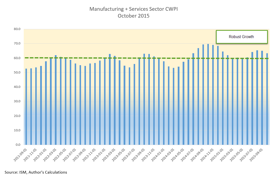
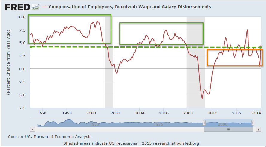
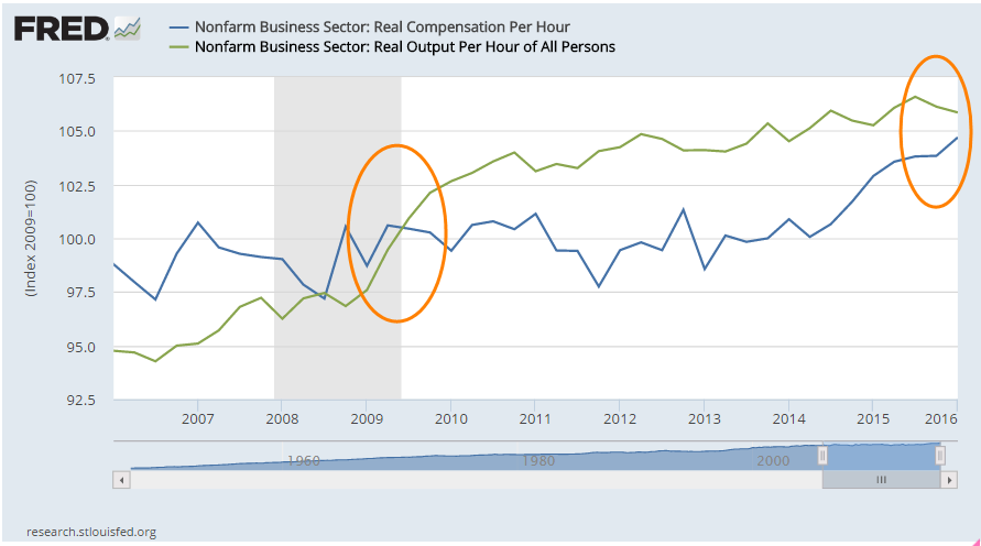
In a recent article, Jim Zarroli with NPR compared productivity growth with the weak growth of only the wages component of employee compensation.  He did leave out an increasingly big chunk of total employee compensation: Federal and State mandated taxes, insurances and benefits.  Since these are mandated costs, the income is not disposable. A term I have never liked for this package of additional costs and benefits is “employer burden.”  The burden is really on the employee as we will see.

In the graph below are two indexes: total compensation per hour and output per hour.  At the end of the last recession in the middle of 2009, the two indexes were the same.  Seven years later, output is slightly higher than total compensation but the discrepancy is rather small compared to the dramatic graph difference shown in the NPR article. As output continues to level and compensation rises more rapidly, we can expect that compensation will again overtake output.

Over the past several decades, employees have voted in the politicians who promised more tax-free insurances and benefits.  While the tax-free aspect of these benefits is an advantage, some employees may think they are freebies.  Payroll stubs produced by more recent software programs enable employers to show the costs of these benefits to employees, who are often surprised at the amount of dollars that are spent on their behalf.  While these benefits are welcome, they don’t pay school tuition, the rising costs of housing or repairs to the family car.

Many voters thought they could have it all because some politicians promised it all: more tax-free insurances and benefits, and higher disposable income.  Total employee compensation, though, must be constrained by productivity growth. In the coming decade, legislators will put forth alternative baskets of total compensation.  More benefits and insurances means less disposable income but a politician can not just say that outright and get re-elected. More disposable income means less insurances and benefits, which will anger other voters.  In short, the political discourse in this country promises to only get more contentious.

Portfolio Stability

February 14, 2016

Disturbed by the recent volatility in the stock market, some investors may be tempted to trade in some of their stock holdings for the price stability of a CD or savings account.  After a year of relatively little change, stock prices have oscillated wildly since China began to devalue the yuan at the beginning of the year.

Just this week, the price of JPMorgan Chase (JPM), one of the largest banks in the world, fell almost 5% one day then rose 7% the next.  Such abrupt price moves in a large multi-national company are driven less by fundamentals and more by fear.  As the price of oil fell below $30, hedge fund and investment managers began to doubt the safety of bank loans to energy companies, particularly those smaller companies whose fortunes have risen recently during the fracking boom.  Even if these types of loans were a miniscule portion of JPM’s total loan portfolio, investors remember that the financial crash began in 2007 with growing defaults of home loans that started a financial chain reaction of derivatives that blew up.  Sell, sell, sell, then buy, buy, buy.

Price stability is a term usually associated with measurements of inflation like the Consumer Price Index (CPI). A basket of typical goods is priced each month by the BLS and the changes in those prices are charted.  Each of us has a basket of investment goods that have varying degrees of price stability.  Stock prices vary a lot;  bond prices less so; house prices even less.  Cash type instruments like savings accounts and CDs have no nominal variation.

Each of us desires some degree of stability as we chug through the waters of our lives.  Like a ship we must make a tradeoff between speed and stability.  A stable ship must compromise between the depth and breadth of its keel, that part of the ship which is below water.  A deep keel provides stability but puts the ship at the risk of running aground in shallow water.  A broad keel is stable but increases the water’s drag, slowing the ship. (Cool stuff about ships)

It is no surprise that stocks provide the power to drive our investment ship.  Few investors realize that housing assets provide more power and stability than bonds.  We judge stability by the rate with which the price of an asset changes.  The slower the price change, the more stable the asset.  Over decades, residential housing has better returns and steadier pricing than bonds, although that might surprise readers who remember the housing bubble and its aftermath.

Many investors include the value of their home in their net worth but not necessarily in their investment portfolio and may underestimate the stability of their portfolio. Let’s imagine an investor with $750,000 in stocks, bonds, CDs, savings accounts and the cash value of a life insurance policy.  Let’s say that $375K is invested in stocks, $375K in bonds and cash equivalents.  That appears to be a middle of the road allocation of 50/50 stocks/bonds.  I will use bonds as a stand in for less volatile investments.

Let’s also assume that this investor has a house valued at $215K with no mortgage.  If we add in the $215K value of the house, we have a total portfolio of $965K and a conservative allocation closer to 40/60 stocks/bonds, not the 50/50 allocation using a more standard model.

We arrive at a conservative estimate of a house value based on the income or rental value that the house can generate, not the current market value of the house, which can be more volatile.  In previous posts, I have noted that houses have historically averaged 16x their annual net operating income, which is their gross annual rental income less their non-mortgage operating expenses. For real estate geeks, this multiplier is 1 divided by the cap rate.

Let’s use an example to see how this multiplier works.  Let’s say that the going rent for a modest sized house is $1600 per month and we guesstimate an average 30% operating expense, leaving a net monthly income of $1120.  Multiplying that amount by 12 months = $13,440 annual net operating income.  Multiply that by our 16x multiplier and we get a valuation of $215K.  Depending on location, this house might have a market value of $260K but we use  historic income multiples to calculate a conservative evaluation.

Our revised portfolio provides a more comprehensive perpective on our investment allocation and the stability of our “buckets.” During the past year, we may have seen a 5 – 10% increase in the value of our home, offsetting some of the apparent riskiness of a 10% or 20% move in the stock market.  Adjusting our portfolio assessment to allow for a home’s value might reveal that our stock allocation is actually a bit on the low side after the recent market decline and – quelle horreur! – we should be selling safer assets and buying stocks to maintain our target portfolio balance.  But OMG, what if stocks fall further?!  Then we might have to buy even more stocks to meet our target allocation percentages!  This is the essential strategy of buying low and selling high, yet it is so counterintuitive to our natural impulses.  We buy some assets when we are fearful of them.  We sell other assets when we think they are doing well.

****************

For anyone interested in housing as a business, the Wall St. Journal published a comprehensive guide, Wall St. Journal Complete Real Estate Investing Guidebook by David Crook in 2006. Recently, Moody’s noted that apartment building cap rates had declined to 5.5%, resulting in a multiplier of 18x that is above historical norms.

**********************

Ominosity

January 10, 2016

Happy New Year!

Wait, get rid of the exclamation point.

Happy New Year.

After this week!  What are you kidding me?!  Get rid of the Happy.

New Year.

Ok, that’s better.  The New Year was not so happy when the market started its first day of trading last Monday.  For the tenth consecutive month, manufacturing activity in China contracted, which weighed down commodities (DBC down over 4%), energy stocks (XLE down 7%), emerging markets (EEM down more than 8%) and the broader market, which was down 6%.  Even stocks (Johnson and Johnson, Coca-Cola) regarded as relatively safe dividend paying equities suffered losses of more than 3 or 4%.  Investors and traders were re-pricing future profits and dividends.

December’s powerful employment report buoyed the mood for a short time on Friday morning but traders soon turned their attention again to China and the broader market fell about 1% by day’s end.

Given the decline in stocks, one would guess that the price of bonds, hard hit during the past few weeks, had showed some strong gains.  TLT, a popular ETF for long term Treasuries, gained more than 2% during the week but remains range bound since last August.  Treasuries are a safe haven for risk averse money, but the prospect of rising interest rates mutes the attractiveness of long term bonds.

Growth in the core work force aged 25 – 54 remains strong, up over 1% from last year.  The number of people not in the labor force dropped by 277,000 from last month, a welcome sign.  However, we need to put aside the politics and look at this in a long term perspective.  For the past twenty years, through good times and bad, the number of people dropping out of the workforce each year has grown.

This demographic trend is more powerful than who is President, or which party runs the Congress.  Depending on our political preferences, we can attribute this 20 year trend to Clinton, Bush, Obama, Democrats or Republicans. The job of the good folks running for President this year will be to convince voters that their policies and prescriptions can overcome this trend.  Our job, as voters, is to believe them.

The Bureau of Labor Statistics recently released a report of a ten year comparison of the reasons why people have left the work force.  Based on this BLS analysis, a Bloomberg writer who had not done their homework mistakenly reported that there has been a dramatic increase in the number of 20-24 year olds who had retired.

This “statistic” points out a flaw in BLS and Census Bureau data. BLS data is partially based on the Current Population Survey, or CPS.  Interviewers are not allowed to follow up and challenge the responder.  Both the BLS and the Census Bureau have been aware of the problem for at least a decade but I don’t think anyone has proposed a solution that doesn’t present its own challenges.

Looking at Chart 3 of the BLS report, the percentage of retired 20-24 year olds was .2% in 2004, .6% in 2014. The number of retired 16-19 year olds was .2% in 2004 and .2% in 2014. Do we really believe that there are almost 200,000 retired 16-19 year olds in this country? See page 16 for the BLS discussion of this problem.

Now, let’s put ourselves in a similar situation.  We are 22 and have recently graduated from college and are having trouble finding a job that actually uses our education.  Because of this, we are staying at our parent’s home.  We answer our parent’s landline phone (Census Bureau is not allowed to call cell phones).  Somebody from the Census Bureau starts asking us questions.  In response to the question why we are not working, we are presented with several choices, one of which is that we are retired (see pages 16 and 17)  Sarcastically we answer that yeh, we are retired.  The questioner can probably tell by our tone of voice that we are being sarcastic but is required to simply record our response.  How valid is that response?

Understand that problems of self-reporting and questionnaire design underlie all of the data from the monthly Household Survey, including the unemployment rate. This gives those with strong political views an opportunity to claim that government statistics are part of a conspiracy.  Claims of conspiracies can not be disproved, which is why they are so persistent throughout human history.

Each year some research firms predict a global recession. Ominosity is the state of sounding ominous and this year is no different. Adam Hayes, a CFA writing at Investopedia, gives some good reasons  that he believes such a widespread recession is possible. All of these risks are present to some degree.

What makes me less convinced of a global recession is the strength of the U.S. economy.  Just as China “saved” the world during the financial crisis, the U.S. may play the role of the cavalry in this coming year. Let’s look at some key data from the recent ISM Purchasing Manager’s index.  This is the new orders and employment components of the services sectors which comprise 85% of the U.S. economy.  Growth remains strong.

Recessions are preceded by a drop in new orders and by a decline in employment.  When payroll growth less population growth is above 1%, as it is today, a recession is unlikely.

Let’s climb into our time machines and go forward just 11 months.  It is now December 2016 and the IMF has enough data to make a post-facto determination that the entire world’s economy went into recession in March 2016.  We look at the SP500 index.  Holy shit!  We climb into our time machines, go back to January 2016 and sell all of our stocks.  Missed that cliff.

What about bonds? Should we sell all those?  Darn it, we forgot to check interest rates and bond prices when we were ahead in the future.  Back into the time machine.  Go forward again.  U.S. Fed halted rate increases in March 2016, then lowered them a 1/4 point.  The ECB had kept interest rates negative in the Eurozone and bond prices have stayed relatively flat.  OK, cool.  We get back in our time machines and go back to January 2016 and decide to hold onto our bond index funds.  The interest on those is better than what we would get on a savings account and we know that we won’t suffer any capital losses on our investment during the year.

We take all the cash we have from selling our stocks and put them entirely in bonds.  Wait, could we make a better return in gold, or real estate?  Back in the time machine and back to the future!  But now we notice that the SP500 index in December 2016 is different.  So is the intermediate bond index.  What’s going on?  The future has changed.  Could it be the Higgs boson causing an abnormality in space-time?  Maybe there’s something wrong with our time machine.  But where can we find a mechanic who can diagnose and repair a time machine?  Suddenly the thought occurs to us that a lot of other investors have gone into the future in their time machines, then have returned to the present and bought and sold.  That, in turn, has changed the future.

The time machine is called the human brain.  Each day traders around the world make decisions based on their analytical and imaginative journeys into the future.  The Efficient Markets Hypothesis (EMH) formulated by Eugene Fama and others postulates that all those journeys and decisions essentially distill all the information available on any particular day.  Therefore, it is impossible to beat a broader market index of those decisions.

Behavioral Finance rests on the judgment that human beings are driven by fear and greed which causes investors to make mistakes in their appraisals of the future.  An understanding of the patterns of these inclinations can help someone take advantage of opportunities when there is a higher likelihood of asset mispricing.

Each year we read of those prognosticators who got it right.  Their time machine is working, we think, and we go with their predictions for the coming year.  Sometimes they get it right a second year.  Sometimes they don’t.  Abby Cohen is a famous example but there are many whose time machines work well for a while.  If I could figure a way to fix time machines, I could make a fortune.

Credit Spreads

November 22, 2015

The behavior of bonds, their pricing and their yields (the interest or return on the bond), can seem like a mystery to many casual investors.  As this Money magazine writer notes, the language is backwards.  Yields rise but that’s bad because prices are falling.  Prices rise but that’s bad for new buyers who are getting a low yield on their investment.   The article mentions a little trick to help keep it straight – convert the yield to a P/E ratio, something more familiar to many investors.

In Montana, a “spread” might be a large ranch but on Wall Street the term often refers to the difference in yield between a safe investment like a 10 year Treasury bond and an index of lower rated corporate bonds, or “junk” bonds. Investors want to be paid for the extra risk they are taking.  As investors get more worried about the economy and the growth of profits, they worry about the ability of some companies to pay their debts.  Debts are paid from profits.  Less profit or no profit increases the chance of default.

Some call the spread a “risk premium,” and when that premium is less than 5 – 6%, it indicates a relatively low to moderate sense of worry among investors.  Anything greater than 6% is a note of caution.  In the chart below a rising spread above 6% often signals the coming of stock market swoons.  When I pulled this chart earlier in the week, the rate was 6.19%.  On Friday, the rate was climbing toward 6.3%.

This 2004 paper from the research division of the Federal Reserve gives a bit more depth on credit spreads and their movements.

*********************************

Inventory-To-Sales Ratio

In a September blog post I noted the elevated inventory to sales ratio, meaning that manufacturers, merchants and wholesalers had too much product on hand relative to the amount of sales.  There is a bit of lag in this series; September’s figures were released only a week ago.  At 1.38, the ratio continues to climb.

*******************************

The Social Security Annuity

In the blog links to the right is an article by Wade Pfau comparing the “annuity” that Social Security provides with those available on the commercial market.  He also analyzes the extra return one can achieve by delaying Social Security until age 70.

Portfolio Allocation and Timing

November 15, 2015

Gone Fishin’ Portfolio

I found this portfolio in a pile of old paperwork.  The idea is to allocate investment dollars in a number of buckets, then more or less forget about it, rebalancing once a year.  The portfolio is 60% stocks, 30% bonds, 10% other

I compared this broadly balanced portfolio #1 with a simpler version #2: 60% stocks, 40% bonds.  Because the Vanguard mutual fund VTSMX is weighted toward U.S. large cap stocks, I split the stock portion of the portfolio with an index of small cap value stocks VISVX.  The 40% bond component is an index of  intermediate-term corporate grade bonds VFICX.  I also included a very simple portfolio #3 without the split in the stock portfolio.  The 60% stocks is represented by one fund VTSMX.  The results from Portfolio Visualizer  include dividends.

Note that there is little difference between Portfolios #2 and #3 over this time period.  Although the Gone Fishin’ portfolio lagged the other two during this time period, it did do better during the period 2000 – 2006.

*****************************

Market timing

Another approach is a fairly simple market timing technique as shown in this paper “A Quantative Approach to Tactical Asset Allocation”  There is no heavy math in the paper.  The timing rule is simple:  buy the SP500 when the monthly close is above the 10 month moving average; sell when the monthly close is below the 10 month average.  Using this system, an investor would have sold an ETF like SPY on the first trading day of September this year  because August’s close was below the ten month average.  After the index rebounded in October and closed above the 10 month average, an investor would have bought back in on the first trading day in November. The average “turnaround,” a buy and a sell signal, is less than one a year.  These short term swings are sometimes called “whipsaws,” where an investor loses several percent by selling after a quick downturn then buying in after prices recover quickly.  The payoff is that an investor avoids the severe 50% drawdowns of 2008 and 2000.

The author of the paper performed a 112 year backtest on this system. He excluded taxes, commissions and slippage in the calculations and used the closing price on the final day of the month as his buy and sell price points. He notes some reasons for these omissions later in the paper which I found inadequate. I recommend using the opening price (ETF) or end of the day price (mutual fund) of the day following the end of the month as  a practical real world backtesting strategy.  Very few individual investors can buy or sell at the closing price and there can be a lot of price movement, or slippage, in the final trading minutes before the close.

Commissions can be estimated at some small percentage.  To exclude commissions is to estimate them at 0% and present an investor with unrealistic returns, a common backtesting fault of many trading or allocation systems.  The same can be said for taxes.  Even if the guesstimate is a mere 1%, it is better than the 0% effective estimate of tax costs when excluded from the backtest.

The difference in annual real, or inflation-adjusted, return between this timing model and “buy and hold” is 4/100ths of 1% per year (p. 23) Because the timing model avoids the severe portfolio drawdowns of a buy and hold stratgegy (p. 28), that tiny difference translates into a difference in compounded return that is less than 1% which produces a huge 250%+ difference in portfolio balances at the end of the 112 year testing period.  None of us will be investing for that long a period but it does illustrate the effect of small incremental differences.

The author then combines an allocation model with the timing model using five global asset classes: US stocks, foreign stocks, bonds, real estate and commodities, assigning 20% of the portfolio to each class.  He backtested this allocation with the same timing strategy vs a buy and hold strategy (p. 30-31).  The advantages of the timing strategy are apparent during severe downturns as in 1973, 2000 and 2008.  A buy and hold strategy took eight years after 1973 to recover and catch up to the timing strategy.  The buy and hold strategy never caught up to the timing strategy after the 2000-2003 downturn in the market.  In 2008, it fell even further behind, highlighting the superiority of the timing strategy.

Returns are important, of course, but volatility and drawdown are especially critical for older investors who do not have as many years to recover.  From 1973 – 2012, the timing model has only one losing year – 2008 – and the loss for the entire portfolio was a mere 6/10ths of a percent (p. 32).

*****************************

October jobs report

A few weeks ago I linked to an article on Reagan’s former budget director David Stockman.  On his web site, he presented a sobering and thorough analysis of the October jobs report.

Stockman breaks down the numbers into “breadwinner” higher paying jobs and the relatively lower paying leisure and hospitality jobs that account for too much of the jub creation in the past fifteen years.  Goods producing jobs – those in manufacturing, construction, mining and timber – are still far below 2000 levels.

“massive money printing and 83 months running of ZIRP [zero interest rate policy of the Federal Reserve] have done nothing for the goods producing economy or breadwinner jobs generally.”

*****************************

Obama’s numbers

A president has far less effect on the economy than the political rhetoric would have one believe.  Despite that fact, each President is judged on his “numbers” as though he were a dictator, a one man show.  With one year to go in his second term, here are the latest numbahs from the reputable FactCheck.

Oh My Gawd!

November 8, 2015

There is the famous Tarzan yell by Carol Burnett and the iconic “Oh my Gawd” exclamation of Janice Lipman in the long running TV series “Friends.”  That’s what Janice would have said when October’s employment report was released this past Friday.

Highlights:

271,000 jobs gained – maybe. That was almost twice the number of job gains in September (137,000).  Really??!! ADP reported private job gains of 182,000.  Huge difference.  Job gains in government were only 3,000 so let’s use my favorite methodology, average the two and we get 228,000 jobs gained, awfully close to the average of the past twelve months.  Better than average gains in professional business services and construction.  Both of these categories pay well.  Good stuff.

At 34.5 hours, average hours worked per week has declined by 1/10th of an hour in the past year.  The average hourly rate rose 2.5%, faster than headline inflation and giving some hope that workers are finally gaining some pricing power in this recovery.

For some historical perspective, here is a chart of monthly hours worked from 1921 to 1942.  Most of those workers – our parents and grandparents – have passed away.  At the lows of the Great Depression people still worked more hours than we do today.  They were used to hard work.  There were few community resources and social insurance programs to rely on.

The headline unemployment rate fell slightly to 5%.  The widest unemployment rate, or U-6 rate, finally fell below 10% to 9.8%, a rate last seen in May 2008, more than seven years ago.  This rate includes people who are working part time because they can’t find a full time job (involuntary part-timers), and those people who have not actively looked for a job in the past month but do want a job (discouraged job seekers).  Macrotrends has an interactive chart showing the three common unemployment rates on the same chart.

The lack of wage growth during this recovery, coupled with rising home prices, may have made owning a home much less likely for first time buyers.  The historical average of new home buyers is 40%.  The National Assn of Realtors reported that the percentage is now 32%, almost at a 30 year low.

2.5% wage growth looks a bit more promising but the composite LMCI (Labor Market Conditions Index) compiled by the Federal Reserve stood at a perfect neutral reading of 0.0 in September.  The Fed will probably update the LMCI sometime next week.  This index uses more than twenty indicators to give the Fed an in-depth reading of the labor market.

**********************************

Bonds and Gold

The strong employment report increased the likelihood that the Fed will raise interest rates at their December meeting and this sent bond prices lower.  A key metric for a bond fund is its duration, which is the ratio of price change in response to a change in interest rates.  Shorter term bond funds have a smaller duration than longer term funds. A short term corporate bond index like Vanguard’s ETF BSV has a duration of 2.7, meaning that the price of the fund will decrease approximately 2.7% in response to a 1% increase in interest rates.  Vanguard’s long term bond ETF BLV has a duration of 14.8, meaning that it will lose about 15% in response to a 1% increase in rates.  In short, BLV is more sensitive than BSV to changes in interest rates. How much more sensitive?  The ratio of the durations – 14.7 / 2.7 = 5.4 meaning that the long term ETF is more than 5 times as sensitive as the short term ETF.

What do we get for this sensitivity, this higher risk exposure?  A higher reward in the form of higher interest rates, or yield.  After a 2.5% drop in the price of long term bond funds this week, BLV pays a yield close to 4% while BSV pays 1.1%.  The reward ratio of 4 / 1.1 = 3.6, less than the risk ratio.   On September 3rd, the reward ratio was much lower, approximately 3.27 / 1.3 = 2.5, or half the risk ratio.

Professional bond fund managers monitor these changing risk-reward ratios on a daily basis.  Retail investors who simply pull the ring for higher interest payments should be aware that not even lollipops at the dentist’s office are free.  Higher interest carries higher risk and duration is that measure of risk.

The prospect of higher interest rates has put gold on a downward trajectory with no parachute since mid-October.  A popular etf  GLD has lost 9% and this week broke below July’s weekly close to reach a yearly low.  Investors in gold last saw this price level in October 2009.  Back then  gold was continuing a multi-year climb that would take its price to nosebleed levels in August 2011, 70% above its current price level.

**********************************

CWPI (Constant Weighted Purchasing Index)

Manufacturing is hovering at the neutral 50 mark in the ISM Purchasing Manager’s Index but the rest of the economy is experiencing even greater growth after a two month lull.  No doubt some of this growth is the normal pre-Christmas hiring and stocking of inventories in anticipation of the season.

The CWPI composite of manufacturing and service sector activity has drifted downward but is within a range indicating robust growth.

Employment and New Orders in the non-manufacturing sectors – most of the economy – rose up again to the second best of the recovery.

Economists have struggled to build a mathematical model that portrays and predicts the rather lackluster wage growth of this recovery in a labor market that has been growing pretty strongly for the past few years.

*************************************

Social Security

The Bipartisan Budget Act of 2015, passed and signed into law this past week, curtails or eliminates a Social Security claiming strategy that has become popular.  (Yahoo Finance – can pause the video and read the text below the video).  These were used by married couples who were both at full retirement age.  One partner collected spousal benefits while the “file and suspend” partner allowed their Social Security benefits to grow until the maximum at age 70.  On the right hand side of this blog is a link to a $40 per year “calculator” that helps people maximize their SS benefit.

************************************

Tax Cuts Anyone?

Former Senator, Presidential contender and actor Fred Thompson died this past week.  The WSJ ran a 2007 editorial by Thompson arguing that the “Bush tax cuts” that the Republican Congress passed in 2001 and 2003, when he was a Senator, had spurred the economy, causing tax revenues to increase, not decrease, as opponents of the tax cuts claimed.  Like others in the tax cut camp, Thompson looked at a rather small slice of time to support his claim: 2003 -2007.

Had tax cut advocates looked at an earlier slice of time – also small – in the late 1990s they would have seen the opposite effect.  Higher tax rates in the 1990s caused greater economic growth and higher tax revenues to the government, thereby shrinking the deficit entirely and producing a surplus.

Tax cuts decrease revenues.  Tax increases increase revenues.  That tax cuts or increases as enacted have a material effect on the economy has been debated by leading economists around the world for forty years.  At the extremes – a 100% tax rate or a 0% tax rate – these will certainly have an effect on people’s behavior.  What is not so clear is that relatively small changes in tax rates have a discernible impact on revenues.  A hallmark of belief systems is that believers cling to their conclusions and find data to support those conclusions in the hopes that they can use that to help spread their beliefs to others.

The evidence shows that economic growth usually precedes tax revenue changes; that tax policy advocates in either camp have the cart before the horse.  A downturn in GDP growth is followed shortly by a decline in tax revenues.

Thompson’s editorial notes a favorite theme of tax cut advocates – that the “Kennedy” tax cuts, initiated into law in memory of President Kennedy several months after his assassination in November 1963, spurred the economy and increased tax revenues. Revenues did increase in 1964 but the passage of the tax act occurred during that year so there is little likelihood that the tax cuts had that immediate an effect.  Revenues in 1965 did increase but fell in subsequent years.  A small one year data point is all the support needed for the claims of a believer.

The question we might ask ourselves is why do tax policy and religion share some of the same characteristics?

Rebound

October 25, 2015

Last week we looked at two components of GDP as simple money flows.  In an attempt to understand the severe economic under-performance during the 1930s Depression, John Maynard Keynes proposed a General Theory that studied the influences of monetary policy on the business cycle (History of macoeconomics).  In his study of money flows, Keynes had a fundamental but counterintuitive insight into an aspect of savings that is still debated by economists and policymakers.

Families curtail their spending, or current consumption, for a variety of reasons.  One group of reasons is planned future spending; today’s consumption is shifted into the future.  Saving for college, a new home, a new car, are just some examples of this kind of delayed spending.  The marketplace can not read minds.  All it knows is that a family has cut back their spending.  In “normal” times the number of families delaying spending balances out with those who have delayed spending in the past but are now spending their savings.  However, sometimes people spend far more than they save or save far more than they spend, producing an imbalance in the economy.

When too many people are saving, sales decline and inventories build till sellers and producers notice the lack of demand. To make up for the lack of sales income, businesses go to their bank and withdraw the extra money that families deposited in their savings accounts.  Note that there is no net savings under these circumstances.  Businesses withdraw their savings while families deposit their savings.  After a period of reduced sales, businesses begin laying off employees and ordering fewer goods to balance their inventories to the now reduced sales.  Now those laid off employees withdraw their savings to make up for the lost income and businesses replace their savings by selling inventory without ordering replacement goods.  As resources begin strained, families increasingly tap the several social insurance programs of state and federal governments which act as a communal savings bank,   Having reduced their employees, businesses contribute less to government coffers for social insurance programs.  Governments run deficits.  To fund its growing debt, the Federal government sells its very low risk debt to banks who can buy this AAA debt with few cash reserves, according to the rules set up by the Federal Reserve.  Money is being pumped into the economy.

As the economy continues to weaken, loans and bonds come under pressure.  The value of less credit worthy debt instruments weakens.  On the other side of the ledger are those assets which are claims to future profits – primarily stocks.  Anticipating lower profit growth, the prices of stocks fall.  Liquidity and concern for asset preservation rise as these other assets fall.  Gold and fiat currencies may rise or fall in value depending on the perception of their liquidity.

Until Keynes first proposed the idea of persistent imbalances in an economy, it was thought that imbalances were temporary.  Government intervention was not needed.  A capitalist economy would naturally generate counterbalancing motivations that would auto-correct the economic disparities and eventually reach an equilibrium.  Economists now debate how much government intervention. Few argue anymore for no intervention.  What we take for granted now was at one time a radical idea.

While some economists and policymakers continue to focus on the sovereign debt amount of the U.S. and other developed economies, the money flow from the store of debt, and investor confidence in that flow, is probably more important than the debt itself.  As long as investors trust a country’s ability to service its debt, they will continue to loan the country money at a reasonable interest rate.  While the idea of money flow was not new in the 1930s, Keynes was the first to propose that the aggregate of these flows could have an effect on real economic activity.

***********************

Stock market

A very good week for the market, up 2% for the week and over 8% for October.  A surprising earnings report from Microsoft lifted the stock -finally – above its year 2000 price.  China announced a lower interest rate to spur economic activity.  ECB chair Mario Draghi announced more QE to fight deflation in the Eurozone. Moderating home prices and low mortgage rate have boosted existing home sales.

The large cap market, the SP500, is in a re-evaluation phase.  The 10 month average, about 220 days of trading activity, peaked in July at 2067 and if it can hold onto this month’s gains, that average may climb above 2050 at month’s end.

The 10 month relative strength of the SP500 has declined to near zero.  Long term bonds (VBLTX) are slightly below zero, meaning that investors are not committing money to either asset class.  The last time there was a similar situation was in October 2000, as the market faltered after the dot-com run-up.  In the months following, investors swung toward bonds, sending stocks down a third over the next two years.  This time is different, of course, but we will be watching to see if investors indicate a commitment to one asset class or the other in the coming months.

Investment Flows

October 18, 2015

When economists tally up the output or Gross Domestic Product (GDP) of a country, they use an agreed upon accounting identity: GDP = C + I + G + NX where C = Consumption Spending, I = Investment or Savings, G = net government spending, and NX is Net Exports, which is sometimes shown as X-M for eXports less iMports. {Lecture on calculating output}

In past blogs I have looked at the private domestic spending part of the equation – the C.  Let’s look at the G, government spending, in the equation.  Let’s construct a simple model based more on money flows into and out of the private sector.  Let’s regard “the government” as a foreign country to see what we can learn.  In this sense, the federal, state and local governments are foreign, or outside, the private sector.

The private sector exchanges goods and services with the government sector in the form of money, either as taxes (out) or money (in).  Taxes paid to a government are a cost for goods and services received from the government. Services can be ethereal, as in a sense of justice and order, a right to a trial, or a promise of a Social Security pension.  Transfer payments and taxes are not included in the calculation of GDP but we will include them here.  These include Social Security, Medicare, Medicaid, food stamps and other social programs.  If the private sector receives more from the government than the government takes in the form of taxes, that’s a good thing in this simplified money flow model. There are two types of spending in this model: inside (private sector) and outside (all else) spending.

Let’s turn to investment, the “I” in the GDP equation.  In the simplified money flow model, an investment in a new business is treated the same as a consumption purchase like buying  a new car.  Investment and larger ticket purchase decisions like an automobile depend heavily on a person’s confidence in the future.  If I think the stock market is way overpriced or I am worried about the economy, I am less likely to invest in an index fund.  If I am worried about my job, I am much less likely to buy a new car.  In its simplicity this model may capture the “animal spirits” that Depression era economist John Maynard Keynes wrote about.

We like to think that an investment is a well informed gamble on the future.  Well informed it can not be because we don’t know what the future brings.  We can only extrapolate from the present and much of what is happening in the present is not available to us, or is fuzzy.  While an investment decision may not be as “chanciful” as the roll of a dice an investment decision is truly a gamble.

Remember, in the GDP equation GDP = C + I + G + NX, investment (the I in the equation) is a component of GDP and includes investments in residential housing. In the first decade of this century, people invested way too much in residential housing.

In the recession following the dot-com bust and the slow recovery that followed the 9-11 tragedy, private investment was a higher percentage of GDP than it is today, six years after the last recession’s end.  Much of this swell was due to the inflow of capital into residental housing.

The inflation-adjusted swell of dollars is clearly visible in the chart below.  It is only in the second quarter of this year that we have surpassed the peak of investment in 2006, when housing prices were at their peak.

Investment spending is like a game of whack-a-mole.  Investment dollars flow in trends, bubbling up in one area, or hole, before popping or receding, then emerging in another area.  Where have investment dollars gone since the housing bust?  An investment in a stock or bond index is not counted as investment, the “I” in the equation, when calculating GDP.  The price of a stock or bond index can give us an indirect reading of the investment flow into these financial products.  An investment in the stock market index SP500 has tripled since the low in the spring of 2009 {Portfolio Visualizer includes reinvestment of dividends}

Now, just suppose that some banks and pension funds were to move more of those stock and bond investments back into residential housing or into another area?

Crossroad

September 13, 2015

The SP500 index is very close to crossing below its 25 month average this month, four years after a similar downward crossing in September 2011.  Worries over the economy and political battles over the budget had created a mood of caution during that summer of 2011.  The market immediately rebounded with a 10% gain in October 2011 and has remained above the 25 month average in the four years since.   Previous crossings, however – in November 2000 and January 2008 – have marked the beginnings of multi-year downturns.

These long term crossings are coincident with extended periods of re-assessment of both value and risk.  Sometimes the price recovery after a crossing below the 25 month average is just a few months as in August 1990, and October 1987, or the quick rebound in 2011.  More often the price of the index takes a year or more to recover, as in 1977, 1981, 2000 and 2008.

The downward crossings of 2000 and 2008 preceded extended periods of price weakness.  Recovery after the popping of the dot-com bubble lasted till the fall of 2006.  In January 2008, just over a year after the end of the last recovery, another downward crossing below the 25 month average occurred.  Later on that year, it got really ugly.

As the saying goes, we can’t time the market.  However, we can listen to the market.  For the fourth year in a row the bond market continues to set records.  The issuance of investment grade and higher risk “junk” corporate bonds has totaled $1.2 trillion so far this year.  Ahead of a possible rate hike by the Federal Reserve this month, Wednesday’s single day bond issuance set an all time record. The reason for the high bond issuance is understandable – companies want to take advantage of historically low interest rates.  The demand for this low interest debt is a gauge of the long term expectations of low inflation.

**********************************
CWPI

The Purchasing Manager’s Index presents a somewhat contradictory note to the recent volatility in the stock market.  The CWPI, a composite of the manufacturing and services surveys, shows strong growth.  The manufacturing sector has weakened somewhat.  The strong dollar has made U.S. exports more expensive.

On the other hand…the ratio of inventory to sales remains elevated at 1.37, meaning that merchants have 37% more product on hand than sales.  The particularly harsh winter was unexpected and hurt sales, helping to boost inventories.  Five months after the winter ended, there should have been a notable decline in this ratio.

Has some of the strong economic growth gone to inventory build-up?

***********************************
Annuity

In  the blog links to the right was an article written by Wade Pfau on the mechanics of income annuities.  Even if you are not considering annuities, this is a good chance to expose yourself to some basic concepts about these financial products.

Wage Growth Rings

June 14, 2015

The broader stock market has been on a continuous upswing since November 2012 when the weekly close of the SP500 index briefly broke below the 48 week average.  The past six months is one of those periods when investors seem undecided.  Even though the market is above its 24 week average, a positive sign, it closed at the same level that it was just before Christmas.  Earlier this week came the news that Greece might avoid default on its June payment to the ECB and the market surged upwards. At the end of the week, news that talks had broken down caused a small wave of selling on Friday morning. Investor reaction to what, in perspective, is a relatively small event, indicates an underlying nervousness in the market.

As the SP500 began a broad upswing in late 2012, the bond market began a downswing.  A broad aggregate of bonds, AGG, fell about 5% over the following ten months before rising up again to those late 2012 levels this January.  In the past five months, this bond index has declined almost 4% as investors anticipate higher rates. A writer at Bloomberg notes a worrisome trend of concentrated ownership of corporate bonds.

Retail sales in May showed strong gains across many sectors in the economy. As the chart shows, growth below 2.5% is weak, indicating some pressures in household budgets that could be a precursor to recession.  Current year-over-year growth in retail sales excluding food and gas is up almost 5% – a healthy sign of a growing economy.

*************************

Wage Growth

“Since 2009, when the great monetary experiment began, global bond markets have increased in value by about $17 trillion. Global equity markets have increased by about $40 trillion. The average worker has seen wages increase by about $722 billion, which means about 2% of the benefit of QE (quantitative easing) went to workers. The rest went to asset prices.” (Source)

A cross section of a tree shows a historical pattern of rainfall, temperature and volcanic activity.  Wage and salary income across a population can provide a similar historical picture of the economic climate of a people.  The recovery from the recent recession has been marked by slow growth in wage and salary income relative to the growth rates of previous recoveries.

Economists find it difficult to reach a consensus to explain the muted growth.  A WSJ blog summarized a number of explanations.  I have noted several of these in past blogs.  They include:

Slack in the job market.  However, the labor dept reports that the number of job openings is at a 15 year high. (BLS Report)

Some economists point to the large number of involuntary part timers, those who want a full time job but can’t find one, as an indication of slack in the labor market.

The number of people quitting their jobs for another job is improving but is still weak by historical standards.

Sluggish productivity growth. Multi-factorial productivity growth estimates by the labor dept show that productivity gains in the past 15 years are chiefly from capital investment, not labor productivity.  Capital productivity during the recovery has been slow but labor productivity has been terrible, according to multi-factorial productivity assessments by the BLS.  As the century turned, we applauded the transition toward a more service oriented economy.  Less pollution from manufacturing industries, we told ourselves.  “The service sector is less cyclic,” economists reminded us.  It is much more difficult to wrest productivity gains from many service sector jobs. The cutting of a lawn, the making of a latte – there is a minimum threshold of time to do these things.

The sticky wages theory: namely, that companies withhold raises during the recovery because they couldn’t cut wages during the recession.

Let’s compare income growth to retail sales growth, using the data for retail sales less  food and gas whose prices are more volatile.  Periods when both growth rates decline set the stage for recessions.  Periods when both rates increase mark recoveries.

Simultaneous declines in 2011 and 2012 prompted stock market corrections.  The upswing of the past two years has contributed to the rising stock market.