Circumstance

May 21, 2017

Last week I mentioned the 20 year CAPE ratio, a modification of economist Robert Shiller’s 10 year CAPE ratio used to evaluate the stock market. This week I’ll again look at equity valuation from a different perspective.  The results surprised me.

The date of our birth is circumstance.  When we retire is guided by our own actions and the circumstance of an era. We have no control over market behavior during the twenty year savings accumulation phase before we retire or the distribution of that savings during our retirement.   Let’s hope that we live long enough to spend twenty years in some degree of retirement.

The state of the market at the beginning of the distribution phase of retirement can have a material effect on our retirement funds, as many newly retired folks found out in 2008 and 2009.  Some based their retirement plans on the twenty year returns  prior to retirement.

I’ll use the SP500 total return index ($SPXTR at stockcharts.com or ^SP500TR at Yahoo Finance) to calculate the total gain including dividends. The twenty year period from 1988 through 2007 began just after the stock market meltdown in October 1987 and ended just as the 2007-2009 recession was beginning in December 2007. The total gain was 742%, or 11.3% annualized. Sweetness! Sign me up for that program.  Those high returns led many older Americans to believe that they didn’t need to accumulate more savings before retirement.  Then came the double shock of zero interest rates and a 50% meltdown in stock market valuation.

Now let’s move that time block one year forward and look at the period 1989 through 2008. Still good but what a difference one year makes. The total gain was 404%, or 8.4% annualized. That’s a drop of 3% per year! Investors missed the 16% bounce back in 1988 after the October 1987 crash, and the time block now included the 35% meltdown of 2008. There was even more pain to come in the first half of 2009 but I’ll come back to that.

1995 through 2014 was a good period with total gains of 550%, or 9.8% annualized. Shift that time block by two years to the period 1997 through 2016 and the gains fall off significantly. The total gain was 340%, or 7.7% annualized.

We can make a rough approximation of total returns during the late 1970s and into the 1980s, an ugly period for equities. In 1980, someone quipped “Equities are dead.” Twenty year periods ending during this time did not fare so well but still notched gains of more than 6%. Bonds, CDs and Treasuries were paying far more than that at the time. In today’s low interest environment, 6% seems a lot better than it did during the double digit inflation of 1980.

In past weeks I have written about the overvaluation of today’s stock market based on trailing P/E ratio and the smoothed 10 year CAPE ratio. Let’s look at the current valuation from the perspective of this twenty year return. It would come as no surprise that the total twenty year gain hit a low at the end of February 2009 when the market was about a 1/4 of its current valuation. That 20 year annualized gain was 5.7%. What surprised me was that the current valuation shows the same 20 year gain! Using this metric as an evaluation guide, the market sits at a relatively low level just like it was in 1988 and 1989.

The historical evidence shows that stock returns may be erratic but consistently make over 5% over a twenty year retirement period. Those who are newly retired or about to retire might understandably desire more safety. The safest approach is not to suddenly shift one’s portfolio entirely to safe assets.

///////////////////////

Income Inequality

Much has been written about the growth of income inequality. The GINI coefficient is the most popular but there are other measures (for those who want to get into the weeds of inequality measures). The Social Security Administration offers a simple indicator of the trend. They track the average and median incomes of millions of earners every year.

When the median and average are fairly close to each other, that indicates that the numbers in the data set are uniformly distributed. As the ratio percentage of the median to the average falls, that indicates that a few big numbers are raising the average but do not raise the median.

Here’s a simple example of an evenly distributed set. Consider a set of numbers 1, 2, 3, 4, 5, 6. The average is 3.5. The median is also 3.5 because there are three numbers in the set below 3.5 and three numbers above 3.5.  The percentage of the median to the average is 100%.

Let’s consider an unevenly distributed set: 1, 2, 3, 4, 5, 12. The median is still the same value as the earlier example: 3.5. But the average is now 4.5. The ratio of the median to the average is 3.5 / 4.5 = about 78%.

The ratio of the median to the average income has fallen from 71% in 1990 to 64% in 2015. This indicates that there is a growing number of large incomes in our data set.

SSAIncomeAvgMedian
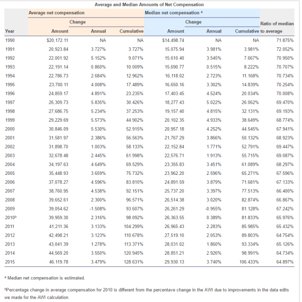
Here’s the data in a graph form

SSAIncomeAvgMedianGraph
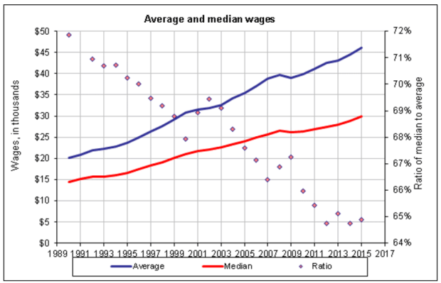
Median wages have doubled, or grown by 100%, while average wages have grown by more than 150% in the last quarter century.

Next week I will look at a hypothetical income tax proposal based on income. It might just blow your mind.

///////////////////////

Dividend Payout Ratio

FactSet Analytics grouped dividend paying stocks in quintiles (20% bands) by the dividend payout ratio (Chart). This is the percentage of profits that are paid to shareholders in the form of dividends. Over the last 20 years of rolling one month returns the stocks that had the highest and lowest payout ratios had the lowest total return. Think about that. Both the highest and lowest quintiles did the worst. What performed the best? Those stocks that were in the middle quintile, the companies who balanced their profit distributions between investors (dividends) and investment (future sales and profits).

//////////////////////////

CWPI

Each month I compute a Constant Weighted Purchasing Index built on a combination of the two Purchasing Manager’s surveys (PMI) each month. For the six month in a row, this composite has shown strong growth and the three year average first crossed the threshold of strong growth in January 2015.

A sub-index composite that I build from the new orders and employment components of the services survey (NMI) shows moderate growth. Its three year average has shown moderate growth since early 2014.

////////////////////////

Surprises

May 14, 2017

Surprises, the good, the bad and the ugly. When we are in retirement, we are less resilient when the bad or ugly surprises happen. There are event surprises and process surprises. An event surprise might be the damage and loss from a weather related event. A process surprise can be even more deadly because it happens over time.

Misestimates and unrealistic expectations are two types of process surprises. Let’s look at the first type – misestimates. In a recent survey, Boomers were asked to estimate the percentage of income they would have to spend on healthcare. The average estimate was a bit less than 25%. The actual average is a third of retirement income. Let’s say a couple gets $4000 in monthly income from Social Security, interest and dividends. If they had budgeted $1000 (25%) of that for healthcare costs, then discover that they are spending over $1300 a month, that extra cost will slowly eat at their savings base.

A good rule of thumb is to estimate that, in the first few years of retirement, we will spend as much if not more than we spent before we retired. If we are wrong and we spend less, that’s a good surprise. In those first years we may find that we are spending more in one area of our lives and less in another.

The second type of process surprise – unrealistic expectations. Let’s say I expect to make 8% per year on my savings with a small amount of risk. People with a lifetime of experience in managing money struggle mightily to accomplish this and all but a few fail. Either they must take on more risk or lower their expectations of return.

Vanguard and other financial companies provide the expected risk and returns of several different allocations over many decades. Here‘s a chart at Vanguard that does not include a cash allocation in its calculation.  These long term calculators have another drawback: they include rather unusual times in history – the 1930s Depression era and World War 2.

We could use the last twenty years of actual returns to guide our expectations for the next twenty years. In past articles, I have linked to the free tools available at Porfolio Visualizer and there is a permanent link on the Tools page.

I select 1997 for the starting year and 2016 for the ending year. I leave the default settings at the top of the screen alone for now. If I input 40% into the U.S. Stock Market, 40% into the Total U.S. Bond Market, and 20% into Cash, I have chosen a conservative allocation – 40/40/20. I click the Analyze Portfolios button and see that the return was a bit over 6% in the CAGR (Compound Annual Growth Rate) column. How likely am I to achieve 8% over the next 20 years? Not very likely.

I’ll input a moderate allocation of 60% stocks, 30% bonds and 10% cash. The result is an almost 7% annual return so I am getting close to my 8% but there was a nasty time when I lost 1/3 of the value of my portfolio. If I am 70 years old, how comfortable would I be if I watched my portfolio sink almost 33%? I think I would have some restless nights worrying whether I would have to go back to work. How up to date are my skills? Would my prospective employer allow me to take a short nap in the afternoon? I feel so rested and ready to rock and roll after a nap. Well maybe not.

Wait a minute, I tell myself. The past 20 years included the busting of a tech bubble, 9-11 and the 2008 financial crisis. Two of those were rather extraordinary events. So I pick a different 20 year time period, 1987 – 2006. That still includes some serious shocks like the tech bubble and its pop, as well as 9-11. My conservative allocation of 40/40/20 made 8-1/2% CAGR and the moderate allocation of 60/30/10 made 9-2/3%.

But I’m not happy with the risk. I could even decrease my risk and make my 8% return by choosing a very conservative allocation of 30% stocks, 50% bonds and 20% cash. My portfolio lost less than 10% in its worst year ever – the maximum drawdown. If I go to Vanguard’s risk return chart they estimate a 7.2% average return over 90 years, which included a horrible depression that lasted a decade and a world war. It’s to be expected that my 20 year period 1987 – 2006 would do a bit better than the 90 year average because the catastrophic shocks are not included.  I think my 20 year period is more representative of the risks I will face in the next 20 years.

I could have picked the 20 years from 1981-2000 and that would have been unrealistic. The conservative allocation earned more than 10% and the annual return on the moderate allocation was almost 12%.

So I have now set what I think is a realistic 20 year time frame that gave me the historical risk and reward that met my expectations. But that’s not realistic. Not yet. I am going to be taking money from this portfolio to supplement my retirement income. So now I go back up to the top of the screen where the defaults are and under “Periodic Adjustments” I select the “Withdraw fixed percentage” option and under that I input 4.0%. This is supposed to be the safe withdrawal percentage. The next row is the “Withdrawal frequency.” I’ll select Annual.

Since I am now taking cash out this portfolio, I will turn to the IRR column of the results because the Internal Rate of Return calculation considers cash flows. My very conservative allocation of 30/50/20 has an IRR of almost 8.5% with a drawdown of less than 15%. The column that says “Final balance” shows that I have more than double the money I started out with and I have been able to withdraw 4% per year. I would have liked to get the drawdown below 10% but I think I can live with 13-1/2%. I’ll be worried but I don’t think I will lose sleep over it. So now I have made what I think is a reasonable expectation of risk and reward based on historical returns.

There’s one last thing I need to do. I know that the 20 year period from 1929 to 1948 was bad but I can’t check that in Portfolio Visualizer because the year selection only goes back to 1972. So I select a really bad ten year period, 2000 – 2009. This was from the heights of the dot.com boom to a short time after the financial crisis. After taking 4% per year, the IRR on my very conservative allocation was 4% and I still had the money I started out with at the beginning of the ten year period. I could probably withstand a 20 year period like this as long as I stay true to my allocation.  But, the maximum drawdown (see here) was 21%, something that I am not comfortable with.

I am left with some hard choices.   In the case of another bad ten year period, I can lower my withdrawal percentage a bit or I can learn to have faith in the allocation process and accept the drawdown.  I have done this with a free tool. I could pay for more sophisticated tools that gradually transition from one allocation to another allocation over a 20 year period.  That would be more realistic still since I will probably get more risk averse as I get older. At least this gets me started.

We often can’t avoid the suprise events. Some surprises are both event and process like the diagnosis of a  life-threatening illness. We can understand and be alert to the process surprises that we may inflict on ourselves. Understanding involves some frank self-assessment and difficult questions. Am I prone to wishful thinking? Do I overestimate my tolerance for risk? How well do I live with the consequences of my decisions?

/////////////////////

CAPE

A few weeks ago I mentioned that I might calculate a 20 year CAPE ratio. The CAPE that Robert Shiller uses is a ten year period. As of the end of 2016 the 20 year CAPE was 31 vs the 70 year average of 21. Whichever calculation we use, the market is priced a good deal above average. The 20 year CAPE first crossed above the average in the late summer of 2009.

//////////////////

California

Over the past 5 years California’s economy has grown faster than any other developed country except for China. Bloomberg article

An Interest-ing Debt

February 12, 2017

Republicans used to talk about the country’s debt load but such talk is so inconvenient now that they control the House, Senate and Presidency. Perhaps it was never more than a political ploy, a rhetorical fencing. Now there is talk of tax cuts and more defense spending, and a $1 trillion dollar infrastructure spending bill. 48 states have submitted a list of over 900 “shovel-ready” projects.

House Speaker Paul Ryan used to be concerned about the country’s debt. Perhaps he has been reading that deficits don’t matter in Paul Krugman’s N.Y. Times op-ed column. For those of us burdened with common sense, debts of all kinds – even those of a strong sovereign government like the U.S. – do matter. The publicly held debt of the U.S. is now more than the country’s GDP.

debt2016q3

In 2016, the Federal interest expense on the $20 trillion publicly held debt was $432 billion, an imputed interest rate of 2.1%. Central banks in the developed world have kept interest rates low, but even that artificially low amount represents 11% of total federal spending. (Treasury)  It represents almost all the money spent on Medicaid, and more than 6 times the cost of the food stamp program. (SNAP)

The latest projection from the CBO estimates that the interest expense will double in eight years, an annual increase of about 9%. The “cut spending” crowd in Washington will face off against the “raise taxes” faction at a time when a growing number of seniors are retiring and wanting the Social Security checks they have paid toward during their working years.

In the past twenty years the big shifts in federal spending as a percent of GDP are Social Security and the health care programs Medicare and Medicaid. These are not projections but historical data; a shift that the CBO anticipates will accelerate as the Boomer generation enters their senior years. Ten years ago, 6700 (see end of section)  people were reaching 65 each day. This year, over 9800 (originally 11,000, which is a projection for the year 2026) per day will cross that age threshold.

cbospendcomp1996-2016
CBO Source

A graph of annual deficits and federal revenue shows the parallel paths that each take. The trend of the past two years is down, promising to accelerate the accumulation of debt.

fedreceiptsdeficit1998-2016

More borrowing and higher interest expense each year will crowd out discretionary spending programs or force the scaling back of benefits under mandatory programs like Social Security, Medicare and Medicaid. President Trump can promise but it is up to Congress to do the hard shoveling.  They will have to bury the bodies of some special interests in order to get some reform done.

[And now for a bit of cheer.  Insert kitten video here.]

We already collect the 4th highest revenue in income taxes as a percent of GDP. Canada and Italy head the list at 14.5%.
South Africa 13.9%,
U.S. 12.0%,
Germany 11.3,
and France 10.9 all collect more than 10%. (WSJ) Those who already pay a high percentage in income taxes will lobby for a VAT tax to increase revenues. Income taxes are progressive and impact higher income households to a greater degree. Poorer households are more affected by a VAT tax.  Cue up more debate on what is a  “fair share.” Many European countries have a VAT tax and the list of exclusions to the tax are bitterly debated.

Adding even more social and financial pressure is the lower than projected returns earned by major pension funds like CALPERS. For decades, the funds assumed an 8% annual return to pay retirees benefits in the future. In the past ten years many have made 6% or less. Several years ago, CALPERS lowered the expected return to 7.5% and has recently announced that they will be gradually lowering that figure to 7%.

Each percentage point lower return equals more money that must be taken from state and local taxes and put into the pension fund to make up the difference. Afraid to call for higher taxes and lose their jobs, local politicians employ some creative accounting to avoid the expense of properly funding the pension obligations. In a 2010 report, Pew Charitable Trust analyzed the underfunding of many public pension funds like CALPERS and found a $1 trillion gap as of 2008. (Pew Report) The slow but steady recovery since then may have helped annual returns but the inevitable crisis is coming.

In December 2009, I first noted a Financial Times Future of Finance article which quoted Raymond Baer, chairman of Swiss private bank Julius Baer. He warned: “The world is creating the final big bubble. In five years’ time, we will pay the true price of this crisis.”
That warning is two years overdue. Sure hope he’s wrong but … here’s the global government debt clock. The total is approaching $70 trillion, $20 trillion of which belongs to the U.S.  We have less than 5% of the world’s population and almost 30% of the world’s government debt.  As Homer Simpson would exclaim, “Doh!”

Correction:  Posted figure for 10 years ago was originally 9000.  Current figure was originally posted at 11,000.  Projected for the year 2026 is 11,000.)

///////////////////////

Market Valuation

Comments by President Trump indicating a “sooner than later” schedule for tax cuts helped lift the stock market by 1% for the week. The Shiller CAPE ratio currently stands at 28.7, just shy of the 30 reading on Black Tuesday 1929. (Graph) Since the average of this ratio is about 16, earnings have some catching up to do. Today’s reading is still a bargain compared to the 44 ratio at the height of the dot com boom. Still, the current ratio is the third highest valuation in the past century.

The Shiller Cyclically Adjusted Price Earnings (CAPE) ratio
1) averages the past ten years of inflation adjusted earnings, then
2) divides that figure into the current price of the SP500 to
3) get a P/E ratio that is a broader time sample than the conventional P/E ratio based on the last 12 months of earnings.

The prices of long-dated Treasury bonds usually move opposite to the SP500.  In the month after the election, stocks rose and bond prices went lower.  Since mid-December an ETF composite of long-dated Treasury bonds (TLT) has risen slightly.  A number of investors are wary of the expectations that underlie current stock valuations.

The casual investor might be tempted to chase those expectations.  The more prudent course is to stick with an allocation of various investments that manages the risk appropriate for one’s circumstances and goals.


Timing Models

May 22, 2016

Long term moving averages can confirm the shifting trends of market sentiment and market watchers customarily watch for crossings of two averages.  The 50 week (1 year) average of the SP500 index just crossed below the 100 week (2 year) average, indicating a  broad and sustained lack of confidence.  Falling oil prices since mid-2014 have led to severe earnings declines at some of the large oil companies in the SP500.  The index is selling for about the same price as the two year average.

What to do?  These crossings or junctions can mark a period of some good buying opportunities – unless they’re not – and that’s the rub with indicators like this one.  Downward crossings typically occur after there has already been a 5 – 15% decline from a recent high.  If an investor sells some stocks at that time, they wind up selling at an interim low, and regret  their action when the market rises shortly thereafter.  They should have bought instead of sold.  AAAARGHHH, a false positive!  Twice in the 1980s, the sentiment shift was less than a year long and an investor who did act lost 10 – 20% as the market climbed after several months.

Conversely, after a 10-15% decline, some investors do buy more stocks, figuring that the excess optimism, or “fluff,” has been shaken out of the market.  Then comes that sinking feeling as the market continues to decline, and decline, and decline.  In April 2001 and July 2008, the 50 week average crossed below the 100 week average.  Investors who lightened up on stocks at those times saved themselves some pain and a lot of money as the broader market continued to lose another 30% or so.

There are not one but two problems with timing models: timing both the exit from and entry back into the market.  Over several decades the majority of active fund managers – professionals who study markets – did not get it right.  They underperformed a broad index like the SP500 because the index is actually a composite of the buying and selling decisions of millions of market participants.  John Bogle, the founder of the now gigantic Vanguard Funds, made exactly this point in his dissertation in the 1950s.  A half century later, this “wacky idea” of index investing has taken over much of the industry.

Consistently successful timing is very difficult and has tax consequences in some accounts.  Investors are encouraged to focus instead on their investment allocation to match their tolerance for risk and volatility, and to consider any prospective income that they might need from a portfolio.

Since 1960, the average annual price gain of the SP500 index has been 6.7%.  Add in an average yield (dividend) of 3% and the total return is almost 10% that an investor gains by doing nothing, a formidable hurdle for any timing model.

Within an allocation model, though, is the idea that an investor might shift a small portion of a portfolio from stocks to bonds and back in response to market signals.  In several previous articles I have looked at a Case-Shiller CAPE10 model (here, here, here, and here) as well as another crossing model using the 50 day and 200 day moving averages, dramatically named the Golden Cross and Death Cross (here, here, and here.)  As already mentioned, we want to avoid some of the false signals of crossing averages.

Instead of a crossing, we can simply use a change in direction of both averages.  When not just one, but both, long term averages turn down, we would move a portion of money from stocks to bonds, and in the opposite direction when both averages turned up.

Over the course of several decades, this strategy has been suprisingly successful.  The market sometimes experiences a decade when prices may be volatile but are essentially flat.  From 2000 – 2012 the SP500 index went up and down but was the same price at the beginning and end of that 12 year period.  1967 to 1977 was another such period, a stagnant period when an investor’s money would be better put to use in the bond market rather than the stock market.

In recent decades, this long term weekly model would have favored stocks from 1982 to March 2001 while the market gained 850%, an annual price gain of 11%.  The model would have shifted money back to stocks in August 2003 at a price about 25% less than the exit price in March 2001. In March 2008, the model would have favored an exit from stocks to bonds.  The stock market at that time was about the same price that it had been 7 years earlier in March 2001.  The model captured a 30% gain while the index went nowhere.

In the 1967 – 1977 period, the model did signal several entries and exits that produced a cumulative 8% price loss over the decade but the model favored the bond market for half of that period when bonds were earning 8% per year, a net gain.

In almost two years, the SP500 has changed little; the yield is less than 2%, far lower than the 3% average of the past 50 years.  However, the broader bond market has also changed little in that time and is paying just a little over 2%.  There are simply periods when strategies and alternatives have little effect. Although the 50 week average crossed below the 100 week average earlier this month, they are essentially horizontal.  The 100 week average is still rising, but barely so, a time of drift and inertia.  In hindsight, we may say it was the calm before a) the storm (1974), or b) the surge (1995). Usually the calm doesn’t last more than two years so we can expect some clear direction by the end of the summer.

/////////////////////////////

It’s the economy, stupid!

One of the myths of Presidential politics is that Presidents have a lot to do with the strength or weakness of the economy, a superhero narrative carefully cultivated by the two dominant parties.  Here’s a comparison of GDP growth during Democratic and Republican administrations. The Dems have it up on the Reps since 1928, chiefly because the comparison starts near the beginning of the Great Depression when the Reps held the Presidency.

For several reasons, GDP data is unreliable during the Depression and WW2 years.  First, the GDP concept wasn’t formalized till just before the start of WW2 so data collection was new, primitive and after the fact.  Secondly, this 14 year period includes an extraordinary amount of government spending which warped the very concept of GDP.  The WPA program that put so many to work during the depression years was a whopping 7% of GDP (Source), like spending $2 trillion dollars, or half the Federal budget, in today’s economy.

The Federal Reserve begins their GDP data series after WW2 when data collection was much improved. If you’re a Dem voter, don’t mention this unreliable data.  Just tell friends, family and co-workers that the Dems have averaged 4% GDP growth since 1927; the Reps only 1.7%.  If you’re a Republican voter, exclude the 20 year period from 1928 to 1947 and begin when the Federal Reserve trusts the data. Starting from 1947,  Republicans have presided over economies with 2.75% annual growth during 36 Presidential years.  During the 30 years Dems have held the Presidency, there has been a slighly greater growth rate of 3.1%.

In short, economic growth is about the same no matter which party holds the Presidency.  Shhhh! Don’t tell anyone till after the election is over.  Legislation by the House and Senate has a much greater impact on the economy.

///////////////////////////

Small Business

“If America is going to dominate the world again, the country has to fix the spirit of free enterprise. Small-business startups are in serious decline.”

“Gallup finds that one-quarter of Americans say they’ve considered becoming business owners but decided not to. ”

These foreboding quotes are from a recent Gallup poll.  Small businesses employ more than 50% of employees and are responsible for the majority of job growth yet many politicians and most voters pay little attention to the concerns of small business owners.  The giant corporations get most of the press, praise and anger.  Could the lack of small business growth be responsible for the lackadaisical growth of the entire economy during this recovery?  As the population  continues to age, growth will be critical to fund the dedication of community resources to both the old and young.

The BLS routinely tracks the Employment-Population Ratio, which is the percentage of people over 16 who are working, currently 60%.  But this ratio does not fully capture the total tax pressures on working people since it excludes those under 16, who require a great deal of community resources.  When we track the number of workers as a percent of the total population, we see a long term decline.  As this ratio declines, the per-worker burdens rise for it is their taxes that must support programs for those who are not working, the young and the old.

Regulatory burdens hamper many small businesses. A recent incident with a Denver brewery highlights the sometimes arbitrary rulemaking that business owners encounter.  Agencies protest that their mission is to ensure public safety.  An unelected manager or small committee in a department of a state or local agency may be the one who decides what is the public safety.  As the rules become more onerous and capricious, fewer people want to chance their savings, their livelihood to start a small business.  As fewer businesses start up, tax revenues decline and the debate grows ever hotter: “more taxes from those with money” vs “less generous social programs.”  Policy changes happen at a glacial pace, further exacerbating the problems until there is some crisis and then the changes are instituted in a haphazard fashion. Since we are unlikely to change this familiar pattern, the issues, anger and contentiousness of this election season are likely to increase in the next decade.  Keep your seat belts buckled.

Stock and Housing Valuations

March 1, 2015

There are several popular methods to evaluate stocks.  The P/E ratio is probably the most quoted metric.  This is a stock price divided by its current earnings.  A conservative variation of this popular methodology is Professor Shiller’s Cyclically Adjusted Price Earnings (CAPE) ratio.  The basis for this metric is the observation that all data reverts to its mean.  Professor Shiller’s method adjusts the past ten years of reported earnings for inflation, then averages those earnings and divides the current price by that average to get a CAPE ratio.

Any well-regarded valuation method has its detractors. This Economist blog points out objections to the Shiller CAPE ratio. In a 2014 blog I tackled an objection to Shiller’s methodology: a ten year average can include a severe downturn in earnings that does not reflect current conditions. I massaged away the 2008 to 2010 downturn to show that Shiller’s CAPE ratio was little changed by the downturn.

Some object that the CAPE ratio uses reported earnings, which includes depreciation (lowers earnings) and interest (increases or decreases earnings).  Operating earnings exclude these items and more accurately reflect the profits generated by ongoing operations.   Operating earnings may be a valid basis for evaluating a single company and Warren Buffet uses this method, among others, to get a sense of sustainable earnings.

Some prefer to use forward operating earnings, which are estimates of profits for the next twelve months.  These estimates come in two varieties: top down and bottom up.  Top down estimates are calculated by estimating a growth percentage of profits for the coming year and applying that percentage to the sum of current profits.  Bottom up estimates are painstakenly compiled by taking the forward earnings guidance given by each company.  Top down estimates tend to be optimistic and are usually revised downward with the passage of time.

I prefer Shiller’s method as a more realistic approach for a long term investment in a stock index like the SP500.  Successful businesses should be able to generate enough profit in their operating margins to account for depreciation, which is included in reported earnings.

Another valuation method is the flip side of the Price Earnings or P/E ratio – an E/P ratio, or earnings yield.  As of a week ago, the current earnings yield was 5.02%.  This is then compared to the 10 year Treasury rate, 2.13%, as of Feb. 20, 2015.  The difference between the earnings yield of stocks and a risk-free investment like U.S. Treasuries – currently about 3% – is called the risk premium for owning stocks.  Often, this risk premium is quoted in basis points, which are 100ths of a percent.  So 3% = 300 basis points.  In 2007, the risk premium was over 4%.  The average from 2002 – 2006 was about 2% as stocks climbed out of a prolonged slump following the dot com bust and 9-11.  So, using this method, we could say that stock valuations are somewhere in the middle, neither frothy or pessimistic.

************************
Housing

Sales of New Homes remained brisk at just under 1/2 million.  The supply of new homes on the market indicates historically strong demand.

The latest Case-Shiller home price index increased 4.3% year-over-year, below the 4.7% growth curve of the past forty years.  From 1975-2000, home prices increased 5.5% annually.  During the boom years of the 2000s housing prices surged above that growth curve only to fall swiftly in the crash of 2008.  The bust in the housing market has more than taken out the excess, bringing the forty year growth curve to 4.7%.

The home price index does not take into account the larger homes being built over the past two decades.  The median square footage of new homes has grown from 1555 SF in 1975 to 2457 SF in 2013. (Census Bureau data)

A greater percentage of today’s homes include air conditioning, extra bathrooms and other amenities that the homes of forty years ago did not have, skewing the long term effective growth curve even lower.  While some metropolitan areas on both coasts may be overvalued, national averages suggest that housing prices are fairly valued.

***********************

Economic Summary

Twice a year the chair of the Federal Reserve testifies before the Senate Banking Committee.  Chair Janet Yellen’s testimony this past week was a concise distillation of economic trends.  Investors bombarded with an avalanche of articles and blogs may sometimes find it difficult to synthesize all the information they absorb.  Ms. Yellen’s initial summary cuts through the clutter:

The unemployment rate now stands at 5.7 percent, down from just over 6 percent last summer and from 10 percent at its peak in late 2009. The average pace of monthly job gains picked up from about 240,000 per month during the first half of last year to 280,000 per month during the second half, and employment rose 260,000 in January. In addition, long-term unemployment has declined substantially, fewer workers are reporting that they can find only part-time work when they would prefer full-time employment, and the pace of quits–often regarded as a barometer of worker confidence in labor market opportunities–has recovered nearly to its pre-recession level. However, the labor force participation rate is lower than most estimates of its trend, and wage growth remains sluggish, suggesting that some cyclical weakness persists. In short, considerable progress has been achieved in the recovery of the labor market, though room for further improvement remains.

At the same time that the labor market situation has improved, domestic spending and production have been increasing at a solid rate. Real gross domestic product (GDP) is now estimated to have increased at a 3-3/4 percent annual rate during the second half of last year. While GDP growth is not anticipated to be sustained at that pace, it is expected to be strong enough to result in a further gradual decline in the unemployment rate. Consumer spending has been lifted by the improvement in the labor market as well as by the increase in household purchasing power resulting from the sharp drop in oil prices. However, housing construction continues to lag; activity remains well below levels we judge could be supported in the longer run by population growth and the likely rate of household formation.

Retail Sales and the Stock Market

July 20th, 2014

This week I’ll take a look at the latest retail sales numbers and revisit a familiar valuation metric for the stock market.

*******************

Retail Sales

Retail sales were a bit of a disappointment this week because of a monthly decline in auto sales.  As strong as vehicle sales have been, we can see a pattern that echoes a trend in employment – the best of this post-recession period is near the low of past recessions.  As a percent of the population, the number of cars and light trucks sold is tepid at best.

In total, retail sales gained more than 4% year-over-year but here again we can see a familiar pattern – declining yearly percentage gains.  Periods of rising gains are about half the length of periods of falling gains.  Over the next several months, we would like to see higher highs in the yearly gains.  Further declines, i.e. lower highs, would be a cause for concern.

*************************

Malaysian Airline Disaster

Oil prices had fallen more than 5% over the past three weeks.  The news of an apparent missile strike on a Malaysian passenger jet over a conflict zone in eastern Ukraine sent oil prices up about 2.5% over two days this week before falling back slightly on Friday.  As families mourn the deaths of almost 300 people on the plane, a fusillade of accusations and denials were launched.  Some accuse Russia of launching the missile that struck the passenger jet flying at 33,000 foot altitude, some blame Russian-backed separatists in eastern Ukraine, others hold Ukranian forces accountable.  Economic sanctions already in place against Russia may be broadened.

Unrest in Ukraine, Iraq and Libya puts upward pressure on oil prices but the effect is moderated by a global supply that is able to meet demand with a safety buffer capable of absorbing these geopolitical conflicts.

***************************

Stock Market Valuation

The stock market continues its two year run to try and meet up with the trend channel of the mid-2000s as though the financial crisis never happened.

Last month I wrote about the Shiller CAPE ratio, introduced by economist Robert Shiller in his book Irrational Exuberance. Some writers also refer to the CAPE ratio as PE10 or the Shiller P/E ratio.

Portfolio Visualizer (PV) has a free tool that lets viewers backtest portfolios using various strategies. An optional timing model based on the CAPE ratio flips the allocation of a portfolio from 60% stocks and 40% bonds (60/40) to a 40/60 mix when the CAPE is high, as it is today.  In the model, “high” is a CAPE above 22, but as I wrote last month, the CAPE has averaged 22.91 for the past 30 years.  In the relatively low interest environment of the past thirty years, investors are willing to pay more for stocks.  The 50 year average is 19.57, within the normal range of the timing model. One could make the point that “high” should be set upward about 3 points, which is the spread between the 30 and 50 year averages (22.91 – 19.57).  In that case, the trigger high would be 25.

Below is a chart of the CAPE ratio and the inflation adjusted or real price of the SP500 index.  As you can see we are far below the nosebleed valuation levels of the late 90s and early 2000s.

The current CAPE ratio is about 26, above even the modified high point.  Using this model, an investor with a $500,000 portfolio with $300,000 in stocks and $200,000 in bonds, would sell $100,000 of stocks and buy bonds with the proceeds.  Over the past twelve years, the Shiller model would have generated an 8.44% annual return vs the 7.21% return of a 50/50 balanced portfolio.  I included an additional two years to capture half of the downturn in the early 2000s when stocks lost 43% of their value.  More importantly, the risk adjusted return of the Shiller model is much better than the 50/50 portfolio.

The Shiller model also did better than the 8% annual returns of a crossing strategy. This is a variation of the 50 day/200 day “Golden Cross” strategy, which I wrote about in February 2012, a week or so after the occurrence of the last Golden Cross.  In this monthly variation using the Shiller model, an investor exits the market when the SP500 monthly index drops below its 10 month moving average.

Keep in mind that a backtested portfolio generates higher than actual returns since they often don’t include trading fees, slippage or a real life re-balancing.  In backtest simulations, an investor may re-balance all in one day following the signal day.  While that may be the case sometimes, many investors are not so quick and some financial advisers will recommend making a gradual transition when re-balancing.  Still, backtests can be useful in comparing strategies.

An investor who puts money into the stock market today is – or should be – more concerned about what that money will be worth 5, 10 and 20 years from today when they might need the money for retirement, children’s college, or other events in a person’s lifetime.

There is a definite negative correlation between the CAPE and the 10 year return, without dividends, of an investment in the SP500.  Since World War 2, the correlation is -.70.  Since 1902, the correlation is -.65, reflecting the greater portion of earnings that were paid out as dividends to investors before WW2.  In short, it is likely that an investor will experience lower returns the higher this CAPE ratio.

*****************************

How much can I take each year from the piggy bank?

There is also a Shiller model for sustainable withdrawals from a portfolio based on the CAPE ratio.  You can read about it here.  Keep in mind that this model uses a 30 year horizon for retirement.  The same author, Wade Pfau, has a separate article on the various time horizons used in withdrawal models.

*****************************

Takeaways

Two steps forward, one step back is a familiar trend in this post-recession period.  Retail sales are healthy but below the 5% threshold of a strong upward trend.

Using the Shiller CAPE ratio as a metric of market valuation, stocks are overvalued.

How Much Is That Doggie In the Window?

June 22, 2014

This week I’ll look at interest rates and various models of evaluating both the stock market and housing.

*****************

GDP Growth Revised

This past Monday, the International Monetary Fund (IMF) cut estimates for this year’s economic growth in the U.S. to 2% from 2.8%.  IMF cited a number of headwinds: the severe winter, weakness in housing, some fragility in the labor market.  It recommends that the central bank keep rates low through 2017.  Expectations were that the Federal Reserve would begin raising interest rates in mid 2015.  Some recommendations in the report will be met with antipathy or a polite “thanks for letting us know”: raising the minimum wage and gasoline taxes.

******************

Fed Don’t Fail Me Now

As expected, the Federal Reserve decided to leave the target interest rate at the extremely low range of 0% to .25% that it has held in place since the beginning of 2009.  Congress has given the Fed a dual mandate:  keep inflation reasonable and promote full employment.  It is this second half of the mandate that presents some problems as the FOMC looks into their crystal ball.  The Labor Force Participation Rate is the percentage of those working to those old enough to work.  It has declined from 66% at the beginning of the recession to less than 63% today.

As economic conditions improve and job prospects brighten, how many of those who have dropped out of the labor force will return?  If workers return to the labor force, actively seeking work, that increased supply of labor will naturally curb wage increases and reduce upward pressure on inflation.  However, if the decline in the participation rate is more or less permanent for several years to a decade, then a stronger economy will create more demand for workers, who can demand more money for their labor, which will contribute to inflation.

**********************

401K Retirement Plans

The Financial Times reported projections  of negative cash flows in 401K plans by 2016 as boomers convert their pension plans to IRAs when they retire.  Retirees tend to have a much more conservative stock/bond allocation and may force institutional money managers to liquidate some equities to meet the outgoing cash flows.  An ominous speculation at the end of the article is that regulations could be put in place to slow the conversion of 401Ks to IRAs.  Whenever the finance industry needs a friend in Washington, they can be sure to find one.

*********************

Stock Market Valuation

It has been 32 months without a 10% correction in the SP500 market index.  The post World War 2 average is 18 months. Is the stock market overvalued?  I will review a common metric of value and develop an alternative model of long-term value.

Probably the most widely used metric of stock valuation is the Price/Earnings, or PE, ratio.  If a stock sells for $100 and its annual earnings are $6, then the P/E ratio is 100/6, or a bit above 16.  The average PE ratio is 15.5 (Source).  Companies do not pay all of those earnings in the form of dividends to investors.  That is another metric, called the Price Dividend, or P/D ratio, that I wrote about last year.

Fact Set provides an analysis of the past quarter’s earnings of the SP500 companies, as well as projections of current  and next year’s earnings. Earnings growth estimates for this year range from 30% (yikes!) for the telecom sector to a bit over 3% for utilities. The health care sector tops estimates of revenue growth at about 8%, while the energy sector is projected to have negative growth.  The basic materials sector tops the 2015 list of earnings growth at 18% and the utilities sector again takes the bottom rung on the ladder with almost 4% growth.

The SP500 is priced at 15.6x forward 12 months earnings, which is above the five year and 10 year averages of less than 14x (Fact Set Report page)  but just about the 100 year average of 15.5.

Robert Shiller, a Yale economist and co-developer of the Case-Shiller housing index, uses a smoothing technique for calculating a Price Earnings ratio and makes his data spreadsheet available.  His team calculates the 10 year average of real, or inflation-adjusted, earnings and divides the inflation adjusted price of the SP500 by that average to arrive at a Cyclically Adjusted Price Earnings, or CAPE, ratio.

Using this methodology, the market’s CAPE  ratio is 25, above the 30 year ratio of 22.91 and the 50 year ratio of 19.57.  In 1996, the market was trading at this same ratio, prompting then Fed Chairman Alan Greenspan to make his infamous comment about “irrational exuberance.”  The market continued to climb till it reached a nosebleed CAPE ratio of 43 in early 2000.  It took another 7 months or so before the SP500 began its descent from 1485 to 900, a drop of 40%, over the next two years.  There is no automatic switch that flips when a market becomes overvalued.  People just get up from their seats and start to leave the theater.

In most decades, this methodology works well to arrive at a longer term perspective of the market’s price.  However, some argue that when severe downturns occur, this methodology continues to factor in the downturn’s impact long after it they have passed.  In 2008 and 2009, SP500 index annual earnings crashed from above $80 down to $60, a precipitous decline that is still factored into the ten year framework of the CAPE method.

So I took Mr. Shiller’s earnings figures and did some magic on them.  I took away most of the downturn in earnings during a 3 year period from 2008 – 2010.

Bye, bye earnings dive.  Hello, stagnating earnings.  The chart shows a slight downturn in earnings, then flat-lines in the pretend world of 2008 – 2010, where the steep recession never happened.

Instead of a deep crater formed in the markets by the financial panic in late 2008, the stock market slid downward over several years before rising again in early 2012.  Can you hear the soft sounds of flutes echoing in the mountain meadows of this pretend world?

Using this pretend data, I recalculated today’s CAPE ratio at 22, below the actual 25 CAPE ratio.  What should be the benchmark in this pretend world?  The 100 year average includes the Great Depression of the 1930s and World War 2, which naturally lowered PE ratios.  A 50 year average includes the Vietnam War and high inflation, particularly during the 1970s and early 1980s.  As such, it is less comparable to today’s environment marked by low inflation and the lack of major hostilities.

So, I ran a 30 year average of our pretend world, from 1984-2013, and calculated a 30 year average of 23, close to the real 30 year average of 22.9!  It shows the relatively small effect that even momentous events have on a long term average of the CAPE ratio, which is why Robert Shiller advocates its use to calculate value and establish a comparison benchmark within a longer time frame.  In the real world, the market’s CAPE ratio of 25 is above that 30 year average.

Let’s put aside the world of soft market landings and mountain meadows and look at what I call the time value of the market.  I picked January 1980, a point almost 35 years in the past, as a starting point.  Then I divided the SP500 index by the number of months that have passed since that starting point.  This gives me a ratio of value over time. If an investor buys into the market when its value is above a long-term average of that ratio, we can expect a lower long-term rate of return.

The 20 year average is 3.98, just a shade above the 20 year median of 3.91, meaning that the highs and lows of the average pretty much cancel out.  Note also that it is only in the past year that the market value has risen above the 20 year average of this ratio.

But we cannot look at a time value of any investment without considering inflation, which erodes value over time.  When we add the Time Value Ratio and the Consumer Price Index (CPI), we find that the current market is priced slightly lower than both the 20 year and 30 year averages.

Historically, as this ratio has risen more than 25 – 30% above its long-term average,  the market peaked.  Today’s ratio is just about average.

So, is the market overvalued?  Based on CAPE methodology, yes.  Fairly valued?  Based on expectations of earnings growth this year and next, yes.  Undervalued?  Probably not.

Common Sense recently published the best and worst 10 and 20 year returns on a 50/50 stock/bond portfolio mix.  This balanced approach had a 2 – 3% annualized gain even during the Depression years when the stock market lost 80 – 90% of its value.  It should be a reminder to all investors that trying to assess the true value of the stock market is perhaps less important than staying diversified.

************************

The P/E of Housing

Home builders broke ground on almost 1.1 million private residential units in April, a 13% increase over last year.  Called Housing Starts, the series includes both multi-family units and single family homes. The pace slowed a bit in May but still broke the 1 million mark.  As a percent of the population, we just aren’t building as many homes as we used to.

For most of us, our working years are about 60% of our lifespan.  Hopefully, our parents took care of our income needs for the first 20% of our lifespan. During our working years, we hope to save enough to generate a flow of income for the last 20% of our lifespan.  Those savings, which include private pensions and Social Security, are like a pool of water that we accumulate until we start turning on the spigot to start draining the pool.    We turn a stock or pool of savings into a flow of income.

The Bureau of Labor Statistics uses a metric called Owner Equivalent Rent (OER) in their calculation of the Consumer Price Index.  This concept treats a home as though it were generating a phantom income equivalent to the rents in that local real estate market.  We can use this concept to value a house.  The future flows from a stock can be used to generate an intrinsic current value for the house.

As an example:  a house which would generate a net $12000 a year in income, whether real or phantom, after taxes and other expenses, is worth about 16 times that net income, according to historical trends calculated by the ratings agency Moodys.  In this case, the house would be worth about $200K.

Coincidentally, this is the average P/E ratio of the stock market.  Historically, stocks have been valued so that the price of the company’s stock has been about 16 times the earnings flow from the company’s activities.  If a primary residence generates 6% in tax free income and 3% in appreciation, the total annual return on owning a house free and clear is more than the average annual return of the stock market.  The housing boom and bust may have given many younger people the impression that home ownership is a debt trap.  It may take a decade for the housing industry to recover from this perception.

**************************

Takeaways

The Fed is likely to keep interest rates low past mid-2015 but is watching the Labor Participation Rate for early indications that rising wage pressures will spur rising inflation.
The stock market is slightly overvalued or fairly valued depending on the metric one uses.
On average, a house has a value multipler that is similar to the stock market but generates a higher after tax income.

Next week I’ll take a look at some long term trends in education spending and tuition costs.

Price Dividend and CWI

August 11th, 2013

Last week I wrote about viewing trends in the market through the lens of hard cold cash; that is, the dividends paid by the companies in the SP500.  Today, I’ll revisit that subject in a bit more depth.  Beginning in the last quarter of 2008, reported earnings of companies in the SP500 dropped precipitously, plunging about 90% in the first two quarters of 2009.

The portion of those earnings paid as dividends fell 24% from peak to trough, far less than earnings.

Robert Shiller, a Yale economist and co-developer of the Case-Shiller housing index, uses a smoothing technique for calculating a Price Earnings ratio and graciously makes his data available.  He calculates the 10 year average of real, or inflation-adjusted, earnings and divides the inflation adjusted price of the SP500 by that average.  Because of the low inflation environment for most of the past decade, the difference between the two earnings figures, nominal and real, is slight.

The drop in corporate earnings was extreme, more so than any recession, including the Great Depression of the 1930s.   In the 2001 recession, earnings declined to about half of their prerecession peak.  In the recession of the early nineties, it was about 30%.  In the back to back recessions of the early 1980s, corporate earnings fell about 25%.

While Shiller’s method evens out earnings, it has one drawback, one that no one could have foreseen until 2008 simply because it had never occurred.  The severity of the decline in earnings skewed the ten year average of earnings down over the 2002 – 2012 period.  Since the earnings average is the divisor in the Shiller P/E ratio, it correspondingly makes the ratio of the price of stocks a bit higher than it might otherwise be.

For that reason, I’ll look at a less volatile ten year average of dividends; that is, the inflation adjusted price of the SP500 divided by the ten year average of inflation adjusted dividends.

Today’s market prices are at the twenty year average of the real price dividend ratio, which is about 61.  For a number of factors, market prices as measured by this dividend ratio are higher for the past twenty years than the thirty year average of 51.  The tech and real estate bubbles over-inflated prices but investors have been willing to pay more for stocks as bond yields have declined steadily from their nosebleed levels of thirty years ago.

Let’s crank up the time machine and go back a year.  Here are a few quotes from an October 13, 2012 Reuters article after the market had dropped about 2%:

“Central bank-fueled gains took markets within reach of five year highs in September, but now U.S. stock market participants are shifting their focus back to corporate outlooks, and the picture is not pretty.”

The article quoted the director of investment strategy at E-Trade Financial, Michael Loewengart: “The overall tone is so pessimistic that we may see some upside surprises, but we could still suffer considerable losses if the news is bad.”

“Profits of SP500 companies are seen dropping 3% this quarter from a year ago, the first decline in three years”

It was close to being almost the end of the world.  As you read various comments in the news, keep in mind that these remarks are coming from active traders who see a 5% drop as catastrophic if they have not anticipated it through options and other hedging strategies.  For longer term investors, a 5% drop after a 5% rise over several months is more yawn provoking than cataclysmic.

Through the middle of November 2012, the market would drop another 5%.  Slowing corporate profits and the looming – yes, looming – fiscal cliff spooked investors.  Then, on the hopes that the Fed would do something to offset these negatives, the market regained the 5% lost in the previous month.  In mid-December, the Fed announced that it would double its bond purchasing program and the market has been rising since, gaining 20%.  Has this been a new bubble, one we’ll call the “Fed Bubble?”  Some say yes, some say no.

As we read the daily news, let’s keep in mind that in ten years we will have forgotten most of it.  Some fears will seem silly, some may seem prescient.  Each day there are many predictions, some like this one from December 30, 2001: “By the year 2003, there will be 2 types of businesses, those doing business on the internet and those out of business.” (Sorry, I didn’t write down the attribution).  Some predictions will seem rather silly like the one in March 2009 that the SP500 would be below 500 in a month.

Farmers and businessmen in ancient Rome consulted soothsayers who threw chicken bones and read the pattern in the bones to tell their clients whether there would be rains in the spring and how hot the summer would be.  Sometimes they were right, sometimes they were wrong.

Each day the market goes up – or it goes down.  For the past twenty years it has gone up 54% of the time, down 46% of the time.  Going up seems like an odds on favorite but this is complicated by the fact that the market usually goes down faster than it goes up.  There is also a well documented behavioral phenomenon of risk aversion; people respond more emotionally to loss than we do to gains.

This past Monday came the release of the ISM monthly survey of Non-Manufacturing businesses.  Like the manufacturing survey released a few days earlier, this index also surged upward in July, a welcome relief after the declining numbers in June.  I’ve updated the composite CWI that I introduced a while back and compared it to the SP500 and the Business Activity Index of the Non-Manufacturing Survey.

This composite index is weighted 70% to non-manufacturing, 30% to manfacturing.  Because this CWI relies on past months’ activity as a predictor of future conditions, it responds with less volatility to a one month surge in survey data.  As we can see, the tepid growth that began appearing this past spring is still showing in this index, although it is a strong 55.5, indicating sure footed, if not surging, growth.  It has been above the neutral mark of 50 since August 2009.