Producer and Consumer Prices

February 4, 2024

by Stephen Stofka

This week’s letter is about the inflationary spurt that began a little over two years ago. The causes of the inflation have been a controversial topic among economists and political commentators. Some blame Biden and the Democrats for enacting a third round of stimulus shortly after he took office. That’s fiscal policy on the hot seat. Some target monetary policy, blaming the Fed for leaving interest rates at a pandemic low near 0%. In this letter, I will focus on a price signal that the Fed could have treated with more importance. A combination of the two is more credible. Republicans hope to make inflation and the immigration crisis at the southern border central issues in this year’s election campaign.

I’ll begin with two measures of changes in consumer prices. The Consumer Price Index, or CPI, is a headline gauge of inflation that reflects current price changes. Because Fed policy must anticipate price changes, it uses a  a less volatile index called the PCEPI, or Personal Consumption Expenditures Price Index. I’ll call it PCE. The CPI is based on a static basket of goods that the average family might buy each month. Households adapt to changing prices where they can but the CPI methodology does not measure that. Nor does it measure costs paid by someone other than the members of a household. To address those weaknesses, the PCE measures the actual spending choices that households make. The PCE includes expenses like health care benefits that an employer provides. The Cleveland branch of the Federal Reserve has a deeper dive on the differences between the two measures.

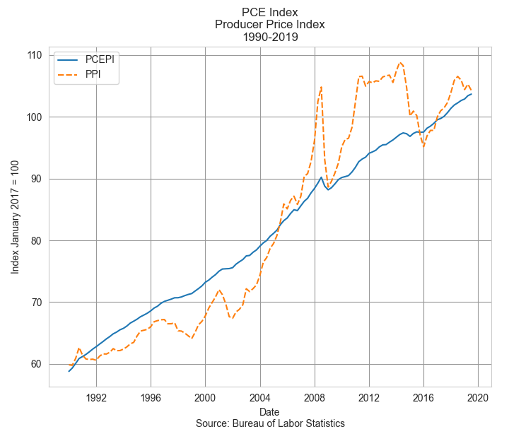
The oldest price index, first charted in 1902, is based on a measure of prices that producers and wholesalers receive at both the intermediate and final stages of production. In the final demand phase, a product is going to be sold to a consumer. In the intermediate stage a producer sells a product to another producer as a component in their product. Each month the BLS surveys thousands of companies to compile the wholesale prices on most of the goods sold in the U.S. and 70% of traded services. The agency then builds hundreds of indexes to measure the changes in those prices. The Producer Price Index, or PPI, is a headline composite of those indexes. As you can see in the graph below, the PPI is more volatile than the PCE measure of consumer price inflation. Government subsidies can increase the prices that suppliers receive with little impact on consumer prices. The PPI is more responsive to changes in transportation and distribution costs.

Despite its volatility, the PPI is regarded by the Fed, Congress and the administration as an advance indication of movements in consumer prices, according to the BLS. It indicates producers’ forecast of consumer demand and reflects economic stress and global supply pressures. However, wholesales prices may not be a reliable forecast tool of consumer inflation if the economy is weak and households cut back on their spending where they can. In the recovery years following the financial crisis in 2008, real GDP did not rise above 3% until the end of 2014. Unemployment finally dipped below 5% in the spring of 2016.

In 2021, the PPI indicated a developing surge in wholesale prices that would become apparent in consumer prices by the following year. But the economy still had not fully opened and unemployment did not fall below 5% until the fall of 2021. Would the pandemic recovery follow the sluggish trend of the recovery after the financial crisis? The Fed waited, preferring to keep interest rates low to support the labor market. In the graph below I’ve charted both the PCE and PPI over the past eight years. I’ve marked out the beginning of Biden’s term in the first quarter of 2021 and the Fed’s tightening that began in the spring of 2022.

The PPI (dotted orange line) had already reversed higher before Biden took office. As we can see in the chart above, the Fed did not enact stricter monetary policy until the PPI had peaked. In hindsight, the Fed was late to respond to surge in prices but Congress has given the Fed a dual mandate to maintain stable prices and full employment. During times of economic stress, those two objectives can indicate contradictory policies. During the initial months of the pandemic in 2020, five million people left the work force. In early 2020, the participation rate for the prime work force aged 25-54 stood at 83%. By the fourth quarter of 2021, the rate was still only 82%. 1.5 million workers had still not returned to the labor force. During a severe crisis like the pandemic, the Fed has trouble balancing those two objectives of stable prices and full employment. If they raised rates too soon, they could have damaged a recovery in the labor market.

While the general price level has come down in the past year, the inflation beast is not dead. There is still a residual inflation energy in some intermediate goods. Had the pre-pandemic price trends continued for the past four years, we might expect prices to be 8 to 10% higher than they were at the start of 2020. The prices of a number of goods have stabilized at levels far above their pre-pandemic levels. Meats are 32% higher after four years. Natural gas prices (WPU0551) have declined from the highs of last winter but are 38% higher than pre-pandemic prices. Residential electric power (WPU0541) and gasoline (WPU0571) are up 25% in four years. LPG gas is up 28% in that period. The prices of paper boxes (WPU095103) are up the same amount. Paper (WPU0913) is up 25%. The prices of bakery goods (WPU0211) are up 22% and still rising.

Despite promises made during the upcoming presidential campaign, the general price level is not going to return to its pre-pandemic level no matter who is president. The pandemic shook up the global economy, raised the general price level and there is no going back. A U.S. president may have their finger on the button of an arsenal of destruction but they have little influence on the producer prices of goods sold around the world. A hindsight analysis can identify policy winners and losers made by both the Trump and Biden administrations. The Fed and other central banks waited too long to respond to a worldwide inflation. Finally, the lessons learned from this pandemic will not all be applicable to the next global crisis.    

////////////////

Photo by Ian Taylor on Unsplash

Keywords: PCE, PPI, wholesale prices, consumer prices, inflation

Note: In April 2022 the Fed began raising its key interest rate by .25% or more each month.  

Price Acceleration

June 19, 2022

by Stephen Stofka

There are several series of inflation and each offers a different perspective on annual price changes. Each month the Bureau of Labor Statistics publishes a headline number CPI-U, or Urban index, which estimates the annualized price change for urban dwellers of all ages. It also publishes a CPI-W or Worker index, which is focused on the spending priorities of working families. Yet another series is an index that the Federal Reserve uses to establish a longer term trend for price changes. This week the Fed enacted a rate increase of .75%, its strongest response to inflation since 1994, to counter the acceleration in price changes.

Working families and the general urban population differ in their spending priorities in transportation costs, household expenses and health insurance (BLS, 2021). Out of every $100 of income, working families spend about $2.40 less on maintaining a household, but $3.80 more on transportation. Being younger, they spend less on health insurance, about $1.50. The difference between the two series indicates which part of the population is bearing the weight of price changes. When transportation costs rise more than housing costs, the difference between the Workers and Urban index is positive.

In 2015-16, increases in senior housing costs caused the difference to go deeply negative. Starting in mid-2021, rising costs for new and used cars produced a positive difference, the highest since WW2. The Russian attack on Ukraine in February accelerated increases in gas prices and working families have borne more of that burden. Rising food costs have an almost equal impact, although working families tend to spend more eating out.

Just as we feel changes in our car speed, we feel changes in inflation. We expect some variation up and down around an average, but expect a balance of up and down. We are sensitive to acceleration, the change in speed, and become alert to too much up or down. Since mid-2021, the monthly acceleration in price changes have been mostly up.

Because pandemics only come along once a century and strangle the global economy, it was hard to tease out the underlying trend. Look at the negative drop in inflation in April 2022 on the far right side of the graph. The acceleration in price changes seemed to be easing up. In May 2022, the acceleration turned positive again and that prompted the Fed’s strong move this week.

Price changes in energy and food are both seasonal and volatile. To understand the trend, the Fed looks at yet another CPI index that excludes food and energy. Before the pandemic, the variation around the trend was small.

After the pandemic the variation in inflation was as severe as the early 1980s. Supply chains had been shut down, goods were stacking up at US ports, people were getting vaccinated and were spending money. With a shortage of new cars because of a chip shortage, used car prices increased a historic 45% in June 2021. Veterans in the industry shook their heads in disbelief. What should the Fed do? It has a double mandate of full employment and stable prices. Unemployment was still high at 6% in the spring of 2021. They maintained a zero-interest rate policy. As unemployment fell below 5% in September 2021, they probably should have increased interest rates a little.

Russia’s invasion of Ukraine and China’s month-long shutdown of Shanghai factories this spring threw yet another wrench in the forecast. Families abruptly switched their spending from household to more social spending, services and travel. Airline fares increased 38% in May. The change in spending patterns caught the buying managers at Target, Home Depot and Wal-Mart by surprise and these retail outlets now have excess inventory.

The housing market is experiencing declines as people respond to rising interest rates. The real estate giant Redfin just reported that home sales fell 10% y-o-y in May 2022, down 3% in one month from April (Ellis, 2022). Rising rates will curb the volatility in price changes but they usually cause a recession. Investment spending, both commercial and residential, responds first and that causes a decline in economic activity. Over the past few months the Atlanta Fed has revised their 2022 GDP forecast from over 2% annualized growth to 0%. Each revision has been negative.

During the pandemic, households reduced their spending and have stored up a lot of spending power. There is a lot of untapped equity in homes as well. Higher interest rates will slow residential and commercial investment spending. Inflation may stay elevated if consumption spending remains strong and offsets that decline.

////////////////

Photo by Piret Ilver on Unsplash

BLS. (2022, February 11). Relative importance of components in the Consumer Price Indexes: U.S. city average, December 2021. U.S. Bureau of Labor Statistics. Retrieved June 17, 2022, from https://www.bls.gov/cpi/tables/relative-importance/2021.htm

Ellis, T. (2022, June 17). Home sales post rare May decline as mortgage rates rise. Redfin Real Estate News. Retrieved June 17, 2022, from https://www.redfin.com/news/housing-market-may-home-sales-decline/

Price Connections

March 13, 2022

by Stephen Stofka

As I was waiting for the car to drink its fill at the gas station, I got to thinking about prices. Their role is to convey information about resource availability but prices are not a conversant sort. They grunt monosyllabic phrases, relaying only the information that something has changed. A person who paid not the slightest attention to the news would wonder what happened when they filled up their car.

When prices decrease, do we buy more of a good or service? Sometimes. We usually pay attention to prices when they increase. In response, we substitute a cheaper good if we can, smoothing out the price changes. Most of us don’t drive more when gas prices decrease. Annual miles driven per adult have fallen as the large Boomer generation has aged (FRED Series TRFVOLUSM227NFWA/CNP16OV). The oldest of the Boomers passed 55 in the mid-2000s when per capita miles peaked.

Prices may not change as quickly as global conditions. When there is a poor coffee harvest in Brazil, the price of coffee in the grocery store may take several months to respond. Not so with gasoline, a global commodity so vital to the global economic engine that gas prices respond quickly to geopolitical events.

Many countries subsidize or control the price of some goods but too much control and prices no longer relay information between producers and consumers. The U.S. government subsidizes the farmers who grow corn to make the ethanol blended into gasoline. It subsidizes dairy, peanut and cotton farmers. Countries with state owned industries may keep a lid on prices to gain and keep political power. This year Kazakhstan lifted price caps on liquified petroleum gas which most people use to fuel their vehicles. Thousands of citizens protested (Neuman, 2022). In 18th century France, people rioted over the price of bread. Gasoline is today’s bread.

The ancient Greek philosopher Protagoras said that man was the measure of all things. In past centuries, essential food commodities that kept people alive were a yardstick of value. Anyone who has to drive to work or drives for a living feels that way about the price of gasoline. Larger firms that depend on predictable prices use the futures market to smooth gas prices but an independent Uber driver bears the full impact of rising gas prices. Should the U.S. subsidize gas prices for those who depend on the fuel? Those policies, politically popular in countries like Venezuela and Kazakhstan, foster political corruption and weaken the economic system. Why? One group of taxpayers subsidizes another group of taxpayers. The price of gasoline is closely linked with the price of power.

Competitive pricing is a hallmark of capitalism but such pricing minimizes profits. Large companies prefer to set a price which maximizes their profits within a competitive environment where other large firms use the same strategy. The result is an entire aisle in a grocery store filled with breakfast cereals that are priced at 10 times their cost. With the milk subsidies, the cereal becomes more affordable. Developed countries have learned to tame the prices of essential items without keeping those prices in a cage. We want our prices to communicate essential resource allocation information but we want well-behaved prices.

In our modern global economy we have many more goods and services available to us. Multiple sources of food products help lower prices but we are subject to the geopolitical risks of a global economy. The Covid pandemic and the war in Ukraine has reminded us that risks accompany benefits. The Russian people are beginning to experience the isolation of being cut off from the international system of trade, money and assets. Like prices, it is better when we are connected to each other.

////////////

Photo by Clint Adair on Unsplash

Neuman, S. (2022, January 8). There’s chaos in Kazakhstan. here’s what you need to know. NPR. Retrieved March 12, 2022, from https://www.npr.org/2022/01/08/1071198056/theres-chaos-in-kazakhstan-heres-what-you-need-to-know

Holiday Snacks

November 24, 2019

by Steve Stofka

I’ll keep it short this holiday week and pass on a few things that caught my attention. The comedian John Oliver called it “whataboutism.” When accused of something, point to someone else and say, “What about them?” I thought the term was new, but Wikipedia says it goes back to 1960s Russia (Wikipedia, n.d.). I did it when I was a kid. My kids did it. In Russia, the practice is a national pastime.

In the impeachment hearings this week, several Republicans repeatedly defended their President of crimes by raising up the Steele dossier. Not familiar? There’s a book out by the two former Wall St. Journal reporters who formed Fusion GPS (NPR, 2019).  It’s the same argument Republicans gave to accusations regarding wiretapping at the Watergate complex.

Until the Supreme Court decided the 2000 election in Bush v. Gore, I thought the judiciary was above this. They were not. The decision was a rare one for the Supreme Court and it was careful to note that the decision set no precedents (Oyez, n.d.). A few months later, the stock market began its hard fall from the dot com boom, China was admitted into the World Trade Organization and later that year, the tragedy of 9-11. That election and the year 2001 marked the end of American innocence. By the time President Bush stumbled into the Iraq war, we were wearing the masks of our own folly.

Now Russia’s Putin smiles wryly as he watches the Americans behaving like Russians. When accused of something, point to someone else and say, “What about them?” Every week comes another revelation of secret visits to Ukraine by someone on the Trump squad. Devin Nunes, the ranking member on the House Intelligence Committee, has just been fingered by Lev Parnas, one of Mayor Giuliani’s indicted Ukrainian fixers. In a crowd of crooks, who knows what the truth is? Putin sees the arrogant Americans pointing fingers at each other and smiles.

Let’s move on to other news. County by county surveys reveal that half of single person senior households have trouble meeting basic expenses each month (Elder Index, 2019). Ouch. A quarter of two-person senior households have the same problem. I was even more surprised to learn that seniors can now live less expensively in Los Angeles than in Denver. Whether renting or having no mortgage payment, costs were higher in Denver. Another ouch. Denver has California-itis. Interested readers can check the web site in the notes below and compare counties of their choosing.

There’s got to be some good news in this week’s blog! Sales of existing homes climbed 4.6% in October. Hooray. On the other hand, less than a third of those sales were to first time buyers, who are getting left out of the market.

Ok. I’ll stop. Next week, I promise I’ll have some cheerier news.

/////////////////////////

Notes:

Elder Index. (2019). The Elder Index™ [Public Dataset]. Boston, MA: Gerontology Institute, University of Massachusetts Boston. Retrieved from ElderIndex.org

Haddad, T. (2019, November 23). After Giuliani ‘Fixer’ Alleges Nunes Met with Ukrainian Officials to Seek Biden Dirt, Congressman Threatens to Sue Media. Newsweek. [Web page]. Retrieved from https://www.newsweek.com/parnas-lawyers-nunes-ukraine-officials-meeting-lawsuit-1473679

NPR. (2019, November 22). Book Reviews: In ‘Crime In Progress,’ Fusion GPS Chiefs Tell The Inside Story Of The Steele Dossier. [Web page]. Retrieved from https://www.npr.org/2019/11/22/781589327/bosses-of-fusion-gps-tell-the-inside-story-of-the-steele-dossier

Oyez. (n.d.). Bush v. Gore. [Web page]. Retrieved from https://www.oyez.org/cases/2000/00-949

Photo by Steve Stofka

Wikipedia. (n.d.). Whataboutism. [Web page]. Retrieved from https://en.wikipedia.org/wiki/Whataboutism#Soviet_and_Russian_leaders_usage

Inflation Measures

“Everyone is entitled to his own opinion but not to his own facts.” – Sen. Daniel Patrick Moynihan

September 30, 2018

by Steve Stofka

The above quote has been attributed to the former Senate Majority Leader. People repeat the quote when discussing a contentious subject. We are often convinced that we have the facts when our facts may indeed be arbitrary. Let’s take the case of real or inflation-adjusted income. Has the average real wage declined or risen in the past decades? The calculation depends on which measure of inflation we choose.

There are two measures of inflation, the Consumer Price Index (CPI) and the Personal Consumption Expenditure Price Index (PCE). The CPI relies on surveys of what consumers buy. The PCE is based on surveys of what businesses sell (Note #1). The CPI uses a fixed basket of goods, regardless of changes in the prices of items in a basket. If the weekly basket of goods includes two pounds of ground beef, that two pounds never changes in response to lower prices. It is static. The PCE does adjust for price changes. If the price of a pound of ground beef went down thirty cents, the PCE calculates that a family bought a bit more ground beef and a little bit less chicken, for example. It is a dynamic measure.

People drive fewer miles and buy more fuel-efficient cars as the price of gas increases BUT only after a certain dollar amount. Our purchasing patterns are both static and dynamic. Because we are creatures of habit, our buying patterns are resistant to change. Within a certain price range, we will continue to buy the same items. Outside of that range, we do make changes because we want to optimize our choices.

In the past forty years the CPI has calculated an annual rate of inflation that is over ½% higher than the PCE rate. That small difference compounded over forty years amounts to 23%. That large difference tells two very different stories. Using the CPI, the average worker has lost a few percent in inflation adjusted hourly wages. Using the PCE, on the other hand, the average worker has enjoyed real gains of 20% in the past forty years (Note #2).

Our most volatile disagreements are in areas where facts are difficult to observe. The household survey data that underlies the CPI is unreliable because people living busy lives are not accurate journal keepers of their daily purchases. On the other hand, surveys based on business sales are inaccurate because people stock up on items whose prices decline.

Even when facts are readily verifiable, the interpretation of those facts varies with context. In arriving at our version of the meaning of those facts and their context, we subtract a lot of observable data.  We must filter reality because we cannot manage such a large amount of information. Because we filter our perceptions, eyewitness testimony is unreliable. Although our perceptions are inaccurate, we must act on those perceptions and hope that they are accurate enough. That same reasoning guides economists, politicians, and those in the social and physical sciences. We would all have more constructive discussions if we understood the imperfection of our perceptions.

//////////////

Notes:

1. The Difference between CPI and PCE {Federal Reserve}

2. Using the average hourly wage for production and non-supervisory employees.

The Fed Feints

September 18, 2016

This week I’ll cover several topics, most of them concerning personal finances.

Social Security and COLA

 Sometime in mid-October the Social Security Administration (SSA) will announce the cost-of-living adjustment (COLA) for social security benefits in 2017 and it will probably be less than 1% (History of previous COLA adjustments).  The COLA is based on the year-over-year increase in the Consumer Price Index (CPI).  In 1982, Congress specified that the SSA use the CPI version for urban workers, called CPI-W. (Info from SSA).  Each month the BLS releases their estimate of inflation, and this week they published their calculation for August – a yearly increase of just .66%.  September’s inflation number may be slightly different but the reality for the average SS recipient is a monthly increase of less than $10 in the average benefit of $1340.

Gas prices fall

For years senior advocacy groups like AARP have argued that a different CPI measure should be used to calculate the COLA.  The alternative measure, the CPI-E, puts more weight on health care expenses and less weight on gasoline and transportation costs because seniors don’t drive as much. So far, Congress has not adopted any changes to the methodology of calculating inflation for retirees.

In late 2014 gasoline prices began to fall and this had a significant impact on measured inflation in 2015, as we can see in the chart below. Although gas prices remain low, they have stabilized so that they will have less of an impact on yearly inflation growth in the future.

Reaching For Yield

Investors who are reliant on the income from their investments, including giant pension and endowment funds, typically desire fairly safe investments that will give them a decent return while preserving their principle.  These include high grade corporate bonds (Johnson and Johnson, for example), Treasury bonds, CDs and savings accounts. Abnormally low interest rates have made those traditional investment choices less desirable.

Like a stream diverted, investors have wandered to riskier assets, bidding up the prices of stocks which are considered more likely to retain their value because they pay dividends.

Dividend ETFs 

 As one example, Vanguard’s VIG is a Dividend Appeciation ETF containing of stocks that  have a consistent record of dividend growth of almost 5% per year.  The growth rate is 5%, not the dividend yield. The companies in this basket are household names: Johnson and Johnson, Microsoft, Pepsi, McDonald’s, and Walgreens, to name a few.  Vanguard has an added benefit: a very low expense ratio.  At the end of August, the Price-Earnings (P/E) ratio on this basket of stocks was 24.5 (see here). In the first two weeks of September, the prospect of an interest rate hike in the next few months has put a small dent in the price, and lowered the PE ratio slightly.  Clearly, investors are willing to pay extra for income, and extra for reliability.  The yield on this basket of reliability is 2.1%, just .4% more than a 10 year Treasury.

DVY

iShares’ DVY is a popular dividend ETF that has a less selective basket of stocks.  This basket also includes oil and energy companies that have a 5 year record of paying dividends but may not have a consistent record of dividend growth because of declining oil prices.  Because the criteria is less restrictive, this ETF is cheaper – it has a higher yield of 3.2% and a lower PE ratio of 20.8.

The Fed

After eight years of near zero interest rates, the Federal Reserve has put itself in a corner. Whatever actions or adjustments it takes must be in small increments to avoid causing a sudden repricing of the very asset prices it has helped lift by maintaining a low interest rate environment.

The financial crisis was so severe that the Fed thought it must lower rates to near zero, which choked income flows from savings.  Such a policy could be justified as an emergency measure. The economy had suffered the equivalent of a heart attack and the Fed need to shock it alive.  However, the recovery that followed was so weak that the Fed thought it must continue to keep rates low.  After eight years of ZIRP (Zero Interest Rate Policy), the Fed finds that it has effectively been picking winners and losers. Debtors win, savers lose. The Fed was forced into the role by the inability of a bitterly divided and ineffective Congress to pass fiscal policy solutions.

To fully grasp the effects of Fed policy, let’s take a trip up into the mountains.  Imagine a high mountain lake reservoir with a dam at one end to contain the water.  On the mountains surrounding the lake falls snow and rain that drains into the reservoir.  The dam is opened enough so that it releases a measured stream of water for users downstream.  The lake is a stock. The release of water is a flow.

Now let’s say that there is a drought for a year or two.  The water level in the reservoir begins to fall.  The dam operators reduce the amount of water released and this has a negative impact on downstream farms and businesses who depend on the water. The price for water rises as farms and businesses bid to get more water, a simple case of supply and demand. Land, another store of value, decreases in value because the lack of adequate water has made the land less productive. Assuming the same demand, prices for produce from the land rises.  This is the flow from the land, So the flow from the land rises while the stock value of the land falls.  Water is a different kind of asset, a consumable.  In the case of water, both the flow and the stock value rise during a drought.

Eventually the rainfall increases and the reservoir refills with water.  Now the dam operators release more water and the price per unit of water naturally declines. Now the stock value and the flow value of the water have declined. A greater supply of produce leads to price declines in the flow of produce from the land, while the price of the land itself, the store of land’s value, increases in anticipation of more productivity from the land.

After the crisis is over, flows from both types of assets declines.  The extra stock value of the water is transferred back to the land. The flow of water from the reservoir has been the catalyst for this transfer of value.

Let’s take this simplified situation and use it as an analogy to understand the Fed.  When the Fed adjusts interest rates, it transfers a store of value from one asset class to another. (It involves a number of asset classes.  I’ll keep it simple.) That’s the transfer of stock value.  But there is also a raising or lowering of the price of the flows from each of those assets.

Now let’s imagine that the Fed raises interest rates by 1%, effectively opening up the dam’s sluice gates a little more.  The flow of income shifts from debtors, who must pay more for borrowed money, to savers, who receive more for their savings.  Debt is a store of value and this is where the transfer of value happens.  New debt competes with old debt and lowers the price of existing debt, both corporate and government, so that old debt can generate the same income flows as new debt. Assets like bonds, which generate income flows at lower interest rates are now worth less.  Why buy a safe bond paying 2% when I can buy a safe bond paying 3%?  Dividend paying stocks are worth less unless they can realistically increase their dividend to compete with higher interest rate expectations. Buyers and sellers of these instruments adjust the prices to reflect the new expectations.

The change in flows acts as a catalyst for the transfer of the stock values between assets.  When we are younger and working, we don’t pay much attention to income flows from our savings.  We look at our portfolio statements, check our 401K or savings balances to see how much of a stock of assets we have built up.  We measure these assets in dollars, not value and may come to think that dollars and value are the same.  Income flows are measured in dollars.  The stock those flows come from are measured in value.  In the future, I hope to explore the ways that we try to convert value to dollars.

A Change Is Gonna Come

December 6, 2015

A horrible week for many families.  When we count the dead and injured in mass shootings, we often neglect to include the family and friends of each of these victims.  If we conservatively estimate 20 – 30 people affected for each victim, we can better appreciate the emotional and economic impact of these events. Shooting Tracker lists the daily mass shootings (involving four or more victims) in the U.S. in 2015.  What surprised me is that, in most cases, the shooter/assailant is unknown.

A strong November jobs report sent equities, gold and bonds soaring higher on Friday.  Markets reacted negatively on Thursday following a lackluster response from the European Central Bank(ECB) and comments by Fed chair Janet Yellen indicating that a small rate increase was in the cards at the mid-December Fed meeting.  The SP500 closed Thurday evening below November’s close.  Not just the close of November 2015, but also the monthly close of November 2014!

Overnight (early Friday morning in the U.S.), the ECB said that they would do whatever it took to support the European economy. Shortly after the cock crowed in Des Moines, the Bureau of Labor Statistics released November’s labor report, confirming an earlier ADP report of private job gains.  By the end of trading on Friday, the SP500 had jumped up 2%.  However, it  is important to step back and gain a longer term perspective.  The index is still slightly below February 2015’s close – and May’s close – and July’s close.

Extended periods of price stability – let’s call them EPPS – are infrequent.  Markets struggle constantly to find a balance of asset valuation. Optimists (bulls) pull on one end of the valuation rope.  Pessimists (bears) pull on the other end.  Every once or twice in a decade, neither bears nor bulls have a commanding influence and prices stabilize. Markets can go up or down after these leveling periods: 1976 (down), 1983 (up),  1994 (up), 2000 (down), 2007 (down), 2015 (?)

**************************

Year End Planning

Mutual funds must pass on their capital gains and losses to investors.  Investors who have mutual funds that are not in a tax-sheltered retirement account should take the time in early December to check on pending capital gains distributions either with their tax advisor or do it themselves.  Most mutual fund companies distribute gains in mid to late December.  Your mutual fund will have a list of pending December distributions on their web site.  For those retail investors in a rush, you might just scan through the list and look for those funds that have a distribution that is 5% or more of the value of the fund, then look and see if it is one of your funds.

An EPPS tends to produce relatively small capital gains but this year some mid-cap growth funds and international funds may be declaring gains of 7 – 10% of the value of the fund.  An investor who had $50,000 in some mid-cap growth fund might see a capital gain distribution of $4,000 on their December statement.  When an investor receives the statement in January 2016, it is too late to offset this gain with a loss.  Depending on the taxpayer’s marginal tax rate, they could be on the hook to the tax man for $700 – $1200.

Let’s say an investor is anticipating a $4000 capital gain distribution in a taxable mutual fund in late December.  Most mutual fund companies list the cost basis of each fund in an investor’s account. An investor who had a cost basis that was higher than the current value of the fund could sell some shares in that fund to offset some or all of the capital gain distribution in the other fund.  This is called tax loss harvesting.  Again, remind or ask your tax advisor if you are unclear on this.

Here is an IRS FAQ sheet on capital gains and losses.  Here is an article on the various combinations of short term and long term gains and losses.

**************************
CWPI

The latest ISM Survey of Purchasing Managers (PMI) showed that the manufacturing sector of the economy contracted in November.  October’s reading was neutral at 50.1.  November’s reading was 48.6.

The services sector, which is most of the economy, is still growing strongly.  Both new orders and employment are showing robust growth.   

However, manufacturing inventories have contracted for five months in a row.  For now, this decline is more than offset by inventory growth in the service industries.  However, the drag from the manufacturing sector is affecting the services sector.  The trough and peak pattern of growth in employment and new orders since the recession recovery in 2009 has begun to get a bit erratic.  Nothing to get too concerned about but something to watch.

The Constant Weighted Purchasing Index combines the manufacturing and service surveys and weights the various components, giving more weight to New Orders and Employment.  Both components anticipate future conditions a bit better than the equal weight methodology used by ISM, which conducts the surveys.  In addition, there is a smoothing calculation for the CWPI.

During this six year recovery, the CWPI has shown a wave-like pattern of growth.  Since the summer of 2014, growth has remained strong but there has been a leveling in the pattern as the manufacturing sector no longer contributes to the peaks of growth.

Despite the underlying growth fundamentals, there are some troubling signs.  In response to activist investors, to boost earnings numbers and maintain dividend levels, companies have bought back shares in their own company at an unprecedented level.  In some cases, companies are taking advantage of low interest rates to borrow money to make the share buybacks. (U.S. Now Spend More on Buybacks Than Factories, WSJ 5/27/15)

*******************************

Labor Report

46,000 jobs gained in construction was a highlight of November’s labor report and was about a fifth of all job gains.  Rarely do gains in construction outweigh gains in professional services or health care. This is more than twice the 21,000 average gains of the past year. The steady but slow growth in construction jobs is heartening but a long term perspective shows just how weak this sector is.

Involuntary part-timers, however, increased by more than 300,000 this past month, wiping out a quarter of the improvement over the past year.  These employees, who are working part time because they can not find full time work, have decreased by almost 800,000 over the past year.

The core work force, those aged 25-54, remains strong with annual growth above 1%.

Other notable negatives in this report are the lack of wage growth and hours worked.  Wage growth for all employees is a respectable 2.3% annual rate, but only 1.7% for production and non-supervisory employees.  This is below the core rate of inflation so that the income of ordinary workers is not keeping up with the increase in prices of the goods they buy.

Hours worked per week has declined one tenth of an hour in the past year, not heartening news at this point in what is supposed to be a recovery.  Overtime hours in the manufacturing sector has dropped 10% in the past year.

******************************

Inflation

The core CPI is a measure of inflation that excludes the more volatile price changes of food  and energy.  While the headline CPI gets the attention, this alternative measure is one that the Federal Reserve looks at to get a sense of the underlying inflationary forces in the economy.  The target annual rate that the Fed uses is 2%.

October’s annual rate was 1.9%.  November’s rate won’t be released till mid-December. However, Ms. Yellen made it pretty clear that the Fed will raise interest rates this month, the first time since the financial crisis. I suspect that prelimary reports to the Fed on November’s reading showed no decline in this core rate.  With employment gains and inflation stable, the FOMC probably felt comfortable with a small uptick in the bench mark rate.

Steady As She Goes

March 22, 2015

Monetary Policy

The FOMC is a committee of Federal Reserve members who meet every six weeks to determine the course of monetary policy.  A statement issued at the end of each two day meeting is carefully parsed by traders in an orgy of exegesis.  And thus it was so this past week.  Recent statements by the Fed included the word “patient” as in low inflation and some lingering weaknesses in the labor market allow us to take a patient approach with monetary policy.  If the Fed removed the word patient, then it was a good bet that they would start raising rates at their mid June meeting.  By the end of the year, the thinking was, the benchmark Fed funds rate could be 1%-1.25%.

So here’s what happened while you were at work, or at lunch or picking up the kids on Wednesday afternoon when the Fed meeting concluded. The initial reaction was negative, or at least that’s how the HFT (high frequency) algorithms parsed the Fed’s statement.  “Patient” was gone.  Sell, sell, sell. Then some human traders noticed that the Fed was also saying that they did not have to be impatient either – the perfect neutral stance.  Buy, buy, buy.  The SP500 jumped 1.5% in a few minutes.  The neutral stance of  the Fed caused many to revise their estimates of the Fed rate at the end of the year to .75% or less.  The broad market index ended the week at the same level as it was when the month began.  Volatility as measured by the VIX is rather low but there has been a lot of  positioning since Christmas and a net gain of only 1% in those three months.

*********************

Earnings Recession


The analytics firm FactSet projects a year-over-year decline in the earnings of the SP500 companies for this first quarter of 2015.  Here is a good review of the historical response of the stock market to earnings recessions, defined as two quarters of year-over-year declines in the composite earnings of the SP500.

***********************

Oil

Oil is an international commodity that trades on world markets in U.S. dollars.  A prudent strategy for countries which are net importers of oil is to stock up on dollars to pay for its short term oil needs.   As the demand for dollars climbs so does its price in other currencies, a self-reinforcing mechanism.  Half of the drop in the price of oil is due merely to the appreciation of the dollar, which has spiked some 25% since the beginning of the year.

For decades, many in academia and government have advocated the adoption of an international currency called the SDR, already in use by the International Money Fund.   Here is an article from last May, before the price of oil started its slide.  The dollar is the latest in a series of reserve currencies over the past 500 years and has been the dominant currency for almost 100 years (History here). The reliance on one country’s currency works – until it begins to cause more problems than it solves.  The  largest producer and consumer of oil, Saudi Arabia and the U.S., have formed a decades long agreement to price oil in U.S. dollars, binding the rest of the world to the movements in the U.S. dollar.The recent volatility in the dollar in threatening the economic stability of many nations, who are increasing their calls for a change in international monetary policy.

***********************

Sticky CPI

In a survey of newspaper articles, inflation was mentioned more than unemployment or productivity.  In the U.S., inflation is often measured by the Consumer Price Index (CPI).  A subset of that measure is called the core CPI and excludes more volatile food and energy items to arrive at a fundamental trend in inflation.  (IMF primer on inflation ) Critics of the core CPI point out that food and energy items are the most frequent purchases that consumers make and have a fundamental effect on the economic well being of U.S. households.  Responding to some of the inherent weaknesses in the methodology of the CPI, the Atlanta branch of the Federal Reserve began development of an alternative measure of inflation – a “sticky” CPI. (History)  This metric gives a statistical weight to the components of the CPI by how much prices change for each component.  The Atlanta Fed has an interactive graph that charts both the sticky measure and a more volatile, or flexible CPI that is similar to the conventional CPI.  The sticky CPI tends to measure expectations of future changes in inflation and moves rather slowly.

Over a half century, the clearest trend is the closing of the gap between the regular CPI and the sticky CPI.

When we compare all three measures, core, sticky and regular CPI, we see that the sticky CPI is usually above the core CPI.  January’s readings are 2.06% for the sticky index, 1.64% for the core index and -.19% for the headline CPI index.

A private project called Price Stats goes through the internet comparing prices on billions of items.(WSJ blog article here)  This data is more timely and shows an uptick in core inflation that is approaching 2%, the Federal Reserve’s target rate.  When asked why the Fed uses 2%, chair Janet Yellen answered that inflation indexes do not capture improvements in products, only prices, so they tend to overstate inflation as a matter of design and practical data gathering.  Secondly, the 2% mark gives the Fed a statistical cushion so that they are able to take appropriate monetary steps to avoid deflation.

Why is deflation a bad thing?  In answering this question, we discover the true benefit of the core CPI.  Food and energy are regularly consumed.  Demand for these goods is relatively “sticky”.  A family may change what types of foods it buys in response to price changes but it is going to buy food. Deflation in these core purchases can be a good thing as it takes less of a bite out of the average household’s wallet.

On the other hand, deflation in less frequently purchased goods, which the core CPI tracks, is not good because it leads to a self-perpetuating cycle in which consumers delay making purchases in the expectation that tomorrow’s price will be lower than today’s price.  If I expect that the price of an iPhone will be lower next week, how likely am I to buy one this week?  As consumers delay purchases, suppliers lower prices even more to move their goods.  Seeing the price competition among vendors, consumers are even more likely to delay purchases, waiting for prices to come down even further.  As sales drop, vendors and manufacturers begin to layoff employees.  Lower prices no longer entice consumers who become concerned about keeping their jobs and purchase only what they need.

***********************
Indicators

The Conference Board, a business association, released their monthly index of Leading Indicators this week but it has a spotty history of forecasting trends. Doug Short puts together a nice snapshot of the Big Four indicators, Employment, Real (inflation-adjusted) Sales, Industrial Production, and Real Income.

GDP, Profits, Inflation

December 22nd, 2013

Merry Christmas!

Last week I reviewed several decades of trends in corporate profits, as well as the 1990 change in measuring inflation that has helped increase corporate profits as a share of GDP.   (For those of you interested in the inflation controversy, here is an article that provides some additional insight.)  This week I’ll look at patterns in the economic growth of this country that sheds some light on recent events and provides some context to understand ongoing trends.

During the 30 years following World War 2, the economy grew at an annual rate of 3.7% after inflation.  Population growth was about 1% per year.  Productivity growth was about 1 – 1.5%.  Government spending, including debt, grew a bit more than 1%.  The chart below shows the compounded annual growth rate.

But I think the story is more clearly told by a different chart constructed from the same data.  The growth rate trend is more easily visible and it is the change in this trend that I will be focusing on.

During the 1970s, an economic trend known as staflation increasingly took hold. This period of high inflation, coupled with slowing growth and growing unemployment, was not thought possible by economists using theories proposed by John Maynard Keynes in the 1930s, during the Great Depression.  In 1974, economist Arthur Laffer first sketched out a theory that tax cuts would stimulate the economy.  As the Federal debt began to rise in the mid to late 1970s, few wanted to take a chance that lower tax rates would produce more revenue for the Federal Government.

The 1980s began with back to back recessions and the highest unemployment since the 1930s Depression. Big spending and tax cuts during the 1980s dramatically increased the federal debt but did little  to spur growth.

During this 13 year period, profit growth slowed to 2.4%.  The myth that the 1980s was a high growth era continues to live in the minds of political pundits.  In a WSJ op-ed on Dec. 18th, Daniel Henninger referred to “the high-growth years of the Reagan presidency.”  Myths live on because they serve a purpose to those who cherish them.  The cardinal rule of politics is “Disregard the Data.”

In 1990, economists at the BLS adopted what is called a hedonic methodology to computing the CPI.  Used by other OECD countries, this supposedly more accurate assessment of the growth of inflation shows a lower growth rate of inflation.  This naturally increases the growth rate of inflation adjusted GDP. (GDP dollars each year are divided by the inflation rate to get the real growth rate.)

The conventional narrative is that the 1990s was an explosive growth period of new technology and growing globalization.  From the beginning of 1990 to the start of 2000, stock market values grew four times.  After the bursting of the internet bubble, 9-11, and the recession of 2001, the economy recovered.  By the mid-2000s, the unemployment rate was less than 5%.  While that may be the conventional narrative, the growth of the economy from 1990 to 2007 was just as slow as the period 1978 – 1989.

Remember that this slow growth would have been even slower if the BLS had not changed their methodology for measuring inflation.  To recap, the 30 year real growth rate of GDP after WW2 was 3.7%.  The following 30 year growth rate was 2.3%.  But that later 30 period is marked by a sharp rise in consumer borrowing.   Without that escalation in borrowing, growth would have been meager.

Families with two incomes borrowed against their homes, drove up the balances on their credit cards and still GDP growth was slow.  Let’s construct a fairy tale, what economists call a counterfactual.  What if the BLS had not changed to this new methodology in 1990?  What would be the growth rate of GDP using an alternate measure of inflation?

The resulting growth pattern is 0% for the 18 year period and is more consistent with the experiences of many workers and families in this economy.  The change in the measurement of inflation has greatly helped mid-size and large size companies.  An understated inflation rate reduces labor costs by reducing cost of living adjustments to salaries and wages.  In addition, companies can borrow at lower rates since many corporate bonds are tied to the inflation rate.  American companies did not engineer this revised methodology of measuring inflation but they have been the largest beneficiaries of the new policy.

In 2008, the financial poop in the popcorn popper began to pop.  In the past 5+ years, we have experienced less than 1% real growth, not enough to keep up with population growth.  Of course, most people are wondering “what growth? It sure doesn’t feel like growth!”

The story may be told more accurately by looking once again at a comparison of inflation adjusted GDP with an alternate version of GDP, one that more realistically reflects inflationary pressures.  This chart shows a decrease of 2% per year.

Did the BLS adopt this methodology under political pressure?  Perhaps.  More likely, it was an alignment of econometric theory with political and corporate interests.  The reduction in published inflation rates did slow the growth of payments to Social Security recipients and reduced Medicare payouts to physicians and hospitals, thus shrinking budget deficits.  The government saves money, corporations make extra money, but – quietly and slowly – families lose money.

Annual cost of living adjustments to Social Security checks have been reduced but the decreased income has forced more seniors to seek assistance through the food stamp program, now called SNAP.  A politically neutral change in the measurement of inflation thus becomes a way for politicians to introduce a means testing component to Social Security income.  Instead of reducing payments based on income, payments are reduced to all recipients and poor seniors are targeted for additional benefits.  Congress has increased eligibility for the food stamp program so that seniors who are dependent on that extra income can receive it in the form of food stamps.  If the BLS had not changed their methodology, seniors would receive appoximately 60% more each month and many wouldn’t need the food stamps in the first place.

With this history in mind, let’s turn to this week’s revisions of GDP and corporate profits for the third quarter ending in September.  The real, or inflation-adjusted, growth of 3rd quarter GDP was raised to a 4.1% annualized growth rate in the third quarter, largely on upward revisions of consumer spending.  Contributing to stronger GDP growth has been a worrisome increase in company inventories, which probably influenced the Federal Reserve’s decision this week to keep any tapering of their QE bond purchases to a minimum.

Corporate profits for the third quarter were revised higher as well.  As a share of GDP, corporate profits continue to reach all time highs.

How likely is it that economists at the BLS will change their methodology to reflect inflationary pressures before we make choices in response to rising prices?  The subject is not easily encapsulated in a sound bite or a short slogan on a placard.  In the 1992 presidential race, independent candidate Ross Pierot was able to use charts to make a point with many voters but few politicians are very good at the easel and unlikely to bring up the subject in the public forum.  Families and workers will continue to suffer and politicians will create more social benefit programs to help those hurt by problems that politicians themselves have either created or failed to address.  Large and mid sized businesses will continue to enjoy the additional slice of pie.

CPI and Wages

Dec. 24th, 2012

Merry Christmas, Everyone!

This is part two of a look at the CPI, comparing the price index to wage growth.  Part 1 is here

In the years 1947-1980, the average hourly earnings of production workers rose 6.08% annually while the CPI grew 4.03% (Source)  In effect, earnings rose 2% higher than prices.   Since 1980, earnings have risen 3.55% annually as the CPI rose 3.29%, giving workers a real growth rate of less that a 1/3rd of 1%.

The rise in worker productivity fueled gains in worker compensation until the past fifteen years.  Below is a chart of real, that is inflation-adjusted, compensation and productivity.

Increased Productivity means more profits.  For several decades in the post-WW2 economy, workers shared in those profits.  After the recession of 1982-1984, workers’ share of the increase in output slowly decreased.  As incomes barely kept up with inflation, workers tapped the equity in their houses.

Low interest rates, poor underwriting standards, lax regulations and a feeding frenzy by both home buyers and banks fueled a binge in home prices, followed by the hangover that started in 2007.  Only now is the housing market struggling up out of a torpor that has lasted for several years.

Before the housing bust, magical thinking led many to believe that the rise in home equity was a sure fire way to riches.  Over a century’s worth of data shows that housing prices tend to rise about the same as the CPI.  Housing prices have finally bottomed out at about the same level as the long term trend line of CPI growth.

The boom and bust upended the lives of a lot of people and the repercussions of that “hump” will continue as banks continue to foreclose on home owners whose incomes have flattened or declined. The recovery in the housing market will help some home owners but the real problem is unemployment, underemployment and the decreasing share of workers’ share of the profits from productivity gains.  Until the labor market heals, the housing market will not fully heal.

Those who do have savings have become cautious.  Since 2006, investors have taken $572 billion out of stocks and put $767 billion in bonds, a move to safety – or so many retail investors think.  For decades, home prices never fell – until they did.  For over thirty years, bond prices have been rising, giving many retail investors the feeling that bonds are safe – until they are not.

Companies have been selling record amounts of corporate bonds into this cheap – for companies – bond market.  As this three decade long upward trend in bond prices begins to turn, bond prices can fall sharply as investors turn from bonds to stocks and other investments.  We are approaching the lows of interest yields on corporate bonds not seen since WW2.  Investors are loaning companies money at record low rates and companies are sucking up all that they can while they can.  Sounds a lot like home buying in the middle of the last decade, doesn’t it?

Y’all be careful out there, ya hear?