February 7th, 2016
Updates on January’s employment report and CWPI are at the end of this post. Get out your snowboards ’cause we’re going to carve the political half-pipe! (*v*)
(X-Game enthusiasts can click here)
////////////////////////////////
To Be Rich or Not To Be Rich
Every year the IRS takes a statistical snapshot of the almost 150,000,000 (150M) personal tax returns it receives. There are some interesting tidbits contained in these tables that will put the lie to many a politician’s claim in this election season. The IRS lists the number of returns for each of some twenty income brackets. They also list the exemptions claimed for each of these income brackets and let’s turn to that for some interesting insights.
From Table 1.4 we learn that there were 290M exemptions claimed in the 147M tax returns filed in 2013, or almost two exemptions per return. In 1995 (Table 1, same link as above) the number of exemptions claimed was 237M for 118M returns, exactly two exemptions per return. Exemptions are people that need to be fed, clothed, and housed.
Census Bureau surveys (CPS) over the past few decades show that households are shrinking. Conservatives assert that median household income has stagnated simply because there are fewer people and workers in households today compared to the past. If this were true, IRS data would show a greater decrease in exemptions over an 18 year period. We can’t say that one or the other data source is “true,” but that averaging data from the two sources probably gives a more accurate composite of income trends in the data. Census data probably overcounts households while the IRS undercounts them. Conservatives who advocate less government support will ignore IRS data that conflicts with their beliefs.
30% of the exemptions were claimed by tax returns with adjusted gross incomes (AGI) of less than $25,000, or less than half the median household income. (AGI is earned income and does not include much of the income received from government social programs.) Only 2M exemptions, or 2/3 of 1%, were claimed by tax returns with an AGI of $1M or more. Out of 315 million people in the U.S., there are only two million “fat cats” with incomes above $1,000,000.
Presidential contender Bernie Sanders tells his supporters that he is going to tax the rich to help pay for his programs. IRS data shows just how few there are to tax to generate money for ambitious social programs. Mr. Sanders says he will get money from the big corporations. Corporations with lots of well paid lawyers are not going to give up their money peacefully.
Instead, Mr. Sanders’ plans will rely on taxing individuals who can not erect the legal or accounting barricades employed by big corporations. 11% of exemptions were claimed by those making more than $200,000, a larger pool of potential tax money. Doctors, lawyers and other professionals will “Feel the Bern.” It is not unusual for a middle class married couple in a high cost of living city like New York or Los Angeles to make $200K. Mr. Sanders has his sights on you. You are now reclassified as rich.
Here is a well-sourced analysis of the net cost to families. Most will save money. Unfortunately, Mr. Sanders made the political mistake of admitting that he would raise taxes, but… No one paid attention to the “but.” Should he win the Democratic nomination, Mr. Sanders will “feel the Bern” as Republicans use the phrase against him. He might have used a phrase like “my plan will lower mandatory payments” to describe the combined effect of higher income taxes and no healthcare insurance payments.
The author calculates that the top 4% will spend a net $21K in extra taxes less savings on health care premiums. The author probably overstates the effect on those at the top because he uses an average instead of a median, but we could conservatively estimate an additional $10K for those with AGIs in the $200K-$300K range.
****************
Earned Income Tax Credit
The Earned Income Tax Credit (EITC) is a reverse income tax for low income workers, who get a check from the federal goverment. For the 2014 tax year, over 27 million returns received about $67 billion from the government for an average of $2400 per receipient (IRS). In inflation adjusted dollars, this is up 50% from the 2000 average of $1600. The number of receipients has expanded 50% as well, growing from 18 million to 27 million. Although Democrats often tout their support for the poor, it is Republican congresses that are largely responsible for expanding this support for low income families. Republicans may talk tough but are more than willing to reach out a helping hand to those who are giving it their best effort. There is a practical political consideration as well. An analysis of IRS data by the Brookings Institute found that, in the past fourteen years, the poor have shifted from urban areas largely controlled by Democrats to the outlying suburbs of metropolitan areas, where Republicans have more support. In short, Republicans are taking care of their voter base.
****************
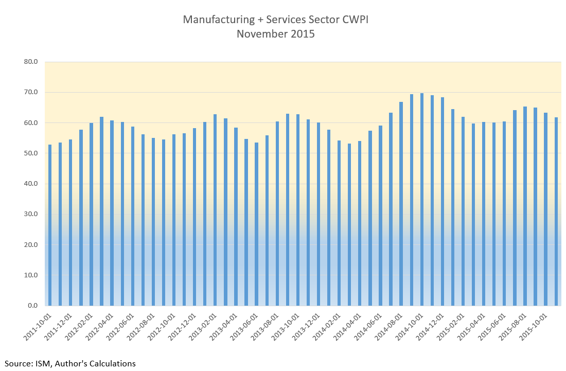
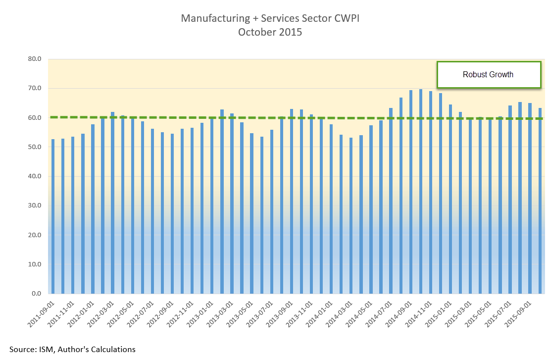
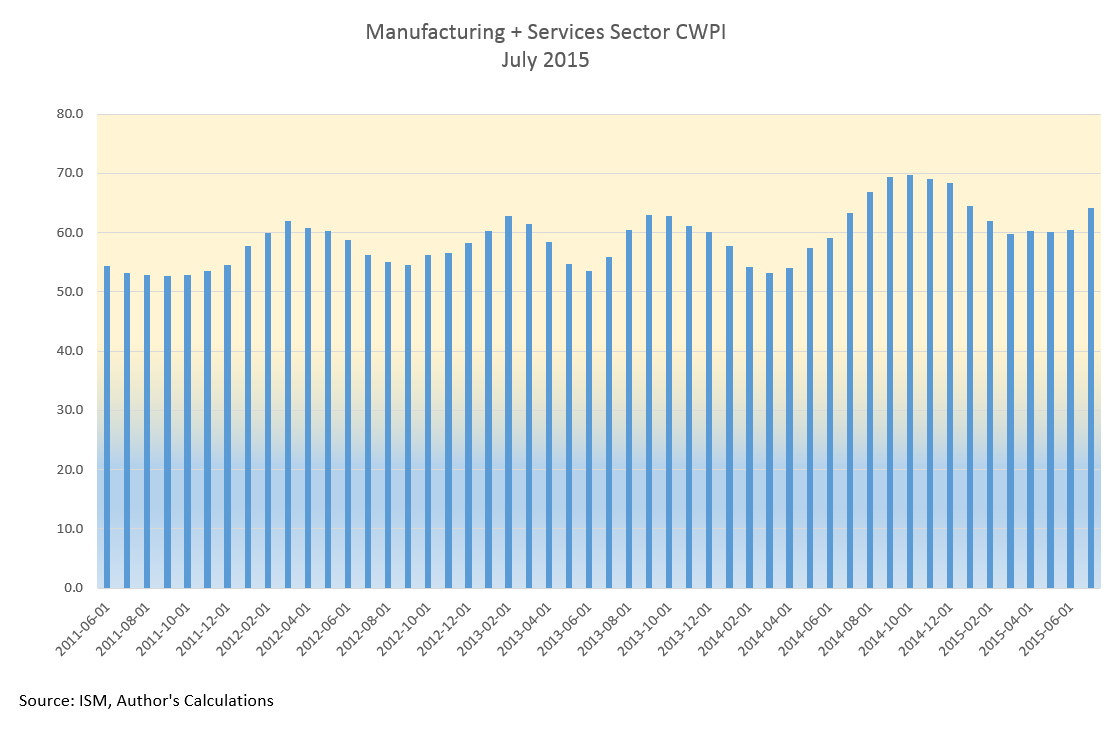
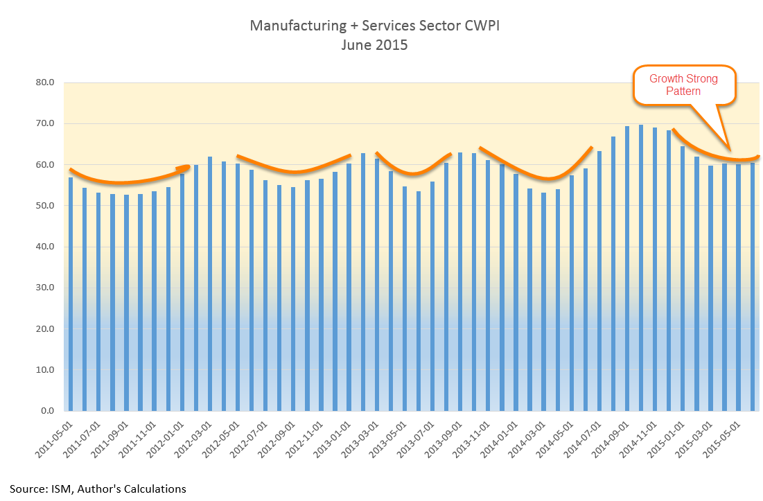
Constant Weighted Purchasing Index (CWPI)
The manufacturing sector, about 15% of the economy, continues to contract slightly, according to the latest Purchasing Manager’s Survey from ISM. The strong dollar and a slowdown in China have dragged exports down. Extremely low oil prices have impacted the pricing component of the manufacturing survey, which has reached levels normally seen during a recession.
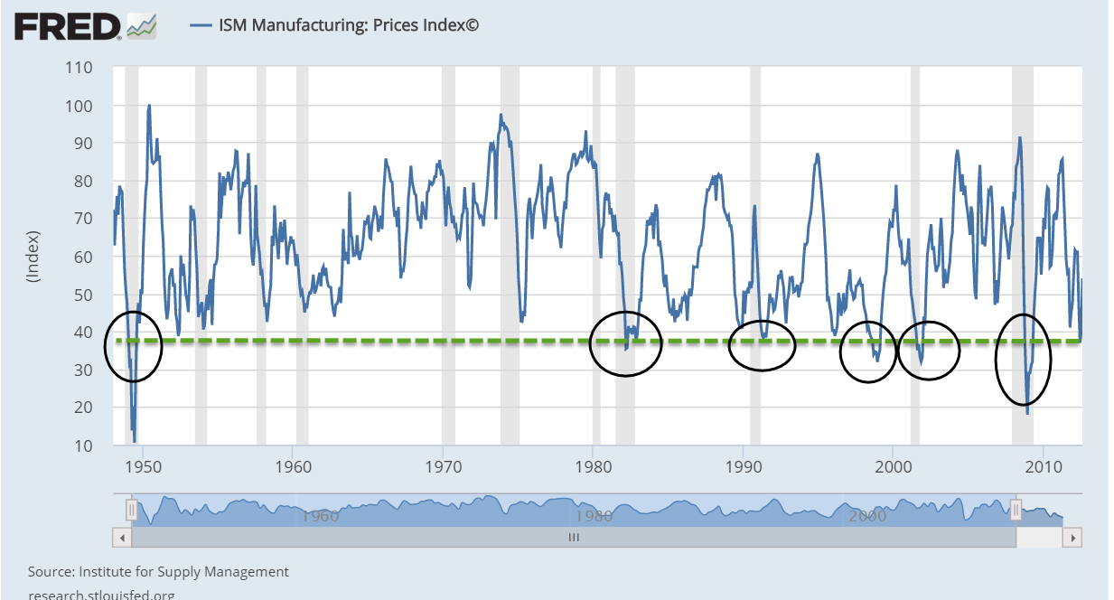
For some industries, like chemical products, the low oil prices have boosted their profit margins. Most industries are reporting strong growth or at least staying busy. Wood, food, beverage and tobacco manufacturers and producers report a sluggish start to the year, as reported to ISM.
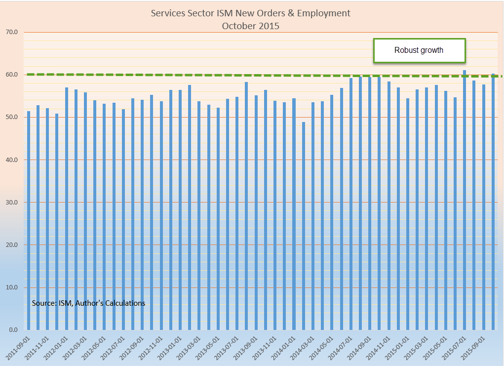
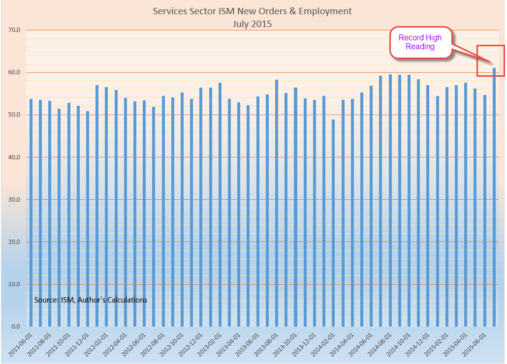
The services sectors have weakened somewhat in the latest survey of Purchasing Managers, but are still growing, with a PMI index reading of 53.5. Above 50 is growing; below 50 is contracting. The weighted composite of the entire economy, the CWPI, is still growing strongly but the familiar up and down cycle of the recovery is changing. Both exports and imports are contracting

The composite of employment and new orders in the non-manufacturing sectors has broken below the 5 year trend. It may turn back up again as it did in the winter of 2014, but it bears watching.

*************************
Employment
Each month theBureau of Labor Statistics (BLS) surveys thousands of businesses and government agencies to compute the number of private and public jobs gained or lost during the month. The payroll processing firm ADP also tallies a change in private jobs based on paychecks generated from thousands of its client businesses. If we subtract government jobs from the BLS total, we should get a total number of jobs that is close to what ADP tallies. As we see in the graph below, that is the case.
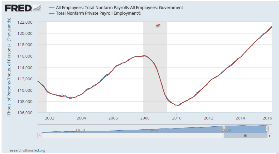
Economists, policy makers and the media look at the monthly change in that total number of jobs. This change is miniscule compared to the 121 million private jobs in the U.S. A historical chart of that monthly change shows that BLS survey numbers are more volatile than ADP.

I find an averaging method reduces the monthly volatility. I take the change in jobs as reported by the BLS, subtract the change in government employment, average that result with the ADP report of jobs gained or lost, then add back in the BLS estimate of the change in government employment. This method produces a resulting monthly change that proves more accurate in time, after the data is subsequently revised by the BLS. Based on that methodology, jobs gains were close to 175K in January, not the 151K reported by the BLS or the 205K reported by ADP.
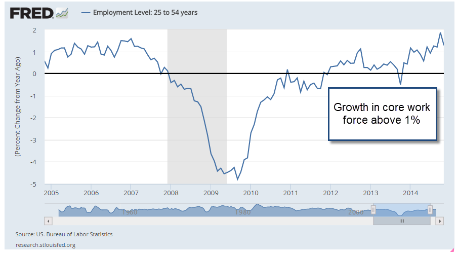
There was a lot to like in January’s survey. The unemployment rate fell below 5%. Average hourly earnings increased by 1/2%. Manufacturing jobs added 29,000 jobs, the most since the summer of 2013. This helped offset the far below average job gains in professional and business services. Year-over-year growth in the core work force aged 25-54 increased further above 1%.
The bad, or not so good, news: job gains in the retail trade sector accounted for 1/3 of total job gains and were more than twice the past year’s average of retail jobs gained. Considering that job growth in retail was near zero in December, this may turn out to be a survey glootch. Food services were another big gainer this past month. Neither of these sectors pays particularly well. The jump in manufacturing jobs probably contributed the most to lift the average hourly wage.
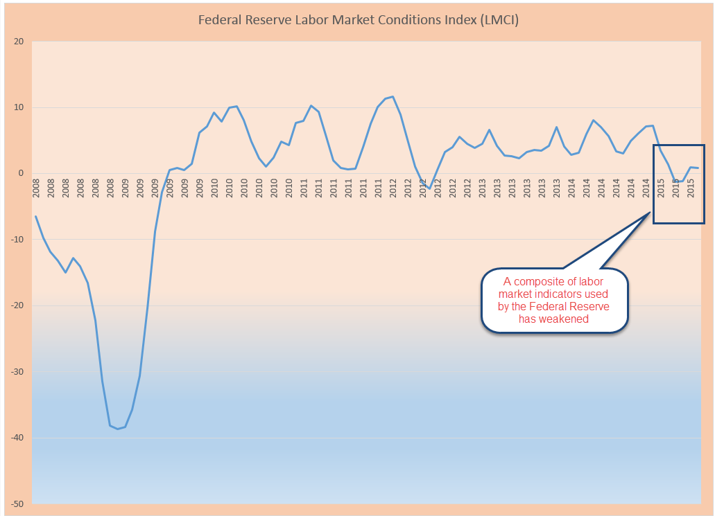
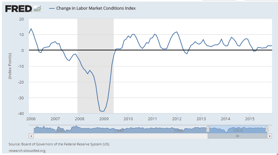
The Labor Market Conditions Index (LMCI) is a cluster of twenty or so employment indicators compiled by the Federal Reserve. December’s change in the monthly index was almost 3%. In the forty year history of this index, there has NEVER been a recession when this index was positive.
We are innately poor at judging risk. We derive indicators and other statistical tools to help us balance that innate human weakness with the strength of mathematical logic. Still, people do not make money by NOT talking about recession. NOT talking does not pay commissions, does not generate the buying of put options, expensive annuities, and other financial products designed to make money on the natural gut fears of investors. Next week I’ll look at the price stability of our portfolios.