Less Bang For The Buck

June 17, 20918

by Steve Stofka

There are two types of inputs into production, human and non-human. Over a hundred years ago, Henry Ford realized that he had to invest in his human inputs as well as his equipment, land and factories. Once he started paying his employees a decent wage, they were able to buy the very cars they were producing on Ford’s assembly line.

The total return on our stock investments depends on two inputs: dividends and capital gains, which is the increase in the stock price. Both are dependent on profits. Dividends are a share of the profits that a company returns to its shareholders. Capital gains arise from the profits/savings of other investors who are willing to buy the shares we own (see end for explanation of mutual funds).

In the past three decades, a growing share of total return has come from capital gains. Because of that shift from dividend income to capital gains, market corrections are harsh and swift.

In the 1970s, stocks paid twice the dividend rate that they do today. It took an oil embargo and escalating oil prices, a continuing war in Vietnam, the impeachment of President Nixon, a long recession and growing inflation to sink the market by 50% beginning in early 1973 to the middle of 1974.

In 2000, the dividend rate or yield was a third of what it was in 1973. Total return was much more dependent on the willingness of other investors to buy stocks. In 2-1/2 years, the market lost 45% because of a lack of investor confidence in the new internet industry, a mild recession and 9-11. Dividends act as a safety net for falling stock prices and dividends were weak.

In 2008, the dividend yield was about the same as in 2000. In 1-1/2 years, the market again lost 45% of its value because of a lack of confidence brought on by a financial crisis and a long and deep recession.

Other bedrock shifts have occurred in the past three decades. Corporate debt is an input to production. In the post-WW2 period until 1980, corporate debt as a percent of GDP was a stable 10-15%. $1 of debt generated $7 to $10 of GDP. Following the back-to-back recessions of the early 1980s until the height of the dot-com boom in 2000, that percentage almost doubled to 27%. Each $1 of corporate debt generated less than $4 of GDP.

CorpDebtPctGDP

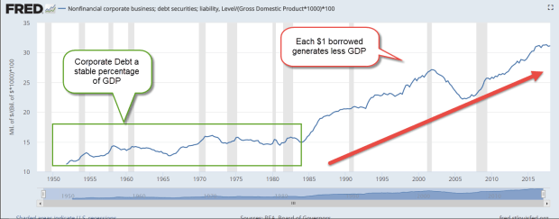
Today $1 of corporate debt generates just $3 of GDP. Debt is a liability pool. GDP is a flow. That pool of debt is generating less flow. It is less efficient. In 1973, $1 of corporate debt generated 46 cents in profit. Now it generates just 30 cents.

To hide that inefficiency and make their stocks appealing to investors, companies have used some of that debt to buy back their own stock. This reduces the P/E ratio many investors use to gauge value, and it increases the leverage of profit flows.

Here’s a simple example to show how a stock buyback influences the P/E ratio. If a company makes a $10 profit and has 10 shares of stock outstanding, the profit per share is $1. If the company’s stock is priced at $20, then Price-Earnings (P/E) ratio is $20/$1 or 20. If that company borrows money and buys back a share of stock, then a $10 profit is divided among 9 shares for a per-share profit of $1.11. The P/E ratio has declined to 18. When the company buys stock back from existing shareholders, that often drives up the price, and thus lowers the P/E ratio further.

The P/E ratio values a company based on the flow of annual profits. A company’s Price to Book (P/B) ratio values the company based on a pool of value, the equity or liquidation value of the firm. If we divide one by the other, we get an estimate of how much profit is generated by each $1 of a company’s equity, or Return On Equity (ROE).

1982 was the worst recession since the Great Depression. Stocks were out of favor with investors and were at a 13 year low. In 1983, $8.70 of equity generated $1 of profit for companies in the SP500. Seventeen years later, at the height of the dot-com boom in 2000, companies had become more efficient at generating profits. $6 of equity generated $1 in profit. In the last quarter of 2017, companies have become less efficient. $7.30 of equity generated $1 of profit.

Let’s look at another flow ratio, one based on the flow of dividends. It’s called the dividend yield, and the current yield is 1.80, about the same as a money market account. I can put my $100 in a money market account or savings account and earn $1.80. If I need that $100 a year from now, it will still be there. I could use that same $100 and buy a fraction of a share of SPY, an ETF that represents the SP500. I could earn the same $1.80. However, if I wanted my $100 back in a year, it might be worth $120 or $50. A stock’s value can be very volatile over a short time like a year, and the current dividend rate does not compensate me for that extra risk.

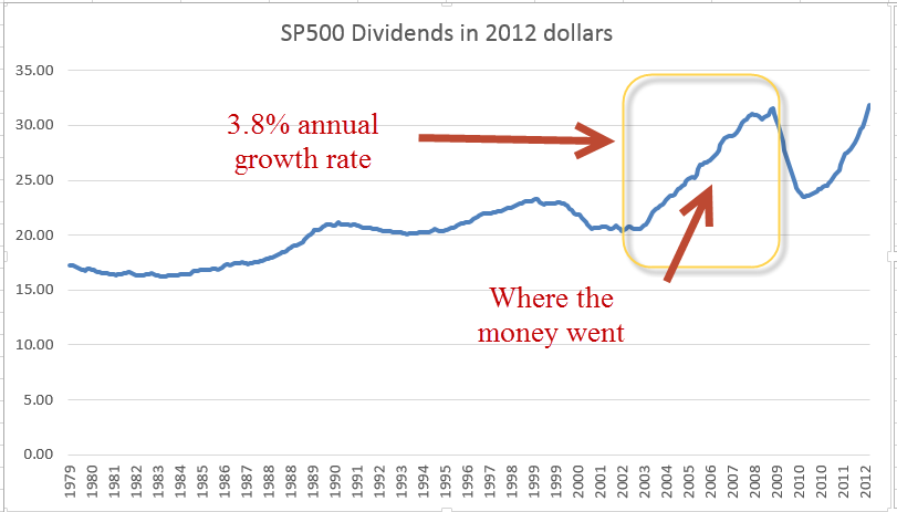
Why don’t investors demand more dividends? After the early 1980s, economists at the Minneapolis Federal Reserve noted (PDF) that, on a global scale, companies’ profits grew at a faster rate than the dividends they paid to shareholders. The dividend yield of the SP500 companies fell from 6% in the early 1980s to 1% in 2000 (chart).

Those extra profits are counted as corporate savings. The same paper showed that global corporate savings as a percent of global GDP increased from 10% in the early 1980s to 15% this decade. Each year companies were adding on debt at a faster pace than during the post-war decades, but undistributed profits were growing even faster. The net result was an increase of 5% in the rate of corporate saving. Companies around the world were able to shift dividends from the savings accounts of shareholders to the savings of the companies themselves.

From the early 1980s to the height of the dot-com boom, stock prices increased more than ten-fold. Investors that had depended on company dividends for income in previous decades now depended on other investors to keep buying stocks and driving up the price. The source of an investor’s income shifted slightly from the pocketbooks of corporations to the pocketbooks of other investors. Investors adopted a shorter time horizon and now look to other investors to read the mood of the market.

The bottom line? If investors rely on each other for a greater part of their total return, price corrections will be dramatic.

///////////////

Notes: Price to Book (P/B) ratio was 1.5 in 1983 (article).
P/B graph since 2000
When mutual funds sell some of their holdings, they assign any capital gains earned to their fund holders. This amount appears on the mutual fund statements and the yearly 1099-DIV tax form.

A November 2017 article on share buybacks at the accounting firm DeLoitte


Circumstance

May 21, 2017

Last week I mentioned the 20 year CAPE ratio, a modification of economist Robert Shiller’s 10 year CAPE ratio used to evaluate the stock market. This week I’ll again look at equity valuation from a different perspective.  The results surprised me.

The date of our birth is circumstance.  When we retire is guided by our own actions and the circumstance of an era. We have no control over market behavior during the twenty year savings accumulation phase before we retire or the distribution of that savings during our retirement.   Let’s hope that we live long enough to spend twenty years in some degree of retirement.

The state of the market at the beginning of the distribution phase of retirement can have a material effect on our retirement funds, as many newly retired folks found out in 2008 and 2009.  Some based their retirement plans on the twenty year returns  prior to retirement.

I’ll use the SP500 total return index ($SPXTR at stockcharts.com or ^SP500TR at Yahoo Finance) to calculate the total gain including dividends. The twenty year period from 1988 through 2007 began just after the stock market meltdown in October 1987 and ended just as the 2007-2009 recession was beginning in December 2007. The total gain was 742%, or 11.3% annualized. Sweetness! Sign me up for that program.  Those high returns led many older Americans to believe that they didn’t need to accumulate more savings before retirement.  Then came the double shock of zero interest rates and a 50% meltdown in stock market valuation.

Now let’s move that time block one year forward and look at the period 1989 through 2008. Still good but what a difference one year makes. The total gain was 404%, or 8.4% annualized. That’s a drop of 3% per year! Investors missed the 16% bounce back in 1988 after the October 1987 crash, and the time block now included the 35% meltdown of 2008. There was even more pain to come in the first half of 2009 but I’ll come back to that.

1995 through 2014 was a good period with total gains of 550%, or 9.8% annualized. Shift that time block by two years to the period 1997 through 2016 and the gains fall off significantly. The total gain was 340%, or 7.7% annualized.

We can make a rough approximation of total returns during the late 1970s and into the 1980s, an ugly period for equities. In 1980, someone quipped “Equities are dead.” Twenty year periods ending during this time did not fare so well but still notched gains of more than 6%. Bonds, CDs and Treasuries were paying far more than that at the time. In today’s low interest environment, 6% seems a lot better than it did during the double digit inflation of 1980.

In past weeks I have written about the overvaluation of today’s stock market based on trailing P/E ratio and the smoothed 10 year CAPE ratio. Let’s look at the current valuation from the perspective of this twenty year return. It would come as no surprise that the total twenty year gain hit a low at the end of February 2009 when the market was about a 1/4 of its current valuation. That 20 year annualized gain was 5.7%. What surprised me was that the current valuation shows the same 20 year gain! Using this metric as an evaluation guide, the market sits at a relatively low level just like it was in 1988 and 1989.

The historical evidence shows that stock returns may be erratic but consistently make over 5% over a twenty year retirement period. Those who are newly retired or about to retire might understandably desire more safety. The safest approach is not to suddenly shift one’s portfolio entirely to safe assets.

///////////////////////

Income Inequality

Much has been written about the growth of income inequality. The GINI coefficient is the most popular but there are other measures (for those who want to get into the weeds of inequality measures). The Social Security Administration offers a simple indicator of the trend. They track the average and median incomes of millions of earners every year.

When the median and average are fairly close to each other, that indicates that the numbers in the data set are uniformly distributed. As the ratio percentage of the median to the average falls, that indicates that a few big numbers are raising the average but do not raise the median.

Here’s a simple example of an evenly distributed set. Consider a set of numbers 1, 2, 3, 4, 5, 6. The average is 3.5. The median is also 3.5 because there are three numbers in the set below 3.5 and three numbers above 3.5.  The percentage of the median to the average is 100%.

Let’s consider an unevenly distributed set: 1, 2, 3, 4, 5, 12. The median is still the same value as the earlier example: 3.5. But the average is now 4.5. The ratio of the median to the average is 3.5 / 4.5 = about 78%.

The ratio of the median to the average income has fallen from 71% in 1990 to 64% in 2015. This indicates that there is a growing number of large incomes in our data set.

SSAIncomeAvgMedian
Here’s the data in a graph form

SSAIncomeAvgMedianGraph
Median wages have doubled, or grown by 100%, while average wages have grown by more than 150% in the last quarter century.

Next week I will look at a hypothetical income tax proposal based on income. It might just blow your mind.

///////////////////////

Dividend Payout Ratio

FactSet Analytics grouped dividend paying stocks in quintiles (20% bands) by the dividend payout ratio (Chart). This is the percentage of profits that are paid to shareholders in the form of dividends. Over the last 20 years of rolling one month returns the stocks that had the highest and lowest payout ratios had the lowest total return. Think about that. Both the highest and lowest quintiles did the worst. What performed the best? Those stocks that were in the middle quintile, the companies who balanced their profit distributions between investors (dividends) and investment (future sales and profits).

//////////////////////////

CWPI

Each month I compute a Constant Weighted Purchasing Index built on a combination of the two Purchasing Manager’s surveys (PMI) each month. For the six month in a row, this composite has shown strong growth and the three year average first crossed the threshold of strong growth in January 2015.

A sub-index composite that I build from the new orders and employment components of the services survey (NMI) shows moderate growth. Its three year average has shown moderate growth since early 2014.

////////////////////////

Midpoints

July 3, 2016

A week after crash-go-boom in the stock market following Brexit, the British vote to leave the European Union, the market recovered most of the 5 – 6% lost in the two days following the vote.  The reaction was a bit too intense, inappropriate to an exogenous shock, the vote, whose consequences would take several years to develop. In last week’s blog I had suggested that the market drop was a good time to put some IRA money to work for 2016.  This was not some kind of magic insight.  Each year’s IRA contribution amount is a small percentage of our accumulated  retirement portfolio.

Buying on market dips can be an alternative strategy to regular dollar cost averaging since the market recovers within a few months after most dips, although the recovery is at a slower pace than the fall.  Fear can cause stampedes out of equities; confidence grows slowly.  As an example of an abrupt price decline, the SP500 index fell almost 7% in five days last August, then took more than two months to regain the price level before the fall.  The 12% price drop at the beginning of this year was more gradual, occurring over six weeks.  The recovery to regain that lost ground also took two months, from mid-February to mid-April. In the latter quarter of 2012, the market also took two months to erase a 7% price decline from mid-October to mid-November.

The price level of the SP500 is near the high mark set in May 2015, more than a year earlier.  Only in the past year has the inflation-adjusted price of the SP500 surpassed its summer 2000 level (Chart and table).  Nope, I’m not making that up. The stock market has just barely kept up with inflation for the past 15 years. The inability of the stock market to move higher indicates that buyers are not attracted to the market at current price levels.  The absurdly low interest yields on bonds makes this caution especially puzzling.  As stock prices recovered this past week, prices on long term Treasury bonds should have fallen as traders moved into more risky assets.  Instead, bond prices have risen.  As the price of long term Treasuries (ETF: TLT) broke through its January 2015 high  on Friday, the last day of June, traders began betting against treasuries (ETF: TBF).

Those who are concerned about the return OF their money, the safety searchers buying bonds, are competing against those seeking a return ON their money.  VIG is a Vanguard ETF that focuses on company stocks with dividend appreciation, and is favored by those seeking some safety while investing in stocks. TLT is an ETF of Treasury bonds for those seeking safety and, as expected, pays more in dividends than VIG.  Rarely do we see a broad stock ETF like VIG have a yield, or interest rate, that is close to what a long term Treasury bond ETF like TLT has.  At the end of this week, VIG had a dividend yield of 2.15%, just slightly below TLT.  Why are investors/traders bidding up the price of Treasury bonds?  Some 10 year government bonds in the Eurozone have recently crossed a dividing line and now have negative interest rates.  The low, but positive, interest rates of U.S. Treasury bonds look like big open flowers to the busy bees of institutional investors around the world.

In a large group of investors, buy and sell decisions tend to counterbalance each other.  Occasionally there are periods when such decisions reinforce each other and create a precarious imbalance that all too often rights itself in an abrupt fashion.  Bubbles and – what’s the opposite of a bubble? – are iconic examples of this kind of self-reinforcing behavior.

In another week we will mark the middle of the summer season.  The All-Star game on July 12th occurs near the halfway mark in the baseball season and advises parents in many states that there are still five to six weeks before the kids head back to school.  Our mid-40s is about the midpoint of our working years, a reminder that we need to start saving for retirement if we have not done so already.  It has been seven years since the market trough in March 2009.  Let’s hope that this is the midpoint of a 14 year bull market but I don’t think so.

Next week will be chock full of data before the start of earnings season for the second quarter. We will get the June employment report as well as the Purchasing Managers Index.  In this time of short, sharp reactions to news events, we can expect continued volatility.

/////////////////////////


Earnings


Pew Research just released a comparison of earnings by racial group and sex that is based on Census Bureau surveys, the same data that the BLS compiles into their monthly employment reports.  My initial criticism of the Pew Research comparison was that they used the earnings of full and part time workers.  Women tend to work more part time jobs so that would skew the earnings comparison, I thought. Thinking that a comparison of full time workers only would show different results, I pulled up the BLS report which groups the data by sex, only to find out that the differences between the earnings of men and women was about the same.  At the median, women earn 82% of men.


An even more depressing feature of the BLS report is that median weekly earnings have barely kept ahead of inflation during the past decade.  This wage stagnation provides a base of support for the criticisms voiced by former Presidential contender Bernie Sanders in a recent NY Times editorial.
Like a truck stuck in the mud, households are spinning their wheels without making much progress.  In the coming months, Donald Trump and Hillary Clinton will try to sell themselves as the tow truck that can pull average American families out of the mud. Well, it would be nice if they would conduct their campaigns in such a positive light.  The truth is that each candidate will try to convince voters that voting for the other candidate will get American families stuck deeper in the mud.  The conventions of both parties are later this month.  Expect the mud to start flying soon after they are over.  By election day in November, we will all be buried in mud.

Productivity

August 25th, 2013

(First a little housekeeping: an anonymous reader commented that when they clicked the “back” button after viewing a larger sized graph they were returned to the beginning of the blog post instead of where they had left off when they clicked on the smaller image within the text.  I suggest that, after viewing a graph, try clicking the ‘X’ button on the top right of the graph page to return to where you left off.   This works in the Chrome browser.)

Since the onset of the recession in late 2007, I have read many articles on the lack of wage growth despite big gains in productivity.  Ideas become popular when they have a narrative, one that I took for granted.  Each quarter, the Bureau of Labor Statistics (BLS) issues a report on productivity and labor costs that I have taken at face value.

The 2001 manual of the OECD manual states “Productivity is commonly defined as a ratio of a volume measure of output to a volume measure of input use.”  They frankly admit that “while there is no disagreement on this general notion, a look at the productivity literature and its various applications reveals very quickly that there is neither a unique purpose for, nor a single measure of, productivity.” (Source)

The authors of a recent paper at the Economics Policy Institute cite BLS data showing that productivity has grown “by nearly 25 percent” in the period 2000 – 2012 while the median real, that is inflation adjusted, earnings for all workers has essentially remained flat.   Company profits are at all time highs and workers are struggling.  The narrative is familiar but I wondered: how does the BLS calculate productivity growth?

What the “headline” productivity numbers describe is labor productivity, the output in dollars divided by the number of hours worked.  The BLS Handbook of Methods, page 92, gives a detailed description of its methodology.  As the BLS notes, this often cited productivity figure disregards capital investments in output like machinery and buildings.  For this reason, the BLS also calculates a less publicized multifactor  productivity measure using methodologies which do incorporate capital spending.  How does capital investment influence the productivity of a worker?

Consider the simple case of a man – I’ll call him Sam – with a handsaw who can make 20 cuts in a 2×4 piece of lumber in an hour.  His company charges customers a $1 for each cut, the going rate, so that the company can sell Sam’s labor for $20 per hour. Due to increased demand for wood cutting, the company invests $1000 to buy an electric chop saw.  The company calculates that Sam’s productivity will rise enough that they can undercut their competition and charge 75 cents a cut.  With the chop saw, Sam can now make 60 cuts per hour at .75 per cut = $45 dollars in revenue per hour to the company.  Sam’s labor productivity has now risen 150%.  In our simple case, this would be the headline labor productivity gain – 150%.

A more complete measure of productivity including capital investments is quite complex.  The latest edition of the OECD handbook notes that “there is a central practical problem to capital measurement that raises many empirical issues – how to value stocks and flows of capital in the absence of (observable) economic transactions.”  To illustrate the point further, the asset subgroup listed in the BLS handbook includes “28 types of equipment, 22 types of nonresidential structures, 9 types of residential structures (owner-occupied housing is excluded), 3 types of inventories (by stage of processing), and land.”

You want simple?  Let’s go back to our kindergarten example.  At this rate of production, let’s say that the saw’s useful life is only 10 months.  The company has an investment of $100 per month in the saw, plus additional costs like electricity, a bigger workbench, etc.  To round out the numbers, let’s say that equipment related costs are $150 a month.  If Sam’s output is 8 hours a day x $45 an hour, Sam is producing $360 per day in revenue for the company, or close to $8000 a month. The $150 a month in equipment costs is trivial and multi-factor productivity is very close to labor productivity.

Sam knows he is making much more money from the company and goes to his boss and says he wants a raise.  Not only is he producing more for the company but the electric saw is much more dangerous than a handsaw.  The company gives Sam a raise from $7 an hour to $8 an hour, an almost 15% increase that Sam is happy with.  In addition to the raise, the company has an additional $2 in mandated labor costs, bringing the total costs for Sam’s labor to $10 an hour.  Even with the higher labor costs, the company is raking in huge profits – $35 an hour – from Sam’s labor.

But now an inspector comes in and tells the company that, because an electric saw makes much more dust than a handsaw, the company will have to install a ventilation and filtering system so that the employees and neighbors won’t have to breathe sawdust.  The company gets bids that average $100,000 to install this system and the company estimates that the system will equal $1000 a month in additional capital costs.  Despite the additional costs, the company still continues to make substantial profits from Sam’s labor.  To the company, the capital costs for this new system represents about 60% of an additional worker’s labor costs, yet that additional cost is largely not included in measuring labor productivity because Sam’s hours and the revenue generated by Sam’s labor remain the same.

A multifactor productivity comparison of handsaw vs. chopsaw production would show a percentage growth of 40%, far below the 150% labor productivity growth.

All of us have our biases (except my readers who are perfectly rational beings) which cause us to look no further than the narrative that clearly supports our previous conceptions.  If we generally agree with the narrative of companies taking advantage of workers, we read of 25% productivity gains for companies and 0% gains for workers in the past twelve years, and we look no further – for the data has confirmed what we previously had concluded.  Big companies = bastards; workers = victims.

In June 2013, the BLS released revisions to their productivity figures for 2012 and included historical productivity gains for various periods since 1987.  During the past 25 years, multifactorial productivity, including capital investment, has averaged .9% per year – less than 1%.

While labor productivity has grown 25% since 2000, multifactorial productivity has been half that, at about 12%.   Dragging the 25 year average down is a meager .5% growth rate since 2007.  Even more striking is the growth rate of input into that recent tepid productivity growth; the BLS calculates 0% net input growth since 2007.  For the past 25 years, capital investment has grown at more than 3% but since the recession capital growth has slowed to 1.3% per year.  I wrote last week that there is an underlying caution among business owners and this further confirms that caution; companies have been cutting back on both labor and capital investment.

If multifactorial productivity rose by 12+ percent over the past 12 years, and the profits did not go to workers, where did the money go?  For a part of the puzzle, let’s look to inflation adjusted dividends of the SP500.

From the beginning of 2000 through 2007, when the recession began, inflation adjusted dividends grew at an annual rate of almost 3.8%, eating up most of the profits from productivity growth.  As bond yields continued to decline, I would guess that investors pressured companies for more of a share of the profits from productivity growth.

As workers lost manufacturing jobs during the 2000s, many were able to switch to construction jobs in the overheating real estate market and unemployment stayed low.  This should have pressured management to give into labor demands for an increased share of the productivity growth but it didn’t.  I suspect that the labor mix contributed to the lack of pressure on management.  Fewer manufacturing jobs meant fewer union jobs; a reduced labor union influence meant less demand on management.

Looking past the headline labor productivity gains, overall productivity is slow.  Capital and labor investment is slow, which means that future overall productivity is likely to remain slow.

While walking a trail in the Colorado Rockies years ago, my brothers and I complained about having to dodge moose poop on the trail.  Then we ran into the bull moose that made the poop.

The Price is Right?

August 4th, 2013

First week of the month and several good monthly reports helped propel the SP500 through the 1700 mark this week, making an all time high.  Last week I wrote that the market would be cautious and the first few trading days of the week was exactly that, drifting sideways.  On Thursday the release of a suprisingly strong ISM Manufacturing report gave an upward jolt to the market.  In several recent blogs on the ISM and an alternative composite called the CWI, we could see that manufacturing has been sliding toward the neutral mark of 50 for the past several months.  On Monday, the ISM non-manufacturing index will be released and next week I hope to update the CWI.

Ultimately, the market rides up or down on the anticipation of future earnings.  However, earnings can be “managed,” to put it politely.  Further confusing the earnings picture for a casual investor are the several different types of earnings: operating, pro-forma and GAAP to mention a few.  There are two types of “future”, or projected, earnings: bottom up and top down.

A simpler approach that some investors use is to calculate the Price Dividend ratio.  There is no fudging of cash dividends to investors.  Robert Shiller, author of  the 2005 book “Irrational Exuberance”, updates the data used in his book.   These include the SP500 index, earnings, dividends, the CPI and a Price Earnings ratio that is based on the past ten years of earnings.  The current ratio of 23.80 is lower than the 2006 ratios which were in the high twenties.

But let’s look at the Price Dividend, or PD, ratio.  For the past ten years that ratio has averaged a bit less than 52, meaning that investors have been willing to pay almost 52 times the amount of the dividend to own the stock.  As of June 30th, the PD ratio stood at a bit more than 48, which means that stocks were a bit cheaper than average at this date.  Since then the market has gone up about 6% so that the PD ratio is now about 51, or just about average.

As the market makes new highs, investors are prone to ask themselves if the price they are paying for stocks is too high.  The long term investor might take a different perspective and ask themselves, “How will I feel in ten years if I continued to put money into the stock market now?”  Ten years from now, in the year 2023, the answer will be “Well, I didn’t get a deal and I didn’t overpay based on the information available at the time.  I paid about average.”

McGraw-Hill, the publisher of the SP500 market index, also keeps an index of dividends.

Dividend growth has plateaued and is about a third of earnings, which means that companies are paying a third of their earnings back to investors in the form of dividends.  This is just slightly more than the median for the past ten years.

There was a lot of data to digest in this past week.  The GDP estimates for the 2nd quarter was a sluggish 1.7%, more than the expectation of 1.1%.  But – always that but – the 1st quarter GDP growth was revised down from 1.7% to 1.1%.

On Thursday, the same day as the ISM manufacturing report, came the monthly report on auto sales.  Total sales of light weight vehicles, which includes cars and pickups, increased about 4% this past month to an annualized amount of 16 million vehicles.

When we look at auto sales on a per capita basis, auto sales are still below 5% of the population, a level that would show me that consumer demand and the construction industry (pickup trucks) is healthy.  As we can see from the chart below, the sale of autos stayed consistently above that 5% level for more than 20 years – until the last recession began.

Employment in the production of motor vehicles and related parts is very  weak.

Although vehicle sales includes both imports and domestics, I wanted to see how many autos are sold per person employed in automotive production.  Advances in manufacturing and the mix of import and domestically made vehicles have impacted employment.

And with that, I’ll look briefly at the Employment Report for July released this past Friday.  On Wednesday, ADP reported 200,000 private jobs gained, giving a brief upward impetus to the market.  As I noted last week, caution would be the watchword of this week and that caution showed in later trading on Wednesday.  The ADP report did give some hope that the BLS employment report would show an approximate gain of that many jobs.  Instead, the employment gains from the BLS were disappointing, at 162,000.   A further disappointment were the small downward revisons in May and June’s employment gains, totalling -26,000.

The unemployment rate declined, from 7.6% to 7.4%, but for the wrong reasons.  For any number of reasons – disappointment, frustration, going back to school, retirement – 240,000 people dropped out of the work force.  This is close to the reduction of 257,000 in the ranks of the unemployed.  After declines or relative stability in the number of “drop outs” in recent months, this month’s surge was particularly disappointing.

Job gains in the core work force aged 25 -54 remains relatively flat.

While older workers continue to add jobs

Business Services and Health Care jobs continued their strong job gains but gains in the health care field have slowed from 27,000 per month in 2012 to only 16,000 in 2013.  Sit down for this one – government workers, mostly at the local level, actually gained 1,000 in July.

Despite the decline in unemployment, the tepid employment and GDP growth reports likely reassured many that the Fed is unlikely to stop or reduce their quantitative easing program in the next few months.

Out Of the Tent and Into the Forest

May 12, 2013
We can take some steps to reduce our susceptibility to adverse events but if our primary aim is to reduce uncertainty as much as possible, our lives suffer in quality and our wallets suffer in quantity.  In our financial lives, we must try to find a balance between risk and reward.  There is a high demand for low risk, high reward investments.  Unfortunately, there is little supply of such investments and the few that are offered are usually scams.

There is a good supply of low risk, low return products. In the past ten years, conservative savers have taken a beating.  There have been only two periods where the interest on one year CDs has exceeded the percentage increase in inflation.

Challenged by low interest rates on CDs, savers have fled the market.

Older people who rely on their savings to generate income continue to search for yield, or the income generated by an investment.  The iShares High Yield Corporate Bond ETF, HYG, and the iShares Dividend Select Index ETF, DVY, have posted strong gains.  As more investors chase yield and drive up prices, the yields correspondingly become lower.   In December 2007, DVY paid out an annualized 4.7% yield on a price of about $53.  In March 2013, the yield was 3.4% on a price of $65 (Source)

Despite the fact that the Federal Reserve has held interest rates at historic lows, the amount of household savings continues to climb.  Some of this is due to an aging population which has more in savings and tends to be more conservative.

The Federal Reserve is essentially kicking people out of the tent and into the forest where the wild animals live.  It’s risky out there in the forest.  How come the banks don’t want our money?  Some people do not realize that a CD or savings account is essentially a loan to the bank.  Through the FDIC, the U.S. government insures most of these loans.  Loan your brother in law money for a  year and you might not get it back.  Loan your bank the money and you are assured that you will get it back.

In the simplified models of banking we learned in grade school, the bank pays us interest for the money we loan it (deposits) and loans that money out to other people at a higher rate of interest.  The difference in the two interest rates is how banks pay their employees and other business costs and make a profit. The reality is much more complex.  A bank does not take a $10 deposit from Mary and loan it to Joe.  The bank takes the $10 deposit from Mary and loans $100 to Joe.  Where did the other $90 come from, you ask?  It is created out of thin air in a process called fractional reserve banking, which allows a bank to leverage the $10 deposit by ten times, in this example.  Because banks are leveraging money, there is a labyrinth of financial metrics of stability to insure that the banks are not taking too much risk.  Some of these metrics include the risk weighting of assets (deposits, loans and securities, for example) and capital asset ratios.

In a 1985 paper by Federal Reserve economists, they note that “There is remarkably little evidence, however, that links the level of capital or the ratio of capital to assets with bank failure rates.”  This paper was written before the S&L crisis of the 1980s.

The financial crisis in 2008 led to a surge of bank failures, peaking at more than 150 in 2010.  In this past year, failures have dropped to a level that can be counted with two hands.

 During the recession, the amount of commercial and industrial loans declined but have risen to nearly the same level as 2008.

From a thirty year perspective, we can see just how severe the decline was.

While loans and interest bearing accounts, or assets, at the largest banks are nearing 2007 levels, assets at small banks have declined.

The banking industry has been consolidating, larger banks eating up the smaller ones.

This past Friday, the Chairman of the Federal Reserve, Ben Bernanke, expressed concern that some of the larger banks are still prone to failure.  The ever increasing size of the big banks has enabled them to have an even greater voice in the halls of Washington.  Bernanke’s remarks hint that he is a proponent of further regulations which would reduce the amount of leverage that banks can use to increase their profits.  Banking industry lobbyists are making the case that if they are required to reduce their leverage, it will hurt the economy by reducing the amount of loans they can make.

The banks are feeling squeezed and they are sure to let lawmakers know.  Their net interest margin, or the spread between what they pay to depositors and what they charge to borrowers, has fallen to pre-recession levels, putting pressure on banks to take more risk to increase their bottom line.

I am reminded of a comment made by Raymond Baer, chairman of Swiss private bank Julius Baer, in 2009 who warned: “The world is creating the final big bubble. In five years’ time, we will pay the true price of this crisis.”  Let’s see: 2009 + 5 = 2014.  Hmmmm….

But we can’t live our lives waiting for the next catastrophe.  We must take some risk, be diversified and be vigilant.  As the stock market reaches new highs with each passing day, more investors will reassess their risk profile.  Some will curse their caution of the past few years and move money from safe but low yielding assets to the market, helping to fuel rising market prices.  The demand for yield creates a feedback loop that actually makes it harder to achieve yield.  If only we could live in a world where they didn’t have these darn feedback loops.

Corporate Taxes

Both conservative and “mainstream” media pundits, as well as candidates In the Republican primary debates, assert that U.S. corporations pay a 35% federal income tax rate, “one of the highest in the world.”  After the corporation pays this tax, it distributes dividends to its shareholders, who then pay tax on the dividend.  Capital gains and dividends are taxed at a lower 15% rate, resulting in a net tax of 50% federal tax on corporate profits.  In arguing for lower corporate tax rates and rationalizing the lower rate on dividends, conservatives ask should the federal government get half of corporate profits?

The federal government may get too much of profits but it is not 50%.  The international accounting firm PricewaterhouseCoopers calculated an effective tax rate of 27% in the years 2006 – 2009.  Sixty years of data from the Bureau of Economic Analysis show that the corporate tax rate has declined markedly since World War 2. (Click to enlarge in separate tab)

Using a three moving average highlights the downward trend.  For those in the Ronald Reagan cult, it may come as some surprise to see the “hump” in rates during the Reagan years.

Zooming in on the past ten years, we see an effective tax rate of 30% or less.  Some might explain that the lower average rate is due to smaller corporations who pay less than the 35% tax but IRS data shows that smaller companies who qualify for these lower rates make up less than 10% of corporate profits.

If companies had paid a 35% rate on their profits this past decade, what would they have paid?  Almost a trillion dollars extra in taxes.

When someone mentions the “35% corporate tax rate”, that is the statuatory rate, not the actual rate companies pay.   In 2009, the three year moving average rate had dropped to 21%.  That is a far cry from 35%.  We can have a discussion – or disagreement – about what a fair tax rate is for U.S. companies.  We should at least start that discussion from some realistic data.

Tidbits

A few tidbits of info sitting around on my desk:

WSJ tidbit 12/31/09 – Families USA reports that Cobra family coverage averages 83% of the average unemployment insurance check, up from 61% in 2001. The stimulus bill provides a subsidy to unemployed individuals averaging $325 a month, $715 for families.

According to a Congressional Research report – after dropping dramatically from 1950 to 1980, death from diabetes has increased to above the levels of 1950, a 33% increase from mortality rates in 1980. Unintentional injuries, including automobile accidents, has dropped by half from 1950. Cancer rates are about the same as 1950. Death from heart disease are at 40% of 1950 levels. (pg 4)

Many of us do not like government interference and mandates, yet we see the results of several decades of seat belt and product safety laws.
Despite all the money invested in cancer research over the past fifty years, the rates have not improved. Of course, more people are living longer, naturally driving up the cancer incidence rate, which disproportionately afflicts older people.
Despite the dislike that some people have for “Big Pharma”, it is thanks to the pharmaceutical industry that heart disease has become a manageable problem for many older Americans.
While many like to blame the soft drink and fast food industry for the increase in diabetes, no one is forcing anyone to drink and eat sugar laden foods. Of course, it is easier to blame the big food companies than take personal responsibility for one’s food choices.

On Oct. 16, 2009, the Bureau of Labor Statistics reported that the median (not average) weekly earnings of the nation’s 100.1 million full-time wage and salary workers was $738 in the third quarter of 2009. This was 2.5 percent higher than a year earlier. The Consumer Price Index for All Urban Consumers (CPI-U) fell by 1.6 percent over the same period.

Social Security income accounts for about 40% of retirement income.

A retired person spends, on average, about 80% of what they spent before retirement.

WSJ tidbit 12/28/09 – The Institute for Justice cites that 50 years ago, 3% of American workers were regulated or licensed by government agencies. It is 35% today.

Food, energy, housing and health care consume the same share of American spending today (55%) that they did in 1960 (53%).

Revolving credit, primarily credit cards, declined at a steep 18.5% annual rate last year.

Smaller businesses are a dying breed in the U.S. Companies with less than 250 workers comprise 70% of the private-sector work force in the European Union, compared with 49% in the U.S., according to EU figures.

In 2009, 804 companies cut dividends, up sharply from 110 two years earlier and the highest level since S&P started to collect such data in 1955. Conversely, the number of dividend increases dropped 36.4% to a record low.

More than 6% of commercial-mortgage borrowers in the U.S. have fallen behind in their payments, a sign of potential troubles ahead as nearly $40 billion of commercial-mortgage-backed bonds come due this year. Moody’s reported a 4.9% actual delinquency rate. It is projected to go above 8% by the end of 2010.

The Mortgage Bankers Association reported that almost 6.2% of mortgages in Arizona and 9.4% of mortgages in Nevada were in foreclosure by the end of the third quarter of 2009. In California, 5.8% of mortgages are in foreclosure and personal bankruptcy filings rose almost 60% last year.