Sugar Daddy

June 7, 2015

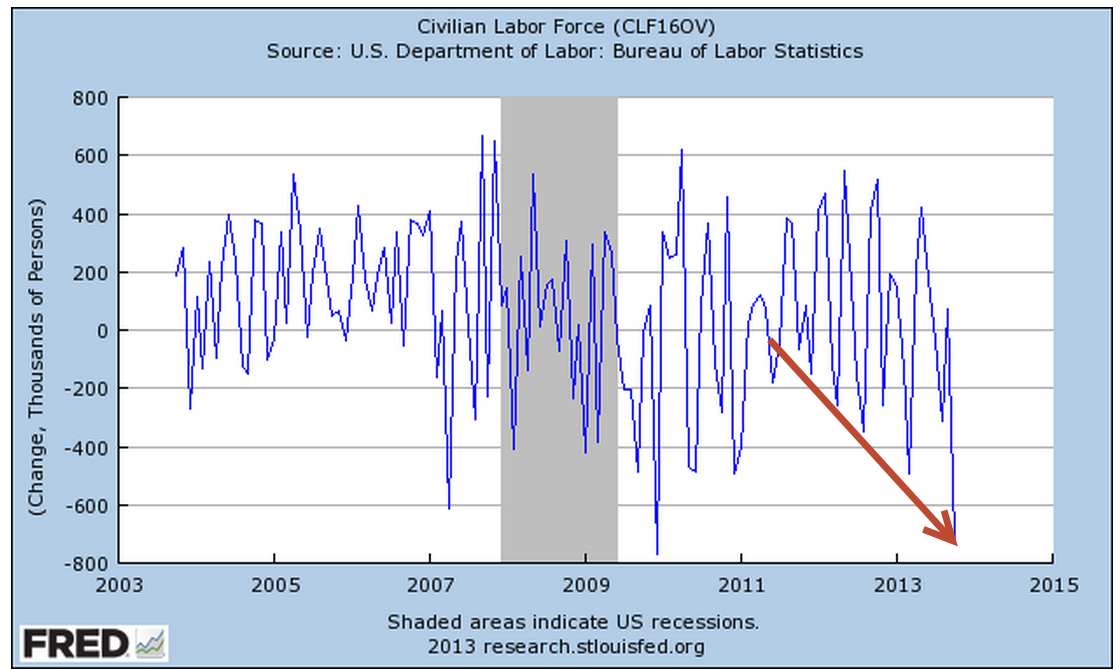
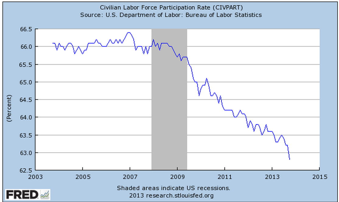
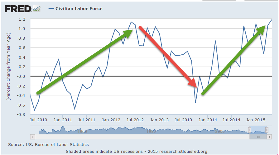
Older readers may remember Bizarro Superman, the mirror image of Superman, who did things backwards, or in reverse.  That’s the world we live in today; good news is bad, and vice versa.  The employment news was doubly good.  Job gains were stronger than expected at 280,000 but more importantly the unemployment rate went up a smidge, and for the right reasons.  As people become more confident in the job market, they re-enter the labor force, actively looking for work.  Discouraged job applicants have fallen 20% in the past twelve months.  The civilian labor force, the sum of employed and the unemployed, has grown.

Is good news good or bad?  If only the news would wear a hat, white or black, so we could tell. In Friday’s trading, investors bet on the timing of the Fed’s first interest rate increase.  September of this year or the beginning of 2016? When will Sugar Daddy, the Fed, take away the punch bowl of easy money?

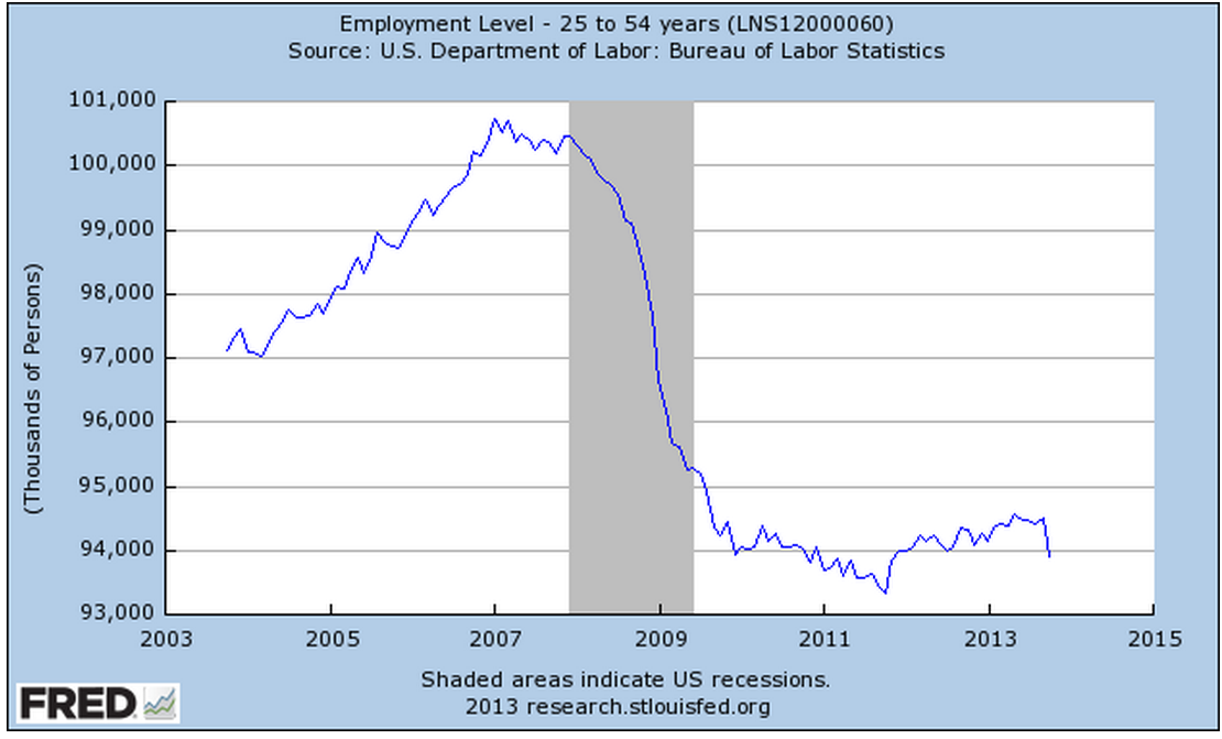
The core work force, those aged 25 – 54 who drive the economy, continues to show growth greater than 1%.

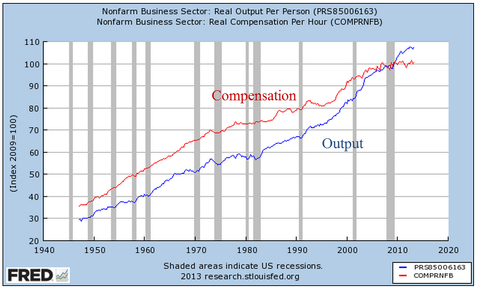
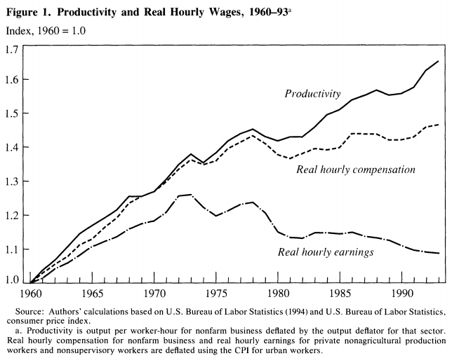
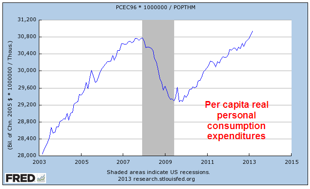
Although hourly wage growth for all private employees has been modest at 2.3% annual growth, weekly earnings for production and non-supervisory employees have risen 30%, or 2.7% per year in the past decade, a period which has included the worst downturn since the 1930s depression.  This more positive outlook on wage growth does not fit well with some political narratives.

The decade from 1995 – 2005 had 36% gains, or 3.1% annual growth, only slightly above the gains of the past decade and yet this period included the go-go years of the dot-com bubble and the housing boom. Inflation was higher in that decade, and in inflation adjusted dollars, the earlier period was only slightly stronger than this past decade.  In short, we are doing suprisingly well considering the negative impacts of the financial crisis.
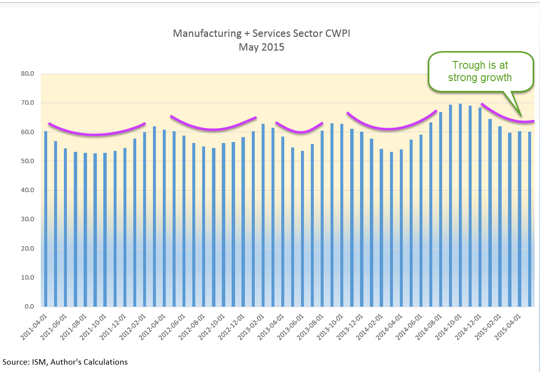
************************

CWPI

Every month I update the Constant Weighted Purchasing Index, a composite of the Purchasing Manager’s monthly index published by the Institute for Supply Management.  This month’s reading was similar to last month’s, continuing a trough in the strong growth region of this index.

**************************

Heaven On Earth

Last week I asked the question: Why can’t a government with a fiat money system simply give everyone a lot of money and create a heaven on earth?  The standard answer is that it would cause inflation.  For several millennia, when a government injects money into an economy, inflation soon follows as the supply of purchasing power increases without a concurrent increase in the supply of goods and services.  In the 18th century philosophers David Hume (On Money) and Adam Smith (Wealth of Nations) noted the phenomenon.  Peter Bernstein’s Power of Gold recounts ancient examples of kings and governments debasing metal monies and the inflation that ensued.

In the seven years since the recession began in late 2007, the government has borrowed and spent $27,000 per person and there has not been the slightest hint of inflation. Why? There are several reasons.  If a government borrows money from the private sector, there is no net injection of money into the system, no printing of money. A Federal Reserve FAQ on printing money is careful to note that “printing money” is the permanent financing of a government’s debt by a central bank.  Whatever people want to call it, when the Federal Reserve buys government debt, new money is injected into the system.  Since 2007, the Fed has injected almost $4 trillion (Balance Sheet), or about $12,000 per person, of new money without an uptick in inflation.  How is this possible?

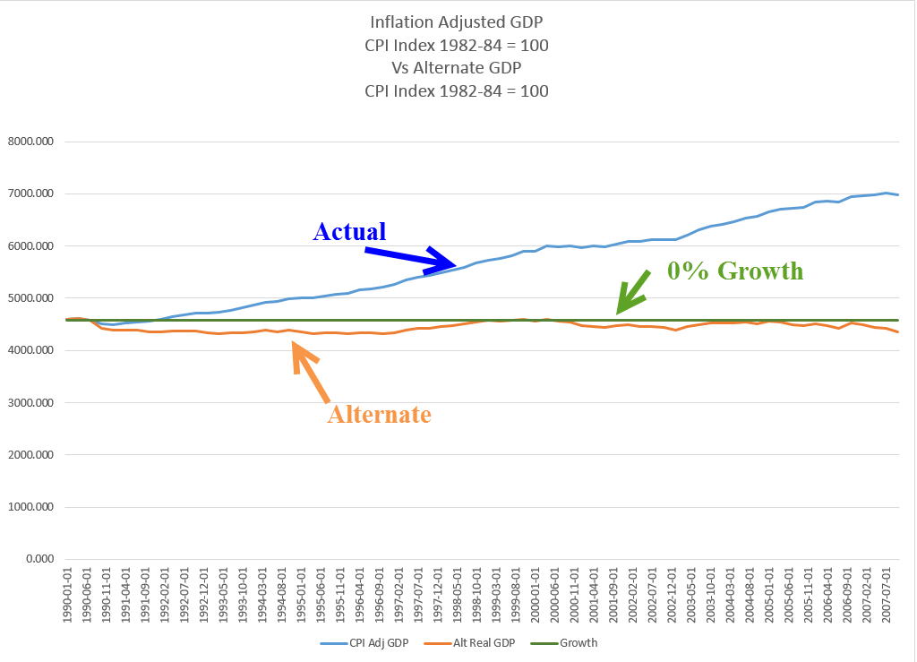
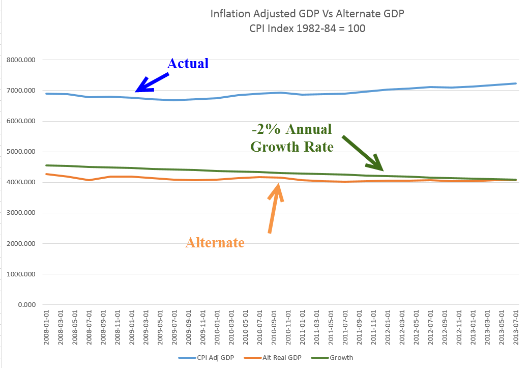
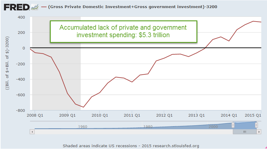
There are two types of spending – today and tomorrow.  Spending for today is consumption.  Spending for tomorrow is investment.  Both types of spending drive demand for goods and services.  The paucity of private investment since 2007 is at levels not seen since the years immediately following World War 2.

Although government investment is a relatively small percentage of GDP, that has also fallen to historically low levels.

The sum of private and government investment as a percentage of GDP is shockingly low.

If we use 2007 investment levels as a base, the accumulated lack of investment is far more than the $4 trillion that the Fed has pumped into the economy.

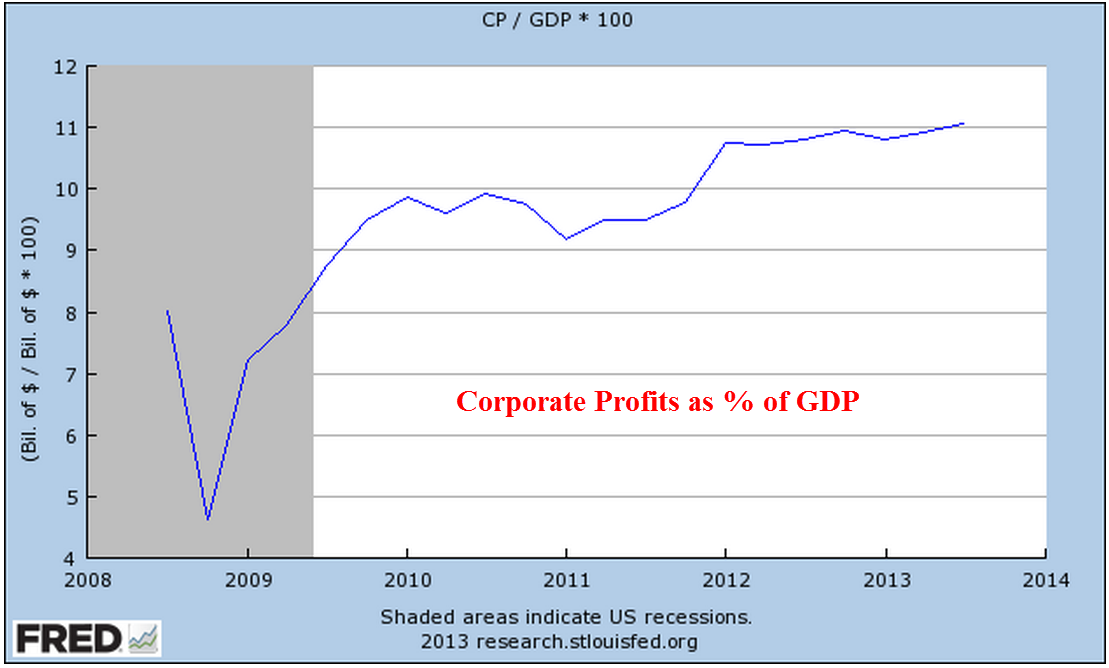
The Fed’s injection of money into the system is primarily spent on government consumption, or today spending, which is helping to offset the lack of investment spending.  As investment spending rises, the Fed has been able to stop adding to its portfolio, although this “tomorrow” spending is still so low that the Fed can not begin to lighten its portfolio of government debt.

Advocates – economist Paul Krugman for one – of greater government investment spending, even if it borrowed money, hope to offset the lack of private confidence in the future.  Previous government stimulus spending did have little effect on overall economic growth simply because it did little more than offset the lack of long term confidence by those in the private sector.

Dance Partners

January 18, 2015

When investors are grumpy, good news is not good enough or it is too good.  Confidence among small businesses climbed to levels not seen since late 2006 and the positive sentiment was broadly based, including new hiring and plans for expansion.

On the other hand…December’s 9/10% decline in retail sales was a surprise after a strong November.  However, a closer look at the retail figures shows some real positives.  The year-over-year gain was 2.6%, above the 1.7% core inflation rate, indicative of modestly  growing demand.

Excluding retail gas sales, retail sales gained 4.8% over last year.

Now, let’s put gas sales in some historical perspective.  In January 2007, the price of a gallon of gasoline was $2.10, about the same as it is now.  On average, we are driving more fuel efficient vehicles than in 2007, yet total retail gas sales are 25% higher now.

Every six weeks, the Federal Reserve releases their Beige Book survey of economic conditions around the country.  They also reported moderate growth in employment and sales.  They noted that flat wage growth and low inflation reduces any urgency in raising rates.  Friday’s release of the CPI confirmed the low inflation rate.  Including gas and food, the yearly increase was only .7%.  Core inflation, which excludes gas and food prices, rose 1.7%.  Consumer sentiment is nearing the levels of the early to mid-1980s, the beginning of a period of strong growth.

For now, stocks and oil prices are dance partners.  In a week of negative sentiment, traders were watching the 1975 level on the SP500.  This was mid-December’s bottom, a short-term key level of support.  After Thursday’s close near 1990, stocks rallied on the strong consumer sentiment and a report from the International Energy Agency that lower prices are causing some oil production cuts. Fourth quarter earnings season has just begun but if volatility in oil prices remains strong, this may drive market sentiment at least as much as earnings reports.

************************

Job Openings (JOLTS)

November’s job openings showed a slight increase, getting ever closer to the 5 million mark and nearing an all time high set in the beginning of 2001 as the dot-com boom was ending.  This summer open positions surpassed the mark set in June 2007 at the end of the housing boom.

The  economy grows stronger on many fronts – labor, retail, housing and industrial production – and is near multi-year high marks without the help of a widespread boom in any one sector of the economy.  The surge in oil  shale production is confined to a few states.

*************************

Portfolio Allocation

As the market remains somewhat volatile, it’s time to revisit a familiar theme – allocation.  Let’s look at a selection of portfolios with moderate allocation. How much difference has there been between a portfolio with 60% stocks and 40% bonds (60/40), and one with 40% stocks, 60% bonds (40/60)?

Earlier in the year, I mentioned a site  that can backtest a pretend portfolio.  In the free version, the re-balancing rules are fairly simple but it does allow us to make some comparisons of long term trends.

All of the following tests include the years 2000 – 2014, a period which covers two downturns.  The first, from 2000 to 2003, was a protracted decline after the dot com bubble.  The second, from late 2007 to 2009, was severe.

The test includes an annual re-balancing to get to the target percentages, and assumes a modest investment of $100 each year into a $10,000+ portfolio.  Because of the two downturns, it’s no surprise that the portfolio weighted toward bonds did better than the portfolio weighted toward stocks.

The difference between the 60/40 and 40/60 was about 7/10% in annual return.  If we were to use intermediate term bonds as a proxy for the bond component of the portfolio, the difference would be even less.  In the middle range of allocation models, the differences in returns over a long period of time are probably smaller than what we worry about.

The importance of moderate allocation is illustrated by the following two examples.  Let’s consider the period from 1995 – 2014, which includes three market rises and two downturns.  Note the ratio: three up to two down.  If we compare a portfolio of all stocks to a balanced portfolio of 50% stocks and 50% long term bonds, we see that it is only in the past five years that the all stock portfolio finally meets the return of the balanced portfolio.

Long term bonds are especially sensitive to changes in interest rates so let’s look at a balanced portfolio of stocks and intermediate term bonds.

In this case, it is only in the past two years that the total return of the all stock portfolio has outperformed the balanced portfolio.  One of the those years included an unusual 30% gain in one year.  In short, it is hard to argue against a balanced portfolio over a long period of time.

Lastly, the example below shows a slight advantage to re-balancing a portfolio.  However, the additional .2% gain each year should not cause us to lose sleep if we forgot to do this for a few months.

****************************

Oil Prices

Oil suppliers are pumping down their inventories as global demand for oil weakens.  More product, less demand = lower prices. In a standard economic model, customers want more of a good at a lower price.  Suppliers are less willing to supply a good at a lower price.  Eventually, suppliers and customers reach an equilibrium at a certain price.

What happens in a price war does not follow this simplified textbook model.  Suppliers with deep reserves try to drive out other suppliers by flooding, or at least over supplying, the market, thus driving the price down.  More units are bought but at lower prices, so the value of gross sales may be lower even though the units sold is higher than before.  The profit on each unit sold, or marginal profit, gets lower and may get negative for a time till the more vulnerable suppliers leave the market.

The governments of Venezuela, Russia and Nigeria depend on oil revenues for much of their income.  Should oil prices stay below $50 for half a year or more, these countries will be pressed to curtail social benefit programs and infrastructure projects.  The interest rates on their bonds will increase as investors price in a greater risk of default.

Sudden changes produce fractures.  Fractures produce frictions. Frictions dissipate in a cascade of minor adjustments or suddenly in a violent upheaval.

GDP, Profits, Inflation

December 22nd, 2013

Merry Christmas!

Last week I reviewed several decades of trends in corporate profits, as well as the 1990 change in measuring inflation that has helped increase corporate profits as a share of GDP.   (For those of you interested in the inflation controversy, here is an article that provides some additional insight.)  This week I’ll look at patterns in the economic growth of this country that sheds some light on recent events and provides some context to understand ongoing trends.

During the 30 years following World War 2, the economy grew at an annual rate of 3.7% after inflation.  Population growth was about 1% per year.  Productivity growth was about 1 – 1.5%.  Government spending, including debt, grew a bit more than 1%.  The chart below shows the compounded annual growth rate.

But I think the story is more clearly told by a different chart constructed from the same data.  The growth rate trend is more easily visible and it is the change in this trend that I will be focusing on.

During the 1970s, an economic trend known as staflation increasingly took hold. This period of high inflation, coupled with slowing growth and growing unemployment, was not thought possible by economists using theories proposed by John Maynard Keynes in the 1930s, during the Great Depression.  In 1974, economist Arthur Laffer first sketched out a theory that tax cuts would stimulate the economy.  As the Federal debt began to rise in the mid to late 1970s, few wanted to take a chance that lower tax rates would produce more revenue for the Federal Government.

The 1980s began with back to back recessions and the highest unemployment since the 1930s Depression. Big spending and tax cuts during the 1980s dramatically increased the federal debt but did little  to spur growth.

During this 13 year period, profit growth slowed to 2.4%.  The myth that the 1980s was a high growth era continues to live in the minds of political pundits.  In a WSJ op-ed on Dec. 18th, Daniel Henninger referred to “the high-growth years of the Reagan presidency.”  Myths live on because they serve a purpose to those who cherish them.  The cardinal rule of politics is “Disregard the Data.”

In 1990, economists at the BLS adopted what is called a hedonic methodology to computing the CPI.  Used by other OECD countries, this supposedly more accurate assessment of the growth of inflation shows a lower growth rate of inflation.  This naturally increases the growth rate of inflation adjusted GDP. (GDP dollars each year are divided by the inflation rate to get the real growth rate.)

The conventional narrative is that the 1990s was an explosive growth period of new technology and growing globalization.  From the beginning of 1990 to the start of 2000, stock market values grew four times.  After the bursting of the internet bubble, 9-11, and the recession of 2001, the economy recovered.  By the mid-2000s, the unemployment rate was less than 5%.  While that may be the conventional narrative, the growth of the economy from 1990 to 2007 was just as slow as the period 1978 – 1989.

Remember that this slow growth would have been even slower if the BLS had not changed their methodology for measuring inflation.  To recap, the 30 year real growth rate of GDP after WW2 was 3.7%.  The following 30 year growth rate was 2.3%.  But that later 30 period is marked by a sharp rise in consumer borrowing.   Without that escalation in borrowing, growth would have been meager.

Families with two incomes borrowed against their homes, drove up the balances on their credit cards and still GDP growth was slow.  Let’s construct a fairy tale, what economists call a counterfactual.  What if the BLS had not changed to this new methodology in 1990?  What would be the growth rate of GDP using an alternate measure of inflation?

The resulting growth pattern is 0% for the 18 year period and is more consistent with the experiences of many workers and families in this economy.  The change in the measurement of inflation has greatly helped mid-size and large size companies.  An understated inflation rate reduces labor costs by reducing cost of living adjustments to salaries and wages.  In addition, companies can borrow at lower rates since many corporate bonds are tied to the inflation rate.  American companies did not engineer this revised methodology of measuring inflation but they have been the largest beneficiaries of the new policy.

In 2008, the financial poop in the popcorn popper began to pop.  In the past 5+ years, we have experienced less than 1% real growth, not enough to keep up with population growth.  Of course, most people are wondering “what growth? It sure doesn’t feel like growth!”

The story may be told more accurately by looking once again at a comparison of inflation adjusted GDP with an alternate version of GDP, one that more realistically reflects inflationary pressures.  This chart shows a decrease of 2% per year.

Did the BLS adopt this methodology under political pressure?  Perhaps.  More likely, it was an alignment of econometric theory with political and corporate interests.  The reduction in published inflation rates did slow the growth of payments to Social Security recipients and reduced Medicare payouts to physicians and hospitals, thus shrinking budget deficits.  The government saves money, corporations make extra money, but – quietly and slowly – families lose money.

Annual cost of living adjustments to Social Security checks have been reduced but the decreased income has forced more seniors to seek assistance through the food stamp program, now called SNAP.  A politically neutral change in the measurement of inflation thus becomes a way for politicians to introduce a means testing component to Social Security income.  Instead of reducing payments based on income, payments are reduced to all recipients and poor seniors are targeted for additional benefits.  Congress has increased eligibility for the food stamp program so that seniors who are dependent on that extra income can receive it in the form of food stamps.  If the BLS had not changed their methodology, seniors would receive appoximately 60% more each month and many wouldn’t need the food stamps in the first place.

With this history in mind, let’s turn to this week’s revisions of GDP and corporate profits for the third quarter ending in September.  The real, or inflation-adjusted, growth of 3rd quarter GDP was raised to a 4.1% annualized growth rate in the third quarter, largely on upward revisions of consumer spending.  Contributing to stronger GDP growth has been a worrisome increase in company inventories, which probably influenced the Federal Reserve’s decision this week to keep any tapering of their QE bond purchases to a minimum.

Corporate profits for the third quarter were revised higher as well.  As a share of GDP, corporate profits continue to reach all time highs.

How likely is it that economists at the BLS will change their methodology to reflect inflationary pressures before we make choices in response to rising prices?  The subject is not easily encapsulated in a sound bite or a short slogan on a placard.  In the 1992 presidential race, independent candidate Ross Pierot was able to use charts to make a point with many voters but few politicians are very good at the easel and unlikely to bring up the subject in the public forum.  Families and workers will continue to suffer and politicians will create more social benefit programs to help those hurt by problems that politicians themselves have either created or failed to address.  Large and mid sized businesses will continue to enjoy the additional slice of pie.

Up, Down, Round and Round

November 10th, 2013

Friday’s release of the monthly employment situation showed strong net job gains of 204,000 jobs and big upward revisions to the previously reported gains in August and September. The market should have reacted negatively to these positive numbers (yeh, go figure) in anticipation of the Fed tapering their stimulus program of monthly bond purchases.

But first we must go back to Thursday. The first estimate of real GDP growth in the third quarter came in above even the most optimistic forecasts at 2.8%, about a full percentage point above second quarter growth.  The primary reason for the gains though was the continuing build in inventories.  Inventory building is good in anticipation of robust sales but, as I’ll cover later, consumer spending has not been so robust.  The market reacted to the report with it’s largest daily loss in a few months.

On Friday, the employment report was released an hour before the market opened.  Trading began at the same level as Thursday’s close with little response to the strong job gains.  We can imagine that traders were twittering furiously to each other in the opening hour, trying to gauge the sentiment.  Buy in on strength in the employment numbers or sell on the strength in the employment numbers?  After the initial hesitation, the main index gained continuing momemtum throughout the day, with a final spike at the closing bell.

After digesting some of the numbers in the report, I think that traders realized how weak some of its components were, dimming the probability that the Fed will ease up on the gas pedal.  The Consumer Sentiment Survey, released a half hour after the opening bell, showed a continuing decline.  Within minutes, the market started trading higher.

The first number popping in the employment report is the 702,000 people who dropped out of the labor force.  To put that number in perspective, take a look at the chart below which shows the monthly changes in the labor force for the past ten years.  This is the second worst decline after the decline in December 2009, shortly after the official end of the recession.

This month’s .4% steep drop in the Civilian Force Participation Rate ties the record set in December 2009 when the economy was still on its knees.  The rate has now fallen below the 63% mark, far below the 66% rate of several years ago.

Employment in the core work force aged 25 – 54 actually dropped this past month.  Classifications of employment by age, sex, and education come from the survey of households, not employers, and may have been affected somewhat by the goverment shutdown. But the numbers of the past years show that there has been no recovery for this segment of the population.  In each lifetime, there are stages that last approximately twenty years.  This time of life should be  about building careers, building families, building assets and growing income.  I fear that for too many people in this age group, the slowly growing economy has not been kind.  This affects both a person’s current circumstances and dampens prospects for the future.

The headline job gains and classification of the types of jobs come from a separate survey of employers called the Establishment Survey.  Employers report their payroll count as of the 12th of each month.  Because they received paychecks, federal employees furloughed during the government shutdown in the first two weeks of October were still counted as employed in October.

There were some strong positives as well in this report.  Retailers added 44,000 jobs, above the average gains of 31,000.  This year’s gains have been the strongest in fifteen years.

The gains are about half of the eye-popping gains of the past fifty years, but they indicate a confidence among retailers.  Retail jobs are often the first job of many younger workers, who have endured persistently high unemployment during this recession. Here’s a glance at yearly job gains in the retail sector for the past fifty years.

As the holiday shopping season gets underway, all eyes will turn to the retail sector as an indicator of the consumer’s mood.  The U. of Michigan Consumer Sentiment Survey, released Friday, showed a continuation of an erosion in consumer confidence.  After peaking during the early summer at 85, this index has declined to 72, about the same levels as late 2009 when the economy was particularly weak.  The Expectations component of this survey, which reflects confidence in employment and income, has declined to about 63.  Gas prices have been declining, inflation has been near zero, and stock and home prices have been rising but this survey shows a steady decline in confidence.  The government shutdown probably had some effect on the consumer mood but the budget battles are not over.  This is the 7th inning stretch and few are standing up to sing “America The Beautiful.”

Professional Services and Health Care have been consistent leaders in job growth for the past few years but gains in these sectors have declined.  The unemployment rate notched up to 7.3% from 7.2%.

In a catch up effort after the recent government shutdown, the Dept of Commerce released data on factory orders for both August and September.  While the manufacturing sector as a whole has been strong, the weakness in new orders in these two months indicates a tempering of industrial production in the near future.

When adjusted for inflation, the level of new orders is still below the levels of mid-2008.

If we zoom out ten years, we can see that we at about the same levels as late 2005.

ISM released their monthly non-manufacturing survey, showing sustained and rising strong growth at just over 55, up a point for the previous month.  I’ve updated the CWI that I’ve been tracking  since June of this year.  A three year chart shows that even the troughs are part of a sustained growth pattern.  Furthermore, the span of the troughs keeps getting shorter, indicating a structural growth in the economy.

Let’s look back six years and compare this composite index of economic activity with the market.

The monthly report of personal income and spending released Friday showed less than 1% inflation on a year over year basis.  For the second month, incomes increased at an annualized rate of 6%, yet consumer spending remains sluggish.  The chart below shows the year over year growth in spending for the past twenty years.

A longer term graph shows the current fragility in an economy whose primary component is consumer spending.

Both the manufacturing and non-manufacturing portions of the economy continue to expand.  Employment has risen consistently at a level just above population growth.  Inflation is tame but so is consumer spending.  Income is rising.  Budget battles loom.  Expectations for holiday retails sales increases are modest.  Will the Fed ease or not ease?  The medium to long term outlook is positive, but with a watchful eye on any further declines in the momentum of consumer spending growth. The short term outlook is a bit more chaotic.  We can expect further wiggles in the stock market as traders rend their garments, struggling  with Hamlet’s dilemma: To buy or not buy?  To sell or not sell?

Employment and Government Shut Down

Earlier this past week there were rumors that, due to the government shut down,  the Bureau of Labor Statistics (BLS) might not release the monthly employment report on Friday.  The employment report is probably the foremost key indicator that guides stock and bond market action as well as a prime metric used by the Federal Reserve in the determination of future monetary policy. On Thursday, the BLS confirmed that they would not release the report, which prompted a drop in the stock market, followed by an almost equal rise over the next day.

On Wednesday, ADP released a tepid 166,000 estimate of net job gains for September accompanied by a downward revision of their August estimate.  On Thursday, the weekly report of new unemployment claims held no surprise.  Traders probably figured that they had enough information to guesstimate the BLS number of net job gains – tepid growth a bit above the 150,000 needed to keep up with population growth.  In short, there was less likelihood that the Federal Reserve would be tapering their QE program before the end of the year.

So this is a good opportunity to take a look at some historical employment trends.  Measuring wage growth and inflation adjustments to wages is a complex task, far more complex than the gentle reader wants to delve into.  Labor economists crunch a lot of regional employment data gathered by the BLS.  Whenever there is a wealth of data, there is also a wealth of ways to treat that data, which data to focus on, etc.  Some economists focus on median compensation.  The median represents the middle, i.e. 50% of workers make more than the median, 50% make less.

In a 2011 paper published by the Economic Policy Institute (EPI), author Lawrence Mishel states  “Between 1973 and 2011, the median worker’s real hourly compensation (which includes wages and benefits) rose just 10.7 percent.”

“Real” means inflation adjusted but there are different methods used to calculate inflation.  One method, the Consumer Price Index, or CPI, has been changed over the years, making it difficult to make comparisons of data.

For a longer term perspective into the controversy over measurement, let’s turn to a graph of real output and total compensation per hour worked for the business sector.  Here we see a narrowing between compensation and output until output crosses above compensation in the mid-2000s.

The flattening of compensation growth is shown when we focus on the past twenty years.

But the hourly data seemingly contradicts the claim that there has been only an 11% increase in real compensation over the past forty years.  Looks like the total compensation of all workers has risen about 40% or more in the past forty years.  How can the median growth be so far below the total?  To understand that, a reader would have to examine the data sources behind the claim.  We might find that median weekly, not hourly, compensation has risen only 11%.  This could be due to more part time workers, or the rising percentage of women in the labor force who generally work fewer hours than men. What we do know is that a competent economist can find or crunch the data to prove his or her point.

The ability to work empirical magic with data often leads to contradictory claims by noteworthy economists.  The contentiousness of the discussion among economists baffles the intelligent reader.

Let’s return to that bugaboo mentioned earlier: measuring inflation. Twenty years ago, economists Brian Bosworth and George Perry noted the trending gap between output and productivity: “In an economy where real wage growth has paralleled the rise in productivity over the long run, this apparent divergence implies that the benefits of increased productivity have not been distributed in the expected way over the past two decades.”  A chart from their paper illustrates the trend.

A notable trend in the numbers is the steep rise of employee taxes and benefits, or non-wage employer costs.  Economists or politicians sometimes point to the decline in the real hourly wage over the past forty years, without bothering to note the growing non-wage costs of employment, a convenient omission.

Bosworth and Perry document problems and changes in measuring inflation in both consumption and output but noted that “the prices that workers pay as consumers have been rising significantly more rapidly than the prices of the products they produce.”  Further analysis by the authors shows that the wage growth in that twenty year period 1973 – 1993 did not flatten till after 1983.  They conclude that the major reason for the divergence is the difference between how inflation was measured before and after 1983. The authors recommended the use of a Personal Consumption Expenditure (PCE) deflator instead of the CPI, which overstates inflation relative to output.

Let’s look at wage growth over the past twelve years using two methods to see the difference.  The BLS calculates real wage growth using the CPI-U inflation index (Source).  Here is a graph from their data.

Now let’s use the PCE deflator to get a slightly different picture of the same Employment Cost Index.

Now let’s compare the two.

They tell two different stories.  Using the CPI inflation adjustment, the blue line, I could tell a story that wage growth has stagnated over the past ten years.  Using the PCE inflation adjustment, I could tell a story that wage growth has stagnated since the financial crisis.

Now imagine a politician who wants to bash the policies of former President George Bush and exalt the policies of the current administration.  That politician would use the blue line to tell the story of how the Bush Administration undercut the wages of American workers and that this led to the worst recession since the Great Depression.

On the other hand, if a politician wanted to criticize the Obama administration, she would point to the red line.  Worker’s wages grew during the Bush years.  Since Obama took office, wages have stagnated, indicating that Obama’s policies are hurting American workers.

Thus a dense and complicated argument on how to measure inflation becomes a talking point for a politician.  Even worse, noteworthy and popular economists who understand the difficulties of measuring both employment and inflation choose one line or the other to tell a simple story based on their own bias.

During this ongoing government shut down, we will hear a lot of spin and invective.  The profusion of TV, radio and internet media sources ensures that anyone can choose exactly – to a ‘T’ – the version of reality that they want to hear.  Of course, our sources and opinions are unbiased and perfectly reasonable.  But can you believe what the other side is saying?  Boy, are they crazy!

Grandpa’s Index

May 26th, 2013

Last week I wrote about the various benefits, particularly Social Security, that are based on the Consumer Price Index and the discussions about alternative measures of increases in the cost of living.  The term “CPI” is a general term for a specific index, the CPI-U, a widely used index of prices for urban (hence, the “U”) consumers that the Bureau of Labor Statistics compiles.

Today I’ll look at an alternative measure, the CPI-E, or Elderly index, which weights the expenditures of elderly consumers differently.  Since the sample size of this population is relatively small, the BLS warns that it is more prone to sampling error, i.e. that the sample may not accurately reflect the characteristics of the entire elderly population.  For the past decade or so, seniors have argued for cost of living increases in Social Security payments to be based on such an alternative measure.  Using the latest BLS survey comparison data, I constructed a chart to show the differences in weighting of the larger components of the CPI-U, the commonly used index, and the CPI-E, the Elderly index.

Housing and medical expenses are weighted significantly higher in the Elderly index.  A survey by the Employee Benefit Research Institute (EBRI) found that over 80% of 65 year olds own their own home.  The mortgage component of total housing costs stays relatively steady for the younger group of elderly, yet the CPI-E that the BLS compiles shows a 4% increase in this component.  The EBRI survey found that homeownership declines rapidly after 75, and it is this older group of the Elderly for whom housing costs rise.  The question is whether the CPI-E can be properly sampled and compiled to show a more accurate picture of costs for the elderly.

The medical component of the elderly index is almost twice that of the general urban population.  Although seniors have access to the subsidized Medicare program, the premiums for Medicare and costs not covered by Medicare are now borne by the elderly, rather than being fully or partially supplied as part of an employee benefit package.  In addition, people access more medical care as they age.  The combination of these two factors make it feasible that medical costs would be significantly higher for seniors.

Inaccuracies in measuring the housing component of the elderly index will be brushed aside by seniors receiving SS benefits.  Whatever measure increases benefits – well, that’s the most accurate one, of course.

An interesting note is the change in recent years of housing costs as surveyed by the BLS.  In 2007-2008, housing was 42% of total expenses.  After the housing and financial crises, that component had dropped to about a third of total expenses. (Source)

But the December 2012 CPI-U index does not reflect the results of more recent findings of BLS personal expense surveys because they are using 2009 -2010 weightings. (Data)

The largest part of the discrepancy between the actual changes in cost of living expenses and the published index is probably the “Owners Equivalent Rent” portion of housing costs which don’t reflect actual costs at all.  Instead they are a calculation of what a home owner would have to pay herself to rent her own home from herself.  No doubt, BLS economists would defend this phantom calculation as accurate but this calculation was never designed to allow for the precipitous drop in housing prices that we have experienced in the past few years.

Based on BLS surveys of actual, not the adjusted, cost of housing changes, there is a good case to be made that the economy is experiencing a continuing mild deflation, not mild inflation. Deflation has become an ugly word. Social Security payments, labor contracts and a host of benefits are tied to the CPI and rely on the cost of living to increase, not decrease.  Lawmakers in Washington have, in fact, mandated that Social Security payments can not decline if the CPI turns negative.  Deflation is reviled almost as much as too much inflation.  The Federal Reserve has a target of 2% inflation, meaning that it should start pulling money out of the economy if inflation rises above 2%.  On the other hand, the Federal Reserve should be pumping money like there’s a five alarm fire if inflation has turned negative.  Has the Fed been pumping money?  Yes.  Ben Bernanke, Chairman of the Fed, prefers to look at Real Personal Consumption Expenditures.  Per capita expenditures have just now risen above 2007 levels.

While some inflation watchers are shouting “The sky is falling” as the Fed continues to pump money into the economy, Mr. Bernanke is looking at the big picture and its tepid.  Tepid means fragile.  Here’s the big pic of the last 15 years or so.

Growth has moderated.  Bernanke has to be worried that low interest rates and continued purchases of mortgage securities by the Fed is helping inflate a stock bubble but he is equally concerned at the slower growth of the economy.  Despite the headline CPI numbers of below 2% inflation, the reality is that it may be closer to 0% than the headline index indicates.

What’s behind that slower growth of spending?  Look no further than something I write about each month, the lack of growth in the core work force, those aged 25 – 54.  These are the people who buy stuff and if a smaller percentage of them are working, then they buy less stuff.  Less stuff buying reduces inflationary pressures.

Widgets and Labor

March 9th, 2012

Labor costs are the major share of the expense of producing goods and services.  While the percentages vary by industry, a rule of thumb is that labor is about 70% of the final cost of a product.  The cost of labor to produce one widget should keep rising with inflation.  With the passage of time, widgets sell for more and employees demand more pay to produce those widgets.  Not surprisingly, the Bureau of Labor Statistics keeps track of the labor cost to produce widgets; they call it Unit Labor Cost.  In laymen’s terms we can think of it as the Widget Labor Cost.  The cost is indexed to a particular year year; in this case it is 2005.  If the labor cost of a widget was $2.43 in 2005, we’ll set that to 100.  Indexing makes what might seem like arbitrary numbers more uniform.  If the labor cost of a widget in 2012 is $2.67, then the index would read 110, or 10% more than 2005.

Widget labor costs typically fall or flatten out in a recession.  A graph of the past ten years shows that we still have not reached 2007 levels.

Keynesian economists say that labor costs are “sticky”, i.e. they do not decline in proportion to the downturn in the economy and the reduced demand during a recession.  Wages are the price of labor. Union contracts and employment laws do not allow these prices to fall to what is called the market clearing level.  Labor prices thus become too expensive and employers want less labor, resulting in higher unemployment.

Several decades of data allows us to see some changing growth trends in the labor costs to make widgets.

As I noted earlier, labor costs rise with inflation.  The graph below shows the relationship between the two.

After WW2, the rise in labor costs was just slightly ahead of the rise in inflation, allowing workers a greater standard of living and to put away some money for the future.  During the “stagflation” of the 1970s, this gap widened as workers demanded more pay in response to rising inflation while economic growth stagnated.  When the economy recovered in the mid-1980s, we began to see a narrowing between unit labor costs and the rate of inflation.  Had this narrowing stopped around the year 2000 and labor costs continued rising with inflation we would have a healthier work force and a healthier  economy.  But the gap narrowed further until labor costs were no longer keeping up with inflation.  Dwindling increases in labor costs have resulted in more profits for companies.  Although the labor market has a strong influence on the stock market, it is an indirect influence.  Stock prices are directly influenced by rising corporate profits and the perception that future profits will increase at a faster or slower rate.

Because wages do not rise and fall in proportion to the swings in the business cycle, companies took the only course of action left.  They reduced the labor component cost of their goods and services where they could.  Union contracts offer a company less flexibility in responding to downturns in the economy.  Companies reduced their exposure to union labor by outsourcing production to other countries, or by subbing out production to smaller companies with non-union workforces.  

Many people have been waiting several years for employment to recover.  As the chart above shows, there has been a systemic decrease in labor needed to produce each widget.  There is little indication that this trend will end as the economy continues to recover.  Since this economy is consumer driven, it is dependent on a healthy labor market.  A stumbling labor force will not produce robust gains in the economy. 

That is the background, the context for a look at February’s monthly labor report from the BLS, a better than expected report.  The headline job gain was 236,000, far above the 170,000 anticipated employment gain.  The unemployment rate dropped to 7.7% and the year over year decrease in the unemployment rate indicates little chance of recession.

There were other positive signs in this latest report.  Average hourly earnings of private-sector production and nonsupervisory employees broke above $20, increasing to $20.04.  After rising and stuttering last year, earnings have increased steadily since August 2012.  Despite these gains, hourly earnings of production employees are little changed from 1965 levels.

A slowly improving economy gave some hope that we might see the number of discouraged unemployed workers decline below 800,000 this month.  Instead the number rose from 804,000 to 885,000.

The Labor Force participation rate dropped another .1%.  Fewer and fewer workers are being asked to shoulder the benefits of the retired and unemployed.  The core work force aged 25-54 is still showing no substantial improvement.

While employment gains in the 25 – 54 age group have stagnated, the larger group aged 25+ continues to show improvement.  The unemployment rate for this larger group declined another .2% and now stands at a respectable 6.3%.  The employment picture for new entrants into the labor force, those aged 16 – 19, remains bleak.  This past month, the rate of the unemployed in this group increased and now stands at 25%.  Hispanics have seen a 10% decrease in unemployment during the past year but there are still almost 10% unemployed.  The minority group that has suffered the most through this recession has been African-Americans, whose unemployment rate has stayed subbornly high.  There have some small declines in unemployment over the past year, but almost 14% of this group is unemployed.

However, a group that has had persistently high unemployment, those without a high school diploma, saw a significant decline from 12% to 11.2%.

A significant contributor to that decrease is the steady rise in construction employment.

Perhaps not so widely followed is the “Craigslist indicator of construction activity.”  No, you won’t find this one charted anywhere but it does give a clue to what it going on in your area.  Search for “work van”, “work truck”, “step van” or “cube van” in your local Craigslist.  If there are a lot of listings, it means things are not good.  A few years ago, the Denver area used to have pages of work vehicles for sale by both owners and dealers.  This month there are few listings.

Other positives were the increase in the weekly hours worked to 34.5, in the pre-recession range.  Health care enjoyed strong gains as usual.  Professional and business services enjoyed strong gains, offsetting the unusually flat gains of January.  A rise in retail hiring was a nice surprise.

A bit of a head scratcher was the revision of January’s job gains, erasing 25% of the 160,000 job gains that month.  Revisions of that size leads to doubts about the winter seasonal adjustments that the BLS makes to the raw data. 

There are still 3 million fewer people working than in January 2008, when the BLS reported employment of 138 million.

In the past week the Dow Jones Industrial average crossed above the high mark of 2007.  On an inflation adjusted basis, the Dow is still well below the level it attained in 2000 and has still not passed 2007 price levels.  Some argue that the average 2.2% in stock dividends paid out each year partially compensates for the 3% loss in purchasing power.  Others argue that the dividend is compensation for the risks the investor assumes in the stock market and should not be taken into account.  If we disregard dividends, the inflation adjusted SP500 index is – well, it’s better than it was in 1990.

If a buy and hold investor has been in the market since 1990, she has gained 4% per year after inflation.  Adding in a dividend yield of about 2.5% over that time results in a total gain of 6.5%.  Had she bought a 30 year Treasury note in 1990, she would have been making about 8% per year for the past 23 years.  There are three lessons to be learned from this:  Diversify, diversify, diversify.

Auto Sales

Auto sales have been one of the strong parts of the economic recovery in the past couple of years, as shown in the graph below.

The industry had been beaten down during the recession as consumers got by with whatever they were driving.  Looking back over the last thirty years, we can see that we are still below a healthier annual average of about 14 million cars and trucks sold, and far from the peak levels of 17 million.

But something more fundamental has changed.  We are simply buying fewer new cars per capita.  Below is a graph of the number of new cars sold divided by the population.

We are making our cars last longer.  The quality and safety of cars has certainly improved but we are simply spending less money per capita on automotive transport.  Below is a graph of per capita spending on new autos and auto parts.  In 2012, we are spending about the same amount of money as in 1998, despite 14 years of inflation.  In real inflation adjusted dollars, we are spending a little less than what we did in 1992.

What these figures do not include is a comparison of the cost of repairs, car insurance and, chief of all, the cost of gas to feed our four wheeled beasts of burden.

Below is a chart of the weekly average price of gasoline in the U.S. since 1990.

If a gallon of gas cost $1 in the early nineties and the price of gas went up with the rate of inflation, we would expect to pay about $2.30 today.  Instead we are paying closer to $4 a gallon.  Indexed to inflation, the cost of gas reached its peak under the Bush administration but gas prices are approaching that 2008 peak.

I have already heard several political ads saying that when Obama came into office, gas was $2.50 a gallon and now the price of gas if $4.00 a gallon.  Sure, gas was $2.50 a gallon when Bush left office.  Oil prices had plummeted in reaction to the global financial crisis.  Political ads trust that our memories are short and that we have forgotten just how high gasoline prices had climbed during the Bush administration.  Since the average of gasoline prices are relatively lower during the Obama administration than the 2nd Bush term, should we then conclude that Bush’s energy policies were bad and Obama’s are good?  The fact is that presidential policies have a teeny tiny effect on the price of gasoline.  Political ads and the money machines behind them are like the shell game operators on Times Square in New York City.  They hope we are gullible enough to believe their illusions.

The Big Picture

Or maybe the title of this post should be “The Big Pitcher”.  No, it’s not about a tall baseball pitcher, but the glass pitchers that central banks around the world hold.  What comes out of the pitcher when the central banks start pouring?  Money.  How do they do that?  It’s magic.  Don’t you wish you had a money pitcher?

Jerry forwarded me an article by someone at Matterhorn Asset Management, a Swiss asset management company that invests primarily in metals as a wealth preservation model so they will have a predisposition to a gloomy outlook because investors’ fears will bring more business to the company.  That said, the article presents a 200 year review and outlook on the mechanics of inflation and rather dire long term predictions for the world economy.

Featuring a 150 year chart on the Consumer Price Index and another one of US Debt to GDP ratio, this 6 page article definitely takes a long view of events in the past in making prognostications of the future. 

A comparison of the 19th and early 20th century with the latter part of the 20th century has to be put in a bit more perspective than this article does.  Electricity is something we take for granted but its effect on our lives has been as profound as the discovery of fire and the invention of cooking.  It is an energy that is readily available to most people in developed countries.  This ready source of energy has radically transformed our society, our productive capacity and our demand for products that use this energy.

In the 1920s, the new industry of radio telecommunications kicked off a bubble in the stock market.  Some predicted that we would walk around with communication devices that we wore on our wrists.  Information would be readily available to all with these cheap and portable two way radios.  It would be another 70 years before this dream would become a reality with the internet and the dawning of the cell phone age.  That in turn prompted another stock bubble in the late nineties.

When countries around the world abandoned the gold standard in the past century, they did so because the supply of gold could not keep up with the rapid expansion of production and demand that accompanied the energy and communication age.  How profound has this expansion been?  Several historians have noted that a person living in Boston in 1780 would have felt familiar with most of what surrounded him in that same city in 1900.  Jump ahead another 50 years to 1950 and that same person would be totally disoriented in a city with electricity, flashing lights, automobiles, subways, TVs, radios and the sheer growth in the population of the city.

The gold standard simply could not accommodate this rapid expansion of economic activity.  However, the gold standard put brakes on the centuries old tendency of sovereign countries to print money or debase the currency.  After abandoning the automatic regulatory mechanism of the gold standard, we have found nothing comparable to provide some restraint on central bankers other than a trust in the wisdom and foresight of those like Ben Bernanke, Chairman of the Federal Reserve.  An entire world of billions of people depends on the wisdom of several hundred individuals making decisions at central banks around the world.  It is a daunting and vulnerable position we find ourselves in.

Returns After Inflation

“So how has your stock portfolio done the past ten years?”

” Well, not good but after the run-up this year, not bad. I think I’m about even.”

The Dow Jones index is about the same as it was 10 years ago, a fact that might mislead some investors into thinking that they have broken even during the past decade. They would be wrong. Adjusting for inflation, the Dow is down about 25% over the past ten years. Think that’s bad? Fly across the pond to Europe and look again at the U.S. market. In Euros, the Dow has lost 25% in nominal terms since 1999 without accounting for inflation. If we adjust for inflation … well, we better not. It’s too depressing.

Returns on any investment have to account for inflation, which averages about 3% over the past several decades.