The Flame of Fame

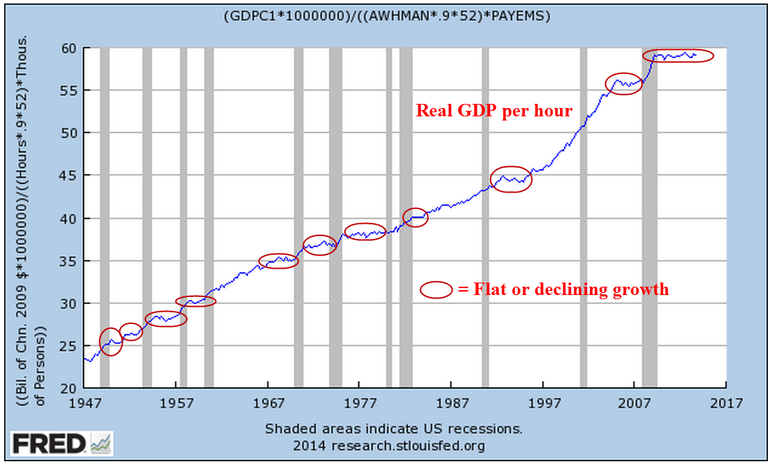
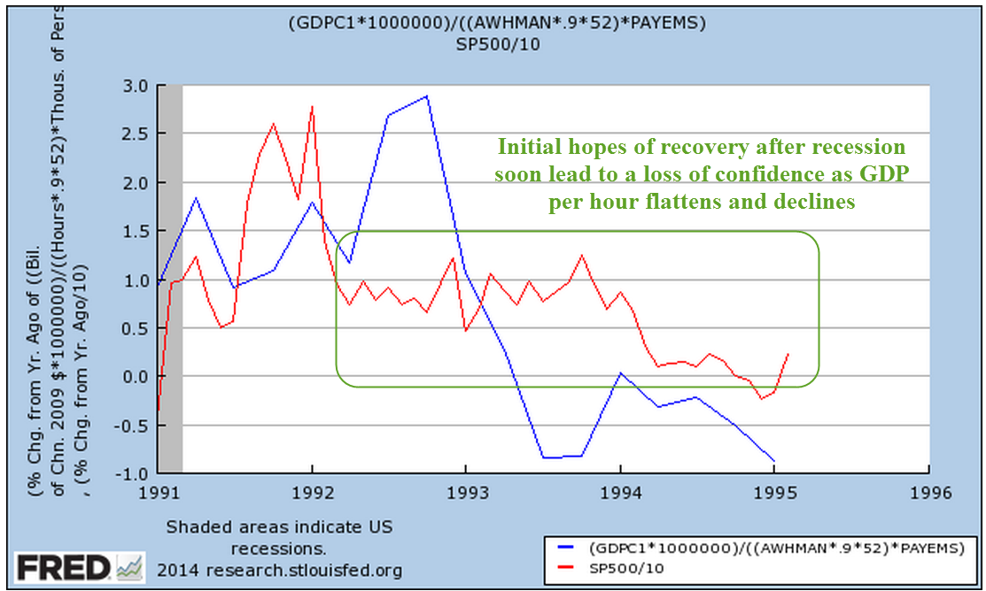
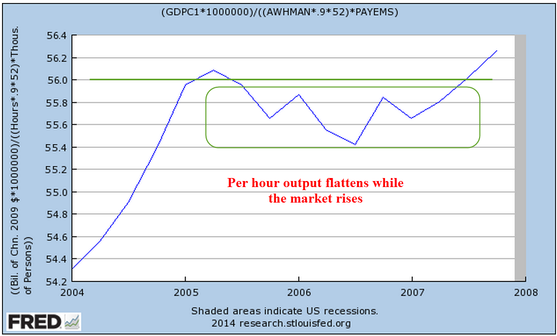
On Monday, George finished a re-read of Nassim Taleb’s Fooled By Randomness, an examination of probability without the mathematics. Taleb wrote from the point of view of a market trader but the book contained apt lessons for many kinds of decision making.  Mabel went out with a few friends to see the movie Birdman.  She asked George if he wanted to go but he was happy to sit around and read.

Taleb told the story of a emerging market bond trader in the 1990s who made a quarter billion dollars for his firm by “buying on the dips.”  When the price of the bonds declined, the trader took a highly leveraged long position, betting that the price of the bonds would rally.  Each time they did.  The man became convinced that he knew this market well.  He believed in his own astute judgment.  Then came a dip with no subsequent rally.  Instead, prices continued to fall.  The trader had no stop loss set, a floor price where a trader closes his position to prevent further losses.  Instead the trader convinced his bosses at the firm that prices would soon rally.  He increased his position as prices fell further.  Eventually, prices fell so low that the firm, near bankruptcy, fired the trader and closed the position, losing almost 600 million.  George thought about that.  There had been one correction in April and May of 2012, a near correction in October and November of that same year.  Smaller dips had occurred in June and August of 2013, then in January, April and August of this year.  Finally, this month a 7% or so dip.  Like the bond trader in the 1990s, the winning strategy of the past few years had been to buy on these dips.  The subsequent rise in prices helped convince buyers that their particular view of the market, whether fundamental or technical, was a sound one.  Note to self, George thought, don’t confuse good luck with genius.

Earnings and sales reports would drive the market for a few days until Wednesday when the Fed was expected to end its bond buying program.  On Thursday, the first estimate of 3rd quarter GDP would be released.  After the close Monday, Amgen reported earnings that were 12% better than expected.  That would help set a positive mood for Tuesday’s open.

Tuesday’s gauge of consumer confidence from the Conference Board was almost 95, the highest since 2007.  Lower gasoline prices have put extra money in consumer pockets.  A 25% decrease in the price of gas ($4 – $3) puts about $800 in a consumer’s pocket, a “raise” of almost $20 a week.  The declining price of oil caused Chevron to revise its earnings guidance downward by 15-20% for 2014 and 2015 but that was not as bad as anticipated and the shares rose.

The Case Shiller index of home prices in 20 metropolitan areas showed a 5.6% year over year gain, the lowest yearly gain in two years.  After almost a decade, the housing market seemed to be returning to more normal patterns of price appreciation.

On the whole, this earnings season seemed positive but the cautionary tone of Taleb’s book reminded George to stay watchful.  On Sunday, the European Banking Authority had released the results of their 2014 stress tests on more than 120 European banks. Approximately 20% had failed the test, most of them in Italy, Greece, Cyprus and Spain. When a football game ends, fans leave their seats and move toward the exits in a loosely organized fashion.  When a larger bank or sovereign country seems to be in danger of failing or defaulting, investors rush toward the exits as though someone called “Fire!”  Still, George was feeling – well, vindicated – that he had seemed to catch this latest dip near the bottom.
 
The mild weather of late October continued.  In shorts and tee shirt, George raked leaves in the backyard on Wednesday morning.  Taking a break, he poured himself another cup of coffee, then glanced out the window overlooking the front yard.  “Oh, wow,” he muttered.  He went to the front door, commenting to Mabel as he opened it, “Must be a bad accident down the street.  There’s a Channel 3 van parked across the street.  I’m gonna check it out.”  If Mabel had a stopwatch, she would have clocked 14 seconds before George was rushing back inside, hurriedly closing the front door. “Geez,” he exclaimed.  “What’s wrong?” Mabel asked.  “Some woman from the TV station, she starts running across the street toward the house when she saw me!  She called my name, for Chrissake!”

George walked into the kitchen, then took up a position on the side of the fridge where he could look out the window onto the street without being seen.  “There’s some guy with a video camera with her!” He said, managing to fit anger, annoyance and exasperation into the tone of his voice.  Mabel got up from her chair, stood by the living room window, partly concealed by the drapes as she looked out at the street.  “What do you think they want, George?  Should we go out and talk to them?”  “No, that’s the problem.  I think that’s exactly what they want – to talk to us.  Weird!”  Mabel noticed that the rooftop mounted dish on the TV van had been raised up.  “I think they’re broadcasting, honey,” she told George in a loud whisper.  The woman outside stood on the sidewalk, her back to the house, gesturing, turning to the house, then turning back to the camera man who wielded a shoulder mounted video camera pointed at the woman and George and Mabel’s house.  “They wouldn’t come into our front yard, would they?” George wondered aloud. “Isn’t there some kinda law against that?”

Mabel switched channels from the weather to Channel 3. “Oh, no!  This is a live feed.” She turned up the volume.  The woman reporter standing out on their sidewalk was looking at Mabel from the TV screen. There seemed to be several seconds of delay so that George and Mabel could see the woman reporter gesturing on the front sidewalk, then seeing that same gesture shortly on the TV as though time had fractured.

Reliable source, the reporter said.   In advance of the mid-terms, President visited Liscombs, who have not demonstrated active role in politics for either party.  Speculation about election strategy in the hotly contested Senate and Governor’s races.  A man presumed to be Mr. Liscomb ran back into the house to avoid answering questions.  Supposedly independent political organizations spending a lot of money in Colorado.  Are the Liscombs bundlers for one of these organizations?  Just how independent are these organizations?  Why did the President visit this house, this couple?  Were campaign rules broken?

George had joined Mabel, standing beside her, staring dumbstruck at the TV.  “Are they saying we’re like some kind of political action group like the ones the Koch Brothers fund?” George asked Mabel.  “Oh, they’re not saying anything,” Mabel said with a touch of anger.  “They’re suggesting, provoking…” she stopped as the report concluded.  “Now here comes the tease before the commercial,” she said.  “More on the upcoming elections here in Colorado when we come back,” announced the lunchtime news host.  “You watch too much TV,” George kidded her.  “You’ve gotten hip to their tricks.”

Both of them turned to look outside the living room window.  The reporter now stood with the video tech near the rear of the van.  “I think they’re leaving,” George said.  “No, wait,” Mabel told him.  “The dish on the van is still elevated for upload.  Wait till they lower it.  Then we’ll know they’re leaving.”  “Where did you learn all this stuff?” George asked her.  “Remember when we had that knife fight at the school five years ago?” Mabel asked.  George nodded.  “Two kids went to the hospital.  The local stations covered it, of course.  Got to see the vans.  It’s amazing how much equipment they cram in a regular van.  There’s probably a third person in the van working all the computers and equipment.”

Eventually, the van pulled away from the curb.  George realized that he’d missed the announcement from the Fed on their bond buying program, switched channels to confirm that they had ended the program. Although the Fed had stopped adding to its balance sheet, it continued to hold a whopping $4.5 trillion in assets, the total of the past several years of printing money to support the economy as the country struggled to recover from the Great Recession.

The market closed at the about the same level as Tuesday.  Dreamworks, the studio that produced the How to Train Your Dragon movies,  reported better than expected earnings after the close, sending the stock up 5% in after hours trading.  Kraft also reported earnings slightly higher but the overall sales picture was tepid.  Samsung reported a huge 60% decline in profit, squeezed on the high end by Apple and under pressure from mid and low end competitors.  The giant insurer MetLife had a blow out quarter.  Visa reported better than expected earnings, sending the stock over 4% higher in after market trading.

If Thursday’s first estimate of 3rd quarter GDP growth had come in at 2.5%, below the consensus of 3%, the market could have dropped 2% or more, George thought.  Instead, the estimate was 3.5%.  The market opened up lower then climbed about 1% during the day.

In each earnings season, there are several stories.  One was Gilead Sciences, a small cap biotech firm, whose “killer app”  was a new hepatitis drug called Sovaldi. Gilead reported earnings of $1.79 for the past quarter.  This was about 10% above earlier guidance but in the crazy world of Wall St., investors had been expecting $1.92, a “whisper” earnings number based on anticipated higher sales of Sovaldi.  Instead, sales of the drug were 20% less than the previous quarter.  The stock dropped about 5% on Wednesday, before climbing to new highs on Thursday.  The stock had more than quadrupled since the beginning of 2012.

On Friday the market jumped 1% at the open.  Overnight, the Bank of Japan had announced a massive stimulus program to combat risks of deflation, the bugaboo of all modern economies.  If prices might be slightly lower next year, why buy this year?  As consumers postpone some purchases, the decline in sales leads to further price declines as companies compete more fiercely to get those fewer sales.  Japan’s core CPI, excluding food and energy prices, had risen above 1% in response to earlier stimulus programs but had now fallen in the past several months back toward 1%.

On the domestic front, personal income gains in September were positive, averaging about 2.4% annually and above inflation. Wages and salaries jumped .4%, double the overall income growth. Consumer spending remained tepid, declining to a 1.4% annual pace of growth.  Amazon had warned earlier that they expected the Christmas season to be subdued this year.  Some speculated that the low rate of inflation and consumer spending would further check any rise in interest rates before the middle of 2015 at the earliest.

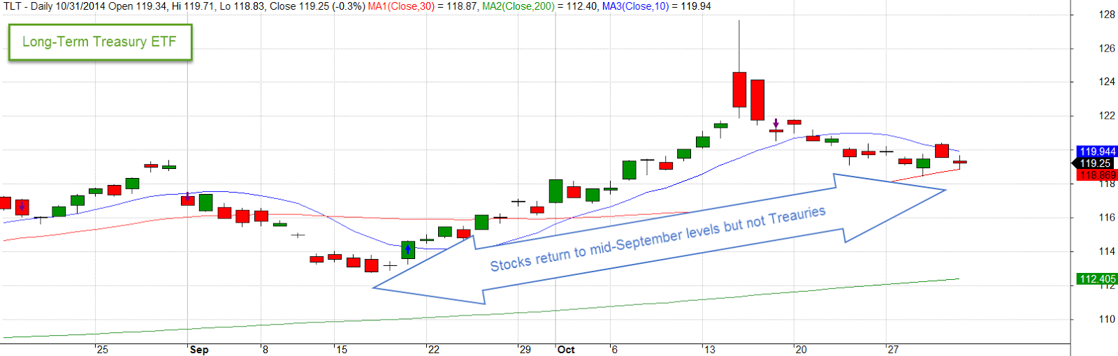
The market closed just slightly above the level it had reached six weeks earlier.  George had to remind himself that it was just luck.  But he sure felt smart.  Then he noticed a disturbing sign, the dragonfly doji after a gap up, on the chart of SPY, the ETF that tracks the SP500 index. The doji are one of many candelestick patterns, a type of technical analysis that tries to understand the psychology of buyers and sellers in the market from price movements over one to three days. After a number of up days, such a pattern might signal that buying pressure has become exhausted. After reading Taleb’s book, George reminded himself once again to be skeptical of signals. The last dragonfly doji after a 1% gap up that George could find in the past few years occurred on April 28, 2012.  The market had turned down after that one, losing more than 10% over the following five weeks.  Of course, George could have missed some doji simply because the market had not turned after the occurrence of one.  As Taleb noted, our view of historical data suffers from hindsight bias, from knowing what happened after a particular event.  We can not see the future very well but it’s worse than that. We don’t see the past very well either.  George had laughed when he read that.

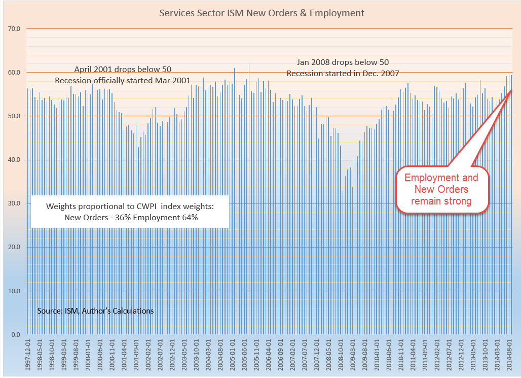
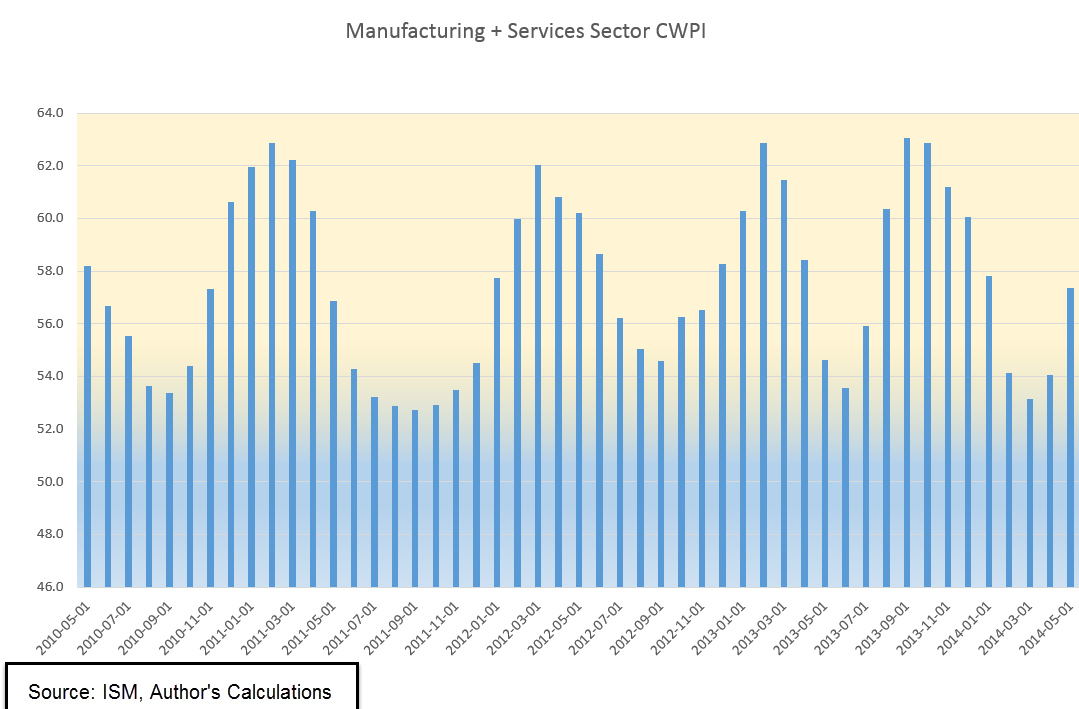
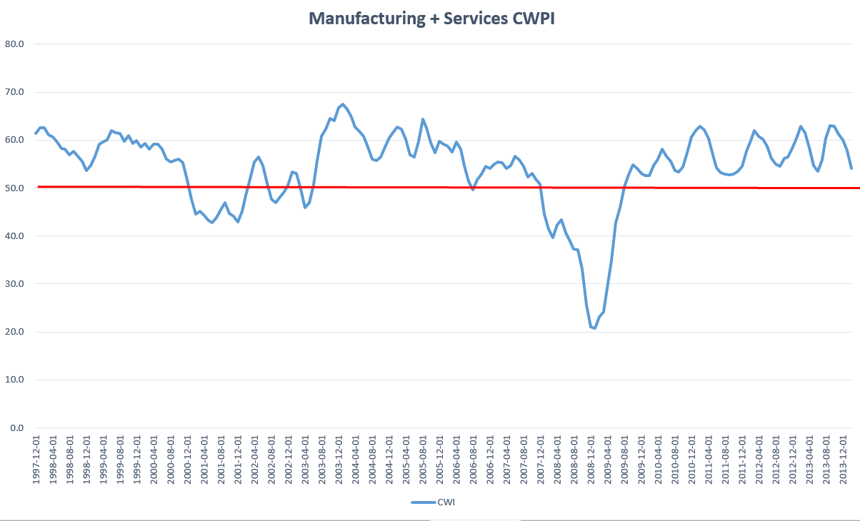
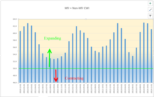
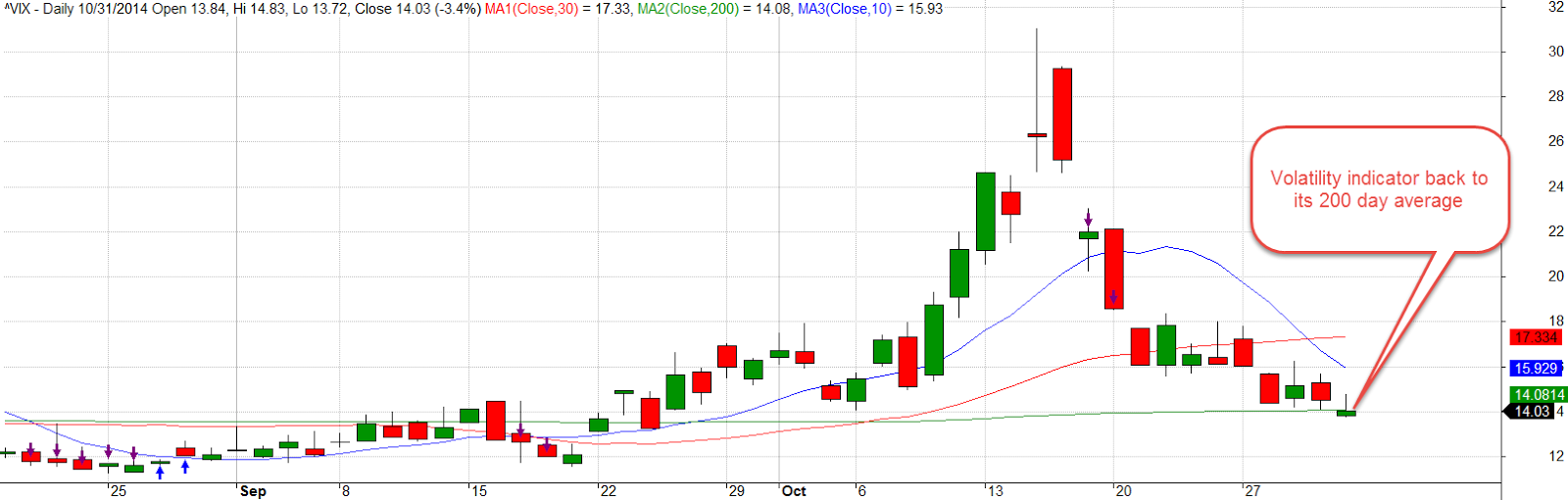
Next week was the first week of the month when several economic reports would capture the attention of investors.   The monthly labor report at the end of the week would get the most attention.  The ISM indexes of the manufacturing and service sectors would be closely watched for any signs of a slowdown.  The sluggish growth in Europe and the strong dollar would have a negative impact on exports, which would show up in the manufacturing index.  The CWPI, a composite of both of the ISM indexes, had probably peaked the previous month, and should be lower this month as a natural part of the cyclic pattern of the past several years.  Investors could react negatively though to this cyclic decline.  The VIX, the volatility indicator, had dropped into a more calm zone and below its 10 day average.

But investors had not abandoned the safety of long-term Treasuries.

If Republicans took control of the Senate in Tuesday’s election, the market would probably get a boost, George figured.  The results might not be known for days or weeks if there were recounts in some key senatorial races and that might drag the market down a bit in advance of the upcoming labor report.  Would the market go up or down?  George could definitely say yes!  He looked out the window Saturday afternoon and could tell the direction of one thing for sure – leaves.  They were calling to him, or was it his wife with a helpful reminder?

Zorro Moon

October 12, 2014

Last Sunday, George and Mabel flew back to Denver from Portland.  They took a bus shuttle from the terminal to long-term parking and discovered that neither of them could find the parking stub which indicated which section they had parked in.  Mabel dutifully looked through her purse.  “I know you kept the stub, George, but I’ll look anyway.”  Mabel remembered details like this so George knew she was probably right. “I should have put it in my wallet and it’s not there,” George replied.  They asked to be let out at the main exit booth.  The attendant told them to go inside the office where they met a nice man with a patient look.  His English was barely accented with the round vowels of Spanish.  “My name is George.  How can I help you?” the attendant announced.  “Hey, that’s my name too,” George replied, as though each of them belonged to a brotherhood.  “Well, we seem to have lost our ticket stub and we can’t remember where we parked our car,” George told him.  “What day did you come in?” the other George asked.  “Last Monday, about 7:30 in the morning.”  The attendant’s face adopted an odd stillness, his eyes looking far away. “That was a busy morning.  We were parking in GG and HH at the far end of the lot.”  Both George and Mabel were amazed at the man’s memory and said so.  The attendant smiled graciously.  He pulled a set of keys from a hook on a key board, picked up two of their bags and led them to an idle shuttle parked near the office.  At the far end of the lot, the attendant drove slowly down one row until they reached the edge of the lot, then drove down the next row.  Mabel was the first to see their car. “There it is!” she exclaimed.  George gave the attendant a $10 bill, thanking him for his help.  The attendant nodded graciously, then drove back toward the office.  “There’s someone with  a remarkable talent working at a parking lot,” Mabel remarked.  “I think our schools do a terrible job of helping students discover their own talents.   The structure of our society, our economy – it could uncover and use these talents better.”

Sitting at his desk Sunday night, George mulled over the same thought that had distracted him on the flight from Portland.  Should he sell some or all of their stock holdings?  Two indicators said yes, another said maybe, one said this was temporary.  While on vacation, he had not compiled his makeshift index based on the monthly Purchasing Managers Index.  ISM, the publishers of the index, had released the services sector figures that past Friday.  He pulled up the latest report, then input the figures into his spreadsheet.  The index seemed to have peaked in September at a very robust reading near 70, rising up a few points from an already robust reading in August.

This composite of economic activity was a “stay out of trouble” indicator, giving buy and sell signals when the index rose above and below 50.  The last signal had been a buy signal in August 2009 when the SP500 was about half its current value.  Before that, the previous cue had been a sell signal in January 2008, a month after the official start of the recession.  Because employment and new orders were the largest components of the index, a chart of just these two components of the services sector reflected the larger composite.

So, the American economy was strong and Friday’s employment report had been a positive surprise. What seemed to be worrying investors was weakness over in Europe.  But Europe had been nearing recession for a few quarters now and that had not worried investors during the past year and a half.  Yes, no, yes, no decisions swirled around in George’s head.  Should he wait till the market opened Monday morning and see what the mood was?  Well, what if it was rather flat?  What would that tell him?  As Yogi Berra said, when you come to a fork in the road, take it.  So George did.  He put in an order to sell half of their stock holdings, essentially taking both forks of the road.

On Monday the market opened up above Friday’s close, indicating that a number of investors had put their buy orders in over the weekend after the positive employment report.  Active traders took the market back down below the level of Friday’s close.  In 1970s lingo, it was “negative vibes,” or negative sentiment in normal speak.

The Federal Reserve announced that they would begin publishing a labor market index that compiled 19 different labor market indicators to give an overall report card on employment.  The index was first proposed in a working paper published in May and the Fed was cautioning that the index was not “official.”

A chart of the various components of the index showed the correlations of each component with overall economic activity in the country.

The Fed provided a permanent link to a spreadsheet that they would update each month.  It was  a zero-based index.  Readings above zero meant overall conditions were improving; below zero, conditions were deteriorating.

The market opened up Tuesday with the news that Germany’s industrial output had dropped 4% in August.  A key leader and consistent performer, Germany was the Derek Jeter of the Eurozone.  As every baseball fan knows, if Derek was not producing, the whole team was in trouble.  The whole team in this analogy was the world.  The IMF revised their global growth rate for 2014 from 3.4% to 3.3%.  Quelle horreur!  Never mind that Tuesday’s JOLTS report showed the most job openings since 2001 when China was admitted to the World Trade Organization and started sucking jobs from the U.S.

Tuesday evening, George and Mabel watched the full moon, the Hunter’s moon, when it was about 30 degrees above the eastern horizon.  Clouds had obscured the moon when it was first rising and really big.  Wisps of clouds still drifted across the pale disk.  “It’s a Zorro moon,” George remarked.  “Zorro would go out on a night like this and undo the oppressive plans of the evil comandante.”  Mabel laughed.  “We’ll rename it the Zorro moon, then.  All those calendars we get each year will have to be changed.”  “Yeh, what’s with that?” George asked.  “No one ever sends a pamphlet of favorite quotes or prominent dates in history.  Just calendars.”

Mabel set her alarm to get up at 4:15 AM so she could watch the lunar eclipse.  She woke up about 7:30 that morning, disappointed that her sleeping self had turned off the alarm without even bothering to notify her lunar eclipse watching self.

On Wednesday afternoon, the Federal Reserve released the minutes of the September meeting of the Open Market Committee, the group within the Fed that that determined interest rate policy.  The sentiment of the Committee was rather dovish, and the stock market rallied up sharply in the last two hours of trading.  Still, the close was not as high as the opening price on Monday, two days earlier.  Volume was the highest it had been since August 1st and should have been confirmation that sentiment had reversed to the positive.  George was still cautious.

The market is essentially an argument over value.  The difference between each day’s high and low price indicates how much investors are arguing. The 5-day average of that difference was now double the 200 day average and rising.  George had learned that bigger arguments usually led to lower prices.  He had enjoyed a nice run up in 20-year Treasuries during the summer but then got out in mid-September.  Now two thirds of his investing stash was sitting on the sidelines in cash.  Treasuries had rallied, proving that it was difficult, if not impossible, to time the market.  Something George didn’t like was the relatively small movement in the price of Treasuries as the stock market rallied.

On Thursday, the market dropped quickly on news that German exports had dropped almost 6% in August. By the end of the day, the SP500 index had lost about 2%.  Bears saw an opportunity to hawk their books warning of the coming collapse of the global economy.  “Is the end near?  Next we go to Doug Munchie of Funchee Crunchie Capital.  Doug, tell our audience some companies that you think will do well as the coming global meltdown approaches.” Doug is looking sharp in a $300 white shirt and a $200 blue and red tie. “Good morning, Megan.  For our cautious clients, we recommend gold Lego blocks.  Our clients can construct many creative projects with their gold while they sit out the collapse.” “Thanks, Doug.  When we come back, we’ll talk to a priest who claims that holy water can cure Ebola.”

By the time he died, George thought, he will have heard at least 1 million hustles.  “Doctor, do you know the cause of Mr. Liscomb’s death?”  “Yes, he suffered from Bullshitis, the accumulation of a lifetime of blather.  A person’s brain becomes clogged and shuts down.”

The decline continued on Friday, bringing the SP500 back to the price levels of late May.  The closing price touched the 200-day average.  For long term investors, the next week might be a good  opportunity to move some idle cash into stocks. If the downturn became a serious decline, the 50 day average would cross below the 200-day average in a few weeks or so.  That crossing was called the Death Cross, a serious shift in sentiment.

Watching the news later that evening, Mabel asked, “We’re fine?”  “We’re fine,” George replied. Then he changed the subject to their recent visit to Oregon.  “I wish could be close to the ocean and yet not have all the dampness.”  “It’s called southern California,” Mabel quipped.

Labor Trends

June 8th, 2014

This week I’ll look at some long term trends in the labor market, short term economic indicators and an unusual move by the European Central Bank.

**************************

May Labor Report

On Friday, the BLS reported job gains of 217K, in line with expectations.  The big headline is that we have finally recovered all the jobs that were lost during the recession.

That headline obscures the weakness in the recovery of the labor market.  The number of jobs gained comes from the monthly survey of businesses.  The household survey shows that the economy is still short about 1 million jobs from its mid-2007 high.  A million jobs is less than 1% of the workforce but we’ll see in a minute that the household survey may be giving us a truer sense of the labor market.  Like a fighter who has been knocked down a few times, the labor market is back on its feet but still maintains a defensive posture.

The number of involuntary part-time workers, those who want full time work but can’t find it, has declined in small increments over the past few years but remains stubbornly high.  Gone are the upward spikes in part-time employment, indicating that the labor market is at least more predictable.

7.3 million involuntary part-timers is about 2.3 million more than a more normal level of 5 million.  Half of that number means that there are effectively 1.2 million jobs still “missing.”  Add to that 1.2 million or more jobs needed each year just to keep up with population growth.  1.2 million x 6 years = 7.2 million.  Add in the 1.2 million jobs to reduce part-timers to normal levels and that is 8.4 million jobs still missing.  Let’s deduct a million jobs or so that were gained before the recession because of an overheated housing market and we still have a 7.5 million jobs gap, or 5% of the potential workforce.  As I will show next week, this job gap puts downward pressure on wages, on personal income, on consumer demand, on…well, just about everything.

This month marked the fourth month in a row that job gains have been higher than 200K.  Two of those four months of  consistently strong job gains came during a weak quarter of economic growth and particularly weak corporate profit growth.  More on that next week.

The narrow measure of unemployment remained unchanged at 6.3% but the widest measure, the U-6 rate, continues to decline from a high of (gulp!) 17% to a current level of 12.2%.

The number of long-term unemployed edges downward.

Although there is much variation in the monthly count of people who are classified as discouraged, the trend is downward from the hump in 2011 and 2012.

After breaking above the 95 million mark earlier this year and rising, the number of workers aged 25 – 54, what I call the core work force, has declined back toward the 95 million mark.

According to the monthly survey of businesses, half of all employees are women.  My gut instinct tells me that this is more out of necessity than desire.  Women do what they have to do to meet the needs of their families and many of those jobs may be part-time to accommodate family needs.

The decline in male-dominated employment in the manufacturing and construction sectors can be seen in the declining participation rate of men in the work force.

Earlier in the week, ADP reported private job gains of 180K, below the consensus estimate of 210K.  A graph of the past decade shows that private job growth has steadied during the past year.

We should probably keep this longer-term perspective in mind to balance out the monthly headlines. Zooming in on the past few years shows the dips, one of which was the recent winter lull.  The trick is to keep a balance between the short-term and the long-term.

The market is expecting growth this quarter that will offset the winter weakness and will probably react quite negatively if prominent indicators like employment, auto sales or housing should disappoint.

Over 10,000 boomers a day reach retirement age.   Not all of them retire but some back of the envelope estimates are that 100K or more do drop out of the labor force each month.  For the past eight months or so, new entrants and re-entrants into the job market has offset these retirees and the number of people not in the labor force has leveled off in the range of 91 to 92 million.

Construction employment finally crossed the psychological 6 million mark this month and for the past year or so has been on the rise from historic lows.  As a percent of the work force, however, employment in this sector is near all-time lows.  Let’s zoom out and look at the past fifty years to get some perspective on this sector.  A more normal percentage of the work force would be about 5%.  The difference is 1 to 1.2 million jobs “missing” in a sector which pays better than average.

In summary, there is a lot to like in the labor reports of the past few months.  But we should not kid ourselves.  The long-term trends show that the challenges are steep.  The question is not whether the glass is half empty or half full.  The question is how many small holes there are in the bottom of the glass.

*********************

Central Banks

Helping to fuel the upward climb in the market this week was the message that central banks are willing to adopt whatever policies they can to support the economy.  In response to the threat of deflation in the Eurozone, the European Central Bank (ECB) made an unprecedented move this week, charging banks 1/10% to park their excess reserves with the central bank.  What does this mean?  Customary policy is that member banks must keep on deposit with the central bank a certain percentage of their outstanding loans and other securities to guard against losses.  For larger banks, this is about 10%.  In a simple example, let’s say that a bank makes another loan for $100.  It must keep an additional $10 on deposit with the central bank.  Let’s say it already has $12 extra on deposit with the central bank.  The central bank would then pay interest to the bank for the extra $2.  The policy change this week by the ECB reverses that policy:  member banks must now pay the central bank for any excess reserves.  Essentially the central bank is charging banks for not making more loans,  a policy which some monetary economists have encouraged the Federal Reserve to adopt.

**********************

CWPI (Constant Weighted Purchasing Index)

On Monday, the Institute for Supply Management released their monthly survey of purchasing managers, then revised it shortly after the release, then revised it again later in the day.  This should remind us that economic gauges are not  like measuring a 2×4 stud with a tape measure.  Seasonal adjustments and other algorithms are applied to most raw data to arrive at a published figure.

The CWPI index I have been tracking for about a year showed further gains in May, rising up from the winter doldrums.  The composite index of the manufacturing and services sectors stands at a bit over 57, solidly in the middle of the strong growth range of 55 to 60.  If the pattern holds, we should expect to see this economic gauge rise during the next few months, peaking at the end of the summer.

An average of two key components of the economy, employment and new orders in the services sector, rose back above 55 this month, a level that hasn’t been seen since last October.

**********************

Key Takeaways

The numbers from the labor market are cause for optimism – job gains are rising while new claims for unemployment are falling.  Auto sales are strong, an indication that consumers have more confidence.  New orders and employment are rising.  Weakness in the housing market bears a close watch.

Net Worth, Labor Productivity And Political Pay

May 10th, 2014

This week I’ll look at some short term mixed signals in economic activity, and long term trends in labor productivity and household net worth.  In advance of the mid term election season in the U.S., I’ll look at several aspects of the money machine that drives elections.

*****************************
CWPI

For almost a year, I’ve been tracking a composite index, a Constant Weighted Purchasing Index, based on the Purchasing Manager’s Index produced by the Institute for Supply Management (ISM).  Based on key elements of ISM’s manufacturing and non-manufacturing monthly indexes, it is less erratic than the ISM indexes and gives fewer false signals of recession and recovery.  After reaching a low of 53.5 last month, the CWPI of manufacturing and service industries is on the rise again.  During this recovery this index of economic activity has shown a regular wave pattern.  If that continues, we should expect to see four to five months of rising activity before the next lull in late summer or early fall.  Any deviation from that pattern would be cause for concern if falling and optimism if rising.

The winter probably prolonged the recent downturn in the index.  In the manufacturing sector, new orders and employment are strong.  In the services sector, which comprises most of the economy, new orders are strong but employment growth has slowed to a tepid pace.

This week the Bureau of Labor Statistics released their estimate of Productivity growth for the first quarter.  One of the metrics is the per hour growth in productivity, which is key to the overall growth of the economy.  As seen in the chart below, the last time annual productivity growth was above 2% was in the 3rd quarter of 2010.  To show the historical trend, I took the 3 quarter moving average of the year over year growth rate.  We can see a remarkable shift downward in productivity.

Recovery after recessions are marked by a spike in growth above 3% simply because the comparison base during the recession is so weak. What the chart shows is the shift from steady growth of 3% to a much weaker growth pattern since the 2008 recession.  In testimony before the Senate Finance Committee, Fed chairwoman Janet Yellen stated that we may have to adjust our expectations to continuing slow growth.  The erosion of productivity growth has probably prompted concerns in the Fed Open Market Committee.

***************************

JOLTS – Job openings

Continuing on from labor productivity, let’s look at a trend in job openings.  With a month lag, the Bureau of Labor Statistics (BLS) reports on the number of job openings around the country. Preceding a recession, the number of job openings begins to decline.  Recovery is marked by an increase in openings. March’s report showed a slight increase in job openings, near the high of the recovery and closer to late 2005 levels.

When we look at the ratio of job openings to the unemployed, the picture is less encouraging.  The unemployed do not include discouraged job seekers.  If we included those, we the readers might get discouraged.  Almost five years after the official end of the recession, we are barely above the low point of the recession of the early 2000s.

When Fed chairwoman Janet Yellen speaks of weaknesses in the labor market that will require continued central bank support, this is one of the metrics that the Fed is no doubt keeping an eye on.

*****************************

Household Net Worth

For many of us, our net worth includes family, friends, pets, interests and passions but the Federal Reserve doesn’t count these in its quarterly Flow of Funds report.  In early March, the Fed released its annual Flow of Funds report, which includes estimated net worth and debt levels of households, business and governments in the U.S.  Below is a chart of household, business and government debt levels from that report.

Rising stock prices and recovering home values have boosted the net worth of households.

As you can see in the chart below, the percent change in net worth has only significantly dipped below zero in the last two recessions.

The severity of this last dip was due to the falls in both the housing and stock markets.  The curious thing is why earlier stock market drops in the 1970s and early 1980s did not produce a significant percentage drop in household net worth. In those earlier periods, increases in home prices were about 4%, similar to the level of economic growth, and not enough to offset significant drops in the stock market.

So what has changed in the past two recessions?  The introduction of IRA accounts in the 1980s prompted individuals to put more of their savings in the stock market instead of bonds, CDs and savings accounts. Downturns in the stock market in the past two recessions affected household balance sheets to a greater degree.  Inflation was greater during the 1970s, 80s and 90s, raising the value of all assets.  China’s growing dominance in the international market was not a factor in the stock market drop in 2000 – 2003.  It was only admitted to the World Trade Organization in 2001.  In an odd coincidence, the past twenty years and particularly the past 15 years are marked by a growing and pervasive inflence of the internet in all aspects of our lives.

If we chart the change in a broad stock market index like the SP500 along with the percent change in net worth over the past seven years, we see a loose correlation using 40% of the change in the stock market.  Rises and falls in the stock market produce a material change in the paper net worth of households and can significantly lead to a change in “mood” among consumers, something the economist John Maynard Keynes called “animal spirits.”

Because the swelling demographic tide of the Boomer generation has a significant part of their retirement nest egg in the stock market, price movements in the markets have probably had a greater effect on total net worth in the past decade.

************************

Party Favors

Now for everyone’s favorite dinner topic – political contributions.  Who contributed the most to the 2012 Presidential campaign?
a) the evil Koch Bros
b) gambling king Sheldon Adelson who almost single-handedly bankrolled the Newt Gingrich campaign
c) hedge fund billionaire George Soros, the  “Octopus” of liberal causes
d) the socialist commie labor unions.

Answer:  Whatever answer suits your political message or opinion.

On the one hand, campaign contributions can be what economists call a “rich” data set so that an analyst can tease out several conclusions or summaries, sometimes contradictory, from the data set.  On the other hand, some “social welfare” organizations do not have to reveal donor lists.  An investigator wishing to discover the myriad channels of political contributions must don their spelunking equipment before descending into the caverns of political finance.   In some cases private IRS data is released by accident, revealing dense networks linking moneyed individuals.

The Federal Election Commission (FEC) maintains a compilation of individual and group contributions to political campaigns.  OpenSecrets.org , a project of the Center for Responsive Politics, summarizes the data.  There we find that Sheldon and Miriam Adelson contributed $30 million through the Republican Restore Our Future PAC  and $20 million to the Republic PAC American Crossroads.

The Democratic PAC Priorities USA did not have a single donor as generous as the Adelsons.  George Soros ponied up $1 million along with many others, including Hollywood movie mogul Steven Spielberg, but the most generous donor contributed only $5 million, punk change when compared to the Adelson’s commitment to Republican causes and candidates.

In the 2012 Presidential race, the Obama campaign drew in so many more individual contributions than the Romney team that outside spending by political action groups was the only way to close the money gap.  Pony up they did, outspending the Obama campaign $419 million to $131 million. The NY Times summarized the outside spending with links to the various groups.

Despite their relatively low percentage of the work force, labor unions are major contributors to the Democratic effort.  A WSJ article in July 2012 revealed the extent of their political activity.  The bulk of union campaign spending is not reported to the FEC but is  reported to the Labor Dept. In total, unions disclosed that they spent over $200 million per year from 2005 – 2011.  54% of the spending reported to the Labor Dept was on state and local campaigns.

As a block then, are unions the largest contributors to Democratic campaigns?  Some “napkin math” would get us to a guesstimate of  $90 to $100 million a year on national campaigns, so surely they are at the top, aren’t they?  Not so fast, you conclusion jumper, you.

As transparent as the unions are, contributors to Republican causes are not.  Corporate political spending like that of the private U.S. Chamber of Commerce are not disclosed, as are many other corporate political and lobbying efforts.  These are some of the largest corporations in the world with vast resources and a strongly vested interest in policy decisions that will affect their bottom line.  Most of those contributions are hidden.

As this midterm election approaches rest assured, gentle reader, that you can confidently say – no matter what your political persuasion – that you have data to back up your opinion that the other side is buying the election.  You can hold your head high, confident in the soundness of your opinions.  And don’t we all sleep better at night, knowing that we are right?

Income and GDP

March 30th, 2014

Business Activity

The Institute for Supply Mgmt (ISM) and Markit Economics are two private companies that survey purchasing managers and release the results in the first week of each month. Toward the end of each month Markit releases what is called a “Flash PMI”, an early indication of activity for the month.  This month’s flash index of manufacturing activity declined slightly but is still showing strong growth.  New orders are showing strong growth at a reading of 58.  The Flash reading of the services sector rose to over 55 but this is a mixed report, with only tepid growth in employment and backlogs actually in a slight contraction.  The most remarkable feature of this report was the 78.1 index of business expectations, an outstandingly optimistic reading. This Flash index gives investors a glimpse of the full survey reports from ISM and Markit that will be released in the first week of next month.

******************************

On the other hand…

The monthly report of durable goods indicates a rather tepid 1-1/2% year over year growth.  This excludes planes, autos, and other transportation orders.  Including those components, there has been no yearly growth.

******************************

Stick with the plan, Stan…

Rising equity and real estate markets have been good for a lot of people. A Bankrate.com blog noted the number of people entering the ranks of millionaires in 2012.  Toward the end of this report was an important lesson: “60 percent of investors worth $5 million or more say they’ll invest in equities this year, while 31 percent of those worth $100,000 to $1 million plan to do the same.”  Hmmm…rich people are not buying into the prophecy prediction analysis that the market will crash this year.  Could they be sticking with a plan that  allocates investments across a variety of assets, including stocks?

*******************************

Personal Income

This week, the Bureau of Economic Analysis (BEA) released February’s estimate of personal income.  Real, or inflation adjusted, disposable personal income (DPI), rose 2.1%, a decline from January’s 2.75% increase but above the 1% that has historically led to recessions.

A few weeks ago I noted that annual DPI had dropped below 1% in 2013.  Contributing to the weak year over year comparison was the high spike in income in the fourth quarter of 2012 when many companies “paid forward” both dividends and bonuses in December in advance of tax increases scheduled for 2013.

While this may have been a contributing factor to the decline, it would be a  mistake to give it too much weight.  The growth in personal income has been relatively weak and it shows in the consumer spending index released this week.  The .1% year over year increase – essentially zero – indicates consumer demand that is too weak to put any upward pressure on prices.  Sensing this, businesses are less likely to invest in growth.  Less investment growth means that employment gains will be modest, which further reinforces modest economic growth.

The stock market trades on profit growth.  Standard and Poors reports that 4th quarter earnings for the companies in the SP500 rose 9.8%, accelerating from the 6.0% growth in the 3rd quarter of 2013.  A moderately improving economy and only modest growth in investment has helped boost profits.  Profits are expected to rise 11% in the second half of 2014.

******************************

GDP

The third estimate of GDP growth in the fourth quarter of last year was 2.6%, in line with consensus estimates.  In her testimony before Senate Finance Committee two weeks ago, Fed chairwoman Janet Yellen noted that we may be in for an extended period of slow growth below the fifty year average of 3%.

Three weeks ago I looked at GDP and the personal savings rate.  This week I’ll look at per hour GDP.  Readers should understand that this is what some economists would call a messy data set.  I have made some assumptions about the number of hours worked per employee.  The BLS publishes average hours worked for manufacturing employees and I made a guesstimate that the average for all workers is about 90% of that.  The number of part time employees who do not work this amount of hours offsets the unreported hours of the self-employed.  I am less concerned about the absolute accuracy of the GDP output per hour worked but that any inaccuracies be fairly consistent.  The trend is more important than the actual numbers.  What can we learn when output per hour flattens or declines?  Below is a graph of sixty five years.

We can see that flat growth tends to precede recessions but there is no definite pattern where we can say with any confidence that a flattening or decline in per hour GDP necessarily precludes a recession.  If we zoom in on the past thirty years, we do notice that the preceding decade has been marked by long periods of flat growth.  More importantly, the recovery from this past recession is marked by the longest period of flat growth in the history of the series.

The summer of 2009 marked the official end of this past recession.  For five years there has been no increase in real GDP per hour worked.  For a few years following a recession in the early 1990s, per hour GDP flattened before taking off in the late 1990s.

Does this flat growth represent a pruning of the economic tree before a surge of new growth? Or does it presage an even worse recession? Is the economy locked inside a limbo of limp growth for years to come, echoing the two decades of little growth in Japan’s economy?  Whatever happens, we can be certain of one thing – the trend and pattern will be so much more obvious in the future simply because we will disregard some past data based on what happens in the future.

As we make investment decisions, we should remember that the “obvious” patterns we see when we look back were much less clear at the time.  Sure there will be investment gurus who tell us that they saw it coming.  We forget that they also saw the depressions of 1994, 1998, 2000, 2004, 2006 and 2011 – the ones that didn’t happen.

Let’s look a bit more closely at recent periods of flat growth.  The recovery from the recession of 1991 was marked by a painfully slow recovery in the job market.  After a 30% rise over three years, the market stumbled.

There’s a story to be told when we look at the growth in the market index and per hour GDP.  Whether it is by coincidence or not, there is a loose response of the market to changes in output.

After another slow recovery from the recession of 2001, the market began to climb in 2004.

But this time the market was not responding to the flattening growth in per hour output.

In the past four years, there has been little growth in output per hour.

But the market has doubled over that time.

Part of that recovery can be attributed to the market simply reversing the decline of 2008 and early 2009, but a good 40% increase in market value can be attributed to the greater share of output that companies have been able to convert to profit. (See last week’s blog)  How long that trend can and will continue is anyone’s guess but we know that it can not go on forever.  Flat revenue growth makes growing profits an ever more difficult task.

The flat growth in per hour output gives us perhaps another insight into the so-so growth in employment.  Without a clear vision of a stimulus that will spur growth, companies are reluctant to commit to plans for an expansion of their work force.

Employment, New Orders, CWPI

CWPI (Formerly CWI)

The Constant Weighted Purchasing Index (CWPI) that I introduced last summer was designed to be an early or timely warning system of weakening elements of the economy.  It is based on a 2003 study by economist Rolando Pelaez on the monthly Manufacturing Purchasing Managers Index (PMI) published by the Institute for Supply Management (ISM).  ISM also produces a Non-Manufacturing index for service industries each month but this was not included in the 2003 study.

The CWPI focuses on five factors published by ISM:  employment, new orders, pricing, inventory levels and the timeliness of supplier deliveries.

The CWPI assigns constant weights to the components of both indexes, then combines both of these indexes into a composite, giving more weight to the services sector since it is a larger part of the economy.  Both the CWPI and PMI are indexed so that 50 is neutral; readings above 50 indicate growth; readings below 50 indicate contraction.  In previous months (here and here), I anticipated that the combined manufacturing and services sector index would move into a trough at this time before rising again in March and April of this year.

A longer term chart shows the wave like formation in this expansionary phase that began in the late summer of 2009.

February’s ISM manufacturing index climbed slightly but the non-manufacturing, or services, index slid precipitously, more than offsetting the rise in manufacturing.  Particularly notable was the huge 9% decline in services employment, from strong growth to contraction.  The service sector portion of the CWPI shows a contraction which some blame on the weather.  A slight contraction – a reading just below 50 – can be just noise in the survey data.  The past two times when the employment component of the services sector has dropped below 48, as it did in this latest report, the economy was already in recession; we just didn’t know it till months later.

A close comparison of the current data with the previous two episodes may sound a cautionary tone.   At this month’s reading of 48.6, the CWPI services portion is not showing as severe a contraction as in April 2001 (43.5) and January 2008 (33.1), when the employment component also dropped below 48.

New orders and employment in both portions of the CWPI are given extra weight. In January 2008, new orders and employment both fell dramatically.  The current decline is similar to the onset of the recession beginning in early 2001, when employment declined severely in April but new orders remained about the same.  Let’s isolate just these two factors and weight them proportionate to their respective weights in the services portion of the CWPI.

Notice that the decline below 50 signaled the beginning of the past two recessions.  Here’s the data in a different graph with a bit more detail.

Some cite the historically severe weather in the populous eastern half of the country as the primary cause for the decline in the services sector employment indicator and it well may be.  If so, we should expect to see a rebound in this component in March.  Basing a prediction on one month’s reading of one or two components of an indicator is a bit rash.  However, we often mistakenly attribute weakness in some parts of the economy to temporary factors and discount their importance because they are temporary – or so we think.

In the early part of 2008, many thought that a healthy correction in an overheated housing market was responsible for the slowdown in economic growth.  In the spring of that year, the bailout of bankrupt Bear Stearns, an undercapitalized investment firm which had made some bad bets in the housing market, confirmed the hypothesis that the corrective phase was nearing its end. As weakness continued into the late spring of that year, some blamed temporarily high gasoline and commodity prices for exacerbating the housing correction.  In the fall of 2008, the financial crisis exploded and only then did many realize that the problems with the economy were more than temporary.

In the early part of 2001, a healthy correction to the internet boom was responsible for the slowdown – a temporary state of affairs.  When the horrific events of 9-11 scarred the country’s psyche, the recession was almost over.  Many were not listening to the sucking sound of manufacturing jobs leaving for China or giving enough importance to the increasing competitiveness of the global market.  Employment would not reach the levels of early 2001 till the beginning of 2005.

This time the slowdown in employment and new orders in the services sector may be a temporary response to the severe winter weather.  Let’s hope so.

********************************

Private Sector employment and new unemployment claims

ADP released their February employment report this week and eyes rolled.  January’s benign reading of 175,000 private job gains was so at odds with the BLS’ reported gains of 113,000.  “Oh, wait,” ADP said this week, “we’ve revised  January’s gains down to 127,000.”  In a work force of some 150 million, 50,000 jobs is rather miniscule.  As the chief payroll processor in this country, ADP has touted its robust data collection from a large pool of employers.  A revision of this magnitude leads one to question the robustness and reliability of their methodology, and the timeliness of their data collection.  For its part, the BLS admits that its current data is based on surveys and that each month’s estimate of job gains is largely educated guesswork.  ADP is actually processing the payrolls, which should reduce the amount of guesswork.

Private job gains in February were 10,000 below the consensus 150,000 but this week’s report of new unemployment claims dropped 27,000, bringing the 4 week average down a few thousand.  As a percent of workers, the 4 week average of continuing claims is below the 33 year average and has been since March 2012.  In this case, below average is good.

********************************

Employment – Monthly Labor Report

This week’s labor report from the BLS carried a banner caveat that the cold weather in February may have affected employment data.  With that in mind, the headline job gains of 175K were above expectations for 150K job gains.  The unemployment rate ticked up a bit.  If we average the ADP job gains with the private sector job gains reported by the BLS, we get 150K plus 13K in government jobs added for a total of 163K total jobs.  The year over year growth in the number of workers is above 1%, indicating a labor market healthy enough to preclude recession.

A big plus this year is the growth in the core work force, those aged 25 – 54, which finally surpassed the level at the end of the recession in the summer of 2009. 

However, there are some persistent trends independent of the weather that underscore the challenges that the current labor market is struggling to overcome.

As I pointed out last week, there are several unemployment measures, from the narrowest measure – the headline unemployment rate – to wider measures which include people who are partially employed.  The U-6 rate includes discouraged workers and those who are working part time jobs because they can’t find full time jobs.  For a different perspective, let’s look at the ratio of the widest measure to the narrowest measure. The increase in this ratio reflects a growing disparity in the economic well being of the work force.

Contributing to the rise in this ratio is the persistently high percentage of workers who are involuntary part timers.  Looking back over several decades, we can see that the unwelcome spike in this component of the work force can take a number of years to decline to average levels.  Following the back to back recessions in the early 1980s, levels of involuntary part timers took 8 years to recover to average, then quickly climbed again as the economy sputtered into another recession.  We are almost five years in recovery from this recession and have still not approached average.

There are more discouraged workers today than there were at the end of the recession in the summer of 2009.  Discouraged workers are included in the wider measure of unemployment but not in the narrow headline unemployment figure.

The median duration of unemployment remains at levels not seen since the 1930s Depression.  Someone who becomes unemployed today has a 50-50 chance of still being unemployed four months from now.  That would make a good survey question:  “In your lifetime, have you ever been involuntarily unemployed for four months?”

Despite all the headlines that the housing market is rebounding, the percent of the work force working in construction is barely above historic lows.

A recent report by two economists at the New York branch of the Federal Reserve paints a disappointing job picture for recent college graduates.  On page 5 of their report is this telling graph of a higher percentage of recent college graduates accepting low wage jobs.

Low wage and part time jobs do not enable a graduate to pay back education loans.  Almost two years ago, the total of student loans surpassed the trillion dollar mark.  According to the Dept. of Education, the default rate in 2011 was 10%.  I’ll bet that the current default rate is higher.

******************************

Takeaways

As is often the case, data from one source partially contradicts data from a different source.  The employment decline reported by ISM bears close watching for further signs of weakness.  The yearly growth in jobs reported by the BLS indicates a relatively healthy job market.

Labor’s Journey

January 12th, 2014

A dramatic decrease in new orders, mostly for export, for the non-manufacturing sector of the economy offset other positives in the December ISM report.  The composite non-manufacturing index dropped slightly but is still growing.  A blend of the manufacturing and non-manufacturing indexes, what I call the CWI, declined from its peak as expected. A month ago I noted the cyclic pattern in this index, and the shorter time between peaks as the economy has formed a stronger base of growth. Most businesses are reporting expansion, or strong growth.  Some respondents to the survey noted that the severe winter weather in December had an impact on their business.

*****************************

Ringing in the New Year, the private payroll firm ADP issued a strong report of employment growth before the release of the BLS figures on Friday.  The reported gain in jobs was above the best of expectations.  In the past few months,  several reports in production and now in employment have exceeded expectations or come in at the upper bounds of estimates.

*************************

Wells Fargo announced that they will be offering non-conforming mortgages to selected buyers who present a low risk.  Non-conforming mortgages may be interest only, or have loan to values that don’t meet guidelines. Reminiscent of the “old days,” Wells Fargo intends to hold onto the mortgages instead of selling the paper in the secondary market.

************************
The Gallup organization announced their monthy percentage of adults who are working full time, what Gallup calls the P2P.  I call this the “Carry the Load” folks, those people whose taxes are supporting the rest of the population.  At 42.9%, it is down a percentage point or two from previous winters.

************************
The 4 week average of new unemployment claims is still below 350,000 but 20,000 higher than a month ago.  As I mentioned last week, this metric will be watched closely by traders in the coming weeks.  Although there is little statistical significance between a 349,000 average and a 355,000 average, for example, there is a psychological boundary marked in 50,000 increments.

************************
Friday I woke up and found that somebody stole the ‘1’s at the Bureau of Labor Statistics.  The BLS reported net job gains were 74,000 and I thought that there was a smudge on my computer screen blocking the ‘1’ of 174,000 and reached out to wipe it off.  There was no smudge.  It is difficult to interpret the discrepancy between the ADP report and the BLS report.  Some say that the particularly harsh winter weather in the midwest and east caused many people to stop looking for work or that many businesses returned their BLS survey late.  If so, we may see some healthy upward revisions to the employment data when the February report comes out. Here’s a look at total private employment as reported by BLS and ADP.

As you can see there is a growing divergence between the two series.  As a percentage of 120 million or so employed in private industry, the divergence of a few hundred thousand is slight.  The BLS assumes a statistical error estimate of 100,000.  But people closely watch the monthly change in employment as a forecast of developing trends in the overall economy, changes in corporate profits and consequently the price of stocks.  Here is a chart of the difference in private employment as measured by the BLS and that measured by ADP.  A positive number means that the BLS is reporting more employment than ADP.

As with any estimates, I tend to average the estimates to get what I feel is a more accurate estimate.  This averaging works well when bidding construction jobs and some statistical experiments have proven the method reliable.  Averaging the two estimates for private payrolls gives us an estimate of job growth that is still above the replacement threshold of about 150,000 net job gains per month needed to keep up with population growth.

The figures above do not include 22 million government employees, or about 14% of total employment.  Flat or declining employment in this sector has dragged down the headline job gains each month.  Adding in net job gains or losses in the government sector gives us a net job gain of about 150,000 in December.

For those of you interested in more analysis of the employment report, Robert Oak at the Economic Populist presents a number of employment charts similar to the ones I have been doing in past months.

********************************
For the past 5 – 10 years, much has been written about the growth in income inequality during the past 30 to 40 years. I’ll call income inequality “Aye-Aye” because the abbreviation  “II” looks like the Roman numeral for “2” and because Ricky Ricardo used to exclaim “Aye, Aye, Lucy!” on that much loved comedy series.  Those on the left blame former President Reagan,  British Prime Minister Thatcher, and deregulation for Aye-Aye.  Those on the right blame increasing regulation that disincentivises businesses from taking chances, from making capital and people investments to pursue robust growth. The expansion of social welfare programs makes people ever more dependent on government and less likely to take jobs that they don’t want.  Economists cite the aging of the population as a cause of the growth of Aye-Aye.  Few I know of seriously challenge the idea that Aye-Aye has been happening.  The argument is over the causes and the solutions.

Thomas Piketty’s Capital in the 21st Century will add to the debate.  The English translation will be published in March.  A book review in the Economist outlines some of the ideas in the book.  Piketty’s analysis of almost 150 years of data from several countries indicates that the slower an economy grows, the more unequal the distribution of income.  One might think that the U.S. would have the most unequal income distribution, but Piketty reveals that it is France that tops the list.

Piketty’s rule of thumb is that the savings rate divided by a country’s growth rate will approximate the ratio of capital wealth to gross income.  As this ratio increases, more of the national income goes to those with capital wealth. So, if the savings rate is 8% and the growth rate is 2%, then capital wealth will be about four times gross national income.  Furthermore, he finds that population growth accounts for about half of economic growth over the past century and half.  Slowing population growth in the developed nations therefore leads to greater inequality of income.  If this rule of thumb is fairly accurate, stronger economic growth is the only way to lessen the inequality of income that has grown steadily over the past thirty to forty years.

If you are familiar enough with French, you can read a preview here or pre-order the English version here.  The book is sure to spark some lively discussion between those in the economic growth camp and those in the demographic camp.  The topic has long been a topic of discussion in emerging economies.  I will quote from an Asian Pacific policy journal published in 2003, “The most important determinant of inequality is not [emphasis mine] economic growth, however, but rather changes in demographic age structure.”

Winter Wonderland

December 8th, 2013

The Bureau of Labor Statistics rode down like Santy Claus on the arctic front that descended on a large part of the U.S. The monthly labor report showed a net gain of 203,000 jobs in November, below the 215,000 private job gains estimated by ADP earlier in the week, but 10% higher than consensus forecasts.  Thirty eight months of consecutive monthly job growth shows that either:

1) President Obama is an American hero who has steered this country out of the worst recession – wait, let me capitalize that – the worst Recession since the Great Depression, or

2) American businesses and Republican leadership in the House have overcome the policies of the worst President in the history of the United States. 

Hey, we got some Hyperbole served fresh and hot courtesy of our radio and TV!

The unemployment rate dropped to 7.0% for the right reasons, i.e. more people working, rather than the wrong reasons, i.e. job seekers simply giving up.  The combination of continued strong job gains and a big jump in consumer confidence caused the market to go “Wheeee!”

***********

A broader measure of unemployment which includes those who want work but haven’t looked for a job in the past four weeks declined to 7.5%.  This is still above the high marks of the recessions of the early 90s and 2000s.

***********

Construction employment suffered severe declines after the collapse of the housing bubble.  We are concerned not only with the level of employment but the momentum of job growth as the sector heals.  A slowing of momentum in 2012 probably factored into the Fed’s decision to start another round of QE in the fall of last year.

********

Job gains were broad, including many sectors except federal employment, which declined 7,000. Average hours worked per week rose by a tenth to 34.5 hours and average hourly pay rose a few cents to $24.15.

Discouraged job seekers are declining as well.  The number of involuntary part time workers fell by 331,000 to 7.7 million in November.  As shown in graph below, the decline is sure but slow.

***********

There are still some persistent trends  of slow growth.  Job gains in the core work force aged 25 -54 are practically non-existent.

**********

The percentage of the labor force that is working edged up after severe declines this year but the trend is down, down and more down.

*********

The number of people working as a percent of the total population has flatlined.

**********

Let’s turn to two sectors, construction and manufacturing, which primarily employ men.  The ratio of working men to the male population continues to decline.  Look at the pattern over 60 years: a decline followed by a leveling before the next decline, and so on.  Contributing to this decline is the fact that men are living longer due to more advanced medical care and a fall in cigarette smoking.

************

The taxes of working people have to pay for a lot of social programs and benefits that they didn’t have to pay for thirty years ago.  Where will the money come from?  A talk show host has an easy solution: tax the the Koch Brothers, cut farm subsidies to big corporations and defense.  Taking all the income from the Kochs and cutting farm subsidies and defense by half will produce approximately $560 billion, not enough to make up for this year’s budget deficit, the lowest in 4 years.  What else?

***********

In a healing job market, those aged 16 and up who are not in the labor force as a percent of the total population  continues to climb.

********************************

A familiar refrain is the steady decline in manufacturing employment.  Recently the decline has been arrested and there is even slight growth in this sector.  Although construction is regarded as a separate sector, construction is a type of manufacturing.  Both employment sectors appeal to a similar type of person.  Both manufacturing and construction have become more sophisticated, requiring a greater degree of specialized knowledge.  Let’s look at employment trends in these two sectors and how they complement each other.

During the 90s, a rise in construction jobs helped offset moribund growth in manufacturing employment.

In 2001, China became a member of the World Trade Organization (WTO) , enabling many manufacturers to ship many lower skilled jobs to China.  At the same time, a recession and the horrific events of 9/11 halted growth in the construction sector so that there was not any offset to the decline in manufacturing jobs.

As the economy began recovering in late 2003, the rise in construction jobs more than offset the steadily declining employment in the manufacturing sector.  People losing their jobs in manufacturing could transition into the construction trades.

As the housing sector slowed, construction jobs declined and the double whammy of losses in both sectors had a devastating effect on male employment.

In the past three years, both sectors have improved.

Although the Labor Dept separates two sectors, we can get a more accurate picture of a trend by combining sectors.

*********************************

In the debate over the effectiveness of government stimulus, there is a type of straw man example proposed:  what if the government were to pay people to dig holes, then pay other people to fill in the holes?  Proponents of Keynesian economics and government stimulus argue that such a policy would help the economy.  Employed workers would spend that money and boost the economy. Those of the Austrian school argue that it would not.  Digging and filling holes has no productive value.  Ultimately it is tax revenues that must pay for that unproductive work.  Therefore, digging and filling holes would hurt the economy.

So, let’s take a look at unemployment insurance through a different set of glasses.  Politicians and the voters like to attach the words “insurance” and “program” to all sorts of government spending.  Regardless of what we call it, unemployment insurance is essentially paying people to dig and fill holes – except that the holes are imaginary.  IRS regulations state that unemployment benefits are income, that they should be included in gross income just as one would include wages, salaries and many other income.

If unemployment is income, how many workers do the various unemployment programs “hire” each year?  Unemployment benefits  vary by state, ranging from 1/2 to 2/3 of one’s weekly wage. (Example in New Jersey)  As anyone who has been on unemployment insurance can verify, it is tough to live on unemployment benefits. I used the average weekly earnings for people in private industry and multiplied that by 32 weeks to get an average pay, as though governments were hiring part time workers.  I then divided unemployment benefits paid each year by this average.  Note that the divisor, average pay, is higher than the median pay, so this conservatively understates the number of workers that are “hired” each year by state and federal governments.

What is the effect of “hiring” these workers?  I showed the adjusted total (blue) and the unadjusted total of unemployed and involuntary part time workers.  The green circle in the graph below illustrates the effect that extensions of unemployment insurance had on a really large number of unemployed people.

At its worst in the second quarter of 2009, the unemployed plus those involuntary part timers totaled 24 million, almost 16% of those in the labor force.  8 million were effectively “hired” to dig imaginary holes.  In the long run, what will be the net effect of paying people to dig holes and fill them?  First of all, a politician can’t indulge in long run thinking.  In a crisis, most politicians will sacrifice long run growth so that they can appease the voters and keep their own jobs.

In the long run, ten years for example, paying people to do nothing productive will hurt the economy.  The argument is how much?   Keynes himself wrote that his theory of stimulus and demand only worked when there was a short run fall in demand.  At the time Keynes wrote his “General Theory,” the world economy was floundering around in a severe depression.  The severe crisis of the Depression birthed a theory that divided the economists into two groups: the tinkerers and the non-tinkerers.  Keynesian economists believe in tinkering, that adjusting the carburetor of the economic engine will get that baby purring.  Austrian or classical economists keep asking the Keynesians to stop messing with the carburetor; that all these adjustments only make the economy worse in the long run.

***********************************

The November report from the Institute for Supply Management (ISM) showed strong to robust growth in the both the manufacturing and services sectors.  As I noted this past week, I was expecting the composite CWI index of these reports that I have been tracking to follow the pattern it has shown for the past three years.  Within this expansion, there is a wave like formation of surging growth followed by an easing period that has become shorter and shorter, indicating a growing consistency in growth.  The peak to peak time span has decreased from 13 months, to 11 months to 7 months.  The index showed a peak in September and October so the slight decline is following the pattern.   IF – a big if – the pattern continues, we might expect another peak in April to May of 2014.

To get some context, here’s a ten year graph of the CWI vs the SP500 index.

**********************************

As the stock market makes new highs each week, some financial pundits get out of bed each morning, saddle up their horses, load up their latest book in the saddle bags and ride through TV land yelling “The crash is coming, the crash is coming.”  Few people would listen to them if they shouted “Buy my book, buy my book.”  They sell a lot more books yelling about the crash.

How frothy is the market?  I took the log of the SP500 index since January 1980 and adjusted it for inflation using the CPI index.  I then plotted out what the index would be if it grew at a steady annualized rate of 5.2%.   Take 5.2%, add in 3% average inflation and 2% dividends and we get the average 10% growth of the stock market over the past 100 years.  The market doesn’t look too frothy from this perspective.  In fact, the financial crisis brought the market back to reality and since then, we have followed this 100 year growth rate.

Now, let’s crank up the wayback machine.  It’s November 1973.  Despite the signing of the Paris Peace accord and an act of Congress to end the Vietnam war, thousands of young American men are still dying in Vietnam.  The Watergate hearings continue to reveal evidence that President Nixon was involved in the break in of the Democratic National Committee and the subsequent attempts to cover it up.  Rip Van Winkle is disgusted.  “This country is going to the dogs,” he mutters to himself.  He lies down to take a nap in an alleyway of the theater district of New York City.  The SP500 index is just below 100.  Well, Rip doesn’t wake up for 20 years.  In November 1993, he wakes up, walks out on Broadway and grabs a paper out of nearby newspaper machine.  The SP500 index is 462.  Rip doesn’t have a calculator but can see that the index has doubled a bit more than twice in that time.  Using the rule of 72 (look it up), Rip estimates that the stock market has grown about 8% per year.  Which is just about normal.  But normal is what Rip left behind in 1973.  “Normal” is SNAFU.  So he goes back into the alleyway and goes back to sleep for another twenty years, waking up just this past month.  He walks out on Broadway and reads that the index has passed 1800.  “Harumph” Rip snorts.  That’s two doublings in twenty years, a growth rate of a little over 7%.  Rip reasons that eventually he’ll wake up, the country will have mended its ways and Rip will notice a growth rate of 9 – 10% in the market index.  He goes back to sleep.

In the 40 years that Rip has been asleep, we have had three bad recessions in the 70s, 80s and 2000s, a savings and loan crisis in the 80s, an internet bubble, a housing bubble, and the mother of all financial crises.  Yet the market plods along, slowing a bit, speeding up a bit.  Long term investors needs to take a Rip Van Winkle perspective.

***********************************

And now, let’s hop in the wayback machine – well, a little ways back.  Shocks happen.  During periods when the market is relatively well behaved as it has been this year, investors get lulled into a sense of well being.  From July 2006 through February 2007, the stock market rose 20%.  Steadily and surely it climbed.  Housing prices had already reached a peak and the growth of corporate profits was slowing. Some market watchers cautioned that fundamentals did not support market valuations. At the end of February 2007, the Chinese government announced steps to curb excessive speculation in the Shanghai stock market (CNN article).  The stocks of Chinese companies tumbled almost 10%, sending shocks through markets around the world.  The U.S. stock market dropped more than 5% in a week.

“Here comes the crash” was the cry from some. The crash didn’t come.  Over the next six months, the market climbed 16%.  Finally, continuing declines in home sales and prices, growing mortgage defaults and poor company earnings began to eat away at the market in October 2007.  Remember, there is still almost a year to the big crash in September and October of 2008.

**************

Next week I’ll put on a different shade of glasses to look at inflation.  Cold air, go back to the North Pole.

Price Dividend and CWI

August 11th, 2013

Last week I wrote about viewing trends in the market through the lens of hard cold cash; that is, the dividends paid by the companies in the SP500.  Today, I’ll revisit that subject in a bit more depth.  Beginning in the last quarter of 2008, reported earnings of companies in the SP500 dropped precipitously, plunging about 90% in the first two quarters of 2009.

The portion of those earnings paid as dividends fell 24% from peak to trough, far less than earnings.

Robert Shiller, a Yale economist and co-developer of the Case-Shiller housing index, uses a smoothing technique for calculating a Price Earnings ratio and graciously makes his data available.  He calculates the 10 year average of real, or inflation-adjusted, earnings and divides the inflation adjusted price of the SP500 by that average.  Because of the low inflation environment for most of the past decade, the difference between the two earnings figures, nominal and real, is slight.

The drop in corporate earnings was extreme, more so than any recession, including the Great Depression of the 1930s.   In the 2001 recession, earnings declined to about half of their prerecession peak.  In the recession of the early nineties, it was about 30%.  In the back to back recessions of the early 1980s, corporate earnings fell about 25%.

While Shiller’s method evens out earnings, it has one drawback, one that no one could have foreseen until 2008 simply because it had never occurred.  The severity of the decline in earnings skewed the ten year average of earnings down over the 2002 – 2012 period.  Since the earnings average is the divisor in the Shiller P/E ratio, it correspondingly makes the ratio of the price of stocks a bit higher than it might otherwise be.

For that reason, I’ll look at a less volatile ten year average of dividends; that is, the inflation adjusted price of the SP500 divided by the ten year average of inflation adjusted dividends.

Today’s market prices are at the twenty year average of the real price dividend ratio, which is about 61.  For a number of factors, market prices as measured by this dividend ratio are higher for the past twenty years than the thirty year average of 51.  The tech and real estate bubbles over-inflated prices but investors have been willing to pay more for stocks as bond yields have declined steadily from their nosebleed levels of thirty years ago.

Let’s crank up the time machine and go back a year.  Here are a few quotes from an October 13, 2012 Reuters article after the market had dropped about 2%:

“Central bank-fueled gains took markets within reach of five year highs in September, but now U.S. stock market participants are shifting their focus back to corporate outlooks, and the picture is not pretty.”

The article quoted the director of investment strategy at E-Trade Financial, Michael Loewengart: “The overall tone is so pessimistic that we may see some upside surprises, but we could still suffer considerable losses if the news is bad.”

“Profits of SP500 companies are seen dropping 3% this quarter from a year ago, the first decline in three years”

It was close to being almost the end of the world.  As you read various comments in the news, keep in mind that these remarks are coming from active traders who see a 5% drop as catastrophic if they have not anticipated it through options and other hedging strategies.  For longer term investors, a 5% drop after a 5% rise over several months is more yawn provoking than cataclysmic.

Through the middle of November 2012, the market would drop another 5%.  Slowing corporate profits and the looming – yes, looming – fiscal cliff spooked investors.  Then, on the hopes that the Fed would do something to offset these negatives, the market regained the 5% lost in the previous month.  In mid-December, the Fed announced that it would double its bond purchasing program and the market has been rising since, gaining 20%.  Has this been a new bubble, one we’ll call the “Fed Bubble?”  Some say yes, some say no.

As we read the daily news, let’s keep in mind that in ten years we will have forgotten most of it.  Some fears will seem silly, some may seem prescient.  Each day there are many predictions, some like this one from December 30, 2001: “By the year 2003, there will be 2 types of businesses, those doing business on the internet and those out of business.” (Sorry, I didn’t write down the attribution).  Some predictions will seem rather silly like the one in March 2009 that the SP500 would be below 500 in a month.

Farmers and businessmen in ancient Rome consulted soothsayers who threw chicken bones and read the pattern in the bones to tell their clients whether there would be rains in the spring and how hot the summer would be.  Sometimes they were right, sometimes they were wrong.

Each day the market goes up – or it goes down.  For the past twenty years it has gone up 54% of the time, down 46% of the time.  Going up seems like an odds on favorite but this is complicated by the fact that the market usually goes down faster than it goes up.  There is also a well documented behavioral phenomenon of risk aversion; people respond more emotionally to loss than we do to gains.

This past Monday came the release of the ISM monthly survey of Non-Manufacturing businesses.  Like the manufacturing survey released a few days earlier, this index also surged upward in July, a welcome relief after the declining numbers in June.  I’ve updated the composite CWI that I introduced a while back and compared it to the SP500 and the Business Activity Index of the Non-Manufacturing Survey.

This composite index is weighted 70% to non-manufacturing, 30% to manfacturing.  Because this CWI relies on past months’ activity as a predictor of future conditions, it responds with less volatility to a one month surge in survey data.  As we can see, the tepid growth that began appearing this past spring is still showing in this index, although it is a strong 55.5, indicating sure footed, if not surging, growth.  It has been above the neutral mark of 50 since August 2009.

Business Cycles

June 16th, 2013

The manufacturing sector accounts for less than 20% of the economy but is probably the major cause of business cycles in the economy.  In the 1990s, the growing development of technology and business services in the U.S., together with what was called “just in time” inventory management, led some economists to declare an end to the business cycle. Cue the loud guffaws.

May’s monthly report on industrial production released Friday showed no monthly gain, after a decline of .4% in April.  The year over year change in the index was just under 2%.  In a separate report from the Institute for Supply Management (ISM) released a week ago, the Manufacturing Purchasing Managers Index (PMI) index for May fell into contraction, its lowest reading since June 2009, when the recession was ending.


New Orders and Production components of this index saw sizeable decreases.  Computer and electronic businesses reported a slowdown that they attributed to the sequester spending cuts enacted a few months ago.

The latest data for non-defense capital goods excluding aircraft from the U.S. Dept of Commerce showed an uptick after a period of decline in the latter half of 2012; however, there is a month lag in this data set.


The sentiment among small businesses improved somewhat, as shown by the monthly National Federation of Independent Businesses (NFIB) survey.  The overall index of 94 indicates rather tepid expectations of growth by small business owners.  Plans for capital spending to expand business are still at recession levels.

A business builds inventory in anticipation of sales growth.  Since the beginning of this year the net number of small businesses expanding inventory has finally turned positive.

  In a 2003 paper, economist Rolando Pelaez tested an alternative model of the Purchasing Managers Index that would better predict business cycles, specifically the swings in GDP growth.  Assigning varying constant weights to several key components of the overall PMI index, his Constant Weighted Index (CWI) model is more responsive to changes in business conditions and expectations.  In early 2008, the PMI showed mild contraction but Pelaez’ CWI model began a nose dive. It would be many months before the National Bureau of Economic Research (NBER) would mark the start of a recession in December 2007 but the CWI had already given the indication.  In May of 2009, the CWI reversed course, crossing above the PMI to indicate the end of the contractionary phase of the recession.  It would be much later that the BEA would mark the recession’s end as June 2009.


The CWI index is rather erratic.  We lose a bit of its ability to lead the PMI when we smooth it with a three month moving average but the trend and turning points are more apparent in a graph.

Before the 2001 recession the CWI index led the PMI index down.

OK, great, you say but what does this have to do with my portfolio?  Smoothing introduces a small lag in the CWI but it is a leading, or sometimes co-incident indicator of where the stock market is headed over the next few months.

Let’s look at the last six years.  In December 2007, the smoothed CWI crossed below the PMI, which was at a neutral reading of about 50.  The stock market had faltered for a few months but as 2008 began, the CWI indicated just how weak the underlying economy was.  The NBER would eventually call the start of the recession in December 2007.  In June 2009, the CWI crossed back above the PMI.  Coincidentally, the NBER would later call this the end of the recession.

The period 2000 – 2004 was a seesaw of broken expectations, making it a difficult one to predict because it was, well, unpredictable.  I did not show this example first because this period is a difficult one for many indicators.  Before 9-11, we were already in a weak recession.  Although the official end was declared in November 2001, the effects were long lasting, a preview of what this last recession would be. In 2002, we seemed to be pulling out of the doldrums but the prospect of an Iraq invasion and a general climate of caution, if not fear, prompted concerns of a double dip recession.

An investor who bought and sold when the smoothed CWI crossed above or below 50 would have had some whipsaws but would have come out about even instead of losing 15% over the five year period.

The present day reading of both the CWI and PMI are at the neutral reading of 50.  Given the rather lackluster growth of the manufacturing sector, the robust rise of the stock market since last November indicates just how much the market is riding on expectations and predications of the future decisions of the Federal Reserve regarding future bond purchases and interest rates. Over the past thirteen years, when the year over year percent change in the stock market hits about 22%, the percentage of growth in the index declines.

So what is a normal run of the mill investor to do?  The CWI, a predictor of business cycles, is not published anywhere that I could find. This and many other indicators are used by the whiz kids at investment firms, pension funds, by financial advisors and traders, to anticipate business conditions as well as the movements of the markets.  But look again at the SP500 chart above and remember that it is the composite of millions of geniuses and not so geniuses trying to anticipate the market.  As I have mentioned in previous blogs, when that percentage change drops below zero, it is time for the prudent investor to consider some portfolio adjustments.  Since 1980, the average year over year percent change in the SP500 is 9.7%, using a monthly average of the SP500 index. Despite the recent 20% gains, the average year over year percent gain during the past ten years is only 4.9%.  If we look back to the beginning of the year 2000, the average is only 3.1%.  Those rather meager gains look robust when compared to the NASDAQ index, which is still 25% below its January 2000 high.  Think of that – thirteen years and still 25% down. The Japanese market index, the Nikkei 225, is at the same level as it was in early 1985, almost thirty years ago.  Both of these examples remind us that we need to pay some  attention or pay someone to do it for us.