Portfolio Performance & Presidents

October 6, 2019

by Steve Stofka

The employment report released Friday was a Goldilocks gain of 136,000 jobs for the month of September. Why Goldilocks? Not as weak as some feared following news this week that manufacturing was getting hit hard in the trade war with China (Note #1). Not so strong that it ruled out the possibility of another rate cut from the Fed this year. Just weak enough to speculate on another rate cut by year’s end. After several days of big losses, the market rallied on Friday.

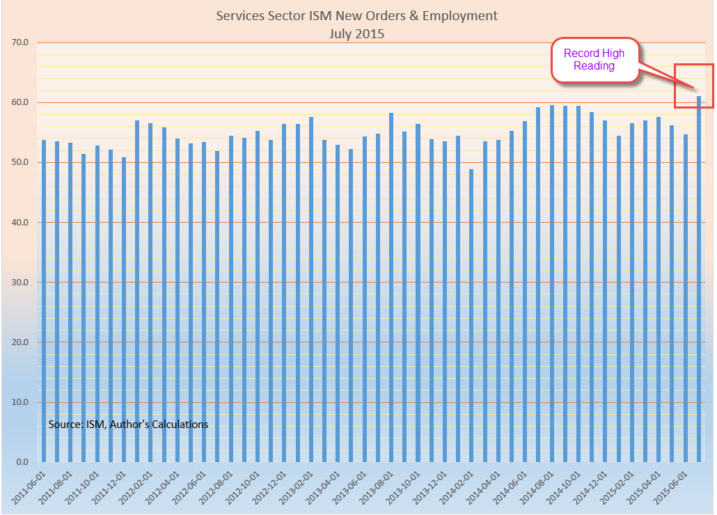
Although manufacturing has been contracting, a report on the rest of the economy was more encouraging, although a bit lackluster (Note #2). Service businesses are continuing to hire but the pace has slowed. New export orders have accelerated but new orders in total slowed significantly from August. Something to like, something not to like.

Billions of dollars around the world are traded as soon as the employment report is released each month. During Mr. Obama’s tenure private citizen Donald Trump accused Obama of fudging the employment numbers. Larry Kudlow, now Mr. Trump’s economic advisor, took him to task for that. Mr. Kudlow worked in the Reagan administration and knew well how sacrosanct the employment numbers were. The BLS is an independent agency working in the Department of Labor and its 2400 employees try to collect and publish the most accurate data it can accomplish. The agency’s Commissioner is the only political appointee in the BLS and once confirmed by the Senate, serves four years, the same as the head of the Federal Reserve (Note #3). According to Mr. Kudlow, the White House gets the number the night before only to prepare a press release when the report is released.

Mr. Trump’s reckless behavior helped him take out 16 other Republican presidential candidates in the 2016 election. He acts quickly and aggressively. That lack of caution has led to several bankruptcies, and because of that, no bank in the world will loan him money (Note #4). What if, on an impulse, Mr. Trump tweeted out the employment number shortly before its official release time? Some traders pay a lot of money so that the news will hit their trading desk a split second faster than a conventional news release. It’s that important. An early leak of the employment numbers would cost a lot of influential people big money around the world and would prompt a national if not a global crisis. Forget about the phone calls to foreign leaders to discredit Joe Biden. That would be an act of treason for sure – against the global financial community. Can’t happen? Won’t happen?

Mr. Trump knows no rules. His father protected him when his rash behavior got him into trouble as a child. The elder Trump sheltered Donald from his own mistakes in the real estate industry and his foolish foray into the Atlantic City gambling business. Now that Mr. Trump’s father is no longer there, he depends on others to protect him. He has enlisted a long line of people in that effort. They have come in the revolving door to the White House and left. The list is longer than I imagined (Note #5). John Bolton, the third National Security Advisor under Mr. Trump’s tenure, was the last high-profile team member to leave.

Mr. Trump has said that Americans would get tired of winning so much while he was President. To use a baseball analogy, when he takes the mound, the team doesn’t win very often. People who lose a lot either give up or blame everyone and everything else for their losses. They need to have an ideal environment or get lucky to win. Mr. Trump berates the independent Fed because he wants them to protect him. He needs every crutch he can get. He couldn’t succeed in a war or in the financial crisis because he is not disciplined or organized.

What does this mean for the average investor? Take a cautious approach and keep a balanced portfolio. Betting that Mr. Trump will pitch a good game is a poor bet.

Or is it? At an event on Friday, he claimed that the stock market has gone up 50% since he was elected. Not quite but it is up 42% since the day after he was elected (Note #6). It’s been about 35 months. That’s pretty good. A 60-40 stock-bond portfolio has gone up 30% in that time. Under Obama’s tenure the market only went up 27%. A balanced portfolio went up almost 40% and he had to deal with the worst recession since the Great Depression. The budget battles with Republicans put a big dampener on investor enthusiasm during Obama’s first term.

35 months after the Supreme Court awarded the presidency to George Bush, the market was down 25% but a balanced portfolio was up 21%. Even Mr. Clinton could not best Mr. Trump, although he comes close. 35 months after the 1992 election the market was up 38%. A balanced portfolio was up 40%. The winner? A balanced portfolio.

What might an investor expect? At today’s low interest rates and inflation, a break-even return might be 5% a year, for a total gain of 22% in four years. Will Mr. Trump’s first four years be one of his few wins? Check back in a year. It’s bound to be a tumultuous year.

/////////////////////////////

Notes:

  1. Institute for Supply Management (ISM). (2019, October 3). September 2019 Manufacturing ISM Report on Business. [Web page]. Retrieved from https://www.instituteforsupplymanagement.org/ISMReport/MfgROB.cfm
  2. Institute for Supply Management (ISM). (2019, October 3). September 2019 Non-Manufacturing ISM Report on Business. [Web page]. Retrieved from https://www.instituteforsupplymanagement.org/ISMReport/NonMfgROB.cfm?navItemNumber=28857&SSO=1
  3. Bureau of Labor Statistics. (n.d.). About the U.S. Bureau of Labor Statistics. [Web page]. Retrieved from https://www.bls.gov/bls/infohome.htm
  4. Business Insider. (2019, August 28). The world is talking about Trump’s relationship with Deutsche Bank. [Web page]. Retrieved from https://markets.businessinsider.com/news/stocks/trump-tax-returns-deutsche-bank-relationship-drawing-intense-scrutiny-2019-8-1028482268#why-it-matters2
  5. Wikipedia. (n.d.). List of Trump administration dismissals and resignations. [Web page]. Retrieved from https://en.wikipedia.org/wiki/List_of_Trump_administration_dismissals_and_resignations
  6. Prices are SPY, the leading ETF that tracks the SP500. Clinton: 42 to 58 (approximately) – up 38%. Bush: 138 to 103 – down 25%. Obama: 91 to 116 – up 27%. Trump: 208 to 295 – up 42%. Balanced portfolio returns from Portfolio Visualizer calculated using a mix of 60% U.S. stock market, and 40% of an evenly balanced mix of intermediate term government and corporate bonds. Dividends were reinvested and the portfolio re-balanced annually.

Circumstance

May 21, 2017

Last week I mentioned the 20 year CAPE ratio, a modification of economist Robert Shiller’s 10 year CAPE ratio used to evaluate the stock market. This week I’ll again look at equity valuation from a different perspective.  The results surprised me.

The date of our birth is circumstance.  When we retire is guided by our own actions and the circumstance of an era. We have no control over market behavior during the twenty year savings accumulation phase before we retire or the distribution of that savings during our retirement.   Let’s hope that we live long enough to spend twenty years in some degree of retirement.

The state of the market at the beginning of the distribution phase of retirement can have a material effect on our retirement funds, as many newly retired folks found out in 2008 and 2009.  Some based their retirement plans on the twenty year returns  prior to retirement.

I’ll use the SP500 total return index ($SPXTR at stockcharts.com or ^SP500TR at Yahoo Finance) to calculate the total gain including dividends. The twenty year period from 1988 through 2007 began just after the stock market meltdown in October 1987 and ended just as the 2007-2009 recession was beginning in December 2007. The total gain was 742%, or 11.3% annualized. Sweetness! Sign me up for that program.  Those high returns led many older Americans to believe that they didn’t need to accumulate more savings before retirement.  Then came the double shock of zero interest rates and a 50% meltdown in stock market valuation.

Now let’s move that time block one year forward and look at the period 1989 through 2008. Still good but what a difference one year makes. The total gain was 404%, or 8.4% annualized. That’s a drop of 3% per year! Investors missed the 16% bounce back in 1988 after the October 1987 crash, and the time block now included the 35% meltdown of 2008. There was even more pain to come in the first half of 2009 but I’ll come back to that.

1995 through 2014 was a good period with total gains of 550%, or 9.8% annualized. Shift that time block by two years to the period 1997 through 2016 and the gains fall off significantly. The total gain was 340%, or 7.7% annualized.

We can make a rough approximation of total returns during the late 1970s and into the 1980s, an ugly period for equities. In 1980, someone quipped “Equities are dead.” Twenty year periods ending during this time did not fare so well but still notched gains of more than 6%. Bonds, CDs and Treasuries were paying far more than that at the time. In today’s low interest environment, 6% seems a lot better than it did during the double digit inflation of 1980.

In past weeks I have written about the overvaluation of today’s stock market based on trailing P/E ratio and the smoothed 10 year CAPE ratio. Let’s look at the current valuation from the perspective of this twenty year return. It would come as no surprise that the total twenty year gain hit a low at the end of February 2009 when the market was about a 1/4 of its current valuation. That 20 year annualized gain was 5.7%. What surprised me was that the current valuation shows the same 20 year gain! Using this metric as an evaluation guide, the market sits at a relatively low level just like it was in 1988 and 1989.

The historical evidence shows that stock returns may be erratic but consistently make over 5% over a twenty year retirement period. Those who are newly retired or about to retire might understandably desire more safety. The safest approach is not to suddenly shift one’s portfolio entirely to safe assets.

///////////////////////

Income Inequality

Much has been written about the growth of income inequality. The GINI coefficient is the most popular but there are other measures (for those who want to get into the weeds of inequality measures). The Social Security Administration offers a simple indicator of the trend. They track the average and median incomes of millions of earners every year.

When the median and average are fairly close to each other, that indicates that the numbers in the data set are uniformly distributed. As the ratio percentage of the median to the average falls, that indicates that a few big numbers are raising the average but do not raise the median.

Here’s a simple example of an evenly distributed set. Consider a set of numbers 1, 2, 3, 4, 5, 6. The average is 3.5. The median is also 3.5 because there are three numbers in the set below 3.5 and three numbers above 3.5.  The percentage of the median to the average is 100%.

Let’s consider an unevenly distributed set: 1, 2, 3, 4, 5, 12. The median is still the same value as the earlier example: 3.5. But the average is now 4.5. The ratio of the median to the average is 3.5 / 4.5 = about 78%.

The ratio of the median to the average income has fallen from 71% in 1990 to 64% in 2015. This indicates that there is a growing number of large incomes in our data set.

SSAIncomeAvgMedian
Here’s the data in a graph form

SSAIncomeAvgMedianGraph
Median wages have doubled, or grown by 100%, while average wages have grown by more than 150% in the last quarter century.

Next week I will look at a hypothetical income tax proposal based on income. It might just blow your mind.

///////////////////////

Dividend Payout Ratio

FactSet Analytics grouped dividend paying stocks in quintiles (20% bands) by the dividend payout ratio (Chart). This is the percentage of profits that are paid to shareholders in the form of dividends. Over the last 20 years of rolling one month returns the stocks that had the highest and lowest payout ratios had the lowest total return. Think about that. Both the highest and lowest quintiles did the worst. What performed the best? Those stocks that were in the middle quintile, the companies who balanced their profit distributions between investors (dividends) and investment (future sales and profits).

//////////////////////////

CWPI

Each month I compute a Constant Weighted Purchasing Index built on a combination of the two Purchasing Manager’s surveys (PMI) each month. For the six month in a row, this composite has shown strong growth and the three year average first crossed the threshold of strong growth in January 2015.

A sub-index composite that I build from the new orders and employment components of the services survey (NMI) shows moderate growth. Its three year average has shown moderate growth since early 2014.

////////////////////////

The Supply Chain Sags

September 11, 2016

Fifteen years ago almost three thousand people lost their lives when the twin towers crumpled from the kamikaze attack of two hijacked airplanes.  Over the fields of rural Pennsylvania that morning, the passengers of a another hijacked plane sacrificed their own lives to rush the hijackers and prevent an attack on Washington.  We honor them and the families who endured the loss of their loved ones.

/////////////////////////

Purchasing Managers Index

Each month a private company ISM surveys the purchasing managers at companies around the country to assess the supply chain of the economy. Are new orders growing or shrinking since last month?  Is the company hiring or firing?  Are inventories growing or shrinking?  How timely are the company’s suppliers?  Are prices rising or falling? ISM publishes their results each month as a  Purchasing Managers Index (PMI), and it is probably the most influential private survey.

ISM’s August survey was disappointing, especially the manufacturing data.  Two key components of the survey, new orders and employment, contracted in August. Both manufacturing and service industries indicated a slight contraction.

For readers unfamiliar with this survey, I’ll review some of the details The PMI is a type of index called a diffusion index. A value of 50 is like a zero line.  Values above 50 indicate expansion from the previous reading; below 50 shows contraction. ISM compiles an index for the two types of suppliers, goods and services, manufacturing and non-manufacturing.

The CWPI variation

Each month I construct an index I call the Constant Weighted Purchasing Index (CWPI) that blends the manufacturing and non-manufacturing surveys into a composite. The CWPI gives extra weight to two components, new orders and employment, based on a methodology presented in a 2003 paper by economist Rolando Pelaez.  Over the past two decades, this index has been less volatile than the PMI and a more reliable warning system of recession and recovery, signaling a few months earlier than the PMI.

Weakness in manufacturing is a concern but it is only about 15% of the overall economy.  In the calculation of the CWPI, however, manufacturing is given a 30% weight.  Manufacturing involves a supply chain that produces a ripple effect in so many service industries that benefit from healthy employment in manufacturing. Because there may be some seasonal or other type of volatility in the survey, I smooth the index with a three month moving average.  Sometimes there is a brief dip in both the manufacturing and non-manufacturing sides of the data. If the downturn continues, the smoothed data will confirm the contraction in the next month.  This is the key to the start of a recession – a continuing contraction.

History of the CWPI

The contraction in the survey results was slight but the effect is more pronounced in the CWPI calculation. One month’s data does not make a trend but does wave a flag of caution. Let’s take a look at some past data.  In 2006 there was a brief one month downturn. In January 2008, the smoothed and unsmoothed CWPI data showed a contraction in the supply chain, and more important continued to contract. The beginning of the recession was later set by the NBER at December 2007. ( Remember that these recession dates are determined long after the actual date when enough data has been gathered that the NBER feels confident in its determination.)  The PMI index did not indicate contraction on both sides of the economy until October 2008, seven months after the signal from the CWPI.  During that time, from January to October 2008, the SP500 index lost 30% of its value.

The CWPI unsmoothed index showed expansion in June 2009 and the smoothed index confirmed that the following month. The PMI did not show a consistent expansion till August 2009.  The NBER later called the end of the recession in June 2009.

The Current Trend

Despite the weak numbers, the smoothed CWPI continues to show expansion but we can see that there is a definite shift from the wave like pattern that has persisted since the recovery began.

With a longer view we can see that an up and down wave is more typical during recoveries.  A flattening or slow steady decline (red arrows) usually precedes an economic downturn.  The red arrows in the graph below occurred a year before a recession.  The left arrow is the first half of 2000, a year before the start of the 2001 recession.  The two arrows in the middle of the graph point to a flattening in 2006, followed by a near contraction.  A rise in the first part of 2007 faltered and fell before the recession started in December 2007.  The current flattening (right arrow) is about six months long.

New Orders and Employment

Focusing on service sector employment and new orders, we can see the weakness in this year’s data.

With a long view, a smoothed version of this-sub indicator signals weakness before a recession starts and doesn’t shut off till late after a recession’s end.  The smoothed version has been below the 5 year average for seven months in a row.  If history is any guide, a recession in the next year is pretty certain.

The 2007-2009 Recession

 In August 2006 this indicator began consistently signaling key weakness in the service sectors of the economy (big middle rectangle in the graph below). Stock market highs were reached in June 2007 and the recession did not officially begin till December 2007, a full sixteen months after the signal started.  That signal didn’t shut off till the spring of 2010, about eight months after the official end of the recession.

The 2001 Recession, Dot-Com Bust and Iraq War

The recession in 2001 lasted only six months but the downturn in the market lasted three years as equities repriced after the over-investment of the dot-com boom.  The smoothed version of this indicator first turned on in January 2001, two months before the start of the recession in March of that year.   Although, the recession officially ended in November 2001, the signal did not shut off till June 2003 (left rectangle in the graph above).  Note that the market (SP500) hit bottom in September 2002, then nosedived again in the winter.  Weak 4th quarter GDP growth that year fueled doubts about the recovery.  Concerns about the Iraq war added uncertainty to the mix and drove equity prices near that September 2002 bottom.  In April 2003, two months before the signal shut off, the market began an upward trajectory that would last over four years.

No one indicator can serve as a crystal ball into the future, but this is a reliable cautionary tool to add to an investor’s tool box.

//////////////////////////////

Stocks, Interest Rates and Employment

There are 24 branches of the Federal Reserve. This week, presidents of two of those banches indicated that they favored an interest rate hike when the Fed meets later this month (Investor’s Business Daily article).  On Friday, the stock market dropped more than 2% in response.  One of those presidents, Rosengren, is a voting member on the committee (FOMC) that sets interest rates.  I have been in favor of higher interest rates for quite some time so I agree with Rosengren that gradual rate increases are needed. However, Chairwoman Janet Yellen relies on the Labor Market Conditions Index (LMCI) to gauge the health of the labor market.

Despite an unemployment rate below 5%, this index of about 20 indicators has been lackluster or negative this year.  There are a record number of job openings but employees are not switching jobs as the rate they do in a healthy labor market.  This is the way that the majority of employees increase their earnings so why are employees not pursuing these opportunities?

The Federal Reserve has a twin mandate from Congress: “maximum employment, stable prices, and moderate long-term interest rates.” (Source) There is a good case to be made that there are too many weaknesses in the employment data, and that caution is the more prudent stance.  The FOMC meets again in early November, just six weeks after the upcoming September meeting. Although the Labor Report will not be released till three days after the FOMC meeting, the members will have preliminary access to the data, giving them two more months of employment data. Yellen can make a good case that a short six week pause is well worth the wait.

Stuck in the Mud

In 18 months, the SP500 is little changed.  A broad index of bonds (BND) is about the same price it was in January 2015.  The lack of price movement is a bit worrying.  There are several alternative investments which investors may include in their portfolio allocation.  Since January 2015, commodities (DBC)  have lost 15%, gold (GLD) has gained a meager 1%, emerging markets (VWO) are down 5%, and real estate (VNQ) is literally unchanged.  A bright note: international bonds (BNDX) have gained almost 6% in that time and pay about 1.5%.  1994 was the last time several non-correlated assets hit the pause button.  The following six years were good for both stocks and bonds.  What will happen this time?  Stay tuned.

Pickup and Letdown

May 8, 2016

Based on ISM’s monthly survey of Purchasing Managers, the CWPI blends both service and manufacturing indexes and gives additional weight to a few components, new orders and employment.  Last month we were looking for an upward bend in the CWPI, to confirm a periodic U-shaped pattern that has marked this recovery. This month’s reading did swing up from the winter’s trough and we would expect to see further improvement in the coming few months to confirm the pattern. A break in this pattern would indicate some concern about a recession in the following six months. What is a break in the pattern? An extended trough or a continued decline toward the contraction zone below 50.

Since the services sectors constitutes most of the economy in the U.S., new orders and employment in services are key indicators of this survey.  A sluggish winter pulled down a composite of the two but a turn around in April has brought this back to the five year average.

Rising oil prices have certainly been a major contributor to the surge in the prices component of the manufacturing sector survey. The BLS monthly labor report (below) indicates some labor cost increases as well.  Each month the ISM publishes selected comments from their respondents.  An employer in the construction industry noted a severe shortage of non-skilled labor, a phenomenon we haven’t seen since 2006, at the height of the housing bubble.

Last week the BEA released a first estimate of almost zero growth in first quarter GDP, confirming expectations.  Oddly enough, the harsh winter of 2015 provided an even lower comparison point so that this year’s year over year growth, while still anemic, is almost 2%.

////////////////////////////

Employment

April’s employment data from the BLS was a bit disheartening.  Earlier this week, the private payroll processor ADP reported job growth of 150,000 in April and lowered expectations for the BLS report released on Friday.  While the BLS estimate of private job growth was slightly better, the loss of about 10,000 government jobs, not included in the ADP estimate, left the total estimate of jobs gained at 160,000. The loss of government jobs is slight compared to the total of 22 million employed at all levels of government but this is the fourth time in the past eight months that government employment has declined.

A three month average of job growth is still above 200,000, a benchmark of labor market health that shows job growth that is more than the average 1% population growth  With a base of 145 million employees in the U.S, a similar 1% growth rate in employment would equal 1.5 million jobs gained each year, or about 125,000 per month.  To account for statistical sampling errors, the churn of businesses opening and closing, labor analysts add another 25,000 to get a total of 150,000 minimum monthly job gains just to keep up with population growth.  The 200,000 mark then shows real economic growth.  In March 2016, the growth of the work force minus the growth in population was 1.2%, indicating continued real labor market gains.

Job growth in the core work force aged 25 -54 remains above 1%, another good sign.  It last dipped briefly below 1% in October.  This core group of workers buys homes, cars, and other durable goods at a faster pace than other age groups; when this powerhouse of the economy weakens, the economy suffers. In the chart below, there is an almost seven year period, from June 2007 through January 2014 where growth in this core work force group was less than 1%.  From January 2008 through January 2012, growth was actually negative.  The official length of the recession was 17 months, from December 2007 through June 2009.  For the core work force, the heart of the economic engine, the recession lasted much longer.

In 2005, a BLS economist estimated that the core work force would number over 105 million in 2014.  In December 2014, the actual number was 96 million, a shortage of 9 million workers, or almost 10% of the workforce.  In April 2016, the number was almost 98 million, still far less than expectations.

Some economists and pundits mistakenly compare this recovery from a financial crisis with recoveries  from economic downturns in the late 20th century.  For an accurate comparison, we must look to a previous financial, not economic, crisis – the Great Depression of the 1930s.

The unemployment rate in April remained the same, but more than a half million people dropped out of the labor force, reversing a six month trend of declines.  It is puzzling that more people came back into the labor force during the winter even as GDP growth slowed.

Average hourly earnings increased for the second month in a row, upping the year over year increase above 2.5%.  For the past ten years, inflation-adjusted weekly earnings of production and non-supervisory workers have grown an anemic .75% per year.  In the sluggish winter of January and February 2015, earnings growth notched  a recovery high of 3%, leading some economists and market watchers to opine that lowered oil costs, on the decline since the summer of 2014, would finally spur worker’s pay growth in this long, subdued recovery.  A year later, earnings growth is about 1.2%, a historically kind of OK level, but one which causes much head scratching among economists at the Federal Reserve.  When will worker’s earnings begin to recover?

/////////////////////////

Hungry

A reader sent me a link to a CNBC article  on food insecurity in the U.S. The problem is widespread and not always confined to those who fall below the poverty benchmark. Contrary to some perceptions, food insecurity is especially prevalent in rural areas, where food costs can be 50% higher than urban centers.  How does the government determine who is food insecure? The USDA publishes a guide with a history of the project, the guidelines and questions.  To point out the highlights, I’ll include the page links within the document. The guidelines have not been revised since this 1998 revision.

In surveys conducted by the Census Bureau, respondents are asked a series of questions.  The answers help determine the degree of household food insecurity.  The USDA repeatedly emphasizes that it is household, not individual, insecurity that they are measuring.  The ranking scale ranges from 0, no insecurity, to 10, severe insecurity and hunger. An informative graph of the scale, the categories and characteristics is helpful.

In 1995, a low .8 percent were ranked with severe food insecurity (page 14) . To be considered food insecure, a household must rank above 2.3 (household without children), or above 2 .8 (with children) on the scale.  Above that are varying degrees of insecurity and whether it is accompanied by hunger. (Table)

The USDA admits that measuring a complex issue like this one can provoke accusations that the measure either exaggerates or understates the number of households.  What are they measuring?  Page 6 contains a formal definition, while page 8 includes a list of conditions that the survey questions are trying to assess, and that a condition arose because of financial limitations like “toward the end of the month we don’t have enough money to eat well.”

Page 9 describes the rather ugly pattern of progressively worse food insecurity and hunger.  At first a household will buy cheaper foods that fill the belly.  Then the parents may cut back a little but spare the kids the sensation of hunger.  In its most severe stage, all the family members go hungry in a particular day.

Those of you wanting additional information or resources can click here.

////////////////

Earnings

Almost a month ago the giant aluminum manufacturer Alcoa kicked off the first quarter earnings season.  87% of companies in the SP500 have reported so far and FactSet calculates a 7% decline in earnings.  They note “the first quarter marks the first time the index has seen four consecutive quarters of year-over-year declines in earnings since Q4 2008 through Q3 2009.”  Automobile manufacturers have been particularly strong while the Energy, Materials and  Financial sectors declined.  Although the energy sector gets the headlines, there has also been a dramatic decrease in the mining sector.  The BLS reports almost 200,000 mining jobs lost since September 2014.

The bottom line for long term investors: the economic data supports an allocation that favors equities.  The continued decline in corporate earnings should caution an investor not to go too heavily toward the equity side of the stock/bond mix.

/////////////////

(Edited May 11th in response to a reader’s request to clarify a few points.)

Income Distributions

February 7th, 2016

Updates on January’s employment report and CWPI are at the end of this post.  Get out your snowboards ’cause we’re going to carve the political half-pipe! (*v*)
(X-Game enthusiasts can click here)

////////////////////////////////

To Be Rich or Not To Be Rich

Every year the IRS takes a statistical snapshot of the almost 150,000,000 (150M) personal tax returns it receives.  There are some interesting tidbits contained in these tables that will put the lie to many a politician’s claim in this election season.  The IRS lists the number of returns for each of some twenty income brackets.  They also list the exemptions claimed for each of these income brackets and let’s turn to that for some interesting insights.

From Table 1.4 we learn that there were 290M exemptions claimed in the 147M tax returns filed in 2013, or almost two exemptions per return.  In 1995 (Table 1, same link as above) the number of exemptions claimed was 237M for 118M returns, exactly two exemptions per return. Exemptions are people that need to be fed, clothed, and housed.

Census Bureau surveys (CPS) over the past few decades show that households are shrinking.  Conservatives assert that median household income has stagnated simply because there are fewer people and workers in households today compared to the past.  If this were true, IRS data would show a greater decrease in exemptions over an 18 year period. We can’t say that one or the other data source is “true,” but that averaging data from the two sources probably gives a more accurate composite of income trends in the data.  Census data probably overcounts households while the IRS undercounts them.  Conservatives who advocate less government support will ignore IRS data that conflicts with their beliefs.

30% of the exemptions were claimed by tax returns with adjusted gross incomes (AGI) of less than $25,000, or less than half the median household income. (AGI is earned income and does not include much of the income received from government social programs.)  Only 2M exemptions, or 2/3 of 1%, were claimed by tax returns with an AGI of $1M or more.  Out of 315 million people in the U.S., there are only two million “fat cats” with incomes above $1,000,000.

Presidential contender Bernie Sanders tells his supporters that he is going to tax the rich to help pay for his programs.  IRS data shows just how few there are to tax to generate money for ambitious social programs. Mr. Sanders says he will get money from the big corporations.  Corporations with lots of well paid lawyers are not going to give up their money peacefully.

Instead, Mr. Sanders’ plans will rely on taxing individuals who can not erect the legal or accounting barricades employed by big corporations.  11% of exemptions were claimed by those making more than $200,000, a larger pool of potential tax money. Doctors, lawyers and other professionals will “Feel the Bern.”  It is not unusual for a middle class married couple in a high cost of living city like New York or Los Angeles to make $200K.  Mr. Sanders has his sights on you.  You are now reclassified as rich.

Here is a well-sourced analysis of the net cost to families.  Most will save money.  Unfortunately, Mr. Sanders made the political mistake of admitting that he would raise taxes, but…  No one paid attention to the “but.”  Should he win the Democratic nomination, Mr. Sanders will “feel the Bern” as Republicans use the phrase against him.  He might have used a phrase like “my plan will lower mandatory payments” to describe the combined effect of higher income taxes and no healthcare insurance payments.

The author calculates that the top 4% will spend a net $21K in extra taxes less savings on health care premiums.  The author probably overstates the effect on those at the top because he uses an average instead of a median, but we could conservatively estimate an additional $10K for those with AGIs in the $200K-$300K range.

****************

Earned Income Tax Credit

The Earned Income Tax Credit (EITC) is  a reverse income tax for low income workers, who get a check from the federal goverment.  For the 2014 tax year, over 27 million returns received about $67 billion from the government for an average of $2400 per receipient (IRS).  In inflation adjusted dollars, this is up 50% from the 2000 average of $1600.  The number of receipients has expanded 50% as well, growing from 18 million to 27 million.  Although Democrats often tout their support for the poor, it is Republican congresses that are largely responsible for expanding this support for low income families.  Republicans may talk tough but are more than willing to reach out a helping hand to those who are giving it their best effort.  There is a practical political consideration as well.  An analysis of IRS data by the Brookings Institute found that, in the past fourteen years, the poor have shifted from urban areas largely controlled by Democrats to the outlying suburbs of metropolitan areas, where Republicans have more support. In short, Republicans are taking care of their voter base.

****************

Constant Weighted Purchasing Index (CWPI)

The manufacturing sector, about 15% of the economy, continues to contract slightly, according to the latest Purchasing Manager’s Survey from ISM.  The strong dollar and a slowdown in China have dragged exports down.   Extremely low oil prices have impacted the pricing component of the manufacturing survey, which has reached levels normally seen during a recession.


For some industries, like chemical products, the low oil prices have boosted their profit margins.  Most industries are reporting strong growth or at least staying busy.  Wood, food, beverage and tobacco manufacturers and producers report a sluggish start to the year, as reported to ISM.

The services sectors have weakened somewhat in the latest survey of Purchasing Managers, but are still growing, with a PMI index reading of 53.5.  Above 50 is growing; below 50 is contracting.  The weighted composite of the entire economy, the CWPI, is still growing strongly but the familiar up and down cycle of the recovery is changing.  Both exports and imports are contracting

The composite of employment and new orders in the non-manufacturing sectors has broken  below the 5 year trend.  It may turn back up again as it did in the winter of 2014, but it bears watching.

*************************

Employment

Each month theBureau of Labor Statistics  (BLS) surveys thousands of businesses and government agencies to compute the number of private and public jobs gained or lost during the month.  The payroll processing firm ADP also tallies a change in private jobs based on paychecks generated from thousands of its client businesses.  If we subtract government jobs from the BLS total, we should get a total number of jobs that is close to what ADP tallies.  As we see in the graph below, that is the case.

Economists, policy makers and the media look at the monthly change in that total number of jobs.  This change is miniscule compared to the 121 million private jobs in the U.S.  A historical chart of that monthly change shows that BLS survey numbers are more volatile than ADP.

I find an averaging method reduces the monthly volatility.  I take the change in jobs as reported by the BLS, subtract the  change in government employment, average that result with the ADP report of jobs gained or lost, then add back in the BLS estimate of the change in government employment.  This method produces a resulting monthly change that proves more accurate in time, after the data is subsequently revised by the BLS.  Based on that methodology, jobs gains were close to 175K in January, not the 151K reported by the BLS or the 205K reported by ADP.

There was a lot to like in January’s survey.  The unemployment rate fell below 5%.  Average hourly earnings increased by 1/2%.  Manufacturing jobs added 29,000 jobs, the most since the summer of 2013.  This helped offset the far below average job gains in professional and business services.  Year-over-year growth in the core work force aged 25-54 increased further above 1%.

The bad, or not so good, news: job gains in the retail trade sector accounted for 1/3 of total job gains and were more than twice the past year’s average of retail jobs gained.  Considering that job growth in retail was near zero in December, this may turn out to be a survey glootch.  Food services were another big gainer this past month.  Neither of these sectors pays particularly well.  The jump in manufacturing jobs probably contributed the most to lift the average hourly wage.

The Labor Market Conditions Index (LMCI) is a cluster of twenty or so employment indicators compiled by the Federal Reserve.  December’s change in the monthly index was almost 3%.  In the forty year history of this index, there has NEVER been a recession when this index was positive.

We are innately poor at judging risk.  We derive indicators and other statistical tools to help us balance that innate human weakness with the strength of mathematical logic.  Still, people do not make money by NOT talking about recession.  NOT talking does not pay commissions, does not generate the buying of put options, expensive annuities, and other financial products designed to make money on the natural gut fears of investors.  Next week I’ll look at the price stability of our portfolios.

A Change Is Gonna Come

December 6, 2015

A horrible week for many families.  When we count the dead and injured in mass shootings, we often neglect to include the family and friends of each of these victims.  If we conservatively estimate 20 – 30 people affected for each victim, we can better appreciate the emotional and economic impact of these events. Shooting Tracker lists the daily mass shootings (involving four or more victims) in the U.S. in 2015.  What surprised me is that, in most cases, the shooter/assailant is unknown.

A strong November jobs report sent equities, gold and bonds soaring higher on Friday.  Markets reacted negatively on Thursday following a lackluster response from the European Central Bank(ECB) and comments by Fed chair Janet Yellen indicating that a small rate increase was in the cards at the mid-December Fed meeting.  The SP500 closed Thurday evening below November’s close.  Not just the close of November 2015, but also the monthly close of November 2014!

Overnight (early Friday morning in the U.S.), the ECB said that they would do whatever it took to support the European economy. Shortly after the cock crowed in Des Moines, the Bureau of Labor Statistics released November’s labor report, confirming an earlier ADP report of private job gains.  By the end of trading on Friday, the SP500 had jumped up 2%.  However, it  is important to step back and gain a longer term perspective.  The index is still slightly below February 2015’s close – and May’s close – and July’s close.

Extended periods of price stability – let’s call them EPPS – are infrequent.  Markets struggle constantly to find a balance of asset valuation. Optimists (bulls) pull on one end of the valuation rope.  Pessimists (bears) pull on the other end.  Every once or twice in a decade, neither bears nor bulls have a commanding influence and prices stabilize. Markets can go up or down after these leveling periods: 1976 (down), 1983 (up),  1994 (up), 2000 (down), 2007 (down), 2015 (?)

**************************

Year End Planning

Mutual funds must pass on their capital gains and losses to investors.  Investors who have mutual funds that are not in a tax-sheltered retirement account should take the time in early December to check on pending capital gains distributions either with their tax advisor or do it themselves.  Most mutual fund companies distribute gains in mid to late December.  Your mutual fund will have a list of pending December distributions on their web site.  For those retail investors in a rush, you might just scan through the list and look for those funds that have a distribution that is 5% or more of the value of the fund, then look and see if it is one of your funds.

An EPPS tends to produce relatively small capital gains but this year some mid-cap growth funds and international funds may be declaring gains of 7 – 10% of the value of the fund.  An investor who had $50,000 in some mid-cap growth fund might see a capital gain distribution of $4,000 on their December statement.  When an investor receives the statement in January 2016, it is too late to offset this gain with a loss.  Depending on the taxpayer’s marginal tax rate, they could be on the hook to the tax man for $700 – $1200.

Let’s say an investor is anticipating a $4000 capital gain distribution in a taxable mutual fund in late December.  Most mutual fund companies list the cost basis of each fund in an investor’s account. An investor who had a cost basis that was higher than the current value of the fund could sell some shares in that fund to offset some or all of the capital gain distribution in the other fund.  This is called tax loss harvesting.  Again, remind or ask your tax advisor if you are unclear on this.

Here is an IRS FAQ sheet on capital gains and losses.  Here is an article on the various combinations of short term and long term gains and losses.

**************************
CWPI

The latest ISM Survey of Purchasing Managers (PMI) showed that the manufacturing sector of the economy contracted in November.  October’s reading was neutral at 50.1.  November’s reading was 48.6.

The services sector, which is most of the economy, is still growing strongly.  Both new orders and employment are showing robust growth.   

However, manufacturing inventories have contracted for five months in a row.  For now, this decline is more than offset by inventory growth in the service industries.  However, the drag from the manufacturing sector is affecting the services sector.  The trough and peak pattern of growth in employment and new orders since the recession recovery in 2009 has begun to get a bit erratic.  Nothing to get too concerned about but something to watch.

The Constant Weighted Purchasing Index combines the manufacturing and service surveys and weights the various components, giving more weight to New Orders and Employment.  Both components anticipate future conditions a bit better than the equal weight methodology used by ISM, which conducts the surveys.  In addition, there is a smoothing calculation for the CWPI.

During this six year recovery, the CWPI has shown a wave-like pattern of growth.  Since the summer of 2014, growth has remained strong but there has been a leveling in the pattern as the manufacturing sector no longer contributes to the peaks of growth.

Despite the underlying growth fundamentals, there are some troubling signs.  In response to activist investors, to boost earnings numbers and maintain dividend levels, companies have bought back shares in their own company at an unprecedented level.  In some cases, companies are taking advantage of low interest rates to borrow money to make the share buybacks. (U.S. Now Spend More on Buybacks Than Factories, WSJ 5/27/15)

*******************************

Labor Report

46,000 jobs gained in construction was a highlight of November’s labor report and was about a fifth of all job gains.  Rarely do gains in construction outweigh gains in professional services or health care. This is more than twice the 21,000 average gains of the past year. The steady but slow growth in construction jobs is heartening but a long term perspective shows just how weak this sector is.

Involuntary part-timers, however, increased by more than 300,000 this past month, wiping out a quarter of the improvement over the past year.  These employees, who are working part time because they can not find full time work, have decreased by almost 800,000 over the past year.

The core work force, those aged 25-54, remains strong with annual growth above 1%.

Other notable negatives in this report are the lack of wage growth and hours worked.  Wage growth for all employees is a respectable 2.3% annual rate, but only 1.7% for production and non-supervisory employees.  This is below the core rate of inflation so that the income of ordinary workers is not keeping up with the increase in prices of the goods they buy.

Hours worked per week has declined one tenth of an hour in the past year, not heartening news at this point in what is supposed to be a recovery.  Overtime hours in the manufacturing sector has dropped 10% in the past year.

******************************

Inflation

The core CPI is a measure of inflation that excludes the more volatile price changes of food  and energy.  While the headline CPI gets the attention, this alternative measure is one that the Federal Reserve looks at to get a sense of the underlying inflationary forces in the economy.  The target annual rate that the Fed uses is 2%.

October’s annual rate was 1.9%.  November’s rate won’t be released till mid-December. However, Ms. Yellen made it pretty clear that the Fed will raise interest rates this month, the first time since the financial crisis. I suspect that prelimary reports to the Fed on November’s reading showed no decline in this core rate.  With employment gains and inflation stable, the FOMC probably felt comfortable with a small uptick in the bench mark rate.

Which Way Sideways?

August 9, 2015

As we all sat around the Thanksgiving table last November, the SP500 was about the same level as it closed this week.  Investors have pulled off the road and are checking their maps to the future.  After forming a base of good growth in the past few months, July’s CWPI reading surged upwards.

Despite years of purchasing managers (PMI) surveys showing expanding economic activity, GDP growth remains lackluster.  Every summer, in response to more complete information or changes to statistical methodologies, the Bureau of Economic Analysis (BEA) revises GDP figures for the most recent years.  A week ago the BEA revised real annual GDP growth rates for the years 2011 – 2014 from 2.3% to 2.0%.  “From 2011 to 2014, real GDP increased at an average annual rate of 2.0 percent; in the  previously published estimates, real GDP had increased at an average annual rate of 2.3 percent.”

A composite of new orders and rising employment in the service sectors showed its strongest reading since the series began in 1997.  The ISM reading bested the strong survey sentiments of last summer. We can assume that the PMI survey is not capturing some of the weakness in the economy.

This level of robust growth should put upward pressure on prices but inflation is below the Federal Reserve’s benchmark of 2%.  Energy and food prices can be volatile so the Fed uses what is called the “core” rate to get a feel for the underlying inflationary pressures in the economy.

The stronger U.S. dollar helps keep inflation in check.  There is less demand from other countries for our goods and the goods that we import from other countries are less expensive to Americans. .  Because the U.S. imports so much more than it exports, the lower cost of imported goods dampens inflation.  In effect, we “export” our inflation to the rest of the world.

When the economy is really, really good or very, very bad we set certain thresholds and compare the current period to those benchmarks.  When the financial crisis exploded in late 2008, the world fled to the perceived safety of the dollar in the absence of a exchange commodity of value like gold.  Because oil is traded in U.S. dollars and the U.S. is a stable and productive economy and trading partner, the U.S. dollar has become the world’s reserve currency.  The conventional way of measuring the strength of a currency like the dollar has been to compile an index of exchange rates with the currencies of our major trading partners.  This index, known as a trade weighted index, does not show a historically strong U.S. dollar.  In fact, since 2005, the dollar has been extremely weak using this methodology and only recently has the dollar risen up from these particularly weak levels.

As I mentioned earlier, a strong dollar helps mitigate inflation pressures; i.e. they are negatively correlated. When the dollar moves up, inflation moves down.  To show the loose relationship between the dollar index and a common measure of inflation, the CPI, I have plotted the yearly percent change in the dollar (divided by 4) and the CPI, then reversed the value of the dollar index.  As we can see in the graph below, the strengthening dollar is countering inflation.

What does this mean for investors?  The relatively strong economy allows the Fed to abandon the zero interest rate policy (ZIRP) of the past seven years and move rates upward.  A zero interest rate takes away a powerful tool that the Fed can employ during economic weakness: to stimulate the economy by lowering interest rates.

The strong dollar, however, makes Fed policy makers cautious. Higher interest rates will make the dollar more appealing to foreign investors which will further strengthen the dollar and continue to put deflationary pressures on the economy.  The Fed is more likely to take a slow and measured approach.  Earlier this year, estimates of the Effective Federal Funds Rate at the end of 2015 were about 1%.  Now they are 1/2% – 3/4%.  In anticipation of higher interest rates, the price of long term Treasury bonds (TLT) had fallen about 12% in the spring.  They have regained about 7% since mid-July.

DBC is a large commodity ETF that tracks a variety of commodities but has about half of its holdings in petroleum products.  It has lost about 15% since May and 40% in a year.  It is currently trading way below its low price point during the financial crisis in early 2009.  A few commodity hedge funds have recently closed and given what money they have left back to investors.  Perhaps this is the final capitulation?  As I wrote last week, there is a change in the air.

*************************

Labor Report

Strong job gains again this month but labor participation remains low.  A key indicator of the health of the work force are the job gains in the core work force, those aged 25 – 54.

While showing some decline, there are too many people who are working part time because they can’t find a full time job.  Six years after the official end of the recession in the summer of 2009, this segment of the work force is at about the same level.

In some parts of the country job gains in Construction have been strong.  Overall, not so much.  As a percent of the work force, construction jobs are relatively low.  In the chart below I have shown three distinct phases in this sector since the end of World War 2.  Extremes are most disruptive to an economy whether they be up or down.    Note the relatively narrow bands in the post war building boom and the two decades from 1975 through 1994.  Compare that to the wider “data box” of the past two decades.

For several months the headline job gains have averaged about 225,000 each month.  The employment component in the ISM Purchasing Managers’ Index (on which the CWPI above is based) is particularly robust.  New unemployment claims are low and the number of people confident enough to quit their jobs is healthy.  The Federal Reserve compiles an index of many factors that affect the labor market called the Labor Market Conditions Index (LMCI).  They have not updated the data for July yet but it is curiously low and gives more evidence that the Fed will be cautious in raising rates.

Winter Wanders

March 8, 2015

Labor Market

If you are reading this and have not set your clock forward, that’s OK.  March to your own drummer!

On Wednesday, payroll processor ADP released their data for February, showing private payroll gains of 212,000.  This confirmed estimates that total job gains from the BLS would be about 230,000.  The bothersome data point in the ADP report was the huge upward revision of job gains in January, bringing it close to the BLS estimate.  ADP is working with a lot of hard data – actual paychecks – so was this revision a discrepancy in seasonal adjustments?

On Thursday, the BLS issued revised figures for labor productivity in the 4th quarter of 2014. The report includes this: “The 4.9 percent increase in hours worked remains the largest increase in this series since a gain of 5.7 percent in the fourth quarter of 1998.” 4th quarter productivity sagged 2.2% from the 3rd quarter,  and was essentially unchanged from the 4th quarter of 2013.  Labor productivity is often a lagging indicator but it narrowed Thursday’s trading range as investors crossed bets on the Fed’s plans for raising interest rates later in the year.

The BLS report of 295,000 job gains in Febuary was so over the top that many traders punched the sell button.  Government employment increased 7,000, meaning that private job gains as reported by the BLS was almost 290,000, a difference of almost 70,000 between the BLS and ADP reports.  When in doubt, traders get out.

For mid to long-term investors, the continuing strength in the labor market is an optimistic sign.  Employees add to costs and commitments.  If businesses are adding jobs, it is because they anticipate higher revenues in the near future.  Some analysts pointed to the high number of jobs gained in the leisure and hospitality sectors as a sign of weakness in the labor market.  These are jobs that pay on average about 25% less than the average of all production and non-supervisory employees and a third less than the average for all employees.  However, higher paying jobs in professional services and construction also showed strong gains.

As I have mentioned before, the Federal Reserve compiles a Labor Market Conditions Index (LMCI) which summarizes 24 employment trends and one which chair Janet Yellen uses as her gauge for the fundamental strength or weakness of the labor market.  Next Wednesday, the Fed will release the LMCI updated for February but a chart of the past twenty years shows longer term trends.

While the index itself is still in negative territory, the momentum (red line) of the index is strong and consistent.  We can understand Yellen’s cautious optimism when recently testifying before the Senate Banking Committee.  This index was only developed a few years ago so this chart includes revised data and methodology that is backward looking.  If history is any guide, a long term investor would be ill advised to bet against the momentum of this index when it is positive.

A key indicator for Ms. Yellen is the Quit rate, the number of employees who quit their jobs to go to another job or who feel confident that they can find another job without much difficulty.  That confidence measure continues to rise and is currently in a sweet spot.  It is not overly confident as it was at the height of the housing boom in 2006 and the dot com boom of the late 1990s.  It is neither pessimistic as it was in the early 2000s or darkly apocalyptic as in the period from 2008 – 2012.

The number of new claims for unemployment as a percentage of the Civilian Labor Force is at historic lows.  One could argue that new claims are too low.

Wage growth in this month’s report was minimal.  However, wage growth since 2006 has not done too badly, growing more than 25% and outpacing the 16% growth in inflation during the period.

Benefits have grown more than 20% in the same period and showed no decline during this past recession.  Many employees are simply not aware of the costs of their benefits.  They may think that vacations and holidays and health care are the only benefits they get.  There are several mandated taxes and insurance that an employer is required to pay.

Because some benefit costs are “sticky,” and not responsive to changing business conditions, the continued strength in the labor market shows an increasing commitment on the part of employers, a growing confidence that economic conditions are fundamentally improving.  Several years ago, many employers were reluctant to take on new employees because positive news was regarded with a healthy skepticism.  “We won’t get fooled again,” as the Who song lyric goes.  Despite improving fundamentals, the market is likely to be somewhat volatile this year as investors and traders speculate on the timing and aggressiveness of any interest rate moves from the Fed.

**************************

Purchasing Managers Index

Based on the monthly survey of purchasing managers, the Constant Weighted Purchasing Index (CWPI) declined slightly again this month as expected.  The manufacturing sector slid a bit this past month but employment in the service sectors popped up, keeping the composite index up above the benchmark of strong growth.  If the post-recession trend continues, we might see one more month of softening within this growth period.

New orders and employment in the service sectors are the key indicators that I highlight to get a more focused analysis of growth trends.  When this blend of the two factors stays above 55, the benchmark of strong growth, the economy is strong.  Except for a slight dip below that mark (54.4) last month, this blend has been above 55 for ten months now.

We can also see the brief periods of steady decline in these two components in 2011, 2012 and the beginning of 2013, causing the Federal Reserve to worry about a further decline into recession. The Federal Reserve enacted a series of bond buying programs called QE.  Continued economic strength may prompt a slow series of interest rate hikes.  The key word is “slow.”  Under former chairman Alan Greenspan, the Federal Reserve adjusted interest rates up and down too quickly, which produced small shock waves in the financial system.  Banks, businesses and investors may make unwise choices in response to rapid rate changes.  Live and learn is the lesson.

Growing Signs

February 8, 2015

Employment

Employment gains in January were at the midpoint of expectations but revisions to the gains of November and December were significant, adding about 70,000 jobs in each month.  After a decline in December, average hourly earnings rose to $24.75, for a year-over-year gain of 2.2% and a good 1% above inflation.

In a sign that people are becoming more optimistic about job prospects, the Participation Rate increased 2/10ths of a percent in January.  After 5 years of decline, this rate may have found a bottom over the past year.

The health or frailty of the core work force aged 25 – 54 years is  a snapshot of the underlying strength of the labor market.  This age band constitutes our primary working years.  In the first half of this thirty year period we build job skills, work and social connections, establish credit, and accumulate relationships and stuff.  Year-over-year growth in the 1 to 2% zone is the preferred “Goldilocks” growth rate.

As the graph below shows, the growth rate has been above 1% for most of the past year.

Monthly gains in construction employment have overtaken professional business services and the health care industry.

The construction industry accounts for less than 5% of employment but each employee accounts for a total of $160,000 in spending so changes affect other industries.  As you can see in the graph below, real or inflation-adjusted construction spending per employee was relatively stable during the 1990s.  As the housing market boomed, spending per employee rose dramatically in the 3-1/2 years from late 2002 to early 2006.  In the worst throes of the recession when the industry shed almost a quarter of its employees, per employee spending stabilized at the same level as the 1990s.

Stimulus spending and Build America projects helped cushion the decline in construction spending but as those programs concluded, spending fell to a multi-decade low in the spring of 2011.  Despite historically low interest rates and increasing state and municipal tax revenues, both residential and commercial construction are below the benchmark set in the 1990s.  Despite strong gains in the past two years, the industry still has room to run.

As the economy improves, those working part time because they can not get full time work has decreased significantly from the nosebleed heights of five years ago.

That total includes those whose hours have been cut back because of slack business conditions.  A subset of that total are the number of workers who are working part time because they can not find a full time job.  This segment of workers has seen little change during this recovery.

*****************************

Purchasing Manager’s Index

Each month I update a composite index of the ISM Purchasing Manager’s indexes (PMI) first introduced by economist Rolando Pelaez in 2003.  This composite, the Constant Weighted Purchasing Index, or CWPI, reached record highs in October 2014.  It is no surprise that, this month, the BLS revised November’s employment gains upwards by 70,000 to over 420,000.  As expected, the composite has declined but remains robust.

The wave like pattern of present and anticipated industrial activity has quickened since early 2013, the troughs and crests coming closer together.  If this pattern continues, we should expect gradual declines over the next two months before rising up again.  A combination of employment and new orders in the service sectors continues to show healthy growth, although it has also declined from the strong growth of the past few months.

Adjusting the Carburetor

November 9, 2014

About two thirds of companies in the SP500 had reported earnings for the third quarter. George guessed that positive earnings surprises were somewhat above the normal 70% but as former Presidential contender Herman Cain said, “I don’t have facts to back that up.”  Checking his guess, George went to Fact Set which provides a weekly update summary of earnings reports.  Positive earnings surprises were the highest percentage in over four years. On the other hand, Fact Set was reporting that the forward price earnings ratio of the SP500 was above the 5 and 10 year average.  Einstein famously quipped that the most powerful force in the universe was compound interest.  He might have mentioned an equally powerful force – reversion to the mean.

George updated his spreadsheet with data from Robert Shiller, the Yale economist who had devised the CAPE ratio, an inflation adjusted Price Earnings ratio for the SP500.  When the CAPE was higher than average, as it had been the past two years, price gains over the following five years were likely to be low or negative.  George had added a spreadsheet column to measure the annual percent gain in stock prices five years in the future, then plotted these five year gains against the CAPE ratio.  In the long run of several years, the above average gains in stock prices of the past few years were likely to drift lower or turn negative, bringing their 5 year return to the post-WW2 historical mean of 7%.

But in the post-WW2 period, the stock market had almost always gained in the year after a mid-term election.   It’s like a junction on a hiking trail with many signs and no mileage, George thought.

Monday’s report on auto and truck sales was almost exactly in the middle of the range of expectations.  Promotional sales in August before the introduction of 2015 models had propelled sales upwards in August. Sales in September and October had stayed on trend, a sales curve that was flattening.

Manufacturing data from ISM was strong and continuing to rise, but the market seemed to be in pause mode a day before the elections.  “One more day!” Mabel exclaimed. “We’re being bombarded with political ads.” George reflected on that for a second. “I don’t think I’ve actually seen one ad,” he said.  “We buzz through them when we’re watching a program.”  “Well, sometimes I like to watch the local news live or the weather channel,” Mabel responded.  “It’s become impossible to watch anything live on TV.”  George wondered how many millions would be spent on this election.  How many voters were like he and Mabel, paying little if any attention?  Mabel was a straight ticket voter.  It took her less than ten minutes to vote.  Amendments to the Colorado Constitution – no. “Don’t you even read them?” George had once asked her.  “Nope, they’re all sponsored by special interests,” she had replied.  “What about the marijuana amendment two years ago?” George had asked. “Well, I did vote yes on that one,” Mabel had conceded.  George spent hours researching candidate bios and their positions on the issues.  He would sometimes bring up a name of an independent candidate or a Libertarian candidate to Mabel.  “Why waste your time?” Mabel had asked.  “Whether we like it or not, we’ve got a two party system in this country.  Pick one and vote.  No Independent or Libertarian candidate is going to win.” “Yeh, what about Ross Perot in ’92?” George had asked.  “Cost Bush the election,” Mabel had responded. “No, it didn’t.  Perot took about as many votes from Clinton as he did from Bush,” George had argued.  Where had he read that?  Probably Wikipedia.  “Fine,” Mabel had countered with that tone of voice meaning end of argument.

As they watched election results on Tuesday, George commented that he had been wrong.  “No!” Mabel exclaimed, her hands raised in supplication to the fates.  “Let me write this down,” she said. “Hecklers, always the hecklers,” George shook his head in a mock display of discouragement. “No, really.  I thought the Republicans would gain the Senate but just barely.  Gardner is cleaning Udall’s clock.  Look at Mia Love in Utah.  Methinks there’s a change in the wind, oh forsooth.”

Colorado was a toss-up.  As they turned in for the night, one channel had declared the Republican gubernatorial candidate, Bob Beauprez, as the winner in the race.  In the state senate and house, the Democrats held a slim majority that could be overturned but the races were too close to call.  George expected a bump up in the market the next day unless ADP, the private payroll processor, had a disappointing report of private job gains.

Wednesday morning they woke to the news that incumbent Colorado governor John Hickenlooper had squeaked out a win but his rival had still not conceded.  State senate and house races were still undecided and there might be recounts through November. “If this were a baseball or football game, this would be exciting.” George’s banter had little effect with Mabel who was in a rather sour mood. “Look,” he added, the Dems will have a chance to take back the Senate in 2016.  The Republicans will have six or seven Senate seats up for grabs by the Democrats.  It’s the math of Senate elections.”

In addition to gaining the Senate, Republicans had extended their control of the House.  George turned to the ADP report of private job gains – 230,000.  The market had popped up about 1/2% at the open, showing a curious restraint after the previous night’s Republican sweep.  One of their CDs would be due in a few weeks but George knew this was not a good time to bring up the subject of moving some of that really safe money into something else.  Their son Robbie, his wife Gail and their grandson Charlie would be coming over this weekend and that would help brighten up the mood in the house.

The price of West Texas Intermediate crude oil crossed below the $80 mark.  The game was on to control the world market for oil.  Fracking in the U.S. had increased supply, reducing net imports of oil by the U.S.  However, the cost per barrel using fracking methods is more expensive than conventional drilling.  The only way that the Saudis could strengthen their dominance of the market was to drive the price down to a point where fracking was no longer profitable, putting pressure on these suppliers.  At a price below $80, plans to start new wells might be put on hold.  At a sustained price below $80, some suppliers with higher drilling costs might shut down or reduce their output.  Russia, Venezuela and Mexico depended on a higher oil price to fund their governments and social programs.  The lower revenues from oil were exerting a lot of political pressure within these countries.

ISM released their monthly report on the service sectors.  George added the new data to his spreadsheet. He had expected a decline from September’s peak, but the composite of manufacturing and non-manufacturing was as strong as September.

Employment and New Orders were two key factors in the services sector.  For the fourth month in a row, the readings pushed the 60 level, the boundary between strong growth and robust growth.  There had only been two times in 2005 when readings had been this strong.

 On Friday, the BLS released their monthly report of employment gains.  Although net job gains were slightly below expectations, there were gains in most industries, a healthy sign.  As usual, George averaged the BLS estimate and ADP’s estimate.  Subtract the 5000 new jobs in government from the 214,000 reported by the BLS to get private job gains of 209,000.  Average that with the 230,000 jobs estimated by ADP to get 220,000, then add back in the 5000 government jobs. A strong report in a string of strong reports.

George had heard a number of explanations for the swing toward the Republicans. The economy was growing.  Why had voters handed such a decisive hand to the Republicans?  It was a repudiation of Obama’s failed policies.  George noticed that Mabel had not eaten all her nacho chips from the night before. There are rules so he asked politely if he could finish them.  Chipotle’s chips were the best. No, they were Democrats focused on tactics rather than ideas.  No, it was a resounding affirmation of conservative principles by the Amuhrican people. No, it was a throw the bums out election.  No, it was a frustrated electorate that is sick of Washington gridlock and a do-nothing Congress.  No, it was shifting sentiments among age groups and demographic groups. Voters over 60 were a greater percentage of voters in this election while voters under 30 were a smaller percentage.  Asian and Hispanic voters had voted Democratic but with less commanding majorities.  Men swung Republican more than women swung Democratic. Post-election analysis sometimes reminded George of post-Super Bowl analysis.  There was one chart that encapsulated a big problem that Democrats had.  Part-timers couldn’t find full-time jobs.

Each of those 3 million extra involuntary part-timers were counted as one job, regardless of the hours.  A little more than 1 million jobs had been created since the peak of employment in 2007.  Job growth, in short, had been paltry.  A good indicator of job growth was Social Security tax revenue collected each year. In 2006, near the height of the housing boom, the Federal Government had collected $809 billion in Social Security taxes (Treasury data), a 27% increase over the amount collected in 2000, at the height of the dot com boom, just before George Bush took office.  In 2008, the year before Obama took office, the government collect $674 billion.  Six years into Obama’s tenure as President, the government would collect about $755 billion in 2014, a modest increase of 12%.  It was true, Obama had been handed an extremely dysfunctional financial system and a global economy in a death dive.  

Strong wage growth had preceded the past three recessions.  Since this past recession, wage growth had fallen and stayed persistently low, causing discontent among frustrated voters.  Many workers were barely keeping up with inflation.

Voters were like the shade tree mechanics of George’s youth.  To adjust a carburetor, turn the screw this way or that way, trying to find the position where the engine idle sounded the smoothest.  It was a negotiation of sorts between air and gas.  Every two years, voters turned the political adjustment screw and waited to see if it made a difference.