March 30th, 2014
Business Activity
The Institute for Supply Mgmt (ISM) and Markit Economics are two private companies that survey purchasing managers and release the results in the first week of each month. Toward the end of each month Markit releases what is called a “Flash PMI”, an early indication of activity for the month. This month’s flash index of manufacturing activity declined slightly but is still showing strong growth. New orders are showing strong growth at a reading of 58. The Flash reading of the services sector rose to over 55 but this is a mixed report, with only tepid growth in employment and backlogs actually in a slight contraction. The most remarkable feature of this report was the 78.1 index of business expectations, an outstandingly optimistic reading. This Flash index gives investors a glimpse of the full survey reports from ISM and Markit that will be released in the first week of next month.
******************************
On the other hand…
The monthly report of durable goods indicates a rather tepid 1-1/2% year over year growth. This excludes planes, autos, and other transportation orders. Including those components, there has been no yearly growth.
******************************
Stick with the plan, Stan…
Rising equity and real estate markets have been good for a lot of people. A Bankrate.com blog noted the number of people entering the ranks of millionaires in 2012. Toward the end of this report was an important lesson: “60 percent of investors worth $5 million or more say they’ll invest in equities this year, while 31 percent of those worth $100,000 to $1 million plan to do the same.” Hmmm…rich people are not buying into the prophecy prediction analysis that the market will crash this year. Could they be sticking with a plan that allocates investments across a variety of assets, including stocks?
*******************************
Personal Income
This week, the Bureau of Economic Analysis (BEA) released February’s estimate of personal income. Real, or inflation adjusted, disposable personal income (DPI), rose 2.1%, a decline from January’s 2.75% increase but above the 1% that has historically led to recessions.
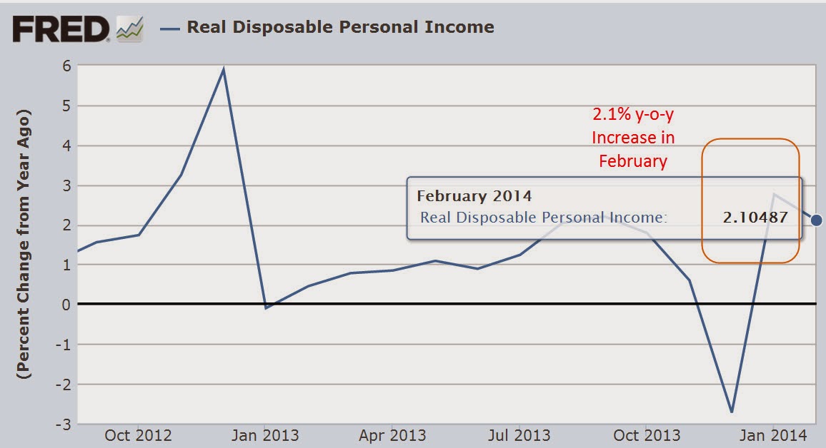
A few weeks ago I noted that annual DPI had dropped below 1% in 2013. Contributing to the weak year over year comparison was the high spike in income in the fourth quarter of 2012 when many companies “paid forward” both dividends and bonuses in December in advance of tax increases scheduled for 2013.

While this may have been a contributing factor to the decline, it would be a mistake to give it too much weight. The growth in personal income has been relatively weak and it shows in the consumer spending index released this week. The .1% year over year increase – essentially zero – indicates consumer demand that is too weak to put any upward pressure on prices. Sensing this, businesses are less likely to invest in growth. Less investment growth means that employment gains will be modest, which further reinforces modest economic growth.
The stock market trades on profit growth. Standard and Poors reports that 4th quarter earnings for the companies in the SP500 rose 9.8%, accelerating from the 6.0% growth in the 3rd quarter of 2013. A moderately improving economy and only modest growth in investment has helped boost profits. Profits are expected to rise 11% in the second half of 2014.
******************************
GDP
The third estimate of GDP growth in the fourth quarter of last year was 2.6%, in line with consensus estimates. In her testimony before Senate Finance Committee two weeks ago, Fed chairwoman Janet Yellen noted that we may be in for an extended period of slow growth below the fifty year average of 3%.
Three weeks ago I looked at GDP and the personal savings rate. This week I’ll look at per hour GDP. Readers should understand that this is what some economists would call a messy data set. I have made some assumptions about the number of hours worked per employee. The BLS publishes average hours worked for manufacturing employees and I made a guesstimate that the average for all workers is about 90% of that. The number of part time employees who do not work this amount of hours offsets the unreported hours of the self-employed. I am less concerned about the absolute accuracy of the GDP output per hour worked but that any inaccuracies be fairly consistent. The trend is more important than the actual numbers. What can we learn when output per hour flattens or declines? Below is a graph of sixty five years.
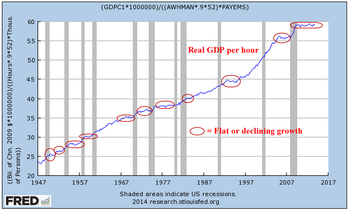
We can see that flat growth tends to precede recessions but there is no definite pattern where we can say with any confidence that a flattening or decline in per hour GDP necessarily precludes a recession. If we zoom in on the past thirty years, we do notice that the preceding decade has been marked by long periods of flat growth. More importantly, the recovery from this past recession is marked by the longest period of flat growth in the history of the series.

The summer of 2009 marked the official end of this past recession. For five years there has been no increase in real GDP per hour worked. For a few years following a recession in the early 1990s, per hour GDP flattened before taking off in the late 1990s.
Does this flat growth represent a pruning of the economic tree before a surge of new growth? Or does it presage an even worse recession? Is the economy locked inside a limbo of limp growth for years to come, echoing the two decades of little growth in Japan’s economy? Whatever happens, we can be certain of one thing – the trend and pattern will be so much more obvious in the future simply because we will disregard some past data based on what happens in the future.
As we make investment decisions, we should remember that the “obvious” patterns we see when we look back were much less clear at the time. Sure there will be investment gurus who tell us that they saw it coming. We forget that they also saw the depressions of 1994, 1998, 2000, 2004, 2006 and 2011 – the ones that didn’t happen.
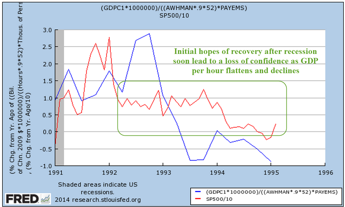
Let’s look a bit more closely at recent periods of flat growth. The recovery from the recession of 1991 was marked by a painfully slow recovery in the job market. After a 30% rise over three years, the market stumbled.

There’s a story to be told when we look at the growth in the market index and per hour GDP. Whether it is by coincidence or not, there is a loose response of the market to changes in output.
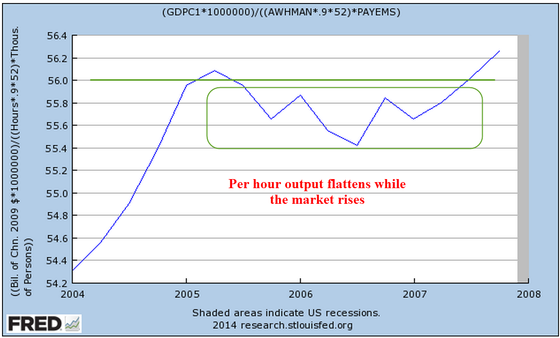
After another slow recovery from the recession of 2001, the market began to climb in 2004.

But this time the market was not responding to the flattening growth in per hour output.
In the past four years, there has been little growth in output per hour.

But the market has doubled over that time.

Part of that recovery can be attributed to the market simply reversing the decline of 2008 and early 2009, but a good 40% increase in market value can be attributed to the greater share of output that companies have been able to convert to profit. (See last week’s blog) How long that trend can and will continue is anyone’s guess but we know that it can not go on forever. Flat revenue growth makes growing profits an ever more difficult task.
The flat growth in per hour output gives us perhaps another insight into the so-so growth in employment. Without a clear vision of a stimulus that will spur growth, companies are reluctant to commit to plans for an expansion of their work force.
