The Missing Productivity Gains

May 1, 2022

by Stephen Stofka

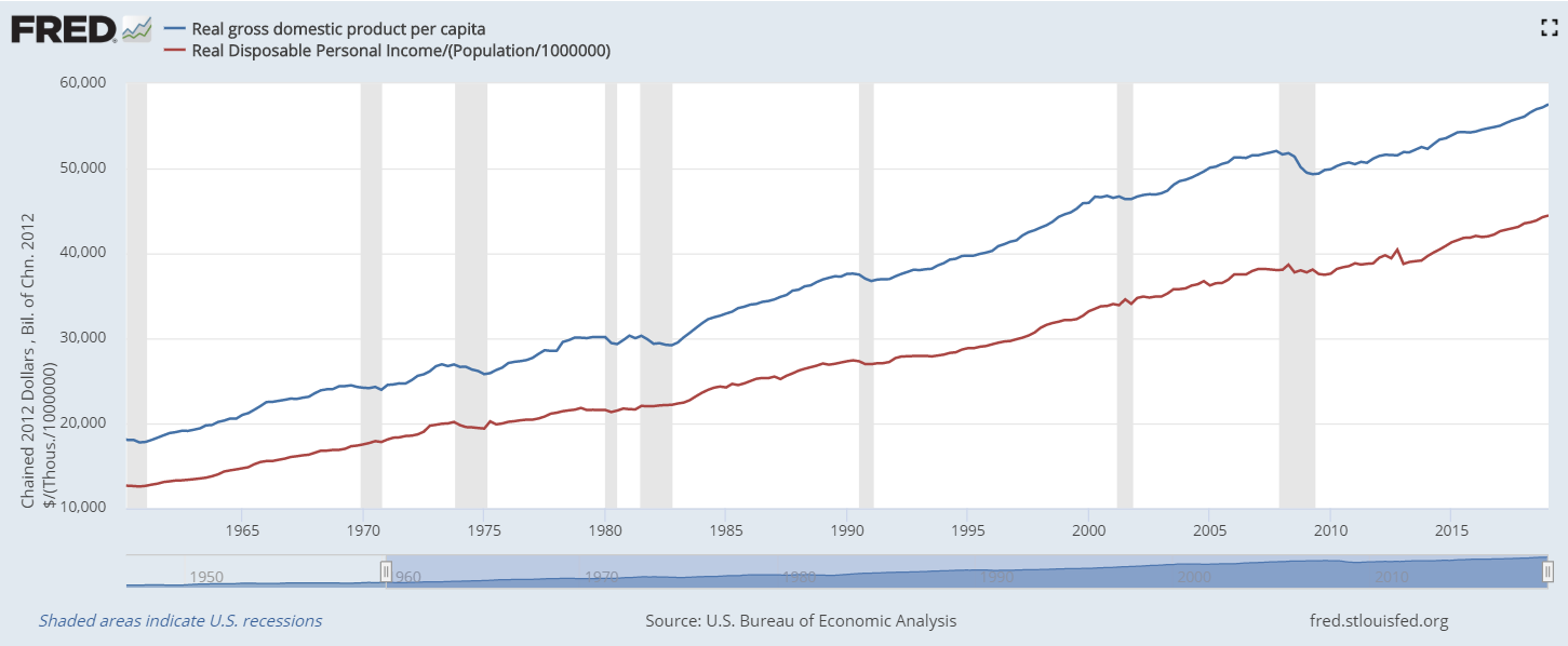
On NBC News this week a reporter mentioned that a living wage was $35.80 an hour for someone with a child. M.I.T.’s Living Wage Calculator (2022) confirmed that approximate amount near where I live. That’s an annual income of $71,000, about $4,000 more than the median household income (MHI) today. In the past few decades incomes have been falling behind by just a little bit in inflation-adjusted income. In 1987, the MHI was $26,600, about $69,000 in today’s money (Series in footnotes). Today’s MHI is just a bit below off that figure. So what’s the problem?

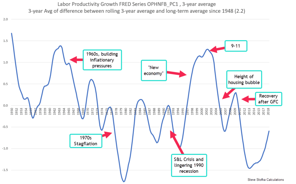
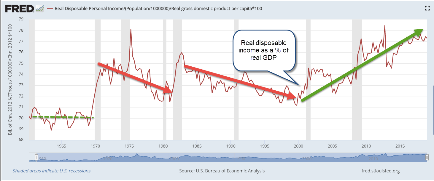
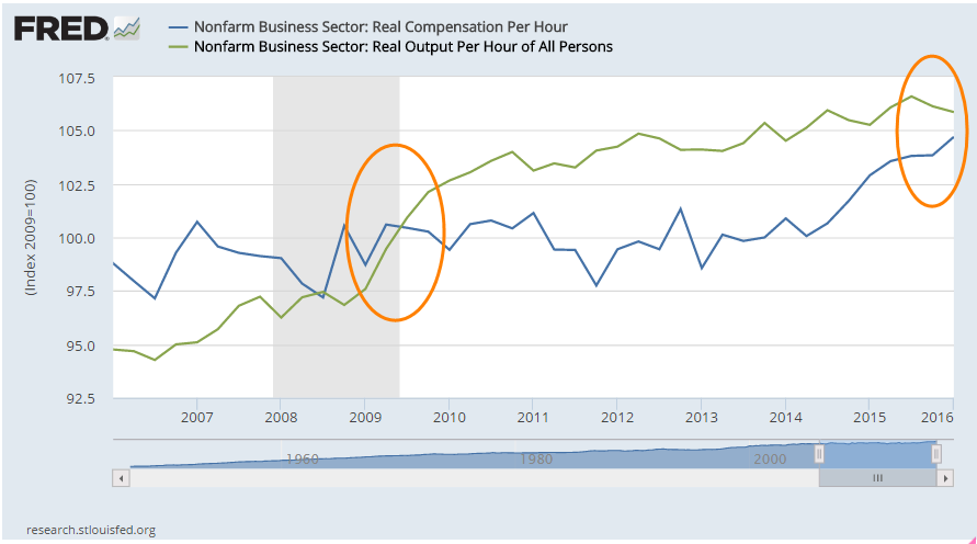
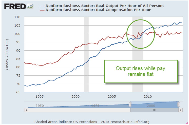
Although incomes have kept up with inflation, they have not kept up with productivity gains. Most economists believe that a worker gets paid the value of her marginal product. If that is so and there have been productivity gains since 1987, then incomes should reflect some of those gains.

The BLS calculates a Total Factor Productivity that includes capital and labor. A 2018 study by the BLS calculated 2.9% annual output growth since the late 1980s. Estimating the sources of growth, they found that capital had contributed 40% more to productivity than labor but, even so, labor’s share of the gains should be at least 1% annually. If so, the MHI would be considerably higher today.

There are several reasons why American household income has not kept pace with productivity gains. They include:

A smaller percentage of workers belong to a union and so have less bargaining power. According to the BLS (2022), only 10.3% of all workers belong to a union. Among public sector workers the rate is far higher – 34%, but only 1 out of 7 employees are in the public sector.

Critics argue that greedy business owners are keeping all the productivity gains. Perhaps so, but that requires market power. Why have workers continued to work for less than a livable wage? Business owners complain that they have little pricing power. If workers and businesses have no pricing power, who has it? It may be buried in the garbage heap where capital goes to die in a competitive and fast changing marketplace. Before 2000, consumption of fixed capital accounted for 15% of GDP. Today, it has risen to 17%. In a $24 trillion economy, a 2% change is a lot. In a world where companies must innovate to survive, we notice only what survives. Growth comes at a cost.

Some say that the job mix has changed so that it is difficult to compare incomes, job skills and productivity with those of 35 years ago. There are now more lower paying service jobs, fewer high paying manufacturing jobs.

Making comparisons tough are the smaller household size today. With fewer people per household, incomes won’t be as high. The 1960s and 1970s saw explosive growth in household formation and this helped fuel the high inflation of the 1970s. Since then household formation has trended upward at a slow pace. The ratio of households to population today (.39) is only slightly higher than it was 40 years ago (.36). That slight difference does not account for the lost income in unpaid productivity gains.

 Some argue that illegal immigrants are taking American jobs. They are willing to work for lower wages, and are reducing the bargaining power of American workers. There are an estimated 12 million undocumented immigrants in this country, including children and people past working age. Many of those who do work do so in agriculture which is not counted in the payroll numbers. Some work in construction but those jobs are only 5% of the workforce. There wouldn’t be any noticeable effect on the incomes of 150 million workers.

So where are the missing productivity gains?

/////////////

Photo by Proxyclick Visitor Management System on Unsplash

BLS. (2018). Sources of growth in real output in the private business sector, 1987-2018. Productivity. Retrieved May 1, 2022, from https://www.bls.gov/productivity/articles-and-research/source-of-output-growth-private-business-productivity-1987-2018.pdf. Note: this is a short summary less than one page. Multi-factorial growth is the difference between calculable inputs and total output. I have divided it up according to the ratio of each factor’s input. Interested readers can find a list of articles on productivity at https://www.bls.gov/productivity/articles-and-research/total-factor-productivity-articles.htm

BLS. (2022, January 20). Union Members – 2021. Bureau of Labor Statistics. Retrieved April 30, 2022, from https://www.bls.gov/news.release/pdf/union2.pdf

FRED Construction Employment: USCONS – 7.6 million. Total employment – 151 million.

FRED Employee Cost Index – Total Compensation: ECIALLCIV, adjusted for inflation using PCEPI.

FRED Median Household Income: MEHOINUSA646N

FRED Total Factor Productivity at Constant Prices RTFPNAUSA632NRUG

M.I.T. (2022). Living Wage Calculator. M.I.T. Retrieved April 30, 2022, from https://livingwage.mit.edu/counties/08031

///////////////

The Fruits of Labor

March 6, 2022

by Stephen Stofka

In trips to the grocery store and gas station, many of us develop an inflation calculator that we trust because it tracks price changes in the unique basket of goods that we buy. If the price of mushrooms doubles, we only care if we buy mushrooms. Economists have the difficult task of computing the price changes of a common set of goods. They spend an extraordinary amount of time and expense surveying people in cities throughout the U.S. to construct a representative sample of the goods we buy (BLS, 2021). The price weighting that economists use to measure inflation differs from our instinctive approach. We assign weighting by the frequency we do something. What catches our attention gets more weight in our consumption basket.

Our sense of inflation can be guided by the price of gasoline when we fill up each week, but it is only 4% of the CPI measure of inflation (BLS, 2022). Many of us underweight the cost of housing that we provide to ourselves. Wait, what? In January, economists at the Bureau of Labor Statistics computed a 4% increase in housing costs even for those who owned their home outright. They call this Owners’ Equivalent Rent (OER) and it makes up a whopping 25% of the calculation of inflation. In the BLS methodology, homeowners are both landlords and renters. Actual rental increases made up only 7% of the index but the BLS uses those rent increases to compute the market price of what a homeowner could rent out their home for each month. For a homeowner, that 4% increase in housing costs is actually a 4% saving. Even better, homeowners do not pay income taxes on that imputed income.

Like gasoline, we overweight the effect of grocery prices because we frequently shop. If we enjoy a sirloin steak once a week, we notice when it increases in price from less than $10 to $13 a pound (FRED series APU0400703613). In the years after the financial crisis many households ate more ground beef. Prices doubled in response to the increased demand (APU000070312). Ground beef is what economists call a Giffen good. Unlike normal goods, we buy more of a Giffen good when our income goes down.

Many of us measure inflation by comparing the prices we pay to the wages we receive. Workers have gained little in the past two decades, eking out an extra 8% in real earnings over that time. All of that gain has come in the past eight years. Workers should expect to share in the productivity increases of the past two decades.

An assumption of neoclassical economics is that workers’ wages reflect their marginal productivity. A BLS analysis (Sprague, 2014) of labor productivity showed an average gain of 2.2% in real output per hour from 2000-2013, yet workers’ real earnings declined slightly. In the past eight years, annual productivity gains have averaged about 1%, slightly below the annual 1.2% increase in real wages. Why have workers been able to command wages appropriate to their productivity in the past eight years but not in the 14 years prior? The problem began before the financial crisis when productivity rose 2.7% per year and real wage growth actually declined. The 2000s came after a period of reversal for the owners of capital. During the 1990s, much money was lost in the pursuit of profits promised by the developing internet. Owners and management recaptured those losses by keeping the productivity gains to themselves during the 2000s. Workers may not be able to regain those lost wages but at least they are securing the fruits of their labor.

/////////////

Photo by Timotheus Fröbel on Unsplash

BLS. (2021, December 9). Consumer price index frequently asked questions. U.S. Bureau of Labor Statistics. Retrieved March 5, 2022, from https://www.bls.gov/cpi/questions-and-answers.htm

BLS. (2022, February 10). Table 1. Consumer price index for all urban consumers (CPI-U): U. S. city average, by Expenditure Category – 2022 M01 results. U.S. Bureau of Labor Statistics. Retrieved March 5, 2022, from https://www.bls.gov/news.release/cpi.t01.htm

Sprague, S. (2014, May). Definition, concepts, and uses. U.S. Bureau of Labor Statistics. Retrieved March 5, 2022, from https://www.bls.gov/opub/btn/volume-3/what-can-labor-productivity-tell-us-about-the-us-economy.htm

A Generation’s Legacy

October 24, 2021

By Steve Stofka

There are two types of federal benefit programs: those that require “dues” to qualify for benefits and those that are means-tested. Social Security is an example of the first type. With some exceptions recipients must contribute to the program to qualify for benefits. Supplemental Security Income (SSI) and the SNAP food program are examples of the latter. A person’s circumstances, not their contributions, determine their qualification for benefits. Because people think of Social Security as an insurance program, not a government charity, it is the “third rail” of politics. Voters feel that they have paid into the system and deserve their promised benefits. The Boomer generation points to the $2.9 trillion in the Social Security Trust Fund as evidence they have indeed paid into the system. Talk of cutting benefits can earn a politician the boot. The question is: have workers paid in enough?

Our choices today are constrained by the priorities and choices of past generations. The Social Security program was created in 1935 to relieve seniors burdened with crushing poverty. The failure of thousands of banks prior to that time had wiped out the lifetime savings of many workers. With a commanding majority in the House and Senate, Democrats responded to the plight of many seniors. Those first generations received far more in benefits than they paid in contributions and created what is called a “legacy debt.”

In 1965 the program was expanded and in 1975 benefits were indexed to inflation. By that time, the sum of contributions exceeded benefits paid so that the trust fund had a reserve of 56% of benefits expected to be paid that year. By 1983, the reserve stood at only 18% of that year’s anticipated benefits. High inflation during the 1970s and some miscalculations in computing inflation adjustments to beneficiaries had depleted reserves. At that time, the Boomer generation ranged in age from 20 to 37, about the same as the Millennial generation today. By 2008, the first of the Boomer generation would be eligible for benefits. A commission recommended accelerating tax increases to build up the trust fund in anticipation of this demographic bulge. When the great financial crisis hit in 2008, the trust funds had 358% in reserves. It should have been much more.

Economists and politicians have remarked on the slow wage growth of the past decades. The cause of that slow growth is a matter of political perspective, but one thing is certain. Labor productivity has slowed as well and there is no consensus on the cause of that. In the chart below, I’ve smoothed out some data from the Bureau of Labor Statistics on Labor Productivity to show the long term trends. I set the 70-year average of 2.2% annual growth at zero to show the periods of below average productivity. The chart shows the two decades of below average growth from 1975 to 1995.

Labor Productivity – 70 year average of 2.2% annual growth set to zero

In a 2001 paper William Nordhaus (2001, 2), a researcher at the National Bureau of Economic Research (NBER) noted “after growing rapidly for a quarter century, productivity came to a virtual halt in the early 1970s.” Nordhaus attributed the growth of the late 1990s to the “new economy,” the communications technology and software development at the dawn of the internet. The productivity surge lasted about a decade, succumbing to the drag of low productivity in the service sector in general.

Because many service jobs have low productivity growth, America has given up the robust growth of the modern industrial age in the post-WW2 period. Low wage growth means less taxes to fund benefits and political tension. Since 2010, Social Security has been tapping the trust funds to pay benefits as the Boomers retire. By 2034, the trust funds will be depleted and the trustees estimate that each year’s taxes will be enough to pay about ¾ of promised benefits unless taxes are raised or general taxes are used to pay benefits. As much as workers have paid in SS taxes, it wasn’t enough. The Social Security trustees estimate that an additional 2.83% in taxes would cure the problem for another 75 years but politicians don’t have the courage to push taxes higher.

The program was created during the depths of the Depression. The generation that enjoyed SS benefits far above their contributions has passed on, leaving their legacy debt with us. They believed that the future would be like the past, that strong productivity and wage growth could pay inflation adjusted benefits for 15-20 years of retirement. Across a divided country and a divided Congress, we must put down the word weapons and ask ourselves “What are we going to do?”

////////////////

Photo by Markus Spiske on Unsplash

Nordhaus, W. D. (2001, January 01). Productivity growth and the New Economy. Retrieved October 24, 2021, from https://www.nber.org/papers/w8096

SSA. (2021). Social Security – Trust Fund Ratios. Retrieved October 24, 2021, from https://www.ssa.gov/oact/tr/2020/lr4b4.html

Making Stuff

May 5, 2019

by Steve Stofka

This week I’ll review several decades of trends in productivity. How much output do we get out of labor, land, and capital inputs? Capital can include new equipment, computers, buildings, etc. In the graph below, the blue line is real GDP (output) per person. The red line is disposable (after-tax) income per person. That’s the labor share of that output after taxes.

As you can see, labor is the majority input. In the following graph is the share of real GDP going to disposable income.  In the past two decades, labor has been getting a larger share.

That might look good but it’s not. Since 2000, the economy has shifted toward service industries where labor does not produce as much GDP per hour. The chart below shows the efficiency of labor, or how much GDP is being produced by labor.

If labor were being underpaid, the amount of GDP produced per dollar of disposable income would be higher, not lower. On average, service jobs do not have as much leverage as manufacturing jobs.

A century ago, agricultural jobs were inefficient in comparison to manufacturing jobs. The share of labor to total output was high. In the past seventy years, the agricultural industry has transformed. Today’s farms resemble large outdoor manufacturing plants without walls and productivity continues to grow. In the past five years, steep price declines in the prices of many agricultural products have put extraordinary pressures on today’s smaller farmers. The increased productivity of larger farms has allowed them to maintain real net farm income at the same level as twenty years ago (Note #1). Here’s a graph from the USDA.

Although agriculture related industries contribute more than 5% of the nation’s GDP, farm output is only 1% of the nation’s total output. The productivity gains in agriculture have not been shared by the rest of the economy. Labor productivity has plunged from 2.8% annual growth in the years 2000-2007 to 1.3% in the past eleven years (Note #2).  Here’s an earlier report from the Bureau of Labor Statistics with a chart that illustrates the trends (Note #3). The report notes “Sluggish productivity growth has implications for worker compensation. As stated earlier, real hourly compensation growth depends upon gains in labor productivity.”

Productivity growth in this past decade is comparable to the two years of deep recession, high unemployment and sky-high interest rates in the early 1980s. The report notes “although both hours and output grew at below-average rates during this cycle [2008 through 2016], the fact that output grew notably slower than its historical average is what yields the historically low labor productivity growth.” Today we have low unemployment and very low interest rates – the exact opposite of that earlier period. Why do the two periods have similar productivity gains? It’s a head scratcher.

Simple answers? No, but hats off to Donald Trump who has called attention to the need for a greater shift to manufacturing in the U.S. economy. He and then Wisconsin governor Scott Walker negotiated with FoxConn Chairman Terry Gou to get a huge factory built in Mount Pleasant, Wisconsin to manufacture LCD displays, but progress has slowed. An article this week in the Wall St. Journal exposed the tensions that erupt among residents of an area which has made a major commitment to economic growth (Note #4).

If we don’t shift toward more manufacturing, American economic growth will slow to match that of the Eurozone. Along with that will come negative interest rates from the central bank and little or no interest on CDs and savings accounts. We already had a taste of that for several years after the recession. No thanks. Low interest rates are a hidden tax on savers. They lower the amount of interest the government pays at the expense of individuals who are saving for education or retirement. Interest income not received is a reduction in disposable income and has the same effect as a tax. Low interest rates encourage an unhealthy growth in corporate debt and drive up both stock and housing prices.

///////////////////

Note:

  1. USDA summary of agricultural industry
  2. BLS report on multi-factor productivity
  3. BLS report on declining labor productivity
  4. FoxConn LCD factory (March article – no paywall). Also, a recent article from WSJ (paywall) – Foxconn Tore Up a Small Town to Build a Big Factory—Then Retreated

Productivity And Labor Unions

February 5, 2017

About 10% of all workers, public and private, belong to a union. Today the percentage of private sector employees who are unionized is the same as in 1932, eighty years ago. (Wikipedia) The rise and fall of unon membership looks like the familiar bell curve, with the peak in the 1970s. The causes of the decline are debated but some attribute the erosion of union power as an important factor in wage stagnation.

The major factor is not declining union membership but declining productivity, and that persistent decline has economists and policymakers baffled.  Higher productivity should equal higher wage growth and, in the 30 year post-war period 1948-1977, multi-factor productivity (MFP) annual growth averaged 1.7%. MFP includes both labor and capital inputs. In the 40 year period from 1976-2015, MFP growth averaged about half that rate – .9%.

prodmfp1948-2015

In the debate over the causes of the decline, some contend that all the easy gains were made by 1980.  Productivity is now returning to a centuries long growth trend that is less than 1%. In an October 2016 Bloomberg article, Justin Fox picked apart BLS data to show that growth has been flat in some key manufacturing areas for the past three decades. The ten-fold surge in productivity growth in the tech sector is largely responsible for any growth during the past 30 years. OECD data indicates that other developed countries are experiencing a similar lack of growth (OECD Table) When no one can conclusively demonstrate what the causes are for the decline, policymakers face tough challenges and even tougher debate over the solutions.

//////////////////////////////

LoanGate

LoanGate may the next scandal. A few months ago, the Dept of Education (DoE) revealed that they had seriously undercounted student loan delinqencies because of a programming error. When the Wall St. Journal analyzed the revised data, they found that the majority of students at 25% of all colleges and trade schools in the U.S. had defaulted on their student loan or failed to make any repayment.  (WSJ article)

The Obama administration forced the closure of many private institutions whose students had low repayment rates. In 2015, Corinthian Colleges shuttered the last of its schools and filed for bankruptcy. The revised data show that many more institutions, both public and private, should be shut down.

This latest programming error at the DoE follows other embarrassing episodes during the two Obama terms. In October 2013, the rollout of Obamacare was riddled with programming errors that blocked many applicants from enrolling in a plan with healthcare.gov.

In 2010, the IRS delayed many applications for 501(c)3 tax status from mostly conservative political groups. Lois Lerner, the head of the agency, first claimed that these had been innocent clerical mistakes by an overworked staff, but a series of hearings uncovered the fact that employees at the IRS had acted on their own political feelings and deliberately targeted these groups. (Mother Jones)

In yet another incident, the Office of Personnel and Managment (OPM), the HR dept for thousands of Federal employees, revealed in 2016 a data breach involving 22,000,000 personnel records, including Social Security numbers.  Unchecked programming errors and data breaches erode the public’s faith in public institutions.  That these mistakes happened under a Democratic administration favoring ever bigger public institutions to solve ever bigger social problems is especially embarrassing.

When Obama first took office in 2009, the inflation adjusted total of student debt had quadrupled in the 15 year period (DoE paper – page 1) since 1993. By the time he left office eight years later, student debt had grown ten-fold to $1.3 trillion. The delinquency rate on that debt is 11% but the repayment rate is considered a better predictor of future delinquencies. The revised data reduced the combined repayment rate to a little more than 50% (Inside Higher Ed), far lower than the 75% plus repayment rates of a few decades ago.

The defaults are coming and there will be an inevitable call for a taxpayer bailout.  A popular element of Bernie Sanders’ Presidential platform was that a college education should be free. In the real world, nothing is free, so somebody pays.  Who should pay and how much will further aggravate tensions in an already divided electorate.

///////////////////////////////////

Five Year Rule

A few weeks ago I wrote about the 5-year rule, a backstop to any allocation rule. Any money needed in the next five years should be in stable assets like short to intermediate term bonds, CDs and cash. Why 5 years of income? Why not 2 years or 10 years? Answer: History.

Let’s look back at 80 years in 5 year slices, or what is called 5-year rolling periods. As an example, the years 2000 – 2004 would be a 5-year rolling period. 2001 – 2005 would be the next period, and so on.

Saving me the time and effort of running the data on stock market returns is a blogger at All Financial Matters who put together a table of this very data for the years 1926-2012. The table shows that the SP500 has held or increased its inflation adjusted value (very important that we look at the real value) almost 75% of the time. So the 5-year rule guards against a loss of value the other 25% of the time.

The 5-year rule can apply whenever there are anticipated income needs from our savings: retirement, college expenses, sickness or disability, and even a greater chance of losing our jobs. In a retirement span of 25 years, 6 of those years will fall into that 25% category. The 5-year rule minimum usually kicks in toward the end of retirement when a person’s reserves are lower and prudence is especially important.


Global Portfolio

May 15, 2016

Picture the poor investor who leaves a meeting with their financial advisor followed by a Pig-Pen tangle of scribbled terms. Allocation, diversification, small cap, large cap, foreign and emerging markets, Treasuries, corporate bonds, real estate, and commodities. What happened to simplicity, they wonder?  Paper route or babysitting money went into a savings account which earned interest and the account balance grew while they slept.

For those in retirement, it’s even worse. The savings, or accumulation, phase may be largely over but now the withdrawal phase begins and, of course, there needs to be a withdrawal strategy.  Now there’s a gazillion more terms about withdrawal rates,  maximum drawdowns and recovery rates, life expectancy, inflation and other mumbo jumbo that is more complicated than Donald Trump’s changing interpretations of his proposed tax plans.

Seeking simplicity, an investor might be tempted to put their money in a low cost life strategy fund or a target date fund, both of which put investing on automatic pilot.  These are “fund of funds,” a single fund that invests in different funds in various allocations depending on one’s risk tolerance. There are income funds and growth funds and moderate growth funds within these categories.  For a target date fund, what date should an investor use?  It is starting to get complicated again.

Well, strap yourself into the mind drone because we are about to go global.  Hewitt EnnisKnupp is an institutional consulting group within Aon, the giant financial services company.  In 2014, they estimated the total global investable capital at a little over $100 trillion as of the middle of 2013. Let’s forget the trillion and call it $100.

Could an innocent investor take their cues from the rest of the world and invest their capital in the same percentages?  Let’s look again at the categories presented by the Hewitt group.  The four main categories, ranked in percentages, that jump off the page are:

Developed market bonds (23%),
U.S. Equities (18%),
U.S. Corporate Bonds (15%),
and Developed Market equities (14%).

The world keeps a cushion of investable cash at about 5% so let’s throw that into the mix for a total of 75%.   Notice how many categories of investment there are that make up the other 25% of investable capital!

In the interest of simplification let’s consider only those four primary categories and the cash. Adjusting those percentages so that they total 100% (and a bit of rounding) gives us:

Developed Market bonds 30%,
U.S. Corporate Bonds 20%,
U.S. Equities 25%
Developed Market equities 19%,
Cash 6%.
Notice that this is a stock/bond mix of 44/56, a bit on the conservative side of a neutral 50/50 mix.  Equities make up 44%, bonds and cash make up 56%.

I’ll call this the “World” portfolio and give some Vanguard ETF and Mutual Fund examples.  Symbols that end in ‘X’, except BNDX, are mutual funds. Fidelity and other mutual fund groups will have similar products.

International bonds 30% –  BNDX, and VTABX, VTIBX
U.S. Corporate Bonds 20% – BND and VBTLX, VBMFX
U.S. Equities 25% – VTI and VTSAX, VTSMX
Developed Market equities 19% – VEA and VTMGX, VDVIX

According to Portfolio Visualizer’s free backtesting tool this mix would have produced a total return of 5.41% over the past ten years, and had a maximum drawdown (loss of portfolio value) of about 22% during this period.  For a comparison, an aggressive mix of 94% U.S. equities and 6% cash would have generated 7.06% during the same period, but the drawdown was almost 50% during the financial upheaval of 2007 – 2009.

There have been two financial crises in the past century:  the Great Depression of the 1930s and this latest Great Recession.  If the balanced portfolio above could generate almost 5-1/2% during such a severe crisis, an investor could feel sure that her inital portfolio balance would probably remain intact during a thirty year period of retirement.  During a horrid five year period, from 2006-2010, with an annual withdrawal rate of 5%, the original portfolio balance was preserved, a hallmark of a steady ship in what some might call the perfect storm.

Finally, let’s look at a terrible ten year period, from January 2000 to December 2009, from the peak of the dot com bubble in 2000 to the beaten down prices of late 2009, shortly after the official end of the recession.  This period included two prolonged slumps in stock prices, in which they lost about 50% of their value.  A World portfolio with an initial balance of $100K enabled a 5% withdrawal each year, or $48K over a ten year period, and had a remaining balance of $90K. Using this strategy, one could have withdrawn a moderate to aggressive 5% of the portfolio each year, and survived the worst decade in recent market history with 90% of one’s portfolio balance still intact.

Advisors often recommend a 4% annual withdrawal rate as a conservative or safe rate that preserves one’s savings during the worst of times and this strategy would have done just that during this worst ten year period.  Retirees who need more income than 4% may find the World portfolio a conservative compromise.

{ For those who are interested in a more granular breakdown of sectors within asset classes, check out this 2008 estimate of global investable capital.}

////////////////////////////

Productivity

In a recent article, Jim Zarroli with NPR compared productivity growth with the weak growth of only the wages component of employee compensation.  He did leave out an increasingly big chunk of total employee compensation: Federal and State mandated taxes, insurances and benefits.  Since these are mandated costs, the income is not disposable. A term I have never liked for this package of additional costs and benefits is “employer burden.”  The burden is really on the employee as we will see.

In the graph below are two indexes: total compensation per hour and output per hour.  At the end of the last recession in the middle of 2009, the two indexes were the same.  Seven years later, output is slightly higher than total compensation but the discrepancy is rather small compared to the dramatic graph difference shown in the NPR article. As output continues to level and compensation rises more rapidly, we can expect that compensation will again overtake output.

Over the past several decades, employees have voted in the politicians who promised more tax-free insurances and benefits.  While the tax-free aspect of these benefits is an advantage, some employees may think they are freebies.  Payroll stubs produced by more recent software programs enable employers to show the costs of these benefits to employees, who are often surprised at the amount of dollars that are spent on their behalf.  While these benefits are welcome, they don’t pay school tuition, the rising costs of housing or repairs to the family car.

Many voters thought they could have it all because some politicians promised it all: more tax-free insurances and benefits, and higher disposable income.  Total employee compensation, though, must be constrained by productivity growth. In the coming decade, legislators will put forth alternative baskets of total compensation.  More benefits and insurances means less disposable income but a politician can not just say that outright and get re-elected. More disposable income means less insurances and benefits, which will anger other voters.  In short, the political discourse in this country promises to only get more contentious.

Heatlh Care

November 29, 2015

Obamacare

United Healthcare (UNH), the largest health insurance carrier in the U.S., announced that they may drop out of the state health care exchanges at the end of 2016.  The CEO indicated that it would review costs again in mid-2016 but was concerned that continuing losses on the state exchange plans would simply make it uneconomical for UNH to continue to offer these plans.

UNH says it has evidence of many individuals gaming the system by coming into and out of the health insurance system when they need medical services. {Bloomberg and Market Watch} It is not clear how patients would do this since the health care exchanges have enrollment rules similar to Medicare.  These restrictions are designed to make it difficult for individuals to game the system.  Are those rules being implemented consistently on the state level?  If the policy rules are in place, have the screening algorithms been reviewed?  Poor implementation and oversight have plagued some exchanges.

At the heart of Obamacare is the projection that costs for the newly insured stabilize after approximately two years, a metric derived from long experience with Medicare patients.  Individuals who have not had regular medical care often have chronic unattended conditions which need to be stabilized.  Medicare costs typically rise during this initial stage before leveling off.

Obamacare will certainly be an issue in the upcoming Presidential election.  The debate will intensify if other insurers express doubts about the economic feasibility of the system,

************************

Productivity and Policy

Economists and policy makers continue to debate the causes, and solutions, for the slowdown in labor productivity that has occurred over the past several decades.  Larry Summers served as Treasury Secretary under President Clinton, Director of the National Economic Council under President Obama, and Chief Economist at the World Bank.  In other words, the guy’s got some chops.

In a recent speech Summers noted several trends:

1)  Dis-employment of unskilled workers.  The participation rate of those aged 25 – 54 has declined from 95% in 1965 to 85% now. (p. 3)  While this is often attributed to technical improvements, Mr. Summers makes the case that labor productivity should go up, not down, due to technical change.  That is not the case.  Summers says he doesn’t have the answer either but the contradiction between theory and data indicates that economists still don’t understand the underlying processes. (p. 4)

2) Mismeasurement.  Productivity measures are based on the calculation of real GDP which is dependent on the measure of inflation.  Summers asks whether differences in quality, or what are called hedonic measures, are captured in CPI data.  He asks “Which would you rather have for you and your family, 1980 healthcare at 1980 prices or 2015 healthcare at 2015 prices?  How many people would prefer 2015 healthcare at 2015 prices?”  If people prefer the 2015 variety at 2015 prices then inflation has been negative in healthcare.  As a percent of GDP, healthcare spending has increased.  Mismeasuring inflation in healthcare may negate all or most of this increase. (p. 5)

3) As we have transitioned to an economy dominated by services, mismeasurement of inflation has probably increased.  A leading technocat in Democratic administrations, Summers casts doubts on a staple of liberal rhetoric – that median family income has not changed since 1973.  This idea is a central tenet of Bernie Sanders presidential campaign.  What if the measurement of median family income is flawed?  This doubt is more often raised by conservative economists and policy makers.  Summers’ remarks crossed the ideological and political divide and surely raised a few eyebrows. (p. 6)

4) Developing the theme of measurement as it pertains to different types of economies, Summers refers to several statistical terms like “unit root” stationarity that may challenge casual readers.

When a time series (data observations over time like GDP) has a unit root it exhibits more deterministic behavior; it is more likely to adopt an altered path or trendline when shocked off its previous path.

Series without a unit root are more likely to exhibit stochastic behavior when subjected to some shock; that is, they will tend to return to their former path or trendline, not form a new trendline.

At mid-century, when our economy was much more reliant on manufacturing, it behaved in a stochastic way when subjected to economic shocks.  It rebounded to a previous trendline.  Our economy is now overwhelmingly service oriented, about 88%.  Summers makes the case (p. 9) that unbalanced economies like ours behave differently than a more balanced economy.  The growth path of GDP changes permanently in response to an economic shock like the financial crisis of 2008.  If that is the case, policy changes will be ineffective in returning GDP and employment back to the former trendline. (For more info on testing the deterministic and stochastic components of time series processes, see this).

Summers adds to the number of voices calling for a more accurate – but also objective – measurement of inflation. Poor measurement leads to imprecise data leads to inaccurate conclusions leads to ineffective policy leads to more problems leads to…

Policy debates often involve complicated issues of identification, measurement, and methods of analysis that are not readily explainable in a campaign speech.  On our way home from work, a complicated system of algorithms based on traffic data determines whether the traffic lights continue to trip green as we maintain a constant speed.  Much of this is hidden from us and incomprehensible to most of us.  All of that complexity is boiled down to a simple heuristic: we go when it’s green, stop when it’s red.

Voters like simple.  The job of a politician is to convince voters and donors that if they are elected, they will implement the right policies, the correct algorithms that will move traffic, i.e. the economic fortunes of the families of America, faster.

Post War Productivity

July 26, 2015

Each year, the Council of Economic Advisors (CEA) submits the Economic Report of the President  to the Congress.  They compile a number of data series to show some long term trends in household income, wages, productivity and labor participation.  Readers should understand that the report, coming from a committee acting under a Democratic President, filters the data to express a political point of view that is skewed to the left.  When the President is from the Republican Party, the filters express a conservative viewpoint.  Has there ever been a neutral economic viewpoint?

In this year’s report the Council identifies three distinct periods since the end of WW2: 1948-1973, 1973-1995, and 1995-2013.  In hindsight, this last period may not be a single bloc, as the report acknowledges (p. 32).

The most common measure of productivity growth is Labor Productivity, which is the increase in output divided by the number of hours to get that increase.  Total Factor Productivity, sometimes called Multi-Factor Productivity (BLS page), measures all inputs to production – labor, material, and capital.  As we can see in the chart below (page source), total factor productivity has declined substantially since the two decade period following WW2.

In the first period 1948-1973, average household income grew at a rate that was 50% greater than total productivity growth, an unsustainable situation.  This post war period, when the factories of Europe had been destroyed and America was the workshop of the world, may have been a singular time never to be repeated.  What can’t go on forever, won’t.  In the period 1973-1995, real median household income that included employer benefits grew by .4% per year, the same growth rate as total productivity.

The decline in the growth rate of productivity hinders income growth which prompts voters to pressure politicians to “fix” the slower wage growth.  If households enjoyed almost 3% income growth in the 1950s and 1960s, they want the same in subsequent decades.  If the rest of the world has become more competitive, voters don’t care.  “Fix it,” they – er, we – tell politicians, who craft social benefit programs and tax programs which shift income gains so that households can once again enjoy an unsustainable situation: income growth that is greater than total productivity growth.

“Where Have All The Flowers Gone?” was a song written by legendary folk singer Pete Seeger in the 1950s. It was  a song about the folly of war but the sentiment applies just as well to politicians who think that they can overcome some of the fundamental forces of economics.  Seeger asked: “When will they ever learn?”

Income, Housing and Durable Goods

In this week’s downturn, prices of the SP500 almost touched the 26 week, or half year, average of $203.90.  Since August 2012, when the 50 day average crossed above the 200 day average, these price dips have been good buying opportunities as the market has resumed its upwards climb after each downturn.

***********************

Manufacturing and Durable Goods

Preliminary readings of March’s Purchasing Managers’ Index (PMI) showed an uptick back into strong growth.  Survey respondents were concerned about weak export sales as the dollar’s strength makes American products more expensive overseas.  The full report will be released this coming Wednesday.

This past Wednesday’s report that Durable Goods had dropped 1.4% in February caused an already negative market to fall another 1.5% for the day and this marked the close of the week’s activity as well.  New orders for non-transportation durable goods have steadily declined since the fall.  Although the year-over-year comparisons are consistent with GDP growth, about 2.3%, the downward trend is concerning.

***********************
Housing

Existing home sales in February rose almost 5% in a year over year comparison, the best in a year and a half but still below the 5 million annual mark. The positive y-o-y gains during the past six months has prompted some optimism that sales may climb back above the 5 million mark in the spring and summer season.

New home sales in February surged back above a half million.  In a more healthy market, sales of new homes are 6% – 7% of existing homes.  In 2006, that ratio started climbing above the normal range, getting increasingly sicker until it reached almost 18% in May 2010.  February’s ratio was 9%. If the ratio were in the normal range, existing home sales would be over 8 million, far above the current 4.9 million units actually sold.

In a 2014 report the National Assn of Realtors noted that boomers tend to buy new or newer homes to avoid maintenance headaches while younger buyers buy older homes because they are less expensive (page 3).  38% of all home buyers are first timers but the percentage is double for those younger than 33 (Exhibit 1-9 in the report).  As the supply of existing homes is inadequate to meet the demand, prices climb and suppress the demand, forcing first timers to either buy a smaller new home or continue renting.

Sales of new homes and the fortunes of home builders are based on the churn of existing homes.  Since October, the stocks of home builders (XHB) have climbed 20% in anticipation of growing sales, but weak existing home sales may prove to be a choke point for growth.

The larger publicly traded homebuilders also build multi-family units.  Real investment in this sector has tripled from the lows of early 2010 but are still below pre-crisis levels.

The housing market in this country is still wounded.  63% of the population are white Europeans (Census Bureau) but are 86% of home buyers (Exhibit 1-6).  While few will admit to racial prejudice in the current housing market, the numbers are the footprints of this nation’s long history of racial discrimination and socio-economic disparity.  Mortgage companies that made – let’s call them imprudent – credit decisions that helped precipitate the housing crisis are especially cautious, making it more difficult for younger buyers to purchase their first home, despite the historically low mortgage rates.  This market will not heal until mortgage companies relax their lending criteria just a bit and that won’t happen while rates are so low.

**************************
Income

The Bee Gees might have sung “Words are all I have to take your heart away” because they were singing about love, not economics and finance.  Graphs often tell the story much better than words.  A milestone was passed a few years back.  For the first time since World War 2, the growth in income crossed below the growth in output.

This past week, the Bureau of Labor Statistics released a revision to their initial estimate of multi-factorial productivity in 2013.  There is a lot of data to gather for this series.  An often quoted productivity growth rate calculates the GDP of the nation divided by an estimate of the number of hours worked, a statistic that is accessible through payroll reports submitted monthly and quarterly.  The contribution of capital to GDP is much more difficult to assess and is largely disregarded by those like Robert Reich, former Secretary of Labor under President Clinton, who have a political axe to grind.  Truth is on a path too meandering for politics.

Total output in the years 2007 – 2013 was just plain bad, growing at an annual rate of only 1%, a third of the 2.9% growth rate from the longer period 1987 – 2013.  In the BLS assessment, the growth rates of both labor and capital inputs were poor by historical norms but capital input accounted for all of the meager gains in non-farm business productivity.  People’s work is simply not contributing as much to growth as before.  That reality means that income growth will be meager, which will prompt louder political rhetoric to make some kind of change, any kind of change, because voters like to believe that politicians have magic wands.

An Unwelcome Guest

Nov. 30, 2014

The short week of Thanksgiving should have been rather uneventful.  The week before, officials in Ferguson, Missouri had announced an imminent decision in the grand jury hearing of the fatal shooting of Michael Brown, an African American, by Darren Wilson, a Ferguson police officer who was European American.

Slavery, the denial of civil rights to African Americans, and persistent housing and job discrimination against African Americans are an integral part of American history.  Bankruptcy is a formal discharge of debt.  There is no formal procedure for discharging past wrongs.  Some Southerners are still distrustful of the Federal bureaucracy in Washington that committed so many wrongs in the period after the Civil War.  The wounds inflicted by white skinned Americans on dark skinned Americans is fresher than those suffered by Southerners during the Reconstruction period almost 150 years ago.  Fresh wounds bleed easily when scratched.

The grand jury took several days longer than “imminent” to reach its decision, announced Monday night.  Several weeks of protests during the course of the hearing erupted into violent rioting at the grand jury’s decision that Officer Wilson should not be indicted for any charges, ranging from first degree murder to manslaughter.  The decision, right or wrong on the facts, picked at the scab of the soul of some African Americans, provoking senseless violence.  Americans of every skin color riot when their team wins the World Series (San Francisco 2014) or Super Bowl (Denver 1998).  Dark skinned Americans riot when they perceive that some injustice has been committed against them.

The costliest riots, over $1 billion in damages, had occurred in Los Angeles in 1992 after the Rodney King beating.  Whether in response to victory or injustice, rioting provoked confusion and condemnation in any society.  It was both uncomfortable and strangely seductive to watch the emergence of a super two-year old, having a temper tantrum, from a group of civilized human beings.

Property damage from civil unrest was covered by many business insurance plans, George knew, but he wondered how many businesses damaged in the Ferguson riots were covered for interruption of business operations, replacing some or all of the owner’s lost income.  Sometimes these were sold as riders to a commercial policy.

People with jobs were less likely to get angry.  Unemployment among African Americans was at the same level as the early seventies, when the economy was in a severe recession, and the oil embargo and inflation had prompted Nixon to enact wage price controls.  Those had not been good times for many Americans. Five years after the official end of this last recession, the unemployment rate among African Americans was twice the rate of the general labor force.

The participation rate among African Americans was about 1% less than that for the entire labor force but the rate difference for men was about 4 to 5%.

George was a bit concerned that Monday night’s riots in Ferguson might have a secondary effect on Tuesday’s trading if the 2nd estimate of GDP growth for the 3rd quarter was below 3%.  Yes, he should have been more focused on making turkeys out of construction paper for the Thanksgiving dinner.  He and Mabel – well, mostly Mabel – had started the tradition when the kids, Robbie and Emily, were younger.  Somehow they had continued the tradition after the kids had gone.  George told Mabel that he would do it while they watched the season finale of Dancing With the Stars on Tuesday night.  Somehow he felt like a kid saying he would do his homework later.  Long marriages result from both partners doing stuff they don’t particularly like doing, George thought.

Tuesday morning’s report of GDP growth allayed George’s concerns.  October’s initial estimate of growth had been 3.5%.  This second estimate was higher, at 3.9%.  The Case Shiller 20 city home price index showed a slight month-to-month increase, but the yearly increase in price was just about 5%, more in line with historical averages.  
 Corporate Profits for the 3rd quarter gained 3.8% year-over-year, slowing down from the 4.6% year-over-year growth in the 2nd quarter.  Profit growth was ultimately driven by growth in productivity.  Capital investments in technology had reaped the greater share of overall growth in the past decade or more.  Labor’s share of growth had been particularly weak the past few years, far below the average of the past forty years. 
A closer look at labor productivity gains in the past decade showed just how meager they were.  
A work force unable to capture productivity growth could not command strong pay growth.  Economists at the BLS anticipated increasing overall output growth in this next decade but those projections were sullied by the lack of clarity regarding the causes for the slow growth in labor productivity of the past decade. Did the shift further away from manufacturing make gains harder to come by?  Was there a limit to growth that could be achieved by better management, process design and innovation? Some blamed the exponential growth of the regulatory state, forcing businesses to devote an increasing number of hours on compliance and reporting.  Others blamed the increase in social benefit programs for softening the competitive edge of American workers.  Got a reason?  Throw it in the hat, George thought. The market traded in a flat range for the day.
On Wednesday, George went to the bank to cash in the joint CD that he and Mabel had discussed the previous week.  He was surprised to learn that the bank did not require the both of them to cash in a joint CD.  Mabel was busy with Thanksgiving fixings so it was convenient that George could go alone to handle the matter.  He picked up a certified bank check from one bank and drove over to the bank where they kept their checking account to deposit the money.  He was also surprised to find that the bank did not credit the money to their account for a few days. “The other bank is just like 10 to 15 blocks away,” George told the teller.  “Well, we have to guard against fraud,” the teller responded.  “So it would have been better to have gotten cash?” George asked. “Well, yeh, but then I think you would have to fill out a form because it’s a large cash transaction,” the teller informed him.  “You know, to say you got the money by legal means, that you’re not a drug dealer,” he went on, “but I’d have to ask my supervisor about that.”
George was going to transfer the money that day to their brokerage but thought he should wait till Monday.  George was tempted to buy maybe a 1000 shares of USO, the commodity ETF that tracked West Texas Intermediate Oil.  OPEC was scheduled to meet Thanksgiving day to discuss the near term future of oil prices.  They had dropped by about a third in the past year as increasing barrels of U.S. shale oil were added to the supply for a weakening global demand.  U.S. oil production was now at 9 million barrels a day, the same level  as the mid-1980s, and rising toward the record production of 10 million barrels in the early 1970s.
Poorer countries in OPEC who funded their government with the sale of oil, wanted to set production cuts to halt any further declines in oil prices.  With their huge supply of oil and relatively inexpensive production costs, the Saudis were content to let the slide continue.  On Tuesday, oil prices had dropped a few percent.  But if the other members of OPEC prevailed and production cuts were announced, George reasoned, he could make a bundle of money in a short time by buying oil the day before.  That was the speculative angel, or devil, on his shoulder whispering in his ear.  His other angel simply asked, “Are we investing or gambling?”  George gave in to his cautious angel.  He could also lose a bunch of money really quickly if the Saudis prevailed.  
Thanksgiving dinner was a relatively muted affair, unlike those of past years.  Bob, George’s older brother, and his wife, Flo, had flown down to Cabo to work on an archaeological dig.  The digging part of that “vacation” didn’t sound appealing to George but this archaeological club, or group, would put them up for 10 days in exchange for their labor and they would still have time for sun and surf.  Bob had become fascinated with archaeology when he was about 60 years old and had pursued it with a passion since then.
Mabel, the oldest of five siblings, had taken on the Thanksgiving festivities.  Two of her sisters lived in Colorado but only Susan, the youngest, came to dinner this week.  Most unusual, George thought, that Charlie was the only child at the dinner this year.  The talk at the dinner table turned to Ferguson.  Robbie had read quite a lot of the testimony at the grand jury hearing and was full of facts.  Charlie got bored as the adults chattered on during the meal. He saw a squirrel coming down the trunk of the tree in the front yard and asked George if he could have some peanuts to feed them.  George had showed Charlie how to sit still on the back deck after putting peanuts out for the squirrels in the middle of the backyard.  He was quite surprised that a child of that age could be motionless and silent for that long as they waited for the squirrels to scurry out from the bushes to snatch up a peanut in their wiry paws.
As the talk and opinions swirled around the table, Mabel was quiet, chewing methodically while listening attentively to the others.  George had already had a few testy words with her earlier in the week so he knew how strong her opinions were.  Robbie’s wife Gail all but accused her husband of being a racist because he did not understand that the facts of the case had been carefully cultivated in favor of the police officer.  Robbie asked his mom for some affirmation.  Mabel finished a bite of sweet potato. 
“About fifteen years ago, I stayed a bit late after school, finishing up some paperwork,” she said to Robbie, then turned to the others around the table.  “It was late October,  maybe early November.  The sun had already set.  There were only a few cars left in the parking lot.  There was one of those parking lot lights, the high ones like street lights, near my car but it would go on for a few seconds, then go off for about a minute.  As I walked to my car in the semi-darkness, I noticed a figure walking to me from my right as though to intersect me as I got to my car.  A second glance up and I saw he was wearing one of those,” she paused, “hoodies, I think they’re called.  As he got closer, maybe twenty feet away, I realized that I couldn’t see his face, that it was a black man in a hoodie. My heart instantly started flippity flopping as I realized that I was going to be attacked.”  
Mabel had everyone’s attention, a difficult thing to do in an family that was not reluctant to share their opinions. “There was no one else in the parking lot that I could call out to for help,” she continued in a purposeful voice. “I hurried my step, reached into my bag, fumbling for the car keys as I approached the car.  I didn’t want to look panicked, fearing I don’t know what.  Maybe that my panic would provoke the attacker.  As I reached out my arm to unlock the car, the man’s voice broke the darkness.  All I heard was ‘Hey’ and I turned and I yelled back ‘Aaaaahhhhh,’ grunting it out like some Kung-Fu movie.  “Mabel?  Is that you? I didn’t mean to startle you,” the voice from the hoodie said.  He brushed back the hood of his parka and I could see that it was James, the biology teacher. 
He was so apologetic and I pretended that I had not noticed him until just that minute. ‘My battery’s dead and I was wondering if you have some cables, could give me a jump,’ he explained to me.  ‘I was going to call AAA and then I saw someone come out of the school entrance and I thought it might be you but I wasn’t sure,’ he went on.  I had cables in the trunk, but I was so upset that I lied and told him no, I didn’t have any.  He thanked me and went back across the parking lot to his car.”  Mabel took a quick sip of water from her glass.  George had never heard this story.  After 35 years of marriage, that rarely occurred.
“I started up the car, then sat there crying,” she continued, her lips tense.  “It’s as though my ideals, my view of myself, was a cloak that I had worn and then, that night, I looked in the mirror without my cloak on.  I wasn’t racist in spirit,” she paused, searching for the words to complete the thought, “or intention, but I realized that I was a racist in perception. Racism is embedded in our culture, in me, whether I like it or not.”  
She stopped and there was silence around the dinner table, a rare event at a Liscomb family gathering.  Robbie, sitting close by his mother, reached across the table to grasp his mother’s hand. From the far end of the table, George was struck by her – what would he call it? Her forthrightness. She had an ability he lacked, and perhaps that’s why the seeing of it in her gave him a sense of admiration.  The moment snapped like a crisp carrot as the front door swung open and Charlie burst through the doorway.  “The squirrel was eating a peanut this far from me!” he yelled excitedly and spread wide his arms.

On Friday, George learned that the Saudis had prevailed at the OPEC meeting.  By the end of the day, USO had dropped more than 8%.  We bear the fruits of what we do and don’t do, George reminded himself, then wondered if that was a line from Shakespeare or maybe Leonard Cohen?

While the stock market stayed relatively quiet during the week, ten year bond prices continued to gather strength.  Stocks and bonds tended to move opposite each other in a dance of risk and return. When they both gained in strength, something had to give.  The last time they met at this strong level was at the end of August, when bonds faltered first, falling  about 5% over two weeks while the SP500 remained fairly stable.  In mid-September they flipped.  Bonds rallied up 8-9% as stocks fell the same amount.  Then stocks rallied to all time highs in the past four or five weeks but bond prices had not fallen more than a few percent.  George resolved to watch this dance during the following week.  It was the first week of the month, filled with a number of reports including the employment report that could renew or drain confidence in the stock market.