The Leaving

January 30, 2022

by Stephen Stofka

Every week I read about the Great Resignation. What is it? The number of people quitting their jobs is at a historic high. In the leisure and hospitality industry, the number of quits is up 20% from pre-pandemic levels. In retail jobs, quits are up 16%. People quit their jobs for a lot of reasons. In more normal times, a higher quit rate indicates a greater confidence in finding another job. As the quits rate goes up, the unemployment rate goes down. I’ve inverted the unemployment rate to show the historic trend between job quits and unemployment.

These are not normal times. Employees in public facing jobs are enduring abuse from patrons. We have lost a social cohesion, an agreement on the rules of civility. In response to physical threats to employees over mask wearing, Denver’s Children’s Museum closed for ten days. According to the FAA, the number of active investigations into unruly passengers climbed 7-fold in 2021. The number of quits in healthcare field, in the leisure and hospitality industry, education, and food services are all more than 1/3 higher than pre-pandemic levels. In professional services, quits have increased by 28%. In the retail sector, the growth is only 18%.

In the South and Midwest regions that the Labor Department surveys, the quits rate has climbed 30%. According to US Census data almost 40% of the country lives in the Southern region and is the fastest growing region of the country. The Midwest region has about half the population, has recently experienced a slight population decline, but is experiencing the same job churn. Are people moving from the Midwest to the South? In the Western and Northeastern regions, the quits rate has grown more modestly – at 20-22%.

The first estimate of last quarter’s real GDP growth was an annualized 5.5% growth (GDPC1). That’s real growth after subtracting the effect of inflation. Household purchasing grew by a strong 7.1% after inflation (PCEC96). How much have households borrowed to fund that buying spree? 3rd quarter real debt rose by only 2.5%, easing slightly after the first two quarters of last year (CMDEBT/PCEPI). We won’t have 4th quarter debt levels until early March but real debt levels are still below the peak of 2007 when households had gorged on debt. Until the financial crisis in 2008, real household debt was growing 7-8% per year then went negative for six years after the crisis. Household debt did not rise above a 1% growth rate until the final year of the Obama presidency.

Households have a historically low debt burden as a percent of disposable income (TDSP). If a household’s monthly income after taxes is $1000, the average debt payment is less than $100, near a four decade low. There is a lot of guesswork in this series but the important thing is the declining trend in the data. People are not borrowing beyond their means as they did during the 2000s. Do lower debt levels mean that buying pressures will remain strong? Will another Covid variant further strain hospital staff and resources?

//////////////////////

Photo by Clem Onojeghuo on Unsplash

Central Banks

September 14, 2014

This week I’ll take a look at the latest JOLTS report from the BLS and an annual assessment of  global financial risks by the Bank of International Settlements.

********************

JOLTS

The BLS releases their Job Openings and Labor Turnover Survey (JOLTS) with a one month lag.  This past week’s release covered survey data for July.  The number of employees quitting their jobs is regarded as a sign of confidence in finding another job.  When it is rising, confidence is increasing.  The latest survey is optimistic.

The number of job openings have accelerated since the January lows.  In June, they passed the peak reached in 2007.

However, since May, the growth of job openings in the private sector has stalled.

The number of new hires continues to increase but we should put this in perspective.  The hire rate, of percentage of new hires to the total number of employees, has only just surpassed the lows of the early 2000s after the dot com bust and the 2001 recession.  This “churn” rate is still low, even below the level at the start of the 2008 Recession.

********************

Consumer Credit

Auto sales and the loans to finance them have been strong but consumers have been slow to crank up the balances on their credit cards.  Although the latest consumer credit report indicates that consumers have loosened their wallets in the past few months, the overall picture is rather flat.

*********************

China 

China reported growth in factory output that was below all estimates at 6.9% and below target growth of 7.5%.  The Purchasing Managers Index, a barometer of industrial production,  shows that both China and Brazil are hovering at the neutral mark while the global index shows moderate growth.  Home prices in China have fallen for 4 months in a row.  As growth momentum slows, the clamor quickens for more easing by the central bank.

*********************

Bank of International Settlements Annual Report

The Bank of International Settlements (BIS) is the clearing house for central banks around the world, including the Federal Reserve and the European Central Bank. It is the central banker’s central bank that facilitates and monitors money and debt flows among the nations.  The BIS has cast a particularly watchful eye on Asian economies, who are about 15 years into their financial cycle.

Their annual June 2014 report sounds a word of caution, emphasizing that central bankers should focus more on the financial cycle than the business cycle as they construct and administer monetary policy:

To return to sustainable and balanced growth, policies need to go beyond their traditional focus on the business cycle and take a longer-term perspective – one in which the financial cycle takes centre stage. They need to address head-on the structural deficiencies and resource misallocations masked by strong financial booms and revealed only in the subsequent busts. The only source of lasting prosperity is a stronger supply side. It is essential to move away from debt as the main engine of growth.

In Chapter 4 the BIS notes the high levels of private sector debt relative to output, particularly in emerging economies. In a low interest environment, households and companies “feast” on debt, leaving them particularly vulnerable when interest rates rise to more normal levels.  International companies in emerging markets can tap the global securities market for funding and much of this private debt remains off the radar of the central bank in a country’s economy.

Financial booms in which surging asset prices and rapid credit growth reinforce each other tend to be driven by prolonged accommodative monetary and financial conditions, often in combination with financial innovation. Loose financing conditions, in turn, feed into the real economy, leading to excessive leverage in some sectors and overinvestment in the industries particularly in vogue, such as real estate. If a shock hits the economy, overextended households or firms often find themselves unable to service their debt. Sectoral misallocations built up during the boom further aggravate this vicious cycle.

While there is no consensus on the definition of a financial cycle, the peak of each cycle is marked by some degree of stress that encompasses a region of the world and can have a global effect.  Emphasizing the global component of financial cycles, the BIS is indirectly encouraging central bankers to communicate with each other.  Money flows largely ignore national borders.  It is not enough for a central banker to sit back, confident in the sage and prudent policies of their nation. Each banker should ask themselves: what are the neighbors doing that could impact my nation’s economy and financial soundness?

Financial cycles tend to last 15 – 20 years, two to three times the length of the business cycle.  It takes time to build up high levels of debt, to lower credit standards and become complacent about downside risks. There may be no clearly identifiable cause that precipitates a financial crisis.

Different regions have different cycles.  More advanced western economies have been on a downward recovery phase after the crisis of 2008 while emerging economies in the east are near the apex of their cycle.  Asian economies experienced their last peak at the start of the millenium.  They have had 15 years to inflate asset and property prices, to lower credit standards and accumulate debt, all hallmarks of a developing environment for a financial crisis.

The report notes that borrowers in China are especially vulnerable to rising interest rates but that many economies in the region would be pushed into crisis should interest rates rise just 2.5%, as they did a decade ago.

*************************

Takeaways

Employee confidence and hiring are strong but private sector hiring may be stalling.  The next crisis?  Look east, young man.

Summer Signs

July 13, 2014

Small Business

Optimism has been on the rise among small business owners surveyed monthly by the National Federal of Independent Businesses (NFIB).  Anticipating a growing confidence, consensus estimates were for a reading of 97 to 98, topping May’s reading of 96.8.  Tuesday’s disappointing report of 95 dampened spirits.  The fallback was primarily in expectations for an improving economy.  Mitigating that reversal of sentiment was a mildly positive uptick in hiring plans. The majority of job growth comes from small and medium sized companies.

*******************************
Job Openings and Labor Turnover Survey (JOLTS)

Speaking of job growth…There is a one month lag in the JOLTS report from the Bureau of Labor Statistics so this week’s report summarized May’s data.  The number of job openings continues to climb as does the number of people who feel confident enough to voluntarily quit their job.  Job openings have surpassed 2007 levels. If I were President, I would greet everyone with a hand shake and “Hi, job openings have surpassed 2007 levels.  Nice to meet you.”

Still, the number of voluntary quits is barely above the low point of the early 2000s downturn.  Let’s not mention that.

We can look at the number of job quits to unemployment, or the ratio of voluntary to involuntary unemployment.  This metric reveals a certain level of confidence among workers as well as the availability of jobs.  That confidence among workers is relatively low.  The early 2000s look like a nirvana compared to the sentiment now.  The country looks positively depressed using this metric.

If I were President, if I were a Congressman or Senator, I would post this chart on the wall in my office and on the chambers of Congress where it would remind myself and every other person in that chamber that part of my job is to help that confidence level rise.  Instead, most of our elected representatives are voicing or crafting a position on immigration ahead of the midterm elections.  Washington is the site of the largest Punch and Judy show on earth.  Like the little train, I will keep repeating to myself “I think I can, I think I can…stay optimistic.”

*******************************

Government Programs

Most social benefit programs are on autopilot, leaving Congress with little discretion in determining the amount of money that flows out of the U.S. Treasury.  These programs include Social Security, Temporary Assistance to Needy Families, Food Stamps, Unemployment Benefits, etc.   Enacted over the past eighty years, the ghosts of Congresses past are ever present in the many Federal agencies that administer these programs.

During the recent recession, payments under social programs shot up, consuming more than 70% of all revenues to the government.  Political acrimony in this country switched into high gear as the U.S. government became the largest insurance agency in the world. As the economy improved, spending fell below the 60% threshold but has hovered around that level.

 That percentage will surely rise as the boomer generation retires, taking an ever increasing share of revenues to pay out Social Security, Medicare and Medicaid benefits.  As the percentage rises again toward the levels of the recession, we can expect that social benefit spending will take center stage in the 2016 Presidential election.

*******************************
Indicators

Back in ye olden days, soothsayers used chicken bones and tea leaves to foretell the future.  We now have powerful computers, sophisticated algorithms and statistical techniques to look through the foggy glass of our crystal ball.  Less sophisticated algorithms are called rules of thumb.  In the board game Monopoly, a good rule of thumb is that it is wiser to build hotels on St. James, Tennessee and New York Ave than on the marquee properties Park Place and Boardwalk.

I heard a guy mention a negative correlation between early summer oil prices and stock market direction for the rest of the year. In other words, if one goes up the other goes down. I have a healthy skepticism of indicators but this one intrigued me since it made sense.  Oil is essentially a tax on our pocketbooks, on the economy.  If oil goes up, it is going to drive up supplier prices, hurt the profits of many companies, reduce discretionary income and drag down economic growth. The market will react to that upward or downward pressure in the next few quarters. But a correlation between six weeks of trading in summer and the market’s direction the rest of the year? Is that backed up by data, I wondered, or is that just an old saw?   I used the SP500 (SPY) as a proxy for the stock market, the U.S. Oil Fund (USO) as a proxy for the oil market and threw in Long Term Treasuries (TLT) into the mix.  I’ll explain why the treasuries in a minute.

A chart of recent history shows that there is some truth to that rule of thumb.  When oil (gray bars) has dropped in price in the first six weeks of summer trading, the stock market has gained (yellow bars) during the rest of the year in five out of the past seven years.   A flip of a coin will come up heads 50% of the time, tails 50% of the time. An investor who can beat those 50/50 chances by a margin of 5 wins to 2 losses will do very well.

Whether this negative correlation is anything but happenstance is anyone’s guess.  If you look at the chart again, you’ll see that there is also a negative correlation between long term Treasuries (TLT) and oil the the first half of summer trading. When one is up, the other is down.  The last year these two moved in tandem was – gulp! – in the summer of 2008.  Oh, and this year.  We know what happened in the fall of 2008.  So, is this the sign of an impending financial catastrophe?  Let me go throw some chicken bones and I’ll let you know.

*************************

Takeaways

Small business sentiment eased back from its recent optimism.  Spending on government social programs exacerbates political tensions and aging boomers will add fuel to the fire.  Job openings and confidence continue to rise from historically low levels.  Do summer oil prices signal market sentiment?

Employment, Obamacare and the Market

April 13, 2014

Nasdaq, Biotech and the Market

The recent declines in the market have come despite positive reports in employment and  manufacturing in the past few weeks.  Nasdaq market is off about 7% from its high on March 6th and some biotech indexes have lost 8% in the past few weeks. A bellwether in the tech industry is Apple whose stock is down about 9% since the beginning of the year, and 4% in the past few weeks.

The larger market, the SP500, has declined about 4% in the past six trading days, prompting the inevitable “the sky is falling” comments on CNBC.  The decline has not even reached the 5% level of what is considered a normal intermediate correction and already the sky is falling. It sells advertising.  The broader market is at about the same level as mid-January.  Ho-hum news like that does not sell advertising.

Both the tech-heavy Nasdaq and the smaller sub-sector of biotech are attractive to momentum investors who ride a wave of sentiment till the wave appears to be turning back out to sea.  In the broader market, expectations for earnings growth are focused on the second half of the year, not this quarter whose results are expected to be rather lackluster.  The 7-1/2% rise in February and early March might have been a bit frothy.

The aluminum company Alcoa kicks off each earnings season.  Because aluminum in used in so many products Alcoa has become a canary in the coal mine, signalling strength or weakness in the global economy.  On Tuesday, Alcoa reported slightly less revenues than forecast but way overshot profit expectations.  This helped stabilize a market that had lost 2.3% in the past two trading days.

On Thursday, the banking giant JPMorgan announced quarterly profit and revenues that were more than 8% below expectations.  Revenues from mortgages dropped a whopping 68% from last year, while interest income from consumer loans and banking fell 25%.  Investors had been expecting declines but not this severe.  JPMorgan’s stock has lost 5% in the past week, giving it a yield of 2.8% but it may need to come down a bit more to entice wary investors.  Johnson and Johnson, which actually makes tangible things that people need, want and buy every week, pays a yield of 2.7%.  Given the choice and assuming a bit of caution, what would you do?

The banking sector makes up about a sixth of the market value of the SP500, competing with the technology sector for first place (Bloomberg) The technology sector has enriched our lives immensely in the past two decades and deserves to have a significant portion of market value.  The financial sector – not so much.  They are like that one in the family that everyone wishes would just settle down and act responsibly.

****************************

Jolts and New Unemployment Claims 

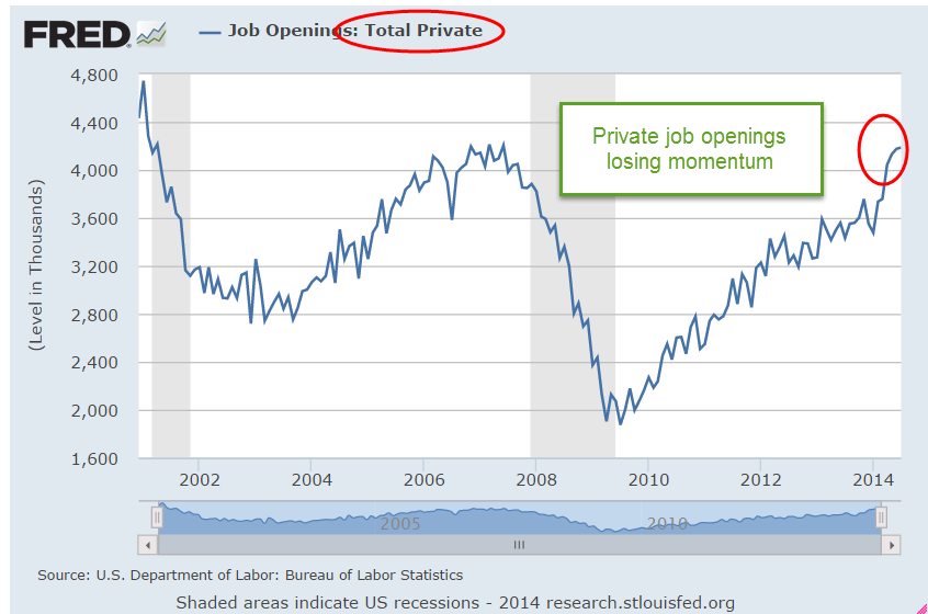
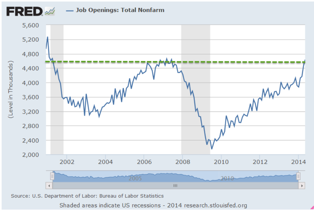
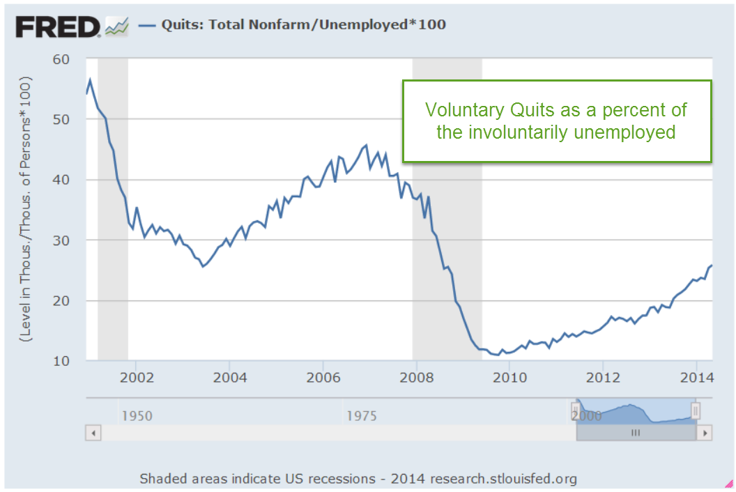
February’s Job Openings report (JOLTS) recorded a milestone, passing the 4 million mark and – finally, after six years – surpassing the number of job openings at the start of the recession.  The number of Quits shows that there still is not much confidence among employees that they can find a better job if they leave their current employment.

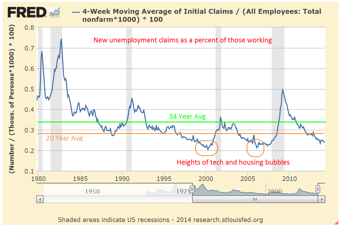
New unemployment claims dropped to 300,000 this week; the steadier 4 week average is at 316,000.  As a percent of the workforce, the number of new claims for unemployment is near historic lows, surpassed only by the tech and housing bubbles.

*******************************

Full-time Employee

A 1986 study of Current Population Survey (CPS) data by the Bureau of Labor Statistics (BLS) found that “well over half of employed Americans work the standard [40 hour] schedule.”  The median hours worked by full time employees changed little at just a bit over 40 hours. The average hours worked by full time employees was 42.5.  The study noted that between 1973 and 1985 the number of full time workers who worked 35 to 39 hours actually declined.

A paper published in 2000 by a BLS economist noted that the Current Population Survey (CPS) that the Census Bureau conducts is the more reliable data when compared to the average work week hours that the BLS publishes each month as part of their Establishment Survey of businesses.  The Establishment survey is taken from employment records but does not properly capture the data on people who work more than one job.  In that survey, a person working two part time jobs at 20 hours each is treated as though they were two people working two part time jobs. The CPS treats that person as one person working 40 hours a week.  Writing in 2000, the author noted that the work week had changed little from 1964 – 1999.

Fast forward to 2013 and the BLS reports that full time workers work an average of 42.5 hours, the same as the 1986 study.  More than 68% of workers reported working 40 or more hours a week.

The House recently passed H.R.2575, titled the “Save American Workers Act of 2014” – I’ll bet the people who write the titles for these bills love their jobs.  I always envision several twenty-somethings sitting in a conference room with pizza and some poetic lubricant and having a “Name That Bill” contest.  I digress.  This bill defines a full time employee as one who works on average 40 hours a week, not the 30 hours currently defined under the Affordable Care Act.

When I first started doing research on this I was biased toward a compromise of 35 hours as the definition of a full time employee.  My gut instinct was that fewer full time employees work a 40 hour week than they did 30 years ago.   The data from the BLS doesn’t support my gut instinct.

******************************

Obamacare

A monthly survey of small businesses by NFIB reported an upswing in confidence in March after a fairly severe decline in February.  That’s the good news.  The bad news is that optimism among small business owners can not seem to break the 95 index since 2007.  According to the U.S. Small Business Administration 2/3rds of new jobs come from small businesses. “Since 1990, as big business eliminated 4 million jobs, small businesses added 8 million new jobs.”

This is the first full year that all the provisions of the ACA, aka Obamacare, take effect.  Millions of small businesses around the country who provide health insurance for their employees are getting their annual business health insurance renewal packages.  For twelve years, my small business has provided health care for employees.  When I received the renewal package a few weeks ago, I was disappointed to find several changes that made comparisons with last year’s costs a bit more difficult.  As an aside, this health insurance carrier has always been the most competitive among five prominent health insurance carriers in the state.

Making the comparison difficult was a change in age banding.  What’s that, you ask?  In my state, business health plans were age banded in 5 year increments; e.g. a 50 year old and a 54 year old would pay the same rate for a particular policy.  Now the age banding is in one year increments.  If I compared the cost for a 45 year old employee last year with the rate for a 46 year old employee this year, the rate increase was a modest 5%.  Not bad.  But if I compare a 48 year old employee’s rate last year with a 49 year old employee this year, costs have risen 11%.   The provider for my company no longer offers the same high deductible ($3000) plan we had, offering a choice between an even higher deductible ($4500) plan or one with a much lower deductible ($1200).  Again, this makes the comparison more difficult.   Changes like this make cost planning more difficult and are less likely to encourage small businesses to bother offering health coverage to their employees.

Out of curiosity, I took a look at 2002 prices. The company long ago abandoned the no deductible plan we had in 2002 simply because it became unaffordable – this was while George Bush was President.  A plan similar to the HMO plan we had in 2002 – $20 copay, $50 specialist, $0 routine physical, no deductible, $2000 Max OOP –  now costs 270% what it did 12 years ago, an annual increase of more than 8%.  An HMO plan as generous as the one we had in 2002 is no longer available, so a more accurate comparison is that health insurance has tripled in twelve years.   It is no wonder that many small businesses either offer no health insurance or cap benefits at a certain amount that reduces the affordability and availability of insurance for many employees.

Until the unemployment rate decreases further, employees and job applicants are unlikely to exert much pressure for benefits from small business employers, a far different scenario than the heady days of the mid-2000s when unemployment was low and employers had to bargain to get decent employees.  There is no one single powerful voice for  many small businesses, other than the NFIB,  which makes it unlikely that Congress or state representatives will get their collective heads out of their butts and address the myriad regulatory and cost burdens that are far more onerous on small business owners.  Because of that we can expect incremental employment gains.

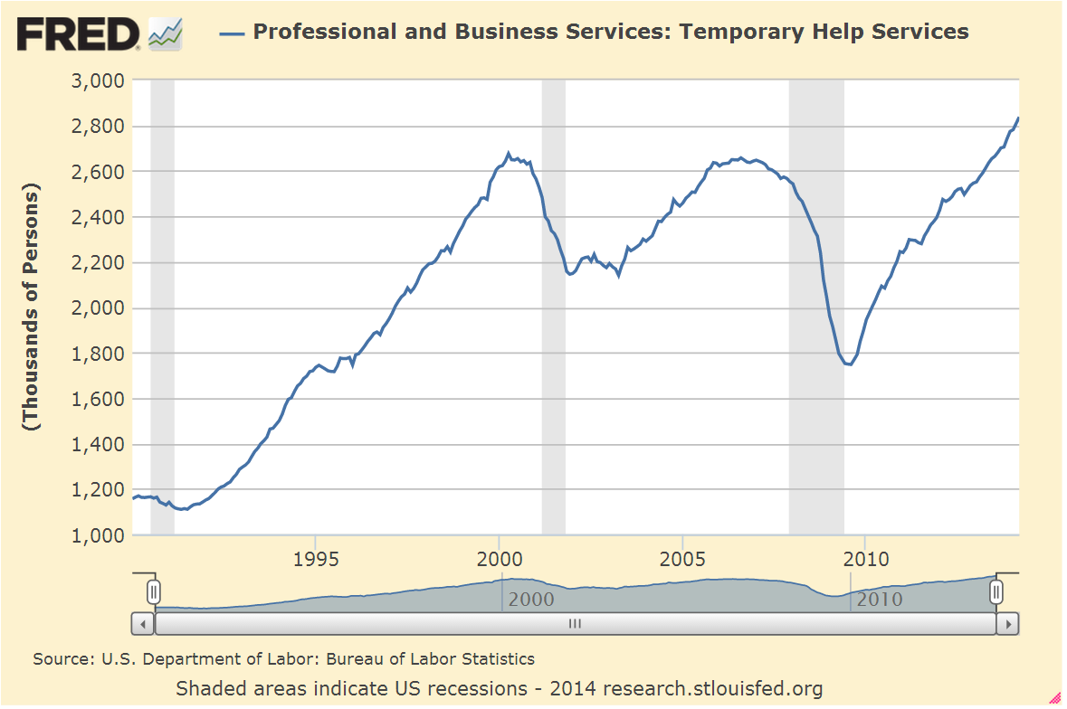
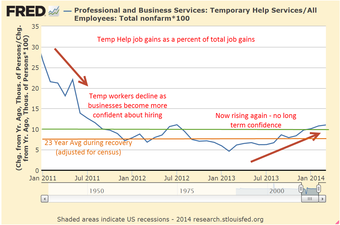
Betraying the lack of long term confidence in the economy and in response to employment burdens, employers increasingly turn to temporary workers, who make up less than 2% of the work force.

As an economy recovers from recession, it is normal for job gains to be distributed unevenly so that the increase in temporary workers is far above their share of the workforce.  Employers are understandably cautious and don’t want to make long term commitments.  Gains in temporary employment as a percent of total job gains should decline below 10%, indicating a stabilizing work force.

For the past two decades of recoveries and relatively healthy growth the average percentage is 7.4% (adjusted for census employment).  The percentage finally fell below this average in early 2012, rose back above it for a few months then stayed under the average till January 2013.  Since February of last year, that percentage has been rising again, crossing above the 10% mark in January, an inexorable evaporation of confidence.

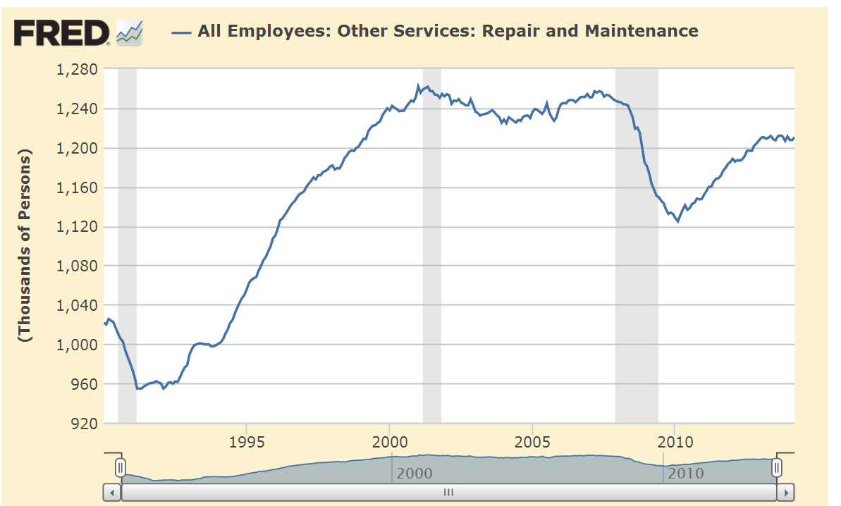
For the past year, repair and maintenance employment has flatlined at 1999 levels, indicating a lack of investment in commercial property and production equipment.

Specialty trade contractors in the construction industries are at 1998 levels despite an increase in population of 40 million.

While not alarming these trends indicate an underlying malaise in the workforce  that will continue to hamper solid growth.  Those ambitious and earnest folks in Washington, eager to make a difference and advance their political careers, continue to create more fixes which make the problem worse.  Imagine a car out of gas.  People out here on Main St. are pushing while the politicians keep hopping in the car to figure out what’s wrong, making the car that much more difficult to push.  At this rate, it is going to be slow going.

Sales, Employment, Social Security

March 15th, 2014

Small business

The monthly survey of small businesses showed an abrupt decline in sentiment, below even the lowest of expectations,  and the sixth report since the beginning of the year to come in below the consensus range.  Two factors led the downward change: lowered sales expectations and hiring plans. The majority of business owners surveyed are reducing, not adding to inventory.  The steady but slowly improving sentiment during 2013 has now weakened.

This reading of optimism among small business owners is indexed to 100 in 1986.  The current survey reading of 91.5 is far above the pessimistic level of 80 that the index sank to in the early part of 2009.  In 2006, sentiment broke below the 95 level and has not risen above that since – eight years of below par sentiment among small business owners.

The lackluster small business report early in the week dampened market activity until the release of February’s retail sales report on Thursday.  The retail sales and employment reports that are released each month probably elicit the most response from the market.  A fall in February’s retail sales might have driven the market down at least 1%.  Instead, the report showed an annualized growth rate of 3.6%, offsetting the weakness in January and December.  Excluding auto sales, which accounts for about 20% of retail sales, total sales have formed a plateau.  Even auto sales were up this past month in spite of the extreme bad weather in parts of the country.  Some see this resilience in the face of the extraordinary weather this winter as an indication of an ever strengthening consumer base, a harbinger of solid economic growth.

The reason for the reduction in inventories indicated by the small business survey was revealed by Thursday’s report of the inventory-sales ratio for January.  Inventories rose at a 4.8% annualized rate versus a 7.2% annualized decline in sales.  January’s ratio of inventory to sales is at the same level as the beginning of the recovery in 2009.  Businesses will be cautious buyers this spring until excess inventories are reduced.

****************************
Employment

The number of unemployment claims declined again this week, bringing the four week average down to approximately 330,000, considered by many to be in the healthy range.  As a percent of the workforce, new unemployment claims are near all time lows.  Enacted in 1993, NAFTA had some small effect on employment but the more consequential impact was the admittance of China into the WTO.  As the relatively more volatile manufacturing employment decreased, so too did the surge in unemployment claims.  Note the reduced volatility of the work force today compared to the 1980s.

As a rule, employees quit jobs when they feel confident that another job is readily available.  The Quits rate has been rising since the official end of the recession in the summer of 2009 but is still relatively weak and declined in January.  The current level is at the lows of the recovery from the recession of the early 2000s.

As a percent of the workforce, however, the level of quits has not even reached the lows of that previous recession.

***************************
Income

Now for a disturbing trend: the decline in disposable income below 1% has always marked the start of a recession.  This annual report from the Bureau of Economic Analysis (BEA) covers the period till the end of 2013 and was not affected by the recent cold weather.

Recent price increases in basic food commodities like milk and cereal nibble away at consumers’ pocketbooks.  An ETF that tracks agricultural commodities is up almost 20% in the last six weeks.

Whenever the growth in real, or inflation-adjusted, personal consumption has declined below 2.5%, the economy has always  gone into recession within the year.  In 2013, consumption growth fell to 2.0%.

Well, maybe this time is different.  Eternal hope, persistent denial. Those of us living in the present too often believe that we belong to an elite club with special rules that those in the past did not enjoy.

**************************

Social Security

Several years ago, the Social Security administration (SSA) estimated that 10,000 people would qualify for benefits each day.  Republican Congressman Eric Cantor and Democratic Senator Ron Wyden are two politicians on opposite sides of the political aisle who mention the 10,000 a day factoid.  The actual number of new retirees per day is actually higher.  Using recent data from the SSA, PolitiFact reported that 11,000 new retirees each day qualify for Social Security.  No one mentions the 4,300 who die and drop off the Social Security rolls (2008 data from the Census Bureau).  This number is likely to increase another 15% as the Boomer population swells into old age; the 1.6 million a year who die is likely to grow to 1.8 million who leave the Social Security system while 4 million become eligible for retirement benefits.  The result is an approximate net increase of 2.2 million beneficiaries each year of the next decade.

For now, let’s leave out the growth in the disability and Medicare programs and focus only on retirement and survivor’s benefits, or OASI.

At an average yearly benefit of $14K the benefits paid by the Social Security Administration rise by $31 billion this year, a 4.6% increase on the approximately $670 billion in Social Security and Survivor’s benefits paid out in 2013 (CBO report).  The relatively small deficit of $60 billion last year will grow into hundreds of billions within the decade.  Congress argues at length over $3 billion; efforts at tackling the really big deficits of Social Security are too often met with blowhard rhetoric, not serious negotiation.

The SSA estimates that “By 2033, the number of older Americans will increase from 45.1 million today to 77.4 million.” (SSA Basic Facts) At an inflation rate of 2.5%, less than the 3% average of the past 50 years, the average $14K annual benefit will grow to $23K by 2033.  Multiply that by 77 million people and the total of benefits that will be paid to seniors in 2033 is close to $1.8 trillion, almost triple the benefits paid in 2013.  

The current elderly count of 45 million people is 14% of today’s population of approximately 313 million.  In 2033, 77 million elderly will be 20% of an estimated population of 382 million.  More people getting paid while fewer people will be paying.  The SSA estimates that a little over 40% of the population who are working will be supporting the 20% of the population that is collecting SS benefits.
Independent Senator Bernie Sanders is fond of reassuring us that the Social Security Trust Funds have plenty of money to pay benefits over the next two decades.  What the trust funds have are I.O.U.s from the U.S. Government’s pool of tax revenues.  Where will the money come from?  Increased taxes. 
Politicians rarely lead.  The art of politics is to look like one is a leader, to position oneself at the front of the herd as it flees the pursuing lions.  In this case, the lions are demographics, and decades of promises, unrealistic assumptions and political cowardice.  The question is whether voters will force the leaders to lead before the lions attack.