The Leaving

January 30, 2022

by Stephen Stofka

Every week I read about the Great Resignation. What is it? The number of people quitting their jobs is at a historic high. In the leisure and hospitality industry, the number of quits is up 20% from pre-pandemic levels. In retail jobs, quits are up 16%. People quit their jobs for a lot of reasons. In more normal times, a higher quit rate indicates a greater confidence in finding another job. As the quits rate goes up, the unemployment rate goes down. I’ve inverted the unemployment rate to show the historic trend between job quits and unemployment.

These are not normal times. Employees in public facing jobs are enduring abuse from patrons. We have lost a social cohesion, an agreement on the rules of civility. In response to physical threats to employees over mask wearing, Denver’s Children’s Museum closed for ten days. According to the FAA, the number of active investigations into unruly passengers climbed 7-fold in 2021. The number of quits in healthcare field, in the leisure and hospitality industry, education, and food services are all more than 1/3 higher than pre-pandemic levels. In professional services, quits have increased by 28%. In the retail sector, the growth is only 18%.

In the South and Midwest regions that the Labor Department surveys, the quits rate has climbed 30%. According to US Census data almost 40% of the country lives in the Southern region and is the fastest growing region of the country. The Midwest region has about half the population, has recently experienced a slight population decline, but is experiencing the same job churn. Are people moving from the Midwest to the South? In the Western and Northeastern regions, the quits rate has grown more modestly – at 20-22%.

The first estimate of last quarter’s real GDP growth was an annualized 5.5% growth (GDPC1). That’s real growth after subtracting the effect of inflation. Household purchasing grew by a strong 7.1% after inflation (PCEC96). How much have households borrowed to fund that buying spree? 3rd quarter real debt rose by only 2.5%, easing slightly after the first two quarters of last year (CMDEBT/PCEPI). We won’t have 4th quarter debt levels until early March but real debt levels are still below the peak of 2007 when households had gorged on debt. Until the financial crisis in 2008, real household debt was growing 7-8% per year then went negative for six years after the crisis. Household debt did not rise above a 1% growth rate until the final year of the Obama presidency.

Households have a historically low debt burden as a percent of disposable income (TDSP). If a household’s monthly income after taxes is $1000, the average debt payment is less than $100, near a four decade low. There is a lot of guesswork in this series but the important thing is the declining trend in the data. People are not borrowing beyond their means as they did during the 2000s. Do lower debt levels mean that buying pressures will remain strong? Will another Covid variant further strain hospital staff and resources?

//////////////////////

Photo by Clem Onojeghuo on Unsplash

Work

April 1, 2018

by Steve Stofka

This week I’ll look at several aspects of work, from cryptocurrencies like Bitcoin, to the minimum wage.

What is work? In general science or physics, the subject of “work” pictured a horse hitched to a pulley lifting a weight (an example). In one minute, the horse could lift so many pounds a foot in the air and that equaled so much horsepower. Thus we could reduce our definition of work to three components: weight, distance and time.

Even this mechanical definition of work illustrates a problem. If the horse lifted the weight, then let it down again, how would we know that the horse did any work? Should we give the horse a few cups of oats, or have we got a lazy horse?

A variation on that problem – I cut my lawn. My neighbor looks at my lawn and sees that work was done. In a week or two the grass has grown and time has erased any sign that I did work.

Thus, we need a way of recording work done. The product of the work performed may serve as a record. A big pyramid sitting on a desert is a permanent record that work was done. If workers dig holes in the ground, then fill the holes, how do we know any work was done? If they have dug up gold from those holes.

Bitcoin and other cryptocurrencies (crypto) are assets like gold. They recognize that some work was done. Equipment, technology and workers were needed to dig up gold. Likewise, electricity was an important resource needed to generate a bitcoin, and even more electricity will be needed to generate a replacement bitcoin if one were lost.

This Politico article is an account of a crypto mining boom in a rural area in Washington state. The electricity consumed is enormous. The mighty Columbia River nearby provides electricity at a fifth of the average cost in the country. By the end of this year, there will be enough electrical capacity in this small area to power the equivalent of a tenth of the homes in Los Angeles. Shipping containers house computer servers which generate so much heat that the exhausted air melts the snow around the containers. As gold records the digging of dirt, a bitcoin records the expenditure of some quantity of electricity.

Assets can represent past work, future work, or a combination of the two. Precious metals, jewels, books and artistic works represent work done in the past. On the other hand, a machine represents future work. Other assets include stocks and bonds, both of which are claims on future work. A bond is a fixed limit claim on a company’s assets. In contrast, a share of stock is an undying claim on a portion of a company’s assets.

The blockchain algorithm behind crypto requires agreement among many parties to confirm a property right to the crypto. The recording of property rights might seem rather ordinary to a reader in the U.S. In some countries, however, property deeds are more easily altered by those in power. In contrast, a blockchain system of recording property rights prevents forgery and alteration.

As a record of work done, money relies on a relatively stable value. High inflation damages the money record of work done. Consequently, high inflation can fracture the social bonds among people. As an example, I cut someone’s lawn on Saturday and am paid. When I spend the money on Sunday, it is worth half the amount. In effect, the money has only recorded that I cut half a lawn. Examples of this hyper-inflation are Zimbabwe in the 2000s, and Yugoslavia in the 1990s (Wikipedia article). Look no further than Venezuela for a current example of the destruction that inflationary policies can have on a society.

Let’s turn from the recording of work done to the doing of it. New unemployment claims are at a 45 year low. A decade ago, job seekers despaired. In contrast, employees today are confident they will quickly find new employment. To illustrate, the quit rate is at the same pace as the mid-2000s, at the height of the housing boom. As a percent of the labor force, new unemployment claims are the lowest ever recorded. Last week’s numbers broke the record set in April 2000 at the height of the dot-com boom.

Equally important to the strength of a job market is the fate of marginal workers who are most vulnerable to the shifting tides of the economy. This includes disabled people who want to work. During the recession, the unemployment rate for disabled men of working age reached almost 20%. Today it is half that.

Let’s turn to another disadvantaged sector of the job market – those who work for minimum wage. The 1930s depression put many employers at an advantage in the job market. The Fair Labor Standards Act of 1938 (FLSA) enacted a wage floor, but many workers were not subject to the new law. In 1955, almost twenty years after passage of the law, “retail workers, service workers, agricultural workers, and construction workers were still not required to be paid at least the minimum wage” (article).

The minimum wage affects many lower paid workers who are making more than minimum wage. In some union jobs, starting wages for helpers are set by contract at a percentage above minimum wage. The understanding may be non-written in some cases. In 1966, the rate was increased from $1.25 per hour to $1.60 per hour. Non-union clerks at a NYC hospital who had been making $1.70 per hour now complained that they were making minimum wage. As a result of their pressure on management, they got a raise within a few months.

Here’s a chart showing the annual increases in the minimum wage for each period since 1950.

MinWagePctInc

In the three decades after World War 2, annual increases in the minimum wage exceeded inflation. Since 1977, the minimum wage standard has not kept pace with inflation.

MinWageLessCPI

If Congress truly represented all of their constituents, they would make the minimum wage adjust automatically with inflation. On the contrary, Congress represents only a small portion of their constituents, and the minimum wage is used as a political football.

Finally, there is the destruction of the record of past work by war. Every minute of every day, living requires calories, another measure of work. Therefore, each of us is a record of work done.  War destroys too many human records, and the unliving records of work like buildings, roads and bridges. Perhaps one day we will fight our battles in video games and stop destroying all those work records.

Connector Jobs

May 7, 2017

Later in this article I’ll take a long term look at connector jobs and how they can help us understand the swings in the economy as a whole.  Last week I mentioned that I might figure and graph a 20 year CAPE ratio for the past few decades.  I will post that up next week. First let’s look at the whole economy.

The initial estimate of first quarter GDP was released this week. Another quarter of meager growth. Here’s a chart of real, or inflation-adjusted, GDP growth per capita. During this recovery there has been only one quarter when annual growth has crossed the healthy benchmark of 2.5%.

GDPPerCap201703

A working paper by economists at the NBER estimates a 2.1% growth rate in OECD countries (which includes the U.S.) for the next few decades. An aging population is the major contributor to the the 25% decline from the 2.8% growth of the post-WW2 era. Promised benefits to those in OECD countries will stretch national budgets in a lower growth environment.

The Trump administration has one mandate – stronger growth – and will be judged by how well it can maintain its focus on that goal. This current second quarter of a new administration is the first one that voters count. Voters and investors will be keenly watching to see if Republicans have anything of substance behind the campaign rhetoric.

///////////////////////

Labor Report

In contrast to the slow GDP growth comes the news that payroll growth is strong. The average of the BLS (includes government jobs) estimate and the ADP (private only jobs) was a 203,000 gain in April.

Here’s an indicator that has proved to be reliable for six decades. As long as the growth in construction jobs is greater than the percentage growth of all jobs, the economy is healthy. An investor who reduced their equity holdings when construction job growth declined faster than overall employment (blue line crossing below declining red line) and overweighted equities when construction job growth was faster (blue line crosses above rising red line) would have done quite well.

ConstVsPayems201705

This might seem like a puzzle to those who do not work in real estate or construction. How does such a small part of the economy – less than 5% – provide such a key indication of the health of an economy? Because construction jobs are connector jobs. Remember Tinker Toys? Construction jobs are the round hubs with the holes in them.

They connect working people who are buying and renting homes.
They connect businesses leasing offices and stores.
They connect politicians and taxpayers to build and repair infrastructure.
They connect investment money and businesses wanting to expand.

When construction jobs decline, we can guess that new home sales are weakening, that demand for office and retail space is slackening, that tax collections are diminishing and government budgets tightening.  Factory, retail and office building construction decline as caution plays a stronger hand among institutional investors.

New unemployment claims remain at historic lows. Continuing claims for unemployment insurance have not been this low since June 1969.

UnemplClaimsPctPayems201705

The number of people voluntarily qutting their jobs for another job (the quit rate) is near the highs seen in 2005 through 2007.

People working part time jobs because they can not find full time work have declined since their peak in September 2011 but are still high. Many employers in retail and restaurants use part time employees to meet daily peaks and ebbs in the customer flow. Benefit costs for part time employees are less than full time. Even in a booming economy like Denver, people in their 20s with a college or two year degree may have to put together two or more part time jobs to make ends meet.

Throughout most of this recovery the weekly earnings of non-government employees has struggled to grow at more than a 2.5% annual pace, far below the plus 4% growth of the middle of the 2000s. On an even more sobering note: the median real weekly earnings of full time black workers is 20% less than all full time workers.

For decades to come, both the financial crisis and the recovery will be studied and written about.  Scholars will try to understand the trend to part time jobs and the slackening wage growth.  The total cost of an employee includes benefit costs and mandated payroll taxes.  As medical insurance premiums continue to rise faster than inflation,  the total cost of an employee has increased faster than inflation.  Employers have compensated by reducing the growth of the wage component of total cost.  Secondly, they have reduced benefit costs by employing more part timers where possible.

Trump was elected on the campaign promise that this so-so rate of growth would not be the “New Normal” under his administration.  Walking that talk may be much harder than he thought, or that anyone thought.

///////////////////////////

Today I heard some one say, “I’m afraid that if I don’t buy a house soon, I will be priced out of the market.” When have I heard that before? It was 2006, at the height of the housing boom.

Ten Year Review

January 15, 2016

10 Year Review

Before I begin a performance review, I’ll refer to an article  on the errors of comparing our real world portfolio returns to the optimized returns of a benchmark index.  An index stays fully invested, has no trading costs, taxes or fees.  An index has survivor bias; companies that go out of business or don’t meet the capitalization benchmark of the index are effortlessly replaced, so there is no risk.  Share buybacks benefit an index but not our portfolio.

The article contains some prudent and realistic recommendations: the importance of preserving our savings, a balance of risk and return that will meet our goals, AND our time frame.  As we review the performance of the following portfolio allocations, keep those caveats in mind.  If a model portfolio earned 8% per year, use that as a rough guideline only.

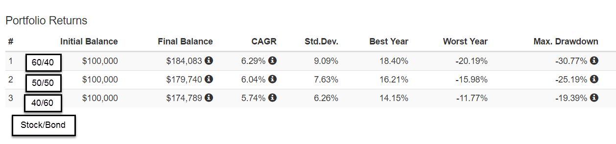
A 60/40 stock/bond portfolio returned an annual 6.3% over the past ten years with a maximum drawdown (MDD) of 30%.
A  50/50 mix returned 6% with an MDD of 25%.
A 40/60 mix returned 5.75% with a MDD of 20%.

A difference of 10% in allocation equalled a .3% in annual return, and a 5% change in MDD.  Let’s put that .3% difference in dollars and cents.  Over a ten year period, a $100,000 portfolio earning .3% extra return per year equalled about $43 extra per month, or about $1.40 per day.  Why is this important?  For whatever reason, some people worry more than others and may be willing to accept a lower return in order to sleep better at night.

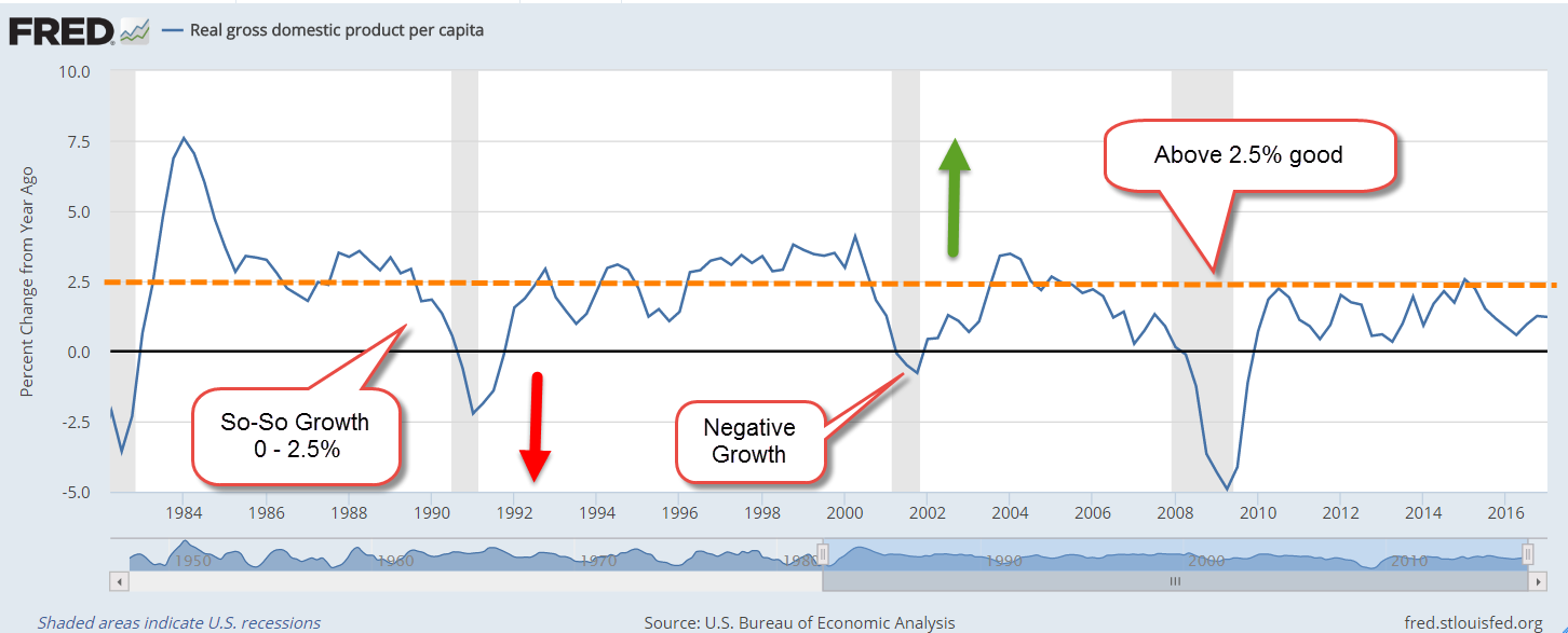
Not all ten year periods will have the same response to various allocations.  The majority of ten year periods will include a recession, but this past ten years included the Great Recession. Let’s look at the historical effect of portfolio allocation during the past ten years.  In the chart below you can see the annual returns of various balanced allocation mixes shown in the left column.  At the end of 2009, the 10 year results show the results of two downturns: the 2001 – 2003 swoon and the 2007 – 2009 crash.

Note that the more aggressive 60/40 allocation has a lower return than the cautious 40/60 allocation during the years 2009-2011.  As we move forward in time, the effects of the 2001-2003 swoon diminish and, starting in 2012, the more aggressive allocation earns a better return.

Not shown in the chart are the results of a 100% allocation to stocks during the ten year period 2000-2009, the first column in the chart above.  A 40/60 allocation had a return of 3.8%.  A 100% allocation to large cap stocks had a LOSS OF 1% per year.

During the 10 year period 2007-2016, a 100% allocation to stocks returned 6.8% annually, a 1/2% higher return than the 60/40 mix, but the drawdown was 51%, far more than the 30% drawdown of the 60/40 portfolio.

High Winds or Hurricane?

A person who spends twenty years in retirement can count on at least two market downturns during that time.  Here’s how MDD, or drawdown, can affect a person’s portfolio.  I’ll present a more extreme example to illustrate the point.  Imagine an 80 year old retiree with a portfolio devoted 100% to stocks.  For several years, she had been withdrawing $40,000 from a portfolio that had a balance of $600,000 in the fall of 2007.  Projecting that her portfolio could earn a reasonable return of at least 7% per year, or $42,000, the balance looked secure.

But by March 2009, a period of only 18 months, the high winds had turned to a hurricane.  Her portfolio, her shelter in the storm, had lost 50% of its value, an MDD or drawdown of approximately $300,000.  During those 18 months, she had also withdrawn $60,000 for living expenses, leaving her with a balance of about $240,000 in the spring of 2009, the low point of the stock market.

Only 18 months earlier she had projected that she could maintain a minimum portfolio balance of $600,000. She had gnawed her nails raw as the market lost 20% by the summer of 2008, then sank in September when Lehman Bros. went bankrupt, then continued to lose value during the winter of 2008-09.  When would it end?

In March 2009, she had only 6 years of income left before her savings were gone.  Unable to stand the loss of any more value, she sold her stocks for $240,000 – at exactly the wrong time, as it turned out.  Her $240,000 earned little in a money market, forcing her to: 1) cut back the amount of money she withdrew from her portfolio to about $24,000 per year, and 2) hope she died before she ran out of money.

Of course, most advisors would NOT recommend that an 80 year old devote 100% of their savings to stocks.  BUT, some retirees might – and have – adopted a risky strategy to “whip” a portfolio to get more income or capital appreciation the way a jockey might do with a tired horse.  On the other hand, some 80 year olds with a very low tolerance for any kind of risk might have all of their savings in cash and CDs, a 0/100 allocation.

Now let’s imagine that our retiree had a cautious 40/60 balanced mix.  She would have had a drawdown of 20%, or $120,000, during the Great Recession.  After withdrawals for living expenses, she still had a balance of about $420,000 in March 2009. At a conservative estimate of a 5.5% annual return, she could have prudently drawn down her portfolio $25,000 – $30,000 for a year and waited. This is important for seniors: an allocation that allows some temporary flexibility in the withdrawal amount from a portfolio.

By the end of 2009, her portfolio had gained about 24%.  After living expenses of about $22,000 taken from the portfolio during the last 9 months of 2009, she had a balance of more than $500,000.  Her balanced allocation allowed her to wait longer for the market to recover.

In 2010, she could once again take her $40,000 living expense withdrawal and still have a $530,000 portfolio balance by the end of that year.  She has weathered the worst of the storm. At the end of 2016, she continued to take out $40,000 (adjusted upward for inflation) and still has a portfolio balance of $486,000.

Finally, her 40/60 allocation mix kept to a rule I have mentioned from time to time: the five year rule. If she wanted to take approximately $40,000 from the portfolio each year, she should have a minimum of 5 years, or $200,000 in bonds and cash – the “60” in the 40/60 allocation mix.  In the fall of 2007, she had $360,000 (60% of $600,000) in less erratic value investments.  This rule helped her withstand the storm winds of the Great Recession.

//////////////////////////

Seniors at Risk

Although the number of loans to those 65+ are less than 7% of the total of student loans, a shocking 40% of these loans are in default.  Most of these loans were cosigned by seniors for their children or grandchildren. The law allows the Federal Government to garnish or lien Social Security and other federal payments to cure the loan defaults.  Readers with a WSJ subscription can read the article here or Google the topic.

//////////////////////////

Hot Housing Markets

In a recent analysis, western cities rule Zillow’s top 10 housing markets for valuation increases.

///////////////////////////

Take this job and shove it!

The latest JOLTS report from the Labor Dept. shows the highest quits rate in private industry since the housing boom in 2006. Employees confident of finding another job are more willing to voluntarily leave their job, and have driven the rate up to 2.4% from a low of 1.4% in the 2nd half of 2009.

Statista compiles data from around the world, including this revealing tidbit: 26% of jobs in the U.S. are unfilled after 60 days, the highest percentage in the developed world. Germany ranks 2nd at 20%, and our neighbor to the north, Canada, comes in at nearly 19%.

What lies behind this data is a mismatch.  Employers may be requiring skills that job applicants don’t have.  Job applicants may want more money or other benefits than employers are willing to pay.

//////////////////////////

Obamacare Repeal

The Committe for a Responsible Federal Budget (CRFB) – yep, it’s a mouthful – has projected costs to repeal Obamacare in whole and in part.  Using both conventional, or static, budget scoring and dynamic scoring (google it if you’re interested), they guesstimate a 10 year cost of $150 to $350 billion for full repeal of the ACA.

Repeal of ACA’s insurance coverage would actually save a lot of money, more than $1.5 trillion. The net effect is a cost, not a savings, because of the $2 trillion in tax revenue on higher incomes that is built into the ACA law.

CRFB analysts have put a lot of work into these projections, including a breakdown of repealing just parts of Obamacare or delaying repeal of certain ACA provisions.  Since the Republican Congress is likely to keep some provisions, readers who are interested might want to come back to this link in the coming weeks as the discussion of this issue unfolds.