A Carousel of Surprises

April 6, 2025

by Stephen Stofka

This is part of a series on centralized power. The debates are voiced by Abel, a Wilsonian with a faith that government can ameliorate social and economic injustices to improve society’s welfare, and Cain, who believes that individual autonomy, the free market and the price system promote the greatest good.

Abel set his water glass on the table. “I’ve been looking forward to our breakfast this week. I want to hear how  you are going to normalize the tariffs that Trump enacted this week.”

Cain shook his head. “Sorry to disappoint you. It’s hard to make sense of the layers of tariffs. 10% base tariff in addition to some previous tariffs except where excluded blah-blah-blah. A company that does international compliance had a table and explanation that helped (Source).”

Abel frowned. “We are on a carousel of weekly announcements and executive orders from the White House. A lot of uncertainty. J.P. Morgan estimates the probability of a global recession at 60% (Source). A few days ago, before the tariff rates were announced, the bank was putting the probability at 40% (Source). That’s quite a jump. Shows how surprised even the analysts at the bank were when the actual tariffs were announced.”

Cain stirred his coffee thoughtfully. “Did you see Trump’s press conference Wednesday? The one where he announced the tariffs? He had a chart, I’ll call it the tariff chart, showing the tariffs that other countries impose on U.S. goods, and I realized that someone in his administration had pulled those numbers out of their ass.”

Abel laughed. “Well, the U.S. Trade Representative has an explainer of how they calculated the rates (Source). Basically, they think that the U.S. should have a net trade balance of zero for each of its trading partners. Anything other than that means that country has enacted trade barriers and/or is engaged in some kind of currency manipulation. It’s nuts.”

Cain nodded. “Good point. International trade is not a zero-sum game. Anyway, the U.S. has the third-lowest tariffs in the world, just behind Japan and Switzerland. As of 2023, it was 2.2% (Source). The EU has an average of less than 3%. Trump’s chart showed that the EU has a 39% tariff rate. Trump exaggerates a lot, but this was excessive even for him.”

Abel wiped syrup off his finger with a napkin. “Well, there probably is some currency manipulation, don’t you think?”

Cain swallowed hurriedly before replying, “Some, but not to the extent shown on that chart. The Congressional Research Service just did a report, a one-pager, answering some of the concerns of House members about currency manipulation (Source). Only Switzerland, Taiwan and Vietnam met the 2015 criteria for currency manipulation.”

Abel asked, “What’s the criteria?”

Cain replied, “First is that the country has a trade surplus greater than $20 billion.”

Abel interrupted, “They sold us $20 billion more than we sold them.”

Cain replied, “Right. The second was that their current account surplus…”

Abel interrupted again, “That’s mostly the trade surplus.”

Cain replied, “Yeah. That’s shouldn’t be more than 2% of that country’s GDP. The third and last criteria is if that country buys dollars in the FX, or foreign exchange, market that is more than 2% of their GDP (Source). That shows their intention to drive up the price of dollars relative to their own currency.”

Abel made a soft clapping sound. “You’ve done your homework.”

Cain laughed. “I’ll bet there are a lot of people trying to understand or refresh their limited understanding of international trade. It’s a WTF moment like when the Twin Towers collapsed on 9-11.”

Abel interrupted, “Except there is even more misinformation now than there was 25 years ago.”

Cain continued, “So, look past the hocus-pocus on the tariff chart and look at the movement in exchange rates between countries. China’s yuan is trading at 86 cents today, the same as it was in 2011 (Source). Is China actively suppressing the value of the yuan? Probably. How much? 20%? 40%?”

Abel asked, “Yeah, but that’s not a tariff.”

Cain nodded. “But it’s an advantage for China’s exporters and a disadvantage for U.S. exporters.”

Abel replied, “So Trump equates ‘advantage’ with ‘tariff.’”

Cain sighed. “I think so.”

Abel argued, “But the advantage for China’s exporters is also an advantage for American consumers who get lower prices. I mean, I bought a cordless pruner, like for cutting tree limbs. It was made in China, well built and cost me less than $100. It’s a good deal.”

Cain frowned. “Yeah, a good deal for you but a bad deal for any American company that might want to make a cordless pruner. At least that’s the way Trump thinks. An American made tool employs an American worker who pays income taxes, Social Security taxes and local taxes. The more that American workers are employed, the less dependent they are on government.”

Abel replied, “So, let’s say that an American-made pruner had cost me $150. That’s a 50% tax on my income.”

Cain interrupted, “And now that pruner will cost you $150 because Trump is charging a 54% tariff on Chinese goods (Source).”

Abel frowned. “So, I would be paying more for an American-made pruner, but another American is less dependent on government welfare because they have a job. Is that what Trump is thinking?”

Cain nodded. “I can’t look inside his head but I’m guessing that is the reasoning underlying the direction of these policies. The problem is that it will take years to build a factory that makes a cordless pruner at a competitive price and the supply chain that supplies the parts for that pruner. A piston in an American-made car starts off in Tennessee as raw aluminum powder, goes to Pennsylvania, then to Canada, then to Mexico and finally to Detroit (Source). The 21st century supply chain is no longer confined to one region or one country. Trump will be out of office by the time a new supply chain is built.”

Abel had a faraway look in his eyes. “When I was a kid, I heard on a talk show that telephone customers who lived in urban areas had a fee tacked onto their monthly bill to support the customers in rural areas. I told mother that I didn’t think that was fair. She explained that it cost more to provide telephone service in a rural area where she grew up. She had lived in both worlds, rural and urban. Because costs were shared, telephone service was more affordable in rural areas, and she could talk to her family. She had that sense of a broad community. Maybe we have lost that. We live in our siloed worlds, absorbed in a perspective that we agree on and share with others.”

Cain replied, “It’s like what happened to music when FM radio started in the 60s and 70s. Large AM radio stations like WABC used to play a variety of music to appeal to a broad consumer base so they could sell advertising. As FM stations proliferated, each station’s choice of music narrowed to a particular taste. In fact, I think it was called ‘narrowcasting,’ not ‘broadcasting’ (Source). A hard rock fan could listen to only hard rock, not soft or pop rock. A country music fan who preferred traditional Nashville style music over Bluegrass could listen to a station that catered to their tastes.”

Abel laughed. “Specialization, the secret to progress, according to Adam Smith. Now we have specialized perspectives and opinions.”

Cain interrupted, “And tailor-made facts, carefully selected to support our opinions. That’s how those tariff rates wound up on Trump’s chart.”

Abel replied, “There’s no consensus.”

Cain nodded. “Divide and conquer. It’s a winning strategy in politics.”

Abel asked, “You’ve studied this recently. Why do you think they chose 10% as a base tariff rate?”

Cain replied, “Exchange rates, I think. Like we discussed before, a strong dollar helps the American consumer buy foreign-made goods at a discount.”

Abel interrupted, “And buy more local services with the money they saved.”

Cain replied, “Right. That’s what Trump’s team doesn’t get. It’s goods and services, not just goods. I can’t buy a haircut from China. Last year, a Federal Reserve study estimated that private services added 72% of economic value in the U.S. (Source). That $50 you saved on the cordless pruner might have been spent at a restaurant or some other service business. That business hires workers who pay federal and local taxes. The business itself supports the local economy with sales, use and property taxes.”

Abel sighed. “Now the $50 will be a tariff charge that goes to the federal government directly. That will hurt service businesses, service workers and local governments.”

Cain shook his head. “More likely is that you decide not to buy the cordless pruner for $150. There is less economic activity. You trim your trees and bushes by hand and save the money. Now someone on Trump’s team might say that the money you saved will be invested in the American economy, but investors are less willing to invest those savings because there is less economic activity. Interest rates go down because there is less demand for loans. The money you saved earns less interest. Consumer or saver, you’re getting screwed.”

Abel nodded. “It’s an endless carousel of cause and effect. Trump wants to return to some imagined idyllic age maybe in the 1950s when he was growing up. That world is out of reach and Trump will destroy this world in his effort to get back to that world.”

Cain shrugged. “Destroy might be an exaggeration. But he will definitely hurt this economy in his pursuit of that dream, I think.”

Abel asked, “Back to the 10% base tariff. Where do you think they came up with that?”

Cain nodded. “Oh yeah. So, if I am going to take a vacation in Europe, I can look up the euro-to-dollar exchange rate to see how many euros my money will buy. Then there’s several indexes that construct a type of average of several currencies against the dollar. There’s a traditional dollar index called DXY that’s often cited in financial markets, but it’s heavily weighted toward the Euro and doesn’t include the Chinese yuan. China is our third largest trading partner (Source) so the Federal Reserve maintains a broad trade-weighted index that includes the Chinese yuan. It is up 20% in the past decade (Source).”

Abel asked, “So that could be used to justify even a 20% base tariff rate?”

Cain sighed. “Like Trump said, the U.S. was being wonderful not charging more.”

Abel asked, “So, we’ve been talking about broad movements of money and goods but most of us stay focused on the prices we pay each week for gas, groceries and other necessities. Next week, we are going to encounter these tariff rates when we go to the grocery store. We get a lot of produce from Mexico and other Central American countries.”

Cain argued, “There are no additional tariffs on those imports from Mexico that were included under the USMCA that Trump negotiated in 2017 (Source).”

Abel replied, “Yeah, but that doesn’t include bananas from Guatemala, for example. During the winter, we get fruits and veggies from Australia and South America. Kennedy wants us to eat healthier, but the tariffs will make healthy foods more expensive.”

Cain nodded. “In the next few weeks, I’m guessing that consumers are going to get very angry. People who were thinking of buying a new car with their tax refund will be heartbroken when they see the increase in prices at the dealership.”

Abel replied, “I heard that some people were trying to lock in deals before the tariffs took hold.”

Cain nodded. “There’s that rush to buy phenomenon but we really notice persistently higher prices in the goods we buy regularly. Members of Congress are going to see their phones blow up with complaints.”

Abel argued, “The Congress has been pretty passive. You think public sentiment will have much effect?”

Cain sighed. “Who knows? Trump has gone rogue.”

Abel asked, “Not what his supporters expected? His poll numbers have declined, and his approval rating is below the average of U.S. Presidents (Source).

Cain replied, “He’s a lame duck president. I don’t know if he cares. Like I said, I think he’s gone rogue.”

Abel stood up. “A rogue president. Unsettling. Look, I’ll see you next week when prices are up on everything. I wonder how much the restaurant will charge for our meal next week? I think I’ll keep a copy of our tab to compare.”

Cain waved. “See you later.”

////////////////////

Image by ChatGPT in response to the prompt “draw an image of a carousel with people sitting on the animals”

Notes: 1) In the U.S. Trade Representative’s explainer of the tariff calculations there is an in-text citation to Cavallo et al. without a corresponding reference. The reference is:
Cavallo, Alberto, Gita Gopinath, Brent Neiman, and Jenny Tang. “Tariff Passthrough at the Border and at the Store: Evidence from U.S. Trade Policy.” (pdf) American Economic Review: Insights 3, no. 1 (March 2021). See the lead author’s page.
2) The title of the first reference is incorrect. The title should read: The long and short (run) of trade elasticities.
3) Because of the values assigned to epsilon and phi in the denominator of the formula, the calculation of the tariff change is essentially (exports – imports) / -imports. A more appropriate measure would be a difference-sum ratio, as in (exports – imports) / (exports + imports).

Fortunate Son

November 10, 2024

By Stephen Stofka

The country has elected a fortunate son for the second time. Throughout his life, Donald has enjoyed the protection of a phalanx of lawyers who have kept him out of jail. A recent decision by the country’s highest court will give him immunity for another four years. His physical condition and cognitive health are declining so rapidly that he likely will not serve out his full term. His much younger Vice-President J.D. Vance will become President and possibly the leader of the MAGA movement for another eight years.

Another take. Former President Donald J. Trump has made the greatest political comeback in the history of this country. Millions of supporters donated money to his legal efforts to defend the integrity of the vote and challenge voter fraud by the Democratic Party. Despite persistent persecution by Democratic prosecutors, Mr. Trump has emerged victorious. In the days leading up to the election, the former President  held many rallies, demonstrating the vitality of a candidate twenty years younger.

Yet another take – a just the facts, ma’am perspective. Presidents with low approval ratings, including Trump in 2020, do not win reelection. This election’s results repeated that trend. James Carville, Clinton’s campaign manager in the 1992 race, coined the famous phrase “It’s the economy, stupid.” Voters showed more concern about inflation and immigration than Trump’s character and demeanor. Voters are especially sensitive to inflation because they feel helpless, and people do not like feeling helpless.

The misery index is the sum of the unemployment rate and the inflation rate. A comfortable reading is about 7%. In 1980, the index was 20% and Jimmy Carter lost his bid for re-election. Bill Clinton and George W. Bush won re-election with misery readings of 8%, and Obama won the 2012 election when the misery index was near 10%. In the fall of this year, the index was below 7%. Perhaps the misery index is not a consistent predictor.

Which is your take on the election results? Each second of our day we download terabytes of information into our brains. We filter out much of that data, then arrange what remains into a version of the world that is uniquely ours. Then we interpret that stimuli, integrating it into our memories along well-worn neural pathways. In that integration process, we reconstruct the world again, discarding the information that conflicts with our previous experience, beliefs and values. We shape what we experience, and our experience shapes us. We may be traveling with others on a train through time, but we have a unique vantage point as we look out the window.

In her book Lost in Math, physicist Sabine Hossenfelder writes, “If a thousand people read a book, they read a thousand different books.” Each voter creates a unique election story. Media analysts focus on different elements of an election, creating their own version of the contest, weaving a narrative of cause and effect. In the telling of the election, we should remember Nassim Taleb’s caution, in Fooled by Randomness, that “past events will always look less random than they were.” Since we are rational creatures, we are both frightened and fooled by randomness. In an evenly divided electorate where a few thousand votes in several key counties can make a difference,  random events can decide the outcome. A snowstorm in a key state in the days before an election, the path of a bullet at an election rally, a decision by a federal judge.

The percentages of the Presidential election votes were no different than 140 million voters flipping a fair coin.. Heads equals a vote from Trump. Tails was a vote for Harris. Did any individual voter flip a coin? Possibly, but unlikely. As a collective, our individual actions can simulate random behavior. Randomness can make us feel helpless, so we act as though our actions have purpose. We act aggressively or assume a false bravado in the face of random mortal danger. Watch the clip from the Deer Hunter where the prisoners are made to play Russian Roulette.

Those who struggle through life may vote for the calm bravado of someone privileged. Ronald Reagan was known as the Teflon President. The public did not hold him responsible for several controversies and scandals that occurred during his eight years in the White House. In 1981 to 1982, the country suffered the worst recession since the Great Depression fifty years earlier. During the 1983 Lebanese civil war, Reagan ignored warnings that the U.S. Marines barrack in Beirut would be vulnerable to attack. The October 23rd bombing resulted in the loss of 241 lives, most of them Marines. . In his 1984 bid for re-election, Reagan won all but one state, a resounding vote of public approval. In 1986, the Iran-Contra scandal, a secretive trade of arms for hostages with Iran, occupied public attention but Reagan escaped any responsibility or public indignation.

Forty years later Donald Trump can wear that moniker, the Teflon President. A slim majority of voters overlooked his many scandals, his felony conviction, and his chaotic management style during the pandemic and most of his first term. Although the Republican Party’s name remains the same, Trump and his followers have erased the legacy of Reagan. The party’s former symbol, an elephant, has been replaced by a red MAGA hat. It has become a party dedicated not to any consistent set of principles but to one person, a fortunate son.

//////////////////

Photo by Danilo Batista on Unsplash

Keywords: misery index, election, recession, inflation

Labor Trends

September 4, 2022

by Stephen Stofka

On this Labor Day Weekend I’ll review some current employment numbers and look at a historic trend whose results surprised me. The August employment report released this past Friday buoyed the stock market. Job gains remained strong but moderated from the half million jobs gained in July. The slowing gains indicated a predicted response to rising interest rates. Had the number of job gains risen to 600,000 for example, the market might have sold off. Why? Currently the market is predicting a rise in rates to a range of 3.5 – 4.0% in the next year. A labor market resistant to rising rates would have implied that the Fed would have to set rates even higher to cool inflation. Secondly, the unemployment rate rose .2% to 3.7%, another indication that rising rates are having a modest effect on employment. Modest is the key word.

The participation rate – the percentage of working age people who are working or looking for work – rose slightly to 62.4%, still 1% below pre-pandemic levels. Reopening classrooms and the further relaxing of pandemic restrictions are contributing factors. Additional family members may be joining the workforce to cope with rising household expenses. The number of marginally attached workers – those who want a job but haven’t actively looked for a job in the past month – declined to 5.5 million, still a half million above pre-pandemic levels. These “discouraged” workers remain below 1% of the labor force, a level indicating a strong labor market. President Obama inherited an economy in crisis and the percent of discouraged workers declined to nearly 1% but not below. As the rate fell below 1% in the first months of the Trump presidency, Mr. Trump cheerfully took credit. A politician and his followers blow their horns to encourage others others to join their coalition.

Surprises

A 17,000 employment gain in financial jobs surprised me. Rising interest rates have lowered mortgage applications and I thought the employment numbers for the financial industry would decline. Lastly, weekly earnings are up over 5.6% but have not kept up with inflation. Unemployment numbers are low, job openings are high. Why don’t workers have more pricing power?

A Historic View

Earlier this week I was looking at labor slumps since World War 2. These slumps are periods at least six months long. They start when the number of workers first declines. They end when employment finally surpasses its previous high. Employment first declines about two months after the start of a recession, as the NBER later determines it*, so it is a lagging indicator.

I split the period 1950-2022 into two 36 year periods. The first period lasted from 1950-1986; the second period from 1986-2022. In the first period there were 7 recessions and employment slumps. In the second period there were 4 recessions and slumps. Even though there were more recessions in the first period, the number of months of sagging employment was far less than the second period, 131 vs 168. No doubt that was due to the 75 month long slump of the Great Recession. That’s an extra three years of a lackluster job market which affected demand for workers and the pay they could command. In the chart below I have sketched the labor slumps. Economic recessions have a lasting impact on the labor market.

In the first period, the longest slump lasted 26 months during the early 1980s recession when the unemployment rate rose above 10% and inflation was in the teens. That began in September 1981 and lasted until November 1983. In the second period, the job market sagged during the Great Recession for 75 months, from February 2008 until May 2014. The least severe slump was this last one, beginning in April 2020 and ending in April 2022. The recession in 2001 lasted only 6 months but the labor slump lasted 40 months, from June 2001 until October 2004, just before the 2004 election.

Wages

More prolonged slumps affect wages. In the chart below the BLS compares nominal and inflation-adjusted median weekly earnings over the past twenty years. The real earnings of workers have barely risen because they are not sharing in the productivity gains of the past decades. The earnings gap between men and women has varied little during that time.

Contributing Factors

Why are labor slumps lasting longer during this later period? There are many contributing factors. When there was a larger manufacturing base recessions were more frequent but workers were brought back to work more quickly. The two recessions of the 2000s made that decade the hardest on workers. The two labor slumps totaled more than five years during the decade.

The 1970s gets a bad rap but it was the 1950s which had the second largest number of months when employment sagged – a total of 3.5 years. Standing five decades apart, the 2000s and 1950s had very different economic and family structures. Fewer women worked in that post war decade. The waiting period for unemployment insurance was twice as long and benefits lasted less than four months. These were inducements for workers to find any kind of work to support their families. Union membership was much higher in the 1950s so workers could rely on those benefits while unemployed. They would not have wanted to lose their union membership so they might have worked off the books for cash while they waited for hiring to pick up at the same company or the same industry. Like so many economic trends, the interaction between factors is complex and not readily identifiable.

Conclusion

Reckless speculation was the main contributor to the two recessions in the 2000s. Financial shenanigans played a smaller role in the slump of the early 1990s. The increased length of these slumps in the last four decades supports an argument that our economy has lost too much of its manufacturing base and is out of balance. There is too much financial speculation and not enough actual production. The federal deficit has increased so much in the past two decades because the private economy cannot generate enough growth on its own.

//////////////

Photo by Patrick Schneider on Unsplash

*The NBER marks only the decline portion of a general economic slump so the gray shaded areas will be shorter than the labor slump. However, the chart illustrates the prolonged effect that an economic decline has on the labor market.

BLS. (2022). Median usual weekly earnings of full-time wage and salary workers by sex. U.S. Bureau of Labor Statistics. Retrieved September 2, 2022, from https://www.bls.gov/charts/usual-weekly-earnings/usual-weekly-earnings-over-time-total-men-women.htm

Price, D. N. (1985, October). Unemployment insurance, then and now, 1935–85. Social Security Administration. Retrieved September 3, 2022, from https://www.ssa.gov/policy/docs/ssb/v48n10/v48n10p22.pdf

Jobs Affect Elections

September 15, 2019

By Steve Stofka

“It’s the economy, stupid,” James Carville posted in the headquarters of Bill Clinton’s 1992 Presidential campaign. The campaign stayed focused on the concerns of middle and working- class people who were still recovering from the 1990 recession. Jobs can make or break a Presidential campaign.

Each month the BLS reports the net gain or loss in jobs and the unemployment rate for the previous month. These numbers are widely reported. Weeks later the BLS releases the JOLTS report for that same month – a survey of job openings available and the number of employees voluntarily quitting their jobs. When there are a lot of openings, employees have more confidence in finding another job and are more likely to quit one job for another. When job openings are down, employees stick with their jobs and quits go down as well.

President Bush began and ended his eight-year tenure with a loss in job openings. Throughout his two terms, he never achieved the levels during the Clinton years. Here’s a chart of the annual percent gains and losses in job openings.

As job losses mounted in 2007, voter affections turned away from the Republican hands-off style of government. They elected Democrats to the House in the 2006 election, then gave the party all the reins of power after the financial crisis.

As the 2012 election approached, the year-over-year increase in job openings slowed to almost zero and the Obama administration was concerned that a downturn would hurt his chances for re-election. As a former head of the investment firm Bain Capital, Republican candidate Mitt Romney promised to bring his experience, business sense and structure to help a fumbling economic recovery. The Obama team did not diminish Romney’s experience; they used it against him, claiming that Romney’s success had come at the expense of workers. The story line went like this: Bain Capital destroyed other people’s lives by buying companies, laying off a lot of hard-working people and turning all the profits over to Bain’s fat cat clients. The implication was that a Romney presidency would follow the same pattern. Perception matters.

In the nine months before the 2016 election, the number of job openings began to decline. That put additional economic pressure on families whose finances had still not recovered following the financial crisis and eight years of an Obama presidency. Surely that led some working-class voters in Michigan, Wisconsin and Pennsylvania to question whether another eight years of a Democratic presidency was good for them. What about this wealthy, inexperienced loudmouth Trump? He didn’t sound like a Republican or Democrat. Yeah, why not? Maybe it will shake things up a bit.  Enough voters pulled the lever in the voting booth and that swung the victory to Trump.

In the past months the growth in job openings has declined. Having gained a victory based partially on economic dissatisfaction, Trump is alert to changes that will affect his support among this disaffected group. As a long-time commentator on CNBC, Trump’s economic advisor, Larry Kudlow, is aware that the JOLTS data reveals the underlying mood of the job market. Job openings matter.

Unable to get action from a divided Congress, Trump wants Fed chairman to lower interest rates. There have been few recessions that began in an election year because they are political dynamite. The recession that began in 1948 almost cost Truman the election. The 1960 recession certainly hurt Vice-President Nixon’s bid for the White House in a close race with the back-bench senator from Massachusetts, John F. Kennedy.

In his bid to unseat President Carter in 1980, Ronald Reagan famously asked whether voters were better off than they were four years earlier. The recession that began that year helped voters decide in favor of Reagan.

Although the 2001 recession started a few months after the election, the implosion of the dot-com boom during 2000 certainly did not help Vice-President Al Gore’s run for the White House. It took a Supreme Court decision and a few hundred votes in Florida to put Bush in the White House.

As I noted earlier, George Bush began and ended his eight years in the White House with significant job losses. Those in 2008 were so large that it convinced voters that Democrats needed a clear mandate to fix the country’s economic problems. After the dust settled, the Dems had retained the house, won a filibuster-proof majority in the Senate and captured the Presidency. Jobs matter.

The 2020 race will mark the 19th Presidential election after World War 2. Recessions have marked only four elections – call it five, if we include the 2000 election.  An election occurs every four years, so it is not surprising that recessions occurred in only 25% of the past twenty elections, right? It’s not just the occurrence of a recession; it’s the start of one that matters.

Presidents and their parties act to fend off economic downturns with fiscal policy or pressure the Fed to enact favorable monetary policy that will delay downturns during an election. Trump’s method of persuasion is not to cajole, but to criticize and denigrate anyone who doesn’t give him what he wants, including the Fed chairman. To Trump, life is a tag-team wrestling match. Chairman Powell can expect more vitriolic tweets in the months to come. Trump will issue more executive orders to give an impression that his administration is doing something. The stock market will probably go up. It usually does in a Presidential election year.

Phillips Curve

November 12, 2017

For the past 16 decades, there has been a least one recession per decade. Given that this bull market is eight years old without a recession, some investors may be concerned that their portfolio mix is a bit on the risky side. Here’s something that can help investors map the road ahead.

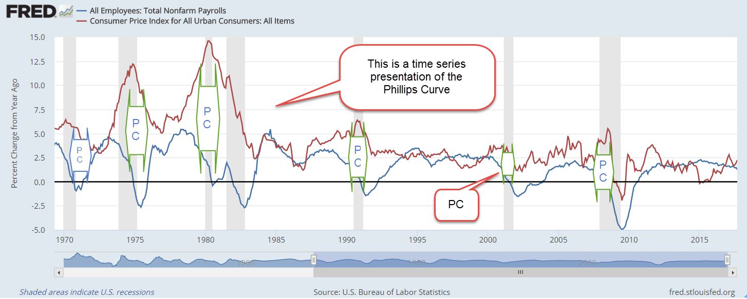
For several decades, the Federal Reserve has used the Phillips Curve to help guide monetary policy. The curve is an inverse relationship between inflation and unemployment. Picture a see saw. When unemployment is low, demand for labor and inflation are high. When unemployment is high, demand for labor and inflation are low (See wonky notes at end).

The monetary economist Milton Friedman said the relationship of the Phillips curve was weak, and economists continue to debate the validity of the curve. As we’ll see, the curve is valid until it’s not. The breakdown of the relationship between employment and inflation signals the onset of a recession.

Let’s compare the annual change in employment, the inverse of unemployment, and inflation. We should see these two series move in lockstep. As these series diverge, the onset of a recession draws near.

In a divergence, one series goes up while one series goes down.  The difference, or spread, between the two grows larger. Spread is a term usually associated with interest rates, so I’ll call this difference the GAP.

In the chart below, I have marked fully developed divergences with an arrow marked “PC”. Each is a recession. I’ll show both series first, so you can see the divergences develop. I’ll show a graph of the GAP at the end.

PhillipsCurveRecession

As you can see to the right of the graph, no divergences have formed since the financial crisis.

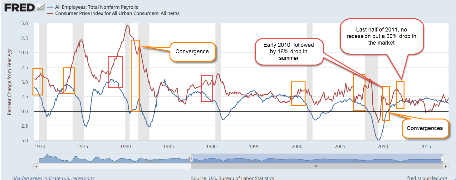
Shown in the chart below are the beginnings of divergences, marked with an orange square. I’ve also included a few convergences, when the series move toward each other. These usually precede a drop in the stock market but no recession.

PhillipsCurveDiverge

Here’s a graph of the difference, or GAP, between the two series in the last 11 years.

PhillipsGap

Fundamental economic indicators like this one can help an investor avoid longer term meltdowns. Can investors avoid all the bear markets? No. Financial, not economic, causes lay behind the sharp downturns of the 1987 October meltdown and 1998 Asian financial crisis.

What about the 2008 financial crisis? A year earlier, in October 2007, this indicator had already signaled trouble ahead based on the high and steadily growing GAP.

What about the dot com crash? In February 2001, several months after the market’s height, the growing GAP warned of a rocky road ahead. A recession began a month later. The downturn in the market would last another two years.

Readers who want to check on this indicator themselves can follow this link.

//////////////////

Wonky Stuff

In Econ101, students become familiar with a graph of this curve. Readers who want to dive deeper can see this article from Dr. Econ at the Federal Reserve. There is also a Khan Academy video .

The Supply Chain Sags

September 11, 2016

Fifteen years ago almost three thousand people lost their lives when the twin towers crumpled from the kamikaze attack of two hijacked airplanes.  Over the fields of rural Pennsylvania that morning, the passengers of a another hijacked plane sacrificed their own lives to rush the hijackers and prevent an attack on Washington.  We honor them and the families who endured the loss of their loved ones.

/////////////////////////

Purchasing Managers Index

Each month a private company ISM surveys the purchasing managers at companies around the country to assess the supply chain of the economy. Are new orders growing or shrinking since last month?  Is the company hiring or firing?  Are inventories growing or shrinking?  How timely are the company’s suppliers?  Are prices rising or falling? ISM publishes their results each month as a  Purchasing Managers Index (PMI), and it is probably the most influential private survey.

ISM’s August survey was disappointing, especially the manufacturing data.  Two key components of the survey, new orders and employment, contracted in August. Both manufacturing and service industries indicated a slight contraction.

For readers unfamiliar with this survey, I’ll review some of the details The PMI is a type of index called a diffusion index. A value of 50 is like a zero line.  Values above 50 indicate expansion from the previous reading; below 50 shows contraction. ISM compiles an index for the two types of suppliers, goods and services, manufacturing and non-manufacturing.

The CWPI variation

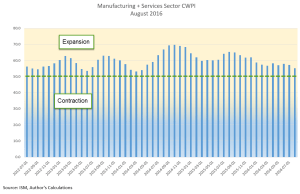
Each month I construct an index I call the Constant Weighted Purchasing Index (CWPI) that blends the manufacturing and non-manufacturing surveys into a composite. The CWPI gives extra weight to two components, new orders and employment, based on a methodology presented in a 2003 paper by economist Rolando Pelaez.  Over the past two decades, this index has been less volatile than the PMI and a more reliable warning system of recession and recovery, signaling a few months earlier than the PMI.

Weakness in manufacturing is a concern but it is only about 15% of the overall economy.  In the calculation of the CWPI, however, manufacturing is given a 30% weight.  Manufacturing involves a supply chain that produces a ripple effect in so many service industries that benefit from healthy employment in manufacturing. Because there may be some seasonal or other type of volatility in the survey, I smooth the index with a three month moving average.  Sometimes there is a brief dip in both the manufacturing and non-manufacturing sides of the data. If the downturn continues, the smoothed data will confirm the contraction in the next month.  This is the key to the start of a recession – a continuing contraction.

History of the CWPI

The contraction in the survey results was slight but the effect is more pronounced in the CWPI calculation. One month’s data does not make a trend but does wave a flag of caution. Let’s take a look at some past data.  In 2006 there was a brief one month downturn. In January 2008, the smoothed and unsmoothed CWPI data showed a contraction in the supply chain, and more important continued to contract. The beginning of the recession was later set by the NBER at December 2007. ( Remember that these recession dates are determined long after the actual date when enough data has been gathered that the NBER feels confident in its determination.)  The PMI index did not indicate contraction on both sides of the economy until October 2008, seven months after the signal from the CWPI.  During that time, from January to October 2008, the SP500 index lost 30% of its value.

The CWPI unsmoothed index showed expansion in June 2009 and the smoothed index confirmed that the following month. The PMI did not show a consistent expansion till August 2009.  The NBER later called the end of the recession in June 2009.

The Current Trend

Despite the weak numbers, the smoothed CWPI continues to show expansion but we can see that there is a definite shift from the wave like pattern that has persisted since the recovery began.

With a longer view we can see that an up and down wave is more typical during recoveries.  A flattening or slow steady decline (red arrows) usually precedes an economic downturn.  The red arrows in the graph below occurred a year before a recession.  The left arrow is the first half of 2000, a year before the start of the 2001 recession.  The two arrows in the middle of the graph point to a flattening in 2006, followed by a near contraction.  A rise in the first part of 2007 faltered and fell before the recession started in December 2007.  The current flattening (right arrow) is about six months long.

New Orders and Employment

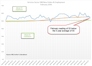
Focusing on service sector employment and new orders, we can see the weakness in this year’s data.

With a long view, a smoothed version of this-sub indicator signals weakness before a recession starts and doesn’t shut off till late after a recession’s end.  The smoothed version has been below the 5 year average for seven months in a row.  If history is any guide, a recession in the next year is pretty certain.

The 2007-2009 Recession

 In August 2006 this indicator began consistently signaling key weakness in the service sectors of the economy (big middle rectangle in the graph below). Stock market highs were reached in June 2007 and the recession did not officially begin till December 2007, a full sixteen months after the signal started.  That signal didn’t shut off till the spring of 2010, about eight months after the official end of the recession.

The 2001 Recession, Dot-Com Bust and Iraq War

The recession in 2001 lasted only six months but the downturn in the market lasted three years as equities repriced after the over-investment of the dot-com boom.  The smoothed version of this indicator first turned on in January 2001, two months before the start of the recession in March of that year.   Although, the recession officially ended in November 2001, the signal did not shut off till June 2003 (left rectangle in the graph above).  Note that the market (SP500) hit bottom in September 2002, then nosedived again in the winter.  Weak 4th quarter GDP growth that year fueled doubts about the recovery.  Concerns about the Iraq war added uncertainty to the mix and drove equity prices near that September 2002 bottom.  In April 2003, two months before the signal shut off, the market began an upward trajectory that would last over four years.

No one indicator can serve as a crystal ball into the future, but this is a reliable cautionary tool to add to an investor’s tool box.

//////////////////////////////

Stocks, Interest Rates and Employment

There are 24 branches of the Federal Reserve. This week, presidents of two of those banches indicated that they favored an interest rate hike when the Fed meets later this month (Investor’s Business Daily article).  On Friday, the stock market dropped more than 2% in response.  One of those presidents, Rosengren, is a voting member on the committee (FOMC) that sets interest rates.  I have been in favor of higher interest rates for quite some time so I agree with Rosengren that gradual rate increases are needed. However, Chairwoman Janet Yellen relies on the Labor Market Conditions Index (LMCI) to gauge the health of the labor market.

Despite an unemployment rate below 5%, this index of about 20 indicators has been lackluster or negative this year.  There are a record number of job openings but employees are not switching jobs as the rate they do in a healthy labor market.  This is the way that the majority of employees increase their earnings so why are employees not pursuing these opportunities?

The Federal Reserve has a twin mandate from Congress: “maximum employment, stable prices, and moderate long-term interest rates.” (Source) There is a good case to be made that there are too many weaknesses in the employment data, and that caution is the more prudent stance.  The FOMC meets again in early November, just six weeks after the upcoming September meeting. Although the Labor Report will not be released till three days after the FOMC meeting, the members will have preliminary access to the data, giving them two more months of employment data. Yellen can make a good case that a short six week pause is well worth the wait.

Stuck in the Mud

In 18 months, the SP500 is little changed.  A broad index of bonds (BND) is about the same price it was in January 2015.  The lack of price movement is a bit worrying.  There are several alternative investments which investors may include in their portfolio allocation.  Since January 2015, commodities (DBC)  have lost 15%, gold (GLD) has gained a meager 1%, emerging markets (VWO) are down 5%, and real estate (VNQ) is literally unchanged.  A bright note: international bonds (BNDX) have gained almost 6% in that time and pay about 1.5%.  1994 was the last time several non-correlated assets hit the pause button.  The following six years were good for both stocks and bonds.  What will happen this time?  Stay tuned.

Growing Government Debt

March 6, 2016

Earlier this year and again last week I suggested that a broad index of energy companies would probably be a good investment for the long term investor.  This week’s inventory report from the U.S. Energy Information Administration (EIA) showed that crude oil inventories continued to climb but that demand for gasoline is up a strong 7% over last year.

The latest Baker Hughes rig count showed an 11th week of declines in North America.  Oil rigs are now at levels last seen in early 2008 and gas rigs are at a 70 year low.

In response to demand growth and a steadily declining supply, crude oil prices climbed almost 10% and energy ETFs like XLE and VDE climbed almost 8% this past week.

////////////////////////

Constant Weighted Purchasing Index (CWPI)

At the beginning of each month I update an index that is based on the Purchasing Managers Index (PMI) using a methodology initially developed by financial economist Roland Pelaez in 2003 as a possible forcasting indicator for recessions.  I modified that to include the dominant non-manufacturing part of the economy, and called this combined index the CWPI, which I have included in my blog for three years.

The PMI is a monthly survey of Purchasing Managers throughout the country that gauges expansion or contraction in several aspects of their business.  The two most important components in the model are employment and new orders.

For the first time since last October, the manufacturing component of the index rose but is still contracting slightly.  Export manufacturers have had to overcome a strong dollar in the past 1-1/2 years, which makes American made products more expensive overseas.  The services sector is still expanding and the composite reading is still strong, indicating that there is little risk of recession in the near term.

Although Friday’s employment report showed strong job gains of 240,000, growth in the employment component of the services sectors is slowing.

Mr. Pelaez has recently published  a peer reviewed recession forecasting tool that I have not reviewed yet but I do look forward to reading his insights. Recessions come infrequently, about once a decade, but a long term investor who can switch out of stocks and into Treasuries to avoid these recessions could theoretically triple their wealth.

A word of caution.  There are several inherent problems with trading models based on infrequent economic events like recessions: 1) backtesting can help one develop a model or trading rule that does little more than fit the historical data;  2) backtesting uses revised economic and financial data.  Unfortunately, we don’t get to make decisions with historically revised data.

A great example of this:  at the June 2008 meeting of the Fed, three months before the financial crisis imploded, the majority of economists at the meeting felt that the economy had skirted a recession.  As more data for the first and second quarters of 2008 showed a definite decline in GDP, the NBER actually marked the start of the recession six months before that meeting, in December 2007.  You want perfect?  Next universe that-a-way.

///////////////////////

Debt Doubts

In December 2009, I mentioned  a comment by Raymond Baer, the chairman of Swiss private bank Julius Baer, who warned: “The world is creating the final big bubble. In five years’ time, we will pay the true price of this crisis.”

That time has come and gone but these things don’t run on a calendar.  As the book “The Big Short” noted, a person has to be right and timely.  Some who bet on the implosion of the housing bubble ran out of money before the bubble burst.

Taking advantage of extremely low interest rates, companies continue to borrow.  Levels of corporate debt are nearly a third of GDP.

Instead of bringing some of its cash profits back into the U.S. and triggering a tax expense, Apple has borrowed money to fund operations and investment.  Banks and investors would rather loan money to Apple than some medium sized business.  How good is that for the long term health of the economy?

To understand the makings of a debt bubble, let’s compare rates of return on investment and debt. Let’s say that a 50/50 balanced portfolio can earn 5.5% per year; 7.5% for stocks, 3.5% for bonds.  If a mortgage can be had for 4%, then it makes sense to NOT pay down the mortgage.  A car lease or loan at a 2% interest rate?  Keep rolling the loan or lease.  A company like Johnson and Johnson can borrow money for 25 years at the same 4%.  Why would they pay down debt?

Debt continues to grow because there is no financial incentive to pay it down.  Some families may pay down debt out of conservative prudence but there is no economic sense in doing so as long as money can be borrowed at a rate that is below what one can earn with the money.

As an example, let’s say that a family is considering paying off the remaining $100K on their mortgage.  They can get a new mortgage for 3.5% – 4%.  If they can earn 5% on that money, why bother paying off the mortgage?  Persistently low interest rates cause families and businesses to make short term decisions that make sense – until they don’t.  Some families will pay off debt as a matter of prudence but the low interest rate environment encourages families and businesses to NOT pay off debt.

In 2009, Raymond Baer was referring to the amount of corporate debt that was being rolled over at the time in order to avoid taking a loss on the loan.  Central banks have helped subsidize that rising corporate debt with low interest rates.  Banks reciprocate by buying government debt.

Global government debt has DOUBLED from $28 trillion in 2007 to almost $56 trillion in 2015 (Global debt clock).  China’s government debt-to-GDP ratio has more than doubled from 21% in 2007 to an estimated 54% in 2008 (S. China Post)

In the U.S. and Europe, government banking agencies reciprocate by requiring banks to hold little if any reserve collateral for the Federal or central government debt the banks purchase.  It’s a great financial buddy system – until it’s not.  We have never lived in a world where central banks can create so much money with an entry in a ledger.  As long as no one runs for the exits, everything is OK.

Under the Dodd-Frank rules, the Federal Reserve does not rate state and municipal debt with the same safety it accords U.S. Treasury debt.  This forces banks to hold more collateral against the debt, making it less attractive.  The Dodd-Frank test is whether banks can survive for thirty days during a financial crisis.  Since municipal and state bonds don’t trade very frequently, their lack of liquidity makes them more susceptible to downward price pressures in a crisis.  The Fed wants banks to offset that risk.  Cities and states complain that this forces them to pay higher interest rates on their debt and gives them less access to the bond market.  What do governments do when they don’t like the judgment of finance professionals?  Get their legislators to pass laws to override that prudence.  Several bills in both the Senate and House have been proposed.  This is how the world goes to hell.  One step at a time. (WSJ article on municipal debt)

////////////////////

Bonds Bust ZLB

Howz dat for a headline?!  ZLB means “Zero Lower Bound”, or 0%. Last Monday, the central bank of Japan sold almost $20 billion of 10-year government bonds that paid a negative interest rate.  Buyers are paying the Japanese government a fee to loan the government money.  Bizarro world!  While I don’t know the details, the buyers are probably Japanese banks who “take one for the team” – lose money – to implement a plan that the central bank hopes will combat the threat of deflation.

Labor Report and Debate

A less than forceful President Obama appeared in Denver this past Wednesday at the first of three debates in the closing weeks before the November elections. (The Secret Service was rather more forceful, mandating a shut down of the main north-south highway through town during the debate.)  Republican contender Mitt Romney showed more preparation and assertiveness but unfortunately left some of the facts behind in his hotel room.  Neither candidate can look the truth in the face.  Mr. Obama’s repeated claim that his economic plan saves $4 trillion uses many discredited (even by his sympathizers) gimmicks to arrive at that figure and yet he continues to trot out the assertion.  Mr. Romney really wants us to believe that Congress is going to jeopardize their jobs by taking away popular tax deductions in order to pass his 20% rate cuts.  Congress will pass the rate cuts, which are good for re-election.  Take away the mortgage interest deduction?  We’re not betting on it, Mr. Romney.  The end result of his tax plan and his pledge to increase military spending would be a $2 trillion deficit, double the annual deficit we are currently running.

Mr. Obama continues to pledge his support for the middle class, many of whom continue to slide down from the middle middle class to the lower middle class on their way to upper lower class and downright poverty.  Mr. Obama spent much of the debate consulting his notes on supporting the middle class as though he were teaching a class on the subject.  Note to Mr. Obama: you are no longer in the classroom.  This is the real world.

There are any number of fact checks on claims by both Mr. Romney and Mr. Obama during the debate.  Here is a fairly short summary from several Associated Press writers.

Then Friday morning, the heavens parted and the voice of – no, not God – the Bureau of Labor Statistics issued forth in their monthly pronouncement on the state of the job market: “The unemployment rate decreased to 7.8 percent in September”.

Throughout the country millions of pundits, economists and average Joes and Bettys stopped in disbelief and reached for their ear trumpets.  Had they heard right, they wondered?  Tweet, tweet, tweet went the twittersphere.  Blah, blah, blah went the blogosphere.  Lies, lies, lies went the right wing cons over at Fox and dance, dance, dance went the lefties at MSNBC.  For the first time in his presidency, Mr. Obama has seen the unemployment rate drop below 8%.

Had a large number of people simply given up and left the work force, causing them not to be counted as unemployed?  This has been a characteristic of the decline in the unemployment rate earlier in the year.  But not this month. 

Was the number of jobs created particularly strong?  Not this month.  At 114,000, job growth was not strong or weak and probably not enough to keep up with population growth.  A third of that job growth was in the health care sector.  A nation that continues to show its greatest growth in taking care of an aging and poorer population is not building a foundation for sound long term economic growth.

Many of the unemployed simply did the best they could do – get a part time job.  The number of involuntary part timers increased by more than a half million this past month. From the BLS Employment Release:

“The number of persons employed part time for economic reasons (sometimes
referred to as involuntary part-time workers) rose from 8.0 million in August
to 8.6 million in September. These individuals were working part time because
their hours had been cut back or because they were unable to find a full-time
job.”

There are good and bad trends that cause the unemployment rate to fall.  The two most problematic of the bad trends are 1) unemployed people simply giving up, and 2) involuntary part timers.  We have now seen both of these trends this year.

The steep drop in discouraged workers contributed to the decline in the unemployment rate.

“Among the marginally attached, there were 802,000 discouraged workers in
September, a decline of 235,000 from a year earlier. (These data are not
seasonally adjusted.) Discouraged workers are persons not currently looking
for work because they believe no jobs are available for them.”

Below is a 10 year graph showing the level of discouraged workers. (Click to enlarge in separate tab)

Another contributing factor was the revision in the number of net jobs gained in the two previous months.

“The change in total nonfarm payroll employment for July was revised from
+141,000 to +181,000, and the change for August was revised from +96,000 to
+142,000.”  Last month, many were scratching their heads when the BLS released their August report showing a dramatically lower number of jobs gained than reported by the payroll processing company ADP. It seems that some companies may have been too busy hiring to fill out and turn in their August BLS survey form.

Discouraged workers comprise part of a larger total of 6.4 million people who want a job but have not actively looked for one in the past 4 weeks.  A year ago, in Sept. 2011, the figure was 5.9 million.

Homebuilder stocks have been on a tear this year but construction employment, at 5.5 million, has barely budged in the past 3 years.

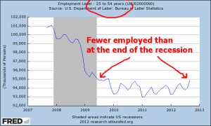
The core work force, those aged 25 – 54, continue to show some improvement but still have not reached the post-recession level of late 2009.

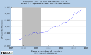
In the larger work force, aged 25 and up, the number of employed has risen almost to pre-recession levels, indicating that there are more older people continuing to work when they can – at full or part time jobs. 

As the population ages, so too does the work force – a natural demographic change.  But older workers are not stepping aside for young workers just entering the work force.  Those who can work do so to compensate for the lackluster growth or decline of retirement funds and declining property values, the two chief sources of wealth that a person builds over a lifetime of work. Below is a graph of workers aged 55 and older.

The number of hours worked per week edged up slightly – a good sign.  But – “over the past 12 months, average hourly earnings have risen by 1.8 percent, ” the BLS report notes, indicating that family earnings are just not keeping up with inflation.

On the bright side, we are doing better than much of Europe which is probably already in recession.  Returning to the topic of debates, did we hear either candidate offer a recovery plan for … not this past recession but the one that will probably occur during the next Presidential term.  “What!!!???” you say, “we haven’t even gotten out of this past recession!”  The law of averages, like the law of gravity, is a pesky, problematic force of nature.  The 1960s and the 1990s are the only two decades in the past century where we did not witness a recession within an eight year period (Source), yet few Presidential candidates dare to discuss the eventuality of such a thing.  Even the Congressional Budget Office does not factor in recessions to their ten year budget projections unless the recession is ongoing.  As the Presidential contender, Mr. Romney must play the part of the man with a plan.  After four years, Mr. Obama probably understands that “hope and change” is little more than rousing rhetoric; that the President must steer the raft through dangerous currents without capsizing or losing any passengers, while the other political party rocks the raft enough to make his task even more difficult.  Should Mr. Romney win the Presidency, he will discover the same sobering truth.

GDP and Recession

So you’re sitting at a picnic table in the park, having a barbecue with friends and family and one of your kids starts complaining about how life is so unfair because of something or other and you find your mind drifting off to the state of the economy.  You feel like telling your kid that, as they grow older, they are going to find that life is full of unfair and to just get over it.  But you don’t tell your kid that because they are not strong enough for it yet, which reminds you of Jack Nicholson’s line in the movie A Few Good Men: “You can’t handle the truth!”  But you don’t tell that to your kid because it would scare them so you act sympathetic and give your kid a little hug and pretty soon everything is OK again except that about eight feet away from the table Uncle Bob is having an argument with your friend about the money the government is spending.

Uncle Bob is saying that Obama and the Democrats are bringing down this country and your friend counters that it is Obama who trying to resurrect the country after Bush’s eight years as President.  You begin to turn your shoulders to them as though to insert yourself into the debate but notice that your wife is looking at you kinda funny from across the picnic table and, while you are not that good at mind reading, there is something in her look that raises a flag of caution in your mind.  Your father in law is busy at the barbecue and calls out that the burgers will be ready in five minutes – which gives you just enough time to whip out your iPad and check the Federal Reserve data site to answer a nagging question:  what is GDP per person in this country?

Gross Domestic Product accounts for most of the private and government economic activity in a country.  GDP doesn’t take into account the money that a government borrows to fund its spending;  GDP only includes the spending.  GDP doesn’t care what the money was spent for, whether it was to build a bridge in Iowa or destroy a bridge in Afghanistan.  Regardless of these and other faults,  GDP serves as a report card on a country’s economy.

Real GDP is an inflation adjusted GDP, a way of comparing apples to apples over the years.  Real GDP per capita is the inflation adjusted economic output per person.

You type in “Real GDP” into the search box  and the Federal Reserve database, or FRED to its many users, obliges you with a list of GDP reports and you select the first one. The full graph comes up showing the years 1947 to 2012.  You touch the Edit Graph button, then change the beginning date to 1960.

Both Uncle Bob and your buddy have had a few beers, a beverage which adds certainty to a man’s opinion.  You wonder how many of these political-economic debates have occurred this week at the dinner table, at the office, while taking a break on a construction site.

Your iPad screen shows the rise in real GDP with the “hook” starting in late 2007.  It is that hook that has got a lot of people arguing.  Its the hook that has pulled home values down and given a hard yank on the retirement dreams of  many people.  That hook tugged away the after school program your kid was in as the school district tightened its belt.  That hook took your wife’s job away; it almost took yours.

Now your buddy is talking loudly and pointedly about higher education cuts, but is barely able to finish his sentence as Uncle Bob interrupts him with the tale of the state university vice-president who is getting $300K a year in pension benefits.  Bob is sick of paying higher taxes for the fat cat retirements of the elite government employees.

Although the Bureau of Economic Analysis called an end to the recession in June of 2009, every adult with half a brain knows that the recesson didn’t end then. The billionaire investor Warren Buffett uses a rule of thumb that a recession ends when real GDP gets above the high point before the recession began.  You touch the “5 year” range button on the screen and see that real GDP has in fact surpassed that high point in 2007 so Buffett probably called and end to the recession in the fall of 2011.


FRED conveniently colors in the recessions, highlighting the periods in gray, but they are the “official” periods of recession, when GDP rises or falls for two consecutive quarters.  GDP could fall from $100, for example, to $60, signalling a recession, then increase to $65 over six months and the BEA would say it was the end of the recession, even though any sane person would say “Hey, we’re still down a third from the $100 high point.”

Has the GDP per person surpassed its 2007 high?  Your mother-in-law leans over and asks whether you want lettuce and tomato, glances down at the iPad screen with just a hint of disapproval in the set of her mouth and tells you that everyone will be eating soon.  OK, just a minute, you tell her.

Touching the screen, you click the “Add Data Series”, then touch line 1.  In the box you type “POPTHM”, the population census figures.  The other night, you couldn’t remember Bruce Willis’ name from the Die Hard movies but you can remember the label for the population series.  You’re not old yet but this is probably what happens to old people’s brains.  To get the GDP, which is in billions, per capita, which is in thousands, you need to multiply the GDP dollars by a million before dividing so you type into the formula box: “a * 1000000 / b” and touch the “Redraw Graph” button below it.

FRED redraws the graph, showing that the per capita GDP has still not risen above the 2007 high point.


For four and half years we have been in recession, you think.  No wonder we are arguing.

Was it as bad as the recession in the early eighties, you wonder.  That was a double dip recession.  You touch the starting date box and click on 1960 and a new expanded graph appears on the screen. “Hey, hon, why don’t you help me with the ice?” your wife asks.  “Ok, just a sec,” you reply, not looking up from the screen.

You see that this recession on a per capita basis is about the same as the early eighties, lasting about four and a half years, from late 1978 to mid 1983, with an upward hiccup during that period.  The period was the same but the decline in the late 70s and early 80s was much shallower than this current recession. 

You want to show both your friend and Uncle Bob why they are arguing, that the recession really hasn’t ended, the comparison of this recession and the 1980s but your wife needs help with the ice so you close the iPad cover.  Maybe you can show them the graph after the meal.  “Burgers are up!” your father-in-law shouts and the whole group sits down to chow down. 

After the meal, your friend hauls out an old croquet set. There are a few hoops missing and one mallet has a head but no handle, but the kids are delighted.  At some point in the game, Uncle Bob sends your friend’s ball far afield with a taunt “Out in left field where the liberals belong!” but your friend doesn’t take the bait.  On second thought, you muse, showing these guys the graphs would only reignite the debate.

“Daddy, it’s your turn.  You can use my mallet,” your kid says and you reach for the mallet, thinking  We try to teach our kids to be considerate and cooperative on the playground and in school.  So what happens to that sense of cooperation when we grow up?

Unemployment and Recession

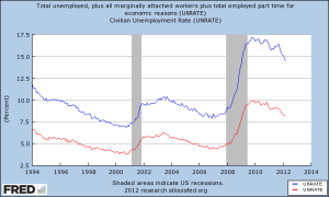
As the political machine of both parties gears up for the Presidential election less than seven months away, we will hear a lot of rhetoric about the unemployment rate.  Depending on the talk show, TV program or publication we will hear many different unemployment figures and the Bureau of Labor Statistics (BLS) does publish several different figures each month.  The headline number published each month is the U3 rate – those people who are not employed but have looked for work in the past four weeks.  Other rates include discouraged unemployed (U4), marginally attached workers (U5) and those who are working part time because they could not find a full time job (U6).  Wikipedia has a pretty good overview on the rates in this country and countries around the world.  The BLS has a detailed explanation of the various categories of unemployment with concrete examples of who they put into each category.  Below is a chart of the U3 rate and the U6 rate.

Some will argue that a particular unemployment rate is the “true” rate.  On a conservative talk show a few weeks ago, I heard a caller quote a “true” employment rate of close to 11%.  Neither I, the host of the show or the caller knew where the caller had come up with that figure.  In response to questions from the host of the show, the caller showed that he did not know the various unemployment rates.  Like many voters, this caller simply heard or read about this “true” figure.

In the ongoing political debate, Democratic leaning voters will use the lower U3 rate, currently 8.2%.  Republican leaning voters may use the U6 rate, the broadest measure of  unemployment, currently 14.5%.  Here’s someone who figures the “true” unemployment rate at 36%.  We tend to believe what we want to believe and our mental squirrels are good at finding the facts that fit our beliefs. 

This past month several economic reports, including the monthly unemployment report, indicated that the economy may once again be stalling – as it did in 2010 and 2011.  The recent rise in Spanish government bond yields shows yet another sign of an underlying lack of confidence in the ability of the European market to avoid slipping into a deeper recession.  In the past six months, China’s growth has slowed as they try to transition from an export economy to a consumer economy.  The Bush tax cuts and the debt ceiling are due to expire at the end of the year.  We can expect more political turmoil as that deadline and the election approach.  Weakening economic data in the coming months could exacerbate fears that the U.S. will fall back into recession, escalating the Republican rhetoric that their party needs to be given the presidential reins to turn the economy around.

Readers of this blog know that I have been especially skeptical of seasonal adjustments to labor figures in the past few years, preferring to use the non seasonally adjusted figures from the monthly Household Survey that the BLS uses to collect employment data.  But for the chart I’m about to show you, there is not much difference between the seasonally adjusted figures and the non seasonally adjusted figures.  The chart compares the percent change in the data and the seasonally adjusted figures are easy for you to get in the future.

If we begin to hear the economic and political pundits raise worries of recession in the coming months, the data in the chart below is a really reliable predictor of recessions.  There was a slight delay in a minor recession in the 1950s and two false signals in 1986 and 1995 when the economy faltered. Here’s the key:  when the percentage change in the unemployment rate from a year ago goes above zero, it is highly likely that we have either just started a recession or will start one shortly.

In the coming months you can pull up this same chart by going here at the Federal Reserve  or entering “Fred Unemployment” in Google search bar and selecting the top pick.  The Federal Reserve does all the work for you.  Click “Edit Graph” just below the graph.  On the next screen, change the “Observation Date Range” below the graph to start with a more recent year to make the chart easier to read.  Go down to the “(a)” section and select “Change from Year Ago, Percent”.  Below that, click “Redraw Graph”.  Now you too can know the future.