Young Beasts of Burden

October 8th, 2017

The Federal Reserve recently released their triennial survey of household income, debt and wealth. Rising asset values have lifted the fortunes of many, but younger families are struggling.  I’ll show a reliable indicator of recessions as well as some trends peeking out behind the numbers. The incomes below are denoted in inflation adjusted 2016 dollars.

The good news is that lower income workers have recently seen some income gains, which the Federal Reserve attributes to the enactment of minimum wage laws in 19 states at the start of 2017. However, single parent families have struggled with income gains, as they have for three decades. The decade from the late 1990s to the financial crisis in 2008 lifted the incomes of single parents but they have struggled during the recovery. Median incomes for this group remain below the 2007 level.

RealMedIncSglParent

That this group needed back-to-back historic asset bubbles in order to see some income gains shows just how vulnerable they are.

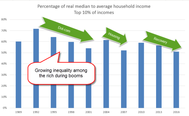
Much has been written about income inequality among households. During booms, there is a growing inequality even among those in the top 10% of incomes. The median in any data set is the halfway point in the numbers, and is usually less than the average of the numbers. If the numbers are evenly distributed the median is closer to the average and the percentage of median to average is high.  When there are a lot of outliers that raise the average far above the median, as in home prices, the percentage is lower.  During boom times there is growing inequality, even among the top 10%  of incomes. (Data from survey)
RealMedMeanIncomeRich

The growth of inequality of income obeys a power law distribution. Think of a 1’x1’ square. The area is 1. Now double the sides to 2’x2’. The area quadruples to 4. Triple the sides to 3’x3’ and the area increases by a factor of 9. Let’s imagine that the area inside of a square is money. How fair is it that the 2’ square has four times the money that the 1’ square has? Politicians may pass tax and social insurance laws to take some of that money from the 2’ square and give it to the 1’ square.  The redistribution of income and wealth can’t change the fundamental characteristics of a power law distribution. Despite the political rhetoric, solutions are bound to be temporary.

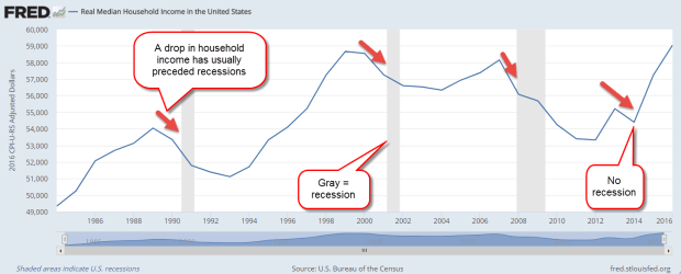
The income figures most cited are for households but this data has only been collected since the mid- 1980s. A fall in real median income usually precedes a recession except for the latest fall in 2014 when oil prices began to slide.
RealMedHHInc

Let’s turn to the data for family household income that has been collected since the mid-1950s. What is the difference between a household and a family? By the Census Bureau definition, a family household consists of at least one person who is related to the householder by blood, marriage or adoption. A fall in family income has preceded every recession except a mild one in the 1960s. Family incomes rose very slightly just before that recession, due in part to a new optimism about the presidency of JFK and the promise of tax cuts.

RealMedinc

Because this family income data is released annually at mid-year, this indicator is usually coincident with the start of a recession. However, it has proven quite reliable in marking the start of recessions.

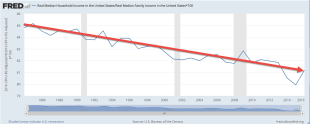
Non-family households are not related. This includes roommates or a childless couple living together but not married. Non-family households are generally younger and their income is less than the income of family households. Over the past three decades, the ratio of the incomes of all households to family households has declined.
RealMedHHIncVsFamilyInc

Although younger people are experiencing slower growth in incomes, they will face increasing pressure to meet the demands of older generations expecting social insurance benefits like Social Security and Medicare. As the oldest Americans begin living in nursing homes in increasing numbers, they are expected to put an ever-growing burden on the Medicaid system (CMS report).  It is the Medicaid system, not Medicare, which covers nursing home costs for seniors after they have depleted their resources. Although the number of nursing homes and certified nursing home beds have declined slightly in the past decade (CMS Report page 21), Medicaid spending still increased a whopping 10% in 2015 as enrollment expanded under Obamacare.

Colorado Governor John Hickenlooper has said that many states are expecting an increase in Medicaid spending on nursing home care as the first of the large Boomer generation turns 75 at the beginning of the next decade. CMS expects total health spending to increase 5.6% per year for the next decade. The last time we had nominal GDP growth that high was in 2006, at the peak of the housing boom.

The demands of both low income families and seniors on the Medicaid system will strain both federal and state budgets.  The federal government can borrow money at will; states are constitutionally prevented from doing so.

What will drive the high growth needed to sustain the promises of the future?  New business starts are at an all-time low (CNN money). How did we get here? The financial crisis caused the failure of many small businesses, many of which are funded with a home equity loan by an entrepreneur.  Home equity loans are down 33% from their peak in early 2009. At the end of last year, the Case-Shiller home price index finally regained the value it had in 2006. In the past decade there has been no home equity growth to tap into.
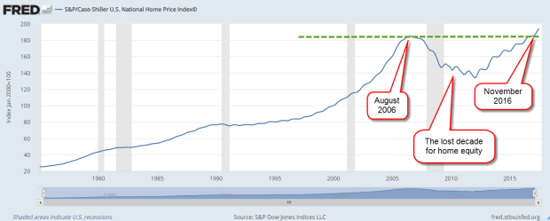
CaseShillerHPI201708

Imagine a couple in their late 30s or early 40s who bought a home 10 to 15 years ago. They may have only recently recovered the value of their home when they bought it. One or both may long to start a new venture but how likely are they to take a chance? In some of the bigger metro areas where home prices grew much stronger during the boom, prices are still below their peak ten years ago.

CaseShiller20City201708

The market has priced in a tax cut package that will lower corporate taxes. Investors are expecting a third or more of those extra profits in dividends. Investors are expecting a compromise that will enable companies like Apple to “repatriate” their foreign profits to the U.S. and for that money to be used to buy back stock or pay down debt, both of which are positive for stocks. The IMF projects 3.6% global GDP growth in 2018. There’s good cause for optimism.

Investors have not priced in the long term effects of this year’s hurricanes, the volatility of commodities, the future risk of conflict with North Korea, the risk that the debt bubble in China, particularly in real estate, could escape the careful management by the Chinese government. Add in the several fault lines in household finances that the Federal Reserve survey reveals and there is good cause to season our optimism with caution.

Individual investors surveyed by AAII are cautiously optimistic, a healthy sign, but the sentiment of actual trading by both individuals and professionals shows extreme optimism, a negative sign.  The VIX – a measure of volatility – just hit a 24-year low this past week, lower than the low readings of early 2007.  Sure, there was some froth in the housing market, investors reasoned at that time, but nothing that was really a problem.

Then, oopsy-boopsy, and stocks began a two year slide. So, don’t run with joy, Roy. Don’t go for bust, Gus. Pocket your glee, Lee. Stick with your plan, Stan. There are at least “50 Ways To Leave Your Money,”  and one of them is investing as though the future is predictable.


Bull Runs

September 17, 2017

Lloyd Blankfein, the CEO of Goldman Sachs, commented recently (CNBC) that the length of this bull market has worried the traders at Goldman. Being a curious sort, I wondered how this bull market compared to previous ones. Wanting a big picture, I looked at the quarterly data for the SP500 index for the past sixty years. A lengthening sequence of quarterly closes above the three-year average is a reliable indicator of a bull market.

In the 1980s, the SP500 had a run of 19 consecutive quarters above its three-year average. That streak ended in the 3rd quarter of 1990, at the start of a mild recession that lasted until March 1991. The animal spirits of the stock market could not be contained for that long. After one quarter down, the market began another streak in the 4th quarter of 1990, a monster bull run of 40 consecutive quarters above the average until the first quarter of 2001.

BullRun1990s

The end of the dot-com boom, the start of a mild recession, then 9-11, the Enron and accounting scandals – all of it led to a 50% drop in the index. Almost three years later, the market finally closed above its three-year average. That began a 17-quarter bull run that ended March 2008.

BullRun2000s

People were getting woke to the reality that housing prices can go down. The neighbor living in the house behind my folks in NYC said to me, “I don’t know what’s going on. Housing prices are not supposed to go down.” As though housing prices obeyed a fundamental physical law like gravity. The bailout of Bear Stearns that first quarter of 2008 was just the beginning of a developing financial crisis that would cripple the global economy. In 2010 and 2011, market prices clawed their way above the 3-year average only to fall back.

Finally, in the last quarter of 2011, after the fitful resolution of the budget crisis, the SP500 broke again above its 3-year average. Since then the market has notched 24 consecutive quarters above that average. This latest bull run has beat every previous SP500 streak except for the 1990s run up.

Bullrun2010s

This is what is worrying Blankfein and the traders at Goldman. Long bull runs in the past have ended horribly.  Like the bull run in the 1990s, there have been few negative, or corrective, quarters during this run.  Those are the quarters in red in the chart above. Some negative sentiment acts as a constraint on ever climbing asset prices.  For now, investors are convinced that inflation and interest rates will remain low, a prime environment for stocks.

The Eclipse of Optimism

August 20, 2017

We are coming up on an anniversary of sorts. Two years ago, the stock market had a series of sell offs in the last week of August. China devalued the yuan, commodity prices around the world swooned, and Greece was in imminent default on its loans. Pictures of empty cities in China prompted speculation that the building boom in China was coming to an end and would bring down the global economy. Over the course of 6 days, the SP500 shed 11%.

By year’s end the SP500 was still slightly below its level at the end of August and did not rise above its mid-2015 price till the summer of 2016. Long term assets at the end of 2015 declined slightly for the first time since the financial crisis (ICI 316 page pdf). There wasn’t a rush for the exits but clearly some investors were spooked. Should I get spooked when the next 10% drop comes?

In the past five years there were 73 daily declines of more than 2% in the SP500 index.  That’s more than one in twenty trading days or about one per month.  2% is more than 400 points on the Dow at current levels.  One bad day per month was relatively mild compared to the previous five-year period from August 2007 to August 2012. Bad days with greater than 2% declines occurred more than once a week!

I wondered if a bad week telegraphed a long term severe decline in stock market prices. Let’s say that within five trading days, the stock market fell 10%, averaging more than a 2% decline on each of those five days. I started my search twenty years ago and each bad week had its own story.

The list:
the LTCM financial crisis of October 1998,
the end of the dot com boom in April 2000,
the week following the attack on 9-11,
the bankruptcy of giant WorldCom and other accounting scandals in July 2002,
the winter months of 2008-2009 during the financial crisis,
the budget battle and fears of the U.S. government defaulting on its debt in August 2011, and the devaluation of the Chinese yuan in August 2015.

In each case investors were jolted by a surprise or some ongoing concern deepened into despair and a rush for safety. In some cases, the crisis ended or a solution was found and the dip was a good buying opportunity. In other cases, the fears signaled a severe and sustained repricing as in 2000–2003 and in 2008-2009.

Let’s say I interpreted a 10% dip as a good time to increase my equities. Imagine the sinking in my belly when stocks continued falling another 20, 30, or 40% as in the two repricing periods above. How could I have been so stupid?

Just as losses of 10% in a week are not reliable predictors of doom, gains of 10% in a week are inconsistent predictors of a market recovery. When bad weeks happen, financial pundits seem so sure that a 50% drop in the market is imminent. The data shows that this is not the case.

Now I’ll turn up the dial and see if I can find any consistency. A drop of 15% in a week is rare. In sixty years, the only instances of this are in October 1987, and October and November of 2008. In each case, there was more pain to come after that initial fall. So, if I happen to be alive when the next 15% weekly drop comes, the market has probably not finished correcting. The only 15% gain in a week was in November 2008, following an almost 20% fall the previous week. Boy, those were the good old days – not.

Since historical data does not give a clear guide for short to mid-term outcomes, my best strategy in reaction to a bout of market darkness may be – gulp! – do nothing. That can be so difficult when I am bombarded with forecasts of catastrophe at those times.  The sun will shine again.  It’s only an eclipse.

Storage Costs

August 6th, 2017

Last week I discussed the concepts of present and future money. This week I’ll look at the costs involved in storing our money for future use. When I store my fishing boat over the winter, I pay storage costs. When I store money for the future I also pay storage costs. Some of these costs are outright fees. If I have a financial advisor, I may pay them a percentage based on the amount of money they manage for me. All mutual funds charge a fee which is clearly stated in the fund’s prospectus. Pension funds charge fees as well and that is not always as clearly stated.

In addition to fees, there are implied costs. My bank lowers the interest rate they pay me for savings and CD accounts to take care of their operating costs and profits. I could put my future money under my pillow but inflation eats away at my store of future money like rats in a granary bin.

Let’s turn to another cost that is more of a packaging cost– income taxes. But wait, taxes come out of my present money, my income. How can that be a cost of my future money? In the progressive income system that we have in this country, my income is taxed. If I make more money than my neighbor, I will pay a higher rate. My neighbor may pay an effective tax rate of 5% and I pay 15%.

We pay taxes on our leftover income – what we could put away into our store of future money. Let’s say that the median household income is $50K and my family makes $70K. The difference is $20K more than the median. It’s money that I could put into my store of future money. On the other hand, my neighbor’s household makes $40K, or $10K less than the median. Part of my family’s income that I could have put away for the future is going to be taken by the government in taxes.  Some of it will be used as a fee to pay for today’s common expenses like defense, police and courts, research, and infrastructure. Part of it will be given to my neighbor as a transfer payment. My future money becomes my neighbor’s present money.

How did I get my present money, my income? Invariably, it came from someone else’s future money which was previously saved and invested in a business that either hired me or contracted with me. All this money is on a merry go round of time.

Now let’s turn to the prospects for my future money. This article lists 22 reasons for not investing more money in equities at current valuations. I have mentioned several points covered in this article. One is the percentage of household wealth that is invested in the stock market. This past month, that percentage surpassed the level at the peak of the housing boom in 2006-2007.

StocksPctFinAssets201706

Maybe this time is different but I won’t count on it. The heady peaks of the dot-com boom in the late 1990s shows that this can go on for some time before the whoosh! comes.

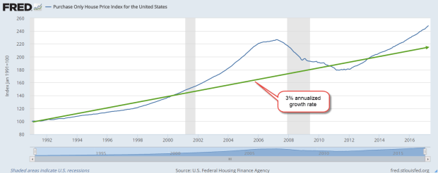
Housing prices continue to grow above a sustainable trend line. I’ve marked out a 3% annualized growth rate on the chart below. This housing index is for home purchases only and does not reflect refinances.

PurchaseOnlyHPI201706

Check out the growth in commercial real estate loans.  The 10% annual growth of 2015 and 2016 has cooled somewhat in the first two quarters of 2017 but is still a torrid 7.6%.  (Source)

CommlRELoans

Several years ago, I thought that real estate pricing would not get frothy again for several decades. We had all learned our lesson, hadn’t we? Maybe I was wrong. The worth of an asset is what the next buyer will pay for it.  Zillow tells me I am growing richer by the day but there’s a problem.  If I did sell my home, what would I buy?  Everywhere I look, housing prices are so expensive.  Now I come back full circle to another storage cost – storing the future me.

Reading the Signs

July 23, 2017

This week I begin with market volatility, or VIX, an index that reflects the price range of short term options on the SP500 index. As I wrote last week, the market has been on a wonderful ride down the river. The waters are strong but calm. No nasty rocks that might upset my raft. As Alfred E. Neuman of Mad Magazine asked, “What, me worry?”

How low can volatility go? The VIX is below 10, a level not seen since a brief moment in November 1993. The market makes new highs while volatility makes historic lows. Some warn of impending doom as though the market were the Titanic. Others predict Dow 30,000.

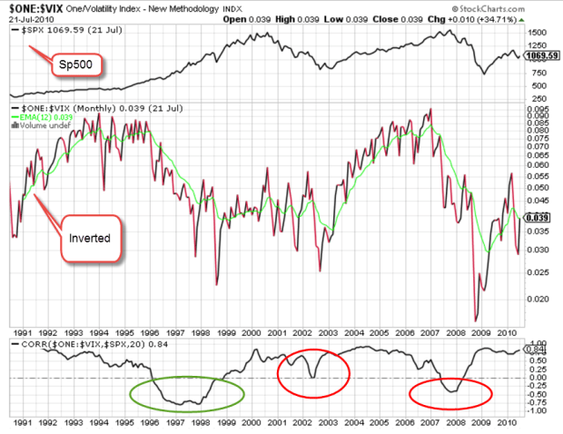
I’ll look at a 20 year period of both the VIX and the SP500 index, from 1990 to 2010. (If you are reading this on a cell phone, the few charts below will be more easily viewed by turning the phone sideways.) The period is marked by 3 strong price trends: 1) the extraordinary price rise in the late 1990s during the dot-com boom; 2) the 50% fall in prices from 2000 – 2003 as the bubble punctured and investment declined; and 3) the recession and financial crisis that began in 2008.

According to models, volatility should move inversely to stocks.  When one zigs, the other zags. By inverting a chart of volatility, I should see a volatility pattern that is somewhat similar to the pattern of SP500 index prices. I’ve added a chart of correlation between the two. I should expect to see a correlation of greater than 50 if things go according to the model.

For most of the twenty years, I do see what we expect. It’s those periods of unusual moves in the SP500 that the relationship breaks down. There is no consistency when the correlation breaks the model.

SPYVIXCorrelation
The green circle highlights the run up in prices of the dot-com boom. If I were to try to form a rule based solely on this mid-1990s behavior, I might say that when the VIX doesn’t behave inversely to prices, I should anticipate a run up in prices.

I’ll now take a look at the financial crisis years 2007 – 2009, the second red circle above. Just as in the late 1990s, the correlation veered away from expectations but this time prices moved in the opposite direction, falling 50%.  So much for my rule making.

The behavior is more complicated still when I look at the correlation pattern in the early 2000s.  The correlation wandered away from what I expected but never fell into the negative, yet prices also fell 50%.

Short-term options on the direction of the SP500 may offer no consistent clues to the long-term casual investor. But then again….maybe I should go long – averages, that is.

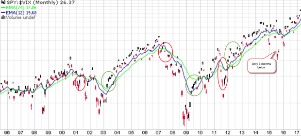
Below is a chart of SPY, a popular ETF that mimics the SP500.  Visual presentations can help me digest a lot of information and relationships. I have divided SPY by the VIX to get a ratio. If the top part of the fraction is supposed to go up when the bottom part of the fraction goes down, the resulting ratio should emphasize any price moves. Here I see a bit more predictability if I concentrate on the 12 and 24 month averages and disregard the noise. There is a lot of noise.

SPY-VIX1995-2017

The 12 month average (blue) runs higher than the 24 month average (green) in upturns and lower during downturns. The transitions may not always be as evident until I turn to the noise. When the current ratio runs below the 12 month average for several months, a downturn is likely. The opposite is true for an upturn. Here’s a chart with these turning points highlighted.

SPY-VIXTurnPoints

Some readers may occasionally want to check this pattern on their own. Without an account at stockcharts.com, someone can still call up weekly charts for free. Type in SPY:$VIX and call up the default daily chart. Above the chart, select the weekly button, then click the Update button to the right. Below the graph, change the default 200 day average to 100 and click Update. You should get a chart similar to the one below.

SPY-VIXWeeklyTurnPts

I have highlighted the turning points. Notice that there is a fairly consistent pattern. For the not so casual investors, you can bring up a daily chart and see similar turning points.

We have not had a 5% price correction in stocks for the past year. Here’s a chart showing twenty years of average performance during the year. We should not be surprised if we see a correction in the next few months but this market continues to befuddle even the most experienced investors.

Across the plains of Africa, the annual migration of wildebeest has crossed into Kenya. To tourists riding in jeeps through the grasslands, the movements of these animals may seem quite random and fragmented.  Tourists riding in hot air balloons above the plains can see the relationship between geography and the animals.  They can see the patterns of movement as the wildebeest follow the valleys and cross the rivers through the grasslands.  Likewise, a few charts of price and volatility can help us visually understand some part of investor behavior.

River Rafting

July 15, 2017

After a good year of snowfall in the Rockies, the rivers run strong. A popular spot for rafting is the Colorado River as it runs through the dramatic scenery of the Glenwood Canyon in western Colorado. Investing is a lot like rafting. We can’t control the amount of snowfall, the change in elevation, where the rocks are or the streams that feed into the river.

Our individual and group behavior on the river can help or hinder our progress. In a good year, rafting companies charge more for a rafting adventure. As more people come onto the river, we must pause in quiet water at the river’s side to give a safe distance between rafts. This crowding effect is made worse by stretches of river that require more caution to navigate. We can steer right or left to avoid some rocks but we are largely at the mercy of the river and each other.

Since the budget crisis in the late summer of 2011, the stock market has enjoyed a fairly strong run, more than doubling since that time. The financial crisis nine years ago was like a winter of extraordinarily deep snowfall. The Fed has kept interest rates abnormally low to thaw that snow, and equity investors have had a wonderful ride.

The Federal Reserve has committed to a series of gradual rate increases. Despite the low rates, people continue to pour their extra money into savings accounts and CDs. Wells Fargo is paying almost 1% below the Fed discount rate on their savings accounts. Why? As long as their customers are willing to accept savings rates of .3%, Wells Fargo has no incentive to raise rates. Discover, Goldman Sachs, American Express, Ally and Synchrony are paying about 1.15%, the Fed rate. (Bankrate) Savings account balances are near $9 trillion, more than double the balances in late 2007 before the recession began. The fear lingers.  Many people stand on the shore, too cautious to ride the river’s tumble and flow.

Until 2015, retail sector stocks (XRT) have been on a fast raft, quintupling from the market lows of March 2009. Over the past two years they have drifted into a side pool, losing about 20%. This year the stocks have been quite volatile as investors gamble on the future of the retail industry. Will Amazon continue to take sales from traditional brick and mortar stores?

June’s retail sales (RSXFS) were disappointing. Year over year growth was 3%, less than the 5 year average of 3.3%, and far below the near 5% growth of the 1st quarter. Excluding auto sales and auto parts (RSFSXMV), annual growth was only 2.4%, a 1/2% below the five year average and half of the 1st quarter rate.

The Trump administration and the Republican Congress have aimed for 3% real – inflation adjusted, that is – GDP growth. In an economy that depends so heavily on consumer sentiment, slowing retail sales will make that growth goal difficult to achieve.

For now, the sun is shining, the river is running strong and I am enjoying myself.  As long as I don’t look around the next bend in the river, everything looks fine!


The Price of Mispricing

June 11, 2017

In an April 2016 Gallup poll  52% of Americans said that they had some stocks in their portfolio. In this annual survey, the two decade high occurred in 2007 when 65% of those surveyed said stocks were a part of their savings. Asked what they thought was the safest long term investment, surveyed respondents answered: stocks/mutual funds. The stock market hit a high in the fall that year.

Turn the dial to April 2008. The market had declined 10% from its October 2007 high but there was still five months to go till the onset of the financial crisis in September. Americans surveyed by Gallup said that savings and CDs were the safest (Poll ). At that time, a 5 year CD was paying 3.7% according to Bankrate . What happened to turn sentiment from rather risky stocks to safe cash and CDs? The decline in the SP500 might have been responsible. A more likely cause was the recent headlines concerning the failure of the investment firm Bear Stearns. The Fed provided a temporary bailout, then arranged a sale of the firm to JPMorgan Chase.

When real estate prices were rising in the early 2000s, people thought real estate was the safest long term investment. Each of us should ask ourselves an honest question. Do I treat relatively short term shifts in asset pricing as though they were long term trends?

Here’s another thought. Do we mentally treat changes in asset pricing as though it were cash income? If I see that the value of my stock portfolio has gone up $10,000 since my last quarterly statement, do I think of that as kind of a dividend reward for my willingness to take a bit of a risk? The statement confirms that I’m a prudent investor. Do I mentally “pocket”  that $10,000 as though someone had sent me a check?

On the other hand, if my statement shows a decrease in value, I have not only lost money but now I may question my prudence. Am I taking too much risk? I might even think that “the market” is wrong. Can I trust a market that could be wrong? What if there’s another financial crisis? Should I sell my stocks and put the money in CDs? A 5 year CD is only paying a little bit above 2% but at least I won’t lose any money.

Let’s crawl out of our heads and into the pages of history. In the early 1950s, two people published ideas that have come to dominate the investment industry.

In 1951, John Bogle wrote his Princeton college thesis “The Economic Role of the Investment Company.” The paper was an in-depth analysis of mutual funds, a product that was less than 30 years old. (Excerpts). At that time, only 8% of individual investors owned stocks.

Two decades later, Mr. Bogle would go on to found Vanguard, the giant of index mutual funds.  Contrary to the founding principle of Vanguard, Bogle’s 1951 paper did not champion indexing.  In Chapter 1, he objected to the portrayal of a mutual fund as settling for the average returns of an index of stocks.  Bogle touted the active management that a mutual fund provided to an investor.  In a quarter century after he wrote the paper, Mr. Bogle’s conviction in the superiority of active management shifted toward passive indexing. Indexing is the averaging of the decisions of all the buyers and sellers in a particular marketplace.

When Bogle wrote his paper, two types of funds competed for an investor’s attention. The earliest funds were closed end (CEF) and date back to the middle of the 19th century. The Adams Diversified Equity Fund was founded in 1854 and continues to trade today under the symbol ADX. After the initial offering a CEF is closed to new investors. The shares continue to trade on the market like a company stock but investors can no longer buy or redeem shares with the company that manages the fund.

A mutual fund is an open end product, meaning that the fund is open to new investors and investors can redeem their shares at any time. The early mutual funds touted this feature but it was not statutory until the enactment of the Investment Act of 1940.

When Bogle wrote his thesis, the market was still in what is called a secular bear market. The beginning of this period was marked by the brutal crash of 1929 and would not end till 1953, when the price of the SP500 finally rose above the highs set in 1929. The 1920s had been a decade of rapid growth in the new radio industry and manufacturing. The automobile and stock markets were fueled by easy credit. In response to this short era of explosive growth, investors elevated their long term expectations. From 1926 to 1929 the stock market doubled in price, a rapid mispricing that finally corrected in the October crash of 1929.

In 1951, Bogle summarized the previous two decades:
“The depression and the great capital losses to investors which resulted from it caused a greater desire for safety of principal, but gradually confidence in stocks (and especially in a diversified group of them) returned, and during the same period bond rates fell. The combination of high income and safe principal thus shifted in favor of the common stock element. In spite of the fact that many funds urge that part of the investor’s capital should be devoted to bonds, after he has cash reserves and insurance needs filled, it seems doubtful that this advice has been widely followed. “[my emphasis]

In his analysis, Bogle identified several metrics that gave open-end mutual funds superiority over closed-end funds: prudent management to keep the fund attractive to new investors, diversification, liquidity, and income.

Bogle concluded his thesis with a caution that is timeless: “That the market will fluctuate is certain, and merely because it has experienced a general upward trend in the decade of the investment company’s greatest growth may have made many investors fail to realize that the share value, like the market, is liable to decline.”

He looked toward the future of mutual funds, and expressed what would become the business plan of Vanguard: “perhaps [the mutual fund industry’s] future growth can be maximized by concentration on a reduction of sales loads and management fees.”

In the past 15 years, only 15% of active large cap managers have beat the returns of the SP500 index.  The performance is even weaker for small cap stock managers.  Only 11% beat their index.  Individual investors have withdrawn money from actively managed funds and put that money to work in their passive counterparts.  As more money flows to index funds, the danger is that those funds will be averaging the decisions of a smaller pool of active managers. That objection is raised by advocates for active management but it seems unlikely that the pool of active managers will diminish to the point that a few remaining managers will essentially control the direction of the market.  Although recent flows of money have favored passive indexing, actively managed mutual funds and ETFs still control two-thirds of all assets (Morningstar).

In the following year, Harry Markowitz, a graduate student at the University of Chicago, wrote a paper titled “Portfolio Selection” which proposed a systemic approach to diversification called Modern Portfolio Theory. Bogle had noted the prudent rule of thumb that an investor should devote some capital to bonds as well as stocks to stabilize a portfolio. Markowitz mathematized this rule of thumb. The key to portfolio stability was a strategy of asset selection that minimized risk in the face of uncertainty. Any two assets, not just stocks and bonds, that were normally non-correlated would provide stability. When one asset zigged in value, the other asset zagged. Both assets could be risky but if one asset responded opposite the other, then the net effect of owning both assets was to lower the risk.

The key word in any talk of historical correlation is “normal.” There is no theory which can explain investor trauma, a total lack of confidence in most assets. In October 2008, every asset but one fell. Both stocks and gold fell 16%, commodities sank 25% and REITs fell a whopping 32%. Even bonds, a safe haven in times of uncertainty, fell 3%. In a world where every asset class was losing value, investors bought short term Treasuries, which rose 1%, but avoided long term Treasuries, which declined 2%. There was no safety to be found outside of the U.S. Emerging markets fell 26%, European stocks sank 23% and international real estate nose dived 32%.

But the correlation in normally non-correlated assets could not last. During the following two months, bonds rose 9%, and gold shot up 20%. Stable or defensive stocks like health care continued to lose value but at a slower pace. Some investors stepped in to pick up quality stocks at bargain prices. The stock market continued to stagger to a bottom until the passage of the American Recovery and Reinvestment Act in February 2009, soon after the inauguration of Barack Obama.

50% market repricings are relatively infrequent. That we experienced two such events in less than a decade in the 2000s caused millions of investors to abandon risky assets entirely. The SP500 index did not recover the ground lost till January 2013, more than five years after the high set in October 2007. The recovery after the dot-com bubble burst in 2000 lasted a similar time, 5-1/2 years.

When was the last time we had back to back severe downturns? We need to turn the dial back to the fall of 1968 when the market began a 1-1/2 year decline of 33%. After a few years of recovery, stocks fell again. Provoked by the Arab-Israeli war, the oil embargo and high inflation, the market began a repricing in 1973. The recovery lasted almost seven years.

In 1975, Bogle founded Vanguard, what some called “Bogle’s Folly.”  Four years later, the SP500 was barely above its high in 1968. Investors had so little confidence in stocks as a long term investment that, in August 1979, Business Week declared that stocks were dead. Since that declaration, the price of the SP500 has gained about 8-1/2% annually.  Add in 2 – 3% in dividends and the total return exceeds 10% annually.

Bogle and Markowitz have had a profound influence on the investment industry by developing two deceptively simple ideas for investors who can’t know the future.  Bogle’s thought: don’t bet on which chicken can lay the most eggs.  The complimentary idea from Markowitz: don’t put all your eggs in one basket.

Next week – what’s so special about market averages?  They’re not your average average.

The Cycle

April 30, 2017

This week I’ll look at the savings, retirement and asset cycle, which all have a similar lifetime. Let’s look first at asset pricing.

Long term moving averages can serve as a safety benchmark for asset prices, and a 50 month, or 4 year average, is one such average. If the price falls below that very slow moving average, there has already been a sizeable repricing of that asset and there may be more to come. It should prompt some caution or review.

Here’s a recent example.  In the summer of 2011, a basket of Brazilian stocks (EWZ) crossed below its 4 year average.  Six years later it is just nearing that long term benchmark. Its been a long hard slog for long term holders of Brazilian stocks, and supports the recommendation that an investor keep funds needed in the next five years out of the stock market.

Emerging markets (EEM, VWO, VEIEX) just crossed above their 4 year averages and are now at the same price as they were in August 2008.  This nine year “flatline” period came after a growth spurt from 2003 to 2007 when emerging market prices grew at 36% per year!  Even after nine years of no growth, an emerging market index has returned 10.5% annually in the the past 14 years.

The S&P500 has fallen below its 4 year average twice in the past three decades. Once was during the dot com bust in 2002 and the financial crisis in 2008. Each time, the index stayed below that benchmark for two or more years. During the 1969 – 1982 bear market, the SP500 fell below that benchmark four times! During that downturn, the index gained only 15% in 14 years. After adjusting for inflation, the loss was 40%,  or 3% per year.

Bond prices have been more stable and provide an anchor to a portfolio. Let’s compare the stock market to Vanguard’s total bond market index fund (VBMFX ). In the last three decades, the fund has NEVER fallen below its 4 year average. Dividend paying stock stalwarts like Johnson and Johnson (JNJ) can also serve as anchors since they fall below their benchmark less frequently than the SP500 index.  When these stable stocks do fall, the price rebounds more quickly than broader indexes because investors are attracted to fairly reliable sales and dividends.

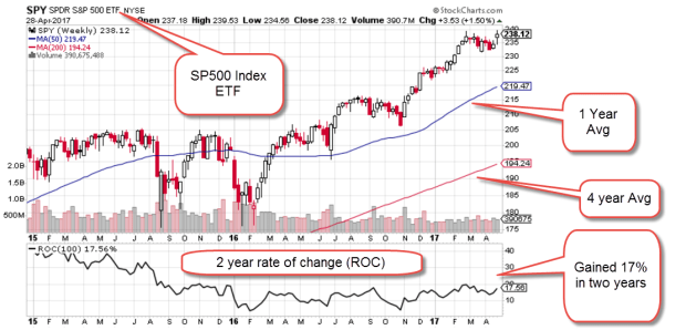
So how does a casual investor without a charting program chart a 4 year average? Stockcharts.com has free charts available. In the example below, I input “SPY,” a popular ETF that tracks the SP500 into the “Enter A Symbol” box on the upper right portion of the screen, then I clicked the Go button. Stockcharts displayed a daily chart for this ETF with default 50 and 200 day averages. Above the chart, I clicked the selection box from Daily to Weekly and pressed the Update button. I left the default 50 and 200 averages alone. The red line is now the 200 week, or approximately 4 year average. The blue line is the 50 week, or one year, average. The chart below is an example.

SP500ROC201704

This particular screen shot includes a Rate of Change indicator in the pane below the chart. Set at 100 weeks, it shows the percentage gain over two years.  Both gold (GLD) and mining stocks (XME) are struggling to get back above their 4 year averages.  You can change the symbol and compare their graphs.

In the earlier example, emerging markets had a five year spurt upwards, then a nine year flatline. Let’s look at a broad index like the SP500 in inflation adjusted dollars and we will see a similar pattern. $100K invested in the SP500 index in January 1997 was worth $183K in real dollars, real buying power, in April 2000. That was almost a doubling in real value in a small time frame. Easy money!

In 2012, twelve bruising years later, that inflation adjusted portfolio value FINALLY rose above $183K. Here is a free chart from PortfolioVisualizer.com

SP500GrowthInflAdj1997-2016

In the past four years, we have had another 62% spurt upwards in real value. The length of these spurts and flat periods are unpredictable, but the flat periods last longer than the spurts.

Let’s go back to the previous twenty year period, from 1977 – 1997.  In the first four years, from 1977 – 1983, the SP500 flatlined. In the following 14 years, the index grew by 570%!  (Exclamation marks for these growth spurts.)

SP500GrowthInflAdj1977-1997
We can see now that the strong asset price growth from 1997 to April 2000 was in addition to the extraordinary price growth from 1983 to 1997.  But doesn’t this example disprove the point I made earlier that flatline periods are longer than the growth spurts?

Let’s look back to those years before 1977 and we will see one of the reasons for that long growth period of the 1980s and 90s.  The six year flatline from 1977 – 83 was the tail end of a much longer period of flat or declining asset prices that lasted for 14 years, from 1969 through 1982. The introduction of tax deferred IRA accounts brought many individuals into the stock market during the 80s and 90s and helped to lift stock prices.  The introduction of the internet in the early 90s helped fuel a boom in asset prices much like the development of radio did in the 1920s.

Let’s turn from the long term 15+ year cycle of the stock market to the savings and retirement cycles. We spend at least forty years working. We may have just the last twenty years of our working career to save up for retirement. We hope to spend fifteen to twenty years in some stage of retirement.

We do not control when we are born nor the timing of these long term asset pricing cycles.  An awareness of these cycles may help guide us to wiser allocation choices.

The Nobel economist Robert Shiller builds an inflation adjusted ten year P/E ratio (CAPE) that is meant to smooth the ups and downs of company earnings. If I get some time next week, I may construct a 20 year ratio that corresponds to the 20 year cycle of 1) saving for retirement, 2) spending in retirement, and 3) the long term ebb and flow in the stock market.

////////////////////

Margin Debt

Investors meeting certain liquidity requirements can borrow money from their broker to buy assets, including stocks.  When stock prices start falling, investors without sufficient collateral in their brokerage accounts to cover the paper losses from falling stock prices may be subject to what is called a margin call.  The broker simply sells some of the client’s stock to replenish collateral.

Here’s an example and I will make the figures simple to avoid some of the complex rules involved.  An investor has $80,000 in stocks that she has bought and paid for.  She applies for a margin account with her broker who agrees to loan her $100,000 to buy other assets.  Thinking that the coming tax cuts will boost stock prices in the coming months, she buys $100,000 on margin in SPY, an ETF that replicates the SP500 index. Two weeks later, the European Union moves to disband in the coming months which makes investors very nervous and the stock market drops 20% in one day.  Yes, I told you I would make it simple.  The $80,000 in stocks that the investor owns outright is now worth $64,000 and the $100,000 of stocks she just bought on margin are worth $80,000.  The brokerage automatically sells $20,000 of the stock at the lower price to cover the shortfall in collateral. This is known as a margin call. One margin call does not create a selling wave.  Thousands of margin calls puts more downward pressure on stock prices and they continue to fall.  This again requires more selling to meet margin calls.

Because margin debt can ignite a selling frenzy in a crisis, the amount of margin debt is monitored.  Two years ago, the level of margin debt surpassed an earlier peak in 2000 at the height of the dot com bubble.  A graph from Doug Short at Advisor Perspectives shows the tight correlation between stock prices and margin debt.  After a brief decline, debt levels have again hit an all time high in real dollars.

There are a number of volatile situations around the world that could start a selling wave.  The level of debt will naturally accelerate that selling.  Now comes the news that there is a pool of margin debt that is not even reported and may add another 20 – 40% onto the reported total.  Here’s an article from Business Insider.

Money Flows

Since the election, the SP500 index has risen about 10%. A broad bond composite has lost about 3%. Investors are clearly willing to take on a bit more risk. Prices are generally a good indicator of trend, but let’s take a few minutes to look at the flows of money into various investment products to understand the shifts in sentiment and confidence.  In the first two weeks of February the flows of money have been staggering.

The Investment Company Institute (ICI) tracks (Stats) the money flows into long-term equity and bond mutual funds as well as hybrid funds that contain both stocks and bonds (Target date funds, for example).  ICI also includes data on ETFs that can be bought and sold like stocks during the trading day. To avoid confusion, I’ll use “products” to describe combined data of mutual funds and ETFs. These long-term products reflect investors’ broader outlook on the market and economy rather than a short-term trading opportunity. For most of 2016, investors withdrew money from equities. Since the election, there has been a surge of $45 billion into equity products, causing a surge in prices.

icifundflows2014-2016

Financial advisors recommend some combination of both stocks and bonds for most investors. Let’s look at the money flows into bond products over the past year. When investors withdraw money from stocks, they tend to put them in bonds or money market funds, a shift from risk to safety.

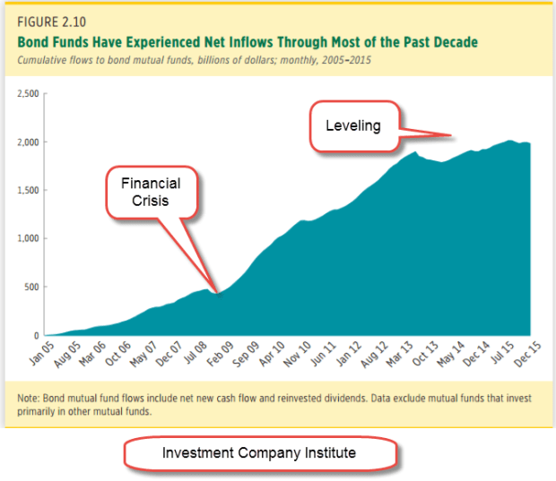
Older people are more cautious and have more of a preference for the price stability and dividends of bond products. The aging population and the painful memories of the financial crisis prompted a rush into bond mutual funds. The cumulative money flows into bond funds has increased from $500 billion in the summer of 2008 just before the financial crisis to over $2 trillion in 2015. (ICI chart)

icibondflows2005-2015

In the chart below we can see inflows into bonds during 2016, counterbalancing the outflows from equities. Since the election, investors have shifted $17 billion from bonds to riskier equity products. Not shown here was a further outflow of $20 billion from balanced hybrid products containing both stocks and bonds.

icibondflows2014-2016
Let’s review those totals. In November and December, there was a net INflow of $8 billion. Compare that with the $43 billion OUTflow in November and December 2015. Clearly, there was an increased appetite for risk. In 2015 and 2016, inflows into stock, bond and hybrid products declined rather dramatically from 2014’s totals.

icistockbondhybrid2014-16

In the first six weeks of this year, that lack of confidence has disappeared. Investors have pumped $63 billion into stock, bond and hybrid products, almost as much as the $74 billion invested in ALL of 2016. Should that pace continue – unlikely, yes – the inflow would be about $550 billion, far outpacing the inflows of 2014.  Over $40 billion of that $63 billion has come in during the first two weeks of February.  That is a $1.1 trillion annual pace. Where has this 2 week surge of money gone?  Half into equity – about $20 billion – and half into bonds -about $20 billion.

Had that money surge gone mostly into equities or mostly into bonds, I would be especially worried of a mini-bubble.  As I wrote last week, I am concerned that anticipated profits have already been priced in. Somewhat reassuring is the Buddha-like balance of flows – the “middle way.”

///////////////////////////

Tools

I have added some resources on the Tools page.  You can click on the menu item at the top of this page to access.  If you have any suggestions or additions, please let me know.


Ten Year Review

January 15, 2016

10 Year Review

Before I begin a performance review, I’ll refer to an article  on the errors of comparing our real world portfolio returns to the optimized returns of a benchmark index.  An index stays fully invested, has no trading costs, taxes or fees.  An index has survivor bias; companies that go out of business or don’t meet the capitalization benchmark of the index are effortlessly replaced, so there is no risk.  Share buybacks benefit an index but not our portfolio.

The article contains some prudent and realistic recommendations: the importance of preserving our savings, a balance of risk and return that will meet our goals, AND our time frame.  As we review the performance of the following portfolio allocations, keep those caveats in mind.  If a model portfolio earned 8% per year, use that as a rough guideline only.

A 60/40 stock/bond portfolio returned an annual 6.3% over the past ten years with a maximum drawdown (MDD) of 30%.
A  50/50 mix returned 6% with an MDD of 25%.
A 40/60 mix returned 5.75% with a MDD of 20%.

A difference of 10% in allocation equalled a .3% in annual return, and a 5% change in MDD.  Let’s put that .3% difference in dollars and cents.  Over a ten year period, a $100,000 portfolio earning .3% extra return per year equalled about $43 extra per month, or about $1.40 per day.  Why is this important?  For whatever reason, some people worry more than others and may be willing to accept a lower return in order to sleep better at night.

Not all ten year periods will have the same response to various allocations.  The majority of ten year periods will include a recession, but this past ten years included the Great Recession. Let’s look at the historical effect of portfolio allocation during the past ten years.  In the chart below you can see the annual returns of various balanced allocation mixes shown in the left column.  At the end of 2009, the 10 year results show the results of two downturns: the 2001 – 2003 swoon and the 2007 – 2009 crash.

Note that the more aggressive 60/40 allocation has a lower return than the cautious 40/60 allocation during the years 2009-2011.  As we move forward in time, the effects of the 2001-2003 swoon diminish and, starting in 2012, the more aggressive allocation earns a better return.

Not shown in the chart are the results of a 100% allocation to stocks during the ten year period 2000-2009, the first column in the chart above.  A 40/60 allocation had a return of 3.8%.  A 100% allocation to large cap stocks had a LOSS OF 1% per year.

During the 10 year period 2007-2016, a 100% allocation to stocks returned 6.8% annually, a 1/2% higher return than the 60/40 mix, but the drawdown was 51%, far more than the 30% drawdown of the 60/40 portfolio.

High Winds or Hurricane?

A person who spends twenty years in retirement can count on at least two market downturns during that time.  Here’s how MDD, or drawdown, can affect a person’s portfolio.  I’ll present a more extreme example to illustrate the point.  Imagine an 80 year old retiree with a portfolio devoted 100% to stocks.  For several years, she had been withdrawing $40,000 from a portfolio that had a balance of $600,000 in the fall of 2007.  Projecting that her portfolio could earn a reasonable return of at least 7% per year, or $42,000, the balance looked secure.

But by March 2009, a period of only 18 months, the high winds had turned to a hurricane.  Her portfolio, her shelter in the storm, had lost 50% of its value, an MDD or drawdown of approximately $300,000.  During those 18 months, she had also withdrawn $60,000 for living expenses, leaving her with a balance of about $240,000 in the spring of 2009, the low point of the stock market.

Only 18 months earlier she had projected that she could maintain a minimum portfolio balance of $600,000. She had gnawed her nails raw as the market lost 20% by the summer of 2008, then sank in September when Lehman Bros. went bankrupt, then continued to lose value during the winter of 2008-09.  When would it end?

In March 2009, she had only 6 years of income left before her savings were gone.  Unable to stand the loss of any more value, she sold her stocks for $240,000 – at exactly the wrong time, as it turned out.  Her $240,000 earned little in a money market, forcing her to: 1) cut back the amount of money she withdrew from her portfolio to about $24,000 per year, and 2) hope she died before she ran out of money.

Of course, most advisors would NOT recommend that an 80 year old devote 100% of their savings to stocks.  BUT, some retirees might – and have – adopted a risky strategy to “whip” a portfolio to get more income or capital appreciation the way a jockey might do with a tired horse.  On the other hand, some 80 year olds with a very low tolerance for any kind of risk might have all of their savings in cash and CDs, a 0/100 allocation.

Now let’s imagine that our retiree had a cautious 40/60 balanced mix.  She would have had a drawdown of 20%, or $120,000, during the Great Recession.  After withdrawals for living expenses, she still had a balance of about $420,000 in March 2009. At a conservative estimate of a 5.5% annual return, she could have prudently drawn down her portfolio $25,000 – $30,000 for a year and waited. This is important for seniors: an allocation that allows some temporary flexibility in the withdrawal amount from a portfolio.

By the end of 2009, her portfolio had gained about 24%.  After living expenses of about $22,000 taken from the portfolio during the last 9 months of 2009, she had a balance of more than $500,000.  Her balanced allocation allowed her to wait longer for the market to recover.

In 2010, she could once again take her $40,000 living expense withdrawal and still have a $530,000 portfolio balance by the end of that year.  She has weathered the worst of the storm. At the end of 2016, she continued to take out $40,000 (adjusted upward for inflation) and still has a portfolio balance of $486,000.

Finally, her 40/60 allocation mix kept to a rule I have mentioned from time to time: the five year rule. If she wanted to take approximately $40,000 from the portfolio each year, she should have a minimum of 5 years, or $200,000 in bonds and cash – the “60” in the 40/60 allocation mix.  In the fall of 2007, she had $360,000 (60% of $600,000) in less erratic value investments.  This rule helped her withstand the storm winds of the Great Recession.

//////////////////////////

Seniors at Risk

Although the number of loans to those 65+ are less than 7% of the total of student loans, a shocking 40% of these loans are in default.  Most of these loans were cosigned by seniors for their children or grandchildren. The law allows the Federal Government to garnish or lien Social Security and other federal payments to cure the loan defaults.  Readers with a WSJ subscription can read the article here or Google the topic.

//////////////////////////

Hot Housing Markets

In a recent analysis, western cities rule Zillow’s top 10 housing markets for valuation increases.

///////////////////////////

Take this job and shove it!

The latest JOLTS report from the Labor Dept. shows the highest quits rate in private industry since the housing boom in 2006. Employees confident of finding another job are more willing to voluntarily leave their job, and have driven the rate up to 2.4% from a low of 1.4% in the 2nd half of 2009.

Statista compiles data from around the world, including this revealing tidbit: 26% of jobs in the U.S. are unfilled after 60 days, the highest percentage in the developed world. Germany ranks 2nd at 20%, and our neighbor to the north, Canada, comes in at nearly 19%.

What lies behind this data is a mismatch.  Employers may be requiring skills that job applicants don’t have.  Job applicants may want more money or other benefits than employers are willing to pay.

//////////////////////////

Obamacare Repeal

The Committe for a Responsible Federal Budget (CRFB) – yep, it’s a mouthful – has projected costs to repeal Obamacare in whole and in part.  Using both conventional, or static, budget scoring and dynamic scoring (google it if you’re interested), they guesstimate a 10 year cost of $150 to $350 billion for full repeal of the ACA.

Repeal of ACA’s insurance coverage would actually save a lot of money, more than $1.5 trillion. The net effect is a cost, not a savings, because of the $2 trillion in tax revenue on higher incomes that is built into the ACA law.

CRFB analysts have put a lot of work into these projections, including a breakdown of repealing just parts of Obamacare or delaying repeal of certain ACA provisions.  Since the Republican Congress is likely to keep some provisions, readers who are interested might want to come back to this link in the coming weeks as the discussion of this issue unfolds.