Prejudice and Jobs

April 22, 2018

by Steve Stofka

America is built on prejudice and the passionate denial that we are a country built on prejudice.

Investors who understand the role of prejudice in the economics of this society can recognize a few early signs of a coming recession. A strong economy, like a bull stock market, raises all boats, including those at the margins who are easily stranded.  During the financial crisis, they were the first to be discarded.  As the current strength of the economy is finally able to lift the fortunes of the more vulnerable, countervailing forces will undermine that strength.

From the country’s founding, broken and forced land treaties, enforced by superior military power, have sidelined those with red skin.  Like the thoroughbred horses in the upcoming Kentucky Derby, Americans with black or brown skin must carry an extra weight during the race of life. I’ll show one data sign of this weight. White people must bear their own burden: privilege. Centuries of discrimination blocked those with black skin from many housing and job choices to give those with white skin a better chance at success. The prejudice against those with brown skin is less strong but has intensified when Candidate Trump used the issue of illegal immigration to taint those with brown skin or Hispanic surnames, regardless of their citizenship.

America has a shorter history of isolating and persecuting immigrants of white skin. First it was the Irish who immigrated to America after the potato blight devastated Ireland’s staple crop in the mid-19th century. Newspapers and periodicals portrayed the Irish as ignorant, shiftless criminals. In a country dominated by Republicans, many Irish were Catholic and suspected of being more loyal to the pope in Rome than democratically elected leaders in America.

As the century turned, Italians and southern Europeans became the target of American prejudice (History). Like the Irish, many Italians were Catholic and not to be trusted. To this day, no Italian has been elected President. JFK was the first successful Irish Catholic candidate for the Presidency, and he had to overcome objections that he would turn to the Pope for advice on national policy.

As discriminatory as Protestants have been to Catholics, they have been especially unkind to those of other Protestant sects. As more Catholics migrated to America, many Protestants in America deflected their prejudices from other Protestants to the Catholics as easy targets of discrimination.

In America, Jews encountered less discrimination than in Europe but housing, job and social discrimination were prevalent in the first half of the 20th Century. In the 19th Century, those of the Mormon faith were driven out of Ohio, then Missouri, and Illinois by Protestant sects who regarded Mormons as non-Christians. The abandoned farms and businesses were auctioned off to the Christian righteous who remained. Mormons escaped across the Great Plains and the Rocky Mountains to settle in a valley in Utah. Following the Holocaust during World War 2, there was a proposal to settle many European Jews in Utah, but Mormons nixed the idea. Even those who suffer persecution for their religious beliefs are not immune to bias.

From Europe, Protestant settlers brought their prejudices with them. Those Protestants who immigrated to America because of religious persecution were often fleeing long standing animosities with other Protestant sects. Eight of the thirteen colonies established churches of a particular denomination and only those citizens belonging to that denomination were allowed to hold office. Each Protestant sect was convinced that the other sects had strayed from the message and meaning of the Bible. To counter such discrimination, Virginia adopted an amendment to protect religious freedom even before the founding of the United States. Mindful of these bedrock prejudices, the Founding Fathers based the language of the First Amendment on the laws of several states protecting religious freedom.

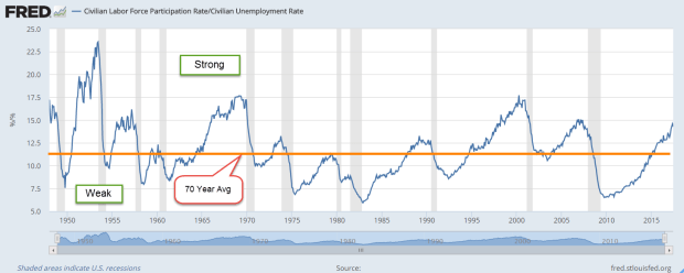
Jobs and their compensation reflect the value that a society places on an individual’s labor. The graph below is a sign of prejudice in America. The unemployment rate for blacks is always higher than the rate for whites. If this were a chart from the year 1890, the persistently higher unemployment rate could be labeled Irish or Italian.  A disadvantaged class of worker is more willing to do unpleasant jobs for less money.

UnemployBlackWhite

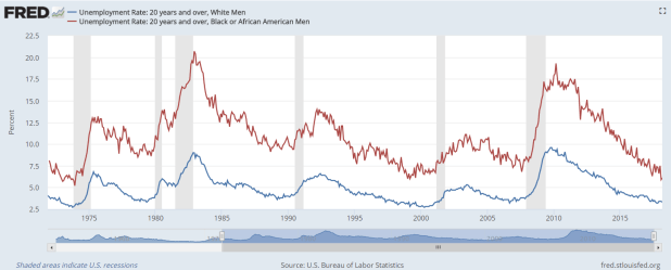
Under Obama, the unemployment rate for black men dropped from 18% in the spring of 2010 to 7.7% in November 2016. Since Trump’s election to the Presidency in November 2016, that rate has fallen another 20%. At 6.1% this rate is the lowest since the early 1970s. There are black grandfathers who thought they might die before seeing a younger generation enjoying an unemployment rate this low.

Still, the current rate for black men is 2.8% higher than the 3.3% rate for white men. Over the past forty years, the average difference between the two unemployment rates is close to 6%. This is the burden of being black in America. In the past half century, there have been few times when the difference in rates is this low: 1) during the Vietnam War when many black and white men were removed from the labor force; 2) 1999, near the height of the dot-com boom; and 3) several months this past year.

UnemplRatesDiff

It’s not just skin color, religion and nationality that drives prejudice in America. Five years after the end of the Civil War in 1865, the 15th Amendment gave black males the right to vote. Women suffragettes lobbied hard to be included in the Amendment and win their right to vote. Susan B. Anthony and Elizabeth Cady Stanton were prominent leaders of this movement. The idea was just too crazy, they were told. Women were too guided by their emotions, and too irrational, particularly during their menses, to be trusted with the vote.

In 1920, exactly fifty years later, the ratification of the 19th Amendment gave women the right to vote. The Suffragette movement had allied with the Prohibition movement to press each of their causes in a joint effort. The Volstead Act, the implementation of the 18th Amendment prohibiting the sale of intoxicating liquor, was passed a few months before the ratification of the 19th Amendment. They were a package. Had women been granted the right to vote in 1870, the Prohibition movement would have lacked a critical partner to win passage of the Amendment. Without Prohibition, the rise of organized crime might not have occurred.

Whenever there is a war, or any act of aggression with another country, Americans single out those nationalities or races for discrimination. In the 19th Century, those of Mexican descent were vilified after the Mexican-American War.

Many Germans were denied jobs and housing following the start of WW1. Historical prejudices were resurrected. German soldiers, known as Hessians, had fought with the British against American colonists in the War for Independence. Americans began to see that there was something wrong with the German character. Political cartoons pictured Germans as Huns, a mongrel and violent race of uncivilized people always lusting for battle.

Following Japan’s 1941 attack on Pearl Harbor, U.S. citizens of Japanese descent were forced to sell their homes and businesses at below market value, then were moved to internment camps away from the west coast.

The most recent assault on U.S. territory was the 9-11 attack by multiple suicide squads. Most hijackers were from Saudi Arabia, but we did not single out Saudi nationals in the U.S. Unlike the targets of previous war discrimination, Saudis have no unique language. Instead we singled out all Muslims, and all Arab speakers as potential threats.

Prejudice based on sex, on religion, on skin color, and on nationality have formed our country. America is built on prejudice and the passionate denial that we are a country built on prejudice. We can’t do the work of healing until we admit the reality.

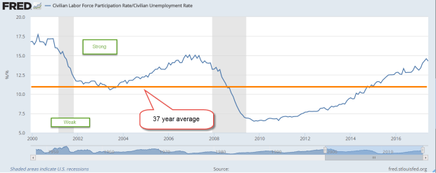
Low unemployment rates among minority groups means that the economy is especially strong. Low levels of unemployment for black, brown and white men usually precede a recession. For white men, the benchmark is 4%. For black men, it’s 7%. For Hispanic men, 5%. Below those benchmarks, the Fed has coincidentally seen what they consider to be inflationary pressures.

In a strong economy with low unemployment, confidence and spending increase. This puts some upward pressure on prices. Central bankers jump at the slightest hint of rising prices. Inflation and employment models like the Phillips curve are imperfect. Despite mountains of surveys, equations and data, inflation is difficult to measure, and many factors influence its rise and fall.  Building a model is made more difficult because each high inflation period has had its own unique features. Among economists, fears of an awakening of the inflation beast has persisted since the recovery in 2009.  Economists had begun to worry why the beast has not awoken.  The models said the beast should be awake! Finally, the Fed is seeing some consistent signs that inflation is growing toward their 2% mark. It has begun to lift interest rates to curb inflationary pressures.

I’ve added the Federal Funds rate to a chart of the unemployment rate for white men to show the pattern. I’ve left off the series for black males that I showed earlier so that the chart was not too cluttered.

UnemplVsFedFundsRate

Economists joke that it’s the Fed’s job to remove the punch bowl just when the party is getting going. Want to know what’s ailing the stock market lately? One of them is the greater likelihood of four rate hikes by the Fed this year. At the start of the year, investors put the chances of four rate hikes at 15%. This week it stands at 45%.

To those on the edges of our society and labor force, and to those just entering the job market, the easier job market that others have enjoyed for several years is just opening to them. If there has been a party, they have been left out. As their prospects brighten, the Fed’s raising of interest rates is a cruel joke.

As interest rates go higher, fewer people can afford to buy homes, cars and furniture. Many companies run on borrowed money to meet short term funding needs and long-term investment. As money becomes more expensive, companies tighten their belts and hiring slows. The most vulnerable are the recently hired and they are often the first to be let go. Like marine life that lives in the tidepools at the ocean’s edge, some are left high and dry when the tide of easy money ebbs.


Work

April 1, 2018

by Steve Stofka

This week I’ll look at several aspects of work, from cryptocurrencies like Bitcoin, to the minimum wage.

What is work? In general science or physics, the subject of “work” pictured a horse hitched to a pulley lifting a weight (an example). In one minute, the horse could lift so many pounds a foot in the air and that equaled so much horsepower. Thus we could reduce our definition of work to three components: weight, distance and time.

Even this mechanical definition of work illustrates a problem. If the horse lifted the weight, then let it down again, how would we know that the horse did any work? Should we give the horse a few cups of oats, or have we got a lazy horse?

A variation on that problem – I cut my lawn. My neighbor looks at my lawn and sees that work was done. In a week or two the grass has grown and time has erased any sign that I did work.

Thus, we need a way of recording work done. The product of the work performed may serve as a record. A big pyramid sitting on a desert is a permanent record that work was done. If workers dig holes in the ground, then fill the holes, how do we know any work was done? If they have dug up gold from those holes.

Bitcoin and other cryptocurrencies (crypto) are assets like gold. They recognize that some work was done. Equipment, technology and workers were needed to dig up gold. Likewise, electricity was an important resource needed to generate a bitcoin, and even more electricity will be needed to generate a replacement bitcoin if one were lost.

This Politico article is an account of a crypto mining boom in a rural area in Washington state. The electricity consumed is enormous. The mighty Columbia River nearby provides electricity at a fifth of the average cost in the country. By the end of this year, there will be enough electrical capacity in this small area to power the equivalent of a tenth of the homes in Los Angeles. Shipping containers house computer servers which generate so much heat that the exhausted air melts the snow around the containers. As gold records the digging of dirt, a bitcoin records the expenditure of some quantity of electricity.

Assets can represent past work, future work, or a combination of the two. Precious metals, jewels, books and artistic works represent work done in the past. On the other hand, a machine represents future work. Other assets include stocks and bonds, both of which are claims on future work. A bond is a fixed limit claim on a company’s assets. In contrast, a share of stock is an undying claim on a portion of a company’s assets.

The blockchain algorithm behind crypto requires agreement among many parties to confirm a property right to the crypto. The recording of property rights might seem rather ordinary to a reader in the U.S. In some countries, however, property deeds are more easily altered by those in power. In contrast, a blockchain system of recording property rights prevents forgery and alteration.

As a record of work done, money relies on a relatively stable value. High inflation damages the money record of work done. Consequently, high inflation can fracture the social bonds among people. As an example, I cut someone’s lawn on Saturday and am paid. When I spend the money on Sunday, it is worth half the amount. In effect, the money has only recorded that I cut half a lawn. Examples of this hyper-inflation are Zimbabwe in the 2000s, and Yugoslavia in the 1990s (Wikipedia article). Look no further than Venezuela for a current example of the destruction that inflationary policies can have on a society.

Let’s turn from the recording of work done to the doing of it. New unemployment claims are at a 45 year low. A decade ago, job seekers despaired. In contrast, employees today are confident they will quickly find new employment. To illustrate, the quit rate is at the same pace as the mid-2000s, at the height of the housing boom. As a percent of the labor force, new unemployment claims are the lowest ever recorded. Last week’s numbers broke the record set in April 2000 at the height of the dot-com boom.

Equally important to the strength of a job market is the fate of marginal workers who are most vulnerable to the shifting tides of the economy. This includes disabled people who want to work. During the recession, the unemployment rate for disabled men of working age reached almost 20%. Today it is half that.

Let’s turn to another disadvantaged sector of the job market – those who work for minimum wage. The 1930s depression put many employers at an advantage in the job market. The Fair Labor Standards Act of 1938 (FLSA) enacted a wage floor, but many workers were not subject to the new law. In 1955, almost twenty years after passage of the law, “retail workers, service workers, agricultural workers, and construction workers were still not required to be paid at least the minimum wage” (article).

The minimum wage affects many lower paid workers who are making more than minimum wage. In some union jobs, starting wages for helpers are set by contract at a percentage above minimum wage. The understanding may be non-written in some cases. In 1966, the rate was increased from $1.25 per hour to $1.60 per hour. Non-union clerks at a NYC hospital who had been making $1.70 per hour now complained that they were making minimum wage. As a result of their pressure on management, they got a raise within a few months.

Here’s a chart showing the annual increases in the minimum wage for each period since 1950.

MinWagePctInc

In the three decades after World War 2, annual increases in the minimum wage exceeded inflation. Since 1977, the minimum wage standard has not kept pace with inflation.

MinWageLessCPI

If Congress truly represented all of their constituents, they would make the minimum wage adjust automatically with inflation. On the contrary, Congress represents only a small portion of their constituents, and the minimum wage is used as a political football.

Finally, there is the destruction of the record of past work by war. Every minute of every day, living requires calories, another measure of work. Therefore, each of us is a record of work done.  War destroys too many human records, and the unliving records of work like buildings, roads and bridges. Perhaps one day we will fight our battles in video games and stop destroying all those work records.

Lots of Changes

March 25, 2018

by Steve Stofka

What a week it was. A glance at the headlines would lead someone to believe that it was all about tariffs and an impending trade war between the U.S. and China. On Thursday and Friday, the Dow Jones Industrial Average lost more than 1000 points, or almost 5%. Was that all about tariffs? Hardly.

As expected, the Federal Reserve raised interest rates ¼% on Wednesday.  This put the Fed rate at 1.5% – 1.75%. Half of the members of the interest setting committee (FOMC) indicated that it might be necessary to raise interest rates four times this year. The market has been pricing in three interest rate increases for 2018. Until Thursday, a fourth increase had not been fully priced in.

Further, the Fed is projecting an unemployment rate below 4% by late 2018 and early 2019. The current rate is 4.1%. Many industries are already struggling to find qualified workers. Rarely does the unemployment rate dip below 4%, and each time, inflation has risen and the stock market has fallen – sometimes substantially.

CPIUnemploy

The downturn following the Korean War was short and shallow, but the other two periods of low unemployment were followed by steep corrections in the market.

On Thursday night, the White House tweety bird announced another change in the roster. Out with the old National Security Adviser, General H. R. McMaster. In with the new adviser, John Bolton, an old school war hawk who avoided military service in Vietnam by joining the National Guard. Bolton’s first instinct is war and regime change as a solution to global disputes. In choosing Mike Pompeo as his new Secretary of State and John Bolton as his new National Security Advisor, Trump has assembled a war cabinet. The market has still not priced in the heightened chances of conflict with North Korea or Iran. Nor has it recognized a greater likelihood of armed conflict with China in the South China Sea. That might come in the next few weeks.

On Thursday, Trump enacted tariffs on imported steel and aluminum from China as promised. Stronger action against China’s trade policies are overdue, as it has long violated the spirit, if not the letter, of the WTO global agreements. Car manufacturers wanting to set up a plant in China must have a Chinese business partner with a 25% stake and – surprise – access to industrial trade secrets. The national government heavily subsidizes key industries so that they can support their own industries and workers. They avoid labor and environmental regulations, and when caught, pledge to do better. They issue a national change in regulation, but the change is only published and enforced in a few local areas.

The theft of intellectual property is a hallmark of most developing nations like China. In the 18th and 19th century, the U.S. was notorious for copying products made by companies in England and France. Article 1, Section 8 of the Constitution added some promise of patent and copyright protection, but the laws instituted protected only U.S. citizens. A half century later, Charles Dickens was “one of the chief victims of American literary piracy” (Source). A foreign inventor had to establish citizenship or residency in the U.S. for two years to gain any patent protection. In 1887, the U.S. joined a 19th century version of the WTO called the Paris Convention. As China does today, the U.S. skirted international agreements for at least a decade (Patent history).

Older Chinese citizens may have watched patrolling U.S. naval ships from the shores of the Yangtze River. The nation remembers the century of U.S. gunboat diplomacy (Wikipedia article). Despite American free market rhetoric, Chinese leaders understand that mercantilism still retains a strong political influence in the trading policies of many developed countries, including the U.S.

When NAFTA was signed in the early 1990s, subsidies of American corn farmers enabled them to sell cheap corn to Mexico. Unable to compete, many farmers in northern Mexico went out of business. As farming jobs decreased in Mexico, many laborers journeyed north to the U.S. to pick crops so that they could support their families. The U.S. is partially responsible for creating the very environment that led to so much illegal immigration from Mexico.

Around the world, developed countries cry foul when another country subsidizes goods that are exported at a lower cost into their countries. Since 1963, the U.S. has imposed a protectionist tariff of 25% on imported light duty trucks, the so called “chicken tax”. Protected for over fifty years by this tariff, domestic truck manufacturers like Ford and Chevy had made few substantial changes to their work vans in the past few decades. In 2015, Ford finally made a substantial change to its F-150 pickup. Notice those Mercedes tall work vans on the road? They are built in Germany, disassembled to avoid the tariff, shipped to the U.S. and reassembled by U.S. workers. Ford uses the same process with its Transit Connect van.

Boeing imports parts from all over the world to build its Dreamliners. Chinese companies use southeast Asia as a manufacturing supply, then assemble and ship thousands of products to the U.S. and around the world. In the truly global manufacturing economy, a trade war is a threat to the profits of many large businesses. They have tuned their operations to the contradictory rules of international trade.

Business leaders understand the political strut of free trade. Each business wants free trade when it wants to compete in someone else’s market. Each business lobbies for more regulations, tariffs and barriers to protect its competitive position within its own market. Yes, it’s all lies, so it’s important that the rules underlying this game not change too much. Trade wars change the rules and that’s bad for business.

The Puff

February 25, 2018

by Steve Stofka

Each week I’m hunting scat, the data droppings that a society of human beings leaves behind. This week I’m looking for a ghost ship called the Phillips Curve, a relationship between employment an inflation that has had some influence on the Federal Reserve’s monetary policy. The ideas and policies of others, some long dead, have a daily impact on our lives. I’ll finish up with a disturbing chart that may be the result of that policy.

A word on the word “cause” before I continue. As school kids we learned a simplistic version of cause and effect. Gravity caused my ball to fall to the ground. As kids, we like simple. As adults, we long for simple. As we grow up, we learn that cause-effect is a very complex machine indeed. The complexity of cause-effect relationships in our lives are the chief source of our disagreements.

So, “cause” is nothing more than shorthand for “has an important influence on.” The dose-response mechanism is a key component of a causal model in biology. If A causes B, I should be able to give more of A, the dose, and get more of B, the response, or a more frequent response.

Let’s turn to the Phillips Curve, an idea that has influenced the Federal Reserve’s monetary policy since it was proposed sixty years ago by economist A.W. Phillips. Simply stated, the lower the unemployment rate, the higher the inflation rate. There is an inverse relationship between unemployment and inflation.

Inverse relationships are everywhere in our lives. Here’s one. The lower the air temperature, the more clothes I wear. I don’t say that air temperature is the only cause for how many clothes I wear. There is wind, humidity, sex, age and fitness, my activity level, social protocols, etc. While there is a complex mechanism at work, I can say that air temperature has an important effect on how many clothes I wear. If I measure the varying air temperatures throughout the year and weigh the amount of clothes that people have on, I will get a strong correlation. High temps, low clothes.

Now what if the temperature got colder and people still wore the same amount of clothes? I would need to come up with an explanation for this discrepancy. Perhaps there never was much of a relationship between air temperature and clothes? That seems unlikely. Perhaps clothes fabrics have been improved? I would need to look at all the other factors that I mentioned above. If I could find no difference, then I would have to conclude that air temperature had little to do with clothes wearing. Headlines would herald this new discovery. Important areas of our economy would be upended. Retail stores would stop stocking coats or bathing suits a few months in advance of the season. Businesses around the country who depend on warm weather clothing would go out of business.

Unlike air temperature and clothes, the relationship between inflation and employment is two-way. The change in one presumably has some influence on the other. During the 1970s, inflation and unemployment both rose. The hypothesis behind the Phillips curve posits that one should go up when the other goes down. Some economists threw the Phillips curve in the trashcan of ideas. Milton Friedman, an economist popular for his lectures and his work on monetary policy, proposed a concept we now call NAIRU. This is a “natural” level of unemployment. If unemployment goes below this level, then inflation rises.

Some economists complained that NAIRU was a statistical figment designed to fit the Phillips curve to existing data. Economic predictions based on the Phillips curve have been consistently wrong. Still, the Congress has mandated that the Federal Reserve maintain “maximum employment, stable prices, and moderate long-term interest rates” (Federal Reserve FAQs). Economists at the Fed must consider both employment and inflation when setting interest rates. The models may not accurately describe the relationship, but many will instinctively feel that the relationship, in some form or another, is valid.

For the past several years, the economy has been at or near maximum employment. In January 2018, the unemployment reading was 4.1%. Whenever that rate has been this low, the country has either been at war or within a year of being in recession. The puzzlement: only lately have there been signs of an awakening inflation.

Because inflation was below the Fed’s 2% benchmark while unemployment declined, the Fed kept its key interest rate near zero for seven years. For its 105 year history, the Fed has never kept interest rates this low for as long as it did. Low interest rates fuel asset bubbles. Such low rates cause people and institutions who depend on income to take inappropriate risks to earn more income. The financial industry develops and markets new products that hide risk and provide that extra measure of income. We can guess that these products are out in the marketplace, waiting to blow up the financial system if a set of circumstances occurs. What set of circumstances? We will only know that in the rear view mirror.

Here’s a chart that tracks price movement of the SP500 ETF SPY for the past twenty years. I’ve shown the tripling in price that has occurred during the past five years.  Notice the long stalk of rising prices. That growth has been nurtured by the Fed’s policy.  Well, maybe this time is different.  Maybe not.

SPYPF20180223

Vulnerable

September 3, 2017

Hurricane Harvey invaded the lives, homes and businesses of so many people in Houston and the surrounding area of southeast Texas. People around the world watched the plight of so many who were caught in the rising waters. I was cheered by the dedication of first responders, by those who came from near and far to help with their boats, with food and clothing. I have never been in a flood. Some of those interviewed had been in several. Why do they stay there, I wondered? The answer is some or all of these: their family, their church, their job, their school, their culture.

Watching so many vulnerable people reminded me of my own. If given a few minutes to leave my house, what would I put in a garbage bag? In the urgency and stress of the moment so many people in Houston forgot their medications.  My list: Pets, papers, clothes, medications. Food? Will the shelter have food? Pet food, as well? Where are we going? Oops, what about a phone charger? And the laptop. What about the list with all the passwords? That too. What about the photos in the closet? I was going to get those scanned in and uploaded. No time now. Take a few of the smaller framed photos on the shelf in the living room. Out of time. Gotta go. All the questions that must have been bouncing around inside the heads of those forced to evacuate as the brown water took possession of their house.

If I don’t call it Climate Change, I could call it Flood Frequency, or Flood Freak for short. Here is a chart showing the increased frequency of flooding during the past century. This was from an article in the WSJ (paywall).

FloodFrequency
This week’s theme – vulnerability. The signs of it and what we can do to lessen it. Debt is a vulnerability. For the past three years, households have been increasing their debt load in mortgages, auto and student loans. Here’s a breakdown of household debt from the NY Fed. (As a side note, this report gives a breakdown of the different types of debt by credit score. For example, the median credit score for an auto loan is about 700).

DebtBalance2016.png
Mortgage debt is more than 2/3rds of total debt. Despite the rise in home prices, more than 5 million homes, or 7%, are still badly “under water.” (Consumer Affairs)

Credit card debt has stayed stable for the past thirteen years. Households are only using 10% of their after-tax income to service their debt.

DebtService2016

Despite low interest rates, households are continuing to deleverage, to decrease their vulnerability. The ratio of household debt – the total of that debt, not the payments – to income climbed above 2.5 in late 2007. It has fallen below 2.2 but is still high. We are still up to our eyeballs in debt.

HouseholdDebtIncomeRatio

Debt reduction will curb economic growth for the near future. According to several cabinet members, Trump is focused on GDP growth in discussions about trade policy, defense policy, infrastructure spending, and the regulatory environment. How does this or that policy get us to 3% growth? he asks.

2/3rds of the nation’s economy is based on the public willingness to spend money. Jobs helps. Higher wage growth helps. Low interest rates help. But without the willingness to take on more debt relative to income, policymakers may feel like they are trying to goad a stubborn mule to go faster. Tough to do.

//////////////////////////////////

Unemployment

Continuing the theme of vulnerability.  As a percentage of the unemployed, the number of long-term unemployed remains stubbornly high at close to 25%.  I call them the 27ers because 27 weeks of unemployment is the cutoff that the BLS uses to determine whether someone is categorized as long term unemployed. 27 weeks or six months is a long time to be actively looking for work and not finding a job.  Eight years after the end of the recession, today’s percentage of 27ers is at the same level as the worst of most past recessions.

LTUnemploy

During any recession the number of long term unemployed climbs higher. When these past few recessions have ended, the number of 27ers doesn’t start to decline.  Instead, they continue to increase and reach a peak several months after the recession is officially over. In the last three recessions, the peaks came later than previous recessions.

UnemployLTPctCLF
This more vulnerable cohort in the labor force struggles to recover after a recession.  Manufacturing is the more volatile element in the business cycle.  As manufacturing has declined, recessions are less frequent. However, manufacturing used to put a lot of people back to work at the end of recessions.  In a recovery, the service sectors are not as quick to add jobs.

The structural shift in the labor force will continue to leave more workers and families vulnerable and needing help just as many older workers are claiming retirement benefits. More than half of voters, both Republican and Democrat, have received benefits from at least one of the six entitlement programs (Pew Research). Elected officials offer promises of future benefits in exchange for taxes, and votes, today. When circumstances force a clash of priorities and promises, Congress seems incapable of resolving the conflict. President Trump’s approval ratings are in the low thirties, but his popularity far exceeds the public’s dismal ratings of Congress.

In a crisis, Americans come together to help each other but why do we wait till there is a crisis? Have we always been a nation of drama queens?  Maybe that’s the American charm.

Intervention

August 27, 2017

Pew Research surveyed four generations of Americans, from the oldest Americans who are part of the Silent Generation, those who grew up during the Great Depression, to the Millennials, those born between the years 1983 – 2002. Pew asked the respondents to list ten events (not their own) or trends that happened during their lifetime that had the most influence on the country. 9-11 was at the top of the list for all four generations. Obama’s election, the tech revolution and the Iraq/Afghanistan war were the other events common on each list. Some differences among the generations were understandable. Some were a surprise to me. The Great Recession/Financial Crisis of 2008 was only on the Millennials list. Many in this generation were in the early stages of their careers when the recession began. Here is a link to the survey results. Perhaps you would like to make your own list. Keep in mind that the events must have happened during your lifetime.

I don’t think that the Boomer generation understands the long-term impact of the Great Recession. In another decade, many will discover how vulnerable the financial crisis left all of us, not just the Millennials. As we’ll see below, the crisis may be over but the response to the crisis is ongoing.

One of the trends common to each generation’s list was the tech revolution, which has reshaped much of the economy just as the last tech revolution did in the 1920s. The widespread use of electricity, radio and telephone in that decade transformed almost every sector of the economy and accelerated the mass migration of the labor force from the farm to the city.

Like today, a small number of people made great fortunes. Like today, the top 1% of incomes accounted for about 15% of all income (Saez, Piketty). The GINI index, a statistical measure of inequality of any data set, has risen significantly since 1967 (Federal Reserve). The GINI index ranges from 0, perfect equality, to 1, perfect inequality. Incomes in the U.S. are more equal than South Africa, Columbia and Haiti (Wikipedia) but we are last among developed countries.

For several decades, Thomas Piketty and Emmanuel Saez have collected the aggregate income and tax data of developed countries. Piketty is the author of Capital in the Twenty-First Century (Capital), which I reviewed here.  A recent NY Times article referenced a report from Piketty and Saez comparing the growth of after-tax, inflation-adjusted incomes from 1946-1980 (gray line labeled 1980) and 1980-2014 (red line labeled 2014). I’ve marked up their graph a bit.

IncomeGrowth1947-2014
The authors calculated net incomes after taxes and transfers to determine the effect of tax and social policies on income distribution. Transfers include social welfare programs like Social Security, TANF, and unemployment. Census Bureau surveys of household income include pre-tax income and it is these surveys which form the basis for the calculation of the GINI index and other statistical measures of inequality.

I am guessing that Piketty and Saez used their database of IRS post-tax income data then adjusted for transfer income based on Census Bureau surveys. The Census Bureau notes that people underreport their incomes on these surveys.  Is the IRS data more reliable?  Probably, but people do hide income from the IRS. Both Piketty and the Census Bureau note that the data does not capture non-cash benefits like food stamps, housing subsidies, etc.

From 1947 to the early 1960s, the very rich paid income tax rates of 90% so that would seem to explain the after-tax income data from Piketty and Saez. The federal government took a lot of money from the very rich, paid off war debts, built highways, flew to the moon and built a big defense network to fight the Cold War.  Those infrastructure projects employed the working class at a wage that lifted them into the middle class. So that should be the end of the story. High taxes on the rich led to more equality of after-tax income.

But that doesn’t explain the pre-tax income data from the Census Bureau. The very rich simply made less money or they learned how to hide it because of the extremely high tax rates.  In the Bahamas and Caymans, there grew a powerful financial industry devoted to hiding income and wealth from the taxman. In the first years of his administration, President Kennedy, a Democrat, understood that the extremely high tax rates were hurting investment, incentives and economic growth.  He proposed lowering both individual and corporate rates but could not get his proposal through the Congress before he died.  Johnson did push it through a few months after Kennedy’s death. The rate on the top incomes fell from 91% to 70%, still rather high by today’s standards.

An important component of income growth in the post war period from 1947-1970 was the lack of competition from other developed countries who had to rebuild their industries following World War 2. These two decades were the first when the government began collecting a lot of data, and this unusual period then became the base for many political arguments. Liberal politicians like Bernie Sanders and Elizabeth Warren advocate policies that they promise will return us to the trends of that period. It is unlikely that any policies, no matter how dramatic, could accomplish that because the rest of the world is no longer recovering from a World War.

We could enact a network of social support policies that resemble those in Europe but could we get used to a 10% unemployment rate that is customary in France? For thirty years beginning in the early 1980s, even Germany, the powerhouse of the Eurozone, had an unemployment rate that exceeded 8%. At that rate, many Americans think the economy is broken. Despite 17 quarters of growth, unemployment in the Eurozone is still 9.1%. Half of unemployed workers in the Eurozone have been unemployed for more than a year. In America, that rate of long term unemployed is only 13% (WSJ paywall).

The post-war period was marked by high tax rates and high federal spending, a period of robust government fiscal policy.  The federal government intervenes in the economy via a second channel – the monetary policy conducted by the central bank.  The Federal Reserve lowers and raises interest rates, and adjusts the effective money supply by the purchase or sale of Treasury debt.

The 1940s, 1970s and 2000s were periods of high intervention in both fiscal and monetary policy. The FDR, Truman, Eisenhower, Johnson and Nixon administrations exerted much pressure on the Fed to help finance war campaigns and the Cold War. In 1977, the Congress ensured more independence to the Federal Reserve by setting two, and only two, clear objectives that were to guide the Fed’s monetary policy in the future: healthy employment and stable inflation.

A rough guide to the level of central bank intervention is the interest rate set by the Fed. When rates are less than inflation, the Fed is probably doing too much in response to some acute or protracted crisis.

EffFundsRate-Infation

Let’s look at an odd – or not – coincidence. I’ll turn to the total return from stocks to understand the effects of central bank policies. There are two components to total return: 1) price appreciation, and 2) dividends. When price appreciation is more than 50% of total return, economic growth and company profits are doing well. Future profit growth looks good and more money comes into the market and drives up prices. When dividends account for more than half of total return, as it did in the 1940s and 1970s, both GDP and company profit growth are weak. Both decades were marked by heavy central bank and government intervention in the economy.

Here’s a link to an article showing the total return on stocks by decade. During the 2000s, the total return from stocks was below zero. An average annual return of 1.5% from dividends could not offset an annual loss of 2.4% in price appreciation. Hubris and political pressure following 9-11 led Fed Chairman Alan Greenspan to make several ill-advised interest-rate moves in the early 2000s that helped fuel the housing boom and the ensuing financial crisis. His successor, Ben Bernanke, continued the policy of heavy intervention. Following the financial crisis, the Fed kept interest rates near zero for nine years and has only recently begun a program of gradually increasing its key interest rate.

The price gains of the 2010s have lifted the average annual return of the past 18 years to 7.4%, and the portion from dividends is exactly half of that, at 3.72% per year.  It has taken extraordinary monetary policy to rescue investors, to achieve balanced returns  that are about average from our stock investments.  Some investors are betting that the Fed will always come to the rescue of asset prices.  That same gamble pushed the country to the financial crisis when the government did not rescue Lehman Brothers in September 2008.

The financial crisis should have been on each generation’s list.  Within ten years it will be.  It is still crouched in the tall grass.

///////////////////////////

Debt

Happy days are here again.  Yes, girls and boys, it’s time to raise the debt ceiling!  By the end of September, the Treasury will run out of money to pay bills unless the debt ceiling is raised. This past week, President Trump hinted/threatened that he would not sign a debt increase bill unless it included money to build the wall between the U.S. and Mexico.

The Congress has not had a budget agreement in several years and is unlikely to enact one this year. People may sound tough on debt but a Pew Research study
showed that a majority do not want to cut government programs, including Medicaid.

Liberal economists insist that government debt levels don’t matter if the interest on the debt can be paid. This article from Pew Research shows the historically low rate on the federal debt. However, Moody’s reports that the U.S. government pays the highest interest as a percentage of revenue among developed countries. As a percent of GDP, we are 4th at 2.5%.

Wage Growth – Not

August 12, 2017

Ratios are important in baseball, finance and cooking, in economics, chemistry and physics, and yes, even love. If I love her a lot and she kinda likes me a little, that’s not a good ratio. I learned that in fourth grade.

Each week I usually turn to one or more ratios to help me understand some behavior. This week I’ll look at a ratio to help explain a trend that is puzzling economists. The unemployment rate is low. The law of supply and demand states that when there is more demand than a supply for something, the price of that something will increase. Clearly there is more demand for labor than the supply. I would expect to see that wage growth, the price of labor, would be strong. It’s not. Why not?

I’ll take a look at an unemployment ratio. There are several rates of unemployment and there is no “real” rate of unemployment, as some non-economists might argue at the Thanksgiving dinner table. The rates vary by the types of people who are counted as un-employed or under-employed. The headline rate that the Bureau of Labor Statistics (BLS) publishes each month is the narrowest rate and is called the U-3 rate. It counts only those unemployed people who have actively searched for work in the past month. In the same monthly labor report, the BLS publishes several wider measures of unemployment, U-4 and U-5, that include unemployed people who have actively searched for a job in the past 12 months. U-6 is the widest measure of unemployment because it includes people who are under-employed, those who want full-time work but can only find part-time jobs. Included in this category would be a person working 32 hours a week who wants but can’t find a 40 hour per week job.

The ratio that helps me understand the underlying trends in the labor market is the ratio of this widest measure of unemployment to the narrowest measure. This is the ratio of U-6/U-3. In the chart below, this ratio remained in a narrow range for 15 years. Unemployment levels grew or shrank in tandem for each group. By 2013, the ratio touched new heights, climbing above 1.9 then crossing 2 in 2014. The two groups were diverging. The U-3 rate, the denominator in the ratio, was improving much quicker than the U-6 rate that included involuntary part-time workers.

U-6-U-3Ratio

What would it take to bring this ratio down to 1.85? About 1.5 million fewer involuntary part time workers. What does that involve? Let’s say that those involuntary part-time workers would like an average of 15 more hours per week of work. That is more than 20 million more hours of work per week, which seems like a lot but is less than a half percent of the approximately 6.1 billion hours worked per week in the 2nd quarter of 2017.  These tiny percentages play a significant role in how an economy feels to the average person.

Let’s turn to a ratio I’ve used before – GDP per hour worked. I don’t expect this to be a precise measurement but it reveals long term trends in productivity. In the chart below, GDP per hour has flatlined since the end of the recession.

GDPPerHour201706

There are two ways to increase GDP per hour: 1) productivity gains, or more GDP per hour worked, and 2) reduce the number of hours worked more than the reduction in GDP. Door #1 is good growth. Door #2 is the what happens during recessions. GDP per hour rises because hours are severely reduced. I would prefer slow steady growth because the alternative is painful. Periods of no growth can be wrestled out of their torpor by a recession, a too common pattern. There were two consecutive periods of flat growth followed by recession in the 1970s and from the mid-2000s to the present day.

GDPPerHour1971-1984

The economy can withstand two years of flat growth without a recession as it did in the early 1990s. It is the long periods of flat growth that are most worrisome. In the early 1970s and late 2000s, the lack of growth lasted three years and were followed by hard recessions. The lack of growth in the late 1970s led to the worst recession since the 1930s Depression. GDP per hour growth has been flat for eight years now and I am afraid that the correction may be hard as well. Maybe it will be different this time. I hope so.

///////////////////

Participation Rate

Some commentators have noted the relatively low Civilian Labor Force Participation Rate (CLFPR). This is the number of people who are working or looking for work divided by the population aged 16 and older. (BLS). The rate reached a high of 67% in 2000 and has declined since then. For the past few years, the rate has stabilized at just under 63%.

A graph of the rate doesn’t give me a lot of information. Starting in the 1960s, the rate rose slowly as more women came into the workforce and the large boomer generation came into their prime working years. So I divide that rate by the unemployment rate to look for long term cyclic trends. Notice that this ratio peaks then begins a downward slide as recessions take hold.

CLFPR-UI1947-2017

In mid-2014 this ratio finally broke above a long term baseline average and has been rising since. Today’s readings are nearly at the peak levels of early 2007.

CLFPR-UI

Some pundits use the CLFPR as a harbinger of doom that includes: 1) too many people are depending on government benefits and don’t want to work; 2) there is a shrinking pool of workers to pay for all these benefit programs; 3) thus, the moral and economic character of the nation is crumbling. During the 1950s and 1960s, when the participation rate was lower than today, our parent’s generation managed to pay off the huge debts incurred by World War 2. It is true that benefit programs were much less than those of today.

In “Men Without Work” Nick Eberstadt documents a long term decline in the percentage of prime age (25 – 54) males who are working.  Some interesting notes on shifting demographics: foreign born men of prime working age are more likely to be working or looking for work than U.S. born males. According to the Census Bureau’s time use surveys, less than 5% of non-working men are taking care of children.

In 2004 the participation rate for white prime age males first fell below those of prime age Hispanic males and has remained below since then.  In 1979, 10% of black males aged 30-34 were in jail.  In 2009, the percentage was 25%.

So why should I care about participation rates and wage growth? Policies initiated in the 1930s and 1960s instituted a system of inter-generational transfer programs.  In simple terms, younger generations provide for their elders. Current Social Security and Medicare benefits are paid in whole or in part by current taxes. We are bound together in a social compact that is not protected by an ironclad law.  Beneficiaries are not guaranteed payments.

For 40 years, from 1975-2008, the number of workers per beneficiary remained steady at about 3.3 (SSA fact sheet). In 2008, the financial crisis and the retirement of the first wave of the Boomer generation marked the beginning of a decline in this ratio to the current level of 2.7.

In their annual reports, both the SSA and the Congressional Budget Office note the swiftly changing ratio.  Within twelve years, the ratio is projected to be about 2.3.  In 2010, benefits paid first exceeded taxes collected and, in 2016, the gap had grown to 7% (CBO report) and will continue to get larger.

Policy makers should be alert to changes in the participation rates of various age and ethnic groups because the social contract is built partly on those participation rates.  As with so many trends, the causes are diffuse and not easily identifiable.  Economic and policy factors play a part.  Cultural trends may contribute to the problem as well.

Congress has a well-established record of not acting until there is an emergency, a habit they are unlikely to change.  Fixing blame wins more votes than finding solutions, but  I’m sure it will all work out somehow, won’t it?


Guessing the Future

April 23, 2017

Human beings have an ability to foretell the future, or at least some people think so.  A more accurate description is that we predict the likelihood of future events based on past patterns.  Index funds average the predictions of buyers and sellers in a particular market.

During the recovery most active fund managers have underperformed their benchmark indexes. Standard & Poors, the creator and publisher of many indexes, provides a quick summary in their SPIVA spotlight. In the past five years, 88% of active fund managers have underperformed the SP500.  In a random world, I would expect that 50% of active fund managers would beat the index, and 50% of managers would underperform the index because the index is an average of all those buy sell decisions.

The 1% higher fees charged by active fund managers contribute mightily to this underperformance. Using long term averages, we expect that a third of active fund managers would beat their benchmark index.  The current percentage is only 12%. It is likely that the law of averages will eventually exert its pull.

Index funds mechanically rebalance regularly. Let’s look at a real life example.  The pharmaceutical giant Johnson and Johnson is a member of both the SP500 and the smaller group of core stocks that make up the Dow Jones index.  This week the company  reported first quarter revenues that were below expectations, and sellers promptly knocked 3% off the stock price.  Because most SP500 index funds are market weighted, index funds that mimic the weighting of the stocks in the index would buy and sell stocks in the index to capture these changes.

Because index funds are averaging the decisions of all stock investors, they should underperform. After all, the index funds are buying those companies that everyone else is buying, and selling companies that everyone else is selling.  Index funds are buying high and selling low, creating a drag on performance that is overcome by the lower fees charged by these funds.

In an article last fall in the Kiplinger newsletter, Steven Goldberg makes the case for a mix of both index and active funds.  Research shows that active fund mangers do better when an index does poorly.  It’s worth a read.

The index fund giant Vanguard is featured in a NY times article. John Bogle founded Vanguard based on his thesis that a passive approach to investing and low fees would reward most investors over the long term.

///////////////////////

Correlation, not Causation

When the stock market crashed in 1929, the unemployment rate was less than 3%.  A booming economy during the 1920s lifted demand for labor, while severe immigration restrictions enacted in 1924 reduced the supply of workers.

Unemploy1929-1942

The unemployment rate was 6% when the market crashed in October 1987 and again in September 2008. There seems to be a weak connection between unemployment and severe market crashes.  However, there is a consistent correlation between the change in number of unemployed and the start of recessions.

UnemployChange

A yearly increase in the number of unemployed on a percentage basis indicates a fundamental weakness in the economy.  Sometimes, the change reverses as it did in early 1996, at the start of the dot com boom, or in the mid-eighties after a downturn in oil and housing exposed a banking scandal. These two periods are circled in blue in the graph above.

Often the economy continues to weaken, more people lose their jobs, GDP falters and the economy slides into depression.

Because we cannot rely on just one indicator as a warning signal, we can chart the amount of production generated by each person in the labor force.  The civilian labor force includes both those who are working and those who are actively looking for work.  A growth rate below 1% indicates some weakness.  Using both the change in unemployment and the change in production helps filter out some of the noise.

While production growth may be faltering, the current unemployment level is not worrying.

///////////////////////

Pay Attention to the Pros

Institutional buyers and sellers of Treasury bonds will usually let the rest of us know when they are worried about a recession.  In a middling to healthy economy, Treasury buyers will demand a higher interest rate for a longer dated bond.  Subtracting the interest rate on a shorter term two year bond from a long term ten year bond should be positive.  In a “normal” environment, a 10 year bond might have an interest rate of 3% and a two year bond an interest rate of 1%.  The difference of 2% would be expected.  However, a negative result indicates that buyers want more interest from short term bonds because they are more concerned about short term risks.  As we can see in the chart below, a negative result precedes a recession by 12 to 18 months.  The current difference shows no indication of concern.

Guessing the future is not divination, nor is it perfect.  Retail investors may not have the time or expertise to estimate future risk, but we can study those who make it their business to manage risk.

Oh My Gawd!

November 8, 2015

There is the famous Tarzan yell by Carol Burnett and the iconic “Oh my Gawd” exclamation of Janice Lipman in the long running TV series “Friends.”  That’s what Janice would have said when October’s employment report was released this past Friday.

Highlights:

271,000 jobs gained – maybe. That was almost twice the number of job gains in September (137,000).  Really??!! ADP reported private job gains of 182,000.  Huge difference.  Job gains in government were only 3,000 so let’s use my favorite methodology, average the two and we get 228,000 jobs gained, awfully close to the average of the past twelve months.  Better than average gains in professional business services and construction.  Both of these categories pay well.  Good stuff.

At 34.5 hours, average hours worked per week has declined by 1/10th of an hour in the past year.  The average hourly rate rose 2.5%, faster than headline inflation and giving some hope that workers are finally gaining some pricing power in this recovery.

For some historical perspective, here is a chart of monthly hours worked from 1921 to 1942.  Most of those workers – our parents and grandparents – have passed away.  At the lows of the Great Depression people still worked more hours than we do today.  They were used to hard work.  There were few community resources and social insurance programs to rely on.

The headline unemployment rate fell slightly to 5%.  The widest unemployment rate, or U-6 rate, finally fell below 10% to 9.8%, a rate last seen in May 2008, more than seven years ago.  This rate includes people who are working part time because they can’t find a full time job (involuntary part-timers), and those people who have not actively looked for a job in the past month but do want a job (discouraged job seekers).  Macrotrends has an interactive chart showing the three common unemployment rates on the same chart.

The lack of wage growth during this recovery, coupled with rising home prices, may have made owning a home much less likely for first time buyers.  The historical average of new home buyers is 40%.  The National Assn of Realtors reported that the percentage is now 32%, almost at a 30 year low.

2.5% wage growth looks a bit more promising but the composite LMCI (Labor Market Conditions Index) compiled by the Federal Reserve stood at a perfect neutral reading of 0.0 in September.  The Fed will probably update the LMCI sometime next week.  This index uses more than twenty indicators to give the Fed an in-depth reading of the labor market.

**********************************

Bonds and Gold

The strong employment report increased the likelihood that the Fed will raise interest rates at their December meeting and this sent bond prices lower.  A key metric for a bond fund is its duration, which is the ratio of price change in response to a change in interest rates.  Shorter term bond funds have a smaller duration than longer term funds. A short term corporate bond index like Vanguard’s ETF BSV has a duration of 2.7, meaning that the price of the fund will decrease approximately 2.7% in response to a 1% increase in interest rates.  Vanguard’s long term bond ETF BLV has a duration of 14.8, meaning that it will lose about 15% in response to a 1% increase in rates.  In short, BLV is more sensitive than BSV to changes in interest rates. How much more sensitive?  The ratio of the durations – 14.7 / 2.7 = 5.4 meaning that the long term ETF is more than 5 times as sensitive as the short term ETF.

What do we get for this sensitivity, this higher risk exposure?  A higher reward in the form of higher interest rates, or yield.  After a 2.5% drop in the price of long term bond funds this week, BLV pays a yield close to 4% while BSV pays 1.1%.  The reward ratio of 4 / 1.1 = 3.6, less than the risk ratio.   On September 3rd, the reward ratio was much lower, approximately 3.27 / 1.3 = 2.5, or half the risk ratio.

Professional bond fund managers monitor these changing risk-reward ratios on a daily basis.  Retail investors who simply pull the ring for higher interest payments should be aware that not even lollipops at the dentist’s office are free.  Higher interest carries higher risk and duration is that measure of risk.

The prospect of higher interest rates has put gold on a downward trajectory with no parachute since mid-October.  A popular etf  GLD has lost 9% and this week broke below July’s weekly close to reach a yearly low.  Investors in gold last saw this price level in October 2009.  Back then  gold was continuing a multi-year climb that would take its price to nosebleed levels in August 2011, 70% above its current price level.

**********************************

CWPI (Constant Weighted Purchasing Index)

Manufacturing is hovering at the neutral 50 mark in the ISM Purchasing Manager’s Index but the rest of the economy is experiencing even greater growth after a two month lull.  No doubt some of this growth is the normal pre-Christmas hiring and stocking of inventories in anticipation of the season.

The CWPI composite of manufacturing and service sector activity has drifted downward but is within a range indicating robust growth.

Employment and New Orders in the non-manufacturing sectors – most of the economy – rose up again to the second best of the recovery.

Economists have struggled to build a mathematical model that portrays and predicts the rather lackluster wage growth of this recovery in a labor market that has been growing pretty strongly for the past few years.

*************************************

Social Security

The Bipartisan Budget Act of 2015, passed and signed into law this past week, curtails or eliminates a Social Security claiming strategy that has become popular.  (Yahoo Finance – can pause the video and read the text below the video).  These were used by married couples who were both at full retirement age.  One partner collected spousal benefits while the “file and suspend” partner allowed their Social Security benefits to grow until the maximum at age 70.  On the right hand side of this blog is a link to a $40 per year “calculator” that helps people maximize their SS benefit.

************************************

Tax Cuts Anyone?

Former Senator, Presidential contender and actor Fred Thompson died this past week.  The WSJ ran a 2007 editorial by Thompson arguing that the “Bush tax cuts” that the Republican Congress passed in 2001 and 2003, when he was a Senator, had spurred the economy, causing tax revenues to increase, not decrease, as opponents of the tax cuts claimed.  Like others in the tax cut camp, Thompson looked at a rather small slice of time to support his claim: 2003 -2007.

Had tax cut advocates looked at an earlier slice of time – also small – in the late 1990s they would have seen the opposite effect.  Higher tax rates in the 1990s caused greater economic growth and higher tax revenues to the government, thereby shrinking the deficit entirely and producing a surplus.

Tax cuts decrease revenues.  Tax increases increase revenues.  That tax cuts or increases as enacted have a material effect on the economy has been debated by leading economists around the world for forty years.  At the extremes – a 100% tax rate or a 0% tax rate – these will certainly have an effect on people’s behavior.  What is not so clear is that relatively small changes in tax rates have a discernible impact on revenues.  A hallmark of belief systems is that believers cling to their conclusions and find data to support those conclusions in the hopes that they can use that to help spread their beliefs to others.

The evidence shows that economic growth usually precedes tax revenue changes; that tax policy advocates in either camp have the cart before the horse.  A downturn in GDP growth is followed shortly by a decline in tax revenues.

Thompson’s editorial notes a favorite theme of tax cut advocates – that the “Kennedy” tax cuts, initiated into law in memory of President Kennedy several months after his assassination in November 1963, spurred the economy and increased tax revenues. Revenues did increase in 1964 but the passage of the tax act occurred during that year so there is little likelihood that the tax cuts had that immediate an effect.  Revenues in 1965 did increase but fell in subsequent years.  A small one year data point is all the support needed for the claims of a believer.

The question we might ask ourselves is why do tax policy and religion share some of the same characteristics?

The Phillips Curve

September 27, 2015

Worries about economic growth in China, in the EuroZone and in emerging markets have prompted fears of a recession in the U.S.  It could happen – it will happen – at some point in the future but not in the near future.  The Fed likes to use a Personal Consumption chain weighted inflation index called the PCE Price Index which more reliably captures underlying inflation trends.  Preceding each recession we see the rate of economic growth fall below the annual growth rate of the PCE index, multiplied by a 1.5 factor.  While GDP growth is not robust, it is far above the growth of the PCE price level.

Speaking of growth, inflation-adjusted GDP growth for the second quarter was revised upwards to a 3.9% annual rate.  Consumer spending was revised higher and inventory growth – a bit worrisome, as I noted earlier – was revised lower.

The SP500 index began the year at a price level ($2068) that was just a bit above the inflation adjusted price level ($2018) of 2000 (Graph here).  Oops! we’re back below that year 2000 level. A sense of pessimism since mid-August has led to an 8% decline in the broad stock index, or 6% below the price level at the beginning of 2015.  A broad composite of bonds, Vanguard’s BND ETF, is also down -about 1.5% – since early 2015.

Some sectors of the market can not find a bottom.  XME, a blend of mining stocks, is down 45% for the year.  Brazil’s index, EWZ, is down a similar amount – about 40%.  Emerging Market stocks (VWO) in general have lost about 17% this year, and are at June 2009 prices.  After losing 5% of their value in the first week of September, they appeared to have found a bottom, regaining that lost 5% in the next two weeks.  This past week they gave up those gains, touching the bottom again.  The second time is a charm.  If this market draws in buyers a second time, this might be a good time to put some long term money to work.

*******************************

Phillips – the curve, not the screwdriver

In a speech/lecture at U. of Massachusetts this week, Federal Reserve Chair Janet Yellen voiced her desire to raise interest rates sometime this year.  She included in her remarks some comments on the Phillips curve, a mainstay of economics textbooks during the past 50 years.  In the 1950s Bill Phillips presented one hundred years of unemployment and inflation data in the United Kingdom and showed that there was a trade-off between unemployment and inflation.  Higher inflation = lower unemployment.  Lower inflation = higher unemployment.  When the number of unemployed workers are low, workers can press employers for higher wages.  Higher wages lead to a higher inflation rate.

As you can see in the graph above (included in the Wikipedia article on the Phillips curve), the regression estimate, the red line, shows a tenuous inverse relationship between unemployment and inflation.  The standard error S of the regression estimate is a guide to the reliability of the estimate to predict future relationships in the data. The S in this regression is not shown but looks to be rather large; a lot of the data points are pretty far away from the red estimate line and so the regression model is unreliable.

Within fifteen years after the Phillips curve became an accepted tenet of economics, the stagflation of the 1970s disproved the central thesis of the Phillips curve.  During that decade, there was both high inflation and high unemployment.  This led economists to revise their thinking; the relationship described by the Phillips curve may have some validity in the short run but not in the long run.

For those of you who might like to go down the rabbit hole on this issue, there are several fascinating but challenging perspectives on the relationship between unemployment, the labor market, and inflation, the price level of goods in an economy.  One is Jason Smith’s Information Transfer model version of the Phillips curve.  Jason is a physicist by education and training who uses the tools of information theory to bring fresh insights to economic data, trends and models.

Roger Farmer (whose blog I link to in my blog links on the right hand side) has developed another perspective based on a sometimes overlooked insight in Keynes’ General Theory published in 1936. Roger is the Department Chair at UCLA’s Dept of Economics.  For the general reader, I heartily recommend his book “How the Economy Works”, a small book which presents his ideas in clear, simple terms. His history of the development of central economic theories weaves a concise narrative of ideas and people that may be the best I have read.

For those of you with the background and math chops, his paper “Expectations, Employment and Prices” (also a book) contains a well-developed mathematical model of longer term economical and business cycles that find an equilibrium at various levels of unemployment. Roger undermines an idea predominant in economics and monetary policy: the so called natural rate of unemployment, or NAIRU, that guides policy decisions at the Fed and is often mentioned by Yellen and others at the Fed.