Sugar Daddy

June 7, 2015

Older readers may remember Bizarro Superman, the mirror image of Superman, who did things backwards, or in reverse.  That’s the world we live in today; good news is bad, and vice versa.  The employment news was doubly good.  Job gains were stronger than expected at 280,000 but more importantly the unemployment rate went up a smidge, and for the right reasons.  As people become more confident in the job market, they re-enter the labor force, actively looking for work.  Discouraged job applicants have fallen 20% in the past twelve months.  The civilian labor force, the sum of employed and the unemployed, has grown.

Is good news good or bad?  If only the news would wear a hat, white or black, so we could tell. In Friday’s trading, investors bet on the timing of the Fed’s first interest rate increase.  September of this year or the beginning of 2016? When will Sugar Daddy, the Fed, take away the punch bowl of easy money?

The core work force, those aged 25 – 54 who drive the economy, continues to show growth greater than 1%.

Although hourly wage growth for all private employees has been modest at 2.3% annual growth, weekly earnings for production and non-supervisory employees have risen 30%, or 2.7% per year in the past decade, a period which has included the worst downturn since the 1930s depression.  This more positive outlook on wage growth does not fit well with some political narratives.

The decade from 1995 – 2005 had 36% gains, or 3.1% annual growth, only slightly above the gains of the past decade and yet this period included the go-go years of the dot-com bubble and the housing boom. Inflation was higher in that decade, and in inflation adjusted dollars, the earlier period was only slightly stronger than this past decade.  In short, we are doing suprisingly well considering the negative impacts of the financial crisis.

************************

CWPI

Every month I update the Constant Weighted Purchasing Index, a composite of the Purchasing Manager’s monthly index published by the Institute for Supply Management.  This month’s reading was similar to last month’s, continuing a trough in the strong growth region of this index.

**************************

Heaven On Earth

Last week I asked the question: Why can’t a government with a fiat money system simply give everyone a lot of money and create a heaven on earth?  The standard answer is that it would cause inflation.  For several millennia, when a government injects money into an economy, inflation soon follows as the supply of purchasing power increases without a concurrent increase in the supply of goods and services.  In the 18th century philosophers David Hume (On Money) and Adam Smith (Wealth of Nations) noted the phenomenon.  Peter Bernstein’s Power of Gold recounts ancient examples of kings and governments debasing metal monies and the inflation that ensued.

In the seven years since the recession began in late 2007, the government has borrowed and spent $27,000 per person and there has not been the slightest hint of inflation. Why? There are several reasons.  If a government borrows money from the private sector, there is no net injection of money into the system, no printing of money. A Federal Reserve FAQ on printing money is careful to note that “printing money” is the permanent financing of a government’s debt by a central bank.  Whatever people want to call it, when the Federal Reserve buys government debt, new money is injected into the system.  Since 2007, the Fed has injected almost $4 trillion (Balance Sheet), or about $12,000 per person, of new money without an uptick in inflation.  How is this possible?

There are two types of spending – today and tomorrow.  Spending for today is consumption.  Spending for tomorrow is investment.  Both types of spending drive demand for goods and services.  The paucity of private investment since 2007 is at levels not seen since the years immediately following World War 2.

Although government investment is a relatively small percentage of GDP, that has also fallen to historically low levels.

The sum of private and government investment as a percentage of GDP is shockingly low.

If we use 2007 investment levels as a base, the accumulated lack of investment is far more than the $4 trillion that the Fed has pumped into the economy.

The Fed’s injection of money into the system is primarily spent on government consumption, or today spending, which is helping to offset the lack of investment spending.  As investment spending rises, the Fed has been able to stop adding to its portfolio, although this “tomorrow” spending is still so low that the Fed can not begin to lighten its portfolio of government debt.

Advocates – economist Paul Krugman for one – of greater government investment spending, even if it borrowed money, hope to offset the lack of private confidence in the future.  Previous government stimulus spending did have little effect on overall economic growth simply because it did little more than offset the lack of long term confidence by those in the private sector.

A Long Term Plan

November 16, 2014

“Yaaaaay!” Charlie erupted as he kicked the pile of leaves in the backyard. Rusted orange, dried blood crimson and mustard yellow flew up into the air.  Rake in hand, George smiled at his grandson’s exuberance. “Hey, champ, let’s get these leaves in the bag.”  The little arms gathered up the colored leaves and swung to the trash can which was about the same height as the four year old boy.  Charlie threw the leaves up over the lip of the trash can.  Very few leaves made it into the can. Charlie tilted the black plastic can toward him so that he could look in the can. “Look, Ganpa!” he exclaimed, proudly showing the inside and the few leaves that had made it into the can.  “The kid’s a politician,” George remarked to his son Robbie sitting on the back deck. “Get’s very little accomplished with a lot of fanfare.”

Robbie held up his phone. “Let me get a shot of the two of you.”  George picked up Charlie and held him over the trash barrel.  Charlie clasped him around the neck and Robbie snapped the picture.  George set the child down and the boy once again gathered up a clump of leaves and threw them up into the air.  Robbie took another picture of his son.  George walked over to the deck.  “Let me see.”  Robbie showed him the two pictures then looked at the picture of his son tossing up the leaves.  He handed the phone to his dad.  “Looks like a scatterplot, doesn’t it?” Robbie asked. George looked.  “Wow, what have you been working on?  Most people don’t see a scatterplot in a cloud of leaves.” A scatterplot is a number of data observations plotted on a graph.

“Still working on pattern recognition for drones,” Robbie said, a bit of tiredness in his voice.  “A lot of tough problems to crack.”  George nodded toward Charlie. “I can remember when you were this age,” George said, a fondness in his voice. Robbie went on, “Charlie – any four year old – has better visual processing that the most sophisticated algorithms we write. The brain scientists plot the paths in our brains but we still sit around the lab wondering what is it that our brains are doing when we interpret the world.  Well, we just keep kicking at this mule…” His voice drifted as Charlie came over to them, leaves clenched in his little fists.  He slumped on Robbie’s knees.  “You need to rake more leaves, Ganpa,” he whined.  George looked up and saw that Charlie had leveled the pile of leaves.  “Ok, champ, let’s rake more leaves.”

Mabel opened the rear screen door.  “I need a potato peeling person!” she called out.  Robbie stood up.  “I’ll get it,” Robbie said, “you rake.”

As he raked, George thought back to that time when Robbie was the same age Charlie was.  At that time, thirty years had seemed like a lifetime because it was.  He and Mabel had been in their thirties.  George remembered some  meetings with their accountant at the time. She had given them the talk, one that she probably gave to other young families. “You need to keep some things in mind for your kids, and for your retirement.  I know it seems like a long time away now but your little boy will be in college before you know it.”  The accountant was only a few years older than they were but talked like a Solon.  George had supposed that the profession encouraged that kind of long term thinking.  Heck, his time horizon was about five years and this woman was stretching their imagination out twenty, thirty and forty years. “The choices you make now will limit or expand your choices in the future.”

Almost thirty years later, George and Mabel had done well by following her advice over the years.  George wanted to thank her but she had moved her business to Oregon or Washington and they had lost touch.  They had not bought the really big house although they had sometimes wished they had more room, especially when the kids were teenagers.  They had treated the two houses they had owned as a place to live, not as an investment vehicle or a store of wealth to borrow from.  The mild downturn in the residential market in the early 1990s had not worried them.  When the prices of homes crashed in 2007 and 2008, they lost little sleep because the mortgage was paid off.  George did take a hit on his 401K though.  He was close to retirement as the market tanked and both of them worried a lot through that 2008 – 2009 winter.

In the late 1980s, George had opted in for what was then a fairly new idea, a 401K plan, at work.  These were termed “defined contribution” plans.  The employee, not the employer, took the risk and the responsibilities for the investment allocations in the plan.  The employer made its contribution to the plan and had no long term liabilities for the results that the investments did or didn’t make.

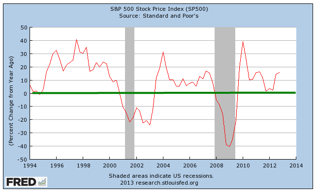
When Mabel returned to teaching in the mid 1990s, she had taken a conventional defined benefit pension plan, the only one that the school offered.  In early 1999, as the Nasdaq climbed to nosebleed valuations, George had eased up on the stock allocation in his 401K.  He didn’t know a whole lot about investing, only that stocks were riskier than bonds.  As the market continued to climb, he sometimes regretted his decision but stuck with it as a matter of common sense. By the end of 2000, as stock prices continued to fall, he was glad he had been more conservative.  In late October 2014, the Nasdaq 100 had finally climbed above the level it reached in 1999, 15 years earlier.

They enjoyed a wonderful Sunday dinner with Robbie, his wife Gail, and their grandson Charlie.  Robbie asked about Emily, his sister, but no they hadn’t heard from her in almost a year.  Two kids grow up in the same house.  One of them is stable, has a good career, and a wonderful family.  The other leads a troubled life, and is consumed by some inner demon.  Emily was not a fit conversation for a dinner table so the talk moved onto other topics.  Robbie, Gail and Charlie drove back to Colorado Springs that evening.  There was a front moving down from Canada or Alaska so they declined the offer to stay in the guest room for the night.

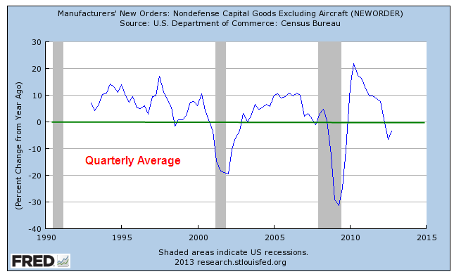
There wasn’t a lot of economic news scheduled for the week so George was not expecting any strong moves in the market.  Much of the earnings season had come and gone.  According to FactSet  almost 80% of companies had reported above consensus estimate of earnings.  A more disturbing sign: three times as many companies had issued negative guidance for fourth quarter earnings as those that had indicated a more positive outlook.

The big news for the week was the Rosetta spacecraft.  Launched ten years earlier, it had rendezvoused with a comet 300 million away on its journey from the far reaches of the solar system to the sun.  As if that wasn’t spectacular enough, the spacecraft then launched a washing machine sized landing vehicle to sit down on the comet as it sped through space.  Talk about long term planning.

On Thursday, the spot price of a barrel of crude oil dropped below $75.  The Energy Information Agency (EIA) announced that the average price of a gallon of gasoline had fallen further to $2.94, the second week below $3.   Several analysts pegged the price range of $65 – $70 as a “make or break” benchmark for many fracking operations.  If oil were to stay down at that level for any length of time, many new drilling plans would be put on hold.  Operations at existing wells might be cut back.  The strong dollar meant that countries who were net exporters of oil would be paid in dollars, which could be traded for more of their own currency.  For these countries, the strong dollar was helping offset the impact of lowered prices.

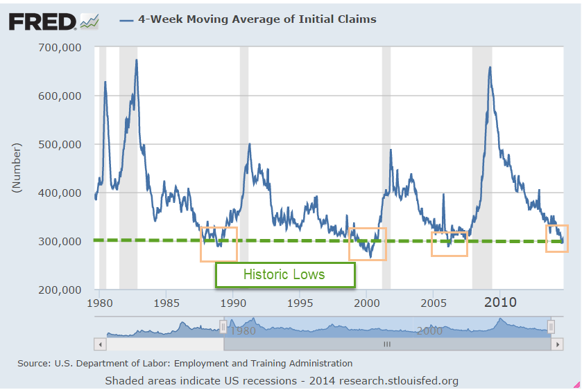
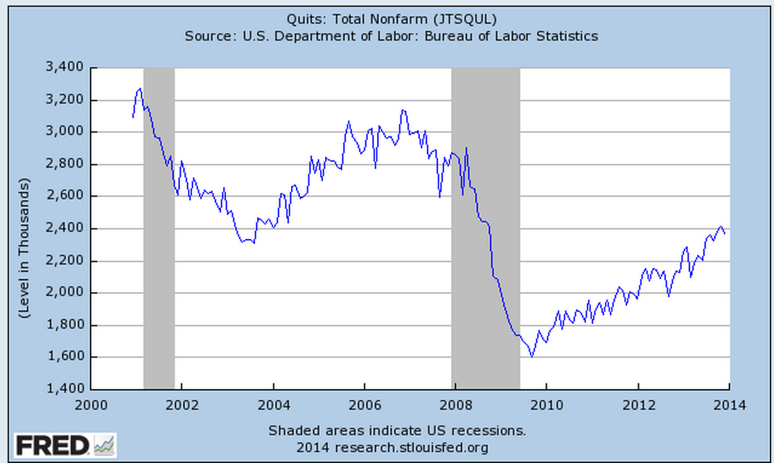
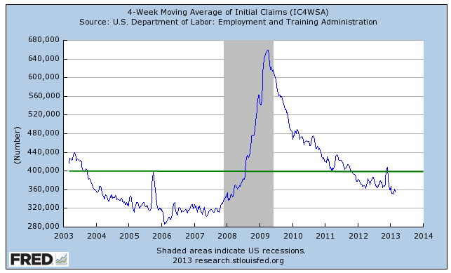
On Thursday, the BLS released the September report of job openings and turnover, or JOLTS.  The number of employees quitting their jobs had risen to a recovery high of 2%.  Workers who were not confident of finding another job did not quit their current job.  Job quitters acted as a canary in a coal mine, where a relatively small part of an ecosystem or economy indicated the health of the entire system.  A rate of 2% or higher indicated a healthy confidence in the employment grapevine.

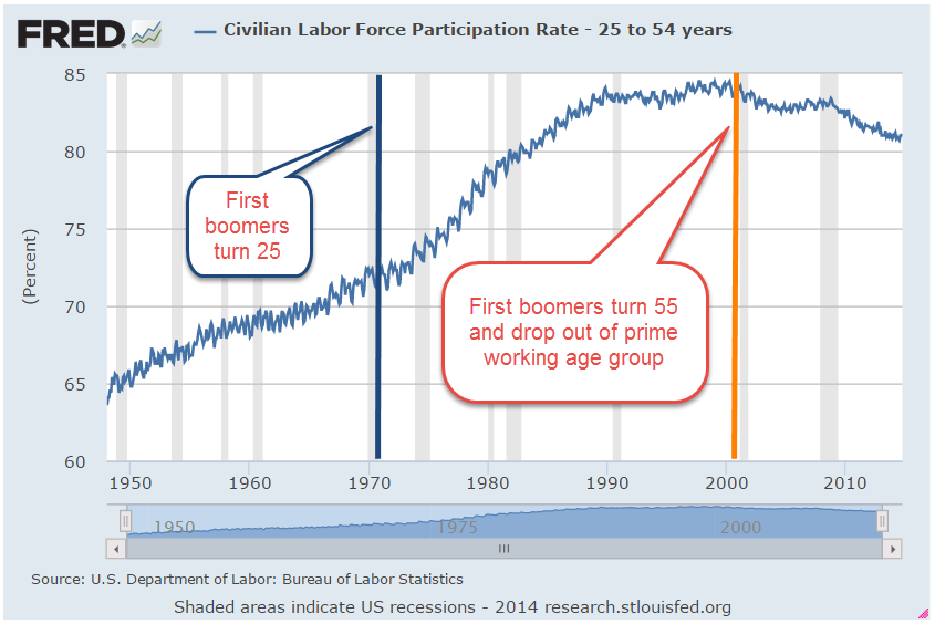
On Friday, George had lunch with a few former colleagues.  Four old guys sitting at a booth, drinking too much coffee. As usual, the discussion was lively.  Each of them had a take on the elections just past but the conversation got a bit heated when Stan said that there were just too many people who didn’t want to work.  Who was going to pay for all these people?  Who was going to pay for all the government programs?  He had just read a report from Pew Research that summarized the changing trends in the labor force participation rate and the sometimes contentious debates about those changes.  The participation rate was the number of people working or looking for work as a percentage of the adult population, the civilian non-institutional population, as it was called.  A 90 year old person could still work and was counted as part of that population of potential workers.

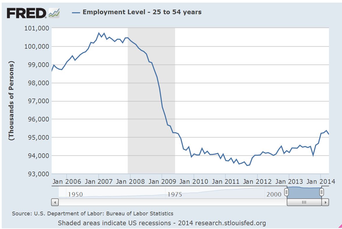
The core work force, those aged 25-54, showed a slightly declining participation.  The first boomers had grown out of this age group at the turn of the century.

George’s opinion, one echoed by the Congressional Budget Office, was that much of the reduction in the participation rate was due to changing demographics.  Since the mid-1990s, women, particularly white women, had had a historically high participation rate.

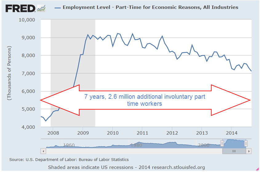
Some workers of earlier generations who had not needed a college education to earn a middle class wage found themselves less desirable in this more technological work environment.  During the recession, employers shed many workers with long term health problems.  As the economy improved employers were reluctant to hire these job seekers who may have had a good work ethic but possessed no above average skills or education.   Some applied for disability, or retired early if they could, or simply gave up trying.

Those with college level education and higher were more likely to be working.  The downtrend in the participation rate for both groups had started during the Clinton years, long before the Bush presidency, the 2008 recession or Obama’s presidency.

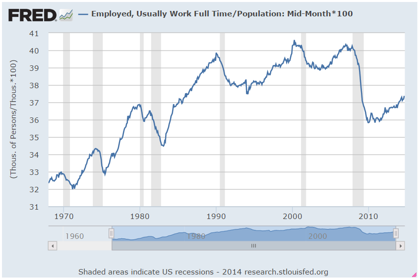
Full time workers as a percent of the total population were about the same level as the mid-1980s, when the economy was in a growth phase.  The 1990s and 2000s had been marked by unsustainable bubbles – the dot com boom and the housing debacle.

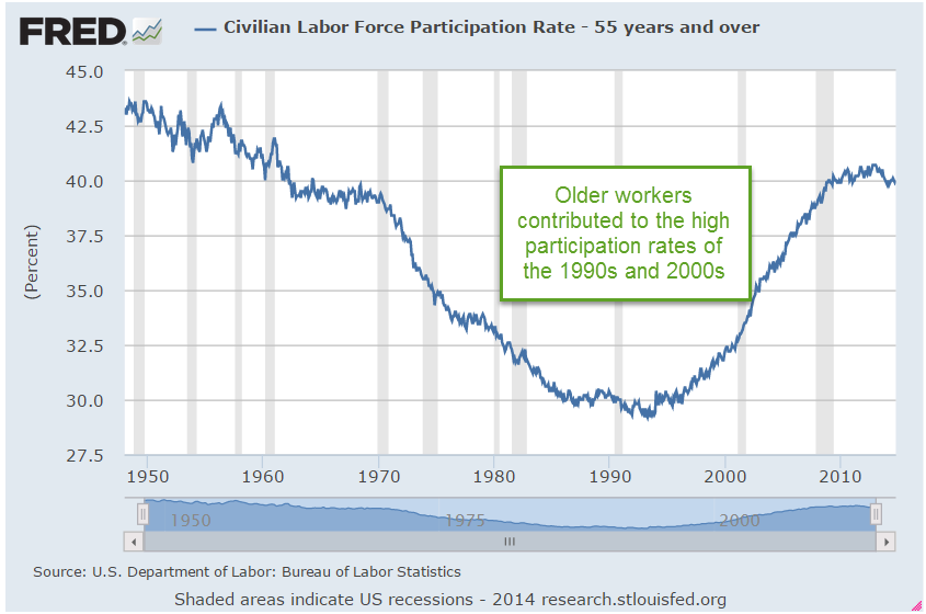
Older workers contributed to the high participation rates of the 1990s and 2000s.  A lot of people came to regard these abnormally high participation rates as normal.  They weren’t, George argued.

Sure, people are living longer, George argued, but the number of older workers can’t keep rising indefinitely.  Since the early 1990s, older workers had risen by 20 million, from 12% of the work force to 24% of the work force.  They were competing with younger workers for jobs.

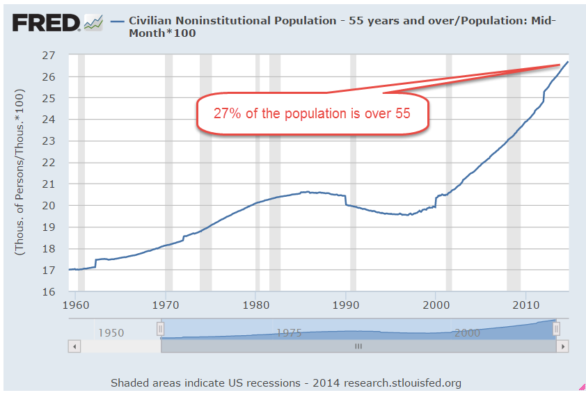
27% of the entire population was older than 55.  Most of that population was past working age yet older workers made up 24% of the work force.

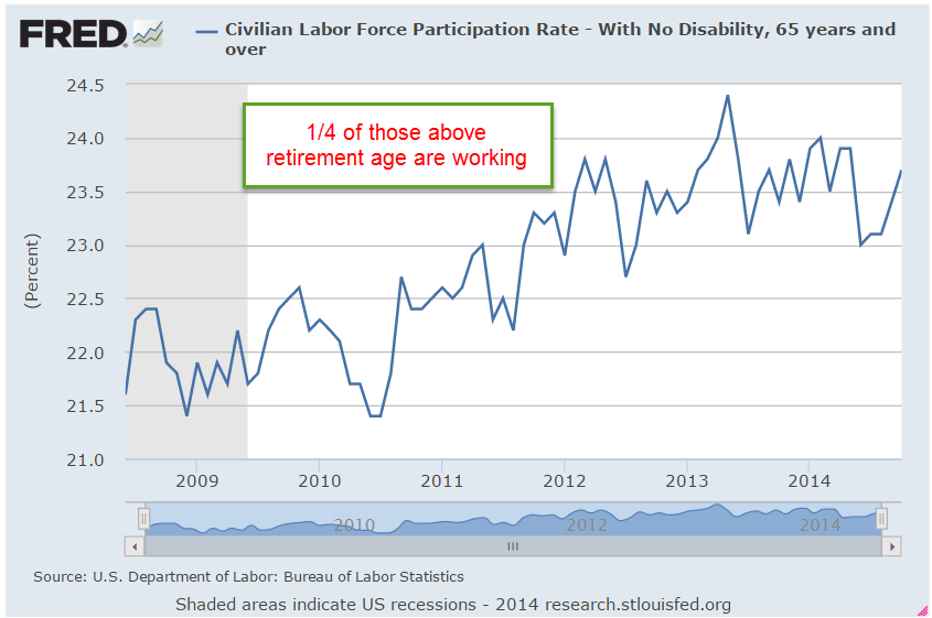
Workers who might have retired in decades past were continuing to work, clogging up the labor pipeline.

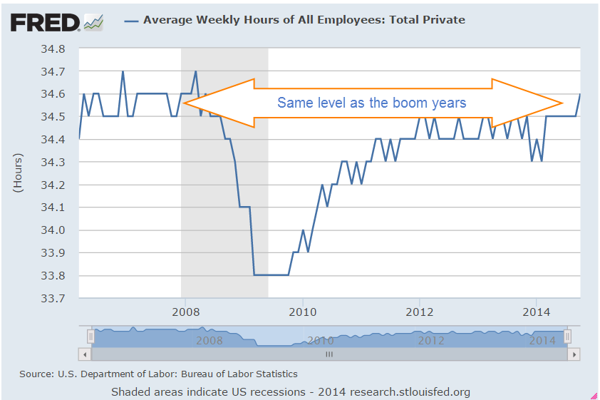
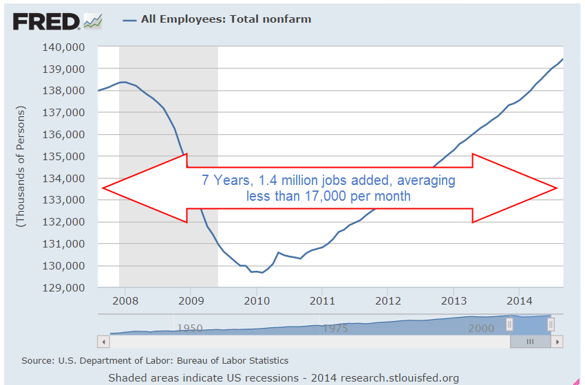
Stan thought the economy had still not recovered and was worried about the next recession.  Who’s gonna pay for all these people, he wondered again.  George reminded him that average weekly hours of all private workers – most of the work force – was now at the same level as before the recession.

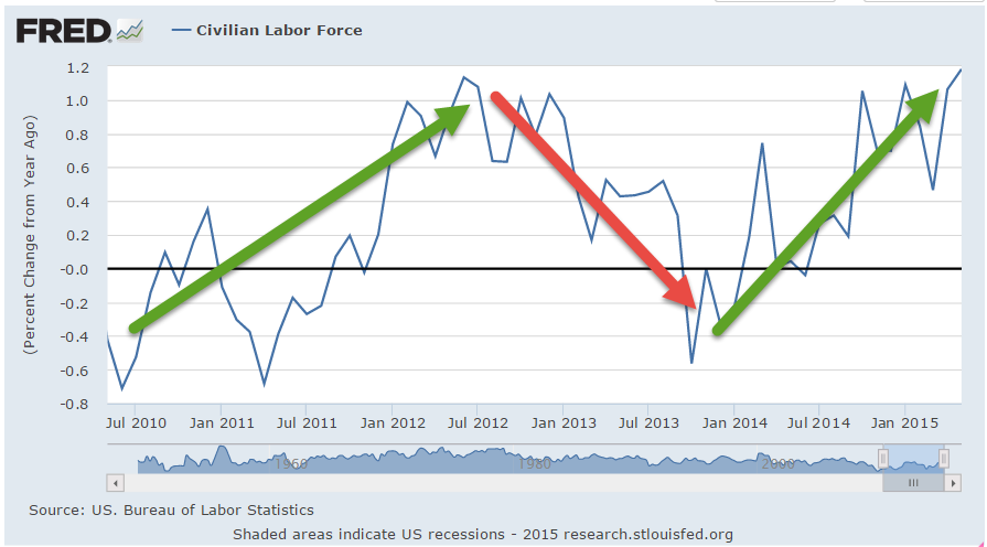
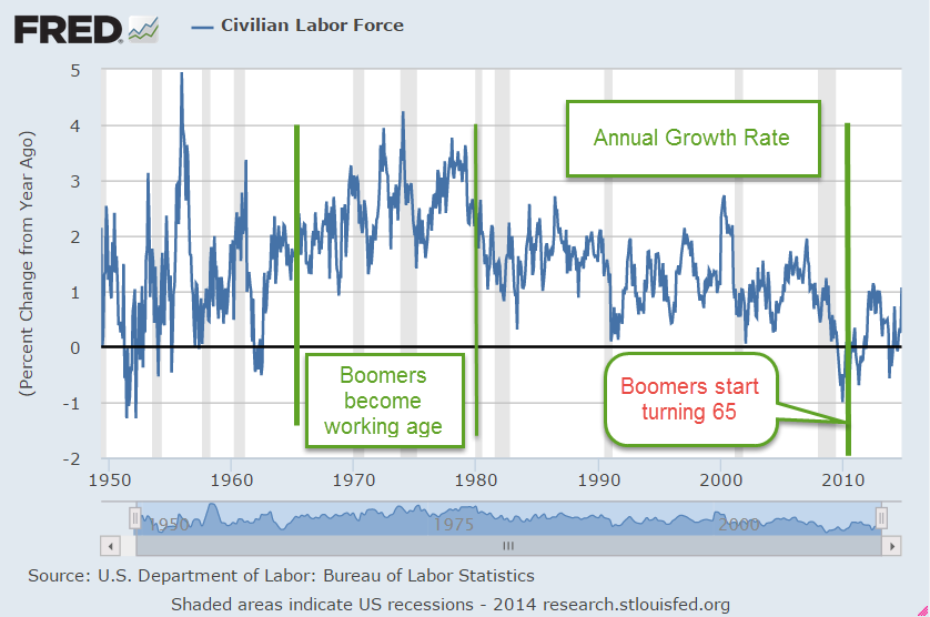
The Civilian Labor Force was higher now than before the recession started.  The growth rate was lower but still growing.

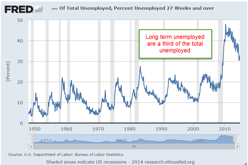
But George agreed that there were persistent problems.  A third of those unemployed had been out of work for more than a half year.

Real weekly earnings were stagnant, neither growing or declining.

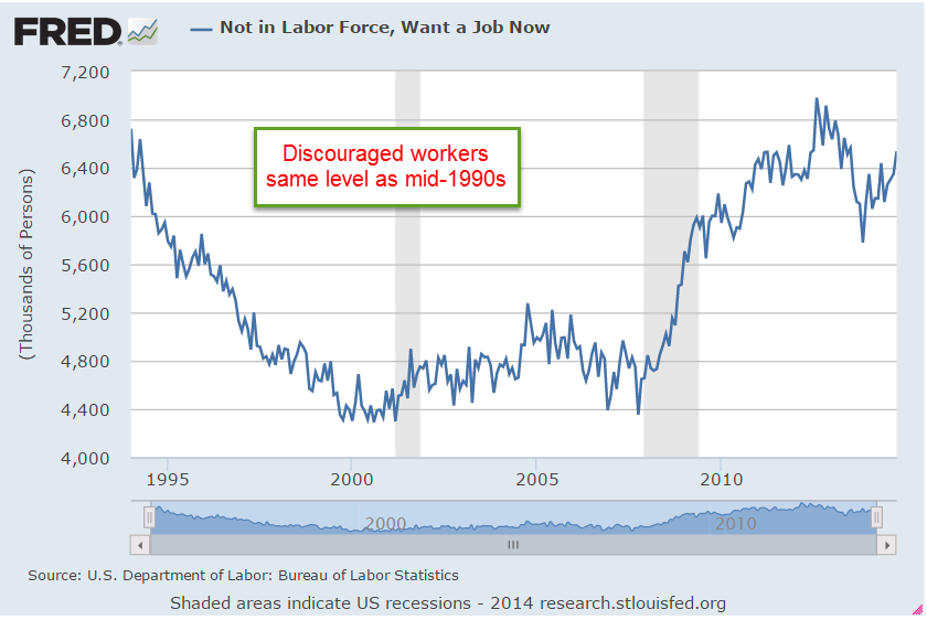
There were still a lot of people who were not counted in the labor force because they were not actively looking for work.  They wanted jobs but had given up.  As bad as it is now, George reminded Stan, discouraged job seekers are at the same level as they were in the mid-1990s.  Did you even notice back then?  George asked.  Stan admitted he hadn’t.

“A lot of us weren’t paying attention,” George told the group seated at the booth.  “Sure, it got bad sometimes, but we figured we would get through it.  This last recession was bad, bad, bad and there is a lot more information available now.  We can see how bad it was five years ago and there’s plenty more information to worry over as we look to the future.”

“So, you’re optimistic?” Stan challenged.  “Yeh, I am,” George replied. “Thirty years ago my accountant told me that by the time we retired, politicians would have to do one of three things:  increase taxes, cut benefits, or increase the retirement age.  She told Mabel and I that politicians would probably do a little of all three to spread the pain out and avoid getting thrown out of office.  I was doubtful.  How could she know what was going to happen so far in the future?  ‘It’s just math,’ she told us. ‘The largest generation of people is going to start turning 65 in twenty-five years and the system is not designed for it.  They’re gonna get sick and who’s gonna pay for it?  You think the little that you pay into Medicare is going to cover that?’  I look back now at her predictions.  They’ve raised the retirement age.  Check. The low inflation rate is helping to reduce the growth in Social Security benefits.  A half-check.  Medicare costs are growing at two to three times the rate of inflation.  They haven’t raised taxes yet but it’s coming.”

Stan said sardonically, “And you call yourself an optimist.”  George laughed.  “I guess I’m an optimist because she got Mabel and I planning for all of this a long time ago.  When they raised the retirement age, we weren’t surprised.  When they cut Social Security benefits in the future, we won’t be surprised.  When they raise taxes, we won’t be surprised.”

“Is this lady still your accountant?  She sounds pretty smart.” Stan asked.  “No,” George replied. “I think she and her husband moved to Oregon or Washington.  They wrote business and investment software but they gave up trying to defend their software from copying.  This was in the late 1980s and early 1990s.  Even their own clients were copying their software and giving it to their friends. ‘Smaller companies like ours just don’t have the time or resources to protect against theft,’ she told us.  ‘Eventually we’ll go to work as consultants for the larger companies.’  And several years later, that’s what they did.”

The waitress brought the check.  Normally they would split it four ways but Stan picked it up and handed it to George.  “Shouldn’t the optimist pay?”  George laughed.  “This one time,” he said, “but on one condition.  You all have to agree with me.  Isn’t that how they do it in politics?”  They all laughed, grunting as they straightened up after sitting so long.

A Busy Week

October 5, 2014

On Monday George and Mabel flew to Portland, Oregon so Mabel could attend a teacher conference in Eugene on the development of strategies and practices for online learning.  “How’d you get invited?  You’re retired,” George had asked a few months earlier.  Mabel had spent many years both as a teacher and high school principal.

“The conference is focused on post-secondary education, but Lorraine thought I would be interested and wangled me a spot.” Her friend Lorraine was a department chair at a local community college. “I might be able to give her some perspective from the high school level as these kids make the transition to college courses.”

They had to get up early to make the morning flight.  Retired people should only get up this early when they are having a colonoscopy, George thought.  After the conference, they planned to spend a few days on the Oregon coast, which they were both looking forward to.  They sat in the Denver airline terminal awaiting the boarding call.  George couldn’t understand most of what they said.  Millions of dollars to build an airport and the contractors seemed to have bought the cheapest speakers through somebody’s Uncle Harry who knows a guy who’s got a connection with some exporter in Malaysia. Airline service had become little more than a subway in the sky.  In fact, the speakers sounded just as bad as the ones used in New York subway cars.  “Gate 23, now pre-boarding …” came out of the speakers as “Ateleeteehoweeornayhinienegetcrispbeergoremekeens.” Passengers, please get in the metal tube, sit down and be quiet.  The metal tube will go up in the air and deposit you at your destination.  Transportation for the masses.  The future has turned out slightly different than the one imagined at the New York World’s Fair in 1964.

In Portland they rented a car and drove down to Eugene.  Settling down in their hotel room, George was pleasantly surprised to find they had good wi-fi reception.  The market had been up but had closed below Friday’s close, indicating that there was still more negative sentiment to come.  Personal income in August had gained 4.3% above the level of August 2013.

That bit of good news was offset somewhat by a report from the National Assn. of Realtors that year-over-year pending home sales were down a little bit more than 2% in August.  This confirmed last week’s housing reports and made it unlikely that tomorrow’s Case-Shiller report on home sales would have any positive surprises.

Tuesday morning, George slept in while Mabel got up early to go to the nearby conference at the University of Oregon.    He missed the free breakfast at the hotel but the woman at the reception desk pointed him to a nearby coffee shop that served egg croissants and a good cup of coffee. The sun broke out on the short walk to the coffee shop, brightening George’s mood.  Despite the mid-morning hour, a number of people sat in the coffee shop working on their laptops.  West coast time was three hours behind New York so half of the day’s trading had occurred before many Oregonians had started work.

The Case-Shiller home index showed that home prices in 20 metropolitan areas had declined for the third month in a row.  Year over year gains were still positive at 6.7% but the pace of growth was slowing. Last Friday’s Consumer Confidence survey from the U. of Michigan had been positive and rising.  A separate Confidence survey by the Conference Board was positive but showed a declining sentiment on worries about employment and income.

In the afternoon, he drove near the campus to meet Mabel.  The campus was an artist’s rendition of what a college was supposed to look like.  Shade trees dotted the grounds between the grand buildings of gray stone.  Lawns and bushes were clipped but didn’t look overly manicured.  The concrete walkways that led from one building to another were well maintained but showed the typical wear of traffic and a wet climate.  The ghosts of mankind’s great minds and talents would feel comfortable on these grounds and in these halls.

Mabel introduced George to several colleagues attending the conference.  Most attendees were teachers and administrators in their forties and fifties.  For 300 years, teachers and students had gathered in  a classroom in what was called face-to-face education.  Students prepared for class at home at various times outside of the classroom but the daily routine of classes centered the educational activity of the students.  Online learning was a new phase in distance learning, attempting to blend the broader educational training of traditional colleges and universities with the asynchronous methods of the correspondence schools of the past century.

On Wednesday came further confirmation that the growth in housing sales and construction was slowing.  Year-over-year construction spending had increased 5% but the growth had declined for 9 months.  George thought this was a fairly normal cycle but the market reacted negatively, dropping more than 1% by the end of the day.

European Central Bank head Mario Draghi announced that they would continue to keep interest rates low to help spur the non-existent growth or decline in many European countries.  The private payroll processor ADP reported job gains of 215,000, slightly above expectations.  The Institute for Supply Management (ISM) showed a slight decline from the robust growth of the previous month but overall a very positive report.

Wednesday evening after the conference had concluded, George and Mabel had dinner at a restaurant with two women who had attended the conference.  The conversation was lively, the food a bit pricey for the quality but George enjoyed the evening.  For the past two days he had encountered many young people, reminding him of his college days decades before.

“I’ve decided I want to be 20 years old again, only not as dumb and inexperienced,” George quipped. He remembered sagely pronouncing that Fitzgerald’s novel, The Great Gatsby, was about social classes that no longer existed in America and was irrelevant. Somehow he had survived his own poor judgment.  He did want to jump high in the air once again, twisting toward the basket and snapping a 3-point shot at the basketball net.  The losses in physical vitality were offset by the gains in sagacity, George hoped.

On Thursday, George and Mabel woke up early (again! two times in one week!) to drive out from Eugene to the Oregon Coast.  At the Oregon Dunes they walked through coastal rain forest, then dunes, then a less dense strip of rain forest, then beach and ocean. “I get smaller the more I walk,” he told Mabel.  “What do you mean?” she asked.  “We walk through places like this, they’re like landscapes, I guess you could call it, shaped by this wind around us, the ocean out there,  and underneath our feet the earth is shifting about.  It’s like we’re teeny tiny bacteria walking on the ridges of paint left by some artist’s brush.”

Mabel smiled, “Well put.”  She paused.  “With the physical classroom, students and teachers can have field trips out to the Oregon dunes.  How do we take that and put it in an online environment?” she wondered.  George glanced at her.  “Someone has brought the conference to the beach, I think.” Later, they stopped off for a coffee in the old town of Florence before ending the day in Yachats where they stayed at the Overleaf Inn.

I could get used to this, George thought, checking the market news from his balcony while the last streaks of sunset and orange turned to purple and gray out over the ocean.  The BLS reported that the 4-week average of new unemployment claims had fallen below 295,000.

Levels lower than this had occurred rarely – in early 2006, 2000 and the winter of 1987-88. Yet there was no dancing in the streets.

Instead, investors focused on the 10% drop in factory orders for August.  Most of the decline was due to volatile aircraft orders, which had surged in July followed by an equal drop in August. The market remained flat.

On Friday, George and Mabel walked several miles on the 804 trail, a sometimes dirt, sometimes asphalt path that ran for many miles along the Oregon cliffs.  They ate at the Drift Inn that evening.  Good food.  “You think there’s much work for younger folks around here other than the tourist industry?” he asked Mabel.  “I doubt it,” she replied. “We’ve seen a lot of twenty-somethings working at hotel reception desks, waiters, waitresses, the coffee shop in Florence.  They can’t be making a lot of money.  Still it is lovely here”, she mused.  “Could be more sun, ya know?”  George nodded.  “We’re kinda spoiled in Colorado,” he said.

When they returned to their hotel room later that night, a stiff wind blew off the ocean, bringing with it a bit more chill than either of them had packed for on this trip.  George checked the monthly employment data released that morning by the BLS.  Job gains had surprised to the upside at almost 250K but the market had still closed below Wednesday’s opening price and was still below the 10-day average. He pulled up some FRED data to get a snapshot of the relative health of the labor force seven years after the start of the recession.   The results were rather chilling – or maybe it was the dampness of the Oregon coast that he was unaccustomed to.  In seven years the number of employed people had grown just 1% – not 1% annually but 1% total for the entire time.

2.6 million more people were working part time because they could not find full time work. The number of underemployed had grown almost twice the 1.4 million new jobs created in seven years.

The unemployment rate had dropped below 6% in September but even that bit of positive news did not look so good when George pulled up the historical snapshot of unemployment since the recession began.

The rate had risen more than 1% in those seven years.  Despite all the talk of recovery, the surge of stock prices from the lows of 2009 and the rise in home values, the labor market was still wounded.

“Why don’t you help me figure out where we’re going to stay tomorrow in Newport?”, Mabel asked.  “One of my friends suggested the Elizabeth St. Inn.”
“Fine with me.  I want to see the Aquarium if it’s open,” George replied.  “Hey, check out the moon.”  Then he put on his windbreaker, pulled a blanket off the bed and went to sit out on the balcony.  Through the shifting clouds, moonlight shone softly on the water below.  Mabel, taking a cue from her husband, tugged a blanket from the second bed, wrapped it around her and sat with him.

Employment, Income and GDP

May 4th, 2014

Employment

Private payroll processor ADP estimated job gains of 220K in April and revised March’s estimate 10% higher, indicating an economy that is picking up some steam.  Of course, we have seen this, done that, as the saying goes.  Good job gains in the early months of 2012 and 2013 sparked hopes of a strong resurgence of economic growth followed by OK growth.

New unemployment claims this week were pushing 350K, a bit surprising.  The weekly numbers are a bit volatile and the 4 week average is still rather low at 320K.  In a period of resurgent growth, that four week average should continue to drift downward, not reverse direction. Given the strong corporate profit growth expectations in the second half of the year, there is a curious wariness in the market.  Conflicting data like this keeps buyers on the sidelines, waiting for some confirmation.  CALPERS, the California Employees Pension Fund with almost $200 billion in assets, expressed some difficulty finding value in U.S. equities and is looking abroad to invest new dollars.

On Friday, the Bureau of Labor Statistics reported job gains of 288K in April, including 15K government jobs.  Most sectors of the economy reported gains but there are several surprises in this report.  The unemployment rate dropped to 6.3% from 6.7% the previous month, but the decline owes much to a huge drop in labor force participation.  After poking through the 156 million mark recently, the labor force shrank more than 800,000 in April, more than wiping out the 500,000 increase in March.

To give recent history some context notice the steady rise in the labor force since the end of World War 2, followed by a flattening of growth in the past six years.

The core work force, those aged 25 – 54 years, finally broke through the 95 million level in January and rose incrementally in February and March.  It was a bit disappointing that employment in this age group dropped slightly this month.

To give this some perspective, look at the employment rate for this age group. Was the strong growth of employment in the core work force largely a Boomer phenomenon unlikely to repeat?  Perhaps this is why the Fed indicated this week that we may have to lower our expectations of growth in the future.

Discouraged job seekers and involuntary part timers saw little change in this latest report.  On the positive side, there was no increase.  On the negative side, these should decline in a growing economy.  There simply isn’t enough growth.  Was the strong pickup in jobs this past month a sign of a resurgent economy?  Was it simply a make up for growth hampered by the exceptional winter?  The answers to these and other questions will become clearer in the future.  My time machine is in the shop.

************************

GDP

Go back with me now to those days of yesteryear – actually, it was last year.  Real GDP growth crossed the 4% line in mid year.  The crowd cheered.  Then the economic engine began to slow down. The initial estimate of fourth quarter growth a few months ago was 3.2%.  The second estimate for that period was revised down to 2.4%, far below a half century’s average of 3%.  This week the final estimate was nudged up a bit to 2.6%, but still below the long term average.

Earlier in the week, the Federal Reserve announced that it will continue its steady tapering of bond buying and that it may have to adjust long term policy to a slower growth model.  The harsh winter makes any analysis rather tentative so we can guess the Fed doesn’t want to get it wrong?

************************

Manufacturing – ISM

ISM reported an upswing in manufacturing activity in April, approaching the level of strong growth.  The focus will be on the service sector which has been expanding at a modest clip.  I’ll update the CWPI when the ISM Service sector report comes out next week.

************************

Income – Spending

Consumer income and spending showed respectable annual gains of 3.4% and 4.0%.  The BLS reported that earnings have increased 1.9% in the past twelve months. CPI annual growth is a bit over 1% so workers are keeping ahead of inflation, but not by much.   Auto sales remain very strong and the percentage of truck sales is rising toward 60%, a sign of growing confidence by those in the construction and service trades.  Construction spending rose in March .2% and is up over 8% year over year but the leveling off of the residential housing market has clearly had an effect on this sector in the past six months.

***********************************

Conservative and Liberals

While this blog focuses mainly on investing and economics, public policy is becoming an ever increasing part of each family’s economic heatlh, both now and particularly in the future.
Some conservatives say that they endorse policies which strengthen the family yet are against rent control, minimum wage and family leave laws, all of which do support families.  How to explain this apparent contradiction?  A feature of philosophies, be they political, social or economic, is that they have a set of rules.  Some rules may be common to competing philosophies but what distinguishes a conceptual framework or viewpoint is the difference in the ordering of those rules.  The prolific author Isaac Asimov, biologist and science fiction writer, proposed a set of three rules programmed into each robot to safeguard humans.  A robot could not obey the second law if it conflicted with the first.  Robots are rigid; humans are not.  Yet we do construct some ordering of our rules.

A conservative, then, might have a rule that policies that protect the family are good.  But conservatives also have two higher priority rules which honor the sanctity of contract and private property: 1) that government should not interfere in voluntary private contracts, and 2) that private property is not to be taken from private individuals or companies without some compensation, either money or an exchange of a good or service. Through rent control policies, governments interfere in a private contract between landlord and tenant and essentially take money from a landlord and give it to a tenant, a violation of both rules 1 and 2.  Minimum wage and mandatory family leave laws enable a government to interfere in a private contract between employer and employee and essentially transfer money from one to the other, another violation of both rules.

In my state, Colorado, there is no rent control.  Instead, landlords receive a prevailing market price and low income tenants receive housing subsidies and energy assistance.  Under rent control, money is taken from a specific subset of the population, landlords, and given to tenants.  Under housing subsidies, money is taken from general tax revenues of one sort or another and given to tenants.  Of the two systems, housing subsidies seems the fairer but many conservatives object to either policy because the government takes from individuals or companies without any exchange, a violation of rule #2.  All policies like housing subsidies which involve transfers of income from one person to another, are mandatory charity, and violate rule #2.

Liberals want to support families as well but they have a different set of rules that prioritizes the sanctity of the social contract: 1) individuals living in a society have an obligation to the well being of other members of that society, and 2) those with greater means have a greater obligation to the well being of the society.  A government which is representative of the individuals of that society has the responsibility to facilitate the movement of wealth and income among those individuals in order to achieve a more equitable balance of happiness within the society.  Flat tax policies espoused by more conservative individuals violate rule #2.  Libertarian proposals for a much smaller regulatory role for government violate rule #1.

For liberals, both of the above rules are subservient to the prime rule: humans have a greater priority than things.  When the preservation of property rights violates the prime rule, property rights are diminished in preference to the preservation of human well-being.  On the other hand, conservatives view property rights as an integral aspect of being human; to diminish property rights is to diminish an individual’s humanity.

In the centuries old dynamic tension between the individual and the group, the liberal view is more tribal, focusing on the well being of the group.  Liberals sometimes ridicule some tax policies espoused by conservatives as “trickle down economics.”  In a touch of irony, it is liberals who truly believe in a trickle down approach in social and economic policies.  The liberal philosophy seeks to protect society from the natural and sometimes reckless self-interest of the individuals within that society. The conservative viewpoint is concerned more with the protection of the individual from the group, believing that the group will achieve a greater degree of well-being if the individuals are secure in their contracts and property. Conservatives then favor what could be called a bottom up approach to organizing society.

Conservatives honor the social contract but give it a lower priority than private contracts.  Liberals honor private contracts but not if they conflict with the social contract. Most people probably fall somewhere on the scale between the two ends of these philosophies and arguments about which approach is “right” will never resolve the fundamental discord between these two philosophies.

In the coming years, we are going to have to learn to negotiate between these two philosophies or public policy will have little direction or effectiveness.  Negotiating between the two will require an understanding of the ordering of priorities of each ideological camp.

Before the 1970s political candidates were picked by the party bosses in each state, who picked those candidates they thought would appeal to the most party voters in the district.   The present system of promoting political candidates by a primary system within each state has favored candidates who are fervent advocates of a strictly conservative or liberal philosophy, chosen by a small group of equally fervent voters in each state.  The middle has mostly deserted each party, leading to a growing polarization.  Survey after survey reveals that the views of most voters are not as polarized as the candidates who are elected to represent them. A graph from the Brookings Institution shows the increasing polarity of the Congress, while repeated surveys indicate that voters are rather evenly divided.

The Market and Growth

March 2nd, 2014

SP500
Some pundits have made the case that the stock market is due to fall this year because of the almost 30% rise in prices in 2013.  On the face of it, it seems logical.  If the average rise in the SP500 over the past fifty years is about 8-1/2% and there is a 30% rise in one year, then the market has essentially “used up” more than three years of the average – all in one year.  But the stock market is the net result of billions of buy and sell decisions by human beings.  My experience has taught me that the connection between sense and the behavior of human beings is tenuous, at best.  The Red Carpet walk at the Oscars Award Ceremony is a demonstration of the nonsensical choices that human beings make.  I mean, can you believe the dress that actress is wearing?  And who told that actor he could grow a beard?  PUH-LEEZ!

So I looked at past history and wondered: what is the average yearly return of the SP500 index over the three years following a 20% rise in the market?  As an example, if the market rises 20% in Year #1, what is the 3 year average of yearly returns in Year #4?  The results surprised me – 9.5%.

But wait! you say.  The late nineties were an aberration of irrational exuberance that skews the average.  Removing those two outliers from the data set gives a yearly average of 6.2%.  Add in 2% dividends and the total comes to 8.2%, a respectable return.

But wait!, you say again.  What about the year after the 20% rise?  Surely, the index must compensate for the above average rise the previous year.  In the year after a 20% rise in the market, the average gain was 13.5%.  Again, there were those crazy years of the late nineties so I’ll take them out, leaving an average gain of 3.7%.  Add in the 2% dividend and it easily outpaces the current return on long term bonds.

This year the pundits could be right and the stock market falls.  However, a successful long term investor must learn to play the averages.

*********************************

GDP and Savings

GDP is a measure of the economic output of a nation but what the heck is it?  A recent presentation by Gary Evans, an economics professor at Harvey Mudd College in California, has a number of wonderfully illustrated graphs that may help the casual reader understand the components of GDP and recent trends in the economy.

On January 30th, the Bureau of Economic Analysis (BEA) released their advance estimate of real GDP growth of 3.1% in the 4th quarter.  As more information of December’s slowdown became available in late January and early February, the market began anticipating that the BEA would revise their advance estimate down.  Slower growth might mean further declines in stock prices, right? Instead, the market anticipated that a slowing of growth in the fourth quarter would calm the hand of the Fed in tapering their bond purchases. As a result, the market  rebounded in February, more than making up for January’s decline.  On Friday, the BEA revised their second estimate of fourth quarter growth downward to 2.4%, almost exactly what the market consensus had anticipated and the market finished out a strong month with a small gain.  The BEA attributed the slower growth in the fourth quarter to reductions in federal, state and local government spending and a slowdown in residential housing.

As the BEA revises their methodology, they also revise previously published GDP data.  In the 2013 revision the BEA adjusted their data going back to 1929.  In the past few years, revisions have added about 1/2 trillion dollars to GDP.  Adjustments to the personal savings rate were substantially higher but savings in the past decade have been at historically low levels.  Personal savings are the amount of disposable income, or income after taxes, that families save.  The rate or PSR is the the percentage of their disposable income that they don’t spend.

When people charge purchases that decreases the savings rate.  Conversely, when families pay down their credit purchases that increases the savings rate.  Despite the explosive growth of household debt in the past thirty years,

the savings rate has remained positive, meaning that the people who do save are more than offsetting those who don’t or can’t save.

Let’s take an example of three families:  the Jones family makes $60K in disposable, or after tax income, saves nothing, but increases their debt $8,000 by buying a new car.  Their personal savings rate is $-8K/$60K, or -13.3%.  The Smith Family also has $60K in disposable income, but is frugal and pays down a few loans and saves some money for a total savings of $2K, or 3.3%.   The Williams family has a disposable income of $120K and has net savings of $20K, or 16.7%. Families with higher incomes tend to save proportionately more of that income.  Total disposable income for the three families is $240K.  Total savings is $14K, or 5.8% of disposable income, but that hides the fact that it is the Williams family that is making most of the contribution to that savings rate.

There is another subtle element contributing to this disparity in savings: inflation.  The Consumer Price Index charts the increasing prices of goods and services – spending.  A higher income family that spends less of its income is less affected by changes in the CPI than a lower income family and this helps a higher income family save proportionately more than the lower income family.  The difference is slight but the compounded effect over thirty years is significant.

During the past thirty years, the personal savings rate has steadily declined.

This doesn’t mean that families are saving less as a percentage of their income but that the number of families with net savings are becoming fewer while the number of families with little net savings or negative net savings are becoming more numerous.  The period from 1930 to 1980 was one of relatively more income equality than the period 1980 to the present.  Let’s look again at the chart above.  In the late 1970s, as income equality begins a decades long decline, so too does the personal savings rate.  The ratio of high income families with a relatively high savings rate to lower income families with a low savings rate also declines.

Savings drives investment in the future.  The low savings rate means that future U.S. economic growth must rely ever more on the savings from those in other countries.  Typically savings rates increase as a recession progresses and then the economy recovers.

Notice that the savings rate has stayed relatively steady in the past three years, indicating neither an increasing confidence or caution.  As shown in the table, only the three year period from 1988 – 1990 period showed the same lack of direction.  GDP growth in that period was stronger than it is today but the savings and loan crisis and the stock market crash of October 1987 had diluted the confidence of many.

****************************

New Home Sales
Here’s a head scratcher.  New home sales rebounded almost 10% in January, after falling 13% in December.  Even the figures for December were revised a bit higher.  As I noted last week, the rather flat growth in incomes has become an obstacle to the affordability of homes. December’s Case Shiller 20 city home price index reported a 13.4% annual increase in home prices. January’s rise in home sales was partially aided by sellers willing to make price concessions, resulting in a 2.2% decrease in the median sales price.

****************************

Durable Goods
Orders for durable goods, excluding transportation, were up about 1% this past month. A durable good is something which has a life of 3 years or more.  Cars and furniture are common examples. The year over year gain, a bit over 1% as well, indicates rather slow growth over the past year after adjusting for inflation.  However, several current regional reports of industrial activity indicate a quickening growth at the start of this year.  Reports from Chicago, Philadelphia and Kansas City hold promise that next week’s ISM assessment of manufacturing activity nationally will show a rebound.

As I have noted in blogs of the past few months, the pattern of the CWI index that I have been compiling since last summer indicated a rebound in overall activity in the early spring of this year.  This gauge of manufacturing and non-manufacturing activity is based on the Purchasing Managers Index released each month by ISM.  I suppose a better name for the CWI index would be “Composite PMI.”  Readers are welcome to make some suggestions.

****************************

Unemployment
New unemployment claims rose, approaching the 350K mark, but the 4 week average of new claims is holding steady at 338K.  In past winters the 4 week average has been around 360K.  If new claims remain relatively low during this particularly harsh winter in half of the country, it will indicate an underlying resiliency in the labor market.

Janet Yellen, the new chairwoman of the Federal Reserve, appeared before the Senate Finance Committee this week.  In her response to questions about the dual mandate of the Fed – inflation and employment – she noted that the Fed looks at much more than just the unemployment rate in gauging the health of the labor market.  One of the employment indicators they use is new unemployment claims.

When asked what unemployment rate the Fed considers “full employment,” Ms. Yellen stated that it was in the 5 – 6% range.  One of the Republican Senators asked about the “real” unemployment rate, without specifying what he meant by the word “real.”  Without hesitation and in a neutral tone, Ms. Yellen responded that if the Senator meant the “widest” measure of unemployment, the U-6 rate, that it was about 13%.  The U-6 rate includes discouraged workers and part time workers who want but can not find full time work.

When George Bush was President, “real” meant the narrowest measure of unemployment to a Republican because it was the smallest number.  With a Democrat in the White House, the word “real” now means the widest measure of unemployment to a Republican because it is the largest number.  Democrats employed the same strategy when George Bush was President, preferring the higher U-6 unemployment rate as the “real” rate because it was higher.  I thought that it would be a good response for anyone when confronted by a colleague at work about the “real unemployment rate” that we steer the conversation to more precise and politically neutral words like “widest” and “narrowest.”

****************************
Pensions
A reader sent me a link to a Washington Post article on the pension and budget woes of San Jose, a large city in California.  I am afraid that we will see more of these in the coming decade.  Beginning in the 1990s politicians in state and local governments found an easy solution to wage demands from public workers: make promises.  Wages come out of this year’s budget; pension promises and retiree health care benefits come out of some budget in the distant future.  For an increasing number of governments, the distant future has arrived.

In Colorado, a reporter at the Denver Post noted that the Democratic Governor and the Republican Treasurer are hoping that the state’s Supreme Court will force the public employee’s pension fund, PERA, to open its books. It might surprise some that a public institution like PERA is less transparent than a publicly traded company.  Actuarial analysis estimates are that PERA’s asset base is underfunded by $23 billion, or about $46,000 for each retiree. It was only last year that the trustees of the fund reluctantly lowered its expected returns to 7.5% from 8%.  Assumptions on expected returns, what is called the discount rate, is a major component in analyzing the health of any retirement fund and the money that must be set aside today to pay for tomorrow’s promised benefits.  Many analysts contend that even 7.5% is a rather lofty assumption in this low interest rate environment.

Readers who Google their own state or city and the subject of pensions will likely find similar tales of past political promises and lofty assumptions running headlong against the realities of these past several years.

Transfer Payments

February 16th, 2014

In this election year, as in 2012, the subject of transfer payments will rear its ugly head with greater frequency.  In the mouths and minds of some politicians, “transfer payments” is synonymous with “welfare.”  Don’t be confused – it is not.  As this aspect of the economy grows, politicians in Washington and the states get an increasing say in who wins and who loses.  Below is a graph of transfer payments as a percent of the economy.  I have excluded Social Security and Unemployment because both of those programs have specific taxes that are supposed to fund the programs.

Transfer payments, as treated in the National Income and Product Accounts (see here for a succinct 2 page overview), are an accounting device that the Bureau of Economic Analysis (BEA) uses to separate transfers of money this year for which no goods or services were purchased this year.  The BEA does this because they want to aggregate the income and production of the current year. Because that category includes unemployment compensation, housing and food subsidies, some people mistakenly believe that the category includes only welfare programs.   Here’s a list of payments that the BEA includes:

Current transfer receipts from government, which are called government social benefits in the NIPAs, primarily consist of payments that are received by households from social insurance funds and government programs. These funds and programs include social security, hospital insurance, unemployment insurance, railroad retirement, work­ers’ compensation, food stamps, medical care, family assistance, and education assistance. Current transfer receipts from business consist of liability payments for personal injury that are received by households, net in­surance settlements that are received by households, and charitable contributions that are received by NPISHs.

That settlement you received from your neighbor’s insurance company when his tree fell on your house is a transfer payment.  Didn’t know you were on welfare, did you?  Some politicians then cite data produced by the BEA to make an argument the government needs to curtail welfare programs.  Receiving a Social Security check after paying Social Security taxes for forty plus years?  You’re on welfare.  A payment to a farmer to not grow a bushel of wheat – an agricultural subsidy – is not a transfer payment.  A payment to a worker to not produce an hour of labor – unemployment insurance – is a transfer payment.  Got that?  While there are valid accounting reasons to treat a farmer’s subsidy check and a worker’s unemployment check differently, some politicians prey on the ignorance of that accounting difference to push an ideological agenda.

That agenda is based on a valid question: should a government be in the business of providing selective welfare; that is, to only a small subset of the population?  Some say yes, some say no.  If the answer is no, does that include relief for the victims of Hurricane Katrina, for example?  Even those who do say no would agree that emergencies of that nature warrant an exception to a policy of no directed subsidies or welfare payments.  It was in the middle of a national emergency, the Great Depression, that Social Security and unemployment compensation were enacted.  Government subsidies for banks began at this time as well.  Agricultural subsidies began in response to an earlier emergency – a sharp depression a few years after the end of World War 1.  Health care subsidies were enacted during the emergency of World War 2.  The pattern repeats; a subsidy starts as a response to an immediate and ongoing emergency but soon becomes a permanent fixture of government policy.

Tea Party purists think that the Constitutional role of the federal government is to tax and distribute taxes equally among the citizens.  Before the 16th Amendment was passed a hundred years ago, the taxing authority of the Federal Government was narrowly restricted.  However, the Federal Government has always been selective in distributing  the resources at its disposal.  Land, forests, mining and water rights were either given or sold for pennies on the dollar to a select few businesses or individuals. (American Canopy is an entertaining and informative read of the distribution and use of resources in the U.S.) By 1913, the Federal Government had dispensed with so much land, trees and water that it had little to parlay with – except money, which it didn’t have enough of.  Solution: the income tax.

In principle, I agree with the Tea Party, that the government at the Federal and state level should not play God.  How likely is it that the voters of this country will overturn two centuries of precedent and end transfers?  When I was in eighth grade, I imagined that adults would have more rational and informed discussions.  Sadly, our political conversation is stuck at an eighth grade level on too many issues.

****************************

While most of us pay attention to the unemployment rate, there is another statistic – the separation rate – that measures how many people are unemployed at any one time.  The unemployment can be voluntary or involuntary, and last for a week, a month or a year.  Not surprisingly, younger workers change jobs more frequently and thus have a higher separation rate than older workers.  In the past decade, almost 4% of younger male workers 16 – 24 become unemployed in any one month.  Put another way, in a two year period, all workers in this age group will change jobs.  For prime age workers 25 – 54, the percentage was 1.5%.  In a 2012 publication, Shigeru Fujita, Senior Economist at the Philadelphia Federal Reserve Bank, examined historical demographic trends in the separation rate.

On page five of this paper, Mr. Fujita presents what is called a “labor-matching” model that attempts to explain changes in unemployment and wages, primarily from the employer’s point of view. Central elements of this model, familiar to many business owners, include uncertainty of future demand and the costs of finding and training a new worker.  Mr. Fujita examines an aspect that is not included in this model – the degree of uncertainty that the worker, not the employer, faces.  In the JOLTS report, the BLS attempts to measure the number of employees who voluntarily leave their jobs.  These Quits indicate the confidence among workers in finding another job.  The JOLTS report released this week shows an increasing level of confidence but one which has only recently surpassed the lows of the recession in the early 2000s.

**************************

Labor Participation
In a more recent paper, Mr. Fujita examines the causes of the decline in the labor participation rate, or the number of people working or looking for work as a percentage of the people who are old enough to work.  As people get older, fewer of them work; the aging of the labor force has long been thought to be the main cause of the decline.  That’s the easy part.  The question is how much does demographics contribute to the decline? What Mr. Fujita has done is the hard work – mining the micro data in the Census Bureau’s Current Population Survey.  He found that 65% of the decline of the past twelve years was due to retirement and disability.  More importantly, he discovered that in the past two years, all of the decline is due to retirement.  The first members of the Boomer generation turned 65 in 2011 so this might come as no surprise.  The surprise is the degree of the effect;  this largest  generational segment of the population dominates the labor force characteristics. During the past two years, discouraged workers and disability claims contributed little or nothing to the decline in the participation rate.  Another significant finding is that relatively few people who retire return to the work force.

In this election year, we will be bombarded with political BS: Obamacare or Obama’s policies are to blame for the weak labor market; the anti-worker attitude of Republicans in Congress are responsible.  Politicians play a shell game with facts, using the same techniques that cons employ to pluck a few dollars from the pockets of tourists in New York City’s Times Square.  Few politicians will state the facts because there is no credit to be taken, no opposing party to blame.  Workers are simply getting older.

In 2011, MIT economist David Autor published a study on the growth of disabiliity claims during the past two decades and the accelerating growth of these claims during this Great Recession.  Mr. Fujita’s analysis reveals an ironic twist – at the same time that Mr. Autor published this study, the growth in disability claims flattened.  The ghost of Rod Serling, the creator and host of the Twilight Zone TV series, may be ready to come on camera and deliver his ironic prologue.

*******************************

Lower automobile sales accounted for January’s .4% decline in retail sales. Given the continuing severity of the weather in the eastern half of the U.S., it is remarkable that retail sales excluding autos did not decline.  In the fifth report to come in below even the lowest of estimates, industrial production posted negative growth in January.  By the time the Federal Reserve meets in mid-March, the clarity of the economy’s strength will be less obscured by the severe winter weather.

*******************************

A reader sent me a link to short article on the national debt.  For those of you who need a refresher, the author includes a number of links to common topics and maintains a fairly neutral stance.  I still hear Congresspeople misusing the words “debt,” the accumulation of the deficits of past years, and “deficit,” the current year’s shortfall or the difference between revenues collected and money spent.  Could we have a competency test for all people who wish to serve in Congress?

*******************************

The House and Senate both passed legislation to raise the debt ceiling this week.  The stock market continued to climb from the valley it fell into two weeks ago and has regained all of the ground it lost since the third week of January.

Year In Review

January 5, 2013  2014

The start of any year presents an opportunity for reflection on the past year as well as the upcoming one.  At the start of the year, few, if any, analysts called for such a strong market in 2013.  The S&P500 closed the year at 1850, a 30% gain. After a correction in May – June of this year, the index rose steadily in response to better employment data, industrial production, GDP increases, and the willingness of the Federal Reserve to continue  buying bonds and keep interest rates low.

I was one of many who were mildly bullish at the beginning of the year but got increasingly cautious as the index pushed past 1600.  Yet, month after month came not only positive or mildly positive reports but a notable lack of really negative reports.  Leading economies in the Euozone, teetering on recession, did not slip into recession.  Fraying monetary tensions in the Eurozone did not explode into a debt crisis.  China’s growth slowed then appeared to stabilize.  Although the attention has been on the Eurozone the past few years, the sleeping dragon is the Chinese economy, its overbuilt infrastructure, the high vacancy rate in commercial buildings in some areas of the country and the high housing valuations relative to the incomes of Chinese workers.

A year end review is an exercise in humility for most investors.  Some fears were unfounded or events unformed which confirmed those fears.  People are story tellers – stories of the past, imaginings of the future.  An investor who keeps all their money in CDs or savings accounts is predicting an unsafe investing environment for their savings.

Perhaps the best strategy is the one that John Bogle, the founder of Vanguard, advocates.  He doesn’t try to predict the future or be the best investor.  He aims for that allocation of stocks, bonds and other investments that, on average, forms a suitable mix of risk and reward for his goals, his age and the financial situation of his family.  He looks at his portfolio once a year.  I do think that a good number of individual investors had adopted the same outlook as Mr. Bogle advocates – until the 2008 financial crisis.

Since the financial crisis, too many investors have adopted a paralyzed strategy, a “deer in the headlight” reaction to the financial crisis that has been hugely unrewarding. Part of this year’s rise in the stock mark can be attributed to individual investors moving cash back into the stock market but I would guess that many of those investors are ready to pull it back out at the first sign of any trouble.  This shows less a confidence in the market but a frustrating lack of alternatives.

Long term bond prices took a significant hit in the middle of the year on fears of an impending rise in interest rates.  Bond prices had simply become too high, driving down the yield, or return, on the investment. Lower bond yields and meager CD and savings rates provided little return for investors, leaving many investors with little choice but to venture back into the stock market.

*************************************
The Coincident Index of Economic Indicators remains level and strong.  A decline in this index below the 1% average growth rate of the population indicates the start of or an impending recession.

Note the index in 2002 – 2003 as it fell back, never rising above the 1% level.  I have written about this economic faltering before.  Much of the headlines were focused on the lead up to and start of the Iraq war.  The recovery from the recession of 2001 and 9-11 was very sluggish.  Fears that the country was entering a double dip recession similar to that of the early 1980s prompted Congress to pass the Bush tax cuts in 2003.  It was only the increased defense spending of 2003 that offset what would have been a decline in GDP and another recession.

***********************************
A worrisome rise in new unemployment claims has puzzled some analysts.  Typically, new claims for unemployment decline at the end of the year, particularly in a year such as this one when reports of strong economic growth have been consistent.  Since 2000, rises in claims at the end of the year have been a cautionary note of things to come.  Mid-term investors and traders will be paying attention to this in the weeks to come.

However, the decline this year may be more of a leveling process that has been forming for most of the year.  On a year over year basis, the long term trend is down – which is up, or good.

In March 2013, I wrote “when unemployment claims go up, the stock market goes down … On a quarterly basis, this negative correlation has proved to be a reliable trading signal for the longer term investor.  When the y-o-y percentage change in new unemployment claims crosses above the SP500 change, sell.  When the claims change crosses below the SP500 change, it’s safe to buy. ”  The percent change in SP500 is still floating above the change in unemployment claims.

**********************************
Sales of motor vehicles in November were above even the most optimistic expectations.  The ISM manufacturing index showed a slight decline but is still in strong growth mode and the already robust growth of new orders continues to accelerate.  The manufacturing component of the composite index I have been following since last June is at the same vigorous levels of late 1983 and 2003 when the economy finally breaks free of a previous recession.  I’ll update the chart when the non-manufacturing report is released this coming Monday.

*********************************
In a healthy economy, the difference between real GDP and Final Sales Less the Growth in Household Debt (Active GDP) stays above 1%, which incidentally is the annual rate of population growth.  As the chart below shows, this difference dropped below 1% in late 2007.  Finally, six long years later, the difference has risen above 1%, indicating a healthy, growing economy.

**********************************
And now a brief look at the year in review.

At the end of 2012, the price of long term bonds had declined slightly from the nose bleed levels of the fall but there was more to come.  I wrote “As this three decade long upward trend in bond prices begins to turn, bond prices can fall sharply as investors turn from bonds to stocks and other investments. We are approaching the lows of interest yields on corporate bonds not seen since WW2. Investors are loaning companies money at record low rates and companies are sucking up all that they can while they can. Sounds a lot like home buying in the middle of the last decade, doesn’t it?”

During the past year, long term bonds declined another 10%.  They seem to have formed a base over the past several months.  Intermediate term bonds are less sensitive to interest rate changes so they are the safer bet.  They lost about 6% in price over the past year.  Short term corporate bonds are a good alternative to savings accounts.  They pay about 1% above the average savings account and they usually vary very little in price so that the principal remains stable.

At the end of 2012, I wrote “the underlying fundamentals of the economy give reason for cautious optimism.” A month later, “As the saying goes, ‘The trend is your friend.’ When the current month of the SP500 index is above the ten month average, it’s a good idea to stay in the market.”  In January 2012, the monthly close broke above the 10 month average. This is a variation of the Golden Cross that I wrote about in January and February 2012.

Let’s look at this crossing above and below the 10 month average.    When this month’s close of the SP500 index crosses above the 10 month average of the index, it indicates a clear change in market sentiment.  I have overlayed the percent difference between each month’s close and the ten month average.

As you can see, the close near the end of December is near 10% above the 10 month average.  If the above chart is a bit too much information for you, here is a graph of the percent difference only.

Is the market overheated?  As you can see the market has sustained a robust (or some might call it exuberant) 10% for 6 – 9 months in 2003, 2009, and 2010-2011.  From 1994 to 1999, the market spent a lot of time in the 10% percent range. Some pundits are talking about this market as a bubble but we can see that this market has not penetrated the 10% mark.  At the end of January 2013, the market closed at more than 7% above it’s 10 month average, over the 4 year positive average of 5.6% (the average when the difference is positive).  The market is 20% up since then.

******************************
In March I introduced the “Craigslist Indicator,” the number of work trucks and vans for sale in a local area, as a gauge of the health of the construction industry.  It was a funny little indicator that indicated a growing strength in the construction industry at the beginning of the year.  Now for the amended version of the Craigslist Indicator: when there are a lot of older work trucks and vans advertised for sale on Craigslist, that indicates a robust construction market.

*****************************

On March 24th, 2013 I wrote ” For the past year, the Eurozone has been in or near recession, yet some are hopeful that increased demand in this country and some emerging markets are helping to balance the contractionary influence of decreased demand in the Eurozone. Let’s hope that this surge in the first part of the year does not fade as it did in 2012.”  Instead, emerging markets began to contract and the Eurozone expanded slightly. Investors who bought emerging markets in March 2013 witnessed a more than 10% decline during the summer but the index ended the year at about the same level as nine months ago.

******************************
I thought that home prices in the early spring has reached a peak and wrote on March 31st, “The upturn in home prices is still above the trend line growth of disposable income and until personal income can resume or surpass a 3% growth rate, any rise in home prices will be constrained.” The Purchase Only House Price Index (HPIPONM226S) rose steadily throughout the year.
In late summer, I noted the falloff in single family home sales that began in the spring.  But prospective buyers were incentivized to make the deal as interest rates began to climb from their historically low levels.  Home sales surged upward; a lack of inventory in many cities also formed a support base that propped up prices.

A sobering note in September, “Rising home values are good for those who own a home but increasing valuations make it that much more difficult for buyers trying to buy their first home.  People in their twenties and early thirties who are most likely to be first home buyers have been hit hard by the recession.”

*******************************
After a decline in the stock market in June, I wrote “For the long term investor, periods of negative sentiment can be an opportunity to put some cash to work.”  Although I took my own advice, I wished I had acted with more conviction.  Of course, if the market had declined 10%, I would have been patting myself on the back for my cautious stance.  Smiley Face!!

*******************************
In July I noted the rather dramatic decrease in the value of securities held at the nation’s largest banks “Recently rising bond yields have contributed to banks’  operating profit margins but the corresponding value of banks’ bond portfolios has fallen quite dramatically.  This decline in asset value affects bank capital ratios, which makes them less likely to increase their lending … [and] will be an impediment to economic growth.”  The rising stock market and a respite in the decline of bond prices helped stabilize those portfolios in the second half of the year.

********************************
In September, I noted “Despite all the daily and weekly responses to political as well as economic news, the SP500 stock market index essentially rides the horse of corporate profits.”  Profits have more than tripled in the past ten years.  We should stay mindful of that stock price to profit correlation as we look out on the investment horizon.

********************************
From time to time I comment on the venality of our elected representatives.  Although they might appear to be idle rants to some readers, they are a caution.  Politicians make promises to get votes.  People become more dependent on those promises.  Inevitably, the day comes when the promises can not be met – as promised.  Those nearing or in retirement become increasingly dependent on political promises and should leave themselves a cushion – some wiggle room – if possible, when they make income and expense projections.  This Washington Post article on proposed budget cuts to military pensions is a case in point.  As long as “they” come for the other guy, we don’t pay too much attention – until they come for us.  Over the next ten to twenty years, we can expect many small cuts to promised benefits.  The cuts have to be small or target a small sector of the population so that they don’t anger voters too much.  In several blogs, I have shown how a simple recalculation of the Consumer Price Index eats away at the incomes of workers and retirees.  Expect more of these “recalculations” in the future as politicians follow a long standing tradition of making promises to win votes and bargain patronage to gather financial support for their campaigns.

We have the midterm elections to look forward to this year!  OK, calm down. Republicans will be hoping to take the Senate and make President Obama’s life miserable for the following two years.  I am guessing that the political campaigns for some Senate seats will vacuum in more money than the GDP of a lot of small and poor countries.

The Price is Right?

August 4th, 2013

First week of the month and several good monthly reports helped propel the SP500 through the 1700 mark this week, making an all time high.  Last week I wrote that the market would be cautious and the first few trading days of the week was exactly that, drifting sideways.  On Thursday the release of a suprisingly strong ISM Manufacturing report gave an upward jolt to the market.  In several recent blogs on the ISM and an alternative composite called the CWI, we could see that manufacturing has been sliding toward the neutral mark of 50 for the past several months.  On Monday, the ISM non-manufacturing index will be released and next week I hope to update the CWI.

Ultimately, the market rides up or down on the anticipation of future earnings.  However, earnings can be “managed,” to put it politely.  Further confusing the earnings picture for a casual investor are the several different types of earnings: operating, pro-forma and GAAP to mention a few.  There are two types of “future”, or projected, earnings: bottom up and top down.

A simpler approach that some investors use is to calculate the Price Dividend ratio.  There is no fudging of cash dividends to investors.  Robert Shiller, author of  the 2005 book “Irrational Exuberance”, updates the data used in his book.   These include the SP500 index, earnings, dividends, the CPI and a Price Earnings ratio that is based on the past ten years of earnings.  The current ratio of 23.80 is lower than the 2006 ratios which were in the high twenties.

But let’s look at the Price Dividend, or PD, ratio.  For the past ten years that ratio has averaged a bit less than 52, meaning that investors have been willing to pay almost 52 times the amount of the dividend to own the stock.  As of June 30th, the PD ratio stood at a bit more than 48, which means that stocks were a bit cheaper than average at this date.  Since then the market has gone up about 6% so that the PD ratio is now about 51, or just about average.

As the market makes new highs, investors are prone to ask themselves if the price they are paying for stocks is too high.  The long term investor might take a different perspective and ask themselves, “How will I feel in ten years if I continued to put money into the stock market now?”  Ten years from now, in the year 2023, the answer will be “Well, I didn’t get a deal and I didn’t overpay based on the information available at the time.  I paid about average.”

McGraw-Hill, the publisher of the SP500 market index, also keeps an index of dividends.

Dividend growth has plateaued and is about a third of earnings, which means that companies are paying a third of their earnings back to investors in the form of dividends.  This is just slightly more than the median for the past ten years.

There was a lot of data to digest in this past week.  The GDP estimates for the 2nd quarter was a sluggish 1.7%, more than the expectation of 1.1%.  But – always that but – the 1st quarter GDP growth was revised down from 1.7% to 1.1%.

On Thursday, the same day as the ISM manufacturing report, came the monthly report on auto sales.  Total sales of light weight vehicles, which includes cars and pickups, increased about 4% this past month to an annualized amount of 16 million vehicles.

When we look at auto sales on a per capita basis, auto sales are still below 5% of the population, a level that would show me that consumer demand and the construction industry (pickup trucks) is healthy.  As we can see from the chart below, the sale of autos stayed consistently above that 5% level for more than 20 years – until the last recession began.

Employment in the production of motor vehicles and related parts is very  weak.

Although vehicle sales includes both imports and domestics, I wanted to see how many autos are sold per person employed in automotive production.  Advances in manufacturing and the mix of import and domestically made vehicles have impacted employment.

And with that, I’ll look briefly at the Employment Report for July released this past Friday.  On Wednesday, ADP reported 200,000 private jobs gained, giving a brief upward impetus to the market.  As I noted last week, caution would be the watchword of this week and that caution showed in later trading on Wednesday.  The ADP report did give some hope that the BLS employment report would show an approximate gain of that many jobs.  Instead, the employment gains from the BLS were disappointing, at 162,000.   A further disappointment were the small downward revisons in May and June’s employment gains, totalling -26,000.

The unemployment rate declined, from 7.6% to 7.4%, but for the wrong reasons.  For any number of reasons – disappointment, frustration, going back to school, retirement – 240,000 people dropped out of the work force.  This is close to the reduction of 257,000 in the ranks of the unemployed.  After declines or relative stability in the number of “drop outs” in recent months, this month’s surge was particularly disappointing.

Job gains in the core work force aged 25 -54 remains relatively flat.

While older workers continue to add jobs

Business Services and Health Care jobs continued their strong job gains but gains in the health care field have slowed from 27,000 per month in 2012 to only 16,000 in 2013.  Sit down for this one – government workers, mostly at the local level, actually gained 1,000 in July.

Despite the decline in unemployment, the tepid employment and GDP growth reports likely reassured many that the Fed is unlikely to stop or reduce their quantitative easing program in the next few months.

Capital Goods and New Claims

March 3rd, 2013

This past week came a number of positive economic reports.  The first one I will look at is the Durable Goods Orders, which indicate a willingness by consumers and businesses to commit money now to buy stuff that will last for several years.  A critical component of this index is capital goods, durable goods like machinery which produce more goods and services.  As a key indicator of business confidence in the future, it is one of the trends I watch. (See Predictions and Indicators)

Until the past few months, this component has been particularly weak, warning of recession.  Resolution of the “fiscal cliff” issue at the beginning of the year has sparked more optimism and it shows in the new orders for capital goods.  This deep a decline in the year over year percentage change has been followed with an uptick in the past, only to fall into recession.

When we smooth out the monthly data with quarterly averages, the trend is still in negative territory.

Every week the Bureau of Labor Statistics issues a report on the number of New Unemployment Claims.  This past week, the BLS reported a lower than expected number of 341,000, a drop of 22,000 from the week before. Numbers of more than 400,000 are a major concern.  The weekly series can be volatile; most analysts look at the 4 week moving average to get a better gauge of the trend. 

As with many data series, I am interested in the year over year (y-o-y) percentage change in the data.  Because the SP500 index is a volatile series, I’ve smoothed out the data to a 6 month average to show the negative correlation between stock prices and  new unemployment claims. 

In other words, when unemployment claims go up, the stock market goes down.  This particular data series is good when it is low, bad when it is high so I reverse the percentage change to show its correlation with the SP500. 

On a quarterly basis, this negative correlation has proved to be a reliable trading signal for the longer term investor.  When the y-o-y percentage change in new unemployment claims crosses above the SP500 change, sell.  When the claims change crosses below the SP500 change, it’s safe to buy.

Again, this strategy is for the long term investor who is more concerned with major structural changes in the economy that can cause a significant dent in her savings.  Using this strategy she will not maximize her gains but she will avoid major losses and it does not require that she check her stock portfolio more than four times a year.  An investor using this strategy for the past twenty something years would have bought in the first week of Oct. 1990 and been in the market during the 1990s as the index climbed, then stalled in the mid 1990s, then climbed again.  She would have sold in the first week of Jan. 2001, missing most of the market drop for the next several years.  She would have re-entered the market in the first week of October 2003 and sold again in the first week of April 2008, just before the financial meltdown in September of that year.  She would have bought again in the first week of January 2010 and would still be in the market.

For the long term investor who does not want to devote a part of their lives to reading financial news or watching CNBC, it is often difficult to separate the “noise” – the weekly headlines and economic reports – from the real motion or trend.  This indicator is a low maintenance signal for that investor.

P.S.  You can get this report yourself without much trouble. 
Enter “Fred New Claims” into your browser’s search bar. 
The first link should be “Unemployment Insurance Weekly Claims Report – FRED” at the Federal Reserve.

Click the link, then select the first series “4-Week Moving Average of Initial Claims”. 
When the graph displays, click Edit Graph in the lower left below the graph.
Select the 10 Years range radio button. 
In the Frequency field below the graph, select “Quarterly” and leave the Aggregation method at the default setting of “Average”. 
In the Units field below that, select “Percent Change From Year Ago”. 

(Adding the SP500 stock market index)
Below the “Redraw Graph” button, select the blue bar Add Data Series
Leave the New Line button selected.
In the Search field, type SP500 and select the default SP500 index.  The graph will redraw automatically but it will make little sense at this point until we edit the settings for the SP500 index. 
Select the 10 Year range button for the SP500.  Make sure you are editing the SP500 data graph and not the New Claims indicator. 
Change the Frequency field to “Quarterly” just as you did for the New Claims. 
Change the Units field to  “Percent Change From Year Ago” just as you did with New Claims. 
Click the Redraw Graph button and voila!

Predictions and Indicators

January 20th, 2013

I was talking with someone this week who thought that, this year or next, the financial world would melt down.  This week someone else asked what I thought was going to happen this year.  The S&P 500 index is approaching the highs of 2007.  Is this a good time to invest in stocks?

I don’t know.  In the early 1970s, Alan Greenspan, who would become head of the Federal Reserve in the late 80s, called for a bull market just a few months before the market imploded and lost almost half its value.  Recently released minutes of meetings of the Federal Reserve in 2007 showed that some members were worried about contagion from the decline of the housing market to the rest of the economy but the overall sentiment was that housing and employment weakness was a needed and normal correction to an economy that had gotten a bit too frothy.  No melt down anticipated there.

All any of us can know is what has happened and even that knowledge is imperfect.  Regulators who are privy to information that might spook the markets often conceal that information and hope to contain the damage.  Brokers and managers at large investment houses actually help build bubbles, skimming off fees and derivatives profits in the process.

With an imperfect assessment of the recent events, and a non-existent knowledge of the future, investors face the choice of putting their savings under the mattress or sending out their vulnerable savings into the economic fog.

Over the past few years, I’ve looked at several indicators that have been fairly reliable foreshadowings of coming recessions.  Before I look at those, let’s look at the big daddy indicator: the stock market.  Over the course of a week, millions of buyers and sellers try to anticipate the direction of the economy and corporate profits.  The majority of the time the market does anticipate these downturns but we need to look beyond the main index, the S&P500.  Instead we look at the year-over-year percent change in the index.  Below is a monthly chart of that percentage change.

The percent change drops below zero when the majority of investors do not believe that the market will increase over the next year.  You may also notice that it is a good time to buy the market when the y-o-y percent change declines 15-20%.

When we look at the past twenty years, the lack of confidence has been a reliable indicator of the past two recessions.  The graph below is the y-o-y percent change in a quarterly average of the S&P500.

These charts are easily available at the Federal Reserve database, FRED.  Just type in “Fred SP500” into your search engine and the top result will probably be a link to a chart of the index.  (Link here ) Click the “Edit Graph” button below the chart, then change the Frequency under the resulting graph to Monthly or Quarterly to smooth out the graph.  Just below the Frequency field is a drop down list of what you want to chart.  Select “Percent Change from Year Ago”, then click “Redraw Graph”.  Fred does all the work for you.

As of right now, the majority of investors are somewhat hopeful that there will be an increase in the index in the coming months. 

Another indicator I look at is the y-o-y percent change in the unemployment rate (UNRATE).  This is the headline number that comes out each month.  When the percentage change goes above 0, it’s probably not the best time to putting more money to work in the market.

Although the unemployment rate is still high, the yearly percent change is healthy.  As someone quipped, “It’s not the fall that kills ya, it’s the change in speed when ya hit the pavement.”  The change in each of these indicators is the key aspect to focus on.

Entering “Fred Unemployment” into a search engine should bring up as the top result a link to the unemployment chart.  Follow the instructions I gave for the SP500 and Mr. Fred will do all the number crunching.

Looking at a broader index of unemployment, the U-6 rate, gives no indication of near term economic decline.  Below is the percent change in that index.

Another indicator is New Orders in Nondefense Capital Goods Excluding Aircraft.  As I noted the past few months, this has been worrisome.  We don’t have sixty years of data for this indicator but a decline in the y-o-y percent change in new orders has foreshadowed the past two recessions.  Recent monthly gains give some hope but the decline in equipment investment shows a lack of business confidence for the near term future.

The last index I look at is a composite indicator put together by the National Bureau of Economic Research, NBER, the agency that makes the official calls on the start and end of recessions.  The Coincident Economic Index combines employment, personal income, industrial production, and manufacturing and trade sales.   In a healthy or at least muddling along economy, the percent change should stay above 2.5%.

You can access this by typing “Fred Coincident” into a search engine and the top result should be the graph for this indicator.  Follow the same instructions as above to show the percent change.

Except for New Orders there does not appear to be anything immediately worrisome.  According to Standard and Poors, (the S&P in the name of the S&P500 index), estimated operating earnings for 2013 are about $112 (Source).  At a 15.0 P/E ratio, that would put fair value of the SP500 at 1680, or 13% above its current level of 1486.  The problem is that the estimates of 2013 earnings have been drifting down from $118 last March.

For the past few years there has been a pattern of declining earnings estimates.  Something seems to be getting the way of early optimistic forecasts.  However, even if operating earnings were to actually come in at $100 for 2013, an investor with a ten year or more time horizon couldn’t say that she had overpaid at current market levels.

A favorite theme of 1950s sci-fi movies was the underwater creatures who had been turned by nuclear radiation into a gigantic monsters lurking on the seabed.  The tranquil calm surface of the water gave no hint of the monster swimming beneath the surface.  Then came an upswelling of water seen from the shore, a crashing crest of wave and the creature erupted from the liquid depths. For many investors, there may be that same sense of foreboding.  European banks loaded up on government debt; the Federal Reserve buying the majority of newly issued U.S. debt this past year; trillion dollar U.S. deficits; persistently high unemployment;  perhaps that is why there is so much cash floating around. 

The MZM money stock includes cash, checking accounts, savings accounts and other demand type accounts, money market funds and traveler’s checks; in short, it is money that people can demand now.  The percentage change has moderated recently and shows neither confidence or fear, of investors not knowing whether to step left or right.

For the long term investor, a showdown over raising the debt ceiling in the next few months may present another buying opportunity before the April 15th deadline to make IRA contributions for the 2012 year.