Jerry and Steve passed on some links to some interesting charts. At the Atlantic is an assortment of graphs of both the European and U.S. economies from a group of economists surveyed by the BBC. Featured on WonkBlog and in the Washington Post is a compendium of graphs more focused on the U.S. economy.
But the most telling chart of all is the end of the recession! After 4 painful years, Real (or inflation adjusted) GDP has finally reached and surpassed the level it was in 2007, before the recession. The official end of the recession was – cue the laugh track – in July 2009.

While this is not the “official” end of the recession marked by the Bureau of Economic Analysis, it is a more pragmatic one used by many traders, investors and market watchers, including Warren Buffett.
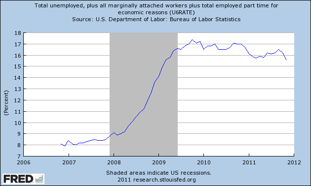
Unemployment still sucks (a technical economic term). The real unemployment rate is about 17% and that picture does not look bright.
Residential housing starts still suck. The market for multi-unit housing has been strong because so many people can not afford or qualify to buy a home despite the fact that there are hundreds of thousands of vacant homes littering the country.

The Euro Zone may implode in 2012 and the political indecision both in the U.S. and Europe have caused many companies to be cautious in their investments and capital spending. The Coincident Economic Activity index sucks but is getting better.

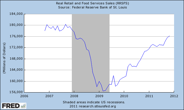
The U.S. consumer is still not back. Below is a graph of real retail sales.
This is going to be a long slog. Keep your head down and move forward. If you have a job and are not upside down on your mortgage and you broke even in the market this year, you should have a Merry Christmas. Give to those who may have lost their merry along the way.
