Feb. 1st, 2015
GDP
The first estimate of 4th quarter GDP growth was 2.6%. This figure is truly a guesstimate and is sometimes heavily revised in the following months. Last October, the first estimate of third quarter GDP growth was 3.5%. As data continued to roll in, that estimate was revised upwards by a whopping 42% to 5.0%.
The year over year growth in inflation-adjusted, or real GDP was 2.5%, more or less following a trend that is four years old.

On a per capita basis, GDP growth is near 2%, the average rate of growth since World War 2.

Let’s get in the wayback machine and look at per capita GDP growth over the past four decades. Reagan and Clinton groupies can leave the room now. The adults are going to talk. The 1970s and first half of the 1980s were a period of high inflation and erratic growth – up 5%, then down 3%.
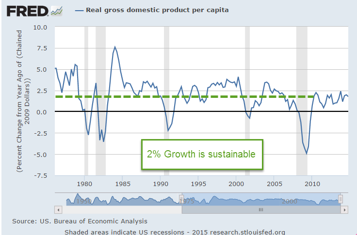
Growth above 3% for any length of time leads to distortions in investment and the labor market which generates a subsequent downward correction lasting several years. Above average growth in the late 1980s was followed by a three year period of below average growth in the early 1990s. The strong growth of the late 1990s was fueled by a boom in dot-com investment and telecom coupled with ever rising house prices. The above 3% growth of those years sparked an inevitable correction lasting three years, bringing us back to the 2% average.
The housing boom of the 2000s generated above average growth followed yet again by a three year correcting downturn. For those families who have struggled to recover from the recession, average growth may be too slow and too small. On the other hand, average growth is less likely to lead to a rebalancing recession.
*************************
Unemployment
Much ado this week when the Labor Dept announced that new claims for unemployment dropped more than 40,000 to 265,000. The week after the Martin Luther holiday is typically volatile each year with little consensus on the reasons. The somewhat erratic weekly numbers are smoothed by using the four week average of new claims. That average has been just below 300,000 since September.
Low numbers for the newly unemployed is good, right?! As with GDP, too much of a good thing for a period of time may be a precursor to an offsetting period of not so good. Such is the law of averages. As a percent of the labor force, new claims are at the same low level as in mid-2000 and late 2006.
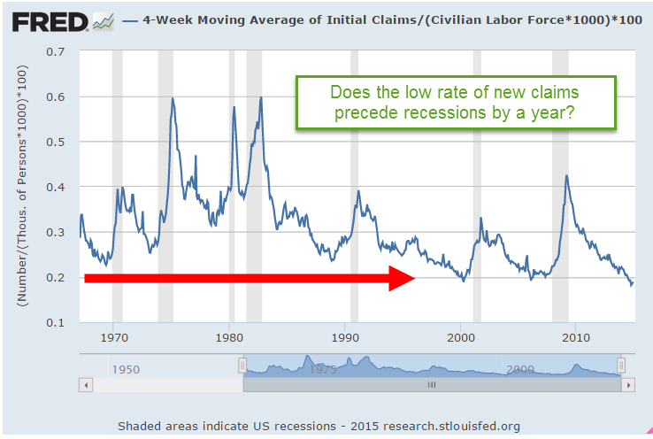
As the demand for labor increases, employers make compromising decisions out of necessity. They hold onto low productivity workers. Workers who are let go can more readily find new jobs. The number of new claims remains low. Re-entrants into the job market help to reduce the pressure for wage increases but eventually wages begin to move upward. Employers may cut margins to pay workers more than their productivity is worth. Real wage growth climbs as the percentage of new unemployment claims remains low.
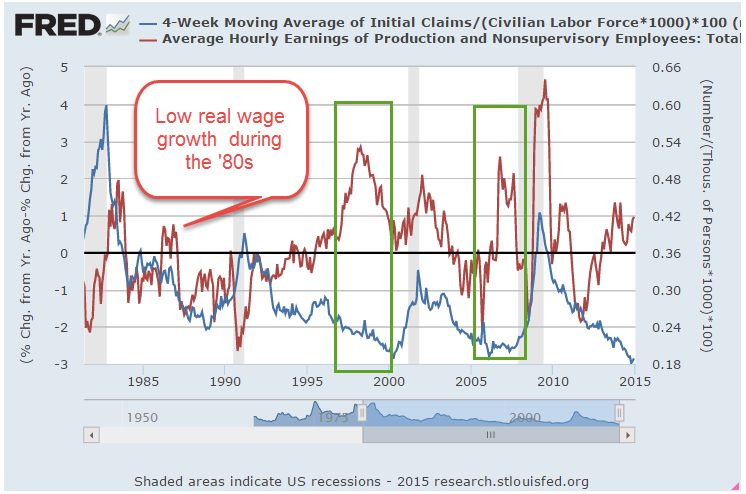
In the graph above I have highlighted two previous periods where new unemployment claims were low as real wage growth climbed. The graph below illustrates the point a bit clearer. It is based on the Employment Cost Index, a relatively new series about ten years old, that tracks the total employment cost, including benefits and required employment taxes and insurance.
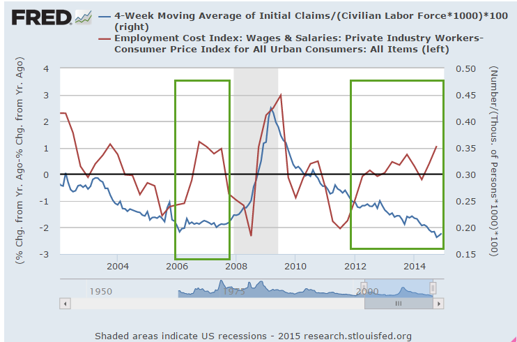
Historical data suggests that a growing divergence between these two factors may play some part in generating an imbalanced economic environment – one that, unfortunately, soon rights itself.
*************************
Market Timing
The link to Doug Short’s blog is on the right side of this page but in case you might miss it, here is Doug’s monthly update of moving averages and the simple allocation model of the Ivy Portfolio. The 10 month simple moving average crossover is similar to the 50/200 day crossover system I have mentioned numerous times: i.e. the Golden Cross and Death Cross. Either system will help a person avoid the worst of a protracted downturn as we saw in the early 2000s and 2008 – 2011, and capture the majority of a long term upswing.
For those of you who have not read it, the Ivy Portfolio is a keep-it-simple allocation and timing model of domestic and foreign stocks, real estate, commodities and bonds using low cost ETFs.
