July 22, 2018
by Steve Stofka
Last week, I showed the inputs to the credit constrained economy as a percent of GDP. I’ll put that up again here.

This week I’ll add in the drains but first let me review one of the inputs, bank loans. Focus your attention on that period just after 9/11, the left gray recession bar, and the end of 2006, just to the left of the red box outlining the Great Recession on the right. For those five years after 9/11, the banks doubled their loans to state and local governments, a surge of $1.4 trillion. The banks increased their household and mortgage lending by $5.3 trillion, or 67%. Why did banks act so foolishly? Former Fed chairman Alan Greenspan couldn’t answer that. We have a partial clue.
For 4-1/2 years after 9/11 and the dot-com bust, there was no growth in credit to businesses, a phenomenon unseen before in the data history since WW2. The banks reached out to households, as well as state and local governments because they needed the $1 trillion in loan business missing on the corporate side (#1 below).
There are four drains in the economic engine – Federal taxes, payments on loans, bad debts and the change in bank capital. State and local government taxes are not a drain because those government entities can not create credit. The change in bank capital reflects the changes in the banks’ loan leverage and their confidence in the economy. During the 1990s and 2010s the sum of the inputs and the drains remained within a tight range of about 1/7th of GDP.

The results of bad policy during the 2000s are shown clearly in the graph. In addition to the surge in bank loans, the Federal government went on a spending spree after 9/11. There was too much input and not enough drain. The reduction in taxes in 2001 and 2003 exacerbated the problem. There was less being drained out. Asset prices absorb policy mistakes until they don’t – a life lesson for all investors.
Let’s add in a second line to the graph – inflation. The rise and fall of inflation approximates the flows of this economic engine model with a lag time of several months. I’ve shown the peaks and troughs in each series.
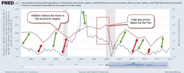
Look at that critical period from 2006 through 2007. The Fed kept raising rates in response to rising inflation (the red line), driven primarily by increases in the price of oil. The Fed Funds rate peaked out at 5-1/4% in the summer of 2006 and stayed at that level for a year. The Fed misread the longer term inflation trend and contributed to the onset of the recession in late 2007. The net flows in the engine model (blue line) indicated that the long term trend of inflation was down, not up.
Where will inflation go next? Using last week’s theme, follow the hounds! Who are the hounds? The banks. The inflow of credit from the banks is the primary driver of inflation. Why has inflation in the past decade been low? Because credit growth has been low. Where will inflation go next? A gentle increase – see the slight incline of the blue line at the right of the graph. Contributing to that increase were last year’s tax cuts. Less money is being drained out of the engine.
Too much flow into the economic engine or an improper setting of interest rates – these mistakes are absorbed by assets, which are the reservoirs of the engine. Stocks, bonds and homes are the most commonly held assets and most likely to be mispriced. During the early to mid 2000s, the mistakes in input were so drastic that the financial crisis seems inevitable when we look in the rear view mirror. During the past eight years, the inputs and drains have remained steady, but interest rates have been set at an inappropriate level. Again, we can anticipate that asset prices have been absorbing the mistakes in policy.
//////////////////////////
1. In the last quarter of 2001, loans to non-financial corporate business totaled $2.9 trillion and had averaged 6%+ growth for the past decade. Anticipating that same growth would have implied a credit balance of $3.9 trillion by the end of 2006. The actual balance was $3.1 trillion.
