Sugar Daddy

June 7, 2015

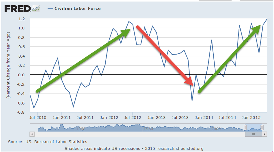
Older readers may remember Bizarro Superman, the mirror image of Superman, who did things backwards, or in reverse.  That’s the world we live in today; good news is bad, and vice versa.  The employment news was doubly good.  Job gains were stronger than expected at 280,000 but more importantly the unemployment rate went up a smidge, and for the right reasons.  As people become more confident in the job market, they re-enter the labor force, actively looking for work.  Discouraged job applicants have fallen 20% in the past twelve months.  The civilian labor force, the sum of employed and the unemployed, has grown.

Is good news good or bad?  If only the news would wear a hat, white or black, so we could tell. In Friday’s trading, investors bet on the timing of the Fed’s first interest rate increase.  September of this year or the beginning of 2016? When will Sugar Daddy, the Fed, take away the punch bowl of easy money?

The core work force, those aged 25 – 54 who drive the economy, continues to show growth greater than 1%.

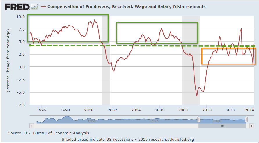
Although hourly wage growth for all private employees has been modest at 2.3% annual growth, weekly earnings for production and non-supervisory employees have risen 30%, or 2.7% per year in the past decade, a period which has included the worst downturn since the 1930s depression.  This more positive outlook on wage growth does not fit well with some political narratives.

The decade from 1995 – 2005 had 36% gains, or 3.1% annual growth, only slightly above the gains of the past decade and yet this period included the go-go years of the dot-com bubble and the housing boom. Inflation was higher in that decade, and in inflation adjusted dollars, the earlier period was only slightly stronger than this past decade.  In short, we are doing suprisingly well considering the negative impacts of the financial crisis.

************************

CWPI

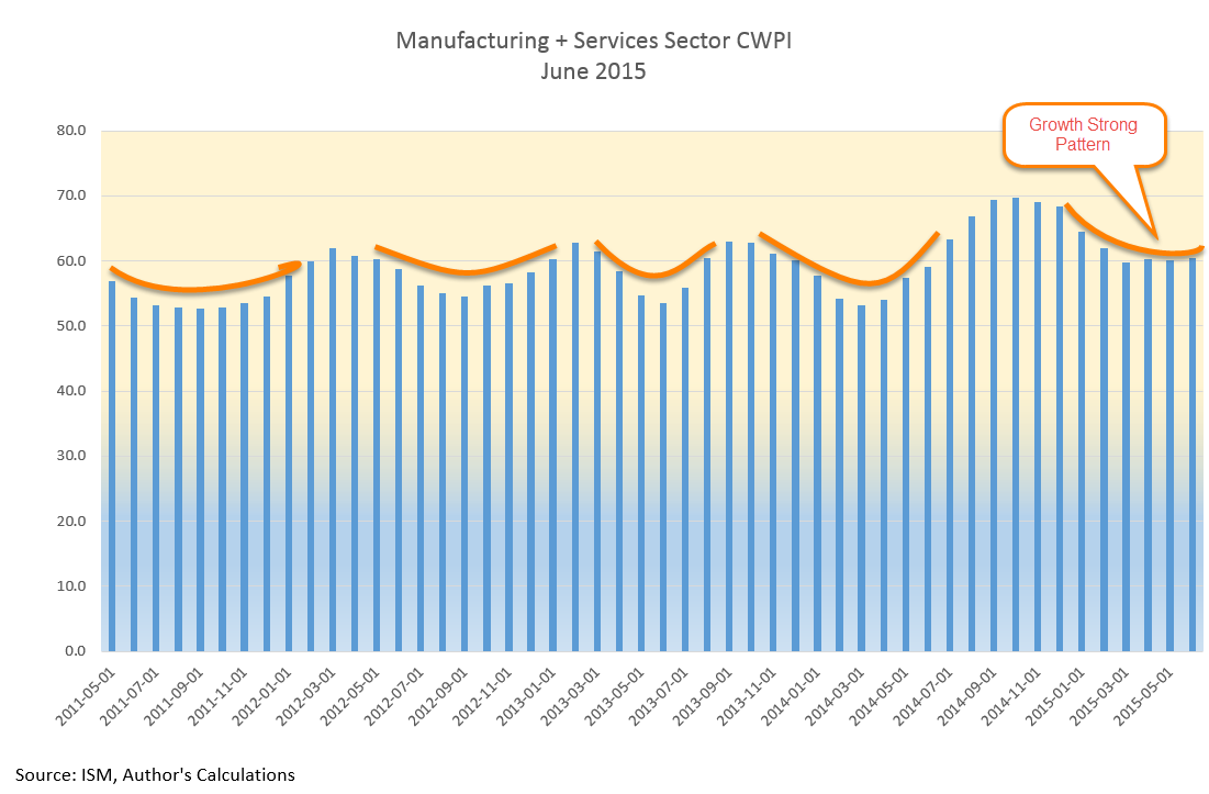
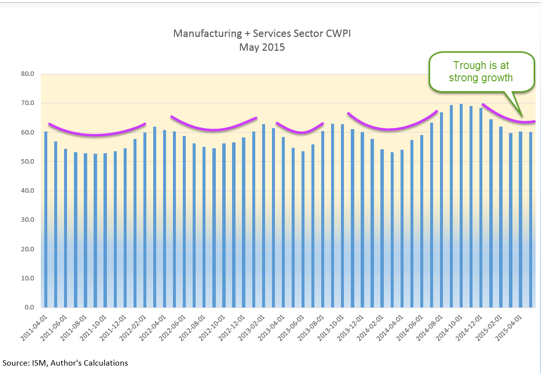
Every month I update the Constant Weighted Purchasing Index, a composite of the Purchasing Manager’s monthly index published by the Institute for Supply Management.  This month’s reading was similar to last month’s, continuing a trough in the strong growth region of this index.

**************************

Heaven On Earth

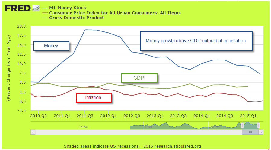
Last week I asked the question: Why can’t a government with a fiat money system simply give everyone a lot of money and create a heaven on earth?  The standard answer is that it would cause inflation.  For several millennia, when a government injects money into an economy, inflation soon follows as the supply of purchasing power increases without a concurrent increase in the supply of goods and services.  In the 18th century philosophers David Hume (On Money) and Adam Smith (Wealth of Nations) noted the phenomenon.  Peter Bernstein’s Power of Gold recounts ancient examples of kings and governments debasing metal monies and the inflation that ensued.

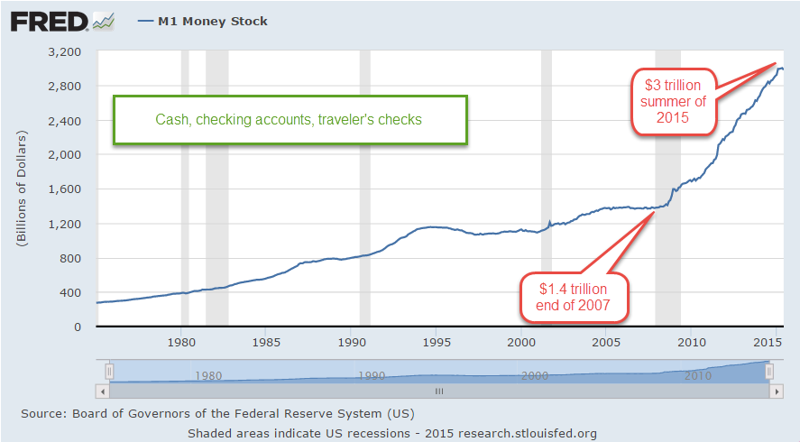
In the seven years since the recession began in late 2007, the government has borrowed and spent $27,000 per person and there has not been the slightest hint of inflation. Why? There are several reasons.  If a government borrows money from the private sector, there is no net injection of money into the system, no printing of money. A Federal Reserve FAQ on printing money is careful to note that “printing money” is the permanent financing of a government’s debt by a central bank.  Whatever people want to call it, when the Federal Reserve buys government debt, new money is injected into the system.  Since 2007, the Fed has injected almost $4 trillion (Balance Sheet), or about $12,000 per person, of new money without an uptick in inflation.  How is this possible?

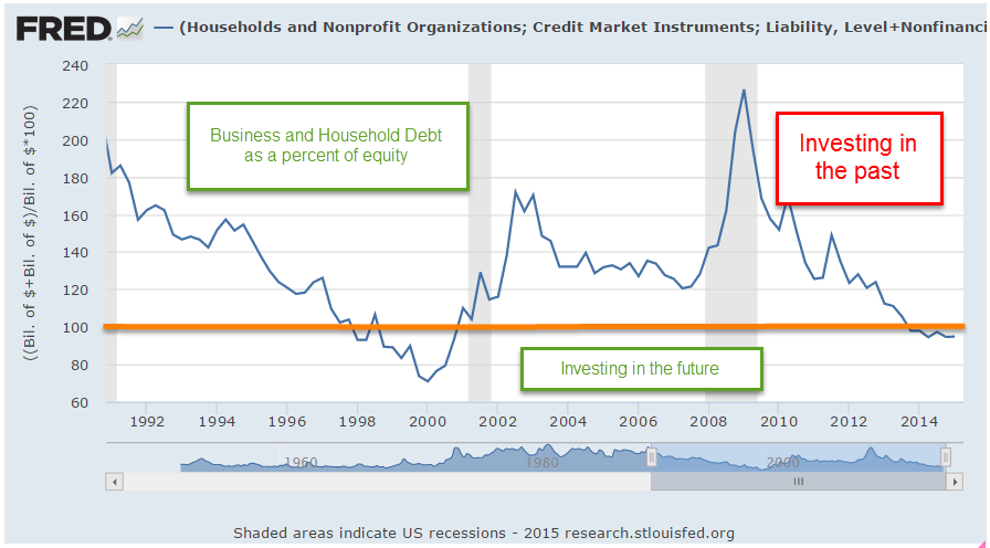
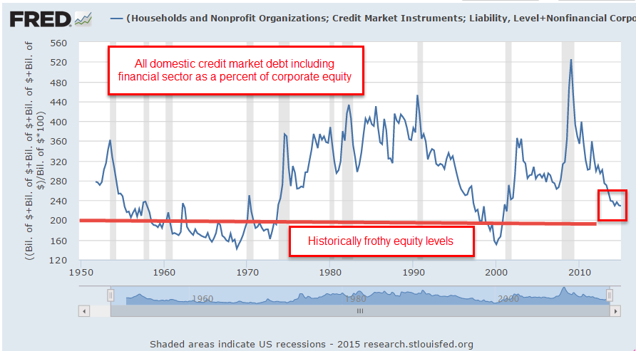
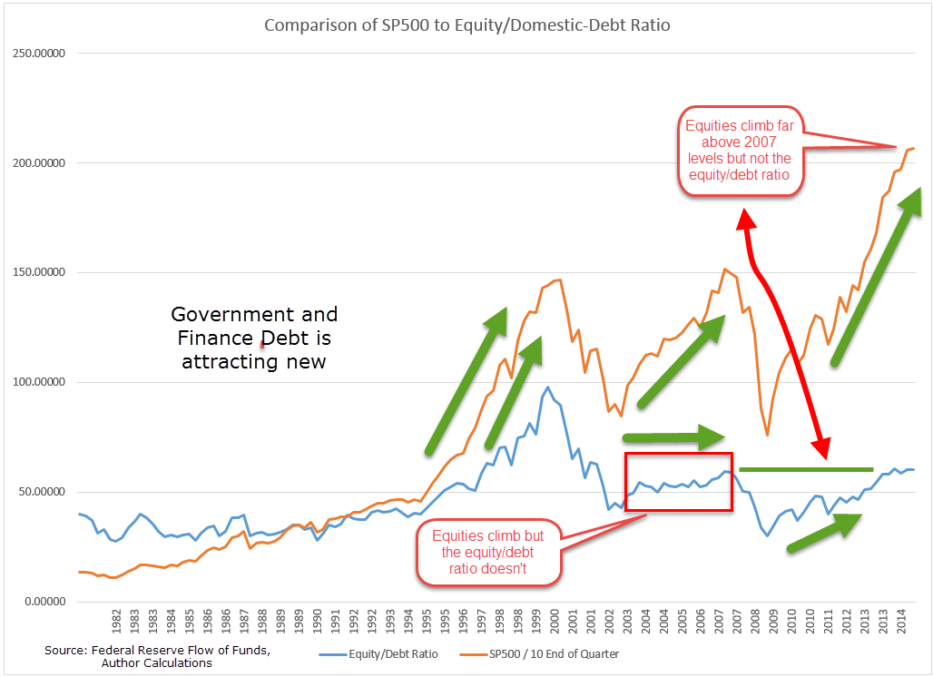
There are two types of spending – today and tomorrow.  Spending for today is consumption.  Spending for tomorrow is investment.  Both types of spending drive demand for goods and services.  The paucity of private investment since 2007 is at levels not seen since the years immediately following World War 2.

Although government investment is a relatively small percentage of GDP, that has also fallen to historically low levels.

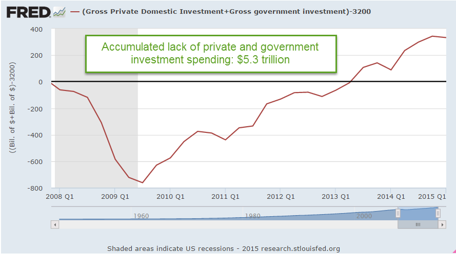
The sum of private and government investment as a percentage of GDP is shockingly low.

If we use 2007 investment levels as a base, the accumulated lack of investment is far more than the $4 trillion that the Fed has pumped into the economy.

The Fed’s injection of money into the system is primarily spent on government consumption, or today spending, which is helping to offset the lack of investment spending.  As investment spending rises, the Fed has been able to stop adding to its portfolio, although this “tomorrow” spending is still so low that the Fed can not begin to lighten its portfolio of government debt.

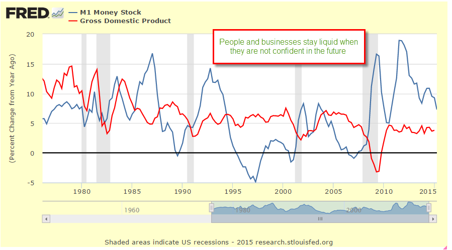
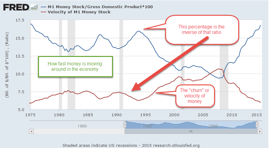
Advocates – economist Paul Krugman for one – of greater government investment spending, even if it borrowed money, hope to offset the lack of private confidence in the future.  Previous government stimulus spending did have little effect on overall economic growth simply because it did little more than offset the lack of long term confidence by those in the private sector.

Heaven On Earth

May 31, 2015

Although the unemployment rate has fallen below 5.5%, the labor participation rate is still rather low and wage growth is slow, prompting renewed calls for government stimulus. A 2010 article laid out the justifications for more government borrowing to spur the economy. Let’s review a few points made by these economists.

“Spending by the federal government always creates new money in the system, while taxation destroys it.”

The nature of money and the government’s relationship to money is certainly beyond the scope of a blog post. In short, money in all its forms is a claim. A central bank (called the Federal Reserve in the U.S.) is a government created institution which regulates and administers the supply of money and credit within a country, and manages the reserves of foreign currencies held within that country.  It acts as the government’s banker and is the lender of last resort both to the public and the government.  If the public will not buy all of the debt issued by the Treasury of a government, the central bank steps in and buys it, a practice known as “printing money” although there is no new money printed.

In a fiat (unbacked by any hard metal or asset) money system, a sovereign government has the power to create and destroy money claims at will.  As the 2010 article notes, all taxation is a destruction of money.  A $100 tax voids a taxpayer’s ability to make a $100 claim for some good or service.   A thief takes money with no promises.  A government takes money with some implied promise or threat but no exchange of value at the time of the taking.  Taxation is not an exchange, but a taking, a destroying, like letting a little bit of air out of a balloon.  As long as the government pumps in the same amount of air that it took out, the size of the balloon changes only in proportion to the change in population.

In 1960, two economists, Gurley and Shaw, coined the terms Inside Money and Outside Money to capture this unique license of government (Federal Reserve paper on this subject). Treasury bills and forms of government debt are claims on government, and termed outside money, as in outside the private marketplace. Money exchanges between people and companies in the private sector are termed inside money. Each dollar of inside money represents a debt by someone else within the private sector.  When government spends more than it taxes, it borrows and pumps outside money into the private sector balloon. Many of us might think inflation is the net change in the size of the balloon but it might be more helpful to imagine that the size of the balloon, or volume, is the size of the population and grows slowly and constantly, about 1% in the U.S.  Inflation, then, is a measure of the pressure inside the balloon. (Boyles’ Law  and other fun facts with gases)

Various economists in this article asserted that the government should pump more outside air into the balloon, which will cause the economy, the molecules inside the balloon, to speed up.  Is there any limit to the amount of outside money that a government can pump into the balloon?

“[A] government cannot become insolvent with respect to obligations in its own currency.”

If a government can make up money out of thin air, why not just give $100K to each of the 300 million citizens in the U.S.?  People who couldn’t afford a newer car could buy one, which would boost the sales of car manufacturers. New homes, new appliances, vacation trips – a shot in the arm for so many industries. Unemployment would practically vanish. Imported goods into the U.S. would soar, helping the workers and businesses in other countries.  People could pay off their credit card and student loan debts but banks might suffer because not as many people would want loans.  Stock prices would soar in value as families searched for a place to invest some of their windfall.  People who had already owned stocks and other assets before the boon would see their net worth increase exponentially.  Housing prices would climb as more people could afford to buy a house.

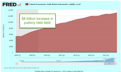
What about inflation?  Well, the government has already pumped in $8 trillion since the recession started in late 2007.

$8 trillion divided by a 300 million population is almost $27,000 per person.  Contrary to predictions of runaway inflation, it has been moderate or below the 2% target rate.  In fact, if we use the method of calculating inflation used in the Eurozone, we have had deflation in the first quarter of this year.   So any inflationary effect from a one time $100K boon would be less than disastrous.  Even if inflation climbed to a 1990s level, about 4 – 5%, what is the harm?

Most of us instinctively look at this scheme, furrow our brow, and get suspicious.  But why?  Why can’t a government with a fiat money system simply create heaven on earth?

Stay tuned till next week….

Procession, Not Recession

May 24, 2015

Existing home sales of just over 5 million (annualized) in April were a bit disappointing.   Since the recession, there have been only about six months that sales have been above a healthy benchmark of 5.2 million set in the late 1990s to early 2000s.

***********************

Procession, not Recession Indicator

When reporting first quarter results, many of the big multi-national companies in the Dow Jones noted that sales had declined in Europe.  The broader stock market, the SP500, has not had a 5% decline for three years and is due for a correction.  Greece is likely to default on their Euro loans in June.  Combine all of these together and some pundits predict a 30 – 40% market correction this summer and/or a recession this year.  Corrections can be overdue for a long time.  Some treat the stock market as though its patterns were almost as predictable as a pregnancy.  Here’s an early 2014 warning that finds a chilling similarity between the bull market of today and, yes, the one before the 1929 crash.

Bull and bear markets tend to confound the best chart watchers.  The bear market of 2000 – 2003 was not like that of 2007 -2009.  Some argue that market valuations are like a rubber band.  The longer prices become stretched, the harder the snapback.  However, the data doesn’t show any consistent conclusion.

The 2003 – 2007 bull market ran for 4-1/2 years without a 5% correction.  That one didn’t end well, as we all know.   The mid-1990s had a three year stampede from the summer of 1994 to the summer of 1997 before falling more than 5%.  After a brief stumble, the market continued upwards for a few more years.  Turn the dial on the wayback machine to the early 1960s for the previous stampede, from the summer of 1962 to the spring of 1965.  That one ended much like the 1990s, dropping back before pushing higher for a few more years. These long runs occur infrequently so there is not much data to go on but the lack of data has never stopped human beings from predicting the end of the world.

April’s Leading Economic Indicator was up .7%, above expectations, but this increase was helped along by an upsurge in building permits.  This series has been unreliable in predicting recessions and its methodology has been revised a number of  times to better its accuracy.  Doug Short does a good job of tracking the history of this composite and here is his update of April’s reading.

A much more consistent indicator of coming recessions is the difference in the interest rates of two Treasury bonds.  The time to start thinking about recessions is when the 10 year interest rate minus the two year rate drops below zero.  The current reading simply doesn’t support concerns about recession in the mid-term.

The Federal Reserve has made it easy for us to track this flattening of the yield curve.  They even do the subtraction for us.  The series is called T10Y2Y, as in “Treasury 10 year 2 year.”

Social Security Age Cohorts

May 17, 2015

Life expectancy (LE) is often measured at birth (CDC).  The great increases in LE during the 20th century can be largely attributed to rapidly declining childhood mortality rates.  Advancements in medical practice have certainly played an important role but clean drinking water and modern sanitation disposal and treatment have had the most effect. Improvements in life expectancy at age 65 have been much less dramatic.

Last week’s Calculated Risk blog presented LE with more clarity – by graphing age cohorts, a group of people born in a particular year or range of years.  If 100 people were born in 1950 – an age cohort – how many of that cohort were alive in 2000?  The chart convincingly illuminates several problems with Social Security funding and payouts in the future.

One of the cohorts shown in the first graph (blue line) are those born in the years 1900 – 1902.  This age group was in their mid–thirties when Social Security was enacted.  Many funded the Social Security system through their working years but only 40% reached the age of 65 to become eligible for Social Security.  Just over 70% of the early Boomer cohort (gold line) born in 1950 is still alive this year, their 65th birthday.  More than 85% of the people born in 2010 are expected to reach 65.

When the Social Security act was written, what if the language of the act reflected life expectancies at that time?  Instead of setting a specific retirement age, it could have specified that every five years, for example, Congress would revise the retirement age based on the half life of an age cohort, that age when half of a generation is alive and half is dead.

For the 1900-1902 cohort, the retirement age would have been 59.  For early Boomers, those who just turned 65, retirement would still be almost a decade away, at 74.  The 2010 generation could expect to retire at around age 83.

As important as the age of eligibility is the number of years that retirees collect Social Security.  What is the half life of an age cohort once they have reached 65?  If 50 out of 100 of a cohort are alive at age 65, how many years before only 25 are alive?  I’ll call this the age-65 half life. I marked up the chart at Calculated Risk to show the current and projected increases in age for these retirees who will be funded by Social Security.

Although life expectancy at birth has increased dramatically, the half life of people who manage to reach the age of 65 shows much slower increases.  The difference between the age-65 half lives of the 1900 and 1950 cohorts is projected to grow only slightly, from 12 to 14 years. That’s just a two year increase for two generations born 50 years apart.  The growth of that half life is projected to quicken for the 2010 generation but we should be suspicious of estimates eighty years in the future.

Of the 76 million boomers born, 65 million were still alive in 2012 (Source) Even though the age-65 half life of people had changed by only two years, that is a lot of people eligible for Social Security payments.   Politicians find it difficult to discuss changes in this program, the “third rail” of politics. People who have paid taxes into the program during a lifetime of work feel that they have earned the payments they receive in retirement.  Any changes have to be done incrementally, like raising the temperature of a pot of water so that the frog doesn’t jump out.  Voters will probably punish lawmakers who suggest wholesale changes.  Former Senator Rick Santorum discovered that brutal truth when he endorsed former President Bush’s proposal to privatize Social Security.  Bush was a lame duck President with little to lose but quickly withdrew the idea in response to the angry response to the idea.  Santorum lost his seat.

Congress might initiate some rules based approach like the half life criteria to setting the retirement age for future decades. This would help avoid political repercussions for any changes to Social Security.  If Congress set the retirement age criteria at 60% instead of 50% (half life), the retirement age would be 69 for this generation, just two years more than current law for the late Boomers.

Spring is springing

May 10, 2015

CWPI

The dollar’s appreciation against the euro and other currencies in the first quarter of this year caused a natural slowdown in exports, which has hurt manufacturing businesses in this country.  U.S. products are simply more expensive to customers in other countries because dollars are more expensive in other currencies. The PMI manufacturing survey showed a decline in employment for the month.  The non-manufacturing sector, which is most of the economy, rallied in April.  As I noted last month, the CWPI should have bottomed out in March-April, reaching the trough in a wave-like series that has been characteristic of this composite index during the past six years of recovery.  Any change to this pattern – a continuing decline rather than just a trough – would be cause for concern.

April’s resurgence in the non-manufacturing sector more than offset the weakness in manufacturing. In fact, there was a slight gain in the CWPI from March’s reading.

Employment and new orders in the non-manufacturing sector are two key components of the composite index and leading indicators of movement in the index.  They have been on the rise since the beginning of the year.  While the decline in the overall index lasted 5 – 6 months, this leading indicator declined for only 3 months, signalling a probable rebound in the spring. Now we get some confirmation of the rebound.

*************************

Employment

Released at the end of the week a few days after the PMI surveys, the monthly employment report from the BLS confirmed a renewal in job growth after rather poor job gains in March.  April’s estimated job gains were over 200K, spurring a relief rally in the stock market on Friday.  Gains were strong enough to signal that the economy was on a growth track but not so strong that the Fed would be in any rush to raise interest rates before September.

March’s job gains were revised even lower to below 100K, but the story was that the severe winter weather was responsible for most of that dip.  As the chart below shows, there was no dip in year over year growth because the winter of 2014 was bad as well.  Growth has been above 2% since September of last year.

During the 2000s, the economy generated plus 2% employment growth for a short three month stretch in early 2006, just before the peak of the housing boom.  The past eight months of plus 2% growth hearkens back to the strong growth of the good ole ’90s.  Like the 90s, Fed chair Janet Yellen warned this week that asset prices are high, recalling former Fed chair Alan Greenspan’s 1996 comment about “irrational exuberance.” Prices rose for another four years in the late 90s after Greenspan’s warning so clairvoyance and timing are not to be assumed simply because the chair of the Federal Reserve expresses an opinion.  However, history is a teacher of sorts.  When Greenspan made that comment in December 1996, the SP500 was just under 600.  Six years later, in late 2002, after the bursting of the dot-com bubble, a mild recession, the horror of 9-11 and the lead up to the Iraq war, the SP500 almost touched those 1996 levels.  An investor who had pulled all their money out of the stock market in early 1997 and put it in a bond index fund would have earned a handsome return.  Of course, our clairvoyance and timing are perfect when we look backward in time.

For 18 months, growth in the core work force, those aged 25 – 54, has been positive.  This age group is critical to the structural health of an economy because they spend a larger percentage of their employment income than older people do.

Construction employment could be better.  Another 400,000 jobs would bring employment in this sector to the recession levels of the early 2000s before the housing sector got overheated.

In the graph below, we can see that construction jobs as a percent of the total work force are at historically low levels.

Every year more workers drop out of the labor force due to retirement, or other reasons.  The population grows by about 3 million; 2 million drop out of the labor force.

The civilian labor force (CLF) consists of those who are employed or unemployed (and actively looking for work).  The particpation rate is that labor force divided by the number of people who can legally work, those who are 16 and over who are not in some institution that prevents them from working.  (BLS FAQ)  That participation rate remains historically low, dropping from 65% five years ago to under 63% for the past year.

That lowered rate partially reflects an aging population, and fewer women in the work force relative to the surge of women entering the work force during the boomer “swell.”  A simpler way of looking at things shows relatively stable numbers for the past five years:  those who can work but don’t, as a percentage of those who are working.  The population changes much more than the number of employed, and the percentage of those who are not working is rock steady at about 66%.  This percentage is important for money flows, the vitality of economic growth and policy decisions.  Those who are not working must get an income flow from their own resources or the resources of those who are working, or a combination of the two.

The late 90s was more than just a dot-com boom.  It was a working boom where the number of people not working was at historically low levels compared to the number of people working.  The end of the dot-com era and the decline in manufacturing jobs that began in the early 2000s, when China was admitted to the WTO, marked the end of this unusual period in U.S. history.  Former Secretary of Labor Robert Reich (Clinton administration) sometimes uses this unusual period as a benchmark to measure today’s environment.

Not only was this non-working/working ratio low, but GDP growth was rather high in the 1990s, in the range of 3 – 5%.

Let’s look at GDP growth from a slightly different perspective.  Real GDP is the country’s output adjusted for inflation.  Real GDP per capita is real GDP divided by the total population in the country.  Real GDP per employee is output per person working.  As GDP falls during a recession, so too do the number of employees, evening out the data in this series.  A 65 year chart reveals some long term growth trends.  In the chart below, I have identified those periods called secular bear markets when the stock market declines significantly from a previous period of growth.  I have used Doug Short’s graph  to identify these broader market trends.  Ideally, one would like to accumulate savings during secular bear markets when asset prices are falling and tap those savings toward the end of a secular bull market, when asset prices are at their height.

In the chart above note the periods (circled in green) of slower growth during the 1968-82 secular bear market and the last few years of the 2000-2009 secular bear market.  After a brief upsurge at the end of this past recession, we have continued the trend of slower economic growth that started in 2004.  A rising tide raises all boats and the tide in this case is the easy monetary policy of the Federal Reserve which buoys stock prices.  In the long run, however, stock prices rise and fall with the expectations of future profits.  Contrary to previous bull markets, this market is not supported by structural growth in the economy, and that lack of support increases the probability of a secular bear market in the next several years, just at the time when the boomer generation will be selling stocks to generate income in their retirement.

Earthquakes in some regions of the world are inevitable.  In the aftermath of the tragedy in Nepal, we were reminded that risky building practices and regulatory corruption can go on for decades.  There is no doubt that there will be  horrific damage and loss of life when the inevitable happens yet the risky practices continue.  The fault lines in our economy are slower per employee GDP growth and a greater burden on those employees to pay for programs for those who are not working. The worth of each program, who has paid what and who deserves what is immaterial to this particular discussion.  Growth and income flow do matter. Asset prices are rising on shaky growth foundations that will crack when the fault lines slip.  Well, maybe the inevitable won’t happen.

A Lack of Giddyup

May 3, 2015

The first estimate of GDP growth in the January to March quarter was almost flat.  Not a big surprise given the severe winter in the eastern part of the U.S. but an annual rate of just .2% growth was lower than most estimates.  It would be a mistake to attribute all of the slow down to the weather.  Lower gas prices have delayed new drilling projects and idled more costly operations.  Some economists have not fully appreciated the positive influence that shale oil drilling has had on a tepid economic recovery.

Growth has not only slowed. It has shifted lower.  The Shiller P/E ratio, or CAPE, uses a 10 year period as a base.  A common measure of inflation expectations is the 10 year Treasury bond.  Let’s look at the change in real per capita GDP over rolling ten year periods starting in 1970.  Below I’ve graphed the logarithm, or log, of current GDP using the GDP 10 years ago as a base.  We can see a fairly consistent trend over forty years until 2008.

Some economists build models – partial derivatives – in which quantity of output fluctuates as a function of price, or F(p).  The thinking goes that price changes are part of a self-reinforcing mechanism. The problem is that price is a reaction to events, not a cause of them.  Prices distribute the effects of changes in supply, demand, and expectations in an economy or market.

The Fed believes that the economy has too much inventory – of savings, of caution.  Just as any store merchant would do, the Fed has lowered the price of savings, the interest rate, in the hopes that  customers will come in and borrow some of that savings.  Blue light special in Housing, Aisle 3!  The sale has been going on for almost seven years but demand in some sectors, particularly housing, is still very low.   The total of outstanding mortgage debt remains subdued no matter how much the price, or interest rate, is lowered.

Last week I showed a chart of new home sales per 1000 people.  I’ll overlay the thirty year mortgage rate over it.

Higher mortgage rates reduce the demand for new homes.  The exceptionally low rates of the past few years should accelerate the demand for new homes.  Let’s do a quick and dirty adjustment by multiplying new home sales by 1 + the interest rate.  This will have a greater effect on sales when interest rates are higher, helping offset the lowered demand.  The actual amounts are not relevant- it’s the comparison.  This chart shows the exceptionally low demand of the past several years.

The total of loans and leases has been growing about 2% annually on average since the end of 2008, from $7.2 trillion to $8.1 trillion, a total of a little over 12% during the period.  To put that in perspective, that total grew by 75% in the previous 6 year period 2003 through 2008, rocketing up from $4.1 trillion to $7.2 trillion.  Since 1995, our economy has shifted and has been running on borrowed money more than in past decades.  These loan totals don’t include the huge, no strike that, call it prodigious, government borrowing that has propped up GDP growth in the past dozen years.

The Fed finished its April meeting this week and decided to keep the fire sale going. “The Committee currently anticipates that, even after employment and inflation are near mandate-consistent levels, economic conditions may, for some time, warrant keeping the target federal funds rate below levels the Committee views as normal in the longer run.” Fed statement 

Even if conditions do meet labor market and inflation targets, the Fed wants to make sure they can stay stable at those targets for a few months before taking action on interest rates.  The sale has been going on for so long now that the anxiety over the end of the sale has acted as a counter balancing force to the sale price.  Models of thinking as well as patterns of behavior are habit forming. One of the greatest scientists of all time, Isaac Newton, continued to believe in the principles of alchemy until he died.  Like other central banks, the Fed believes in the alchemy of interest rates, the price of money – that they can turn a leaden economy into gold.

New Home Sales Sink

April 26, 2015

Housing

A few months ago sales of new homes per 1000 people climbed above the low water mark set during the back to back recessions of the early 1980s.  In a more normal environment, new home sales would be closer to 800,000, not 500,000.

This past week came the news that new home sales fell more than 11% in March.  The good news is that they were up more than 10% over this month last year.  The supply of new homes is still fairly thin, less than half a year of sales, so builders are unlikely to slow the pace of construction.  As new home sales were climbing this winter, sales of existing homes – 90% of all home sales – languished.  The process flipped in March as existing home sales surged, up 10% year over year.

************************

Long Term or Short Term

Somewhere I read that all investment or savings is a loan.  Loans are short or long term, principle assured or not.  When we deposit money in a checking or savings account, we are loaning the bank money, principle assured.  When we buy shares in an SP500 index mutual fund, we are loaning our hard earned money to “Mr. Market,” as it is sometimes called.  Principle not assured. We hope we get paid back with a decent rate of interest when we need to cash in our loan.  Most of us probably think that this type of investing is long term but, in this model, most stock and bond investments by individual investors are liquid, which is by definition short term.  Every month that a person leaves their money in a stock or bond fund, it is a decision to roll over the loan.  The value of our asset loan depends on the willingness of others to roll over their loans to that same asset market.  Occasionally many lenders to the stock and bond markets shift their concern from return on principal to return of principal and call in their loans.  When phrased this way, we come to understand the inherent fragility of our portfolios.

Because pension and sovereign wealth funds may carry a sizeable position in a market, the entirety of their position is not liquid.  Substantial changes in position will probably affect the price of the asset.  Even in a large position, however, there is a certain amount of liquidity because the fund can sell so many thousand shares of an asset without a material change in the price.  A family’s decision to leave their 401K money in a stock fund in any month, to roll over the loan, joins them at the hip with a sovereign wealth fund in Dubai or CALPERS, the California state employee pension fund.  They are all participants in the short term asset loan market.

In March 2000, at the height of the dot-com boom fifteen years ago, many investors were still loaning money to the NASDAQ market (QQQ).  This past month investors who had bought and held QQQ finally broke even on the nominal value of their loans.   The relatively small dividend payments over the years hardly compensated for the 27% loss of purchasing power during those fifteen years.  

***********************

Taxes

Every facet of our culture seems to get a calendar month, so I guess April is tax month.  In that spirit, let’s look at some historical trends in income taxes.  In 2001, the Congressional Budget Office did an assessment of changes in Federal tax rates by income quintile for the years 1979 – 1997.   These are effective, not marginal, rates.  If someone makes $100K gross and pays $15K in Federal income tax, then their effective rate is 15%.

Effective corporate income tax rates went down for all quintiles while Social Security and Medicare taxes went up for those at all income levels.  The top 20% of incomes saw little change in their effective rates during this 19 year period, while everyone else enjoyed lower rates.  The reason why the top 20% saw little reduction was that their income grew faster than the incomes of those in the other quintiles.

The negative income tax rate for the lowest quintile was due to the adoption of the Earned Income Tax Credit and the increasing generosity of the credit given to low income families. (In 1979, a worker with three children received $1400 in 2012 dollars.  In 2012, they received $5,891, a 400% increase)

*********************

International Currencies

This graphic from the global financial nexus Swift com shows just how much the US dollar and the Euro dominate international trade.  For those of you interested in international currency wars, you might like this Bloomberg article.

Bank analyst Dick Bove thinks that it is unlikely that the Fed will raise interest rates this year.  The U.S. dollar has gained so much strength that a raise in interest rates has too many dangerous implications for other economies and would destabilize global trade.

A well written, informative and entertaining read is James Rickards’ Currency Wars (Amazon).  The author, a former CIA agent, weaves a coherent and interesting narrative that connects a lot of information and events of the past one hundred years.

Avoidable Taxes

April 19, 2015

Taxes

Some call them loopholes, tax breaks, or giveaways but the official name for them are tax expenditures.  In August of last year, the Joint (House and Senate) Committee on Taxation detailed  the many gimmes in the tax code.  The Pew Research Center graphed out the largest expenditures including the big banana, tax free employer paid health insurance premiums. (They forgot to include the $38 billion in Sec. 125 cafeteria plans.) That program started during World War 2 when wage increases were frozen by law.  That war ended 70 years ago but the “temporary” tax break goes on and on.

The list of giveaways runs for 12 pages. Those with incomes above $100,000 get 80% of the mortgage interest deduction (page 37), 90% of real estate tax write-offs (page 38),  60% of the child care credits (page 39), and claim 86% of the charitable contributions (page 38).  Reduced rates on dividends and capital gains cost almost $100 billion in 2014.

28 million low income families qualify for the earned income tax credit but the $68 billion cost for that is less than half the cost of tax free health insurance premiums.  Almost 37 million families claim a child tax credit for $57 billion dollars (page 41).

Seniors get $60 billion of gimmes in tax free Medicare benefits (page 32).  In 2015, tax breaks for all types of medical spending will total almost 1/4 trillion dollars in foregone tax revenue.   As spring arrives, let’s lobby for tax deductions for gardening expenses.  Gardening is therapeutic, a genuine medical expense.

*************************

CWPI

As expected, the composite Purchasing Managers Index (PMI) in the manufacturing and service sectors declined further but remains strong. We may see a slight decline for one more month before the cycle upwards starts again.

New orders and employment in the service sectors is strong and growing, offsetting some weakness in the manufacturing sector.

March’s retail sales gain of almost 1% was a bit heartening after the winter slump.  Excluding auto sales, year over year gains have dropped sharply since November and the trend continued in March as the yearly gain was only 1/4%.

************************

Labor Market Conditions Index

The Federal Reserve takes about a week after the release of the monthly labor report to compile their Labor Market Conditions Index (LMCI), a comprehensive snapshot of the many facets of the labor market.  For the first time in three years, the index turned negative in March.  It barely crossed below 0 but is sure to give some pause, a watch and wait when the FOMC meets at the end of this month.  While some of the FOMC members have been making a more aggressive case for raising interest rates, chair Janet Yellen is sure to point out that the economy is below target in both employment and inflation.

************************

Mortgage Banking

In an April 8th article, the Wall St. Journal reported that loans backed by bank deposits fell from 44% in 1980 to 20% in 2008.  Since 2012, the big banks have fled the mortgage business and now account for only a third of new federally guaranteed mortgages.  Small finance companies, which avoid much of the oversight and regulation in Dodd-Frank, now account for more than half of new mortgages.

************************

Gobs of Jobs

April 12, 2015

Last week I wrote about the recent flow of investment dollars to markets outside the U.S.  This week emerging markets (EEM, VWO, for example) shot up another 4%.  For the first time since last October, the 30 day average in these two index ETFs just broke above the 100 day average.

******************************

Job Openings (JOLTS)

February’s JOLTS report from the BLS, released this past Tuesday, showed that the number of job openings is nearing the heights of the dot com bubble in 2000.

Last week we saw that new claims for unemployment as a percent of people working were at historically low levels.  I’ll show the graph again so I can lay the groundwork for an explanation of why bad things can happen when things get too good.

Here are job openings as a percent of those working. I’ll call it JOE. In 2007, JOE approached 3.5%.  In 2000 and these past few months, it exceeded that.  As openings fall below a previous low point, recessions follow as the economy “corrects course.”  I have noted these transition points on the chart below.  September’s low of 3.3% marks the current low barrier.  Any decline below that level would be cause for worry.

Let’s look at it from another angle.  Below are job openings as a percent of the unemployed who are actively looking for a job.  This metric would give us a rough idea of the skills and pay mismatch.  This looks a bit more tempered. We are not at the high level of 2007 and not even close to the nosebleed level of 2000.

As openings grow, one would expect that some who have been out of the labor force would come back in but that doesn’t seem to be the case this time.  The participation rate remains low.  The reasons for this trend are partly demographic – aging boomers, small GenX population, end of the female labor “wave” into the labor force during the past few decades – but we should expect to see some uptick in the participation rate, some positive upward response to economic growth.

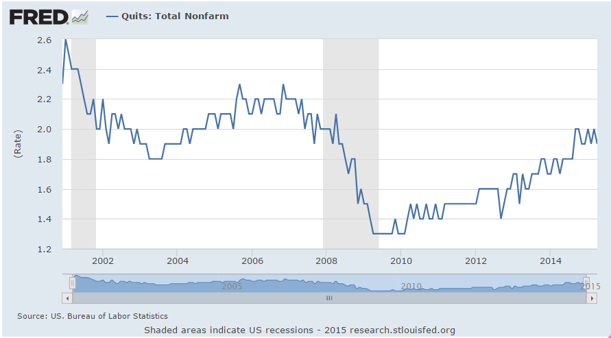
As jobs become harder to fill or applicants want more money to fill those jobs, employers may decide to cut back expansion plans rather than hire people who are are either too costly to train or who might not meet the company’s work standards. Employees who previously tolerated certain conditions or a level of pay at their job now act on their dissatisfaction.  They may leave the job or ask for more money or a change in conditions.  Little by little investment spending ebbs, then declines a bit more, reaches a threshold which triggers layoffs, and another business cycle falls from its peak.

**********************

Bank of Japan

Recently the NY Post reported  that the Bank of Japan (BOJ) was buying equities and the author implied that BOJ was pumping up the stock market. The central bank in the U.S. buys only government bonds, not equities.   Warnings of doomsday are popular in financial reporting because people pay attention. The truth just doesn’t get much attention because it is not exciting. I want to help the reader understand how misleading these kind of cross country comparisons can be.

Here is a comparison of the holdings of the U.S., Japanese and European central banks.  Look closely at the holdings of insurance and pension funds in the U.S. and Japan.  Notice that U.S. pension funds (which are government funds or private funds guaranteed and regulated by the U.S. government) have 9% equity holdings while Japan’s insurance and pension funds have only 2%.   Combining the holdings of the central bank and insurance and pension funds, we find that Japan has 4% in stock assets while the U.S. has 9% of its assets in stocks.  Contrary to this reporter’s implications, it is the U.S. government that is pumping up the stock market far more than the Bank of Japan.

The author quotes a Wall St. Journal article from March 11, 2015: “The Bank of Japan’s aggressive purchasing of stock funds” but only seven months ago, on August 12, 2014, that same newspaper reported: “As Tokyo shares fall back from their recent highs, the Bank of Japan has been significantly stepping up its purchases of domestic exchange traded funds.” [my emphasis]
Note the difference in wording.  The earlier article notes that BOJ is buying domestic equities, particularly ETFs, which are baskets of stocks.  The later article leaves out these important distinctions, leading a reader to believe that BOJ policy might be pumping up the U.S. equity market or any market, for that matter. The data does not support that contention.

What U.S. investors should be concerned about (I mentioned this in last week’s blog) is that federally guaranteed pension plans and government pension plans are finding it difficult in this low interest rate environment to meet their projected benchmark returns of 7% to 8%.  A more realistic goal is 5% to 6% for a large fund with a balanced risk profile.  Pension plans are having to take on more risk at a time when boomers are retiring and wanting the money promised in those pension plans.  These investment pools can not afford to wait five years for asset values to recover from a severe downturn, making them more likely to adjust their equity or bond positions as quickly as they can in the case of a crisis of confidence in these markets.  Be aware of the underlying environment we are living in.

Easter Egg

April 5, 2015

On this Easter Sunday, Christians celebrate the Resurrection of Jesus, Jews observe Passover, basketball fans await the final contest of the Final Four and baseball fans look forward to the start of the new season.  After Friday’s disappointing report of job gains in March, investors might be wondering what will happen Monday when markets in the U.S. reopen following Good Friday.  In overseas markets, yields on the 10 year Treasury bond fell on the employment news.  Job gains that were about half of expectations helped allay fears of a June rate increase.  We may see a positive response from both the bond and equity markets on Monday as the time table for rate increases might start in September.  On the other hand, the weekend might allow more rational judgment to prevail. One month’s disappointment does not a trend make.  Year over year gains in employment are especially strong.

April is usually a good month in the stock   market.  Since breaking the 2000 mark in August, the index has neither gained or lost much ground.  Gains in the technology companies that are included in the SP500 (Apple, for example) have been offset by losses in the oil sector of the SP500 (Exxon, Chevron, for example).  Long term Treasuries (TLT) have risen 10% in the past six months, despite the prospect of rising interest rates in 2015.

ICI reports that domestic long term equity mutual funds had an outflow of about $8 billion in March. Investors have not abandoned equity funds by any means but have changed focus. During this past month, $14 billion flowed into world equity funds.   Bond funds continue to post strong inflows – $10 billion in March.

The boomer generation amassed a lot of pension promises through their working years.  Pension funds must balance both equity and bond risk in their investment portfolios  and yet try to meet their assumed growth rates of 7% – 8%.  Caught on the horns of this dilemma, pension funds straddle both the equity and bond markets.  During the past ten years, many have become underfunded because they have not been able to match their projected growth rates.   This delicate balance of risk and reward sets the stage for a catastrophic decline in response to even a relatively small monetary shock because pension funds can not afford to wait out another three or four year decline.  Too many boomers will start cashing in those promises accumulated during the past decades.

The relatively low number of new jobs created in March was probably due to the severe winter in the eastern part of the country.  The BLS revised downward their previous estimates of employment gains in January and February.  Even with the downward revisions and this past month’s relatively anemic 126,000 gains, the average for the quarter is still about 200,000 per month, a particularly strong figure when one considers the impact that plummeting oil prices have had. In the first 3 months of this year, companies in oil and gas exploration have shed 3/4 of the jobs added during all of last year.  The strong dollar makes U.S. exports more expensive and hurts manufacturing.  The employment diffusion index in manufacturing industries dropped below 50, a sign that there is some contraction in the 83 industries included in this index.  However, March’s Manufacturing Purchasing Managers Index showed some slight expansion still and employment in manufacturing is still strong.  Across all private industries, the diffusion index remains strong at 61.4.

Fed chair Janet Yellen has repeatedly said that interest rate decisions will be based on data.  If the data of subsequent months show a resumption of strong growth, an interest rate increase at the FOMC meeting in late July could still be in the cards.  The CWPI composite built on the PMI anticipated a declining trend in growth this winter and spring before resuming an upward climb.  When the non-manufacturing  PMI is released this coming Monday, I’ll update that and show the results in next week’s blog.  Based on the numbers already released, I do anticipate a further decline in March then an evening out in April.  The particularly strong dollar  has cast some doubt on growth predictions, particularly in manufacturing. Both oil and the dollar have made sharp moves in the previous months and it is the rate of change which can be disruptive in an economy.

**********************

Unemployment

New claims for unemployment were the lowest since the spring of 2000, just as the bubble of the dot-com boom began to deflate.  As a percent of those working, this is the third time since WW2 that new claims have reached these very low levels.  The last two times did not turn out well for the economy or the stock market.

**********************

Oil

Going back through some old notes.  Here’s an October 2009 article where Deutsche Bank estimates the price of oil at $175 in 2016.  2009 was just about the time that newer techniques in horizontal drilling were being developed.  The fracking boom was just about to get underway.  Whether you are an investor or a second baseman, the future is tough to figure out so stay balanced, stay prepared and keep your knees bent.