A Labor-Output Ratio

February 19, 2023

by Stephen Stofka

When analyzing the economies of some developing countries, economists refer to a “resource curse,” a commodity like oil or minerals that a country can sell on the global market. In a developing country, that commodity may become the main source of foreign currency, used to pay for imports of other goods. The extraction of that resource requires capital investment which usually comes from outside the country. If the production of that resource is not nationalized, most of the profits leave the country.

There are a few big winners and a lot of losers. This uneven ratio promotes economic and social inequality. Political instability arises as people within the country want to get a hold on those resources. Some politicians promise to use the profits from the resource to benefit everyone but those who seize power benefit the most. Political priorities determine economic decisions and the production of that resource becomes inefficient.

A key factor in the “resource curse” is that its contribution to GDP is usually far above its contribution to employment. If a mining sector accounts for 2% of employment but contributes 10% to GDP, the ratio of employment / GDP % equals 2%/10%, or 0.2. Ratios that are far below 1 do not promote a healthy economy. Industries that are closer to a 1-1 ratio will produce a more well rounded and vibrant economy because employed people spend their earnings in other sectors of the economy – a diffusion effect. Some economists might say that a low ratio means that capital is being used more efficiently and attracts capital investment. However, that efficiency comes at an undesirable social and economic cost.

 Let’s look at some examples in the U.S. The construction industry contributes 3.9% to GDP (blue line in the graph below) but accounts for 5.1% of employment (red line). Notice that this is the opposite of the example I gave above. The 1.31 ratio of employment/GDP is above 1, meaning that the industry employs more people for the direct value that it adds to the economy.  Construction spending includes remodels and building additions but does not include maintenance and repair (Census Bureau, n.d.). In the chart below, look at how closely GDP and employment move together. The divergence in the two series since the pandemic indicates the distortions in the housing market because of rising interest rates. Builders have put projects on hold but employment in the sector is still rising because of the tight labor market.

The finance sector’s share of the economy has grown since the financial crisis yet employment has remained steady – or stuck, depending on one’s perspective. The great financial crisis put stress on banks, big and small, but the government bailed out only the “systemically important” banks, leaving smaller regional banks to fend for themselves. The larger banks absorbed many smaller banks, leading to a consolidation in the industry. That consolidation and investments in technology helped the sector become more efficient. The ratio is about 0.75, above the 0.2 ratio in the example I gave earlier. I labeled the lines because the colors are reversed.

Retail employs a lot of people relative to its contribution to GDP. The ratio is about 1.65. Does that mean retail is an inefficient use of capital? Retail sales taxes pay for many of the city services we enjoy and take for granted. Retail is the glue that holds our communities together.

The manufacturing sector employs fewer people in relation to its GDP contribution. It’s ratio is 0.77, about the same as finance.

As I noted earlier, the mining sector is capital intensive with a high ratio of GDP to employment. This sector includes gas and oil extraction. In the U.S. that ratio averages about 0.33 but it is erratic global demand. Look at the effect during the pandemic. In our diversified economy, the mining sector contributes only a small amount, like 2%. In a developing country like Namibia in southern Africa, mining accounts for 10% of GDP. In the pandemic year, the demand for minerals declined and Namibia’s economy fell 8%.

Lastly, I will include the contribution of health care, education and social services, which contribute 7.5% to GDP but employ almost a quarter of all workers. Since the financial crisis and the passage of Obamacare, this composite sector contributes an additional 1% to GDP. These sectors include many public goods and services that form the backbone of our society. The 3.0 ratio is the inverse of the mining sector.

To summarize, the construction, retail, health care and education sectors have a ratio above 1. They employ more people for each percentage unit of output. The finance, manufacturing, mining, oil and gas sectors have ratios less than 1, employing fewer people per percentage unit of output. For readers interested in the GDP contribution of other industries, the Federal Reserve maintains a list of charts, linked here [https://fred.stlouisfed.org/release?rid=331].

//////////////////

Photo by Camylla Battani on Unsplash

Census Bureau. (2019, April 15). Construction spending – definitions. United States Census Bureau. Retrieved February 16, 2023, from https://www.census.gov/construction/c30/definitions.html

U.S. Bureau of Economic Analysis, Value Added by Industry: Construction as a Percentage of GDP [VAPGDPC], retrieved from FRED, Federal Reserve Bank of St. Louis; https://fred.stlouisfed.org/series/VAPGDPC, February 12, 2023.

U.S. Bureau of Labor Statistics, All Employees, Construction [USCONS], retrieved from FRED, Federal Reserve Bank of St. Louis; https://fred.stlouisfed.org/series/USCONS, February 12, 2023.

U.S. Bureau of Labor Statistics, All Employees, Total Nonfarm [PAYEMS], retrieved from FRED, Federal Reserve Bank of St. Louis; https://fred.stlouisfed.org/series/PAYEMS, February 12, 2023.

I will not do a complete reference for each series. Here’s the identifiers for each series: Finance Value Added – VAPGDPFI. Employment in finance – USFIRE. Construction employees – USCONS. Retail Value Added – VAPGDPR. Retail Employees – USTRADE. Manufacturing Value Added – VAPGDPMA. Manufacturing Employees – MANEMP. Education, Health Care, Social Services Value Added – VAPGDPHCSA. Employment is a composite of 4 series. Mining Value Added – VAPGDPM. Mining Employment – CES1021000001

Employment Trends

September 10, 2017

I’ll review a few notes from last week’s employment report and highlight some long-term trends. There’s good news and bad news.  Figuring out the future is tough because it hasn’t happened yet.  Heck, scholars still haven’t figured out what went on in the past.

The unemployment rates are computed from a Household Survey and is a self-reporting statistic. The answers of survey respondents are not verified. The monthly job gains come from a separate survey of businesses and the data is more reliable. One of the recession indicators I use is the change in employment from the business survey. I regard a 1% year-over-year gain as a minimum threshold for a stable or growing economy. 1% is about the rate of population growth. If our economy cannot keep up with population growth, that is a pretty sure indicator of a coming recession. Here is a chart of the past five years. Growth is still above 1% but there is a definite downward trend.

Employ201608

Here’s a graph of the past two recessions showing that crucial decline below the 1% threshold.

Employ99-09

Due to higher manufacturing employment and higher population growth during the 1960s – 1980s, the recession threshold was closer to 2%. Here’s a graph of the 1970s to 1990s. The exception that broke the rule was the economic shock of the 1973 Arab-Israeli war. The oil embargo that followed straightjacketed the U.S. economy.

Employ1973-1993

The NAFTA agreement signed in the early 1990s began an erosion of the manufacturing base and employment in this country. Still, the decline was rather mild until China was admitted into the WTO in 2001. The streamlining of ocean shipping and land transport of goods by cargo container reduced costs and catalyzed a mass migration of manufacturers and supply chains to China and southeast Asia.

Gains in construction employment are waning. A sustained plateau followed by a decline precedes every recession.  Notice that the growth is not in the actual number of construction employees but in the percentage of construction employment to total employment.

ConstructEmploy

A plateau in construction employment began in April 2000 and persisted through one recession till the spring of 2003. In late 2002, there was talk of another recession. Fed chair Alan Greenspan continued to push rates down to 1% to ward off the boogie man of recession.

ConstructEmploy1998-2005

With unemployment as low as it is, wage growth should be stronger.  In the latter part of 2016 and earlier this year the hourly earnings of private employees sometimes pushed toward 3% annual growth. Since April, growth has stayed rock steady at a mild 2.5%.  It’s like some joker is laughing at the dominant economic models.

Speaking of predictive models, the Fed has discontinued the Labor Market Conditions Index (LMCI), a broad composite of 19 employment indicators. As a general picture of the employment market, it was satisfactory. As a predictive tool of developing trends, the Fed thought it was too sensitive. For those readers who would like a deeper dive, Doug Short of Advisor Perspectives examines the Feds remarks on this index.

/////////////////////

Lloyd Blankfein, the CEO of Goldman Sachs, commented recently (CNBC) that the length of this bull market has worried the traders at Goldman.   Next week, I’ll compare this bull run with those of the past.

Connector Jobs

May 7, 2017

Later in this article I’ll take a long term look at connector jobs and how they can help us understand the swings in the economy as a whole.  Last week I mentioned that I might figure and graph a 20 year CAPE ratio for the past few decades.  I will post that up next week. First let’s look at the whole economy.

The initial estimate of first quarter GDP was released this week. Another quarter of meager growth. Here’s a chart of real, or inflation-adjusted, GDP growth per capita. During this recovery there has been only one quarter when annual growth has crossed the healthy benchmark of 2.5%.

GDPPerCap201703

A working paper by economists at the NBER estimates a 2.1% growth rate in OECD countries (which includes the U.S.) for the next few decades. An aging population is the major contributor to the the 25% decline from the 2.8% growth of the post-WW2 era. Promised benefits to those in OECD countries will stretch national budgets in a lower growth environment.

The Trump administration has one mandate – stronger growth – and will be judged by how well it can maintain its focus on that goal. This current second quarter of a new administration is the first one that voters count. Voters and investors will be keenly watching to see if Republicans have anything of substance behind the campaign rhetoric.

///////////////////////

Labor Report

In contrast to the slow GDP growth comes the news that payroll growth is strong. The average of the BLS (includes government jobs) estimate and the ADP (private only jobs) was a 203,000 gain in April.

Here’s an indicator that has proved to be reliable for six decades. As long as the growth in construction jobs is greater than the percentage growth of all jobs, the economy is healthy. An investor who reduced their equity holdings when construction job growth declined faster than overall employment (blue line crossing below declining red line) and overweighted equities when construction job growth was faster (blue line crosses above rising red line) would have done quite well.

ConstVsPayems201705

This might seem like a puzzle to those who do not work in real estate or construction. How does such a small part of the economy – less than 5% – provide such a key indication of the health of an economy? Because construction jobs are connector jobs. Remember Tinker Toys? Construction jobs are the round hubs with the holes in them.

They connect working people who are buying and renting homes.
They connect businesses leasing offices and stores.
They connect politicians and taxpayers to build and repair infrastructure.
They connect investment money and businesses wanting to expand.

When construction jobs decline, we can guess that new home sales are weakening, that demand for office and retail space is slackening, that tax collections are diminishing and government budgets tightening.  Factory, retail and office building construction decline as caution plays a stronger hand among institutional investors.

New unemployment claims remain at historic lows. Continuing claims for unemployment insurance have not been this low since June 1969.

UnemplClaimsPctPayems201705

The number of people voluntarily qutting their jobs for another job (the quit rate) is near the highs seen in 2005 through 2007.

People working part time jobs because they can not find full time work have declined since their peak in September 2011 but are still high. Many employers in retail and restaurants use part time employees to meet daily peaks and ebbs in the customer flow. Benefit costs for part time employees are less than full time. Even in a booming economy like Denver, people in their 20s with a college or two year degree may have to put together two or more part time jobs to make ends meet.

Throughout most of this recovery the weekly earnings of non-government employees has struggled to grow at more than a 2.5% annual pace, far below the plus 4% growth of the middle of the 2000s. On an even more sobering note: the median real weekly earnings of full time black workers is 20% less than all full time workers.

For decades to come, both the financial crisis and the recovery will be studied and written about.  Scholars will try to understand the trend to part time jobs and the slackening wage growth.  The total cost of an employee includes benefit costs and mandated payroll taxes.  As medical insurance premiums continue to rise faster than inflation,  the total cost of an employee has increased faster than inflation.  Employers have compensated by reducing the growth of the wage component of total cost.  Secondly, they have reduced benefit costs by employing more part timers where possible.

Trump was elected on the campaign promise that this so-so rate of growth would not be the “New Normal” under his administration.  Walking that talk may be much harder than he thought, or that anyone thought.

///////////////////////////

Today I heard some one say, “I’m afraid that if I don’t buy a house soon, I will be priced out of the market.” When have I heard that before? It was 2006, at the height of the housing boom.

The Un-Recovery Machine

December 4, 2016

I’ve titled this week’s blog “The Un-Recovery Machine” for a reason I’ll explain toward the end of the blog as I look at the lack of growth in household income for the past 16 years.  Lastly, I will show how easy peasy it is to do a year end portfolio review. First, I’ll look at the latest job figures and a quick five year summary of a few key stats of stewardship under the Obama administration.

The economy added 180,000 jobs in November, close to estimates.  Obama will leave office with an average monthly gain of 206,000 jobs over the past five years, a strong track record. The president has a minor influence on the number of jobs created each month but each president is judged by job growth regardless.  We need to have a donkey to pin the tail on when something goes wrong.

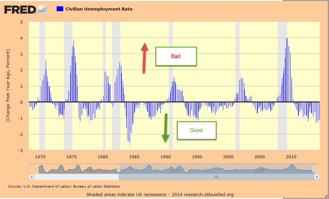
The real surprise this month was the drop of .3% in the unemployment rate to 4.6%.  Some not so smart analysts attributed the drop to discouraged workers who dropped out of the labor force.  However, the number of dropouts in November was the same as October when the unemployment rate declined only .1%.  Seasonal factors, Christmas jobs and variations in survey data may have contributed to the discrepancy.  What is clear is that the greatest number of those who are dropping out of the labor force are the increasing numbers of boomers who are retiring every month. I’ll look further at this in a moment.

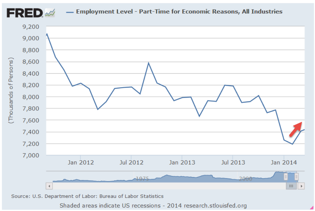
The number of involuntary part-timers has dropped from 2.5 million five years ago to 1.9 million, about 1.3% of workers. This is a lower percentage than the 1970s, the 1980s, and the first half of the 1990s.  It is only when the tech boom and housing bubble grew in the late 90s and 2000s that this percentage was lower.

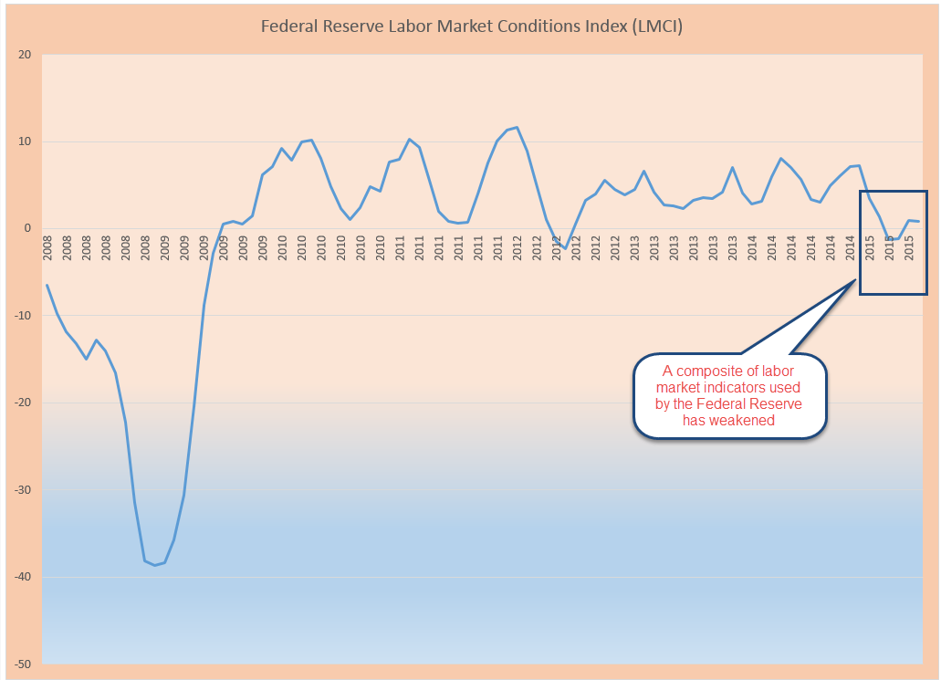
Growth in the core work force is a strong 1.5%, a good sign.  These are the workers aged 25-54 who are building families, careers and businesses.  The change in the Labor Market Conditions Index (LMCI) turned positive again in October.  This is a composite labor index of twenty indicators that the Federal Reserve uses to judge the overall health of the labor market.  They have not released November’s LMCI yet.  This index showed negative growth for the first part of the year and was the chief reason why the Fed did not raise interest rates earlier this year.

The quit rate is back to pre-recession levels at a strong 2.1%.  This is the number of employees who have voluntarily quit their jobs in the past month and is used to gauge the confidence of workers in finding another job quickly. The highest this reading has ever been was 2.6% just as the dot com boom was ending in 2001.  Too much confidence. When the housing boom was frothing in the mid-2000s, the quit rate was typically 2.3%, a level of over-confidence. 2.1% seems strong without being too much.

Another unwelcome surprise this month was a .03 decline in the average hourly wage of private workers.  On the heels of a welcome .11 increase in October, this decline was disappointing. One month’s increase or decrease of a few cents is statistical noise.  The year-over-year increase gives the longer term trend.  For the past five years, the yearly increase in wages has been unable to get above 2.5%, which was the annual growth in November.

The greatest challenge that the incoming president will face is the ever growing ranks of Boomers who are retiring.  In 2007, the number of those Not in the Labor Force was 78 million.  These are adults who can legally work but are not looking for work, and includes retirees, discouraged job applicants, women staying home with the kids, and those going to college.  That number has now grown to 95 million, an increase of 2 million workers per year, and will only keep growing as the 80 million strong boomer generation continues to retire each month.   The millenials, those aged 16 to 34, are a larger generation than the boomers but will not fully offset the number of retirees till the first half of the 2020s.  If any president can explain this in very simple terms, it is Donald Trump, who has mastered the art of communicating a message in short bursts.

//////////////////////////

Construction and Local Employment

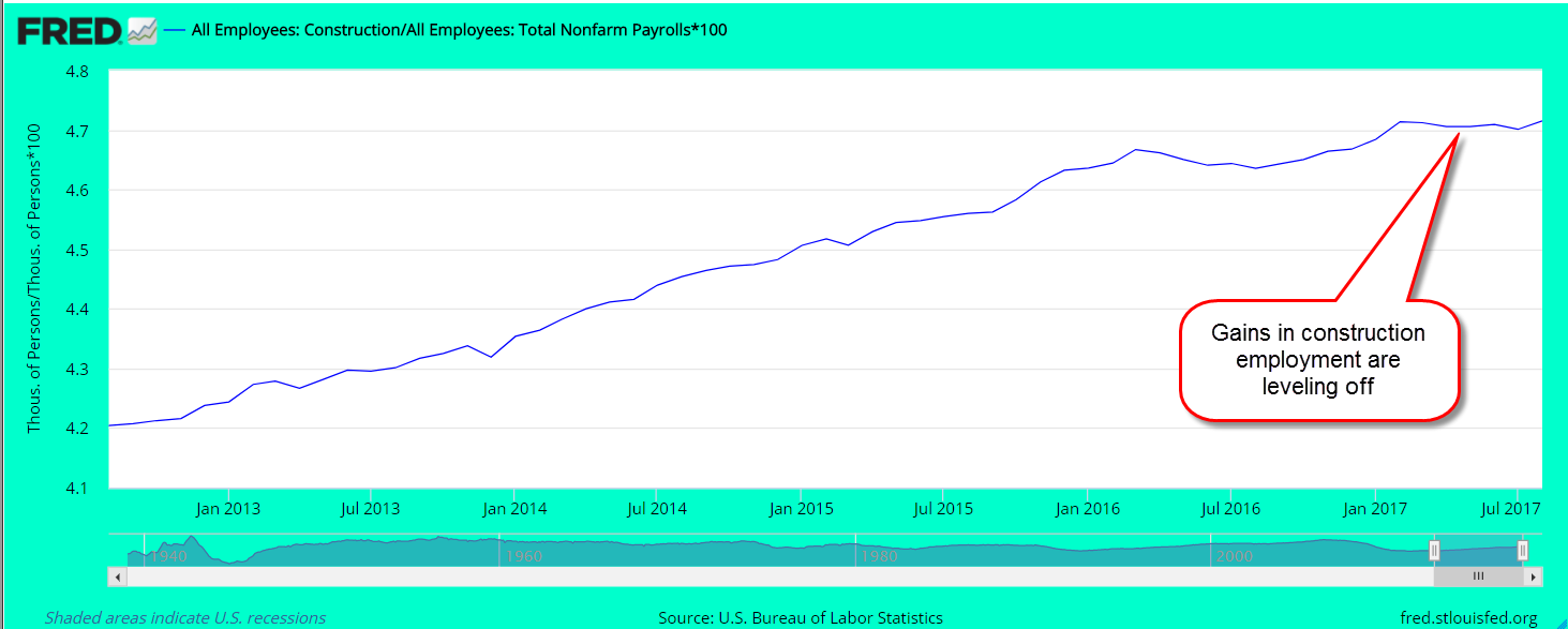
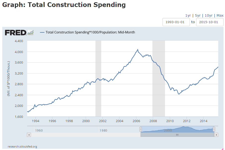
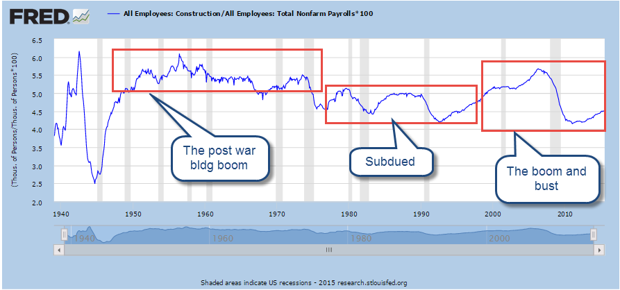
Construction employment matters.  When growth in this one relatively small sector drops below the growth of all employment, that signals a weakness in the overall economy that indicates a good probability of recession within the year.  It’s not an ironclad law like the 2nd law of thermodynamics but has proven to be a reliable rule of thumb for the past forty years.  Fortunately, the economy is still showing healthy growth in construction employment that has outpaced broader job gains for the past four years.

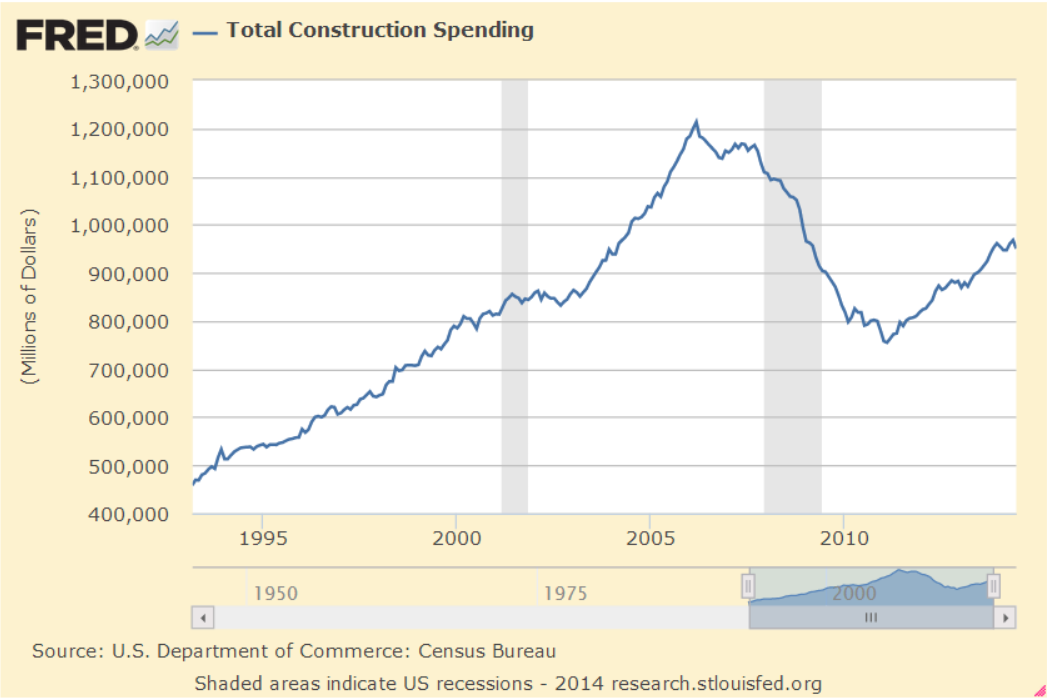
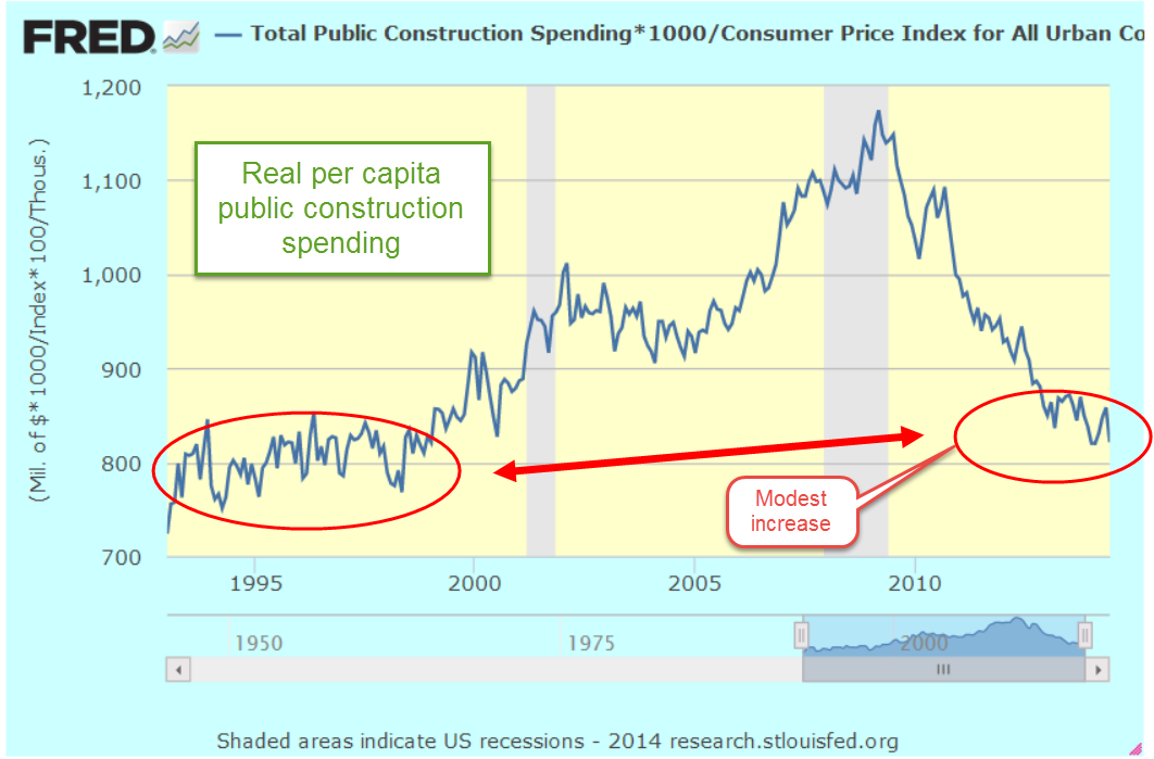
The puzzle is why construction spending is an economic weathervane.  It has fallen from 11% of GDP in the 1960s to slightly over 6% of GDP today. (Graph )   Yet when this  relatively small part of the economy stops singing, there’s something amiss.

Real construction spending (in 2016 dollars) is currently at a healthy level of $175K per employee, 16% above the low of $151K in the spring of 2011.  Although we have declined slightly in the past year, the average is about the same level as late 2006 – 2007 and is above the spending of the 1990s.  As a rule of thumb in the construction industry, an employee is going to average 33% in wages and salaries. That doesn’t include the cost of employee benefits, insurance and taxes which will bring the total cost of the employee above 40% of the total cost.   So, if spending is $175K, we can guesstimate that the average worker is making about $58K.  When I check with the BLS, the average weekly earnings in construction is $1120, or almost $58K.  As a side note: that 40% employee cost is used by some contractors as a rule of thumb for a bid total when estimating a job.

During the recession many workers dropped out of the trades.  Older workers with beat up bodies cut back on hours, went on disability or took early retirement.  Younger workers who saw the layoffs and lack of construction employment during the recession turned their sights to other fields.  Workers who do come into the trades find that the physical transition takes some getting used to.  Even workers in their twenties discover that muscles and joints working 8 – 10 hours a day need some time to adapt.

The average workweek hours for construction workers hit at a 70 year high in December 2015 and is still near those highs at 39.8 hrs a week.  In some areas the lack of applicants for construction jobs is constraining growth.  In Denver, construction jobs grew by almost 20% in the past year and that surge is helping to attract  workers from other states.  The unemployment rate in Denver is 2.9%, below the 3.5% in the entire state.  (BLS Denver  Colorado)  This pattern is not confined to Colorado. Very often economic growth may be strong in the cities but weak and faltering in rural communities throughout the state.  For decades this has caused some resentment in rural communities who feel that politicians in the cities dominate policy making in each state.

Local employment

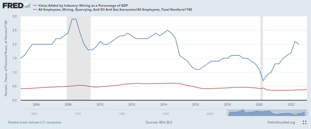
The Civilian Labor Force, those working and actively wanting work, is growing in all states except Alaska, Louisiana, Minnesota, New Jersey, New York, Nebraska, Nevada, Oklahoma and Wyoming (BLS here if you want to look up your city or state stats).  Some of the changes may be demographic.  I suspect that is the case in New York and New Jersey. The decline in some states are those related to resource extraction.  Employment in states with coal mining and oil production has taken a hit in the past two years.  In Colorado, the 11% gain in construction jobs has offset a 12% decrease in mining jobs.

/////////////////////////////

Household Income

On a more sobering note…In 1999 real median household income touched a high $58,000 annually.  Sixteen years later that median was $56,500, a decline of about 3%.  There’s a lot of pain out there.

For readers unfamiliar with the terminology, “real” means inflation adjusted.  “Median” is the halfway point.  Half of all incomes are above the median, half below.  Economists and market analysts prefer to use the median as a measure of both incomes and house prices to avoid having a small number of large incomes or expensive houses give an inaccurate picture of the data.

Both parties can take responsibility for this – two Republican administrations (Bush) and two Democratic (Obama) terms. There have been a number of different party configurations in the Presidency, House and Senate, so neither party can reasonably lay the blame at the other party’s feet.  The “new” more idealogically pure Republicans  in the House regard the “old” Republicans of the two Bush terms as traitors to conservative ideals.  Never mind that a lot of those “old” silly Republicans are still taking up room in the House.

Both parties have borrowed and spent a lot of money but little has flowed down to the American worker.  So much for the imaginativeness of trickle down economic theory.  When George Bush assumed office in January 2001, the Federal Public debt totalled $5.6 trillion.  When he left office in January 2009, the debt had almost doubled to $10.7 trillion.  Under Obama’s two terms, the debt nearly doubled again, crossing the $19.4 trillion mark in June 2016.  $14 trillion dollars of Federal borrowing and spending since early 2001 has not helped lift the incomes of American families.  It is a damning indictment of both major parties who have lost touch with the everyday concerns of many American families.

Can Donald Trump be the catalyst that miraculously turns the Washington whirlpool of money into an effective machine?  Doubtful, but let’s stay hopeful. 535 Congressmen and Senators, each with an outlook, a constituency, and an agenda funded by a coalition of lobbyists, are going to fight against giving up control.  Spend the money on my constituents. they will say.  Republicans throw out the phrase “limited government” to their base voters who whuff, whuff and chow down.  Once elected, many Republican politicians are as controlling as their Democratic counterparts, only in different areas of our lives. A Republican controlled government will push for more regulations on women’s health, regulations on people’s moral and social behaviors, a proposal to reinstitute the draft, and threats to private companies who move jobs out of the U.S.   Donald Trump recently enacted Bernie Sanders’ prescription for keeping jobs in America.  He no doubt threatened Carrier’s parent corporation, United Technologies, that they would lose defense contracts if Carrier moved all those 1000 jobs to Mexico.

So Donald Trump, the leader of the Republican Party, is following a socialist play book.  We are going to see more of this because Trump is the leader of the Trump party, not wedded to any particular ideology.  He is a transactional leader who plays any card in the deck to win, regardless of suit. Chaining oneself to ideals is a good way to drown in the political soup.

Republicans in Washington have consistently betrayed conservative ideals of financial responsibility and a smaller government imprint on the daily lives of the American people.  Democratic politicians cluck, cluck about progressive principles but Democratic voters find that their leaders have left them a pile of chicken poop. Unlike Republican voters, Democrats haven’t developed the organizational skills to make personnel changes in party primaries. Both parties are infected with old ideas, loyalties and prejudices.

Because of this, retail investors – plain old folks saving for their retirement – can expect increased volatility in the next two years.  We may look back with fondness at these last two years, a peaceful time of few accomplishments in Washington, and a sideways market in stocks and bonds.  A balanced portfolio will help weather the volatility.

Mutual fund companies and investment brokers track this information for us and we can access it fairly easily online at the company’s website.  Even if we have several places where we keep our funds, it is a relatively simple paper and pencil process to calculate our total allotment to various investments. We don’t need to be precise.  We are not launching a rocket to Mars.

If I have $198,192.15 at Merry Mutual and they say I have 70% stocks and 30% bonds, I can write down $140 in stocks, $60 in bonds.   Then over to my 401K at the Ready Retirement Company to find out that I have $201,323.39 balance, with 80% stocks and real estate funds and 20% bonds.  I write down $160 for stocks and $40 for bonds.  Then over to my savings account at Safety Savings where I have $39,178.64, which I include with my bonds.  I write down $40.  Finally, over to my CDs at the First Best Bank in my neighborhood where I have $32,378.14 in CDs of various maturities.  I include those with my bonds and write down $32. Maybe I have an insurance policy with some paid up value that I want to include in my bonds.

So, adding it all up, my stocks (more risk) are $140 + $160 = $300.  My bonds/cash (less risk) are $60 + $40 + $40 + $32 = $172.  $300 + $172 = $472 total portfolio value.  $300 stocks / $472 total = .635 which is about 64%.  So I have a 64% / 36% stock / bond split and I have figured this out without expensive software, or an investment advisor.

Depending on my comfort level, knowledge and expertise I may want some software or some advice from a professional but I know where my allocation lies.  I am on the risky side of a perfectly balanced (50% / 50%) portfolio and how do I feel about that?  If I do talk to an advisor or a friend I can tell them up front what my allocation is and we will have a much more informed conversation.

The Coming Boom or Not

November 27, 2016

For most of Obama’s time in the White House, the Republican led House has fought more borrowing to repair the nation’s decaying infrastructure.  The incoming Trump administration has promised to fulfill a campaign pledge to spend $500 billion or more on these repairs. Funding this spending while reducing taxes may prove to be improbable.  A lack of available labor in parts of the country may stress the economies of some states.

In 2010, economists Robert Frank and Paul Krugman recommended additional infrastructure spending to take care of much needed repairs at low interest rates and an idle construction workforce.  In February 2010, the unemployment rate among construction workers was 27% (FRED).

Since early 2010 construction spending has increased by 42% (FRED).  As older workers in the field retire, the severe downturn in the housing industry dissuaded many young workers from entering the profession in the past decade.  Following the housing bust and the 2008 crisis, many workers native to Mexico left the U.S. to find lower paying work in their home country. Continuing high unemployment did not attact new migrant workers who would contribute to the productivity of the U.S. economy. A mood of hostility towards foreigners has furthered dampened the appeal of work in the U.S.  Only the desperate now risk the dangers of crossing the border.

While roofing companies struggle to find workers at $20 an hour, farmers are simply leaving crops to rot for lack of available workers to pick the vegetables and fruits.  Automated picking machines still can not tell ripe from unripe produce. As job openings go unfilled, employers cut back on plans for expansion.  After six years of paralysis and debate, fiscal stimulus may be achievable under a Trump regime.  Irony may have the final curtain if the extra spending is too much too late. Readers with a WSJ subscription can read more here.

//////////////////////////////

Existing Home Sales

Sales of existing homes in October notched a recovery high at 5.6 million.  Home prices are rising fastest in the western states at a 7.8% clip.  Prices are now 50% higher than the country’s median. (NAR)  Volume increases of 10% are far outpacing the national yearly increase of 5.9%. Expect continuing price increases in the western states.

Mortgage interest rates have risen 1/2% but are still low by comparison with past decades.  The increase has prompted an uptick in refinances.  Higher rates will put homes in some neighborhoods out of reach for first time buyers as well as current owners who were hoping to trade up.

In the early part of 2008, the delinquency rate on single family mortgages rose above 5%.  During the 90s and 00s, the rate averaged a little over 2%.  Despite seven years of recovery, escalating home prices and extremely low mortgage rates, the delinquency rate just fell below 5% earlier this year.  In short, there is still a lot of pain out there.

On the other hand, credit card delinquency is at an all time low.  So are consumer loan delinquency. Consumer credit continues to grow but at a slower pace since the financial crisis.

////////////////////////////

Commercial Loans

Tightening lending standards for large and mid-size companies has proven to be a reliable recession indicator.   When the percentage of cautious banks grows above 25%, recession has followed within the year.

We can also see periods of doubt in this chart.  In late 2011 to early 2012 a short rising spike indicates a growing caution following the budget standoff in the summer of 2011.  In response to an economic dip in the beginning of this year, banks again grew more cautious.

//////////////////////////////////

Stocks make new highs

Stocks continue to rise modestly on hopes of greater economic growth, future profits, lower taxes and tax policy changes.  After more than a year of declining profits, price levels are a bit rich but may be justified if…  After spiking up on election night, volatility has fallen near year to date lows.   Traders have priced in the likelihood that the Fed will raise rates in mid-December.

Pickup Purchasing Power

April 24, 2016

Relatively stagnant wages and income inequality have become a frequent theme on the campaign trail.  Let’s look at what I’ll call pickup purchasing power to understand the problem.  Sorry.  No graph from the Federal Reserve on this one.

A favorite vehicle among construction workers is the F-150 pickup, a reliable vehicle with room for a toolbox and a trip to the local lumberyard for supplies.  The MSRP of a standard bed 1998 model, available to the public in September 1997, was $14,835 (Source ) In 2016, the MSRP of that same model is $26,430 (Source), a 78% increase, about 3.2% per year.  There have certainly been improvements in that truck model in the past two decades but customers can not order the model without the improvements.  The basic model is the basic model.

Let’s look now at the wages needed to buy that pickup.  In May 1997, shortly before the 1998 F-150 was released to the public, the BLS survey reported average carpenters’ wages of $30,800.  At that time, wages and salaries were about 70.5% of total compensation, or about $43,700 (BLS report).  In the decade before that, wages as a percent of total compensation had declined from 73.3% in 1988 to 70.5% in 1997.  Rising insurance costs and other direct benefits to employees were slowly eating into the net compensation of the average carpenter.

In 2015, the average wage for carpenters was $43,530.  The BLS reported that wages were now 67.7% of the total employment cost, or about $64,300.  In that 18 year period, carpenters’ wages grew 41% but total compensation grew 47%, or 2.1% per year.  The price of that pickup truck, though, grew at 3.2% per year.  That seemingly small difference of 1% per year adds up to a big difference over the years.  That’s the sense of anger that underlies the current election season.  The growth in price of that pickup is only slightly above the average post WW2 inflation rate of 3%.  It is the wages that have fallen behind.

Trump blames the politicians who have given away American jobs with badly negotiated trade agreements that disadvantage Americans.  Trump’s promise to bring those manufacturing jobs back home wins him popular appeal in those communities impacted by the decline in manufacturing.  The loss of manufacturing jobs has left a larger pool of job applicants for construction jobs.  Some of those displaced workers did not have the carpentry skills needed but some were able to work in roles supervised by an experienced carpenter.  The more the supply of job applicants the less upward pressure on wages. If – a big if – some manufacturing jobs do come back to the U.S., it will help spur more growth in carpenter’s wages.

Bernie Sanders blames the fat cats and proposes taxing all but the poorest Americans to distribute income more evenly. His remedies to promote his programs of fairness are far ranging.  Employers who are currently providing health insurance for their employees will probably welcome a 6.2% payroll tax.  On a forty year old employee making $50,000 a year, the $3100 tax is far less cost than an HMO plan. Employers who do not provide such coverage will resent the imposition of more taxes but at least it will be across the board, affecting all competitors within an industry or local market.  Sanders’ healthcare plan also relies on 10% cuts in payments to doctors and hospitals, who are projected to save at least that much in reduced billing costs.

While Trump addresses a specific demographic, a particular segment of the labor market, Sanders proposes broad remedies to a number of problems.  Trump’s appeal will be to those who want a specific fix.  Bring back jobs to our community.  We’ll figure out the rest.  Sanders’ proposals will appeal to voters who have more confidence in government as a problem solver.

///////////////////////////

Oil Stocks

Readers who put some money to work in oil stocks (XLE, VDE for example) in late February, when I noted the historical bargain pricing, might have noticed the almost 20% increase in prices since then.  There are a number of reasons for the surge in price but the buying opportunity has faded with that surge.  Inventories are still high relative to demand.  Recent comprehensive market reports from the IEA require a subscription but last year’s report is available to those interested in a historical snapshot of the supply and demand trends throughout the world.  Until 2014, total demand had slightly exceeded supply.  A glance at the chart shows just how tightly coordinated supply and demand are in this global market. A “glut”in supply may be less than 1% of daily worldwide consumption and it is why prices can shift rather dramatically as traders try to guess both short and long term trends in demand and supply.

Home Sweet Asset

April 3, 2016

Normally we do not include the value of our home in our portfolio.  A few weeks ago I suggested an alternative: including a home value based on it’s imputed cash flows.  Let’s look again at the implied income and expense flows from owning a home as a way of building a budget.  The Bureau of Labor Statistics and the Census Bureau take that flow approach, called Owner Equivalent Rent (OER), when constructing the CPI, and homeowners are well advised to adopt this perspective.  Why?

1) By regarding the house as an asset generating flows, it may provide some emotional detachment from the house, a sometimes difficult chore when a couple has lived in the home a long time, perhaps raised a family, etc.

2) It focuses a homeowner on the monthly income and rent expense connected with their home ownership.  It asks a homeowner to visualize themselves separately as asset owner and home renter. It is easy for homeowners to think of a mortgage free home as an almost free place to live. It’s not.

3) Provides realistic budgeting for older people on fixed incomes.  Some financial planners recommend spending no more than 25% of income on housing in order to leave room for rising medical expenses.  Some use a 33% figure if most of the income is net and not taxed.  For this article, I’ll compromise and use 30% as a recommended housing share of the budget.

A fully paid for home that would rent for $2000 is an investment that generates an implied $1400 in income per month, using a 70% net multiplier as I did in my previous post. Our net expense of $600 a month includes home insurance, property taxes, maintenance and minor repairs, as well as an allowance for periodic repairs like a new roof, and capital improvements.

Using the 30% rule, some people might think that their housing expense was within prudent budget guidelines as long as their income was more than $2000 a month.  $600 / $2000 is 30%.

However, let’s separate the roles involved in home ownership.  The renter pays $2000 a month, implying that this renter needs $6700 a month in income to stay within the recommended 30% share of the budget for housing expense.  The owner receives $1400 in net income a month, leaving a balance of $5300 in income needed to stay within the 30% budget recommendation. $6700 – $1400 = $5300.  Some readers may be scratching their heads.  Using the first method – actual expenses – a homeowner would need only $2000 per month income to stay within recommended guidelines.  Using the second method of separating the owner and renter roles, a homeowner would need $5300 a month income. A huge difference!

Let’s say that a couple is getting $5000 a month from Social Security, pension and other investment income.  Using the second method, this couple is $300 below the prudent budget recommendation of 30% for housing expense.  That couple may make no changes but now they understand that they have chosen to spend a bit more on their housing needs each month.  If – or when – rising medical expenses prompt them to revisit their budget choices, they can do so in the full understanding that their housing expenses have been over the recommended budget share.

This second method may prompt us to look anew at our choices.  Depending on our needs and changing circumstances, do we want to spend $2000 a month for a house to live in?  Perhaps we no longer need as much space.  Perhaps we could get a suitable apartment or townhome for $1400?  Should we move?  Perhaps yes, perhaps no.  Separating the dual roles of owner and renter involved in owning a home, we can make ourselves more aware of the implied cost of our decision to stay in the house.  A house may be a treasure house of memories but it is also an asset.  Assets must generate cash flows which cover living expenses that grow with the passage of time.

/////////////////////

The Thrivers and Strugglers

“Bravo to MacKenzie. When she was born, she chose married, white, well-educated parents who live in an affluent, mostly white neighborhood with great public schools.”

In a recent report published by the Federal Reserve Bank at St. Louis, the authors found that four demographic characteristics were the chief factors for financial wealth and security:  1) age; 2) birth year; 3) education; 4) race/ethnicity.

While it is no surpise that our wealth grows as we age, readers might be puzzled to learn that the year of our birth has an important influence on our accumulation of wealth.  Those who came of age during the depression had a harder time building wealth than those who reached adulthood in the 1980s.

Ingenuity, dedication, persistence and effort are determinants of wealth but we should not forget that the leading causes of wealth accumulation in a large population are mostly accidental.  It is a humbling realization that should make all of us hate statistics!  We want to believe that success is all due to our hard work, genius and determination.

//////////////////////

Employment

March’s job gains of 215K met expectations, while the unemployment rate ticked up a notch, an encouraging sign.  Those on the margins are feeling more confident about finding a job and have started actively searching for work.  The number of discouraged workers has declined 20% in the past 12 months.

Employers continue to add construction jobs, but as a percent of the workforce there is more healing still to be done.

The y-o-y growth in the core workforce, aged 25-54, continues to edge up toward 1.5%, a healthly level it last cleared in  the spring of last year.

The Labor Market Conditions Index (LMCI) maintained by the Federal Reserve is a composite of about 20 employment indicators that the Fed uses to gauge the overall strength and direction of the labor market.  The March reading won’t be available for a couple of weeks, but the February reading was -2.4%.

Inflation is below the Fed’s 2% target, wage gains have been minimal, and although employment gains remain relatively strong, there is little evidence to compel Chairwoman Yellen and the rate setting committee (FOMC) to maintain a hard line on raising interest rates in the coming months.  I’m sure Ms. Yellen would like to get Fed Funds rate to at least a .5% (.62% actual) level so that the Fed has some ability to lower them again if the economy shows signs of weakening.  Earlier this year the goal was to have at least a 1% rate by the end of 2016 but the data has lessened the urgency in reaching that goal.

ISM will release the rest of their Purchasing Manager’s Index next week and I will update the CWPI in my next blog.  I will be looking for an uptick in new orders and employment.  Manufacturing lost almost 30,000 jobs this past month – most of that loss in durable goods.  Let’s see if the services sector can offset that weakness.

///////////////////////////

Company Earnings

Quarterly earnings season is soon upon us and Fact Set reports that earnings for the first quarter are estimated to be down almost 10% from this quarter a year ago.  The ten year chart of forward earnings estimates and the price of the SP500 indicates that prices overestimated earnings growth and has traded in a range for the past year.  March’s closing price was still below the close of February 2015.  Falling oil prices have taken a shark bite out of earnings for the big oil giants like Exxon and Chevron and this has dragged down earnings growth for the entire SP500 index.

New Year Review

January 3, 2016

As we begin 2016, let’s take a look at some trends.  It is often repeated that the recovery has been rather muted.  As former Presidential contender Herman Cain once said, “Blame Yourself!”  You and I are the problem.  We are not charging enough stuff or we are making too much money. Debt payments as a percent of after tax income are at an all time low.

At its 2007 peak, households spent 13% of their after tax income to service their debt.  Currently, it is about 10%. In early 2012, this ratio crossed below the recession levels of the early 1990s.  By the end of 2012, this debt service payment ratio had fallen even below the levels of the early 1980s.  Almost six years after the official end of the Great Recession the American people are behaving as though we are still in a recession.  An aging population is understandably more cautious with debt.  In addition to that demographic shift, middle aged and younger consumers are cautious after the financial crisis. We gorged on debt in the 1990s and 2000s and paid the price with two prolonged downturns.  Having learned our lessons, our overactive caution is now probably dragging down the economy.

In this election year, we can anticipate hearing that the sluggish economy can be blamed on: A) the Democratic President, or B) the Republican Congress.  It is Big Government’s fault.  It is the fault of greedy Big Companies.  Someone is to blame.  Pin the tail on the donkey.  Blah, blah, blah till we are sick of it.

************************

Auto Sales

The latest figures on auto sales show that we are near record levels of more than 18 million cars and light trucks sold, surpassed only by the auto sales of February 2000, just before the dot com boom fizzled out.  On a per capita basis, however, car sales are barely above average.  The thirty year average is .054 of a vehicle sold per person.  The current sales level is .056 of a car per person.  Automobile dealers would have to sell an addiitonal 900,000 cars and light trucks per year to have a historically strong sales year.

************************

Construction Spending

In some cities, housing prices and rents are rising, and vacancies are low.  We might assume that construction is booming throughout the country.  Six years into the recovery per capital construction spending is at 2004 levels and that does not account for inflation.  Levels like this are OK, not good, and certainly not booming.

*************************

Employment

The unemployment rate and average hourly wage may get most of the public’s attention but the Federal Reserve compiles an index of many indicators to judge the health of the labor market.  Positive changes in this index indicate an improving employment picture.  Negative changes may be temporary but can prompt the Fed to take what action it can to support the labor market.  Recent readings are mildly positive but certainly not strong.

*************************

Stock Market

Many of the companies in the SP500 generate half of their revenue overseas.  Because of the continuing strength of the dollar, the profits from those foreign sales are reduced when exchanged for dollars.  According to Fact Set, earnings for the SP500 are projected to be about $127 per share, the same level as mid-2014.  In the third quarter of 2015, the majority of companies reported revenue below estimates.  As 4th quarter revenue and earnings are released in the coming weeks, investors will be especially vigilant for any downturns in sales as well as revisions to sales estimates for the coming year.  It could get bloody.

Which Way Sideways?

August 9, 2015

As we all sat around the Thanksgiving table last November, the SP500 was about the same level as it closed this week.  Investors have pulled off the road and are checking their maps to the future.  After forming a base of good growth in the past few months, July’s CWPI reading surged upwards.

Despite years of purchasing managers (PMI) surveys showing expanding economic activity, GDP growth remains lackluster.  Every summer, in response to more complete information or changes to statistical methodologies, the Bureau of Economic Analysis (BEA) revises GDP figures for the most recent years.  A week ago the BEA revised real annual GDP growth rates for the years 2011 – 2014 from 2.3% to 2.0%.  “From 2011 to 2014, real GDP increased at an average annual rate of 2.0 percent; in the  previously published estimates, real GDP had increased at an average annual rate of 2.3 percent.”

A composite of new orders and rising employment in the service sectors showed its strongest reading since the series began in 1997.  The ISM reading bested the strong survey sentiments of last summer. We can assume that the PMI survey is not capturing some of the weakness in the economy.

This level of robust growth should put upward pressure on prices but inflation is below the Federal Reserve’s benchmark of 2%.  Energy and food prices can be volatile so the Fed uses what is called the “core” rate to get a feel for the underlying inflationary pressures in the economy.

The stronger U.S. dollar helps keep inflation in check.  There is less demand from other countries for our goods and the goods that we import from other countries are less expensive to Americans. .  Because the U.S. imports so much more than it exports, the lower cost of imported goods dampens inflation.  In effect, we “export” our inflation to the rest of the world.

When the economy is really, really good or very, very bad we set certain thresholds and compare the current period to those benchmarks.  When the financial crisis exploded in late 2008, the world fled to the perceived safety of the dollar in the absence of a exchange commodity of value like gold.  Because oil is traded in U.S. dollars and the U.S. is a stable and productive economy and trading partner, the U.S. dollar has become the world’s reserve currency.  The conventional way of measuring the strength of a currency like the dollar has been to compile an index of exchange rates with the currencies of our major trading partners.  This index, known as a trade weighted index, does not show a historically strong U.S. dollar.  In fact, since 2005, the dollar has been extremely weak using this methodology and only recently has the dollar risen up from these particularly weak levels.

As I mentioned earlier, a strong dollar helps mitigate inflation pressures; i.e. they are negatively correlated. When the dollar moves up, inflation moves down.  To show the loose relationship between the dollar index and a common measure of inflation, the CPI, I have plotted the yearly percent change in the dollar (divided by 4) and the CPI, then reversed the value of the dollar index.  As we can see in the graph below, the strengthening dollar is countering inflation.

What does this mean for investors?  The relatively strong economy allows the Fed to abandon the zero interest rate policy (ZIRP) of the past seven years and move rates upward.  A zero interest rate takes away a powerful tool that the Fed can employ during economic weakness: to stimulate the economy by lowering interest rates.

The strong dollar, however, makes Fed policy makers cautious. Higher interest rates will make the dollar more appealing to foreign investors which will further strengthen the dollar and continue to put deflationary pressures on the economy.  The Fed is more likely to take a slow and measured approach.  Earlier this year, estimates of the Effective Federal Funds Rate at the end of 2015 were about 1%.  Now they are 1/2% – 3/4%.  In anticipation of higher interest rates, the price of long term Treasury bonds (TLT) had fallen about 12% in the spring.  They have regained about 7% since mid-July.

DBC is a large commodity ETF that tracks a variety of commodities but has about half of its holdings in petroleum products.  It has lost about 15% since May and 40% in a year.  It is currently trading way below its low price point during the financial crisis in early 2009.  A few commodity hedge funds have recently closed and given what money they have left back to investors.  Perhaps this is the final capitulation?  As I wrote last week, there is a change in the air.

*************************

Labor Report

Strong job gains again this month but labor participation remains low.  A key indicator of the health of the work force are the job gains in the core work force, those aged 25 – 54.

While showing some decline, there are too many people who are working part time because they can’t find a full time job.  Six years after the official end of the recession in the summer of 2009, this segment of the work force is at about the same level.

In some parts of the country job gains in Construction have been strong.  Overall, not so much.  As a percent of the work force, construction jobs are relatively low.  In the chart below I have shown three distinct phases in this sector since the end of World War 2.  Extremes are most disruptive to an economy whether they be up or down.    Note the relatively narrow bands in the post war building boom and the two decades from 1975 through 1994.  Compare that to the wider “data box” of the past two decades.

For several months the headline job gains have averaged about 225,000 each month.  The employment component in the ISM Purchasing Managers’ Index (on which the CWPI above is based) is particularly robust.  New unemployment claims are low and the number of people confident enough to quit their jobs is healthy.  The Federal Reserve compiles an index of many factors that affect the labor market called the Labor Market Conditions Index (LMCI).  They have not updated the data for July yet but it is curiously low and gives more evidence that the Fed will be cautious in raising rates.

Employment, GDP and Construction

August 3, 2014

Employment

The employment report for July was moderately strong but below expectations.  Year-over-year growth in employment edged up to 1.9%, a level it first touched in March of 2012.

The unemployment rate ticked up a notch after ticking down two notches last month.  Notches can distract a long term investor from the underlying trend, which is positive.  Comparing the year-over-year percent change in the unemployment rate gives a good overall view of the economy and  the mid term prospects for the stock market.

There was some slight improvement in the Civilian Labor Force Participation Rate this month.  The decline in the participation rate has been worrisome.  When we view the unemployment rate as a percentage of the Civilian Labor Force Participation Rate, we do see a continuing decline in this ratio, which is positive.  From early 2002 to early 2003, the market continued its decline even after the end of a fairly mild recession.  Employment gains were meager, prompting concerns of a double dip recession. Should this ratio start to increase over several months, investors would be wise to start digging their foxholes.

Employment numbers can hide weaknesses in the labor market. After falling to a low of 7.2 million this February, people working part time because they can’t find full time work has climbed up 300,000 to 7.5 million.  The good news is that the ranks of involuntary part-timers has dropped by 700,000, or 8.5%, from July 2013 to this July.

Employment in service occupations makes up almost 20% of the work force and usually peaks in July of each year after a January trough.  The numbers come from the monthly survey of business payrolls so it affects the job gains number to some degree, depending on the seasonal adjustments.  I expected this month’s report to show the normal pattern, rising up at least 50,000 from June’s total of 26.54 million.  I was surprised to see that employment in this composite had dropped by 170,000 in July.

Unlike the majority of years, this year’s trough occurred in February, one month later than usual.  This may be weather related.  1998, 2003, 2005, 2011 were also years in which the trough occurred one month late. Over the past twenty years, the peak has always come in July – until this year.

Hourly wages have grown 2% in the past twelve months, meaning that there is no gain after inflation.  That’s the bad news.  The good news is that weekly earnings for production and non-salaried employees this July bested July 2013 earnings by 2.9%.

************************

Auto Sales

July’s vehicle sales slipped 2.4% from June’s annualized pace of 16.9 million vehicles.  Robust vehicle sales are due in part to an increase in sub-prime loans, which have grown to 30% of new car loans.  A few weeks ago, the N.Y. Times published an article describing some auto loan application shenanigans.

The casual reader may not understand the significance of numbers in the millions so I created a chart showing numbers in the hundreds.  The manufacturing of cars is part of a broader category called durable goods.  If a 100 workers are employed making durable goods, we would like to see at least 11 of them making cars or parts for cars.  In a healthy economy, 5 people out of 100 buy a car or truck.  The chart below shows the relationship between the number of people buying cars and the percent of durable goods workers making cars.  The chart is a bit “busy” but I hope the reader can see that, despite talk of an auto bubble that could crash the market, the percent of the population buying cars is just barely above the minimum healthy level.

There may be a bubble in auto financing but not auto sales.  Secondly, a vehicle can be repossessed and resold much more easily than evicting a delinquent homeowner.

***********************

GDP

The first estimate of 2nd quarter GDP was 4% annualized growth, above the 3% consensus expectations.  Under the hood, we see that 1.7% of that 4% is a build up of inventories.  This mirrors the 1.7% negative change in inventories in the first quarter, as I noted in last month’s blog.  It is not a coincidence and should remind us that these are human beings making a first estimate of the entire economic activity of a country.

Let’s put this early estimate in perspective.  The year-over-year percent growth is 2.4%, above the 1.6% average y-o-y growth of the past ten years.  Let’s get out our magic wand and take away the recessionary four quarters in 2008 and two quarters in 2009.  Let’s add some good numbers in late 2003 and early 2004 as the economy recovered from the dot com boom period.  Presto chango!  Well, not so presto.  We see that the average over these 37 quarters, just a bit more than 9 years, is still only 2.3%.

From 1970 – 2007, the average is 3.1%, or almost double the 1.6% average of the past ten years.  The Federal Reserve and other central banks around the world have employed the tactics at their disposal to avert deflation and to spur lending.  While low interest rates and bond purchases have accomplished some of those goals, they have created some distortions in the markets, putting upward pressure on both equity and bond valuations.  Higher stock prices pressure companies to produce the profits – on paper, at least – that will justify the increased valuation.  In the past this has induced some companies to pursue a course of – an appropriate term might be “aggressive” accounting – to meet investor demands.

So this first estimate of GDP for the 2nd quarter is slightly above the magic wand average of the past decade and way above the real ten year average.  Not bad.  I’m guessing that the second estimate of 2nd quarter GDP, released near the  end of August, will be revised downward but even if it is, economic growth is better than average.

***********************

Construction Spending and Employment

Construction added 20,000 jobs in July, and are up 3.6% above July of 2013.  Total Construction spending includes residential and commercial buildings, public infrastructure and transportation. Spending in June declined almost 2% from a strong May but is up more than 5% from last year.  A casual glance at the spending numbers might lead one to observe that, after the housing boom and bust, the construction sector is on the mend.

The underlying reality is that further improvements in construction spending may be modest.  The chart below shows real, or inflation adjusted, per capita spending.  What was good enough in 1994 may be equally good in 2014 and beyond.

Residential construction has leveled off just slightly below what is probably a sustainable zone of $1200 to $1600 per person spending. At the height of the housing boom, per person spending was almost twice that of the midline $1400 per person.  Corrections to such severe imbalances are painful.

While many of us think that the boom was all in the residential sector, per person construction of public infrastructure had its own boom, growing almost 50% from the levels of the mid-90s.  Some economists and politicians continue to advocate more public construction as a Keynesian stimulus but we can see below that real per-capita public spending today is slightly more than the levels of the mid-1990s.

Spending on public infrastructure including highways helped buffer the downturn in residential construction.  As a percent of total construction spending, it is still contributing more than its share to the total.  If residential construction were just a bit stronger, this percentage would drop to a more normal range closer to 25%.

Workers in their thirties now came of age at a time when “normal” in the construction sector was far above normal. Policy makers grew to believe that this elevated level of spending was evidence of a strong economy.  They believed they were masters of the economy, ushering in a new normal of prudent fiscal policy that worked in tandem with assertive government policy to promote housing investment that would lift up those on the lower rungs of the economic ladder.

Today we don’t hear as much from those masters of economic and social engineering.  Their names include former Fed Chairman Alan Greenspan, former President George Bush, former Congressman Barney Frank, and current Congresswoman Maxine Waters.  Each of them might point to the mis-managers who helped pump up the housing balloon.  They include former Fannie Mae head Franklin Raines, and Kathleen Corbett, the former president of the ratings agency Standard and Poors which slapped a pristine AAA rating on the good and the bad. “Kathleen is an advocate of best practices, fiscal responsibility and effective management” reads Ms. Corbett’s page  at the New Canaan Town Council.

Then there are the crooks who knew what their companies were doing was dangerous, if not wrong. Topping that list is Angelo Mozilo, the head of Countrywide Financial, the largest originator of sub-prime loans.  “Crooks” is the term Mr. Mozilo once used to describe companies who wrote sub-prime mortgages.  If the suit fits, wear it.

A crook needs a fence to move the goods and there were two prominent ones in this side of the game: Dick Fuld, the former head of Lehman Bros, and Stan O’Neal, the former head of Merrill Lynch.  Both companies made a lot of sausage out of sub-prime mortgages.

Thank God that’s all behind us.  Hmmm, we said that after the savings and loan crisis of the late 1980s.  Well, thank God that’s all behind us till the mid-2020s, when we will repeat our mistakes.  A retiree should consider that during their retirement an episode of foolishness and downright dishonesty will likely have a serious impact on the value of their portfolio.

*************************

Takeaways

Continued strength in employment, with some weaknesses.  Estimate of 2nd quarter GDP growth probably a tad high.  Construction spending still just a bit below the historical per-capita channel of spending.