The Parade Goes Bye

Millennials have witnessed several market selloffs where investors put every kind of asset in their wheelbarrow and bring them to market. Stocks and bonds, equity and debt assets, are supposed to have different risk profiles that are uncorrelated. No matter. Into the wheelbarrow they go. What was valuable a few months ago has become infected with fear, a saleable surplus. The market is neither equitable nor smart, but it is efficient at distributing surplus. Investors sold their fear and bought cash. Cash represents certainty, the antidote to fear.

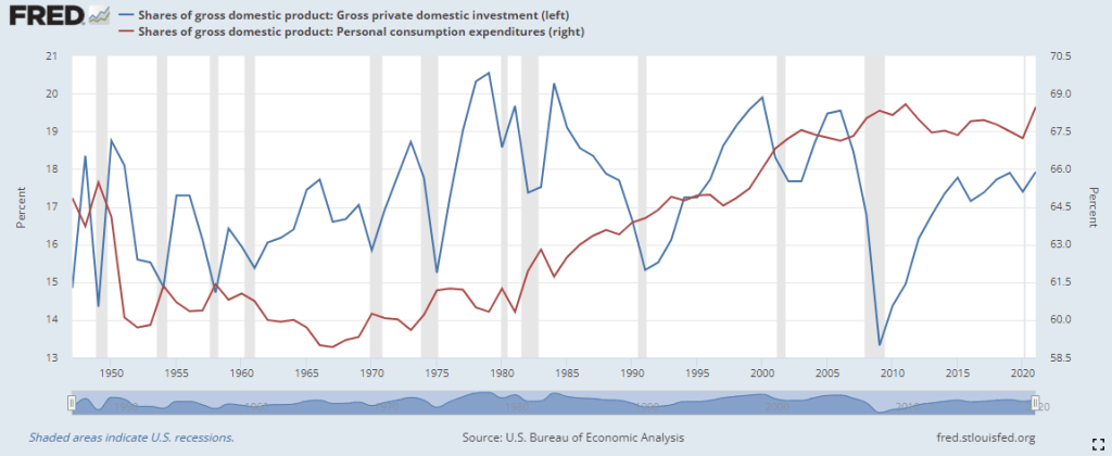
Last year private investment was 19% of the economy, near the top of the historical range of 15-20%. At that level, investment competes with consumption for real resources. The graph below compares consumption and investment as a percent of output. The blue line is investment, including residential housing, the red line household consumption.

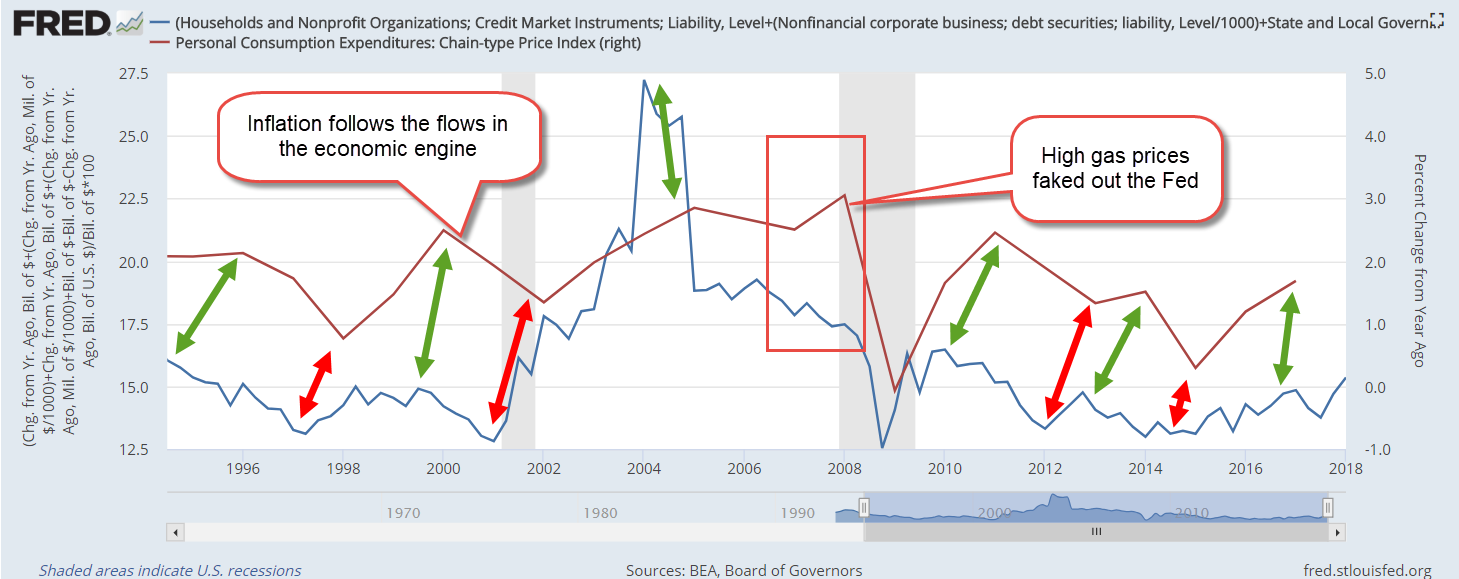
Investment looks to the future and is more volatile because it rides on the bumpy road of expectations, a central component of human behavior. People respond not to their current environment but to a forecast of their environment, the uncertainty of further interest rate hikes to combat inflation. The expectation of rising interest rates reduces investment and that helps reduce inflation and the rationale for the Fed’s raising of interest rates – a case of simultaneous causality.

The rise and fall in inflation lags changes in investment by about three months. That does not indicate an “investment causes inflation” causality but signals that they are running around the economic racetrack together. Rising investment brings jobs and higher wages and more spending income. An interruption in the supply chain causes a divergence between supply and demand, between investment and consumer spending. That divergence causes inflation.

A surplus of misplaced investment needs to be redirected to other parts of the economy. Some investment cannot be redeployed and is lost. As the level of investment falls from 19% to 15%, the economy experiences negative growth – a recession. The market distributes saleable surpluses; it doesn’t correct the causes of the surpluses. People, institutions and policies produce surpluses and it is they who have to correct those surpluses. Why doesn’t the market distribute excess wealth? It does, but not where some people would like. People respond to shortages, inequalities of circumstances. The market responds only to surpluses.

In some cities there are a lot of homeless people crowding downtown streets. There is a surplus of little used backyard space to house the homeless. Is there a surplus of homeless people or a shortage of housing? At the heart of a persistent problem is a shortage.

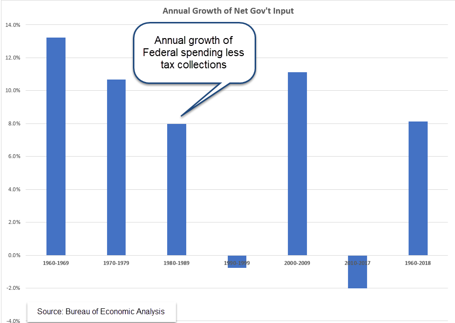
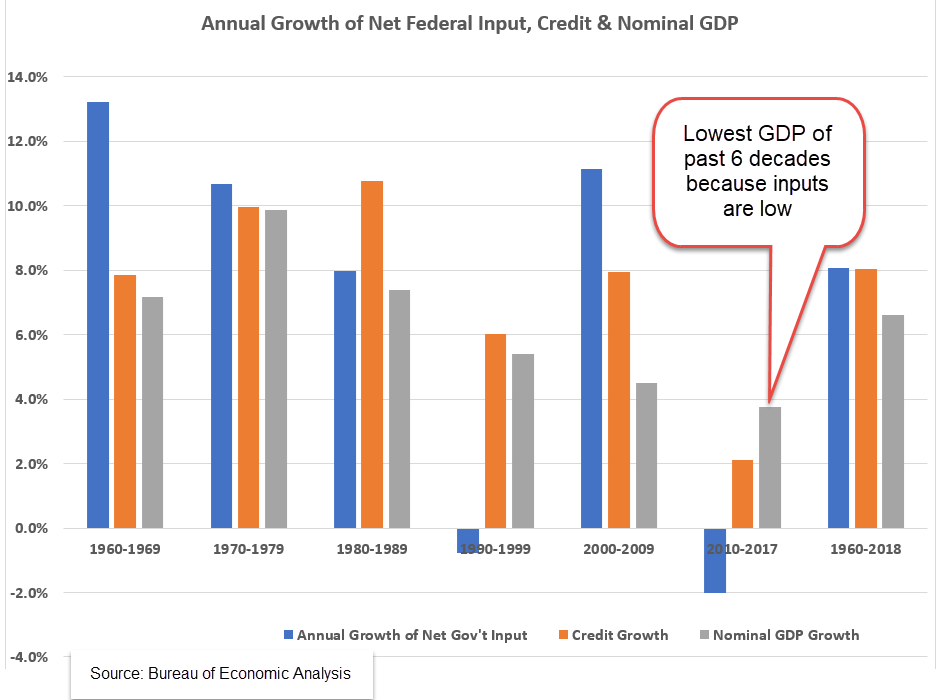
A monetarist like Milton Friedman claimed that inflation was a surplus of money in the system. He argued the root cause of high and erratic inflation in the 1970s was the Fed feeding too much base money into the system. This is “high-powered” money that banks multiply when they make loans. In the peak of the oil shock and recession of 1973-75, the percentage of base money to GDP (bmg) was almost 7%. This level, far above the historical average of 5%, looked like a likely target as the cause for inflation. In the recovery after the financial crisis, bmg was nearly 23% in 2014, more than three times higher. Inflation was low – too low. Cautious bank management had parked that high-powered money at the Fed as excess reserves. The percent of deployed bmg never reached 8%. Today bmg is at 25% but the deployed level of base money has not reached 10%.

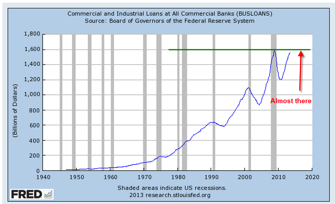
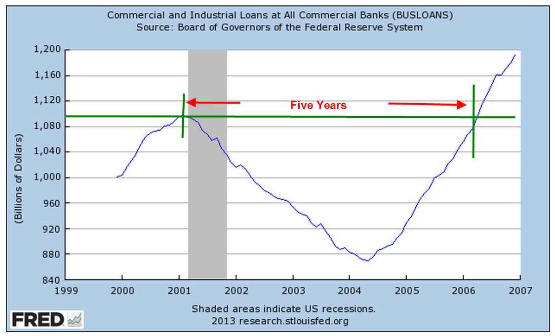
Although the Fed controls the money supply, over 4,000 banking institutions control the effect of changes in the money supply. They direct credit to where they think the losses will be the least and the gains the most. Total bank credit is up more than 9% this year and is at 68% of the economy, a historic high. Growth in businesses loans remains negative after the pandemic and at the level of loans outstanding at their historical norm of 10% of the economy. Consumers have a surplus of purchasing power that the credit market is distributing. Where does that money go? Consumers take the money they get from the banks and spend it at their local businesses. Those businesses do not have to go to the banks to get money as long as their customers have access to bank money and the businesses can attract the customers.  

By now Millennials feel like bystanders at a long parade, looking down the street for a empty space that signals the end. 9-11, housing crash, financial crisis, slow recovery with too much unemployment and not enough inflation, then an overheated housing market, a once-in-a-century pandemic and now a period with too much inflation. The oldest Millennials are just approaching middle age and might be wondering if the last half of their lives is going to be as eventful as the first half. No, of course not. Everything will be fine as long as you don’t answer the phone or open the door or say, “I’ll be right back.” It’s just a scary movie.

/////////////////

Photo by Norbu GYACHUNG on Unsplash

Base money is the FRED Series BOGMBASE. Bgm is BOGMBASE / GDP. Deployed bgm is bgm – excess reserves EXCSRESNS / GDP. That series was discontinued in 2020 at the start of the pandemic.

Gross Private Domestic Investment as a share of GDP is FRED Series A006RE1Q156NBEA. Consumption is DPCERE1Q156NBEA.

Total bank credit is TOTBKCR. Business loans is BUSLOANS.

The Force of the Fed

To some extent, the Federal Reserve considers itself government. Other times, when it serves, it considers itself not government. – Philip Coldwell, President FRB Dallas 1968-74

September 2, 2018

by Steve Stofka

The nations of the world are the gods of Mt. Money, most of them with central banks who administer the credit and currency of each nation. Like the ancient Mt. Olympus of Greek lore, there is competition and a hierarchy among the gods. Currently the U.S. is the top god of Mt. Money.  Central banks manage credit by changing the interest rate, or price, that they will charge the demi-god banks within the nation’s borders. The banks, however, do not perfectly distribute the intentions of the central bank. Acting as intermediaries, the banks filter monetary policy and have a more direct effect on the economy. In this intermediary role, banks control the draining of Federal taxes generated by the economic engine.

In the U.S., the Federal Reserve (Fed) is the central bank of the Federal government, an independent agency created by Congress which has given it two targets: promote full employment and stable inflation. To meet those goals, Fed economists must gauge the strength of the economy, a difficult task, and estimate an ideal state of the economy, an even more difficult task.

Each August the Federal Reserve holds an economic summit at Jackson Hole in Wyoming. The newly appointed head of the Federal Reserve, Jerome Powell, is the first non-economist leading the central bank in 39 years. His paper (Note #1) is plain spoken and illustrates the difficulty of reading an economy in real time. As such, I think he will be a gradualist, someone who advocates measured moves in interest rates unless there is a more abrupt shift that requires a stronger policy tonic.

Powell uses the analogy of a sailor steering the waters by reading the stars. The waves and weather can make real time observations unreliable, yet the sailor must make decisions that steer his course. Optimizing employment is one of the two missions that Congress has given the Federal Reserve. The Fed must make a real-time estimate of what they think is the optimum or natural rate of unemployment (NAIRU) and adjust interest rates to help align the actual unemployment rate to the natural rate. Powell presented a chart that compares the actual rate of unemployment to NAIRU as it was estimated at the time, and the “hindsight” NAIRU as economists now calculate it. (Note #2) The speech balloons are mine.

UnemployEstimatesPowell2018

On page seven, Powell writes that, in the past, the central bank “placed too much emphasis on its imprecise estimates of [NAIRU] and too little emphasis on evidence of rising inflation expectations.”

Note the final word – expectations. Measuring what will happen is especially difficult because it has not happened. Probability methods can help but an economy has many more inputs than a dice game. One category of estimates are surveys of guesses about what will happen in the future, but these overstate actual inflation [Note #3]. A second category uses market prices. One method uses the price that buyers are willing to pay for a Treasury Inflation Protected Security (TIPS) (Note #4) In my July 22nd post, I introduced another market method – the net flow of money into the economic engine (Note #5)

Credit expansion has been poor since the Financial Crisis. The Fed cannot force banks to increase or decrease their loan portfolios by changing interest rates. In the years following the Financial Crisis, the Fed was frustrated by this inability, called “pushing on a wet noodle.” Interest rates are the carrot. The stick is a complex regulatory process that raises or lowers asset leverage ratios to encourage or discourage lending (Note #6).

The Fed manages credit flow through asset sales and purchases. While the central banks of other countries can buy stocks and commodities, the Fed is limited to buying debt, including foreign currencies, from its member banks (Note #7).

The Fed has the extraordinary power to purchase or sell the reserves of its member banks without their consent. Like the Fed, you or I can increase the reserves of a bank by depositing money in the bank (Note #8). What we can’t do is lower those reserves by writing our own loans. However, credit card companies, who are underwritten by banks, do provide us with a line of credit that we can draw on by using our cards. During the Financial Crisis, credit card debt jumped $50B, or 15%, because card holders reduced their payments by that much. In response, credit card companies reduced credit card limits by 28% (Note #9). While the Fed encouraged banks to loan, the behavior of consumers and businesses did the opposite. Consumers and businesses were more powerful than the Fed.

The banks administer or filter Fed policy in their interactions with consumers and businesses. If a bank must pay higher interest for its funds, then it will charge higher interest rates for consumer and business loans. Interest is the price for a loan. When the price rises, the supply for loans rises (banks make more profit on the spread) but demand for loans falls. The reverse is not true, as the data of the past decade has shown. When the price falls, the supply of loans falls while the demand increases.

Less credit expansion results in a slower economic engine, which generates less Federal tax revenue. For the engine to run properly, the internal pressure must remain stable. Inflation is one gauge of that internal pressure. The annual growth in Federal tax revenue must be equal to or greater than the inflation rate. When it is not, the engine begins to stall. In the graph below, I’ve charted the annual growth in Federal tax revenue less the inflation rate. Note the periods when this metric dropped below zero. In most cases, recession follows. Look at the right side of this chart. There has never been a time when the reading is so far below zero without a recession. That is a cautionary note.

FedTaxLessInflation

The Fed must look through the fog of the future before it deploys its money super powers. In the face of this, the Fed must act with humility and a practical caution. Once it has decided on a strategy, the banks modify its implementation because they obey three masters: the Fed, their customers and their stockholders. Actual monetary policy becomes not the work of a select few in the Federal Reserve but an emergent composite of policy force and practical friction.

/////////////////////////

1. Powell’s speech is 14 pages double-spaced with several pages of charts and references.

2. For thirty years, from 1955 to 1985, the gap between the real-time estimate of NAIRU and the hindsight estimate is 1-1/2%, an error of 25%. In the 1990s economists’ models were more accurate. The estimate of NAIRU and its validity is debated now as it was in 1998 when Nouriel Roubini referenced several views on the topic.

3. A one-page Fed article on survey and market methods of measuring inflation expectations.

4. A one-page Fed article on long-term inflation expectations using the implied rate of TIPS treasury bonds – currently it is 2.1%. Vanguard article explaining TIPS bonds.

5. The net flows of credit growth, federal spending and taxes precedes inflation by several months (July 22 blog post).

6. Credit growth has been flat for the past decade as I showed in this July 15th post.

7. In conjunction with the Treasury, the Federal Reserve may buy foreign currencies to correct disruptive imbalances in interest rates. A NY Fed article explaining the process.

8. When we deposit money in a bank, its reserves, or cash balance, increases on the asset side. It incurs an offsetting liability of the same amount because the bank owes us money. We have, in effect, loaned the bank money. When so many banks collapsed before and during the Great Depression, people came to realize the true nature of depositing money in a bank. The banks could not pay back the money that depositors had loaned them. The creation of the FDIC insured depositors that the money creating powers of the Federal government would stand behind any member bank. My mom grew up during the Depression era and passed on the lessons learned from her parents. She would point to the FDIC Insured decal on the bank window and tell us kids to look for that decal on any bank we did business with in the future.

9. Credit card companies lowered limits. See page 8. Oddly enough, this Fed study found “we have little evidence on the effect of such large declines in housing wealth on the demand for debt.” Page 9. NY Fed paper written in 2013.

Taxes – A Nation’s Tiller

Printing money is merely taxation in another form. – Peter Schiff


August 12, 2018

by Steve Stofka

The Federal government does not need taxes to fund its spending, so why does it impose them? Taxes act as a natural curb on the price pressures induced by Federal spending. Taxes can promote steady growth and allow the government to introduce more entropy into the economic system.

During World War 2, the Federal government ran deficits that were 25% of the entire economy (Note #1) and five times current deficit levels as a percent of the economy. Despite its monetary superpowers, the government imposes a wide range of taxes. Why?

Using the engine model I first introduced a few weeks ago (Note #2), taxes drain pressure from the economic system and act as a natural check on price inflation. During WW2, the government spent so much more than it taxed that it needed to impose wage and price controls to curb inflationary pressures. Does it matter how inflation is checked? Yes.

When price pressures are curbed by law, people turn to other currencies or barter. During WW2, the alternative was barter and do-it-yourself. Because neither of these is a recorded exchange of money, the government collected fewer taxes which further increased price pressure in the economic engine. After the war was over and price controls lifted, tax collections relieved the accumulated price pressures. As a percent of GDP, taxes collected were 50% more than current levels.

For the past fifty years, Federal tax collections have ranged from 10-12% of GDP, but they are not an isolated statistic. What matters is the difference between Federal spending and tax collections, or net Federal input. During the past two decades Federal input has become a growing share of GDP.

FedSpendLessTaxPctGDP

During the past sixty years, that net input has grown 8% per year. The growth rates have varied by decade but the strongest rates of input growth rates have occurred when the same party has held the Presidency and House. Neither party knows restraint. The lowest input growth has occurred when a Republican House restrains a Democratic President (Note #3).

FedNetInputGrowth

Let’s compare net Federal input to the growth of credit. As I wrote last week, the Federal government took a more dominant role in the economy in the late 1960s. By the year 2000, net Federal input grew at an annual rate of 10.3%, over one percent higher than credit growth. During all but six of those years, Democrats controlled the House and the purse. During those forty years, inequality grew.

FedNetInputCreditGrowth

During the 1990s and 2010s, government should have increased its net input to offset the lack of credit growth. To increase input, the government can increase spending, reduce taxes or a combination of both. When GDP growth is added to the chart, we can see why this decade’s GDP growth rate has been the lowest of the past six decades. It’s not rocket science; the inputs have been low.

FedNetInputCreditGrowthGDPGrowth

A universe with maximum entropy is a still universe because all the energy is uniformly distributed. At a minimum entropy, the universe exploded in the Big Bang. Too much clumping of money energy provokes rebellion. Too little clumping hampers investment and interest and condemns a nation to poverty. As an act of self-preservation, a government adopts redistributive tax policies. Among the developed nations, the U.S. is second only to France in the percent of disposable income it redistributes to its people (Note #4).

A nation can either tax its citizens directly, or add so much net input that it provokes higher inflation, which taxes people indirectly through the loss of purchasing power. Of the two alternatives, the former is the more desirable. In a democracy we can vote for those who spend our tax dollars. Inflation is both a tax and an unmanaged redistribution of money from the poor to the rich. How so? Credit is money. Higher inflation rates lead to higher interest rates which reduce access to credit for lower income households, and give households with greater assets a higher return on their savings.

////////////////////////////////

Notes:
1. Federal Income and Outlays at the Office Management and Budget, Historical Tables

2. The “engine” was first introduced in Hunt For Inflation, and continued in Hunt, Part 2 , Engine Flow , and Washington’s Role.

3. Federal spending less tax collections grew at a negative annual rate during the Clinton and Obama administrations. Both had to negotiate with a hostile Republican House in the last six years of their administrations.

4. “U.S. transfer payments constitute 28.5% of Americans’ disposable income—almost double the 15% reported by the Census Bureau. That’s a bigger share than in all large developed countries other than France, which redistributes 33.1% of its disposable income.” (WSJ – Paywall) The OECD’s computation of the GINI coefficient is based on disposable personal income, which is calculated differently in the U.S.

Miscellaneous:

Average GDP growth for the past sixty years has been 3.0%. The average inflation rate has been 3.3%. The 60-year median is 2.6%. The average inflation rate of the past two decades have been only 2.1%.

A good recap of the after effects of the financial crisis.


Washington’s Role

“The rich are much better placed to feed at the public trough. The poor get crumbs.” – Steve Hanke, American Economist, 1942 –

August 5, 2018

by Steve Stofka

In the past fifty years, the increasing role of the Federal government in the economy has been the chief contributor to inequality. In the last years of the Bush administration, America became a socialist economy. Credit growth under the Trump administration has not changed from the levels during the Obama administration. On this score, Trump is Obama II.

Since the Great Recession, the federal government has far surpassed the role of banks in net input into the economic engine. In the post WW2 period, the annual growth in credit outstanding (see Notes #1) to households, corporations, state and local government surpassed the net input of the federal government, its spending less the taxes it drained out of the engine. The blue line in the graph below is the growth in bank credit.

CreditGrowthvsFedInput1953-1970

The Great Society and the escalation of the Vietnam War in the 1960s marked a changing role for the Federal government. Bernie Sanders marked the early 1970s as the beginning of the increase in inequality. Bernie suggested that the Federal government should have a greater role in the economy to correct the problem. Bernie has it backwards, as I will show. It is the greater role of the Federal government in the economy that has contributed to inequality. The hand that feeds the poor becomes the hand that feeds the rich.

Under subsequent presidents after 1968, both Republican and Democratic, the Federal input into the economy dominated the net – loans minus payments – input of bank credit. When the Federal government spends more than it taxes, it becomes a proxy debtor for individuals, state and local governments who cannot borrow enough to meet their needs. As the net credit input into the economy sank in the last two years of the Bush administration, 2007-2008, the role of the Federal government approached the levels of western European socialist governments.

CreditGrowthVsFedInput

The Obama Administration and super-majority Democratic Congress of 2009-2010 simply held that input level established earlier by the Bush Administration and a Democratic House. When Republicans took control of the House in 2011, they fought with the Obama Administration to reduce the input level. From 2012 through 2015, the growth in credit eclipsed the net input of the Federal government. Since early 2016, the growth in Federal input has once again dominated the role of the banks in the private economy. After the tax cuts passed last year, the Federal government will drain less taxes out of the economy and further cement its dominant role as an input into the engine.

For the past 65 years, quarterly credit growth has averaged 1.9%. In the last ten years, it has averaged .4%. From April 2017, two months after Trump took office, through March 2018, quarterly net credit growth averaged the same .4% as it did during the Obama years. Banks may express confidence in the Trump presidency, but their credit policies indicate that they have as little confidence in Trump’s Washington as they had in Obama’s Washington. Unless Trump can turn that sentiment, his administration will suffer the same lackluster growth as the Obama administration. If the Federal government continues to dominate economic input, Trump’s pledge to drain the swamp will be broken. Federal economic power only feeds the K-Street crocodiles lurking in the swamp waters.

/////////////////////

Notes

  1. The growth of credit outstanding (net input) is a function of new credit issued (input), debtors’ payments on existing loans (drain) and the write-off of non-performing loans (drain).

K-Street in Washington is the location of many of the nation’s most powerful lobbying firms.


Engine Flow

July 29, 2018

by Steve Stofka

“Banking was conceived in inequity and born in sin” – Josiah Stamp

In the past two weeks, I’ve looked at the inputs and drains to the economic engine. This week I’ll look at the flow between bank credit, the largest input, and loan payments, the largest drain. Because bankers want to make a profit on the money they pump into the economy, they do a better job of managing the economy than government officials.  Banks manage access to the credit system better than governments and achieve less economic inequality. Whenever governments wrest control of credit creation away from the banks to promote greater equality, the country’s economy suffers.

Let’s begin with the first point; banks must protect their loan portfolios. To do that, they monitor the health of the economy. The Conference Board uses ten data series to construct its index of leading economic indicators to estimate the probability of recession. ECRI uses 50 data series to chart its weekly leading index. These indicators are sensitive and may give a false signal, indicating a coming recession which doesn’t occur. Watching these data series are the banks who form an emergent Artificial Intelligence machine that varies the amount of credit they input into the economic engine.

Let’s piggy back on the efforts and watchfulness of the banks. We can look for a change in the ratio of household credit, an input to the engine, to the unemployment rate, or the ability to drain the input. One quarter’s decline of 2% or greater in this ratio, or two quarters of a smaller decline has been a reliable indicator that a recession is approaching. Below is a graph of the Household Debt-Unemployment ratio during the past thirty years but this signal has been reliable since World War 2.

HouseholdDebtUnemploymentRate

Bank behavior has accurately predicted the start of every recession since WW2. Is this the holy grail for mid to long-term trading decisions? Not quite. The Federal Reserve does not release the total amount of household debt for each quarter until the end of the following quarter (see #1 at end). However, every month, the BLS releases the unemployment rate, the divisor in the Debt-Unemployment ratio. If the rate is lower than a year ago, no worries. If the year-over-year change in the rate is higher in two consecutive months, worry.

Unemploy

Here’s the same chart with the stock market’s reaction when the year-over-year change has been above zero for two months in a row. Insiders and market movers have lightened their exposure to equities.

UnemployStkMkt

Loans add money to the engine. Loan payments drain money from the engine. As unemployment rises, people reduce their loan payments. In managing their risk, the banks react to signs of economic weakness by reducing the amount of credit they issue. Because they are more responsive to evolving conditions than central banks and elected officials, banks manage the economy better than the government.

Access to credit is the key to understanding the disparity in fortunes among Americans. Let’s look at the flow of credit creation in a system where a bank can loan out ten times its deposits. Let’s say I borrow $10,000 from Bank A for a bath remodel. The contractor might have a gross profit of $2500 which he deposits in Bank B, who leverages that into a $25,000 loan to another customer, who remodels her basement. Her contractor’s gross profit of $5000 is deposited in Bank C, which leverages that into a $50,000 loan to another customer for a complete kitchen remodel. Only those people with good credit – the haves – can access this money machine. The machine is closed to the have-nots.

Governments have attempted to fix this inequality. The government borrows from the banks, acting as a substitute for the people who cannot borrow. The government then inputs the money into the economy, but this does not make the engine run because there is not enough being drained out in loan payments and taxes. The engine runs on flow – inputs and drains. One without the other damages the engine and makes the country vulnerable to a triggering event which causes collapse and the economic engine blows up. Yugoslavia (1994), Argentina (2000), Zimbabwe (2008) and Venezuela (2017) are the most recent examples.

Quoting an unnamed source, Winston Churchill said, “Democracy is the worst form of Government except for all those other forms that have been tried from time to time.”  Private bank management of credit creation is a terrible system, but far better than the other systems that have been tried.

///////////////////

Notes:
1. With a month delay, the Fed releases a monthly estimate of household debt that excludes mortgages and HELOCs.

Ten years after the recession, the amount of household debt per employee is still above trend. A ratio of debt to disposable income is below trend.

According to the credit reporting agency Experian “Transactors” are 29% of card holders and pay off their balance each month. 43% carry a balance. The rest are dormant accounts. Experian ranks states by the average credit rating of its residents.

Fannie Mae reports that, as of the end of 2017, 37% of the mortgages modified during the housing crisis had defaulted again.

Bank of America clients with High Net Worth reported that their allocations were 55% stocks, 21% bonds, 15% cash, 10% other.

In May, consumer credit increased at a seasonally adjusted annual rate of 7-1/2 percent. Revolving credit increased at an annual rate of 11-1/2 percent, while nonrevolving credit increased at an annual rate of 6-1/4 percent (Federal Reserve)


The Hunt, Part 2

July 22, 2018

by Steve Stofka

Last week, I showed the inputs to the credit constrained economy as a percent of GDP. I’ll put that up again here.

CreditGrowthFedSpendPctGDP

This week I’ll add in the drains but first let me review one of the inputs, bank loans. Focus your attention on that period just after 9/11, the left gray recession bar,  and the end of 2006, just to the left of the red box outlining the Great Recession on the right.  For those five years after 9/11, the banks doubled their loans to state and local governments, a surge of $1.4 trillion. The banks increased their household and mortgage lending by $5.3 trillion, or 67%. Why did banks act so foolishly? Former Fed chairman Alan Greenspan couldn’t answer that. We have a partial clue.

For 4-1/2 years after 9/11 and the dot-com bust, there was no growth in credit to businesses, a phenomenon unseen before in the data history since WW2. The banks reached out to households, as well as state and local governments because they needed the $1 trillion in loan business missing on the corporate side (#1 below).

There are four drains in the economic engine – Federal taxes, payments on loans, bad debts and the change in bank capital. State and local government taxes are not a drain because those government entities can not create credit. The change in bank capital reflects the changes in the banks’ loan leverage and their confidence in the economy. During the 1990s and 2010s the sum of the inputs and the drains remained within a tight range of about 1/7th of GDP.

InputLessDrains

The results of bad policy during the 2000s are shown clearly in the graph. In addition to the surge in bank loans, the Federal government went on a spending spree after 9/11. There was too much input and not enough drain. The reduction in taxes in 2001 and 2003 exacerbated the problem. There was less being drained out. Asset prices absorb policy mistakes until they don’t – a life lesson for all investors.

Let’s add in a second line to the graph – inflation. The rise and fall of inflation approximates the flows of this economic engine model with a lag time of several months. I’ve shown the peaks and troughs in each series.

InputLessDrainsVsPCE

Look at that critical period from 2006 through 2007. The Fed kept raising rates in response to rising inflation (the red line), driven primarily by increases in the price of oil.  The Fed Funds rate peaked out at 5-1/4% in the summer of 2006 and stayed at that level for a year. The Fed misread the longer term inflation trend and contributed to the onset of the recession in late 2007. The net flows in the engine model (blue line) indicated that the long term trend of inflation was down, not up.

Where will inflation go next? Using last week’s theme, follow the hounds! Who are the hounds? The banks. The inflow of credit from the banks is the primary driver of inflation. Why has inflation in the past decade been low? Because credit growth has been low. Where will inflation go next? A gentle increase – see the slight incline of the blue line at the right of the graph. Contributing to that increase were last year’s tax cuts. Less money is being drained out of the engine.

Too much flow into the economic engine or an improper setting of interest rates – these mistakes are absorbed by assets, which are the reservoirs of the engine. Stocks, bonds and homes are the most commonly held assets and most likely to be mispriced. During the early to mid 2000s, the mistakes in input were so drastic that the financial crisis seems inevitable when we look in the rear view mirror. During the past eight years, the inputs and drains have remained steady, but interest rates have been set at an inappropriate level. Again, we can anticipate that asset prices have been absorbing the mistakes in policy.


//////////////////////////

1. In the last quarter of 2001, loans to non-financial corporate business totaled $2.9 trillion and had averaged 6%+ growth for the past decade. Anticipating that same growth would have implied a credit balance of $3.9 trillion by the end of 2006. The actual balance was $3.1 trillion.

Credit Patterns

July 28, 2013

Economic growth is hampered when credit growth declines.  In 2008, we experienced a sharp decline in confidence and lending that has only now reached the levels before the decline.

When we look at the big picture, we can see that we are now at more sustainable growth trends.

The amount of outstanding commercial and industrial loans is almost at the level last seen in 2008.

A smiliar slow recovery in business loans occurred during the 2001 recession.

Although housing evaluations have been rising, the amount of revolving equity lines of credit (HELOC) continues to decline.  The total outstanding is still high but approaching a more reasonable trendline of growth.

Recently rising bond yields have contributed to banks’  operating profit margins but the corresponding value of banks’ bond portfolios has fallen quite dramatically.

This decline in asset value affects bank capital ratios, which makes them less likely to increase their lending. which will be an impediment to economic growth.

This Wednesday the first estimate of 2nd quarter GDP will be released.  Real GDP growth is expected to be about 1.1%, less than the meager 1.8% growth of the 1st quarter.  Slowing growth may revive interest in bonds.  The recent sell off in bonds has probably been an over reaction incited by fears that the Federal Reserve will reduce its bond buying program dubbed “Quantitative Easing.”  While there are positive signs in the economy, they do not indicate any impending robust growth.

In addition to Wednesday’s release of GDP figures, the payroll firm ADP will show their monthly report of private employment growth, guesstimated to be slightly below the 188,000 gain predicted for June.  The BLS monthly labor report follows on Friday and will be watched closely.  Unemployment has been stuck in the mid-7% range since March and reductions in unemployment have been largely due to people either leaving the work force or taking part time jobs because they could not find full time work.

The Federal Reserve has said that its target for withdrawing its quantitative easing program is an unemployment target of 6.5%, with a caveat that inflation remains tame. A slow economy will naturally reduce inflationary pressures and improvements in the labor market are slowing as well.  In short, the Fed is likely to continue its monetary support for another year at least.

For a month now, the stock market has risen steadily in small increments, making up the losses that began in the third week of May.  Volume typically declines during summer months but this year’s volume of trading in SPY, the ETF that tracks the SP500 index, is 20% lower than this same time last year.  This week, we may see a market hesitation before the release of both the GDP and labor reports.