How Much Is That Doggie In the Window?

June 22, 2014

This week I’ll look at interest rates and various models of evaluating both the stock market and housing.

*****************

GDP Growth Revised

This past Monday, the International Monetary Fund (IMF) cut estimates for this year’s economic growth in the U.S. to 2% from 2.8%.  IMF cited a number of headwinds: the severe winter, weakness in housing, some fragility in the labor market.  It recommends that the central bank keep rates low through 2017.  Expectations were that the Federal Reserve would begin raising interest rates in mid 2015.  Some recommendations in the report will be met with antipathy or a polite “thanks for letting us know”: raising the minimum wage and gasoline taxes.

******************

Fed Don’t Fail Me Now

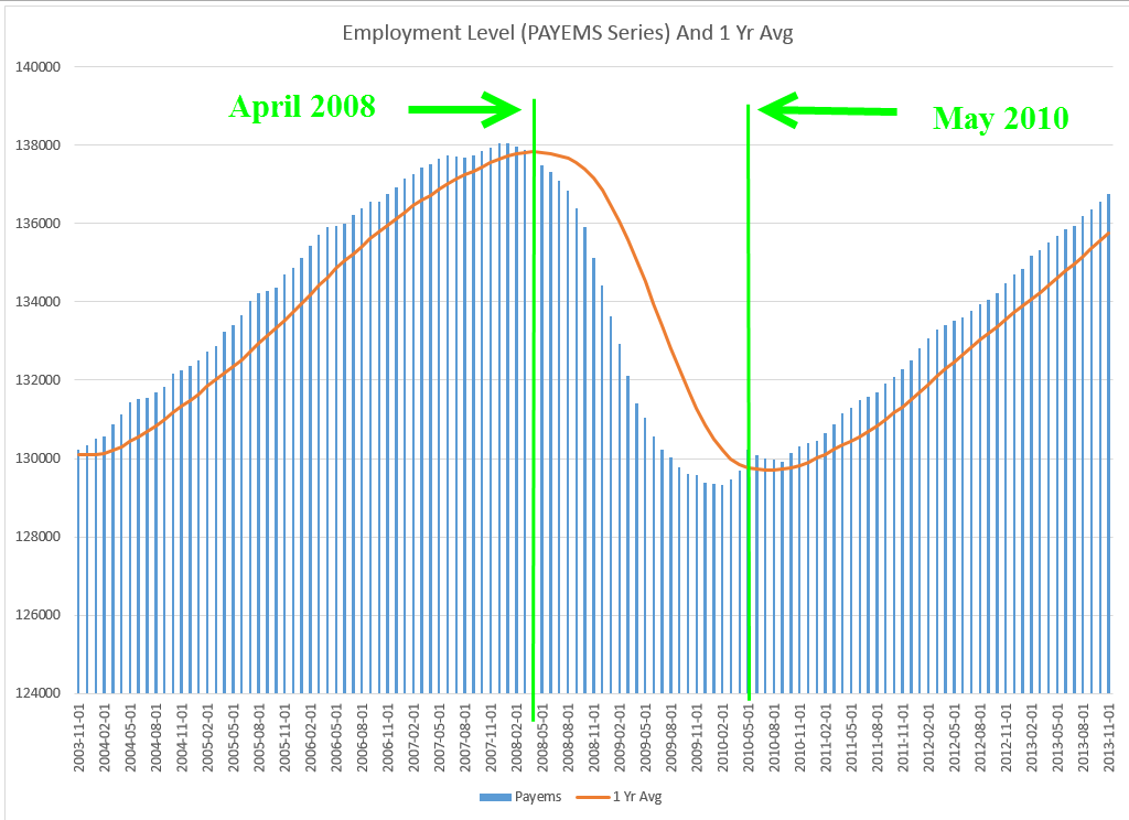
As expected, the Federal Reserve decided to leave the target interest rate at the extremely low range of 0% to .25% that it has held in place since the beginning of 2009.  Congress has given the Fed a dual mandate:  keep inflation reasonable and promote full employment.  It is this second half of the mandate that presents some problems as the FOMC looks into their crystal ball.  The Labor Force Participation Rate is the percentage of those working to those old enough to work.  It has declined from 66% at the beginning of the recession to less than 63% today.

As economic conditions improve and job prospects brighten, how many of those who have dropped out of the labor force will return?  If workers return to the labor force, actively seeking work, that increased supply of labor will naturally curb wage increases and reduce upward pressure on inflation.  However, if the decline in the participation rate is more or less permanent for several years to a decade, then a stronger economy will create more demand for workers, who can demand more money for their labor, which will contribute to inflation.

**********************

401K Retirement Plans

The Financial Times reported projections  of negative cash flows in 401K plans by 2016 as boomers convert their pension plans to IRAs when they retire.  Retirees tend to have a much more conservative stock/bond allocation and may force institutional money managers to liquidate some equities to meet the outgoing cash flows.  An ominous speculation at the end of the article is that regulations could be put in place to slow the conversion of 401Ks to IRAs.  Whenever the finance industry needs a friend in Washington, they can be sure to find one.

*********************

Stock Market Valuation

It has been 32 months without a 10% correction in the SP500 market index.  The post World War 2 average is 18 months. Is the stock market overvalued?  I will review a common metric of value and develop an alternative model of long-term value.

Probably the most widely used metric of stock valuation is the Price/Earnings, or PE, ratio.  If a stock sells for $100 and its annual earnings are $6, then the P/E ratio is 100/6, or a bit above 16.  The average PE ratio is 15.5 (Source).  Companies do not pay all of those earnings in the form of dividends to investors.  That is another metric, called the Price Dividend, or P/D ratio, that I wrote about last year.

Fact Set provides an analysis of the past quarter’s earnings of the SP500 companies, as well as projections of current  and next year’s earnings. Earnings growth estimates for this year range from 30% (yikes!) for the telecom sector to a bit over 3% for utilities. The health care sector tops estimates of revenue growth at about 8%, while the energy sector is projected to have negative growth.  The basic materials sector tops the 2015 list of earnings growth at 18% and the utilities sector again takes the bottom rung on the ladder with almost 4% growth.

The SP500 is priced at 15.6x forward 12 months earnings, which is above the five year and 10 year averages of less than 14x (Fact Set Report page)  but just about the 100 year average of 15.5.

Robert Shiller, a Yale economist and co-developer of the Case-Shiller housing index, uses a smoothing technique for calculating a Price Earnings ratio and makes his data spreadsheet available.  His team calculates the 10 year average of real, or inflation-adjusted, earnings and divides the inflation adjusted price of the SP500 by that average to arrive at a Cyclically Adjusted Price Earnings, or CAPE, ratio.

Using this methodology, the market’s CAPE  ratio is 25, above the 30 year ratio of 22.91 and the 50 year ratio of 19.57.  In 1996, the market was trading at this same ratio, prompting then Fed Chairman Alan Greenspan to make his infamous comment about “irrational exuberance.”  The market continued to climb till it reached a nosebleed CAPE ratio of 43 in early 2000.  It took another 7 months or so before the SP500 began its descent from 1485 to 900, a drop of 40%, over the next two years.  There is no automatic switch that flips when a market becomes overvalued.  People just get up from their seats and start to leave the theater.

In most decades, this methodology works well to arrive at a longer term perspective of the market’s price.  However, some argue that when severe downturns occur, this methodology continues to factor in the downturn’s impact long after it they have passed.  In 2008 and 2009, SP500 index annual earnings crashed from above $80 down to $60, a precipitous decline that is still factored into the ten year framework of the CAPE method.

So I took Mr. Shiller’s earnings figures and did some magic on them.  I took away most of the downturn in earnings during a 3 year period from 2008 – 2010.

Bye, bye earnings dive.  Hello, stagnating earnings.  The chart shows a slight downturn in earnings, then flat-lines in the pretend world of 2008 – 2010, where the steep recession never happened.

Instead of a deep crater formed in the markets by the financial panic in late 2008, the stock market slid downward over several years before rising again in early 2012.  Can you hear the soft sounds of flutes echoing in the mountain meadows of this pretend world?

Using this pretend data, I recalculated today’s CAPE ratio at 22, below the actual 25 CAPE ratio.  What should be the benchmark in this pretend world?  The 100 year average includes the Great Depression of the 1930s and World War 2, which naturally lowered PE ratios.  A 50 year average includes the Vietnam War and high inflation, particularly during the 1970s and early 1980s.  As such, it is less comparable to today’s environment marked by low inflation and the lack of major hostilities.

So, I ran a 30 year average of our pretend world, from 1984-2013, and calculated a 30 year average of 23, close to the real 30 year average of 22.9!  It shows the relatively small effect that even momentous events have on a long term average of the CAPE ratio, which is why Robert Shiller advocates its use to calculate value and establish a comparison benchmark within a longer time frame.  In the real world, the market’s CAPE ratio of 25 is above that 30 year average.

Let’s put aside the world of soft market landings and mountain meadows and look at what I call the time value of the market.  I picked January 1980, a point almost 35 years in the past, as a starting point.  Then I divided the SP500 index by the number of months that have passed since that starting point.  This gives me a ratio of value over time. If an investor buys into the market when its value is above a long-term average of that ratio, we can expect a lower long-term rate of return.

The 20 year average is 3.98, just a shade above the 20 year median of 3.91, meaning that the highs and lows of the average pretty much cancel out.  Note also that it is only in the past year that the market value has risen above the 20 year average of this ratio.

But we cannot look at a time value of any investment without considering inflation, which erodes value over time.  When we add the Time Value Ratio and the Consumer Price Index (CPI), we find that the current market is priced slightly lower than both the 20 year and 30 year averages.

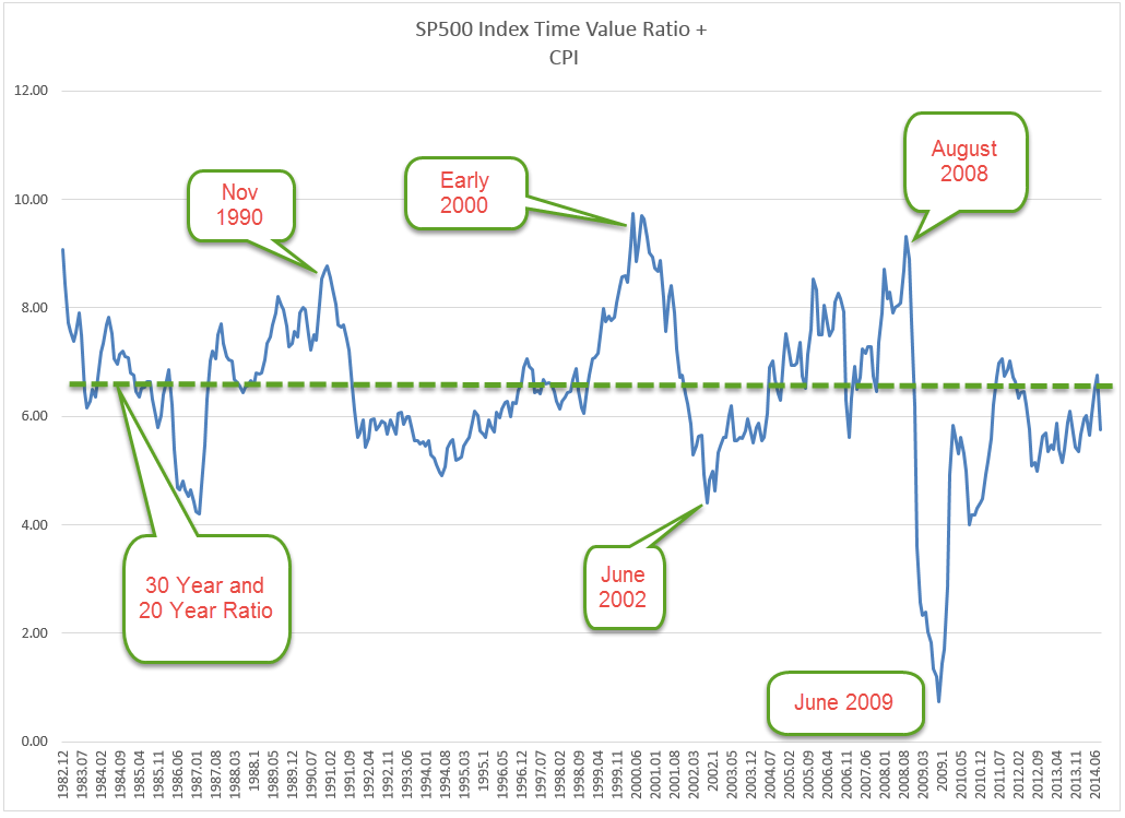
Historically, as this ratio has risen more than 25 – 30% above its long-term average,  the market peaked.  Today’s ratio is just about average.

So, is the market overvalued?  Based on CAPE methodology, yes.  Fairly valued?  Based on expectations of earnings growth this year and next, yes.  Undervalued?  Probably not.

Common Sense recently published the best and worst 10 and 20 year returns on a 50/50 stock/bond portfolio mix.  This balanced approach had a 2 – 3% annualized gain even during the Depression years when the stock market lost 80 – 90% of its value.  It should be a reminder to all investors that trying to assess the true value of the stock market is perhaps less important than staying diversified.
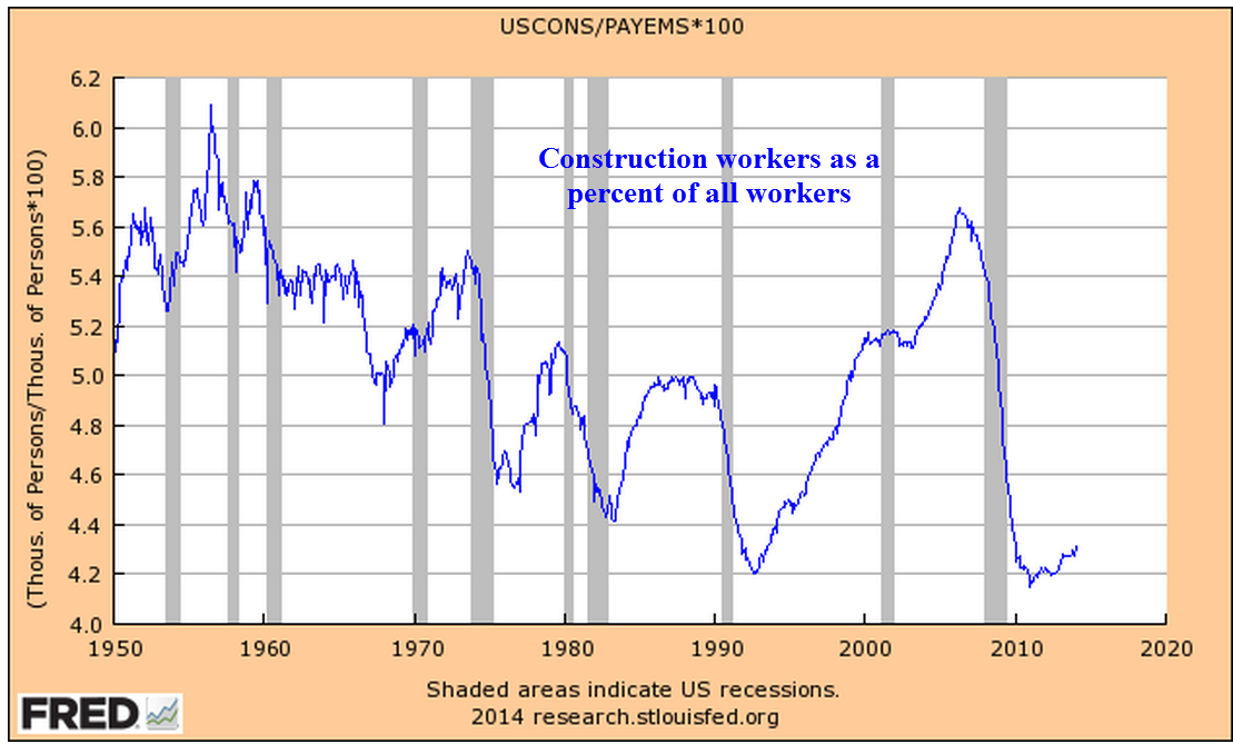
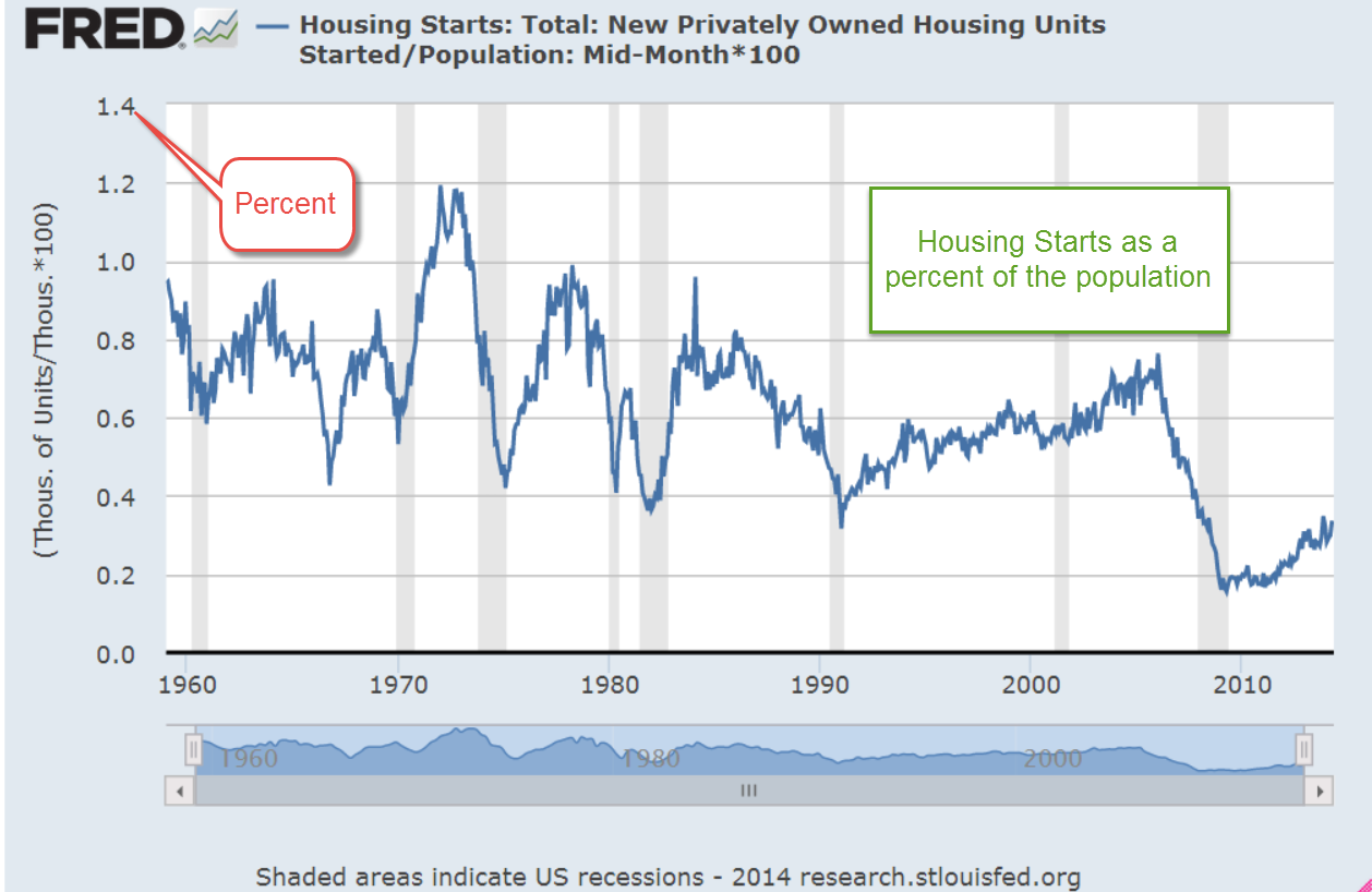
************************

The P/E of Housing

Home builders broke ground on almost 1.1 million private residential units in April, a 13% increase over last year.  Called Housing Starts, the series includes both multi-family units and single family homes. The pace slowed a bit in May but still broke the 1 million mark.  As a percent of the population, we just aren’t building as many homes as we used to.

For most of us, our working years are about 60% of our lifespan.  Hopefully, our parents took care of our income needs for the first 20% of our lifespan. During our working years, we hope to save enough to generate a flow of income for the last 20% of our lifespan.  Those savings, which include private pensions and Social Security, are like a pool of water that we accumulate until we start turning on the spigot to start draining the pool.    We turn a stock or pool of savings into a flow of income.

The Bureau of Labor Statistics uses a metric called Owner Equivalent Rent (OER) in their calculation of the Consumer Price Index.  This concept treats a home as though it were generating a phantom income equivalent to the rents in that local real estate market.  We can use this concept to value a house.  The future flows from a stock can be used to generate an intrinsic current value for the house.

As an example:  a house which would generate a net $12000 a year in income, whether real or phantom, after taxes and other expenses, is worth about 16 times that net income, according to historical trends calculated by the ratings agency Moodys.  In this case, the house would be worth about $200K.

Coincidentally, this is the average P/E ratio of the stock market.  Historically, stocks have been valued so that the price of the company’s stock has been about 16 times the earnings flow from the company’s activities.  If a primary residence generates 6% in tax free income and 3% in appreciation, the total annual return on owning a house free and clear is more than the average annual return of the stock market.  The housing boom and bust may have given many younger people the impression that home ownership is a debt trap.  It may take a decade for the housing industry to recover from this perception.

**************************

Takeaways

The Fed is likely to keep interest rates low past mid-2015 but is watching the Labor Participation Rate for early indications that rising wage pressures will spur rising inflation.
The stock market is slightly overvalued or fairly valued depending on the metric one uses.
On average, a house has a value multipler that is similar to the stock market but generates a higher after tax income.

Next week I’ll take a look at some long term trends in education spending and tuition costs.

Employment, Income and GDP

May 4th, 2014

Employment

Private payroll processor ADP estimated job gains of 220K in April and revised March’s estimate 10% higher, indicating an economy that is picking up some steam.  Of course, we have seen this, done that, as the saying goes.  Good job gains in the early months of 2012 and 2013 sparked hopes of a strong resurgence of economic growth followed by OK growth.

New unemployment claims this week were pushing 350K, a bit surprising.  The weekly numbers are a bit volatile and the 4 week average is still rather low at 320K.  In a period of resurgent growth, that four week average should continue to drift downward, not reverse direction. Given the strong corporate profit growth expectations in the second half of the year, there is a curious wariness in the market.  Conflicting data like this keeps buyers on the sidelines, waiting for some confirmation.  CALPERS, the California Employees Pension Fund with almost $200 billion in assets, expressed some difficulty finding value in U.S. equities and is looking abroad to invest new dollars.

On Friday, the Bureau of Labor Statistics reported job gains of 288K in April, including 15K government jobs.  Most sectors of the economy reported gains but there are several surprises in this report.  The unemployment rate dropped to 6.3% from 6.7% the previous month, but the decline owes much to a huge drop in labor force participation.  After poking through the 156 million mark recently, the labor force shrank more than 800,000 in April, more than wiping out the 500,000 increase in March.

To give recent history some context notice the steady rise in the labor force since the end of World War 2, followed by a flattening of growth in the past six years.

The core work force, those aged 25 – 54 years, finally broke through the 95 million level in January and rose incrementally in February and March.  It was a bit disappointing that employment in this age group dropped slightly this month.

To give this some perspective, look at the employment rate for this age group. Was the strong growth of employment in the core work force largely a Boomer phenomenon unlikely to repeat?  Perhaps this is why the Fed indicated this week that we may have to lower our expectations of growth in the future.

Discouraged job seekers and involuntary part timers saw little change in this latest report.  On the positive side, there was no increase.  On the negative side, these should decline in a growing economy.  There simply isn’t enough growth.  Was the strong pickup in jobs this past month a sign of a resurgent economy?  Was it simply a make up for growth hampered by the exceptional winter?  The answers to these and other questions will become clearer in the future.  My time machine is in the shop.

************************

GDP

Go back with me now to those days of yesteryear – actually, it was last year.  Real GDP growth crossed the 4% line in mid year.  The crowd cheered.  Then the economic engine began to slow down. The initial estimate of fourth quarter growth a few months ago was 3.2%.  The second estimate for that period was revised down to 2.4%, far below a half century’s average of 3%.  This week the final estimate was nudged up a bit to 2.6%, but still below the long term average.

Earlier in the week, the Federal Reserve announced that it will continue its steady tapering of bond buying and that it may have to adjust long term policy to a slower growth model.  The harsh winter makes any analysis rather tentative so we can guess the Fed doesn’t want to get it wrong?

************************

Manufacturing – ISM

ISM reported an upswing in manufacturing activity in April, approaching the level of strong growth.  The focus will be on the service sector which has been expanding at a modest clip.  I’ll update the CWPI when the ISM Service sector report comes out next week.

************************

Income – Spending

Consumer income and spending showed respectable annual gains of 3.4% and 4.0%.  The BLS reported that earnings have increased 1.9% in the past twelve months. CPI annual growth is a bit over 1% so workers are keeping ahead of inflation, but not by much.   Auto sales remain very strong and the percentage of truck sales is rising toward 60%, a sign of growing confidence by those in the construction and service trades.  Construction spending rose in March .2% and is up over 8% year over year but the leveling off of the residential housing market has clearly had an effect on this sector in the past six months.

***********************************

Conservative and Liberals

While this blog focuses mainly on investing and economics, public policy is becoming an ever increasing part of each family’s economic heatlh, both now and particularly in the future.
Some conservatives say that they endorse policies which strengthen the family yet are against rent control, minimum wage and family leave laws, all of which do support families.  How to explain this apparent contradiction?  A feature of philosophies, be they political, social or economic, is that they have a set of rules.  Some rules may be common to competing philosophies but what distinguishes a conceptual framework or viewpoint is the difference in the ordering of those rules.  The prolific author Isaac Asimov, biologist and science fiction writer, proposed a set of three rules programmed into each robot to safeguard humans.  A robot could not obey the second law if it conflicted with the first.  Robots are rigid; humans are not.  Yet we do construct some ordering of our rules.

A conservative, then, might have a rule that policies that protect the family are good.  But conservatives also have two higher priority rules which honor the sanctity of contract and private property: 1) that government should not interfere in voluntary private contracts, and 2) that private property is not to be taken from private individuals or companies without some compensation, either money or an exchange of a good or service. Through rent control policies, governments interfere in a private contract between landlord and tenant and essentially take money from a landlord and give it to a tenant, a violation of both rules 1 and 2.  Minimum wage and mandatory family leave laws enable a government to interfere in a private contract between employer and employee and essentially transfer money from one to the other, another violation of both rules.

In my state, Colorado, there is no rent control.  Instead, landlords receive a prevailing market price and low income tenants receive housing subsidies and energy assistance.  Under rent control, money is taken from a specific subset of the population, landlords, and given to tenants.  Under housing subsidies, money is taken from general tax revenues of one sort or another and given to tenants.  Of the two systems, housing subsidies seems the fairer but many conservatives object to either policy because the government takes from individuals or companies without any exchange, a violation of rule #2.  All policies like housing subsidies which involve transfers of income from one person to another, are mandatory charity, and violate rule #2.

Liberals want to support families as well but they have a different set of rules that prioritizes the sanctity of the social contract: 1) individuals living in a society have an obligation to the well being of other members of that society, and 2) those with greater means have a greater obligation to the well being of the society.  A government which is representative of the individuals of that society has the responsibility to facilitate the movement of wealth and income among those individuals in order to achieve a more equitable balance of happiness within the society.  Flat tax policies espoused by more conservative individuals violate rule #2.  Libertarian proposals for a much smaller regulatory role for government violate rule #1.

For liberals, both of the above rules are subservient to the prime rule: humans have a greater priority than things.  When the preservation of property rights violates the prime rule, property rights are diminished in preference to the preservation of human well-being.  On the other hand, conservatives view property rights as an integral aspect of being human; to diminish property rights is to diminish an individual’s humanity.

In the centuries old dynamic tension between the individual and the group, the liberal view is more tribal, focusing on the well being of the group.  Liberals sometimes ridicule some tax policies espoused by conservatives as “trickle down economics.”  In a touch of irony, it is liberals who truly believe in a trickle down approach in social and economic policies.  The liberal philosophy seeks to protect society from the natural and sometimes reckless self-interest of the individuals within that society. The conservative viewpoint is concerned more with the protection of the individual from the group, believing that the group will achieve a greater degree of well-being if the individuals are secure in their contracts and property. Conservatives then favor what could be called a bottom up approach to organizing society.

Conservatives honor the social contract but give it a lower priority than private contracts.  Liberals honor private contracts but not if they conflict with the social contract. Most people probably fall somewhere on the scale between the two ends of these philosophies and arguments about which approach is “right” will never resolve the fundamental discord between these two philosophies.

In the coming years, we are going to have to learn to negotiate between these two philosophies or public policy will have little direction or effectiveness.  Negotiating between the two will require an understanding of the ordering of priorities of each ideological camp.

Before the 1970s political candidates were picked by the party bosses in each state, who picked those candidates they thought would appeal to the most party voters in the district.   The present system of promoting political candidates by a primary system within each state has favored candidates who are fervent advocates of a strictly conservative or liberal philosophy, chosen by a small group of equally fervent voters in each state.  The middle has mostly deserted each party, leading to a growing polarization.  Survey after survey reveals that the views of most voters are not as polarized as the candidates who are elected to represent them. A graph from the Brookings Institution shows the increasing polarity of the Congress, while repeated surveys indicate that voters are rather evenly divided.

Employment, Obamacare and the Market

April 13, 2014

Nasdaq, Biotech and the Market

The recent declines in the market have come despite positive reports in employment and  manufacturing in the past few weeks.  Nasdaq market is off about 7% from its high on March 6th and some biotech indexes have lost 8% in the past few weeks. A bellwether in the tech industry is Apple whose stock is down about 9% since the beginning of the year, and 4% in the past few weeks.

The larger market, the SP500, has declined about 4% in the past six trading days, prompting the inevitable “the sky is falling” comments on CNBC.  The decline has not even reached the 5% level of what is considered a normal intermediate correction and already the sky is falling. It sells advertising.  The broader market is at about the same level as mid-January.  Ho-hum news like that does not sell advertising.

Both the tech-heavy Nasdaq and the smaller sub-sector of biotech are attractive to momentum investors who ride a wave of sentiment till the wave appears to be turning back out to sea.  In the broader market, expectations for earnings growth are focused on the second half of the year, not this quarter whose results are expected to be rather lackluster.  The 7-1/2% rise in February and early March might have been a bit frothy.

The aluminum company Alcoa kicks off each earnings season.  Because aluminum in used in so many products Alcoa has become a canary in the coal mine, signalling strength or weakness in the global economy.  On Tuesday, Alcoa reported slightly less revenues than forecast but way overshot profit expectations.  This helped stabilize a market that had lost 2.3% in the past two trading days.

On Thursday, the banking giant JPMorgan announced quarterly profit and revenues that were more than 8% below expectations.  Revenues from mortgages dropped a whopping 68% from last year, while interest income from consumer loans and banking fell 25%.  Investors had been expecting declines but not this severe.  JPMorgan’s stock has lost 5% in the past week, giving it a yield of 2.8% but it may need to come down a bit more to entice wary investors.  Johnson and Johnson, which actually makes tangible things that people need, want and buy every week, pays a yield of 2.7%.  Given the choice and assuming a bit of caution, what would you do?

The banking sector makes up about a sixth of the market value of the SP500, competing with the technology sector for first place (Bloomberg) The technology sector has enriched our lives immensely in the past two decades and deserves to have a significant portion of market value.  The financial sector – not so much.  They are like that one in the family that everyone wishes would just settle down and act responsibly.

****************************

Jolts and New Unemployment Claims 

February’s Job Openings report (JOLTS) recorded a milestone, passing the 4 million mark and – finally, after six years – surpassing the number of job openings at the start of the recession.  The number of Quits shows that there still is not much confidence among employees that they can find a better job if they leave their current employment.

New unemployment claims dropped to 300,000 this week; the steadier 4 week average is at 316,000.  As a percent of the workforce, the number of new claims for unemployment is near historic lows, surpassed only by the tech and housing bubbles.

*******************************

Full-time Employee

A 1986 study of Current Population Survey (CPS) data by the Bureau of Labor Statistics (BLS) found that “well over half of employed Americans work the standard [40 hour] schedule.”  The median hours worked by full time employees changed little at just a bit over 40 hours. The average hours worked by full time employees was 42.5.  The study noted that between 1973 and 1985 the number of full time workers who worked 35 to 39 hours actually declined.

A paper published in 2000 by a BLS economist noted that the Current Population Survey (CPS) that the Census Bureau conducts is the more reliable data when compared to the average work week hours that the BLS publishes each month as part of their Establishment Survey of businesses.  The Establishment survey is taken from employment records but does not properly capture the data on people who work more than one job.  In that survey, a person working two part time jobs at 20 hours each is treated as though they were two people working two part time jobs. The CPS treats that person as one person working 40 hours a week.  Writing in 2000, the author noted that the work week had changed little from 1964 – 1999.

Fast forward to 2013 and the BLS reports that full time workers work an average of 42.5 hours, the same as the 1986 study.  More than 68% of workers reported working 40 or more hours a week.

The House recently passed H.R.2575, titled the “Save American Workers Act of 2014” – I’ll bet the people who write the titles for these bills love their jobs.  I always envision several twenty-somethings sitting in a conference room with pizza and some poetic lubricant and having a “Name That Bill” contest.  I digress.  This bill defines a full time employee as one who works on average 40 hours a week, not the 30 hours currently defined under the Affordable Care Act.

When I first started doing research on this I was biased toward a compromise of 35 hours as the definition of a full time employee.  My gut instinct was that fewer full time employees work a 40 hour week than they did 30 years ago.   The data from the BLS doesn’t support my gut instinct.

******************************

Obamacare

A monthly survey of small businesses by NFIB reported an upswing in confidence in March after a fairly severe decline in February.  That’s the good news.  The bad news is that optimism among small business owners can not seem to break the 95 index since 2007.  According to the U.S. Small Business Administration 2/3rds of new jobs come from small businesses. “Since 1990, as big business eliminated 4 million jobs, small businesses added 8 million new jobs.”

This is the first full year that all the provisions of the ACA, aka Obamacare, take effect.  Millions of small businesses around the country who provide health insurance for their employees are getting their annual business health insurance renewal packages.  For twelve years, my small business has provided health care for employees.  When I received the renewal package a few weeks ago, I was disappointed to find several changes that made comparisons with last year’s costs a bit more difficult.  As an aside, this health insurance carrier has always been the most competitive among five prominent health insurance carriers in the state.

Making the comparison difficult was a change in age banding.  What’s that, you ask?  In my state, business health plans were age banded in 5 year increments; e.g. a 50 year old and a 54 year old would pay the same rate for a particular policy.  Now the age banding is in one year increments.  If I compared the cost for a 45 year old employee last year with the rate for a 46 year old employee this year, the rate increase was a modest 5%.  Not bad.  But if I compare a 48 year old employee’s rate last year with a 49 year old employee this year, costs have risen 11%.   The provider for my company no longer offers the same high deductible ($3000) plan we had, offering a choice between an even higher deductible ($4500) plan or one with a much lower deductible ($1200).  Again, this makes the comparison more difficult.   Changes like this make cost planning more difficult and are less likely to encourage small businesses to bother offering health coverage to their employees.

Out of curiosity, I took a look at 2002 prices. The company long ago abandoned the no deductible plan we had in 2002 simply because it became unaffordable – this was while George Bush was President.  A plan similar to the HMO plan we had in 2002 – $20 copay, $50 specialist, $0 routine physical, no deductible, $2000 Max OOP –  now costs 270% what it did 12 years ago, an annual increase of more than 8%.  An HMO plan as generous as the one we had in 2002 is no longer available, so a more accurate comparison is that health insurance has tripled in twelve years.   It is no wonder that many small businesses either offer no health insurance or cap benefits at a certain amount that reduces the affordability and availability of insurance for many employees.

Until the unemployment rate decreases further, employees and job applicants are unlikely to exert much pressure for benefits from small business employers, a far different scenario than the heady days of the mid-2000s when unemployment was low and employers had to bargain to get decent employees.  There is no one single powerful voice for  many small businesses, other than the NFIB,  which makes it unlikely that Congress or state representatives will get their collective heads out of their butts and address the myriad regulatory and cost burdens that are far more onerous on small business owners.  Because of that we can expect incremental employment gains.

Betraying the lack of long term confidence in the economy and in response to employment burdens, employers increasingly turn to temporary workers, who make up less than 2% of the work force.

As an economy recovers from recession, it is normal for job gains to be distributed unevenly so that the increase in temporary workers is far above their share of the workforce.  Employers are understandably cautious and don’t want to make long term commitments.  Gains in temporary employment as a percent of total job gains should decline below 10%, indicating a stabilizing work force.

For the past two decades of recoveries and relatively healthy growth the average percentage is 7.4% (adjusted for census employment).  The percentage finally fell below this average in early 2012, rose back above it for a few months then stayed under the average till January 2013.  Since February of last year, that percentage has been rising again, crossing above the 10% mark in January, an inexorable evaporation of confidence.

For the past year, repair and maintenance employment has flatlined at 1999 levels, indicating a lack of investment in commercial property and production equipment.

Specialty trade contractors in the construction industries are at 1998 levels despite an increase in population of 40 million.

While not alarming these trends indicate an underlying malaise in the workforce  that will continue to hamper solid growth.  Those ambitious and earnest folks in Washington, eager to make a difference and advance their political careers, continue to create more fixes which make the problem worse.  Imagine a car out of gas.  People out here on Main St. are pushing while the politicians keep hopping in the car to figure out what’s wrong, making the car that much more difficult to push.  At this rate, it is going to be slow going.

Employment and Economy Swings Up

April 6th, 2014

Capital Goods

Factory orders, including aircraft, rose in February but general investment spending on capital goods declined.  The leveling off of non-defense capital spending in the past year indicates a lack of certainty among many businesses to commit funds for future growth.

A more panoramic view of the past two decades shows a peaking phenomenon at about $68 billion, one which this recovery has not been able to rise above.

Remember that these peaks are in current dollars and do not take inflation into account.  When adjusted for inflation, the trend is not reassuring.  A significant component of capital goods orders comes from the manufacturing sector – manufacturers ordering capital goods from other manufacturers – whose declining share of the economy puts a damper on growth in this area.

**********************************************
Employment

Modestly strong job gains of almost 200,000 in March sparked hope that the winter doldrums are over. The private payroll processor ADP reported 191,000 private job gains in March, in line with expectations and revised their February job gains from 139,000 to 178,000.  The headline this month was that private sector employment FINALLY surpassed the level in late 2008.

Net gains or losses in government employment have been negligible in the past several months.  State and local governments have been hiring enough to offset the small monthly declines in federal employees. Total non-farm employment is still below 2007 levels but so-o-o-o-o close.

While the unemployment rate stayed unchanged, many more unemployed started looking for work.  A reader writes “I read that the labor force has increased by 1.5 million from Jan-Mar, but that doesn’t jive with the number of people hired over that time.  Am I missing something here?”

The labor force includes both the employed and the unemployed.  Unemployed people, including those who retire, who have not looked for work in the past four weeks are not considered active participants in the labor force.   Whether a person was 50 or 80, if they started looking for work, they would then be counted in the unemployed and in the labor force.

The Bureau of Labor Statistics (BLS) states that:
The basic concepts involved in identifying the employed and unemployed are quite simple:
People with jobs are employed.
People who are jobless, looking for jobs, and available for work are unemployed.
People who are neither employed nor unemployed are not in the labor force.
This definition of the labor force uses the narrowest, or headline, measure of unemployment.  Since the beginning of the year, the labor force has increased 1.3 million, 1.6 million since October.

When people get discouraged, they stop looking for work.  Then a friend says “Hey, ABC company is hiring,” and people start their job hunt again.  In the past quarter, a net 800,000 people have come back into the labor force, despite the record number of people retiring and leaving the work force.

As the economy improves, enrollment in for-profit and community college will continue to decline, accelerating from the 2% decline in 2012 – 2013 (NY Times article)  As students start looking for work, they officially re-enter the labor force.

Retirees: According to PolitiFact 11,000 boomers per day become eligible for Social Security.  Let’s say that only 8,000 per day drop out of the labor force, making a total of about 700,000+ who retired this past quarter.  A job market that can continue to overcome the drag from retirement is a sign of strength.

The Civilian Labor Force Participation Rate is the percentage of (employed + unemployed) / (people who can legally work).  So if the Civilian Labor Force were 150 million and there were 250 million people 16 years and over and not institutionalized, 150/250 = .6 or 60%.  The participation rate is currently at 63%.

**********************************************

CWPI

In the March ISM survey of service sector purchasing managers, employment rebounded strongly from the contracting readings of February.  New orders grew stronger; both of these components get more emphasis in the calculation of the CWPI.

Weighed down by the winter lull, the smoothed composite index of manufacturing and services growth has declined for six months in a row but this should be the bottoming out of this expansionary wave. Barring any April surprises, March’s strength in employment and new orders should lead to an uptick in  the composite in the coming months.

***********************************

Investing

What are the chances an actively managed fund beat its benchmark?  Not good.  An analyst at Standard and Poors compared various indexes that her company produces vs the performance of actively managed funds.  In the past five years, only 28% of large cap actively managed funds beat the benchmark SP500 index.  Some mid cap and real estate funds did much worse; less than 20% beat their benchmarks.  Consider also that actively managed funds carry higher annual fees and/or operating expenses because the fund has to pay for the brain power of active management.

Sales, Employment, Social Security

March 15th, 2014

Small business

The monthly survey of small businesses showed an abrupt decline in sentiment, below even the lowest of expectations,  and the sixth report since the beginning of the year to come in below the consensus range.  Two factors led the downward change: lowered sales expectations and hiring plans. The majority of business owners surveyed are reducing, not adding to inventory.  The steady but slowly improving sentiment during 2013 has now weakened.

This reading of optimism among small business owners is indexed to 100 in 1986.  The current survey reading of 91.5 is far above the pessimistic level of 80 that the index sank to in the early part of 2009.  In 2006, sentiment broke below the 95 level and has not risen above that since – eight years of below par sentiment among small business owners.

The lackluster small business report early in the week dampened market activity until the release of February’s retail sales report on Thursday.  The retail sales and employment reports that are released each month probably elicit the most response from the market.  A fall in February’s retail sales might have driven the market down at least 1%.  Instead, the report showed an annualized growth rate of 3.6%, offsetting the weakness in January and December.  Excluding auto sales, which accounts for about 20% of retail sales, total sales have formed a plateau.  Even auto sales were up this past month in spite of the extreme bad weather in parts of the country.  Some see this resilience in the face of the extraordinary weather this winter as an indication of an ever strengthening consumer base, a harbinger of solid economic growth.

The reason for the reduction in inventories indicated by the small business survey was revealed by Thursday’s report of the inventory-sales ratio for January.  Inventories rose at a 4.8% annualized rate versus a 7.2% annualized decline in sales.  January’s ratio of inventory to sales is at the same level as the beginning of the recovery in 2009.  Businesses will be cautious buyers this spring until excess inventories are reduced.

****************************
Employment

The number of unemployment claims declined again this week, bringing the four week average down to approximately 330,000, considered by many to be in the healthy range.  As a percent of the workforce, new unemployment claims are near all time lows.  Enacted in 1993, NAFTA had some small effect on employment but the more consequential impact was the admittance of China into the WTO.  As the relatively more volatile manufacturing employment decreased, so too did the surge in unemployment claims.  Note the reduced volatility of the work force today compared to the 1980s.

As a rule, employees quit jobs when they feel confident that another job is readily available.  The Quits rate has been rising since the official end of the recession in the summer of 2009 but is still relatively weak and declined in January.  The current level is at the lows of the recovery from the recession of the early 2000s.

As a percent of the workforce, however, the level of quits has not even reached the lows of that previous recession.

***************************
Income

Now for a disturbing trend: the decline in disposable income below 1% has always marked the start of a recession.  This annual report from the Bureau of Economic Analysis (BEA) covers the period till the end of 2013 and was not affected by the recent cold weather.

Recent price increases in basic food commodities like milk and cereal nibble away at consumers’ pocketbooks.  An ETF that tracks agricultural commodities is up almost 20% in the last six weeks.

Whenever the growth in real, or inflation-adjusted, personal consumption has declined below 2.5%, the economy has always  gone into recession within the year.  In 2013, consumption growth fell to 2.0%.

Well, maybe this time is different.  Eternal hope, persistent denial. Those of us living in the present too often believe that we belong to an elite club with special rules that those in the past did not enjoy.

**************************

Social Security

Several years ago, the Social Security administration (SSA) estimated that 10,000 people would qualify for benefits each day.  Republican Congressman Eric Cantor and Democratic Senator Ron Wyden are two politicians on opposite sides of the political aisle who mention the 10,000 a day factoid.  The actual number of new retirees per day is actually higher.  Using recent data from the SSA, PolitiFact reported that 11,000 new retirees each day qualify for Social Security.  No one mentions the 4,300 who die and drop off the Social Security rolls (2008 data from the Census Bureau).  This number is likely to increase another 15% as the Boomer population swells into old age; the 1.6 million a year who die is likely to grow to 1.8 million who leave the Social Security system while 4 million become eligible for retirement benefits.  The result is an approximate net increase of 2.2 million beneficiaries each year of the next decade.

For now, let’s leave out the growth in the disability and Medicare programs and focus only on retirement and survivor’s benefits, or OASI.

At an average yearly benefit of $14K the benefits paid by the Social Security Administration rise by $31 billion this year, a 4.6% increase on the approximately $670 billion in Social Security and Survivor’s benefits paid out in 2013 (CBO report).  The relatively small deficit of $60 billion last year will grow into hundreds of billions within the decade.  Congress argues at length over $3 billion; efforts at tackling the really big deficits of Social Security are too often met with blowhard rhetoric, not serious negotiation.

The SSA estimates that “By 2033, the number of older Americans will increase from 45.1 million today to 77.4 million.” (SSA Basic Facts) At an inflation rate of 2.5%, less than the 3% average of the past 50 years, the average $14K annual benefit will grow to $23K by 2033.  Multiply that by 77 million people and the total of benefits that will be paid to seniors in 2033 is close to $1.8 trillion, almost triple the benefits paid in 2013.  

The current elderly count of 45 million people is 14% of today’s population of approximately 313 million.  In 2033, 77 million elderly will be 20% of an estimated population of 382 million.  More people getting paid while fewer people will be paying.  The SSA estimates that a little over 40% of the population who are working will be supporting the 20% of the population that is collecting SS benefits.
Independent Senator Bernie Sanders is fond of reassuring us that the Social Security Trust Funds have plenty of money to pay benefits over the next two decades.  What the trust funds have are I.O.U.s from the U.S. Government’s pool of tax revenues.  Where will the money come from?  Increased taxes. 
Politicians rarely lead.  The art of politics is to look like one is a leader, to position oneself at the front of the herd as it flees the pursuing lions.  In this case, the lions are demographics, and decades of promises, unrealistic assumptions and political cowardice.  The question is whether voters will force the leaders to lead before the lions attack.

Employment, New Orders, CWPI

CWPI (Formerly CWI)

The Constant Weighted Purchasing Index (CWPI) that I introduced last summer was designed to be an early or timely warning system of weakening elements of the economy.  It is based on a 2003 study by economist Rolando Pelaez on the monthly Manufacturing Purchasing Managers Index (PMI) published by the Institute for Supply Management (ISM).  ISM also produces a Non-Manufacturing index for service industries each month but this was not included in the 2003 study.

The CWPI focuses on five factors published by ISM:  employment, new orders, pricing, inventory levels and the timeliness of supplier deliveries.

The CWPI assigns constant weights to the components of both indexes, then combines both of these indexes into a composite, giving more weight to the services sector since it is a larger part of the economy.  Both the CWPI and PMI are indexed so that 50 is neutral; readings above 50 indicate growth; readings below 50 indicate contraction.  In previous months (here and here), I anticipated that the combined manufacturing and services sector index would move into a trough at this time before rising again in March and April of this year.

A longer term chart shows the wave like formation in this expansionary phase that began in the late summer of 2009.

February’s ISM manufacturing index climbed slightly but the non-manufacturing, or services, index slid precipitously, more than offsetting the rise in manufacturing.  Particularly notable was the huge 9% decline in services employment, from strong growth to contraction.  The service sector portion of the CWPI shows a contraction which some blame on the weather.  A slight contraction – a reading just below 50 – can be just noise in the survey data.  The past two times when the employment component of the services sector has dropped below 48, as it did in this latest report, the economy was already in recession; we just didn’t know it till months later.

A close comparison of the current data with the previous two episodes may sound a cautionary tone.   At this month’s reading of 48.6, the CWPI services portion is not showing as severe a contraction as in April 2001 (43.5) and January 2008 (33.1), when the employment component also dropped below 48.

New orders and employment in both portions of the CWPI are given extra weight. In January 2008, new orders and employment both fell dramatically.  The current decline is similar to the onset of the recession beginning in early 2001, when employment declined severely in April but new orders remained about the same.  Let’s isolate just these two factors and weight them proportionate to their respective weights in the services portion of the CWPI.

Notice that the decline below 50 signaled the beginning of the past two recessions.  Here’s the data in a different graph with a bit more detail.

Some cite the historically severe weather in the populous eastern half of the country as the primary cause for the decline in the services sector employment indicator and it well may be.  If so, we should expect to see a rebound in this component in March.  Basing a prediction on one month’s reading of one or two components of an indicator is a bit rash.  However, we often mistakenly attribute weakness in some parts of the economy to temporary factors and discount their importance because they are temporary – or so we think.

In the early part of 2008, many thought that a healthy correction in an overheated housing market was responsible for the slowdown in economic growth.  In the spring of that year, the bailout of bankrupt Bear Stearns, an undercapitalized investment firm which had made some bad bets in the housing market, confirmed the hypothesis that the corrective phase was nearing its end. As weakness continued into the late spring of that year, some blamed temporarily high gasoline and commodity prices for exacerbating the housing correction.  In the fall of 2008, the financial crisis exploded and only then did many realize that the problems with the economy were more than temporary.

In the early part of 2001, a healthy correction to the internet boom was responsible for the slowdown – a temporary state of affairs.  When the horrific events of 9-11 scarred the country’s psyche, the recession was almost over.  Many were not listening to the sucking sound of manufacturing jobs leaving for China or giving enough importance to the increasing competitiveness of the global market.  Employment would not reach the levels of early 2001 till the beginning of 2005.

This time the slowdown in employment and new orders in the services sector may be a temporary response to the severe winter weather.  Let’s hope so.

********************************

Private Sector employment and new unemployment claims

ADP released their February employment report this week and eyes rolled.  January’s benign reading of 175,000 private job gains was so at odds with the BLS’ reported gains of 113,000.  “Oh, wait,” ADP said this week, “we’ve revised  January’s gains down to 127,000.”  In a work force of some 150 million, 50,000 jobs is rather miniscule.  As the chief payroll processor in this country, ADP has touted its robust data collection from a large pool of employers.  A revision of this magnitude leads one to question the robustness and reliability of their methodology, and the timeliness of their data collection.  For its part, the BLS admits that its current data is based on surveys and that each month’s estimate of job gains is largely educated guesswork.  ADP is actually processing the payrolls, which should reduce the amount of guesswork.

Private job gains in February were 10,000 below the consensus 150,000 but this week’s report of new unemployment claims dropped 27,000, bringing the 4 week average down a few thousand.  As a percent of workers, the 4 week average of continuing claims is below the 33 year average and has been since March 2012.  In this case, below average is good.

********************************

Employment – Monthly Labor Report

This week’s labor report from the BLS carried a banner caveat that the cold weather in February may have affected employment data.  With that in mind, the headline job gains of 175K were above expectations for 150K job gains.  The unemployment rate ticked up a bit.  If we average the ADP job gains with the private sector job gains reported by the BLS, we get 150K plus 13K in government jobs added for a total of 163K total jobs.  The year over year growth in the number of workers is above 1%, indicating a labor market healthy enough to preclude recession.

A big plus this year is the growth in the core work force, those aged 25 – 54, which finally surpassed the level at the end of the recession in the summer of 2009. 

However, there are some persistent trends independent of the weather that underscore the challenges that the current labor market is struggling to overcome.

As I pointed out last week, there are several unemployment measures, from the narrowest measure – the headline unemployment rate – to wider measures which include people who are partially employed.  The U-6 rate includes discouraged workers and those who are working part time jobs because they can’t find full time jobs.  For a different perspective, let’s look at the ratio of the widest measure to the narrowest measure. The increase in this ratio reflects a growing disparity in the economic well being of the work force.

Contributing to the rise in this ratio is the persistently high percentage of workers who are involuntary part timers.  Looking back over several decades, we can see that the unwelcome spike in this component of the work force can take a number of years to decline to average levels.  Following the back to back recessions in the early 1980s, levels of involuntary part timers took 8 years to recover to average, then quickly climbed again as the economy sputtered into another recession.  We are almost five years in recovery from this recession and have still not approached average.

There are more discouraged workers today than there were at the end of the recession in the summer of 2009.  Discouraged workers are included in the wider measure of unemployment but not in the narrow headline unemployment figure.

The median duration of unemployment remains at levels not seen since the 1930s Depression.  Someone who becomes unemployed today has a 50-50 chance of still being unemployed four months from now.  That would make a good survey question:  “In your lifetime, have you ever been involuntarily unemployed for four months?”

Despite all the headlines that the housing market is rebounding, the percent of the work force working in construction is barely above historic lows.

A recent report by two economists at the New York branch of the Federal Reserve paints a disappointing job picture for recent college graduates.  On page 5 of their report is this telling graph of a higher percentage of recent college graduates accepting low wage jobs.

Low wage and part time jobs do not enable a graduate to pay back education loans.  Almost two years ago, the total of student loans surpassed the trillion dollar mark.  According to the Dept. of Education, the default rate in 2011 was 10%.  I’ll bet that the current default rate is higher.

******************************

Takeaways

As is often the case, data from one source partially contradicts data from a different source.  The employment decline reported by ISM bears close watching for further signs of weakness.  The yearly growth in jobs reported by the BLS indicates a relatively healthy job market.

January Employment and Economic Production

February 9th, 2014

The ISM manufacturing report for January reported a severe decline from the robust readings of past months.  New orders suffered the most, dropping from a strong reading of almost 65 in December to just a bit above the neutral reading of 50.  Prices jumped significantly.  Manufacturing’s drop off in new orders comes on the heels of a similar decline in the service sector in December.  This is the third report in the past thirty days that came in below even low estimates, the other two being pending home sales and December’s employment gains.  At mid week, ISM released their January estimate of the health of the service sector which is the bulk of the economy.  Happily, this showed continued growth, helping to offset concerns about a broad slowdown in the economy.

The CWI that I have been tracking continues to show an overall strength, declining slightly to 58 from the rather vigorous reading of 60 last month.  As I noted a few weeks, this index anticipated a winter lull before picking up energy again in early spring.

A reader had difficulty understanding the wave like graph of the CWI.  I indexed it to a starting base then indexed that to the SP500 average in 1997.  Perhaps this will help visualizing the long term response of the SP500 to underlying economic activity.

*******************************

ADP reported a gain of 175,000 private jobs in January, below the strong 227,000 job gains of December.  There was only a slight revision to ADP’s previous report, confirming the suspicion of some that the greater flaw lies in the BLS figures for December.

On Friday, the Bureau of Labor Statistics (BLS) released their estimate of 113,000 job gains in January, far below the consensus of about 180,000.  Here’s a story from the Atlantic that captures some of the highlights.  Forgive some of the misspellings, if they are still there by the time you read it.

As I did last month, I’ll show the average of monthly job gains estimated by the BLS and ADP.  ADP does not report government jobs so I’ve just added those in from the BLS report.

The decline below the replacement level of 150,000 may be a temporary response to severe weather conditions in the populous east coast and Chicago region.

The market responded quite favorably to this labor report. A slackening labor market prompted hopes that the Federal Reserve will not accelerate their easing of bond buying.  A large revision of job gains in November was a big positive in the report.  Another positive was the half a million increase in the core work force, those aged 25 – 54.  Men accounted for most of this increase.

The number of people working part time because they can’t find a full time job dropped by a half million but there are still more than 7 million people in this situation.  A 232,000 decrease in the number of long term unemployed was heartening although many lost their unemployment benefits at the end of the year and may have had little choice but to take whatever job they could find.

*****************************

Doug Elmendorf is the head of the Congressional Budget Office (CBO) that advises the Congress in constructing the budget, making appropriations, and the anticipated or actual economic effects of policy.  In advance of his testimony before the House Budget Committee this past week, the CBO released the highlights of their report. Some talk show hosts and conservative media were trumpeting a loss of 2.3 million jobs due to Obamacare.  In his testimony, Mr. Elmendorf explained that the 2.3 million jobs mentioned in the CBO report are not lost jobs because the CBO does not estimate any reduction in the demand for employees because of Obamacare. The CBO estimated the number of hours that employees would voluntarily reduce their hours in order to meet qualifications for subsidies under Obamacare and divided those total hours by what a full time employee would work in a year.  Since there is a surplus of labor in this country, this voluntary reduction would help those who are either looking for a job or want to work more hours.  The CBO sees no impact on part time jobs that can be attributed to Obamacare.

*******************************
Republicans and some Independents have repeated the claim that the rich are paying most of the personal income taxes in this country. IRS 2010 data (Table 2 ) doesn’t seem to support that contention.  The top 5% of taxable returns with taxable incomes greater than $200K had taxable income of $1.9 trillion, or 36% of the total $5.3 trillion in taxable income.  On that income, the top 5% paid $513 billion in Federal income tax, 49% of the total.  In a flat tax system, the top 5% would have paid a bit more than $360 billion.

When Republicans use the code words “broaden the tax base” what they mean is that they want a flat tax so that rich people pay the same percentage of tax as poor people.  Several states have such a flat tax system.  To Democrats, a broadening of the tax base means making more of the income of rich taxpayers subject to progressive tax rates.

When Democrats use the code words “paying their fair share” they mean that the rich should pay proportionately more than the additional load of about 32% that they are currently paying.  To Republicans “fair share” means a flat tax.

What the IRS data shows is that the rich are not paying most of the income taxes in this country.  Often tax policy and social benefit programs are lumped together, confusing the issue in the minds of many.  The Tax Foundation did an analysis of the net benefit and expense of taxation and benefit programs.  They report that:

As a group, the bottom 60 percent of American families receive more back in total government spending than they pay in total taxes.

Government tax and spending policies combine to redistribute more than $2 trillion from the top 40 percent of families to the bottom 60 percent.

The methodology that the Tax Foundation uses presumes that everyone benefits equally from public spending like defense, police and the courts.  An alternative assumption that people benefit according to their income results in a $1.2 trillion redistribution, about 40% lower, according to the Tax Foundation.  (Kudos to the Tax Foundation for making both computations.)

What the report does not do – because it is just so hard to do – is calculate age and circumstance related movements of taxpayers from the top 40% to the bottom 60%.  Consider a taxpayer – I’ll call her Linda – making $100,000 who is in the top 40%.  She loses her job and starts collecting unemployment for several months.  Her income now puts her in the bottom 60%.  “Past Linda” was supporting the bottom 60% but “present Linda” is now part of the bottom 60%, according to the methodology used by the Tax Foundation.  Yet if we isolate this one taxpayer, we can say that “past Linda” was actually supporting “present Linda.”  When Linda was making $100K, she presumably paid a lot in income and other taxes, including unemployment taxes paid by her employer.  The Federal Government does not keep records that would allow this kind of inter-temporal analysis.  As a result, we get a distorted view of what is actually happening.

Let’s look at an older taxpayer – I’ll call him Sam – who retires.  Sam was making $80K before he retired and was in the top 40%.  With social Security income and income from savings, Sam now makes $36K in retirement, which puts him in the bottom 60%.  Is Sam being supported by the top 40%?  Statistically he is.  However, most of us would say that Sam is simply living off the benefits that he paid into during his working life.

I appreciate the exhaustive work that the Tax Foundation does but the problem is more complex than they present.  Furthermore, many people are not aware of the difficulties and complications of calculating who supports whom.  Some use this analysis to present the case that the majority of Americans are sucking on the teats of the few well off.  Presidential contender Mitt Romney’s unguarded comment about “the 47%” who are living off the efforts of others did not serve him well in the past election yet a sizeable percentage of voters believe this.

The 16th Amendment passed a century ago allowed the Federal government to tax the income of individuals directly and it was intended to be progressive.  Relatively few paid any income taxes in the first decades after the enactment of the income tax.  Whether one likes the progressivity of the tax code, one has to recognize that the law was intended to be that way when it was passed.

I would like to see the repeal of the 16th Amendment for two reasons: 1) protect individuals from the power of the Federal government; 2) slow the consolidation of money in Washington.  Money brings power and power begets patronage, if not downright graft.  We can never get rid of patronage, only retard the concentration of patronage. Studying 5000 years of history, we have learned that the concentration of power in any political institution ultimately leads to the downfall of that institution.  Only corporations can exist with such a concentration of power and even they sometimes fall when top leadership in a company becomes resistant to change.

Perhaps we could adopt a taxing system where the Federal government taxes the states based on the population in each state.  If a state has 10% of the country’s population, then they would owe 10% of any tax used to replace the current income tax.  Let the states determine how they will collect the money.  Racism has been a constant nemesis of this country and legal protections could be enacted which would prevent states from taxing citizens based on race or sex.  Head taxes have a tawdry reputation because they were often used to disenfranchise poorer voters.  If the population count of a state was simply used as an allotment mechanism and not applied directly to each citizen, I think that this could be a fairer and safer system of taxation.  Certainly, legislation could be passed preventing the denial of rights to a citizen based on a tax.

Could Doug Elmendorf and his cohorts at the CBO build a model based on such a system?

*******************************

Tidbit:

And we’re talking about nine million individuals who are eligible for both Medicare and Medicaid. They are responsible for a significant amount of spending in both programs — approximately 46% of Medicaid and close to a quarter of Medicare spending annually.  Estimates range that that is anywhere from 300 to $350 billion a year total that we’re [CMS] spending. 
Melanie Bella, Director of the Federal Healthcare Office at the Centers for Medicare and Medicaid Services, Federal Coordinated Healthcare Office Conference 11/1/2010

Labor’s Journey

January 12th, 2014

A dramatic decrease in new orders, mostly for export, for the non-manufacturing sector of the economy offset other positives in the December ISM report.  The composite non-manufacturing index dropped slightly but is still growing.  A blend of the manufacturing and non-manufacturing indexes, what I call the CWI, declined from its peak as expected. A month ago I noted the cyclic pattern in this index, and the shorter time between peaks as the economy has formed a stronger base of growth. Most businesses are reporting expansion, or strong growth.  Some respondents to the survey noted that the severe winter weather in December had an impact on their business.

*****************************

Ringing in the New Year, the private payroll firm ADP issued a strong report of employment growth before the release of the BLS figures on Friday.  The reported gain in jobs was above the best of expectations.  In the past few months,  several reports in production and now in employment have exceeded expectations or come in at the upper bounds of estimates.

*************************

Wells Fargo announced that they will be offering non-conforming mortgages to selected buyers who present a low risk.  Non-conforming mortgages may be interest only, or have loan to values that don’t meet guidelines. Reminiscent of the “old days,” Wells Fargo intends to hold onto the mortgages instead of selling the paper in the secondary market.

************************
The Gallup organization announced their monthy percentage of adults who are working full time, what Gallup calls the P2P.  I call this the “Carry the Load” folks, those people whose taxes are supporting the rest of the population.  At 42.9%, it is down a percentage point or two from previous winters.

************************
The 4 week average of new unemployment claims is still below 350,000 but 20,000 higher than a month ago.  As I mentioned last week, this metric will be watched closely by traders in the coming weeks.  Although there is little statistical significance between a 349,000 average and a 355,000 average, for example, there is a psychological boundary marked in 50,000 increments.

************************
Friday I woke up and found that somebody stole the ‘1’s at the Bureau of Labor Statistics.  The BLS reported net job gains were 74,000 and I thought that there was a smudge on my computer screen blocking the ‘1’ of 174,000 and reached out to wipe it off.  There was no smudge.  It is difficult to interpret the discrepancy between the ADP report and the BLS report.  Some say that the particularly harsh winter weather in the midwest and east caused many people to stop looking for work or that many businesses returned their BLS survey late.  If so, we may see some healthy upward revisions to the employment data when the February report comes out. Here’s a look at total private employment as reported by BLS and ADP.

As you can see there is a growing divergence between the two series.  As a percentage of 120 million or so employed in private industry, the divergence of a few hundred thousand is slight.  The BLS assumes a statistical error estimate of 100,000.  But people closely watch the monthly change in employment as a forecast of developing trends in the overall economy, changes in corporate profits and consequently the price of stocks.  Here is a chart of the difference in private employment as measured by the BLS and that measured by ADP.  A positive number means that the BLS is reporting more employment than ADP.

As with any estimates, I tend to average the estimates to get what I feel is a more accurate estimate.  This averaging works well when bidding construction jobs and some statistical experiments have proven the method reliable.  Averaging the two estimates for private payrolls gives us an estimate of job growth that is still above the replacement threshold of about 150,000 net job gains per month needed to keep up with population growth.

The figures above do not include 22 million government employees, or about 14% of total employment.  Flat or declining employment in this sector has dragged down the headline job gains each month.  Adding in net job gains or losses in the government sector gives us a net job gain of about 150,000 in December.

For those of you interested in more analysis of the employment report, Robert Oak at the Economic Populist presents a number of employment charts similar to the ones I have been doing in past months.

********************************
For the past 5 – 10 years, much has been written about the growth in income inequality during the past 30 to 40 years. I’ll call income inequality “Aye-Aye” because the abbreviation  “II” looks like the Roman numeral for “2” and because Ricky Ricardo used to exclaim “Aye, Aye, Lucy!” on that much loved comedy series.  Those on the left blame former President Reagan,  British Prime Minister Thatcher, and deregulation for Aye-Aye.  Those on the right blame increasing regulation that disincentivises businesses from taking chances, from making capital and people investments to pursue robust growth. The expansion of social welfare programs makes people ever more dependent on government and less likely to take jobs that they don’t want.  Economists cite the aging of the population as a cause of the growth of Aye-Aye.  Few I know of seriously challenge the idea that Aye-Aye has been happening.  The argument is over the causes and the solutions.

Thomas Piketty’s Capital in the 21st Century will add to the debate.  The English translation will be published in March.  A book review in the Economist outlines some of the ideas in the book.  Piketty’s analysis of almost 150 years of data from several countries indicates that the slower an economy grows, the more unequal the distribution of income.  One might think that the U.S. would have the most unequal income distribution, but Piketty reveals that it is France that tops the list.

Piketty’s rule of thumb is that the savings rate divided by a country’s growth rate will approximate the ratio of capital wealth to gross income.  As this ratio increases, more of the national income goes to those with capital wealth. So, if the savings rate is 8% and the growth rate is 2%, then capital wealth will be about four times gross national income.  Furthermore, he finds that population growth accounts for about half of economic growth over the past century and half.  Slowing population growth in the developed nations therefore leads to greater inequality of income.  If this rule of thumb is fairly accurate, stronger economic growth is the only way to lessen the inequality of income that has grown steadily over the past thirty to forty years.

If you are familiar enough with French, you can read a preview here or pre-order the English version here.  The book is sure to spark some lively discussion between those in the economic growth camp and those in the demographic camp.  The topic has long been a topic of discussion in emerging economies.  I will quote from an Asian Pacific policy journal published in 2003, “The most important determinant of inequality is not [emphasis mine] economic growth, however, but rather changes in demographic age structure.”

Year In Review

January 5, 2013  2014

The start of any year presents an opportunity for reflection on the past year as well as the upcoming one.  At the start of the year, few, if any, analysts called for such a strong market in 2013.  The S&P500 closed the year at 1850, a 30% gain. After a correction in May – June of this year, the index rose steadily in response to better employment data, industrial production, GDP increases, and the willingness of the Federal Reserve to continue  buying bonds and keep interest rates low.

I was one of many who were mildly bullish at the beginning of the year but got increasingly cautious as the index pushed past 1600.  Yet, month after month came not only positive or mildly positive reports but a notable lack of really negative reports.  Leading economies in the Euozone, teetering on recession, did not slip into recession.  Fraying monetary tensions in the Eurozone did not explode into a debt crisis.  China’s growth slowed then appeared to stabilize.  Although the attention has been on the Eurozone the past few years, the sleeping dragon is the Chinese economy, its overbuilt infrastructure, the high vacancy rate in commercial buildings in some areas of the country and the high housing valuations relative to the incomes of Chinese workers.

A year end review is an exercise in humility for most investors.  Some fears were unfounded or events unformed which confirmed those fears.  People are story tellers – stories of the past, imaginings of the future.  An investor who keeps all their money in CDs or savings accounts is predicting an unsafe investing environment for their savings.

Perhaps the best strategy is the one that John Bogle, the founder of Vanguard, advocates.  He doesn’t try to predict the future or be the best investor.  He aims for that allocation of stocks, bonds and other investments that, on average, forms a suitable mix of risk and reward for his goals, his age and the financial situation of his family.  He looks at his portfolio once a year.  I do think that a good number of individual investors had adopted the same outlook as Mr. Bogle advocates – until the 2008 financial crisis.

Since the financial crisis, too many investors have adopted a paralyzed strategy, a “deer in the headlight” reaction to the financial crisis that has been hugely unrewarding. Part of this year’s rise in the stock mark can be attributed to individual investors moving cash back into the stock market but I would guess that many of those investors are ready to pull it back out at the first sign of any trouble.  This shows less a confidence in the market but a frustrating lack of alternatives.

Long term bond prices took a significant hit in the middle of the year on fears of an impending rise in interest rates.  Bond prices had simply become too high, driving down the yield, or return, on the investment. Lower bond yields and meager CD and savings rates provided little return for investors, leaving many investors with little choice but to venture back into the stock market.

*************************************
The Coincident Index of Economic Indicators remains level and strong.  A decline in this index below the 1% average growth rate of the population indicates the start of or an impending recession.

Note the index in 2002 – 2003 as it fell back, never rising above the 1% level.  I have written about this economic faltering before.  Much of the headlines were focused on the lead up to and start of the Iraq war.  The recovery from the recession of 2001 and 9-11 was very sluggish.  Fears that the country was entering a double dip recession similar to that of the early 1980s prompted Congress to pass the Bush tax cuts in 2003.  It was only the increased defense spending of 2003 that offset what would have been a decline in GDP and another recession.

***********************************
A worrisome rise in new unemployment claims has puzzled some analysts.  Typically, new claims for unemployment decline at the end of the year, particularly in a year such as this one when reports of strong economic growth have been consistent.  Since 2000, rises in claims at the end of the year have been a cautionary note of things to come.  Mid-term investors and traders will be paying attention to this in the weeks to come.

However, the decline this year may be more of a leveling process that has been forming for most of the year.  On a year over year basis, the long term trend is down – which is up, or good.

In March 2013, I wrote “when unemployment claims go up, the stock market goes down … On a quarterly basis, this negative correlation has proved to be a reliable trading signal for the longer term investor.  When the y-o-y percentage change in new unemployment claims crosses above the SP500 change, sell.  When the claims change crosses below the SP500 change, it’s safe to buy. ”  The percent change in SP500 is still floating above the change in unemployment claims.

**********************************
Sales of motor vehicles in November were above even the most optimistic expectations.  The ISM manufacturing index showed a slight decline but is still in strong growth mode and the already robust growth of new orders continues to accelerate.  The manufacturing component of the composite index I have been following since last June is at the same vigorous levels of late 1983 and 2003 when the economy finally breaks free of a previous recession.  I’ll update the chart when the non-manufacturing report is released this coming Monday.

*********************************
In a healthy economy, the difference between real GDP and Final Sales Less the Growth in Household Debt (Active GDP) stays above 1%, which incidentally is the annual rate of population growth.  As the chart below shows, this difference dropped below 1% in late 2007.  Finally, six long years later, the difference has risen above 1%, indicating a healthy, growing economy.

**********************************
And now a brief look at the year in review.

At the end of 2012, the price of long term bonds had declined slightly from the nose bleed levels of the fall but there was more to come.  I wrote “As this three decade long upward trend in bond prices begins to turn, bond prices can fall sharply as investors turn from bonds to stocks and other investments. We are approaching the lows of interest yields on corporate bonds not seen since WW2. Investors are loaning companies money at record low rates and companies are sucking up all that they can while they can. Sounds a lot like home buying in the middle of the last decade, doesn’t it?”

During the past year, long term bonds declined another 10%.  They seem to have formed a base over the past several months.  Intermediate term bonds are less sensitive to interest rate changes so they are the safer bet.  They lost about 6% in price over the past year.  Short term corporate bonds are a good alternative to savings accounts.  They pay about 1% above the average savings account and they usually vary very little in price so that the principal remains stable.

At the end of 2012, I wrote “the underlying fundamentals of the economy give reason for cautious optimism.” A month later, “As the saying goes, ‘The trend is your friend.’ When the current month of the SP500 index is above the ten month average, it’s a good idea to stay in the market.”  In January 2012, the monthly close broke above the 10 month average. This is a variation of the Golden Cross that I wrote about in January and February 2012.

Let’s look at this crossing above and below the 10 month average.    When this month’s close of the SP500 index crosses above the 10 month average of the index, it indicates a clear change in market sentiment.  I have overlayed the percent difference between each month’s close and the ten month average.

As you can see, the close near the end of December is near 10% above the 10 month average.  If the above chart is a bit too much information for you, here is a graph of the percent difference only.

Is the market overheated?  As you can see the market has sustained a robust (or some might call it exuberant) 10% for 6 – 9 months in 2003, 2009, and 2010-2011.  From 1994 to 1999, the market spent a lot of time in the 10% percent range. Some pundits are talking about this market as a bubble but we can see that this market has not penetrated the 10% mark.  At the end of January 2013, the market closed at more than 7% above it’s 10 month average, over the 4 year positive average of 5.6% (the average when the difference is positive).  The market is 20% up since then.

******************************
In March I introduced the “Craigslist Indicator,” the number of work trucks and vans for sale in a local area, as a gauge of the health of the construction industry.  It was a funny little indicator that indicated a growing strength in the construction industry at the beginning of the year.  Now for the amended version of the Craigslist Indicator: when there are a lot of older work trucks and vans advertised for sale on Craigslist, that indicates a robust construction market.

*****************************

On March 24th, 2013 I wrote ” For the past year, the Eurozone has been in or near recession, yet some are hopeful that increased demand in this country and some emerging markets are helping to balance the contractionary influence of decreased demand in the Eurozone. Let’s hope that this surge in the first part of the year does not fade as it did in 2012.”  Instead, emerging markets began to contract and the Eurozone expanded slightly. Investors who bought emerging markets in March 2013 witnessed a more than 10% decline during the summer but the index ended the year at about the same level as nine months ago.

******************************
I thought that home prices in the early spring has reached a peak and wrote on March 31st, “The upturn in home prices is still above the trend line growth of disposable income and until personal income can resume or surpass a 3% growth rate, any rise in home prices will be constrained.” The Purchase Only House Price Index (HPIPONM226S) rose steadily throughout the year.
In late summer, I noted the falloff in single family home sales that began in the spring.  But prospective buyers were incentivized to make the deal as interest rates began to climb from their historically low levels.  Home sales surged upward; a lack of inventory in many cities also formed a support base that propped up prices.

A sobering note in September, “Rising home values are good for those who own a home but increasing valuations make it that much more difficult for buyers trying to buy their first home.  People in their twenties and early thirties who are most likely to be first home buyers have been hit hard by the recession.”

*******************************
After a decline in the stock market in June, I wrote “For the long term investor, periods of negative sentiment can be an opportunity to put some cash to work.”  Although I took my own advice, I wished I had acted with more conviction.  Of course, if the market had declined 10%, I would have been patting myself on the back for my cautious stance.  Smiley Face!!

*******************************
In July I noted the rather dramatic decrease in the value of securities held at the nation’s largest banks “Recently rising bond yields have contributed to banks’  operating profit margins but the corresponding value of banks’ bond portfolios has fallen quite dramatically.  This decline in asset value affects bank capital ratios, which makes them less likely to increase their lending … [and] will be an impediment to economic growth.”  The rising stock market and a respite in the decline of bond prices helped stabilize those portfolios in the second half of the year.

********************************
In September, I noted “Despite all the daily and weekly responses to political as well as economic news, the SP500 stock market index essentially rides the horse of corporate profits.”  Profits have more than tripled in the past ten years.  We should stay mindful of that stock price to profit correlation as we look out on the investment horizon.

********************************
From time to time I comment on the venality of our elected representatives.  Although they might appear to be idle rants to some readers, they are a caution.  Politicians make promises to get votes.  People become more dependent on those promises.  Inevitably, the day comes when the promises can not be met – as promised.  Those nearing or in retirement become increasingly dependent on political promises and should leave themselves a cushion – some wiggle room – if possible, when they make income and expense projections.  This Washington Post article on proposed budget cuts to military pensions is a case in point.  As long as “they” come for the other guy, we don’t pay too much attention – until they come for us.  Over the next ten to twenty years, we can expect many small cuts to promised benefits.  The cuts have to be small or target a small sector of the population so that they don’t anger voters too much.  In several blogs, I have shown how a simple recalculation of the Consumer Price Index eats away at the incomes of workers and retirees.  Expect more of these “recalculations” in the future as politicians follow a long standing tradition of making promises to win votes and bargain patronage to gather financial support for their campaigns.

We have the midterm elections to look forward to this year!  OK, calm down. Republicans will be hoping to take the Senate and make President Obama’s life miserable for the following two years.  I am guessing that the political campaigns for some Senate seats will vacuum in more money than the GDP of a lot of small and poor countries.

Employment Growth

December 29th, 2013

In several past blogs here and here, I have noted a “rule of thumb” guide to recessions based on the unemployment rate.  When the year over year percentage change in the unemployment rate goes above 0, recession smoke alarms go off.  Sorry, no phone app for this alarm. This metric sometimes indicates a recession that doesn’t quite materialize in the economic data, a false positive, although the market may react to the possibility of a recession.  Employment is but one factor in a complex economy and no one indicator can stand as a fail safe predictor of a serious enough decline in the economy that it gets labelled “recession” by the NBER.

Another related measure is the total employment level.  This employee count comes from the Establishment Survey conducted by the BLS and is the source for the monthly headline job gains or losses. To show the correlation between payroll and economic activity, I took a measure of GDP – I’ll call it active GDP – that excludes changes in business inventories and net exports.  From this I subtracted the change in real household debt in each quarter.  This measure of economic activity reflects what consumers can actually pay for.  Below is a chart of the yearly change in this adjusted measure of GDP and the number of people working.  There is a remarkable correlation.

As I will show below, the employment market has not fallen into an unsafe zone but the decline in growth of domestic demand indicates a fragility that should not be overlooked.  Comparing the number of people working to the 12 month average reveals trends and weaknesses in the economy.  Historically, when the number of workers falls below its 12 month average we are almost certainly in a recession.  As of now employment is maintaining a healthy but not robust growth rate.

When the difference between the monthly count of people working and its 12 month average (I’ll call it DIFF) falls below 1% (I’l call it WEAK), it shows a pre-recession weakness in the economy. In past decades, this DIFF might fall to .75% before recovering, a temporary weakness.  Since June 2000, employment growth has been in a WEAK state, never recovering above 1%.  Following the dot com bust in 2000, 2001 included an 8 month recession, the admittance of  China to the World Trade Organization and the sucking up of low skilled manufacturing jobs, and the horrific events of 9-11.  For two years the country endured a painfully slow and fitful recovery, prompting a Republican Congress to pass  what are called the Bush tax cuts.  Neither tax cuts or the overheated housing market of the mid 2000s could kick the DIFF above 1% although it got very close for a number of months in late 2005 and early 2006 as the housing market peaked.

When the DIFF falls below 500, we can mark fairly closely the beginnings and ends of recessions as they are called by the NBER many months later.

It is important to note that historical data is already revised data.  We must make investment decisions with the data available at the time. (See an earlier blog for some examples of revisions to payroll data.)

**************************
This week’s reports were generally better than expected.  These included durable goods orders, sales of new homes, personal income and spending.  Housing prices, as shown by the FHFA purchase only index, are maintaining an 8% year over year change.  Over the past quarter century, housing prices have followed a 3.2% annualized growth rate.

**************************
In previous blogs, I have examined the PCE inflation measure that routinely produces the lowest rate of inflation.  This is not the headline CPI index but is used to produce what is called a chain type price index.  Inflation estimates based on this indicator showed 0% inflation in November and less than 1% for an entire year.  Isn’t that great?  Rents, food, utility bills, insurances have barely increased over the past year.  Yes, I know you are ROFL until you realize that the joke is on you, on all of us.

***************************

Let’s get in the wayback machine and go back to early 2007 when the Bush administration released their estimate of GDP for the years 2007 – 2013.  Every Presidential budget indulges in the folly of predicting the future economic growth of the largest economy in the world.  When we dig into the figures, the process is rather simple.  These estimates simply take actual figures from 2006 and calculate 5% annual growth in nominal GDP.  Any of us could do this with an Excel spreadsheet.   An unemployment rate below 5% is rather infrequent and unlikely to continue for very long but the Bush Administration projected that this sub-5%level would continue for another six years.  If your 12 year old came to you with these calculations, you would probably praise them for their effort and smile inwardly at the innocence of the projections.  You wouldn’t tell your twelve year old that things don’t stay rosy indefinitely because they will find that out in due time.  This kind of middle school mentality is what passes for wisdom in Washington.

In the course of our lives, how many times do we come to a carefully calculated answer only to step back and say “Well, that can’t be.  Something’s wrong.”  It seems that there are few in Washington who doubt themselves.  The polarization in Washington means that everyone in any position of responsibility has many critics on the other side of an issue.  Each one then surrounds themselves with others who support their position, their values, their calculations.  There is no stepping back and saying, “Wait, is that right?” The revolving door in Washington ensures that many politicians have little to lose even if they lose their seats.  Many soon find an even more lucrative position in the private lobbying industry.  What they do lose is the ability to wake up in the morning, look in the mirror and say, “I’m important.”  Lose a bit of arrogance, gain a bit of humility.  Not such a bad tradeoff.

The investor who puts his own money at risk, who has skin in the game, as the economist Nassim Taleb calls it, can not afford to NOT step back and take a second look at their investment strategies and allocations.  As we complete another lap, this is a good time to recheck and rebalance.  The 25+% gains in the stock market have probably skewed the allocations of many an individual’s portfolio.  Here’s hoping everyone has a good year!