Fault Lines

January 20, 2019

by Steve Stofka

If your twin brother went away on a spaceship a month ago and looked at the current price level of the SP500, he wouldn’t see much change. What a month it has been! A 7% drop in stock price the week of December 17th, followed by a Christmas Eve when Santa left a lump of coal in investor’s stockings, followed by a government shutdown.

Let’s say your twin brother went off to the Romulan Galaxy on a spaceship flying near the speed of light on October 1, 2007. He has just come back and has aged a few weeks. You have aged a great deal. The financial crisis, the housing crisis, the job crisis, the crisis crisis. No wonder you look older. There are too many crises.

Your twin brother notes a similarity in the behavior of the stock market the past few months and the fall of 2007 when he took his starflight cruise. What similarity you ask? He hauls out his Romulan graphing tool and shows you a plot comparison of SP500 prices (SPY) in the fall of 2007 and the fall of 2018. Not only does your twin brother look younger but he also got a Romulan grapher on his journey. It is not fair.

spycomp20072018

“In both periods, prices fell about 15% in 15 weeks,” your brother says.

“They happened to fall the same percentage in the same amount of time,” you answer.  “That probably happens all the time and we just don’t notice.”

“15-20% drops in as many weeks doesn’t happen all the time,” your brother says. “It happens when there are fault lines forming. It happened in December 2000, January 2008, again in August 2011 during another government shutdown, and now.”

“Sure, there are some trade problems and the government shutdown,” you protest, “but the economy is good. Employment is at all- time highs, wage gains were over 3% last month, and inflation is relatively tame.”

“Everything was still pretty good in December 2000 and January 2008,” your brother responds. “‘A healthy correction after a price boom,’ some said. ‘The market is blowing off the excess froth before going higher,’ others said. At both times, there was something far more serious going on. We just didn’t know it.”

“You got pretty smart in the time you were gone,” you tell your brother. “Can I get one of those Romulan graphers?”

“Yes, I bought one for your Christmas present 11 years ago,” your brother says and hands you a grapher from his spacesack. “Tell me, what are these picture phones that people are carrying around now? I don’t remember them from when I left. And what’s Facebook?”

Strong Reactions

December 30, 2018

by Steve Stofka

Happy New Year!

Dramatic trading days signal a down market. In the week prior, the SP500 index lost over 7%. On Monday, Christmas Eve, the stock market fell to a level that would traditionally signal the beginning of a bear market, which is 20% below a recent high closing price. After a huge rally on Wednesday and a lot of volatile trading this week, the index gained 3%.

A disruptive stock market underscores the importance of asset allocation. The SP500 has lost 10% in December. A conservatively balanced fund like Vanguard’s Wellesley Income (VWINX) lost 1.8%. The fund is actively managed and has 40% stocks, 60% bonds/cash. A fund of index funds, VTHRX, lost 7.8%. It has a more aggressive mix of 65% stocks and 35% bonds/cash.

As I noted a few weeks ago (Hat Trick), there have been repeated signs of a struggle between hope and fear, between competing estimates of future earnings. 7% weekly price falls occur at crises or turning points. In the past sixty years, there have been only fifteen such weeks. Let’s take a look at the most recent.

In August 2011, then President Obama walked away from an informal budget deal with House Speaker John Boehner. The market lost almost 20% but fell short from hitting that mark. Once a budget deal was negotiated, the market recovered but it took five months to make up the losses.

SPY4YR2011-2018

Three years earlier, in October 2008, the market lost more than 7% in a week when negotiations for a bank bailout fell apart. This was a month after the bankruptcy of investment firm Lehman Brothers ignited the financial crisis. The market would take 39 months to recover that October price level. On February 17, 2009, President Obama signed the American Recovery and Reinvestment Act (Note #1). Senate Democrats made many concessions to win a few Republican votes for the bill to gain passage. Once it became clear that the stimulus funds would be trickled into the economy over several years, the market tanked, losing 11% during the month of February. In a final week of capitulation, the market lost 7% in the first week of March. This was the turning point.

A 10% weekly price drop in April 2000 heralded the end of the dot-com boom. The market would not recover for 83 months, almost seven years. An even worse fall came after the market opened following the 9-11 attack. The indictment of the international accounting firm Arthur Anderson sparked doubts about the financial statements of other companies and helped fuel an 8% drop in July 2002.

With six weeks of 7% price drops, the 2000s was the most tumultuous decade since the Great Depression. Strong reactions in the market deserve our attention and caution.

//////////////////////
Notes:
1. The American Recovery and Reinvestment Act 

The Crack in the World

Ignorance has one virtue: persistence. – John Kramer, Blythe

September 23, 2018

by Steve Stofka

Ten years ago, the financial world cracked. Job losses during the first eight months of 2008 were definite signs of recession, but this correction to an overheated housing market had been expected for two years. In July 2008 came the news that June’s job losses had eased. The average duration of a post-WW2 recession was eight months, so the correction was nearing an end. More worrying were the high gas prices, which had topped $4 per gallon. Beginning in mid-July, the stock market rose more than 5% and traded in a consolidation level through August.

In early September, the market lost 3% when August job losses worsened. Within a week, the market recovered those losses and closed on Friday, September 12th at the consolidation level it had been at during August. Over that weekend, the Federal Reserve, U.S. Treasury and other banking agencies tried to arrange a rescue of the investment firm Lehman Brothers.

On September 15th, the world learned of the firm’s collapse. Within hours, the market lost almost 5% of its value, more than the market may gain or lose in a year. In busy urban areas, people stopped to stare at the market’s extraordinary volatility displayed on storefront TV screens. There were more such days to come. Over the next two weeks of turbulent price swings, the market stabilized at its mid-July low, closing September just below 11,000.

What stabilized the market in those closing days of September? On September 30th, the N.Y. Times reported that the Securities and Exchange Commission (SEC) might suspend a newly implemented FASB international accounting standard SFAS 157 (Note #1 and #2). This accounting rule required financial institutions to value loans and other assets on their books at market value, not by the present value of future cash flows (Note #3). In turbulent markets, when raw fear is the auctioneer, market prices do not reflect the future value of assets.

After a TARP bill (Note #4) failed to pass Congress on the first go, there would be another attempt by the end of the first week in October. Neither the Congress or the administration could summon the political will to temporarily suspend the accounting rule. The TARP bill that President Bush signed on Saturday, October 3rd, required only that the SEC study the accounting rule.

Investors ran for the exits. The financial carnage may have happened in September, but the market implosion happened in October. In seven consecutive days in early October, the Dow Jones Industrial Average lost almost 23% of its value (Note #5). Did an accounting standard cause the financial crisis? No, but it did intensify negative investor reaction to the financial crisis, which exacerbated the crisis in a negative feedback loop.

In early March 2009, after the market had lost 40% of the value it had in early October 2008, the FASB announced that they would modify the standard a month later (Note #6). By the time that modification was implemented on April 9, 2009, the SP500 had risen 20%.

Could the Bush administration have eased the response to the crisis? Yes. Did accounting standards cause the financial crisis? No. Can we expect another crisis sooner rather than later? Yes. Central bankers and Federal agencies that supervise the banking system cannot fully monitor modern credit markets in real time. When the horses are spooked, regulators sitting in the driver’s seat may hold the reins but have little control of the panicked animals.

Investors who maintain some balance in their savings portfolio can weather these market catastrophes. 50% market falls have occurred only three times in the past fifty years (Note #7). Investors with long time horizons can afford to take a less balanced approach.

//////////////////////

1. The FASB is a privately held international organization that sets accounting standards. Fair Value Accounting standard SFAS157 (“mark to market”) is one of their standards, implemented in 2006. An explanation of the standard from FASB in May 2008, before the crisis.

2. Suspension of the SFAS 157 standard would have allowed banks to report higher profits and relieve some of the capital pressures on bank balance sheets. Sept. 30th NY Times article.

3. FDR suspended mark-to-market accounting in 1938. See this March 2009 article for a  review of the issue.

4. TARP – The Troubled Asset Relief Program was a compilation of many programs designed to support the automotive, housing and financial industries. On page 11, a reminder of the corruption of Wall Street and the incompetence in Washington. “In March 2009, after receiving $170 billion in federal bailout money with another $30 billion pending, AIG announced a $165 million bonus payout to executives. Despite the bailout and the U.S. government having ownership control, AIG management thought it was prudent to pay executive bonuses in a financially struggling company. The U.S. government lacked the oversight to assure efficient use of taxpayer bailout funds.”

5. The sharp fall in October was the second sharpest decline since World War 2. The leader is the October 1987 crash, when the market lost 28% in four days.  What about the dot-com bust? Over 2-1/2 years, the market lost half its value but there wasn’t a decline of more than 20% during that market fall. The strongest decline began in February 2001 and took 34 trading days to lose 18%.

6. An article from the Harvard Business Review in November 2009.

7. 50% market falls: The gas crisis of 1973-74, the dot-com bust of 2000 – 2003, and the mortgage and financial crisis of 2007-2009. Less severe falls came in 1966, 1969-70, 1977-78, 1982, 1987, 1990, and 2011. These were all more than 20% drops in market value.

/////////////////////////

Misc

In mid-2016, the inflation-adjusted price of the SP500 index finally rose above its price at the start of the century. The price has risen 25% since then.

InflAdjSP500

Years Past

December 31, 2017

by Steve Stofka

This past week, I found a July 2008 Wall St. Journal used as shelf liner. On the eve of 2018, a look back has some useful reminders for a casual investor.

Journal20080703

Most of us remember the financial crisis that erupted in September 2008. What we may not remember is that the first half of that year was very volatile. In reporting about the first half, there were “warnings of the collapse of the global financial system.”

In the first six months of 2008, 703,000 jobs had been lost. The job losses continued until March of 2010 and totaled a staggering 8 million. In early July 2008, the stock market had lost 16% from its high mark in October 2007 but a balanced portfolio of 60% stocks and 40% bonds had lost only 8%. To prepare for a difficult second half of 2008, investors were cautioned to:
1) Balance
2) Diversity
3) Spend less and invest more
4) Don’t pay high investment fees
5) Don’t get greedy and chase get rich investments

The advice is timeless.

/////////////////////////

Tax Reform

In a holiday week, thousands of residents in coastal states lined up at their local tax assessor in order to pre-pay 2018 property taxes in 2017.  Most of these residents have annual property taxes that exceed the $10,000 cap on all state and local taxes that can be deducted on 2018 Federal taxes.

The IRS said that they would not allow deductions for prepaid taxes unless the local district had assessed the tax by December 31, 2017.  We may see lawsuits over the definition of the word “assess.” When is a homeowner assessed a property tax?  When they receive a bill?  When the district announces the rate for the following year?

In their battle against the IRS, Republicans have cut the agency’s funding so much that the IRS does not have the resources to perform audits on several hundred thousand to determine the status of assessment.  The courts will likely weigh in on the question.  Come next November, voters will register their opinions.

The New York Times featured a several question calculator  to estimate the effect of the tax bill on your 2018 taxes.

///////////////////////

Income

Economists have noted the decades long decline in inflation-adjusted wages.  Since 1973, the share of national income going to wages and salaries has declined by 14%.

WagesSalariesPctGDI

Employee benefits as a percent of gross domestic income have grown by a third since the 1970s. Of course, a person cannot spend benefits.

BenefitsPctGDI

Even after the increase in benefits, total income is down. In 1973, 50% of Gross Domestic Income (GDI) went to wages and salaries + 7.5% to benefits for a total of 57.5%. In 2016, 42% went to wages + 10% to benefits = 52%.  Total compensation is down 10%.

As the wealth of the affluent continues to grow, the ratio of net wealth to disposable income has reached an all-time high.

WealthPctInc
It is inevitable that extreme imbalances must revert to mean.  The last two peaks preceded severe asset repricings.

Dance of Debt

April 9th, 2017

Last week I wrote about the dance of household, corporate and government debt. When the growth of one member of this trinity is flat, the other two increase. Since the financial crisis the federal debt has increased by $10 trillion. Let’s look at the annual interest rate that the Federal government has paid on its marketable debt of Treasuries. This doesn’t include what is called interagency debt where one part of the government borrows from another. Social Security funds is the major example.

In 2016, the Federal government paid $240 billion in interest, an average rate of 1.7% on $14 trillion in publicly held debt. Only during WW2 has the Federal government paid an effective interest rate that is as low as it today. World War 2 was an extraordinary circumstance that justified an enormous debt. Following the war, politicians increased taxes on households and businesses to reduce the debt. Here is a graph of the net interest rate paid by the Federal government since 1940.

InterestRate

In 2008, before the run up in debt, the interest rate on the debt was 4.8%. If we were to pay that rate in 2017, the interest would total $672 billion, more than the defense budget. Even at a measly 3%, the interest would be $420 billion.  That is $180 billion greater than the interest paid in 2016.  That money can’t be spent on households, or highways, or education or scientific research.

The early 1990s were filled with political arguments about the debt because the interest paid each year was crippling so many other programs. Presidential candidate Ross Perot made the debt his central platform and took 20% of the vote, more than any independent candidate since Teddy Roosevelt eighty years earlier. Debt matters. In 1994, Republicans took over Congress after 40 years of Democratic rule on the promise that Republicans would be more fiscally responsible. In the chart below, we can see the interest expense each year as a percent of federal expenses.

PctFedExp

Let’s turn again to corporate debt. As I showed last week, corporate debt has doubled in the past ten years.

CorpDebt2016

In December, the analytics company FactSet reported (PDF) that the net debt to earnings ratio of the SP500 (ex-financials) had set another all time high of 1.88. Debt is almost twice the amount of earnings before interest, taxes, debt and amortization (EBITDA). Some financial reporters (here, for example ) use the debt-to-earnings ratio for the entire SP500, including financial companies. Financial companies were highly leveraged with debt before the crisis. In the aftermath and bailout, deleveraging in the financial industry effectively hides the growth of debt by non-financial companies.

What does that tell us? Unable to grow profits at a rate that will satisfy stockholders, corporations have borrowed money to buy back shares. Profits are divided among fewer shares so that the earnings per share increases and the price to earnings (profit), or P/E ratio, looks lower. Corporations have traded stockholder equity for debt, one of the many incidental results of the Fed’s zero interest rate policy for the past eight years.

Encouraged by low interest rates, corporations have gorged on debt. In 2010, the pharmaceutical giant Johnson and Johnson was able to borrow money at a cheaper rate than the Federal government, a sign of the greater trust that investors had in Johnson and Johnson at that time.

Other financial leverage ratios are flashing caution signals, prompting a subdued comment in the latest Federal Reserve minutes ( PDF ) “some standard measures of valuations [are] above historical norms.” Doesn’t sound too concerning, does it?

Each period of optimistic valuation is marked by a belief in some idea. When the bedrock of that idea cracks, doubts grow then form a chasm which swallows trillions of dollars of marketable value.

The belief could be this: passively managed index funds inevitably outperform actively managed funds. What is the difference? Here’s  a one-page comparison table. In 1991, William Sharpe, creator of the Sharpe ratio used to evaluate stocks, made a simple, short case for the assertion that passive will outperform active.

During the post-crisis recovery, passive funds have clearly outperformed active funds. Investors continue to transfer money from active funds and ETFs into index funds and ETFs. What happens when a smaller pool of active managers make buy and sell decisions on stocks, and an ever larger pool of index funds simply copy those decisions? The decisions of those active managers are leveraged by the index funds. Will this be the bedrock belief that implodes? I have no idea.

Market tensions are a normal state of affairs. What is a market tension? A conflict in pricing and risk that makes investors hesitate as though the market had posed a riddle. Perhaps the easiest way to explain these tensions is to give a few examples.

1. Stocks are overvalued but bond prices are likely to go down as interest rates rise. The latest minutes from the Fed indicated that they will start winding down their portfolio of bonds. What this means is that when a Treasury bond matures, they will no longer buy another bond to replace the maturing bond. That lack of bond purchasing will dampen bond prices. Stocks, bonds or cash? Tension.

2. Are there other alternatives? Gold (GLD) is down 50% from its highs several years ago. Inflation in most of the developing world looks rather tame so there is unlikely to be an upsurge in demand for gold. However, a lot of political unrest in the Eurozone could drive investors into gold as a protection against a decline in the euro. Tension.

3. What about real estate? After a run up in 2014, prices in a broad basket (VNQ) of real estate companies has been flat for two years. A consolidation before another surge? However, there is a lot of debt which will put pressure on profits as interest rates go up. Tension.

In the aftermath of the financial crisis, we discovered that financial companies, banks, mortgage brokers and ordinary people resolved market tensions through fraud, a lack of caution, and magical thinking. Investors can only hope that there is enough oversight now, that the memories of the crisis are still fresh enough that plain old good sense will prevail.

During the present seven year recovery there have been four price corrections in the Sp500 (Yardeni PDF). A correction is a drop in price of 10 – 20%. The last one was in the beginning of 2016. Contrast this current bull market with the one in the 2000s, when there was only one correction. That one occurred almost immediately after the bear market ended in the fall of 2002. It was really just a part of the bear market. From early 2003 till the fall of 2007, a period of 4-1/2 years, there was no correction, no relief valve for market tensions.

Despite the four corrections and six mini-corrections (5 – 10%) during this recovery, the inflation adjusted price of the SP500 is 50% higher than the index in the beginning of 2007, near the height of the market.  Inflation adjusted sales per share have stayed rather stable and that can be a key metric in the late stages of a bull market. The current price to sales (P/S) ratio is almost as high as at the peak of the dot com boom in 2000 and that ratio may prove to be the better guide. In a December 2007 report, Hussman Funds sounded a warning based on P/S ratios.  Nine years later, this report will help a reader wanting to understand the valuation cycles of the past sixty years.

The Long Road

September 25, 2016

Almost daily I read about the coming implosion in the stock market.  There are only two price predictions: up and down.  One of them will be right.  So far, no catastrophe, so why worry?  Should an innocent investor just Ease On Down the Road? (Video from the 1978 movie).

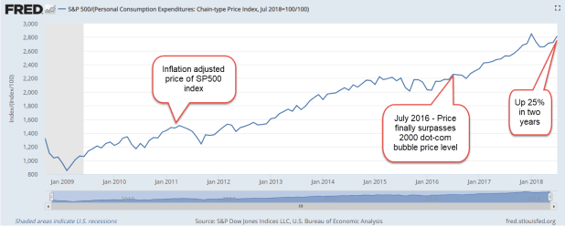
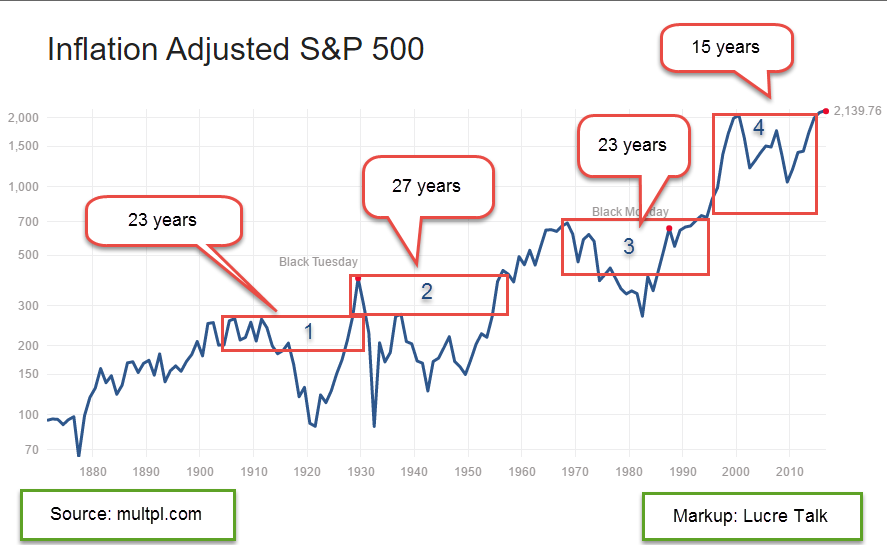
Unfortunately, the stock market road looks like Rt. 120 south of Mono Lake in California. The road is like a ribbon, marked by highs that are many years apart, more years than the majority of us will live in retirement.  In the graph from below from multpl.com I have marked up the decades-long periods before the inflation adjusted SP500 surpassed a previous high.  It is truly humbling.

It took 23 years for the market to finally surpass the high set in 1906.  Happy days!  Well, not quite.  Several months later came the stock market crash of 1929.  In 1932, the market fell near the 1920 lows.  In 1956, 27 years after the ’29 crash, the market finally notched a new high. In more recent decades, the market spent 23 years in a trough from 1969 to 1992.  Lastly, we have this most recent period from the high set in 2000 to a new high set in 2015.

IF – yes, the big IF – a person could call the high in a market, that would sure be nice, as Andy Griffith might say. (Youngsters can Google this.)  Of course, Andy would be suspicious of any city slicker who claimed to have such a crystal ball.  Knowing the high mark in advance is magic.  Knowing a previous high is not magic.

Looking at the chart we can see that the price in each period falls below the high of the period before it.  In the period marked “1” in the graph, the price fell below the high set in 1892. In period marked “2”, the price fell below the high set in 1906.  In the period marked “3”, the price fell below the high set in 1929.  In this last period marked “4” the price – well, it never fell below the high set in 1969.  The run up in the 1990s was so extreme that the market still has not truly corrected, according to some. Even the low set in 2008 didn’t come close to falling below the highs of that 1969-1992 period.  An investor who used a price rule that had been good for more than a hundred years found that the rule did not apply this time.

In 2008-2009, why didn’t prices fall below the high of the 1969-1992 period? They would have had to fall below 500 and in March 2009, there were a number of market predictors calling for just that. On March 9th, the SP500 index closed at 676, after touching a low of 666 that day.  The biblical significance was not lost on some. Announcements from major banks that they had actually been profitable in January and February caused a sharp rebound in investor confidence.  The newly installed Obama administration had promised some economic stimulus and the Federal Reserve added their own reassurances of monetary stimulus.

Did these fiscal and monetary relief measures prevent the market from fully purging itself?  Maybe.  Are stock prices wildly inflated because the Federal Reserve has kept interest rates so low for so long.  Could be.  How low are interest rates?  In 2013 the CBO predicted interest rates of 3-4% by this time.  They are still less than 1/2%.

How much are stock prices inflated?  Robert Shiller, the author of “Irrational Exuberance,” devised a price earnings ratio that removes most of the natural swings in earnings and the business cycle. Called the Cyclically Adjusted Price Earnings ratio, or CAPE, it divides the current price of the SP500 index by a ten year period of inflation adjusted earnings.  The current CAPE ratio is just below the high ratio set in 2007 by a market riding a housing boom.  The only times when the CAPE ratio has been higher are the periods during the housing bubble (2008), the dot-com boom (2000), and the go-go 1920s when many adults could buy stocks on credit.  Each of these booms was marked by a price bust that lasted at least a decade.

Price rules require some kind of foresight, and crystal balls are a bit cloudy.  There is a strong argument to be made for allocation, a balance of investments that generally are non-correlated, i.e. one investment goes up in price when another goes down.  An investor does not have to frequently monitor prices as with price rules. A once or twice a year reallocation is usually sufficient.

In an allocation strategy, equities and bonds are the most common investments because they generally counterbalance each other. A portfolio with 60% stocks and 40% bonds, or 60/40, is a common allocation. (Some people write the bond allocation first, as in 40/60.)   Shiller has recommended that an investor shift their allocation balance toward bonds when the CAPE ratio gets this high. For example, an investor would move toward a 60% bond, 40% stock allocation.

To see the effects of a balanced allocation, let’s look at a particularly ugly period in the market, the period from 2000 through 2011.  The stock market went through two downturns.  From 2000-2003, the SP500 lost 43% (using monthly prices). The decline from October 2007 to March 2009 was a nasty 53%.  In  2011 alone, a budget battle between the Obama White House and a Republican Congress prompted a sharp 20% fall in prices. During those 12 years, the SP500 index lost about 10%, excluding dividends.

During that period, a broad bond index mutual fund (VBMFX) more than doubled. Equities down, bonds up.  A rather routine portfolio composed of 60% stocks and 40% bonds had a total return of 3.75% per year.  Considering the stock market losses during that period, that return sounds pretty good. Inflation averaged 2.6% so that balanced portfolio had a real gain of about 1.2%.  Better than negative, we reason.  On the other hand, a portfolio weighted at 40% stocks, 60% bonds had a total annual return of 4.75%, making the case for Shiller’s strategy of shifting allocations.

There is also the nervousness of a portfolio, i.e. how much an investor gets nervous depending on one’s age and the various components of a portfolio.  During the 2000-2003 downturn in which the SP500 lost 43%, an investor with a 60/40 allocation had just 14% less than what they started with in the beginning of 2000. Not bad. 2008 was not pleasant but they still had 11% more than what they started with.  That is a convincing case for a balanced portfolio, then, even in particularly tumultuous times.

Can an investor possibly do any better by reacting to certain price triggers?  We already discussed one price rule that was fairly reliable for a hundred years till it wasn’t. The problem with rules are the exceptions and it only takes one exception to bruise an average 20 year retirement cycle.  Another price rule is a medium term one, the 50 day and 200 day averages.  These are called the Golden Cross and Death Cross.  Rules involve compromises and this rule is no exception.  In some cases, an investor may sell just when the selling pressure has mostly been exhausted.  Such a case was July 2010 when the 50 day average of the SP500 crossed below the 200 average, a Death Cross, and triggered a sell signal.  The market reversed over the following months and when the 50 day average crossed back above the 200 day average, a Golden Cross, an investor bought back in at a price 10% higher than they had sold!

The same scenario happened again in August 2011 – January 2012, buying back into the market in January 2012 at a price 10% higher than the price they sold at in August 2011.  These short term price swings are called whipsaws and they are the bane of strict price rules. In the past year there were two such whipsaws, one of them causing a 5% loss.  Clearly, this traditional trading rule needs a toss into the garbage can!  What works for a few decades may fail in a later decade.

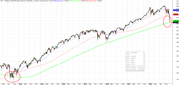
For those investors who want a more active approach to managing a portion of their portfolio, what is needed is a flexible price rule that has been fairly reliable over six decades.  As a bull market tires, the monthly price of a broad market index like the SP500 begins to ride just above the two year average.  The monthly close will dip below that benchmark average for a month as the bull nears exhaustion.  If it continues to decline, that is a good indication that the market has run its course.  The price rule is an attention trigger that may not necessarily prompt action.

Let’s look at a few examples.  President Kennedy’s advisors were certainly aware of this pattern when the market fell below the two year mark in 1962.  They began pushing for tax cuts, particularly for those at the highest levels.  Rumors of a tax cut proposal helped lift the market back above the benchmark by the end of 1962   In early 1963, JFK made a formal proposal to lower personal rates by a third and corporate rates by 10% (At that time, corporations paid a 52% rate). An investor who sold after a two month decline suffered the same whipsaw effect, buying back into the market at about 10% higher than they sold.  However, at that selling point in 1962, rumors of tax cuts were helping the market rebound and might have caused an investor to wait another week before selling. The market had  in fact reached its low.

In mid-1966, the SP500 fell below its 24 month benchmark for seven months.  Escalating defense spending for the Vietnam War helped arrest that decline.

The bull market finally tired in the summer of 1969 and dropped below the 24 month benchmark in July.  The index treaded water just below the benchmark for a few months before starting a serious decline of 25%.  More than a year passed before the monthly price closed above the benchmark in late 1970.

The 1973 Israeli-Arab war and the consequent oil embargo threw the SP500 into a tailspin.  The price dipped below the average a few times starting in May 1973 before crossing firmly below in November 1973.  After falling almost 40%, the price finally crossed back above the benchmark in late 1974.  Remember that this was a particularly difficult fourteen year period marked by war, high unemployment and inflation, and a whopping four recessions.  The SP500 crossed below its ten year – not month, but year – average in 1970, again in 1974-75, and lastly in 1978.  Such crossings happen infrequently in a century and are great buying opportunities when they do happen.  To have it happen three periods in one decade is historic.

I’ll skip some minor events in the late 1970s and early 1980s.  In most episodes an investor can take advantage of these opportunities to step aside as the market swoons, then buy back in at a price that is 5-10% lower when the market recovers.

The most recent episodes were in November 2000 when the SP500 fell below its benchmark at about 1300. When it crossed  back over the benchmark in August 2003, the index was at 1000, a nice bargain.  This was another crossing below the ten year average.  The last one was in 2008 when the monthly price fell below the benchmark in January.  Although it skirted just under the average it didn’t cross back above the 24 month average.  In June it began a decline that steepened in September as the financial crisis exploded. Again the index fell below its ten year average. By the time the price closed back above the benchmark in November 2009, an investor could buy in at a 20% discount from the June 2008 price.

In September 2015 and again in February of this year, the index dropped briefly below its 24 month average. They were short drops but it doesn’t take much of a price correction because the index is riding parallel with the benchmark, above it by only 100 points, or less than 5%.  Corporate profits have declined for five quarters.  The bull is panting but still standing.

As we have seen in past exhaustions, there is a lot of political pressure to do something.  What could refuel the bull market? Monetary policy seems exhausted.  The Federal Reserve has indicated that they will use negative interest rates if they have to but they are very reluctant to do so.  Just this past week, the Bank of Japan (BOJ) indicated that their policy of negative interest rates is not helping their economic growth.  The BOJ had started down a negative interest rate path and has now warned other central banks not to follow.

What about fiscal policy? The upcoming election could usher in some fiscal policy changes but that seems unlikely.  Donald Trump has joined with Democrats advocating for more infrastructure spending but that is unlikely to pass muster with a conservative House holding the purse strings and a federal public debt approaching $20 trillion.  Only sixteen years ago, it was less than $6 trillion.  Democrats keep reminding everyone that the Federal Government can borrow money at very cheap rates.  However, the level of debt matters and Republicans will likely control the money in this next Congress.

Managing an entire portfolio with a price rule is a bit aggressive but might be appropriate for some investors who want to take a more active approach with a portion of their portfolio.  This price rule – or let’s call it guidance – is more a pain avoidance tool than a timing tool.

Turning Toward

July 31, 2016

The Fourth Turning

A favorite historical device of the Western tradition is the timeline, running straight from the past to the future.  Cyclic models of history are less popular and circular models seem too formulaic, even primitive, for historical narrative.   Surely, Neil Howe and William Strauss, authors of the 1997 book “The Fourth Turning,” understood that their model might encounter a cool reception from the academic community.

Published a few years before the millennium and the Y2K scare, the book recounted the historical pattern of generations from 1500 through 2000, before taking on the ambitious task of predicting the pattern of events for the coming twenty years.  While researching a previous book “Generations,” the authors discovered a repeating pattern of responses to events.  They developed a model of four generational archetypes spanning the range of a human lifetime.  Every twenty years or so each generation passes into another phase of life, from childhood to adulthood, to middle age, then the elder years.  The authors called these passages “turnings.”

Every 80 years or so, every fourth generation, begins a period of crisis. The authors had projected this current fourth turning to last from approximately 2004 – 2026, understanding that these turnings are not fixed to a calendar. Although the authors trace the turnings back to 1500, previous crisis fourth turnings that we are familiar with are the American Revolution 1773-94, Civil War 1860-65, Depression and WW2 1929-46.

During a crisis period comes a pre-crisis strain that primes the scene for the main crisis.  Each crisis revolves around the social contract, the relationship between individuals and their government.  The resolution of the crisis occurs during the first turning in which a new version of the social contract is forged.  The leaders of these resolutions are the generation in middle age, approximately 42-62.  [So us Boomer parents better be nice to our kids 🙂 ]

In predicting the current crisis period, the authors pulled no punches.  Chapter Ten of the book is titled “A Fourth Turning Prophecy.” The time frames of these prophecies are approximate because they predict behavioral trends.   It has been almost twenty years since the book was published and it surprised me how well the authors understood the trends and ingredients of the crises that have occurred in the past decade.  Frankly, I hope that the authors are wrong about the coming decade when a generation of crisis intensifies and forces a resolution.

The authors predicted a financial crisis about 2005 and sketched a number of other plausible scenarios typical of a generation of crisis.  “The era will have left the financial world arbitraged and tentacled: Debtors won’t know who holds their notes, homeowners who owns their mortgages, and shareholders who runs their equities – and vice versa.” (p. 274 of the Broadway Books 1998 paperback edition)  Sound familiar?  Remember, this was written twelve years before the 2008 financial crisis.

The authors caution that these scenarios are archetypes, unlikely to happen in detail as written and yet the generalities are both scary and prescient. The hypothetical scenarios include terrorists blowing up an airplane, a government shutdown precipitated by a federal budget stalemate, the spread of a new communicable virus and an increasing aggression by Russia toward its former satellite countries. “All you know in advance is something about the molten ingredients of the climax,” the authors wrote.

Twenty years before the main crisis event, the nature of the crisis is difficult to see, the authors cautioned.  A series of crises weaken the social order and people’s expectations, creating tensions between groups in society.  We could use the analogy of tectonic plates to understand the economic and social frictions that build over time until the earthquake is finally triggered.  While a particular event is the catalyst for the main crisis, it is not the cause of the fracturing of the social contract.

The frictions can be promises made to one group that can not be kept.  Technological change may bring economic changes that favor one portion of a society and disadvantage others.  Political changes may pose constitutional challenges that are resolved with violence.  Long simmering military antagonisms may finally break out into war.  These are only a few frictions in a long list presented by the authors (p. 277).

The authors can be forgiven for a few incorrect predictions – that the government would hike taxes in response to a financial crisis or depression.  Perhaps they were misled by the economically conservative mood of the nation at the time when they wrote the book.  The authors did not anticipate that the Federal government would quadruple the Federal debt over fifteen years in response to 9-11 and the 2008 Financial Crisis.  They did not foresee that the Federal Reserve would add four trillion to its balance sheet to absorb the bad securitizations that contributed to the Financial Crisis.

Twenty years ago, the authors guesstimated the onset of the main crisis in the year 2020 followed by a six year period of resolution.  As I noted earlier, it is the middle aged generation that leads in the formation of solutions to these crises.  In this case, those leaders would be the children of the Boomers, the cohort labelled “Generation X” in sociological and popular literature.

Criticisms, controversy and praise for the generational model presented by the authors can be found at a Wikipedia article, which has been flagged for its lack of neutrality. Should a decade pass with no crisis, we could rest assured that the theory is totally bonkers pseudoscience.  There are a few problems, however, that could precipitate a crisis: 1) a federal debt approaching $20 trillion; 2) terrorist acts in the news each week; 3) many trillions of dollars in Social Security and  public pension promises that 80 million Boomers are beginning to redeem; 4) immigration, tax and other  policy disputes over who is entitled to what and who pays what.  These are some of the groaning sounds of tectonic frictions in our country.

Californians live with the possibility of a “big one,” a monster earthquake unleashed at the San Andreas fault that runs along the mountain spine of the state.  Each person silently hopes that the inevitable doesn’t happen in their lifetime.  Count me among that bunch.

Crises

September 16th, 2013

September marks two anniversaries that we wish had not happened.  One of those is the financial crisis and the meltdown of the economy in September 2008.  In the fourth quarter of 2008, GDP fell about $250 billion.  By itself, this was not a disaster.  However, it came on the heels of a decline in the 2nd quarter and flat growth in the 1st quarter.

Almost overnight, consumers cut back on their spending.  Retail sales dropped $40 billion, a bit more than 10%.

There was little drop in food sales – people gotta eat.  All of the drop was in retail sales excluding food.

Retail sales are less than 3% of GDP.  Contributing to the GDP decline was the 33% fall in auto sales, about $20 billion.

Offsetting the decline in retail sales, however, total Government spending increased $40 billion in the 4th quarter.

Disposable Personal Income (income after taxes) fell $100 billion, about 1%, but was still on a healthy upward trajectory during the year preceding the crisis.

We routinely import more goods and services than we export.  In the national accounts of domestic production, imports are naturally treated as a negative number, while exports are positive. The difference, called net exports, is negative and reduces GDP.  For all of 2008, we had about the same net exports as 2007.

Gross Private Domestic Investment declined $200 billion or 9% over the year.  This includes investments in buildings, equipment and housing.  Housing accounted for $150 billion of the change.

The TV news media, a visual medium, focuses on crises because it is not well suited for more thoughtful analysis.  On camera interviews in a crisis do not have to be very detailed or accurate.  Viewers understand that it is a crisis.  But viewers are also an impatient bunch with trigger fingers on their remote controls. Video footage has to be loaded, sequenced and edited.  On air interviews and several short video clips run repeatedly during a news hour will have to do.  The recent flooding in Colorado is a reminder that there is only so much video footage available.  TV stations simply reran the same sequences over and over.  On the 9 PM local news, the station featured an on site reporter in front of a driveway heaped full with damaged belongings and furniture.  At 10 PM, a different local station featured their reporter in front of the same house.

In September 2008, the media focused on the financial crisis and the implosion of stock prices.  When the stock market opens up on a September morning 300 points down, what else is there to cover?  It is important to understand that the economy is a big organism with a lot of moving parts.  The housing decline was already two years old before the financial crisis hit in September 2008.

Fast forward to this September.  A day ahead of the ISM Manufacturing report on September 4th came the news that China’s manufacturing sector has strengthened, a positive note in the Asian region where capital outflows from emerging nations have weakened the economies of other nations.  The prospect of higher interest rates in the U.S. has sparked a change in money flows to the U.S., strengthening the dollar against the currencies of emerging countries.  This change in flows promises to put pressure on companies in developed nations who had earlier borrowed money in U.S. dollars to take advantage of low interest rates.  The stream of capital follows the deepest channel.  The combination of risk and reward in each country can largely determine the depth of the channel.  Countries can, by central bank policy or law, control the flows of foreign investment into and out of their country.  China and India exercise some degree of control in an attempt to maintain some stability in their economies.  Like other developed nations, the U.S. has few controls.  In the run up of the housing bubble, foreign flows into the U.S. provided the impetus for investment banks like Goldman Sachs to initiate and bundle many thousands of mortgages into tradable financial products that met the demand by foreign investors.

Manufacturing data in the Eurozone was a big positive with several countries recording their strongest growth in over two years.  The Purchasing Managers Indexes (PMI) are not strong but are showing some expansion, a turn about from the slight contraction or neutral growth of the past two years.   The fragile economic growth of the Eurozone has been exacerbated by the concentration of growth in France and Germany, particularly Germany.  Recent strong gains in some of the peripheral countries, those in the former Communist bloc and southern Europe, suggest that economic activity is becoming more dispersed.  Dramatic differences in the economies of countries that share the same currency make the setting of monetary policy difficult and it is hoped that more even growth will take pressure off central banks in the Eurozone.

At an overall reading of 55.7, the ISM Manufacturing report released a week ago Tuesday showed even stronger growth than the previous month’s index of 55.4.  50 is the neutral mark that indicates neither expansion or contraction of manufacturing activity.  New orders began a worrisome decline in  the latter part of 2012 that persisted into the spring of this year, and the turnaround of the past few months forecasts a healthy manufacturing sector for the next several months.  Levels above 60 in any of the components of this index indicate robust growth;  both new orders and production are above that mark.

A few days later ISM reported their Non-Manufacturing composite was 58.6, indicating strong expansion in service industries which make up the bulk of the economy.  The Business Activity index came in at a robust 62.2.  ISM also reported that their figures for June had an incorrect seasonal adjustment.  The New Orders Index for June was revised up a significant 2%.  Prices were revised up 4.3%.  Other changes were relatively insignificant.

The constant weighted index I have been tracking smooths the ISM data so that it responds less strongly to one month’s data but it is showing strong upward movement in both manufacturing and non-manufacturing.

The Commerce Dept reported last Friday that Retail Sales continue to grow at a modest pace.  However, let’s look at retail sales as a percent of disposable income.  Consumers are still cautious.

Speaking of disposable income.  As we import more and export less, disposable income as a percent of GDP continues to rise.  This percentage rises sharply at the onset of recessions.  It is a bit troublesome that the 40 year trend is rising.

Reckless Regs

In a 9/24/09 WSJ op-ed, Jeffrey Friedman, editor of the Critical Review journal, makes the case that the causes of the banking crisis lie more with reckless regulation than reckless bankers. Mr. Friedman notes that several studies suggest that “bank executives were simply ignorant of the risks their institutions were taking – not that they were deliberately courting disaster because of their pay packages.” He notes that “bank CEOs held about 10 times as much of their banks’ stock as they were typically paid per year, ” and that several high profile CEOs lost $500 million and more.

So what role did reckless regulation play in the debacle? In 2001, financial regulators in the U.S. amended international banking rules regarding mortgage backed securities (MBS). These “recourse rule” changes allowed banks to maintain less of a capital risk cushion for MBS than that needed for holding individual mortgages and commercial loans. By 2007, the rest of the G-20 countries implemented the same rules. Thus regulators created a profit opportunity for investment banks.

If banks had been out to take additional risk to maximize profit, Friedman argues, they would have bought far more lower rated packages of MBS. But they didn’t. Many opted for the least risky MBS packages, rated AAA, which provided lower profits. Reassured by the AAA rating, Citigroup brought all of the MBS packages it could. Doubtful of the underlying soundness of these financial products, J.P. Morgan Chase didn’t. In this competition, J.P.Morgan Chase emerged strong from the crisis while Citigroup is a taxpayer supported financial house of cards.

Friedman argues that capitalism is a competition of predictions about which procedures will bring profits. “Regulations homogenize,” he states, promoting a herd behavior on competitors in the market. The investment banking herd, prodded by regulatory ideas of what constitutes prudent banking, ran off the cliff. After this disastrous experiment in regulating capital allocation at banking institutions, the G-20 now wants to write rules on what should be prudent compensation practices in the banking industry.

The responsibility for the crisis is certainly shared by the regulators. Friedman neglects to mention the lobbying by the financial industry during the nineties to loosen up the recourse rules. Friedman contends that the purchasing of AAA rated MBS packages was a desire for safety. In 2001, Marty Rosenblatt, a well recognized expert on securitization, wrote an analysis of the rule changes on the capital requirements for banks. Rather than a desire for safety, as Friedman contends, purchases of AAA and AA rated MBS packages enabled banks to multiply the leverage of their capital by five times. Instead of requiring banks to hold 8 cents in capital for every $1 of risk, banks had to hold only 1.6 cents, a leverage of 60 to 1, or $1 of capital to $60 of risk. This highly leveraged capital to risk ratio dwarfs the high ratios of the late 1920’s, whose high leverages brought on the stock market implosion of 1929.

Why would the the Federal Reserve and other U.S. banking regulators adopt such a lax captial requirement? Because they were using historical data of losses on mortgage securitizations when lending requirements were stricter. Shortly after financial regulators loosened captial requirements for banks, the regulators at the U.S. mortgage giants, Freddie Mac and Fannie Mae, began relaxing lending standards for mortage holders in order to promote President Bush’s “ownership society” in the aftermath of 9/11. This uncoordinated confluence of regulatory changes laid the foundations for the crisis. The imprint of financial rule makers certainly conveyed a sense of sound and prudent financial standards. Investment banks discarded their internal risk management rules to take advantage of the opportunity to make large profits from the securitization boom.

Some, like Friedman, will lay most of the blame on the regulators while some place it at the feet of the investment banks who chose to ignore principles derived from decades of risk management experience. Investment bankers lay some of the responsibility on the “pressure” of savings, particularly savings accumulated in a rapidly industrializing Asia, chasing the higher yields of MBS. The demand for these financial products became a strong persuasion to bankers who scrambled to put financial packages together to meet the demand. To meet that demand, investment bankers reached out to mortgage brokers, who met the demand of the investment bankers by selling mortgages to people who really weren’t good mortgage risks. Those people simply took advantage of an opportunity to buy a house, to ride the wave of escalating property values.

This larger story is too often left out by op-ed writers. It is the gestalt of regulation, profit seeking capital markets and opportunistic savers and consumers that is responsible for the financial crisis. Each of these components are necessary to a well functioning market. Probably the one flaw common to each of these “players” was the decision to ignore an old maxim, “If it sounds too good to be true, it is.”