April 9th, 2017
Last week I wrote about the dance of household, corporate and government debt. When the growth of one member of this trinity is flat, the other two increase. Since the financial crisis the federal debt has increased by $10 trillion. Let’s look at the annual interest rate that the Federal government has paid on its marketable debt of Treasuries. This doesn’t include what is called interagency debt where one part of the government borrows from another. Social Security funds is the major example.
In 2016, the Federal government paid $240 billion in interest, an average rate of 1.7% on $14 trillion in publicly held debt. Only during WW2 has the Federal government paid an effective interest rate that is as low as it today. World War 2 was an extraordinary circumstance that justified an enormous debt. Following the war, politicians increased taxes on households and businesses to reduce the debt. Here is a graph of the net interest rate paid by the Federal government since 1940.

In 2008, before the run up in debt, the interest rate on the debt was 4.8%. If we were to pay that rate in 2017, the interest would total $672 billion, more than the defense budget. Even at a measly 3%, the interest would be $420 billion. That is $180 billion greater than the interest paid in 2016. That money can’t be spent on households, or highways, or education or scientific research.
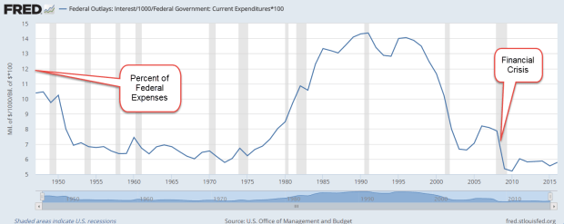
The early 1990s were filled with political arguments about the debt because the interest paid each year was crippling so many other programs. Presidential candidate Ross Perot made the debt his central platform and took 20% of the vote, more than any independent candidate since Teddy Roosevelt eighty years earlier. Debt matters. In 1994, Republicans took over Congress after 40 years of Democratic rule on the promise that Republicans would be more fiscally responsible. In the chart below, we can see the interest expense each year as a percent of federal expenses.

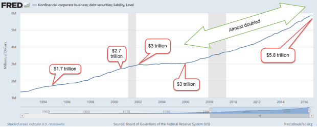
Let’s turn again to corporate debt. As I showed last week, corporate debt has doubled in the past ten years.

In December, the analytics company FactSet reported (PDF) that the net debt to earnings ratio of the SP500 (ex-financials) had set another all time high of 1.88. Debt is almost twice the amount of earnings before interest, taxes, debt and amortization (EBITDA). Some financial reporters (here, for example ) use the debt-to-earnings ratio for the entire SP500, including financial companies. Financial companies were highly leveraged with debt before the crisis. In the aftermath and bailout, deleveraging in the financial industry effectively hides the growth of debt by non-financial companies.
What does that tell us? Unable to grow profits at a rate that will satisfy stockholders, corporations have borrowed money to buy back shares. Profits are divided among fewer shares so that the earnings per share increases and the price to earnings (profit), or P/E ratio, looks lower. Corporations have traded stockholder equity for debt, one of the many incidental results of the Fed’s zero interest rate policy for the past eight years.
Encouraged by low interest rates, corporations have gorged on debt. In 2010, the pharmaceutical giant Johnson and Johnson was able to borrow money at a cheaper rate than the Federal government, a sign of the greater trust that investors had in Johnson and Johnson at that time.
Other financial leverage ratios are flashing caution signals, prompting a subdued comment in the latest Federal Reserve minutes ( PDF ) “some standard measures of valuations [are] above historical norms.” Doesn’t sound too concerning, does it?
Each period of optimistic valuation is marked by a belief in some idea. When the bedrock of that idea cracks, doubts grow then form a chasm which swallows trillions of dollars of marketable value.
The belief could be this: passively managed index funds inevitably outperform actively managed funds. What is the difference? Here’s a one-page comparison table. In 1991, William Sharpe, creator of the Sharpe ratio used to evaluate stocks, made a simple, short case for the assertion that passive will outperform active.
During the post-crisis recovery, passive funds have clearly outperformed active funds. Investors continue to transfer money from active funds and ETFs into index funds and ETFs. What happens when a smaller pool of active managers make buy and sell decisions on stocks, and an ever larger pool of index funds simply copy those decisions? The decisions of those active managers are leveraged by the index funds. Will this be the bedrock belief that implodes? I have no idea.
Market tensions are a normal state of affairs. What is a market tension? A conflict in pricing and risk that makes investors hesitate as though the market had posed a riddle. Perhaps the easiest way to explain these tensions is to give a few examples.
1. Stocks are overvalued but bond prices are likely to go down as interest rates rise. The latest minutes from the Fed indicated that they will start winding down their portfolio of bonds. What this means is that when a Treasury bond matures, they will no longer buy another bond to replace the maturing bond. That lack of bond purchasing will dampen bond prices. Stocks, bonds or cash? Tension.
2. Are there other alternatives? Gold (GLD) is down 50% from its highs several years ago. Inflation in most of the developing world looks rather tame so there is unlikely to be an upsurge in demand for gold. However, a lot of political unrest in the Eurozone could drive investors into gold as a protection against a decline in the euro. Tension.
3. What about real estate? After a run up in 2014, prices in a broad basket (VNQ) of real estate companies has been flat for two years. A consolidation before another surge? However, there is a lot of debt which will put pressure on profits as interest rates go up. Tension.
In the aftermath of the financial crisis, we discovered that financial companies, banks, mortgage brokers and ordinary people resolved market tensions through fraud, a lack of caution, and magical thinking. Investors can only hope that there is enough oversight now, that the memories of the crisis are still fresh enough that plain old good sense will prevail.
During the present seven year recovery there have been four price corrections in the Sp500 (Yardeni PDF). A correction is a drop in price of 10 – 20%. The last one was in the beginning of 2016. Contrast this current bull market with the one in the 2000s, when there was only one correction. That one occurred almost immediately after the bear market ended in the fall of 2002. It was really just a part of the bear market. From early 2003 till the fall of 2007, a period of 4-1/2 years, there was no correction, no relief valve for market tensions.
Despite the four corrections and six mini-corrections (5 – 10%) during this recovery, the inflation adjusted price of the SP500 is 50% higher than the index in the beginning of 2007, near the height of the market. Inflation adjusted sales per share have stayed rather stable and that can be a key metric in the late stages of a bull market. The current price to sales (P/S) ratio is almost as high as at the peak of the dot com boom in 2000 and that ratio may prove to be the better guide. In a December 2007 report, Hussman Funds sounded a warning based on P/S ratios. Nine years later, this report will help a reader wanting to understand the valuation cycles of the past sixty years.