Marching Forward

April 28, 2019

by Steve Stofka

When former President Obama took the oath of office, the economy was in the worst shape since the Great Depression 75 years earlier. Tax receipts plunged and benefit claims soared. Millions of homes and thousands of businesses fell into the black hole created by the Financial Crisis. In sixteen years of the Bush and Obama presidencies, the country added $16 trillion to the public federal debt, more than tripling the sum at the time Clinton left office in early 2001.

Although growth has remained slow since the financial crisis (see my blog last week), the economy has not gone into recession. Despite the fears of some, a recession in the next year does not look likely. The chart below charts the annual percent change in real GDP (green) against a ratio called the M1 money multiplier, the red line (Note #1). Notice that when the change in GDP dips below the money multiplier for two quarters we have been in recession.

The money multiplier seems to act like a growth boundary. While some economy watchers have warned of an impending recession, GDP growth has been above 2.5% for more than a year and is rising. In 2018, real disposable personal income grew nearly 3%. This is not the weak economic growth of 2011 or the winter of 2015/16 when concerns of recession were well founded.

The number of people voluntarily quitting their job is near the 1999 and 2006 highs. Employees are either transferring to other jobs or they feel confident that they can quickly get another job. An even more important sign is that this metric has shown no decline since the low point in August 2009.

In 2013, the Social Security disability fund was in crisis and predicted to run out of money within a decade. As the economy has improved, disability claims have plunged to all-time lows and the Social Security administration recently extended the life of the fund until 2052 (Note #2).

Approximately 1 in 6 (62 million) Americans receive Social Security benefits and that number is expected to grow to 78 million in a decade. However, the ratio of workers to the entire population is near all time highs. The number of Millennials (1982-1996) has surpassed the number of Boomers. This year the population of iGen, those born after 1996, will surpass the Millennial generation (Note #3). Just as a lot of seniors are leaving the work force, a lot of younger workers are entering. The ratio of worker to non-worker may reach 1 to 1. 45 years ago, one worker supported two non-workers.

As the presidential cycle gets into gear, we will hear claims that there are not enough workers to pay promised benefits. Those claims are based on the Civilian Employment Participation Rate, which is the ratio of workers to adults. While the number of seniors is growing, the number of children has been declining. To grasp the total public burden on each worker, we want to look at the ratio of workers to the total population. As I noted before, that is at an all time high and that is a positive.

Raising a child is expensive. The average cost of public education per child is almost $12K (Note #4).  Public costs for housing, food and medical care can push average per child public cost to over $20K annually.

Let’s compare to public costs for seniors. The average person on Social Security receives $15,600 in benefits (Note #5). In 2018, the Medicare program cost an average of $10,000 per retiree (Note #6). The public cost for seniors is not a great deal more than those for children.

As a society, we can do this.

/////////////////

Notes:

  1. The M1 money multiplier is the ratio of cash and checking accounts to the amount of reserves held at the Federal Reserve.
  2. SSDI solvency now extended to 2052. Here’s a highlight presentation of the trustee’s report.
  3. Generation Z will surpass the numbers of Millennials in 2019. Report
  4. Public education costs per pupil
  5. Social Security costs
  6. Medicare program cost $583 billion. There are approximately 60 million on the program. CMS

Deepening Debt

December 2, 2018

by Steve Stofka

Each time the Federal Reserve raises interest rates, the President tweets out his disapproval. This week Fed Chair Jerome Powell indicated that interest rates increases might be slowing and the Dow Jones average jumped up more than 2% in a few hours (Note #1). Presidents don’t like rising interest rates because they contribute to a slump in housing and car sales, two relatively small pieces of the economy that create ripples throughout a community’s economy. Trump’s strategy relies on strong growth.

The passage of the tax law last December reduced Federal tax revenues, which contributed to a rising deficit. The gamble was that the repatriation of corporate profits plus a reduced corporate tax rate would spur higher GDP growth which would offset the falling revenues. It hasn’t so far.

Let’s get away from dollars and use percentages. Economists track the annual budget deficit as a percent of GDP. I’ll call it DGDP. Let’s say a family made $50,000 last year and had to borrow $1000 because they spent more than they made, their DGDP would be $-1,000/$50,000 or -2%. In a growing economy, the DGDP rises, or gets less negative. It falls, or gets more negative, as the economy nears a recession.

DeficitPctGDP

A DGDP below the 60-year average of -2.5% indicates an unhealthy economy and, by this measure, the economy has not been healthy since 2007. The DGDP was the same in the last year of Bush’s presidency as it was in the last year of the Obama presidency. By 2014, it had risen above -3% and rose slightly again in 2015 but fell again the following year.

In 2016, the last year of the Obama presidency, the DGDP was -3.13%. In the first year of the Trump presidency it fell slightly to -3.4%. As I said earlier, the administration and Congressional Republicans hoped the tax law passed at the end of 2017 would spur enough GDP growth to offset declining corporate revenues. So far, that has not happened. The 2018 budget year just ended in September. Preliminary figures indicate that the deficit will be 3.9% of GDP this year (Note #2). Some economists project a DGDP near -5% in 2019.

Japan’s economy for the past two decades strongly suggests that an aging population weakens GDP growth. The U.S. economy must flourish against that demographic headwind. By December this year, Social Security (SS) benefits will surpass the $1 trillion mark, equal to or surpassing SS taxes collected (Note #3). For years, the excess in SS tax collections has lessened the amount that the Federal government had to borrow from the public. Each year, the government has left an I.O.U. in the SS trust fund. The total of those IOUs is almost $3 trillion.

Now the Federal government faces two challenges: interest on the ever-growing Federal debt and the government’s need to borrow more from the public to “pay back” those IOUs. The interest on the debt will soon overtake defense spending. Politicians could reduce cost of living increases in SS benefits by indexing benefits to the chained price index, a flexible measure of inflation that assumes that human beings alter their consumption in response to changing prices. Benefits are currently indexed to the Consumer Price Index (CPI) whose fixed basket of goods never changes. The CPI overstates inflation, but seniors are sure to lobby against any changes that would reduce cost of living increases. Politicians are reluctant to face angry seniors who might boot some of them out of office at the next election.

Trump has a better alternative than strategically lowering benefit increases for the swelling ranks of retiring Boomers – increase SS tax collections. The only way to do that is jobs, jobs, jobs. Jobs that are “on the books,” that take out SS taxes with each paycheck; not the jobs of the underground economy that flourish in immigrant communities. More jobs to draw in the half million discouraged workers who are sitting on the sidelines of the job market (Note #4).

Jobs, jobs and more jobs take care of a lot of budget problems. Campaign strategist James Carville stressed that point to Bill Clinton during the 1992 Presidential campaign. Higher interest rates hurt the construction, auto and retail industries, and blue collar small business service industries. All of these are more likely to reach out and hire marginal workers.

The headwinds are more than demographic. The economy has been stuck in low for a decade. In the eleven years since the 3rd quarter of 2007, just before the 2007-2009 recession, real GDP has averaged only 1.6% annual growth (Note #5). That is barely above population growth. Sectors that were strong, housing and auto sales, have slowed. Housing sales have declined for six months. Auto sales have declined for 18 months. Fed interest rate policy has been very supportive but that is slowly being withdrawn.

The DGDP is one more indicator that we should already be in a recession or approaching one. A recession will add to the demographic headwinds, increase the annual budget deficit and swell the accumulated federal debt. Job growth must counter job loss due to automation. Good policies are those likely to add jobs. Bad policies are those that thwart job growth. It doesn’t matter how well intentioned the policies are. Good or bad for job growth is all that matters in the next decade.

Here’s why. Another credit crisis is building. Low interest rates transferred billions of dollars in interest from the savings accounts of older people to businesses and government, who were able to go on a borrowing binge. Defaults and delinquency on business loans will probably be the source of our next crisis. After that is the coming pension crisis in several cities and states. Let’s hope those two don’t hit simultaneously.

////////////////////
Notes:

  1. Within a day, interest rate futures that had priced in a 1/2% increase in the Fed Funds Rate during 2019 fell to just .3% for next year.
  2. Estimates of 2018 Fed deficit and GDP
  3. Social Security trustees’ summary report for fiscal year 2017.
  4. BLS series LNU05026645 discouraged workers. After ten long years, there are now as many discouraged workers as October 2008, just as the financial crisis sent the economy into shock. Within two years after the onset of the crisis, the number of discouraged workers had exploded 250%, reaching 1.25 million in October 2010.
  5. Real GDP: 3rd quarter 2007 – $15,667B. 3rd quarter 2018 – $18,672B. Constant 2012 dollars.

Taxes – A Nation’s Tiller

Printing money is merely taxation in another form. – Peter Schiff


August 12, 2018

by Steve Stofka

The Federal government does not need taxes to fund its spending, so why does it impose them? Taxes act as a natural curb on the price pressures induced by Federal spending. Taxes can promote steady growth and allow the government to introduce more entropy into the economic system.

During World War 2, the Federal government ran deficits that were 25% of the entire economy (Note #1) and five times current deficit levels as a percent of the economy. Despite its monetary superpowers, the government imposes a wide range of taxes. Why?

Using the engine model I first introduced a few weeks ago (Note #2), taxes drain pressure from the economic system and act as a natural check on price inflation. During WW2, the government spent so much more than it taxed that it needed to impose wage and price controls to curb inflationary pressures. Does it matter how inflation is checked? Yes.

When price pressures are curbed by law, people turn to other currencies or barter. During WW2, the alternative was barter and do-it-yourself. Because neither of these is a recorded exchange of money, the government collected fewer taxes which further increased price pressure in the economic engine. After the war was over and price controls lifted, tax collections relieved the accumulated price pressures. As a percent of GDP, taxes collected were 50% more than current levels.

For the past fifty years, Federal tax collections have ranged from 10-12% of GDP, but they are not an isolated statistic. What matters is the difference between Federal spending and tax collections, or net Federal input. During the past two decades Federal input has become a growing share of GDP.

FedSpendLessTaxPctGDP

During the past sixty years, that net input has grown 8% per year. The growth rates have varied by decade but the strongest rates of input growth rates have occurred when the same party has held the Presidency and House. Neither party knows restraint. The lowest input growth has occurred when a Republican House restrains a Democratic President (Note #3).

FedNetInputGrowth

Let’s compare net Federal input to the growth of credit. As I wrote last week, the Federal government took a more dominant role in the economy in the late 1960s. By the year 2000, net Federal input grew at an annual rate of 10.3%, over one percent higher than credit growth. During all but six of those years, Democrats controlled the House and the purse. During those forty years, inequality grew.

FedNetInputCreditGrowth

During the 1990s and 2010s, government should have increased its net input to offset the lack of credit growth. To increase input, the government can increase spending, reduce taxes or a combination of both. When GDP growth is added to the chart, we can see why this decade’s GDP growth rate has been the lowest of the past six decades. It’s not rocket science; the inputs have been low.

FedNetInputCreditGrowthGDPGrowth

A universe with maximum entropy is a still universe because all the energy is uniformly distributed. At a minimum entropy, the universe exploded in the Big Bang. Too much clumping of money energy provokes rebellion. Too little clumping hampers investment and interest and condemns a nation to poverty. As an act of self-preservation, a government adopts redistributive tax policies. Among the developed nations, the U.S. is second only to France in the percent of disposable income it redistributes to its people (Note #4).

A nation can either tax its citizens directly, or add so much net input that it provokes higher inflation, which taxes people indirectly through the loss of purchasing power. Of the two alternatives, the former is the more desirable. In a democracy we can vote for those who spend our tax dollars. Inflation is both a tax and an unmanaged redistribution of money from the poor to the rich. How so? Credit is money. Higher inflation rates lead to higher interest rates which reduce access to credit for lower income households, and give households with greater assets a higher return on their savings.

////////////////////////////////

Notes:
1. Federal Income and Outlays at the Office Management and Budget, Historical Tables

2. The “engine” was first introduced in Hunt For Inflation, and continued in Hunt, Part 2 , Engine Flow , and Washington’s Role.

3. Federal spending less tax collections grew at a negative annual rate during the Clinton and Obama administrations. Both had to negotiate with a hostile Republican House in the last six years of their administrations.

4. “U.S. transfer payments constitute 28.5% of Americans’ disposable income—almost double the 15% reported by the Census Bureau. That’s a bigger share than in all large developed countries other than France, which redistributes 33.1% of its disposable income.” (WSJ – Paywall) The OECD’s computation of the GINI coefficient is based on disposable personal income, which is calculated differently in the U.S.

Miscellaneous:

Average GDP growth for the past sixty years has been 3.0%. The average inflation rate has been 3.3%. The 60-year median is 2.6%. The average inflation rate of the past two decades have been only 2.1%.

A good recap of the after effects of the financial crisis.


Smackdown

February 4, 2018

by Steve Stofka

We tell ourselves stories. Here’s one. The stock market fell over 2% on Friday so I sold everything. Here’s another story. After the stock market fell 2+% on Friday, the SP500 is up only 21% since 2/2/2017. Wait a second. 21%! What was the yearly gain just a few days earlier? 24%! Yikes! How did the market go up that much? Magic beans.

Here’s another story. Did you know that there has been a rout in the bond market? Yep, that’s how one pundit described it. A rout. Let’s look at a broad bond composite like the Vanguard ETF BND, which is down 4% since early September, five months ago.  The stock market can go down that much in a few days. Bonds stabilize a portfolio.

Two stories. Story #1. The Recession in 2008-2009 produced a gap between actual GDP and potential GDP that persists to this day. To try to close that gap, the Federal Reserve had to keep interest rates near zero for almost eight years and is only gradually raising interest rates in small increments.

Story #2. The Great Recession was an overcorrection in a return to normal. The GDP gap was closed by 2014. Here’s a chart to tell that story. It’s GDP since 1981. I have marked the linear trends. The first one is from 1981 through 1994. The second trend is an uptick in growth from 1995 to the present.

GDP1981-2018

What do these competing narratives mean? For two years the economy has been growing at trend. Should the Federal Reserve have started withdrawing stimulus sometime in 2015, instead of waiting till 2017? Perhaps chair Janet Yellen and other members were worried that the economy might not sustain the growth trend. A do-nothing incompetent Congress could not agree on fiscal policy to stimulate the economy.  The extraordinary monetary tools of the Federal Reserve were the only resort for a limping economy during the post-Recession period.

Ms. Yellen’s last day as Fed chair was Friday. She served four years as vice-Chair, then four years as chair. During her tenure, she was the most powerful woman in the history of this country. She was even-tempered in a politically contentious environment. She kept her cool when  testifying before the Senate Finance Committee.  A tip of the hat to Ms. Yellen.

////////////////

Performance

Vanguard recently released a comparison of their funds to the performance of all funds.

///////////////

Trump To The Rescue

by Steve Stofka

December 10, 2017

This blog post goes to what may be a dark place for some readers. The election of Donald J. Trump may have stopped a year-long slide into recession. I didn’t start out with that conclusion. I meant to point out some interesting correlations in the velocity of money. Yeh, yawn. By the time I was done, not yawn.

If I mention the change in the velocity of money, do you groan at the prospect of a wonky economics topic? Take heart. Anyone who has slowed down from 65 MPH on a highway to 15 MPH in rush hour traffic is familiar with a change in velocity.

The velocity of money measures the amount of time that money stays in our pockets. It signals the willingness of buyers and sellers to make transactions. When buyers and sellers can’t agree on price, transactions fall and the change in velocity goes negative. In the chart below, the change in the velocity of money (blue line) often has a similar pattern to the change in real GDP (red line).

VelocityVsGDP

Both recent recessions were preceded by declines in GDP growth and the speed of money. Following the financial crisis, the Fed began to inflate the money supply in a series of policies dubbed “QE,” or Quantitative Easing. In 2011, after two rounds of QE, the Fed worried that the recovery might stall out.

Let’s turn to the green square in the chart labelled Operation Twist. Obama and a do-nothing Republican Congress were at odds so there was little chance of Congress enacting any fiscal policy to come to the economic rescue. That task was left – once again – to the Federal Reserve to use its monetary tools.

In Congressional hearings, then Fed Chairman Ben Bernanke advised the Senate Finance Committee that the short term interest rate was already zero and the Fed was out of monetary tools. The Congress should step in with a stimulative fiscal policy. The Committee members somberly hung their heads. We are incompetent, they said, so the Federal Reserve will have to rescue the country.

If it expanded the money supply further, the Fed was concerned that they would spark inflation. In hindsight, that fear was unfounded, but none of us has the luxury of making decisions while looking in the rearview mirror. Economic identities like M*V = P*Q (notes at end) are just that – looking in the rearview mirror.

The Fed resurrected a monetary tool from the 1960s dubbed Operation Twist, after the dance craze the Twist (Fed paper).  Early Boomers will remember Chubby Checker. The Fed began selling the short-term Treasuries they owned and buying long term Treasuries. By increasing the demand for long term Treasuries, the Fed drove down long-term interest rates as an inducement for businesses and consumers to borrow. Despite the low rates, consumers continued to shed debt for another year. How effective was Operation Twist – maybe a little bit (Survey).

As the price of oil declined in late 2014 and the Fed ended yet another round of QE (QE3), there was a real danger of moving into a recession. Notice the decline in GDP growth (red) and money velocity (blue).

The downward trend barely reversed itself in the 3rd quarter of 2016, just before the election, but not by much.

MoneyGDPGrowth2013-2017

The election of Donald J. Trump and a single party controlling both houses of Congress kindled hope of a looser regulatory environment and tax reform. Only then did the speed of money turn consistently upward. But we are not out of the woods yet. A year later, in late 2017, money velocity is still negative. As I said earlier, buyers and sellers still cannot agree on price. There is a mismatch in confidence and expectations. Until that blue line turns positive, GDP growth will remain tepid or turn negative.

///////////////////

M*V = P*Q is an identity that equates money supply (M) and demand (V) to inflation (P) and output (Q).


Young Beasts of Burden

October 8th, 2017

The Federal Reserve recently released their triennial survey of household income, debt and wealth. Rising asset values have lifted the fortunes of many, but younger families are struggling.  I’ll show a reliable indicator of recessions as well as some trends peeking out behind the numbers. The incomes below are denoted in inflation adjusted 2016 dollars.

The good news is that lower income workers have recently seen some income gains, which the Federal Reserve attributes to the enactment of minimum wage laws in 19 states at the start of 2017. However, single parent families have struggled with income gains, as they have for three decades. The decade from the late 1990s to the financial crisis in 2008 lifted the incomes of single parents but they have struggled during the recovery. Median incomes for this group remain below the 2007 level.

RealMedIncSglParent

That this group needed back-to-back historic asset bubbles in order to see some income gains shows just how vulnerable they are.

Much has been written about income inequality among households. During booms, there is a growing inequality even among those in the top 10% of incomes. The median in any data set is the halfway point in the numbers, and is usually less than the average of the numbers. If the numbers are evenly distributed the median is closer to the average and the percentage of median to average is high.  When there are a lot of outliers that raise the average far above the median, as in home prices, the percentage is lower.  During boom times there is growing inequality, even among the top 10%  of incomes. (Data from survey)

RealMedMeanIncomeRich

The growth of inequality of income obeys a power law distribution. Think of a 1’x1’ square. The area is 1. Now double the sides to 2’x2’. The area quadruples to 4. Triple the sides to 3’x3’ and the area increases by a factor of 9. Let’s imagine that the area inside of a square is money. How fair is it that the 2’ square has four times the money that the 1’ square has? Politicians may pass tax and social insurance laws to take some of that money from the 2’ square and give it to the 1’ square.  The redistribution of income and wealth can’t change the fundamental characteristics of a power law distribution. Despite the political rhetoric, solutions are bound to be temporary.

The income figures most cited are for households but this data has only been collected since the mid- 1980s. A fall in real median income usually precedes a recession except for the latest fall in 2014 when oil prices began to slide.

RealMedHHInc

Let’s turn to the data for family household income that has been collected since the mid-1950s. What is the difference between a household and a family? By the Census Bureau definition, a family household consists of at least one person who is related to the householder by blood, marriage or adoption. A fall in family income has preceded every recession except a mild one in the 1960s. Family incomes rose very slightly just before that recession, due in part to a new optimism about the presidency of JFK and the promise of tax cuts.

RealMedinc

Because this family income data is released annually at mid-year, this indicator is usually coincident with the start of a recession. However, it has proven quite reliable in marking the start of recessions.

Non-family households are not related. This includes roommates or a childless couple living together but not married. Non-family households are generally younger and their income is less than the income of family households. Over the past three decades, the ratio of the incomes of all households to family households has declined.

RealMedHHIncVsFamilyInc

Although younger people are experiencing slower growth in incomes, they will face increasing pressure to meet the demands of older generations expecting social insurance benefits like Social Security and Medicare. As the oldest Americans begin living in nursing homes in increasing numbers, they are expected to put an ever-growing burden on the Medicaid system (CMS report).  It is the Medicaid system, not Medicare, which covers nursing home costs for seniors after they have depleted their resources. Although the number of nursing homes and certified nursing home beds have declined slightly in the past decade (CMS Report page 21), Medicaid spending still increased a whopping 10% in 2015 as enrollment expanded under Obamacare.

Colorado Governor John Hickenlooper has said that many states are expecting an increase in Medicaid spending on nursing home care as the first of the large Boomer generation turns 75 at the beginning of the next decade. CMS expects total health spending to increase 5.6% per year for the next decade. The last time we had nominal GDP growth that high was in 2006, at the peak of the housing boom.

The demands of both low income families and seniors on the Medicaid system will strain both federal and state budgets.  The federal government can borrow money at will; states are constitutionally prevented from doing so.

What will drive the high growth needed to sustain the promises of the future?  New business starts are at an all-time low (CNN money). How did we get here? The financial crisis caused the failure of many small businesses, many of which are funded with a home equity loan by an entrepreneur.  Home equity loans are down 33% from their peak in early 2009. At the end of last year, the Case-Shiller home price index finally regained the value it had in 2006. In the past decade there has been no home equity growth to tap into.

CaseShillerHPI201708

Imagine a couple in their late 30s or early 40s who bought a home 10 to 15 years ago. They may have only recently recovered the value of their home when they bought it. One or both may long to start a new venture but how likely are they to take a chance? In some of the bigger metro areas where home prices grew much stronger during the boom, prices are still below their peak ten years ago.

CaseShiller20City201708

The market has priced in a tax cut package that will lower corporate taxes. Investors are expecting a third or more of those extra profits in dividends. Investors are expecting a compromise that will enable companies like Apple to “repatriate” their foreign profits to the U.S. and for that money to be used to buy back stock or pay down debt, both of which are positive for stocks. The IMF projects 3.6% global GDP growth in 2018. There’s good cause for optimism.

Investors have not priced in the long term effects of this year’s hurricanes, the volatility of commodities, the future risk of conflict with North Korea, the risk that the debt bubble in China, particularly in real estate, could escape the careful management by the Chinese government. Add in the several fault lines in household finances that the Federal Reserve survey reveals and there is good cause to season our optimism with caution.

Individual investors surveyed by AAII are cautiously optimistic, a healthy sign, but the sentiment of actual trading by both individuals and professionals shows extreme optimism, a negative sign.  The VIX – a measure of volatility – just hit a 24-year low this past week, lower than the low readings of early 2007.  Sure, there was some froth in the housing market, investors reasoned at that time, but nothing that was really a problem.

Then, oopsy-boopsy, and stocks began a two year slide. So, don’t run with joy, Roy. Don’t go for bust, Gus. Pocket your glee, Lee. Stick with your plan, Stan. There are at least “50 Ways To Leave Your Money,”  and one of them is investing as though the future is predictable.


Political Promises

February 28, 2016

Heaven on Earth

The tax and spending policies proposed by Presidential contender Bernie Sanders were “vetted” by economist Gerald Friedman.  David and Christina Romer review Friedman’s assumptions and methodology,  finding the former unrealistic and the latter flawed. Christina Romer was former chair of the Council of Ecomic Advisors during the Obama administration.

Friedman assumes that Sanders’ income redistribution policies will spur a lot of demand in the next decade, 37% more than the Congressional Budget forecasts.  Real GDP will grow by 5.3% per year (page 7), erasing the effects of the 2008 financial crisis. Friedman also thinks that the productive capacity of this country is far below its optimum.  Therefore, all that extra demand will not lead to increased inflation, which would naturally put a brake on economic growth.  Employment will increase by 26% from the 2007 peak and, magically, all that extra demand for workers will not cause an increase in wages and inflation.

On page 8, the authors provide some historical context:  “Growth above 5% has certainly happened for a few years, such as coming out of the severe 1982 recession. But what Friedman is predicting is 5.3% growth for 10 years straight. The only time in our history when growth averaged over 5% for a decade was during the recovery from the Great Depression and the years of World War II.”

While GDP growth averaged over 5% during the decade after WW2, it was erratic growth spurred on by the inability of many families to buy many household items during the war.  It included one recession as well as phenomenal growth of 13% in 1950, and is unlikely to be replicated.

But we want to believe, don’t we?

/////////////////////

Labor Force Health Report

Yes, we’re busy so who has time to look at a lot of data to understand whether the world will implode tomorrow?  As an indicator, the health of the labor market is pretty good.  To take the temperature of the labor market we can look at the ratio of active job seekers to job openings.  At an ideal level of 100%, seekers = openings.  In the real world, there are always more job seekers than job openings.  When the percentage of seekers to openings is 200%, it is almost certainly a recession.  The economy rarely produces levels below 150%, which means that there are 3 job seekers for every 2 job openings.

Looks pretty good on a historical basis, doesn’t it?

///////////////////

Women in the Workforce

Fact Check: Women make less than men.  In 2013, the BLS published a survey comparing the full time wages of men and women in the general population and by race.  In 2012, median weekly earnings for women were 81% of men’s.  Black and Hispanic women were higher, at 90% and 88%, but this may be due to the fact that Black and Hispanic men make less than white men.

Education levels have changed dramatically.  In 1970, only 11% of women had a college degree.  In 2012, 38% did, just slightly below the 40% average for the U.S.  A 2010 BLS study found that, in 2009, median weekly earnings of workers with bachelor’s degrees were 1.8 times the average amount earned by those with a high school diploma.  (They are comparing a median to an average to reduce the effect of especially high incomes).

What the BLS notes is that “the comparisons of earnings in this report are on a broad level and do not control for many factors that may be important in explaining earnings differences.”  We will never hear that on the campaign trail.  Academic caveats do not get voters fired up to go out and vote.  If a candidate is running on a platform of fixing income disparity (Democrats), we will hear quoted the report with the most disparity.  Candidates running who claim little disparity (Republicans) will quote a paper whose statistical assumptions minimize income differences.

A more distressing trend is that older women are having to work longer.  8% of women worked beyond retirement age in 1992.  The percentage has almost doubled to 14%.  The BLS estimates that, in ten years, 20% of women will be working past retirement age.

///////////////////////////

Oil Rig Count

Almost half of the oil and gas rigs in the U.S. are located in Texas.  The 60% reduction in Texas rigs reflects the decline in total rigs throughout the U.S., according to Baker Hughes.  Rigs pumping oil account for 3/4 of the rigs shut down.

The oil “glut” is only about 1.5 million barrels of oil per day, less than 2% of the 2016 daily demand of 96 million gallons barrels estimated by the IEA.  Fewer rigs reduce downward price pressures and lately we have seen crude prices rise into the mid-$30s. With a long time horizon of several years or more, a diversified mutual fund or ETF like XLE, VDE or VGENX would likely provide an investor with some dividend income and capital gains. Could prices go lower?  Of course. After falling more than 40% in 2008, the SP500 stood at 900 at the end of December.   Investors who bought at those depressed levels might have felt foolish when the index dropped another 25% in the following months.  Those “fools” have more than doubled their investment in the past 7 years, averaging annual gains greater than 12%.

A Lack of Giddyup

May 3, 2015

The first estimate of GDP growth in the January to March quarter was almost flat.  Not a big surprise given the severe winter in the eastern part of the U.S. but an annual rate of just .2% growth was lower than most estimates.  It would be a mistake to attribute all of the slow down to the weather.  Lower gas prices have delayed new drilling projects and idled more costly operations.  Some economists have not fully appreciated the positive influence that shale oil drilling has had on a tepid economic recovery.

Growth has not only slowed. It has shifted lower.  The Shiller P/E ratio, or CAPE, uses a 10 year period as a base.  A common measure of inflation expectations is the 10 year Treasury bond.  Let’s look at the change in real per capita GDP over rolling ten year periods starting in 1970.  Below I’ve graphed the logarithm, or log, of current GDP using the GDP 10 years ago as a base.  We can see a fairly consistent trend over forty years until 2008.

Some economists build models – partial derivatives – in which quantity of output fluctuates as a function of price, or F(p).  The thinking goes that price changes are part of a self-reinforcing mechanism. The problem is that price is a reaction to events, not a cause of them.  Prices distribute the effects of changes in supply, demand, and expectations in an economy or market.

The Fed believes that the economy has too much inventory – of savings, of caution.  Just as any store merchant would do, the Fed has lowered the price of savings, the interest rate, in the hopes that  customers will come in and borrow some of that savings.  Blue light special in Housing, Aisle 3!  The sale has been going on for almost seven years but demand in some sectors, particularly housing, is still very low.   The total of outstanding mortgage debt remains subdued no matter how much the price, or interest rate, is lowered.

Last week I showed a chart of new home sales per 1000 people.  I’ll overlay the thirty year mortgage rate over it.

Higher mortgage rates reduce the demand for new homes.  The exceptionally low rates of the past few years should accelerate the demand for new homes.  Let’s do a quick and dirty adjustment by multiplying new home sales by 1 + the interest rate.  This will have a greater effect on sales when interest rates are higher, helping offset the lowered demand.  The actual amounts are not relevant- it’s the comparison.  This chart shows the exceptionally low demand of the past several years.

The total of loans and leases has been growing about 2% annually on average since the end of 2008, from $7.2 trillion to $8.1 trillion, a total of a little over 12% during the period.  To put that in perspective, that total grew by 75% in the previous 6 year period 2003 through 2008, rocketing up from $4.1 trillion to $7.2 trillion.  Since 1995, our economy has shifted and has been running on borrowed money more than in past decades.  These loan totals don’t include the huge, no strike that, call it prodigious, government borrowing that has propped up GDP growth in the past dozen years.

The Fed finished its April meeting this week and decided to keep the fire sale going. “The Committee currently anticipates that, even after employment and inflation are near mandate-consistent levels, economic conditions may, for some time, warrant keeping the target federal funds rate below levels the Committee views as normal in the longer run.” Fed statement 

Even if conditions do meet labor market and inflation targets, the Fed wants to make sure they can stay stable at those targets for a few months before taking action on interest rates.  The sale has been going on for so long now that the anxiety over the end of the sale has acted as a counter balancing force to the sale price.  Models of thinking as well as patterns of behavior are habit forming. One of the greatest scientists of all time, Isaac Newton, continued to believe in the principles of alchemy until he died.  Like other central banks, the Fed believes in the alchemy of interest rates, the price of money – that they can turn a leaden economy into gold.

Employment, GDP and Construction

August 3, 2014

Employment

The employment report for July was moderately strong but below expectations.  Year-over-year growth in employment edged up to 1.9%, a level it first touched in March of 2012.

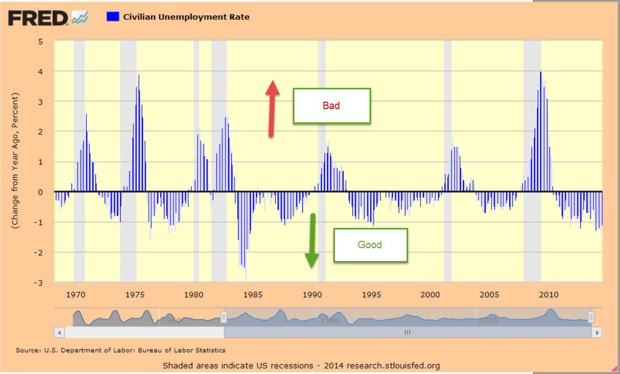
The unemployment rate ticked up a notch after ticking down two notches last month.  Notches can distract a long term investor from the underlying trend, which is positive.  Comparing the year-over-year percent change in the unemployment rate gives a good overall view of the economy and  the mid term prospects for the stock market.

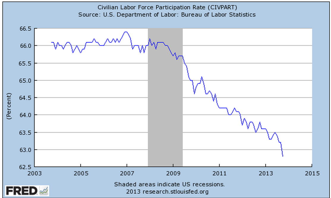
There was some slight improvement in the Civilian Labor Force Participation Rate this month.  The decline in the participation rate has been worrisome.  When we view the unemployment rate as a percentage of the Civilian Labor Force Participation Rate, we do see a continuing decline in this ratio, which is positive.  From early 2002 to early 2003, the market continued its decline even after the end of a fairly mild recession.  Employment gains were meager, prompting concerns of a double dip recession. Should this ratio start to increase over several months, investors would be wise to start digging their foxholes.

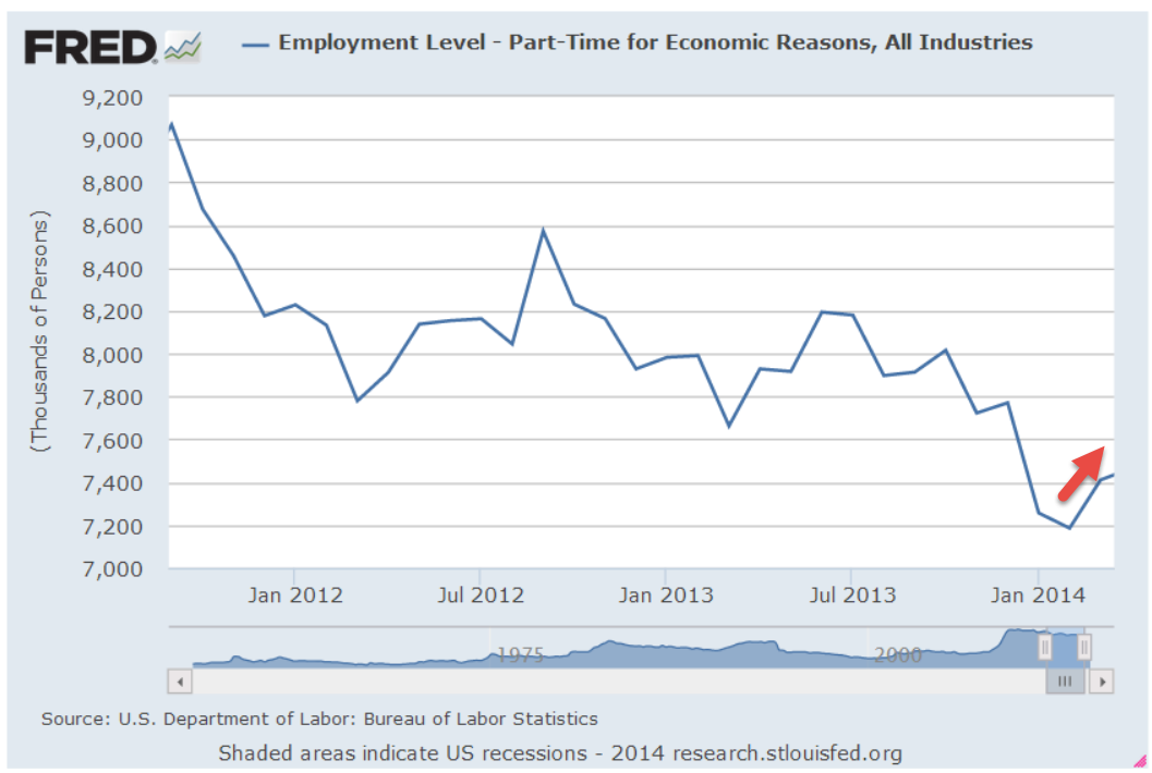
Employment numbers can hide weaknesses in the labor market. After falling to a low of 7.2 million this February, people working part time because they can’t find full time work has climbed up 300,000 to 7.5 million.  The good news is that the ranks of involuntary part-timers has dropped by 700,000, or 8.5%, from July 2013 to this July.

Employment in service occupations makes up almost 20% of the work force and usually peaks in July of each year after a January trough.  The numbers come from the monthly survey of business payrolls so it affects the job gains number to some degree, depending on the seasonal adjustments.  I expected this month’s report to show the normal pattern, rising up at least 50,000 from June’s total of 26.54 million.  I was surprised to see that employment in this composite had dropped by 170,000 in July.

Unlike the majority of years, this year’s trough occurred in February, one month later than usual.  This may be weather related.  1998, 2003, 2005, 2011 were also years in which the trough occurred one month late. Over the past twenty years, the peak has always come in July – until this year.

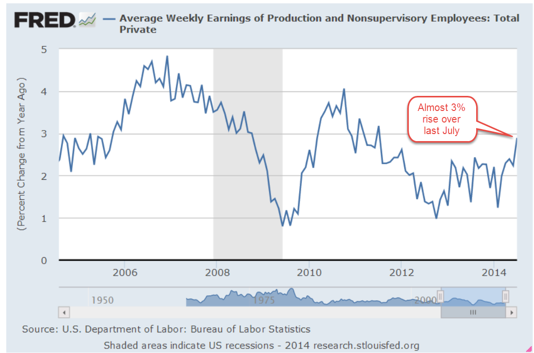
Hourly wages have grown 2% in the past twelve months, meaning that there is no gain after inflation.  That’s the bad news.  The good news is that weekly earnings for production and non-salaried employees this July bested July 2013 earnings by 2.9%.

************************

Auto Sales

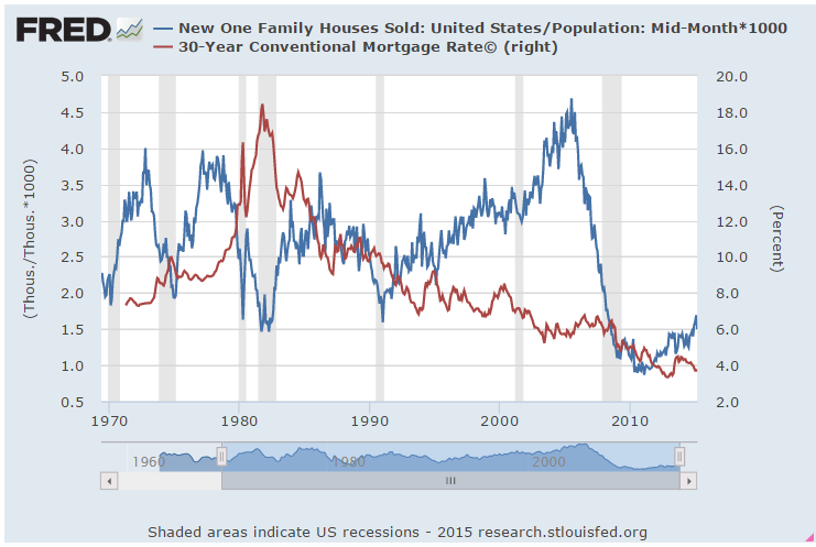
July’s vehicle sales slipped 2.4% from June’s annualized pace of 16.9 million vehicles.  Robust vehicle sales are due in part to an increase in sub-prime loans, which have grown to 30% of new car loans.  A few weeks ago, the N.Y. Times published an article describing some auto loan application shenanigans.

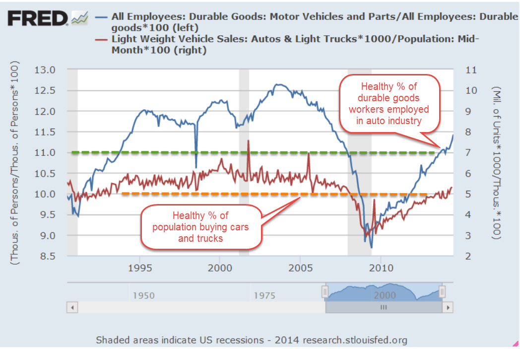
The casual reader may not understand the significance of numbers in the millions so I created a chart showing numbers in the hundreds.  The manufacturing of cars is part of a broader category called durable goods.  If a 100 workers are employed making durable goods, we would like to see at least 11 of them making cars or parts for cars.  In a healthy economy, 5 people out of 100 buy a car or truck.  The chart below shows the relationship between the number of people buying cars and the percent of durable goods workers making cars.  The chart is a bit “busy” but I hope the reader can see that, despite talk of an auto bubble that could crash the market, the percent of the population buying cars is just barely above the minimum healthy level.

There may be a bubble in auto financing but not auto sales.  Secondly, a vehicle can be repossessed and resold much more easily than evicting a delinquent homeowner.

***********************

GDP

The first estimate of 2nd quarter GDP was 4% annualized growth, above the 3% consensus expectations.  Under the hood, we see that 1.7% of that 4% is a build up of inventories.  This mirrors the 1.7% negative change in inventories in the first quarter, as I noted in last month’s blog.  It is not a coincidence and should remind us that these are human beings making a first estimate of the entire economic activity of a country.

Let’s put this early estimate in perspective.  The year-over-year percent growth is 2.4%, above the 1.6% average y-o-y growth of the past ten years.  Let’s get out our magic wand and take away the recessionary four quarters in 2008 and two quarters in 2009.  Let’s add some good numbers in late 2003 and early 2004 as the economy recovered from the dot com boom period.  Presto chango!  Well, not so presto.  We see that the average over these 37 quarters, just a bit more than 9 years, is still only 2.3%.

From 1970 – 2007, the average is 3.1%, or almost double the 1.6% average of the past ten years.  The Federal Reserve and other central banks around the world have employed the tactics at their disposal to avert deflation and to spur lending.  While low interest rates and bond purchases have accomplished some of those goals, they have created some distortions in the markets, putting upward pressure on both equity and bond valuations.  Higher stock prices pressure companies to produce the profits – on paper, at least – that will justify the increased valuation.  In the past this has induced some companies to pursue a course of – an appropriate term might be “aggressive” accounting – to meet investor demands.

So this first estimate of GDP for the 2nd quarter is slightly above the magic wand average of the past decade and way above the real ten year average.  Not bad.  I’m guessing that the second estimate of 2nd quarter GDP, released near the  end of August, will be revised downward but even if it is, economic growth is better than average.

***********************

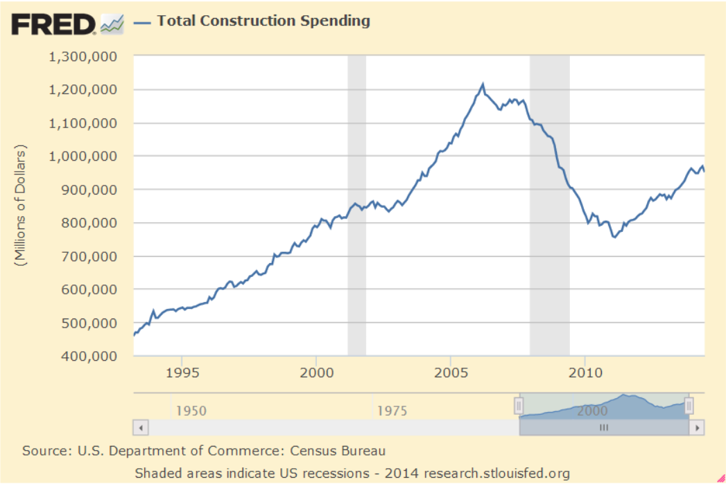
Construction Spending and Employment

Construction added 20,000 jobs in July, and are up 3.6% above July of 2013.  Total Construction spending includes residential and commercial buildings, public infrastructure and transportation. Spending in June declined almost 2% from a strong May but is up more than 5% from last year.  A casual glance at the spending numbers might lead one to observe that, after the housing boom and bust, the construction sector is on the mend.

The underlying reality is that further improvements in construction spending may be modest.  The chart below shows real, or inflation adjusted, per capita spending.  What was good enough in 1994 may be equally good in 2014 and beyond.

Residential construction has leveled off just slightly below what is probably a sustainable zone of $1200 to $1600 per person spending. At the height of the housing boom, per person spending was almost twice that of the midline $1400 per person.  Corrections to such severe imbalances are painful.

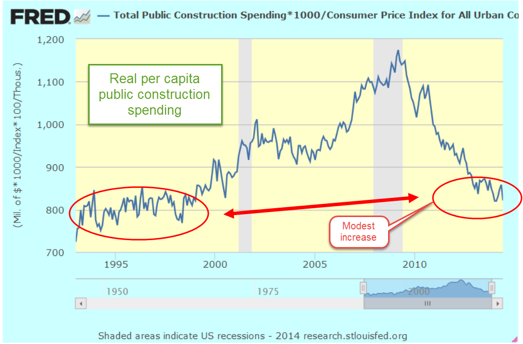
While many of us think that the boom was all in the residential sector, per person construction of public infrastructure had its own boom, growing almost 50% from the levels of the mid-90s.  Some economists and politicians continue to advocate more public construction as a Keynesian stimulus but we can see below that real per-capita public spending today is slightly more than the levels of the mid-1990s.

Spending on public infrastructure including highways helped buffer the downturn in residential construction.  As a percent of total construction spending, it is still contributing more than its share to the total.  If residential construction were just a bit stronger, this percentage would drop to a more normal range closer to 25%.

Workers in their thirties now came of age at a time when “normal” in the construction sector was far above normal. Policy makers grew to believe that this elevated level of spending was evidence of a strong economy.  They believed they were masters of the economy, ushering in a new normal of prudent fiscal policy that worked in tandem with assertive government policy to promote housing investment that would lift up those on the lower rungs of the economic ladder.

Today we don’t hear as much from those masters of economic and social engineering.  Their names include former Fed Chairman Alan Greenspan, former President George Bush, former Congressman Barney Frank, and current Congresswoman Maxine Waters.  Each of them might point to the mis-managers who helped pump up the housing balloon.  They include former Fannie Mae head Franklin Raines, and Kathleen Corbett, the former president of the ratings agency Standard and Poors which slapped a pristine AAA rating on the good and the bad. “Kathleen is an advocate of best practices, fiscal responsibility and effective management” reads Ms. Corbett’s page  at the New Canaan Town Council.

Then there are the crooks who knew what their companies were doing was dangerous, if not wrong. Topping that list is Angelo Mozilo, the head of Countrywide Financial, the largest originator of sub-prime loans.  “Crooks” is the term Mr. Mozilo once used to describe companies who wrote sub-prime mortgages.  If the suit fits, wear it.

A crook needs a fence to move the goods and there were two prominent ones in this side of the game: Dick Fuld, the former head of Lehman Bros, and Stan O’Neal, the former head of Merrill Lynch.  Both companies made a lot of sausage out of sub-prime mortgages.

Thank God that’s all behind us.  Hmmm, we said that after the savings and loan crisis of the late 1980s.  Well, thank God that’s all behind us till the mid-2020s, when we will repeat our mistakes.  A retiree should consider that during their retirement an episode of foolishness and downright dishonesty will likely have a serious impact on the value of their portfolio.

*************************

Takeaways

Continued strength in employment, with some weaknesses.  Estimate of 2nd quarter GDP growth probably a tad high.  Construction spending still just a bit below the historical per-capita channel of spending.

Up, Down, Round and Round

November 10th, 2013

Friday’s release of the monthly employment situation showed strong net job gains of 204,000 jobs and big upward revisions to the previously reported gains in August and September. The market should have reacted negatively to these positive numbers (yeh, go figure) in anticipation of the Fed tapering their stimulus program of monthly bond purchases.

But first we must go back to Thursday. The first estimate of real GDP growth in the third quarter came in above even the most optimistic forecasts at 2.8%, about a full percentage point above second quarter growth.  The primary reason for the gains though was the continuing build in inventories.  Inventory building is good in anticipation of robust sales but, as I’ll cover later, consumer spending has not been so robust.  The market reacted to the report with it’s largest daily loss in a few months.

On Friday, the employment report was released an hour before the market opened.  Trading began at the same level as Thursday’s close with little response to the strong job gains.  We can imagine that traders were twittering furiously to each other in the opening hour, trying to gauge the sentiment.  Buy in on strength in the employment numbers or sell on the strength in the employment numbers?  After the initial hesitation, the main index gained continuing momemtum throughout the day, with a final spike at the closing bell.

After digesting some of the numbers in the report, I think that traders realized how weak some of its components were, dimming the probability that the Fed will ease up on the gas pedal.  The Consumer Sentiment Survey, released a half hour after the opening bell, showed a continuing decline.  Within minutes, the market started trading higher.

The first number popping in the employment report is the 702,000 people who dropped out of the labor force.  To put that number in perspective, take a look at the chart below which shows the monthly changes in the labor force for the past ten years.  This is the second worst decline after the decline in December 2009, shortly after the official end of the recession.

This month’s .4% steep drop in the Civilian Force Participation Rate ties the record set in December 2009 when the economy was still on its knees.  The rate has now fallen below the 63% mark, far below the 66% rate of several years ago.

Employment in the core work force aged 25 – 54 actually dropped this past month.  Classifications of employment by age, sex, and education come from the survey of households, not employers, and may have been affected somewhat by the goverment shutdown. But the numbers of the past years show that there has been no recovery for this segment of the population.  In each lifetime, there are stages that last approximately twenty years.  This time of life should be  about building careers, building families, building assets and growing income.  I fear that for too many people in this age group, the slowly growing economy has not been kind.  This affects both a person’s current circumstances and dampens prospects for the future.

The headline job gains and classification of the types of jobs come from a separate survey of employers called the Establishment Survey.  Employers report their payroll count as of the 12th of each month.  Because they received paychecks, federal employees furloughed during the government shutdown in the first two weeks of October were still counted as employed in October.

There were some strong positives as well in this report.  Retailers added 44,000 jobs, above the average gains of 31,000.  This year’s gains have been the strongest in fifteen years.

The gains are about half of the eye-popping gains of the past fifty years, but they indicate a confidence among retailers.  Retail jobs are often the first job of many younger workers, who have endured persistently high unemployment during this recession. Here’s a glance at yearly job gains in the retail sector for the past fifty years.

As the holiday shopping season gets underway, all eyes will turn to the retail sector as an indicator of the consumer’s mood.  The U. of Michigan Consumer Sentiment Survey, released Friday, showed a continuation of an erosion in consumer confidence.  After peaking during the early summer at 85, this index has declined to 72, about the same levels as late 2009 when the economy was particularly weak.  The Expectations component of this survey, which reflects confidence in employment and income, has declined to about 63.  Gas prices have been declining, inflation has been near zero, and stock and home prices have been rising but this survey shows a steady decline in confidence.  The government shutdown probably had some effect on the consumer mood but the budget battles are not over.  This is the 7th inning stretch and few are standing up to sing “America The Beautiful.”

Professional Services and Health Care have been consistent leaders in job growth for the past few years but gains in these sectors have declined.  The unemployment rate notched up to 7.3% from 7.2%.

In a catch up effort after the recent government shutdown, the Dept of Commerce released data on factory orders for both August and September.  While the manufacturing sector as a whole has been strong, the weakness in new orders in these two months indicates a tempering of industrial production in the near future.

When adjusted for inflation, the level of new orders is still below the levels of mid-2008.

If we zoom out ten years, we can see that we at about the same levels as late 2005.

ISM released their monthly non-manufacturing survey, showing sustained and rising strong growth at just over 55, up a point for the previous month.  I’ve updated the CWI that I’ve been tracking  since June of this year.  A three year chart shows that even the troughs are part of a sustained growth pattern.  Furthermore, the span of the troughs keeps getting shorter, indicating a structural growth in the economy.

Let’s look back six years and compare this composite index of economic activity with the market.

The monthly report of personal income and spending released Friday showed less than 1% inflation on a year over year basis.  For the second month, incomes increased at an annualized rate of 6%, yet consumer spending remains sluggish.  The chart below shows the year over year growth in spending for the past twenty years.

A longer term graph shows the current fragility in an economy whose primary component is consumer spending.

Both the manufacturing and non-manufacturing portions of the economy continue to expand.  Employment has risen consistently at a level just above population growth.  Inflation is tame but so is consumer spending.  Income is rising.  Budget battles loom.  Expectations for holiday retails sales increases are modest.  Will the Fed ease or not ease?  The medium to long term outlook is positive, but with a watchful eye on any further declines in the momentum of consumer spending growth. The short term outlook is a bit more chaotic.  We can expect further wiggles in the stock market as traders rend their garments, struggling  with Hamlet’s dilemma: To buy or not buy?  To sell or not sell?