October 1, 2023
by Stephen Stofka
This week’s letter is about the federal public debt and GDP. This weekend the federal government may experience a partial shut down unless there is some last minute bargain. The Constitution gave Congress, not the President, the power of the purse yet it been unable to pass a budget on time for 29 years, according to Pew Research. Conservatives complain that entitlement programs like Social Security and Medicare have put most federal spending on automatic pilot, taking away much of the power that the Constitution gave to Congress. Democrats complain that too much money is devoted to military spending at the cost of programs that support families.
The conflict over social benefit programs is not new. Congress struggled with pension spending for decades following the civil war. Veterans benefits were expanded to survivors in 1879 and 1890 and by 1893, pension payments were over 40% of federal spending. The passage of the 16th Amendment in 2013 authorized the taxing of incomes to provide a funding source for these pensions.
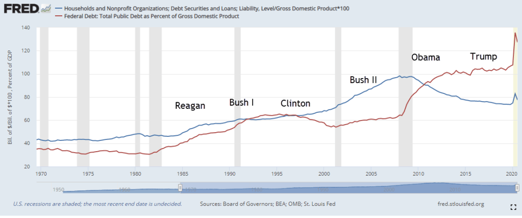
In 2014, the public debt exceeded GDP, or the country’s annual output. I have charted the annual growth rates of the public debt and GDP below. The growth rate of debt has remained above the growth rate of GDP under both Democratic and Republican presidents. I’ll present the trends and highlights but here is a link to the chart at FRED’s website if you want to explore more.

During the 1980s, the debt began to consistently grow more than the economy. Republicans excused the deficits under Reagan as a necessary expense to end the threat of the Soviet Union. The 1984 Republican Party platform proposed a multi-front strategy to contain and combat Soviet influence and aggression. Republicans excused the profligate spending of the Bush Administration who pursued two wars in Afghanistan and Iraq in response to the 9-11 attack on the Twin Towers in Manhattan. In September 2008, the Bush administration took extraordinary measures to rescue the banking system. The 2008 bank bailouts first ignited dissent within the Republican party and the Republican Study Committee emerged as a fierce opponent to a pattern of federal spending that was suddenly out of control. Under President Obama, the growth rate of debt increased to handle the fallout from the financial crisis. Democrats blamed the crisis and the increase in debt on the lax financial oversight of the Bush administration.
Economics students are introduced to a lot of unfamiliar concepts. One of these is elasticity, a ratio of growth rates that divides (compares) the percent change in one variable by the percent change in another variable. The economist Alfred Marshall (1842-1924) – the one who popularized the familiar supply-demand diagram – coined the term to compare two growth rates. Responsiveness would have been a better term, I think. Here’s the idea. If the price of bananas goes up 1%, does the quantity of bananas decrease 1%? If so, then the elasticity is minus 1 (Often, the absolute value is used), a unit elasticity. There is an equal response of bananas to changes in price. If there is no change in the quantity of bananas bought, then the demand for bananas is perfectly inelastic, or unresponsive. If a small rise in the price of bananas causes a large drop in the demand for bananas, then demand is very elastic, or responsive. See the notes below for more.
The critical benchmark for policy makers and business strategists is 1 (using the absolute value), or unit elasticity. A policymaker will ask: if a city increases their police force by 1%, does crime decrease by 1%? If the relationship is relatively inelastic, then the number of crimes will not decrease by as much. That will make it more difficult for a policy maker to appeal for greater police funding. Let’s keep that threshold of 1 in mind as we look at the public debt and GDP.
I will make a reasonable presumption that when GDP goes up, more taxes are collected and there are fewer claims for unemployment benefits and other social support benefit programs. In a blackboard theoretical world, debt would decline when GDP grew. The best we can expect is that debt increases by a smaller percent than the percent increase in GDP. Unfortunately, that’s not the case and the history of debt and GDP provides several paradoxes.
Let’s start with the 1970s, a decade noted for:
- the Vietnam War,
- Nixon’s impeachment and resignation,
- The end of gold convertibility,
- high gas prices and energy bills
- high inflation
- two recessions, one of them severe
For economists, the decade is a benchmark used for comparative analysis. “Are current conditions as bad as the 1970s?” Despite all the political and economic upheaval, the elasticity we are charting was above 1 for only two years, 1975 and 1976. In other words, the growth in debt was less than the growth in GDP for most of the 1970s.
Economists regard the 1980s as a turnaround but the decade marked a new regime of using debt to buy GDP growth. During the period 1980 through 1995, there was only one year when economic growth was higher than the growth of debt. The Omnibus Budget Reconciliation Act of 1993 raised taxes, reducing the growth of debt as GDP increased during the years 1995 through 2001. When the Bush Administration signed a tax cut package in 2001, the growth rate of debt again overtook economic growth. Two wars and a financial crisis kept the elasticity above 1. 2015 and 2017 were the only two years when the growth rate of debt was less than the growth rate of GDP. In 2020, the year of the pandemic, the elasticity spiked to almost 15. Low percent of economic growth, high percentage growth in debt. In the past two years, the elasticity has been below 1 only because debt grew so high and so fast during the pandemic.
Can we continue to borrow to buy ourselves economic growth? There is an old adage: anything that can’t go on forever won’t. The question is how long before a change of sentiment turns our present policy into folly?
///////////////////
Photo by Markus Spiske on Unsplash
Keywords: elasticity, growth rate, debt, GDP
Elasticity Note: If the quantity of bananas sold falls 0% for a 1% rise in the price of bananas, then 0% / 1% = 0, a perfect inelasticity, or unresponsive. If the quantity of bananas sold falls 99% for a 1% rise in price, then -99% / 1% = -99. Often the absolute value is used. Here is an explainer on the price elasticity of demand.