March 2nd, 2014
SP500
Some pundits have made the case that the stock market is due to fall this year because of the almost 30% rise in prices in 2013. On the face of it, it seems logical. If the average rise in the SP500 over the past fifty years is about 8-1/2% and there is a 30% rise in one year, then the market has essentially “used up” more than three years of the average – all in one year. But the stock market is the net result of billions of buy and sell decisions by human beings. My experience has taught me that the connection between sense and the behavior of human beings is tenuous, at best. The Red Carpet walk at the Oscars Award Ceremony is a demonstration of the nonsensical choices that human beings make. I mean, can you believe the dress that actress is wearing? And who told that actor he could grow a beard? PUH-LEEZ!
So I looked at past history and wondered: what is the average yearly return of the SP500 index over the three years following a 20% rise in the market? As an example, if the market rises 20% in Year #1, what is the 3 year average of yearly returns in Year #4? The results surprised me – 9.5%.
But wait! you say. The late nineties were an aberration of irrational exuberance that skews the average. Removing those two outliers from the data set gives a yearly average of 6.2%. Add in 2% dividends and the total comes to 8.2%, a respectable return.
But wait!, you say again. What about the year after the 20% rise? Surely, the index must compensate for the above average rise the previous year. In the year after a 20% rise in the market, the average gain was 13.5%. Again, there were those crazy years of the late nineties so I’ll take them out, leaving an average gain of 3.7%. Add in the 2% dividend and it easily outpaces the current return on long term bonds.
This year the pundits could be right and the stock market falls. However, a successful long term investor must learn to play the averages.
*********************************
GDP and Savings
GDP is a measure of the economic output of a nation but what the heck is it? A recent presentation by Gary Evans, an economics professor at Harvey Mudd College in California, has a number of wonderfully illustrated graphs that may help the casual reader understand the components of GDP and recent trends in the economy.
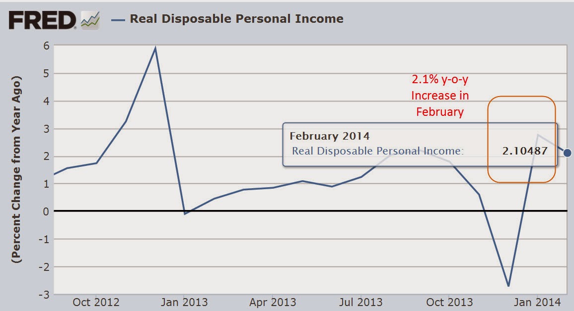
On January 30th, the Bureau of Economic Analysis (BEA) released their advance estimate of real GDP growth of 3.1% in the 4th quarter. As more information of December’s slowdown became available in late January and early February, the market began anticipating that the BEA would revise their advance estimate down. Slower growth might mean further declines in stock prices, right? Instead, the market anticipated that a slowing of growth in the fourth quarter would calm the hand of the Fed in tapering their bond purchases. As a result, the market rebounded in February, more than making up for January’s decline. On Friday, the BEA revised their second estimate of fourth quarter growth downward to 2.4%, almost exactly what the market consensus had anticipated and the market finished out a strong month with a small gain. The BEA attributed the slower growth in the fourth quarter to reductions in federal, state and local government spending and a slowdown in residential housing.
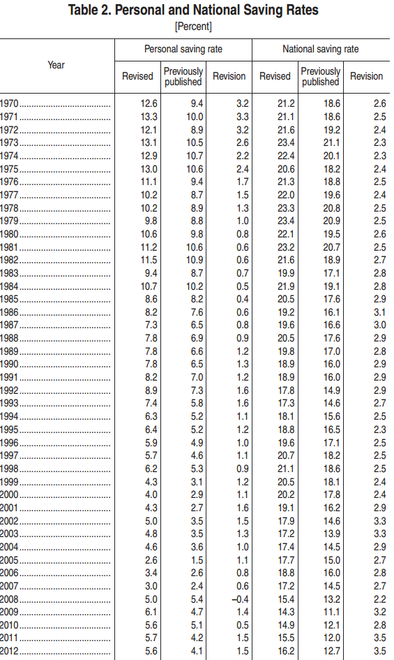
As the BEA revises their methodology, they also revise previously published GDP data. In the 2013 revision the BEA adjusted their data going back to 1929. In the past few years, revisions have added about 1/2 trillion dollars to GDP. Adjustments to the personal savings rate were substantially higher but savings in the past decade have been at historically low levels. Personal savings are the amount of disposable income, or income after taxes, that families save. The rate or PSR is the the percentage of their disposable income that they don’t spend.
When people charge purchases that decreases the savings rate. Conversely, when families pay down their credit purchases that increases the savings rate. Despite the explosive growth of household debt in the past thirty years,
the savings rate has remained positive, meaning that the people who do save are more than offsetting those who don’t or can’t save.
Let’s take an example of three families: the Jones family makes $60K in disposable, or after tax income, saves nothing, but increases their debt $8,000 by buying a new car. Their personal savings rate is $-8K/$60K, or -13.3%. The Smith Family also has $60K in disposable income, but is frugal and pays down a few loans and saves some money for a total savings of $2K, or 3.3%. The Williams family has a disposable income of $120K and has net savings of $20K, or 16.7%. Families with higher incomes tend to save proportionately more of that income. Total disposable income for the three families is $240K. Total savings is $14K, or 5.8% of disposable income, but that hides the fact that it is the Williams family that is making most of the contribution to that savings rate.
There is another subtle element contributing to this disparity in savings: inflation. The Consumer Price Index charts the increasing prices of goods and services – spending. A higher income family that spends less of its income is less affected by changes in the CPI than a lower income family and this helps a higher income family save proportionately more than the lower income family. The difference is slight but the compounded effect over thirty years is significant.
During the past thirty years, the personal savings rate has steadily declined.
This doesn’t mean that families are saving less as a percentage of their income but that the number of families with net savings are becoming fewer while the number of families with little net savings or negative net savings are becoming more numerous. The period from 1930 to 1980 was one of relatively more income equality than the period 1980 to the present. Let’s look again at the chart above. In the late 1970s, as income equality begins a decades long decline, so too does the personal savings rate. The ratio of high income families with a relatively high savings rate to lower income families with a low savings rate also declines.
Savings drives investment in the future. The low savings rate means that future U.S. economic growth must rely ever more on the savings from those in other countries. Typically savings rates increase as a recession progresses and then the economy recovers.
Notice that the savings rate has stayed relatively steady in the past three years, indicating neither an increasing confidence or caution. As shown in the table, only the three year period from 1988 – 1990 period showed the same lack of direction. GDP growth in that period was stronger than it is today but the savings and loan crisis and the stock market crash of October 1987 had diluted the confidence of many.
****************************
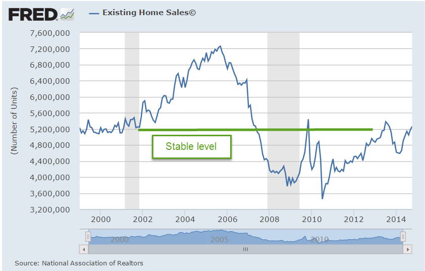
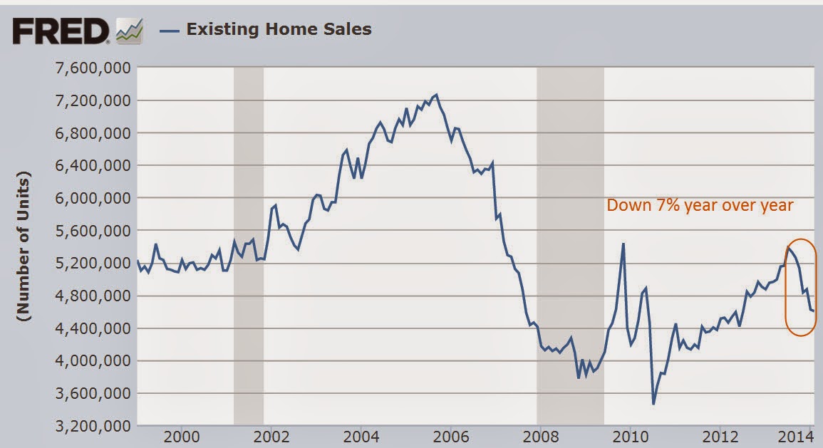
New Home Sales
Here’s a head scratcher. New home sales rebounded almost 10% in January, after falling 13% in December. Even the figures for December were revised a bit higher. As I noted last week, the rather flat growth in incomes has become an obstacle to the affordability of homes. December’s Case Shiller 20 city home price index reported a 13.4% annual increase in home prices. January’s rise in home sales was partially aided by sellers willing to make price concessions, resulting in a 2.2% decrease in the median sales price.
****************************
Durable Goods
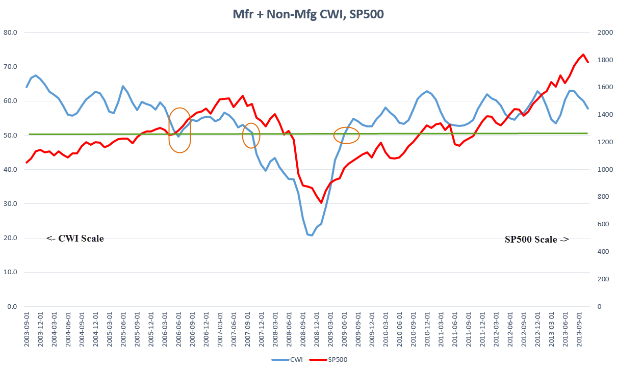
Orders for durable goods, excluding transportation, were up about 1% this past month. A durable good is something which has a life of 3 years or more. Cars and furniture are common examples. The year over year gain, a bit over 1% as well, indicates rather slow growth over the past year after adjusting for inflation. However, several current regional reports of industrial activity indicate a quickening growth at the start of this year. Reports from Chicago, Philadelphia and Kansas City hold promise that next week’s ISM assessment of manufacturing activity nationally will show a rebound.
As I have noted in blogs of the past few months, the pattern of the CWI index that I have been compiling since last summer indicated a rebound in overall activity in the early spring of this year. This gauge of manufacturing and non-manufacturing activity is based on the Purchasing Managers Index released each month by ISM. I suppose a better name for the CWI index would be “Composite PMI.” Readers are welcome to make some suggestions.
****************************
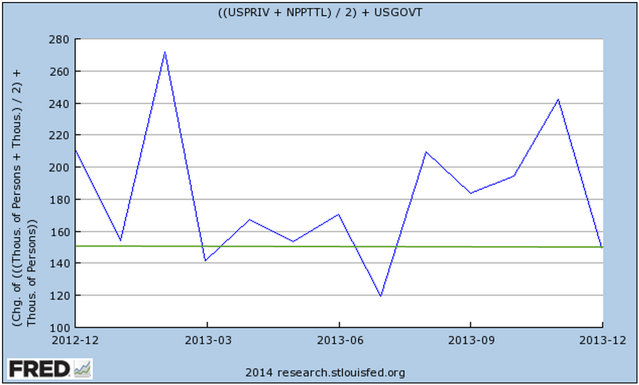
Unemployment
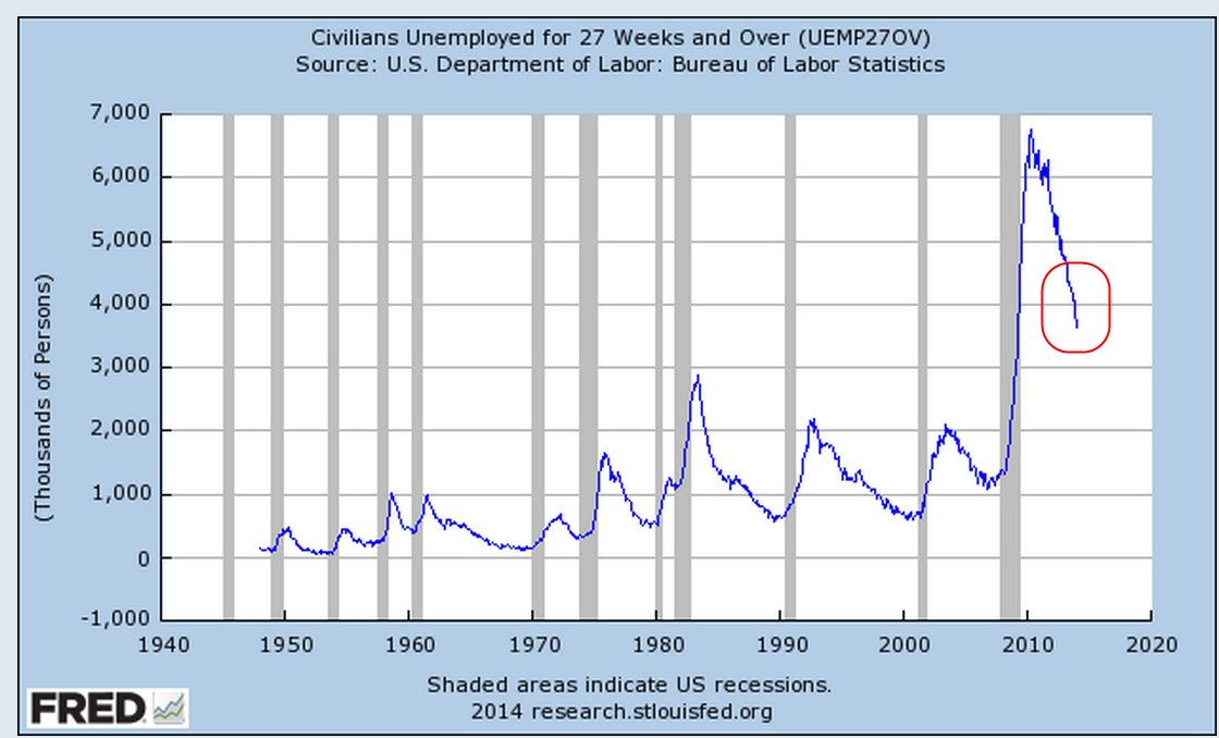
New unemployment claims rose, approaching the 350K mark, but the 4 week average of new claims is holding steady at 338K. In past winters the 4 week average has been around 360K. If new claims remain relatively low during this particularly harsh winter in half of the country, it will indicate an underlying resiliency in the labor market.
Janet Yellen, the new chairwoman of the Federal Reserve, appeared before the Senate Finance Committee this week. In her response to questions about the dual mandate of the Fed – inflation and employment – she noted that the Fed looks at much more than just the unemployment rate in gauging the health of the labor market. One of the employment indicators they use is new unemployment claims.
When asked what unemployment rate the Fed considers “full employment,” Ms. Yellen stated that it was in the 5 – 6% range. One of the Republican Senators asked about the “real” unemployment rate, without specifying what he meant by the word “real.” Without hesitation and in a neutral tone, Ms. Yellen responded that if the Senator meant the “widest” measure of unemployment, the U-6 rate, that it was about 13%. The U-6 rate includes discouraged workers and part time workers who want but can not find full time work.
When George Bush was President, “real” meant the narrowest measure of unemployment to a Republican because it was the smallest number. With a Democrat in the White House, the word “real” now means the widest measure of unemployment to a Republican because it is the largest number. Democrats employed the same strategy when George Bush was President, preferring the higher U-6 unemployment rate as the “real” rate because it was higher. I thought that it would be a good response for anyone when confronted by a colleague at work about the “real unemployment rate” that we steer the conversation to more precise and politically neutral words like “widest” and “narrowest.”
****************************
Pensions
A reader sent me a link to a Washington Post article on the pension and budget woes of San Jose, a large city in California. I am afraid that we will see more of these in the coming decade. Beginning in the 1990s politicians in state and local governments found an easy solution to wage demands from public workers: make promises. Wages come out of this year’s budget; pension promises and retiree health care benefits come out of some budget in the distant future. For an increasing number of governments, the distant future has arrived.
In Colorado, a reporter at the Denver Post noted that the Democratic Governor and the Republican Treasurer are hoping that the state’s Supreme Court will force the public employee’s pension fund, PERA, to open its books. It might surprise some that a public institution like PERA is less transparent than a publicly traded company. Actuarial analysis estimates are that PERA’s asset base is underfunded by $23 billion, or about $46,000 for each retiree. It was only last year that the trustees of the fund reluctantly lowered its expected returns to 7.5% from 8%. Assumptions on expected returns, what is called the discount rate, is a major component in analyzing the health of any retirement fund and the money that must be set aside today to pay for tomorrow’s promised benefits. Many analysts contend that even 7.5% is a rather lofty assumption in this low interest rate environment.
Readers who Google their own state or city and the subject of pensions will likely find similar tales of past political promises and lofty assumptions running headlong against the realities of these past several years.