Follow The Money

June 14th, 2014

This week I’ll take a look at some near-term trends in small business, labor, oil and housing and a few long-term trends in income and debt.

***********************
Small Business

Huzzah, huzzah!  The monthly survey of small business owners by the National Federation of Independent Businesses (NFIB) broke through the 96 level after cracking the 95 level last month.  Sentiment has not been this good since mid-2007.  Hiring plans have been on the rise for the past several months and owners are reporting rising sales.

**********************

JOLTS (Job Openings and Labor Turnover Survey)

The Job Openings report from the Bureau of Labor Statistics (BLS) has a one month delay so the data released this past week was for April.  The number of job openings was 40,000 higher than expected, coming in close to 4.5 million.  As a percent of the workforce, job openings are approaching pre-recession highs.

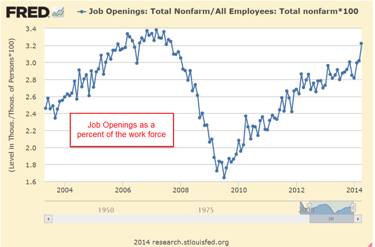
The decline in construction job openings is a disappointment.  We are near the same level as 2003, a weak year of economic growth.  We should expect to see an uptick in job openings in next month’s report, confirming that projects put on hold during the severe winter in the eastern part of the country are again on track.  Further declines would indicate a spreading malaise.

************************

Gross Domestic Income

On a quarterly basis Gross Domestic Income, GDI, and Gross Domestic Product, GDP, differ somewhat but over the long run closely track each other.  Following up on two previous posts on Thomas Piketty’s book Capital in the 21st Century, I wondered what percent of GDI goes to pay employee compensation.  As we can see in the chart below, total compensation for human labor has been dwindling to post WW2 levels.

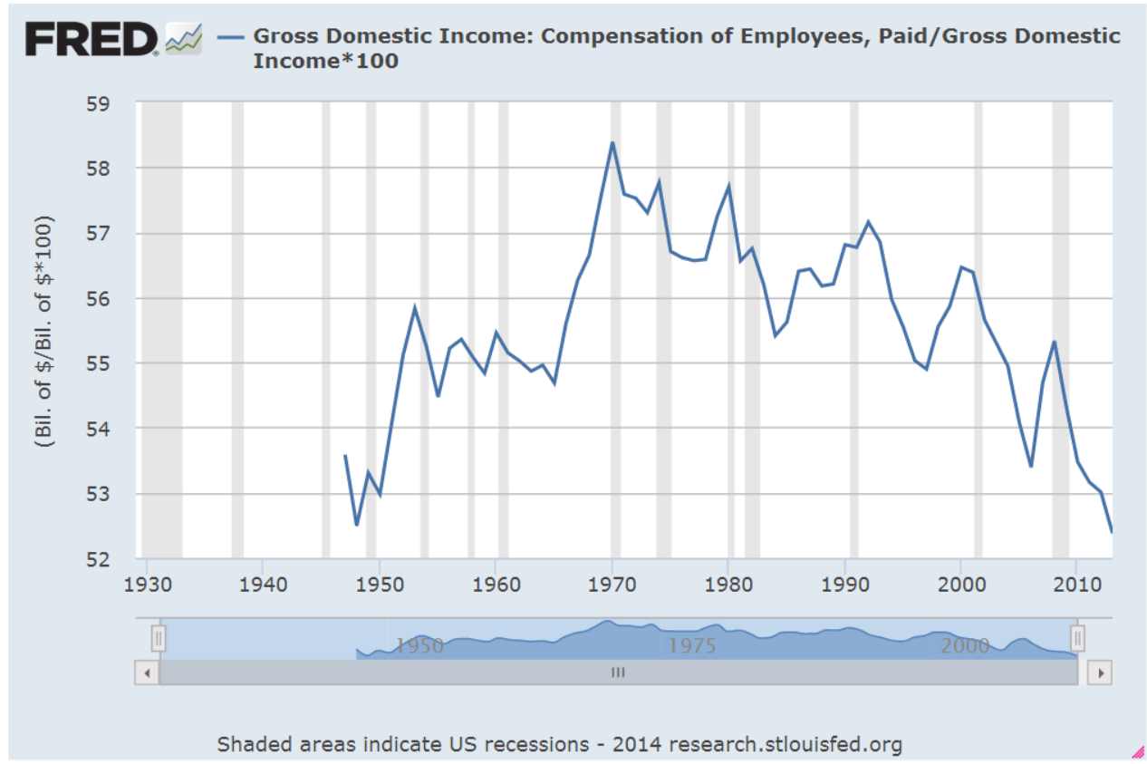
This is total compensation, including benefits.  Wage and salary income as a percent of total national income has declined steadily.

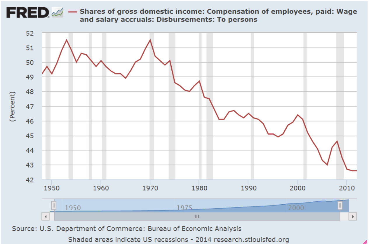
As a percent of total income, employee benefits have more than tripled since the end of World War 2 and now comprise more than 10% of the country’s income.

Demographic shifts have contributed to the decline of labor income.  The post war boomer generation, 80 million strong and 25% of the population, contributes to the trend as they save for retirement. As capital gains, interest and dividend income increase, this reduces the share of wage and salary income.

Economic changes have been a major factor in the decline of labor income.  Capital investments in technology, both in hardware and software, have reduced the need for labor for a given level of production.  Capital investment demands income to pay back the investment. For most of the 20th Century, machines replaced human muscle in farming, manufacturing and construction.  In the past two decades, machines are increasingly replacing mental muscle.

How we count labor income has changed.  Tax law changes in 1986 and 1993 reduced the amounts that are included as compensation but the overall effect of these changes is relatively minor.

If we divide the country’s total employee compensation by the number of employees, we might ask “What recession?”  Average annual compensation has climbed from $38-54K in a dozen years.  That’s almost a 50% raise for every employee!

Of course, everyone has not had a 50% increase in income over the past 12 years.  Human capital, the educational and technical training that an employee has to offer, has earned an increasing premium in the past three decades. Those with more of this capital have captured more benefit from the dwindling pool of labor needed for the nation’s production.

Average disposable income tells a more accurate story of the majority of people in this country.  Disposable income is what’s left over after taxes.  The trend is downward.

How do we cope with flat income growth?  Charge it!  It’s the Amurikin way! Per capita Household Debt has increased 75% in the past 13 years.  After a decline from the rather high levels before the recession began in late 2007, per capita debt has leveled off in the past two years.

Rising house prices and stock market values have increased net worth.  As a percent of net worth, household debt has declined to the more sustainable levels of the 1990s.

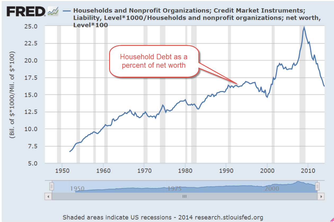
The percentage of disposable income needed to service that debt is at thirty year lows, meaning that there is room for growth.

In response to the hostilities in Iraq, oil prices have been on the rise.  Historically, a rise in oil prices leads to a rise in prices at the pump which takes an extra bite out of disposable income and puts a damper on consumer spending growth.

***********************

Oil Prices

A blog by Greg McIsaac at the Washington Monthly in May 2012 presents an interesting historical summary of oil prices and production.  The American love of simplicity leads many to credit one man, the President, for the rise and fall in gasoline prices, although the President has little, if any, influence on oil pricing. McIsaac notes The combination of lower energy prices and increased energy efficiency in the 1980s reduced US expenditures on energy by nearly 6 percent of GDP.  Deregulation of energy prices begun under the Carter Administration were largely credited to the Reagan administration.   He writes “crediting Reagan with falling energy prices of the 1980s exaggerates the roles of both Reagan and deregulation and obscures the larger influence of conservation and increased production outside the US.”  Production actually fell for several years after regulatory controls were lifted.

Further increases in oil prices will no doubt be blamed on this President.  The one thing that each outgoing President bequeaths to the newcomer before the inauguration is the Presidential donkey suit.

***********************

Housing

Redfin Research Center reports a sharp decline in the number of houses sold through May. After a 7.6% year-over-year decline in April, home sales slid 10% from May 2013 levels.  Real estate agents are reporting a shift from a seller’s market to a buyer’s market.

***********************

Takeaways

Small business accounts for approximately 60% of new jobs and optimistic sentiment among small business owners is growing.  The labor market continues to show continuing strength in the number of job openings and a decline in new unemployment claims.  Disposable income growth is flat but the portion of income needed to service debt is very low.  Rising oil prices and a slowing housing market will crimp economic growth.
Next week I’ll look at a complex topic – is the stock market fairly valued?  

Labor and Money Flows

September 1st, 2013

On this Labor Day weekend, I’ll review some things that caught my attention this past week.

The employment picture has shown steady but slow improvement.  The weekly survey of new unemployment claims continues to show downward movement.  In a survey that is about 13 years old, called the JOLTS, the BLS gathers data on Job Openings, Layoffs and Turnovers.  A component of this survey includes the number of employees who have quit their jobs, referred to as the “JOLTS quit rate.” In the aggregate, it indicates a hive intelligence, the estimation of millions of people about the prospects of getting another job.  Decades ago, researchers asked a number of people to estimate the number of jelly beans in a jar.  Each estimate has very small chances of getting close to the actual number, but the average of all estimates was found to be almost exactly the number of jelly beans in the jar.  I don’t know whether this experiment has been replicated but it is interesting.

After recent months of surging new orders for durable goods, July’s report, released Monday, showed signs of caution and a “return to the mean” of a positive upswing this year.

Although this past month’s data was negative, industrial production shows a clear uptrend.

In an analysis released a few months ago, the Federal Reserve examined data from the 2010 triennial (every 3 years) survey of households and estimated that inflation adjusted net worth per household (green line in the graph) has just climbed back to the level it was almost ten years ago.


On the positive side, average net worth is not less than it was ten years ago.  On the negative side for those nearing retirement, it is not more that it was ten years ago.

On Friday, the Personal Consumption and Expenditures (PCE) report showed a 1.4% year over year percent gain, indicating the tepid growth in household spending.  Below I’ve charted the percent gain in PCE vs the percent gain in GDP for the past thirty years.

We are still below the low points of the 1980s, 1990s and early 2000s.  The Federal Reserve is projecting GDP growth of 3 – 3.5% in 2014 but this may be another in a string of rosy forecasts by the Fed, who have repeatedly revised earlier rosy forecasts.  If the Fed were a contractor, it would be out of business due to poor estimating.  A $16 trillion economy is not a kitchen remodel by any means, but it does illustrate how difficult it is for the best minds to make even short term predictions of the economy from the vast amounts of sometimes conflicting data.  Consider then the folly of the Government Accountability Office (GAO), the economic watchdog created by Congress and mandated by Congress to come up with ten year estimates of economic growth and the consequences of existing and proposed legislation.  Those in Congress continue to trot out these fantasy numbers to support or criticize policy and legislation.

Washington continues to vacuum in money and talent from the rest of the country.  Of the richest counties in per capita income in the U.S., the Washington metro area has two of the top three.  The other county in the top three is a stone’s throw from the metro area.  As Washington politicians convince the rest of us that they have the solutions, lobbyists and graduates flock to the concentration of power, jobs, money and influence.
 
Bond yields have increased more than 1% since the spring, meaning that the prices of the bonds themselves have fallen dramatically.  Most of this change has been a reaction to forecasts for stronger growth and a tapering of the Fed’s stimulus program called Quantitative Easing.  Washington is sure to get in the way of stronger growth for the economy as a whole.  Policy out of Washington is designed to promote strong economic growth for Washington.

The market research firm Trim Tabs regularly monitors money flows into and out of the stock and bond markets.  They  reported today that outflows from the stock market in August were half of the record inflows in July.

The blood spilled this year has been in the bond market.  Trim Tabs reports that outflows from bond funds and ETFs have totalled more than $123 billion in the past three months.  Flows into bond funds and ETFs were about $750 billion in 2012, almost a doubling from the $400 billion invested in 2011. (Fed Flow of Funds tables F.120, F.121)

While the prospect of higher rates may have been the trigger that caused a reversal of bond inflows, the underlying current is also an overdue correction of the surge of investment in bonds in 2012.

Households continue to shed debt in one form or another so that total liabilities continue to decline. However, every man, woman and child in this country is carrying, on an inflation adjusted basis, 2-1/2 times the amount of debt they carried thirty years ago.  This level of household liability will continue to put downward pressure on growth.

This next week will kick off with the ISM manufacturing report on Tuesday and finish the week with the monthly employment report.  Year over year percent gains in employment have been steady and guesstimates are for maybe 200,000 net job gains.  150,000 net jobs are needed to keep up with population growth.

The Fed meeting is coming up in mid-September so this employment report will be watched closely to guess the next steps the Fed will take. 

Happy Days

January 27th, 2013

This past week, Republicans in the House passed a bill to delay the raising of the debt ceiling till May.  The S&P500 crossed 1500, nearing the high of 1550 it set in October 2007.  This past week, money flowing into equity mutual funds finally surpassed the flows into bond funds (Lipper Source)

As the saying goes, “The trend is your friend.”  When the current month of the SP500 index is above the ten month average, it’s a good idea to stay in the market.

So, happy days are here again!  Well, not quite.  Household net worth is still climbing but has not reached the 2007 peak.

But when we step back and look at the past thirty years, household net worth is better than trend.

Asset bubbles overly inflate and deflate net worth, which includes the valuation of assets like stocks and homes.  An asset bubble is like a Ponzi scheme in that those who get in toward the end, before the bubble bursts, often suffer the worst.

CredAbility, a non-profit credit counseling service, produces a Consumer Distress score that evaluates five categories that have a significant effect on a consumer’s financial stability: employment, housing, credit, the household budget and Net Worth. It has only just broken out of the unstable range into the bottom of the frail range.

The Federal Housing Finance Administration (FHFA) released their House Price index a few days ago.  This price gauge is indexed so that 1991 prices equal $100. The index, which does not include refinancing, came in at $193, or just about 3% per year.  Although housing prices are still depressed from the heights of the housing bubble they are still above the CPI inflation index since 1991.  Housing prices generally rise about 3% – 4% per year, depending on what part of the country you live. 

When we look back twenty years, we can see that housing prices are, in fact, above a sustainable trend line established before the Community Reinvestment Act and the advent of mortgage securitization, both of which undermined rational underwriting standards.

Nationally, we are close to sustainable price trend but still a bit inside the bubble.  Sensing that home prices may have hit bottom, Home Builder stocks as a group are up about 50% in the past year.  Think that’s good?  They rose almost 100% from the spring of 2009 to the spring of 2010, only to fall back again. 

Tight credit, rigid underwriting standards and a still frail consumer will present challenges to the housing market as it climbs slowly out of the doldrums of the past few years.

Worth More White

The Federal Interagency Forum on Aging-Related Statistics keeps track of the decades long transfer of wealth from the younger to the older.

After adjusting for inflation, “between 1984 and 2005, the median net worth of households headed by white people age 65 and over increased 81 percent from $125,000 to $226,900. The median net worth of households headed by black people age 65 and over increased 34 percent from $28,200 to $37,800.” Click on Indicator 10.

The graph shows an overall trend but a look at some historical data at the site shows that older blacks did not share in the boom of the late nineties. Their net worth declined.

There are a number of other interesting stats on this web site. For example: after declining for several decades in the 20th century, a greater number of older people are working in retirement. Indicator 9 tab shows the the decades long change in the mix of income sources for older Americans.