Cliff Diving

November 18th, 2012

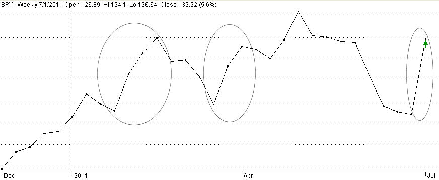
This past week, President Obama gave a post-election news conference, answering a number of questions about the fiscal cliff due to take effect on January 1st if the lame duck Congress and the President can not come to an agreeement on some budget bandaging.  The stock market has had the jitters since the first week of October, falling 9% since then; about half of that decline came after the election.  At almost the same hour that it became apparent that the balance of power in Washington would remain the same came the unwelcome forecast of no growth for the Eurozone in 2013.  When in doubt, get out.

For the past two years, there have been few “Kumbaya” moments in the halls of Congress or the White House.  The market has had a good run this year; capital gains taxes could increase next year; many decided to take their profits and run.  A I wrote a month ago, the drop in new orders for durable goods was troublesome.  Three weeks ago, the newest durable goods report showed further declines yet consumer confidence was up, creating a tug of war and I waved the yellow flag, saying that the “prudent investor might exercise some caution.”

For the long term investor who makes annual investments in their IRA, this drop in the stock market is an opportunity to make some of that contribution for this year.  If the wrangling over revenue and spending cuts continues over the next few weeks, the market could drop another 10 – 15%. When budget negotiations collapsed in July – August 2011, the market declined almost to bear market territory – about 19%.  All too often, some of us wait till the last minute in April to make our annual IRA contribution. 

The “cliff” terminology was spoken by Fed Chairman Ben Bernanke at a hearing in February.  He probably wished he had chosen less colorful language but he was probably trying to wake up some of the senators at the hearing.  How bad is this cliff?

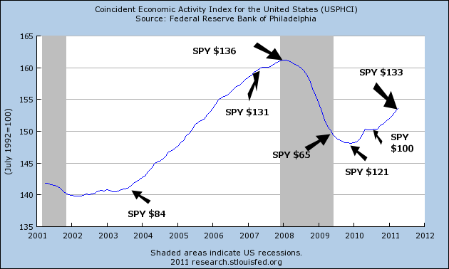
The total measured economic output of the U.S., its GDP, is estimated by the BEA (Bureau of Economic Analysis) at around $16 trillion – $15.85 trillion, to be exact, based on this year’s estimated growth of about 2.2% and next year’s average 2.75% estimate of growth.  What’s a trillion dollars?  About $9000 for every household in the country.

The non-partisan Congressional Budget Office (CBO) estimated some of the economic impacts if we did go over the cliff; in other words, if the spending cuts and revenue increases occurred next year.  Below is a chart of the percentages of GDP that each component of spending cuts and revenue were to occur.

The total of these is 3.2% of the economy.  Well, that’s not Armageddon, you might think and you would be right. As I mentioned earlier, forecast growth is only about 2.75% for next year so that means that GDP would contract slightly next year.  On the other hand, the cliff sure helps the deficit for next year, cutting it by almost half.  The deficit is projected at about $1.1 trillion before spending cuts and revenue increases.  In more manageable numbers, the country is going to go further into debt next year to the tune of almost $10,000 for every household.

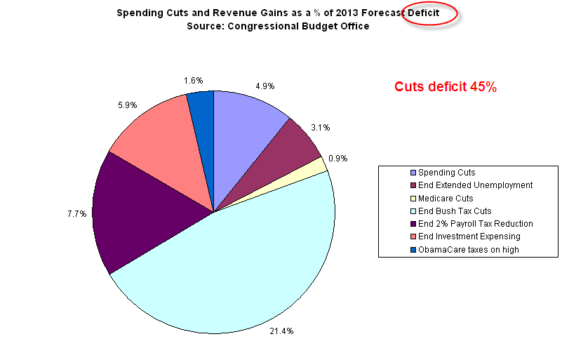
Politicians in front of a microphone are prone to hyperbole.  So are news anchors.  Politicians try to sell their version of the story; news anchors try to keep our attention.  Small numbers like 3.2% of GDP might not get our attention so we could hear more dramatic numbers.  News anchors may say “Spending cuts of $100 billion” because $100 billion sounds important.  But without a total or a percentage, we have no context to evaluate the amount of money.  Is $100 billion a little or a lot?  $100 billion in spending cuts is .6% of the entire economy, or 2.6% of the budget for this coming year.  We may hear “Revenue increases of $400 billion,” which sounds gigantic.  It is 2.5% of the economy, or an additional 13.8% of the projected federal revenue.  Remember, even with the revenue increases, should they take effect, the country’s budget will still be “in the red” an estimated $600 billion dollars, or $5400 per household.

This country needs more revenue and it needs to cut expenses.  Each side of the aisle will fight to protect the “job creators” (interpretation: people with money) or the “working poor” (interpretation: people who are barely making it week to week) or the “middle class” (interpretation: the rest of us).  Tax the other guy, not me.  Cut the other guy’s deductions, not mine.  Cut subsidies, but not mine.  Cut expenses but not in my industry or area of the country. This is the same kind of behavior that 5 – 8 year old kids exhibited in an experiment featured on CBS’ 60 Minutes tonight.  Maybe, just maybe, we need to grow up.

Job Openings – March

A couple of weeks ago, the Bureau of Labor Statistics (BLS) issued their March JOLTS (Job Opening and Labor Turnover Survey) report showing a continuing increase in job openings. Below is a Federal Reserve historical graph incorporating the latest March data.

Graphing the quarterly data evens out the monthly fluctuations and shows the upward trend.

While the trend is upward, we have come from a deep trough and we still have a long way to go to get to a healthy job market.  The number of job openings is about the same as in 2004 but the population has grown by 20 million since 2004.

The stock market is inextricably chained to the labor market.  In the graph below, we can see the similarity in trends between the S&P500 and the job openings.

The stock market attempts to anticipate the health of the job market.  In the spring of 2006, job openings halted their decline then rose and the market resumed upward in anticipation of a continued climb in job openings.  As job openings reversed and resumed their decline in 2007, it was a harbinger of the coming economic cliff.

The Long Run

Now the really big picture.  Reflecting the severity of the market downturn that began in late 2007, the 4 year average (50 month) of the S&P500 index is getting close to crossing below the 17 year (200 month) average.  Remember, this is years.  In the normal course of affairs, inflation tends to keep the shorter average above the longer average.  The crossing or “nearing” of these two averages reveals just how sick the past decade has been.  The last time the market showed this indicator of prolonged market weakness was in the first half of 1978, after a 43% market drop in the bear market of 1973-74 and a 19% drop in 1977.

In the last 60 years, was the October 2008 market drop of 17% the deepest monthly plunge in equity prices?  No, that honor goes to the almost 22% dive in October 1987.  For a consecutive 3 month drop, 2008 does barely nudge out 1987, both falling 30%.

Although headlines will speak of the downturn in the Fall of 2008 as the worst since the depression, it is important for Boomers to remember that our parents’ generation suffered through some pretty severe market declines as well.  In 1987, most Boomers were in their thirties and probably had relatively few dollars in the stock market.  We may remember “Black Monday”, October 19, 1987, for the headlines but it was not as personal as the 2008 decline because we were decades before retirement and had less at stake.  What particularly distinguishes the two years is that the unemployment rate continued to fall during the 1987 decline.

Young people don’t remember market crashes the way that older people do.  When we are young, we have – like forever – before we are going to be old.  For the echo boomer generation born in the eighties and nineties, also known as the  “millennials”, or Generation Y, the crash of 2008 will be a faint or non-existent memory when they reach their fifties decades from now.  They will probably get to have their own crash – one that they will remember because they will have more at stake.

When we are in our twenties, someone should prepare us.  We are going to work hard and save money.  We are probably going to put some of that hard earned money in the stock market.  Then, when we are in our fifties, sixties or seventies, we are going to flip out when our stock portfolio drops by 40%.  Would we listen to or remember that sage advice?  Probably not.

Golden Cross

A few weeks ago, I wrote about a long term trading strategy using the 200 day moving average of a popular index, the S&P500, which captures 75% of the corporate activity in the U.S.  As corporate profits of larger companies increasingly come from overseas, the S&P provides some foreign stock exposure as well.  Over the past decade, the strategy worked pretty well, getting out of the market before the 2008 downturn, enabling an investor to pick up shares at a cheaper price in 2009.  That is, after all, the point of adopting any type of trading strategy – sell when shares are expensive, buy them back when they are cheap.

Today, I’ll look at a variation of the 200 day strategy called the “Golden Cross”, which I have mentioned in a few past blogs.  A Golden Cross buy signal occurs when the 50 day moving average crosses above the 200 day moving average.  A sell signal occurs when the 50 day average crosses below the 200 day average. A buy signal just occurred at the end of January. You can chart the S&P index for free at StockCharts.  I will compare this Golden Cross strategy to the buy and hold strategy. 

The Golden Cross strategy investor must overcome two major problems: tax attrition and the return on cash while out of the market.  The first problem is formidable. The IRS takes their pound of flesh out of profits that the trading strategy produces.  The downturn in prices when the strategy is out of the market may not be enough to compensate for the 20% (or more?) tax bite, which reduces the investor’s capital pool when he buys back into the market.  Thus the investor may buy fewer shares on the next buy date, and those fewer shares generate less profits as market prices climb.  The second problem is almost as formidable.  Over the 50 years that I will explore, the investor would be out of the market about a third of the time.  The interest rate one earns on one’s capital while out of the market is an important factor in total returns.

Here are the assumptions of the study:

20% Effective Tax Rate – capital gains taxes are “taken out” at the time of the sale.

3% Average Dividend Yield (see here for historic dividend yields)- dividends are recorded and taxes paid for those dividends for both strategies at buy and hold dates.  While not entirely accurate, it largely accounts for the value of dividends to a portfolio.

Interest – 4% on cash while out of the market.

Reinvest – For the conservative buy and hold strategy, the investor pays taxes on the dividends received and puts the money in some cash equivalent fund earning the stipulated interest.  The Golden Cross strategy accumulates and reinvests the dividends at the next stock purchase date. (Click to enlarge in separate tab)

The market downturn during the 70s was severe enough that the Golden Cross investor could book profits, pay taxes and buy back more shares than he had before.  In the early 80s, the downturns were not significant enough to overcome tax attrition.  Had we ended this exploration in the year 2000, this strategy would have done poorly when compared to a buy and hold strategy, even after accounting for the deferred taxes owed by the buy and hold investor.  During the two severe bear markets of the 2000s, the Golden Cross strategy shined, exceeding the returns of the buy and hold strategy.

The lesson is that the downturn must be strong enough that the Golden Cross strategy can overcome the tax attrition by buying shares back at greatly reduced prices.  Although the Golden Cross strategy produced only 5 losses out of 27 round trip (buy/sell) trades, a winning percentage of about 80%, the tax obstacle is a formidable barrier to increased profits over buy and hold.  The buy and hold strategy is about 25% invested in cash at the end of this study, a conservative approach consistent with a buy and hold investor.  If the buy and hold investor were to periodically reinvest dividends instead of holding cash, it would probably equal the after tax returns of the Golden Cross strategy.

The Golden Cross strategy is much more dependent on finding a good return on cash when the investor is out of the market.  In these times, that is not an easy task.  As a retirement strategy, it might be wise to choose a combination of the Golden Cross and buy and hold.  A buy and hold investor in or approaching retirement would assess their income needs for the next 3 – 5 years and sell just enough shares to fill the cash account when a Golden Cross sell signal arrives.  During their working years, a buy and hold investor would add shares when a Golden Cross buy signal arrived.

200 Day Nudges Higher

The market is a reflection of hope and fear, of world events that affect each of us, our jobs, our families, our schools, churches and neighborhoods.  The 200 day moving average moves through the minute gyrations of the daily market like a great leviathan, changing its course only gradually.  If you are a Star Wars fan, think of the 200 day as The Force.

For the long term investor, it is wise to buy or sell as this average changes direction.  When we compare a month’s (21 trading days) average of the 200 day to the previous month’s average, we can see these changes in direction.  At the onset of the recession in 1990, the S&P 500 index dropped about 17%.  The recession was fairly short but it was a jobless recovery.  From the October 1990 trough to the end of 1993, the index climbed 60%, then paused and stumbled.

Almost 3 years after the recession had officially ended in March 1991, the unemployment rate was still a lofty 6.5%.

Due in part to the jobless recovery, the federal debt had risen 50% in the four years of 1990 through the end of 1993 and would continue it’s relentless march upwards for several more years.


In 1994, the 200 day average waggled in indecision, barely moving during that summer before nudging upwards in August, then falling again in November, before making its decisive move upwards in 1995.  In six years, the index would more than double.  When the 200 day began to roll over in the fall of 2000, the wise long term investor listened to that slow heartbeat and headed for the exits.  In the middle of May 2003, the 200 day began another 4-1/2 year climb up before rolling over in Jan. 2008.  18 months later, the 200 day began yet another climb after the steep descent of the financial crisis of 2008.  Just this past September, the 200 day signaled exit after a tumultuous summer and before continuing unrest in the fall.

A person investing in the S&P500 index who turned when the 200 day average turned would have made 460%, including dividends, on their money since 1994, 81% in the past ten years and that doesn’t include money that could be made in interest while their money sat safely outside of the market mayhem. 

In the last quarter of 2011, the 200 day moving average had been slightly declining but largely flatlining – unchanged – since the beginning of August. A week ago, it nudged higher.  Will this be like the nudge higher in August 1994 that may reverse in a month or two?  Could be. Although the signals of the 200 day average are relatively few, a prudent investor would monitor the situation every week in case this is a “waggle” and not the beginning of a move up.

Scorecard

It’s been a tough trading or investing year.  So what investments have done relatively well this year?  The names below are either in the Dow Jones, S&P100 or are a group of investments.  The following are within 95% of their 200 day highs:

Abbott Labs
Bonds, Corporate – Short, Mid and Long Term
Home Depot
IBM
McDonald’s
Altria (Tobacco)
U.S. Treasuries
Wal Mart
Utility Stocks

And the not so well.  The following are more than 20% below their 200 day highs.  Those with an asterisk are down more than 35%:

Alcoa*
Blackrock (Investment)
Citigroup*
Caterpillar
Disney
Eastman Kodak*
Emerging Market Index
China, Brazil, Australia, Canada, Latin America Stock Indexes
Goldman Sachs*
Hewlett Packard*
JP Morgan*
Silver
European Index
Financials Index
Mining Stock Index

Turning Points

In late January, it took 3 weeks of trading for the S&P index to rise up 5% from a brief drop at 1270 to its mid-February peak of 1340. (Shown above and below is a chart of an ETF, SPY, that tracks the index – ETF prices are 1/10th of the index) After the Japan tsunami, the index once again touched that 1270 low before rising up again to that 1340 level.  That upward move again took 3 weeks.  This past week the index again rose from the 1270 low to the same 1340 level in ONE week.

A 5% upward move in a broad index in one week is dramatic.  When did we last see such a dramatic move?  In early July of last year, the index rose about the same amount.

Since 2000, the history of these abrupt upward moves reveals that they come in two varieties:  the first is an underlying argument about the long term health of our economy and corporate profits; the second are crises. (Click to show larger graph in a separate tab)

There were several closely clustered sharp upward moves in the spring of 2000 as the long bull market of the 1990s was coming to a close.  After 9/11 the market rose sharply in a week after crashing the week before.  In the last half of 2002 there were two such abrupt moves as early hopes that the country could pull out of recession were dashed in the first two moves.  The final move up in late March 2003 marked the beginning of the 5 year bull market of the 2000s.  Not until February 2008 did we see another weekly surge, shortly after the recession began in December 2007.  The next event occurred in October 2008 during the ongoing financial crisis when there was a sudden rise in prices following a breathtaking 20% decline the previous week as equity holders ran for cover after the financial crisis exploded.  For the next several months in late 2008 and early 2009, we had five steep upward price moves as buyers and sellers scrambled for safety or bargains.  Three more spikes occurred in March, April and July of that year as the country pulled its way up from the depths of the financial mudpit.

After the July 4th holiday in 2010, the market rose steeply, canceling out the abrupt drop of the week before.  This past week, 51 weeks after the spike of 2010, the index spiked again, canceling out not a week’s worth of decline but a month of gradual decline.

Does this past week’s surge mark the beginning of a third leg up in the 2 year old bull market or a fakeout “relief rally” by buyers hopeful that the economy’s growth is not faltering?  Why have 3 of these price surges happened around the July 4th holiday? 

The end of June marks the end of the 2nd quarter.  Many traders have taken an early holiday.  The market is left to retail investors, you and me, and fund managers adjusting their holdings before the end of the quarter, when they publish their holdings.  After eight weeks of steadily declining prices, retail investors may overreact to a few pieces of good news.  The delay of Greece’s default – it is only a delay – was the first piece of good news.  The Chicago Purchasing Manager’s Index and the monthly ISM manufacturing report, while not boffo, were encouraging to those hoping that the recent signs of a manufacturing slump were temporary.  This coming Wednesday’s ADP Employment report will give a sneak preview of the Labor Dept’s monthly Employment Report next Friday.  Also on Wednesday, the ISM Non-Manufacturing survey will take the pulse of the service sector of the economy.  If there are some positive surprises this week, then this could be the start of the third leg up in stock prices.  If there are negative surprises, watch out below…

Convergence

There are four commonly used moving averages used to gauge stock prices.  The 20 day (20MA) average is about a month’s market activity.  Common longer term averages used are 50, 100 and 200 days.  Why these particular numbers?  Why not a 60 day moving average or a 65 day average – about 3 months of market activity? In a high frequency trading environment of one minute intervals, a 200MA is about half a trading day. 

Whatever the reason, the movement of these averages triggers buying and selling decisions.  A long term investor may sell a stock when the price falls below the 200 day MA (9 months of market action), hoping to avoid a catastrophic crash in the stock’s price.  The reasoning is that something has fundamentally changed in either the company or the market if a stock falls below its 9 month average.  After a period of rising prices, a long term cautious investor or the manager of a pension fund who does not want to be whipsawed by daily price changes might wait till the 20 day MA crosses below or comes close to touching the 200 day MA before selling some holdings.  If the 20 day MA crosses back above the mid term 100 day MA, the investor or manager then re-enters the market.  They may have lost a few percent of profit but it is a relatively small “insurance” fee to protect against a more severe downturn and loss of value.

When these four common averages converge, it indicates that there is an underlying argument between short term and long term investors.  It marks a time of indecision, of conflicting economic indicators, and signals an impending move, either up or down.  These averages for the S&P500 index converged or clustered in September 2010, in December 2007, in August 2006, October 2004, April 2003, April 2002 and October 2000.

In September 2010, the market headed up after a summer of turbulent price swings.  This was precipitated by the Federal Reserve’s decision to introduce more stimulus by buying $600 billion of Treasury bonds over the following months.

December 2007 marked the end of a 4 year bull market and a gradual decline into the shock of the financial crisis.

In August 2006 another less turbulent summer ended and the bull market resumed its rise.  In October 2004, the market finally shook off its herky jerky range bound price action of the entire year and continued the rise that had started in April 2003, which was another convergence.  In April – May 2002, it started becoming apparent that the recession had not ended the previous October and the market started its descent after rising from the previous 9/11 lows. 

September – October 2000 marked the end of the strong bull market of the 90s.

When these averages converge, the prudent long term investor might do well to wait a few weeks to a month to see where the market is headed before making any portfolio shifts.  That initial move after the convergence usually signals where the market is going over the next year or several years.  Many sites have stock charts.  A free site with good charts is stockcharts.com.  They allow 3 moving averages overlaid on the price chart.  An ETF that captures almost all of the S&P500 index is SPY.

Convergences of 3 of these averages may accompany or occur near a convergence of 4 averages.  These usually signal a shorter term shift of sentiment that is not yet confirmed by economic and company earnings data.  A recent example was a minor cluster of the shorter averages in April 2009 when optimism about a stimulative recovery prompted some optimism that faltered slightly in June 2009 before the shorter term averages moved decisively above the longer 200 day MA.  An investor taking a long position (buying) at these minor convergences should be ready to exit their position if optimism proves unfounded. After the rescue of Bear Stearns in March 2008, a similar cluster of 3 rising shorter term averages in late May – early June of 2008 was not able to cross the long term 200 day MA in the weeks after the cluster.  This failure to confirm was a sign to the investor that something was amiss.  The following months proved the point.

The three shorter term averages of the S&P500 converged this past week, the shortest term averages shifting down toward the 200 day MA.   Stay alert during the coming weeks.

Reading Tea Leaves

Each month the Federal Reserve in Philadephia compiles a Coincident Index (CI) for each state, then combines state information to get a picture of the U.S. economy.  The Federal Reserve at St. Louis publishes this composite which provides an overall economic picture for the nation. (Click to view larger graphs in separate tab)

The graph shows clearly why this is the Mother of All Recessions.

These coincident indexes rely primarily on labor and production statistics and a decline in the index correlates pretty closely with the official start of recessions as set forth by the National Bureau of Economic Research (NBER).  The CI gives a more accurate picture of the underlying economic strength of the country.  The NBER calls an end to a recession long before it feels like the end of a recession, leading some economists and market watchers to scoff lightly when the NBER pronounces that a recession is over as it did in the middle of 2009.

When is a recession really over?  In my view, it is when the index reaches the level it was at when the recession began.  Using this criteria as a guide, the relatively shallow recessions of the early 90s and 2000s were longer lived than the official NBER  dates.  Those of us who lived through them can concur that the CI gives the more accurate picture.

Those earlier recessions look like mere wrinkles compared to this last recession and using my criteria, we are still in recession.  The millions of unemployed would confirm that.

Combining some of the same labor and production data, together with fear and greed, the stock market tries to anticpate the earnings of publicly traded companies.  Since earnings are based largely on the strength of economic activity in this country and abroad, the stock market is a divination of sorts.  Like augurers of ancient Rome, sometimes they get it right, sometimes they don’t.

Below is a chart of the CI following the recession of the early 90s to the height of the “dot com” era in the early part of 2000.  The growth of the personal computer and the advent of the internet helped usher in a decade like the 1920s when the telephone and telegraph prompted both investment and speculation.  Below is a chart of the CI with a few price flags of a popular ETF, SPY, that mimics the movement of the S&P500 index.

With the rise in economic activity and the stock market, we began to take on ever more debt during that period, continuing and accelerating a trend that started in the early 1980s.  In anticipation of a continuing boom in economic activity, we borrowed against the rising equity in our homes and in our stocks.  That borrowing fueled ever more economic activity as we remodeled our homes, bought new cars and took more expensive vacations.

As the froth of the dot com era blew away, overall economic activity was still rising and so was household debt.  The stock market may have experienced a correction but the American family was still riding the rocket of rising home prices.  In his campaign, George W. Bush had warned of an impending recession and soon after he took office, the recession began.  The recession officially lasted 8 months, about average, but was exacerbated by the 9/11 disaster.  The true length of that recession is marked more clearly by the CI, which shows how truly weak the recovery was.

On the whole, Republicans believe that government can boost the economy by taking less in taxes out of the private sector.  Democrats believe that government can boost the economy by more government spending.  With a slight majority in both the House and Senate, Republicans and Democrats crafted an elegant solution – tax less and spend more.  Never mind that such a solution is a long term recipe for economic disaster.

By the beginning of 2004, the CI had risen to the level of early 2001, finally ending an almost 3 year recessionary period.  The stock market was beginning a strong upward move.  House prices were still on the rise and accelerating, prompting homeowners to trade up to bigger houses and renters to become homeowners.  It was a period of Buy, buy, buy and Borrow, borrow, borrow.

In a November 2005 research paper by the St. Louis Fed, the authors write,  “Real U.S. house prices, on average, have appreciated by 6 percent annually since 2000, a historically high rate when compared with the 2.7 percent annual rate between 1975 and 1999.” But, the authors concluded, “if bubble conditions do exist, they appear only on the two coasts and in Michigan.”  In the same month this research paper was published, the peak of the housing boom occurred, using the Case Shiller index as an indicator.

Fueled by borrowing and a rising stock market, economic activity continued to climb until it peaked in December 2007 – January 2008.  The stock market had stumbled in August 2007 as the unemployment rate edged up toward 5% (the good old days!) and softness in the housing market became more pronounced.

An investor who simply took a cue from the rise and fall of the CI over the past 20 years would have done very well.   The market anticipates an upturn or downturn in economic activity just as the CI is turning up or down EXCEPT for 2009.  What did the market respond to when it turned up in the spring of 2009?  It was not economic activity because activity was still falling and showed no signs of bottoming.  The market was hoping that massive government spending would spur increased economic activity.  As stimulus spending flowed through the economy throughout 2009, economic activity did pick up but stalled in the spring of 2010 as the greatest part of the stimulus had already been spent and the underlying weakness of the economy became apparent.  Enter the Federal Reserve in September with another round of stimulus via its QE2 program of Treasury bond purchases, which again spurred an uptick in activity and the stock market.

As the CI shows, the recessionary period isn’t over.  Over the past 3 years, we have shifted household debt

and bank debt

to the federal government – that’s you, me, our kids and grandkids.

It is going to be a bumpy ride.  The CI has proven to be a fairly reliable road map.