Not Trading

“It takes a lot of time to be a genius. You have to sit around so much, doing nothing, really doing nothing.”― Gertrude Stein

September 16, 2018

by Steve Stofka

As the U.S. market grinds higher, emerging markets are in bear territory, off 20% from their highs at the beginning of the year and selling at 2007 prices. After nine years of recovery, the U.S. economy is in the late stages of the cycle. Warnings of an impending market fall will come true at some point. If the market falls in 2020, those who called for a fall in 2014 will say, “See, I called it. Buy my book.” This year, hedge funds, the smart money, have underperformed index funds, the dumb money. For several years, passive index funds have outperformed active fund managers, a phenomenon that some warn will lead to a catastrophic meltdown when it happens.

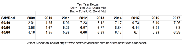
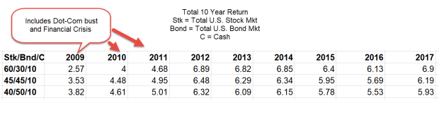
For the average retail investor, it is difficult to beat buy and hold. An investor who bought the SP500 index 25 years ago would have earned 9% per year in price appreciation alone. Adding in dividends would have raised the annual gain to 9.58%. That is what is called a “Buy and Hold” (BnH) strategy. It’s not a strategy. It’s a strategy of no strategy, and yet it is surprisingly difficult to consistently beat a no-brainer no-strategy like BnH over several decades. The stock market earned this while riding through two downturns that erased half of the market’s value. Even a middle of the road strategy of 60% stocks and 40% bonds earned 8.3% annually during the same period.

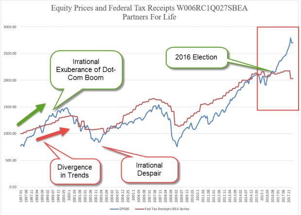
Traders develop rules that work in one decade, but don’t work in the next. A strategy that worked well in the years 1998-2007 didn’t work well in the period 2008-2017. Why? Because they were two different time periods, with different events and circumstances (Note #1).

Here’s a rule that could have earned an investor twenty – yes, twenty – times BnH in the period from 1960-1993. The rule did not work in any timing frame other than daily. Each morning at the open, buy the SP500 index if the previous day was up, sell if it was down. Huge profits even after trading costs (Note #2). 1993 – 2018? It was a losing strategy. It would have been better to do exactly the opposite – sell after an up day and buy after a down day.

Every year thousands of people will shell out good money for a winning strategy that promises to best the market. Most strategies don’t beat the market consistently. Those that do are guarded like the nation’s gold at Fort Knox and are not shared. For the rest of us, the winning strategy is a few rules: save money and invest in a balanced portfolio that is appropriate for our age and needs in the next five years.

///////////////////////////

Notes:

  1. From 1998-2007, an emerging market index fund (VEIEX) earned 15.08% annually. From 2008-2017, that same fund earned 1.13% annually. For the combined twenty-year period, the annual gain was 7.87%.
  2. Until the SPY exchange traded product was created in 1993, there was no product that enabled a retail investor to trade daily and frequently. Mutual funds that mimicked the index restricted the frequency of trades. I used the daily SP500 index numbers as though there had been such a product created in 1960.

Stocks and Tax Receipts

July 1, 2018

by Steve Stofka

There is a close correlation (see end) between the trend in equity prices and Federal tax receipts, as we can see in the chart below. Occasionally, the market gets too optimistic or pessimistic. When it does it inevitably corrects back to the trend in tax collections.

SP500VsTaxReceipts

Note the strong divergence between stock prices (blue line) and tax collections (red line) since the 2016 election. Tax collections grew modestly in the first year of the Trump administration; from $2.133 trillion in the first quarter of 2017 to $2.178 trillion in the fourth quarter of last year. Following the tax cuts passed at the end of last year, tax revenues in the first quarter of 2018 fell $150 billion to $2.033 trillion. In fifteen months, the trend is negative for tax collections. In that same time frame, the SP500 rose 20% on the hope – or for some, the faith – that Trump policy will spur economic activity. That greater growth should lead to greater tax collections. It hasn’t.

Some say that the taxes during the previous administrations were too high. “Lowering the rates will raise the revenue,” is the prayer of supply-siders and tax cutters. “Just wait, revenues will rise as strong economic growth kicks in,” they promise. But this correlation of equity prices and tax revenues transcends administrations: the Obama years, and the Bush years and the Clinton years and into the H.W. Bush presidency. We could go even further back. When equity prices mis-estimate future growth, they correct back to the hard trend of tax revenues. It doesn’t happen overnight. The market had been correcting for more than a year before September ‘s implosion of Lehman Brothers in 2008.

George Soros became one of the most successful traders by constructing a story in advance of his trades. The story is a prediction of what he thinks will result if event A happens. When event A doesn’t happen within a set time, or when event A does not lead to B result, he gets out of the trade. He doesn’t fall in love with his story as so many of us do. Economists and politicians fall in love with their theories and stories the way fans do a baseball or football team. This year we’re going to go all the way!

For the long-term investor, the important thing is an allocation commensurate with one’s risk tolerance, time horizon and income needs. Secondly, have patience.

/////////////////////

Since 1990, the correlation is .96. Since 1997, it is .91. Since 2008, it is .94. Since the 2016 election, it is -.45.

Work

April 1, 2018

by Steve Stofka

This week I’ll look at several aspects of work, from cryptocurrencies like Bitcoin, to the minimum wage.

What is work? In general science or physics, the subject of “work” pictured a horse hitched to a pulley lifting a weight (an example). In one minute, the horse could lift so many pounds a foot in the air and that equaled so much horsepower. Thus we could reduce our definition of work to three components: weight, distance and time.

Even this mechanical definition of work illustrates a problem. If the horse lifted the weight, then let it down again, how would we know that the horse did any work? Should we give the horse a few cups of oats, or have we got a lazy horse?

A variation on that problem – I cut my lawn. My neighbor looks at my lawn and sees that work was done. In a week or two the grass has grown and time has erased any sign that I did work.

Thus, we need a way of recording work done. The product of the work performed may serve as a record. A big pyramid sitting on a desert is a permanent record that work was done. If workers dig holes in the ground, then fill the holes, how do we know any work was done? If they have dug up gold from those holes.

Bitcoin and other cryptocurrencies (crypto) are assets like gold. They recognize that some work was done. Equipment, technology and workers were needed to dig up gold. Likewise, electricity was an important resource needed to generate a bitcoin, and even more electricity will be needed to generate a replacement bitcoin if one were lost.

This Politico article is an account of a crypto mining boom in a rural area in Washington state. The electricity consumed is enormous. The mighty Columbia River nearby provides electricity at a fifth of the average cost in the country. By the end of this year, there will be enough electrical capacity in this small area to power the equivalent of a tenth of the homes in Los Angeles. Shipping containers house computer servers which generate so much heat that the exhausted air melts the snow around the containers. As gold records the digging of dirt, a bitcoin records the expenditure of some quantity of electricity.

Assets can represent past work, future work, or a combination of the two. Precious metals, jewels, books and artistic works represent work done in the past. On the other hand, a machine represents future work. Other assets include stocks and bonds, both of which are claims on future work. A bond is a fixed limit claim on a company’s assets. In contrast, a share of stock is an undying claim on a portion of a company’s assets.

The blockchain algorithm behind crypto requires agreement among many parties to confirm a property right to the crypto. The recording of property rights might seem rather ordinary to a reader in the U.S. In some countries, however, property deeds are more easily altered by those in power. In contrast, a blockchain system of recording property rights prevents forgery and alteration.

As a record of work done, money relies on a relatively stable value. High inflation damages the money record of work done. Consequently, high inflation can fracture the social bonds among people. As an example, I cut someone’s lawn on Saturday and am paid. When I spend the money on Sunday, it is worth half the amount. In effect, the money has only recorded that I cut half a lawn. Examples of this hyper-inflation are Zimbabwe in the 2000s, and Yugoslavia in the 1990s (Wikipedia article). Look no further than Venezuela for a current example of the destruction that inflationary policies can have on a society.

Let’s turn from the recording of work done to the doing of it. New unemployment claims are at a 45 year low. A decade ago, job seekers despaired. In contrast, employees today are confident they will quickly find new employment. To illustrate, the quit rate is at the same pace as the mid-2000s, at the height of the housing boom. As a percent of the labor force, new unemployment claims are the lowest ever recorded. Last week’s numbers broke the record set in April 2000 at the height of the dot-com boom.

Equally important to the strength of a job market is the fate of marginal workers who are most vulnerable to the shifting tides of the economy. This includes disabled people who want to work. During the recession, the unemployment rate for disabled men of working age reached almost 20%. Today it is half that.

Let’s turn to another disadvantaged sector of the job market – those who work for minimum wage. The 1930s depression put many employers at an advantage in the job market. The Fair Labor Standards Act of 1938 (FLSA) enacted a wage floor, but many workers were not subject to the new law. In 1955, almost twenty years after passage of the law, “retail workers, service workers, agricultural workers, and construction workers were still not required to be paid at least the minimum wage” (article).

The minimum wage affects many lower paid workers who are making more than minimum wage. In some union jobs, starting wages for helpers are set by contract at a percentage above minimum wage. The understanding may be non-written in some cases. In 1966, the rate was increased from $1.25 per hour to $1.60 per hour. Non-union clerks at a NYC hospital who had been making $1.70 per hour now complained that they were making minimum wage. As a result of their pressure on management, they got a raise within a few months.

Here’s a chart showing the annual increases in the minimum wage for each period since 1950.

MinWagePctInc

In the three decades after World War 2, annual increases in the minimum wage exceeded inflation. Since 1977, the minimum wage standard has not kept pace with inflation.

MinWageLessCPI

If Congress truly represented all of their constituents, they would make the minimum wage adjust automatically with inflation. On the contrary, Congress represents only a small portion of their constituents, and the minimum wage is used as a political football.

Finally, there is the destruction of the record of past work by war. Every minute of every day, living requires calories, another measure of work. Therefore, each of us is a record of work done.  War destroys too many human records, and the unliving records of work like buildings, roads and bridges. Perhaps one day we will fight our battles in video games and stop destroying all those work records.

Labor Languishes

March 4, 2018

by Steve Stofka

Next week, the White House intends to impose tariffs on imported steel and aluminum. China subsidizes their core building industries. When global demand for China’s products wanes and inventories build, Chinese industries can sell at reduced costs, a practice known as “dumping.” Although the Commerce Dept. has warned China about dumping, the lower prices do benefit a range of U.S. industries but hurt U.S. steel manufacturers, who have endured both lower demand and unfair pricing competition from China.

Following the announcement, the Dow fell back 3%, wiping out Thursday morning’s gains. The prospect of tariff wars sent global stocks down later that night and the following morning. China’s stock index fell 6.5% for the week and Japan was down more than 4%. On Friday, the U.S. market experienced wide swings but settled nearly flat for the day and down 3% for the week.  Opinions vary on the long term consequences.

Let’s turn to a trend that has developed since China was admitted to the World Trade Organization (WTO) in 2001. A year ago two BLS economists presented a historical estimate of labor’s share of yearly GDP since World War 2. If GDP is $100, how much went to the people who produced that output?

The authors describe it: “The labor share is the percentage of economic output that accrues to workers in the form of compensation. It is calculated by dividing the compensation earned during a certain period by the economic output produced over the same period.” The paper is intended for an academic audience, but I will extract some disturbing highlights. First of all, the graph.

LaborShareOfGDP

Note the sharp decline after China was admitted into the World Trade Organization (WTO) in 2001. Some economists have concluded that half of the decline can be attributed to the mobility of computerized capital. Firms can produce a $100 of output with less labor and more of this mobile capital.

Labor in the U.S. is gradually being converted into capital. A business owner may be able to cut his labor costs by buying a machine. A rule of thumb in some industries is a two-year payback period for an investment of this type. Let’s say an owner can save $50,000 per year in labor costs with a machine. Using the two-year rule of thumb, they would not want to pay more than $100K for that machine.

During the past two decades, Asian factories have greatly improved their manufacture of such production machinery and the lower labor costs in Asian makes the machines cheaper. Quality up, costs down. It makes economic sense for more American business owners to replace some of their workers with machines. Before replacement: $100 output by the firm took $65 of labor and $20 of capital and included a profit of $15. After buying the machine, the figures might look like this initially: $100 of output by the firm costs $60 of labor, $25 capital, $15 profit. The $5 that used to go to an American worker now goes to a company in Japan and a bank in America that financed the purchase of the machine.

That laid off American worker bought stuff in their local community. Their sales and property taxes supported the services provided by the community. Although the machine may need maintenance and repairs, it doesn’t spend money regularly in the community, nor require community services like schools, police and medical care.

Donald Trump was elected President based on his claim that his administration would reverse this two decade trend.  The tariffs announced this week will have a small beneficial effect on workers in those industries because steel and aluminum manufacturing have become much more automated in the past twenty years.  The aluminum tariff will add about 1 penny to the cost of a can of beer. The tariffs are a symbolic nod to a campaign pledge that Trump made to those in the rust belt.

I applaud Trump for remembering his campaign pledges.  Professional politicians have long understood that campaign pledges are rhetoric that must fall to conflicting political alliances. Six months after taking office, most pledges have been broken or quietly slipped to the rear of an administration’s porfolio.  Trump has not forgotten the voters who put him in office, but he does have trouble maintaining a consistent stance on gun policy or immigration.  Keep those seat belts buckled.

The Puff

February 25, 2018

by Steve Stofka

Each week I’m hunting scat, the data droppings that a society of human beings leaves behind. This week I’m looking for a ghost ship called the Phillips Curve, a relationship between employment an inflation that has had some influence on the Federal Reserve’s monetary policy. The ideas and policies of others, some long dead, have a daily impact on our lives. I’ll finish up with a disturbing chart that may be the result of that policy.

A word on the word “cause” before I continue. As school kids we learned a simplistic version of cause and effect. Gravity caused my ball to fall to the ground. As kids, we like simple. As adults, we long for simple. As we grow up, we learn that cause-effect is a very complex machine indeed. The complexity of cause-effect relationships in our lives are the chief source of our disagreements.

So, “cause” is nothing more than shorthand for “has an important influence on.” The dose-response mechanism is a key component of a causal model in biology. If A causes B, I should be able to give more of A, the dose, and get more of B, the response, or a more frequent response.

Let’s turn to the Phillips Curve, an idea that has influenced the Federal Reserve’s monetary policy since it was proposed sixty years ago by economist A.W. Phillips. Simply stated, the lower the unemployment rate, the higher the inflation rate. There is an inverse relationship between unemployment and inflation.

Inverse relationships are everywhere in our lives. Here’s one. The lower the air temperature, the more clothes I wear. I don’t say that air temperature is the only cause for how many clothes I wear. There is wind, humidity, sex, age and fitness, my activity level, social protocols, etc. While there is a complex mechanism at work, I can say that air temperature has an important effect on how many clothes I wear. If I measure the varying air temperatures throughout the year and weigh the amount of clothes that people have on, I will get a strong correlation. High temps, low clothes.

Now what if the temperature got colder and people still wore the same amount of clothes? I would need to come up with an explanation for this discrepancy. Perhaps there never was much of a relationship between air temperature and clothes? That seems unlikely. Perhaps clothes fabrics have been improved? I would need to look at all the other factors that I mentioned above. If I could find no difference, then I would have to conclude that air temperature had little to do with clothes wearing. Headlines would herald this new discovery. Important areas of our economy would be upended. Retail stores would stop stocking coats or bathing suits a few months in advance of the season. Businesses around the country who depend on warm weather clothing would go out of business.

Unlike air temperature and clothes, the relationship between inflation and employment is two-way. The change in one presumably has some influence on the other. During the 1970s, inflation and unemployment both rose. The hypothesis behind the Phillips curve posits that one should go up when the other goes down. Some economists threw the Phillips curve in the trashcan of ideas. Milton Friedman, an economist popular for his lectures and his work on monetary policy, proposed a concept we now call NAIRU. This is a “natural” level of unemployment. If unemployment goes below this level, then inflation rises.

Some economists complained that NAIRU was a statistical figment designed to fit the Phillips curve to existing data. Economic predictions based on the Phillips curve have been consistently wrong. Still, the Congress has mandated that the Federal Reserve maintain “maximum employment, stable prices, and moderate long-term interest rates” (Federal Reserve FAQs). Economists at the Fed must consider both employment and inflation when setting interest rates. The models may not accurately describe the relationship, but many will instinctively feel that the relationship, in some form or another, is valid.

For the past several years, the economy has been at or near maximum employment. In January 2018, the unemployment reading was 4.1%. Whenever that rate has been this low, the country has either been at war or within a year of being in recession. The puzzlement: only lately have there been signs of an awakening inflation.

Because inflation was below the Fed’s 2% benchmark while unemployment declined, the Fed kept its key interest rate near zero for seven years. For its 105 year history, the Fed has never kept interest rates this low for as long as it did. Low interest rates fuel asset bubbles. Such low rates cause people and institutions who depend on income to take inappropriate risks to earn more income. The financial industry develops and markets new products that hide risk and provide that extra measure of income. We can guess that these products are out in the marketplace, waiting to blow up the financial system if a set of circumstances occurs. What set of circumstances? We will only know that in the rear view mirror.

Here’s a chart that tracks price movement of the SP500 ETF SPY for the past twenty years. I’ve shown the tripling in price that has occurred during the past five years.  Notice the long stalk of rising prices. That growth has been nurtured by the Fed’s policy.  Well, maybe this time is different.  Maybe not.

SPYPF20180223

The Un-Crash

February 18, 2018

by Steve Stofka

The stock market did not go down 4% this past Wednesday.  It could have. The annual inflation reading for January was above expectations and confirmed fears that inflation forces are heating up. January’s retail sales report was also released Wednesday. It showed the second weakest annual increase in the past two years. If consumers are moderating their spending a bit, that would counteract inflation pressures.  Instead of dropping 2 – 4% on Valentine’s day, the SP500 went up 2.7%.

The labor report and the retail sales report each month have a significant sway on the market’s mood because they measure how much people are working and getting paid, and how much they are spending.

On a long-term basis, I think (and hope) that consumers will remain relatively cautious in their use of credit. Families today carry a higher debt burden relative to their income. By 2004, household debt levels had surpassed their annual level of income. As housing prices continued to rise, many families overextended themselves further and paid a horrible price when jobs and housing prices declined during the recession.

Families during the 1960s and 1970s carried far less debt relative to their income. People saved their income and bought many items when they could afford it. High inflation in the late 1970s and more relaxed lending standards in the 1980s helped cause a shift in thinking. Why wait? Charge it. Businesses learned that consumers are more likely to spend plastic money than real money. Consumers were encouraged to take another credit card. Buy that new car. Your family deserves it. We have a good interest rate for you.

Following the recession, families have kept the ratio of debt to income at a steady level, so that their debt is slightly below the level of their annual income. Prudent consumers will help keep inflation in check.  Here’s a chart of the debt to income ratio.  See how low it was during the decades after World War 2.

BuyingPower

/////////////////////

Housing

In the past year, tenant groups in California have been lobbying to loosen rent control laws in that state. You can read about it here (Sacramento Bee). To illustrate the economic pressures on many middle-class California residents, I’ll show you a few graphs. The first one is per capita income in six cities. All of them are above the national average. San Francisco and New York top the income list, followed by Denver, Chicago, Los Angeles and Dallas.

PerCapIncomeMSA

Now I’ll divide these income figures by an index of housing costs, the largest expense in most household budgets. In the past few years Chicago has edged into the top spot.  San Francisco is still in the top 3, but has shifted downward as housing costs have climbed.  The housing adjusted income of Los Angeles has dropped even further below the national average.

PerCapitaIncomeHousingMSA

Feeling the fatigue of keeping up with escalating costs, some Angelenos are reaching out to their local politicians for help. Some have thrown up their hands and left the state.

Stress Test

February 11, 2018

by Steve Stofka

The recent market correction, defined as a 10% decline, has been a real time stress test for our portfolios. There hasn’t been a stock market correction since the 11% drop in December 2015 to January 2016. Because the end of January was near the height of the stock market, you can more easily find out how much your portfolio declined relative to the market. As of the close Friday, the SP500 had fallen 7.2% since the end of January. That is your benchmark. Later in this blog, I’ll review a few reasons for the decline.

You can now compare the decline in your portfolio to that of the market.  If you use a personal finance program like Quicken, this is an easy task. If you don’t, then follow these steps:
1) Write down your January ending balances at your financial institutions, including any savings accounts or CDs that you own.
2) Write down the current balances and calculate the difference in value since the end of January.
3) Divide that difference by the balance at the end of January to get a percentage decline.

For instance, let’s say your balances at the end of January added up to $100K and your current balance is $95K (Step 1). The difference is $5K (Step 2). Your portfolio has declined 5% (Step 3) compared to the market’s 7.2%, or about 70% of the market. If the market were to fall 50% as it did from 2000-2002 and 2007-2009, you could expect that your portfolio would fall about 35%. Are you emotionally and financially comfortable with that? A safety rule of investing is that any money you might need for the next five years should not be invested in the stock market.

The next step is to compare the gains of your portfolio in 2017 to the market’s gain, about 24%. The gain should be approximately the same as the loss percentage you calculated above. If the gain is slightly more than the losses, you have a good mix.

The chart below compares two portfolios over the past ten years: 1) 100% U.S. stock market and 2) 60% stocks/ 40% bonds (60/40 allocation). Notice that the best and worst years of the 60/40 portfolio are nearly the same while the best year of the 100% stocks is 10% less than the worst year.

StressTest2008-2017
The 60/40 portfolio captured 80% of the profits of the 100% stock portfolio ($101,532 / $128,105) but had only 60% of the drawdown, or decline in the portfolio. Compare that with the chart below, which spans only nine years and leaves out most of the meltdown of value during the Financial Crisis. There is no worst year! La-di-da! Investors who are relatively new to the stock market may underestimate the degree of risk.

StressTest2009-2017
The 60/40 portfolio captured 58% of the profits of the 100% stock portfolio ($152,551 / $262,289) but the drawdown was 63% (11.15% / 17.84%).  If the drawdown is more than the profits, that doesn’t look like a very good deal for the 60/40 portfolio, does it?  That is how bull markets entice investors to take more risk than might be appropriate for their circumstances.  Come on in, the water’s fine!  An investor might not see the crocodiles. Markets can be volatile. This has been a good reminder to check our portfolio allocation.

///////////////////

Why?

So, why did the market sell off? Let me count the ways. It began on Friday, February 2nd, when the monthly labor report showed an annual gain of 2.9% in hourly wages. For much of this recovery, economists have been asking why wage growth was sluggish as unemployment fell. Economists who like their idealized mathematical models don’t like it when reality disagrees with those models. Finally, wage growth showed some healthy gains and the market got spooked. Why?

As wages take more of the economic pie, profits decline. Companies respond by raising prices, i.e. higher inflation. As interest rates rise, there are several negative consequences. Companies must pay more to borrow money. Fewer consumers can afford mortgages.  Homebuilders and home improvement centers like Home Depot and Lowe’s may see a decline in sales. Car loans become more expensive which can cause a decline in auto sales. There is one caveat: even though hourly wages increased, weekly earnings remained stable because weekly hours declined slightly.  Next month’s reports may show that inflation concerns were overestimated.

This past Monday, ISM released their monthly survey of  Non-Manufacturing businesses and it was a whopper. 8% growth in new orders in one month. Over 5% growth in employment. These are two key indicators of strong economic growth, and confirmed  the fears stirred up the previous day’s labor report. Inflation was a go and traders began to sell, sell, sell.

For the past year, market volatility was near historic lows. Volatility is a measure of the predictability of the pricing of SP500 options. A profitable tactic of traders was to “short” volatility, i.e. to bet that it would go lower. There were two exchange traded funds devoted to this: XIV and SVXY. Traders who bought XIV at the beginning of 2017 had almost tripled their money by the end of the year. When volatility tripled this past week, the whole trade blew up. People who had borrowed to make these bets found that their brokers were selling assets to meet margin calls.  Within days, XIV was closed and investors were given 4 cents on the dollar. SVXY may soon follow. Investors had been warned that these products could blow up. Here’s one from 2014.

The stock market is both a prediction of future profits and a prediction of other investor’s predictions of future profits! The prospect of stronger interest rate growth caused traders to reprice risks and returns. Much of the impact of the selling this past week was in the last hour on Monday and Thursday, when machine algorithms traded furiously with each other. The last hour of trading on Monday saw an 800 point, or 3% , price swing in just a few minutes. In the closing ten minutes of that hour, Vanguard’s servers had difficulty keeping up with the flow of orders.

Contributing to the decline were worries over the government’s debt.  The new budget deal signed into law this week will likely increase the yearly deficit to more than $1  trillion.  There was soft demand for government debt at this week’s Treasury bill auction.  Even without a recession in the next ten years, the accumulation of deficits will increase the total debt level to about $33 trillion.

This correction is an opportunity for the casual investor to make some 2017 or 2018 contributions to their IRA. Profit growth is projected to be strong for the coming year. The correction in prices this week has probably brought the forward P/E ratio of the SP500 to just below 20, a more affordable level that we haven’t seen in few years.


Ten Year Review

January 14, 2018

by Steve Stofka

To ward off any illusions that I am an investing genius, I keep a spreadsheet summarizing the investments and cash flows of all my accounts, including savings and checking. Each year I compare my ten year returns to a simple allocation model using the free tool at Portfolio Visualizer. Below is a screen capture showing the ten-year returns for various balanced allocations during the past several years.

10YrReturn20180112
The two asset baskets are the total U.S. stock market and the total U.S. bond market. A person could closely replicate these index results with two ETFs from Vanguard: VTI and BND. Note that there is no exposure to global stocks because Portfolio Visualizer does not offer a Total World Stock Asset choice in this free tool. An investor who had invested in a world stock index (Vanguard’s VT, for example) could have increased their annual return about 1.3% using the 60/40 stock/bond mix.

I include my cash accounts to get a realistic baseline for later in life when my income needs will require that I keep a more conservative asset allocation. An asset allocation that includes 10% cash looks like this.

10YrReturnStkBondCash20180112
In the trade-off between return and risk, a balanced portfolio including cash earns a bit less. In 2017, the twenty-year return was not that different from the ten-year return. From 2009 through 2011, ten-year returns were impacted by two severe downturns in the stock market.

//////////////////////

The Hurt

Falling agricultural prices for seven years have put the hurt on many farmers. This decade may turn out to be as bad as the 1980s when many smaller farms went belly up because of declining prices. Remember the Farm Aid concerts?

The Bloomberg Agriculture Index has fallen about 40% over the past five years. While farmers get paid less for their produce, the companies who supply farmers with the tools and products to grow that produce are doing reasonably well. A comparison of two ETFs shows the divergence.

DBA is a basket of agricultural commodity contracts. It is down 33% over the past five years.
MOO is a basket of the stocks of leading agricultural suppliers. The five-year total return is 31%.

The large growers can afford to hedge falling prices. For family farmers, the decline in agricultural prices is a cut in pay. Imagine you were making $25 per hour at the beginning of 2017 and your employer started cutting your pay bit by bit as the year progressed? That’s what its like for many smaller farmers. They work just as hard and get paid less each year.

Long-Term Trends

January 7th, 2018

by Steve Stofka

This week I’ll look at a few long-term trends in the marketplace for goods and labor.  Millennials born between approximately 1982 – 2002 are now the largest generation alive. Their tastes will dominate the marketplace for the next twenty years at least.  In the first eighteen years of the new century, change has been a dominant theme.

Some businesses drowned in the rush of change. A former member of the Dow Jones Industrial Average, the film giant Eastman Kodak is a shadow of its former self after it emerged from bankruptcy in 2013.

Some in the music business complain that the younger generations don’t want to pay for music. Much of YouTube music is pirated material and yes, Google, the site’s owner, does remove content in response to complaints. There’s just so much of it. Album sales revenue in the U.S., both digital and physical, fell 40% in the five years from 2011 to 2016. Globally, the entire music business has lost 40% in revenues since the millennium and is just now starting to grow again (More).

Some in the porn industry make the same complaint as those in the music business. As online demand for porn grew, the industry helped pioneer digital payment security. Now there is too much free porn on the internet. Producers and distributors pirate each other’s content. Who wants to invest in good production values only to see their work ripped off? (Atlantic article/interview on the porn industry) Will the lack of quality reduce demand? ROFL!

An ever-diminishing number of city newspapers struggle to survive. Some complain that people don’t want to pay for local news. Local reporters have long been the bloodhounds who sniff out the corruption in city halls and state capitols around the country. There are fewer of them now.  Think that corruption has been reduced?  ROFL!

Surviving bookstores glance over their shoulders at Amazon’s growing physical presence in the marketplace. This year Amazon became the 4th largest chain of physical bookstores. The large book publishing houses try to preserve their hegemony as readers turn to a greater variety of alternatively published books.

As online sales grow, brick and mortar stores struggle to produce enough revenue growth to sustain the costs of a physical store.  During the past three years, an ETF basket of retail sector stocks (XRT) is down almost 10%.

Hip-hop music was a fad of the ‘80s and ’90 until It wasn’t. Rock ‘n Roll was a fad that has lasted sixty years. In the early 60s, the Beatles were told to make it rich while they could, and they worked hard to capitalize on their success before it fizzled. Never happened.

How are we going to predict the future if it is so unpredictable? Some standards fade while some fads become standards. We face the past, not the future, as the future sneaks up on us from behind.

//////////////////////////////

Employment

A few notes on what was the weakest employment report of the past year. Job gains were only 150K as reported to government surveyors but the percentage of businesses responding to the survey was particularly low. Expect the BLS to revise those job gains higher next month when more of the survey forms come in. I have long used an average of the BLS numbers and ADP’s estimate of private job gains. That average was 200K – a healthy number indicative of a growing economy.

The long-term trend remains positive. The annual growth of total employment should be at 1.5% or above. We are currently holding that threshold despite the loss of jobs to automation and the growing number of Boomers retiring.  Growth in construction jobs  remains at or above the growth in total employment – another healthy sign.

ConVsPayemsGrowth

The employment market faces a long-term challenge as the largest generation of workers in history is retiring. In January 2000, 69 million adults were out of the labor force. That figure now stands at 95 million. As a ratio, there were 53 adults not in the labor force for every 100 adults with a job. Now there are 65 adults for each 100 workers.

NotInLabForceVsPayems

Although growth in hourly wages is at 2.5%, weekly paychecks have grown 3% as part-time workers get more hours or find full-time jobs. Look for inflation to approach that growth in paychecks.

WeeklyEarnVsInflation

When inflation rises above paycheck growth, workers struggle more than usual to balance their income with spending.  I’ll use that same chart to highlight some stress points during the past decade.

WeeklyEarnStressPoints

As the economy continues to improve, the Fed is expected to continue increasing interest rates either two or three times in the coming year.  After a decade of zero interest rates (ZIRP), those with savings accounts may have noticed that their bank is paying 1% or more in interest.  It is still a far cry from the 4% to 5% rates paid on CDs in the ’90s and 2000s.  This past decade has been particularly worrisome for older folks trying to live off their savings.

Expectations

by Steve Stofka

December 3, 2017

What can I expect from my portfolio mix? Portfolio Visualizer has a free tool  to analyze an asset mix. We can also get a quick approximation by looking at a fund with that mix.
An investor with a 40/60 stock/bond mix might go to the performance page of Vanguard’s Wellesley Income fund VWINX. It’s 50-year return is close to 10% but that includes the heady days of the 1970s and early 1980s when both interest rates and inflation were high. The ten-year performance of this fund includes the financial crisis and is close to 7%.

An investor with a slightly aggressive 65/35 stock bond mix could look to Vanguard’s Wellington Fund VWELX, which has a similar weighting. It’s 90-year return is 8.3% but that includes the Great Depression and WW2. It’s 10-year return is – wait for it – close to 7%.

Two funds – a conservative 40/60 and a slightly aggressive 65/35 – both had the same ten-year returns. All it took was one bad year in the stock market – 2008 – to even up the returns between these two very different allocations. On a year-by-year comparison of the two funds we see a trend. During the two negative years of this fifteen period, I charted the absolute value to better show that trend. Also, compare the absolute values of the returns in 2008 and 2009. The collapse and bounce back was about the same level.

VWELX-VWINXComp

During this fifteen year period, the cautious mix earned 88 cents to the $1 earned by the slightly aggressive mix. Looking back thirty years, cautious made only 75 cents. In the past fifteen years, the difference between positive and negative years was important. In good years, cautious earned 20 cents less. But in negative years, like 2002 and 2008, cautious made 73 cents more by losing that much less.

////////////////////////

Personal Saving Rate

The savings rate is near all-time lows. We’ve seen a similar lack of caution in 2000 and 2006. As housing and equities rise, families may count those gains in their mental piggy bank. Asset gains are not savings. Asset prices, particularly equities, will decline during a recession. Jobs are lost. Without an adequate financial cushion, families struggle to weather the downturn. The rise in bankruptcies and foreclosures further exacerbates the downturn.
SavingsRate1998-2017

///////////////////////////////

Annuity

A good explanation of the various types of annuities.  The graphics that the author presents might help some readers understand the role of annuities, and the advantages of deferred vs. immediate annuitues.  I have also posted this on the Tools page for future reference.

http://www.theretirementcafe.com/2017/11/income-annuities-immediate-and-deferred.html