Home Sweet Asset

April 3, 2016

Normally we do not include the value of our home in our portfolio.  A few weeks ago I suggested an alternative: including a home value based on it’s imputed cash flows.  Let’s look again at the implied income and expense flows from owning a home as a way of building a budget.  The Bureau of Labor Statistics and the Census Bureau take that flow approach, called Owner Equivalent Rent (OER), when constructing the CPI, and homeowners are well advised to adopt this perspective.  Why?

1) By regarding the house as an asset generating flows, it may provide some emotional detachment from the house, a sometimes difficult chore when a couple has lived in the home a long time, perhaps raised a family, etc.

2) It focuses a homeowner on the monthly income and rent expense connected with their home ownership.  It asks a homeowner to visualize themselves separately as asset owner and home renter. It is easy for homeowners to think of a mortgage free home as an almost free place to live. It’s not.

3) Provides realistic budgeting for older people on fixed incomes.  Some financial planners recommend spending no more than 25% of income on housing in order to leave room for rising medical expenses.  Some use a 33% figure if most of the income is net and not taxed.  For this article, I’ll compromise and use 30% as a recommended housing share of the budget.

A fully paid for home that would rent for $2000 is an investment that generates an implied $1400 in income per month, using a 70% net multiplier as I did in my previous post. Our net expense of $600 a month includes home insurance, property taxes, maintenance and minor repairs, as well as an allowance for periodic repairs like a new roof, and capital improvements.

Using the 30% rule, some people might think that their housing expense was within prudent budget guidelines as long as their income was more than $2000 a month.  $600 / $2000 is 30%.

However, let’s separate the roles involved in home ownership.  The renter pays $2000 a month, implying that this renter needs $6700 a month in income to stay within the recommended 30% share of the budget for housing expense.  The owner receives $1400 in net income a month, leaving a balance of $5300 in income needed to stay within the 30% budget recommendation. $6700 – $1400 = $5300.  Some readers may be scratching their heads.  Using the first method – actual expenses – a homeowner would need only $2000 per month income to stay within recommended guidelines.  Using the second method of separating the owner and renter roles, a homeowner would need $5300 a month income. A huge difference!

Let’s say that a couple is getting $5000 a month from Social Security, pension and other investment income.  Using the second method, this couple is $300 below the prudent budget recommendation of 30% for housing expense.  That couple may make no changes but now they understand that they have chosen to spend a bit more on their housing needs each month.  If – or when – rising medical expenses prompt them to revisit their budget choices, they can do so in the full understanding that their housing expenses have been over the recommended budget share.

This second method may prompt us to look anew at our choices.  Depending on our needs and changing circumstances, do we want to spend $2000 a month for a house to live in?  Perhaps we no longer need as much space.  Perhaps we could get a suitable apartment or townhome for $1400?  Should we move?  Perhaps yes, perhaps no.  Separating the dual roles of owner and renter involved in owning a home, we can make ourselves more aware of the implied cost of our decision to stay in the house.  A house may be a treasure house of memories but it is also an asset.  Assets must generate cash flows which cover living expenses that grow with the passage of time.

/////////////////////

The Thrivers and Strugglers

“Bravo to MacKenzie. When she was born, she chose married, white, well-educated parents who live in an affluent, mostly white neighborhood with great public schools.”

In a recent report published by the Federal Reserve Bank at St. Louis, the authors found that four demographic characteristics were the chief factors for financial wealth and security:  1) age; 2) birth year; 3) education; 4) race/ethnicity.

While it is no surpise that our wealth grows as we age, readers might be puzzled to learn that the year of our birth has an important influence on our accumulation of wealth.  Those who came of age during the depression had a harder time building wealth than those who reached adulthood in the 1980s.

Ingenuity, dedication, persistence and effort are determinants of wealth but we should not forget that the leading causes of wealth accumulation in a large population are mostly accidental.  It is a humbling realization that should make all of us hate statistics!  We want to believe that success is all due to our hard work, genius and determination.

//////////////////////

Employment

March’s job gains of 215K met expectations, while the unemployment rate ticked up a notch, an encouraging sign.  Those on the margins are feeling more confident about finding a job and have started actively searching for work.  The number of discouraged workers has declined 20% in the past 12 months.

Employers continue to add construction jobs, but as a percent of the workforce there is more healing still to be done.

The y-o-y growth in the core workforce, aged 25-54, continues to edge up toward 1.5%, a healthly level it last cleared in  the spring of last year.

The Labor Market Conditions Index (LMCI) maintained by the Federal Reserve is a composite of about 20 employment indicators that the Fed uses to gauge the overall strength and direction of the labor market.  The March reading won’t be available for a couple of weeks, but the February reading was -2.4%.

Inflation is below the Fed’s 2% target, wage gains have been minimal, and although employment gains remain relatively strong, there is little evidence to compel Chairwoman Yellen and the rate setting committee (FOMC) to maintain a hard line on raising interest rates in the coming months.  I’m sure Ms. Yellen would like to get Fed Funds rate to at least a .5% (.62% actual) level so that the Fed has some ability to lower them again if the economy shows signs of weakening.  Earlier this year the goal was to have at least a 1% rate by the end of 2016 but the data has lessened the urgency in reaching that goal.

ISM will release the rest of their Purchasing Manager’s Index next week and I will update the CWPI in my next blog.  I will be looking for an uptick in new orders and employment.  Manufacturing lost almost 30,000 jobs this past month – most of that loss in durable goods.  Let’s see if the services sector can offset that weakness.

///////////////////////////

Company Earnings

Quarterly earnings season is soon upon us and Fact Set reports that earnings for the first quarter are estimated to be down almost 10% from this quarter a year ago.  The ten year chart of forward earnings estimates and the price of the SP500 indicates that prices overestimated earnings growth and has traded in a range for the past year.  March’s closing price was still below the close of February 2015.  Falling oil prices have taken a shark bite out of earnings for the big oil giants like Exxon and Chevron and this has dragged down earnings growth for the entire SP500 index.

Portfolio Stability

February 14, 2016

Disturbed by the recent volatility in the stock market, some investors may be tempted to trade in some of their stock holdings for the price stability of a CD or savings account.  After a year of relatively little change, stock prices have oscillated wildly since China began to devalue the yuan at the beginning of the year.

Just this week, the price of JPMorgan Chase (JPM), one of the largest banks in the world, fell almost 5% one day then rose 7% the next.  Such abrupt price moves in a large multi-national company are driven less by fundamentals and more by fear.  As the price of oil fell below $30, hedge fund and investment managers began to doubt the safety of bank loans to energy companies, particularly those smaller companies whose fortunes have risen recently during the fracking boom.  Even if these types of loans were a miniscule portion of JPM’s total loan portfolio, investors remember that the financial crash began in 2007 with growing defaults of home loans that started a financial chain reaction of derivatives that blew up.  Sell, sell, sell, then buy, buy, buy.

Price stability is a term usually associated with measurements of inflation like the Consumer Price Index (CPI). A basket of typical goods is priced each month by the BLS and the changes in those prices are charted.  Each of us has a basket of investment goods that have varying degrees of price stability.  Stock prices vary a lot;  bond prices less so; house prices even less.  Cash type instruments like savings accounts and CDs have no nominal variation.

Each of us desires some degree of stability as we chug through the waters of our lives.  Like a ship we must make a tradeoff between speed and stability.  A stable ship must compromise between the depth and breadth of its keel, that part of the ship which is below water.  A deep keel provides stability but puts the ship at the risk of running aground in shallow water.  A broad keel is stable but increases the water’s drag, slowing the ship. (Cool stuff about ships)

It is no surprise that stocks provide the power to drive our investment ship.  Few investors realize that housing assets provide more power and stability than bonds.  We judge stability by the rate with which the price of an asset changes.  The slower the price change, the more stable the asset.  Over decades, residential housing has better returns and steadier pricing than bonds, although that might surprise readers who remember the housing bubble and its aftermath.

Many investors include the value of their home in their net worth but not necessarily in their investment portfolio and may underestimate the stability of their portfolio. Let’s imagine an investor with $750,000 in stocks, bonds, CDs, savings accounts and the cash value of a life insurance policy.  Let’s say that $375K is invested in stocks, $375K in bonds and cash equivalents.  That appears to be a middle of the road allocation of 50/50 stocks/bonds.  I will use bonds as a stand in for less volatile investments.

Let’s also assume that this investor has a house valued at $215K with no mortgage.  If we add in the $215K value of the house, we have a total portfolio of $965K and a conservative allocation closer to 40/60 stocks/bonds, not the 50/50 allocation using a more standard model.

We arrive at a conservative estimate of a house value based on the income or rental value that the house can generate, not the current market value of the house, which can be more volatile.  In previous posts, I have noted that houses have historically averaged 16x their annual net operating income, which is their gross annual rental income less their non-mortgage operating expenses. For real estate geeks, this multiplier is 1 divided by the cap rate.

Let’s use an example to see how this multiplier works.  Let’s say that the going rent for a modest sized house is $1600 per month and we guesstimate an average 30% operating expense, leaving a net monthly income of $1120.  Multiplying that amount by 12 months = $13,440 annual net operating income.  Multiply that by our 16x multiplier and we get a valuation of $215K.  Depending on location, this house might have a market value of $260K but we use  historic income multiples to calculate a conservative evaluation.

Our revised portfolio provides a more comprehensive perpective on our investment allocation and the stability of our “buckets.” During the past year, we may have seen a 5 – 10% increase in the value of our home, offsetting some of the apparent riskiness of a 10% or 20% move in the stock market.  Adjusting our portfolio assessment to allow for a home’s value might reveal that our stock allocation is actually a bit on the low side after the recent market decline and – quelle horreur! – we should be selling safer assets and buying stocks to maintain our target portfolio balance.  But OMG, what if stocks fall further?!  Then we might have to buy even more stocks to meet our target allocation percentages!  This is the essential strategy of buying low and selling high, yet it is so counterintuitive to our natural impulses.  We buy some assets when we are fearful of them.  We sell other assets when we think they are doing well.

****************

For anyone interested in housing as a business, the Wall St. Journal published a comprehensive guide, Wall St. Journal Complete Real Estate Investing Guidebook by David Crook in 2006. Recently, Moody’s noted that apartment building cap rates had declined to 5.5%, resulting in a multiplier of 18x that is above historical norms.

**********************

Ugly January

January 17, 2016

The ever-strengthening dollar and growing inventories of crude led to a plunge in the price of a barrel of West Texas Intermediate (WTI) which fell below $30.  I remember hearing some analyst on Bloomberg about a year ago saying that oil prices could go as low as the $20 range.  HaHaHaHa!  A popular basket of oil stocks, XLE, is about half of it’s July 2014 price, falling 25% in the past two months and almost 10% in the two weeks. Here’s a tidbit from the latest Fact Set earnings brief: “On September 30, the estimated earnings decline for the Energy sector for Q1 2016 was -17.7%. Today, it stands at -56.1%.”  Ouch!

Volume in energy stocks this week was more than double the three month average.  It smells like capitulation, that point when a lot of investors have left the theater.  Investors who do believe that the theater is on fire, as it was in 2008, should probably stay away.

What the heck is going on?  This Business Insider article from June 2015 (yes, six months ago) explains and forecasts the money outflows from China and emerging markets.  Pay particular attention to #4. This Bloomberg article from this week confirms the capital flight from China as investors anticipate a further devaluing of the yuan.

4th quarter earnings reports will begin in earnest in the following week.  If there are disappointments, that will magnify the already negative sentiment.

**********************

Death Cross

No, it’s not the title of a Fellini movie.  The merits of technical analysis can be more controversial than a Republican Presidential debate, but here goes.   The 50 day average of the SP500 crossed above the 200 day average, a Golden Cross, at Christmas, then crossed back below the longer average this week, a Death Cross.  A Golden Cross is a positive sign of investor sentiment.  The Death Cross is self-explanatory.  A crossing above, then below, happens infrequently – very infrequently.  The last two times were in 1960 and 1969 and the following months were negative.  After January 1960, the market stayed relatively flat for a year.  In June 1969, it marked the beginning of an 18 month downturn.  There was an almost Golden Cross followed by a Death Cross in May 2002.  A similar 18 month downturn followed.

Longer term investors might use a 6 month short term average and an 18 month longer average, selling when the 6 month crosses below the 18 month, buying back in when the one month (or 6 month average in the case of more volatile sector ETFs) crosses back above the longer average. Like any trading system, one takes the risk of losing a small amount sometimes but avoids losing big.

Trading signals are infrequent using monthly average prices.  Note that the sharp downturn of the 1998 Asian financial crisis did not trigger a sell signal.  The six month average of the SP500 as a broad composite of investor sentiment is above the 18 month average but several sectors have been sells for several months: Emerging markets (June and July 2015), Energy stocks (January 2015), and European stocks (August 2015).  Industrials (XLI) have taken a beating this month and will probably give a sell signal at the end of the month.

John Bogle, founder of Vanguard, recommends that long term investors look at their statement once a year and rebalance to meet their target allocation, one that is suitable for their age, needs and tolerance for risk.  In that case, don’t look at your January statement.  As I wrote a few weeks ago, it could look ugly.

********************

CPI

In 1998, the Boskin Commission estimated that the Consumer Price Index (CPI) over-estimates the rate of inflation by an average of 1.1%. In 2000, the NBER (the agency that determines recessions) revised their methodology and their estimate of the over-statement to .65%.  In 2006, Robert Gordon, a member of the original committee, re-examined subsequent CPI data and the methods used by the committee.  His analysis re-asserted that the over-statement was at least 1%.

Although this academic debate might seem arcane, the implications are enormous, particularly in an election year.  Presidential contender Bernie Sanders is gaining momentum on Hillary Clinton (HRC) by repeatedly asserting that the inflation-adjusted incomes of working families have declined since 1973.  Although Mr. Sanders makes no proposals to stimulate economic growth, he has many redistribution plans to achieve economic justice.  If inflation has been overstated for the past few decades, then Mr. Sanders’ argument is logically weak but emotionally strong.  More importantly, neither side of the political aisle can even agree on a common set of facts.  The other side is not evil, or stupid, or disingenuous. The disagreement over methodology is legitimate and ongoing.

Ominosity

January 10, 2016

Happy New Year!

Wait, get rid of the exclamation point.

Happy New Year.

After this week!  What are you kidding me?!  Get rid of the Happy.

New Year.

Ok, that’s better.  The New Year was not so happy when the market started its first day of trading last Monday.  For the tenth consecutive month, manufacturing activity in China contracted, which weighed down commodities (DBC down over 4%), energy stocks (XLE down 7%), emerging markets (EEM down more than 8%) and the broader market, which was down 6%.  Even stocks (Johnson and Johnson, Coca-Cola) regarded as relatively safe dividend paying equities suffered losses of more than 3 or 4%.  Investors and traders were re-pricing future profits and dividends.

December’s powerful employment report buoyed the mood for a short time on Friday morning but traders soon turned their attention again to China and the broader market fell about 1% by day’s end.

Given the decline in stocks, one would guess that the price of bonds, hard hit during the past few weeks, had showed some strong gains.  TLT, a popular ETF for long term Treasuries, gained more than 2% during the week but remains range bound since last August.  Treasuries are a safe haven for risk averse money, but the prospect of rising interest rates mutes the attractiveness of long term bonds.

Growth in the core work force aged 25 – 54 remains strong, up over 1% from last year.  The number of people not in the labor force dropped by 277,000 from last month, a welcome sign.  However, we need to put aside the politics and look at this in a long term perspective.  For the past twenty years, through good times and bad, the number of people dropping out of the workforce each year has grown.

This demographic trend is more powerful than who is President, or which party runs the Congress.  Depending on our political preferences, we can attribute this 20 year trend to Clinton, Bush, Obama, Democrats or Republicans. The job of the good folks running for President this year will be to convince voters that their policies and prescriptions can overcome this trend.  Our job, as voters, is to believe them.

The Bureau of Labor Statistics recently released a report of a ten year comparison of the reasons why people have left the work force.  Based on this BLS analysis, a Bloomberg writer who had not done their homework mistakenly reported that there has been a dramatic increase in the number of 20-24 year olds who had retired.

This “statistic” points out a flaw in BLS and Census Bureau data. BLS data is partially based on the Current Population Survey, or CPS.  Interviewers are not allowed to follow up and challenge the responder.  Both the BLS and the Census Bureau have been aware of the problem for at least a decade but I don’t think anyone has proposed a solution that doesn’t present its own challenges.

Looking at Chart 3 of the BLS report, the percentage of retired 20-24 year olds was .2% in 2004, .6% in 2014. The number of retired 16-19 year olds was .2% in 2004 and .2% in 2014. Do we really believe that there are almost 200,000 retired 16-19 year olds in this country? See page 16 for the BLS discussion of this problem.

Now, let’s put ourselves in a similar situation.  We are 22 and have recently graduated from college and are having trouble finding a job that actually uses our education.  Because of this, we are staying at our parent’s home.  We answer our parent’s landline phone (Census Bureau is not allowed to call cell phones).  Somebody from the Census Bureau starts asking us questions.  In response to the question why we are not working, we are presented with several choices, one of which is that we are retired (see pages 16 and 17)  Sarcastically we answer that yeh, we are retired.  The questioner can probably tell by our tone of voice that we are being sarcastic but is required to simply record our response.  How valid is that response?

Understand that problems of self-reporting and questionnaire design underlie all of the data from the monthly Household Survey, including the unemployment rate. This gives those with strong political views an opportunity to claim that government statistics are part of a conspiracy.  Claims of conspiracies can not be disproved, which is why they are so persistent throughout human history.

Each year some research firms predict a global recession. Ominosity is the state of sounding ominous and this year is no different. Adam Hayes, a CFA writing at Investopedia, gives some good reasons  that he believes such a widespread recession is possible. All of these risks are present to some degree.

What makes me less convinced of a global recession is the strength of the U.S. economy.  Just as China “saved” the world during the financial crisis, the U.S. may play the role of the cavalry in this coming year. Let’s look at some key data from the recent ISM Purchasing Manager’s index.  This is the new orders and employment components of the services sectors which comprise 85% of the U.S. economy.  Growth remains strong.

Recessions are preceded by a drop in new orders and by a decline in employment.  When payroll growth less population growth is above 1%, as it is today, a recession is unlikely.

Let’s climb into our time machines and go forward just 11 months.  It is now December 2016 and the IMF has enough data to make a post-facto determination that the entire world’s economy went into recession in March 2016.  We look at the SP500 index.  Holy shit!  We climb into our time machines, go back to January 2016 and sell all of our stocks.  Missed that cliff.

What about bonds? Should we sell all those?  Darn it, we forgot to check interest rates and bond prices when we were ahead in the future.  Back into the time machine.  Go forward again.  U.S. Fed halted rate increases in March 2016, then lowered them a 1/4 point.  The ECB had kept interest rates negative in the Eurozone and bond prices have stayed relatively flat.  OK, cool.  We get back in our time machines and go back to January 2016 and decide to hold onto our bond index funds.  The interest on those is better than what we would get on a savings account and we know that we won’t suffer any capital losses on our investment during the year.

We take all the cash we have from selling our stocks and put them entirely in bonds.  Wait, could we make a better return in gold, or real estate?  Back in the time machine and back to the future!  But now we notice that the SP500 index in December 2016 is different.  So is the intermediate bond index.  What’s going on?  The future has changed.  Could it be the Higgs boson causing an abnormality in space-time?  Maybe there’s something wrong with our time machine.  But where can we find a mechanic who can diagnose and repair a time machine?  Suddenly the thought occurs to us that a lot of other investors have gone into the future in their time machines, then have returned to the present and bought and sold.  That, in turn, has changed the future.

The time machine is called the human brain.  Each day traders around the world make decisions based on their analytical and imaginative journeys into the future.  The Efficient Markets Hypothesis (EMH) formulated by Eugene Fama and others postulates that all those journeys and decisions essentially distill all the information available on any particular day.  Therefore, it is impossible to beat a broader market index of those decisions.

Behavioral Finance rests on the judgment that human beings are driven by fear and greed which causes investors to make mistakes in their appraisals of the future.  An understanding of the patterns of these inclinations can help someone take advantage of opportunities when there is a higher likelihood of asset mispricing.

Each year we read of those prognosticators who got it right.  Their time machine is working, we think, and we go with their predictions for the coming year.  Sometimes they get it right a second year.  Sometimes they don’t.  Abby Cohen is a famous example but there are many whose time machines work well for a while.  If I could figure a way to fix time machines, I could make a fortune.

The Other Book

December 27, 2015

Here’s hoping everyone had a good Christmas.

Investors use several different metrics to judge the value of a company.  Probably the most common is the Price to Earnings, or P/E, ratio.  This is the stock’s price divided by the earnings per share that the company has generated over the past twelve months.

Another common measure is the Price to Sales (P/S) ratio: the stock price divided by the Revenue per Share.  A third yardstick is the Price to Book (P/B) ratio, the stock price divided by the Book Value per Share.  What is book value?  Subract the debt of a company from its assets and what is left is the book value of the company.  If a company were to be liquidated, the shareholders get everything that belongs to the company after the creditors are paid off.  Book value does not include intangible assets like intellectual property and the power of a well-known brand, sometimes referred to as “blue sky.”

Some investors may argue that book value understates the true value of a company because it ignores these vague assets.  A value investor, on the other hand, might counter that the intangible value of a brand can dwindle rapidly in a highly competitive and rapidly changing environment.  As an example, remember Palm?  Don’t know who or what that is?  In the 1990s, there was a lot of blue sky baked into market valuations that dissipated quickly as investors regained their senses.

Even long time retail stalwarts like Sears have learned that brand is sand, eroding under the relentless pounding of shifting tastes, technologies and  competition.

Combining the P/S and P/B ratio – a mashup, so to speak – is the S/B ratio, the Sales to Book ratio, and is sometimes called the Buffet indicator, after Warren Buffet, a well known value investor.   While this ratio may not appear in the key valuation ratios for a company, it is derived easily by dividing the P/B ratio by the P/S ratio.

Let’s look at two examples in the same industry.  Apple has a P/S ratio of 2.59 and a P/B ratio of 5.08.  Using simple math we get an S/B ratio of 5.08 / 2.59 which we round off to 2.  Microsoft has a P/S ratio fo 4.91 and a P/B ratio of 5.76, giving us an S/B ratio of 5.76 / 4.91, or approximately 1.2.

The difference between those two ratios, 2.0 for Apple and 1.2 for Microsoft, tells us that the market values Apple’s blue sky a lot more than it does Microsoft.  Fifteen years ago, the situtation was reversed.  This was before the introduction of  the iPod, the iPhone and iPad.  Apple’s brand has become the dominant force in the consumer technology market.

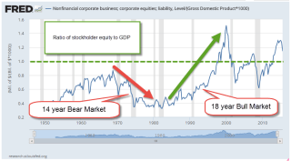
Using the book value of all companies we can construct a ratio that tells us the relative richness of asset valuations.  We will flip the S/B ratio used with individual companies and substitute GDP, the economic activity of a nation, for sales or revenue.

Here is a decades long chart of that indicator.  Higher interest rates and inflation in the late 1960s and 1970s helped lower this ratio.  By the early part of the 1980s stock valuations, using this method, were so beaten up that they had nowhere to go but up.  Lower interest rates and an  explosion of technological innovation in the past few decades have contributed to the rise in this indicator.  It wasn’t until about 1995 that the ratio was an even 1.0.

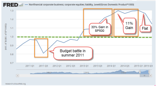
To the value investor, the ratio and the direction of changes in the ratio are equally important.  How much blue sky is baked into current market valuations? Is the ratio rising or falling?  Has the market overpriced the future value of the corporate blue sky?  If so, future price gains may be muted as investors correct their valuations.  Like 2011, the SP500 index will probably show little gain or loss this year.  Here’s a closer look at recent years.  The ratio is falling but still above 1.0.

*******************
 New Year’s Resolutions

Readers who are looking for one more resolution to add to their list can try this one: remembering stuff using spaced repetition with Anki Flashcards.  The desktop app is free and there are a number of shared decks of flashcards available for download.  In no time, you’ll be able to remember your wedding anniversary.  You’ll be able to retrieve French or Spanish phrases stored in some dark corner of your brain along with the lyrics to a 1980s Devo song.  Anything is possible.  Who was the actress who played Princess Leia?  Easy.  Who was the director of the movie Touch of Evil?  Oooh, repeat that one again.

Year End Approaches

December 19, 2015

For those of you who pay attention to crossing averages, the 50 day average of the SP500 index just crossed above the 200 day average.  This long term buy signal is often referred to as the Golden Cross.  The Death Cross, when the 50 crossed below the 200 day average in early August, is a sell signal.  Those who sold some of their holdings at that time missed the volatility of the past few months.  The index was at 2100 in early August.  It closed at approximately 2000 on Friday.  The index has lost about 4% in the past two days.

Past buy crosses were June 2009, October 2010, January and August 2012 and this past week.  Recent sell crosses were December 2007, July 2010, August 2011, July 2012, and August 2015.

In buy, sell order they were December 2007 (sell), June 2009 (buy), July 2010 (sell), October 2010 (buy), August 2011 (sell), January 2012 (buy), July 2012 (sell), August 2012 (buy), August 2015 (sell) and December 2015 (buy).  Note the three year period between buy and sell signals from August 2012 to August 2015.  The market gained 55% during that period.

As you can see from the list above, the market usually regains its footing after a few months – except when it doesn’t, as in 2008.  This buy sell rule avoided the protracted market downturns in 2000 and 2008 at the expense of acting on signals that are false positives, or what is known in statistics as Type I errors.

*****************************

Cost Basis

Mutual fund companies typically calculate an investor’s cost basis for their funds.  Some investors mistakenly think that cost basis reflects the performance of their investment.  It doesn’t. Let’s look at an example of a cost basis entry:

At first glance, an investor might think they have lost $186 since they first started investing in the fund.  Usually, that’s not the case.  In this case, the fund has earned more than $5000 in ten years.

Let’s look at some basics.  An investor in a mutual fund has the option of having dividends and capital gains reinvested in the same fund or transferred to another fund like a money market.  To begin our simple example, let’s choose to NOT reinvest.

Let’s say an investor put $1000 in a bond fund BONDX.  Each share sells for $100 so they have bought 10 shares.  Every quarter the fund pays a $1 dividend per share.  A day before the dividend is paid the fund’s share price is $101.  The fund then distributes the $1 dividend.  The market value of each share instantly falls by the amount of the dividend – $1 – so that after the dividend the market value of each share of BONDX is $100.  What is the investor’s cost basis?  $1000.  The market value is 10 shares x $100 = $1000.  Capital gain or loss? $0.  Does this mean the investor has made no money?  No, they have an extra 10 shares x $1 dividend per share = $10 in their money market account.

When opening up a fund the default option may be to reinvest capital gains and dividends.  This is where some investors get confused.  So, let’s change the reinvest option and choose YES. Now, as before, the fund distributes the $1 dividend and the share price of the fund falls to $100, just as before.  Now, however, the money is not transferred to the money market fund.  Instead it is used to buy more shares of BONDX.  The $10 that the investor receives buy a 1/10 share of BONDX.  Now the investor owns 10.1 shares of BONDX at a cost of $100 per share = $1010 cost basis.  The market price of the fund is $100 per share x 10.1 shares = $1010.  Captial gain or loss: $0.  Again, the capital gain or loss does not reflect the total performance, or profit and loss, of the investment.  The profit is $10.

So, the capital gain or loss should be used only to calculate the tax effect of selling a fund, not the performance of the fund.  The fund company will calculate the performance, or the rate of return (IRR) on an investor’s funds on a separate screen.  Choose that option instead of the cost basis screen.

******************************

The Investment Cycle

Investments tend to rise and fall in price over the course of a business cycle.  At the end of an expansionary cycle, commodity prices start falling.  Yardeni Research has some good graphs which illustrate the ongoing plunge in commodity prices.

As the economy begins its contraction phase, the prices of bonds start to fall.  As we enter recession or at least a contraction of growth, stocks fall.  In the recovery, comodities rise first, followed by bonds, then stocks.  Here is more information for readers who are interested in exploring the details and background of this cycle.

***************************
Diabetes

The American Diabetes Assn puts the direct costs of treating diabetes at $150 billion.  That is 25% of the $600 billion spent on Medicare in 2014.  Indirect costs add another $75 billion in costs.  Much of the increased expenditure is for treating late onset Type II diabetes.  Expenses are sure to grow as the population ages and people do not make the life style changes needed to delay or moderate the onset of the disease.

***************************
Credit Spreads

Several weeks ago, I noted the growing “spread” between Treasury bonds and high yield junk bonds.    The graph I showed was the benchmark of junk bonds, the Master II class. Let’s call them Bench Junks. The bottom of the barrel, so to speak, are those company bonds rated CCC and lower.  These are companies that are more likely to default as economic growth slows or contracts. Let’s call them Low Junks. While the Bench Junks’ spread shows investor concern, the Low Junks’ spread shows a stampede out of these riskier bonds.  A rising spread means that the prices for those bonds are falling, effectively giving buyers a higher interest rate. Investors want the higher yield to compensate them for the higher risk of owning the bonds.

Here is an article explaining the composition of some high yield bond ETFs for those readers who are interested. in learning more.

**************************

Income Taxes

Turbo Tax may be the most widely used individual income tax software but there are many providers of tax software.  Each state usually lists the software programs it has approved.  You can Google “approved income tax software” and insert your state name at the beginning of the search term. Here is a link to Colorado‘s list of approved software.  Here is the list for Texas, New York and California.

**************************
Lastly, have a wonderful Christmas!

Risky Biz

December 13, 2015

How low can crude oil prices go?  Older readers may remember the Limbo, a party dance popular in the early 60s.  After breaking through the “limbo stick” of $40 per barrel, gas prices sank even lower when the IEA indicated that the supply glut will continue through 2016 (Story).

A popular energy ETF, XLE, has fallen 11% in nine trading days.  Yes, an entire sector of the economy has lost more than 1% per day this month. Some oil service companies lost more than 3% on Friday alone. The large integrated oil companies like Exxon (XOM) and Chevron (CVX) say they are committed to maintaining their dividends (Exxon now near 4%, Chevron near 5%) but investors are concerned that continuing price pressures will make that ever more difficult. This article provides a good overview of the structure, revenue and profit streams of large integrated oil companies.

So we lie around at night worried about our stock portfolio.  Why would we do that?  Because someone – who? – is going to pay us a little extra to worry about our stocks.  Or, at least, that’s the way it’s supposed to go, isn’t it? The extra return we are supposed to get for our worries is called a risk premium, or the plural – premia.  One measure of that premium is the total return on stocks minus the total return on a safe long term bond like a ten year Treasury bond.

In his book Expected Returns, An Investor’s Guide to Harvesting Market Reward,  Antti Ilmanen reviews the historical returns of several types of assets during the past century. He wrote a free summary of the book in 2012 (Kindle version  OR PDF version).  Mr Ilmanen presents an investing cube (pg. 3) as a visualization of the factors or choices that an investor must consider.   On one face are assets categorized into four types of investment.  On another face are four styles of investment.  On the third face of the cube are four types of risk.

A surprising find was that the risk premia of stocks over bonds was only 2.38% (p. 12) during the past fifty years.  Investors are not being paid much for their worry.  When the author compared the returns on stocks to longer term twenty year Treasury bonds (an ETF like TLT, for example), the risk premium has been negative for the past forty years.

The author emphasizes that “a key theme in this book is the crucial distinction between realized (ex post) average excess returns and expected (ex ante) risk premia.” (p. 15)  Historical averages of risk premia may be exaggerated by high inflation, which hurt the returns on bonds in the 1970s and part of the 1980s, and made returns on stocks that much better by comparison.  In a low inflation environment such as the one we have now the risk premia for owning stocks may be rather muted.

Ilmanen’s analysis of past returns reveals several historical trends that can help an investor’s portfolio.    Value investing tends to produce higher returns over time.  So-called Dividend stocks also generate additional return.

I was surprised at the relative stability of per capita GDP growth over 100 years.  We wring our hands in response to a crisis like the dot-com meltdown or the Great Recession but these horrific events barely show in the average aggregate output of the country over a person’s working years. Here is a table from the PDF summary.

A mutual fund QSPIX was formed last year based partly on the research in the book.  However, the minimum investment is $5,000,000.    The fund is currently 28% in cash.

*********************************

Social Security Strategies

A resource on the right side of this blog is Maximize My Social Security (MMSS), a personally tailored – and inexpensive – advisory service to guide older people to better informed Social Security choices.  The site does not use your social security number.  If you already have an online account with the Social Security Administration, you can complete the forms at MMSS and get some results in under twenty minutes.

Old people who used to talk about the latest Pink Floyd or Led Zep album when they were younger now talk about Social Security, Medicare and their aches and pains.  Always a popular topic:  hey, what do you think about waiting to file for Social Security?

Pros of waiting:

1.  Where else  can any of us earn a guaranteed 8% on our money each year?  Sign me up!  For each year we wait, our Social Security annual benefit increases by 8%.

2. Inflation adjusted:  On top of the additional 32% we get from SS when we start collecting SS at age 70, we are getting an inflation adjustment on that higher amount.

3.  If we need to borrow money to get by during the 4 years we wait, we may be able to borrow the money using our house as collateral.  Depending on our tax circumstances, the interest we pay on the borrowed money could be deductible, reducing the net cost of borrowing.

4.  If we are a guy, we will probably die before our spouse.  Wives who may have a lower benefit will get their benefit amount bumped up to what we were receiving.

Cons of waiting:

1.  We could die before the “payoff” age, between 79 and 82.  This is the age when the inflation adjusted benefits we receive by delaying our benefit matches the total we would have collected by claiming at an earlier age.  However, we often don’t factor in the advantage of the #4 Pro above in which our spouse collects a higher amount till her death.

2.  Congress could change SS payments and rules.  The institution does not have a good track record for keeping its promises.  The swelling ranks of the Boomer generation contributed far more than recipients of earlier generations took out in benefits. Congresses of the past few decades have spent all the extra money accumulated in the Social Security coffers.  After 2020 the system will come under greater cash flow pressure as the Boomers continue to retire and claim benefits.  If Congress does reduce benefits,  then those of us who waited to file for benefits will probably regret our decision.  By the way, MMSS allows users to estimate the long term impact of such a reduction.

3.  We may have to borrow to make ends meet while we wait to collect benefits.  Banks don’t usually loan money to retirees with no job income, necessitating some asset-backed mortgage. Older people may be averse to assuming any new debt.

4.  Withdrawing money from savings while we wait will reduce our savings for a time, which will lessen the “endowment” base of our lifetime wealth.  While the additional 8% per year from SS should more than offset that loss, we can never be certain.  As an example, let’s imagine a retiree at the beginning of 1995 who decided to draw down savings and wait four years to start collecting SS benefits.  The stock market had gone nowhere during 1994.  She sold some stocks and bought a 4 year CD “ladder” for the amount she would need to tide her over till she started collecting benefits.  During those next four years, the SP500 index rose from 459 to 1229, a 167% gain – more than 25% annually excluding dividends.  Even with the additional money our retiree was making each month in SS benefits because of her decision to delay, it was the worst time to get out of the stock market!

Portfolio Allocation and Timing

November 15, 2015

Gone Fishin’ Portfolio

I found this portfolio in a pile of old paperwork.  The idea is to allocate investment dollars in a number of buckets, then more or less forget about it, rebalancing once a year.  The portfolio is 60% stocks, 30% bonds, 10% other

I compared this broadly balanced portfolio #1 with a simpler version #2: 60% stocks, 40% bonds.  Because the Vanguard mutual fund VTSMX is weighted toward U.S. large cap stocks, I split the stock portion of the portfolio with an index of small cap value stocks VISVX.  The 40% bond component is an index of  intermediate-term corporate grade bonds VFICX.  I also included a very simple portfolio #3 without the split in the stock portfolio.  The 60% stocks is represented by one fund VTSMX.  The results from Portfolio Visualizer  include dividends.

Note that there is little difference between Portfolios #2 and #3 over this time period.  Although the Gone Fishin’ portfolio lagged the other two during this time period, it did do better during the period 2000 – 2006.

*****************************

Market timing

Another approach is a fairly simple market timing technique as shown in this paper “A Quantative Approach to Tactical Asset Allocation”  There is no heavy math in the paper.  The timing rule is simple:  buy the SP500 when the monthly close is above the 10 month moving average; sell when the monthly close is below the 10 month average.  Using this system, an investor would have sold an ETF like SPY on the first trading day of September this year  because August’s close was below the ten month average.  After the index rebounded in October and closed above the 10 month average, an investor would have bought back in on the first trading day in November. The average “turnaround,” a buy and a sell signal, is less than one a year.  These short term swings are sometimes called “whipsaws,” where an investor loses several percent by selling after a quick downturn then buying in after prices recover quickly.  The payoff is that an investor avoids the severe 50% drawdowns of 2008 and 2000.

The author of the paper performed a 112 year backtest on this system. He excluded taxes, commissions and slippage in the calculations and used the closing price on the final day of the month as his buy and sell price points. He notes some reasons for these omissions later in the paper which I found inadequate. I recommend using the opening price (ETF) or end of the day price (mutual fund) of the day following the end of the month as  a practical real world backtesting strategy.  Very few individual investors can buy or sell at the closing price and there can be a lot of price movement, or slippage, in the final trading minutes before the close.

Commissions can be estimated at some small percentage.  To exclude commissions is to estimate them at 0% and present an investor with unrealistic returns, a common backtesting fault of many trading or allocation systems.  The same can be said for taxes.  Even if the guesstimate is a mere 1%, it is better than the 0% effective estimate of tax costs when excluded from the backtest.

The difference in annual real, or inflation-adjusted, return between this timing model and “buy and hold” is 4/100ths of 1% per year (p. 23) Because the timing model avoids the severe portfolio drawdowns of a buy and hold stratgegy (p. 28), that tiny difference translates into a difference in compounded return that is less than 1% which produces a huge 250%+ difference in portfolio balances at the end of the 112 year testing period.  None of us will be investing for that long a period but it does illustrate the effect of small incremental differences.

The author then combines an allocation model with the timing model using five global asset classes: US stocks, foreign stocks, bonds, real estate and commodities, assigning 20% of the portfolio to each class.  He backtested this allocation with the same timing strategy vs a buy and hold strategy (p. 30-31).  The advantages of the timing strategy are apparent during severe downturns as in 1973, 2000 and 2008.  A buy and hold strategy took eight years after 1973 to recover and catch up to the timing strategy.  The buy and hold strategy never caught up to the timing strategy after the 2000-2003 downturn in the market.  In 2008, it fell even further behind, highlighting the superiority of the timing strategy.

Returns are important, of course, but volatility and drawdown are especially critical for older investors who do not have as many years to recover.  From 1973 – 2012, the timing model has only one losing year – 2008 – and the loss for the entire portfolio was a mere 6/10ths of a percent (p. 32).

*****************************

October jobs report

A few weeks ago I linked to an article on Reagan’s former budget director David Stockman.  On his web site, he presented a sobering and thorough analysis of the October jobs report.

Stockman breaks down the numbers into “breadwinner” higher paying jobs and the relatively lower paying leisure and hospitality jobs that account for too much of the jub creation in the past fifteen years.  Goods producing jobs – those in manufacturing, construction, mining and timber – are still far below 2000 levels.

“massive money printing and 83 months running of ZIRP [zero interest rate policy of the Federal Reserve] have done nothing for the goods producing economy or breadwinner jobs generally.”

*****************************

Obama’s numbers

A president has far less effect on the economy than the political rhetoric would have one believe.  Despite that fact, each President is judged on his “numbers” as though he were a dictator, a one man show.  With one year to go in his second term, here are the latest numbahs from the reputable FactCheck.

Investment Flows

October 18, 2015

When economists tally up the output or Gross Domestic Product (GDP) of a country, they use an agreed upon accounting identity: GDP = C + I + G + NX where C = Consumption Spending, I = Investment or Savings, G = net government spending, and NX is Net Exports, which is sometimes shown as X-M for eXports less iMports. {Lecture on calculating output}

In past blogs I have looked at the private domestic spending part of the equation – the C.  Let’s look at the G, government spending, in the equation.  Let’s construct a simple model based more on money flows into and out of the private sector.  Let’s regard “the government” as a foreign country to see what we can learn.  In this sense, the federal, state and local governments are foreign, or outside, the private sector.

The private sector exchanges goods and services with the government sector in the form of money, either as taxes (out) or money (in).  Taxes paid to a government are a cost for goods and services received from the government. Services can be ethereal, as in a sense of justice and order, a right to a trial, or a promise of a Social Security pension.  Transfer payments and taxes are not included in the calculation of GDP but we will include them here.  These include Social Security, Medicare, Medicaid, food stamps and other social programs.  If the private sector receives more from the government than the government takes in the form of taxes, that’s a good thing in this simplified money flow model. There are two types of spending in this model: inside (private sector) and outside (all else) spending.

Let’s turn to investment, the “I” in the GDP equation.  In the simplified money flow model, an investment in a new business is treated the same as a consumption purchase like buying  a new car.  Investment and larger ticket purchase decisions like an automobile depend heavily on a person’s confidence in the future.  If I think the stock market is way overpriced or I am worried about the economy, I am less likely to invest in an index fund.  If I am worried about my job, I am much less likely to buy a new car.  In its simplicity this model may capture the “animal spirits” that Depression era economist John Maynard Keynes wrote about.

We like to think that an investment is a well informed gamble on the future.  Well informed it can not be because we don’t know what the future brings.  We can only extrapolate from the present and much of what is happening in the present is not available to us, or is fuzzy.  While an investment decision may not be as “chanciful” as the roll of a dice an investment decision is truly a gamble.

Remember, in the GDP equation GDP = C + I + G + NX, investment (the I in the equation) is a component of GDP and includes investments in residential housing. In the first decade of this century, people invested way too much in residential housing.

In the recession following the dot-com bust and the slow recovery that followed the 9-11 tragedy, private investment was a higher percentage of GDP than it is today, six years after the last recession’s end.  Much of this swell was due to the inflow of capital into residental housing.

The inflation-adjusted swell of dollars is clearly visible in the chart below.  It is only in the second quarter of this year that we have surpassed the peak of investment in 2006, when housing prices were at their peak.

Investment spending is like a game of whack-a-mole.  Investment dollars flow in trends, bubbling up in one area, or hole, before popping or receding, then emerging in another area.  Where have investment dollars gone since the housing bust?  An investment in a stock or bond index is not counted as investment, the “I” in the equation, when calculating GDP.  The price of a stock or bond index can give us an indirect reading of the investment flow into these financial products.  An investment in the stock market index SP500 has tripled since the low in the spring of 2009 {Portfolio Visualizer includes reinvestment of dividends}

Now, just suppose that some banks and pension funds were to move more of those stock and bond investments back into residential housing or into another area?

Crossroad

September 13, 2015

The SP500 index is very close to crossing below its 25 month average this month, four years after a similar downward crossing in September 2011.  Worries over the economy and political battles over the budget had created a mood of caution during that summer of 2011.  The market immediately rebounded with a 10% gain in October 2011 and has remained above the 25 month average in the four years since.   Previous crossings, however – in November 2000 and January 2008 – have marked the beginnings of multi-year downturns.

These long term crossings are coincident with extended periods of re-assessment of both value and risk.  Sometimes the price recovery after a crossing below the 25 month average is just a few months as in August 1990, and October 1987, or the quick rebound in 2011.  More often the price of the index takes a year or more to recover, as in 1977, 1981, 2000 and 2008.

The downward crossings of 2000 and 2008 preceded extended periods of price weakness.  Recovery after the popping of the dot-com bubble lasted till the fall of 2006.  In January 2008, just over a year after the end of the last recovery, another downward crossing below the 25 month average occurred.  Later on that year, it got really ugly.

As the saying goes, we can’t time the market.  However, we can listen to the market.  For the fourth year in a row the bond market continues to set records.  The issuance of investment grade and higher risk “junk” corporate bonds has totaled $1.2 trillion so far this year.  Ahead of a possible rate hike by the Federal Reserve this month, Wednesday’s single day bond issuance set an all time record. The reason for the high bond issuance is understandable – companies want to take advantage of historically low interest rates.  The demand for this low interest debt is a gauge of the long term expectations of low inflation.

**********************************
CWPI

The Purchasing Manager’s Index presents a somewhat contradictory note to the recent volatility in the stock market.  The CWPI, a composite of the manufacturing and services surveys, shows strong growth.  The manufacturing sector has weakened somewhat.  The strong dollar has made U.S. exports more expensive.

On the other hand…the ratio of inventory to sales remains elevated at 1.37, meaning that merchants have 37% more product on hand than sales.  The particularly harsh winter was unexpected and hurt sales, helping to boost inventories.  Five months after the winter ended, there should have been a notable decline in this ratio.

Has some of the strong economic growth gone to inventory build-up?

***********************************
Annuity

In  the blog links to the right was an article written by Wade Pfau on the mechanics of income annuities.  Even if you are not considering annuities, this is a good chance to expose yourself to some basic concepts about these financial products.