Key Expectations

June 9, 2024

by Stephen Stofka

This week’s letter continues my exploration of the role of expectations. They coordinate the supply, demand and price relationships that form the web of our economic and financial lives. They shape our voting patterns, and alter our behavior in interactions with others. If we expect a police officer to be hostile, we are defensive. That reaction will affect the behavior of the officer, increasing the chance that the encounter will be hostile. Expectations cause us to behave in ways that confirm and amplify our expectations, aggravating undesirable circumstances.

Expectations and yearnings act symbiotically within us but there is a distinction between the two. Expectations are a calculation; yearnings are a desire. “I think that” is an expectation. “I hope that” is a yearning. A woman may yearn to have a child, but she expects to have a child within a period of time. A yearning knows no time or logic. We expect a certain range of compensation for the type of work we do, our skill level and experience. Business coaches encourage people to visualize and enhance their good attributes to raise those expectations. Business owners expect their capital to earn a certain percentage of profit as compensation for the risk, planning and skill that a successful business requires.

Consumers expect a certain range of prices for many frequently bought goods and services. The price of meat may be more or less than average in a week, but the price will not be $100 a pound for ground beef. We may have no price anchor for infrequent purchases like replacing a hot water heater. A few hundred dollars or a few thousand? A search in a browser can help with an average price of approximately $2100 to help a homeowner evaluate quotes from a plumbing contractor.

In the U.S., the pricing of medical care is treated as a catastrophic event like a house fire. The connection between price and medical care has been cut so that patients may not know beforehand the price of a procedure. A browser search for the cost of a colonoscopy indicates an average cost of $2200, close to that of a hot water heater, coincidentally, but medical providers do not quote a price. Prices are negotiated between health insurance companies and a network of medical providers. The negotiated price may be a fifth of the stated list price. If patients have health insurance, the only price visible to them is a co-pay. The prospect of higher medical costs next year does not incentivize us to seek care now at a lower price. Colonoscopy prices going up soon? Let me book one now! However, as costs increase, workers negotiate for better benefit packages that cover the anticipated higher costs.

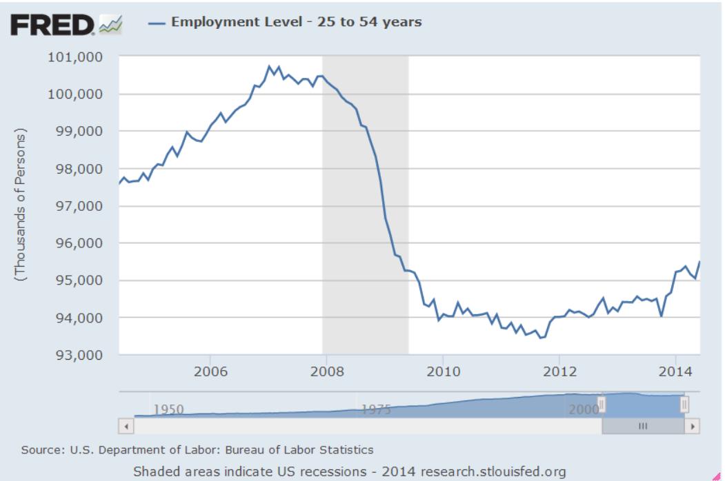
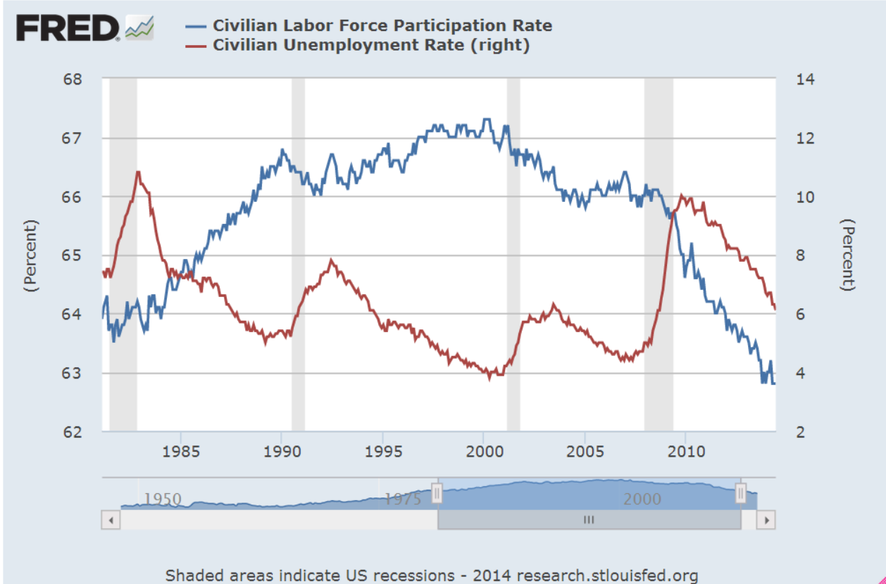
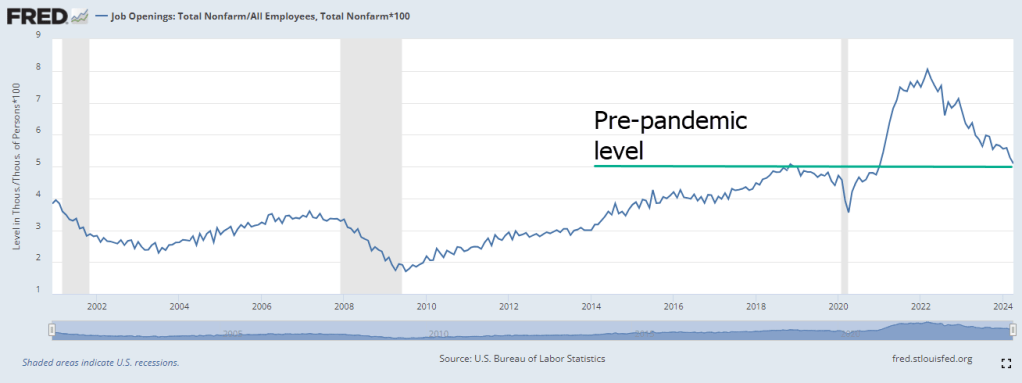
In our economy, workers play a dual role of producer and consumer. The monthly labor report and retail sales report captures the importance of these roles, and the release of these reports move markets. In the core labor force age range of 25 to 54, four out of five people are working or looking for work, according to the latest labor report. The largest generation in this demographic are the Millennials, born between 1981 and 1996. They produce the most and buy the most so their expectations steer the economy. Job openings as a percent of total employment indicate a historically robust labor market. Recent reports indicate that openings are returning to pre-pandemic levels.

Job openings as a percent of total non-farm employment

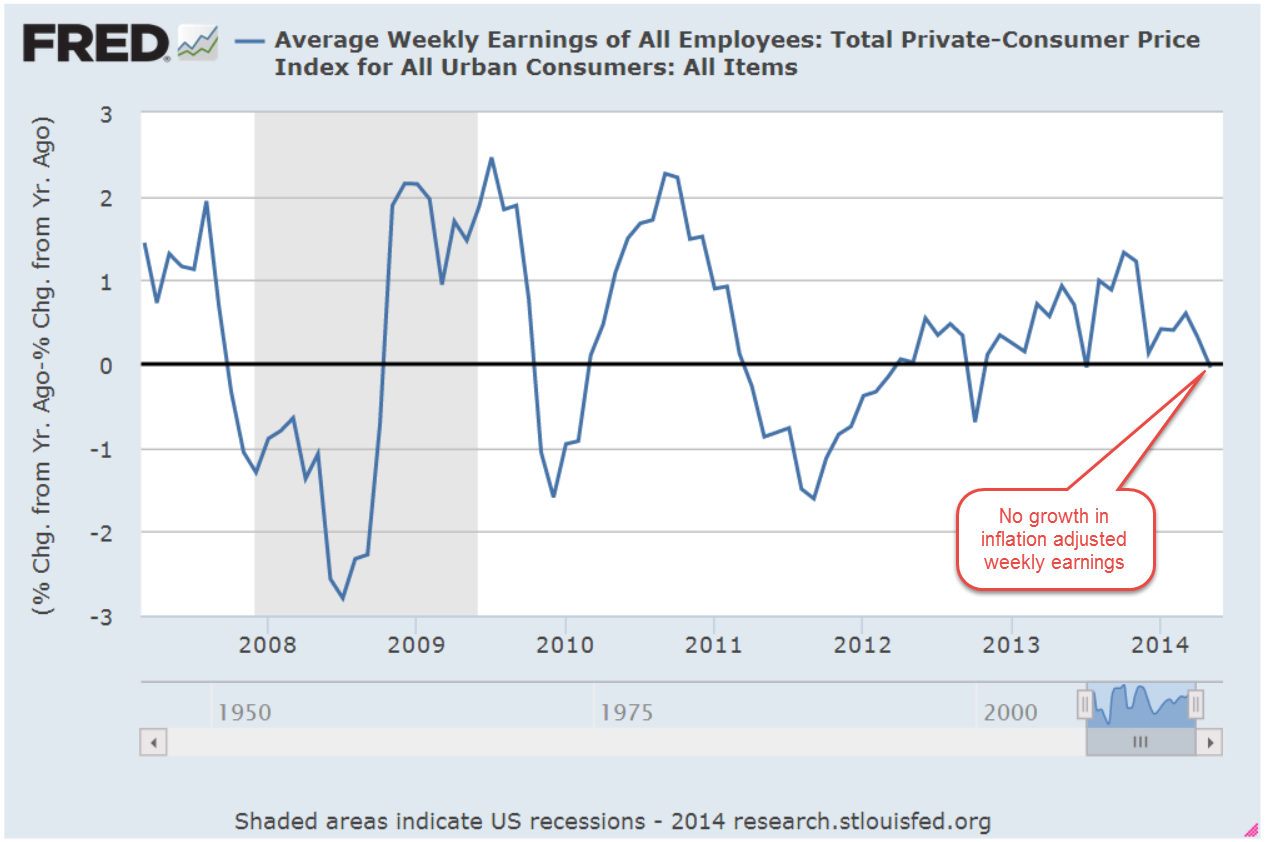
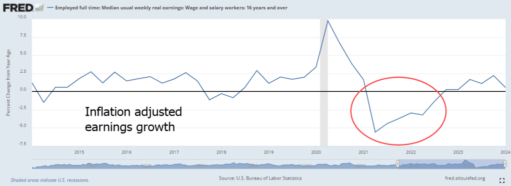
Despite the strong demand for labor, post-pandemic inflation has taken a bite out of gains in median earnings. Biden assumed office as earnings gains turned negative. Despite legislation meant to promote investment and support the labor market – the Inflation Reduction Act – the decline in real earnings did not turn positive until 2023.

Real earnings equals real purchasing power. Late Millennials reaching their early thirties expected to be able to settle down and buy a house. Older Millennials in their forties who expected to trade up to a different home are frustrated by high home prices and interest rates. Political power in our system is captured by the interests of older voters, particularly the Boomers. Less than one out of four in this generation is working (FRED series here). They want to reduce their tax costs, and preserve or enhance the government benefits they feel they have earned after a lifetime of working.

This week, David Leonhardt, editor of the N.Y. Times Morning Newsletter, pointed out a poll indicating strong support for many policies initiated by the Biden administration. Most of the public’s attention is directed to controversial issues like immigration, the war in Gaza and American support for Ukraine in their continuing war against Russia’s invasion. The pandemic focused the public’s attention on Trump’s chaotic governing style. His behavior defied expectations and his supporters became accustomed to excusing or rationalizing his actions. A majority voted for Biden as a return to normalcy in the recovery from the pandemic.

People vote their expectations, and those expectations strongly influence voters’ assessments of the economy even before a candidate has taken office. A candidate needs to offer a clear set of new expectations that manifest the yearnings of a majority of voters. Has either candidate made the connection between voter expectations and yearnings? Next week I will look more closely at the political aspect of expectations.

////////////////

Photo by Jan Tinneberg on Unsplash

Keywords: prices, growth, earnings, inflation

The Old, Young and Middle

October 9, 2022

by Stephen Stofka

This week I’ll compare inflation-adjusted or real spending on Social Security and K-12 education with wage growth. I was surprised to learn that the number of people in both programs are the same. I’ll begin with Friday’s employment report because the market’s reaction to it indicates the erratic – but rational – thinking that higher inflation can trigger. Job gains of 263,000 were in line with expectations, but the unemployment rate went down by .1% because people stopped looking for jobs. Three years ago a .1% move would be discarded as a survey error. The unemployment rate is derived from a survey of households, not businesses, and often exaggerates any move up or down. In today’s volatile market, traders are skittish, employing algorithms that don’t care about the extent of a move, only whether it is up or down. Short term options trading leverages both money and time and they are now almost half of the options market. A minus sign might trigger a sell, a plus sign a buy. The number after that plus or minus is less important. A trader might have taken a position forecasting a slight uptick in the unemployment rate. No increase or a decrease = sell and minimize losses. This is reactive trading, not economic evaluation.

This week’s ADP report of private job gains showed a decline of 7,000. Averaged together job gains were only 116,000 in September and has shown a distinct downward response to the Fed’s raising of interest rates. The historical average of the two surveys has been the more accurate after revisions. More disappointing for workers is that wage growth has been more than 3% below the inflation rate.

While workers’ wages are not keeping up with inflation, social security recipients will likely get a COLA (cost-of-living-adjustment) raise of about 8.6% this year. By law, the COLA calculation compares this year’s average third quarter CPI to last year’s third quarter average. September’s CPI report will be released Thursday, October 13th, finalizing this year’s 3rd quarter and the final adjustment percentage. It will be the largest increase since 1981’s adjustment of 11.3%, according to the Social Security Administration (2022).

An eternal theme in the Republican platform is the privatization of Social Security before it goes broke. A few weeks before the election, some Republicans will undoubtedly use the COLA adjustment to call for Social Security privatization. They will claim that higher payments will inevitably lead to the insolvency of the fund. Retirees will get partial payments or no payments.

Former House Speaker and Republican Vice-Presidential candidate, Paul Ryan once asked Alan Greenspan, then Chairman of the Fed and a fellow conservative, a leading question meant to demonstrate the insolvency of Social Security. Wouldn’t personal retirement accounts (privatized Social Security accounts) make the retirement system more financially secure? In his dry tone, Greenspan answered that “there is nothing to prevent the Federal Government from creating as much money as it wants and paying it to somebody” (C-Span, 2005). Ryan, a champion of privatization, was disappointed in the answer.

Why then do we have the trust funds? The Social Security system is “Pay-Go.” The taxes of current workers pay for the benefits to retired workers. When the program was created almost 90 years ago, President Roosevelt (FDR) thought that Republicans – and some conservative southern Democrats – would be more hesitant to cancel the program if funds were – on paper at least – dedicated to the program and called “insurance.” Republicans challenged the program up to the Supreme Court on the basis that the Federal government had no Constitutional right to force people to pay into a retirement program. The Court ruled that, even if the program was called “insurance,” it was a tax and the government had the right to tax incomes. Read the 16th Amendment. The unfairness in the system was that the first generation of recipients paid little into the system for the benefits they received when they retired. Today, the average retiree receives $1673 a month, or $20K per year (SSA, 2022). Let’s compare that to spending on K-12 education.

The U.S. has about the same number of K-12 students as it does retirees who are collecting Social Security – a bit more than 50 million. Social Security is a federal program. K-12 education is funded at the state and local level with only 8% federal funding. The federal government has deep pockets. State and local governments have shallow pockets with many demands from their constituents. In 2019, federal, state and local governments spent $765B, or $15,120 per pupil in 2019 (Hanson, 2022). That’s 75% of what we spend on retirees. Have we shifted too many resources to seniors from children?

Retirees have paid Social Security taxes for their entire working lives and feel that those funds have been set aside for them. The federal government doesn’t have to provide goods and services to retirees. Even the task of computing and remitting Social Security taxes is done by businesses – by law and for free. The accounting is a business expense. State and local governments must provide real resources. These include schools and facilities, teachers and lunches, school nurses and security guards.

Education competes with other essential services. The 2008 financial crisis and the slow recovery “put a hurt” in most state and local budgets. Since 2008, the national average of real per pupil funding has increased only 6% (Hanson, 2022). For most of that time, inflation has been low. Imagine what a sustained period of high inflation might do. Let’s look back at the last period – the 1970s and early 1980s.

Higher inflation wakes us up. Even when inflation is low, workers are squeezed, having to support children and retirees. Inflation increases the budget squeeze so workers pay closer attention to personal budgets and public policies. In the high inflation decade of the 1970s the public discovered that income and real estate taxes were not indexed to inflation. Rising wages caused people to go into higher tax brackets even when their real wages had barely moved. Tax laws were changed in the 1980s.

Ever rising real estate taxes in California made it difficult for retired homeowners on fixed incomes to stay in their homes. A growing taxpayer revolt rose up in many states. In 1978, California voters approved Proposition 13 which limited annual increases in taxes. Real estate taxes are the largest source of funding for schools so today California spends 10% less than the national average on K-12 students. Will today’s higher inflation provoke some sweeping policy changes?

Knowing past history, the Fed can’t let high inflation get entrenched in the economy for long. People will demand policy and institutional changes. Next week I’ll look at consumer psychology during high inflation periods.

////////////////////////

Photo by CDC on Unsplash

C-Span. (2005, March 3). User Clip: Alan Greenspan answers Paul Ryan. C-Span. Retrieved October 7, 2022, from https://www.c-span.org/video/?c4923562%2Fuser-clip-alan-greenspan-answers-paul-ryan

Hanson, Melanie. “U.S. Public Education Spending Statistics” EducationData.org, June 15, 2022, https://educationdata.org/public-education-spending-statistics

Social Security Administration. (2022). Cost of Living Adjustments. Cost-Of-Living Adjustments. Retrieved October 7, 2022, from https://www.ssa.gov/oact/cola/colaseries.html

SSA: Social Security Administration. (2022, August). Monthly Statistical Snapshot, August 2022. Research, Statistics & Policy Analysis. Retrieved October 7, 2022, from https://www.ssa.gov/policy/docs/quickfacts/stat_snapshot/

////////////////////////

50595238

The Role of Government

December 18, 2016

What role should government at many levels – Federal, state and local – play in our lives?  Some want a large role, some small.  Does the Constitution give the Federal government a diminished role in our lives? That is the viewpoint of those on the right side of the political divide in this country.  As Donald Trump gets ready to lead a Republican dominated Federal government, the debate burns white hot, as it did at the founding of this country.

Let’s turn the time dial back to 1936, the middle of the Great Depression, to appreciate just how much we depend on government today.  At that time, the unemployment rate had declined from a soul crushing 24%, but was still high at 17%.  The Roosevelt administration had ushered in many programs to alleviate joblessness.  In 1936, total government spending at all levels was $257 billion. (Dollar amounts don’t include what is called transfer payments like Social Security. and are in 2016 dollars.)

Eighty years later, it is $6 trillion, about 24 times the 1936 level.  Some might counter that the population has grown so, of course, government spending has grown.  The population has indeed increased, but only 2.7 times, far below the 24 times that government spending has multiplied.  In 1936, per person spending was $2,000.  Today it is $19,000.

During World War 2, government spending climbed six times to $1.6 trillion, about 25% of today’s level.  We are not currently engaged in a global war which occupies most of our economy as it did in the 1940s.  We do not have millions of young men in combat.  And remember, these figures don’t include Social Security, welfare and business subsidies.

Now let’s look at this from another viewpoint, one that might lead to a different conclusion.  Let’s look at government spending as it relates to family income.  According to the IRS and BLS, average family income was about $26,000 in 1936. (IRS and BLS See note below).  Remember, this was during the most severe Depression in our nation’s history.  So, per capita government spending was about 6% of this rather low family income.  Today, it is 33% of the $56,000 median family income.  So, we squint at these figures from two viewpoints and we are still left with the same conclusion.  As a percent of income and on a per capita basis, government spending has become a significant part of our lives.

When Republicans talk about smaller government, the “small” in that catch phrase should be kept in perspective.  At best, Republicans might want to lower spending growth to eight times, not ten times, the spending of 1936.  Those on the left might want to accelerate that growth to 12 times.  In either case, neither party advocates the frugal spending levels of 1936.  I should note that President Roosevelt himself was concerned that this low (to us) level of government spending – most of them his New Deal programs – was becoming too high.

The current fad is speaking in hyperbole.  Many daily experiences in our lives are awesome.  Our kids, our vacation, the latte we had yesterday – all awesome. It is no surprise, then, that we would  use hyperbole to describe those who don’t agree with our political views.  They are communists, or socialists, or capitalist anarchists, or [insert epithet here].  The voices of moderation are growing smaller by the year.

Half of the voters in this country want less government, half want more.  If each of us wants “our” views to prevail, we need to get up off our asses and pull on the rope in this political tug of war.  When “our” side gets into power, the other half has to suffer through it, and vice-versa.  This battle of ideas will continue throughout our lifetimes and – God Forbid! – we might even change sides.

/////////////////////////////

Endnotes

According to the IRS, only 4.3% of tax returns reported positive taxable income in 1936.  One out of 20 families footed the entire bill for Federal government spending. 95% of families had no federal taxable income. 

Real wage growth in the U.K. has turned negative for the first time since the 1860s.
(Bloomberg)

The most common job in a lot of states:  truck driver.  (NPR)

Pickup and Letdown

May 8, 2016

Based on ISM’s monthly survey of Purchasing Managers, the CWPI blends both service and manufacturing indexes and gives additional weight to a few components, new orders and employment.  Last month we were looking for an upward bend in the CWPI, to confirm a periodic U-shaped pattern that has marked this recovery. This month’s reading did swing up from the winter’s trough and we would expect to see further improvement in the coming few months to confirm the pattern. A break in this pattern would indicate some concern about a recession in the following six months. What is a break in the pattern? An extended trough or a continued decline toward the contraction zone below 50.

Since the services sectors constitutes most of the economy in the U.S., new orders and employment in services are key indicators of this survey.  A sluggish winter pulled down a composite of the two but a turn around in April has brought this back to the five year average.

Rising oil prices have certainly been a major contributor to the surge in the prices component of the manufacturing sector survey. The BLS monthly labor report (below) indicates some labor cost increases as well.  Each month the ISM publishes selected comments from their respondents.  An employer in the construction industry noted a severe shortage of non-skilled labor, a phenomenon we haven’t seen since 2006, at the height of the housing bubble.

Last week the BEA released a first estimate of almost zero growth in first quarter GDP, confirming expectations.  Oddly enough, the harsh winter of 2015 provided an even lower comparison point so that this year’s year over year growth, while still anemic, is almost 2%.

////////////////////////////

Employment

April’s employment data from the BLS was a bit disheartening.  Earlier this week, the private payroll processor ADP reported job growth of 150,000 in April and lowered expectations for the BLS report released on Friday.  While the BLS estimate of private job growth was slightly better, the loss of about 10,000 government jobs, not included in the ADP estimate, left the total estimate of jobs gained at 160,000. The loss of government jobs is slight compared to the total of 22 million employed at all levels of government but this is the fourth time in the past eight months that government employment has declined.

A three month average of job growth is still above 200,000, a benchmark of labor market health that shows job growth that is more than the average 1% population growth  With a base of 145 million employees in the U.S, a similar 1% growth rate in employment would equal 1.5 million jobs gained each year, or about 125,000 per month.  To account for statistical sampling errors, the churn of businesses opening and closing, labor analysts add another 25,000 to get a total of 150,000 minimum monthly job gains just to keep up with population growth.  The 200,000 mark then shows real economic growth.  In March 2016, the growth of the work force minus the growth in population was 1.2%, indicating continued real labor market gains.

Job growth in the core work force aged 25 -54 remains above 1%, another good sign.  It last dipped briefly below 1% in October.  This core group of workers buys homes, cars, and other durable goods at a faster pace than other age groups; when this powerhouse of the economy weakens, the economy suffers. In the chart below, there is an almost seven year period, from June 2007 through January 2014 where growth in this core work force group was less than 1%.  From January 2008 through January 2012, growth was actually negative.  The official length of the recession was 17 months, from December 2007 through June 2009.  For the core work force, the heart of the economic engine, the recession lasted much longer.

In 2005, a BLS economist estimated that the core work force would number over 105 million in 2014.  In December 2014, the actual number was 96 million, a shortage of 9 million workers, or almost 10% of the workforce.  In April 2016, the number was almost 98 million, still far less than expectations.

Some economists and pundits mistakenly compare this recovery from a financial crisis with recoveries  from economic downturns in the late 20th century.  For an accurate comparison, we must look to a previous financial, not economic, crisis – the Great Depression of the 1930s.

The unemployment rate in April remained the same, but more than a half million people dropped out of the labor force, reversing a six month trend of declines.  It is puzzling that more people came back into the labor force during the winter even as GDP growth slowed.

Average hourly earnings increased for the second month in a row, upping the year over year increase above 2.5%.  For the past ten years, inflation-adjusted weekly earnings of production and non-supervisory workers have grown an anemic .75% per year.  In the sluggish winter of January and February 2015, earnings growth notched  a recovery high of 3%, leading some economists and market watchers to opine that lowered oil costs, on the decline since the summer of 2014, would finally spur worker’s pay growth in this long, subdued recovery.  A year later, earnings growth is about 1.2%, a historically kind of OK level, but one which causes much head scratching among economists at the Federal Reserve.  When will worker’s earnings begin to recover?

/////////////////////////

Hungry

A reader sent me a link to a CNBC article  on food insecurity in the U.S. The problem is widespread and not always confined to those who fall below the poverty benchmark. Contrary to some perceptions, food insecurity is especially prevalent in rural areas, where food costs can be 50% higher than urban centers.  How does the government determine who is food insecure? The USDA publishes a guide with a history of the project, the guidelines and questions.  To point out the highlights, I’ll include the page links within the document. The guidelines have not been revised since this 1998 revision.

In surveys conducted by the Census Bureau, respondents are asked a series of questions.  The answers help determine the degree of household food insecurity.  The USDA repeatedly emphasizes that it is household, not individual, insecurity that they are measuring.  The ranking scale ranges from 0, no insecurity, to 10, severe insecurity and hunger. An informative graph of the scale, the categories and characteristics is helpful.

In 1995, a low .8 percent were ranked with severe food insecurity (page 14) . To be considered food insecure, a household must rank above 2.3 (household without children), or above 2 .8 (with children) on the scale.  Above that are varying degrees of insecurity and whether it is accompanied by hunger. (Table)

The USDA admits that measuring a complex issue like this one can provoke accusations that the measure either exaggerates or understates the number of households.  What are they measuring?  Page 6 contains a formal definition, while page 8 includes a list of conditions that the survey questions are trying to assess, and that a condition arose because of financial limitations like “toward the end of the month we don’t have enough money to eat well.”

Page 9 describes the rather ugly pattern of progressively worse food insecurity and hunger.  At first a household will buy cheaper foods that fill the belly.  Then the parents may cut back a little but spare the kids the sensation of hunger.  In its most severe stage, all the family members go hungry in a particular day.

Those of you wanting additional information or resources can click here.

////////////////

Earnings

Almost a month ago the giant aluminum manufacturer Alcoa kicked off the first quarter earnings season.  87% of companies in the SP500 have reported so far and FactSet calculates a 7% decline in earnings.  They note “the first quarter marks the first time the index has seen four consecutive quarters of year-over-year declines in earnings since Q4 2008 through Q3 2009.”  Automobile manufacturers have been particularly strong while the Energy, Materials and  Financial sectors declined.  Although the energy sector gets the headlines, there has also been a dramatic decrease in the mining sector.  The BLS reports almost 200,000 mining jobs lost since September 2014.

The bottom line for long term investors: the economic data supports an allocation that favors equities.  The continued decline in corporate earnings should caution an investor not to go too heavily toward the equity side of the stock/bond mix.

/////////////////

(Edited May 11th in response to a reader’s request to clarify a few points.)

Pickup Purchasing Power

April 24, 2016

Relatively stagnant wages and income inequality have become a frequent theme on the campaign trail.  Let’s look at what I’ll call pickup purchasing power to understand the problem.  Sorry.  No graph from the Federal Reserve on this one.

A favorite vehicle among construction workers is the F-150 pickup, a reliable vehicle with room for a toolbox and a trip to the local lumberyard for supplies.  The MSRP of a standard bed 1998 model, available to the public in September 1997, was $14,835 (Source ) In 2016, the MSRP of that same model is $26,430 (Source), a 78% increase, about 3.2% per year.  There have certainly been improvements in that truck model in the past two decades but customers can not order the model without the improvements.  The basic model is the basic model.

Let’s look now at the wages needed to buy that pickup.  In May 1997, shortly before the 1998 F-150 was released to the public, the BLS survey reported average carpenters’ wages of $30,800.  At that time, wages and salaries were about 70.5% of total compensation, or about $43,700 (BLS report).  In the decade before that, wages as a percent of total compensation had declined from 73.3% in 1988 to 70.5% in 1997.  Rising insurance costs and other direct benefits to employees were slowly eating into the net compensation of the average carpenter.

In 2015, the average wage for carpenters was $43,530.  The BLS reported that wages were now 67.7% of the total employment cost, or about $64,300.  In that 18 year period, carpenters’ wages grew 41% but total compensation grew 47%, or 2.1% per year.  The price of that pickup truck, though, grew at 3.2% per year.  That seemingly small difference of 1% per year adds up to a big difference over the years.  That’s the sense of anger that underlies the current election season.  The growth in price of that pickup is only slightly above the average post WW2 inflation rate of 3%.  It is the wages that have fallen behind.

Trump blames the politicians who have given away American jobs with badly negotiated trade agreements that disadvantage Americans.  Trump’s promise to bring those manufacturing jobs back home wins him popular appeal in those communities impacted by the decline in manufacturing.  The loss of manufacturing jobs has left a larger pool of job applicants for construction jobs.  Some of those displaced workers did not have the carpentry skills needed but some were able to work in roles supervised by an experienced carpenter.  The more the supply of job applicants the less upward pressure on wages. If – a big if – some manufacturing jobs do come back to the U.S., it will help spur more growth in carpenter’s wages.

Bernie Sanders blames the fat cats and proposes taxing all but the poorest Americans to distribute income more evenly. His remedies to promote his programs of fairness are far ranging.  Employers who are currently providing health insurance for their employees will probably welcome a 6.2% payroll tax.  On a forty year old employee making $50,000 a year, the $3100 tax is far less cost than an HMO plan. Employers who do not provide such coverage will resent the imposition of more taxes but at least it will be across the board, affecting all competitors within an industry or local market.  Sanders’ healthcare plan also relies on 10% cuts in payments to doctors and hospitals, who are projected to save at least that much in reduced billing costs.

While Trump addresses a specific demographic, a particular segment of the labor market, Sanders proposes broad remedies to a number of problems.  Trump’s appeal will be to those who want a specific fix.  Bring back jobs to our community.  We’ll figure out the rest.  Sanders’ proposals will appeal to voters who have more confidence in government as a problem solver.

///////////////////////////

Oil Stocks

Readers who put some money to work in oil stocks (XLE, VDE for example) in late February, when I noted the historical bargain pricing, might have noticed the almost 20% increase in prices since then.  There are a number of reasons for the surge in price but the buying opportunity has faded with that surge.  Inventories are still high relative to demand.  Recent comprehensive market reports from the IEA require a subscription but last year’s report is available to those interested in a historical snapshot of the supply and demand trends throughout the world.  Until 2014, total demand had slightly exceeded supply.  A glance at the chart shows just how tightly coordinated supply and demand are in this global market. A “glut”in supply may be less than 1% of daily worldwide consumption and it is why prices can shift rather dramatically as traders try to guess both short and long term trends in demand and supply.

Post War Productivity

July 26, 2015

Each year, the Council of Economic Advisors (CEA) submits the Economic Report of the President  to the Congress.  They compile a number of data series to show some long term trends in household income, wages, productivity and labor participation.  Readers should understand that the report, coming from a committee acting under a Democratic President, filters the data to express a political point of view that is skewed to the left.  When the President is from the Republican Party, the filters express a conservative viewpoint.  Has there ever been a neutral economic viewpoint?

In this year’s report the Council identifies three distinct periods since the end of WW2: 1948-1973, 1973-1995, and 1995-2013.  In hindsight, this last period may not be a single bloc, as the report acknowledges (p. 32).

The most common measure of productivity growth is Labor Productivity, which is the increase in output divided by the number of hours to get that increase.  Total Factor Productivity, sometimes called Multi-Factor Productivity (BLS page), measures all inputs to production – labor, material, and capital.  As we can see in the chart below (page source), total factor productivity has declined substantially since the two decade period following WW2.

In the first period 1948-1973, average household income grew at a rate that was 50% greater than total productivity growth, an unsustainable situation.  This post war period, when the factories of Europe had been destroyed and America was the workshop of the world, may have been a singular time never to be repeated.  What can’t go on forever, won’t.  In the period 1973-1995, real median household income that included employer benefits grew by .4% per year, the same growth rate as total productivity.

The decline in the growth rate of productivity hinders income growth which prompts voters to pressure politicians to “fix” the slower wage growth.  If households enjoyed almost 3% income growth in the 1950s and 1960s, they want the same in subsequent decades.  If the rest of the world has become more competitive, voters don’t care.  “Fix it,” they – er, we – tell politicians, who craft social benefit programs and tax programs which shift income gains so that households can once again enjoy an unsustainable situation: income growth that is greater than total productivity growth.

“Where Have All The Flowers Gone?” was a song written by legendary folk singer Pete Seeger in the 1950s. It was  a song about the folly of war but the sentiment applies just as well to politicians who think that they can overcome some of the fundamental forces of economics.  Seeger asked: “When will they ever learn?”

Wage Growth Rings

June 14, 2015

The broader stock market has been on a continuous upswing since November 2012 when the weekly close of the SP500 index briefly broke below the 48 week average.  The past six months is one of those periods when investors seem undecided.  Even though the market is above its 24 week average, a positive sign, it closed at the same level that it was just before Christmas.  Earlier this week came the news that Greece might avoid default on its June payment to the ECB and the market surged upwards. At the end of the week, news that talks had broken down caused a small wave of selling on Friday morning. Investor reaction to what, in perspective, is a relatively small event, indicates an underlying nervousness in the market.

As the SP500 began a broad upswing in late 2012, the bond market began a downswing.  A broad aggregate of bonds, AGG, fell about 5% over the following ten months before rising up again to those late 2012 levels this January.  In the past five months, this bond index has declined almost 4% as investors anticipate higher rates. A writer at Bloomberg notes a worrisome trend of concentrated ownership of corporate bonds.

Retail sales in May showed strong gains across many sectors in the economy. As the chart shows, growth below 2.5% is weak, indicating some pressures in household budgets that could be a precursor to recession.  Current year-over-year growth in retail sales excluding food and gas is up almost 5% – a healthy sign of a growing economy.

*************************

Wage Growth

“Since 2009, when the great monetary experiment began, global bond markets have increased in value by about $17 trillion. Global equity markets have increased by about $40 trillion. The average worker has seen wages increase by about $722 billion, which means about 2% of the benefit of QE (quantitative easing) went to workers. The rest went to asset prices.” (Source)

A cross section of a tree shows a historical pattern of rainfall, temperature and volcanic activity.  Wage and salary income across a population can provide a similar historical picture of the economic climate of a people.  The recovery from the recent recession has been marked by slow growth in wage and salary income relative to the growth rates of previous recoveries.

Economists find it difficult to reach a consensus to explain the muted growth.  A WSJ blog summarized a number of explanations.  I have noted several of these in past blogs.  They include:

Slack in the job market.  However, the labor dept reports that the number of job openings is at a 15 year high. (BLS Report)

Some economists point to the large number of involuntary part timers, those who want a full time job but can’t find one, as an indication of slack in the labor market.

The number of people quitting their jobs for another job is improving but is still weak by historical standards.

Sluggish productivity growth. Multi-factorial productivity growth estimates by the labor dept show that productivity gains in the past 15 years are chiefly from capital investment, not labor productivity.  Capital productivity during the recovery has been slow but labor productivity has been terrible, according to multi-factorial productivity assessments by the BLS.  As the century turned, we applauded the transition toward a more service oriented economy.  Less pollution from manufacturing industries, we told ourselves.  “The service sector is less cyclic,” economists reminded us.  It is much more difficult to wrest productivity gains from many service sector jobs. The cutting of a lawn, the making of a latte – there is a minimum threshold of time to do these things.

The sticky wages theory: namely, that companies withhold raises during the recovery because they couldn’t cut wages during the recession.

Let’s compare income growth to retail sales growth, using the data for retail sales less  food and gas whose prices are more volatile.  Periods when both growth rates decline set the stage for recessions.  Periods when both rates increase mark recoveries.

Simultaneous declines in 2011 and 2012 prompted stock market corrections.  The upswing of the past two years has contributed to the rising stock market.

Winter Wanders

March 8, 2015

Labor Market

If you are reading this and have not set your clock forward, that’s OK.  March to your own drummer!

On Wednesday, payroll processor ADP released their data for February, showing private payroll gains of 212,000.  This confirmed estimates that total job gains from the BLS would be about 230,000.  The bothersome data point in the ADP report was the huge upward revision of job gains in January, bringing it close to the BLS estimate.  ADP is working with a lot of hard data – actual paychecks – so was this revision a discrepancy in seasonal adjustments?

On Thursday, the BLS issued revised figures for labor productivity in the 4th quarter of 2014. The report includes this: “The 4.9 percent increase in hours worked remains the largest increase in this series since a gain of 5.7 percent in the fourth quarter of 1998.” 4th quarter productivity sagged 2.2% from the 3rd quarter,  and was essentially unchanged from the 4th quarter of 2013.  Labor productivity is often a lagging indicator but it narrowed Thursday’s trading range as investors crossed bets on the Fed’s plans for raising interest rates later in the year.

The BLS report of 295,000 job gains in Febuary was so over the top that many traders punched the sell button.  Government employment increased 7,000, meaning that private job gains as reported by the BLS was almost 290,000, a difference of almost 70,000 between the BLS and ADP reports.  When in doubt, traders get out.

For mid to long-term investors, the continuing strength in the labor market is an optimistic sign.  Employees add to costs and commitments.  If businesses are adding jobs, it is because they anticipate higher revenues in the near future.  Some analysts pointed to the high number of jobs gained in the leisure and hospitality sectors as a sign of weakness in the labor market.  These are jobs that pay on average about 25% less than the average of all production and non-supervisory employees and a third less than the average for all employees.  However, higher paying jobs in professional services and construction also showed strong gains.

As I have mentioned before, the Federal Reserve compiles a Labor Market Conditions Index (LMCI) which summarizes 24 employment trends and one which chair Janet Yellen uses as her gauge for the fundamental strength or weakness of the labor market.  Next Wednesday, the Fed will release the LMCI updated for February but a chart of the past twenty years shows longer term trends.

While the index itself is still in negative territory, the momentum (red line) of the index is strong and consistent.  We can understand Yellen’s cautious optimism when recently testifying before the Senate Banking Committee.  This index was only developed a few years ago so this chart includes revised data and methodology that is backward looking.  If history is any guide, a long term investor would be ill advised to bet against the momentum of this index when it is positive.

A key indicator for Ms. Yellen is the Quit rate, the number of employees who quit their jobs to go to another job or who feel confident that they can find another job without much difficulty.  That confidence measure continues to rise and is currently in a sweet spot.  It is not overly confident as it was at the height of the housing boom in 2006 and the dot com boom of the late 1990s.  It is neither pessimistic as it was in the early 2000s or darkly apocalyptic as in the period from 2008 – 2012.

The number of new claims for unemployment as a percentage of the Civilian Labor Force is at historic lows.  One could argue that new claims are too low.

Wage growth in this month’s report was minimal.  However, wage growth since 2006 has not done too badly, growing more than 25% and outpacing the 16% growth in inflation during the period.

Benefits have grown more than 20% in the same period and showed no decline during this past recession.  Many employees are simply not aware of the costs of their benefits.  They may think that vacations and holidays and health care are the only benefits they get.  There are several mandated taxes and insurance that an employer is required to pay.

Because some benefit costs are “sticky,” and not responsive to changing business conditions, the continued strength in the labor market shows an increasing commitment on the part of employers, a growing confidence that economic conditions are fundamentally improving.  Several years ago, many employers were reluctant to take on new employees because positive news was regarded with a healthy skepticism.  “We won’t get fooled again,” as the Who song lyric goes.  Despite improving fundamentals, the market is likely to be somewhat volatile this year as investors and traders speculate on the timing and aggressiveness of any interest rate moves from the Fed.

**************************

Purchasing Managers Index

Based on the monthly survey of purchasing managers, the Constant Weighted Purchasing Index (CWPI) declined slightly again this month as expected.  The manufacturing sector slid a bit this past month but employment in the service sectors popped up, keeping the composite index up above the benchmark of strong growth.  If the post-recession trend continues, we might see one more month of softening within this growth period.

New orders and employment in the service sectors are the key indicators that I highlight to get a more focused analysis of growth trends.  When this blend of the two factors stays above 55, the benchmark of strong growth, the economy is strong.  Except for a slight dip below that mark (54.4) last month, this blend has been above 55 for ten months now.

We can also see the brief periods of steady decline in these two components in 2011, 2012 and the beginning of 2013, causing the Federal Reserve to worry about a further decline into recession. The Federal Reserve enacted a series of bond buying programs called QE.  Continued economic strength may prompt a slow series of interest rate hikes.  The key word is “slow.”  Under former chairman Alan Greenspan, the Federal Reserve adjusted interest rates up and down too quickly, which produced small shock waves in the financial system.  Banks, businesses and investors may make unwise choices in response to rapid rate changes.  Live and learn is the lesson.

GDP, Unemployment, Wage Growth

Feb. 1st, 2015

GDP

The first estimate of 4th quarter GDP growth was 2.6%.  This figure is truly a guesstimate and is sometimes heavily revised in the following months. Last October, the first estimate of third quarter GDP growth was 3.5%.  As data continued to roll in, that estimate was revised upwards by a whopping 42% to 5.0%.

The year over year growth in inflation-adjusted, or real GDP was 2.5%, more or less following a trend that is four years old.

On a per capita basis, GDP growth is near 2%, the average rate of growth since World War 2.

Let’s get in the wayback machine and look at per capita GDP growth over the past four decades.  Reagan and Clinton groupies can leave the room now.  The adults are going to talk.  The 1970s and first half of the 1980s were a period of high inflation and erratic growth – up 5%, then down 3%.

Growth above 3% for any length of time leads to distortions in investment and the labor market which generates a subsequent downward correction lasting several years.  Above average growth in the late 1980s was followed by a three year period of below average growth in the early 1990s.  The strong growth of the late 1990s was fueled by a boom in dot-com investment and telecom coupled with ever rising house prices.  The above 3% growth of those years sparked an inevitable correction lasting three years, bringing us back to the 2% average.

The housing boom of the 2000s generated above average growth followed yet again by a three year correcting downturn. For those families who have struggled to recover from the recession, average growth may be too slow and too small.  On the other hand, average growth is less likely to lead to a rebalancing recession.

*************************

Unemployment

Much ado this week when the Labor Dept announced that new claims for unemployment dropped more than 40,000 to 265,000.  The week after the Martin Luther holiday is typically volatile each year with little consensus on the reasons.  The somewhat erratic weekly numbers are smoothed by using the four week average of new claims.  That average has been just below 300,000 since September.

Low numbers for the newly unemployed is good, right?!  As with GDP, too much of a good thing for a period of time may be a precursor to an offsetting period of not so good.  Such is the law of averages.  As a percent of the labor force, new claims are at the same low level as in mid-2000 and late 2006.

As the demand for labor increases, employers make compromising decisions out of necessity.  They hold onto low productivity workers. Workers who are let go can more readily find new jobs.  The number of new claims remains low.  Re-entrants into the job market help to reduce the pressure for wage increases but eventually wages begin to move upward.  Employers may cut margins to pay workers more than their productivity is worth.  Real wage growth climbs as the percentage of new unemployment claims remains low.

In the graph above I have highlighted two previous periods where new unemployment claims were low as real wage growth climbed.  The graph below illustrates the point a bit clearer.  It is based on the Employment Cost Index, a relatively new series about ten years old, that tracks the total employment cost, including benefits and required employment taxes and insurance.

Historical data suggests that a growing divergence between these two factors may play some part in generating an imbalanced economic environment – one that, unfortunately, soon rights itself.

*************************

Market Timing

The link to Doug Short’s blog is on the right side of this page but in case you might miss it, here is Doug’s monthly update of moving averages and the simple allocation model of the Ivy Portfolio.    The 10 month simple moving average crossover is similar to the 50/200 day crossover system I have mentioned numerous times: i.e. the Golden Cross and Death Cross.  Either system will help a person avoid the worst of a protracted downturn as we saw in the early 2000s and 2008 – 2011, and capture the majority of a long term upswing.

For those of you who have not read it, the Ivy Portfolio is a keep-it-simple allocation and timing model of domestic and foreign stocks, real estate, commodities and bonds using low cost ETFs.

Wage and Industrial Growth

July 6, 2014

This week I’ll take a look at the monthly employment report, update the CWPI and introduce a surprising medium term trading indicator.

***********************

Employment

On Wednesday, the private payroll processor ADP gave an early forecast that this month’s labor report from the BLS would be robust, near the tippy-top of estimates of job gains that ranged from 200K to 290K.  The BLS reported $288K i net job gains, including 26K government jobs added. 17,000 of those jobs were in education at the local level.  Rising sales and property tax revenues have enabled many city and county governments to replace education jobs that were lost during the recession.

Job gains may be even better than the headline data shows.  ADP reports that the large majority of hiring is coming from small and medium sized firms.  The headline number of job gains each month comes from the BLS Establishment Survey, which underestimates job growth in really small firms.  The Household Survey estimated about 400K job gains this past month.  Usually, the Establishment Survey is thought to be the more reliable estimate but in this case, I would give a bit of a bump up toward the Household Survey estimate and guesstimate that job gains were closer to 330K this past month.  The BLS also revised April and May’s job gains upward.

The unemployment rate decreased .2% to 6.1% and the y-o-y decline in the rate has accelerated.

Excellent news, but let’s dig a bit deeper. The BLS tracks several unemployment rates.  The headline rate is the U-3 rate.  The U-4 rate includes both the unemployed who have looked for work in the past month, and those who have not, referred to as discouraged workers.  The trend in discouraged workers has been drifting down, although it is still above the normal range of .2 to .3% of the work force.

I would be a whole lot more optimistic about the labor market if the employment rate of the core work force aged 25 – 54 were higher.

Slowly and inexorably the employment level of this core has been rising in the past few years but the emphasis is on the word slowly.

The number of workers who usually work part time seems to have reached a high plateau, close to 18% of the Civilian Labor Force (CLF).  The CLF includes most people over the age of 16.  June’s Household Survey shows a historic jump of 800,000 additional part time jobs added in the past month.

A closer look at the BLS data makes me doubt that number. The unseasonally adjusted number of part timers shows only a 400,000 gain, leading me to question any seasonal adjustment that doubles that gain.  Secondly, the BLS did not seasonally adjust last month’s tally of part time workers, leading me to guess that June’s figure includes two months of seasonal adjustment.

That same survey shows a one month loss of more than 500,000 full time jobs lost (Table A-9 BLS Employment Situation).  The year-over-year percent change in full time workers is 1.8%.  As you can see in the graph below this is in the respectable range.  The unseasonally adjusted y-o-y gains is close to the seasonally adjusted gain, leading me to believe that the losses, if any, have been overstated due to month-to-month fluctuations in seasonal adjustments.

However, if you are selling a newsletter that says the stock market is grossly overvalued and the end is coming, then you would want to highlight the change in June’s seasonally adjusted numbers, to wit:  500,000 full time jobs lost;  800,000 part time jobs gained.

While the Civilian Participation Rate has steadied, it is rather low.  The Participation Rate is the number of people working or looking for work as a percent of most of the population above 16. Below is a chart showing the declining participation rate and the unemployment rate.

Now let’s divide the Participation Rate by the Unemployment Rate and we see that this ratio is still below the 34 year average.

                                                                                      
********************

Wage Growth

Each month the BLS reports average weekly earnings as part of the labor report. Year-over-year inflation adjusted wage growth is flat but has probably declined below zero.

An investor would have done very well for themselves if they had paid attention to this one indicator.  (There is a week lag between the end of the month price of SP500 and the release of the employment report for that month but it is close enough for this medium to long term analysis.)

The SP500 has gained almost 50% since the first quarter of 2006.  An investor going in and out of the market when inflation-adjusted wage growth crossed firmly above and below 0% would have made 134% during that same period.  “Ah, ha!  The crystal ball that will give me a glimpse into the future!” The problem with any one indicator is that it may work for a period of time.  This one has worked extremely well for the past eight years.  This series which includes all employees goes back only to March 2006.  The series that includes only Production and Non-Supervisory employees goes back to 1964.  The two series closely track each other.  I have left the CPI adjustment out of both series to show the comparison.

However, an investor using this strategy in the mid-1990s would have been out of the market during a 33% rise.  She would have been in the market during half of the 2000-2002 downturn and been mostly out of the market during an almost 50% rise from 2003-2005.  In approximately twenty years, she would have made half as much as simply staying in the market.

The ups and downs of wage growth may not be a reliable indicator of the market’s direction but it does indicate positive and negative economic pressures.  Poor wage growth in the mid-2000s probably fueled speculation in real estate and the stock market.

From the mid-1980s to the mid-1990s, a decade of negative inflation adjusted wage growth exerted downward pressure on labor income, which naturally led to a stratospheric increase in household debt.

The stock market quintupled as inflation adjusted wages stagnated.  During this period an investor would have been better to do the opposite: buy when wage growth fell below zero, sell when it crossed above.  As long as workers were willing and able to borrow to make up for the lack of wage growth, company profits could continue to grow and it is profits that ultimately drive stock market valuations.

Wage growth ultimately influences retail sales which impacts GDP growth.  The difference between the growth in retail sales and wage growth roughly tracks changes in GDP.

If retail sales growth is more than wage growth for a number of years, the imbalance has to eventually correct.  We are in a period of little wage growth and modest sales growth which means that GDP growth is likely to remain modest as well.

**********************

Constant Weighted Purchasing Index (CWPI)

Purchasing Managers surveyed by the Institute for Supply Management continue to report strong growth.  The CWPI index, based on both the Manufacturing and Services surveys, continues to rise as expected.

A composite of new orders and employment in the services sector remains strong.  February’s dip below 50 was an anomaly caused by the severe winter weather which coincided with inventory adjustments.

We see that this is a cyclic indicator, responding to the push and tug of new orders, employment, deliveries and inventories.  If the pattern continues, we would expect a decline in activity in the several months before the Christmas shopping season, a cycle that we have not seen since 2006.

The CWPI generates buy and sell signals when the index crosses firmly above and below 50 and has generated only 8 trades, or 16 separate transactions, in the past 17 years.  It is suited more to the long term investor who simply wants to avoid a majority of the pain of a severe downturn in the market.  Because it charts a composite of economic activity, it will not generate a signal in response to political events like the budget disagreement in July 2011 that led to an almost 20% drop in the market.  A strategy based on the CWPI gained 180% over the past 17 years as the market gained about 110%.

************************

Takeaways

Strong employment report but wage growth is flat and declining on a year over year basis.  CWPI indicator continues to rise up from the winter doldrums and should peak in two months.