May 8, 2016
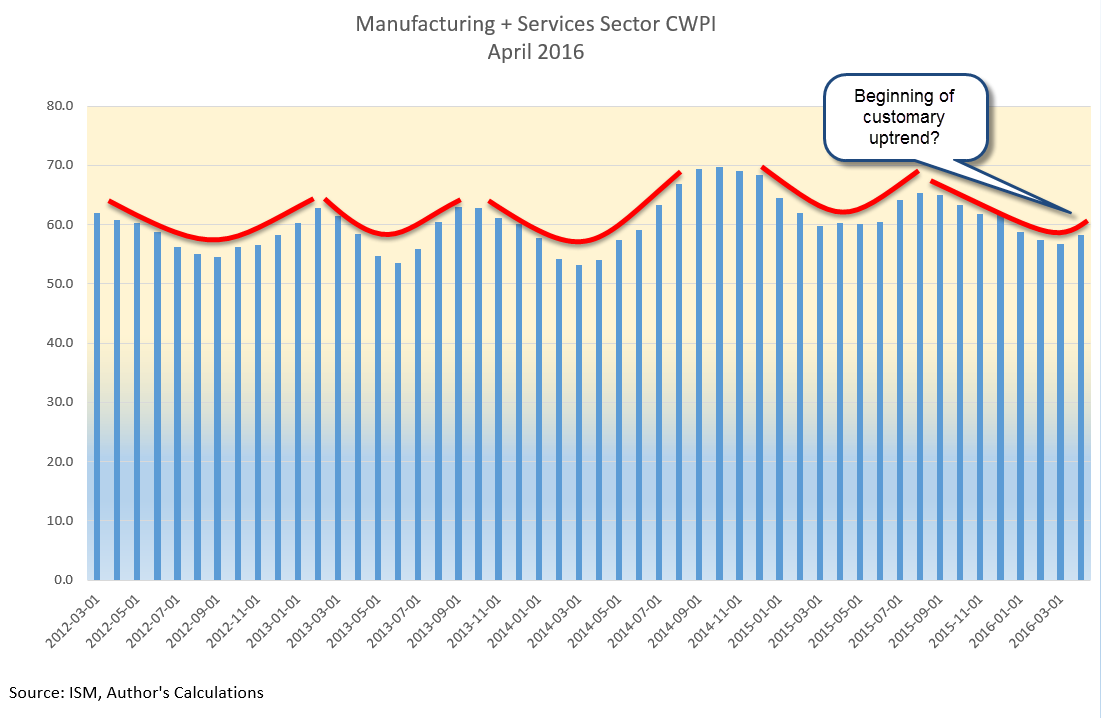
Based on ISM’s monthly survey of Purchasing Managers, the CWPI blends both service and manufacturing indexes and gives additional weight to a few components, new orders and employment. Last month we were looking for an upward bend in the CWPI, to confirm a periodic U-shaped pattern that has marked this recovery. This month’s reading did swing up from the winter’s trough and we would expect to see further improvement in the coming few months to confirm the pattern. A break in this pattern would indicate some concern about a recession in the following six months. What is a break in the pattern? An extended trough or a continued decline toward the contraction zone below 50.
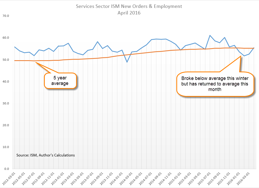
Since the services sectors constitutes most of the economy in the U.S., new orders and employment in services are key indicators of this survey. A sluggish winter pulled down a composite of the two but a turn around in April has brought this back to the five year average.
Rising oil prices have certainly been a major contributor to the surge in the prices component of the manufacturing sector survey. The BLS monthly labor report (below) indicates some labor cost increases as well. Each month the ISM publishes selected comments from their respondents. An employer in the construction industry noted a severe shortage of non-skilled labor, a phenomenon we haven’t seen since 2006, at the height of the housing bubble.
Last week the BEA released a first estimate of almost zero growth in first quarter GDP, confirming expectations. Oddly enough, the harsh winter of 2015 provided an even lower comparison point so that this year’s year over year growth, while still anemic, is almost 2%.
////////////////////////////
Employment
April’s employment data from the BLS was a bit disheartening. Earlier this week, the private payroll processor ADP reported job growth of 150,000 in April and lowered expectations for the BLS report released on Friday. While the BLS estimate of private job growth was slightly better, the loss of about 10,000 government jobs, not included in the ADP estimate, left the total estimate of jobs gained at 160,000. The loss of government jobs is slight compared to the total of 22 million employed at all levels of government but this is the fourth time in the past eight months that government employment has declined.
A three month average of job growth is still above 200,000, a benchmark of labor market health that shows job growth that is more than the average 1% population growth With a base of 145 million employees in the U.S, a similar 1% growth rate in employment would equal 1.5 million jobs gained each year, or about 125,000 per month. To account for statistical sampling errors, the churn of businesses opening and closing, labor analysts add another 25,000 to get a total of 150,000 minimum monthly job gains just to keep up with population growth. The 200,000 mark then shows real economic growth. In March 2016, the growth of the work force minus the growth in population was 1.2%, indicating continued real labor market gains.
Job growth in the core work force aged 25 -54 remains above 1%, another good sign. It last dipped briefly below 1% in October. This core group of workers buys homes, cars, and other durable goods at a faster pace than other age groups; when this powerhouse of the economy weakens, the economy suffers. In the chart below, there is an almost seven year period, from June 2007 through January 2014 where growth in this core work force group was less than 1%. From January 2008 through January 2012, growth was actually negative. The official length of the recession was 17 months, from December 2007 through June 2009. For the core work force, the heart of the economic engine, the recession lasted much longer.

In 2005, a BLS economist estimated that the core work force would number over 105 million in 2014. In December 2014, the actual number was 96 million, a shortage of 9 million workers, or almost 10% of the workforce. In April 2016, the number was almost 98 million, still far less than expectations.
Some economists and pundits mistakenly compare this recovery from a financial crisis with recoveries from economic downturns in the late 20th century. For an accurate comparison, we must look to a previous financial, not economic, crisis – the Great Depression of the 1930s.
The unemployment rate in April remained the same, but more than a half million people dropped out of the labor force, reversing a six month trend of declines. It is puzzling that more people came back into the labor force during the winter even as GDP growth slowed.
Average hourly earnings increased for the second month in a row, upping the year over year increase above 2.5%. For the past ten years, inflation-adjusted weekly earnings of production and non-supervisory workers have grown an anemic .75% per year. In the sluggish winter of January and February 2015, earnings growth notched a recovery high of 3%, leading some economists and market watchers to opine that lowered oil costs, on the decline since the summer of 2014, would finally spur worker’s pay growth in this long, subdued recovery. A year later, earnings growth is about 1.2%, a historically kind of OK level, but one which causes much head scratching among economists at the Federal Reserve. When will worker’s earnings begin to recover?
/////////////////////////
Hungry
A reader sent me a link to a CNBC article on food insecurity in the U.S. The problem is widespread and not always confined to those who fall below the poverty benchmark. Contrary to some perceptions, food insecurity is especially prevalent in rural areas, where food costs can be 50% higher than urban centers. How does the government determine who is food insecure? The USDA publishes a guide with a history of the project, the guidelines and questions. To point out the highlights, I’ll include the page links within the document. The guidelines have not been revised since this 1998 revision.
In surveys conducted by the Census Bureau, respondents are asked a series of questions. The answers help determine the degree of household food insecurity. The USDA repeatedly emphasizes that it is household, not individual, insecurity that they are measuring. The ranking scale ranges from 0, no insecurity, to 10, severe insecurity and hunger. An informative graph of the scale, the categories and characteristics is helpful.
In 1995, a low .8 percent were ranked with severe food insecurity (page 14) . To be considered food insecure, a household must rank above 2.3 (household without children), or above 2 .8 (with children) on the scale. Above that are varying degrees of insecurity and whether it is accompanied by hunger. (Table)
The USDA admits that measuring a complex issue like this one can provoke accusations that the measure either exaggerates or understates the number of households. What are they measuring? Page 6 contains a formal definition, while page 8 includes a list of conditions that the survey questions are trying to assess, and that a condition arose because of financial limitations like “toward the end of the month we don’t have enough money to eat well.”
Page 9 describes the rather ugly pattern of progressively worse food insecurity and hunger. At first a household will buy cheaper foods that fill the belly. Then the parents may cut back a little but spare the kids the sensation of hunger. In its most severe stage, all the family members go hungry in a particular day.
Those of you wanting additional information or resources can click here.
Earnings
Almost a month ago the giant aluminum manufacturer Alcoa kicked off the first quarter earnings season. 87% of companies in the SP500 have reported so far and FactSet calculates a 7% decline in earnings. They note “the first quarter marks the first time the index has seen four consecutive quarters of year-over-year declines in earnings since Q4 2008 through Q3 2009.” Automobile manufacturers have been particularly strong while the Energy, Materials and Financial sectors declined. Although the energy sector gets the headlines, there has also been a dramatic decrease in the mining sector. The BLS reports almost 200,000 mining jobs lost since September 2014.
The bottom line for long term investors: the economic data supports an allocation that favors equities. The continued decline in corporate earnings should caution an investor not to go too heavily toward the equity side of the stock/bond mix.
/////////////////
(Edited May 11th in response to a reader’s request to clarify a few points.)
