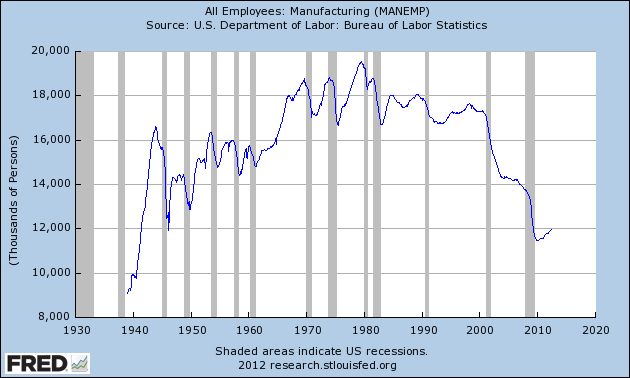
May Labor Report

May’s monthly Labor Report headlined a seasonally adjusted job gain of about 70K, less than half of the 150K expected.  The stock market response was swift and worsened as the day’s trading progressed.  By the time the dust cleared Friday evening, the broader S&P500 index had lost about 2.5%, it’s worst daily performance since Oct. 3, 2011.

On Feb. 5th, I wrote in response to the January labor report showing a gain of 234,000 jobs: “With the S&P500 index at 1344, some market pundits are whispering the 1500 mark that the S&P could take a run at this year.  Holy moly, macanoli, what a buzz about one labor report!” and later “Any job growth is good, but when I see a better improvement in the employment numbers for [the core work force aged 25 – 54], I will know that we are building a resilient economy, one that can withstand some shocks.”

Remember, the headline numbers are seasonally adjusted.  For the past three years, market watchers and economists have been warning about the seasonal adjustment factors used by the Labor Dept.  The severe job losses in the fall and winter of 2008/2009 have probably skewed the adjustment factors, leading the Labor Dept to overstate job gains during the winter and understate job gains in the spring and summer months.  The unusually warm winter of 2011/2012 further skewed job gains, pushing some normal spring hiring forward into the winter months.  That’s why I look at year over year gains in unseasonally adjusted numbers, particularly in the core work force aged 25 – 54.

Below is a graph of the percent gains of the core work force, which accounts for about 2/3 of the total work force.  The FED has conveniently saved me the trouble of running the graphs from the Labor Dept – but mine are more colorful :-).

The headline numbers of monthly job gains of more than 200K led many investors to bid up stock prices a bit more than the job gains in the core work force warranted.  Friday’s stock market reaction was probably a bit much but many investors simply bailed.  The same stock price and labor market patterns of 2010 and 2011 are emerging again this year.  Last June, I wrote about a backtest of investing based on the old “Sell In May and Go Away” mantra. While that investment strategy underperformed regular monthly investing, it has been disturbingly profitable for the past two years and looks to repeat again this year.  The disappointing labor figures only compounded the worries about the ongoing recession and financial woes in Europe, causing many to bail out of the market.

Let’s “zoom out” on the core work force, looking at the past year and a half.  There is a definite positive trend in place.

Let’s fly up like little birdies and look at the core work force for the past 12 years to see this recent upward trend in perspective.

Let’s look at the larger work force, those aged 25+, which accounts for 88% of employment in this country.  The year over year gains have leveled off at about 1.6% in the past few months.

Looking back the past 12 years, we see that this gain is moderately healthy.  The housing bubble produced employment gains of over 2% – gains concentrated in construction.

Now let’s look back to the “roaring nineties,” before China joined the WTO in 2001, leading to a loss of 4 million manufacturing jobs in this country.  The country enjoyed a tech boom in that decade, eventually leading to the dot-com bubble as we approached the millennium mark.

The job gains these past 6 – 8 months are respectable, averaging what they were in the nineties; core work force numbers are still growing.  The job losses of this past recession were historic.  Most of the 8.13 million jobs lost happened before Obama took office and the job losses were staggering when compared to other recessions.  The 1982-84 recession, for comparison, suffered total job losses of 2.84 million, about a third of the job losses of this past recession. Below is a graph of the year over change in employment levels since 1948.  This past recession makes all the past recessions look like small wrinkles.  Job losses of this size severely weakened the structure of our economy.

The employment growth of the past few years has been respectable, even more so given the deep hole our economy is climbing out of.  We are a people who have become accustomed to instant gratification.  We want change and we want it now, dammit.  The political and media machines of both parties know this and play to it.  George Bush played to it in the 2000 campaign, promising to bring the parties closer together, only to drive them further apart.  Obama played to it in his 2008 run for the White House, promising to usher in a new era of honest and accessible government, of community of government and the middle classes, where everyone enjoyed a more even playing field.  Romney’s run for the Presidency will highlight his business experience, promising unspecified growth policies.  What all of these people and their advisors know is that the American public is a sucker for change, reaching for the brass ring of change as we whirl around on the political merry-go-round.  We can be easily lied to because we trust our guts, not our brains.  If we trust someone or agree with their ideology, we will believe almost any data they throw at us.  Most of us don’t check the data.  We’re too busy for that or we don’t know how to check the data.  It all becomes a blur of he said this and the other guy said that and we get confused and vote with our guts.  The parties play to our prejudices.  Think you don’t have any?  Think again.

This election season we will hear a lot of claims, accusations and refutations.  Moderators of the upcoming Presidential debates rarely challenge a candidate with data.  The moderators ask policy questions; the candidate responds with mostly rehearsed answers.  Then on to the next question.  It is up to us to do our homework but most of us won’t.  Too many of us may be like the caller to a talk show recently.  When confronted with government statistics that refuted the caller’s opinion, he responded “That can’t be right” and countered that the government data is wrong.  We do love our opinions and that is the number one prejudice we all share. 

Job Openings – March

A couple of weeks ago, the Bureau of Labor Statistics (BLS) issued their March JOLTS (Job Opening and Labor Turnover Survey) report showing a continuing increase in job openings. Below is a Federal Reserve historical graph incorporating the latest March data.

Graphing the quarterly data evens out the monthly fluctuations and shows the upward trend.

While the trend is upward, we have come from a deep trough and we still have a long way to go to get to a healthy job market.  The number of job openings is about the same as in 2004 but the population has grown by 20 million since 2004.

The stock market is inextricably chained to the labor market.  In the graph below, we can see the similarity in trends between the S&P500 and the job openings.

The stock market attempts to anticipate the health of the job market.  In the spring of 2006, job openings halted their decline then rose and the market resumed upward in anticipation of a continued climb in job openings.  As job openings reversed and resumed their decline in 2007, it was a harbinger of the coming economic cliff.

Obama’s Fiscal Prudence

Two months ago I compared federal debt by Presidential administration.  Obama’s administration leads the pack.  This would lead one to assume that President Obama is a big spender.  He’s not.  In a WSJ MarketWatch article (I don’t think you need a subscription to see this article), Rex Nutting examined the historical data of federal spending from the Office of Management and Budget (OMB) and Congressional Budget Office (CBO). The data shows that the big spenders were Reagan and G.W. Bush.  What has plagued the Obama administration is a lack of revenue, particularly income tax revenue, because of the recession. 

In a balanced approach, Nutting gives proper due to the role Republicans in Congress have played, checking Congressional spending approvals.

Regardless of the data, we can expect that Republican pundits and political ads will continue to paint the Obama administration as the big daddy of  “tax and spend” Democratic Presidents.  To partisans of either party, when facts don’t conform to their ideology or preconceived notions, there must be something wrong with the facts.  Both parties rely on the fact that many voters vote with their guts, not their heads.

JPMorgan Hedge Update

This weekend the Wall St. Journal had more details about the large gamble/hedge that JPMorgan (JPM) has taken in a derivative index called IG9 that tracks the overall health of corporate bonds. The full value of JPM’s position is about $100 billion or about 78% of the firm’s entire market cap.  Other hedge funds are waiting for JPM to start unwinding their position, aiming to profit at JPM’s expense.  Some estimates are that JPM’s losses could run as high as $6 – $7 billion.

In my blog yesterday, I stated that JPM had about 150 regulators working on site, supposedly supervising JPM’s operations to ensure the public safety.  The Office of the Comptroller of the Currency (OCC) revealed that they had 60 regulators who did nothing but monitor JPM’s trades and were aware of these highly aggressive trades.  As of late April, those regulators evidently saw nothing unsafe in JPM’s trading positions.  Do those regulators still have their jobs?  Probably.

The Federal Reserve and the FDIC also have onsite regulators who monitor JPM’s activities.  So many regulators and no cause for alarm before this blew up?  The Senate Banking Committee has started an investigation into this debacle.  In the political merry-go-round, we can expect more hearings, more regulations, more regulators, more cost to the taxpayer and less safety, less effectiveness from our government.

JPMorgan Hedge

The recent scandal involving JP Morgan’s hedging loss of $2.3 billion (and is growing by $100 to $150 million per day),  has refocused attention on the Volcker rule, a key provision of the 2010 Dodd-Frank bill that initiated a new set of regulatory restrictions on the banking industry.  At more than 800 pages, the law spawns millions of new regulations, many of which won’t be finalized until July of this year, when the Federal Reserve is to start supervising the banking industry to bring them into full compliance with all the regulations by 2014.  The Volcker rule was ostensibly designed to curb the gambling type of hedging that brought the banking industry and the economy to its knees in 2008.  The JPMorgan fiasco has ignited a debate among politicians and pundits, bankers and regulators as to whether this trading strategy would have fallen under the purview of the Volcker rule.

As always, the devil is in the details.  Section 619 of a draft version of the bill stated that banks might initiate hedging trades “in connection with and related to individual positions.”  The banking lobby wanted to insert two small words “or aggregated” so that the final version of the bill would read “in connection with and related to individual or aggregated positions.”  They may have argued that banking and/or investment firms do aggregate a position over time through a series of trades, a common practice to avoid “moving the market” with a single large trade.  This, in fact, is the final language of the Dodd-Frank law (pg. 249)
Some argue that these two simple words effectively negates the effect of the Volcker rule because it allows an investment bank to engage in any hedging strategy as a tool to ameliorate the risk of any portion of the banks portfolio of investments.  The entire bank’s portfolio is, after all, an aggregated position in the market.  In effect, the language of the law allows investment banks to engage in the same kind of risky bets that the Dodd-Frank law is supposed to curtail. Jamie Dimon, the Chairman and CEO of JP Morgan, insists that the failed hedge would not have fallen under the Volcker rule.  There are about 150 bank regulators who work in the home offices of JP Morgan, constantly monitoring the operations of the largest bank in the U.S.  Either those regulators did not know of the hedge or did not understand the risks involved.  The trades were initiated in London so it might be feasible that the regulators did not know of the trades – except that both Bloomberg and the Wall St. Journal had called attention to the risky trades in April and Jamie Dimon had dismissed any concerns about the risks.  This example should refute the arguments of those who champion ever more regulation and more regulators of all business activity as the solution to keep the public safe.  The housing, securities, banking and insurance industries are all heavily regulated yet the confluence of poor risk management in these industries led to the debacle of 2008.  Regulations too often morph into a job programs for regulators and lawyers without achieving the desired goal of protecting the public from grievous harm.

The voters elect representatives to go to Washington to write competent laws.  Instead, the voters get poorly written laws written by a mish-mosh of inexperienced lawyers, industry lobbyists and passionate but impractical partisans.

JPMorgan gives the impression that Bruno Iksil, the London trader responsible for these aggressive trades, was a rogue trader  –  that the bank’s risk management team should have supervised him more closely.  What JPMorgan doesn’t readily disclose is that Mr. Iksil made the bank almost a half billion in profit just six months ago using equally aggressive trades.  Why supervise someone who apparently has the golden touch?

Where does JPMorgan get the money to engage in this risky gambling?  Your money.  JPMorgan had about $1.3 trillion in deposits from small depositors and large customers on its books but only about $700 billion in loans, leaving it with a lot of extra money, insured by the taxpayer, to gamble with.  They lost.  For now, the stockholders are the ones who have paid the price.  The stock has lost 24% of its value since the trading loss was confirmed by Jaime Dimon.  The amount of money lost so far is less than 1% of JPMorgan’s assets.  But it raises the question raised so alarmingly just a few years ago:  WTF????!!!  When I put my money in a bank, I expect them to keep it safe.  I don’t want the bank to take my money and gamble it.

Employment – April 2012

This past friday, the Bureau of Labor Statistics (BLS) released their monthly assessment of labor conditions in this country and the headline figure was a disappointment.  The survey of businesses showed a seasonally adjusted 115,000 net jobs added in April, below the 150,000 expected by economists.  The unemployment rate dropped to 8.1% as almost 350,000 people simply dropped out.  Some of this was due no doubt to early retirees but the Federal Reserve estimates that retirees account for about 25% of the drop out rate.

As I have done in the past, I’ll take a deeper look at some numbers behind the headline numbers.  The core work force of people aged 25 – 54 continues to show gains but the chart below shows the comparative weakness of this segment of the work force.  This age demographic is the “middle”, when people accumulate both earning and buying power and form the primary demand of a consumer economy like the U.S.

The year over year job gains continue to climb upwards.

Late last summer, the larger work force of those aged 25 and older began showing year over year job gains several months before the core work force, revealing an underlying structural weakness of both the workforce and the recovery.

Some of the workforce is graying, moving from the core 25 – 54 age demographic into the older 55+ demographic, where workers are trying to save for retirement or taking jobs because their social security and retirement income is not adequate.  With a natural propensity for saving, older workers do not create the needed demand for the economy to grow strongly.  In the chart below is the year over year job gains for those aged 55+ and this is a key metric for it shows which age group have enjoyed the bulk of job gains in this recovery.

Throughout this recession and the massive loss of jobs, older workers have continued to show gains.  Strengths in the labor force statistics have been in retail, business services and health care.  Experienced older workers can be attractive to employers offering business services.  In retail and health care, it may be that older workers have less family responsibility, show a greater reliability and are thus more attractive to employers who enjoy a “buyers” market.  This past month was the first month that gains slowed while the gains of the core work force continued to climb.

As I have noted before, the demographic bell curve of the past three decades is coming to a close.  The participation rate, the number of workers as a percent of the working age population, has declined to 1981 levels, nearing the closing of an upswell brought on as the post WW2 boomer generation entered their prime working years.

The 1980 Census shows that, there were 25.5 million people 65 and older in 1980 (11.3% of the total population), an increase of 5 million from the 20.0 million count (12.3% of total) in 1970.  While the numbers climbed, the percentage stayed stable in that 10 year period.  Those aged 50 – 64 numbered 33.4 million, or 14.7% of the population.  In 1970, it was 29.7 million or 14.6%.  Again, the numbers were stable.  The median age of the U.S. population was 30.

Fast forward to the 2010 census and the percentage of those aged 65+ is still relatively stable at 40.3 million or 13.0% of the population.  Despite all the medical advances of the past 30 years and the trillions of Medicare dollars spent on the elderly, the percentage of older people is still about the same as it was in 1970 and 1980.

But the juggernaut of Boomers is waiting in the wings.  The 2010 Census shows that those aged 50 – 64, the “meat” of the Boomer generation, numbered 58.8 million, or 19% of the total population.  In thirty years, they have increased from 15% to 19% of the population.  The median age of the population is now 37 years, an increase of seven years.

The 25 – 54 age group funds the social contract that provides health insurance and retirement income for older Americans.   For this core work force, the increasing job gains of the past four months have been a welcome sign but, as the chart above shows, this core has suffered huge job losses in the past 3+ years and are climbing out of a deep hole.  I hope that April is the beginning of new trend, where the job gains increasingly go to the core younger segment of the work force and not to older Americans.  Only then will we see sustainable economic growth.

Unemployment and Recession

As the political machine of both parties gears up for the Presidential election less than seven months away, we will hear a lot of rhetoric about the unemployment rate.  Depending on the talk show, TV program or publication we will hear many different unemployment figures and the Bureau of Labor Statistics (BLS) does publish several different figures each month.  The headline number published each month is the U3 rate – those people who are not employed but have looked for work in the past four weeks.  Other rates include discouraged unemployed (U4), marginally attached workers (U5) and those who are working part time because they could not find a full time job (U6).  Wikipedia has a pretty good overview on the rates in this country and countries around the world.  The BLS has a detailed explanation of the various categories of unemployment with concrete examples of who they put into each category.  Below is a chart of the U3 rate and the U6 rate.

Some will argue that a particular unemployment rate is the “true” rate.  On a conservative talk show a few weeks ago, I heard a caller quote a “true” employment rate of close to 11%.  Neither I, the host of the show or the caller knew where the caller had come up with that figure.  In response to questions from the host of the show, the caller showed that he did not know the various unemployment rates.  Like many voters, this caller simply heard or read about this “true” figure.

In the ongoing political debate, Democratic leaning voters will use the lower U3 rate, currently 8.2%.  Republican leaning voters may use the U6 rate, the broadest measure of  unemployment, currently 14.5%.  Here’s someone who figures the “true” unemployment rate at 36%.  We tend to believe what we want to believe and our mental squirrels are good at finding the facts that fit our beliefs. 

This past month several economic reports, including the monthly unemployment report, indicated that the economy may once again be stalling – as it did in 2010 and 2011.  The recent rise in Spanish government bond yields shows yet another sign of an underlying lack of confidence in the ability of the European market to avoid slipping into a deeper recession.  In the past six months, China’s growth has slowed as they try to transition from an export economy to a consumer economy.  The Bush tax cuts and the debt ceiling are due to expire at the end of the year.  We can expect more political turmoil as that deadline and the election approach.  Weakening economic data in the coming months could exacerbate fears that the U.S. will fall back into recession, escalating the Republican rhetoric that their party needs to be given the presidential reins to turn the economy around.

Readers of this blog know that I have been especially skeptical of seasonal adjustments to labor figures in the past few years, preferring to use the non seasonally adjusted figures from the monthly Household Survey that the BLS uses to collect employment data.  But for the chart I’m about to show you, there is not much difference between the seasonally adjusted figures and the non seasonally adjusted figures.  The chart compares the percent change in the data and the seasonally adjusted figures are easy for you to get in the future.

If we begin to hear the economic and political pundits raise worries of recession in the coming months, the data in the chart below is a really reliable predictor of recessions.  There was a slight delay in a minor recession in the 1950s and two false signals in 1986 and 1995 when the economy faltered. Here’s the key:  when the percentage change in the unemployment rate from a year ago goes above zero, it is highly likely that we have either just started a recession or will start one shortly.

In the coming months you can pull up this same chart by going here at the Federal Reserve  or entering “Fred Unemployment” in Google search bar and selecting the top pick.  The Federal Reserve does all the work for you.  Click “Edit Graph” just below the graph.  On the next screen, change the “Observation Date Range” below the graph to start with a more recent year to make the chart easier to read.  Go down to the “(a)” section and select “Change from Year Ago, Percent”.  Below that, click “Redraw Graph”.  Now you too can know the future.

March Labor Repot

This past Friday the Bureau of Labor Statistics (BLS) released the monthly labor report, showing job gains of 120K, far below the 200K expected.  The unemployment rate dropped 1/10th percent to 8.2% as over 100K people quit looking for work.  Contrary to a popular myth, when someone runs out of unemployment benefits they do not drop out of the workforce as long as they are continuing to look for work.

Although this report was a disappointment, the economy has added 247K jobs per month over the past quarter.  As I have done the past few months, I will look beyond the seasonally adjusted headline numbers to the unseasonally adjusted year-on-year job gains of the core work force.  These core figures tempered my enthusiasm in January and February and, as you will see, temper my disappointment in March’s headline numbers.

The core work force, men and women aged 25 – 54 years old, continues to show accelerating job gains.  In February, the year over year (y-o-y) gain was 350K.  In March, the gain was 374K, a modest gain but still gaining. A decline in that gain would be cause for worry.

This core work force metric is a powerful leading indicator of the health of the economy, as I will show below in this monthly chart of y-o-y job gains or losses.  January 2008 was the first month that year over year gains slipped below 0 and proved to be the canary in the coal mine that the economy was weakening.

Let’s expand the picture as I have done the past few months, looking at the larger pool of workers aged 25+. The March y-o-y gain did decline somewhat from 2079K to 2048K.  While job gains are strong, the acceleration has reversed.  Did the record breaking warm winter weather push spring hiring forward into January and February?  Could be. Does the March 34K loss in retail jobs largely account for this slight dip in job gains?  Could be.

There are several long term trends that are cautionary, revealing some structural weaknesses in the economy and the recovery.  The number of people who want work but have not looked in the past four weeks, referred to as discouraged workers, was  essentially unchanged. The number of long term unemployed was unchanged.  The average work week fell .1 hours and the income gains of workers shows an annual increase of only 2.1%.  However, the number of people working part time because they could not find a full time job fell almost 10%, an encouraging sign.

In short, this is a mixed report but one that I see, on balance, as more encouraging than discouraging.

Health Care Puzzle

Here is a WSJ guest opinion piece (article was accessible without an online subscription) by a finance professor with the Cato Institute who summarizes the many failings of the health care industry.  They include what amounts to racketeering by the AMA and Congress, an insurance system geared to raise costs in the health care industry, the lack of consistency in the tax treatment of insurance policies, and the lack of individual choice or portability – to name but a few.

Health care is one area where libertarians meet liberals in some agreement.  

Here is a 2007 thought piece by Brad DeLong on some rather simple solutions to the problem of catastrophic health care costs.  Can you imagine a world in which a person who makes $50K a year can rest secure that no matter what illness or accident happens to them, their out of pocket expense will be no more than $10K for that year?

Many years ago, I got a piece of metal in my eye and scored up my eyeball trying to get it out.  It was evening and my doctor’s office was closed so I went to the emergency room at a nearby hospital.  I had catastrophic health insurance with one of the largest insurance carriers in the country, but I had a deductible on the policy that wasn’t meant to cover the rather small cost of an ER visit for an eye injury. 

With my hand covering my painful eye, I presented my ID and insurance card to the ER admitting clerk.  “We don’t accept that insurance,” she said. 
“I’m not expecting this insurance policy to cover the cost of the ER visit,” I replied, “because of the deductible.” 
“No, we don’t have an agreement with this insurance company,” she replied. 
“What do you accept?” I asked.  She mentioned Blue Cross and one other. 
“Well, how do I get care?” I asked. 
“You pay [$560 in today’s dollars] and we will have a doctor see you as soon as possible,” she said.
“Do I get a discount for paying cash?” I asked.
“No, there are no discounts,” she said.
Having nowhere else to go for after hours care, I said “Ok, where do I sign?” 
“You have to pay first,” she said.
“What if it doesn’t cost this much?” I asked.
“The hospital will mail you a refund,” she said.
“What if it costs more?” I asked.
“The hospital will send you a bill,” she said.
“Just out of curiosity,” I asked, “what if I had a Blue Cross policy with a deductible like the one I have?”
“Then the hospital would bill you, she said.
“Would it be the same price?” I asked.
“It would be at the price set by the insurance company and the hospital,” she answered.

The care was excellent and done quickly with little waiting. I was out of there in less than an hour.  The hospital did bill me for a small amount in addition to what I had already paid. 

Over twenty years later, does a similar story still play out in emergency rooms around this country?

Piggy Banks

The Bureau of Economic Analysis (BEA) keeps track of our “piggy banks” in a metric called the Personal Savings Rate (PSR).  This is a measure of disposable income less spending on consumption items.  The rate is a percentage of savings to disposable income.  Below is a graph of the past 60 years, showing the steady decline in personal savings that began in the 1980s. (Source)

The stock market has cheered the recent rise in consumer confidence and spending but – a word of caution.  As the graph shows, the PSR was at 4.7% in December 2011.  This past Friday, the BEA reported that the PSR had declined to 4.3% in January and declined again in February to 3.7%.  In real inflation-adjusted dollars, personal incomes declined slightly at the beginning of this year, making it doubtful that the recent rise in consumer spending can be sustained.