Consumer Spending

OK, you’ve just finished your winter book project, War and Peace, and now you’d like something not quite as long. How about a 100 year history of consumer spending? This 69 (PDF) page report has lots of easily understood graphs and brief summaries of the economic household picture at selected periods during the last century.

Most revealing are the 100 year trend graphs near the end of the report. In chart 40 on (PDF) page 64,

we can see the century long rise of consumer spending in real 1901 dollars despite the fact that food, clothing and housing expenses take up far less of our income today. What are we spending our money on? Chart 43 on (PDF) page 67 shows the share of income that the average household spends on non-necessities, from a low of less than 25% in 1900 to 50% today.

While the percentage of income for most categories of spending have changed, there is one expense that has changed little during the past 100 years: entertainment. Those expenses have decreased only slighty, taking up just over 5% of the average household income.

The last page of the report summarizes the century’s changes in discretionary spending: ” households throughout the country have purchased computers, televisions, iPods,DVD players, vacation homes, boats, planes, and recreational vehicles. They have sent their children to summer camps; contributed to retirement and pension funds; attended theatrical and musical performances and sporting events; joined health, country, and yacht clubs; and taken domestic and foreign vacation excursions. These items, which were unknown and undreamt of a century ago, are tangible proof that U.S. households today enjoy a higher standard of living.”

It is doubtful that we will enjoy an increase in discretionary spending as dramatic as the last 100 years. Chart 43 on (PDF) page 67 shows the leveling that has happened over the past 25 years.

A comparison of a century’s worth of income data shown in Table 27, (PDF) page 56, reveals that there has been dramatic changes in income for the working person. In 1935, the average manufacturing wage was 58 cents an hour, or $7.62 in 2002 dollars. Real manufacturing wages have doubled in 80 years. Real construction wages ($.49 in 1935 = $6.39 in 2002) have tripled in that same time. In the finance and insurance industry, wages have seen the smallest increase in real terms but even those have swelled by 60%. However, after adjusting the wage data in Table 27 for inflation reveals that real wages have decreased in the past 30 years. The boom happened a long time ago.

Accompanied by that dramatic rise in real discretionary income has come the explosive rise of advertising dollars aimed at enticing us to part with that extra income on new cars, electronics, service contracts for cell phones and internet and cable service that we simply can’t do without. In short, the average American household has been sold the idea that these non-essential items are, in fact, necessary.

As noted earlier, the growth in discretionary income as a percentage of total income has slowed, leveling at about 50%. Wages have declined for more than a generation. Until there is some increase in real wages or the invention of a Star Trek like Replicator machine, the proportion of discretionary income will probably remain stagnant and households will continue to tighten their belts.

Bank Tax

The Obama administration is proposing a tax on the largest banks, based on the amount of leverage they employ. The estimated annual amount of the tax is $10 billion a year. Goldman Sachs estimates that the largest banks made $250 billion last year before taxes and loan-loss provisions. Based on those numbers, the tax amounts to a manageable 2/10th of 1 percent.

Some banks have protested. The 2008 TARP law did require the White House to come up with some system to pay for any losses under the program but a government estimate of $120 billion in losses consists largely of losses in the automotive industry. Jamie Dimon, the CEO of J.P.Morgan says that banks shouldn’t have to pay for another industry’s losses.

That does seem unfair but Dimon overlooks the long term liability of credit default swaps that the government has assumed in the AIG bailout. The Depository Trust and Clearing Corporation estimates the net value of these swaps at $82B. Also overlooked is the full price that AIG paid banks like Goldman Sachs and Societe General on credit default swaps (CDS) totalling $62.1B. In the late part of 2008, many of these swap contracts were selling for as little as 25 cents on the dollar. Let’s conservatively estimate that AIG paid these banks $30B above market price.

Additionally, the Federal Reserve bought $1.45T in Fannie Mae and Freddie Mac mortgage bonds, paying full price for bonds that had fallen 30 – 40% in value. Among these investors were the large investment banks, who took the money from the Fed and re-invested it in Treasury bonds. I have not been able to find estimates of this gift from the U.S. taxpayer but it must be at least $100B for the larger banks as a whole.

In short, the banks will be repaying taxpayers far less than they will have received from taxpayers.

Investment Fees

Let’s put aside our rosy glasses, put on our fine print glasses and look at some percentages regarding investment fees.

I will compare two bond funds holding the same type of bonds. Fund A, an index fund, charges .5% while Fund B, an actively managed fund, charges 1.5% in management and other expenses. The manager or salesperson for Fund B may tell a prospective client that the returns for their fund are superior and will make up for the 1% difference in fees. Many brokers are of the Lake Wobegon mentality, believing that the products they sell are above average.

1% sounds like a small amount so this might seem reasonable to you if you are wearing your rosy glasses. But let’s look at some hard data. Let’s say that the index Fund A averages a 5% return before expenses. The more actively managed fund B would have to earn 6% before fees just to break even with the return on Fund A. Again, that 1% sounds small but what it means is that Fund B has to make a return that is 20% greater than the index. Very few funds are able to do that.

Let’s look at those fees again as a percentage of the return, not the total dollars invested. On a 5% return, index Fund A’s fee of .5% is 10% of the return. Even if Fund B can generate a 6% return, it’s 1.5% fee is a fat 25% of the return, more than what many hedge funds charge.

Let’s say that Fund B has generated these higher returns in the past. How does it do that? Often, by taking more risk than the index fund A. You can check an assessment of a fund’s return vs. risk at any number of stock research sites. Yahoo’s finance site has some good assessment tools. Enter the fund’s symbol and in the resulting summary page, click on “Risk” in the left column. You will be taken to a page which shows 3 year, 5 year and 10 year risk and return ratios.

Alpha measures the amount of return for the degree of risk involved. The average is 0. Less than 0 means that the fund does not get a return commensurate with the risks it takes. More than 0 means that the fund gets a better than average return for the risks it takes. You will be able to compare the fund with other funds in its category.

There are so many index funds and low cost index ETFs in the market for an investor to choose from. If you are willing to take more risk in bonds, for example, you can probably find an index product that invests in a riskier class of bonds. Over the long run, expense fees do matter. The lower the return, the more they matter. Over 10 years, that additional 1% in fees will cost you $1400 on a $10,000 investment in a fund averaging a 5% return.

In short, play the percentages.

Tidbits

A few tidbits of info sitting around on my desk:

WSJ tidbit 12/31/09 – Families USA reports that Cobra family coverage averages 83% of the average unemployment insurance check, up from 61% in 2001. The stimulus bill provides a subsidy to unemployed individuals averaging $325 a month, $715 for families.

According to a Congressional Research report – after dropping dramatically from 1950 to 1980, death from diabetes has increased to above the levels of 1950, a 33% increase from mortality rates in 1980. Unintentional injuries, including automobile accidents, has dropped by half from 1950. Cancer rates are about the same as 1950. Death from heart disease are at 40% of 1950 levels. (pg 4)

Many of us do not like government interference and mandates, yet we see the results of several decades of seat belt and product safety laws.
Despite all the money invested in cancer research over the past fifty years, the rates have not improved. Of course, more people are living longer, naturally driving up the cancer incidence rate, which disproportionately afflicts older people.
Despite the dislike that some people have for “Big Pharma”, it is thanks to the pharmaceutical industry that heart disease has become a manageable problem for many older Americans.
While many like to blame the soft drink and fast food industry for the increase in diabetes, no one is forcing anyone to drink and eat sugar laden foods. Of course, it is easier to blame the big food companies than take personal responsibility for one’s food choices.

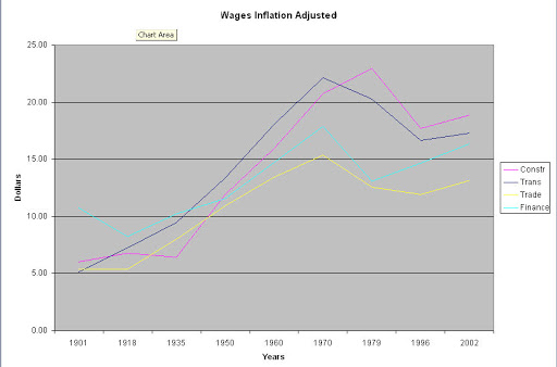
On Oct. 16, 2009, the Bureau of Labor Statistics reported that the median (not average) weekly earnings of the nation’s 100.1 million full-time wage and salary workers was $738 in the third quarter of 2009. This was 2.5 percent higher than a year earlier. The Consumer Price Index for All Urban Consumers (CPI-U) fell by 1.6 percent over the same period.

Social Security income accounts for about 40% of retirement income.

A retired person spends, on average, about 80% of what they spent before retirement.

WSJ tidbit 12/28/09 – The Institute for Justice cites that 50 years ago, 3% of American workers were regulated or licensed by government agencies. It is 35% today.

Food, energy, housing and health care consume the same share of American spending today (55%) that they did in 1960 (53%).

Revolving credit, primarily credit cards, declined at a steep 18.5% annual rate last year.

Smaller businesses are a dying breed in the U.S. Companies with less than 250 workers comprise 70% of the private-sector work force in the European Union, compared with 49% in the U.S., according to EU figures.

In 2009, 804 companies cut dividends, up sharply from 110 two years earlier and the highest level since S&P started to collect such data in 1955. Conversely, the number of dividend increases dropped 36.4% to a record low.

More than 6% of commercial-mortgage borrowers in the U.S. have fallen behind in their payments, a sign of potential troubles ahead as nearly $40 billion of commercial-mortgage-backed bonds come due this year. Moody’s reported a 4.9% actual delinquency rate. It is projected to go above 8% by the end of 2010.

The Mortgage Bankers Association reported that almost 6.2% of mortgages in Arizona and 9.4% of mortgages in Nevada were in foreclosure by the end of the third quarter of 2009. In California, 5.8% of mortgages are in foreclosure and personal bankruptcy filings rose almost 60% last year.
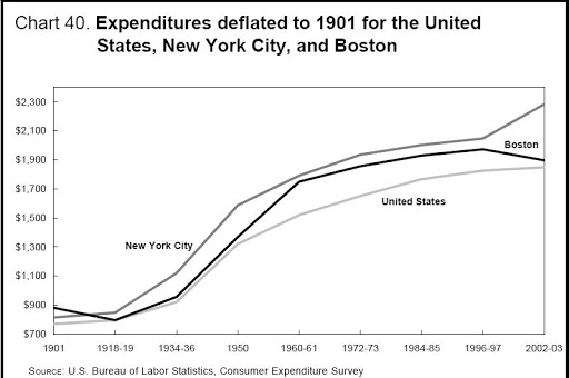
Forecast: Clearing

In forecasting future company profits, there are two Ouija boards and each board comes up with different results.

On the first Ouija board, equity analysts put their hands on the triangular platen and divine the future profits of each company they cover. All the results are then added up for a total “bottom up” forecast for earnings of the S&P 500. For 2010, the analyst Ouija board spelled out $77.54 in profits, a 30% increase over 2009.

On the other Ouija board, a bunch of economists put their fingers on the platen and foretell future profits. This is termed a “top-down” forecast. The economist board says $72.52. This small $5 difference in the two forecasts – a year ago the difference was $40 – is a good indicator of greater clarity looking forward, and a more stable market.

The Dump

Recycling has become popular in China.

In 1999, Chinese state owned banks dumped $200B (U.S.) of bad loans made during the 1990s into Asset Mgmt Companies (AMC) or “bad banks”, banks set up to hold “toxic assets” and non-performing loans. Six years later, they dumped another $170B into these AMCs. Many of these loans are carried on the books at face value, far above their true market value. When the loans came due this year, most were rolled over for another ten years. Here is a brief summary from the Gerson Lehman Group.

Large private companies have been accused of managing, or massaging, earnings in order to sustain a higher stock price for the company’s stock. Tempting as this practice is for private executives, public officials are under even greater pressure to put their best foot forward by manipulating asset values. China’s strong, rapid move to urbanize is bound to incur casualties along the way. The commercial real estate market is beset with vacancies, while newly constructed factories stand ready to supply a world whose demands have slowed. When state owned banks defer the recognition of bad real estate loans, it becomes difficult to honestly evaluate their financial status.

FXI is an ETF that tracks China’s top banks. A word of caution.

Housing Boom

An August 2005 NY Times article reported Robert Shiller’s – the Shiller in the Case-Shiller housing index – clarion call that the housing boom would soon bust. Since we are now in the future, we know how that prediction turned out. What interested me was Shiller’s brief 400 year history of housing prices.

The Commons

Several hundreds of years before Adam Smith wrote his seminal work “The Wealth of Nations” (full text ), England wrestled with the Problem of the Commons, which is the title of a book by Gordon Marshall.

“The use of commons (publicly available land on which farmers graze their cattle) becomes a problem when one such farmer reasons that he or she can expand his or her herd since this small addition to the total stock will contribute little harm to the available pasture. However, if other farmers reason likewise, these incremental additions to the stock using the land lead to overgrazing and thus the destruction of the resource itself. In other words, if each individual in this situation rationally pursues his or her own short-term interest while disregarding others similarly pursuing theirs, then the long-run consequence is that everyone loses their share in the collective resource.” (GORDON MARSHALL. “Problem of the Commons.” A Dictionary of Sociology. 1998. Encyclopedia.com. 23 Sep. 2009)

Communism and other forms of collectivism try to solve this thorny problem by eliminating one of the sources of the conflict, private property. In an ideal form, free market capitalism denies the existence of the commons, thereby eliminating the other source of the problem.

Between those two extremes lie various attempts to form societies to manage, not solve, this enduring struggle, allowing the two competing interests of private and public to wrestle.

The Labor Force


Here’s a time series graph of the Colorado civilian labor force, which includes everyone over 16 not institutionalized or in the service and who is either working at least a few hours or looking for work. If a person is retired, they are not in labor force. Nor is a person who has given up looking for work and no longer bothers to register with the state unemployment office after running out of benefits.

I have added some approximate numbers in the graph to highlight the employment – or rather lack of it – problem. The difference between the upper green line and lower green line is about 100,000 decrease in the number of people counted in the labor force in the last 15 months or so. Despite that decrease, the graph shows an increase of 300,000 in the labor force over the past decade. Until the latter part of 2008, Colorado enjoyed a low unemployment rate, meaning that most of that net 300,000 growth was new jobs being created. So, what’s the problem? New jobs are good, right?

This past week came the announcement that Colorado’s estimated population had crossed the 5 million mark, meaning that, in the past decade, the population has grown by approximately 700,000. Colorado has a relatively younger population. In a healthy economy, the ratio of those in its workforce to those not in the workforce is about 55 to 45, higher than the national average of 51 to 49. As a comparison, Florida has an older population and its ratio has averaged 49 to 51 over the decade.

With the population increase scaled to this ratio and overlayed on the graph (blue line), we can see that the growth in the labor force matched the growth in the population until the past year or so. With an total estimated population of 5 million, a healthier labor force would total about 2.75 million. We are about 80,000 short.

Future Fun Facts

In 1950, life expectancy at birth was about 67 years. In 2003, it was 80 years. That dramatic increase in life expectancy over a span of 50 years is less dramatic when we look at a comparison of life expectancy for a 65 year old. During that same 50 years, it had gone up only 3 years, from almost 78 years of age to 81 years of age.

Although less impressive in years, those three extra years of life equals 36 additional months of collecting Social Security and that’s one problem: old people getting older and continuing to collect Social Security.

The way to fix that problem is to have more workers contributing to Social Security. That’s the second problem. Not enough young people and we can blame parents for that. People are just having fewer kids, leaving fewer workers to pay for the old people continuing to collect Social Security.

How to fix that problem? Immigration. Relaxed immigration standards will allow more workers to come into the country and contribute to Social Security. That’s the third problem. Immigrants may require more social services than what they contribute in taxes and Social Security and eventually those immigrants will get old and start collecting Social Security themselves.

A 2006 Congressional Research Service (CRS) report projected that, by 2075, an average life expectancy for a 65 year old to be about 86.5 years of age. That’s an additional 66 months of Social Security payments.

The solutions to the relentless march of these demographic numbers are politically unpalatable so we can expect that our elected representatives will do everything else before finally adopting them.

First, expect retirement ages to increase. Older workers will not like that. Second, expect the Social Security contribution rate to increase. Workers of all ages will not like that. To avoid their anger, politicians will “soak the rich” by increasing the amount of income that is subject to Social Security tax. Those in the upper income brackets get far less in return for what they contribute and they can expect to pay more and get less. Third, expect Social Security payments to decrease or to increase at a slower rate. Retired people vote and they will not like that.

These are the fun facts of the future. Maybe the “Future Fairy” will take away these problems and leave us a quarter.