Money Flows

Since the election, the SP500 index has risen about 10%. A broad bond composite has lost about 3%. Investors are clearly willing to take on a bit more risk. Prices are generally a good indicator of trend, but let’s take a few minutes to look at the flows of money into various investment products to understand the shifts in sentiment and confidence.  In the first two weeks of February the flows of money have been staggering.

The Investment Company Institute (ICI) tracks (Stats) the money flows into long-term equity and bond mutual funds as well as hybrid funds that contain both stocks and bonds (Target date funds, for example).  ICI also includes data on ETFs that can be bought and sold like stocks during the trading day. To avoid confusion, I’ll use “products” to describe combined data of mutual funds and ETFs. These long-term products reflect investors’ broader outlook on the market and economy rather than a short-term trading opportunity. For most of 2016, investors withdrew money from equities. Since the election, there has been a surge of $45 billion into equity products, causing a surge in prices.

icifundflows2014-2016

Financial advisors recommend some combination of both stocks and bonds for most investors. Let’s look at the money flows into bond products over the past year. When investors withdraw money from stocks, they tend to put them in bonds or money market funds, a shift from risk to safety.

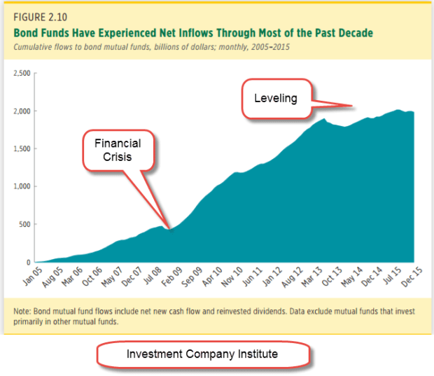
Older people are more cautious and have more of a preference for the price stability and dividends of bond products. The aging population and the painful memories of the financial crisis prompted a rush into bond mutual funds. The cumulative money flows into bond funds has increased from $500 billion in the summer of 2008 just before the financial crisis to over $2 trillion in 2015. (ICI chart)

icibondflows2005-2015

In the chart below we can see inflows into bonds during 2016, counterbalancing the outflows from equities. Since the election, investors have shifted $17 billion from bonds to riskier equity products. Not shown here was a further outflow of $20 billion from balanced hybrid products containing both stocks and bonds.

icibondflows2014-2016
Let’s review those totals. In November and December, there was a net INflow of $8 billion. Compare that with the $43 billion OUTflow in November and December 2015. Clearly, there was an increased appetite for risk. In 2015 and 2016, inflows into stock, bond and hybrid products declined rather dramatically from 2014’s totals.

icistockbondhybrid2014-16

In the first six weeks of this year, that lack of confidence has disappeared. Investors have pumped $63 billion into stock, bond and hybrid products, almost as much as the $74 billion invested in ALL of 2016. Should that pace continue – unlikely, yes – the inflow would be about $550 billion, far outpacing the inflows of 2014.  Over $40 billion of that $63 billion has come in during the first two weeks of February.  That is a $1.1 trillion annual pace. Where has this 2 week surge of money gone?  Half into equity – about $20 billion – and half into bonds -about $20 billion.

Had that money surge gone mostly into equities or mostly into bonds, I would be especially worried of a mini-bubble.  As I wrote last week, I am concerned that anticipated profits have already been priced in. Somewhat reassuring is the Buddha-like balance of flows – the “middle way.”

///////////////////////////

Tools

I have added some resources on the Tools page.  You can click on the menu item at the top of this page to access.  If you have any suggestions or additions, please let me know.


An Interest-ing Debt

February 12, 2017

Republicans used to talk about the country’s debt load but such talk is so inconvenient now that they control the House, Senate and Presidency. Perhaps it was never more than a political ploy, a rhetorical fencing. Now there is talk of tax cuts and more defense spending, and a $1 trillion dollar infrastructure spending bill. 48 states have submitted a list of over 900 “shovel-ready” projects.

House Speaker Paul Ryan used to be concerned about the country’s debt. Perhaps he has been reading that deficits don’t matter in Paul Krugman’s N.Y. Times op-ed column. For those of us burdened with common sense, debts of all kinds – even those of a strong sovereign government like the U.S. – do matter. The publicly held debt of the U.S. is now more than the country’s GDP.

debt2016q3

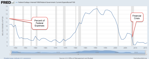
In 2016, the Federal interest expense on the $20 trillion publicly held debt was $432 billion, an imputed interest rate of 2.1%. Central banks in the developed world have kept interest rates low, but even that artificially low amount represents 11% of total federal spending. (Treasury)  It represents almost all the money spent on Medicaid, and more than 6 times the cost of the food stamp program. (SNAP)

The latest projection from the CBO estimates that the interest expense will double in eight years, an annual increase of about 9%. The “cut spending” crowd in Washington will face off against the “raise taxes” faction at a time when a growing number of seniors are retiring and wanting the Social Security checks they have paid toward during their working years.

In the past twenty years the big shifts in federal spending as a percent of GDP are Social Security and the health care programs Medicare and Medicaid. These are not projections but historical data; a shift that the CBO anticipates will accelerate as the Boomer generation enters their senior years. Ten years ago, 6700 (see end of section)  people were reaching 65 each day. This year, over 9800 (originally 11,000, which is a projection for the year 2026) per day will cross that age threshold.

cbospendcomp1996-2016
CBO Source

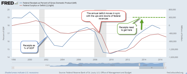
A graph of annual deficits and federal revenue shows the parallel paths that each take. The trend of the past two years is down, promising to accelerate the accumulation of debt.

fedreceiptsdeficit1998-2016

More borrowing and higher interest expense each year will crowd out discretionary spending programs or force the scaling back of benefits under mandatory programs like Social Security, Medicare and Medicaid. President Trump can promise but it is up to Congress to do the hard shoveling.  They will have to bury the bodies of some special interests in order to get some reform done.

[And now for a bit of cheer.  Insert kitten video here.]

We already collect the 4th highest revenue in income taxes as a percent of GDP. Canada and Italy head the list at 14.5%.
South Africa 13.9%,
U.S. 12.0%,
Germany 11.3,
and France 10.9 all collect more than 10%. (WSJ) Those who already pay a high percentage in income taxes will lobby for a VAT tax to increase revenues. Income taxes are progressive and impact higher income households to a greater degree. Poorer households are more affected by a VAT tax.  Cue up more debate on what is a  “fair share.” Many European countries have a VAT tax and the list of exclusions to the tax are bitterly debated.

Adding even more social and financial pressure is the lower than projected returns earned by major pension funds like CALPERS. For decades, the funds assumed an 8% annual return to pay retirees benefits in the future. In the past ten years many have made 6% or less. Several years ago, CALPERS lowered the expected return to 7.5% and has recently announced that they will be gradually lowering that figure to 7%.

Each percentage point lower return equals more money that must be taken from state and local taxes and put into the pension fund to make up the difference. Afraid to call for higher taxes and lose their jobs, local politicians employ some creative accounting to avoid the expense of properly funding the pension obligations. In a 2010 report, Pew Charitable Trust analyzed the underfunding of many public pension funds like CALPERS and found a $1 trillion gap as of 2008. (Pew Report) The slow but steady recovery since then may have helped annual returns but the inevitable crisis is coming.

In December 2009, I first noted a Financial Times Future of Finance article which quoted Raymond Baer, chairman of Swiss private bank Julius Baer. He warned: “The world is creating the final big bubble. In five years’ time, we will pay the true price of this crisis.”
That warning is two years overdue. Sure hope he’s wrong but … here’s the global government debt clock. The total is approaching $70 trillion, $20 trillion of which belongs to the U.S.  We have less than 5% of the world’s population and almost 30% of the world’s government debt.  As Homer Simpson would exclaim, “Doh!”

Correction:  Posted figure for 10 years ago was originally 9000.  Current figure was originally posted at 11,000.  Projected for the year 2026 is 11,000.)

///////////////////////

Market Valuation

Comments by President Trump indicating a “sooner than later” schedule for tax cuts helped lift the stock market by 1% for the week. The Shiller CAPE ratio currently stands at 28.7, just shy of the 30 reading on Black Tuesday 1929. (Graph) Since the average of this ratio is about 16, earnings have some catching up to do. Today’s reading is still a bargain compared to the 44 ratio at the height of the dot com boom. Still, the current ratio is the third highest valuation in the past century.

The Shiller Cyclically Adjusted Price Earnings (CAPE) ratio
1) averages the past ten years of inflation adjusted earnings, then
2) divides that figure into the current price of the SP500 to
3) get a P/E ratio that is a broader time sample than the conventional P/E ratio based on the last 12 months of earnings.

The prices of long-dated Treasury bonds usually move opposite to the SP500.  In the month after the election, stocks rose and bond prices went lower.  Since mid-December an ETF composite of long-dated Treasury bonds (TLT) has risen slightly.  A number of investors are wary of the expectations that underlie current stock valuations.

The casual investor might be tempted to chase those expectations.  The more prudent course is to stick with an allocation of various investments that manages the risk appropriate for one’s circumstances and goals.


Productivity And Labor Unions

February 5, 2017

About 10% of all workers, public and private, belong to a union. Today the percentage of private sector employees who are unionized is the same as in 1932, eighty years ago. (Wikipedia) The rise and fall of unon membership looks like the familiar bell curve, with the peak in the 1970s. The causes of the decline are debated but some attribute the erosion of union power as an important factor in wage stagnation.

The major factor is not declining union membership but declining productivity, and that persistent decline has economists and policymakers baffled.  Higher productivity should equal higher wage growth and, in the 30 year post-war period 1948-1977, multi-factor productivity (MFP) annual growth averaged 1.7%. MFP includes both labor and capital inputs. In the 40 year period from 1976-2015, MFP growth averaged about half that rate – .9%.

prodmfp1948-2015

In the debate over the causes of the decline, some contend that all the easy gains were made by 1980.  Productivity is now returning to a centuries long growth trend that is less than 1%. In an October 2016 Bloomberg article, Justin Fox picked apart BLS data to show that growth has been flat in some key manufacturing areas for the past three decades. The ten-fold surge in productivity growth in the tech sector is largely responsible for any growth during the past 30 years. OECD data indicates that other developed countries are experiencing a similar lack of growth (OECD Table) When no one can conclusively demonstrate what the causes are for the decline, policymakers face tough challenges and even tougher debate over the solutions.

//////////////////////////////

LoanGate

LoanGate may the next scandal. A few months ago, the Dept of Education (DoE) revealed that they had seriously undercounted student loan delinqencies because of a programming error. When the Wall St. Journal analyzed the revised data, they found that the majority of students at 25% of all colleges and trade schools in the U.S. had defaulted on their student loan or failed to make any repayment.  (WSJ article)

The Obama administration forced the closure of many private institutions whose students had low repayment rates. In 2015, Corinthian Colleges shuttered the last of its schools and filed for bankruptcy. The revised data show that many more institutions, both public and private, should be shut down.

This latest programming error at the DoE follows other embarrassing episodes during the two Obama terms. In October 2013, the rollout of Obamacare was riddled with programming errors that blocked many applicants from enrolling in a plan with healthcare.gov.

In 2010, the IRS delayed many applications for 501(c)3 tax status from mostly conservative political groups. Lois Lerner, the head of the agency, first claimed that these had been innocent clerical mistakes by an overworked staff, but a series of hearings uncovered the fact that employees at the IRS had acted on their own political feelings and deliberately targeted these groups. (Mother Jones)

In yet another incident, the Office of Personnel and Managment (OPM), the HR dept for thousands of Federal employees, revealed in 2016 a data breach involving 22,000,000 personnel records, including Social Security numbers.  Unchecked programming errors and data breaches erode the public’s faith in public institutions.  That these mistakes happened under a Democratic administration favoring ever bigger public institutions to solve ever bigger social problems is especially embarrassing.

When Obama first took office in 2009, the inflation adjusted total of student debt had quadrupled in the 15 year period (DoE paper – page 1) since 1993. By the time he left office eight years later, student debt had grown ten-fold to $1.3 trillion. The delinquency rate on that debt is 11% but the repayment rate is considered a better predictor of future delinquencies. The revised data reduced the combined repayment rate to a little more than 50% (Inside Higher Ed), far lower than the 75% plus repayment rates of a few decades ago.

The defaults are coming and there will be an inevitable call for a taxpayer bailout.  A popular element of Bernie Sanders’ Presidential platform was that a college education should be free. In the real world, nothing is free, so somebody pays.  Who should pay and how much will further aggravate tensions in an already divided electorate.

///////////////////////////////////

Five Year Rule

A few weeks ago I wrote about the 5-year rule, a backstop to any allocation rule. Any money needed in the next five years should be in stable assets like short to intermediate term bonds, CDs and cash. Why 5 years of income? Why not 2 years or 10 years? Answer: History.

Let’s look back at 80 years in 5 year slices, or what is called 5-year rolling periods. As an example, the years 2000 – 2004 would be a 5-year rolling period. 2001 – 2005 would be the next period, and so on.

Saving me the time and effort of running the data on stock market returns is a blogger at All Financial Matters who put together a table of this very data for the years 1926-2012. The table shows that the SP500 has held or increased its inflation adjusted value (very important that we look at the real value) almost 75% of the time. So the 5-year rule guards against a loss of value the other 25% of the time.

The 5-year rule can apply whenever there are anticipated income needs from our savings: retirement, college expenses, sickness or disability, and even a greater chance of losing our jobs. In a retirement span of 25 years, 6 of those years will fall into that 25% category. The 5-year rule minimum usually kicks in toward the end of retirement when a person’s reserves are lower and prudence is especially important.


The Presidential Baton

January 29, 2017

Welcome to the new site, Innocent Investor.  You can easily reach this blog by entering innocentinvestor.com into your browser. Loyal readers can resubscribe by clicking the RSS Feed button at the bottom of this blog.  For a few weeks, I will post up a short entry at LucreTalk.blogspot.com in order to activate existing RSS feed subscriptions.

I think readers will love the presentation of both text and graphics in this WordPress format. I plan to integrate comment balloons so that a reader who is unfamiliar with a term like “GDP” can hover over the word and a quick explanation of the term will appear.

On the menu at the top of each page is an item labeled “Tools.” That page is under construction but will include many of the resources I have mentioned over the course of the past eight years.

/////////////////////////

The Presidential Baton

After the Trump inauguration, President Obama and his family boarded a helicopter bound for Andrews Air Force Base. The headline U-3 unemployment rate was less than 5%, half the level when he had taken office eight years earlier. In that time, the SP500 stock index had almost tripled. Consumer Confidence has risen from 61 in January 2009 to almost 100 as he left. GDP has been growing for 30 quarters.

Good job, Mr. Obama. Thanks for your leadership during a very bad economic crisis, and have a good life. Wouldn’t it be nice? History is a messy business. Presidents endure a lot of stress, their families make major compromises and yet half of us focus on their faults.

Let’s revisit another President who took office during very bad economic times, Ronald Reagan. When he assumed the leadership role, we were on the tail end of a recession, and still deep in an energy crisis. Interest rates and inflation were more than 10%, small business loans were about 20%, and the unemployment rate was 7.5%.

Reagan made the difficult decision to let Fed Reserve chief Paul Volker take some monetary measures to bring down interest rates, knowing that those actions would probably send the economy back into recession.  Unemployment rose 3% to 10.8%, GDP fell 2-1/2% and stayed negative for four quarters.  Inflation came down from 10% to less than 5% in that year long recession, providing an environment for businesses to grow and consumers to borrow.  Real GDP started growing at rates greater than 5%, and in 1984, Reagan was re-elected by a landslide over Walter Mondale.

A historic tax reform bill capped Reagan’s second term in office.  Like health care, tax reform is notoriously difficult because there are so many powerful interests involved. Although the Soviet Union did not officially collapse until 1991, the democratization process began in 1987 and conservatives have built a narrative that credits Reagan for the collapse. Like the executive of any large corporation, a President takes the credit and the blame.

A President’s administration rarely escapes scandal, and Reagan’s second term was so riddled with scandal that his own Vice-President, H.W. Bush, had to distance himself from Reagan’s policies in Bush’s 1988 Presidential bid. Iran-Contra and the S&L crisis were the most conspicuous of the scandals, but the Keating 5, and the HUD and EPA Grant Rigging to influence elections indicated an administration with lax ethics.

Let’s turn back to the first few months in former President Obama’s first term.  Almost daily came the announcement of another major American company near bankruptcy. In February 2009, a few weeks after Obama’s inauguration, the credit rating firm Moody’s estimated that 15 large companies were close to bankruptcy in the coming year.

The list included Rite-Aid drugstores with 100,000 employees, Chrysler with 55,000 workers, Blockbuster with 60,000 employees, and Six Flags Amusement Parks with 30,000 workers. One of the companies, Trump Resorts with 9500 workers, went into bankruptcy within a month of Obama’s inauguration.

During Obama’s first two years he was able to get some fiscal stimulus enacted and, like Reagan, took on a historic task – health care reform. The tax bill of 1986 was passed by voice vote (Govtrack) so we don’t know the vote by party.  However, the Democrats held the house at that time so nothing could be done without bipartisan bargaining. On the other hand, the health care reform was passed without a single Republican vote. A hostile voter reaction to Obamacare swept the Republicans into control of the House in 2010. The Republican House stymied attempts at further stimulus or much of any fiscal policy to alleviate the economic suffering.

The policy burden of economic recovery rested on the shoulders of the Federal Reserve, who were forced to be extremely accommodative to avoid another recession. Throughout this long and slow recovery, the Fed’s monetary tools have been stretched thin to the point of ineffectiveness.  For several years, they have wanted to raise interest rates to a more normal range of at least 2%. This past year, Chair Janet Yellen felt confident enough to bump up rates by a mere 1/4% in December.  This left the key interest rate in a range of just .5% – .75%.

With one party government Donald Trump has promised to get a languidly growing economy into high gear. GDP growth in the 4th quarter slowed to 1.9%, bringing annual growth in 2016 to a disapointing 1.6%. The post-WW2 growth rate is more than 1% higher.

The bond market is estimating that the Fed will raise interest rates three more times this year. This attempt to normalize interest rates may frustrate the Trump administration, since rising interest rates tend to curb economic growth.  President Trump will likely voice his antagonism but Chair Janet Yellen has pledged to serve out her full term, which expires in February 2018.

//////////////////////

Best President for Stock Market

So you were having a friendly conversation with a co-worker about Obama’s legacy and you mentioned that Obama had been the best President ever for the stock market. The conversation turned not so friendly and the issue was left unresolved because neither of you could find the information at the time. Well, here’s the chart

returnsbypres

Coolidge, the President that many of us forgot in history class, ranks top with annual gains of 25%.

The chart ranks the Presidents by Total Return during their term(s) in office.  Because term lengths vary, a truer rank is by annualized return (many times the rankings are the same). Coolidge tops the list in both categories. #2 is Clinton, #3 Obama, #4 Reagan. The worst on the list were #19 Hoover, and #18 G. W. Bush.

Inauguration 2017

January 22, 2017

Mr. Trump’s inauguration marks the first time in almost a hundred years that a business person assumes the highest political position in the country.  His cabinet choices share that same characteristic. There will be an inevitable clash of cultures.  Many civil servants are lifers, drawn to the generous benefits of government service, and the stability of employment.  Some may be drawn to the work because it gives them a sense of self-worth.

Many have little experience in private industry and distrust the motives of business owners.  Former President Obama was one of these.  An inspirational figure to some, his antipathy to business interests of all sizes antagonized political foes who challenged him for most of his two terms.

Mr. Trump has a similar weakness – his antipathy to and unfamiliarity with the insular culture of civil servants who work in a massive bureaucracy characterized by a thicket of rules and a lack of transparency.

Work in the private sector is characterized by competition, a striving for efficiency, the changing winds of people’s preferences, and the quality of the services and products we provide.  Employment in the public sector requires patience with burdensome procedure, a tolerance of a heirarchy of both the competent and the undeserving, and a willingness to work in a system that relies less on merit and more on seniority.

What will happen when these two diametrically opposed cultures mix?  Stay tuned.

/////////////////////////////////

Obamacare Kaput?

Since FDR began the custom, Presidents have signed executive orders on their first day in office to signify that they are on the job for that portion of the American electorate that put them in office.  One of the highlights of Mr. Trump’s campaign was the repeal of Obamacare.  Shortly after his inauguration President Trump signed an order stating his intention to repeal the ACA.  The order freezes any further promulgation of rules and regulations pertaining to the act.   I thought it would be appropriate to republish a blog I wrote in April 2011, a year before the Supreme Court ruled that most of the ACA was constitutional.  Like Social Security, ACA premiums and penalties were a tax.

The problems of providing health care and the insuring of that care have not gone away: rising costs, more sophisticated and expensive therapies, more demand for care from an aging population.  The problem is a knotty one:  how to distribute health care costs.  We all benefit from the availability of medical resources, yet these resources are very expensive.  The 24 hour care and equipment that stays idle in an urban hospital must be paid for with funds from other parts of the health care system.

It might surprise readers that more than 50% of the $3.5 trillion in Federal outlays is for Social Security benefits ($930B), Medicare ($600B) and Medicaid and Community health programs ($500B).  Eighty years ago, FDR initiated a new role for the Federal Government: an economic support system. To do that, FDR had to threaten and cajole a Supreme Court reluctant to stretch the meanings of several clauses in the Constitution.

Even FDR would be appalled to learn that the Federal Government has become an insurance company whose chief function is the collection of insurance premiums through taxes in order to pay insurance claims in the form of Social Security, Medicare and Medicaid Benefits.

Readers who would like to read more on a pie chart breakdown of government spending can visit the Kaiser Family Foundation’s fact sheet. Dollar amounts are from the latest White House budget.

//////////////////////////

MM Bash

I’m about to bash criticize some of the reporting in mainstream media (MM) publications, whose budgets rely on viewership.  When that audience was more predictable, flagship publications like the NY Times, Washington Post and Wall St. Journal could wait to verify facts before running a story.  In the current 24 hours news cycle and the rush to print, fact checking sometimes comes after the story is published online – if at all.

MM channels rested on their decades old reputations for thorough journalism and were willing to cut off at the knees any reporter compromising that reputation.  More than a decade ago, Dan Rather lost his anchor job with CBS for running with a story about George Bush that had not been properly vetted. News (fact-checked) and opinion (not checked) were clearly defined when they were in separate sections of the newspaper. In this new age when most information is delivered digitally, we are quoting blogs or other opinions that are not fact checked as reputable news sources without verifying the information.

A lie travels around the world by the time the truth gets its boots on. Something like  that.  In today’s lightning fast world of information flow, an apocalyptic news item that can move markets can be tweeted, webbed, facebooked, and retweeted.  “China fires on U.S. destroyer in South China sea!”  “N. Korean missle hits Alaska!” Sell, sell, sell, buy, buy, buy signals can flash instantly to world markets.

Later, it’s no, China didn’t fire on a U.S. destroyer.  China said it would fire if fired on by a U.S. vessel in the S. China Sea.  No, the North Koreans didn’t actually fire a missle.  Instead they said that they had a missle that could fire a nuclear payload on Alaska.  They’ve been saying that for several years.  Most defense analysts remain skeptical.  Oops, nevermind stock and bond markets.

We can not prevent this, nor can we hide our savings under a mattress.  We can prepare by making sure that we have some emergency funds in place.  Most financial advisors recommend six months replacement income.  Only after those funds are in place should we consider that boat we want on Craigslist or the down payment on that house we want to flip.  Don’t just plan to have a plan.  Have a plan.

//////////////////////////

Household Net Worth Ratio

The zero interest rates for the past eight years are not natural and have created distortions in business and residential investment as well as stock market valuations. Let’s look at the residential side of the picture.  Below is a sixty year chart of the percentage of household net worth to disposable income.

The majority of the net worth of households is in their home.  The value of stocks and bonds comes second.  One or both of the two factors in that ratio is mispriced.  Perhaps disposable income has not grown to match the growth in asset valuations.  When reality doesn’t match predictions for a time, assets reprice.

What affects the pricing of these assets? The stock market rises on the prospect of sales and profit growth.   Salaries and wages rise as businesses compete for workers in a faster growing marketplace.  Disposable income rises.  Home prices rise on the prospect that more workers can afford to buy a home.

Now, what happens when disposable incomes, the divisor or bottom number in this ratio, don’t rise as much as predicted?  Yep, the ratio goes up, just as it did in 1999-2000 and 2006-2008, the peaks in the graph.

Ten Year Review

January 15, 2016

10 Year Review

Before I begin a performance review, I’ll refer to an article  on the errors of comparing our real world portfolio returns to the optimized returns of a benchmark index.  An index stays fully invested, has no trading costs, taxes or fees.  An index has survivor bias; companies that go out of business or don’t meet the capitalization benchmark of the index are effortlessly replaced, so there is no risk.  Share buybacks benefit an index but not our portfolio.

The article contains some prudent and realistic recommendations: the importance of preserving our savings, a balance of risk and return that will meet our goals, AND our time frame.  As we review the performance of the following portfolio allocations, keep those caveats in mind.  If a model portfolio earned 8% per year, use that as a rough guideline only.

A 60/40 stock/bond portfolio returned an annual 6.3% over the past ten years with a maximum drawdown (MDD) of 30%.
A  50/50 mix returned 6% with an MDD of 25%.
A 40/60 mix returned 5.75% with a MDD of 20%.

A difference of 10% in allocation equalled a .3% in annual return, and a 5% change in MDD.  Let’s put that .3% difference in dollars and cents.  Over a ten year period, a $100,000 portfolio earning .3% extra return per year equalled about $43 extra per month, or about $1.40 per day.  Why is this important?  For whatever reason, some people worry more than others and may be willing to accept a lower return in order to sleep better at night.

Not all ten year periods will have the same response to various allocations.  The majority of ten year periods will include a recession, but this past ten years included the Great Recession. Let’s look at the historical effect of portfolio allocation during the past ten years.  In the chart below you can see the annual returns of various balanced allocation mixes shown in the left column.  At the end of 2009, the 10 year results show the results of two downturns: the 2001 – 2003 swoon and the 2007 – 2009 crash.

Note that the more aggressive 60/40 allocation has a lower return than the cautious 40/60 allocation during the years 2009-2011.  As we move forward in time, the effects of the 2001-2003 swoon diminish and, starting in 2012, the more aggressive allocation earns a better return.

Not shown in the chart are the results of a 100% allocation to stocks during the ten year period 2000-2009, the first column in the chart above.  A 40/60 allocation had a return of 3.8%.  A 100% allocation to large cap stocks had a LOSS OF 1% per year.

During the 10 year period 2007-2016, a 100% allocation to stocks returned 6.8% annually, a 1/2% higher return than the 60/40 mix, but the drawdown was 51%, far more than the 30% drawdown of the 60/40 portfolio.

High Winds or Hurricane?

A person who spends twenty years in retirement can count on at least two market downturns during that time.  Here’s how MDD, or drawdown, can affect a person’s portfolio.  I’ll present a more extreme example to illustrate the point.  Imagine an 80 year old retiree with a portfolio devoted 100% to stocks.  For several years, she had been withdrawing $40,000 from a portfolio that had a balance of $600,000 in the fall of 2007.  Projecting that her portfolio could earn a reasonable return of at least 7% per year, or $42,000, the balance looked secure.

But by March 2009, a period of only 18 months, the high winds had turned to a hurricane.  Her portfolio, her shelter in the storm, had lost 50% of its value, an MDD or drawdown of approximately $300,000.  During those 18 months, she had also withdrawn $60,000 for living expenses, leaving her with a balance of about $240,000 in the spring of 2009, the low point of the stock market.

Only 18 months earlier she had projected that she could maintain a minimum portfolio balance of $600,000. She had gnawed her nails raw as the market lost 20% by the summer of 2008, then sank in September when Lehman Bros. went bankrupt, then continued to lose value during the winter of 2008-09.  When would it end?

In March 2009, she had only 6 years of income left before her savings were gone.  Unable to stand the loss of any more value, she sold her stocks for $240,000 – at exactly the wrong time, as it turned out.  Her $240,000 earned little in a money market, forcing her to: 1) cut back the amount of money she withdrew from her portfolio to about $24,000 per year, and 2) hope she died before she ran out of money.

Of course, most advisors would NOT recommend that an 80 year old devote 100% of their savings to stocks.  BUT, some retirees might – and have – adopted a risky strategy to “whip” a portfolio to get more income or capital appreciation the way a jockey might do with a tired horse.  On the other hand, some 80 year olds with a very low tolerance for any kind of risk might have all of their savings in cash and CDs, a 0/100 allocation.

Now let’s imagine that our retiree had a cautious 40/60 balanced mix.  She would have had a drawdown of 20%, or $120,000, during the Great Recession.  After withdrawals for living expenses, she still had a balance of about $420,000 in March 2009. At a conservative estimate of a 5.5% annual return, she could have prudently drawn down her portfolio $25,000 – $30,000 for a year and waited. This is important for seniors: an allocation that allows some temporary flexibility in the withdrawal amount from a portfolio.

By the end of 2009, her portfolio had gained about 24%.  After living expenses of about $22,000 taken from the portfolio during the last 9 months of 2009, she had a balance of more than $500,000.  Her balanced allocation allowed her to wait longer for the market to recover.

In 2010, she could once again take her $40,000 living expense withdrawal and still have a $530,000 portfolio balance by the end of that year.  She has weathered the worst of the storm. At the end of 2016, she continued to take out $40,000 (adjusted upward for inflation) and still has a portfolio balance of $486,000.

Finally, her 40/60 allocation mix kept to a rule I have mentioned from time to time: the five year rule. If she wanted to take approximately $40,000 from the portfolio each year, she should have a minimum of 5 years, or $200,000 in bonds and cash – the “60” in the 40/60 allocation mix.  In the fall of 2007, she had $360,000 (60% of $600,000) in less erratic value investments.  This rule helped her withstand the storm winds of the Great Recession.

//////////////////////////

Seniors at Risk

Although the number of loans to those 65+ are less than 7% of the total of student loans, a shocking 40% of these loans are in default.  Most of these loans were cosigned by seniors for their children or grandchildren. The law allows the Federal Government to garnish or lien Social Security and other federal payments to cure the loan defaults.  Readers with a WSJ subscription can read the article here or Google the topic.

//////////////////////////

Hot Housing Markets

In a recent analysis, western cities rule Zillow’s top 10 housing markets for valuation increases.

///////////////////////////

Take this job and shove it!

The latest JOLTS report from the Labor Dept. shows the highest quits rate in private industry since the housing boom in 2006. Employees confident of finding another job are more willing to voluntarily leave their job, and have driven the rate up to 2.4% from a low of 1.4% in the 2nd half of 2009.

Statista compiles data from around the world, including this revealing tidbit: 26% of jobs in the U.S. are unfilled after 60 days, the highest percentage in the developed world. Germany ranks 2nd at 20%, and our neighbor to the north, Canada, comes in at nearly 19%.

What lies behind this data is a mismatch.  Employers may be requiring skills that job applicants don’t have.  Job applicants may want more money or other benefits than employers are willing to pay.

//////////////////////////

Obamacare Repeal

The Committe for a Responsible Federal Budget (CRFB) – yep, it’s a mouthful – has projected costs to repeal Obamacare in whole and in part.  Using both conventional, or static, budget scoring and dynamic scoring (google it if you’re interested), they guesstimate a 10 year cost of $150 to $350 billion for full repeal of the ACA.

Repeal of ACA’s insurance coverage would actually save a lot of money, more than $1.5 trillion. The net effect is a cost, not a savings, because of the $2 trillion in tax revenue on higher incomes that is built into the ACA law.

CRFB analysts have put a lot of work into these projections, including a breakdown of repealing just parts of Obamacare or delaying repeal of certain ACA provisions.  Since the Republican Congress is likely to keep some provisions, readers who are interested might want to come back to this link in the coming weeks as the discussion of this issue unfolds.

Sales Tax Collections

January 8, 2017

The New Year begins, the 9th year of this blog that began during the financial crisis.  For two decades I had studied financial markets but the financial crisis surprised most people.  This was my attempt to organize and share my thoughts.

Sales Tax Collections

Let’s look at a data point that has been a consistent indicator of economic health – sales tax collections. This is not survey data or economic estimates but actual tax collections based on consumer purchases. For the first 3 quarters of 2016, sales tax collections are up 1.6% above the same period in 2015. (Census Bureau)    As we will see, this tepid growth rate does not compare well with the historical data of the past 25 years.  Below is a quarterly graph of sales tax collected in the 50 states.

As we can see in the graph above, the 2nd quarter (orange bar) is the highest each year, and is a good indicator of consumer activity and confidence. Since population growth is about 1%, the annual growth of sales tax collected should be above that mark to be effectively positive.

In the graph below, we can see negligible or negative growth in 2001, 2008 and 2016. In 2001 and 2008, we were already in recession, although it took the recession marking committee at the NBER almost a year to declare the beginning of those recessions.  By selecting the 2nd quarter growth rate in the historical data, we can more easily see the weakness at the start of an economic downturn.

In retrospect, 25 years of data is rather sparse.  We can only hope that this year’s lack of sales tax growth may turn out to be a warning sign only, a fluke.  Third quarter tax collections were effectively positive, but only 2% growth, and that annual growth has consistently declined in the past three years in a pattern exactly like the weakening of 2006 – 2008.

Of particular note in the graph above is the steep 10% drop in sales tax collections in the second quarter of 2009. Fom a vantage point eight years in the future, we may have forgotten the degree of fear during the winter of 2008-2009.  The American people were holding onto their money.  State budgets were crippled by the lack of sales tax collections, an important and ongoing source of revenue for state and local governments.

See end for a side note.

////////////////////////

Population Growth

Business Insider published a chart of 2015-2016 population data from the Census Bureau.  We can see a clear shift from the northern states to the mountain and southern states.  Retiring boomers, who want to maximize their fixed incomes, will shift from states with high state income and property taxes like New Jersey and New York, and move to states with lower taxes.

///////////////////////

Tax Reform

In a few weeks Republicans will control the legislative machinery, and have promised  tax reform that, after thirty years, is overdue.  One of the proposals on the bargaining table is the end of the home interest deduction, which prompted this blog post at Slate.  The author contends that the elimination of this deduction will hurt middle class homeowners, who will see the value of their homes decline by 7%.

I’ll add in some contextual data from the IRS.  In 2011, 22% of the 145 million (M) returns claimed mortgage interest totalling $321 billion. ( IRS tax stats Table 3) People making a middle class income of less than $100K claimed half of that interest – 14% of all returns.  The average interest deduction for these middle class households was $8100.

Two million returns with incomes of $500K and above claimed $46B in mortgage interest, about 15% of the total interest claimed.  For these high earners, the average deduction was $20,000.

The tax reform of 1986 eliminated the interest deduction on credit cards and cars, but lawmakers could not go the final distance and squelch the home mortgage interest deduction.  At the time, auto dealerships complained that, without the interest deduction on new car loans, their business would suffer.  Tax subsidies affect both consumers and the businesses who are indirect recipients of the subsidy. Should 78% of taxpayers subsidize the housing costs for 22% of taxpayers?   Certainly, the 22% appreciate the subsidy! The real estate industry continues to resist any tax changes that might have a negative impact on their business.  Each industry deserves a subsidy of some kind because that industry is important to the overall economy – or so the argument goes.

///////////////////////

The End of Capitalism – Almost

Let’s get in the wayback machine and dial in 1997.  The dot-com boom is not yet a bubble but is growing.  Cell phones are growing in acceptance but the majority of people do not have one.  A one year CD is paying more than 5%.  The unemployment rate is about the same level as today (2016).  What is very different between then and now is the number of publicly traded companies.  In 1997, there were over 9000 listed companies.  Today, there are about 6000 companies.  The 2002 Sarbanes-Oxley (SB) law has such stringent and plentiful financial reporting regulations that many companies decide not to go public, or to sell themselves to a larger company that already has the internal infrastructure in place to comply with SB regulations.  Both parties want to repeal or amend the law but cannot agree on the details.  Readers can click for more info.

//////////////////////////

Next week I will compare the 10 year performance and risks of various portfolios.  There are some surprises there.

//////////////////////////

Side note on Sales Tax.  The Federal Reserve charts retail sales but these are based on data samples and will not be as accurate as the actual tax collected.  When retail sales are adjusted for inflation, the year over year growth can give a number of false positives.  In the graph below, I have marked up periods that went negative without the economy going into recession.  I think that the actual tax collected may be a much more accurate predictor of economic weakness.

Post-Election Bounce

January 1, 2017

Happy New Year!  How many days will it take before we remember to write the year correctly as 2017, not 2016? It is going to be an interesting year, I bet.  But let’s do a year end review.

Homeownership

The home ownership rate has fallen near the lows set in 1985 and the mid-1960s at about less than 64%. (Graph)  In 2004, the rate hit a high of 69%.  For the U.S., the sweet spot is probably around 2/3 or 66%.  Most other countries have higher rates of home ownership, including Cuba with a rate of 90%. (Wikipedia article)  Rents in some cities have been growing rapidly.  In the country as a whole, rents have increased almost 4%, about twice the growth in the CPI, the general rate of inflation for all goods and services. (Graph)

Earnings

Real, or inflation-adjusted, weekly earnings of full time workers spiked up during the recession as employers laid off lower paid and less productive workers.  By late 2013, weekly earnings had fallen to 2006 levels and have risen since, finally surpassing that 2009 peak this year.

Core Work Force

Almost every month I look at the changes in the core work force of those aged 25-54 who are in their prime working years, who buy homes for the first time and have families.  These are the formative years when people build their careers, and form product preferences, making them a prime target for advertisers.  The economy depends on this age group.  They fund the benefit systems of Social Security and Medicare by paying taxes without collecting a benefit.  In short, an economy dependent on intergenerational transfers of money needs this core work force to be employed.

For two decades, from 1988 to 2008, the labor participation rate of this age group remained steady at 82% – 83%. (BLS graph) By the summer of 2015, it had fallen to 80%.  A few percent might not seem like much but each percent is about a million workers.  For the past year it has climbed up from that trough, regaining about half of what was lost since the Great Recession.

Consumer Confidence

A post-election bounce in consumer confidence has put it near the levels of 2001, near the end of the dot-com boom and just before 9-11. (Conference Board)  In 2012, the confidence index was almost half what it is today.

Business Sentiment

Small business sentiment has improved significantly since the November election (NFIB Survey).  Almost a quarter of businesses surveyed expect to add more employees, a jump of 2-1/2 times the 9% of businesses who responded positively in the October survey.  In October, 4% of companies expected sales growth in the coming year.  After the election, 20% responded positively.  This jump in sentiment indicates the degree of hope – and expectation – that business owners have built on the election of Donald Trump.

Hope leads to investment and business investment growth has turned negative (Graph). Recession often, but not always, accompanies negative growth. Since 1960, investment growth has turned negative eleven times.  Eight downturns preceded or accompanied recessions.  Let’s hope this renewed hope and some policy changes reverses sentiment.

On the other hand, those expectations may present a challenge to the incoming administration, which has promised some tax reform and regulatory relief. Small business owners will lobby for different reforms than the executives of large businesses.  Regulations of all types hamper small business but large businesses may welcome some regulation which acts as a barrier to entry into a particular market by smaller firms.

Publicly held firms will continue to lobby for repeal or reform of Sarbane Oxley reporting provisions.  For six years, the Obama administration has wanted to roll back these regulations but has been unable to come up with a compromise between the SEC, which regulates publicly traded companies, and Congress.  A Trump administration may finally reform a law that was rushed into place by George Bush and a Republican Congress in response to the Enron scandal.  That scandal grew in part from the Bush administration’s push to deregulate the energy market.

Voters Veer From Side To Side

We have stumbled from an all Republican government in 2002 to an all Democratic government in 2008 and now come full circle again to an all Republican government. Once in power, neither party can resist using economic policy to pick winners and losers.  Every few years the voters throw out the guys in charge and bring the other guys in, hoping that the party that has been out of power will be chastened somewhat.  Within a few months of taking power, each party digs up their old bones and begins to gnaw on them again.  Tax reform, prison reform, justice and fairness for all, climate change, more regulation, less regulation – these bones are well chewed.

Still we keep trying.  The priests and prophets of long ago kingdoms could not govern.  Neither could the kings and queens of empires.  So we have tried government of the people, by the people and for the people and it has been the bloodiest two centuries in human history.  Still we keep hoping.

The Presidential Test

Most presidents are tested in their first year in office.  Kennedy had to grapple with the Soviet threat and Cuba almost as soon as he took office.   Johnson struggled with urban violence, social upheaval and the war in Vietnam.

Nixon confronted a newly resurgent Viet Cong army when he first took office.  His second term began with the Arab oil embargo.  Ford dealt with the aftermath of Watergate and Nixon’s resignation under the threat of impeachment.

Jimmy Carter began his term with the challenges of high inflation and unemployment, and an energy crisis to boot.  Ronald Reagan wrestled with sky-high interest rates and a back to back recession in his early years.  His successor, H.W. Bush, met a Soviet Union near the end of its 70 year history as Gorbachev loosened the reins of Soviet control of eastern European countries and the Berlin Wall collapsed.

After an unsuccessful attempt to reform health care in his first year of office, Clinton suffered in the off year election of 1994.  G. W. Bush had perhaps the worst first year of any modern President – the tragedy of 9-11.  Obama entered office under a full blown global financial crisis.

Despite Putin’s bargaining rhetoric regarding President-elect Donald Trump, every President has to learn the lesson anew – Russia is not our friend.  Trump will have to learn  the same lesson.  China’s territorial claims in the South China sea may prompt an international incident.  N. Korea could launch a missle at S. Korea and start a small war.  Iran, Afghanistan, Iraq and Syria, Israel’s settlements, Palestinian independence – the crises may come from any of these tinderboxes.  We wish the new President well as he hops into the fire.

Historical Portfolio Returns

December 25, 2016

Merry Christmas Everyone!

This week I will look at the historical performance of different portfolio allocations.  Also, a comparison of this year’s performance to long term averages.  There are a few surprises.

In the weeks since the election, there has been a strong demand for risk, lifting the broad SP500 index by 8%. So how goes it over on the safety side of the ledger? Holders of an index of the total bond market, VBMFX or BND, have seen a price drop of a bit more than 3% since the election, but a net gain of 2-1/4% in the past twelve months.  Almost all of that gain is the yield, or interest earned on the bonds.  Inflation eats up most of that net gain, leaving the bond investor with little net gain for the year, but no loss.

 Morningstar provides a comparison table of various investments.  The AGG broad bond index in their table has an average total return of 2.18% over the past five years.  Yes, this year’s rather low return of 2.25% is better than the five year average.

Vanguard provides a 90 year comparison of various portfolio allocations and it is the first one on the page that I’ll turn to.  Over 90 years, the average total return of interest and price appreciation on a 100% fixed income, i.e. bond, portfolio is 5-1/4%, or 3% more than this year’s total return.

In today’s low yield universe, there is little difference, or spread between today’s yield on a broad bond index and that on a broad stock index.  Over that 90 year period, stocks have averaged 10% per year total return.  The difference between the average total return on bonds and stocks is almost 5% and is called the risk premia.  It means that, on average, a bond investor sacrifices 5% annual return for the income and the relative price stability of bonds. That’s the 90 year average.  The 5 year average tells quite a different story: a 15% per year total return for the SP500 vs 2.18% for a broad bond index.  That risk premia is 2-1/2 times the 90 average.   Seniors and others needing safety have paid a high price.

OR…let’s look at this from a different perspective.  In the long run, the law of averages is like gravity. What price would the SP500 be if its total return were more in line with the 90 year average of 10%?  The answer is a price that we last saw during February of this year – about $1840.  That is an 18% drop from today’s current price of $2264.

As the generation of boomers continues to draw down savings to supplement their income, we can expect that price stability will become more valued.  That should balance some of the downside price risk of owning bonds in an environment of rising interest rates.  There are some countervailing forces.  Oil states may derive more than half of their revenue from profits based on the price of oil.  When oil prices were high, the sovereign funds of these states bought U.S. Treasuries and other assets with the excess profits.  As prices declined since mid-2014, the lower revenues have produced budget deficits in those countries dependent on oil.  They have already sold some assets and will continue to do so if prices remain below $60 a barrel.

Comfortability Ratio

The Vanguard table of returns for various allocations (see above) shows that a 60% stocks/ 40% bond portfolio allocation (60/40) produces the best total returns of the choices for a balanced portfolio.  Let’s look at a comfortability ratio – the average return divided by the percent of years with a loss, or %AR / %YL.  This can be an important psychological ratio for those approaching and in retirement.

As many studies have shown, we give more weight to losses than gains.  We are naturally risk averse, and especially so as we near the end of our working years.  Higher comfort ratios are safer.  A 40/60 and 50/50 allocation have comfort ratios of .44.  Their average return is 44% of the percent of years that an investor suffers a loss.

Ranked by this comfort ratio, the surprise is that a 60/40 allocation acts more like a growth, not a balanced, allocation.  70/30 and 80/20 growth allocations have the same .37 comfort ratios as the 60/40.  On a more surprising note, a strongly agressive 90/10 allocation with a .38 ratio  has a better comfort ratio than any of these growth allocations.  Here’s a table:

Allocation Avg % Years Comfort Ratio
                   Return    With Loss
40/60 7.8 17.7 .44
50/50 8.3 18.8 .44
60/40 8.7 23.3 .373
70/30 9.1 24.4 .373
80/20 9.5 25.5 .373
90/10 9.8 25.5 .384
100/0 10.1 27.8 .364

Allocation based on income needs

As an alternative to conventional allocation models using percentages, an investor might keep five years of income needs in bonds and cash and devote the rest to equities. An important caveat: income needs do not include emergency cash. Using this model, an investor who needed $20K from their portfolio each year, would keep $100K in bonds and cash, and put the rest in stocks.  A 35 year old with no income needs would have 100% in equities.  This model naturally becomes more conservative as the portfolio is drawn down.

For two years the stock and bond market have seen little net change.  Investors might have become complacent.  Since the election, the shift in sentiment has been strong and investors should check their year end statements and make adjustments based on their needs and targets.

////////////////////////////

In a country far, far away….

Cue the Star Wars theme. Dah, dummm, dah, dah, dah, dummmmm.  In 2008, China overtook Japan to become the country that holds the largest amount of U.S. Treasuries. Since this summer, China has been selling Treasury bonds to support its currency, the yuan, and is now again in 2nd place.  As long as the dollar continues to rise, China is likely to continue this practice which will maintain a slight downward pressure on bond prices.

The Role of Government

December 18, 2016

What role should government at many levels – Federal, state and local – play in our lives?  Some want a large role, some small.  Does the Constitution give the Federal government a diminished role in our lives? That is the viewpoint of those on the right side of the political divide in this country.  As Donald Trump gets ready to lead a Republican dominated Federal government, the debate burns white hot, as it did at the founding of this country.

Let’s turn the time dial back to 1936, the middle of the Great Depression, to appreciate just how much we depend on government today.  At that time, the unemployment rate had declined from a soul crushing 24%, but was still high at 17%.  The Roosevelt administration had ushered in many programs to alleviate joblessness.  In 1936, total government spending at all levels was $257 billion. (Dollar amounts don’t include what is called transfer payments like Social Security. and are in 2016 dollars.)

Eighty years later, it is $6 trillion, about 24 times the 1936 level.  Some might counter that the population has grown so, of course, government spending has grown.  The population has indeed increased, but only 2.7 times, far below the 24 times that government spending has multiplied.  In 1936, per person spending was $2,000.  Today it is $19,000.

During World War 2, government spending climbed six times to $1.6 trillion, about 25% of today’s level.  We are not currently engaged in a global war which occupies most of our economy as it did in the 1940s.  We do not have millions of young men in combat.  And remember, these figures don’t include Social Security, welfare and business subsidies.

Now let’s look at this from another viewpoint, one that might lead to a different conclusion.  Let’s look at government spending as it relates to family income.  According to the IRS and BLS, average family income was about $26,000 in 1936. (IRS and BLS See note below).  Remember, this was during the most severe Depression in our nation’s history.  So, per capita government spending was about 6% of this rather low family income.  Today, it is 33% of the $56,000 median family income.  So, we squint at these figures from two viewpoints and we are still left with the same conclusion.  As a percent of income and on a per capita basis, government spending has become a significant part of our lives.

When Republicans talk about smaller government, the “small” in that catch phrase should be kept in perspective.  At best, Republicans might want to lower spending growth to eight times, not ten times, the spending of 1936.  Those on the left might want to accelerate that growth to 12 times.  In either case, neither party advocates the frugal spending levels of 1936.  I should note that President Roosevelt himself was concerned that this low (to us) level of government spending – most of them his New Deal programs – was becoming too high.

The current fad is speaking in hyperbole.  Many daily experiences in our lives are awesome.  Our kids, our vacation, the latte we had yesterday – all awesome. It is no surprise, then, that we would  use hyperbole to describe those who don’t agree with our political views.  They are communists, or socialists, or capitalist anarchists, or [insert epithet here].  The voices of moderation are growing smaller by the year.

Half of the voters in this country want less government, half want more.  If each of us wants “our” views to prevail, we need to get up off our asses and pull on the rope in this political tug of war.  When “our” side gets into power, the other half has to suffer through it, and vice-versa.  This battle of ideas will continue throughout our lifetimes and – God Forbid! – we might even change sides.

/////////////////////////////

Endnotes

According to the IRS, only 4.3% of tax returns reported positive taxable income in 1936.  One out of 20 families footed the entire bill for Federal government spending. 95% of families had no federal taxable income. 

Real wage growth in the U.K. has turned negative for the first time since the 1860s.
(Bloomberg)

The most common job in a lot of states:  truck driver.  (NPR)