Rebound

October 25, 2015

Last week we looked at two components of GDP as simple money flows.  In an attempt to understand the severe economic under-performance during the 1930s Depression, John Maynard Keynes proposed a General Theory that studied the influences of monetary policy on the business cycle (History of macoeconomics).  In his study of money flows, Keynes had a fundamental but counterintuitive insight into an aspect of savings that is still debated by economists and policymakers.

Families curtail their spending, or current consumption, for a variety of reasons.  One group of reasons is planned future spending; today’s consumption is shifted into the future.  Saving for college, a new home, a new car, are just some examples of this kind of delayed spending.  The marketplace can not read minds.  All it knows is that a family has cut back their spending.  In “normal” times the number of families delaying spending balances out with those who have delayed spending in the past but are now spending their savings.  However, sometimes people spend far more than they save or save far more than they spend, producing an imbalance in the economy.

When too many people are saving, sales decline and inventories build till sellers and producers notice the lack of demand. To make up for the lack of sales income, businesses go to their bank and withdraw the extra money that families deposited in their savings accounts.  Note that there is no net savings under these circumstances.  Businesses withdraw their savings while families deposit their savings.  After a period of reduced sales, businesses begin laying off employees and ordering fewer goods to balance their inventories to the now reduced sales.  Now those laid off employees withdraw their savings to make up for the lost income and businesses replace their savings by selling inventory without ordering replacement goods.  As resources begin strained, families increasingly tap the several social insurance programs of state and federal governments which act as a communal savings bank,   Having reduced their employees, businesses contribute less to government coffers for social insurance programs.  Governments run deficits.  To fund its growing debt, the Federal government sells its very low risk debt to banks who can buy this AAA debt with few cash reserves, according to the rules set up by the Federal Reserve.  Money is being pumped into the economy.

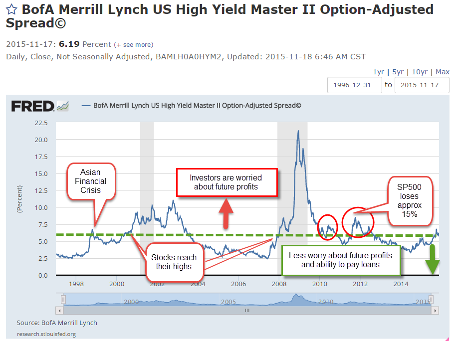
As the economy continues to weaken, loans and bonds come under pressure.  The value of less credit worthy debt instruments weakens.  On the other side of the ledger are those assets which are claims to future profits – primarily stocks.  Anticipating lower profit growth, the prices of stocks fall.  Liquidity and concern for asset preservation rise as these other assets fall.  Gold and fiat currencies may rise or fall in value depending on the perception of their liquidity.

Until Keynes first proposed the idea of persistent imbalances in an economy, it was thought that imbalances were temporary.  Government intervention was not needed.  A capitalist economy would naturally generate counterbalancing motivations that would auto-correct the economic disparities and eventually reach an equilibrium.  Economists now debate how much government intervention. Few argue anymore for no intervention.  What we take for granted now was at one time a radical idea.

While some economists and policymakers continue to focus on the sovereign debt amount of the U.S. and other developed economies, the money flow from the store of debt, and investor confidence in that flow, is probably more important than the debt itself.  As long as investors trust a country’s ability to service its debt, they will continue to loan the country money at a reasonable interest rate.  While the idea of money flow was not new in the 1930s, Keynes was the first to propose that the aggregate of these flows could have an effect on real economic activity.

***********************

Stock market

A very good week for the market, up 2% for the week and over 8% for October.  A surprising earnings report from Microsoft lifted the stock -finally – above its year 2000 price.  China announced a lower interest rate to spur economic activity.  ECB chair Mario Draghi announced more QE to fight deflation in the Eurozone. Moderating home prices and low mortgage rate have boosted existing home sales.

The large cap market, the SP500, is in a re-evaluation phase.  The 10 month average, about 220 days of trading activity, peaked in July at 2067 and if it can hold onto this month’s gains, that average may climb above 2050 at month’s end.

The 10 month relative strength of the SP500 has declined to near zero.  Long term bonds (VBLTX) are slightly below zero, meaning that investors are not committing money to either asset class.  The last time there was a similar situation was in October 2000, as the market faltered after the dot-com run-up.  In the months following, investors swung toward bonds, sending stocks down a third over the next two years.  This time is different, of course, but we will be watching to see if investors indicate a commitment to one asset class or the other in the coming months.

Investment Flows

October 18, 2015

When economists tally up the output or Gross Domestic Product (GDP) of a country, they use an agreed upon accounting identity: GDP = C + I + G + NX where C = Consumption Spending, I = Investment or Savings, G = net government spending, and NX is Net Exports, which is sometimes shown as X-M for eXports less iMports. {Lecture on calculating output}

In past blogs I have looked at the private domestic spending part of the equation – the C.  Let’s look at the G, government spending, in the equation.  Let’s construct a simple model based more on money flows into and out of the private sector.  Let’s regard “the government” as a foreign country to see what we can learn.  In this sense, the federal, state and local governments are foreign, or outside, the private sector.

The private sector exchanges goods and services with the government sector in the form of money, either as taxes (out) or money (in).  Taxes paid to a government are a cost for goods and services received from the government. Services can be ethereal, as in a sense of justice and order, a right to a trial, or a promise of a Social Security pension.  Transfer payments and taxes are not included in the calculation of GDP but we will include them here.  These include Social Security, Medicare, Medicaid, food stamps and other social programs.  If the private sector receives more from the government than the government takes in the form of taxes, that’s a good thing in this simplified money flow model. There are two types of spending in this model: inside (private sector) and outside (all else) spending.

Let’s turn to investment, the “I” in the GDP equation.  In the simplified money flow model, an investment in a new business is treated the same as a consumption purchase like buying  a new car.  Investment and larger ticket purchase decisions like an automobile depend heavily on a person’s confidence in the future.  If I think the stock market is way overpriced or I am worried about the economy, I am less likely to invest in an index fund.  If I am worried about my job, I am much less likely to buy a new car.  In its simplicity this model may capture the “animal spirits” that Depression era economist John Maynard Keynes wrote about.

We like to think that an investment is a well informed gamble on the future.  Well informed it can not be because we don’t know what the future brings.  We can only extrapolate from the present and much of what is happening in the present is not available to us, or is fuzzy.  While an investment decision may not be as “chanciful” as the roll of a dice an investment decision is truly a gamble.

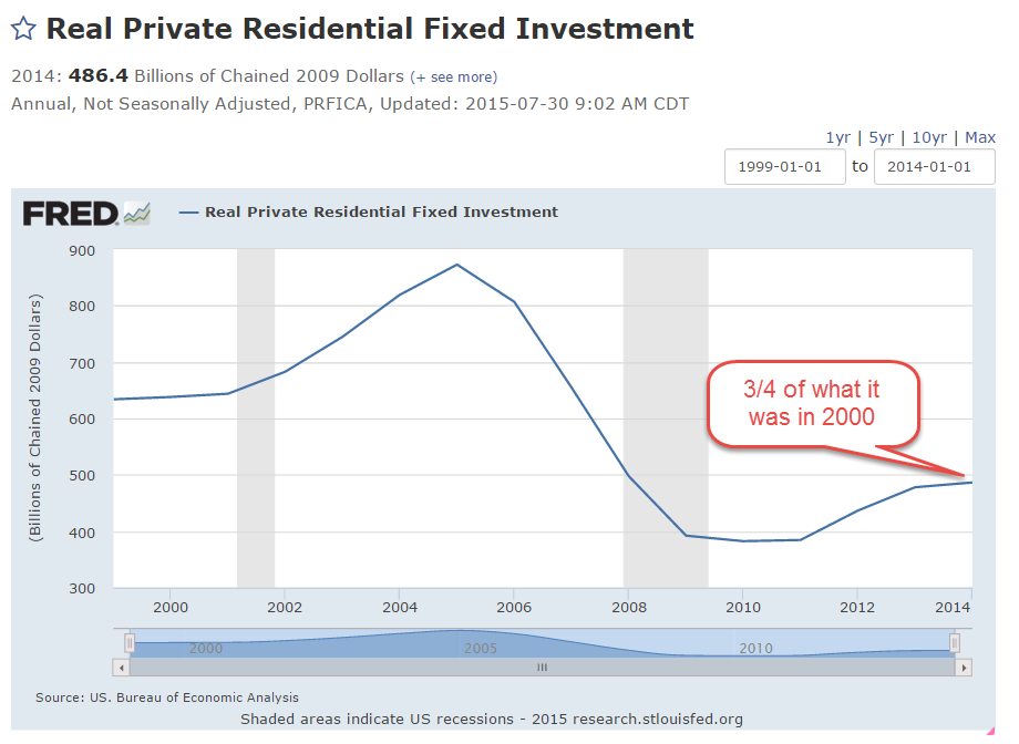
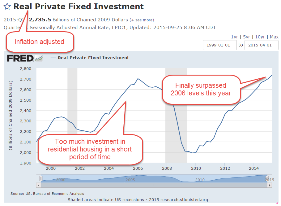
Remember, in the GDP equation GDP = C + I + G + NX, investment (the I in the equation) is a component of GDP and includes investments in residential housing. In the first decade of this century, people invested way too much in residential housing.

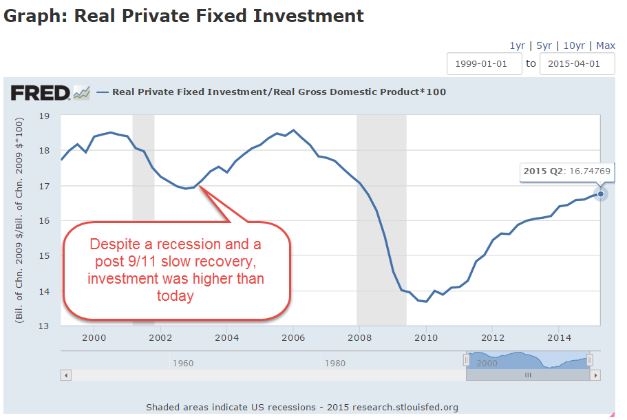
In the recession following the dot-com bust and the slow recovery that followed the 9-11 tragedy, private investment was a higher percentage of GDP than it is today, six years after the last recession’s end.  Much of this swell was due to the inflow of capital into residental housing.

The inflation-adjusted swell of dollars is clearly visible in the chart below.  It is only in the second quarter of this year that we have surpassed the peak of investment in 2006, when housing prices were at their peak.

Investment spending is like a game of whack-a-mole.  Investment dollars flow in trends, bubbling up in one area, or hole, before popping or receding, then emerging in another area.  Where have investment dollars gone since the housing bust?  An investment in a stock or bond index is not counted as investment, the “I” in the equation, when calculating GDP.  The price of a stock or bond index can give us an indirect reading of the investment flow into these financial products.  An investment in the stock market index SP500 has tripled since the low in the spring of 2009 {Portfolio Visualizer includes reinvestment of dividends}

Now, just suppose that some banks and pension funds were to move more of those stock and bond investments back into residential housing or into another area?

October Surprise

October 11, 2015

A good week for stocks (SPY), up over 3%.  Emerging markets (VWO) were up over 5%, but are still down 18% from spring highs and are on sale, so to speak, at February 2014 prices.

On news that domestic crude oil production had fallen 120,000 barrels per day, about 15%, in September, an oil commodity ETF (USO) rose up 8% this week.  On fears, and confirmations of fears, of an economic slowdown in much of the world, commodities have taken a beating in the past year, falling 50% or more.  A broad basket of commodities (DBC) was up 4% this week but are still at ten year lows.  An August 2010 Market Watch commentary recounted the evils of commodity ETFs as a place where the pros take the suckers’ money.  Not for the casual investor.

The Telegraph carried a brief summary of the latest IMF assessment of credit conditions around the world.  There is an informative graphic of the four stages of the macro credit cycle and which countries are at what stage in the cycle.

**************************

Social welfare

Some people say they dislike redistribution schemes on moral grounds.  The government takes money from some people based on their ability and gives it to other people based on their need, a central tenet of Communism.

In a 2014 paper IMF researchers have found that redistribution is a hallmark of developed economies.  Why?  Because advanced economies have the most income inequality.  Why?  Developed economies have greater income opportunity and opportunity breeds inequality.  A sense of human decency prompts the voters in these developed countries to even the playing field a bit.

In countries with greater equality, living standards and median income are lower.  There is less income to redistribute.  In the real world where the choices are higher income and redistribution vs an equality of poverty, I’ll take the more advanced economies.

****************************

CWPI

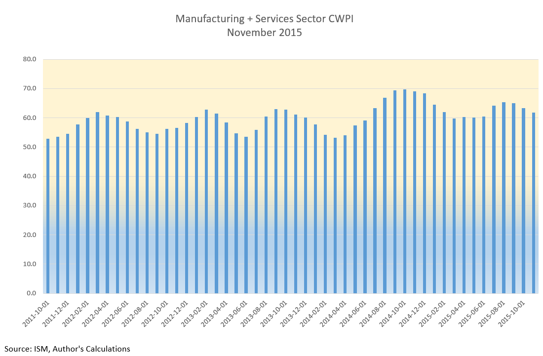
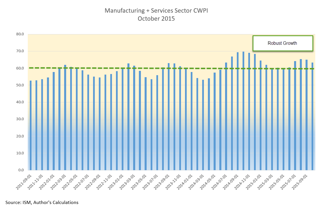
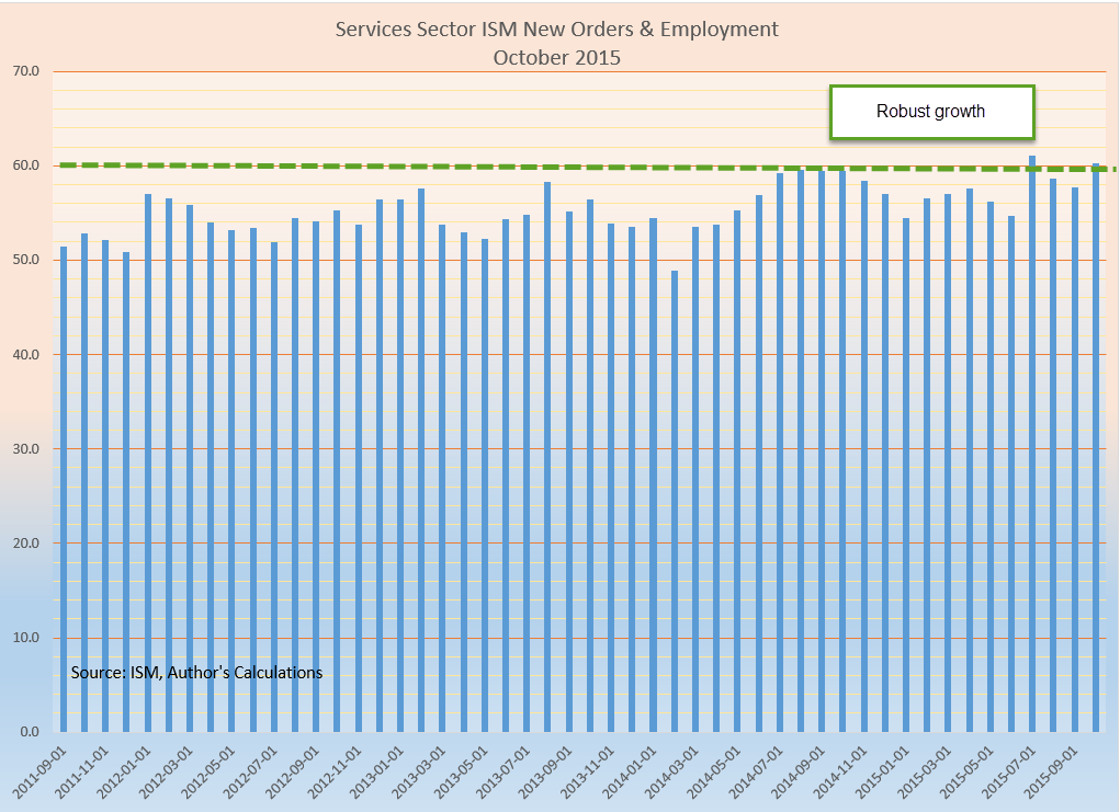
Since the beginning of this year the manufacturing component of the Purchasing Managers’ Index has continued to expand.  The strong dollar has made U.S. products more expensive around the world and this has hurt domestic manufacturers.  Growth has slowed from the strong expansion of the last half of 2013 and all of 2014.  September’s survey of manufacturers is right at the edge between expansion and contraction.  The CWPI weights the new orders and employment portions of each index more heavily.  Using this methodology, the manufacturing side of the equation looks stronger than the headline index indicates.

The services sector, most of the economy, is still enjoying robust growth and this strength elevates the combined CWPI.

How much will the substandard growth in the rest of the world affect the U.S. economy?  Industrial production in Germany declined last month.  China’s growth is slowing.  GDP growth in the Eurozone is barely positive.  Emerging markets are struggling with capital outflows.  Developed economies that are dependent on natural resources – Canada and Australia – are struggling.  The GDP growth rate of both countries is very slightly negative. The U.S. is probably the one economic ray of hope.  September’s lackluster labor report and the Fed’s decision to delay a rate increase has attracted capital back into the stock market. This past Monday, volatility in the market (VIX – 17) dropped down below its long term historical average of 20 but is a tiny bit above its 200 day average.  I’d like to see another calm week before I was convinced that the underlying nervousness in the market has abated.  Third quarter earnings season is here and estimates by Fact Set  are for a 5% decline in earnings, the second consecutive quarter of declines since 2009.

The Active and the Inactive

October 4, 2015

A disappointing September jobs report capped off a third week of losses a rescue from a third week of losses in the stock market.  The initial reaction on Friday morning was a 1.5% drop in the SP500. Over the past several weeks, the stock (SPY) and long term Treasury market (TLT) have become little more than speculative gambles on when the Fed will raise interest rates.  Until Friday’s jobs report, the choices were mainly restricted to October or December 2015. Janet Yellen voiced a commitment to raising interest rates this year in comments (see last week’s blog) at the U. of Massachusetts.  However, the lackluster jobs report ushered in another choice – March of 2016.  By the closing bell on Friday, the SP500 had gained 1.5%, a reversal of 3% on the day and a gain of 1% in the index for the week.

Emerging markets bounced up almost 5% this week, showing that there are enough buyers who are willing to invest at these low price levels.  The Vanguard ETF VWO formed a “W” pattern on a weekly chart and strong volume.

Despite the tepid job growth of 142,000, the unemployment rate remained steady because more than 300,000 left the work force.  Probably the biggest surprise was that July and August’s job gains were revised downward as well.  I had been expecting an upward revision in August’s numbers.

The Labor Force Participation Rate (CLF) declined .2% to 62.4%.  The CLF rate measures the (number of people working or looking for a job) / (number of people who can legally work).  There is another measurement that I have used before on this blog: the ratio of (people not working or looking for a job) / (the number of people working).  Let’s call it the Inactive Active ratio, or IARATIO.

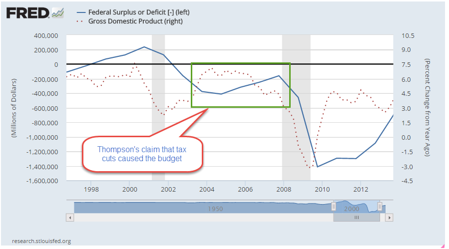
Visually, the blue CLF rate doesn’t show us much; it is a relatively monotonic data series.  In contrast, the decades long fluctuations in the red IARATIO present some useful information.  We can see a simple answer for the federal budget surplus at the end of the 1990s, when the ratio of inactive to active workers was very low. Although politicians like to claim and blame for every data point, the simple truth is that there were almost as many adults working as not working in the late ’90s. Working people tend to put in more than they take out of the kitty.  For two decades there was a striking correlation between the Federal Surplus/Deficit and the IARATIO.

At about .75, the ratio of this past recovery was similar to that of the first half of the 1980s.  In the past two years, the IARATIO has dropped to .72, a good sign,  similar to the readings of 1986, a time of economic growth.

The ever greater number of Boomers retiring over the next decade will put upward pressure on this IARATIO.  The fix?  More jobs. Jobs solve a lot of problems, both for families and government budgets.

The Phillips Curve

September 27, 2015

Worries about economic growth in China, in the EuroZone and in emerging markets have prompted fears of a recession in the U.S.  It could happen – it will happen – at some point in the future but not in the near future.  The Fed likes to use a Personal Consumption chain weighted inflation index called the PCE Price Index which more reliably captures underlying inflation trends.  Preceding each recession we see the rate of economic growth fall below the annual growth rate of the PCE index, multiplied by a 1.5 factor.  While GDP growth is not robust, it is far above the growth of the PCE price level.

Speaking of growth, inflation-adjusted GDP growth for the second quarter was revised upwards to a 3.9% annual rate.  Consumer spending was revised higher and inventory growth – a bit worrisome, as I noted earlier – was revised lower.

The SP500 index began the year at a price level ($2068) that was just a bit above the inflation adjusted price level ($2018) of 2000 (Graph here).  Oops! we’re back below that year 2000 level. A sense of pessimism since mid-August has led to an 8% decline in the broad stock index, or 6% below the price level at the beginning of 2015.  A broad composite of bonds, Vanguard’s BND ETF, is also down -about 1.5% – since early 2015.

Some sectors of the market can not find a bottom.  XME, a blend of mining stocks, is down 45% for the year.  Brazil’s index, EWZ, is down a similar amount – about 40%.  Emerging Market stocks (VWO) in general have lost about 17% this year, and are at June 2009 prices.  After losing 5% of their value in the first week of September, they appeared to have found a bottom, regaining that lost 5% in the next two weeks.  This past week they gave up those gains, touching the bottom again.  The second time is a charm.  If this market draws in buyers a second time, this might be a good time to put some long term money to work.

*******************************

Phillips – the curve, not the screwdriver

In a speech/lecture at U. of Massachusetts this week, Federal Reserve Chair Janet Yellen voiced her desire to raise interest rates sometime this year.  She included in her remarks some comments on the Phillips curve, a mainstay of economics textbooks during the past 50 years.  In the 1950s Bill Phillips presented one hundred years of unemployment and inflation data in the United Kingdom and showed that there was a trade-off between unemployment and inflation.  Higher inflation = lower unemployment.  Lower inflation = higher unemployment.  When the number of unemployed workers are low, workers can press employers for higher wages.  Higher wages lead to a higher inflation rate.

As you can see in the graph above (included in the Wikipedia article on the Phillips curve), the regression estimate, the red line, shows a tenuous inverse relationship between unemployment and inflation.  The standard error S of the regression estimate is a guide to the reliability of the estimate to predict future relationships in the data. The S in this regression is not shown but looks to be rather large; a lot of the data points are pretty far away from the red estimate line and so the regression model is unreliable.

Within fifteen years after the Phillips curve became an accepted tenet of economics, the stagflation of the 1970s disproved the central thesis of the Phillips curve.  During that decade, there was both high inflation and high unemployment.  This led economists to revise their thinking; the relationship described by the Phillips curve may have some validity in the short run but not in the long run.

For those of you who might like to go down the rabbit hole on this issue, there are several fascinating but challenging perspectives on the relationship between unemployment, the labor market, and inflation, the price level of goods in an economy.  One is Jason Smith’s Information Transfer model version of the Phillips curve.  Jason is a physicist by education and training who uses the tools of information theory to bring fresh insights to economic data, trends and models.

Roger Farmer (whose blog I link to in my blog links on the right hand side) has developed another perspective based on a sometimes overlooked insight in Keynes’ General Theory published in 1936. Roger is the Department Chair at UCLA’s Dept of Economics.  For the general reader, I heartily recommend his book “How the Economy Works”, a small book which presents his ideas in clear, simple terms. His history of the development of central economic theories weaves a concise narrative of ideas and people that may be the best I have read.

For those of you with the background and math chops, his paper “Expectations, Employment and Prices” (also a book) contains a well-developed mathematical model of longer term economical and business cycles that find an equilibrium at various levels of unemployment. Roger undermines an idea predominant in economics and monetary policy: the so called natural rate of unemployment, or NAIRU, that guides policy decisions at the Fed and is often mentioned by Yellen and others at the Fed.

Holding Pattern

September 20, 2015

The big news this week was the decision by the Fed to not raise interest rates this month.  Big mistake.  The Fed’s decision signaled a lack of confidence in the global economy.  Are we to believe that the continuing strength of the American economy is so weak that it can not weather even a 1/4% interest rate increase?

Message received.  When the news was announced on Thursday, the initial reaction was good.  Yaay!  no rate increase.  Then, the reality sunk in.  Does the Fed know something that the rest of us don’t? The buyers went to the back of the bus.  The sellers started driving the bus.  Pessimism wiped out the gains in the early part of the week and ended the week down 7/10%.  When in doubt, traders get out.

There are many aspects of the labor market.  The Fed crafts a composite of over 20 factors, called the Labor Market Conditions Index (LMCI).  The latest reading was released on September 9th, a week before this month’s Fed meeting.  This may have contributed to the caution in the Fed’s decision making.  The overall labor market has still not fully recovered from the downturn this past spring.

****************************
Automation

Will your job become automated?  In this fast morphing economy, the demand for a particular skill set can change quickly.  Younger people, whether working or still in school, need to focus on developing transferable skills.   Here’s a list of the nine criteria that some researchers determined were important to keeping a job from being automated: “social perceptiveness, negotiation, persuasion, assisting and caring for others, originality, fine arts, finger dexterity, manual dexterity and the need to work in a cramped work space.”

When the first Boomers were born at the end of World War II, 16% of the workforce was employed in agriculture.  Millions of agricultural jobs have been lost in the past 70 years. Now it is less than 2%. (USDA source)

Computerization has led to the loss of millions of clerical and accounting jobs in the back offices of businesses throughout this country. Despite those job losses of the past 25 years, there are almost twice as many professional and business employees now as there were in 1990 (Source )

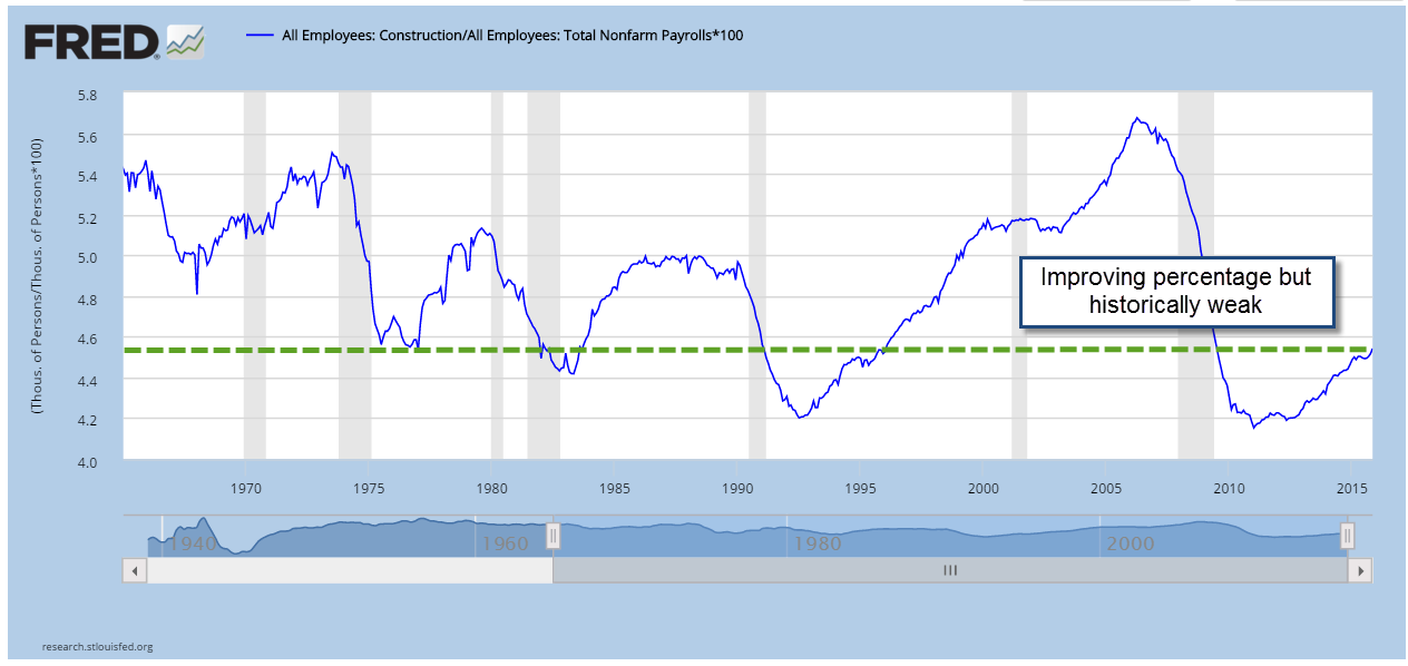
In contrast, construction employment is about the same as it was 20 years ago – an example of an industry that boomed and busted in the past two decades.  Despite that lack of growth, construction employment is still almost twice what it was in the go-go years of the 1960s. (Source)

Despite all these job losses due to automation and more efficient production methods, there are 350% more people working now (140 million) than there were at the end of WW2 (40 million). (Source)

Those who get left behind are those who have a narrow set of skills.

*************************
Labor Market Analysis

Each August the Federal Reserve hosts an economic summit for central bankers, economists and academics.  In 2014, Fed chair woman Janet Yellen commented on several aspects of the labor market:

Labor force participation peaked in early 2000, so its decline began well before the Great Recession. A portion of that decline clearly relates to the aging of the baby boom generation. But the pace of decline accelerated with the recession. As an accounting matter, the drop in the participation rate since 2008 can be attributed to increases in four factors: retirement, disability, school enrollment, and other reasons, including worker discouragement.

As Yellen noted, some changes were structural, some cyclical:
Over the past several years, wage inflation, as measured by several different indexes, has averaged about 2 percent, and there has been little evidence of any broad-based acceleration in either wages or compensation. Indeed, in real terms, wages have been about flat, growing less than labor productivity.

Ms. Yellen agrees that the headline unemployment rate, the U-3 rate, does not reflect current labor market conditions:  “the recent behavior of both nominal and real wages point to weaker labor market conditions than would be indicated by the current unemployment rate.

Since unemployment peaked at 25% during the Great Depression in the 1930s there has been an ongoing debate about unemployment during recessions.  Why don’t employees simply offer to work for less when the economy starts slowing down? Yellen offered some insights [my comments in brackets below]:

the sluggish pace of nominal [current dollars] and real [inflation-adjusted] wage growth in recent years may reflect the phenomenon of ‘pent-up wage deflation.’ The evidence suggests that many firms faced significant constraints in lowering compensation during the recession and the earlier part of the recovery because of ‘downward nominal wage rigidity’–namely, an inability or unwillingness on the part of firms to cut nominal wages. To the extent that firms faced limits in reducing real and nominal wages when the labor market was exceptionally weak, they may find that now they do not need to raise wages to attract qualified workers. As a result, wages might rise relatively slowly as the labor market strengthens. If pent-up wage deflation is holding down wage growth, the current very moderate wage growth could be a misleading signal of the degree of remaining slack. Further, wages could begin to rise at a noticeably more rapid pace once pent-up wage deflation has been absorbed.”

Crossroad

September 13, 2015

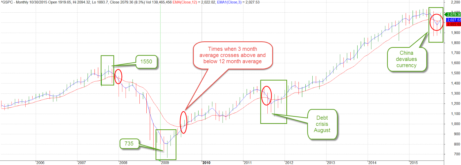
The SP500 index is very close to crossing below its 25 month average this month, four years after a similar downward crossing in September 2011.  Worries over the economy and political battles over the budget had created a mood of caution during that summer of 2011.  The market immediately rebounded with a 10% gain in October 2011 and has remained above the 25 month average in the four years since.   Previous crossings, however – in November 2000 and January 2008 – have marked the beginnings of multi-year downturns.

These long term crossings are coincident with extended periods of re-assessment of both value and risk.  Sometimes the price recovery after a crossing below the 25 month average is just a few months as in August 1990, and October 1987, or the quick rebound in 2011.  More often the price of the index takes a year or more to recover, as in 1977, 1981, 2000 and 2008.

The downward crossings of 2000 and 2008 preceded extended periods of price weakness.  Recovery after the popping of the dot-com bubble lasted till the fall of 2006.  In January 2008, just over a year after the end of the last recovery, another downward crossing below the 25 month average occurred.  Later on that year, it got really ugly.

As the saying goes, we can’t time the market.  However, we can listen to the market.  For the fourth year in a row the bond market continues to set records.  The issuance of investment grade and higher risk “junk” corporate bonds has totaled $1.2 trillion so far this year.  Ahead of a possible rate hike by the Federal Reserve this month, Wednesday’s single day bond issuance set an all time record. The reason for the high bond issuance is understandable – companies want to take advantage of historically low interest rates.  The demand for this low interest debt is a gauge of the long term expectations of low inflation.

**********************************
CWPI

The Purchasing Manager’s Index presents a somewhat contradictory note to the recent volatility in the stock market.  The CWPI, a composite of the manufacturing and services surveys, shows strong growth.  The manufacturing sector has weakened somewhat.  The strong dollar has made U.S. exports more expensive.

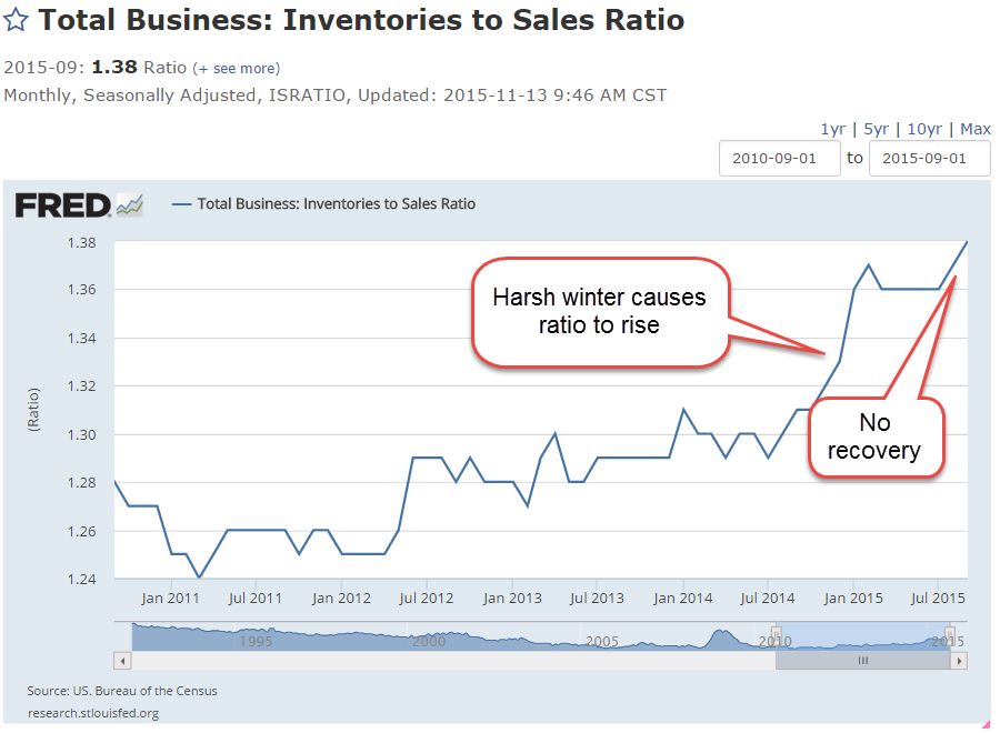
On the other hand…the ratio of inventory to sales remains elevated at 1.37, meaning that merchants have 37% more product on hand than sales.  The particularly harsh winter was unexpected and hurt sales, helping to boost inventories.  Five months after the winter ended, there should have been a notable decline in this ratio.

Has some of the strong economic growth gone to inventory build-up?

***********************************
Annuity

In  the blog links to the right was an article written by Wade Pfau on the mechanics of income annuities.  Even if you are not considering annuities, this is a good chance to expose yourself to some basic concepts about these financial products.

Crossings

September 6, 2015

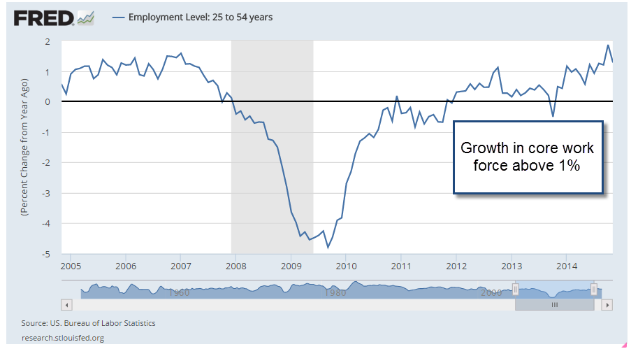
I am not going to say a lot about the August employment numbers, reported at 173,000,   since August’s numbers are routinely revised.  The BLS survey was 20,000 less than the ADP survey of private payrolls.  The revised figure will probably be closer to 210,000 jobs gained in August.  We can see the more important trends when we look at the annual job gains averaged over 12 months.

The slowdown in China and other markets and the selloff in markets around the world inevitably prompts talk of recession.  Since WW2 there has been only one recession – the one that followed the 1973 oil embargo –  that occurred when monthly job gains were above 200,000.   There have been 12 recessions since WW2. The work force was very much smaller fifty years ago.  There has been only one exception to this “rule” and when we look at this exception in closer detail we see that it was very much like the prelude to other recessions. Averaged monthly job gains were declining sharply as they do before every recession.  Job gains are NOT declining sharply today.

******************************

Resource Countries On Sale

Monday came the news that the Canadian economy was officially in recession.  California, the most populous of fifty U.S. states, has two million more people than all of Canada, whose economic vitality relies on its vast stores of timber, oil, gas and minerals.  Australia, Russia, Norway and New Zealand also ride the roller coaster of commodity prices. (WSJ article )  An ETF that captures a composite of Canadian stocks, EWC, is down almost 30% from its high of August 2014.  The 50 week (not day, but week) average is about to cross below the 200 week average.

These long term downward crossings are often bullish, indicating that prices are near a low point in the multi-year cycle.  An ETF composite of Australian stocks, EWA, is down a bit more than 30% and its 50 week average just crossed below the 200 week average.

A Vanguard ETF composite of energy stocks is near the lows of 2011.

********************
Subprime Mortgages

Conventional wisdom: subprime mortgages started the recent financial crisis in 2008.  A recent National Bureau of Economic Research (NBER) analysis (A short summary ) of home foreclosures overturns that misconception.  The authors found that twice as many prime borrowers lost their homes to foreclosure as subprime borrowers.

********************
Inflation

In 2007, the Social Security Administration estimated that prices would be 20% higher in 2015. Then came the severe recession of 2008-09 and persistently low inflation.  Prices this year are only 15% higher than those in 2007.  Social Security payments will total almost $900 billion this fiscal year (FRED series), more than 20% of Federal spending, and are indexed to inflation.  Low inflation “saves” the Federal government about $40 billion each year when compared with earlier projections.  Sounds good?  Life is a trade-off.  The 60 million (SSA) people who receive social security spend most of it.  That savings of $40 billion is money not spent.  In addition, low interest rates have reduced income for many retirees, who depend on safer investments for an income stream.  These safer accounts, which include savings, CDs, short and mid-term bond funds, have paid historically low interest rates since the Federal Reserve lowered its target interest rate to near-zero (ZIRP) in 2008.

A Pause On the Road

August 30, 2015

For the past few weeks, the volatility in the stock market has been front and center.  I finished last week’s blog with a note that the market would be conducting a vote of confidence in the coming weeks.  In the opening minutes last Monday morning, the Dow Jones index dropped a 1000 points, almost 6%.  No doubt many investors had spent the weekend worrying and put their sell orders in the night before.  By Friday’s close, however, the SP500 had gained almost 1% for the week.

A few weeks ago the Dow Jones index, composed of just 30 large company stocks, marked a death cross. The death cross is the crossing of the 50 day price average below the 200 day average.  See last week’s blog if you are unfamiliar with this.  This week the broader SP500 index, composed of the largest 500 U.S. companies, marked it’s own death cross.

Two weeks ago, I noted the attitude of one Wall St. Journal reporter to the dreaded death cross. In one word: blarney.  In two words: hocus-pocus.  So why do some investors and the press give this any attention?  Used as a trading system in the broader SP500 the death cross (sell) and it’s companion golden cross (buy) signal have produced a winning trade 4 out of 5 times.  Where do I sign up?, you might be thinking.  In an almost sixty year period of the SP500, however, the extra annual return is slight – about  8/100ths of a percent, or 8 basis points  – over no timing strategy, i.e. buy and hold.  To the average small investor, taxes and other fees more than offset this negligible advantage.

In contrast to any technical stock market price indicators, the fundamentals of the U.S. economy are mostly strong or expanding. Consumer Confidence rose above 100 this past month, surpassing the optimism of the benchmark set in 1985.  The second estimate of GDP growth released this past week was above some of the high estimates.  After inflation, real GDP growth continues at 2.65%.

Corporate profits are growing at 7.3%, home prices are up 5%.  Real, or inflation-adjusted, consumption spending and income is  growing at more than 3%, equaling the heights of pre-recession spending and income growth in early 2007.

Housing prices are increasing for a good reason.  Inventory of homes for sales is relatively low.  In the middle of the 2000s, prices rose even though inventory of homes for sale were going up, a sign of a speculative bubble.  Ah, things look so clear in the rear view mirror.

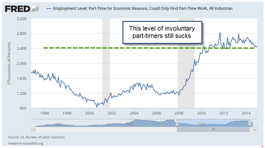
New jobless claims remain at historically low levels and job growth has been consistently solid.  There are more involuntary part-timers than we would like to see and the participation rate is low.  Gloom and doomers will tend to focus on the relatively few negative points in an otherwise optimistic economic panorama.  Gloom and doomers think that those who disregard  negative signs are Pollyannas.  Eventually, years later, the gloom and doomers are right.  “My timing was off but, see, I was right!” they exclaim. The lesson of the death cross and the golden cross are this: a person can be right most of the time.  The secret to successful investing is knowing when we are wrong and acting on it.

For the individual investor, signals like the death cross can be calls to check our assets and needs.  Older investors may depend on some stability in their portfolio’s equity value for income, selling some equities every quarter to generate some cash.   Financial advisors will often recommend that these investors keep two to five years of income in liquid, low volatility investments.  These include cash, savings accounts, and short to medium term corporate bonds and Treasuries.  Younger investors may see this price correction as an opportunity to put some cash to work.

The China Syndrome

August 23, 2015

Some of you may have spent the summer vacation on a small island in the Pacific where there was no access to the news.  So a quickie catch up.  The new Mission Impossible movie Rogue Nation is edge of the seat great fun and its still on the big screen.  And, yeh, almost two weeks ago the central bank of China devalued the Yuan a bit over 3%. Yes, that was a bit unusual.  An unexpected 8% drop in July’s exports spooked economists in the Chinese government.

That brought some additional pressure on oil stocks but the larger market eked out a .7% gain at the close of the week on August 14th.  But – cue up the going down the dark stairs into the basement music – the 50 day average of the Dow Jones crossed below the 200 day average during that week.

Yep, the death cross of doom.  Of course, the Dow Jones is only 30 stocks, weighed down by the plunging fortunes of oil giants like Chevron and Exxon.  The 50 day average of the broader SP500 index was still above the 200 day average so there was cause for concern, but not panic.

For the first two days of this past week, the market was essentially flat.  USO, a commodity ETF that tracks West Texas Intermediate crude oil (WTI) rose more than 1% on Tuesday.  Then came the news that crude oil inventories were continuing their relentless advance upwards. On the good side, lower oil prices are leading to higher demand but sometimes investors focus on the bad news.  WTI oil dropped 4.4% on Wednesday.  Whispers of disappointing manufacturing production out of China added fuel to the fire. On Thursday, the broader market fell 2%, joining the continuing downturn in energy stocks and emerging markets.  A PMI (Purchasing Managers Index) survey of Chinese manufacturers confirmed a slight contraction in the Chinese economic machine. That spooked investors, leading to a 3% drop in the broader market on Friday.

By the time the smoke cleared at the end of the week’s battle, the broader index had lost 5.6% for the week.  Energy and emerging market indexes were down 8%.  Weekly volume in the popular SP500 ETF SPY was the highest this year, an indication that this concern may be more than a temporary blip.

The 50 day average of the SP500 is still above the 200 day average.  No feared death cross yet.

After four years without a 10% correction, the SP500 crossed below that mark this week, falling 10% from the recent high in late May.  Time to sell? Did you get out of the market last October when the broader market fell more than 6% in a month?  Remember that one? The market was going to fall by 50%, according to some market gurus.  Friday’s close is 5% above that October low.

Some long term traders use a 50 week average as a guideline.  As long as it is rising, why worry?  Until this week, the 50 week average had been substantially rising since September 2009.  Why do I use the word “substantially?”  There were a few weeks in late 2011 and early 2012 when the average dipped a few cents.  This week’s decline was like those little dips – a mere 5  cents in SPY, the popular ETF that tracks the SP500.

The world’s economy has come to depend on the growth of two stalwarts – the U.S. and China. For the past eight years, the Eurozone has fumbled and floundered through a cobweb of of political and economic problems. When the U.S. economy cratered in 2008 – 2009, the economic burden shifted to China, whose expansionist growth truly saved the world from a Great Depression.  Although the U.S. economy is showing strong growth, can it offset the economic weakness in China?  The stock market is holding an election, a vote of confidence on that very question.