Job Trends

This past Wednesday the payroll firm ADP released their monthly report of private employment with a rather tepid 119,000, prompting an equally tepid sell off in the market, which lost about .7% by the end of Wednesday.  Although the price move was under 1%, the volume of trading was high.  Was this the end of the 6+ month run up in stock prices?  Was the economy slowing down? 

Came Thursday and a very cheery weekly report of new claims for unemployment and moods brightened.  The market regained the ground lost Wednesday and then some, but on rather low volume.  Standing on the sidewalks of Wall Street, traders repeatedly opened up their umbrellas, then closed their umbrellas, put on their sunglasses, then took off their sunglasses. 

[And now a pause from our sponsor.  A trader tells his doctor he’s anxious and asks for a prescription.  The doctor gives him some advice: “stop looking at the market so much.”]

Back to our story. Friday morning dawned, the heavens opened and the sun shone.  The Bureau of Labor Statistics issued its monthly weather – er, labor – report and traders threw down their umbrellas and put on their shades.  Huzzahs rang throughout the canyons of lower Manhattan.  Some slacker dudes cooly tossed their stocking caps in the air, while men dressed in crisp suits wished that they too had hats.

The labor report is released an hour before the market opens at 9:30 AM.  The market opened up 1%, drifted higher but ended the day at about the same price as it opened.  So, huh? We’ll get to the huh part later.

The reported job gains of 165,000 for April were just slightly above the 150,000 jobs consensus estimate and the replacement rate needed to keep up with population growth.  Spurring the initial enthusiasm was relief that job gains were not as weak as some had feared (100,000 or so) and the revisions to previous months job gains, adding 114,000 to February and March’s job gains. But February’s revision from strong to very strong job growth provokes some head scratching.

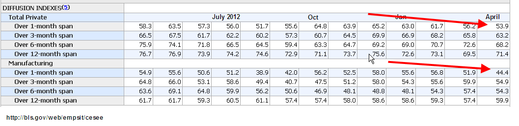
What good things happened in February to inspire such strong job growth?  Hmmmm….here’s a table of the past 12 months data from the establishment survey. 

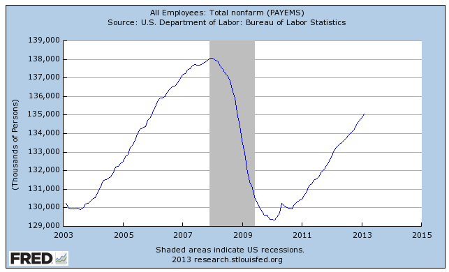
There was a lot to like in this month’s report.  The unemployment rate dropped a tenth of a percent to 7.5%.  We just passed employment levels of February 2006 – yep, it’s been a slow recovery.

To get the big picture, let’s look at the last forty years.

From this perspective, we can see just how deep the job losses have been since 2008.  From this rather sobering point of view, let’s look at some of the positives from this month’s report.

Professional and Business services added a whopping 73,000 jobs this month, far above the 49,000 average of the past 12 months.  Restaurant and bar jobs were up 50% above their 12 month average, showing gains of 38,000. Temp help posted strong gains of 31,000, its highest of the past year.

Construction jobs showed little change, a surprise at this time of year.  Construction has been averaging gains of 27,000 a month for the past six months. This past week, I spoke to a woman at a Denver branch of a national temp agency.  This branch focuses on manual labor, mostly for the construction industry.  She confirmed that business has been brisk but most of the calls are for road repair and rebuilding and some commercial construction.  When I asked her about calls for helpers and job site clean up for residential construction, she said it had been sporadic.

Job gains in health care were somewhat below their 12 month average of 24,000 but any slack in health care was made up by strong growth in retail.  Government jobs continue to contract slightly each month.

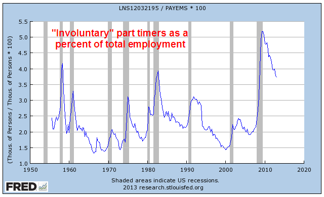
Underlying the positive aspects of the job market are some anemic indicators.  The average of weekly hours dropped .2 hour to 34.4; the average has lost .1 hr in the past year.  The ranks of the long term unemployed dropped by 258,000 workers but the number of people working part time who would like a full time job jumped 278,000.  The ranks of the “involuntary” part timers – those who would like a full time job but can’t find one – is about 5 million.  Here’s a surprise. Today’s levels of involuntary part timers as a percent of total employment is only the third highest in the past fifty years; the late 1950s and the early 1980s were worse.  But this only means that the ranks of part timers have fallen mercifully from nose bleed levels.
The diffusion index is showing some weakness; this is the share of employers who are reporting job gains vs. job losses, with a value of 50 being neutral.  Manufacturing employers are already reporting more job losses than gains.  Overall, employers are slowly drifting toward neutral in their hiring for the past several months.
The core work force aged 25 – 54 is still limping along.

Even more disturbing is the participation rate of this core work force.

Shortly after the market opened on Friday came the report on factory orders and it muted some of the enthusiasm generated by the labor report.  New orders for durable goods, a barometer of business confidence, fell 5.8%, confirming the slowdown in manufacturing.  Employment in this sector has been flat the past two months.

While the monthly labor report makes headlines, it is not a leading indicator. Professional investors watch the squiggles of daily and weekly economic and news reports, trying to anticipate developing trends.  Many of us have neither the time or inclination.  For the long term “retail” investor, continuing job gains are positive, particularly if they are at or above the replacement level of 150,000. The long term investor is more concerned about significant losses in their retirement portfolio.

What if an investor lightened up on their stock holdings shortly after the BLS reported the first job losses?   I looked back at historical employment releases ; I wanted to use the original releases, not the revised figures of later months, to capture the sentiment at the time.  We must make decisions in the present.  We don’t have the luxury of going into the future, looking at data revisions, then coming back to the present and making our investing decisions.  That would be a good time machine, wouldn’t it?  Here’s an example of how employment data can be reported initially and later revised.  The graph shows the later revisions.
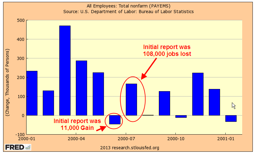
In early August 2000, the BLS reported job losses of 108,000 in July.  But this was due to the layoff of 290,000 temporary Census workers.  Do census workers really count in our strategy?  Let’s say not.  We wait till next month’s report, which shows a loss of 105,000. Should we use our strategy?  Again, those darn census workers.  Without them, there would have been a small gain in jobs.  So we don’t sell in September.  Then, in the beginning of October comes the news of strong job gains in September, followed by more job gains in October, November and December.  Good thing we didn’t sell at that first downturn, we tell ourselves.  Meanwhile the stock market has been slipping and sliding since that first negative job report.  Eventually, it will fall about 40%.
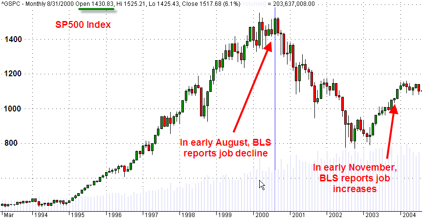
Wow, we should have taken that first signal and avoided all those losses!  But if our strategy is to then buy back in when there are positive job gains reported, then we could be in and out of the market like a yo-yo in years when the economy is struggling to find direction or strength. We were looking for a more even tempered strategy.

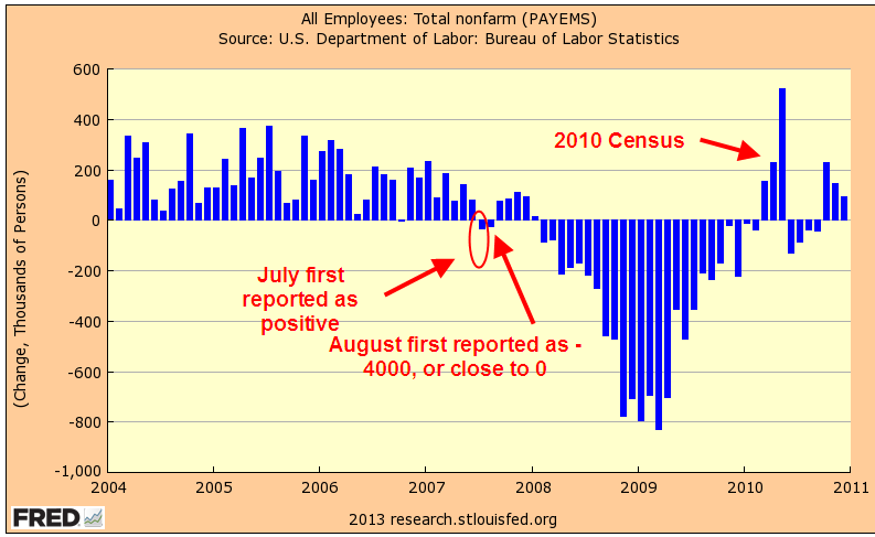
To emphasize how the revisions in employment can mean the difference between job gains and job losses,  take a look at the chart below.  These are the revised figures.  I have noted months where the initial monthly labor report showed positive job gains but were later revised to job losses.  Some of these revisions can happen months later.

From the first reported job losses in mid 2000, more than three years passed before job gains would exceed the “replacement” level of 150,000.  That is the number of jobs needed for the growth in the labor force. While many, myself included, have blamed the knucklehead politicans who enacted the Bush tax cuts in 2003, it is understandable that they were beginning to wonder if the labor market would ever turn around.  Three years of job losses is a long time.

Let’s move on to the last decline.  The market had already begun its decline before the first job losses were announced in early February 2008.

In this past recession, the job losses were severe but the first job increases were announced about two years after the first decrease, in early April 2010.  When reviewing the historical BLS releases, this really surprised me that the 2000 – 2003 labor downturn lasted longer than this last one, though it was much less severe.  By the time the first job increases had been announced in 2010, the market had already been on an upswing for a year. 
In short, the headline monthly job gains don’t appear to offer a long term casual investor any particular insight or advantage.  In a work force of 143 million, a hundred thousand jobs can be a slip of the pencil.  But reported job gains of 150,000 or more do offer an investing hint – quit worrying about your retirement portfolio for at least another month.  Go fishin’, play with the kids, hang out with friends.

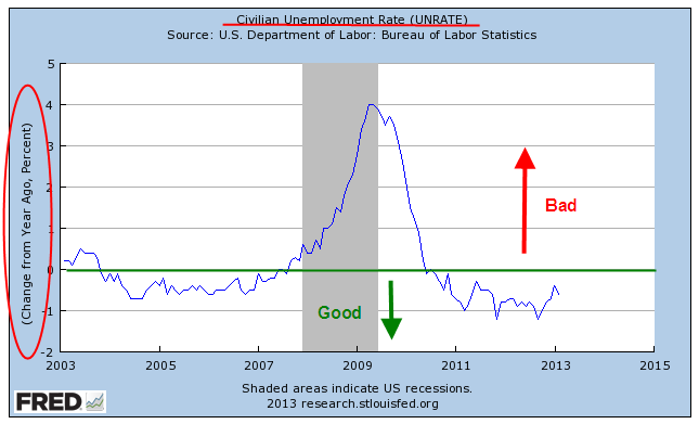
A labor indicator that seems to be more reliable is the year over year percent change in the unemployment rate, which I have discussed in earlier blogs.
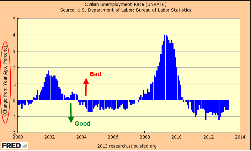
Although the unemployment rate – or percentage – is derived from the count of total employment, the revisions are much smaller.  Secondly, we are using a percentage gain in that percentage, further reducing swings.

The stock market continues to post new highs in anticipation of good corporate profits in the latter part of the year.  What is a bit troublesome is the number of revenue shortfalls reported by companies in the first quarter.  Reducing expenses and boosting productivity can only get a company so far.  Profit growth becomes harder and harder to come by without revenue growth.
The Madness of Methodology

April 28th, 2013

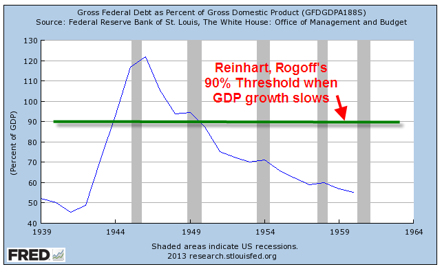
A fight between economists is not as exciting as a dinosaur smackdown (Jurassic Park), but the controversy can be as damaging.  Politicians and pundits love to trot out those economic studies and theories which justify their actions or political point of view.  In 2009, two economists Carmen Reinhart and Kenneth Rogoff (now affectionately known as RR), published a study which showed that a country’s GDP growth becomes slightly negative when its debt grows above 90% of its GDP.  The study was cited by many politicians and pundits in Europe and the US, including VP candidate Paul Ryan, as they proposed various forms of austerity to curb the explosive growth of national debt.

Here’s what the debt to GDP ratio looked like 1940 – 1960

In the years 1947 – 1959, we had an annualized growth rate of 3.6% but a strong component of this growth was our strategic advantage in exports, being the manufacturing capital of the world after much of the production capacity of the developed world was destroyed in WW2.

Here’s what it looks like now; the same spike of debt.

But we have lost the advantage of being the leading manufacturer.

Given the assignment of replicating an existing economic study, Thomas Herndon, a PhD candidate at UMass, discovered some glaring spreadsheet errors in the original data set compiled by RR.  You can read an Alternet article summarizing the details here.

Some quick background.  There are two categories of economic policies.  Fiscal policy encompasses taxing and spending measures by a government.  Monetary policy is conducted by a country’s central bank and are targeted at the supply of money and interest rates.  Economists argue over which policy is more effective in a given circumstance.  Each of us goes about our daily lives under the influence of both fiscal and monetary policy. 

During the 1930s depression, the economist John Maynard Keynes proposed that governments borrow and spend money during recessions to make up for the lack of aggregate demand in the economy.  After the economy recovered, governments would then raise taxes to pay back the borrowed money.  Another leading economist, James Buchanan, predicted that nations who followed Keynes’ ideas would have permanent deficits.  While Keynes’ economic model was elegant, Buchanan argued that there was no incentive for a politician to raise taxes.

In 1963, with the publication of A Monetary History of the U.S., economists Milton Friedman and Anna Schwartz argued that the Depression had been largely a result of failed monetary policy by central banks.  During the 1970s, when government fiscal policies of increasing intervention in the economy failed to ingnite growth or curb inflation, Keynes’ policies fell into disfavor. 

The age old debate about the effectiveness of fiscal and monetary policy never dies. The recession that began in 2008 revived Keynes’ ideas.  In the late 1990s and early 2000s, economist Paul Krugman and Federal Reserve chairman Ben Bernanke were proponents of monetary solutions for Japan’s moribund economy.  As the world economy imploded in 2008, both men changed course and became advocates for fiscal policy as the most effective solution for the country’s economic woes.

In a recently published paper UMass professors Michael Ash and Robert Pollin (Herndon’s advisors), explained their methodology and took RR to task for their lack of follow up on incomplete data analysis after several years.  What they had missed was a follow up paper by RR in February 2011 and another published in the summer of 2012.  In these papers, RR modified their initial findings, saying that GDP growth slowed but did not necessarily turn negative.

In a WSJ blog post , RR answered the critique from the UMass Professors.  They admitted their spreadsheet error but reaffirmed their other assumptions in the study and their amended conclusions.

Paul Krugman weighed in (or waded in?), voicing his disappointment with RR’s methodology and their conclusion.  Krugman does make a point oft repeated in the social studies: correlation is not causation.  Does high debt cause slow GDP growth?  Or, does slow GDP growth cause high debt?  Or can we say that there is some indication that they accompany each other?

At Econbrowser, U. Cal professor James Hamilton, reviewed RR’s methodology and Ash and Pollin’s critique. (Link)  To which, Professors Ash and Pollin responded with some good points.

Ash and Pollin have made the original data available.  Some have accused RR of purposefully leaving five countries out of their data, saying that these five countries would have weakened or invalidated their findings.  The Excel file shows that this was a simple – but dumb – mistake, not some nefarious plan by RR.  The countries left out are on the last five worksheets which are arranged in alphabetical order.  What surprises many is that two prominent economists could publish a paper based on work that had so little verification before publication. 

What I question is RR’s decision to include many of the smaller countries at all in their analysis.  Finland and Ireland each have less than 2% of the GDP of the U.S. 

What I do hope is that this controversy will spur more analysis of the relationship between a nation’s debt load and its economic growth.  What I am afraid of is that this will discourage researchers from sharing their working data.  Reinhart and Rogoff are to be highly commended for doing so.

Readin’, Writin’ and Arithmetic

April 21, 2013

In any lively discussion of public education – its effectiveness, the spending and taxes required – some people bring out their swords, others their shields, and some are armed with both.  Armed only with a crayon, I will examine some of these trends.

Let’s look first at higher education spending.  The National Center for Education Statistics (NCES) at the U.S. Dept of Education reported that real – that is, inflation adjusted – spending per pupil had increased 233% in the past 31 years, an annual growth rate in real dollars of 2.8%.

NCES reports a slower spending growth in K-12 education – 185% in 28 years, or an annual growth rate of 2.2%.

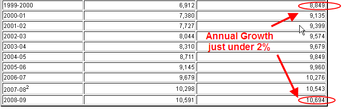
But the annual growth rate during the past decade, 1999 – 2009,  has slowed to just under 2%.


When we zoom in on the spending growth during the 1960s and 1970s, we see a real growth rate of 3.6%

What we see in the per pupil data is a gradual slowing down of the real growth rate of spending.  Those who claim that there have been spending cuts in education have not looked at the data.  There have been no cuts in real spending, only reductions in the rate of growth. 

Some decry “austerity” policies recently undertaken in some European countries – the U.K. is an example – claiming that a country pursuing these policies has cut spending.  When we look at the spending data, we find that there have been no decreases in real spending, only in the growth of spending.  This misconception is common and results from a comparison of what we expect and what happens

If we have usually received a wage or salary increase of 3% each year, we come to expect a 3% increase.  If we get a 2% increase this year, it is 33% less than our expections and feels like a cut.  A retiree who has become accustomed to an annual 8% return on her investments, may feel that she has lost money if her investments only gain 5% this year.  It does no good to mention that she has really not lost anything.

Let’s get up in our hot air balloons and travel to California, where the size of its economy puts the state above many  countries.  California has often been the leading edge of trends that spread to the other states.  Ed-Data reports that per pupil spending has flattened since the recession started in 2008.  In real dollars, there has been NO GROWTH in per pupil spending in the past ten years.

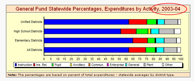
Another complaint from teachers is that money is increasingly being spent on administrative costs, not teaching.  In California, teachers still command the lion’s share of spending  – more than 60%.

The proportion of teacher spending has remained relatively constant – above 60% – in the past ten years.

What has been growing?  On a per pupil basis, “Services and Other Operating Expenses” have grown 4% per year, or 1.8% real annual growth,  above the 2.2% annual growth in inflation.  Administration expenses have grown at the same rate of inflation so that real growth has been flat.  However, spending on teacher salaries has declined in real money at an annual rate of .7%.  However, their benefits expenses have grown 1.4% annually in real dollars.  Again, most people do not “feel” the cost of a benefit increase.  The bottom line to most of us is what we bring home.  It does not pay to tell a K-12 teacher that they are actually receiving a slight increase in real total compensation.

In California, as in many states, property taxes are a major component of revenues for K-12 education.  Over the past nine years, revenues from property taxes for education have declined 3% annually in real money.  For each student, there is $500 less money available from property taxes than it would have been if property tax revenues had kept up with inflation.  As a percent of total revenue for K-12 education, property taxes make up a little over 60%.

In 2011-2012, property tax revenues essentially paid teacher salaries.  Ten years ago, the percentage of revenues from property taxes was about 6% higher.

Other State revenues have had to make up for the shortfall in property taxes; the gap is about $1000 per student.  The problem would be even worse if it were not for the slight decline in students for the past 8 years.

While California faces challenges from declining property tax revenues, what about the rest of the country?  Let’s climb back in our data balloon and look at student enrollment throughout the country.  The NCES reports the same slight decline in K-12 enrollment.  However, they estimate a total 6% growth in K-12 enrollment in this decade.

As K-12 enrollment grew by a little more than 1 million in the 2000s, post secondary education enrollment grew by 6 million, or 37%, to over 21 million. (Source http://nces.ed.gov/fastfacts/display.asp?id=98).  The growth rate in older students, those aged 25+ is even faster, rising 42%. In this decade, “NCES projects a rise of 11 percent in enrollments of students under 25, and a rise of 20 percent in enrollments of students 25 and over.”

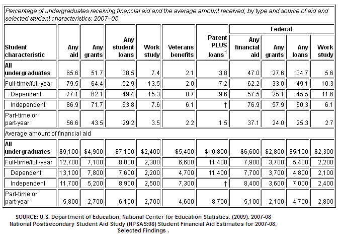
 The ratio of K-12 students to post-12 students was 28% in 2000; a decade later, it was 38%.  While K-12 enrollment is projected to increase for the rest of the decade, post-12 enrollment is estimated to be much faster.  How do these students pay for college?  The most recent data from NCES is at the start of the recession; I would guess that the need for aid has grown mightily since then. 

Put all of this in the blender: a declining work force (see my blog two weeks ago), a generational swelling of older people retiring, recovering but not robust state and local revenues, and more demand for K-12 AND post secondary education services.  How will politicians react in the midst of so many competing demands for money?

The increasing pressures for money from different segments of the population puts us in the precarious position that we can not afford to go into a recession, an impossible situation since the normal business cycle includes a recession every 7 – 10 years.  Europe is already in recession; China’s growth is still robust but slowing; on Friday, India announced a growth rate below 5%, the weakest in four years; in a hopeful sign, Brazil, the economic powerhouse of South America, is projecting GDP growth over 3%, rising up from an anemic 2.7% growth of the past 5 years.  (World Bank source)

Slackening demand around the world presents challenges for the U.S. economy, problems that a spastic Congress will only worsen. Y’all be careful out there…

Things That Spring

April 14th, 2013

Across the land, springtime wakens the trees and flowers, birds chirp and squirrels chatter.  From the buildings where the humans live comes the wailing and gnashing of teeth as many procrastinators spend this last weekend before the tax deadline in a spring ritual of angst.  The lost W-2 form is finally found beneath the Netflix DVD that has lain casually on the bookcase, waiting to be watched.  The 1099DIV form is found beneath a birthday card that was never sent.

Lay aside your problems; let’s climb inside the hot air balloon and look at the big picture.  A few weeks ago, economic growth for the fourth quarter of 2012 was revised marginally higher into positive territory, but dropping from the annualized growth rate of 3.1% in the 3rd quarter of 2012.  Let’s look at GDP from a per person basis since WW2.  Until the recession hit in late 2007, economic growth had consistently outpaced population growth.  Then POOF! went the economy and blew away a big gap in GDP.

Let’s zoom in on the past ten years to see the effect.  On a per person basis, the gap is $5,000 of spending that simply didn’t get spent.

Call it the GDP dust bowl of the 2000s, similar to the dust bowl of the 1930s when the wind blew the top soil from the prairie of the Oklahoma panhandle and forced many families from their farms.  In this case, the wind blew away a lot of jobs and chunks of home equity.

Policy makers in Washington want to close that $5000 per person gap.  If they could write a law forcing everyone to spend that $5000, they would.  Instead, they keep giving away money in unemployment benefits, food stamps, disability benefits, crop subsidies – all to keep people from not spending even less and making the problem worse.

Retail sales account for about 1/3rd of the total economy.  Including automobile sales and parts, consumers are still below twenty year averages.

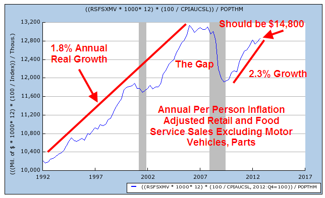
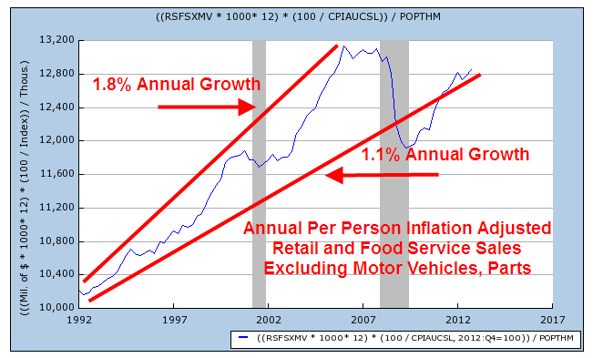
This past Friday, the monthly report on retail sales showed little change from the past month.  When we look at per person real retail and food sales and take out automotive sales we get a feel for core sales, those that we make on a frequent basis.  Once again, we see the same gap that we saw in GDP.  Since mid-2009, this core consumer spending has grown 2.3% annually, above the 1.8% annual growth trend from 1992 through 2006, but it still down $2000 a year from what we would have spent if we had stayed on the same trend line before this past recession hit.

To make it a bit clearer, let’s look again at that chart and compare the 15 year annual growth rate from 1992 to the longer 21 year growth rate.  It has fallen from 1.8% to 1.1% annual growth.
GDP measures spending; let’s look at Gross Domestic Income, or GDI.  A fundamental principles of economics is that it takes money to spend money.  A six year old asks a parent “Why can’t we just go out and get more money?” to which the parent replies “Whaddya think money grows on trees?!”  End of Chapter One in the Parent’s Guide to Economics.

When we compare the country’s income to spending, we find that a dip in income below production precedes recessions.

After the 2008 – 2009 crash and recovery in national income and spending, both are limping along.

A few weeks ago came the monthly New Orders, an indication of business confidence.  As regular readers know, I have been watching this declining trend since September of last year, when the percent change in New Orders was negative.  The recent rise has been a welcome sign of growing confidence but new orders fell 2.7% in February and now hover around the zero growth line. 

On a quarterly basis, the year over year (y-o-y) percent change is still firmly in negative territory, meaning that businesses are not putting up more money to invest in new equipment.  Why?  Because they are still not sure about consumer spending. The six month run up in the SP500 stock index might lead a casual observer to think that the economy and companies are gearing up.  New Orders indicates that there is much more caution out there than the stock index would indicate.

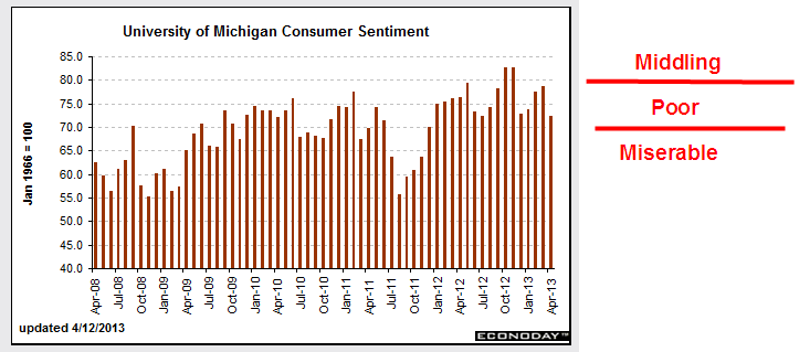
This past Friday, business’ caution to commit to new investment was only reinforced when the latest Consumer Sentiment index was released.  After climbing the past few months, confidence is sinking again.  Maybe it’s the extra 2% coming out of paychecks since January 1st.  Whatever it is, it doesn’t inspire many business owners to put a lot of money into expanding their production.

When the stock market is trading on hope, it looks six months ahead.  The recent run up is hoping for double digit profit growth in the second half of this year.  When the market trades on fear, it looks ahead about 2 seconds, faster than the normal investor can or should react.  Let me get out my broken record for another spin, cue the needle and play that same old song “Diversify.”

P.S. For those of you who are more active investors, check the latest post from Economic Pic in my blog link list on the right.  It shows the past 40 year returns for a strategy of selling the SP500 index in May and buying the long term government / credit index.  The iShares ETF that tracks this index is ITLB.  A comparable ETF from Vanguard is BLV.

Labor Participation Rate

April 6th, 2013

First I will look at a rather disappointing March Labor Report, released this past Friday.  Then I will zoom up and look at the big picture and some disturbing trends.  The net job gains this past month were 88,000, about half of the 169,000 average gains of the past year.  Remember that it takes about 150,000 job gains each month just to keep up with population growth.  Although the headline unemployment rate dropped .1% to 7.6%, it was because almost half a million people dropped out of the work force, meaning that they had stopped looking for a job in the past month.

Mitigating the meager job gains were revisions to previous months gains as more survey data was returned by employers. January’s job gains were revised from +119,000 to +148,000, and February’s gains were bumped upward from +236,000 to +268,000.  The two revisions added up to an additional 61,000 jobs; adding that to March’s gain of 88,000 gets close to the minimum gains needed of 150,000. The initial reaction of the market was a swift loss at Friday’s market opening of almost 200 points on the Dow.  By the end of the day, the market had regained much of the ground it lost, ending down about 40 points.

The average hours worked increased again to 34.6, a hopeful sign, but earnings saw no change.

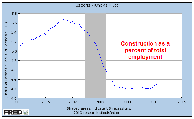
Construction continued to show gains; the media’s attention to this area of employment probably gives the casual reader the impression that contruction jobs are a larger part of the work force than they actually are.

Compare that to Professional and Business Services, which has showed consistently strong gains and low unemployment.

Employment in the health care field continues to grow.  As a percent of total employment, health care continues to reach new heights, although its growth has moderated.  Taking care of the sick may be a sign of a compassionate society, but it consumes resources, prompting the question: what is the upper limit?  One in nine workers now work in health care.  Twenty years ago, the ratio was one in twelve. 

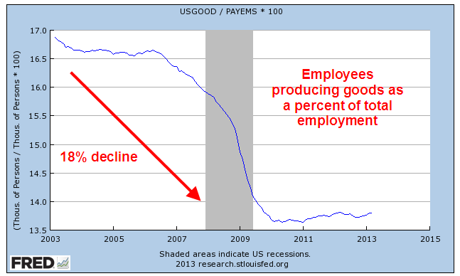
Over the past twenty years, the employment market has shifted markedly away from producing goods.  As a share of total employment, about 1 in 7 workers produces goods.  Just ten years ago, the ratio was 1 in 6.

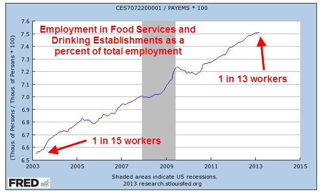
What jobs did those workers find?  Serving food and drink to the ever growing share of people in Professional and Business Services.

The core work force, those aged 25 – 54, shows no growth over the past year.  I use the words “work force” to include only the employed.  “Labor force” includes both the employed and unemployed.  More on that in a bit.

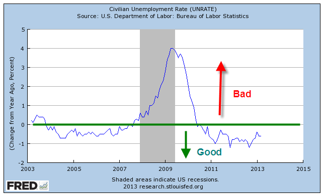
I have written before about the year over year (y-o-y) percent change in the headline unemployment rate, or U-3 rate, and that past recessions usually follow when this change goes above 0.  The unemployment rate has benefitted remarkably from the number of people who continue to drop out and are no longer counted as unemployed.  Because of the drop outs the percent change in the unemployment rate is still in good territory.

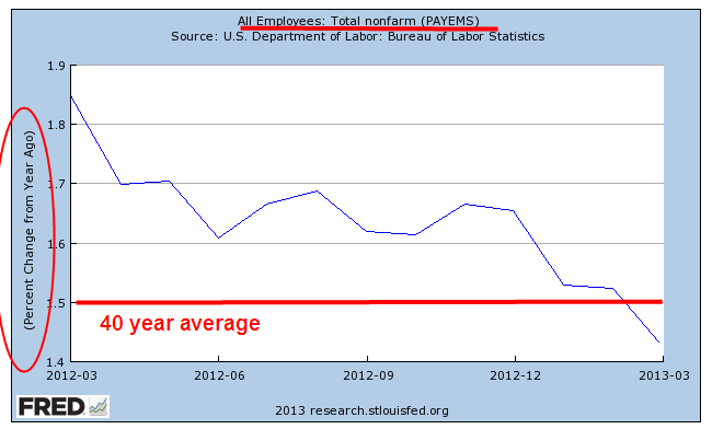
A secondary indicator may be the y-o-y percent gain in the employed.  The long term average is 1.5%.  When the percent gain falls below that, recession soon follows.  The percent gain just fell below the long term 1.5% average.

Let’s zoom out to the past forty years to see how this percent gain in employment has preceded past recessions.  The exception was in 1973-74 when the Arab oil embargo created a sudden and deep recession in the country.

There was a decline in the number of people who dropped out but had been searching for work (but not in the past month) and were available to work.

The long term trend of those not in the labor force continues to reach new heights.  As a percent of the population, it  keeps climbing at an alarming rate.

Older workers are retiring, either voluntarily or involuntarily, at the rate of 800,000 a year.

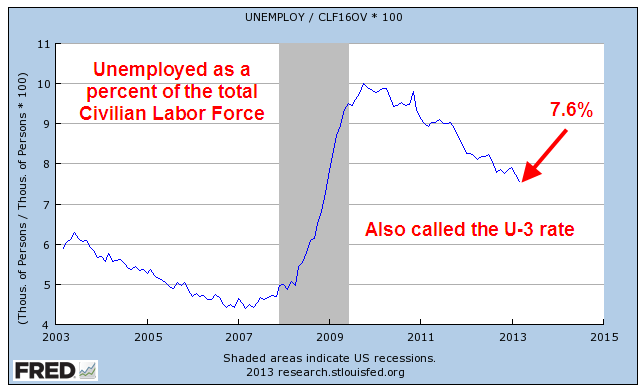
Which brings us to several sometimes confusing concepts, the Civilian Labor Force (CLF), the Participation Rate, and other metrics.  The Civilian Labor Force is those people aged 16 and over who are either employed or unemployed.  To be counted as unemployed, a person is not working but has searched for work in the past month.  The unemployment rate is simply the percentage of unemployed in the Civilian Labor Force, which now totals about 155 million.  An unemployment rate of 7.6% means that about 12 million people are counted as unemployed. 
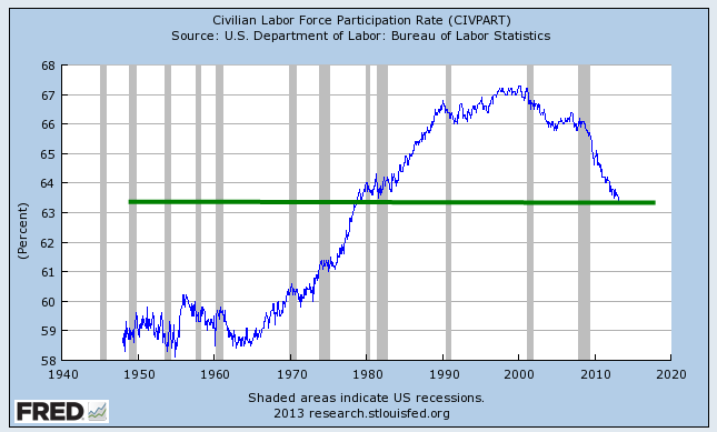
Then there is the Civilian Labor Force Participation Rate, or simply the Participation Rate, which is the percentage of the Labor Force to what the BLS calls the Civilian Non-Institutional Population (CNP).  Don’t go to sleep on me.  The CNP is those people who are aged 16 or more and who are not in prison or the military. 

So, the Participation Rate (PR) is the number of people who ARE working as a percent of people who CAN legally work; i.e. who are over 16 and not in some institutional setting that prevents them from working or finding work.


Let me give you some numbers and a pie chart.

The total population of the U.S. is estimated at 313 million; the CNP is estimated at 245 million.  The difference between those two figures are mostly children under 16 and people in prison and the military.  Here’s how the Labor Force compares with those not in the labor force and children under 16.

Why does the the Participation Rate (PR) matter?  As it declines, workers have to support more of those who are not working.  Many seniors feel that they “paid into the system” but the “system” – yes, your elected representatives in Congress – spent the additional money paid into the system over the past thirty years.  Social Security is a “Pay as you Go” system meaning that existing workers must somehow pay back into the system to pay benefits for those who retire.  Pay back = higher taxes. As the percentage of the population who works declines, taxes must rise or benefits decrease regardless of who paid into the system. 

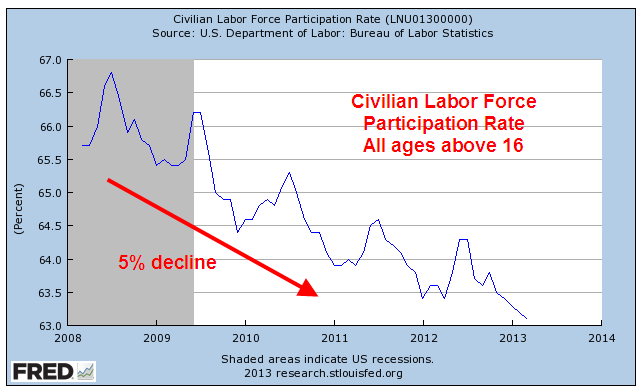
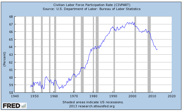
This past month the BLS estimated a further decline of .2% to a level of 63.3%.  For comparison, Canada has a PR of 66.6%. 

Part of the decline is a natural demographic change as the population ages.   So how much has the aging of the population contributed to the decline in the PR?  What is the PR for those of working age 16 – 64?  Oddly enough, the time series figures are not easy to come by.  But before we get to that, let’s get to the surprises.

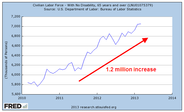
Since 2010, the older labor force, those aged 65+, has grown by 1.2 million. 

In 20 years, the participation rate among seniors has risen 50%, from 11.8% in 1990 to 17.4% in 2010.  The BLS projects that it will rise to 22.6% by 2020, a doubling in thirty years.  Seniors will continue to compete for jobs with the working age population.

Meanwhile, the participation rate of the core work force, those aged 25 – 54, is on a steady decline.

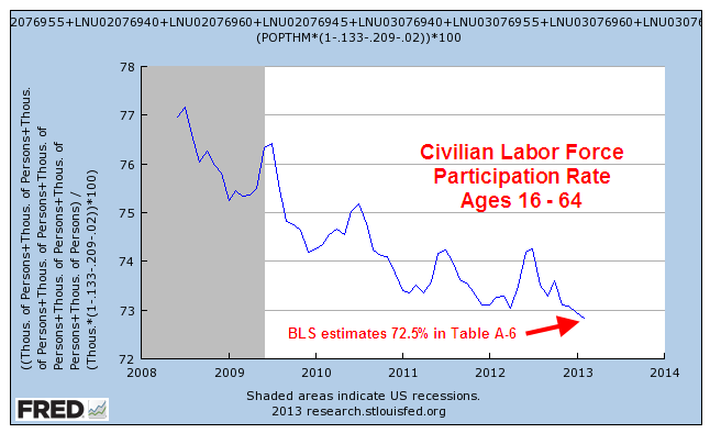
Now comes the biggest surprise, the decline in the working age Participation Rate.  To get the time series, I had to add a number of series together and take some population estimates by the Census Bureau.  Changing demographic shifts and 2010 census revisions make the series not entirely accurate but does give a good representation of the approximate 6% decline.

Let’s look at the last five years for the overall Participation Rate, which has declined about 5%. 

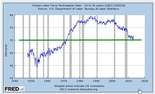
The aging of the population is contributing maybe 20% to the overall decline.  The bulk of the decline is a deterioration of the working age labor force.  Some are going back to school, some have given up looking for a job recently.  Many younger workers are finding it difficult to find a job. The Consumer Credit report released Friday shows another surge in student loans.  The FinAid student debt clock shows that student loans now exceed a trillion dollars. I have the sinking feeling that this will end badly. The participation rate for those aged 20 – 24 has declined about 7% and is now slightly less than the rate for all working ages. 

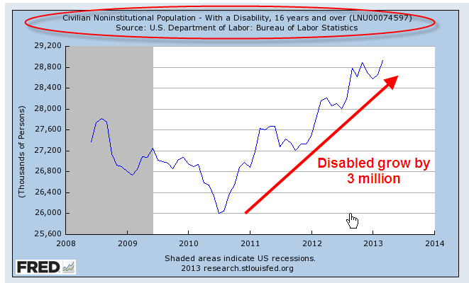
Payments under the Social Security Disability program, or SSDI, took about 10% of Social Security taxes in 1984.  They now consume 20% of SS taxes and are becoming an increasing burden on the Social Security program even as the boomers begin to retire.  The ranks of the disabled have grown more than 10% in the past three years.

A declining percentage of the population working to pay for an increasing number of benefits – this economic tension is sure to produce social and political conflict.  Many of us probably hold the vague hope that it will all work out somehow.  Some think that politicians in Washington will figure it out despite the fact that the solutions that Congress comes up with to most problems only exacerbate the problem or shift the problem to another area.

On the other hand, the baseball season is still young and anything is possible, right? 

Home Sweet Home

March 31st, 2013

From its catatonic state the housing market continues to make headlines.  On Tuesday came a somewhat disappointing report on new home sales for February; at 411,000 it was a bit below expectations of 425,000.   A real estate saleswoman told me this week that it’s now a seller’s market in Denver.  I presume that means that buyers are now having to offer the asking price or above when submitting a sales contract to a seller.

For a long term perspective, let’s zoom out fifty years.  Home sales are at past recession bottoms BUT they are better than last year and the year before and the housing and labor markets are hoping.

Will the patient stir, starting to rise, only to fall back on the bed?  PUH-LEEZ DON’T!

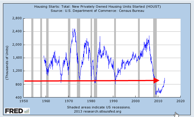
Housing Starts, which include multi-family dwellings, are on an upswing but are also coming from a deep trough.

What is more telling for the labor market is the ratio of home sales to housing starts, which continues to decline as more and more multi-unit apartment buildings and condos are being built.

Construction of multi-unit dwellings takes less labor per family unit and the type of construction is often skewed to a different kind of labor force than the construction of single family homes.  There is more steel, concrete and masonry work in multi-unit construction, employing trade skills unfamiliar to some in single family residential construction.  This shifting emphasis of skills in the work force may damper growth in the construction labor market.

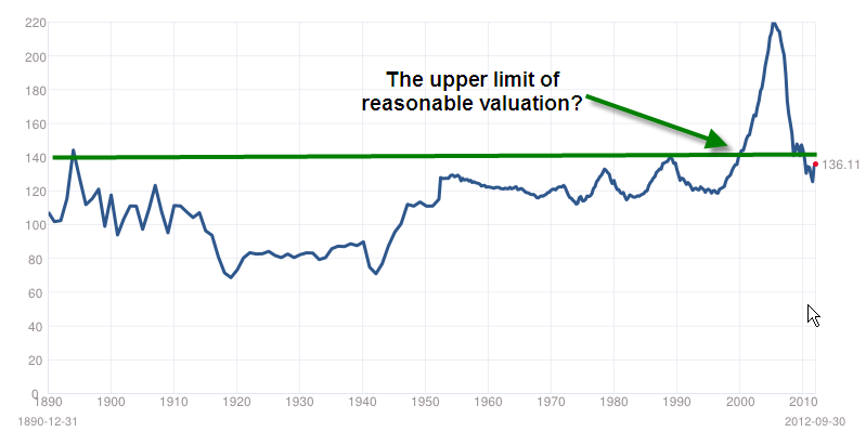
Let’s go up in our hot air balloons and take a gander at home valuation for the past 130 years.  The Case-Shiller Home Price index surveys home prices throughout the nation and adjusts for inflation.  The homes of today offer more than the homes of 100 years ago, both in convenience, comfort and safety.  However, the index is approaching an upper range that may be less attractive to potential buyers.

Let’s look at housing evaluations from an affordability perspective.  The National Association of Realtors offers an affordability index based on a composite of mortgages.  I prefer a different measure, one that is based on disposable income – income after taxes.  For many of us, buying a house is the biggest purchase of our lives.  Before we make such a big commitment, we need to have some savings (except during the housing boom) to make a down payment, and we need to feel some certainty about our future income.  Mortgage payments will probably take the largest bite out of our income.  

When we look at a long term history of the growth of the home price index (purchases only) and the growth of inflation adjusted disposable income, they track each other closely – until the housing boom really took off in 2000.  Below is a graph of the past 20+ years, showing the relationship between the two.


The upturn in home prices is still above the trend line growth of disposable income and until personal income can resume or surpass a 3% growth rate, any rise in home prices will be constrained.

Blossoms and Blight

March 24th, 2013

The Blossoms

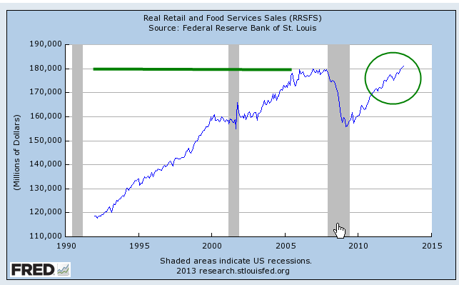
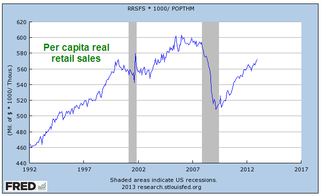
There have been a number of encouraging reports these past several months, helping to fuel new highs in the popular SP500 stock index.  After falling off dramatically five years ago, real (inflation adjusted) retail sales finally surpassed 2007 levels.

Housing prices around the country are on the mend.  Although the purchase only home price index is still below the vaulted levels of the bubble years, it is exactly where it would have been if there had been no bubble and housing prices had grown at their customary 3 – 4% per year.

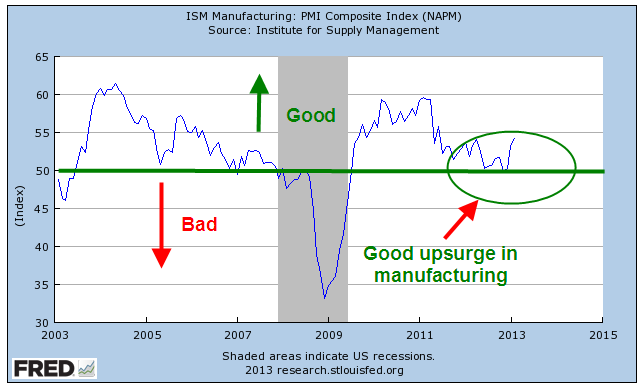
In recent months, the manufacturing sector of the economy has surged upward, rebounding from weakness in the latter part of 2012.  For the past year, the Eurozone has been in or near recession, yet some are hopeful that increased demand in this country and some emerging markets are helping to balance the contractionary influence of decreased demand in the Eurozone.  Let’s hope that this surge in the first part of the year does not fade as it did in 2012.

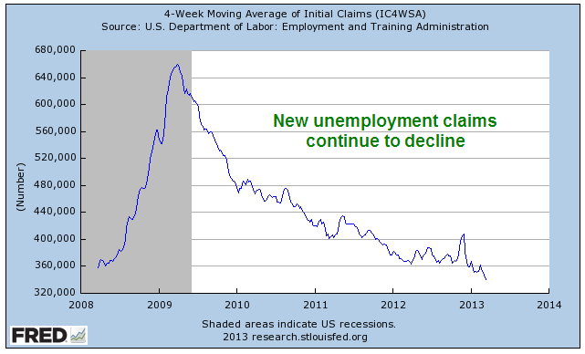
New claims for unemployment continue to decline. 

The Blight

But a 7.7% unemployment rate and a record 14 million disabled (SSA Source) show that the labor market is still sick.  The percent of working age people who are working, or the participation rate, continues to drift downward.

While the steadily improving retail sales indicate growing consumer confidence, per capita purchases are about where they were in the late 1990s, 15 years ago.

While consumers have been shedding debt, state and local governments continue to hold large levels of debt which does not include promised pension and health care benefits to retirees.

Federal Spending continues to outpace receipts, adding to the debt at a rate of more than 4% per year. At that rate the debt will double in about 18 years, reaching $30 trillion in 2030.  As a percent of the entire economy of the country, the deficit or annual shortfall between spending and revenues is still about 7%.
 

As housing prices recover and households either pay down or shed debt in foreclosure or bankruptcy, household balance sheets are looking better. What has happened in the past five years is a massive shift of household debt to the balance sheets of local, state and federal governments.

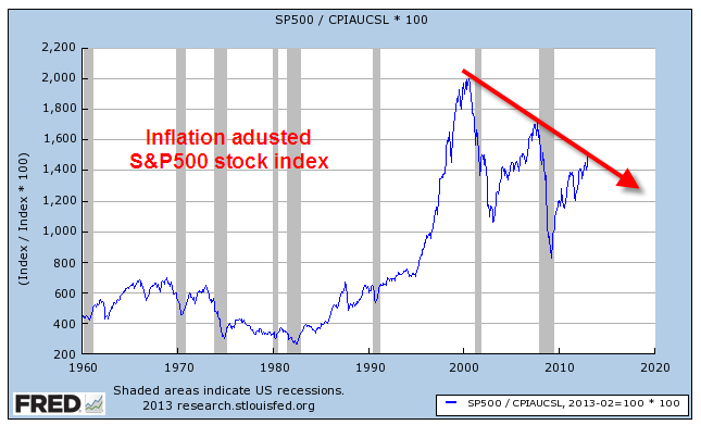
The blossoms catch our eye, inspiring hope, causing some to not notice the blight.  But the stock market, the barometer of millions of watching eyes, tells a more complete story.  While the stock market has shown renewed optimism in the past several months, its inflation adjusted value indicates a more tempered enthusiasm for the long term future of the economy and corporate profits.

Widgets and Labor

March 9th, 2012

Labor costs are the major share of the expense of producing goods and services.  While the percentages vary by industry, a rule of thumb is that labor is about 70% of the final cost of a product.  The cost of labor to produce one widget should keep rising with inflation.  With the passage of time, widgets sell for more and employees demand more pay to produce those widgets.  Not surprisingly, the Bureau of Labor Statistics keeps track of the labor cost to produce widgets; they call it Unit Labor Cost.  In laymen’s terms we can think of it as the Widget Labor Cost.  The cost is indexed to a particular year year; in this case it is 2005.  If the labor cost of a widget was $2.43 in 2005, we’ll set that to 100.  Indexing makes what might seem like arbitrary numbers more uniform.  If the labor cost of a widget in 2012 is $2.67, then the index would read 110, or 10% more than 2005.

Widget labor costs typically fall or flatten out in a recession.  A graph of the past ten years shows that we still have not reached 2007 levels.

Keynesian economists say that labor costs are “sticky”, i.e. they do not decline in proportion to the downturn in the economy and the reduced demand during a recession.  Wages are the price of labor. Union contracts and employment laws do not allow these prices to fall to what is called the market clearing level.  Labor prices thus become too expensive and employers want less labor, resulting in higher unemployment.

Several decades of data allows us to see some changing growth trends in the labor costs to make widgets.

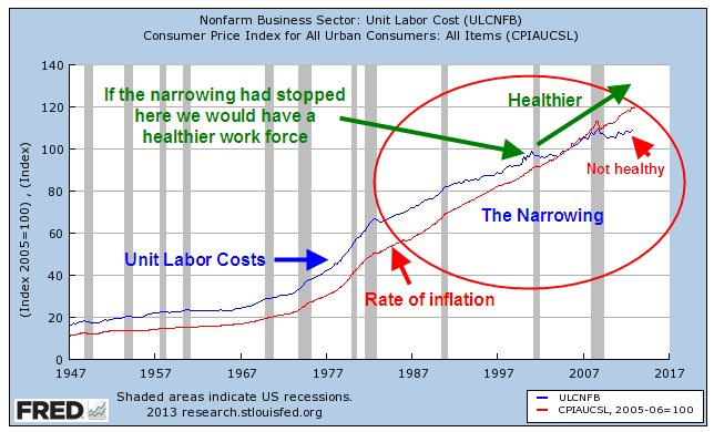
As I noted earlier, labor costs rise with inflation.  The graph below shows the relationship between the two.

After WW2, the rise in labor costs was just slightly ahead of the rise in inflation, allowing workers a greater standard of living and to put away some money for the future.  During the “stagflation” of the 1970s, this gap widened as workers demanded more pay in response to rising inflation while economic growth stagnated.  When the economy recovered in the mid-1980s, we began to see a narrowing between unit labor costs and the rate of inflation.  Had this narrowing stopped around the year 2000 and labor costs continued rising with inflation we would have a healthier work force and a healthier  economy.  But the gap narrowed further until labor costs were no longer keeping up with inflation.  Dwindling increases in labor costs have resulted in more profits for companies.  Although the labor market has a strong influence on the stock market, it is an indirect influence.  Stock prices are directly influenced by rising corporate profits and the perception that future profits will increase at a faster or slower rate.

Because wages do not rise and fall in proportion to the swings in the business cycle, companies took the only course of action left.  They reduced the labor component cost of their goods and services where they could.  Union contracts offer a company less flexibility in responding to downturns in the economy.  Companies reduced their exposure to union labor by outsourcing production to other countries, or by subbing out production to smaller companies with non-union workforces.  

Many people have been waiting several years for employment to recover.  As the chart above shows, there has been a systemic decrease in labor needed to produce each widget.  There is little indication that this trend will end as the economy continues to recover.  Since this economy is consumer driven, it is dependent on a healthy labor market.  A stumbling labor force will not produce robust gains in the economy. 

That is the background, the context for a look at February’s monthly labor report from the BLS, a better than expected report.  The headline job gain was 236,000, far above the 170,000 anticipated employment gain.  The unemployment rate dropped to 7.7% and the year over year decrease in the unemployment rate indicates little chance of recession.

There were other positive signs in this latest report.  Average hourly earnings of private-sector production and nonsupervisory employees broke above $20, increasing to $20.04.  After rising and stuttering last year, earnings have increased steadily since August 2012.  Despite these gains, hourly earnings of production employees are little changed from 1965 levels.

A slowly improving economy gave some hope that we might see the number of discouraged unemployed workers decline below 800,000 this month.  Instead the number rose from 804,000 to 885,000.

The Labor Force participation rate dropped another .1%.  Fewer and fewer workers are being asked to shoulder the benefits of the retired and unemployed.  The core work force aged 25-54 is still showing no substantial improvement.

While employment gains in the 25 – 54 age group have stagnated, the larger group aged 25+ continues to show improvement.  The unemployment rate for this larger group declined another .2% and now stands at a respectable 6.3%.  The employment picture for new entrants into the labor force, those aged 16 – 19, remains bleak.  This past month, the rate of the unemployed in this group increased and now stands at 25%.  Hispanics have seen a 10% decrease in unemployment during the past year but there are still almost 10% unemployed.  The minority group that has suffered the most through this recession has been African-Americans, whose unemployment rate has stayed subbornly high.  There have some small declines in unemployment over the past year, but almost 14% of this group is unemployed.

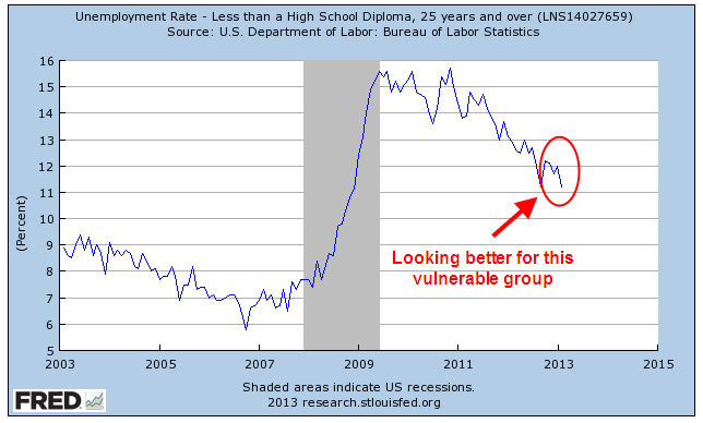
However, a group that has had persistently high unemployment, those without a high school diploma, saw a significant decline from 12% to 11.2%.

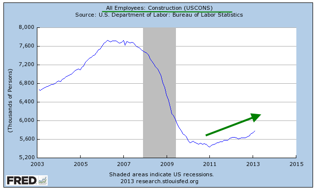
A significant contributor to that decrease is the steady rise in construction employment.

Perhaps not so widely followed is the “Craigslist indicator of construction activity.”  No, you won’t find this one charted anywhere but it does give a clue to what it going on in your area.  Search for “work van”, “work truck”, “step van” or “cube van” in your local Craigslist.  If there are a lot of listings, it means things are not good.  A few years ago, the Denver area used to have pages of work vehicles for sale by both owners and dealers.  This month there are few listings.

Other positives were the increase in the weekly hours worked to 34.5, in the pre-recession range.  Health care enjoyed strong gains as usual.  Professional and business services enjoyed strong gains, offsetting the unusually flat gains of January.  A rise in retail hiring was a nice surprise.

A bit of a head scratcher was the revision of January’s job gains, erasing 25% of the 160,000 job gains that month.  Revisions of that size leads to doubts about the winter seasonal adjustments that the BLS makes to the raw data. 

There are still 3 million fewer people working than in January 2008, when the BLS reported employment of 138 million.

In the past week the Dow Jones Industrial average crossed above the high mark of 2007.  On an inflation adjusted basis, the Dow is still well below the level it attained in 2000 and has still not passed 2007 price levels.  Some argue that the average 2.2% in stock dividends paid out each year partially compensates for the 3% loss in purchasing power.  Others argue that the dividend is compensation for the risks the investor assumes in the stock market and should not be taken into account.  If we disregard dividends, the inflation adjusted SP500 index is – well, it’s better than it was in 1990.

If a buy and hold investor has been in the market since 1990, she has gained 4% per year after inflation.  Adding in a dividend yield of about 2.5% over that time results in a total gain of 6.5%.  Had she bought a 30 year Treasury note in 1990, she would have been making about 8% per year for the past 23 years.  There are three lessons to be learned from this:  Diversify, diversify, diversify.

Capital Goods and New Claims

March 3rd, 2013

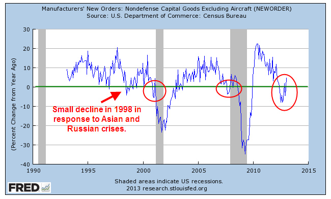
This past week came a number of positive economic reports.  The first one I will look at is the Durable Goods Orders, which indicate a willingness by consumers and businesses to commit money now to buy stuff that will last for several years.  A critical component of this index is capital goods, durable goods like machinery which produce more goods and services.  As a key indicator of business confidence in the future, it is one of the trends I watch. (See Predictions and Indicators)

Until the past few months, this component has been particularly weak, warning of recession.  Resolution of the “fiscal cliff” issue at the beginning of the year has sparked more optimism and it shows in the new orders for capital goods.  This deep a decline in the year over year percentage change has been followed with an uptick in the past, only to fall into recession.

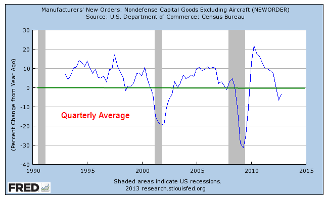
When we smooth out the monthly data with quarterly averages, the trend is still in negative territory.

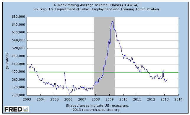
Every week the Bureau of Labor Statistics issues a report on the number of New Unemployment Claims.  This past week, the BLS reported a lower than expected number of 341,000, a drop of 22,000 from the week before. Numbers of more than 400,000 are a major concern.  The weekly series can be volatile; most analysts look at the 4 week moving average to get a better gauge of the trend. 

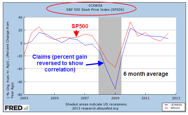
As with many data series, I am interested in the year over year (y-o-y) percentage change in the data.  Because the SP500 index is a volatile series, I’ve smoothed out the data to a 6 month average to show the negative correlation between stock prices and  new unemployment claims. 

In other words, when unemployment claims go up, the stock market goes down.  This particular data series is good when it is low, bad when it is high so I reverse the percentage change to show its correlation with the SP500. 

On a quarterly basis, this negative correlation has proved to be a reliable trading signal for the longer term investor.  When the y-o-y percentage change in new unemployment claims crosses above the SP500 change, sell.  When the claims change crosses below the SP500 change, it’s safe to buy.

Again, this strategy is for the long term investor who is more concerned with major structural changes in the economy that can cause a significant dent in her savings.  Using this strategy she will not maximize her gains but she will avoid major losses and it does not require that she check her stock portfolio more than four times a year.  An investor using this strategy for the past twenty something years would have bought in the first week of Oct. 1990 and been in the market during the 1990s as the index climbed, then stalled in the mid 1990s, then climbed again.  She would have sold in the first week of Jan. 2001, missing most of the market drop for the next several years.  She would have re-entered the market in the first week of October 2003 and sold again in the first week of April 2008, just before the financial meltdown in September of that year.  She would have bought again in the first week of January 2010 and would still be in the market.

For the long term investor who does not want to devote a part of their lives to reading financial news or watching CNBC, it is often difficult to separate the “noise” – the weekly headlines and economic reports – from the real motion or trend.  This indicator is a low maintenance signal for that investor.

P.S.  You can get this report yourself without much trouble. 
Enter “Fred New Claims” into your browser’s search bar. 
The first link should be “Unemployment Insurance Weekly Claims Report – FRED” at the Federal Reserve.

Click the link, then select the first series “4-Week Moving Average of Initial Claims”. 
When the graph displays, click Edit Graph in the lower left below the graph.
Select the 10 Years range radio button. 
In the Frequency field below the graph, select “Quarterly” and leave the Aggregation method at the default setting of “Average”. 
In the Units field below that, select “Percent Change From Year Ago”. 

(Adding the SP500 stock market index)
Below the “Redraw Graph” button, select the blue bar Add Data Series
Leave the New Line button selected.
In the Search field, type SP500 and select the default SP500 index.  The graph will redraw automatically but it will make little sense at this point until we edit the settings for the SP500 index. 
Select the 10 Year range button for the SP500.  Make sure you are editing the SP500 data graph and not the New Claims indicator. 
Change the Frequency field to “Quarterly” just as you did for the New Claims. 
Change the Units field to  “Percent Change From Year Ago” just as you did with New Claims. 
Click the Redraw Graph button and voila!

Fill ‘er up!

February 23, 2013

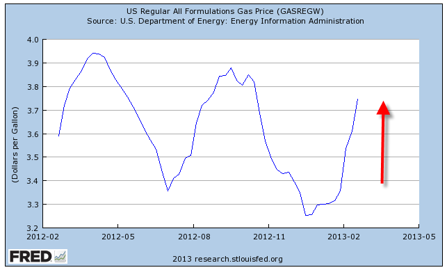
Most of us with cars have noticed the rather dramatic increase in gas prices since the beginning of the year.  I’ll use the all formulations series, which is about 8 – 10 cents cheaper than what a family might pay at the pump.

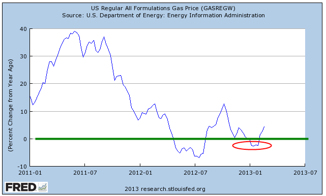
A reason given for the upsurge in prices is that this is a normal seasonal change as refineries shut down to make the change over from a winter gas formulation to a summer gas formulation.  Heavier volatile organic compounds are removed from gas during the summer months to reduce smog.  The resultant decrease in supply therefore leads to an increase in price.  It’s Econ 101.  If that were true, then the year-over-year percent change would be relatively minor at this time of year.  In one of those contradictory anomalies, this year is the only year that the refinery change-over explanation actually fits.  Price changes over the same months in 2012 have been minor.  Notice that in other years, price increases in the early months contradicted the theory.

The change has been particularly noticeable because gas prices decreased to near $3 a gallon toward the end of 2012.  In the Denver area, prices dropped below $3 a gallon, prompting comments in idle conversation.  The average driver uses about 10 gallons a week but out west, where driving distances are greater, that average gas consumption is probably closer to 15 – 17 gallons.  The difference between $3 gas and $4 gas can mean a weekly gas “tax” of $15 or more.  For those of us who use a vehicle for work, the difference can be $30 or more.

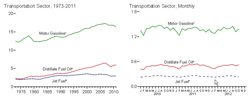
Since the recession began in 2007, our use of gasoline has decreased, ending a multi-decade rise in overall gasoline consumption (EIA Source)

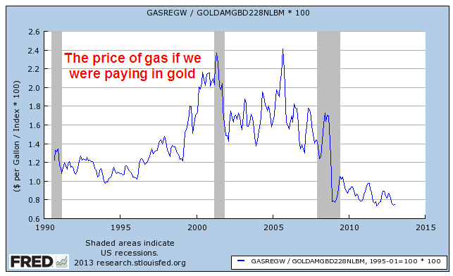
However, since the late nineties average gas prices are rising and have become quite volatile.  So why?  Our gasoline use was increasing during the nineties but prices were flat at a little over a $1 a gallon. Why the big increase in the past 10 – 15 years?  If one were buying gasoline with gold, the price has fallen over the past two decades.

If our consumption has levelled off in the past few years and we are producing more oil in this country, why has the price of gasoline stayed pretty consistently above $3 a gallon?

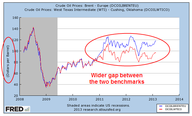
The three main variations of crude oil are heavy (Venezuela, for example), medium (North Sea and MidEast) and light (Texas). The benchmark for medium grade is Brent Crude; for light grade it is West Texas Intermediate (WTI). The two benchmarks have traditionally moved in tandem with Brent Crude trading about $2 above WTI.  Over the past few years, the difference in price between the two benchmarks has widened considerably.  “Fracking” has led to an upsurge in domestic production; production in the North Sea has been steadily declining; tensions in the MidEast and North Africa have contributed a risk premium to medium crude produced in the region.

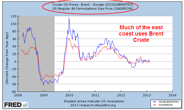
Refineries are set up to process a particular type. Most east coast refineries process Brent Crude; higher transportation costs of domestically produced crude oil over land made it more cost efficient for eastern refineries to import oil from overseas.  Since the majority of the U.S. population lives in the eastern U.S., the majority of the American people use imported gas.  Gas prices move in tandem with the spot price of Brent crude.

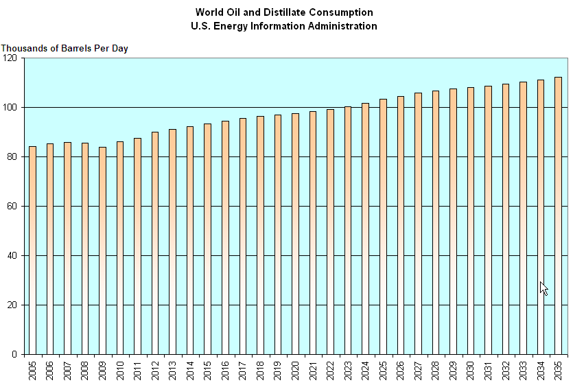
While U.S. oil consumption has declined, world consumption has been rising.

The U.S. Energy Information Administration projects  a slow, steady rise in oil consumption over the next two decades as the standard of living improves.

No magic wand will cause gas prices to decline.  Crude oil and its derivative products are a world commodity and can be shipped inexpensively in large tankers all around the world.

Last week I wrote about the long term trend in federal debt; that it was not a “New Normal” but a continuation of the same old normal of the past several decades.  The continued rise in oil prices is another trend that has become a fixture of our daily lives and will continue to eat at the dollars in our pocketbooks for the foreseeable future.