Economic Activity Indexes

July 14th, 2013

A few weeks ago I wrote about a constant weighted index (CWI) of the monthly Purchasing Managers survey. Presented by economist Rolando Pelaez in a 2003 paper, the CWI assigned various fixed weights to the separate components of the survey.

The Purchasing Managers Index, or PMI, covers manufacturing industries, now a relatively small part of economy.  In the past thirty years, our economy has become dominated by service industries which are surveyed separately each month.  The composite of the non-manufacturing survey is the Business Activity Index, or BAI.

Two weeks ago, June surveys for both sectors indicated a very slight expansion.  The service sector edged up but is hardly robust.

Wanting to see what a composite Manufacturing, Non-Manufacturing index would look using Mr. Pelaez methodology, I combined the components of each survey, assigning 70% to the service sector and 30% to the manufacturing sector.  Did I get out my R statistics program and run multiple regressions to find the combination of percentages that fit the historical data best?  No.  While the manufacturing sector is less than 20% of the economy, it has powerful influences on the service industries in a community.  How much effect?  Using my gut, I came up with 30%.

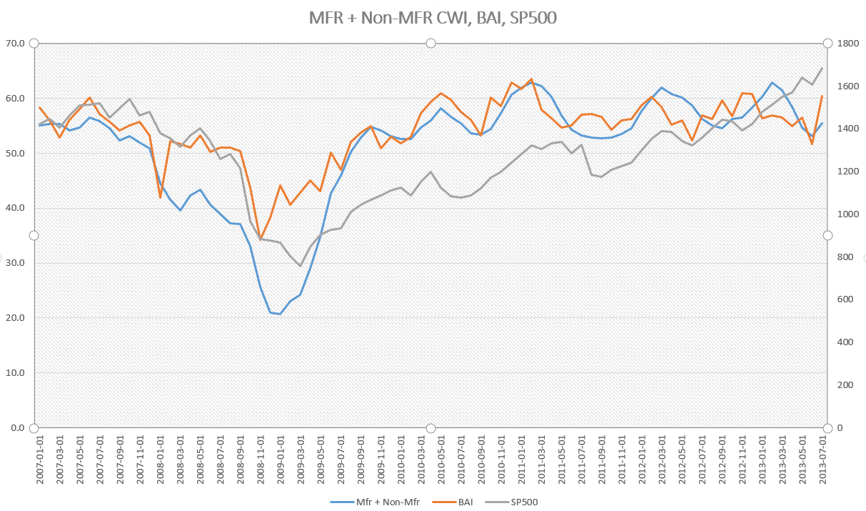
The results surprised me.  The graph below starts in 1997 and includes the latest June figures.  It compares this composite index, labelled M+NM (manufacturing and non-manufacturing), with the service sector BAI and the SP500 stock market index.  The composite index loosely follows the  BAI, which is an easily available index that an investor can find by typing in “Fred Business Activity Index” into Dr. Google.

The chart shows a divergence between the recent rise in the stock market and the recent decline in business activity.

Let’s take away the clutter and look at the BAI itself.  Growth has slowed but this may just be a normal dip in the business cycle – nothing to be alarmed about.

For the past month the stock market has been trading on whether the Fed, and China, can keep holding up the world’s economy.  Corporate earnings this past quarter are expected to show lackluster growth, economic activity indexes are showing a somewhat lackluster expansion – and the stock market makes new highs.

It’s a head scratcher.

Job Trends

July 7th, 2013
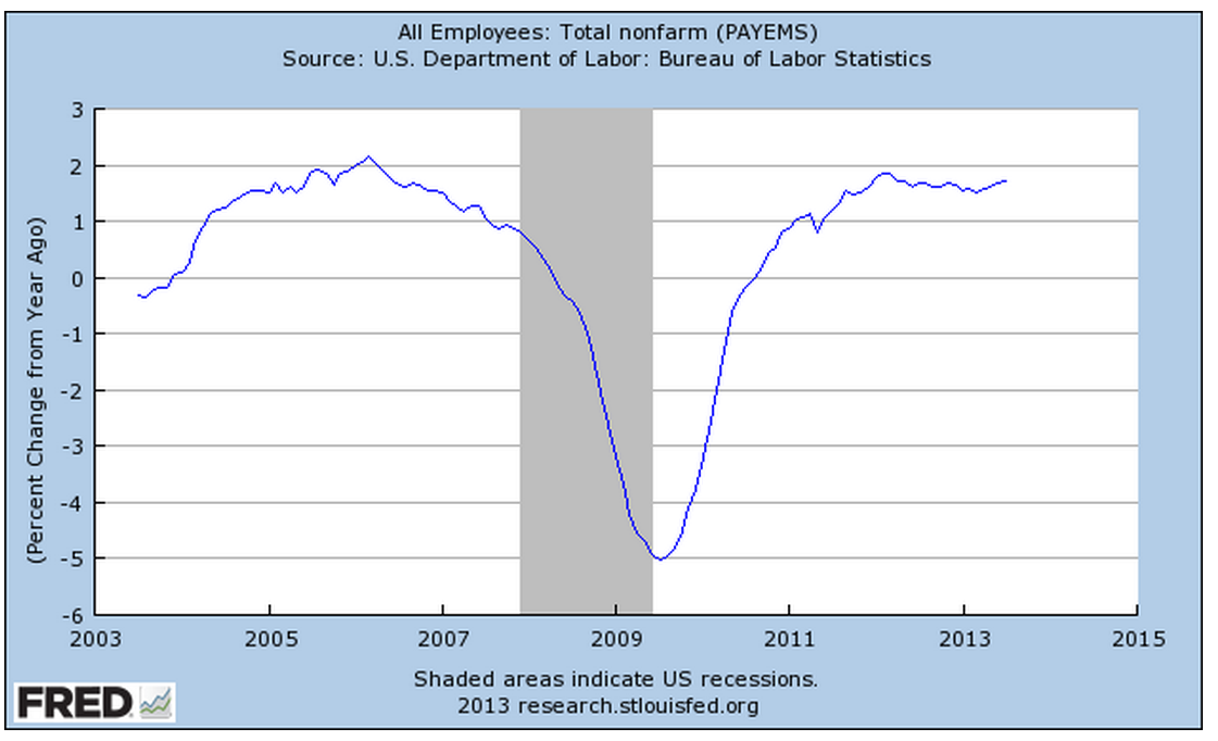
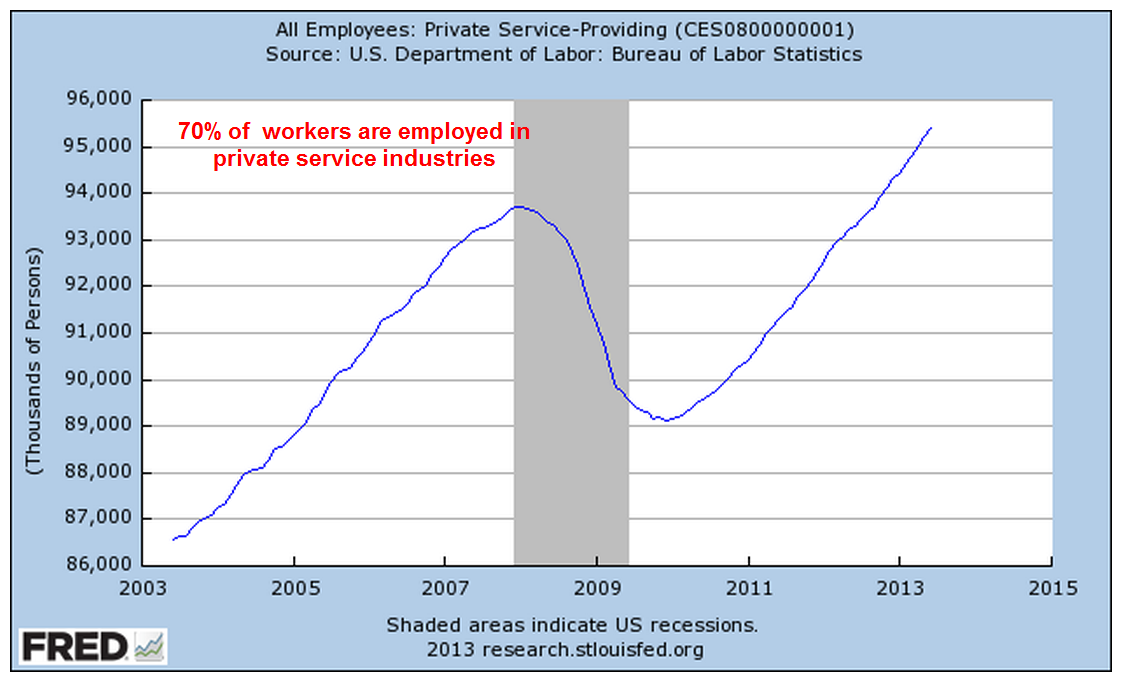
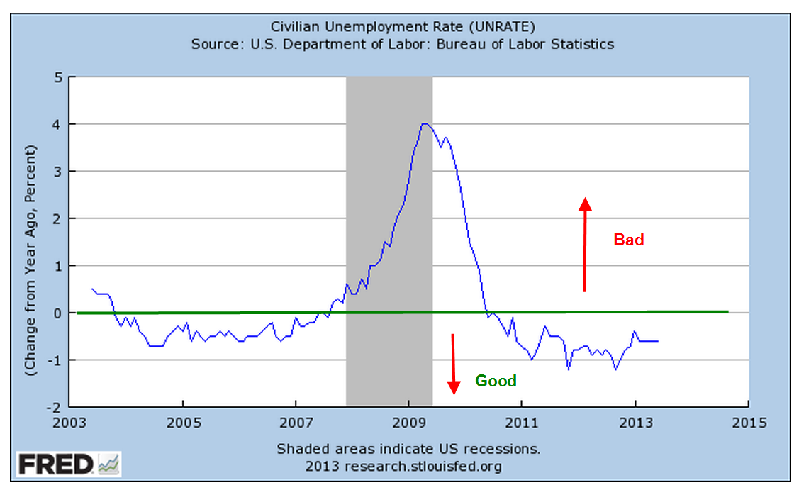
A better than expected June labor report released this week prompted some speculation that the Federal Reserve may begin tapering its quantitative easing program as early as this fall.  The employer survey reported a net gain of 195,000 jobs and the gains of earlier months were revised up 70,000.  Government workers continue to decline. We will see that the modest strength in the labor market is part of a mixed employment picture.    The unemployment rate remained steady at 7.6%; the year over year percent change in this headline index continues to chug along in the “good” territory.

70% of workers – about 95 million – are employed in private service jobs, most of which showed strong gains in the past quarter.

14% of workers are government employees; federal, local and state governments continue to shed workers.

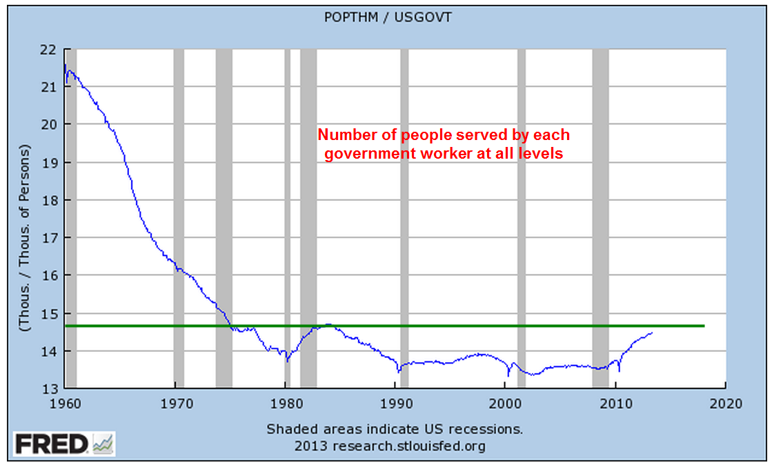
As the number of workers declines, the number of people served by each worker continues to rise, approaching levels last seen in the early 1980s and mid-1970s.  The government work force would need to decline a further two million, or 10%, to reach the level of 15 people per government worker.  That level is still far below the comparatively lean government worker levels of the 1960s and earlier.

The major part of the attrition in government jobs seems to be over.  Local governments are adding employees while the federal government continues to shed employees.

Job gains continue to come in lower paying retail and food service jobs.  In 2013, employment finally surpassed early 2008 levels.  The average wage of $14 to $17 per hour in these industries is far below the $24 average of all workers and the $20 average of private production and non-supervisory workers.

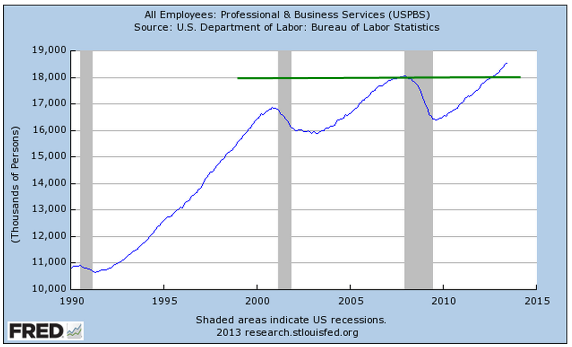
Much higher paying jobs in Professional and Business Service industries continued to show strong gains and have also climbed above 2008 levels.  The average wage in this category is 15% higher than that of all workers.

Over seven million people not counted in the labor force or in the headline unemployment rate say they want a job now.  Four years after the official end of the recession, the number of “kind of unemployed” remains high.

The number of involuntary part-time workers increased by 322,000, or about 4%, to 8.2 million, over 5% of the total labor force.  These are workers who are working part time but want full time jobs.  A healthier labor market would have about 3% of these unwilling part timers.

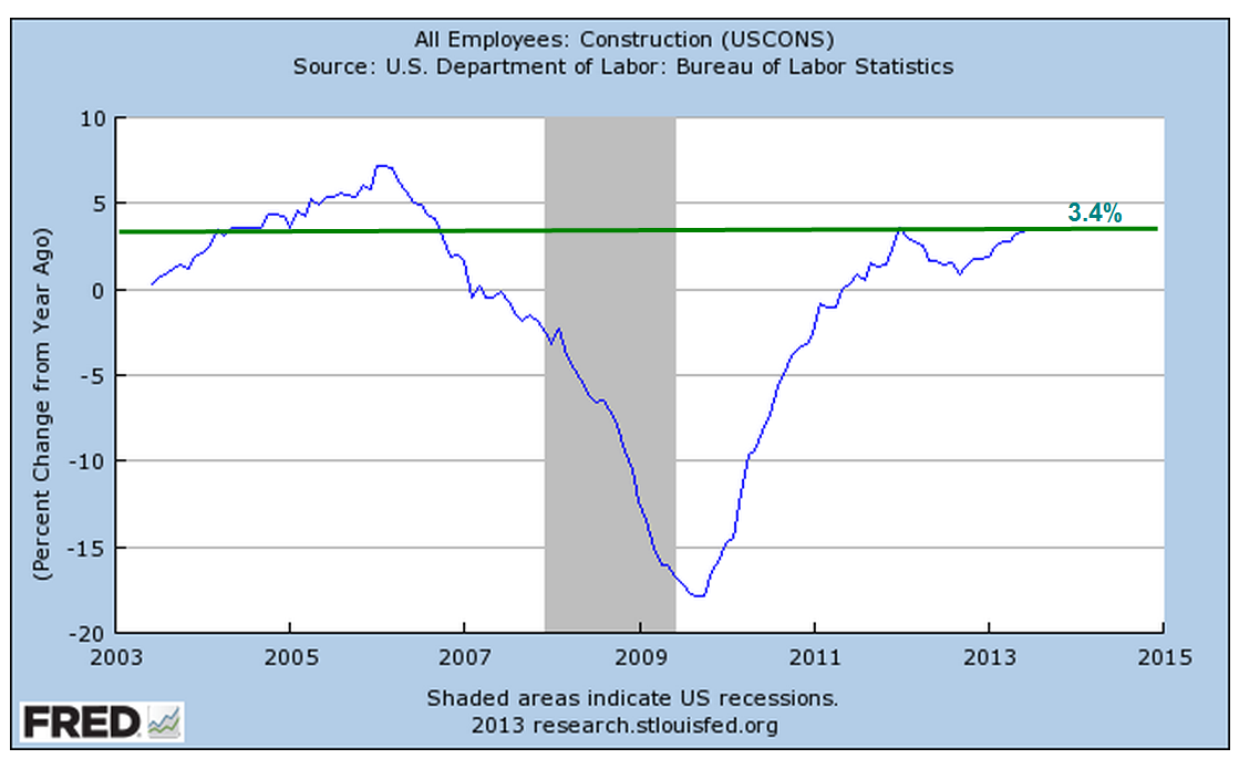
As the number of housing starts increases, the unemployment rate among construction workers continues to decline and dipped below 10% this month.  Lower lows in this unseasonally adjusted index of unemployment is a good sign.

But the year-over-year percent change in construction employment is still not robust enough to reverse the heavy job losses since the onset of the recession.

The core work force aged 25 – 54 dropped by 100,000 and continues its slight upward struggle above the recession depths.

A decline in this prime working age population is partly responsible, but the 1.6 million decline in population is but a third of the 5 million plus decline in employment for this age group.

A 2004 paper by a BLS economist, Jessica Sincavage, provides an interesting historical perspective on multi-decade generational trends in the unemployment rate.  She noted “The characteristics of today’s younger workers differ from those of their baby-boomer counterparts in several ways that may affect the former group’s impact on the labor force and the unemployment rate now and in the future. Among the relevant characteristics affecting both groups are school enrollment patterns, race and Hispanic origin, and women’s labor force participation.”

In 1979, over 42% of the last of the boomer generation aged 20 – 24 were enrolled in school.  In 2002, under 37% of the “echo boomer” generation aged 20 -24 were enrolled.  Easy job availability, the growth of the internet and the sustained rise of the stock market during the 1990s persuaded many younger workers that the opportunity cost of going to college was simply not worth it.

The onset of this recession has divided the prime work force into two groups.  For those with a degree unemployment has remained low.  For those without the higher education, unemployment is almost double.  In a curious correlation, the unemployment rate for three groups is about the same – the general labor force,  workers above 25 years with a high school only education, and Hispanics.

The third factor noted by Ms. Sincavage is the participation rate of women in the labor force. In her 2004 paper she observed “In 1979, the participation rate of women 16 to 34 years was about 63 percent; by 1999, it was 70 percent.” By the mid 2000s, this cultural and demographic bulge began to decline.  The rate for all women has now declined below the levels of the early 1990s.

Although there was a lot to like about this month’s labor report, recent job gains are swimming against an undertow of shifting demographics and labor demands from employers.  A casual reading of the headline numbers might lead one to discount these long term negative trends.

The Great Moderation

June 30th, 2013

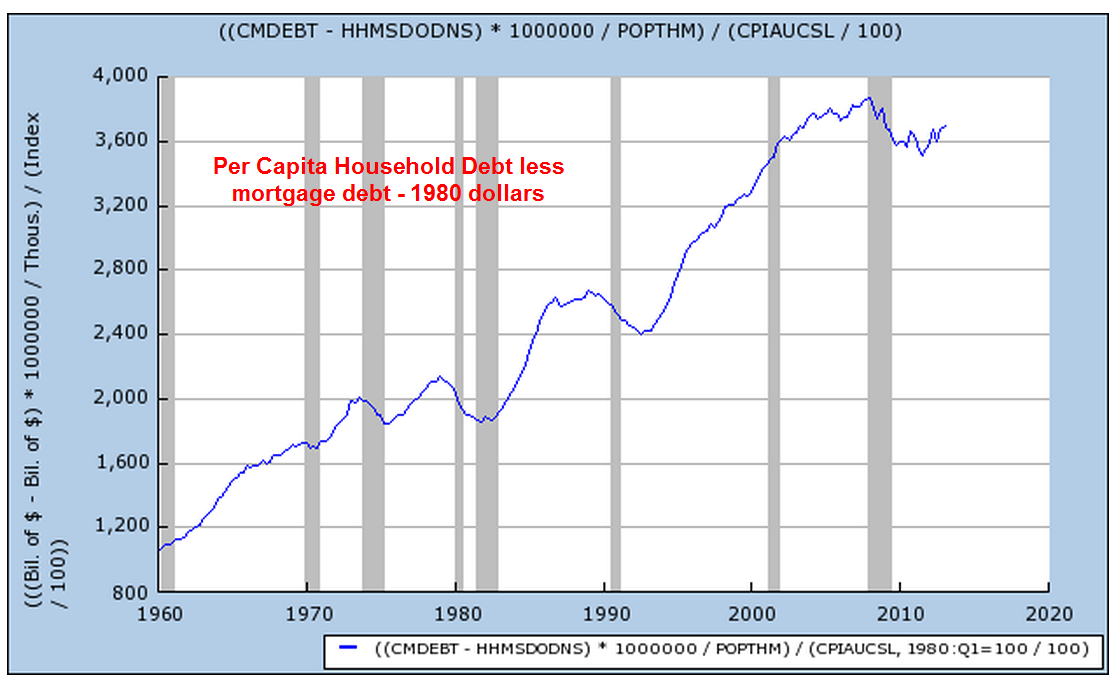
Economists cite a number of factors to account for the growth during the 1980s and 1990s, a period some call the “Great Moderation” because it is marked by more moderate policies by politicians and central bankers.  Causes or trends include less regulation, lower taxes, lower inflation than the 1970s, the rise of emerging economies,  and a more consistent rules based monetary policy by the Federal Reserve.  Often underappreciated, but significant, was the huge increase in consumer credit. Household spending accounts for 2/3rds of the economy.  A new generation, the boomers, emerging fully into adulthood in the early ’80s, welcomed the broader availability of credit.  Like their parents, the boomers took on the burden and responsibility of owning a home, the largest portion of a household’s debt load, but unlike the previous generation, the boomers sucked up as much credit as they could get for cars, clothes, vacations, home furnishings and the growing array of electronic devices.

When we look at the non-mortgage portion of household debt, the rate of growth is more restrained – a mere 80% increase in per capita real dollars.

The parents of the boomer generation, dubbed by newscaster Tom Brokaw as the “Greatest Generation”,  had been habitual savers.  By 1980, the personal savings rate was about 10% of disposable income.  By the middle of that decade, the Greatest Generation began retiring and withdrawing some of that savings.  Their children, the boomers, did not have a similar sense of frugality.

Rapid advances in technology led to the introduction of new electronic toys for adults.  Credit cards, once reserved for the well to do, became ubiquitous.  Consumers parted with their money more painlessly when charging purchases.  Financing terms for automobiles became more generous,  allowing more people to purchase new cars, which became increasingly expensive as regulators mandated more safety controls.

After thirty years of gorging on credit, households threw up.  The past six years could be called the “Great Diet” or the “Great Purge” to get over the three decade credit binge.

We can expect rather lackluster growth for several more years as households continue to shed those ungainly pounds debts.  Not only are households shedding debt but also certain kinds of assets. In 2009, the Federal Reserve reported that households and non-profit corporations owned $400 billion in mortgage securities like Fannie Mae and Freddie Mac.  In the first quarter of 2013, the total was $10 billion.  (Table of household assets and liabilities)

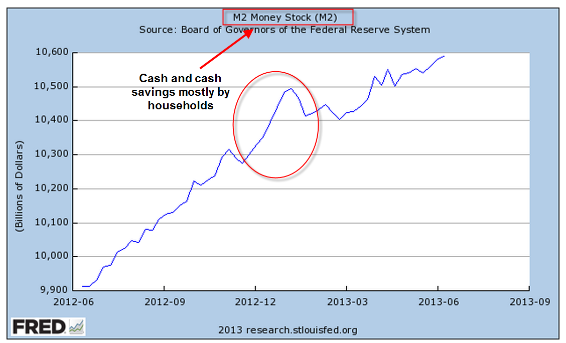
Households continue to keep ever higher balances in low yielding savings accounts and money market funds, indicating the high degree of caution. The big jump in deposits was probably due to higher dividends and bonuses paid in the last quarter of 2012 to avoid higher taxes in 2013.

For the past two weeks, global markets shuddered at the prospect of the Federal Reserve easing up on their quantitative easing program of buying government bonds.  Some have proclaimed that it is the end of the thirty year bull market in bonds, causing many retail investors to pull money out of bonds.  In several speeches this past week, Reserve Board members have reassured the public that quantitative easing will be here for several years.

As we have seen, households still shoulder a lot of debt weight, making it unlikely that either this economy or interest rates will experience a surge upward in the next several years.  An aging and more cautious population together with a declining participation rate in the work force indicates that another “Great Moderation” is upon us.  The previous moderation was one of political policy.  This moderation is led by consumers.  We can expect – yes, moderate, or lackluster – growth over the coming years.  The positive tradeoff for this subdued growth is the probability that the underlying business cycle of growth surges and corrective declines in economic activity will be subdued as well.

Summer Sale

June 23rd, 2013

It would be a mistake for the casual investor to think that the decline in the market this week was due entirely to Fed chairman Ben Bernanke’s comments regarding future Fed policy.  There was little that was not anticipated.  The Fed will continue to follow a rules based approach to its quantitative easing program, scaling back its purchases of government securities if employment improves or inflation increases above the Fed’s target of 2%.  Bernanke also reiterated that the Fed would increase its purchases if employment does not improve and inflation remains subdued.  So why the drop?

Shortly after the conclusion of each Fed meeting, Bernanke holds a press conference, where he issues a ten minute or so summary of the meeting and issues discussed.  He then takes about twenty questions.  At the start of this past Wednesday’s press conference at 2:30 PM EDT, the market was neutral as it had been all morning.  The Fed chairman was more specific about the anticipated timeline of the wind down of quantitative easing if the economy continued to improve.   Although he was essentially repeating himself, the voicing of a specific and concrete timeline evidently jolted some sleeping bulls who surmised that the party was over; in the final hour of trading the SP500 fell a bit more than 1% in the final hour.  For many traders, it was time to take profits from the eight month run up in prices.  “Quadruple witching”, a quarterly phenomenon that occurs when stock and commodity options and futures expire, was approaching.  The few days before this event usually see a spike in volume as traders resolve their options and futures bets.

With much of the Eurozone in a mild recession and slow growth in emerging markets, the rest of the world perked up their ears as the central banker of the largest economy envisioned an easing of monetary stimulus sometime in 2014.

Overnight (Wednesday/Thursday) came the news that the Shanghai interbank rate had shot up from about 4% to 13%, a rate so high that it threatened to seize up the flow of money between Chinese banks.  This bit of bad news from the second largest economy added additional downward pressure on world markets.  For some time, analysts covering China have been warning about the amount of poorly performing loans at China’s biggest banks.  The spike in interbank rates, prompted by the Chinese government, was an official warning to Chinese banks to be more cautious in their lending practices.

On Thursday morning came the news that jobless claims had increased, adding more downward pressure.  The SP500 opened up another 1% lower that morning and dropped a further 1.5% during the trading day. This classic “one-two” punch knocked the market down about 4%.  European markets fell about 5%, while emerging markets endured a 7.5% drop in two days.

In the past four weeks, there has been a decided shift in market sentiment.  When the market is bullish, it tends to shrug off minor bad news.  As it turns toward a bearish stance, the market reacts negatively to news that just a few months ago it largely ignored.

Over the past two months, long term bonds have declined 10% and more.  Here is a popular Vanguard long term bond ETF that has declined 12% since early May.

For the long term investor, periods of negative sentiment can be an opportunity to put some cash to work.

Business Cycles

June 16th, 2013

The manufacturing sector accounts for less than 20% of the economy but is probably the major cause of business cycles in the economy.  In the 1990s, the growing development of technology and business services in the U.S., together with what was called “just in time” inventory management, led some economists to declare an end to the business cycle. Cue the loud guffaws.

May’s monthly report on industrial production released Friday showed no monthly gain, after a decline of .4% in April.  The year over year change in the index was just under 2%.  In a separate report from the Institute for Supply Management (ISM) released a week ago, the Manufacturing Purchasing Managers Index (PMI) index for May fell into contraction, its lowest reading since June 2009, when the recession was ending.


New Orders and Production components of this index saw sizeable decreases.  Computer and electronic businesses reported a slowdown that they attributed to the sequester spending cuts enacted a few months ago.

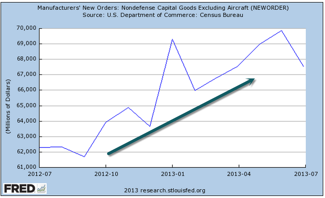
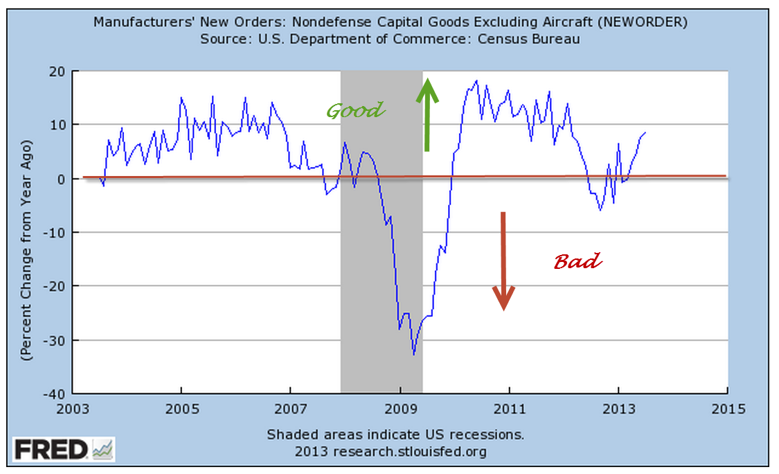
The latest data for non-defense capital goods excluding aircraft from the U.S. Dept of Commerce showed an uptick after a period of decline in the latter half of 2012; however, there is a month lag in this data set.


The sentiment among small businesses improved somewhat, as shown by the monthly National Federation of Independent Businesses (NFIB) survey.  The overall index of 94 indicates rather tepid expectations of growth by small business owners.  Plans for capital spending to expand business are still at recession levels.

A business builds inventory in anticipation of sales growth.  Since the beginning of this year the net number of small businesses expanding inventory has finally turned positive.

  In a 2003 paper, economist Rolando Pelaez tested an alternative model of the Purchasing Managers Index that would better predict business cycles, specifically the swings in GDP growth.  Assigning varying constant weights to several key components of the overall PMI index, his Constant Weighted Index (CWI) model is more responsive to changes in business conditions and expectations.  In early 2008, the PMI showed mild contraction but Pelaez’ CWI model began a nose dive. It would be many months before the National Bureau of Economic Research (NBER) would mark the start of a recession in December 2007 but the CWI had already given the indication.  In May of 2009, the CWI reversed course, crossing above the PMI to indicate the end of the contractionary phase of the recession.  It would be much later that the BEA would mark the recession’s end as June 2009.


The CWI index is rather erratic.  We lose a bit of its ability to lead the PMI when we smooth it with a three month moving average but the trend and turning points are more apparent in a graph.

Before the 2001 recession the CWI index led the PMI index down.

OK, great, you say but what does this have to do with my portfolio?  Smoothing introduces a small lag in the CWI but it is a leading, or sometimes co-incident indicator of where the stock market is headed over the next few months.

Let’s look at the last six years.  In December 2007, the smoothed CWI crossed below the PMI, which was at a neutral reading of about 50.  The stock market had faltered for a few months but as 2008 began, the CWI indicated just how weak the underlying economy was.  The NBER would eventually call the start of the recession in December 2007.  In June 2009, the CWI crossed back above the PMI.  Coincidentally, the NBER would later call this the end of the recession.

The period 2000 – 2004 was a seesaw of broken expectations, making it a difficult one to predict because it was, well, unpredictable.  I did not show this example first because this period is a difficult one for many indicators.  Before 9-11, we were already in a weak recession.  Although the official end was declared in November 2001, the effects were long lasting, a preview of what this last recession would be. In 2002, we seemed to be pulling out of the doldrums but the prospect of an Iraq invasion and a general climate of caution, if not fear, prompted concerns of a double dip recession.

An investor who bought and sold when the smoothed CWI crossed above or below 50 would have had some whipsaws but would have come out about even instead of losing 15% over the five year period.

The present day reading of both the CWI and PMI are at the neutral reading of 50.  Given the rather lackluster growth of the manufacturing sector, the robust rise of the stock market since last November indicates just how much the market is riding on expectations and predications of the future decisions of the Federal Reserve regarding future bond purchases and interest rates. Over the past thirteen years, when the year over year percent change in the stock market hits about 22%, the percentage of growth in the index declines.

So what is a normal run of the mill investor to do?  The CWI, a predictor of business cycles, is not published anywhere that I could find. This and many other indicators are used by the whiz kids at investment firms, pension funds, by financial advisors and traders, to anticipate business conditions as well as the movements of the markets.  But look again at the SP500 chart above and remember that it is the composite of millions of geniuses and not so geniuses trying to anticipate the market.  As I have mentioned in previous blogs, when that percentage change drops below zero, it is time for the prudent investor to consider some portfolio adjustments.  Since 1980, the average year over year percent change in the SP500 is 9.7%, using a monthly average of the SP500 index. Despite the recent 20% gains, the average year over year percent gain during the past ten years is only 4.9%.  If we look back to the beginning of the year 2000, the average is only 3.1%.  Those rather meager gains look robust when compared to the NASDAQ index, which is still 25% below its January 2000 high.  Think of that – thirteen years and still 25% down. The Japanese market index, the Nikkei 225, is at the same level as it was in early 1985, almost thirty years ago.  Both of these examples remind us that we need to pay some  attention or pay someone to do it for us.

Goldilocks Jobs

June 9th, 2013

In the long running comedy series “Frasier,” Frasier or Niles would often order a latte  in their local neighborhood bar, being careful to note exactly how they wanted the drink made.  Friday’s employment report was made to order – not too strong so as to hasten the end of the Fed’s latest bond buying program and not so weak as to confirm fears of another summer swoon.

Slowly and inexorably the number of employed trudges up the recovery hill.  The unemployment rate ticked up a scosh to 7.6% as more people tried to find work.  The year over year percent change is still in good territory.

On the not so good side, the percent of the total population that is working is still below the 30 year average of almost 44%.

The unemployment rate of those with a college degree is far below that of the general labor force but is still 50% above the average of the early 2000s.

Student aid loans have passed a trillion dollars (source).  To put that figure in perspective,  student loan debt is about 10% of the $11 trillion in outstanding debt of residential mortgages (source)

Changes in the bankruptcy laws in 2005 exempted student loan debt from bankruptcy.  Over the next decade or so, will the investment in education pay off?  Let’s hope so.  100 years, an 8th grade education became a standard used by employers to winnow job applicants in a tough job environment.  70 years ago, the new standard became a high school education.  For the past 30 years, we have moved to a 4 year degree as the new standard.
We now spend more on defense and more on Medicare that the $500 billion total amount spent by the state and the federal government on K-12 education. (source) Community college educators are painfully aware that many students are simply not prepared to take college courses.  Local communities used to fund 70% of K-12 education.  Thirty years ago, homeowners protested ever rising property taxes to fund K-12 education and, since that time, local funding has dropped below 50%.

If we expect our children to develop the skills for a college education, we are going to have to find an alternative model of funding.  The states have relied on an ever increasing share of Federal funding for K-12 education.  Although the percentage of Federal spending on K-12 is small, less than 10%, the aging Boomer generation will command ever more spending of general tax dollars in addition to the Medicare taxes collected.

The core work force aged 25 – 54 struggled upwards

but the participation rate, the percentage of the population in the labor force, is still weak.

The “total” unemployment rate, which includes those working part time for economic reasons, continues to drift down but is still high.

Understand that this represents over 20 million people, a bit more than the entire population of New York State.  Turn on C-Span sometime and tell me how many committee hearings on jobs there are.  Immigration, federal surveillance and the targeting of conservative groups by the IRS are important matters, yes, but why aren’t politicians in Washington talking about jobs?  There are several reasons: no one has a clue; no clear political advantage to be gained; constituents are not writing letters to their representatives and senators about jobs.

Welcome to the “New Abnormal.”

Stocks vs Bonds

June 2nd, 2013

As the market makes new highs this past month, I am reading articles and seeing charts on asset allocation that reminded me of those I saw in 2000.  Here is a chart that appeared in the WSJ this weekend.

Mutual Funds typically report their performance over several time periods, usually 1, 3, 5, and 10 year periods.  This spring, as the SP500 index continue to peak, a ten year lookback window begins near a trough in the index in the spring of 2003.

Why did the WSJ writer pick 25 year and 35 year time periods as a comparison?  We can only guess but it just so happens that the starting points of these two lookback periods were also troughs in stock prices.  Why not pick 20 and 30 year time periods? Let’s look at the 25 year period which starts in April 1988.

What if the writer had used a 20 year lookback?  They would have started in April 1993, when the stock market was 72% higher.  I don’t want to take the time to calculate the difference in returns, including dividends, between the different strategies shown in the chart, but the reader can imagine that the difference would be significant.

Why use a 35 year lookback?  Why not a 30 year lookback?  In 1978, the SP500 index was again pulling out of a trough in prices after a slow slide in values during 1977.

Had the WSJ writer picked a 30 year window starting in April 1983, the stock market index was – again – 72% higher than in April 1978.  Again, we can imagine that the comparison of strategies would be significantly different.

Being aware of these peaks and troughs can help us evaluate past performance of various investment allocations.  Consider an example of a 10 year comparison of the SP500 vs a bond index fund like Vanguard’s VBMFX

The SP500 index shows the better return but, if we know that spring of 2003 was a trough in this index, we can view such a comparison with some skepticism.  A five year comparison tells a different story.

Now we are comparing performance starting with a downslide in the index, when the SP500 had fallen about 11% from its peak.  It is also close to the 3 year moving average of the SP500 index.

Based on a five year window and the fact that our starting point was a 3 year average in the SP500, we might conclude that our portfolio should contain mostly bonds.  Who needs the aggravation of the volatility in the stock index when we can make the same return with a boring bond index?

In a 3 year time frame, stocks have clearly outperformed bonds.

Our starting point of this 3 year window also happens to be the 3 year average of the SP500 index.  Not only that, it is just  a bit above the midpoint between the 2007 index peak and the trough in the spring of 2009.  We couldn’t ask for a more reliable starting point to make our comparison.

So we have a second reliable starting point but the conclusion we draw is significantly different from the conclusion we drew in the 5 year comparison.  Let’s look closer at this stronger performance of the SP500 vs a bond index.

Half of the better 3 year performance of stocks has come in just the last 6 months after the Federal Reserve announced their open QE program of buying government bonds until the unemployment index reaches a target of 6.5%.  The recent upsurge in stocks has “goosed” the comparison numbers upwards in favor of stocks.

Our conclusion is that historical performance numbers presented by mutual funds or an investment advisor cannot be taken at face value.  It is important to understand the starting point of the historical comparison, which can have a significant effect on the numbers.

Grandpa’s Index

May 26th, 2013

Last week I wrote about the various benefits, particularly Social Security, that are based on the Consumer Price Index and the discussions about alternative measures of increases in the cost of living.  The term “CPI” is a general term for a specific index, the CPI-U, a widely used index of prices for urban (hence, the “U”) consumers that the Bureau of Labor Statistics compiles.

Today I’ll look at an alternative measure, the CPI-E, or Elderly index, which weights the expenditures of elderly consumers differently.  Since the sample size of this population is relatively small, the BLS warns that it is more prone to sampling error, i.e. that the sample may not accurately reflect the characteristics of the entire elderly population.  For the past decade or so, seniors have argued for cost of living increases in Social Security payments to be based on such an alternative measure.  Using the latest BLS survey comparison data, I constructed a chart to show the differences in weighting of the larger components of the CPI-U, the commonly used index, and the CPI-E, the Elderly index.

Housing and medical expenses are weighted significantly higher in the Elderly index.  A survey by the Employee Benefit Research Institute (EBRI) found that over 80% of 65 year olds own their own home.  The mortgage component of total housing costs stays relatively steady for the younger group of elderly, yet the CPI-E that the BLS compiles shows a 4% increase in this component.  The EBRI survey found that homeownership declines rapidly after 75, and it is this older group of the Elderly for whom housing costs rise.  The question is whether the CPI-E can be properly sampled and compiled to show a more accurate picture of costs for the elderly.

The medical component of the elderly index is almost twice that of the general urban population.  Although seniors have access to the subsidized Medicare program, the premiums for Medicare and costs not covered by Medicare are now borne by the elderly, rather than being fully or partially supplied as part of an employee benefit package.  In addition, people access more medical care as they age.  The combination of these two factors make it feasible that medical costs would be significantly higher for seniors.

Inaccuracies in measuring the housing component of the elderly index will be brushed aside by seniors receiving SS benefits.  Whatever measure increases benefits – well, that’s the most accurate one, of course.

An interesting note is the change in recent years of housing costs as surveyed by the BLS.  In 2007-2008, housing was 42% of total expenses.  After the housing and financial crises, that component had dropped to about a third of total expenses. (Source)

But the December 2012 CPI-U index does not reflect the results of more recent findings of BLS personal expense surveys because they are using 2009 -2010 weightings. (Data)

The largest part of the discrepancy between the actual changes in cost of living expenses and the published index is probably the “Owners Equivalent Rent” portion of housing costs which don’t reflect actual costs at all.  Instead they are a calculation of what a home owner would have to pay herself to rent her own home from herself.  No doubt, BLS economists would defend this phantom calculation as accurate but this calculation was never designed to allow for the precipitous drop in housing prices that we have experienced in the past few years.

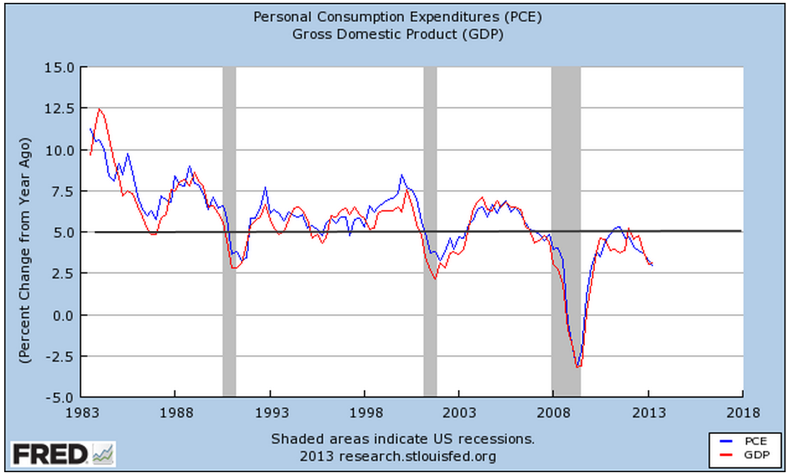
Based on BLS surveys of actual, not the adjusted, cost of housing changes, there is a good case to be made that the economy is experiencing a continuing mild deflation, not mild inflation. Deflation has become an ugly word. Social Security payments, labor contracts and a host of benefits are tied to the CPI and rely on the cost of living to increase, not decrease.  Lawmakers in Washington have, in fact, mandated that Social Security payments can not decline if the CPI turns negative.  Deflation is reviled almost as much as too much inflation.  The Federal Reserve has a target of 2% inflation, meaning that it should start pulling money out of the economy if inflation rises above 2%.  On the other hand, the Federal Reserve should be pumping money like there’s a five alarm fire if inflation has turned negative.  Has the Fed been pumping money?  Yes.  Ben Bernanke, Chairman of the Fed, prefers to look at Real Personal Consumption Expenditures.  Per capita expenditures have just now risen above 2007 levels.

While some inflation watchers are shouting “The sky is falling” as the Fed continues to pump money into the economy, Mr. Bernanke is looking at the big picture and its tepid.  Tepid means fragile.  Here’s the big pic of the last 15 years or so.

Growth has moderated.  Bernanke has to be worried that low interest rates and continued purchases of mortgage securities by the Fed is helping inflate a stock bubble but he is equally concerned at the slower growth of the economy.  Despite the headline CPI numbers of below 2% inflation, the reality is that it may be closer to 0% than the headline index indicates.

What’s behind that slower growth of spending?  Look no further than something I write about each month, the lack of growth in the core work force, those aged 25 – 54.  These are the people who buy stuff and if a smaller percentage of them are working, then they buy less stuff.  Less stuff buying reduces inflationary pressures.

Bennies From Heaven

May 19th, 2013

During the past several years, a demographic and economic shift crossed below the zero line.  For decades, Social Security taxes collected exceeded Social Security benefits paid.  The Federal Government “borrowed” this excess and used it for other programs.  Since 2010, there has been nothing to borrow.  The Social Security Administration (SSA) has several sources of revenue, but the bulk of its revenues is what we commonly call the Social Security tax, or FICA.  However, this tax has several components.  The largest portion of the tax – the Old Age and Survivors Insurance tax (OASI) – is to pay out social security benefits and it is this component I wanted to look at.  SSA gives a pie chart of its revenue and benefits paid.

I have shown the latest revisions to the pie chart but it gives you a sense of the revenue and expense components.  A table of SSA income and outgo shows only the total receipts and expenditures.  When we look at the OASI component, we can get a sense of the upcoming political debates and financial pressures.  SS benefits paid are already exceeding OASI tax receipts.  Below is a chart of SSA data showing the surplus and deficit for the past ten years.

On January 1st, the Congress let lapse the 2% reduction in payroll taxes.  In the first quarter of 2013, that has meant an additional $245 billion in revenue to the Treasury. (Source).  Since the money all goes into the same Federal pot, the additional revenue has forestalled the debt limit debate till this fall.

The SSA records other income, including income taxes on the SS benefits paid out.  This is a “pencil” income entry: the IRS keeps track of taxes paid on SS benefits and “transfers” them to the SSA.  For decades, this pencil entry has increased the SS surplus and Congress borrowed it.  The SSA charges interest income to the Federal government and records this pencil income as more money that the Federal government owes the SS trust funds.

The bottom line is that SS is a “pay go” system.  Current taxes pay for current benefits.  When benefits exceed the taxes devoted to pay for those benefits, the money has to come from somewhere.  That “somewhere” is the Federal government, but it can only get those funds from you and I and the companies who pay corporate taxes.  More troubling is the ever increasing percentage of federal tax receipts devoted to paying social benefits of one form or another.  These include, SS, Disability, SSI, TANF, SNAP and a host of other programs.

As people become increasingly dependent on the government for their welfare, they will put increasing pressure on politicians to maintain or increase these benefits.  This political pressure only heats up the political debate over how to pay for these benefits.  At the federal level, benefits have increased by $800 billion over the last ten years.

Including the states and local governments, the increase is over $1 trillion.

Any cuts in calculating benefits are met with a firestorm of protest from those who are, or will, collect those benefits.  Few care about the accuracy of calculating cost of living adjustments to these benefits.  Whatever calculation provides the best benefit becomes the most “accurate” calculation.  The current debate is whether to use the CPI or what is called a Chained CPI.  Over several decades, the CPI gives the most increase in benefits.

40% of the calculation of the CPI is housing cost and the calculation of that cost, called Owner’s Equivalent Rent, has almost tripled in the past thirty years, boosting the CPI.

Census data shows that 2/3rds of the 132 million households in this country own their homes.  Before the housing boom, a primary reason for owning a home was to lock in a monthly payment, avoiding rent increases.  Taxes, upkeep, and energy costs do go up, but the majority of a house expense, the mortage payment, is a fixed cost for many homeowners.  However, the Bureau of Labor Statistics, which compiles the CPI, calculates the housing component of the CPI as though a homeowner was renting from herself.

according to the National Association of Realtors, between 1983 and 2007 the monthly principal and interest payment required to purchase a median-priced existing home in the United States rose by 79 percent, much less than the rental equivalence increase of 140 percent over that same period.” (BLS Source)

We will continue to have a lively debate over the calculation of the CPI because it influences millions of Social Security checks each month.  We can anticipate that this debate will be at the forefront of the upcoming 2014 elections.  Why?  Because the debate stirs passions on both sides and that is what politicians need – passion.  Passion provokes people to vote.  Passion promotes donations.  Passion ignites political volunteer efforts.
The trend of worsening deficits between SS contributions and the benefits paid will only worsen as we get into the latter half of the decade.  Before the 2010 elections, we were treated to the spectacle of angry old people – without makeup – yelling at politicians to keep their stinkin’ government hands off their Medicare, itself a government program.  In the upcoming years, the debates over Social Security will make those earlier demonstrations seem rather mild.  Old people vote.  Angry old people vote a lot.

Out Of the Tent and Into the Forest

May 12, 2013
We can take some steps to reduce our susceptibility to adverse events but if our primary aim is to reduce uncertainty as much as possible, our lives suffer in quality and our wallets suffer in quantity.  In our financial lives, we must try to find a balance between risk and reward.  There is a high demand for low risk, high reward investments.  Unfortunately, there is little supply of such investments and the few that are offered are usually scams.

There is a good supply of low risk, low return products. In the past ten years, conservative savers have taken a beating.  There have been only two periods where the interest on one year CDs has exceeded the percentage increase in inflation.

Challenged by low interest rates on CDs, savers have fled the market.

Older people who rely on their savings to generate income continue to search for yield, or the income generated by an investment.  The iShares High Yield Corporate Bond ETF, HYG, and the iShares Dividend Select Index ETF, DVY, have posted strong gains.  As more investors chase yield and drive up prices, the yields correspondingly become lower.   In December 2007, DVY paid out an annualized 4.7% yield on a price of about $53.  In March 2013, the yield was 3.4% on a price of $65 (Source)

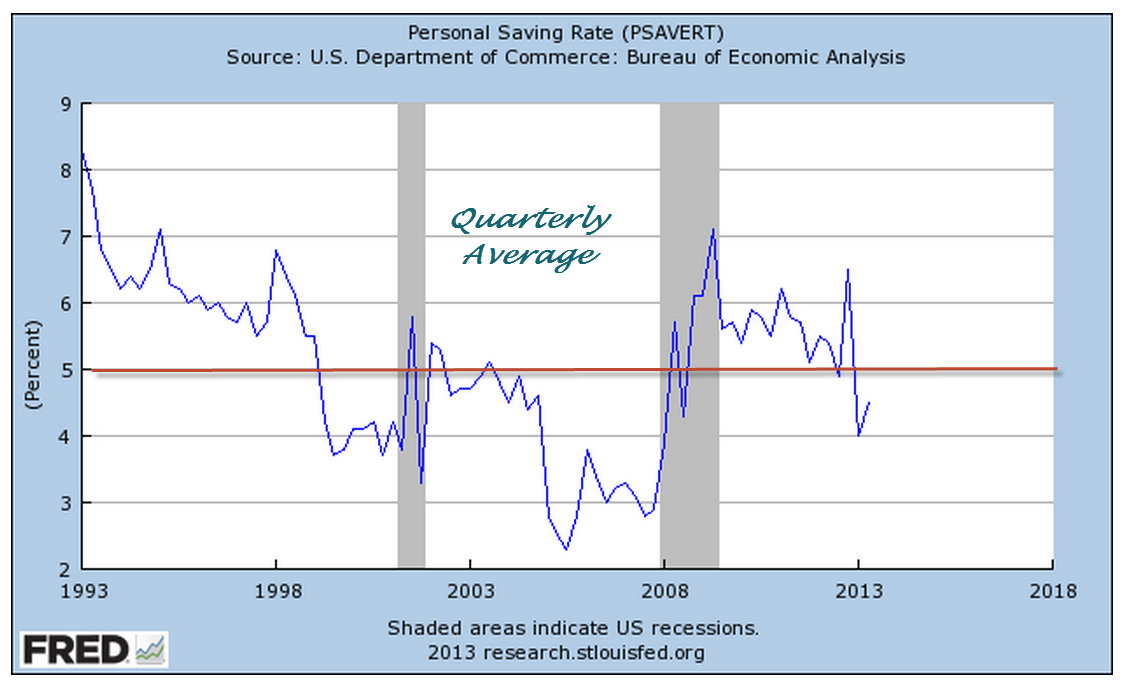
Despite the fact that the Federal Reserve has held interest rates at historic lows, the amount of household savings continues to climb.  Some of this is due to an aging population which has more in savings and tends to be more conservative.

The Federal Reserve is essentially kicking people out of the tent and into the forest where the wild animals live.  It’s risky out there in the forest.  How come the banks don’t want our money?  Some people do not realize that a CD or savings account is essentially a loan to the bank.  Through the FDIC, the U.S. government insures most of these loans.  Loan your brother in law money for a  year and you might not get it back.  Loan your bank the money and you are assured that you will get it back.

In the simplified models of banking we learned in grade school, the bank pays us interest for the money we loan it (deposits) and loans that money out to other people at a higher rate of interest.  The difference in the two interest rates is how banks pay their employees and other business costs and make a profit. The reality is much more complex.  A bank does not take a $10 deposit from Mary and loan it to Joe.  The bank takes the $10 deposit from Mary and loans $100 to Joe.  Where did the other $90 come from, you ask?  It is created out of thin air in a process called fractional reserve banking, which allows a bank to leverage the $10 deposit by ten times, in this example.  Because banks are leveraging money, there is a labyrinth of financial metrics of stability to insure that the banks are not taking too much risk.  Some of these metrics include the risk weighting of assets (deposits, loans and securities, for example) and capital asset ratios.

In a 1985 paper by Federal Reserve economists, they note that “There is remarkably little evidence, however, that links the level of capital or the ratio of capital to assets with bank failure rates.”  This paper was written before the S&L crisis of the 1980s.

The financial crisis in 2008 led to a surge of bank failures, peaking at more than 150 in 2010.  In this past year, failures have dropped to a level that can be counted with two hands.

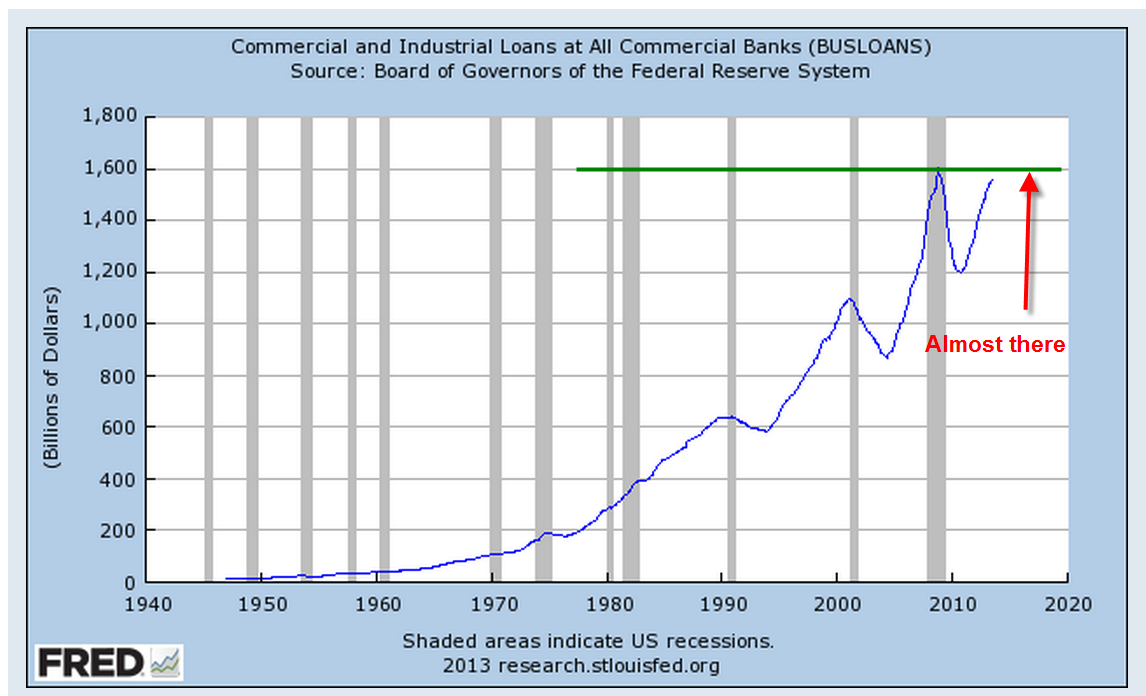
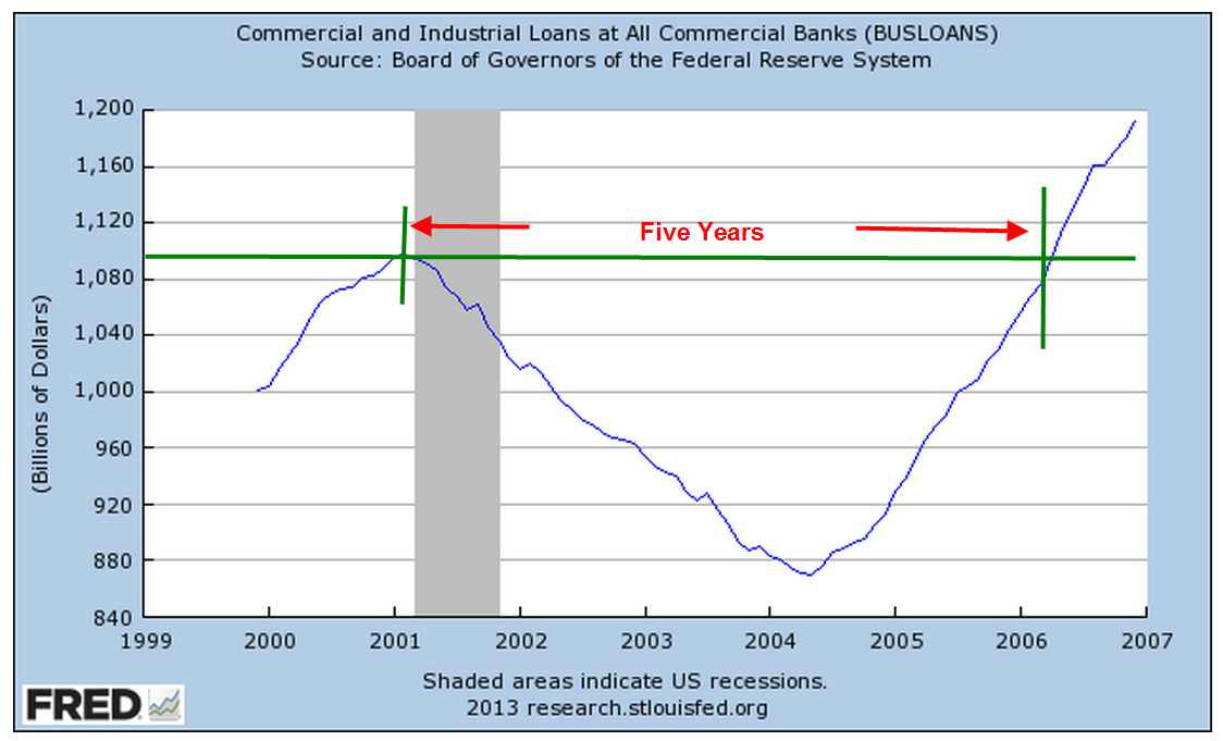
 During the recession, the amount of commercial and industrial loans declined but have risen to nearly the same level as 2008.

From a thirty year perspective, we can see just how severe the decline was.

While loans and interest bearing accounts, or assets, at the largest banks are nearing 2007 levels, assets at small banks have declined.

The banking industry has been consolidating, larger banks eating up the smaller ones.

This past Friday, the Chairman of the Federal Reserve, Ben Bernanke, expressed concern that some of the larger banks are still prone to failure.  The ever increasing size of the big banks has enabled them to have an even greater voice in the halls of Washington.  Bernanke’s remarks hint that he is a proponent of further regulations which would reduce the amount of leverage that banks can use to increase their profits.  Banking industry lobbyists are making the case that if they are required to reduce their leverage, it will hurt the economy by reducing the amount of loans they can make.

The banks are feeling squeezed and they are sure to let lawmakers know.  Their net interest margin, or the spread between what they pay to depositors and what they charge to borrowers, has fallen to pre-recession levels, putting pressure on banks to take more risk to increase their bottom line.

I am reminded of a comment made by Raymond Baer, chairman of Swiss private bank Julius Baer, in 2009 who warned: “The world is creating the final big bubble. In five years’ time, we will pay the true price of this crisis.”  Let’s see: 2009 + 5 = 2014.  Hmmmm….

But we can’t live our lives waiting for the next catastrophe.  We must take some risk, be diversified and be vigilant.  As the stock market reaches new highs with each passing day, more investors will reassess their risk profile.  Some will curse their caution of the past few years and move money from safe but low yielding assets to the market, helping to fuel rising market prices.  The demand for yield creates a feedback loop that actually makes it harder to achieve yield.  If only we could live in a world where they didn’t have these darn feedback loops.