Building A Peak

June 3, 2018

by Steve Stofka

First I will look at May’s employment report before expanding the scope to include some decades long trends that are great and potentially destructive at the same time. In the plains states of Texas, Oklahoma, Kansas, and Nebraska, summer rain clouds are a welcome sign of needed moisture for crops. That’s the good. As those clouds get heavy and dark and temperatures peak, that’s bad. Destruction is near.

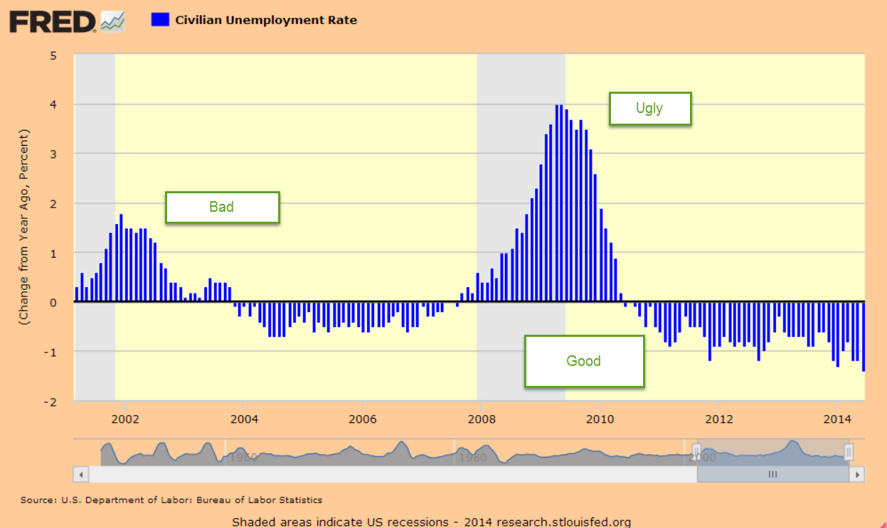
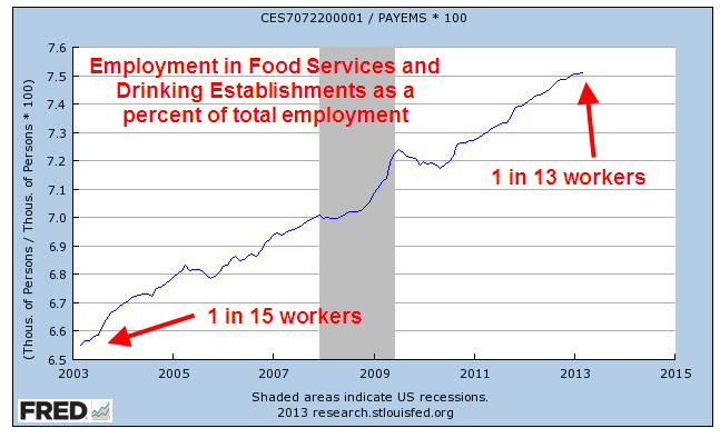
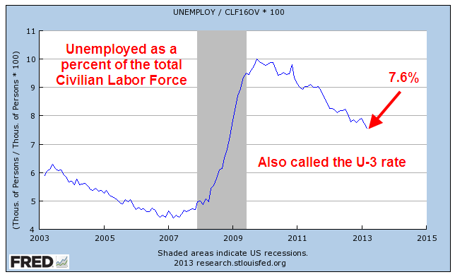
May’s employment survey was better than expected. The average of the BLS and ADP employment surveys was 203K job gains. The headline unemployment rate fell to an 18 year low. African-American unemployment is the lowest recorded since the BLS started including that metric in their surveys more than thirty years ago. As a percent of employment, new unemployment claims were near a 50-year low when Obama left office and are now setting records each month.

During Obama’s tenure, Mr. Trump routinely called the headline unemployment rate “fake.” It’s one of many rates, each with its own methodology. Now that Mr. Trump is President, he takes credit for the very statistic that he formerly called fake. The contradiction, so typical of a veteran politician, shows that Mr. Trump has innate political instincts. A President has little influence on the economy but the public likes to keep things simple, and pins the praise or blame on the President’s head.

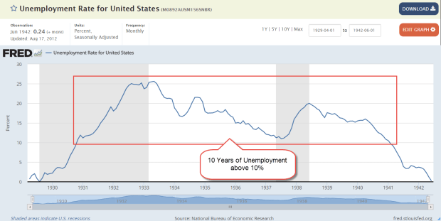
The wider U-6 unemployment rate includes discouraged and other marginally attached workers who are not included in the headline unemployment rate. Included also are involuntary part-time workers who would like a full-time job but can’t find one. Mr. Trump can be proud that this rate is now better than at the height of the housing boom. Only the 2000 peak of the dot com boom had a better rate.

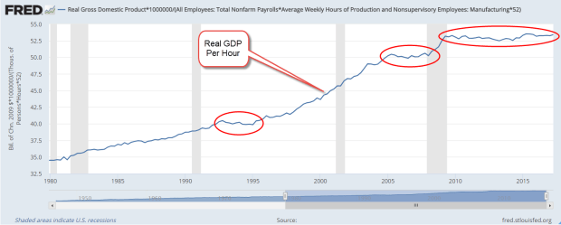
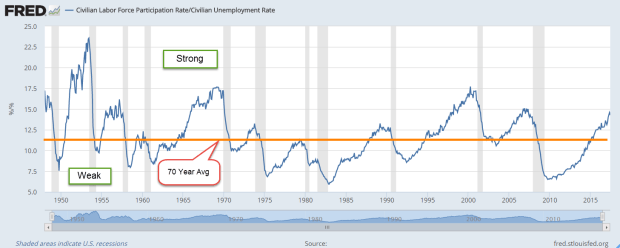
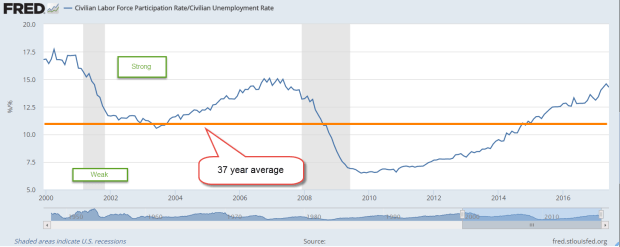
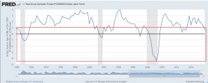
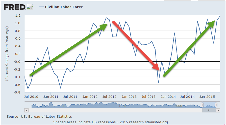
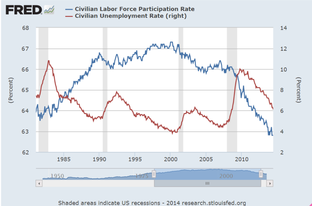
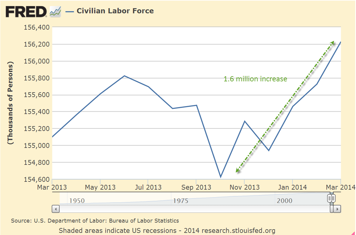
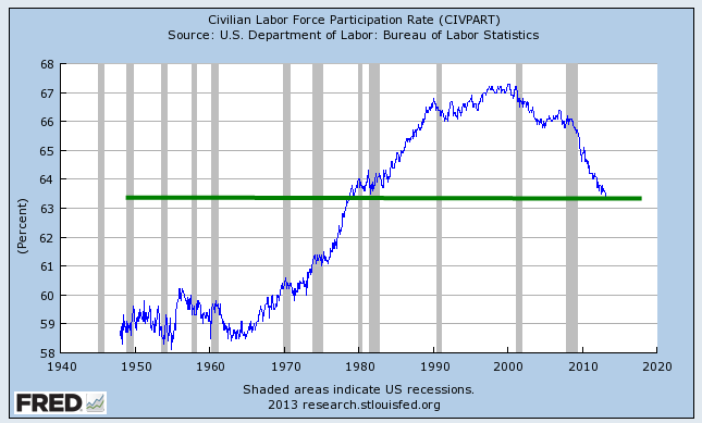
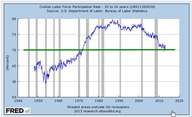
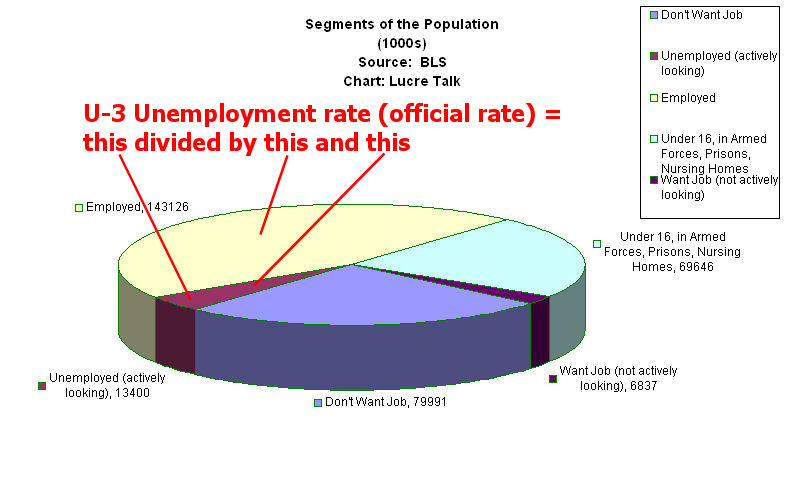
Let’s look at a key ratio whose current value is both terrific and portentous, like a summer’s rain clouds. First, some terms. The Civilian Labor Force includes those who are working and those who are actively seeking work. The adult Civilian Population are those that can legally work. This would include an 89-year old retiree and a 17-year old high school student. Both could work if they wanted and could find a job, so they are part of the Civilian Population, but are not counted in the Labor Force because they are not actively seeking a job. The Civilian Labor Force Participation Rate is the ratio of the Civilian Labor Force to the Civilian Population. Out of every 100 people in this country, almost 63 are in the Labor Force.

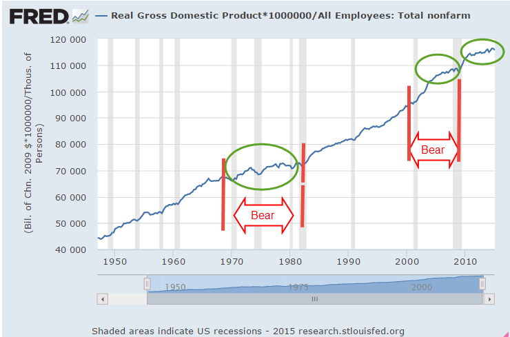
While that is often regarded as a key ratio, I’m looking at a ratio of two rates mentioned above: the Labor Force Participation Rate divided by the U-3, or headline, Unemployment Rate. That ratio is the 3rd highest since the Korean War more, ranking with the peak years of 1969 and 2000. That is terrific. Let’s look at the chart of this ratio to understand the portentous part.

CLFUIRatio
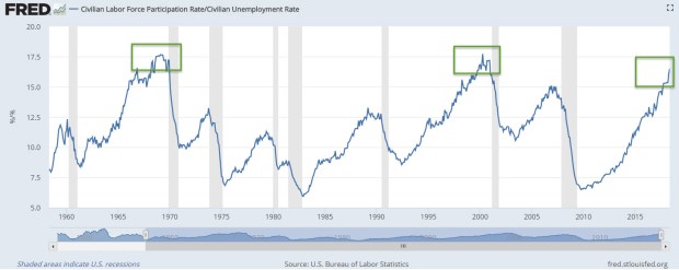
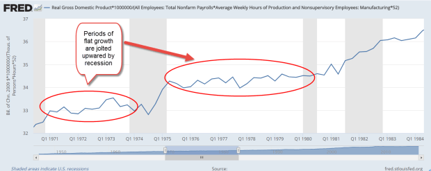
Whenever this ratio gets this high, the labor economy is very imbalanced. Let’s look at some previous peaks. After the 1969 peak, the stock market endured what is called a secular bear market for 13 years. The price finally crossed above its 1969 beginning peak in 1982. In inflation-adjusted prices, the bear market lasted till 1992 (SP500 prices). Imagine retiring at 65 in 1969 and the purchasing power of your stock funds never recovers for the rest of your life. Let’s think more pleasant thoughts!

For those in the accumulation phase of their lives, who are saving for retirement, a secular bear market of steadily lower  asset prices is a boon. Unfortunately, bear markets are accompanied by higher unemployment rates. The loss of a job may force some savers to cash in part of their retirement funds to support themselves and their families. Boy, I’m just full of cheery thoughts this week!

After the 2000 peak, stock market prices recovered in 2007, thanks to low interest rates, mortgage and securities fraud. Just as soon as the price rose to the 2000 peak, it fell precipitously during the 2008 Financial Crisis. Finally, in the first months of 2013, stock market prices broke out of the 13-year bear market.

We have seen two peaks, followed by two secular bear markets that lasted thirteen years. The economy is still in the process of building a third peak. Will history repeat itself? Let’s hope not.

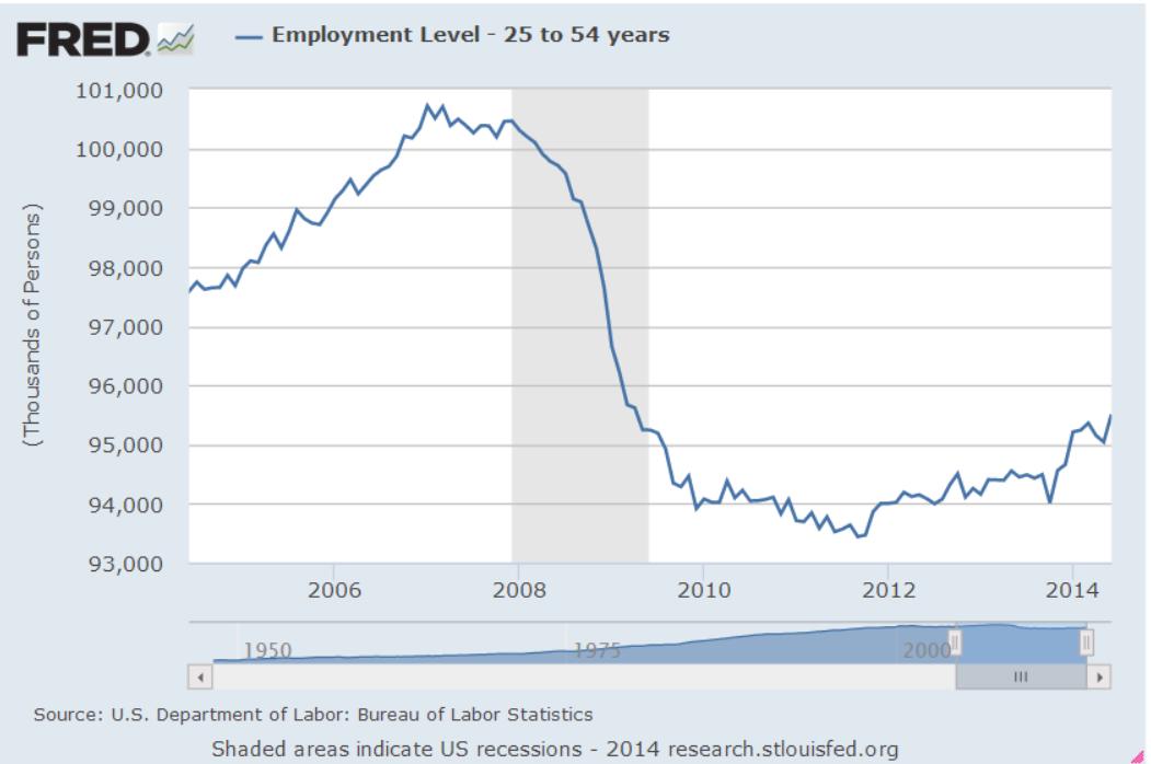
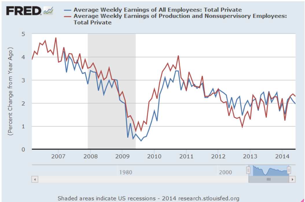
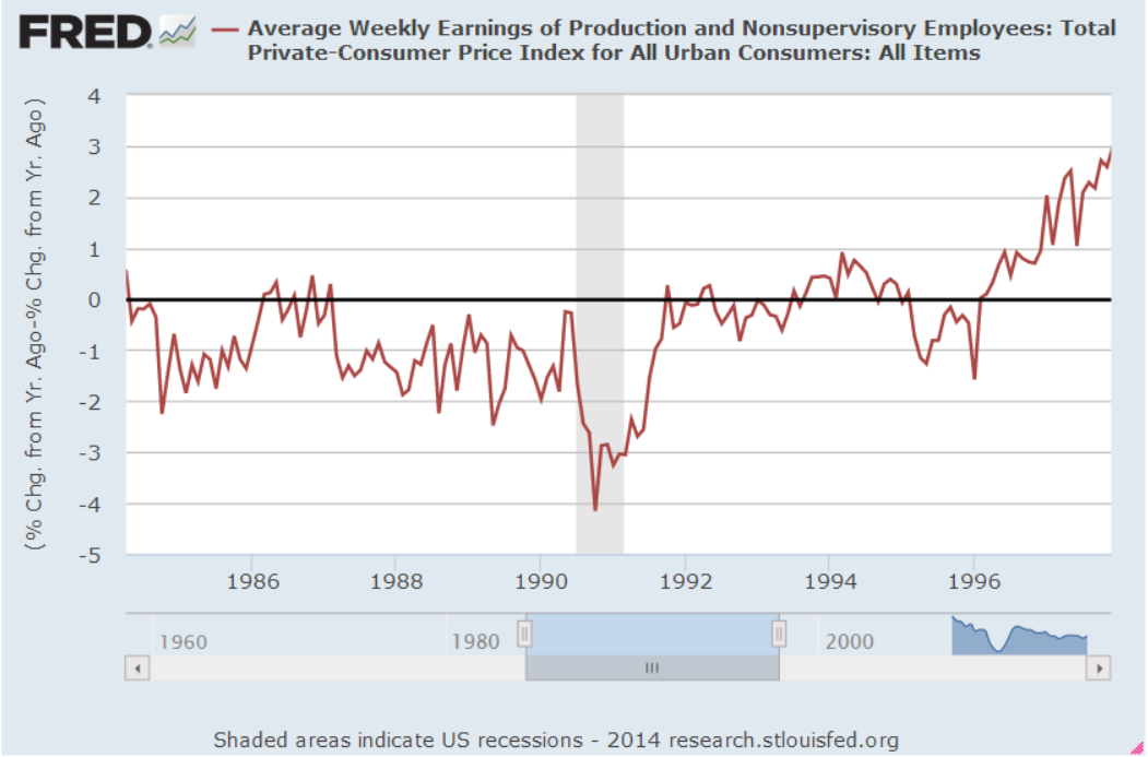
May’s annual growth of wages was 2.7%, strengthening but still below the desirable rate of 3%. The work force, and the economy, is only as strong as the core work force aged 25-54. This age group raises families, starts companies, and buys homes. For most of 2017, annual employment growth of the core fell below 1%. It crossed above that level in November 2017 and continues to stay above that benchmark.

Overall, this was a strong report with job gains spread broadly across most sectors of the economy. Mr. Trump, go ahead and take your bow, but put your MAGA hat on first so you don’t mess up your hair.

///////////////////////////////

Executive Clemency

This week President Trump pardoned the filmmaker Dinesh D’Souza, serving a five-year probation after a 2014 conviction for breaking election finance laws. He helped fund a friend’s 2012 Senate campaign by using “straw” contributions. D’Souza complains that he was targeted by then President Obama and General Attorney Holder for being critical of the administration. A judge found no evidence for the claim but if he didn’t see the conspiracy against D’Souza, then he was part of the conspiracy, no doubt. I reviewed the 2016 movie in which D’Souza unveiled the perfidious history of the Democratic Party and its high priestess, Hillary Clinton.

Wage Growth – Not

August 12, 2017

Ratios are important in baseball, finance and cooking, in economics, chemistry and physics, and yes, even love. If I love her a lot and she kinda likes me a little, that’s not a good ratio. I learned that in fourth grade.

Each week I usually turn to one or more ratios to help me understand some behavior. This week I’ll look at a ratio to help explain a trend that is puzzling economists. The unemployment rate is low. The law of supply and demand states that when there is more demand than a supply for something, the price of that something will increase. Clearly there is more demand for labor than the supply. I would expect to see that wage growth, the price of labor, would be strong. It’s not. Why not?

I’ll take a look at an unemployment ratio. There are several rates of unemployment and there is no “real” rate of unemployment, as some non-economists might argue at the Thanksgiving dinner table. The rates vary by the types of people who are counted as un-employed or under-employed. The headline rate that the Bureau of Labor Statistics (BLS) publishes each month is the narrowest rate and is called the U-3 rate. It counts only those unemployed people who have actively searched for work in the past month. In the same monthly labor report, the BLS publishes several wider measures of unemployment, U-4 and U-5, that include unemployed people who have actively searched for a job in the past 12 months. U-6 is the widest measure of unemployment because it includes people who are under-employed, those who want full-time work but can only find part-time jobs. Included in this category would be a person working 32 hours a week who wants but can’t find a 40 hour per week job.

The ratio that helps me understand the underlying trends in the labor market is the ratio of this widest measure of unemployment to the narrowest measure. This is the ratio of U-6/U-3. In the chart below, this ratio remained in a narrow range for 15 years. Unemployment levels grew or shrank in tandem for each group. By 2013, the ratio touched new heights, climbing above 1.9 then crossing 2 in 2014. The two groups were diverging. The U-3 rate, the denominator in the ratio, was improving much quicker than the U-6 rate that included involuntary part-time workers.

U-6-U-3Ratio

What would it take to bring this ratio down to 1.85? About 1.5 million fewer involuntary part time workers. What does that involve? Let’s say that those involuntary part-time workers would like an average of 15 more hours per week of work. That is more than 20 million more hours of work per week, which seems like a lot but is less than a half percent of the approximately 6.1 billion hours worked per week in the 2nd quarter of 2017.  These tiny percentages play a significant role in how an economy feels to the average person.

Let’s turn to a ratio I’ve used before – GDP per hour worked. I don’t expect this to be a precise measurement but it reveals long term trends in productivity. In the chart below, GDP per hour has flatlined since the end of the recession.

GDPPerHour201706

There are two ways to increase GDP per hour: 1) productivity gains, or more GDP per hour worked, and 2) reduce the number of hours worked more than the reduction in GDP. Door #1 is good growth. Door #2 is the what happens during recessions. GDP per hour rises because hours are severely reduced. I would prefer slow steady growth because the alternative is painful. Periods of no growth can be wrestled out of their torpor by a recession, a too common pattern. There were two consecutive periods of flat growth followed by recession in the 1970s and from the mid-2000s to the present day.

GDPPerHour1971-1984

The economy can withstand two years of flat growth without a recession as it did in the early 1990s. It is the long periods of flat growth that are most worrisome. In the early 1970s and late 2000s, the lack of growth lasted three years and were followed by hard recessions. The lack of growth in the late 1970s led to the worst recession since the 1930s Depression. GDP per hour growth has been flat for eight years now and I am afraid that the correction may be hard as well. Maybe it will be different this time. I hope so.

///////////////////

Participation Rate

Some commentators have noted the relatively low Civilian Labor Force Participation Rate (CLFPR). This is the number of people who are working or looking for work divided by the population aged 16 and older. (BLS). The rate reached a high of 67% in 2000 and has declined since then. For the past few years, the rate has stabilized at just under 63%.

A graph of the rate doesn’t give me a lot of information. Starting in the 1960s, the rate rose slowly as more women came into the workforce and the large boomer generation came into their prime working years. So I divide that rate by the unemployment rate to look for long term cyclic trends. Notice that this ratio peaks then begins a downward slide as recessions take hold.

CLFPR-UI1947-2017

In mid-2014 this ratio finally broke above a long term baseline average and has been rising since. Today’s readings are nearly at the peak levels of early 2007.

CLFPR-UI

Some pundits use the CLFPR as a harbinger of doom that includes: 1) too many people are depending on government benefits and don’t want to work; 2) there is a shrinking pool of workers to pay for all these benefit programs; 3) thus, the moral and economic character of the nation is crumbling. During the 1950s and 1960s, when the participation rate was lower than today, our parent’s generation managed to pay off the huge debts incurred by World War 2. It is true that benefit programs were much less than those of today.

In “Men Without Work” Nick Eberstadt documents a long term decline in the percentage of prime age (25 – 54) males who are working.  Some interesting notes on shifting demographics: foreign born men of prime working age are more likely to be working or looking for work than U.S. born males. According to the Census Bureau’s time use surveys, less than 5% of non-working men are taking care of children.

In 2004 the participation rate for white prime age males first fell below those of prime age Hispanic males and has remained below since then.  In 1979, 10% of black males aged 30-34 were in jail.  In 2009, the percentage was 25%.

So why should I care about participation rates and wage growth? Policies initiated in the 1930s and 1960s instituted a system of inter-generational transfer programs.  In simple terms, younger generations provide for their elders. Current Social Security and Medicare benefits are paid in whole or in part by current taxes. We are bound together in a social compact that is not protected by an ironclad law.  Beneficiaries are not guaranteed payments.

For 40 years, from 1975-2008, the number of workers per beneficiary remained steady at about 3.3 (SSA fact sheet). In 2008, the financial crisis and the retirement of the first wave of the Boomer generation marked the beginning of a decline in this ratio to the current level of 2.7.

In their annual reports, both the SSA and the Congressional Budget Office note the swiftly changing ratio.  Within twelve years, the ratio is projected to be about 2.3.  In 2010, benefits paid first exceeded taxes collected and, in 2016, the gap had grown to 7% (CBO report) and will continue to get larger.

Policy makers should be alert to changes in the participation rates of various age and ethnic groups because the social contract is built partly on those participation rates.  As with so many trends, the causes are diffuse and not easily identifiable.  Economic and policy factors play a part.  Cultural trends may contribute to the problem as well.

Congress has a well-established record of not acting until there is an emergency, a habit they are unlikely to change.  Fixing blame wins more votes than finding solutions, but  I’m sure it will all work out somehow, won’t it?


Guessing the Future

April 23, 2017

Human beings have an ability to foretell the future, or at least some people think so.  A more accurate description is that we predict the likelihood of future events based on past patterns.  Index funds average the predictions of buyers and sellers in a particular market.

During the recovery most active fund managers have underperformed their benchmark indexes. Standard & Poors, the creator and publisher of many indexes, provides a quick summary in their SPIVA spotlight. In the past five years, 88% of active fund managers have underperformed the SP500.  In a random world, I would expect that 50% of active fund managers would beat the index, and 50% of managers would underperform the index because the index is an average of all those buy sell decisions.

The 1% higher fees charged by active fund managers contribute mightily to this underperformance. Using long term averages, we expect that a third of active fund managers would beat their benchmark index.  The current percentage is only 12%. It is likely that the law of averages will eventually exert its pull.

Index funds mechanically rebalance regularly. Let’s look at a real life example.  The pharmaceutical giant Johnson and Johnson is a member of both the SP500 and the smaller group of core stocks that make up the Dow Jones index.  This week the company  reported first quarter revenues that were below expectations, and sellers promptly knocked 3% off the stock price.  Because most SP500 index funds are market weighted, index funds that mimic the weighting of the stocks in the index would buy and sell stocks in the index to capture these changes.

Because index funds are averaging the decisions of all stock investors, they should underperform. After all, the index funds are buying those companies that everyone else is buying, and selling companies that everyone else is selling.  Index funds are buying high and selling low, creating a drag on performance that is overcome by the lower fees charged by these funds.

In an article last fall in the Kiplinger newsletter, Steven Goldberg makes the case for a mix of both index and active funds.  Research shows that active fund mangers do better when an index does poorly.  It’s worth a read.

The index fund giant Vanguard is featured in a NY times article. John Bogle founded Vanguard based on his thesis that a passive approach to investing and low fees would reward most investors over the long term.

///////////////////////

Correlation, not Causation

When the stock market crashed in 1929, the unemployment rate was less than 3%.  A booming economy during the 1920s lifted demand for labor, while severe immigration restrictions enacted in 1924 reduced the supply of workers.

Unemploy1929-1942

The unemployment rate was 6% when the market crashed in October 1987 and again in September 2008. There seems to be a weak connection between unemployment and severe market crashes.  However, there is a consistent correlation between the change in number of unemployed and the start of recessions.

UnemployChange

A yearly increase in the number of unemployed on a percentage basis indicates a fundamental weakness in the economy.  Sometimes, the change reverses as it did in early 1996, at the start of the dot com boom, or in the mid-eighties after a downturn in oil and housing exposed a banking scandal. These two periods are circled in blue in the graph above.

Often the economy continues to weaken, more people lose their jobs, GDP falters and the economy slides into depression.

Because we cannot rely on just one indicator as a warning signal, we can chart the amount of production generated by each person in the labor force.  The civilian labor force includes both those who are working and those who are actively looking for work.  A growth rate below 1% indicates some weakness.  Using both the change in unemployment and the change in production helps filter out some of the noise.

While production growth may be faltering, the current unemployment level is not worrying.

///////////////////////

Pay Attention to the Pros

Institutional buyers and sellers of Treasury bonds will usually let the rest of us know when they are worried about a recession.  In a middling to healthy economy, Treasury buyers will demand a higher interest rate for a longer dated bond.  Subtracting the interest rate on a shorter term two year bond from a long term ten year bond should be positive.  In a “normal” environment, a 10 year bond might have an interest rate of 3% and a two year bond an interest rate of 1%.  The difference of 2% would be expected.  However, a negative result indicates that buyers want more interest from short term bonds because they are more concerned about short term risks.  As we can see in the chart below, a negative result precedes a recession by 12 to 18 months.  The current difference shows no indication of concern.

Guessing the future is not divination, nor is it perfect.  Retail investors may not have the time or expertise to estimate future risk, but we can study those who make it their business to manage risk.

The Active and the Inactive

October 4, 2015

A disappointing September jobs report capped off a third week of losses a rescue from a third week of losses in the stock market.  The initial reaction on Friday morning was a 1.5% drop in the SP500. Over the past several weeks, the stock (SPY) and long term Treasury market (TLT) have become little more than speculative gambles on when the Fed will raise interest rates.  Until Friday’s jobs report, the choices were mainly restricted to October or December 2015. Janet Yellen voiced a commitment to raising interest rates this year in comments (see last week’s blog) at the U. of Massachusetts.  However, the lackluster jobs report ushered in another choice – March of 2016.  By the closing bell on Friday, the SP500 had gained 1.5%, a reversal of 3% on the day and a gain of 1% in the index for the week.

Emerging markets bounced up almost 5% this week, showing that there are enough buyers who are willing to invest at these low price levels.  The Vanguard ETF VWO formed a “W” pattern on a weekly chart and strong volume.

Despite the tepid job growth of 142,000, the unemployment rate remained steady because more than 300,000 left the work force.  Probably the biggest surprise was that July and August’s job gains were revised downward as well.  I had been expecting an upward revision in August’s numbers.

The Labor Force Participation Rate (CLF) declined .2% to 62.4%.  The CLF rate measures the (number of people working or looking for a job) / (number of people who can legally work).  There is another measurement that I have used before on this blog: the ratio of (people not working or looking for a job) / (the number of people working).  Let’s call it the Inactive Active ratio, or IARATIO.

Visually, the blue CLF rate doesn’t show us much; it is a relatively monotonic data series.  In contrast, the decades long fluctuations in the red IARATIO present some useful information.  We can see a simple answer for the federal budget surplus at the end of the 1990s, when the ratio of inactive to active workers was very low. Although politicians like to claim and blame for every data point, the simple truth is that there were almost as many adults working as not working in the late ’90s. Working people tend to put in more than they take out of the kitty.  For two decades there was a striking correlation between the Federal Surplus/Deficit and the IARATIO.

At about .75, the ratio of this past recovery was similar to that of the first half of the 1980s.  In the past two years, the IARATIO has dropped to .72, a good sign,  similar to the readings of 1986, a time of economic growth.

The ever greater number of Boomers retiring over the next decade will put upward pressure on this IARATIO.  The fix?  More jobs. Jobs solve a lot of problems, both for families and government budgets.

Sugar Daddy

June 7, 2015

Older readers may remember Bizarro Superman, the mirror image of Superman, who did things backwards, or in reverse.  That’s the world we live in today; good news is bad, and vice versa.  The employment news was doubly good.  Job gains were stronger than expected at 280,000 but more importantly the unemployment rate went up a smidge, and for the right reasons.  As people become more confident in the job market, they re-enter the labor force, actively looking for work.  Discouraged job applicants have fallen 20% in the past twelve months.  The civilian labor force, the sum of employed and the unemployed, has grown.

Is good news good or bad?  If only the news would wear a hat, white or black, so we could tell. In Friday’s trading, investors bet on the timing of the Fed’s first interest rate increase.  September of this year or the beginning of 2016? When will Sugar Daddy, the Fed, take away the punch bowl of easy money?

The core work force, those aged 25 – 54 who drive the economy, continues to show growth greater than 1%.

Although hourly wage growth for all private employees has been modest at 2.3% annual growth, weekly earnings for production and non-supervisory employees have risen 30%, or 2.7% per year in the past decade, a period which has included the worst downturn since the 1930s depression.  This more positive outlook on wage growth does not fit well with some political narratives.

The decade from 1995 – 2005 had 36% gains, or 3.1% annual growth, only slightly above the gains of the past decade and yet this period included the go-go years of the dot-com bubble and the housing boom. Inflation was higher in that decade, and in inflation adjusted dollars, the earlier period was only slightly stronger than this past decade.  In short, we are doing suprisingly well considering the negative impacts of the financial crisis.

************************

CWPI

Every month I update the Constant Weighted Purchasing Index, a composite of the Purchasing Manager’s monthly index published by the Institute for Supply Management.  This month’s reading was similar to last month’s, continuing a trough in the strong growth region of this index.

**************************

Heaven On Earth

Last week I asked the question: Why can’t a government with a fiat money system simply give everyone a lot of money and create a heaven on earth?  The standard answer is that it would cause inflation.  For several millennia, when a government injects money into an economy, inflation soon follows as the supply of purchasing power increases without a concurrent increase in the supply of goods and services.  In the 18th century philosophers David Hume (On Money) and Adam Smith (Wealth of Nations) noted the phenomenon.  Peter Bernstein’s Power of Gold recounts ancient examples of kings and governments debasing metal monies and the inflation that ensued.

In the seven years since the recession began in late 2007, the government has borrowed and spent $27,000 per person and there has not been the slightest hint of inflation. Why? There are several reasons.  If a government borrows money from the private sector, there is no net injection of money into the system, no printing of money. A Federal Reserve FAQ on printing money is careful to note that “printing money” is the permanent financing of a government’s debt by a central bank.  Whatever people want to call it, when the Federal Reserve buys government debt, new money is injected into the system.  Since 2007, the Fed has injected almost $4 trillion (Balance Sheet), or about $12,000 per person, of new money without an uptick in inflation.  How is this possible?

There are two types of spending – today and tomorrow.  Spending for today is consumption.  Spending for tomorrow is investment.  Both types of spending drive demand for goods and services.  The paucity of private investment since 2007 is at levels not seen since the years immediately following World War 2.

Although government investment is a relatively small percentage of GDP, that has also fallen to historically low levels.

The sum of private and government investment as a percentage of GDP is shockingly low.

If we use 2007 investment levels as a base, the accumulated lack of investment is far more than the $4 trillion that the Fed has pumped into the economy.

The Fed’s injection of money into the system is primarily spent on government consumption, or today spending, which is helping to offset the lack of investment spending.  As investment spending rises, the Fed has been able to stop adding to its portfolio, although this “tomorrow” spending is still so low that the Fed can not begin to lighten its portfolio of government debt.

Advocates – economist Paul Krugman for one – of greater government investment spending, even if it borrowed money, hope to offset the lack of private confidence in the future.  Previous government stimulus spending did have little effect on overall economic growth simply because it did little more than offset the lack of long term confidence by those in the private sector.

Spring is springing

May 10, 2015

CWPI

The dollar’s appreciation against the euro and other currencies in the first quarter of this year caused a natural slowdown in exports, which has hurt manufacturing businesses in this country.  U.S. products are simply more expensive to customers in other countries because dollars are more expensive in other currencies. The PMI manufacturing survey showed a decline in employment for the month.  The non-manufacturing sector, which is most of the economy, rallied in April.  As I noted last month, the CWPI should have bottomed out in March-April, reaching the trough in a wave-like series that has been characteristic of this composite index during the past six years of recovery.  Any change to this pattern – a continuing decline rather than just a trough – would be cause for concern.

April’s resurgence in the non-manufacturing sector more than offset the weakness in manufacturing. In fact, there was a slight gain in the CWPI from March’s reading.

Employment and new orders in the non-manufacturing sector are two key components of the composite index and leading indicators of movement in the index.  They have been on the rise since the beginning of the year.  While the decline in the overall index lasted 5 – 6 months, this leading indicator declined for only 3 months, signalling a probable rebound in the spring. Now we get some confirmation of the rebound.

*************************

Employment

Released at the end of the week a few days after the PMI surveys, the monthly employment report from the BLS confirmed a renewal in job growth after rather poor job gains in March.  April’s estimated job gains were over 200K, spurring a relief rally in the stock market on Friday.  Gains were strong enough to signal that the economy was on a growth track but not so strong that the Fed would be in any rush to raise interest rates before September.

March’s job gains were revised even lower to below 100K, but the story was that the severe winter weather was responsible for most of that dip.  As the chart below shows, there was no dip in year over year growth because the winter of 2014 was bad as well.  Growth has been above 2% since September of last year.

During the 2000s, the economy generated plus 2% employment growth for a short three month stretch in early 2006, just before the peak of the housing boom.  The past eight months of plus 2% growth hearkens back to the strong growth of the good ole ’90s.  Like the 90s, Fed chair Janet Yellen warned this week that asset prices are high, recalling former Fed chair Alan Greenspan’s 1996 comment about “irrational exuberance.” Prices rose for another four years in the late 90s after Greenspan’s warning so clairvoyance and timing are not to be assumed simply because the chair of the Federal Reserve expresses an opinion.  However, history is a teacher of sorts.  When Greenspan made that comment in December 1996, the SP500 was just under 600.  Six years later, in late 2002, after the bursting of the dot-com bubble, a mild recession, the horror of 9-11 and the lead up to the Iraq war, the SP500 almost touched those 1996 levels.  An investor who had pulled all their money out of the stock market in early 1997 and put it in a bond index fund would have earned a handsome return.  Of course, our clairvoyance and timing are perfect when we look backward in time.

For 18 months, growth in the core work force, those aged 25 – 54, has been positive.  This age group is critical to the structural health of an economy because they spend a larger percentage of their employment income than older people do.

Construction employment could be better.  Another 400,000 jobs would bring employment in this sector to the recession levels of the early 2000s before the housing sector got overheated.

In the graph below, we can see that construction jobs as a percent of the total work force are at historically low levels.

Every year more workers drop out of the labor force due to retirement, or other reasons.  The population grows by about 3 million; 2 million drop out of the labor force.

The civilian labor force (CLF) consists of those who are employed or unemployed (and actively looking for work).  The particpation rate is that labor force divided by the number of people who can legally work, those who are 16 and over who are not in some institution that prevents them from working.  (BLS FAQ)  That participation rate remains historically low, dropping from 65% five years ago to under 63% for the past year.

That lowered rate partially reflects an aging population, and fewer women in the work force relative to the surge of women entering the work force during the boomer “swell.”  A simpler way of looking at things shows relatively stable numbers for the past five years:  those who can work but don’t, as a percentage of those who are working.  The population changes much more than the number of employed, and the percentage of those who are not working is rock steady at about 66%.  This percentage is important for money flows, the vitality of economic growth and policy decisions.  Those who are not working must get an income flow from their own resources or the resources of those who are working, or a combination of the two.

The late 90s was more than just a dot-com boom.  It was a working boom where the number of people not working was at historically low levels compared to the number of people working.  The end of the dot-com era and the decline in manufacturing jobs that began in the early 2000s, when China was admitted to the WTO, marked the end of this unusual period in U.S. history.  Former Secretary of Labor Robert Reich (Clinton administration) sometimes uses this unusual period as a benchmark to measure today’s environment.

Not only was this non-working/working ratio low, but GDP growth was rather high in the 1990s, in the range of 3 – 5%.

Let’s look at GDP growth from a slightly different perspective.  Real GDP is the country’s output adjusted for inflation.  Real GDP per capita is real GDP divided by the total population in the country.  Real GDP per employee is output per person working.  As GDP falls during a recession, so too do the number of employees, evening out the data in this series.  A 65 year chart reveals some long term growth trends.  In the chart below, I have identified those periods called secular bear markets when the stock market declines significantly from a previous period of growth.  I have used Doug Short’s graph  to identify these broader market trends.  Ideally, one would like to accumulate savings during secular bear markets when asset prices are falling and tap those savings toward the end of a secular bull market, when asset prices are at their height.

In the chart above note the periods (circled in green) of slower growth during the 1968-82 secular bear market and the last few years of the 2000-2009 secular bear market.  After a brief upsurge at the end of this past recession, we have continued the trend of slower economic growth that started in 2004.  A rising tide raises all boats and the tide in this case is the easy monetary policy of the Federal Reserve which buoys stock prices.  In the long run, however, stock prices rise and fall with the expectations of future profits.  Contrary to previous bull markets, this market is not supported by structural growth in the economy, and that lack of support increases the probability of a secular bear market in the next several years, just at the time when the boomer generation will be selling stocks to generate income in their retirement.

Earthquakes in some regions of the world are inevitable.  In the aftermath of the tragedy in Nepal, we were reminded that risky building practices and regulatory corruption can go on for decades.  There is no doubt that there will be  horrific damage and loss of life when the inevitable happens yet the risky practices continue.  The fault lines in our economy are slower per employee GDP growth and a greater burden on those employees to pay for programs for those who are not working. The worth of each program, who has paid what and who deserves what is immaterial to this particular discussion.  Growth and income flow do matter. Asset prices are rising on shaky growth foundations that will crack when the fault lines slip.  Well, maybe the inevitable won’t happen.

Wage and Industrial Growth

July 6, 2014

This week I’ll take a look at the monthly employment report, update the CWPI and introduce a surprising medium term trading indicator.

***********************

Employment

On Wednesday, the private payroll processor ADP gave an early forecast that this month’s labor report from the BLS would be robust, near the tippy-top of estimates of job gains that ranged from 200K to 290K.  The BLS reported $288K i net job gains, including 26K government jobs added. 17,000 of those jobs were in education at the local level.  Rising sales and property tax revenues have enabled many city and county governments to replace education jobs that were lost during the recession.

Job gains may be even better than the headline data shows.  ADP reports that the large majority of hiring is coming from small and medium sized firms.  The headline number of job gains each month comes from the BLS Establishment Survey, which underestimates job growth in really small firms.  The Household Survey estimated about 400K job gains this past month.  Usually, the Establishment Survey is thought to be the more reliable estimate but in this case, I would give a bit of a bump up toward the Household Survey estimate and guesstimate that job gains were closer to 330K this past month.  The BLS also revised April and May’s job gains upward.

The unemployment rate decreased .2% to 6.1% and the y-o-y decline in the rate has accelerated.

Excellent news, but let’s dig a bit deeper. The BLS tracks several unemployment rates.  The headline rate is the U-3 rate.  The U-4 rate includes both the unemployed who have looked for work in the past month, and those who have not, referred to as discouraged workers.  The trend in discouraged workers has been drifting down, although it is still above the normal range of .2 to .3% of the work force.

I would be a whole lot more optimistic about the labor market if the employment rate of the core work force aged 25 – 54 were higher.

Slowly and inexorably the employment level of this core has been rising in the past few years but the emphasis is on the word slowly.

The number of workers who usually work part time seems to have reached a high plateau, close to 18% of the Civilian Labor Force (CLF).  The CLF includes most people over the age of 16.  June’s Household Survey shows a historic jump of 800,000 additional part time jobs added in the past month.

A closer look at the BLS data makes me doubt that number. The unseasonally adjusted number of part timers shows only a 400,000 gain, leading me to question any seasonal adjustment that doubles that gain.  Secondly, the BLS did not seasonally adjust last month’s tally of part time workers, leading me to guess that June’s figure includes two months of seasonal adjustment.

That same survey shows a one month loss of more than 500,000 full time jobs lost (Table A-9 BLS Employment Situation).  The year-over-year percent change in full time workers is 1.8%.  As you can see in the graph below this is in the respectable range.  The unseasonally adjusted y-o-y gains is close to the seasonally adjusted gain, leading me to believe that the losses, if any, have been overstated due to month-to-month fluctuations in seasonal adjustments.

However, if you are selling a newsletter that says the stock market is grossly overvalued and the end is coming, then you would want to highlight the change in June’s seasonally adjusted numbers, to wit:  500,000 full time jobs lost;  800,000 part time jobs gained.

While the Civilian Participation Rate has steadied, it is rather low.  The Participation Rate is the number of people working or looking for work as a percent of most of the population above 16. Below is a chart showing the declining participation rate and the unemployment rate.

Now let’s divide the Participation Rate by the Unemployment Rate and we see that this ratio is still below the 34 year average.

                                                                                      
********************

Wage Growth

Each month the BLS reports average weekly earnings as part of the labor report. Year-over-year inflation adjusted wage growth is flat but has probably declined below zero.

An investor would have done very well for themselves if they had paid attention to this one indicator.  (There is a week lag between the end of the month price of SP500 and the release of the employment report for that month but it is close enough for this medium to long term analysis.)

The SP500 has gained almost 50% since the first quarter of 2006.  An investor going in and out of the market when inflation-adjusted wage growth crossed firmly above and below 0% would have made 134% during that same period.  “Ah, ha!  The crystal ball that will give me a glimpse into the future!” The problem with any one indicator is that it may work for a period of time.  This one has worked extremely well for the past eight years.  This series which includes all employees goes back only to March 2006.  The series that includes only Production and Non-Supervisory employees goes back to 1964.  The two series closely track each other.  I have left the CPI adjustment out of both series to show the comparison.

However, an investor using this strategy in the mid-1990s would have been out of the market during a 33% rise.  She would have been in the market during half of the 2000-2002 downturn and been mostly out of the market during an almost 50% rise from 2003-2005.  In approximately twenty years, she would have made half as much as simply staying in the market.

The ups and downs of wage growth may not be a reliable indicator of the market’s direction but it does indicate positive and negative economic pressures.  Poor wage growth in the mid-2000s probably fueled speculation in real estate and the stock market.

From the mid-1980s to the mid-1990s, a decade of negative inflation adjusted wage growth exerted downward pressure on labor income, which naturally led to a stratospheric increase in household debt.

The stock market quintupled as inflation adjusted wages stagnated.  During this period an investor would have been better to do the opposite: buy when wage growth fell below zero, sell when it crossed above.  As long as workers were willing and able to borrow to make up for the lack of wage growth, company profits could continue to grow and it is profits that ultimately drive stock market valuations.

Wage growth ultimately influences retail sales which impacts GDP growth.  The difference between the growth in retail sales and wage growth roughly tracks changes in GDP.

If retail sales growth is more than wage growth for a number of years, the imbalance has to eventually correct.  We are in a period of little wage growth and modest sales growth which means that GDP growth is likely to remain modest as well.

**********************

Constant Weighted Purchasing Index (CWPI)

Purchasing Managers surveyed by the Institute for Supply Management continue to report strong growth.  The CWPI index, based on both the Manufacturing and Services surveys, continues to rise as expected.

A composite of new orders and employment in the services sector remains strong.  February’s dip below 50 was an anomaly caused by the severe winter weather which coincided with inventory adjustments.

We see that this is a cyclic indicator, responding to the push and tug of new orders, employment, deliveries and inventories.  If the pattern continues, we would expect a decline in activity in the several months before the Christmas shopping season, a cycle that we have not seen since 2006.

The CWPI generates buy and sell signals when the index crosses firmly above and below 50 and has generated only 8 trades, or 16 separate transactions, in the past 17 years.  It is suited more to the long term investor who simply wants to avoid a majority of the pain of a severe downturn in the market.  Because it charts a composite of economic activity, it will not generate a signal in response to political events like the budget disagreement in July 2011 that led to an almost 20% drop in the market.  A strategy based on the CWPI gained 180% over the past 17 years as the market gained about 110%.

************************

Takeaways

Strong employment report but wage growth is flat and declining on a year over year basis.  CWPI indicator continues to rise up from the winter doldrums and should peak in two months.

Employment and Economy Swings Up

April 6th, 2014

Capital Goods

Factory orders, including aircraft, rose in February but general investment spending on capital goods declined.  The leveling off of non-defense capital spending in the past year indicates a lack of certainty among many businesses to commit funds for future growth.

A more panoramic view of the past two decades shows a peaking phenomenon at about $68 billion, one which this recovery has not been able to rise above.

Remember that these peaks are in current dollars and do not take inflation into account.  When adjusted for inflation, the trend is not reassuring.  A significant component of capital goods orders comes from the manufacturing sector – manufacturers ordering capital goods from other manufacturers – whose declining share of the economy puts a damper on growth in this area.

**********************************************
Employment

Modestly strong job gains of almost 200,000 in March sparked hope that the winter doldrums are over. The private payroll processor ADP reported 191,000 private job gains in March, in line with expectations and revised their February job gains from 139,000 to 178,000.  The headline this month was that private sector employment FINALLY surpassed the level in late 2008.

Net gains or losses in government employment have been negligible in the past several months.  State and local governments have been hiring enough to offset the small monthly declines in federal employees. Total non-farm employment is still below 2007 levels but so-o-o-o-o close.

While the unemployment rate stayed unchanged, many more unemployed started looking for work.  A reader writes “I read that the labor force has increased by 1.5 million from Jan-Mar, but that doesn’t jive with the number of people hired over that time.  Am I missing something here?”

The labor force includes both the employed and the unemployed.  Unemployed people, including those who retire, who have not looked for work in the past four weeks are not considered active participants in the labor force.   Whether a person was 50 or 80, if they started looking for work, they would then be counted in the unemployed and in the labor force.

The Bureau of Labor Statistics (BLS) states that:
The basic concepts involved in identifying the employed and unemployed are quite simple:
People with jobs are employed.
People who are jobless, looking for jobs, and available for work are unemployed.
People who are neither employed nor unemployed are not in the labor force.
This definition of the labor force uses the narrowest, or headline, measure of unemployment.  Since the beginning of the year, the labor force has increased 1.3 million, 1.6 million since October.

When people get discouraged, they stop looking for work.  Then a friend says “Hey, ABC company is hiring,” and people start their job hunt again.  In the past quarter, a net 800,000 people have come back into the labor force, despite the record number of people retiring and leaving the work force.

As the economy improves, enrollment in for-profit and community college will continue to decline, accelerating from the 2% decline in 2012 – 2013 (NY Times article)  As students start looking for work, they officially re-enter the labor force.

Retirees: According to PolitiFact 11,000 boomers per day become eligible for Social Security.  Let’s say that only 8,000 per day drop out of the labor force, making a total of about 700,000+ who retired this past quarter.  A job market that can continue to overcome the drag from retirement is a sign of strength.

The Civilian Labor Force Participation Rate is the percentage of (employed + unemployed) / (people who can legally work).  So if the Civilian Labor Force were 150 million and there were 250 million people 16 years and over and not institutionalized, 150/250 = .6 or 60%.  The participation rate is currently at 63%.

**********************************************

CWPI

In the March ISM survey of service sector purchasing managers, employment rebounded strongly from the contracting readings of February.  New orders grew stronger; both of these components get more emphasis in the calculation of the CWPI.

Weighed down by the winter lull, the smoothed composite index of manufacturing and services growth has declined for six months in a row but this should be the bottoming out of this expansionary wave. Barring any April surprises, March’s strength in employment and new orders should lead to an uptick in  the composite in the coming months.

***********************************

Investing

What are the chances an actively managed fund beat its benchmark?  Not good.  An analyst at Standard and Poors compared various indexes that her company produces vs the performance of actively managed funds.  In the past five years, only 28% of large cap actively managed funds beat the benchmark SP500 index.  Some mid cap and real estate funds did much worse; less than 20% beat their benchmarks.  Consider also that actively managed funds carry higher annual fees and/or operating expenses because the fund has to pay for the brain power of active management.

Labor Participation Rate

April 6th, 2013

First I will look at a rather disappointing March Labor Report, released this past Friday.  Then I will zoom up and look at the big picture and some disturbing trends.  The net job gains this past month were 88,000, about half of the 169,000 average gains of the past year.  Remember that it takes about 150,000 job gains each month just to keep up with population growth.  Although the headline unemployment rate dropped .1% to 7.6%, it was because almost half a million people dropped out of the work force, meaning that they had stopped looking for a job in the past month.

Mitigating the meager job gains were revisions to previous months gains as more survey data was returned by employers. January’s job gains were revised from +119,000 to +148,000, and February’s gains were bumped upward from +236,000 to +268,000.  The two revisions added up to an additional 61,000 jobs; adding that to March’s gain of 88,000 gets close to the minimum gains needed of 150,000. The initial reaction of the market was a swift loss at Friday’s market opening of almost 200 points on the Dow.  By the end of the day, the market had regained much of the ground it lost, ending down about 40 points.

The average hours worked increased again to 34.6, a hopeful sign, but earnings saw no change.

Construction continued to show gains; the media’s attention to this area of employment probably gives the casual reader the impression that contruction jobs are a larger part of the work force than they actually are.

Compare that to Professional and Business Services, which has showed consistently strong gains and low unemployment.

Employment in the health care field continues to grow.  As a percent of total employment, health care continues to reach new heights, although its growth has moderated.  Taking care of the sick may be a sign of a compassionate society, but it consumes resources, prompting the question: what is the upper limit?  One in nine workers now work in health care.  Twenty years ago, the ratio was one in twelve. 

Over the past twenty years, the employment market has shifted markedly away from producing goods.  As a share of total employment, about 1 in 7 workers produces goods.  Just ten years ago, the ratio was 1 in 6.

What jobs did those workers find?  Serving food and drink to the ever growing share of people in Professional and Business Services.

The core work force, those aged 25 – 54, shows no growth over the past year.  I use the words “work force” to include only the employed.  “Labor force” includes both the employed and unemployed.  More on that in a bit.

I have written before about the year over year (y-o-y) percent change in the headline unemployment rate, or U-3 rate, and that past recessions usually follow when this change goes above 0.  The unemployment rate has benefitted remarkably from the number of people who continue to drop out and are no longer counted as unemployed.  Because of the drop outs the percent change in the unemployment rate is still in good territory.

A secondary indicator may be the y-o-y percent gain in the employed.  The long term average is 1.5%.  When the percent gain falls below that, recession soon follows.  The percent gain just fell below the long term 1.5% average.

Let’s zoom out to the past forty years to see how this percent gain in employment has preceded past recessions.  The exception was in 1973-74 when the Arab oil embargo created a sudden and deep recession in the country.

There was a decline in the number of people who dropped out but had been searching for work (but not in the past month) and were available to work.

The long term trend of those not in the labor force continues to reach new heights.  As a percent of the population, it  keeps climbing at an alarming rate.

Older workers are retiring, either voluntarily or involuntarily, at the rate of 800,000 a year.

Which brings us to several sometimes confusing concepts, the Civilian Labor Force (CLF), the Participation Rate, and other metrics.  The Civilian Labor Force is those people aged 16 and over who are either employed or unemployed.  To be counted as unemployed, a person is not working but has searched for work in the past month.  The unemployment rate is simply the percentage of unemployed in the Civilian Labor Force, which now totals about 155 million.  An unemployment rate of 7.6% means that about 12 million people are counted as unemployed. 

Then there is the Civilian Labor Force Participation Rate, or simply the Participation Rate, which is the percentage of the Labor Force to what the BLS calls the Civilian Non-Institutional Population (CNP).  Don’t go to sleep on me.  The CNP is those people who are aged 16 or more and who are not in prison or the military. 

So, the Participation Rate (PR) is the number of people who ARE working as a percent of people who CAN legally work; i.e. who are over 16 and not in some institutional setting that prevents them from working or finding work.


Let me give you some numbers and a pie chart.

The total population of the U.S. is estimated at 313 million; the CNP is estimated at 245 million.  The difference between those two figures are mostly children under 16 and people in prison and the military.  Here’s how the Labor Force compares with those not in the labor force and children under 16.

Why does the the Participation Rate (PR) matter?  As it declines, workers have to support more of those who are not working.  Many seniors feel that they “paid into the system” but the “system” – yes, your elected representatives in Congress – spent the additional money paid into the system over the past thirty years.  Social Security is a “Pay as you Go” system meaning that existing workers must somehow pay back into the system to pay benefits for those who retire.  Pay back = higher taxes. As the percentage of the population who works declines, taxes must rise or benefits decrease regardless of who paid into the system. 

This past month the BLS estimated a further decline of .2% to a level of 63.3%.  For comparison, Canada has a PR of 66.6%. 

Part of the decline is a natural demographic change as the population ages.   So how much has the aging of the population contributed to the decline in the PR?  What is the PR for those of working age 16 – 64?  Oddly enough, the time series figures are not easy to come by.  But before we get to that, let’s get to the surprises.

Since 2010, the older labor force, those aged 65+, has grown by 1.2 million. 

In 20 years, the participation rate among seniors has risen 50%, from 11.8% in 1990 to 17.4% in 2010.  The BLS projects that it will rise to 22.6% by 2020, a doubling in thirty years.  Seniors will continue to compete for jobs with the working age population.

Meanwhile, the participation rate of the core work force, those aged 25 – 54, is on a steady decline.

Now comes the biggest surprise, the decline in the working age Participation Rate.  To get the time series, I had to add a number of series together and take some population estimates by the Census Bureau.  Changing demographic shifts and 2010 census revisions make the series not entirely accurate but does give a good representation of the approximate 6% decline.

Let’s look at the last five years for the overall Participation Rate, which has declined about 5%. 

The aging of the population is contributing maybe 20% to the overall decline.  The bulk of the decline is a deterioration of the working age labor force.  Some are going back to school, some have given up looking for a job recently.  Many younger workers are finding it difficult to find a job. The Consumer Credit report released Friday shows another surge in student loans.  The FinAid student debt clock shows that student loans now exceed a trillion dollars. I have the sinking feeling that this will end badly. The participation rate for those aged 20 – 24 has declined about 7% and is now slightly less than the rate for all working ages. 

Payments under the Social Security Disability program, or SSDI, took about 10% of Social Security taxes in 1984.  They now consume 20% of SS taxes and are becoming an increasing burden on the Social Security program even as the boomers begin to retire.  The ranks of the disabled have grown more than 10% in the past three years.

A declining percentage of the population working to pay for an increasing number of benefits – this economic tension is sure to produce social and political conflict.  Many of us probably hold the vague hope that it will all work out somehow.  Some think that politicians in Washington will figure it out despite the fact that the solutions that Congress comes up with to most problems only exacerbate the problem or shift the problem to another area.

On the other hand, the baseball season is still young and anything is possible, right? 

Unemployment Measures

When the Bureau of Labor Statistics (BLS) issues their monthly labor report, the headlines quote an unemployment rate and the number of jobs gained in the past month.  In addition to those headline numbers, a newspaper article may cite a Civilian Participation Rate, the number of long term unemployed, discouraged workers, etc.  To the casual reader, all of these numbers swirl around, making it difficult to see a clear picture.  Below is a pie chart breaking down the approximately 313 million people of the U.S. into various segments. (Click to enlarge in separate tab)

When you read about the Civilian Non-Institutional Population, it is all the people in the country except for those who are under 16, in the Armed Forces, a nursing home or prison.   A better term might be “non-restricted”, i.e. those who are, by definition, free to choose whether they want a job or not.  “Persons not in the labor force combined with those in the civilian labor force constitute the civilian noninstitutional population 16 years and over. (There is no upper age limit.)”  (BLS Source )

This population number becomes the divisor (the bottom number of a fraction) for the Civilian Employment Population Ratio (EMRATIO), which calculates the percentage of employed people to the Non-Institutional Population.

When you read “Civilian Labor Force” that means “”The sum of the employed and the unemployed constitutes the civilian labor force” (BLS Source)

When you read about the unemployment rate, this is the U-3 employment rate.

Sometimes you will read about the “true” or “real” unemployment rate, although often the speaker or author can not define what is “true” or “real”, showing a lack of knowledge about the various employment rates.  What they are usually referring to is the U-6 unemployment rate, which includes discouraged workers and those who are working part time because they either can not find a full time job or business is slow and their hours are reduced.

A casual reader of American History will remember the WPA, a government project that put up to three million people to work during the 1930s.  Projects included the Hoover Dam, Grand Coulee Dam, the Lincoln Tunnel linking Manhattan and New Jersey, Carlsbad Caverns, the Great Smoky Mountains National Park and public buildings throughout the U.S.  But who knew that a large part of the unemployment report itself was a WPA project begun in 1940? (BLS Source)