Growing Signs

February 8, 2015

Employment

Employment gains in January were at the midpoint of expectations but revisions to the gains of November and December were significant, adding about 70,000 jobs in each month.  After a decline in December, average hourly earnings rose to $24.75, for a year-over-year gain of 2.2% and a good 1% above inflation.

In a sign that people are becoming more optimistic about job prospects, the Participation Rate increased 2/10ths of a percent in January.  After 5 years of decline, this rate may have found a bottom over the past year.

The health or frailty of the core work force aged 25 – 54 years is  a snapshot of the underlying strength of the labor market.  This age band constitutes our primary working years.  In the first half of this thirty year period we build job skills, work and social connections, establish credit, and accumulate relationships and stuff.  Year-over-year growth in the 1 to 2% zone is the preferred “Goldilocks” growth rate.

As the graph below shows, the growth rate has been above 1% for most of the past year.

Monthly gains in construction employment have overtaken professional business services and the health care industry.

The construction industry accounts for less than 5% of employment but each employee accounts for a total of $160,000 in spending so changes affect other industries.  As you can see in the graph below, real or inflation-adjusted construction spending per employee was relatively stable during the 1990s.  As the housing market boomed, spending per employee rose dramatically in the 3-1/2 years from late 2002 to early 2006.  In the worst throes of the recession when the industry shed almost a quarter of its employees, per employee spending stabilized at the same level as the 1990s.

Stimulus spending and Build America projects helped cushion the decline in construction spending but as those programs concluded, spending fell to a multi-decade low in the spring of 2011.  Despite historically low interest rates and increasing state and municipal tax revenues, both residential and commercial construction are below the benchmark set in the 1990s.  Despite strong gains in the past two years, the industry still has room to run.

As the economy improves, those working part time because they can not get full time work has decreased significantly from the nosebleed heights of five years ago.

That total includes those whose hours have been cut back because of slack business conditions.  A subset of that total are the number of workers who are working part time because they can not find a full time job.  This segment of workers has seen little change during this recovery.

*****************************

Purchasing Manager’s Index

Each month I update a composite index of the ISM Purchasing Manager’s indexes (PMI) first introduced by economist Rolando Pelaez in 2003.  This composite, the Constant Weighted Purchasing Index, or CWPI, reached record highs in October 2014.  It is no surprise that, this month, the BLS revised November’s employment gains upwards by 70,000 to over 420,000.  As expected, the composite has declined but remains robust.

The wave like pattern of present and anticipated industrial activity has quickened since early 2013, the troughs and crests coming closer together.  If this pattern continues, we should expect gradual declines over the next two months before rising up again.  A combination of employment and new orders in the service sectors continues to show healthy growth, although it has also declined from the strong growth of the past few months.

Adjusting the Carburetor

November 9, 2014

About two thirds of companies in the SP500 had reported earnings for the third quarter. George guessed that positive earnings surprises were somewhat above the normal 70% but as former Presidential contender Herman Cain said, “I don’t have facts to back that up.”  Checking his guess, George went to Fact Set which provides a weekly update summary of earnings reports.  Positive earnings surprises were the highest percentage in over four years. On the other hand, Fact Set was reporting that the forward price earnings ratio of the SP500 was above the 5 and 10 year average.  Einstein famously quipped that the most powerful force in the universe was compound interest.  He might have mentioned an equally powerful force – reversion to the mean.

George updated his spreadsheet with data from Robert Shiller, the Yale economist who had devised the CAPE ratio, an inflation adjusted Price Earnings ratio for the SP500.  When the CAPE was higher than average, as it had been the past two years, price gains over the following five years were likely to be low or negative.  George had added a spreadsheet column to measure the annual percent gain in stock prices five years in the future, then plotted these five year gains against the CAPE ratio.  In the long run of several years, the above average gains in stock prices of the past few years were likely to drift lower or turn negative, bringing their 5 year return to the post-WW2 historical mean of 7%.

But in the post-WW2 period, the stock market had almost always gained in the year after a mid-term election.   It’s like a junction on a hiking trail with many signs and no mileage, George thought.

Monday’s report on auto and truck sales was almost exactly in the middle of the range of expectations.  Promotional sales in August before the introduction of 2015 models had propelled sales upwards in August. Sales in September and October had stayed on trend, a sales curve that was flattening.

Manufacturing data from ISM was strong and continuing to rise, but the market seemed to be in pause mode a day before the elections.  “One more day!” Mabel exclaimed. “We’re being bombarded with political ads.” George reflected on that for a second. “I don’t think I’ve actually seen one ad,” he said.  “We buzz through them when we’re watching a program.”  “Well, sometimes I like to watch the local news live or the weather channel,” Mabel responded.  “It’s become impossible to watch anything live on TV.”  George wondered how many millions would be spent on this election.  How many voters were like he and Mabel, paying little if any attention?  Mabel was a straight ticket voter.  It took her less than ten minutes to vote.  Amendments to the Colorado Constitution – no. “Don’t you even read them?” George had once asked her.  “Nope, they’re all sponsored by special interests,” she had replied.  “What about the marijuana amendment two years ago?” George had asked. “Well, I did vote yes on that one,” Mabel had conceded.  George spent hours researching candidate bios and their positions on the issues.  He would sometimes bring up a name of an independent candidate or a Libertarian candidate to Mabel.  “Why waste your time?” Mabel had asked.  “Whether we like it or not, we’ve got a two party system in this country.  Pick one and vote.  No Independent or Libertarian candidate is going to win.” “Yeh, what about Ross Perot in ’92?” George had asked.  “Cost Bush the election,” Mabel had responded. “No, it didn’t.  Perot took about as many votes from Clinton as he did from Bush,” George had argued.  Where had he read that?  Probably Wikipedia.  “Fine,” Mabel had countered with that tone of voice meaning end of argument.

As they watched election results on Tuesday, George commented that he had been wrong.  “No!” Mabel exclaimed, her hands raised in supplication to the fates.  “Let me write this down,” she said. “Hecklers, always the hecklers,” George shook his head in a mock display of discouragement. “No, really.  I thought the Republicans would gain the Senate but just barely.  Gardner is cleaning Udall’s clock.  Look at Mia Love in Utah.  Methinks there’s a change in the wind, oh forsooth.”

Colorado was a toss-up.  As they turned in for the night, one channel had declared the Republican gubernatorial candidate, Bob Beauprez, as the winner in the race.  In the state senate and house, the Democrats held a slim majority that could be overturned but the races were too close to call.  George expected a bump up in the market the next day unless ADP, the private payroll processor, had a disappointing report of private job gains.

Wednesday morning they woke to the news that incumbent Colorado governor John Hickenlooper had squeaked out a win but his rival had still not conceded.  State senate and house races were still undecided and there might be recounts through November. “If this were a baseball or football game, this would be exciting.” George’s banter had little effect with Mabel who was in a rather sour mood. “Look,” he added, the Dems will have a chance to take back the Senate in 2016.  The Republicans will have six or seven Senate seats up for grabs by the Democrats.  It’s the math of Senate elections.”

In addition to gaining the Senate, Republicans had extended their control of the House.  George turned to the ADP report of private job gains – 230,000.  The market had popped up about 1/2% at the open, showing a curious restraint after the previous night’s Republican sweep.  One of their CDs would be due in a few weeks but George knew this was not a good time to bring up the subject of moving some of that really safe money into something else.  Their son Robbie, his wife Gail and their grandson Charlie would be coming over this weekend and that would help brighten up the mood in the house.

The price of West Texas Intermediate crude oil crossed below the $80 mark.  The game was on to control the world market for oil.  Fracking in the U.S. had increased supply, reducing net imports of oil by the U.S.  However, the cost per barrel using fracking methods is more expensive than conventional drilling.  The only way that the Saudis could strengthen their dominance of the market was to drive the price down to a point where fracking was no longer profitable, putting pressure on these suppliers.  At a price below $80, plans to start new wells might be put on hold.  At a sustained price below $80, some suppliers with higher drilling costs might shut down or reduce their output.  Russia, Venezuela and Mexico depended on a higher oil price to fund their governments and social programs.  The lower revenues from oil were exerting a lot of political pressure within these countries.

ISM released their monthly report on the service sectors.  George added the new data to his spreadsheet. He had expected a decline from September’s peak, but the composite of manufacturing and non-manufacturing was as strong as September.

Employment and New Orders were two key factors in the services sector.  For the fourth month in a row, the readings pushed the 60 level, the boundary between strong growth and robust growth.  There had only been two times in 2005 when readings had been this strong.

 On Friday, the BLS released their monthly report of employment gains.  Although net job gains were slightly below expectations, there were gains in most industries, a healthy sign.  As usual, George averaged the BLS estimate and ADP’s estimate.  Subtract the 5000 new jobs in government from the 214,000 reported by the BLS to get private job gains of 209,000.  Average that with the 230,000 jobs estimated by ADP to get 220,000, then add back in the 5000 government jobs. A strong report in a string of strong reports.

George had heard a number of explanations for the swing toward the Republicans. The economy was growing.  Why had voters handed such a decisive hand to the Republicans?  It was a repudiation of Obama’s failed policies.  George noticed that Mabel had not eaten all her nacho chips from the night before. There are rules so he asked politely if he could finish them.  Chipotle’s chips were the best. No, they were Democrats focused on tactics rather than ideas.  No, it was a resounding affirmation of conservative principles by the Amuhrican people. No, it was a throw the bums out election.  No, it was a frustrated electorate that is sick of Washington gridlock and a do-nothing Congress.  No, it was shifting sentiments among age groups and demographic groups. Voters over 60 were a greater percentage of voters in this election while voters under 30 were a smaller percentage.  Asian and Hispanic voters had voted Democratic but with less commanding majorities.  Men swung Republican more than women swung Democratic. Post-election analysis sometimes reminded George of post-Super Bowl analysis.  There was one chart that encapsulated a big problem that Democrats had.  Part-timers couldn’t find full-time jobs.

Each of those 3 million extra involuntary part-timers were counted as one job, regardless of the hours.  A little more than 1 million jobs had been created since the peak of employment in 2007.  Job growth, in short, had been paltry.  A good indicator of job growth was Social Security tax revenue collected each year. In 2006, near the height of the housing boom, the Federal Government had collected $809 billion in Social Security taxes (Treasury data), a 27% increase over the amount collected in 2000, at the height of the dot com boom, just before George Bush took office.  In 2008, the year before Obama took office, the government collect $674 billion.  Six years into Obama’s tenure as President, the government would collect about $755 billion in 2014, a modest increase of 12%.  It was true, Obama had been handed an extremely dysfunctional financial system and a global economy in a death dive.  

Strong wage growth had preceded the past three recessions.  Since this past recession, wage growth had fallen and stayed persistently low, causing discontent among frustrated voters.  Many workers were barely keeping up with inflation.

Voters were like the shade tree mechanics of George’s youth.  To adjust a carburetor, turn the screw this way or that way, trying to find the position where the engine idle sounded the smoothest.  It was a negotiation of sorts between air and gas.  Every two years, voters turned the political adjustment screw and waited to see if it made a difference.

Zorro Moon

October 12, 2014

Last Sunday, George and Mabel flew back to Denver from Portland.  They took a bus shuttle from the terminal to long-term parking and discovered that neither of them could find the parking stub which indicated which section they had parked in.  Mabel dutifully looked through her purse.  “I know you kept the stub, George, but I’ll look anyway.”  Mabel remembered details like this so George knew she was probably right. “I should have put it in my wallet and it’s not there,” George replied.  They asked to be let out at the main exit booth.  The attendant told them to go inside the office where they met a nice man with a patient look.  His English was barely accented with the round vowels of Spanish.  “My name is George.  How can I help you?” the attendant announced.  “Hey, that’s my name too,” George replied, as though each of them belonged to a brotherhood.  “Well, we seem to have lost our ticket stub and we can’t remember where we parked our car,” George told him.  “What day did you come in?” the other George asked.  “Last Monday, about 7:30 in the morning.”  The attendant’s face adopted an odd stillness, his eyes looking far away. “That was a busy morning.  We were parking in GG and HH at the far end of the lot.”  Both George and Mabel were amazed at the man’s memory and said so.  The attendant smiled graciously.  He pulled a set of keys from a hook on a key board, picked up two of their bags and led them to an idle shuttle parked near the office.  At the far end of the lot, the attendant drove slowly down one row until they reached the edge of the lot, then drove down the next row.  Mabel was the first to see their car. “There it is!” she exclaimed.  George gave the attendant a $10 bill, thanking him for his help.  The attendant nodded graciously, then drove back toward the office.  “There’s someone with  a remarkable talent working at a parking lot,” Mabel remarked.  “I think our schools do a terrible job of helping students discover their own talents.   The structure of our society, our economy – it could uncover and use these talents better.”

Sitting at his desk Sunday night, George mulled over the same thought that had distracted him on the flight from Portland.  Should he sell some or all of their stock holdings?  Two indicators said yes, another said maybe, one said this was temporary.  While on vacation, he had not compiled his makeshift index based on the monthly Purchasing Managers Index.  ISM, the publishers of the index, had released the services sector figures that past Friday.  He pulled up the latest report, then input the figures into his spreadsheet.  The index seemed to have peaked in September at a very robust reading near 70, rising up a few points from an already robust reading in August.

This composite of economic activity was a “stay out of trouble” indicator, giving buy and sell signals when the index rose above and below 50.  The last signal had been a buy signal in August 2009 when the SP500 was about half its current value.  Before that, the previous cue had been a sell signal in January 2008, a month after the official start of the recession.  Because employment and new orders were the largest components of the index, a chart of just these two components of the services sector reflected the larger composite.

So, the American economy was strong and Friday’s employment report had been a positive surprise. What seemed to be worrying investors was weakness over in Europe.  But Europe had been nearing recession for a few quarters now and that had not worried investors during the past year and a half.  Yes, no, yes, no decisions swirled around in George’s head.  Should he wait till the market opened Monday morning and see what the mood was?  Well, what if it was rather flat?  What would that tell him?  As Yogi Berra said, when you come to a fork in the road, take it.  So George did.  He put in an order to sell half of their stock holdings, essentially taking both forks of the road.

On Monday the market opened up above Friday’s close, indicating that a number of investors had put their buy orders in over the weekend after the positive employment report.  Active traders took the market back down below the level of Friday’s close.  In 1970s lingo, it was “negative vibes,” or negative sentiment in normal speak.

The Federal Reserve announced that they would begin publishing a labor market index that compiled 19 different labor market indicators to give an overall report card on employment.  The index was first proposed in a working paper published in May and the Fed was cautioning that the index was not “official.”

A chart of the various components of the index showed the correlations of each component with overall economic activity in the country.

The Fed provided a permanent link to a spreadsheet that they would update each month.  It was  a zero-based index.  Readings above zero meant overall conditions were improving; below zero, conditions were deteriorating.

The market opened up Tuesday with the news that Germany’s industrial output had dropped 4% in August.  A key leader and consistent performer, Germany was the Derek Jeter of the Eurozone.  As every baseball fan knows, if Derek was not producing, the whole team was in trouble.  The whole team in this analogy was the world.  The IMF revised their global growth rate for 2014 from 3.4% to 3.3%.  Quelle horreur!  Never mind that Tuesday’s JOLTS report showed the most job openings since 2001 when China was admitted to the World Trade Organization and started sucking jobs from the U.S.

Tuesday evening, George and Mabel watched the full moon, the Hunter’s moon, when it was about 30 degrees above the eastern horizon.  Clouds had obscured the moon when it was first rising and really big.  Wisps of clouds still drifted across the pale disk.  “It’s a Zorro moon,” George remarked.  “Zorro would go out on a night like this and undo the oppressive plans of the evil comandante.”  Mabel laughed.  “We’ll rename it the Zorro moon, then.  All those calendars we get each year will have to be changed.”  “Yeh, what’s with that?” George asked.  “No one ever sends a pamphlet of favorite quotes or prominent dates in history.  Just calendars.”

Mabel set her alarm to get up at 4:15 AM so she could watch the lunar eclipse.  She woke up about 7:30 that morning, disappointed that her sleeping self had turned off the alarm without even bothering to notify her lunar eclipse watching self.

On Wednesday afternoon, the Federal Reserve released the minutes of the September meeting of the Open Market Committee, the group within the Fed that that determined interest rate policy.  The sentiment of the Committee was rather dovish, and the stock market rallied up sharply in the last two hours of trading.  Still, the close was not as high as the opening price on Monday, two days earlier.  Volume was the highest it had been since August 1st and should have been confirmation that sentiment had reversed to the positive.  George was still cautious.

The market is essentially an argument over value.  The difference between each day’s high and low price indicates how much investors are arguing. The 5-day average of that difference was now double the 200 day average and rising.  George had learned that bigger arguments usually led to lower prices.  He had enjoyed a nice run up in 20-year Treasuries during the summer but then got out in mid-September.  Now two thirds of his investing stash was sitting on the sidelines in cash.  Treasuries had rallied, proving that it was difficult, if not impossible, to time the market.  Something George didn’t like was the relatively small movement in the price of Treasuries as the stock market rallied.

On Thursday, the market dropped quickly on news that German exports had dropped almost 6% in August. By the end of the day, the SP500 index had lost about 2%.  Bears saw an opportunity to hawk their books warning of the coming collapse of the global economy.  “Is the end near?  Next we go to Doug Munchie of Funchee Crunchie Capital.  Doug, tell our audience some companies that you think will do well as the coming global meltdown approaches.” Doug is looking sharp in a $300 white shirt and a $200 blue and red tie. “Good morning, Megan.  For our cautious clients, we recommend gold Lego blocks.  Our clients can construct many creative projects with their gold while they sit out the collapse.” “Thanks, Doug.  When we come back, we’ll talk to a priest who claims that holy water can cure Ebola.”

By the time he died, George thought, he will have heard at least 1 million hustles.  “Doctor, do you know the cause of Mr. Liscomb’s death?”  “Yes, he suffered from Bullshitis, the accumulation of a lifetime of blather.  A person’s brain becomes clogged and shuts down.”

The decline continued on Friday, bringing the SP500 back to the price levels of late May.  The closing price touched the 200-day average.  For long term investors, the next week might be a good  opportunity to move some idle cash into stocks. If the downturn became a serious decline, the 50 day average would cross below the 200-day average in a few weeks or so.  That crossing was called the Death Cross, a serious shift in sentiment.

Watching the news later that evening, Mabel asked, “We’re fine?”  “We’re fine,” George replied. Then he changed the subject to their recent visit to Oregon.  “I wish could be close to the ocean and yet not have all the dampness.”  “It’s called southern California,” Mabel quipped.

Labor and Purchasing Managers Index

September 7, 2014

Labor Report

The Bureau of Labor Statistics (BLS) reported net job gains of 142K in August, much lower than the 200K+ expected.  The private payroll processor ADP reported 204K net private job gains earlier this week.  Some economists predicted that the number will be revised upwards in the next month.  Some point to the difficulties of the seasonal adjustment factor in August.  Below is the monthly net change in jobs with and without seasonal adjustments.

As usual, I average the private net job gains reported by BLS and the payroll processor ADP to come up with net job gains of 169K, add in the 8K job gains in the government sector to get a total of 177K. Another approach to take out the variability is to use the year-over-year change or percent change in employment.  As you can see in the chart below, the monthly seasonal adjustment (in red, overlayed on the blue non-seasonally adjusted figures) attempt to replicate this year over year change on a monthly basis.

As the year-over-year job gains topped the 2 million mark at the start of 2012, the “Golden Cross” – when the 50 day average of the SP500 crosses above the 200 day average – occurred shortly thereafter.  Zooming in on the past year, we can see that the difference between the two series is relatively slight.  In fact, the economy is nearing the levels of late 2005 to 2006 when the labor market was a bit overheated in some regions of the U.S.  The difference between now and then is that workers have relatively weak pricing power.  The average wage has increased just 2.1% in the past year.

A comparison of the monthly growth in jobs, as reported by the BLS, to the Employment index of the ISM Non-Manufacturing Survey shows that the ISM number charts a less erratic path through the variability of the employment data.  The index has been positive and rising since the hard winter dip.

The unemployment rate ticked down slightly in August, but the more significant trend is the decreasing number of involuntary part timers, those who are working part time because they can’t find full time work.

The widest measure of unemployment, which includes both these part time workers and those who have become discouraged and stopped looking for work, finally touched the 12% mark this month.

In short, this month’s employment report was good enough but not so good that it would shorten the period before the Federal Reserve begins to hike interest rates.

***********************

Constant Weighted Purchasing Index (CWPI)

Each month for the past year, I have been doing a little spreadsheet magic on the Purchasing Managers Index published by ISM to weight the employment and new orders components of this index more heavily.  This has proven to be a reliable and less erratic guide to the economic health of the country.

The manufacturing component of the ISM Purchasing Managers Index was particularly strong in August.  Because the CWPI weights new orders and employment heavily in its composition, the manufacturing component of the CWPI is at levels rarely seen in the past 34 years.  Levels greater than this have occurred only twice before – in November and December 1983 and December 2003.  Both of these previous periods marked the end of a multi-year malaise.

The services sector, which comprises most of the economic activity in the country, is strong and rising as well. New orders declined slightly but are still robust and employment is growing.  The composite of these two components is near robust levels.

This month the CWPI composite of manufacturing and service industries topped the previous high of 66.7 set in December 2003 and is now at an all time high in the 17 years that ISM has been publishing the non-manufacturing index. If the pattern of the past few years continues, this overall composite will probably decline in the next month or two.

Takeaways
Strong economic activity was muted somewhat by a lower than expected monthly labor report.

Summer Swoon

August 10, 2014

Consistent Investing

After two unsettled weeks and a 6% drop in the market, let’s revisit a prediction made in August 2010 – impending doom.  Even when doom does show up as it did in late 2008, there are inevitably predictions of even more doom.  When doom does not show up as scheduled, it is a bubble which portends catastrophic doom.  Those who sound a cautionary note do not seem to get the same headlines as the doom predictors.

Each year the Employment Benefit Research Institute (EBRI) analyzes the activity of more than 20 million 401(K) participants.  In their most recent analysis of 2012 data,   EBRI found that a third of participants are “consistent participants”, i.e. employees who participate regularly in 401(K) programs despite the market environment. The portfolios of consistent participants overwhelmingly outperformed the two-thirds who were not as consistent.

Analysis of a consistent group of 401(k) participants highlights the impact of ongoing participation in 401(k) plans. At year-end 2012, the average account balance among consistent participants was 67 percent higher than the average account balance among all participants” in the EBRI/ICI 401(k) database. The consistent group’s median balance was almost three times [my emphasis] the median balance across all participants at year-end 2012.

This data did not include the 30% rise in the stock market in 2013, which only reinforces the point – it pays to participate regularly in a 401(K).   EBRI found that the superior returns of consistent participants was not due to any asset selection.  Their allocation was about the same as the entire group, about 60/40 stocks and bonds.

***********************

Investor Sentiment

An indicator of investor sentiment is the price reaction to upside and downside earnings reports.  If a company reports earnings that are better than average expectations, that is an upside.  Conversely, if a company’s quarterly earnings fall below mean estimates, that is a downside. As the majority of companies in the SP500 have reported earnings for the 2nd quarter that ended in June, FactSet compared investor reaction to this quarter’s  earnings surprises with the average reaction over the past five years.  The sentiment overall has been negative.  There has been little positive reaction to positive earnings surprises and a more than average negative reaction to disappointing earnings reports.

***********************

Target Funds

Some funds, called Target Funds, designate a specific year when an investor will need to start drawing some or all of the money from the investment.  As the fund approaches its target year, the fund adjusts its allocation to a more conservative blend of bonds and stocks.  A fund with a target year that is 12 – 15 years in the future may have a stock bond mix of 75/25.  A fund with a target date 5 years in the future may have a 60/40 stock bond mix. Vanguard’s VTHRX (2030) and VTWNX (2020) are examples which illustrate the difference in allocations.

The appeal of “set it and forget it” has helped these funds grow in popularity.  According to the Investment Company Institute (ICI) the number of target funds has grown from 6 in 1995 to almost 500 in 2013 (Table 53)  At the end of 2008, assets in target funds totaled $160 billion.  Five years later, in 2013, total assets had almost quadrupled to $618 billion.  New investment in these funds peaked in 2007 at $56 billion, then fell to $42 billion per year from 2008 through 2011.  New investment rose again to $52 billion in 2012 and 2013.

Because these funds have a blend of stocks and bonds, most investors would assume that the risk adjusted return (RAR) would be better than a fund fully invested in the stock market.  The Sharpe ratio, a common measure of RAR, computes a ratio of excess return to the volatility of the investment.  Excess return is the extra amount an investment earns compared to a risk free investment like Treasury bills.  If an investment has a Sharpe ratio of 1, then the investor got what they paid for in worry.  A ratio greater than 1 means that the investor got more than they paid for.  The 5 year Sharpe ratio of the SP500 is 1.24, meaning that an investor got about 25% more return than the volatility of the market. Keep in mind that the bull market is almost 5-1/2 years old. Over ten years, the Sharpe ratio of the SP500 was less than .5, meaning that an investor got half as much return for the amount of worry it cost them.  Many target funds do not have a long enough history to compute a ten year ratio.

An investor comparing the 5 year Sharpe ratio of their target fund may be surprised if their fund has a lower RAR than the SP500. Check the expense ratios on the fund.  Target funds that use indexes as their underlying investment may charge as little as $170 per year on a $100,000 investment in the fund. Some funds may charge $800 or more on the same investment. Lastly, what is the correlation between a target fund and the stock market?  A correlation of 1.00 means that the prices of two investments move in lockstep. Stockcharts.com let’s an investor compare the one year correlation of their fund with the SP500. A target fund with a correlation of .99, a high expense ratio and a lower than market Sharpe ratio might lead an investor to question the value of that fund.

***********************

Constant Weighted Purchasing Index

As anticipated, ISM reported strong numbers in July for both the manufacturing and service sectors.  Employment and New Orders, two key components of the Purchasing Managers Index (PMI), were robust in the manufacturing sector at a reading near 65.  In the service sectors, which comprise most of the nation’s economy, employment did not get the same high marks but remains strong at 56.  The combination of new orders and employment in the services sector stands just below 60.

The composite of both manufacturing and services rose to 63.3, continuing the upward climb in this part of a cyclic trend that has been in place for more than three years.

If this pattern continues, we could expect further strong reports into the fall, before declining in October or November.

**********************

Takeaways

Production and employment numbers are strong, causing some worry that the Federal Reserve may raise interest rates sooner than mid 2015.  A growing number of mid and short term investors feel that any near term upside has already been priced into the market.


Wage and Industrial Growth

July 6, 2014

This week I’ll take a look at the monthly employment report, update the CWPI and introduce a surprising medium term trading indicator.

***********************

Employment

On Wednesday, the private payroll processor ADP gave an early forecast that this month’s labor report from the BLS would be robust, near the tippy-top of estimates of job gains that ranged from 200K to 290K.  The BLS reported $288K i net job gains, including 26K government jobs added. 17,000 of those jobs were in education at the local level.  Rising sales and property tax revenues have enabled many city and county governments to replace education jobs that were lost during the recession.

Job gains may be even better than the headline data shows.  ADP reports that the large majority of hiring is coming from small and medium sized firms.  The headline number of job gains each month comes from the BLS Establishment Survey, which underestimates job growth in really small firms.  The Household Survey estimated about 400K job gains this past month.  Usually, the Establishment Survey is thought to be the more reliable estimate but in this case, I would give a bit of a bump up toward the Household Survey estimate and guesstimate that job gains were closer to 330K this past month.  The BLS also revised April and May’s job gains upward.

The unemployment rate decreased .2% to 6.1% and the y-o-y decline in the rate has accelerated.

Excellent news, but let’s dig a bit deeper. The BLS tracks several unemployment rates.  The headline rate is the U-3 rate.  The U-4 rate includes both the unemployed who have looked for work in the past month, and those who have not, referred to as discouraged workers.  The trend in discouraged workers has been drifting down, although it is still above the normal range of .2 to .3% of the work force.

I would be a whole lot more optimistic about the labor market if the employment rate of the core work force aged 25 – 54 were higher.

Slowly and inexorably the employment level of this core has been rising in the past few years but the emphasis is on the word slowly.

The number of workers who usually work part time seems to have reached a high plateau, close to 18% of the Civilian Labor Force (CLF).  The CLF includes most people over the age of 16.  June’s Household Survey shows a historic jump of 800,000 additional part time jobs added in the past month.

A closer look at the BLS data makes me doubt that number. The unseasonally adjusted number of part timers shows only a 400,000 gain, leading me to question any seasonal adjustment that doubles that gain.  Secondly, the BLS did not seasonally adjust last month’s tally of part time workers, leading me to guess that June’s figure includes two months of seasonal adjustment.

That same survey shows a one month loss of more than 500,000 full time jobs lost (Table A-9 BLS Employment Situation).  The year-over-year percent change in full time workers is 1.8%.  As you can see in the graph below this is in the respectable range.  The unseasonally adjusted y-o-y gains is close to the seasonally adjusted gain, leading me to believe that the losses, if any, have been overstated due to month-to-month fluctuations in seasonal adjustments.

However, if you are selling a newsletter that says the stock market is grossly overvalued and the end is coming, then you would want to highlight the change in June’s seasonally adjusted numbers, to wit:  500,000 full time jobs lost;  800,000 part time jobs gained.

While the Civilian Participation Rate has steadied, it is rather low.  The Participation Rate is the number of people working or looking for work as a percent of most of the population above 16. Below is a chart showing the declining participation rate and the unemployment rate.

Now let’s divide the Participation Rate by the Unemployment Rate and we see that this ratio is still below the 34 year average.

                                                                                      
********************

Wage Growth

Each month the BLS reports average weekly earnings as part of the labor report. Year-over-year inflation adjusted wage growth is flat but has probably declined below zero.

An investor would have done very well for themselves if they had paid attention to this one indicator.  (There is a week lag between the end of the month price of SP500 and the release of the employment report for that month but it is close enough for this medium to long term analysis.)

The SP500 has gained almost 50% since the first quarter of 2006.  An investor going in and out of the market when inflation-adjusted wage growth crossed firmly above and below 0% would have made 134% during that same period.  “Ah, ha!  The crystal ball that will give me a glimpse into the future!” The problem with any one indicator is that it may work for a period of time.  This one has worked extremely well for the past eight years.  This series which includes all employees goes back only to March 2006.  The series that includes only Production and Non-Supervisory employees goes back to 1964.  The two series closely track each other.  I have left the CPI adjustment out of both series to show the comparison.

However, an investor using this strategy in the mid-1990s would have been out of the market during a 33% rise.  She would have been in the market during half of the 2000-2002 downturn and been mostly out of the market during an almost 50% rise from 2003-2005.  In approximately twenty years, she would have made half as much as simply staying in the market.

The ups and downs of wage growth may not be a reliable indicator of the market’s direction but it does indicate positive and negative economic pressures.  Poor wage growth in the mid-2000s probably fueled speculation in real estate and the stock market.

From the mid-1980s to the mid-1990s, a decade of negative inflation adjusted wage growth exerted downward pressure on labor income, which naturally led to a stratospheric increase in household debt.

The stock market quintupled as inflation adjusted wages stagnated.  During this period an investor would have been better to do the opposite: buy when wage growth fell below zero, sell when it crossed above.  As long as workers were willing and able to borrow to make up for the lack of wage growth, company profits could continue to grow and it is profits that ultimately drive stock market valuations.

Wage growth ultimately influences retail sales which impacts GDP growth.  The difference between the growth in retail sales and wage growth roughly tracks changes in GDP.

If retail sales growth is more than wage growth for a number of years, the imbalance has to eventually correct.  We are in a period of little wage growth and modest sales growth which means that GDP growth is likely to remain modest as well.

**********************

Constant Weighted Purchasing Index (CWPI)

Purchasing Managers surveyed by the Institute for Supply Management continue to report strong growth.  The CWPI index, based on both the Manufacturing and Services surveys, continues to rise as expected.

A composite of new orders and employment in the services sector remains strong.  February’s dip below 50 was an anomaly caused by the severe winter weather which coincided with inventory adjustments.

We see that this is a cyclic indicator, responding to the push and tug of new orders, employment, deliveries and inventories.  If the pattern continues, we would expect a decline in activity in the several months before the Christmas shopping season, a cycle that we have not seen since 2006.

The CWPI generates buy and sell signals when the index crosses firmly above and below 50 and has generated only 8 trades, or 16 separate transactions, in the past 17 years.  It is suited more to the long term investor who simply wants to avoid a majority of the pain of a severe downturn in the market.  Because it charts a composite of economic activity, it will not generate a signal in response to political events like the budget disagreement in July 2011 that led to an almost 20% drop in the market.  A strategy based on the CWPI gained 180% over the past 17 years as the market gained about 110%.

************************

Takeaways

Strong employment report but wage growth is flat and declining on a year over year basis.  CWPI indicator continues to rise up from the winter doldrums and should peak in two months.

Labor Trends

June 8th, 2014

This week I’ll look at some long term trends in the labor market, short term economic indicators and an unusual move by the European Central Bank.

**************************

May Labor Report

On Friday, the BLS reported job gains of 217K, in line with expectations.  The big headline is that we have finally recovered all the jobs that were lost during the recession.

That headline obscures the weakness in the recovery of the labor market.  The number of jobs gained comes from the monthly survey of businesses.  The household survey shows that the economy is still short about 1 million jobs from its mid-2007 high.  A million jobs is less than 1% of the workforce but we’ll see in a minute that the household survey may be giving us a truer sense of the labor market.  Like a fighter who has been knocked down a few times, the labor market is back on its feet but still maintains a defensive posture.

The number of involuntary part-time workers, those who want full time work but can’t find it, has declined in small increments over the past few years but remains stubbornly high.  Gone are the upward spikes in part-time employment, indicating that the labor market is at least more predictable.

7.3 million involuntary part-timers is about 2.3 million more than a more normal level of 5 million.  Half of that number means that there are effectively 1.2 million jobs still “missing.”  Add to that 1.2 million or more jobs needed each year just to keep up with population growth.  1.2 million x 6 years = 7.2 million.  Add in the 1.2 million jobs to reduce part-timers to normal levels and that is 8.4 million jobs still missing.  Let’s deduct a million jobs or so that were gained before the recession because of an overheated housing market and we still have a 7.5 million jobs gap, or 5% of the potential workforce.  As I will show next week, this job gap puts downward pressure on wages, on personal income, on consumer demand, on…well, just about everything.

This month marked the fourth month in a row that job gains have been higher than 200K.  Two of those four months of  consistently strong job gains came during a weak quarter of economic growth and particularly weak corporate profit growth.  More on that next week.

The narrow measure of unemployment remained unchanged at 6.3% but the widest measure, the U-6 rate, continues to decline from a high of (gulp!) 17% to a current level of 12.2%.

The number of long-term unemployed edges downward.

Although there is much variation in the monthly count of people who are classified as discouraged, the trend is downward from the hump in 2011 and 2012.

After breaking above the 95 million mark earlier this year and rising, the number of workers aged 25 – 54, what I call the core work force, has declined back toward the 95 million mark.

According to the monthly survey of businesses, half of all employees are women.  My gut instinct tells me that this is more out of necessity than desire.  Women do what they have to do to meet the needs of their families and many of those jobs may be part-time to accommodate family needs.

The decline in male-dominated employment in the manufacturing and construction sectors can be seen in the declining participation rate of men in the work force.

Earlier in the week, ADP reported private job gains of 180K, below the consensus estimate of 210K.  A graph of the past decade shows that private job growth has steadied during the past year.

We should probably keep this longer-term perspective in mind to balance out the monthly headlines. Zooming in on the past few years shows the dips, one of which was the recent winter lull.  The trick is to keep a balance between the short-term and the long-term.

The market is expecting growth this quarter that will offset the winter weakness and will probably react quite negatively if prominent indicators like employment, auto sales or housing should disappoint.

Over 10,000 boomers a day reach retirement age.   Not all of them retire but some back of the envelope estimates are that 100K or more do drop out of the labor force each month.  For the past eight months or so, new entrants and re-entrants into the job market has offset these retirees and the number of people not in the labor force has leveled off in the range of 91 to 92 million.

Construction employment finally crossed the psychological 6 million mark this month and for the past year or so has been on the rise from historic lows.  As a percent of the work force, however, employment in this sector is near all-time lows.  Let’s zoom out and look at the past fifty years to get some perspective on this sector.  A more normal percentage of the work force would be about 5%.  The difference is 1 to 1.2 million jobs “missing” in a sector which pays better than average.

In summary, there is a lot to like in the labor reports of the past few months.  But we should not kid ourselves.  The long-term trends show that the challenges are steep.  The question is not whether the glass is half empty or half full.  The question is how many small holes there are in the bottom of the glass.

*********************

Central Banks

Helping to fuel the upward climb in the market this week was the message that central banks are willing to adopt whatever policies they can to support the economy.  In response to the threat of deflation in the Eurozone, the European Central Bank (ECB) made an unprecedented move this week, charging banks 1/10% to park their excess reserves with the central bank.  What does this mean?  Customary policy is that member banks must keep on deposit with the central bank a certain percentage of their outstanding loans and other securities to guard against losses.  For larger banks, this is about 10%.  In a simple example, let’s say that a bank makes another loan for $100.  It must keep an additional $10 on deposit with the central bank.  Let’s say it already has $12 extra on deposit with the central bank.  The central bank would then pay interest to the bank for the extra $2.  The policy change this week by the ECB reverses that policy:  member banks must now pay the central bank for any excess reserves.  Essentially the central bank is charging banks for not making more loans,  a policy which some monetary economists have encouraged the Federal Reserve to adopt.

**********************

CWPI (Constant Weighted Purchasing Index)

On Monday, the Institute for Supply Management released their monthly survey of purchasing managers, then revised it shortly after the release, then revised it again later in the day.  This should remind us that economic gauges are not  like measuring a 2×4 stud with a tape measure.  Seasonal adjustments and other algorithms are applied to most raw data to arrive at a published figure.

The CWPI index I have been tracking for about a year showed further gains in May, rising up from the winter doldrums.  The composite index of the manufacturing and services sectors stands at a bit over 57, solidly in the middle of the strong growth range of 55 to 60.  If the pattern holds, we should expect to see this economic gauge rise during the next few months, peaking at the end of the summer.

An average of two key components of the economy, employment and new orders in the services sector, rose back above 55 this month, a level that hasn’t been seen since last October.

**********************

Key Takeaways

The numbers from the labor market are cause for optimism – job gains are rising while new claims for unemployment are falling.  Auto sales are strong, an indication that consumers have more confidence.  New orders and employment are rising.  Weakness in the housing market bears a close watch.

Net Worth, Labor Productivity And Political Pay

May 10th, 2014

This week I’ll look at some short term mixed signals in economic activity, and long term trends in labor productivity and household net worth.  In advance of the mid term election season in the U.S., I’ll look at several aspects of the money machine that drives elections.
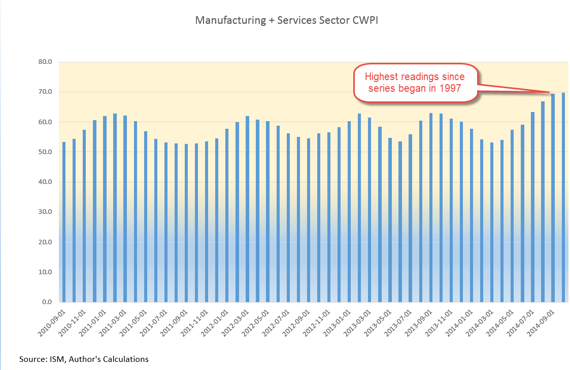
*****************************
CWPI

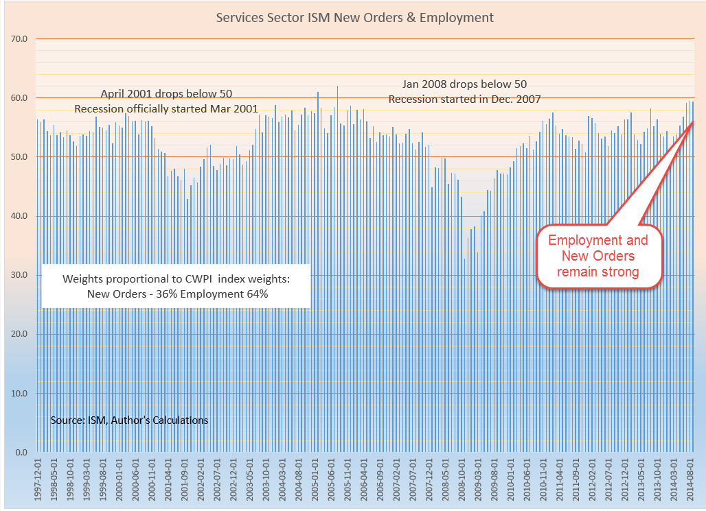
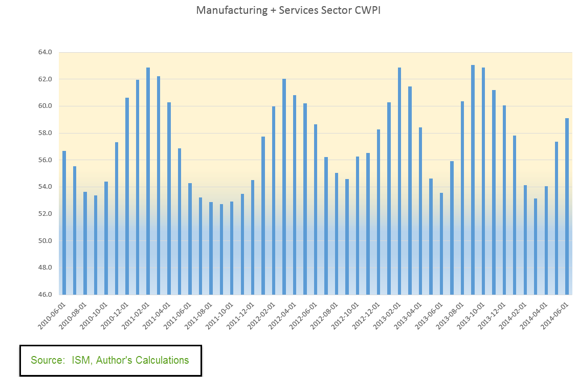
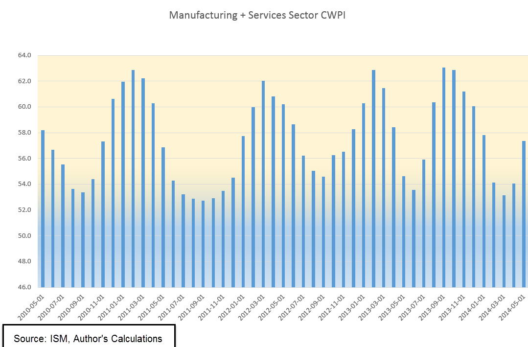
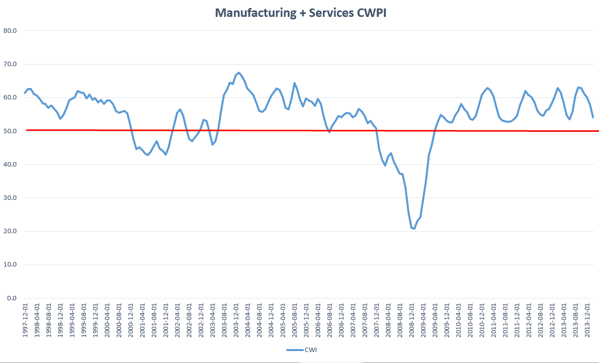
For almost a year, I’ve been tracking a composite index, a Constant Weighted Purchasing Index, based on the Purchasing Manager’s Index produced by the Institute for Supply Management (ISM).  Based on key elements of ISM’s manufacturing and non-manufacturing monthly indexes, it is less erratic than the ISM indexes and gives fewer false signals of recession and recovery.  After reaching a low of 53.5 last month, the CWPI of manufacturing and service industries is on the rise again.  During this recovery this index of economic activity has shown a regular wave pattern.  If that continues, we should expect to see four to five months of rising activity before the next lull in late summer or early fall.  Any deviation from that pattern would be cause for concern if falling and optimism if rising.

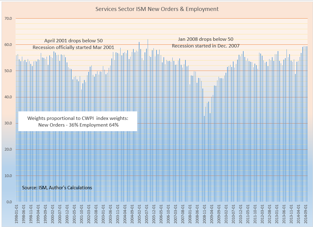
The winter probably prolonged the recent downturn in the index.  In the manufacturing sector, new orders and employment are strong.  In the services sector, which comprises most of the economy, new orders are strong but employment growth has slowed to a tepid pace.

This week the Bureau of Labor Statistics released their estimate of Productivity growth for the first quarter.  One of the metrics is the per hour growth in productivity, which is key to the overall growth of the economy.  As seen in the chart below, the last time annual productivity growth was above 2% was in the 3rd quarter of 2010.  To show the historical trend, I took the 3 quarter moving average of the year over year growth rate.  We can see a remarkable shift downward in productivity.

Recovery after recessions are marked by a spike in growth above 3% simply because the comparison base during the recession is so weak. What the chart shows is the shift from steady growth of 3% to a much weaker growth pattern since the 2008 recession.  In testimony before the Senate Finance Committee, Fed chairwoman Janet Yellen stated that we may have to adjust our expectations to continuing slow growth.  The erosion of productivity growth has probably prompted concerns in the Fed Open Market Committee.

***************************

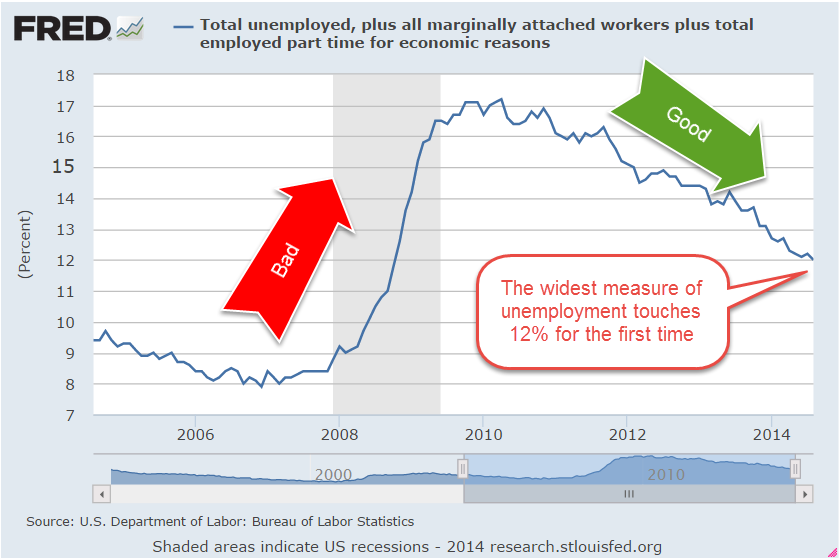
JOLTS – Job openings

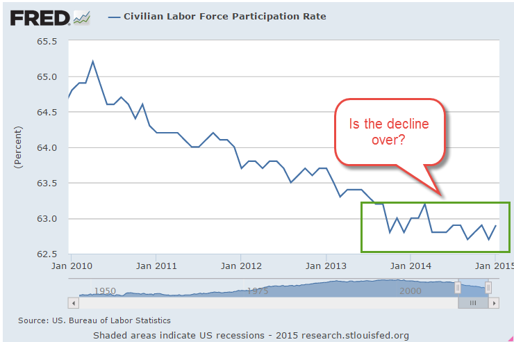
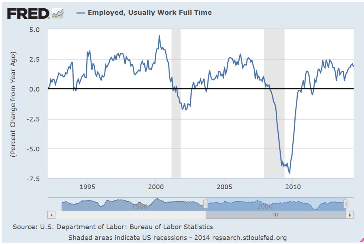
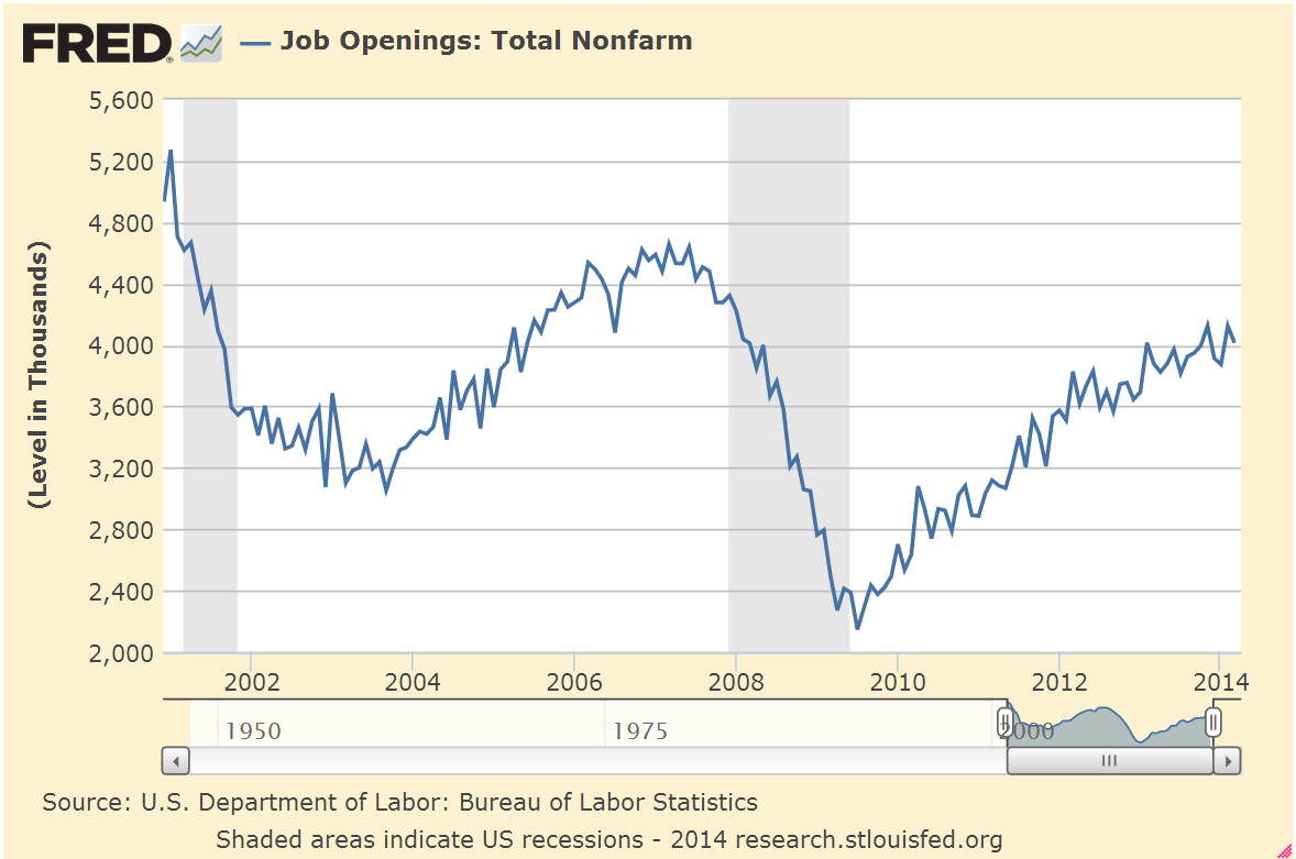
Continuing on from labor productivity, let’s look at a trend in job openings.  With a month lag, the Bureau of Labor Statistics (BLS) reports on the number of job openings around the country. Preceding a recession, the number of job openings begins to decline.  Recovery is marked by an increase in openings. March’s report showed a slight increase in job openings, near the high of the recovery and closer to late 2005 levels.

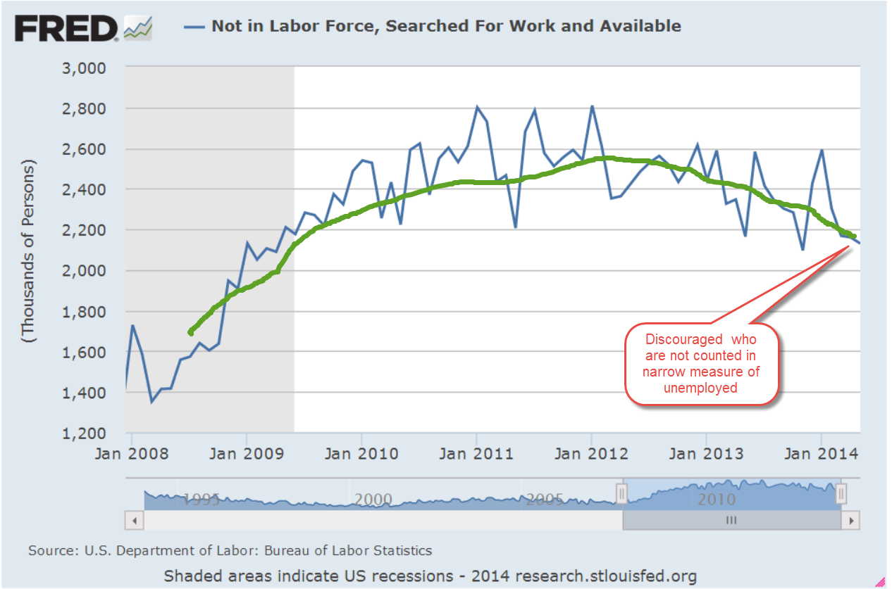
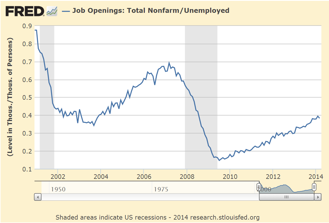
When we look at the ratio of job openings to the unemployed, the picture is less encouraging.  The unemployed do not include discouraged job seekers.  If we included those, we the readers might get discouraged.  Almost five years after the official end of the recession, we are barely above the low point of the recession of the early 2000s.

When Fed chairwoman Janet Yellen speaks of weaknesses in the labor market that will require continued central bank support, this is one of the metrics that the Fed is no doubt keeping an eye on.

*****************************

Household Net Worth

For many of us, our net worth includes family, friends, pets, interests and passions but the Federal Reserve doesn’t count these in its quarterly Flow of Funds report.  In early March, the Fed released its annual Flow of Funds report, which includes estimated net worth and debt levels of households, business and governments in the U.S.  Below is a chart of household, business and government debt levels from that report.

Rising stock prices and recovering home values have boosted the net worth of households.

As you can see in the chart below, the percent change in net worth has only significantly dipped below zero in the last two recessions.

The severity of this last dip was due to the falls in both the housing and stock markets.  The curious thing is why earlier stock market drops in the 1970s and early 1980s did not produce a significant percentage drop in household net worth. In those earlier periods, increases in home prices were about 4%, similar to the level of economic growth, and not enough to offset significant drops in the stock market.

So what has changed in the past two recessions?  The introduction of IRA accounts in the 1980s prompted individuals to put more of their savings in the stock market instead of bonds, CDs and savings accounts. Downturns in the stock market in the past two recessions affected household balance sheets to a greater degree.  Inflation was greater during the 1970s, 80s and 90s, raising the value of all assets.  China’s growing dominance in the international market was not a factor in the stock market drop in 2000 – 2003.  It was only admitted to the World Trade Organization in 2001.  In an odd coincidence, the past twenty years and particularly the past 15 years are marked by a growing and pervasive inflence of the internet in all aspects of our lives.

If we chart the change in a broad stock market index like the SP500 along with the percent change in net worth over the past seven years, we see a loose correlation using 40% of the change in the stock market.  Rises and falls in the stock market produce a material change in the paper net worth of households and can significantly lead to a change in “mood” among consumers, something the economist John Maynard Keynes called “animal spirits.”

Because the swelling demographic tide of the Boomer generation has a significant part of their retirement nest egg in the stock market, price movements in the markets have probably had a greater effect on total net worth in the past decade.

************************

Party Favors

Now for everyone’s favorite dinner topic – political contributions.  Who contributed the most to the 2012 Presidential campaign?
a) the evil Koch Bros
b) gambling king Sheldon Adelson who almost single-handedly bankrolled the Newt Gingrich campaign
c) hedge fund billionaire George Soros, the  “Octopus” of liberal causes
d) the socialist commie labor unions.

Answer:  Whatever answer suits your political message or opinion.

On the one hand, campaign contributions can be what economists call a “rich” data set so that an analyst can tease out several conclusions or summaries, sometimes contradictory, from the data set.  On the other hand, some “social welfare” organizations do not have to reveal donor lists.  An investigator wishing to discover the myriad channels of political contributions must don their spelunking equipment before descending into the caverns of political finance.   In some cases private IRS data is released by accident, revealing dense networks linking moneyed individuals.

The Federal Election Commission (FEC) maintains a compilation of individual and group contributions to political campaigns.  OpenSecrets.org , a project of the Center for Responsive Politics, summarizes the data.  There we find that Sheldon and Miriam Adelson contributed $30 million through the Republican Restore Our Future PAC  and $20 million to the Republic PAC American Crossroads.

The Democratic PAC Priorities USA did not have a single donor as generous as the Adelsons.  George Soros ponied up $1 million along with many others, including Hollywood movie mogul Steven Spielberg, but the most generous donor contributed only $5 million, punk change when compared to the Adelson’s commitment to Republican causes and candidates.

In the 2012 Presidential race, the Obama campaign drew in so many more individual contributions than the Romney team that outside spending by political action groups was the only way to close the money gap.  Pony up they did, outspending the Obama campaign $419 million to $131 million. The NY Times summarized the outside spending with links to the various groups.

Despite their relatively low percentage of the work force, labor unions are major contributors to the Democratic effort.  A WSJ article in July 2012 revealed the extent of their political activity.  The bulk of union campaign spending is not reported to the FEC but is  reported to the Labor Dept. In total, unions disclosed that they spent over $200 million per year from 2005 – 2011.  54% of the spending reported to the Labor Dept was on state and local campaigns.

As a block then, are unions the largest contributors to Democratic campaigns?  Some “napkin math” would get us to a guesstimate of  $90 to $100 million a year on national campaigns, so surely they are at the top, aren’t they?  Not so fast, you conclusion jumper, you.

As transparent as the unions are, contributors to Republican causes are not.  Corporate political spending like that of the private U.S. Chamber of Commerce are not disclosed, as are many other corporate political and lobbying efforts.  These are some of the largest corporations in the world with vast resources and a strongly vested interest in policy decisions that will affect their bottom line.  Most of those contributions are hidden.

As this midterm election approaches rest assured, gentle reader, that you can confidently say – no matter what your political persuasion – that you have data to back up your opinion that the other side is buying the election.  You can hold your head high, confident in the soundness of your opinions.  And don’t we all sleep better at night, knowing that we are right?

Employment and Economy Swings Up

April 6th, 2014

Capital Goods

Factory orders, including aircraft, rose in February but general investment spending on capital goods declined.  The leveling off of non-defense capital spending in the past year indicates a lack of certainty among many businesses to commit funds for future growth.

A more panoramic view of the past two decades shows a peaking phenomenon at about $68 billion, one which this recovery has not been able to rise above.

Remember that these peaks are in current dollars and do not take inflation into account.  When adjusted for inflation, the trend is not reassuring.  A significant component of capital goods orders comes from the manufacturing sector – manufacturers ordering capital goods from other manufacturers – whose declining share of the economy puts a damper on growth in this area.

**********************************************
Employment

Modestly strong job gains of almost 200,000 in March sparked hope that the winter doldrums are over. The private payroll processor ADP reported 191,000 private job gains in March, in line with expectations and revised their February job gains from 139,000 to 178,000.  The headline this month was that private sector employment FINALLY surpassed the level in late 2008.

Net gains or losses in government employment have been negligible in the past several months.  State and local governments have been hiring enough to offset the small monthly declines in federal employees. Total non-farm employment is still below 2007 levels but so-o-o-o-o close.

While the unemployment rate stayed unchanged, many more unemployed started looking for work.  A reader writes “I read that the labor force has increased by 1.5 million from Jan-Mar, but that doesn’t jive with the number of people hired over that time.  Am I missing something here?”

The labor force includes both the employed and the unemployed.  Unemployed people, including those who retire, who have not looked for work in the past four weeks are not considered active participants in the labor force.   Whether a person was 50 or 80, if they started looking for work, they would then be counted in the unemployed and in the labor force.

The Bureau of Labor Statistics (BLS) states that:
The basic concepts involved in identifying the employed and unemployed are quite simple:
People with jobs are employed.
People who are jobless, looking for jobs, and available for work are unemployed.
People who are neither employed nor unemployed are not in the labor force.
This definition of the labor force uses the narrowest, or headline, measure of unemployment.  Since the beginning of the year, the labor force has increased 1.3 million, 1.6 million since October.

When people get discouraged, they stop looking for work.  Then a friend says “Hey, ABC company is hiring,” and people start their job hunt again.  In the past quarter, a net 800,000 people have come back into the labor force, despite the record number of people retiring and leaving the work force.

As the economy improves, enrollment in for-profit and community college will continue to decline, accelerating from the 2% decline in 2012 – 2013 (NY Times article)  As students start looking for work, they officially re-enter the labor force.

Retirees: According to PolitiFact 11,000 boomers per day become eligible for Social Security.  Let’s say that only 8,000 per day drop out of the labor force, making a total of about 700,000+ who retired this past quarter.  A job market that can continue to overcome the drag from retirement is a sign of strength.

The Civilian Labor Force Participation Rate is the percentage of (employed + unemployed) / (people who can legally work).  So if the Civilian Labor Force were 150 million and there were 250 million people 16 years and over and not institutionalized, 150/250 = .6 or 60%.  The participation rate is currently at 63%.

**********************************************

CWPI

In the March ISM survey of service sector purchasing managers, employment rebounded strongly from the contracting readings of February.  New orders grew stronger; both of these components get more emphasis in the calculation of the CWPI.

Weighed down by the winter lull, the smoothed composite index of manufacturing and services growth has declined for six months in a row but this should be the bottoming out of this expansionary wave. Barring any April surprises, March’s strength in employment and new orders should lead to an uptick in  the composite in the coming months.

***********************************

Investing

What are the chances an actively managed fund beat its benchmark?  Not good.  An analyst at Standard and Poors compared various indexes that her company produces vs the performance of actively managed funds.  In the past five years, only 28% of large cap actively managed funds beat the benchmark SP500 index.  Some mid cap and real estate funds did much worse; less than 20% beat their benchmarks.  Consider also that actively managed funds carry higher annual fees and/or operating expenses because the fund has to pay for the brain power of active management.

Employment, New Orders, CWPI

CWPI (Formerly CWI)

The Constant Weighted Purchasing Index (CWPI) that I introduced last summer was designed to be an early or timely warning system of weakening elements of the economy.  It is based on a 2003 study by economist Rolando Pelaez on the monthly Manufacturing Purchasing Managers Index (PMI) published by the Institute for Supply Management (ISM).  ISM also produces a Non-Manufacturing index for service industries each month but this was not included in the 2003 study.

The CWPI focuses on five factors published by ISM:  employment, new orders, pricing, inventory levels and the timeliness of supplier deliveries.

The CWPI assigns constant weights to the components of both indexes, then combines both of these indexes into a composite, giving more weight to the services sector since it is a larger part of the economy.  Both the CWPI and PMI are indexed so that 50 is neutral; readings above 50 indicate growth; readings below 50 indicate contraction.  In previous months (here and here), I anticipated that the combined manufacturing and services sector index would move into a trough at this time before rising again in March and April of this year.

A longer term chart shows the wave like formation in this expansionary phase that began in the late summer of 2009.

February’s ISM manufacturing index climbed slightly but the non-manufacturing, or services, index slid precipitously, more than offsetting the rise in manufacturing.  Particularly notable was the huge 9% decline in services employment, from strong growth to contraction.  The service sector portion of the CWPI shows a contraction which some blame on the weather.  A slight contraction – a reading just below 50 – can be just noise in the survey data.  The past two times when the employment component of the services sector has dropped below 48, as it did in this latest report, the economy was already in recession; we just didn’t know it till months later.

A close comparison of the current data with the previous two episodes may sound a cautionary tone.   At this month’s reading of 48.6, the CWPI services portion is not showing as severe a contraction as in April 2001 (43.5) and January 2008 (33.1), when the employment component also dropped below 48.

New orders and employment in both portions of the CWPI are given extra weight. In January 2008, new orders and employment both fell dramatically.  The current decline is similar to the onset of the recession beginning in early 2001, when employment declined severely in April but new orders remained about the same.  Let’s isolate just these two factors and weight them proportionate to their respective weights in the services portion of the CWPI.

Notice that the decline below 50 signaled the beginning of the past two recessions.  Here’s the data in a different graph with a bit more detail.

Some cite the historically severe weather in the populous eastern half of the country as the primary cause for the decline in the services sector employment indicator and it well may be.  If so, we should expect to see a rebound in this component in March.  Basing a prediction on one month’s reading of one or two components of an indicator is a bit rash.  However, we often mistakenly attribute weakness in some parts of the economy to temporary factors and discount their importance because they are temporary – or so we think.

In the early part of 2008, many thought that a healthy correction in an overheated housing market was responsible for the slowdown in economic growth.  In the spring of that year, the bailout of bankrupt Bear Stearns, an undercapitalized investment firm which had made some bad bets in the housing market, confirmed the hypothesis that the corrective phase was nearing its end. As weakness continued into the late spring of that year, some blamed temporarily high gasoline and commodity prices for exacerbating the housing correction.  In the fall of 2008, the financial crisis exploded and only then did many realize that the problems with the economy were more than temporary.

In the early part of 2001, a healthy correction to the internet boom was responsible for the slowdown – a temporary state of affairs.  When the horrific events of 9-11 scarred the country’s psyche, the recession was almost over.  Many were not listening to the sucking sound of manufacturing jobs leaving for China or giving enough importance to the increasing competitiveness of the global market.  Employment would not reach the levels of early 2001 till the beginning of 2005.

This time the slowdown in employment and new orders in the services sector may be a temporary response to the severe winter weather.  Let’s hope so.

********************************

Private Sector employment and new unemployment claims

ADP released their February employment report this week and eyes rolled.  January’s benign reading of 175,000 private job gains was so at odds with the BLS’ reported gains of 113,000.  “Oh, wait,” ADP said this week, “we’ve revised  January’s gains down to 127,000.”  In a work force of some 150 million, 50,000 jobs is rather miniscule.  As the chief payroll processor in this country, ADP has touted its robust data collection from a large pool of employers.  A revision of this magnitude leads one to question the robustness and reliability of their methodology, and the timeliness of their data collection.  For its part, the BLS admits that its current data is based on surveys and that each month’s estimate of job gains is largely educated guesswork.  ADP is actually processing the payrolls, which should reduce the amount of guesswork.

Private job gains in February were 10,000 below the consensus 150,000 but this week’s report of new unemployment claims dropped 27,000, bringing the 4 week average down a few thousand.  As a percent of workers, the 4 week average of continuing claims is below the 33 year average and has been since March 2012.  In this case, below average is good.

********************************

Employment – Monthly Labor Report

This week’s labor report from the BLS carried a banner caveat that the cold weather in February may have affected employment data.  With that in mind, the headline job gains of 175K were above expectations for 150K job gains.  The unemployment rate ticked up a bit.  If we average the ADP job gains with the private sector job gains reported by the BLS, we get 150K plus 13K in government jobs added for a total of 163K total jobs.  The year over year growth in the number of workers is above 1%, indicating a labor market healthy enough to preclude recession.

A big plus this year is the growth in the core work force, those aged 25 – 54, which finally surpassed the level at the end of the recession in the summer of 2009. 

However, there are some persistent trends independent of the weather that underscore the challenges that the current labor market is struggling to overcome.

As I pointed out last week, there are several unemployment measures, from the narrowest measure – the headline unemployment rate – to wider measures which include people who are partially employed.  The U-6 rate includes discouraged workers and those who are working part time jobs because they can’t find full time jobs.  For a different perspective, let’s look at the ratio of the widest measure to the narrowest measure. The increase in this ratio reflects a growing disparity in the economic well being of the work force.

Contributing to the rise in this ratio is the persistently high percentage of workers who are involuntary part timers.  Looking back over several decades, we can see that the unwelcome spike in this component of the work force can take a number of years to decline to average levels.  Following the back to back recessions in the early 1980s, levels of involuntary part timers took 8 years to recover to average, then quickly climbed again as the economy sputtered into another recession.  We are almost five years in recovery from this recession and have still not approached average.

There are more discouraged workers today than there were at the end of the recession in the summer of 2009.  Discouraged workers are included in the wider measure of unemployment but not in the narrow headline unemployment figure.

The median duration of unemployment remains at levels not seen since the 1930s Depression.  Someone who becomes unemployed today has a 50-50 chance of still being unemployed four months from now.  That would make a good survey question:  “In your lifetime, have you ever been involuntarily unemployed for four months?”

Despite all the headlines that the housing market is rebounding, the percent of the work force working in construction is barely above historic lows.

A recent report by two economists at the New York branch of the Federal Reserve paints a disappointing job picture for recent college graduates.  On page 5 of their report is this telling graph of a higher percentage of recent college graduates accepting low wage jobs.

Low wage and part time jobs do not enable a graduate to pay back education loans.  Almost two years ago, the total of student loans surpassed the trillion dollar mark.  According to the Dept. of Education, the default rate in 2011 was 10%.  I’ll bet that the current default rate is higher.

******************************

Takeaways

As is often the case, data from one source partially contradicts data from a different source.  The employment decline reported by ISM bears close watching for further signs of weakness.  The yearly growth in jobs reported by the BLS indicates a relatively healthy job market.