A Virtuous Cycle

August 7, 2022

by Stephen Stofka

July’s employment survey (BLS, 2022) reported a half-million job gains and marked a milestone – the recovery of all the jobs lost during the pandemic. In addition, earlier employment gains were revised higher by 28,000. The BLS survey indicated that only 7.1% of employees worked remotely, a surprising contrast to the amount of attention that the media gives teleworking. Last week, I discussed the dating of recessions. With this report, it is unlikely that the dating committee at the NBER will dub this a recession. Consumption, income, employment and investment are the pillars of this economy and they are doing well, contributing to the current inflationary trends.

Annual gains in private investment topped 18% in the second quarter, besting the 16% gain in 2012:Q1 a decade ago (series notes at end). Businesses invest in people, driving up employment gains. In the graph below, I multiplied the annual gain in employment by 4 to show the correlation between investment and employment.

Higher employment leads to higher incomes. Just as employment has returned to pre-pandemic levels, real (inflation-adjusted) disposable incomes are now at pre-pandemic levels. Disposable income includes government transfers like social security and pandemic stimulus checks. The last stimulus checks went out in March/April 2021, more than a year ago. It’s a good bet that these are sustainable income numbers produced by economic growth, not the result of special  transfer payments.

Higher incomes lead to higher spending. Real (inflation-adjusted) consumption spending marked an annual gain of 1.57% in June and is now up 4.5% over pre-pandemic levels. Consumers have made an abrupt shift from buying goods to buying services. Real sales at restaurants are now 10% above pre-pandemic levels.

To keep up with high demand for goods and clogged shipping ports during the pandemic, Target and Wal-Mart ordered extra and now have more inventory than they would like. Their loss is the travel and leisure industry’s gain. Marriott Hotels (2022) reported a surge in demand this year. In the U.S. and Canada, their leisure traffic is 15% above pre-pandemic levels and their revenue per room is about the same as in 2019.

Higher incomes usually lead to higher savings. In the decade before the pandemic, households saved 6-7% of disposable income. In 2020 and 2021, the savings rate averaged a whopping 20% and 12%. Most of that higher savings was done by households with higher incomes. Congress could have passed a CARES act that sent stimulus payments only to those with lower incomes, but they chose not to. Those additional savings became investment and that brings us full circle to the higher investment and employment – a virtuous cycle that Adam Smith wrote about more than two hundred years ago.

////////////////////

Photo by Markolf von Ketelhodt on Unsplash

BLS. (2022, August 5). Employment situation summary – 2022 M07 results. U.S. Bureau of Labor Statistics. Retrieved August 5, 2022, from https://www.bls.gov/news.release/empsit.nr0.htm

Marriott Internatonal. (2022, August 2). Marriott International Reports Outstanding Second Quarter 2022 results and resumes share repurchases. Marriott International Newscenter (US). Retrieved August 5, 2022, from https://news.marriott.com/news/2022/08/02/marriott-international-reports-outstanding-second-quarter-2022-results-and-resumes-share-repurchases

U.S. Bureau of Economic Analysis, Gross Private Domestic Investment [GPDI], retrieved from FRED, Federal Reserve Bank of St. Louis; https://fred.stlouisfed.org/series/GPDI, August 5, 2022.

U.S. Bureau of Economic Analysis, Real Personal Consumption Expenditures [PCEC96], retrieved from FRED, Federal Reserve Bank of St. Louis; https://fred.stlouisfed.org/series/PCEC96, August 4, 2022.

U.S. Bureau of Economic Analysis, Real Disposable Personal Income [DSPIC96], retrieved from FRED, Federal Reserve Bank of St. Louis; https://fred.stlouisfed.org/series/DSPIC96, August 4, 2022.

U.S. Bureau of Economic Analysis, Personal saving as a percentage of disposable personal income [A072RC1Q156SBEA], retrieved from FRED, Federal Reserve Bank of St. Louis; https://fred.stlouisfed.org/series/A072RC1Q156SBEA, August 4, 2022.

U.S. Census Bureau, Advance Retail Sales: Food Services and Drinking Places [RSFSDP], retrieved from FRED, Federal Reserve Bank of St. Louis; https://fred.stlouisfed.org/series/RSFSDP, August 5, 2022. Note: I adjusted for inflation using the CPI.

 U.S. Bureau of Labor Statistics, All Employees, Total Nonfarm [PAYEMS], retrieved from FRED, Federal Reserve Bank of St. Louis; https://fred.stlouisfed.org/series/PAYEMS, August 5, 2022.

Wealth-Income Ratio

January 16, 2022

by Stephen Stofka

Analyses of wealth and income inequality engage policymakers and economists and provoke lively discussion on social media. Thomas Piketty (2013) stirred up debate with the publication of Capital in the Twenty-First Century. Five years later came the publication of After Piketty (Boushey et al., 2019), a series of essays by prominent economists. I wanted to tackle a different aspect of this subject – why the ratio of wealth to income has become so erratic in the past two decades. The answers are too complex for a blog post and beyond my capability to understand. But let’s take a short journey down the rabbit hole.

In the past ten years both stocks and housing prices have more than doubled, moving in a synchronized dance. In the graph below I’ve plotted the two series on top of each other to show the similarity in trend.

The Federal Reserve charts a ratio of household wealth to disposable income, which is income less taxes plus transfer payments like Social Security. Although there are some similar components, the ratio is different than the capital-income ratio that Piketty uses. Housing represents the majority of wealth for many households. Many workers own part of the stock market through mutual funds, 401K plans at work or IRA retirement plans. The doubling of these two asset classes has led to a rise in household wealth and raised the wealth-income ratio to historically elevated levels.

In the graph above I have highlighted past decades where this percentage found a level and remained there. For almost 50 years following WW2 household wealth was about 5x disposable income. Beginning in the mid-90s, this percentage turned erratic, unable to find any stability until the violent recession following the fiscal crisis. In 2013, stock prices and housing began a steady climb that endured the pandemic shock and continues to this day. Will we establish a new level of wealth at 8x disposable income in the next few years? I doubt it. Such a growth curve is unsustainable.

As I search for the underlying causes, I look back to the mid-90s when the wealth-income ratio first turned erratic. The internet first began to grow into our commercial and personal lives. Heady expectations of rocketing business profits led many investors to make wild bets on companies who had little history, a lot of hype and little profit. Out of the carnage of mis-investment emerged an internet platform that has transformed our personal lives. Apple and Amazon are two success stories. In 1997 giant Microsoft made a $150 million investment in failing Apple Computer that kept Apple out of bankruptcy. This year Apple’s valuation passed the $3 trillion mark, about 13% of the entire GDP of the U.S. That same year Amazon went public. It’s business model? Selling books. For years it struggled to make a profit. Amazon’s market capitalization is now over $1.6 trillion. The so called FAANG stocks of big tech have surpassed the industrial and financial giants of the 20th century. Two researchers at Morningstar studied the decade long impact of the ten largest stocks and the impact they made on the overall return of the entire stock market (Solberg & Lauricella, 2021). Perhaps that concentration of market power is contributing to a more erratic wealth-income ratio.

Low interest rates and leverage have affected household wealth. In the mid-90s, bankers at JP Morgan developed the collateralized mortgage to spread risk. In ten years, misuse and overuse of that idea led to a historic meltdown in housing prices and caused a worldwide fiscal crisis. Since then the supply of new housing has not kept pace with demand. Fueling that demand is a large Millennial generation which is settling down. Persistently low mortgage rates have increased the pool of qualifying buyers. Low rates have raised the present value of the future housing services a homeowner receives from the house they buy. Not enough supply to meet demand has led to higher housing prices.

High inflation this year has grabbed headlines and stirred up comparisons to the stagflation of the 1970s. There are too many differences between now and then but that is a subject for another blog post. A rising federal debt has certainly contributed to a rising level of wealth but does not account for the erratic behavior of the ratio itself. In the mid-90s, the federal debt began falling and the wealth-income ratio rose dramatically.

I suspect that finding an equilibrium in this ratio will be a painful process. To reestablish a sustainable ratio, there are two possibilities. The first is a hard landing where asset valuations fall more than incomes fall. The second scenario is a soft landing in which incomes rise more than valuations rise. Let’s hope for the soft landing.

///////////////////

Photo by Ludde Lorentz on Unsplash

Boushey, H., Bradford, D. L. J., & Steinbaum, M. (2019). After Piketty: The agenda for economics and inequality. Harvard University Press.

Cautero, R. M. (2021, December 28). What is disposable income? The Balance. Retrieved January 15, 2022, from https://www.thebalance.com/what-is-disposable-income-4156858

Piketty, T. (2013). Capital in the Twenty-First Century. (A. Goldhammer, Trans.). The Belknap Press of Harvard University Press.

Solberg, L., & Lauricella, T. (2021, December 1). The FAANG Market is Fading. Morningstar, Inc. Retrieved January 15, 2022, from https://www.morningstar.com/articles/1070180/the-faang-market-is-fading

Making Stuff

May 5, 2019

by Steve Stofka

This week I’ll review several decades of trends in productivity. How much output do we get out of labor, land, and capital inputs? Capital can include new equipment, computers, buildings, etc. In the graph below, the blue line is real GDP (output) per person. The red line is disposable (after-tax) income per person. That’s the labor share of that output after taxes.

As you can see, labor is the majority input. In the following graph is the share of real GDP going to disposable income.  In the past two decades, labor has been getting a larger share.

That might look good but it’s not. Since 2000, the economy has shifted toward service industries where labor does not produce as much GDP per hour. The chart below shows the efficiency of labor, or how much GDP is being produced by labor.

If labor were being underpaid, the amount of GDP produced per dollar of disposable income would be higher, not lower. On average, service jobs do not have as much leverage as manufacturing jobs.

A century ago, agricultural jobs were inefficient in comparison to manufacturing jobs. The share of labor to total output was high. In the past seventy years, the agricultural industry has transformed. Today’s farms resemble large outdoor manufacturing plants without walls and productivity continues to grow. In the past five years, steep price declines in the prices of many agricultural products have put extraordinary pressures on today’s smaller farmers. The increased productivity of larger farms has allowed them to maintain real net farm income at the same level as twenty years ago (Note #1). Here’s a graph from the USDA.

Although agriculture related industries contribute more than 5% of the nation’s GDP, farm output is only 1% of the nation’s total output. The productivity gains in agriculture have not been shared by the rest of the economy. Labor productivity has plunged from 2.8% annual growth in the years 2000-2007 to 1.3% in the past eleven years (Note #2).  Here’s an earlier report from the Bureau of Labor Statistics with a chart that illustrates the trends (Note #3). The report notes “Sluggish productivity growth has implications for worker compensation. As stated earlier, real hourly compensation growth depends upon gains in labor productivity.”

Productivity growth in this past decade is comparable to the two years of deep recession, high unemployment and sky-high interest rates in the early 1980s. The report notes “although both hours and output grew at below-average rates during this cycle [2008 through 2016], the fact that output grew notably slower than its historical average is what yields the historically low labor productivity growth.” Today we have low unemployment and very low interest rates – the exact opposite of that earlier period. Why do the two periods have similar productivity gains? It’s a head scratcher.

Simple answers? No, but hats off to Donald Trump who has called attention to the need for a greater shift to manufacturing in the U.S. economy. He and then Wisconsin governor Scott Walker negotiated with FoxConn Chairman Terry Gou to get a huge factory built in Mount Pleasant, Wisconsin to manufacture LCD displays, but progress has slowed. An article this week in the Wall St. Journal exposed the tensions that erupt among residents of an area which has made a major commitment to economic growth (Note #4).

If we don’t shift toward more manufacturing, American economic growth will slow to match that of the Eurozone. Along with that will come negative interest rates from the central bank and little or no interest on CDs and savings accounts. We already had a taste of that for several years after the recession. No thanks. Low interest rates are a hidden tax on savers. They lower the amount of interest the government pays at the expense of individuals who are saving for education or retirement. Interest income not received is a reduction in disposable income and has the same effect as a tax. Low interest rates encourage an unhealthy growth in corporate debt and drive up both stock and housing prices.

///////////////////

Note:

  1. USDA summary of agricultural industry
  2. BLS report on multi-factor productivity
  3. BLS report on declining labor productivity
  4. FoxConn LCD factory (March article – no paywall). Also, a recent article from WSJ (paywall) – Foxconn Tore Up a Small Town to Build a Big Factory—Then Retreated

A Real Minimum Wage

November 18, 2018

by Steve Stofka

Near the top of the Democratic agenda in the new Congress is a minimum wage of $15. The bill is unlikely to pass the Senate, but it will signal to the voters that the Democratic House is meeting campaign promises. The states with the most solid Democratic support are those on the west coast and northeast coast where the cost of living is much higher. A single minimum wage for the entire country is not appropriate. Republicans control the Senate and they are from states with much lower costs of living. They will reject an ambitious minimum wage that is one-size fits all.

Housing is the largest monthly expense for most families. Below is a graph of home prices in several western metropolitan areas (MSAs) and the national average of twenty large MSAs. Home prices in Dallas and Phoenix are a 1/3 less than Los Angeles and San Francisco. Housing costs in many smaller cities will be below Dallas and Phoenix.

CaseShillerComps

Why isn’t the minimum wage indexed to inflation? Because politicians of both parties, but particularly Democrats, have used it as a wedge issue to gain voter support. If the House Democrats wanted to pass bi-partisan legislation on a minimum wage, they could use a flexible minimum wage that is indexed to the average wages for each region within the country. These are published regularly by the Bureau of Labor Statistics, the same agency that publishes the monthly report of job gains and the unemployment rate. I’ve charted the annual figures for those same cities.

HourlyEarnComp

A $15 minimum wage is 40% of the average wage in San Francisco, and a bit more than half of the average wage in Los Angeles. It is almost 60% of the national average. The current minimum of $7.25 is 28% of the national average.

If the House passed a minimum wage bill that set the wage to 40% of the average wage for each region, Senate Republicans might at least consider it. In Denver and L.A., the minimum wage would be about $11.50. In Dallas and Phoenix, it would be about $10.60. Democrats could show that they are in Washington to pass legislation for working families, not pound some ideological stump as Republicans did for eight years with the repeal of Obamacare.

//////////////////////

Stocks and Taxes

There is a close correlation between stock prices and corporate tax collections. The tax bill passed last December lowered corporate tax revenues in the hope that businesses would invest more in the U.S. The divergence between prices and collections has to correct. Either tax collections increase because of greater profitability or stock prices come down.

StocksVTaxes
/////////////////////////
Income Growth

The financial crisis severely undercut income growth. Real, or inflation-adjusted, per capita income after taxes decreased for three years from 2008 through 2010, and again in 2014. It is the longest period of negative growth since the 1930s Depression.

IncomeRealPerCapGrowth

High Optimism

June 18, 2017

Last week I looked at two simple rules: 1) don’t bet on which chicken will lay the most eggs, and 2) don’t put all your eggs in one basket. This week I will look at index averages and I promise I won’t mention chickens.  Lastly, I will look at a metric that disturbs me.

When I first started investing in Vanguard’s SP500 index mutual fund VFINX, I thought I was buying the average performance of the top 500 companies in America. Like many index funds, VFINX is weighted by market capitalization. With this methodology, a relatively small number of companies have more influence on the movement in the index than their numbers might warrant.

Let’s turn to Vanguard’s breakdown of the top ten stocks in their VFINX fund. These ten stocks are household names, including Apple, Microsoft, Google (Alphabet), Amazon, and Facebook. These five tech stocks are 1% of the 500 companies in the index but make up 13% of the fund. The ten companies make up 20% of the fund.

For investors who want to cast a wider net, there is an alternative: equal weighted funds. Guggenheim’s RSP is an equal weighted ETF first offered in 2003. Using Portfolio Visualizer, I started off in 2004 with $100,000 and invested $500 a month. Despite the higher expense ratio, RSP had a better return, besting a conventional market cap index by 1% annually.

VFINXVsRSP

Why does RSP outperform VFINX?  Funds that mimic the SP500 are heavily weighted to large cap stocks. Equal weight funds have a greater percentage of mid-cap companies which may outperform large caps in a particular decade but that outperformance may come at a price: volatility.

Standard deviation is a statistical measure of the zig and zag of a data series, like measuring how much a drunk veers as he stumbles along his chosen path. The standard deviation (Stdev column above) of RSP is slightly higher than VFINX, and the maximum drawdown of RSP is almost 5% higher during the 2008-2009 financial crisis.  The Sharpe ratio is a measure of risk adjusted return, and the higher the better. As we can see in the Sharpe column, the two strategies are within a few decimal points.  In the past 13 years, an equal weighted strategy produced higher returns with only a slightly higher risk.

If I want to mimic some of the diversity of an equal weight index, I can spread out my investment dollars among large-cap, mid-cap and small-cap funds. As SP500 index products, neither RSP or VFINX includes small cap stocks, but let’s add a small percentage into our mix.

Into my comparison of strategies, I’ve added a portfolio with a 40% allocation to VFINX, 40% to VIMSX, a mid-cap Vanguard index fund, and 20% to VISVX, a Vanguard-small cap value index fund. The performance is almost as good as the equal weight RSP and the Sharpe ratio, or risk adjusted return, is similar.

VFINXVsRSPVsMix

In 2011, Vanguard published an analysis (PDF) of various approaches to indexing that may be of interest to those who want to dive into the topic.

//////////////////////

Household Net Worth

Let’s turn from indexing strategies to stock market valuation. We base our expectations of the future on the recent past. Those expectations are the primary driver of valuation. If we expected an affordable self-driving car in the next few years, the current value of today’s cars would be lower.

I have written before about a store of value compared to a flow of value. Savings are a store of value. Income is a flow. The historical ratio of wealth (store) to income (flow) reveals a trend that should give us caution.  The Federal Reserve charts estimates of  both household wealth and disposable income. The current ratio of wealth to income is now higher than the peaks in 2006 and 2000 when the real estate and dot-com booms inflated wealth valuations.

HouseholdNetWorthPctIncome

The current ratio is far above the 70 year average but a moving ten year average of the ratio may better reflect trends in investment allocation over the past few decades. Using this metric, today’s ratio is still very high. Rarely does the wealth-income ratio vary by more than 10% from its 10 year average.

When the wealth-income ratio dips as low as 90% of its ten year average, extreme pessimism reigns, as in the early 1970s.  A ratio that is 10% more than the ten year average indicates extreme optimism as in the late 1990s, mid-2000s and now. Today’s ratio is 13% above its ten year average.

In early 2000, the ratio was 16% above its ten year average when the enthusiasm of dot-com expectations began to deflate and the price of the SP500 fell from its lofty heights. The ratio reached 14% above its ten year average in 2005 and remained above 10% till mid-2007 when the first cracks in the housing crisis began to surface and the SP500 said goodbye to its peak.

A picture is worth a 1000 words so here’s a chart of the Household Wealth to Income ratio divided by its ten year average. I have highlighted the periods of extreme pessimism and optimism.

HouseholdWealthRatio10Year

If history is any guide, the ratio of wealth to income can stay elevated for a few years. The “haves” keep trading with each other in a game of muscial chairs until people begin to leave the game and move their dollars into other assets, other markets, or bonds and cash. Unfortunately, many slow moving casual investors are left in the game with deteriorated portfolio values.

Economist Robert Shiller, author of Irrational Exuberance and developer of the long term CAPE ratio, recommended a strategy of shifting allocation in response to periods of exuberance and pessimism.  When valuations were historically low or average, an investor might allocate 60% or more of their portfolio to stocks.  As valuations became overextended, an investor might shift their stock allocation to 40%.  The investor is not trying to predict the future. The portfolio remains balanced but the stock and bond weights within the portfolio changes.

Using this wealth-income ratio as a guide, the casual investor might gradually implement an allocation shift toward safety in the coming year.

Inauguration 2017

January 22, 2017

Mr. Trump’s inauguration marks the first time in almost a hundred years that a business person assumes the highest political position in the country.  His cabinet choices share that same characteristic. There will be an inevitable clash of cultures.  Many civil servants are lifers, drawn to the generous benefits of government service, and the stability of employment.  Some may be drawn to the work because it gives them a sense of self-worth.

Many have little experience in private industry and distrust the motives of business owners.  Former President Obama was one of these.  An inspirational figure to some, his antipathy to business interests of all sizes antagonized political foes who challenged him for most of his two terms.

Mr. Trump has a similar weakness – his antipathy to and unfamiliarity with the insular culture of civil servants who work in a massive bureaucracy characterized by a thicket of rules and a lack of transparency.

Work in the private sector is characterized by competition, a striving for efficiency, the changing winds of people’s preferences, and the quality of the services and products we provide.  Employment in the public sector requires patience with burdensome procedure, a tolerance of a heirarchy of both the competent and the undeserving, and a willingness to work in a system that relies less on merit and more on seniority.

What will happen when these two diametrically opposed cultures mix?  Stay tuned.

/////////////////////////////////

Obamacare Kaput?

Since FDR began the custom, Presidents have signed executive orders on their first day in office to signify that they are on the job for that portion of the American electorate that put them in office.  One of the highlights of Mr. Trump’s campaign was the repeal of Obamacare.  Shortly after his inauguration President Trump signed an order stating his intention to repeal the ACA.  The order freezes any further promulgation of rules and regulations pertaining to the act.   I thought it would be appropriate to republish a blog I wrote in April 2011, a year before the Supreme Court ruled that most of the ACA was constitutional.  Like Social Security, ACA premiums and penalties were a tax.

The problems of providing health care and the insuring of that care have not gone away: rising costs, more sophisticated and expensive therapies, more demand for care from an aging population.  The problem is a knotty one:  how to distribute health care costs.  We all benefit from the availability of medical resources, yet these resources are very expensive.  The 24 hour care and equipment that stays idle in an urban hospital must be paid for with funds from other parts of the health care system.

It might surprise readers that more than 50% of the $3.5 trillion in Federal outlays is for Social Security benefits ($930B), Medicare ($600B) and Medicaid and Community health programs ($500B).  Eighty years ago, FDR initiated a new role for the Federal Government: an economic support system. To do that, FDR had to threaten and cajole a Supreme Court reluctant to stretch the meanings of several clauses in the Constitution.

Even FDR would be appalled to learn that the Federal Government has become an insurance company whose chief function is the collection of insurance premiums through taxes in order to pay insurance claims in the form of Social Security, Medicare and Medicaid Benefits.

Readers who would like to read more on a pie chart breakdown of government spending can visit the Kaiser Family Foundation’s fact sheet. Dollar amounts are from the latest White House budget.

//////////////////////////

MM Bash

I’m about to bash criticize some of the reporting in mainstream media (MM) publications, whose budgets rely on viewership.  When that audience was more predictable, flagship publications like the NY Times, Washington Post and Wall St. Journal could wait to verify facts before running a story.  In the current 24 hours news cycle and the rush to print, fact checking sometimes comes after the story is published online – if at all.

MM channels rested on their decades old reputations for thorough journalism and were willing to cut off at the knees any reporter compromising that reputation.  More than a decade ago, Dan Rather lost his anchor job with CBS for running with a story about George Bush that had not been properly vetted. News (fact-checked) and opinion (not checked) were clearly defined when they were in separate sections of the newspaper. In this new age when most information is delivered digitally, we are quoting blogs or other opinions that are not fact checked as reputable news sources without verifying the information.

A lie travels around the world by the time the truth gets its boots on. Something like  that.  In today’s lightning fast world of information flow, an apocalyptic news item that can move markets can be tweeted, webbed, facebooked, and retweeted.  “China fires on U.S. destroyer in South China sea!”  “N. Korean missle hits Alaska!” Sell, sell, sell, buy, buy, buy signals can flash instantly to world markets.

Later, it’s no, China didn’t fire on a U.S. destroyer.  China said it would fire if fired on by a U.S. vessel in the S. China Sea.  No, the North Koreans didn’t actually fire a missle.  Instead they said that they had a missle that could fire a nuclear payload on Alaska.  They’ve been saying that for several years.  Most defense analysts remain skeptical.  Oops, nevermind stock and bond markets.

We can not prevent this, nor can we hide our savings under a mattress.  We can prepare by making sure that we have some emergency funds in place.  Most financial advisors recommend six months replacement income.  Only after those funds are in place should we consider that boat we want on Craigslist or the down payment on that house we want to flip.  Don’t just plan to have a plan.  Have a plan.

//////////////////////////

Household Net Worth Ratio

The zero interest rates for the past eight years are not natural and have created distortions in business and residential investment as well as stock market valuations. Let’s look at the residential side of the picture.  Below is a sixty year chart of the percentage of household net worth to disposable income.

The majority of the net worth of households is in their home.  The value of stocks and bonds comes second.  One or both of the two factors in that ratio is mispriced.  Perhaps disposable income has not grown to match the growth in asset valuations.  When reality doesn’t match predictions for a time, assets reprice.

What affects the pricing of these assets? The stock market rises on the prospect of sales and profit growth.   Salaries and wages rise as businesses compete for workers in a faster growing marketplace.  Disposable income rises.  Home prices rise on the prospect that more workers can afford to buy a home.

Now, what happens when disposable incomes, the divisor or bottom number in this ratio, don’t rise as much as predicted?  Yep, the ratio goes up, just as it did in 1999-2000 and 2006-2008, the peaks in the graph.

New Year Review

January 3, 2016

As we begin 2016, let’s take a look at some trends.  It is often repeated that the recovery has been rather muted.  As former Presidential contender Herman Cain once said, “Blame Yourself!”  You and I are the problem.  We are not charging enough stuff or we are making too much money. Debt payments as a percent of after tax income are at an all time low.

At its 2007 peak, households spent 13% of their after tax income to service their debt.  Currently, it is about 10%. In early 2012, this ratio crossed below the recession levels of the early 1990s.  By the end of 2012, this debt service payment ratio had fallen even below the levels of the early 1980s.  Almost six years after the official end of the Great Recession the American people are behaving as though we are still in a recession.  An aging population is understandably more cautious with debt.  In addition to that demographic shift, middle aged and younger consumers are cautious after the financial crisis. We gorged on debt in the 1990s and 2000s and paid the price with two prolonged downturns.  Having learned our lessons, our overactive caution is now probably dragging down the economy.

In this election year, we can anticipate hearing that the sluggish economy can be blamed on: A) the Democratic President, or B) the Republican Congress.  It is Big Government’s fault.  It is the fault of greedy Big Companies.  Someone is to blame.  Pin the tail on the donkey.  Blah, blah, blah till we are sick of it.

************************

Auto Sales

The latest figures on auto sales show that we are near record levels of more than 18 million cars and light trucks sold, surpassed only by the auto sales of February 2000, just before the dot com boom fizzled out.  On a per capita basis, however, car sales are barely above average.  The thirty year average is .054 of a vehicle sold per person.  The current sales level is .056 of a car per person.  Automobile dealers would have to sell an addiitonal 900,000 cars and light trucks per year to have a historically strong sales year.

************************

Construction Spending

In some cities, housing prices and rents are rising, and vacancies are low.  We might assume that construction is booming throughout the country.  Six years into the recovery per capital construction spending is at 2004 levels and that does not account for inflation.  Levels like this are OK, not good, and certainly not booming.

*************************

Employment

The unemployment rate and average hourly wage may get most of the public’s attention but the Federal Reserve compiles an index of many indicators to judge the health of the labor market.  Positive changes in this index indicate an improving employment picture.  Negative changes may be temporary but can prompt the Fed to take what action it can to support the labor market.  Recent readings are mildly positive but certainly not strong.

*************************

Stock Market

Many of the companies in the SP500 generate half of their revenue overseas.  Because of the continuing strength of the dollar, the profits from those foreign sales are reduced when exchanged for dollars.  According to Fact Set, earnings for the SP500 are projected to be about $127 per share, the same level as mid-2014.  In the third quarter of 2015, the majority of companies reported revenue below estimates.  As 4th quarter revenue and earnings are released in the coming weeks, investors will be especially vigilant for any downturns in sales as well as revisions to sales estimates for the coming year.  It could get bloody.

Merry Christmas

December 21, 2014

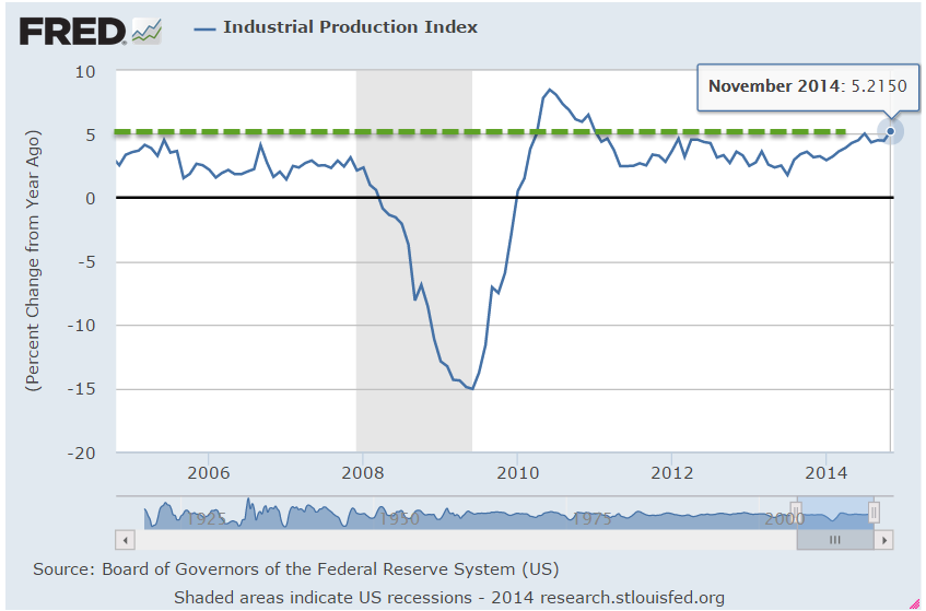
In preparation for today’s solstice, the market partied on in a week long saturnalia.  The week started off on a positive note.  Industrial production increased 1.3% in November, gaining more than 5% over November of 2013.

Capacity utilization of factories broke above 80%, a sign of strong production.  Production takes energy.  I’ll come to the energy part in a bit.

The Housing Market Index remained strong at 57, indicating that builders remain confident.  Tuesday’s report of Housing Starts was a bit of a head scratcher.  After a strong October, single family starts fell almost 6%.  Multi-family starts fell almost 10% in October, then rebounded almost 7% in November.  Combined housing starts fell 7% from November 2013.

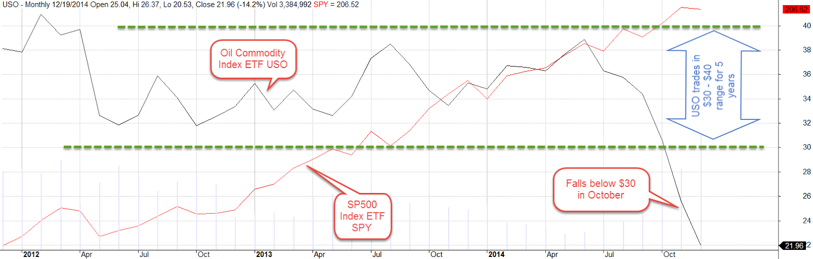
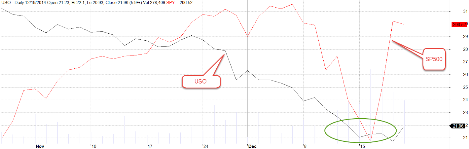
The market continued to react to the change in oil prices.  For the big picture, let’s go back a few years and compare the SP500 (SPY) to an oil commodity index (USO).  For the past five years, USO has traded in a range of $30 to $40, a cyclical pattern typical of a commodity.  In October, the oil index broke below the lower point of that trading range.

On Tuesday, oil seemed to have found a bottom in the high $50 range.  USO found a floor at $21, about a third below its five year trading range.  Beaten down for the past three weeks, energy stocks began to show some life (see note below).

Encouraging economic news helped lift investor sentiment on Tuesday morning. Some bearish investors who had shorted the market went long to close out their short positions. Growth in China was slowing down, Japan was in recession, much of Europe was at stall speed if not recession and the continued strength of the U.S. dollar was making emerging markets more frail.  While the rest of the world was going to hell in a hand basket, the U.S. economy was getting stronger.  Thee Open Market Committee at the Federal Reserve, FOMC, began its two day meeting and traders began to worry that the committee might react to the strengthening U.S. economy with the hint at an interest rate increase in the spring of 2015.  This helped sent the market down about 2% by Tuesday’s close.

Wednesday’s report on the Consumer Price Index (CPI) was heartening.  Falling gas prices were responsible for a .3% fall in the index in November, lowering inflation pressures on the Fed’s decision making about the timing of interest rate hikes.  The core CPI, which excludes the more volatile energy and food prices, had risen 1.7% over the past year, slightly below the Fed’s 2% target inflation rate.  Traders piled back into the market on Wednesday ahead of the Fed announcement Wednesday afternoon.  Back and forth, up and down, is the typical behavior when investors are uncertain about the short term direction of both interest rates and economic growth.

The Fed’s announcement that they would almost certainly leave interest rates alone till mid-2015 gave a further 1% boost upwards on Wednesday afternoon.  Twelve hours later, the German market opened  up at 3 A.M. New York time.  Early Thursday morning, the price of SP500 futures began to climb, indicating that European investors were reacting to the Fed’s decision by putting their money in the U.S. stock market.  Those of you living in the mountain and pacific time zones of the U.S. might have caught the news on Bloomberg TV before going to bed.  Maybe you got your buy orders in before brushing your teeth and putting your nightgown on. Very difficult for an individual to compete in a global market on a 24 hour time frame.  On Thursday, the market rose up as high as 5% above Wednesday’s close, before falling back to a 2.5% gain.

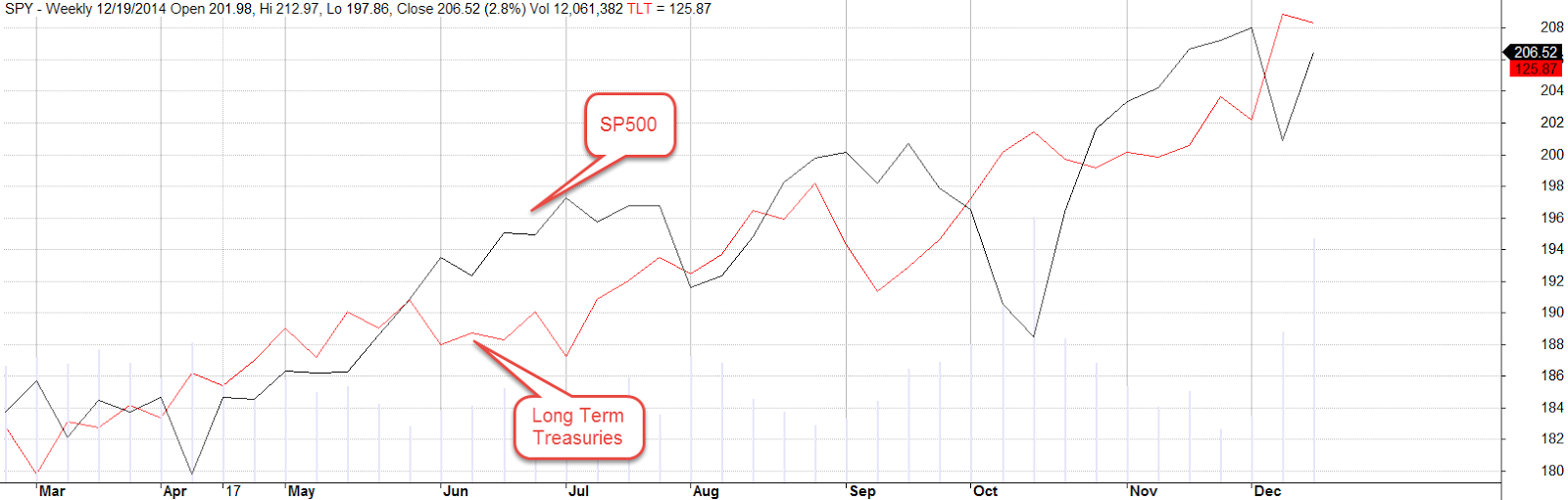
Still, a word of caution.  Both long term Treasuries, TLT, and the SP500, SPY, have been rising since October 2013.

As long as inflation remains low and the Fed continues its zero interest rate policy (ZIRP), long term Treasuries and stocks will remain attractive.   Something has to break eventually.  ZIRP  helps recovery from the aftermath of the last crisis but helps create the next crisis.  Abnormally low interest rates over an extended period are bad for the long term stability of both the markets and the economy.

**********************
Sale – Energy Stocks – Limited Time Only

(Note: this was sent out to a reader this past Tuesday.  Energy stocks popped up 4 – 5% the following day, a bit more of rebound than I expected. The week’s gain was almost 9% and the ETF closed above its 200 week average.)

As oil continues its downward slide, the prices of energy stocks sink.  XLE, a widely traded ETF that tracks energy stocks,  has dropped below the 200 week (four years!) average.  (A Vanguard ETF equivalent is VDE).  Historically, this has been a good buying opportunity. In the market meltdown of October 2008, this ETF crashed through the 200 week average.  A year later, the stock was up 38% and paid an additional 2% dividend to boot.  Let’s go further back in time to highlight the uncertainty in any strategy. The 2000 – 2003 downturn in the market was particularly notable because it took almost three years for the market to hit bottom before rising up again.  The 2007 – 2009 decline was more severe but took only 18 months. In June 2002, XLE sank below its 200 week average.  A year later, the stock had neither gained nor lost value. While this is not a sure fire strategy – nothing is – an investor  is more likely to enjoy some gains by buying at these lows.

****************************

Emerging Markets Stocks

Also selling below the 200 week average are emerging market (EM) stocks.  These include the BRICs (Brazil, Russia, India, China) as well as other countries like Mexico, Vietnam, Turkey, Indonesia and the Philipines. When a basket of stocks is trading below its four year average, there are usually a number of good reasons. Several money managers note the negatives  for EM.   Also included are a few voices of cautious optimism.  Sometimes the best time to buy is when everyone is pretty sure that this is not the right time to buy.  Another blog author recounts two strategies for emerging markets: a long term ten year horizon and a short term watchful stance.  The long term investor would take advantage of the low price and the prospect for higher growth rates in emerging economies.  The short term investor should be cognizant of the fickleness of capital flows into and out of these countries and be ready to pull the sell trigger if those flows reverse in the coming months.

******************************

Welfare

What are the characteristics of TANF families?  When the traditional welfare program was revised in the 1990s, lawmakers coined a new name, Temporary Assistance to Needy Families, to more accurately describe the program.  The old term carried a lot of negative connotations as well. Two years ago Health and Human Services (HHS) published their analysis of a sample of 300,000 recipients of TANF income in 2010.  Although the recession had officially ended in 2009, the unemployment rate in 2010 was still very high, above 9%.  It is less than 6% today.

There were 4.3 million recipients, three-quarters of them children, about 1.4% of the population. By household, the percentage was also the same 1.4% (1.8 million families out of 132 million households).  In 2013, the number of recipients had dropped to 4.0 million, the number of families to 1.7 million (Congressional Research Service)

In 2010, average non-TANF income was $720 per month, or about $170 a week.  To put this in perspective, this was about the average daily wage at that time The average monthly income from TANF averaged $392. Recipients were split evenly across race or ethnic background: 32% were white, 32% black, and 30% Hispanic. For adult recipients only, 37% were white, 33% black, and 24% Hispanic.

Rather surprising was how concentrated the recipients were. 31% of all TANF recipients in 2010 lived in California.  43.3% of all recipients lived in either New York, California or Ohio.  The three states have 22% of the U.S. population and almost 44% of TANF cases.

HHS data refutes the notion that welfare families are big.  50% of TANF families had only one child.  Less than 8% of TANF families had more than 3 children.  82% of TANF families also receive SNAP benefits averaging $378 per month.

In 2014, Federal and State spending on the TANF program was less than $30 billion, about 1/2% of the $6 trillion dollars in total government spending.  The Federal government spends a greater percentage on foreign aid (1%) than the TANF program. Yet people consistently overestimate the percentage of spending on both programs (Washington Post article).  The average estimate for foreign aid? A whopping 28%.  Cynical politicians take advantage of these public misperceptions.

**********************

Omnibus

Aiming to overhaul the health care insurance programs throughout the country, the Affordable Care Act (ACA) was a big bill.  No, it wasn’t 2700 pages as often quoted by those who didn’t like it.  The final, or Reconciled, version of the bill was “only” 900 pages.  The House and Senate versions were also about 900 pages each; hence, the 2700 pages.

At 1600 pages in its final form, the recently passed Omnibus Spending bill makes the ACA look like a pamphlet.  As  specified in the Constitution, all spending bills originate in the House.  Past procedure has been to pass a series of 12 spending bills.  Majority leader John Boehner has found it difficult to get his fractious members to agree on anything in this Congress so all 12 bills were crammed into this behemoth bill just in time to avoid a government shutdown.  Just as with the ACA, most members of the House and Senate did not have adequate time to digest the details of the bill.  The bill is sure to hold many surprises for those who signed it and we, the people, who must live under the farcical law-making of this Congress.  Here is a primer on the budget and spending process.

**********************

Home Appraisals

They’re back!  A review of 200,000 mortgages between 2011 and 2014 showed that 14% of homes had “generous” appraisals, inflating the value of the home by 20% or more.  Loan officers and real estate agents are putting increasing pressure on appraisers to adjust values upwards.

**********************

Personal Income

You may have read that household income has been rather stagnant for the past ten years or more.  In the past fifty years household formation has increased 78%, far more than the 50% increase in population.  The nation’s total income is thus divided by more households, skewing the per household figure lower.  During the past thirty years, per person income has actually grown 1.7% above inflation each year.  Inflation adjusted income is now 66% higher than what it was in 1985.

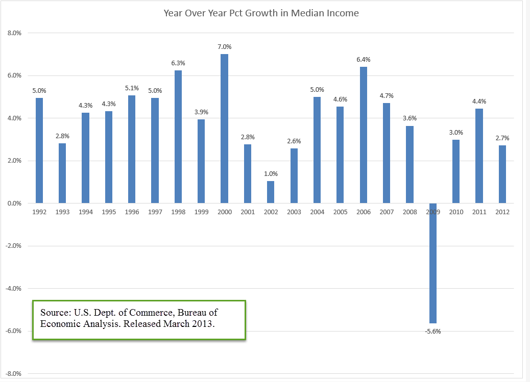
In 2013, the Bureau of Economic Analysis released median income data for the past two decades. Median is the middle; half were higher; half were lower.  This is the actual dollars not adjusted for inflation.  Except for the recession around the time of 9-11 and the great recession of 2008 – 2009, incomes have risen steadily.

The 3.7% yearly growth in median incomes has outpaced inflation by almost 25%.

Why then does household income get more attention?  A superficial review of household data paints a negative picture of the American economy. Negative news in general tugs at our eyeballs, gets our attention.  The majority of the evening news is devoted to negative news for a reason. News providers sell advertising in some form or another.  They are in the business of capturing our attention, not providing a balanced summary of the news.  In addition, a story of stagnating incomes helps promote the agenda of some political groups.

***********************

Merry Christmas and Happy Chanukah!

Economic Porridge

August 31, 2014

As summer comes to a close and the sun drifts south for the winter, the porridge is not too hot or too cold.

********************

Coincident Index

The index of Leading Indicators came out last week, showing increased strength in the economy.  Despite its name, this  index has been notoriously poor as a predictor of economic activity.  The Philadelphia branch of the Federal Reserve compiles an index of Coincident Activity in the 50 states, then combines that data into an index for the country.

This index is in the healthy zone and rising. When the year-over-year percent change in this index drops below 2.5%, the economy has historically been on the brink of recession.  The index turns up near the end of the recession, and until the index climbs back above the 2.5% level, an investor should be watchful for any subsequent declines in the index.

As with any historical series, we are looking at revised data.  When this index was published in mid-2011, the percent change in the index was -7% at the recession’s end in mid-2009.  Notice that the percent drop in the current chart is a bit less than 5%.  This may be due to revisions in the data or the methodology used to compile the index.

**************************

Disposable Income

The Bureau of Economic Analysis (BEA) produces a number of annual series, which it updates through the year as more complete data from the previous year is received.  2013 per capita real disposable income, or what is left after taxes, was revised upward by .2% at the end of July but still shows a negative drop in income for 2013.  While all recessions are not accompanied by a negative change in disposable income, a negative change has coincided with ALL recessions since the series began at the start of the 1930s Depression.

Many positive economic indicators make it highly unlikely that we are either in or on the brink of recession.  Clearly something has changed.  Something that has routinely not been counted in disposable personal income is having some positive effect on the economy.  In 2004, the BEA published a paper comparing the methodology they use to count personal income and a measure of income, called money income, that the Census Bureau uses.  What both measures don’t count in their income measures are capital gains.

Unlike BEA’s measure of personal income, CPS money income excludes employer contributions to government employee retirement plans and to private health and pension funds, lumps-sum payments except those received as part of earnings, certain in-kind transfer payments—such as Medicare, Medicaid, and food stamps—and imputed income. Money income includes, but personal income excludes, personal contributions for social insurance, income from government employee retirement plans and from private pensions and annuities, and income from interpersonal transfers, such as child support. (Source)

Analysis (Excel file) of 2012 tax forms by the IRS shows $620 billion in capital gains that year, about 5% of the $12,384 billion in disposable personal income counted by the BEA.  An acknowledged flaw in the counting of disposable income is that the total reflects the taxes that individuals pay on the capital gains (deducted from income) but not the capital gains that generated that taxable income.  Although 2013 data is not yet available from the IRS, total personal income taxes collected rose 16%.  We can suppose that the 30% rise in the stock market generated substantial capital gains income.

*************************

Interest

Every year the Federal Government collects taxes and spends money.  Most years, the spending is more than the taxes collected – a deficit.  The public debt is the accumulation of those annual deficits.  It does not include money “borrowed” from the Social Security trust fund as well as other intra-governmental debt, which add another third to the public debt.  (Treasury FAQ)  This larger number is called the gross debt.  At the end of 2012, the public debt was more than GDP for the first time.

The Federal Reserve owns about 15% of the public debt.  But wait, you might say, isn’t the Federal Reserve just part of the government?  Well, yes it is.  Even the so-called public debt is not so public.  How did the Federal Reserve buy that  government debt?  By magic – digital magic.  There is a lot of deliberation, of course, but the actual buying of government debt is done with a few dozen keystrokes.  Back in ye olden days, a government with a spending problem would have to melt down some of its gold reserves, add in some cheaper metal to the mix and make new coins.  It is so much easier now for a government to go to war or to give out goodies to businesses and people.

Despite the high debt level, the percent of federal revenues to pay the interest on that debt is relatively low, slightly above the average percentage in the 1950s and 1960s but far below the nosebleed percentages of the 1980s and 1990s.

As the boomer generation continues to retire, the Federal Government is going to exchange intra-governmental debt, i.e. the money the government owes to the Social Security trust funds, for public debt.  As long as 1) the world continues to buy this debt,  and 2) interest rates stay low, the impact of the interest cost on the annual budget is reasonable.  However, the higher the debt level, the more we depend on these conditions being true.

************************

Watch the Percentages

As the SP500 touched and crossed the 2000 mark this week, some investors wondered whether the herd is about to go over the cliff.  The blue line in the chart below is the 10 month relative strength (RSI) of the SP500.  The red line is the 10 month RSI of a Vanguard fund that invests in long term corporate and government bonds.  Readings above 70 indicate a strong market for the security. A reading of 50 is neutral and 30 indicates a weak market for the security. The longer the RSI stays above 70, the greater the likelihood that the security is getting over-bought.

Long term bonds tend to move in the opposite direction of the stock market.  While they may both muddle along in the zone between 30 and 70, it is unusual for both of them to be particularly strong or weak at the same time.  We see a period in 1998 during the Asian financial crisis when they were both strong.  They were both weak in the fall of 2008 when the global financial crisis hit.  Long term bonds are again about to share the strong zone with the stock market.

Let’s zoom out even further to get a really long perspective.  Since November 2013, the SP500 index has been more than 30% above its 4 year average – a relatively rare occurrence.  It happened in 1954 – 1956 after the end of the Korean War, again in December of 1980, during the summer months of 1983, the beginning of 1986 to the October 1987 crash, and from the beginning of 1996 through September 2000.

In the summer of 2000, the fall from grace was rather severe and extended.  In most cases, including the crash of 1987, losses were minimal a year after the index dropped back below the 30% threshold.  When the market “gets ahead of itself” by this much, it indicates an optimism brought on by some distortion.  It does not mean that an investor should panic but it is likely that returns will be rather flat over the following year.

The index rarely gets 30% below its 4 year average and each time these have proven to be excellent buying opportunities.  The fall of 1974, the winter months of 2002 – 2003, and the big daddy of them all, March 2009, when the index fell almost 40% below its 4 year average.

************************

GDP

The Bureau of Economic Analysis (BEA) released the 2nd estimate of 2nd quarter GDP growth and surprised to the upside, revising the inital 4.0% annual growth rate to 4.2%.  As I noted a month ago, the first estimate of 2nd quarter growth included a 1.7% upward kick because of a build up of inventory, which seemed a bit high.  The BEA did revise inventory growth down to 1.4% but the decrease was more than offset primarily by increases in nonresidential investment. A version of GDP called Final Sales of Domestic Product does not include inventory changes.  As we can see in the graph below, the year-over-year percent gain is in the Goldilocks zone – not strong, but not weak.

New orders for durable goods that exclude the more volatile transportation industries, airlines and automobiles, showed a healthy 6.5% y-o-y increase in July.  Like the Final Sales figures above, this is sustainable growth.

***********************

Takeaways

Economic indicators are positive but market prices may have already anticipated most of the positive, leaving investors with little to gain over the following twelve months.

Sales, Savings and Volatility

August 17, 2014

This week I’ll take a look at the latest retail sales figures, a less publicized volatility indicator, a comparison of BLS projections of the Labor Force Participation Rate, and the adding up of personal savings.

**********************

Retail Sales

Two economic reports which have a major influence on the market’s mood are the monthly employment and retail sales reports.  After a disappointing but healthy employment report this month, July’s retail sales numbers were disappointing, showing no growth for the second month in a row.  The year-over-year growth is 3.7%, which, after inflation, is about 1.5% real growth.  Excluding auto sales (blue line in the graph below), sales growth is 3.1, or about 1% real growth, the same as population growth.

As we can see in the graph below, the growth in auto sales has kicked in an additional 1/2% in growth during this recovery period. Total growth has been weakening for the past two years despite strong growth in auto sales, a sign of an underlying lack of consumer power.

Real disposable income rebounded in the first six months of this year after negative growth in the last half of 2013 but there does not seem to be a corresponding surge in sales.

*****************************

Labor Force Projections

While we are on the subject of telling the future…

All we need are 8 million more workers in the next two years to meet Labor Force projections made in 2007 by the Bureau of Labor Statistics (BLS).   8 million / 24 months = 300,000 a month net jobs gained. Hmmm…probably not.  In 2007, the BLS forecast slowing growth in the labor force in the decade 2006 – 2016.  Turned out it was a lot slower. Estimates then for 2016 projected a total of 164 million employed and unemployed.  In July 2014, the BLS put the current figure at 156 million employed.  The Great, or at least Big, Recession caused the BLS to revise their forecast a number of times.  The current estimate has a target date of 2022 to hit the magic 164 million.  In other words, we are 6 years behind schedule.

The Participation Rate is the ratio of the Civilian Labor Force to the Civilian Non-Institutional Population aged 16 and above.  The equation might be written:  (E + UI) / A = PR, where E = Employed, UI = Unemployed and Actively Looking for Work, and A = people older than 16 who are not in the military or in prison or in some institution that would prevent them from making a choice whether to work or not.  As people – the A divisor in the equation – live longer, the participation rate gets lower.  It ain’t rocket science, it’s math, as baseball legend Yogi Berra might have said.

The Participation Rate started rising in the 1970s as more women entered the work force, then peaked in the years 1997 – 2000.  Prior to the recession of 2001, the pattern of the participation rate was predictable, declining during an economic downturn, then rising again as the economy recovered.  The recovery after the recession of 2001 was different.  The rate continued to decline even as the economy strengthened.

In 2007, the BLS expected further declines in the rate from a historically high 67% in 2000 to 65.5% in 2016.  In 2012, the rate stood at 63.7%.  Current projections from the BLS estimate that the rate will drop to 61.6% by 2022.

Much of the decline in the participation rate was attributed to demographic causes in the 2007 BLS projections:

“Age, sex, race, and ethnicity are among the main factors responsible for the changes in the labor force participation rate.” (Pg. 38)

Comparing estimates by some smart and well trained people over a number of years should remind us that it is extremely difficult to predict the future.  We may mislead ourselves into thinking that we are better than average predictors.  Our jobs may seem fairly secure until they are not; a 5 year CD will get about 5 – 6% until it doesn’t; the stock market will sell for about 15x earnings until it doesn’t; bonds are safe until they’re not.

The richest people got rich and stay rich because they know how unpredictable the world really is.  They hire managers to shield them – hopefully – from that unpredictability.  They fund political campaigns to provide additional insurance against the willy-nilly of public policy.  They fight for government subsidies to provide a safety cushion, to offset portfolio losses and mitigate risk.  What do many of us who are not so rich do to insure ourselves against volatility?  Put our money in a safe place like a savings account or CD.  In real purchasing power, that costs us 1 – 2%, the difference between inflation and the paltry interest rate paid on those insured accounts.  In addition, we can pay a hidden “insurance” fee of 4% in foregone returns by being out of the stock and bond markets.  We stay safe – and not-rich.  Rich people manage to stay safe – and rich – by not doing what the not-rich people do to stay safe.  Yogi Berra couldn’t have said it better.

***************************

China

For you China watchers out there, Bloomberg economists have compiled a monetary index from several key factors of monetary policy.  After hovering near decade lows, China’s central bank has considerably loosened lending in the past two months.  The chart shows the huge influx of monetary stimulus that China provided in 2009 and 2010 as the developed world tried to climb up out of the pit of the world wide financial crisis.

The tug of war in China is the same as in many countries.  Politicians want growth.  Central banks worry about inflation.  The rise in this index indicates that the central bank is either 1) bowing to political pressure, or 2) feels that inflationary pressures are low enough that they can afford to loosen the monetary reins.  As is often the case with monetary policy, it is probably some combination of the two.

**************************
Personal Savings Rate

Over the past two decades, economists have noted the low level of savings by American workers.  While economists debate methodologies and implications, politicians crank up their spin machines. More conservative politicians cite the low savings rate as an indication of a lack of personal responsibilty.  As workers become ever more dependent on government programs, they do not feel the need to save.  Over on the left side of the political aisle, liberals cite the low savings rate as a sign of the growing divide between the middle class and the rich.  Many families can not afford to save for a house, or their retirement, or put aside money for their children’s education.  We need more programs to correct the economic inequalities, they say.

While there might be some truth in both viewpoints, the plain fact is that the Personal Savings Rate doesn’t measure savings as most of us understand the term.  A more accurate title for what the government calls a savings rate would be “Delayed Consumption Rate.”  The methodology used by the Dept. of Commerce counts whatever is not spent by consumers as savings.  “To consume now or consume later, that is the question.”

If a worker puts money into a 401K each month, the employer’s matching contribution is not counted.  If a consumer saves up for a down payment for a house, that is included in savings.  When she takes money out of savings to buy the house, that is a negative savings.  The house has no value in the “savings” calculation.  Many investors have a large part of their savings in mutual funds through personal accounts and 401K plans at work.  Capital gains in those funds are not counted as savings.  (Federal Reserve paper) In short, it is a poor metric of the aggregate behavior of consumers.  Some economists will point out that the savings rate indicates a level of demand that consumers have in reserve but because a significant portion of saved income is not counted, it fails to properly account for that either.

************************

Volatility – A section for mid-term traders

No one can accurately predict the future but we can examine the guesses that people make about the future.  In his 2004 book The Wisdom of Crowds (excerpt here) James Surowiecki relates a number of studies in which people are asked to guess answers to intractable problems, like how many jelly beans are in a jar.  As would be expected, respondents rarely get it right.  The surprising find was that the average of guesses was remarkably close to the correct answer.

Through the use of option contracts, millions of traders try to guess the market’s direction or insure themselves against a change in price trend.  A popular and often quoted gauge of the fear in the market is the VIX, a statistical measure of the implied volatility of option contracts that expire in the next thirty days.  When this fear index is below 20, it indicates that traders do not anticipate abrupt changes in stock prices.

Less mentioned is the 3 month fear index, VXV (comparison from CBOE). Because of its longer time horizon, it might more properly be called a worry index.  Many casual investors have neither the time, inclination or resources to digest and analyze the many economic and financial conditions that impact the market.  So what could be easier than taking a cue from traders preoccupied with the market?  Below is a historical chart of the 3 month volatility index.

Historically, when this gauge has crossed above the 20 mark for a couple of weeks, it indicates an elevated state of worry among traders.  The 48 month or 4 year average of the index is 19.76.  Currently, we are at a particularly tranquil level of 14.42.

When traders get really spooked, the 10 day average of this anxiety index will climb to nosebleed heights as it did during the financial crisis.  As the market calms down, the average will drift back into the 20s range, an opportunity for a mid-term trader to get cautiously back into the water, alert for any reversal of sentiment.

*********************

Takeaways

Retail sales have flat-lined this summer but y-o-y gains are respectable.  So-so income growth constrains many consumers.  The 3 month volatility index is a quick and dirty summary of the mid-term anxiety level of traders.  A comparison of BLS labor force projections shows the difficulty of making accurate predictions.  The personal savings rate under-counts savings.