Sales, Savings and Volatility

August 17, 2014

This week I’ll take a look at the latest retail sales figures, a less publicized volatility indicator, a comparison of BLS projections of the Labor Force Participation Rate, and the adding up of personal savings.

**********************

Retail Sales

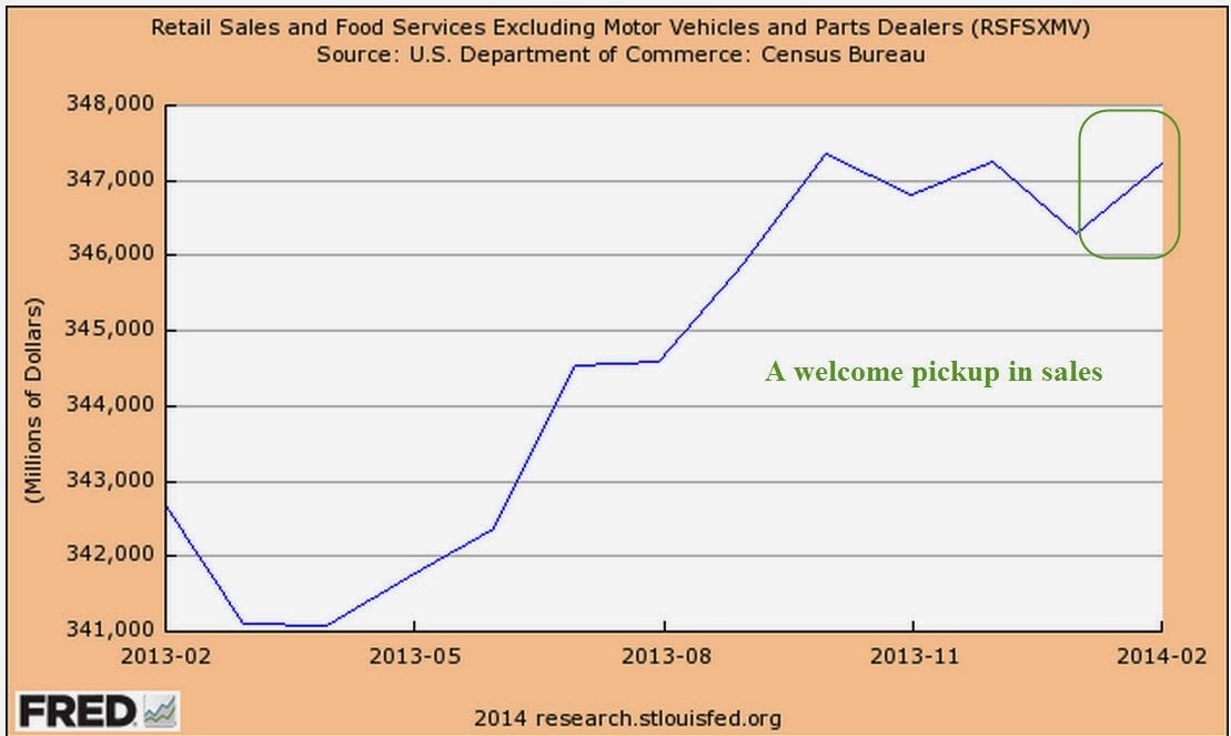
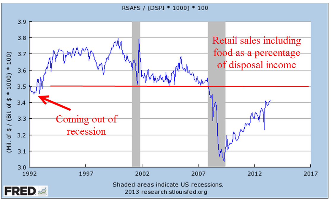
Two economic reports which have a major influence on the market’s mood are the monthly employment and retail sales reports.  After a disappointing but healthy employment report this month, July’s retail sales numbers were disappointing, showing no growth for the second month in a row.  The year-over-year growth is 3.7%, which, after inflation, is about 1.5% real growth.  Excluding auto sales (blue line in the graph below), sales growth is 3.1, or about 1% real growth, the same as population growth.

As we can see in the graph below, the growth in auto sales has kicked in an additional 1/2% in growth during this recovery period. Total growth has been weakening for the past two years despite strong growth in auto sales, a sign of an underlying lack of consumer power.

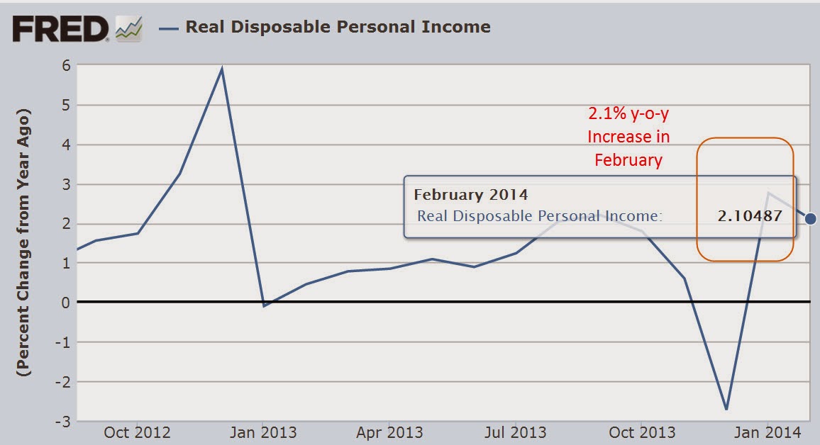
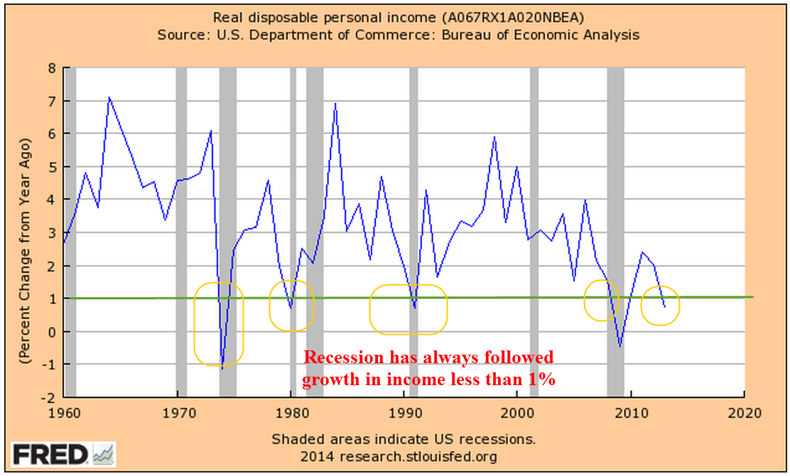
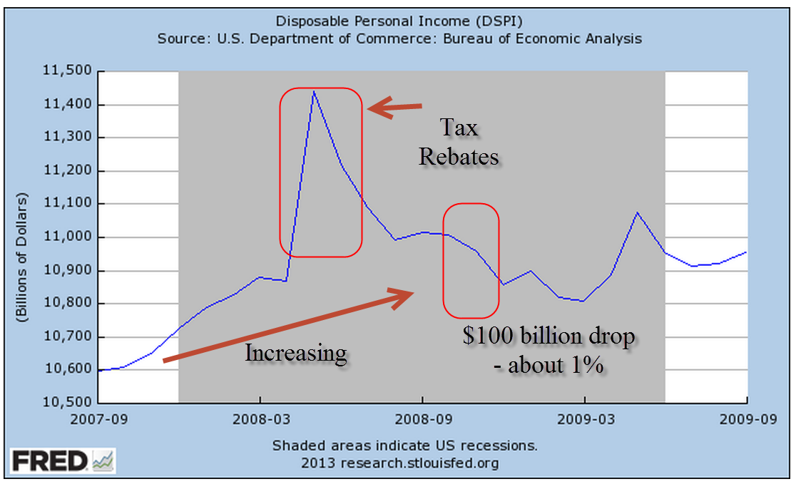
Real disposable income rebounded in the first six months of this year after negative growth in the last half of 2013 but there does not seem to be a corresponding surge in sales.

*****************************

Labor Force Projections

While we are on the subject of telling the future…

All we need are 8 million more workers in the next two years to meet Labor Force projections made in 2007 by the Bureau of Labor Statistics (BLS).   8 million / 24 months = 300,000 a month net jobs gained. Hmmm…probably not.  In 2007, the BLS forecast slowing growth in the labor force in the decade 2006 – 2016.  Turned out it was a lot slower. Estimates then for 2016 projected a total of 164 million employed and unemployed.  In July 2014, the BLS put the current figure at 156 million employed.  The Great, or at least Big, Recession caused the BLS to revise their forecast a number of times.  The current estimate has a target date of 2022 to hit the magic 164 million.  In other words, we are 6 years behind schedule.

The Participation Rate is the ratio of the Civilian Labor Force to the Civilian Non-Institutional Population aged 16 and above.  The equation might be written:  (E + UI) / A = PR, where E = Employed, UI = Unemployed and Actively Looking for Work, and A = people older than 16 who are not in the military or in prison or in some institution that would prevent them from making a choice whether to work or not.  As people – the A divisor in the equation – live longer, the participation rate gets lower.  It ain’t rocket science, it’s math, as baseball legend Yogi Berra might have said.

The Participation Rate started rising in the 1970s as more women entered the work force, then peaked in the years 1997 – 2000.  Prior to the recession of 2001, the pattern of the participation rate was predictable, declining during an economic downturn, then rising again as the economy recovered.  The recovery after the recession of 2001 was different.  The rate continued to decline even as the economy strengthened.

In 2007, the BLS expected further declines in the rate from a historically high 67% in 2000 to 65.5% in 2016.  In 2012, the rate stood at 63.7%.  Current projections from the BLS estimate that the rate will drop to 61.6% by 2022.

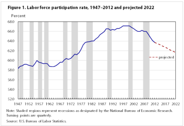
Much of the decline in the participation rate was attributed to demographic causes in the 2007 BLS projections:

“Age, sex, race, and ethnicity are among the main factors responsible for the changes in the labor force participation rate.” (Pg. 38)

Comparing estimates by some smart and well trained people over a number of years should remind us that it is extremely difficult to predict the future.  We may mislead ourselves into thinking that we are better than average predictors.  Our jobs may seem fairly secure until they are not; a 5 year CD will get about 5 – 6% until it doesn’t; the stock market will sell for about 15x earnings until it doesn’t; bonds are safe until they’re not.

The richest people got rich and stay rich because they know how unpredictable the world really is.  They hire managers to shield them – hopefully – from that unpredictability.  They fund political campaigns to provide additional insurance against the willy-nilly of public policy.  They fight for government subsidies to provide a safety cushion, to offset portfolio losses and mitigate risk.  What do many of us who are not so rich do to insure ourselves against volatility?  Put our money in a safe place like a savings account or CD.  In real purchasing power, that costs us 1 – 2%, the difference between inflation and the paltry interest rate paid on those insured accounts.  In addition, we can pay a hidden “insurance” fee of 4% in foregone returns by being out of the stock and bond markets.  We stay safe – and not-rich.  Rich people manage to stay safe – and rich – by not doing what the not-rich people do to stay safe.  Yogi Berra couldn’t have said it better.

***************************

China

For you China watchers out there, Bloomberg economists have compiled a monetary index from several key factors of monetary policy.  After hovering near decade lows, China’s central bank has considerably loosened lending in the past two months.  The chart shows the huge influx of monetary stimulus that China provided in 2009 and 2010 as the developed world tried to climb up out of the pit of the world wide financial crisis.

The tug of war in China is the same as in many countries.  Politicians want growth.  Central banks worry about inflation.  The rise in this index indicates that the central bank is either 1) bowing to political pressure, or 2) feels that inflationary pressures are low enough that they can afford to loosen the monetary reins.  As is often the case with monetary policy, it is probably some combination of the two.

**************************
Personal Savings Rate

Over the past two decades, economists have noted the low level of savings by American workers.  While economists debate methodologies and implications, politicians crank up their spin machines. More conservative politicians cite the low savings rate as an indication of a lack of personal responsibilty.  As workers become ever more dependent on government programs, they do not feel the need to save.  Over on the left side of the political aisle, liberals cite the low savings rate as a sign of the growing divide between the middle class and the rich.  Many families can not afford to save for a house, or their retirement, or put aside money for their children’s education.  We need more programs to correct the economic inequalities, they say.

While there might be some truth in both viewpoints, the plain fact is that the Personal Savings Rate doesn’t measure savings as most of us understand the term.  A more accurate title for what the government calls a savings rate would be “Delayed Consumption Rate.”  The methodology used by the Dept. of Commerce counts whatever is not spent by consumers as savings.  “To consume now or consume later, that is the question.”

If a worker puts money into a 401K each month, the employer’s matching contribution is not counted.  If a consumer saves up for a down payment for a house, that is included in savings.  When she takes money out of savings to buy the house, that is a negative savings.  The house has no value in the “savings” calculation.  Many investors have a large part of their savings in mutual funds through personal accounts and 401K plans at work.  Capital gains in those funds are not counted as savings.  (Federal Reserve paper) In short, it is a poor metric of the aggregate behavior of consumers.  Some economists will point out that the savings rate indicates a level of demand that consumers have in reserve but because a significant portion of saved income is not counted, it fails to properly account for that either.

************************

Volatility – A section for mid-term traders

No one can accurately predict the future but we can examine the guesses that people make about the future.  In his 2004 book The Wisdom of Crowds (excerpt here) James Surowiecki relates a number of studies in which people are asked to guess answers to intractable problems, like how many jelly beans are in a jar.  As would be expected, respondents rarely get it right.  The surprising find was that the average of guesses was remarkably close to the correct answer.

Through the use of option contracts, millions of traders try to guess the market’s direction or insure themselves against a change in price trend.  A popular and often quoted gauge of the fear in the market is the VIX, a statistical measure of the implied volatility of option contracts that expire in the next thirty days.  When this fear index is below 20, it indicates that traders do not anticipate abrupt changes in stock prices.

Less mentioned is the 3 month fear index, VXV (comparison from CBOE). Because of its longer time horizon, it might more properly be called a worry index.  Many casual investors have neither the time, inclination or resources to digest and analyze the many economic and financial conditions that impact the market.  So what could be easier than taking a cue from traders preoccupied with the market?  Below is a historical chart of the 3 month volatility index.

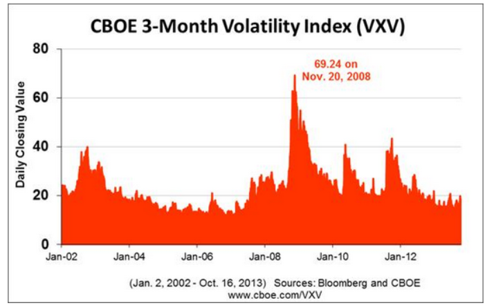
Historically, when this gauge has crossed above the 20 mark for a couple of weeks, it indicates an elevated state of worry among traders.  The 48 month or 4 year average of the index is 19.76.  Currently, we are at a particularly tranquil level of 14.42.

When traders get really spooked, the 10 day average of this anxiety index will climb to nosebleed heights as it did during the financial crisis.  As the market calms down, the average will drift back into the 20s range, an opportunity for a mid-term trader to get cautiously back into the water, alert for any reversal of sentiment.

*********************

Takeaways

Retail sales have flat-lined this summer but y-o-y gains are respectable.  So-so income growth constrains many consumers.  The 3 month volatility index is a quick and dirty summary of the mid-term anxiety level of traders.  A comparison of BLS labor force projections shows the difficulty of making accurate predictions.  The personal savings rate under-counts savings.

Follow The Money

June 14th, 2014

This week I’ll take a look at some near-term trends in small business, labor, oil and housing and a few long-term trends in income and debt.

***********************
Small Business

Huzzah, huzzah!  The monthly survey of small business owners by the National Federation of Independent Businesses (NFIB) broke through the 96 level after cracking the 95 level last month.  Sentiment has not been this good since mid-2007.  Hiring plans have been on the rise for the past several months and owners are reporting rising sales.

**********************

JOLTS (Job Openings and Labor Turnover Survey)

The Job Openings report from the Bureau of Labor Statistics (BLS) has a one month delay so the data released this past week was for April.  The number of job openings was 40,000 higher than expected, coming in close to 4.5 million.  As a percent of the workforce, job openings are approaching pre-recession highs.

The decline in construction job openings is a disappointment.  We are near the same level as 2003, a weak year of economic growth.  We should expect to see an uptick in job openings in next month’s report, confirming that projects put on hold during the severe winter in the eastern part of the country are again on track.  Further declines would indicate a spreading malaise.

************************

Gross Domestic Income

On a quarterly basis Gross Domestic Income, GDI, and Gross Domestic Product, GDP, differ somewhat but over the long run closely track each other.  Following up on two previous posts on Thomas Piketty’s book Capital in the 21st Century, I wondered what percent of GDI goes to pay employee compensation.  As we can see in the chart below, total compensation for human labor has been dwindling to post WW2 levels.

This is total compensation, including benefits.  Wage and salary income as a percent of total national income has declined steadily.

As a percent of total income, employee benefits have more than tripled since the end of World War 2 and now comprise more than 10% of the country’s income.

Demographic shifts have contributed to the decline of labor income.  The post war boomer generation, 80 million strong and 25% of the population, contributes to the trend as they save for retirement. As capital gains, interest and dividend income increase, this reduces the share of wage and salary income.

Economic changes have been a major factor in the decline of labor income.  Capital investments in technology, both in hardware and software, have reduced the need for labor for a given level of production.  Capital investment demands income to pay back the investment. For most of the 20th Century, machines replaced human muscle in farming, manufacturing and construction.  In the past two decades, machines are increasingly replacing mental muscle.

How we count labor income has changed.  Tax law changes in 1986 and 1993 reduced the amounts that are included as compensation but the overall effect of these changes is relatively minor.

If we divide the country’s total employee compensation by the number of employees, we might ask “What recession?”  Average annual compensation has climbed from $38-54K in a dozen years.  That’s almost a 50% raise for every employee!

Of course, everyone has not had a 50% increase in income over the past 12 years.  Human capital, the educational and technical training that an employee has to offer, has earned an increasing premium in the past three decades. Those with more of this capital have captured more benefit from the dwindling pool of labor needed for the nation’s production.

Average disposable income tells a more accurate story of the majority of people in this country.  Disposable income is what’s left over after taxes.  The trend is downward.

How do we cope with flat income growth?  Charge it!  It’s the Amurikin way! Per capita Household Debt has increased 75% in the past 13 years.  After a decline from the rather high levels before the recession began in late 2007, per capita debt has leveled off in the past two years.

Rising house prices and stock market values have increased net worth.  As a percent of net worth, household debt has declined to the more sustainable levels of the 1990s.

The percentage of disposable income needed to service that debt is at thirty year lows, meaning that there is room for growth.

In response to the hostilities in Iraq, oil prices have been on the rise.  Historically, a rise in oil prices leads to a rise in prices at the pump which takes an extra bite out of disposable income and puts a damper on consumer spending growth.

***********************

Oil Prices

A blog by Greg McIsaac at the Washington Monthly in May 2012 presents an interesting historical summary of oil prices and production.  The American love of simplicity leads many to credit one man, the President, for the rise and fall in gasoline prices, although the President has little, if any, influence on oil pricing. McIsaac notes The combination of lower energy prices and increased energy efficiency in the 1980s reduced US expenditures on energy by nearly 6 percent of GDP.  Deregulation of energy prices begun under the Carter Administration were largely credited to the Reagan administration.   He writes “crediting Reagan with falling energy prices of the 1980s exaggerates the roles of both Reagan and deregulation and obscures the larger influence of conservation and increased production outside the US.”  Production actually fell for several years after regulatory controls were lifted.

Further increases in oil prices will no doubt be blamed on this President.  The one thing that each outgoing President bequeaths to the newcomer before the inauguration is the Presidential donkey suit.

***********************

Housing

Redfin Research Center reports a sharp decline in the number of houses sold through May. After a 7.6% year-over-year decline in April, home sales slid 10% from May 2013 levels.  Real estate agents are reporting a shift from a seller’s market to a buyer’s market.

***********************

Takeaways

Small business accounts for approximately 60% of new jobs and optimistic sentiment among small business owners is growing.  The labor market continues to show continuing strength in the number of job openings and a decline in new unemployment claims.  Disposable income growth is flat but the portion of income needed to service debt is very low.  Rising oil prices and a slowing housing market will crimp economic growth.
Next week I’ll look at a complex topic – is the stock market fairly valued?  

Piketty Pushes Back

June 1st, 2014

First a shout out to our friends in the southern hemisphere where the winter is beginning in earnest.  Hey, you had the sun for six months.  Now it’s our turn.  We all have to share.  I think that because there are more people in the northern hemisphere, the sun should stay up here for longer than six months.  It’s not fair.

Piketty Controversy

Talking about fair…..Last week I touched on some of the highlights in Thomas Piketty’s book, Capital in the 21st Century.  At the time of that writing, Chris Giles in the Financial Times had just reported that he found some data errors while using Piketty’s source material.  Giles’ criticisms were rather precise and included charts of the revised data which Giles claimed contradicted Piketty’s conclusions that wealth inequality had risen during the past thirty years.  This past Friday, the financial site Bloomberg reported that Piketty had rebutted criticisms of his methodology.  En garde!!! For those of you who are not interested in the minutiae of the disagreements, I will quote from Piketty’s response:

What is troubling about the FT methodological choices is that they use the estimates based upon estate tax statistics for the older decades (until the 1980s), and then they shift to the survey based estimates for the more recent period. This is problematic because we know that in every country wealth surveys tend to underestimate top wealth shares as compared to estimates based upon administrative fiscal data. Therefore such a methodological choice is bound to bias the results in the direction of declining inequality.

Piketty’s rebuttal is sound but the debate over data and methodology does underscore a problem. There were times when I have questioned Piketty’s data only to find that he addressed those concerns in either the footnotes to the book or in notes contained in his tables.   Fearing that I might put readers to sleep, I edited out of last week’s blog a concern I had with Piketty’s rate of inflation shown on page 448 when he presented a table – Table 12.2 – of historical returns by university endowments.  Piketty states a 2.4% inflation rate from 1980-2010, which struck me as too low (BLS figures are 3.3%).  In a note at the bottom of the Excel file TS12.2, he revealed that he used the GDP deflator, not the CPI, in order to keep data consistent with the GDP series.  He could have stated this simply at the bottom of the table in the book.  It’s not like the publishers were trying to save space in a 700 page book.

So, Open Letter to Professor Piketty and other Economists:  Please put your caveats and clarifications up front and center and repeat often. Last week, I gave several examples of Piketty’s clarifications which could be found in a referenced paper or on one of the spreadsheets that his team compiled.  James Joyce famously said of his book Finnegan’s Wake that he expected the reader to put as much time and effort in reading the book as Joyce did in writing the book.  Relatively few people have read Finnegan’s Wake.  Help us understand your point!!

For those of you who want more of the controversy, a reader sent me this, including  Simon Wren-Lewis’s comments on the matter at Mainly Macro, which I link to every week on the side of this blog. Economist Tyler Cowen comments echo my concerns with valuations of capital that vary widely because of asset pricing.  When an asset is difficult to price or varies widely in price, should one use the SNA international convention (System of National Accounts) and estimate a present value based on projected future flows?  The founder of Vanguard, John Bogle, recommends this common sense approach for our personal portfolios; that we should stop looking at our statements and look at the money flows that our portfolio mix will probably generate them when we need them.  That is the true worth of our portfolios, according to Bogle – not some temporary valuation based on the market prices on the last day of the month.

**************************

What is Income?

This week, as I listened to and read discussions of income in the U.S., it became apparent that there are understandable misconceptions of what is being counted when economists tally up the income of a household and the income of a nation.  Update:  Corrected. A 2011 report from the Census Bureau states that household income does include cash benefits before taxes.  EITC payments are not included because they are a reverse tax (Source).  Non-cash benefits like Medicaid, Food Stamps and housing assistance are not included.  These non-cash benefits can easily surpass $1000 per month.

Money income includes earnings, unemployment compensation, workers’ compensation, Social Security, Supplemental Security Income, public assistance, veterans’ payments, survivor benefits, pension or retirement income, interest, dividends, rents, royalties, income from estates and trusts, educational assistance, alimony, child support, cash assistance from outside the household, and other miscellaneous sources.

The national income figures that Thomas Piketty uses in his book do include government transfers.  The 2005 NIPA Guide summarizes what is included in personal income.   IVA and CCAdj are inventory and depreciation adjustments.

Personal income is the sum of compensation of em­ployees, received; 
proprietors’ income with IVA and CCAdj; 
rental income of persons with CCAdj; 
personal income receipts on assets; 
and personal current trans­fer receipts; 
less contributions for government social insurance

Measuring income to determine an aggregate level of well-being within the population is challenging and gives each side ample ammunition in the political debate.  The inclusion and exclusion of various types of benefit, cash and otherwise, leads one side to dismiss the conclusions of the other side and hinders a constructive dialog.

*************************

GDP Growth

Each month the BEA (Bureau of Economic Analysis) releases a new estimate of the previous quarter’s GDP.  This past week the BEA released the 2nd estimate of 1st Quarter GDP growth, showing an annualized 1% decline.  This was pretty much in line with consensus estimates and the market’s response was rather neutral on the day of the release.  Much of the downturn was ascribed to the particularly harsh winter weather and many economists are projecting a 4% annualized increase in this quarter, a rebound to offset the past quarter’s decline.

Peering under the hood of the GDP report:  under the category of Private Domestic Investment, residential housing dropped almost 8% (annual rate) in the fourth quarter and another 5% in the first quarter of 2014.  What is more surprising is the almost 2% drop in business investment.  Let me go back to a paper by Ed Leamer that I first wrote about in February.  Mr. Leamer’s thesis is that the sales of new homes first decreases, followed by a decrease in business investment. He found that this 1-2 punch precedes most recessions by about 3 – 4 quarters.  In two cases, it was a false positive.  Perhaps this latest 1-2 punch  is a false positive.  Perhaps it was just the winter weather.  This economy does not feel like a recession is at all imminent. Industrial activity, the labor market and auto sales are strong or expanding. More perplexing to a casual investor might be a summer lurch downward in the market if the economy does not show signs of a correcting rebound.

*********************

Fixed Capital Consumption

Since 2000, there has been a notable change in economic growth.  It is not often that we see growth above 3% as we did in the 20th century.

Helping that meager growth rate look – well, less meager – is an item that the BEA adds to GDP called Fixed Capital Consumption.  To the ordinary Joe, this is simply depreciation, but this is not the depreciation that your accountant might have mentioned if you own a small business or rent out part of your home. The depreciation that the BEA calculates is based on the current market price of a piece of equipment, for example, not the actual cost of the item.  As an example, let’s say that Billy and Betty Jones bought a new $20,000 truck for their business and their accountant depreciates it over a 5-year cycle.  To keep it simple, assume that the truck’s depreciation each year is 20%.  That depreciation is based on the cost of the vehicle.  Let’s do it the way the BEA does it (if only!  The IRS does not allow this!).  In year 3, the current market price of a similar vehicle is $24,000.  20% of $24,000 is $4800, higher than the $4000 depreciation based on the cost of the vehicle. In a given year, the amount of depreciation actually reported by companies might be $2 trillion.  The BEA figure will be higher and this is included in Gross Domestic Product.  As a percentage of GDP, depreciation has risen considerably since the early 2000s, driving up reported GDP growth just a smidge.  Below is a chart of the increasing percentage of GDP that is Fixed Capital Consumption.  Almost one of every six dollars of GDP is being allocated to depreciation, a third higher than 1960 rates.

In a low inflation environment, the change in the market prices of equipment and land is muted.  Are capital expenditures becoming obsolete at a faster pace?  Over the past two decades, software and systems development has become an increasing share of non-residential investment.  Rapid changes in technology may be one driver of the acceleration in depreciation.  Wikipedia has a good article on the concept as it is reported in the national accounts.

*************************


Education

As I mentioned last week, I’ll look at a paper I read recently which had some rather startling conclusions. In a paper published in the World Economic Review earlier this year, economists James Galbraith and J. Travis Hale reviewed paycheck and IRS income data to identify state and national trends in income inequality during the past 40+ years.  It comes as no surprise that there is inequality between sectors in the economy, a fact which Galbraith and Hale acknowledge.  Their particular focus was the changes in inequality within and between sectors at the state and national levels.

There are two components to income inequality: 1) wage growth or the lack of it; and 2) employment growth or the lack of it within each sector.  If a particular sector experiences a period of high growth in earnings but jobs decline in that sector, then the gains become more concentrated and inequality between sectors grows.

What Galbraith and Hale found was that the changes in the 1990s and 2000s had one common characteristic: booming sectors of the economy vs. non-booming sectors accounted for most of the growth in income inequality.  Where each decade differed was the change in the sectors that experienced high growth.  The 1990s was marked by a growth spike in information technology, giving rise to out-sized gains to workers in the professional, scientific, and technical fields.   The 2000s was the decade of outsized growth in construction, defense and extractive technologies. Here is a troubling finding of their study: common to both periods is that the number of jobs declined in those sectors that experienced high wage growth.  Higher pay = less job growth. Also common to both decades, until the financial crisis in 2008, was the high growth in the finance and insurance industries.  Problem:  Rising  inequality.  Remedy: More education. The authors acknowledge this common response:

When public discourse admits inequality to be a problem, education is often given as the cure.  According to Treasury Secretary Henry Paulson (2006), for instance, the correct response to rising inequality is to “focus on helping people of all ages pursue first-rate education and retraining opportunities, so they can acquire the skills needed to advance in a competitive worldwide environment.”  This is a view with powerful support among economists. 

But their evidence casts this common conception into doubt:

As we’ve shown, the last two decades have seen significantly slower job growth in the high-earnings-growth sectors than in the economy at large. So even if large numbers of young people do “acquire the skills needed to advance” there is no evidence that the economy will provide them with jobs to suit.  Many will simply end up not using their skills.  Moreover, a strategy of investment in education presupposes advance knowledge of what the education should be for. Years of education in different fields are not perfect substitutes, and it does little good to train too many people for jobs that, in the short space of four or five years, may (and do) fall out of fashion. And experience shows clearly that the population does not know, in advance, what to train for. Rather, education and training have become a kind of lottery, whose winners and losers are determined, ex post, by the behavior of the economy.

Does this mean that parents and grandparents should cash in those college funds for the kids and take a long vacation with the money?  Hardly.  Bureau of Labor Statistics reveal that those with a college education have a significantly greater lifetime income than those without. The findings of this paper imply, however, that the economy and the job market change in ways which none of us can reliably predict.  The wiser course for students might be the same advice financial advisors give to investors: diversify.  If a student is majoring in philosophy, take some business, computer or science courses. Science majors could do with some literature and writing courses as well.

At the start of the 20th Century, 40% of the population was engaged in farming-related jobs.  A century later, less than 2% of jobs are in the agricultural sector.

When I was a teenager, an aunt told me that a reliable bookkeeper could always find a job. That was before the introduction of the computer and accounting programs for small businesses.

The number of librarians has declined about 10% in less than a decade.  In 1990, who could have predicted that?

Records Management, once a clerical job, has evolved into management of many interdependent mediums, complicated by laws and regulations that few could foresee just twenty years. A science major confident in the availability of work in a certain skilled profession might find that the introduction of a qubit computer in 2025 sharply reduces jobs in that profession.

*****************************

Takeaway

As investors, we often think that we can avoid the pain so many of us experienced in 2008 if we pay more attention to economic and corporate indicators.  In hindsight, the graphed data looks so obvious. We ignore now what we didn’t ignore then because we know now what to ignore, making hindsight a marvel of clarity.  The future enables us to filter out the noise of the past.

If China’s housing sector implodes and repercussions of that undermine the U.S. economy, we’ll criticize ourselves for not reading that article on page 24 that detailed the coming crisis.  There will be a graph of some spread in interest rates or some other indicator that we glossed over at the time.  If there is a recession 9 months from now (this is just an ‘if’), we will forget the harsh winter of 2014 that blinded us to the early warning signs.  We will see the decline in 1st quarter GDP together with the decline in disposable personal income as the clearest of warning signs and slap ourselves on the head for missing it.  Some guy will get on the telly and show us how he predicted it all along and we’ll think that we should get his newsletter because this guy knows.

As to our current disputes, the grandchildren of our grandchildren may be puzzled by our concerns with income and wealth inequality.  We remember the first two paragraphs of the Declaration of Independence, which the signers largely agreed to with a few revisions.  The majority of the Declaration is concerned with a list of grievances against the British Empire, which the signers debated vigorously, making numerous amendments to the text.

When did we last have a debate on which metal, gold or silver, should serve as a backing to the currency?  This burning topic of the late 19th Century is of little more than historic interest.

Over a fifty year period in the 19th Century, bankruptcy became less a criminal act and more a civil matter, culminating in the Nelson Act in 1898 which codified our more modern notion of bankruptcy.

With relatively little debate, 19th Century Americans bequeathed their heirs a country dominated by large corporations.  Less by design and more by default, the raising of private capital by corporations seemed to be a convenient solution to the persistent misuse of public funds by corrupt politicians in that century.

We no longer argue, as they did during the Civil War, whether the Federal Government has a responsibility to bury soldiers who have died on the battlefield.

We argue about guns and the meaning of the Second Amendment, which 19th Century Americans thought was non-controversial and not a universal individual right to gun ownership.

A hot topic of debate in the early part of the 20th Century was whether Irish, Italians and other Southern European immigrants were fully evolved humans and were capable of exercising the right to vote.

19th Century Americans argued about the moral validity of slavery.  We don’t.

What is the minimum working age for children?  Is it six or eight years of age?  What should be the legal maximum hours that they can work?  These burning questions of the early 20th Century are dead embers now.

The issues changes, our perspectives change, but we can be sure of one thing: in a hundred years, we will still be arguing as much as we do today and that is oddly reassuring.

Income and GDP

March 30th, 2014

Business Activity

The Institute for Supply Mgmt (ISM) and Markit Economics are two private companies that survey purchasing managers and release the results in the first week of each month. Toward the end of each month Markit releases what is called a “Flash PMI”, an early indication of activity for the month.  This month’s flash index of manufacturing activity declined slightly but is still showing strong growth.  New orders are showing strong growth at a reading of 58.  The Flash reading of the services sector rose to over 55 but this is a mixed report, with only tepid growth in employment and backlogs actually in a slight contraction.  The most remarkable feature of this report was the 78.1 index of business expectations, an outstandingly optimistic reading. This Flash index gives investors a glimpse of the full survey reports from ISM and Markit that will be released in the first week of next month.

******************************

On the other hand…

The monthly report of durable goods indicates a rather tepid 1-1/2% year over year growth.  This excludes planes, autos, and other transportation orders.  Including those components, there has been no yearly growth.

******************************

Stick with the plan, Stan…

Rising equity and real estate markets have been good for a lot of people. A Bankrate.com blog noted the number of people entering the ranks of millionaires in 2012.  Toward the end of this report was an important lesson: “60 percent of investors worth $5 million or more say they’ll invest in equities this year, while 31 percent of those worth $100,000 to $1 million plan to do the same.”  Hmmm…rich people are not buying into the prophecy prediction analysis that the market will crash this year.  Could they be sticking with a plan that  allocates investments across a variety of assets, including stocks?

*******************************

Personal Income

This week, the Bureau of Economic Analysis (BEA) released February’s estimate of personal income.  Real, or inflation adjusted, disposable personal income (DPI), rose 2.1%, a decline from January’s 2.75% increase but above the 1% that has historically led to recessions.

A few weeks ago I noted that annual DPI had dropped below 1% in 2013.  Contributing to the weak year over year comparison was the high spike in income in the fourth quarter of 2012 when many companies “paid forward” both dividends and bonuses in December in advance of tax increases scheduled for 2013.

While this may have been a contributing factor to the decline, it would be a  mistake to give it too much weight.  The growth in personal income has been relatively weak and it shows in the consumer spending index released this week.  The .1% year over year increase – essentially zero – indicates consumer demand that is too weak to put any upward pressure on prices.  Sensing this, businesses are less likely to invest in growth.  Less investment growth means that employment gains will be modest, which further reinforces modest economic growth.

The stock market trades on profit growth.  Standard and Poors reports that 4th quarter earnings for the companies in the SP500 rose 9.8%, accelerating from the 6.0% growth in the 3rd quarter of 2013.  A moderately improving economy and only modest growth in investment has helped boost profits.  Profits are expected to rise 11% in the second half of 2014.

******************************

GDP

The third estimate of GDP growth in the fourth quarter of last year was 2.6%, in line with consensus estimates.  In her testimony before Senate Finance Committee two weeks ago, Fed chairwoman Janet Yellen noted that we may be in for an extended period of slow growth below the fifty year average of 3%.

Three weeks ago I looked at GDP and the personal savings rate.  This week I’ll look at per hour GDP.  Readers should understand that this is what some economists would call a messy data set.  I have made some assumptions about the number of hours worked per employee.  The BLS publishes average hours worked for manufacturing employees and I made a guesstimate that the average for all workers is about 90% of that.  The number of part time employees who do not work this amount of hours offsets the unreported hours of the self-employed.  I am less concerned about the absolute accuracy of the GDP output per hour worked but that any inaccuracies be fairly consistent.  The trend is more important than the actual numbers.  What can we learn when output per hour flattens or declines?  Below is a graph of sixty five years.

We can see that flat growth tends to precede recessions but there is no definite pattern where we can say with any confidence that a flattening or decline in per hour GDP necessarily precludes a recession.  If we zoom in on the past thirty years, we do notice that the preceding decade has been marked by long periods of flat growth.  More importantly, the recovery from this past recession is marked by the longest period of flat growth in the history of the series.

The summer of 2009 marked the official end of this past recession.  For five years there has been no increase in real GDP per hour worked.  For a few years following a recession in the early 1990s, per hour GDP flattened before taking off in the late 1990s.

Does this flat growth represent a pruning of the economic tree before a surge of new growth? Or does it presage an even worse recession? Is the economy locked inside a limbo of limp growth for years to come, echoing the two decades of little growth in Japan’s economy?  Whatever happens, we can be certain of one thing – the trend and pattern will be so much more obvious in the future simply because we will disregard some past data based on what happens in the future.

As we make investment decisions, we should remember that the “obvious” patterns we see when we look back were much less clear at the time.  Sure there will be investment gurus who tell us that they saw it coming.  We forget that they also saw the depressions of 1994, 1998, 2000, 2004, 2006 and 2011 – the ones that didn’t happen.

Let’s look a bit more closely at recent periods of flat growth.  The recovery from the recession of 1991 was marked by a painfully slow recovery in the job market.  After a 30% rise over three years, the market stumbled.

There’s a story to be told when we look at the growth in the market index and per hour GDP.  Whether it is by coincidence or not, there is a loose response of the market to changes in output.

After another slow recovery from the recession of 2001, the market began to climb in 2004.

But this time the market was not responding to the flattening growth in per hour output.

In the past four years, there has been little growth in output per hour.

But the market has doubled over that time.

Part of that recovery can be attributed to the market simply reversing the decline of 2008 and early 2009, but a good 40% increase in market value can be attributed to the greater share of output that companies have been able to convert to profit. (See last week’s blog)  How long that trend can and will continue is anyone’s guess but we know that it can not go on forever.  Flat revenue growth makes growing profits an ever more difficult task.

The flat growth in per hour output gives us perhaps another insight into the so-so growth in employment.  Without a clear vision of a stimulus that will spur growth, companies are reluctant to commit to plans for an expansion of their work force.

Productivity & GDP

March 23rd, 2014

Industrial Production

The week opened with a positive report on industrial production.  The .8% rise offset Janary’s decline and was the 4th month in which this index has been above the level of late 2007, the onset of the last recession.  To give the reader a sense of historical perspective, this index of industrial production has been produced for almost hundred years.  The average recovery period of civilian production is 2-1/2 years.  This recovery period of this past recession, 6 years, is second only to the  7-1/2 year recovery of the 1930s Depression.  I have excluded the 6-1/2 year post WW2 recovery period from war time production, which doubled production to produce goods and armaments for the war.  If that period is included, the average is 3 years.

Here is a comparison of the recovery periods since 1919.  The back to back dips of 1979 and 1980-83 were, in effect, one long dip lasting 4 years, making it the third worst recovery period of the past one hundred years.

When industrial production takes several years to regain the ground lost during a recession, it is vulnerable to even minor economic weaknesses.  As production recovered from a 7-1/2 year dip during the 1930s Depression, the Federal Reserve tightened money and production slid once again before reviving to produce arms to ship to British and European forces in the early years of World War 2.  Outgoing Federal Reserve chairman Ben Bernanke, a noted scholar of the 1930s Depression, understands the inherent weakness of an economy when production takes several years to recover.  For this reason, he was reluctant to ease up on monetary support until production was clearly and securely recovered.

The new Federal Reserve chairwoman, Janet Yellen, has decades of experience and is well aware of the fragility that is inherent in an economy that experiences a long period of industrial recovery.  This will be one of several factors that the Federal Reserve watches closely for any signs of faltering.  Those who think that the Fed will make any abrupt changes in monetary policy have not been reading the footprints left by the past.

****************************

Productivity

Last August I wrote about the rather slow growth of multi-factorial productivity (MFP) since 2000.  The Bureau of Labor Statistics (BLS) calculates a meager 1% annual rate of growth in that time.  Far down in their historical tables is a revealing trend: Labor’s contribution to production has declined dramatically in the past ten years while capital’s share of inputs has increased.  Capital inputs include equipment, inventories, land and buildings.  In 2011, the most recent year available, labor’s share of input had decreased to 63.9%, far below the 60 year average of 68.1%.

Capital’s share of input had increased to 36.1%, far above the average 31.9%

As I mentioned last August, the headline productivity figures are misleading because they simply divide output by number of hours worked and ignore the contributions of capital to the final output.  As capital’s share of input increases, the contributors of that capital want more return, i.e. profit, on their increased contribution.

In the twelve years from 2000 – 2011, capital’s share of input has increased 20%, from 30% to 36%.  In that same period, after tax profits have grown by 130%, a whopping return on the additional 20% capital invested.  While overall MFP growth has slowed, the mix has changed.

Given such a rich return, we can expect this trend to continue until the growth of profits on ever larger capital investments reaches a plateau and slows.  Until then, labor’s share of productivity gains will be slight, acting as a continuing restraint on family incomes.

*******************************

Existing Home Sales

The 5 million sales of existing homes in 2013 was 9% above 2012 levels but the percentage of cash buyers has increased as well, now making up almost 1/3 of existing homes sales. (National Assn of Realtors).  The percentage of first time buyers declined from 30% in December 2012 to 27% in December 2013. For the past half year sales of existing homes have declined and the latest figures for February show a 7% decline from 2013 levels.

In May 2013, the price of Home Depot’s stock hit $80, a 400% rise from the doldrums of the spring of 2009.  Since then, it has traded in a close range around that price.  In May 2013, the price of the stock was 200% of the 4 year average, an indication that all of the optimism had been baked into the stock price.  It now trades at 160% of the 4 year average, rich but more reasonable if expectations for a continued housing recovery materialize.

In January 2000, the stock broke above $50 and was also trading at almost 250% of it’s 4 year average.  After trading in a range in the high $40s for several months, the stock began to fall.  By mid-June of 2000, the stock traded for 150% of its 4 year average.

The range bound price of Home Depot’s stock price for 8 months now is a good indication that investors have become watchful of the real estate sector, particularly the existing home market.  The percentage of cash buyers has risen 10%, replacing the similar decline in the number of first time home buyers.  Remember that this stalling is taking place at a time when interest rates are near historic lows.

*******************************

Reader questions

A reader posed a few questions about last weeks blog.

When annualized sales rates are down, but annualized inventory rates are up, is that usually because of prior contracts that businesses must accept?  Or is it usually hope for their future?  In other words, is a higher inventory rate a positive sign or a negative one?

When sales are going down and inventories are going up, it means that businesses were not prepared for the change in sales. This ratio measures the amount of surprise.  Businesses will then reduce their orders to factories, wholesalers, etc.  They may decide to reduce any hiring plans.  On the other hand, they might increase their marketing expense.  Look closely at the Inventory to Sales Ratio (ISRATIO) graph from the Fed.  In the early part of the recession in the first quarter of 2008, the ISRATIO moved up a bit, then down in the 2nd quarter but it was still in the subdued normal range of 1.25 to 1.30 established since 2006.  During the summer of 2008, the ISRATIO rose again but it was not until September 2008 that this ratio began it’s several month upward spike as sales crashed.

Re:  Decline in real personal consumption below 2.5% has ALWAYS led to a recession within a year.  Are there any substantive changes in how the economy is run now than in the past?  For example, has the Fed always been involved with quantitative easing like it is now?  Could that easing create a better economic climate despite personal consumption decline?  When we look at the past, are we generally comparing apples to apples?

The fact that a recession has always happened when inflation adjusted personal consumption falls below 2.5% does NOT mean that it will happen this time.  These are indicators, not predictors and we must remember that indicators of past trends are with revised data.  Investors and policy makers must make decisions with the currently available data, before it is fully complete. Personal consumption for 2013 could be revised higher in the coming quarters.  Some revisions happen as much as three years later.  What it does mean is that the Fed will be watching this sign of weakness in the consumer economy and is unlikely to make any dramatic policy changes.

So how do you think our leaders should lead in regards to SS?  Do you think the age should be raised to say 70?  Do you think we will not be able to depend on SS being there throughout our lifetimes?  It must be of great concern to your kids that it may not be there for them, esp. after having contributed over the years.

I think politicians will have to spread the pain on Social Security.  These suggestions are not new.

1) Raise the salary level that is subject to the tax so that more tax is captured from higher salaries.  This years maximum is $117K. (SSA) This is a tough sell.  The ratio of the maximum taxed earnings to the median household income (Census Bureau Table H.6) has gone up from 150% in 1980 to almost 220% in 2012.

Well to do people feel like they are already paying their “fair share.”  Senator Bernie Sanders and other Democrats use the ratio of the maximum taxed earnings to the top 10% of incomes to make the case that the maximum should be as high as $175K.  Computers and the availability of so much data enable policy makers and think tanks to produce whatever data set they want in order to support their conviction.

2)  Raise the employee and employer share of the tax .1% each year for the next five years.  Democrats will not like this one because it raises the burden on lower income families.

3)  Initially raise the social security age by two months each year over the next five years and index it to the growth in the life expectancy of a 65 year old so that the official retirement age is 15 years less than the life expectancy.  In 2025, if the life expectancy is 85 years, then the official retirement age would be 70.  Early retirement should be set at 3 years less than full retirement age.  In this case, early retirement would be 67.

All of these are tough choices and most politicians don’t want to touch them.   Voters are not noted for their prudence and are unlikely to pressure pressure policy makers for more taxes and less benefits. In order to sell these difficult proposals, I would add one more proposal.

4) Guarantee the payout of benefits for ten years, regardless of death.  Each retiree would name beneficiaries for their social security and payments would go to those beneficiaries until the 10 year anniversary that retirement benefits began.  This would incentivize retirees who could afford it to delay the start of their retirement benefits until 70, knowing that their heirs would get at least ten years of benefits. This delay would ease some of the fiscal shock as the boomer generation is now retiring.

Currently, the highest social security benefit is paid to a surviving spouse.  If a man dies with a higher monthly benefit than his wife, then the wife gets the husband’s higher benefit amount each month but loses her benefit.  Under this proposal, the wife would get her benefit and the husband’s benefit plus her benefit if her husband dies within ten years of retirement.  Often, a couple’s income is cut in half or by a third when a spouse dies.  Older women are particularly impacted, finding that they can no longer afford the mortgage or rent in their current housing situation. This feature would enhance the popular understanding that Social Security is like an insurance annuity.  It would help particularly vulnerable older surviving female spouses, an emotionally appealing feature that politicians could sell to voters, thus making it more likely that voters would accept the higher taxes and raised retirement age.  Whether the idea is fiscally sound is something that the Board of Trustees at the SSA could calculate.

Sales, Employment, Social Security

March 15th, 2014

Small business

The monthly survey of small businesses showed an abrupt decline in sentiment, below even the lowest of expectations,  and the sixth report since the beginning of the year to come in below the consensus range.  Two factors led the downward change: lowered sales expectations and hiring plans. The majority of business owners surveyed are reducing, not adding to inventory.  The steady but slowly improving sentiment during 2013 has now weakened.

This reading of optimism among small business owners is indexed to 100 in 1986.  The current survey reading of 91.5 is far above the pessimistic level of 80 that the index sank to in the early part of 2009.  In 2006, sentiment broke below the 95 level and has not risen above that since – eight years of below par sentiment among small business owners.

The lackluster small business report early in the week dampened market activity until the release of February’s retail sales report on Thursday.  The retail sales and employment reports that are released each month probably elicit the most response from the market.  A fall in February’s retail sales might have driven the market down at least 1%.  Instead, the report showed an annualized growth rate of 3.6%, offsetting the weakness in January and December.  Excluding auto sales, which accounts for about 20% of retail sales, total sales have formed a plateau.  Even auto sales were up this past month in spite of the extreme bad weather in parts of the country.  Some see this resilience in the face of the extraordinary weather this winter as an indication of an ever strengthening consumer base, a harbinger of solid economic growth.

The reason for the reduction in inventories indicated by the small business survey was revealed by Thursday’s report of the inventory-sales ratio for January.  Inventories rose at a 4.8% annualized rate versus a 7.2% annualized decline in sales.  January’s ratio of inventory to sales is at the same level as the beginning of the recovery in 2009.  Businesses will be cautious buyers this spring until excess inventories are reduced.

****************************
Employment

The number of unemployment claims declined again this week, bringing the four week average down to approximately 330,000, considered by many to be in the healthy range.  As a percent of the workforce, new unemployment claims are near all time lows.  Enacted in 1993, NAFTA had some small effect on employment but the more consequential impact was the admittance of China into the WTO.  As the relatively more volatile manufacturing employment decreased, so too did the surge in unemployment claims.  Note the reduced volatility of the work force today compared to the 1980s.

As a rule, employees quit jobs when they feel confident that another job is readily available.  The Quits rate has been rising since the official end of the recession in the summer of 2009 but is still relatively weak and declined in January.  The current level is at the lows of the recovery from the recession of the early 2000s.

As a percent of the workforce, however, the level of quits has not even reached the lows of that previous recession.

***************************
Income

Now for a disturbing trend: the decline in disposable income below 1% has always marked the start of a recession.  This annual report from the Bureau of Economic Analysis (BEA) covers the period till the end of 2013 and was not affected by the recent cold weather.

Recent price increases in basic food commodities like milk and cereal nibble away at consumers’ pocketbooks.  An ETF that tracks agricultural commodities is up almost 20% in the last six weeks.

Whenever the growth in real, or inflation-adjusted, personal consumption has declined below 2.5%, the economy has always  gone into recession within the year.  In 2013, consumption growth fell to 2.0%.

Well, maybe this time is different.  Eternal hope, persistent denial. Those of us living in the present too often believe that we belong to an elite club with special rules that those in the past did not enjoy.

**************************

Social Security

Several years ago, the Social Security administration (SSA) estimated that 10,000 people would qualify for benefits each day.  Republican Congressman Eric Cantor and Democratic Senator Ron Wyden are two politicians on opposite sides of the political aisle who mention the 10,000 a day factoid.  The actual number of new retirees per day is actually higher.  Using recent data from the SSA, PolitiFact reported that 11,000 new retirees each day qualify for Social Security.  No one mentions the 4,300 who die and drop off the Social Security rolls (2008 data from the Census Bureau).  This number is likely to increase another 15% as the Boomer population swells into old age; the 1.6 million a year who die is likely to grow to 1.8 million who leave the Social Security system while 4 million become eligible for retirement benefits.  The result is an approximate net increase of 2.2 million beneficiaries each year of the next decade.

For now, let’s leave out the growth in the disability and Medicare programs and focus only on retirement and survivor’s benefits, or OASI.

At an average yearly benefit of $14K the benefits paid by the Social Security Administration rise by $31 billion this year, a 4.6% increase on the approximately $670 billion in Social Security and Survivor’s benefits paid out in 2013 (CBO report).  The relatively small deficit of $60 billion last year will grow into hundreds of billions within the decade.  Congress argues at length over $3 billion; efforts at tackling the really big deficits of Social Security are too often met with blowhard rhetoric, not serious negotiation.

The SSA estimates that “By 2033, the number of older Americans will increase from 45.1 million today to 77.4 million.” (SSA Basic Facts) At an inflation rate of 2.5%, less than the 3% average of the past 50 years, the average $14K annual benefit will grow to $23K by 2033.  Multiply that by 77 million people and the total of benefits that will be paid to seniors in 2033 is close to $1.8 trillion, almost triple the benefits paid in 2013.  

The current elderly count of 45 million people is 14% of today’s population of approximately 313 million.  In 2033, 77 million elderly will be 20% of an estimated population of 382 million.  More people getting paid while fewer people will be paying.  The SSA estimates that a little over 40% of the population who are working will be supporting the 20% of the population that is collecting SS benefits.
Independent Senator Bernie Sanders is fond of reassuring us that the Social Security Trust Funds have plenty of money to pay benefits over the next two decades.  What the trust funds have are I.O.U.s from the U.S. Government’s pool of tax revenues.  Where will the money come from?  Increased taxes. 
Politicians rarely lead.  The art of politics is to look like one is a leader, to position oneself at the front of the herd as it flees the pursuing lions.  In this case, the lions are demographics, and decades of promises, unrealistic assumptions and political cowardice.  The question is whether voters will force the leaders to lead before the lions attack.

Crises

September 16th, 2013

September marks two anniversaries that we wish had not happened.  One of those is the financial crisis and the meltdown of the economy in September 2008.  In the fourth quarter of 2008, GDP fell about $250 billion.  By itself, this was not a disaster.  However, it came on the heels of a decline in the 2nd quarter and flat growth in the 1st quarter.

Almost overnight, consumers cut back on their spending.  Retail sales dropped $40 billion, a bit more than 10%.

There was little drop in food sales – people gotta eat.  All of the drop was in retail sales excluding food.

Retail sales are less than 3% of GDP.  Contributing to the GDP decline was the 33% fall in auto sales, about $20 billion.

Offsetting the decline in retail sales, however, total Government spending increased $40 billion in the 4th quarter.

Disposable Personal Income (income after taxes) fell $100 billion, about 1%, but was still on a healthy upward trajectory during the year preceding the crisis.

We routinely import more goods and services than we export.  In the national accounts of domestic production, imports are naturally treated as a negative number, while exports are positive. The difference, called net exports, is negative and reduces GDP.  For all of 2008, we had about the same net exports as 2007.

Gross Private Domestic Investment declined $200 billion or 9% over the year.  This includes investments in buildings, equipment and housing.  Housing accounted for $150 billion of the change.

The TV news media, a visual medium, focuses on crises because it is not well suited for more thoughtful analysis.  On camera interviews in a crisis do not have to be very detailed or accurate.  Viewers understand that it is a crisis.  But viewers are also an impatient bunch with trigger fingers on their remote controls. Video footage has to be loaded, sequenced and edited.  On air interviews and several short video clips run repeatedly during a news hour will have to do.  The recent flooding in Colorado is a reminder that there is only so much video footage available.  TV stations simply reran the same sequences over and over.  On the 9 PM local news, the station featured an on site reporter in front of a driveway heaped full with damaged belongings and furniture.  At 10 PM, a different local station featured their reporter in front of the same house.

In September 2008, the media focused on the financial crisis and the implosion of stock prices.  When the stock market opens up on a September morning 300 points down, what else is there to cover?  It is important to understand that the economy is a big organism with a lot of moving parts.  The housing decline was already two years old before the financial crisis hit in September 2008.

Fast forward to this September.  A day ahead of the ISM Manufacturing report on September 4th came the news that China’s manufacturing sector has strengthened, a positive note in the Asian region where capital outflows from emerging nations have weakened the economies of other nations.  The prospect of higher interest rates in the U.S. has sparked a change in money flows to the U.S., strengthening the dollar against the currencies of emerging countries.  This change in flows promises to put pressure on companies in developed nations who had earlier borrowed money in U.S. dollars to take advantage of low interest rates.  The stream of capital follows the deepest channel.  The combination of risk and reward in each country can largely determine the depth of the channel.  Countries can, by central bank policy or law, control the flows of foreign investment into and out of their country.  China and India exercise some degree of control in an attempt to maintain some stability in their economies.  Like other developed nations, the U.S. has few controls.  In the run up of the housing bubble, foreign flows into the U.S. provided the impetus for investment banks like Goldman Sachs to initiate and bundle many thousands of mortgages into tradable financial products that met the demand by foreign investors.

Manufacturing data in the Eurozone was a big positive with several countries recording their strongest growth in over two years.  The Purchasing Managers Indexes (PMI) are not strong but are showing some expansion, a turn about from the slight contraction or neutral growth of the past two years.   The fragile economic growth of the Eurozone has been exacerbated by the concentration of growth in France and Germany, particularly Germany.  Recent strong gains in some of the peripheral countries, those in the former Communist bloc and southern Europe, suggest that economic activity is becoming more dispersed.  Dramatic differences in the economies of countries that share the same currency make the setting of monetary policy difficult and it is hoped that more even growth will take pressure off central banks in the Eurozone.

At an overall reading of 55.7, the ISM Manufacturing report released a week ago Tuesday showed even stronger growth than the previous month’s index of 55.4.  50 is the neutral mark that indicates neither expansion or contraction of manufacturing activity.  New orders began a worrisome decline in  the latter part of 2012 that persisted into the spring of this year, and the turnaround of the past few months forecasts a healthy manufacturing sector for the next several months.  Levels above 60 in any of the components of this index indicate robust growth;  both new orders and production are above that mark.

A few days later ISM reported their Non-Manufacturing composite was 58.6, indicating strong expansion in service industries which make up the bulk of the economy.  The Business Activity index came in at a robust 62.2.  ISM also reported that their figures for June had an incorrect seasonal adjustment.  The New Orders Index for June was revised up a significant 2%.  Prices were revised up 4.3%.  Other changes were relatively insignificant.

The constant weighted index I have been tracking smooths the ISM data so that it responds less strongly to one month’s data but it is showing strong upward movement in both manufacturing and non-manufacturing.

The Commerce Dept reported last Friday that Retail Sales continue to grow at a modest pace.  However, let’s look at retail sales as a percent of disposable income.  Consumers are still cautious.

Speaking of disposable income.  As we import more and export less, disposable income as a percent of GDP continues to rise.  This percentage rises sharply at the onset of recessions.  It is a bit troublesome that the 40 year trend is rising.

Home Sweet Home

March 31st, 2013

From its catatonic state the housing market continues to make headlines.  On Tuesday came a somewhat disappointing report on new home sales for February; at 411,000 it was a bit below expectations of 425,000.   A real estate saleswoman told me this week that it’s now a seller’s market in Denver.  I presume that means that buyers are now having to offer the asking price or above when submitting a sales contract to a seller.

For a long term perspective, let’s zoom out fifty years.  Home sales are at past recession bottoms BUT they are better than last year and the year before and the housing and labor markets are hoping.

Will the patient stir, starting to rise, only to fall back on the bed?  PUH-LEEZ DON’T!

Housing Starts, which include multi-family dwellings, are on an upswing but are also coming from a deep trough.

What is more telling for the labor market is the ratio of home sales to housing starts, which continues to decline as more and more multi-unit apartment buildings and condos are being built.

Construction of multi-unit dwellings takes less labor per family unit and the type of construction is often skewed to a different kind of labor force than the construction of single family homes.  There is more steel, concrete and masonry work in multi-unit construction, employing trade skills unfamiliar to some in single family residential construction.  This shifting emphasis of skills in the work force may damper growth in the construction labor market.

Let’s go up in our hot air balloons and take a gander at home valuation for the past 130 years.  The Case-Shiller Home Price index surveys home prices throughout the nation and adjusts for inflation.  The homes of today offer more than the homes of 100 years ago, both in convenience, comfort and safety.  However, the index is approaching an upper range that may be less attractive to potential buyers.

Let’s look at housing evaluations from an affordability perspective.  The National Association of Realtors offers an affordability index based on a composite of mortgages.  I prefer a different measure, one that is based on disposable income – income after taxes.  For many of us, buying a house is the biggest purchase of our lives.  Before we make such a big commitment, we need to have some savings (except during the housing boom) to make a down payment, and we need to feel some certainty about our future income.  Mortgage payments will probably take the largest bite out of our income.  

When we look at a long term history of the growth of the home price index (purchases only) and the growth of inflation adjusted disposable income, they track each other closely – until the housing boom really took off in 2000.  Below is a graph of the past 20+ years, showing the relationship between the two.


The upturn in home prices is still above the trend line growth of disposable income and until personal income can resume or surpass a 3% growth rate, any rise in home prices will be constrained.

The Personal Income Problem

Last week, I looked at Obama’s GDP problem.  This week I’ll look at the Disposable Personal Income (DPI) problem.  DPI is after tax income, what’s left to spend and save.  The following chart (thanks to the FRED database at Federal Reserve) showd the real, or inflation adjusted, rise in per person disposable income since 1960.

Zooming in on the past thirty years shows just how severe this recession has been.  Real disposable income flattened out or declined only slightly in past recessions; in this recent recession, it fell sharply.

Looking closer at the last ten years shows the 2008 – 2009 decline more clearly and the stalling out of income growth over the past two years.

Now the bad news for the 99% of us.  Remember, this is inflation adjusted income, in 2005 constant dollars. When we look at the annual increase in income, we see a steady decline in the peaks.  The chart below shows a three year smoothed average of that yearly increase in real income.  We are working more and making less.  Higher paying manufacturing jobs have been lost to foreign countries and more of us are working in the service sector, whose average wages and productivity gains are below that of manufacturing workers.

Next, let’s look at Obama’s problem in this election year.  Below is that same chart with the results of re-elections over the past 40 years.

Voters cast their ballots with their guts and the level of personal income and financial security is both a dollar figure and a gut feeling.  President Obama can make a good case, as Ronald Reagan did, that the poor to middling economic performance of the past few years is due largely to the severity of the downturn he inherited.  The chart also shows the decline in personal income during Reagan’s second term and helps to explain why Reagan received poor poll numbers from the public on his management of the economy in the mid to late eighties.  Many are not old enough to remember those days and some who are old enough were not paying much attention at the time.  With a tripling of the nation’s debt and personal incomes falling during Reagan’s second term, Reagan’s vice-president, HW Bush, felt he had to run away from Reagan’s economic policies to get elected.  In a two decade effort to lift up Reagan’s legacy, the mainstream conservative media has consistently glossed over, rationalized or neglected much of the economic history of those times. 

Ross Perot, running as an Independent, kept the 1992 election focus on the economy.  HW Bush would have been re-elected had not Perot taken enough Republican votes that he cost Bush his re-election.  Obama can learn from HW Bush’s experience.  With no substantive third party challenger to take away votes, Obama will need to broaden the political conversation to include more than the economy.

Obama’s most ardent supporters have become lukewarm but Romney has not won much enthusiasm either.  This election will be one of trench warfare, each side carrying their banner, hoping to rally voters to the banner, not the man.

Piggy Banks

The Bureau of Economic Analysis (BEA) keeps track of our “piggy banks” in a metric called the Personal Savings Rate (PSR).  This is a measure of disposable income less spending on consumption items.  The rate is a percentage of savings to disposable income.  Below is a graph of the past 60 years, showing the steady decline in personal savings that began in the 1980s. (Source)

The stock market has cheered the recent rise in consumer confidence and spending but – a word of caution.  As the graph shows, the PSR was at 4.7% in December 2011.  This past Friday, the BEA reported that the PSR had declined to 4.3% in January and declined again in February to 3.7%.  In real inflation-adjusted dollars, personal incomes declined slightly at the beginning of this year, making it doubtful that the recent rise in consumer spending can be sustained.