January 14, 2024
by Stephen Stofka
This week’s letter is about our portfolios and the return we earn for the risks we take. Flounder is tasty but be careful of the bones. January is a good time to review savings and assets and start making plans for 2024. Did I make any contributions to my IRA in 2023? After the gains in the stock market last year, how has my portfolio allocation changed? I thought I would take a wee bit of time to review the performance and key indicators of some model portfolios over the past sixteen years. We have endured a great recession, a financial panic, a slow recovery during the 2010s and a pandemic in 2020. Despite all those setbacks the SP500 index has more than tripled since December 2007. Huh?! Before I begin, I will remind readers that none of what I am about to say should be considered financial advice.
Allocation
A portfolio can be separated into three broad categories: stocks, bonds, and cash. Stocks are a purchase of equity or ownership in a company; bonds are a purchase of public and private debt; cash is an insurance policy. Each of these can be subdivided further but I will stick with these broad categories. An allocation is a weighting of these types of assets. A benchmark allocation is 60/40, meaning 60% stocks and 40% bonds and cash. The percentage of stocks in a portfolio indicates an investor’s appetite or tolerance for risk. In this review I will discuss three allocations: 50/50, 60/40 and 70/30. A 70/30 allocation is considered more aggressive than a 50/50 allocation.
Investment Cohorts
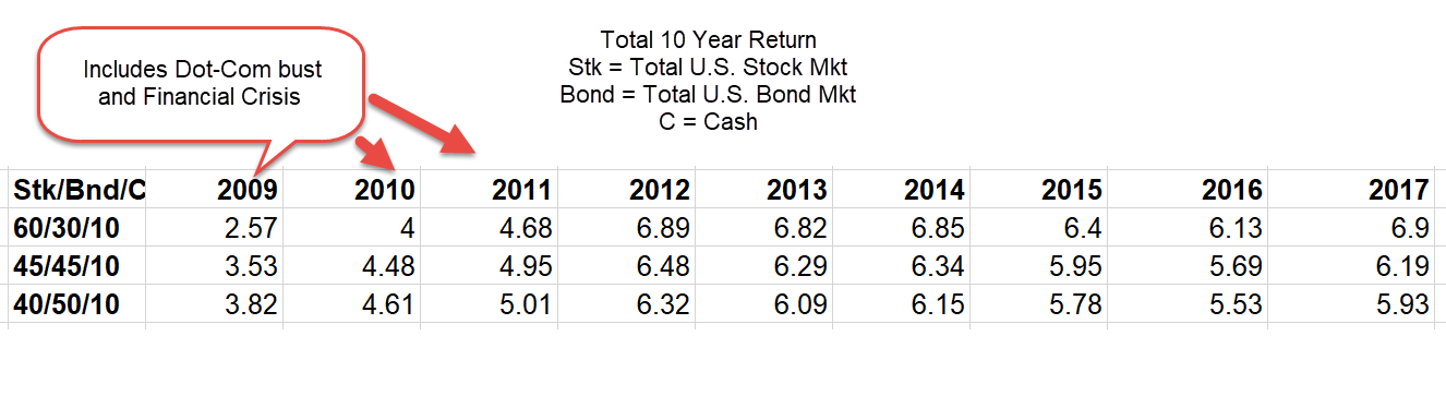
The 50/50 portfolio was invested equally in the SP500 (SPY) and the total bond market (AGG) at the start of each 8-year period, beginning with the period that began in 2007. I will refer to these 8-year periods as cohorts, just like age cohorts. The 2007 cohort was “born” on January 1, 2007, and “died” on December 31, 2014. The second cohort was born on January 1, 2008, and died on December 31, 2015. There was no rebalancing done throughout each period to test the effect of a severe financial shock during the life of the investment.
Presidential Administrations
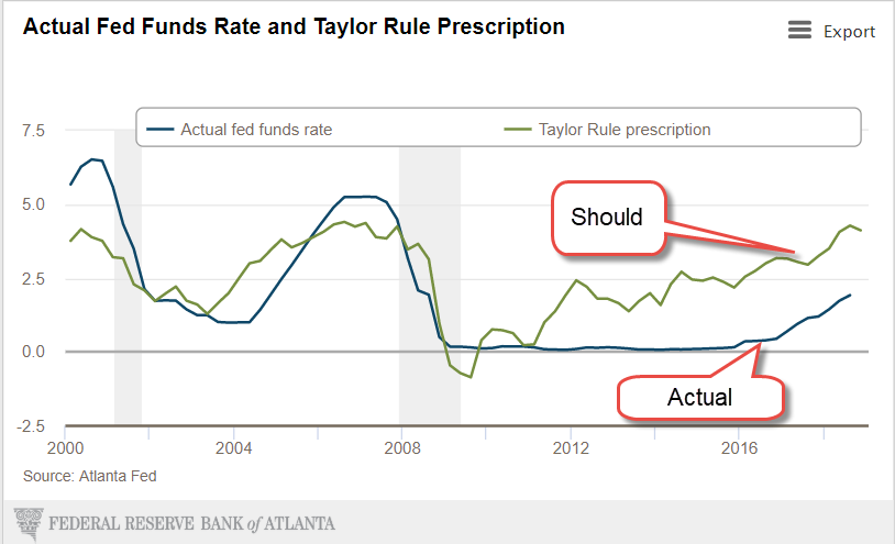
I picked an 8-year period because it aligns with two Presidential terms. A change in administration alters the political climate and presumably has some effect on a portfolio’s returns. The data, however, did not confirm that hypothesis. Presidential candidates try to persuade voters that their candidacy and their party will make people better off. To the millions of people trying to build a retirement nest egg, a change in administrations during the past 16 years had little effect. The market responds to forces much broader than the policies of any administration.
Specific Cohorts and their Returns
Let’s look at a few cohorts. Despite the severe downturn during 2007-2009, the slow recovery and the pandemic shock, the more aggressive 70/30 allocation delivered consistently higher returns than the two safer allocations. Obama’s two term Presidency began in 2009 at a decades low in the stock market, an opportune time to invest. However, that 8-year return had only the second highest return in this analysis. The highest return was the 2013-2020 cohort that consisted of Obama’s second term and Trump’s only term (so far).

Risk vs. Return
In 2008 a 50/50 portfolio cushioned the 37% loss in the U.S. stock market but over an 8-year period, the advantage of a safer allocation largely disappeared. In the period that began in 2008 all three portfolios delivered less than a 6% annualized return. During a severe downturn, a safer portfolio can mitigate an investor’s fears but the best tonic is a long term perspective. Generally the difference in returns is about 1% per year so the 50/50 portfolio earned 1% less than the 60/40 which earned less than the 70/30 portfolio. However the 70/30 investor absorbed more risk than the other two portfolios. In the chart below is the standard deviation (SD) of each portfolio, a measure of the risk or variation in a portfolio.

Performance Metrics
Recall that the 2013 cohort (green dotted line) had a return above 12%. The risk was almost 11%, a nearly one-to-one ratio of return to risk. Financial analysts have developed several measures of the tradeoff between risk and return. The Sharpe ratio is a measure of return that adjusts for risk by subtracting the return on a really safe investment from the return on the portfolio. The benchmark for a risk free investment is a short term Treasury bill (The interest rate on a money market account would be a close substitute).
Let’s use some rounded figures from the 2013 cohort as an example. The 70/30 portfolio earned 12% and a safe investment earned just 1%, a difference of 11%. That is the numerator in the Sharpe ratio. The denominator is the level of risk which is the standard deviation (SD) mentioned above. The SD was almost 11%, giving a ratio of 1. In the chart below is the Sharpe ratio for each cohort and shows that the actual ratio of 1.1 was close to the approximation above. Notice that the safer 50/50 portfolio often had the higher risk adjusted return.

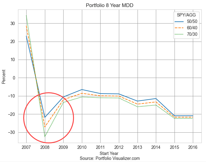
From Peak to Valley
Investors may ask themselves “how much in return can I earn” when the more appropriate question is “how much risk can I tolerate?” The MDD, or maximum drawdown, is the greatest change in the value of a portfolio, regardless of the beginning and ending of a year. A portfolio might have gained 20% by October of 2007, then lost 60% in the next six months. The MDD would be 60%. It can be a gauge of your comfort level. Notice in the chart below that the MDD only varies under great stress like the financial crisis when the difference between the safer 50/50 allocation and the 70/30 portfolio was about 10%.
The Impact of Loss
We feel losses more than we do gains, even if the losses are only on paper. A portfolio that gains 20% only has to lose 16% to return to even. Regardless of our math abilities in a classroom, our instincts can be quite good at percentages. At higher gains, the percentages are painful. A portfolio that gains 50% then loses 50% nets a 25% net loss from our starting position (see notes at end). An MDD is a good indicator of “will this loss of value cause me to sell the investment?” In the early part of 2009 after the market had been battered, some clients could not handle the anxiety and sold some or all of their stocks, despite the advice from their advisors that this was the worst time to sell.
No Two Crises are Alike
Since December 2019, a few months before the pandemic restrictions began, the stock market gained 20% after adjusting for inflation (details at end). During and after the financial crisis, stocks lost 12% during the four years from December 2007 through December 2011 (details at end). The better response of asset prices during the pandemic era can be attributed to two phenomenon: technological advances and high government support of households and small business. During the financial crisis the majority of government support strengthened the foundations of financial institutions at the expense of households and small businesses. During the pandemic, many people could be productive from home. Students were in a virtual classroom with 15-30 other students. Had the pandemic happened in 2007, there was not enough bandwidth to support that kind of access, nor had the software been developed that could run that network capacity.
Takeaways
Households vary by income, by age, by health, circumstances and family characteristics. Each of these factors is a component of a risk exposure that a household faces. A younger couple might have time on their side but family obligations reduces their risk tolerance. Those obligations might include caring for an elderly parent or supporting a child’s educational goals. These models cannot replicate actual portfolios or individual circumstances but they do illustrate the smoothing effect of time even under the worst shocks. Risk tolerance is a matter of time tolerance.
//////////
Keywords: portfolio allocation, standard deviation, risk, return, Sharpe ratio
A portfolio of $100 that gains 50% is then worth $150. If it loses 50%, the result is a value of $75, a net loss of $25 or 25%.
According to multpl.com, the inflation-adjusted value of the SP500 was 4708 in December 2023. This was a 20.6% gain above an index of 3902 in December 2019. The index stood at 2005 in December 2007, the first month of the Great Recession that would become the financial crisis in 2008. In December 2011, the index stood at 1762, an inflation-adjusted loss of 12%.