Dec. 11, 2016
For the second week since the election the SP500 index rose more than 3%, reversing a slight loss the previous week. The SP500 has added 160 points, or 7.6%, in total since the election. Barring some surprise, the market looks like it will end the year with a 10+% annual gain, all of it in the 6 – 7 weeks after the election. Small cap stocks have risen 17% in the past five weeks. Buoyed by hopes of looser domestic regulations, and that international capital requirements will be relaxed, financial stocks are up a whopping 20% in the same time.
Having held their Senate majority, Republicans now control both branches of Congress and the Presidency but lack a filibuster proof dominance in the Senate. They are expected to pass many measures in the Senate using a budget reconciliation process that requires only a simple majority. The promise of tax cuts and fewer regulations has led investment giants Goldman Sachs and Morgan Stanley to increase their estimate of next year’s earnings by $8 – $10. Multiply that increase in profits by 16x and voila! – the 160 points that the SP500 has risen since the election. The forward Price Earnings ratio is now 16-17x.
Speculation is about what will happen. History is about what has happened. The Shiller CAPE10 PE ratio is calculated by pricing the past ten years of earnings in current year’s dollars, then dividing the average of those inflation adjusted earnings into today’s SP500 index. The current ratio is 26x, a historically optimistic value. The Federal Reserve is expected to raise interest rates at their December meeting this coming week.
As buyers have rotated from defensive stocks and bonds to growth equities, prices have declined. A broad bond index ETF, BND, has lost 3% of its value since the election. A composite of long term Treasury bonds, TLT, has lost 10% in 5 weeks. For several years advisors have recommended that investors lighten up on longer dated bonds in anticipation of rising interest rates which cause the price of bond funds to decline. For 6 years fiscal policy remedies have been thwarted by a lack of cooperation between a Democratic President and a Republican House that must answer to a Tea Party coalition that makes up about a third of Republican House members. The Federal Reserve has had to carry the load with monetary policy alone. Both former Chairman Bernanke and curent Chairwoman Yellen have expressed their frustration to Congress. If Congress can enact some policy changes that stimulate the economy, the Federal Reserve will have room to raise interest rates to a more normal range.
//////////////////////////////
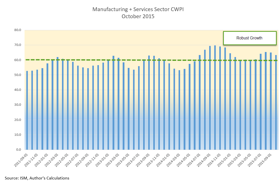
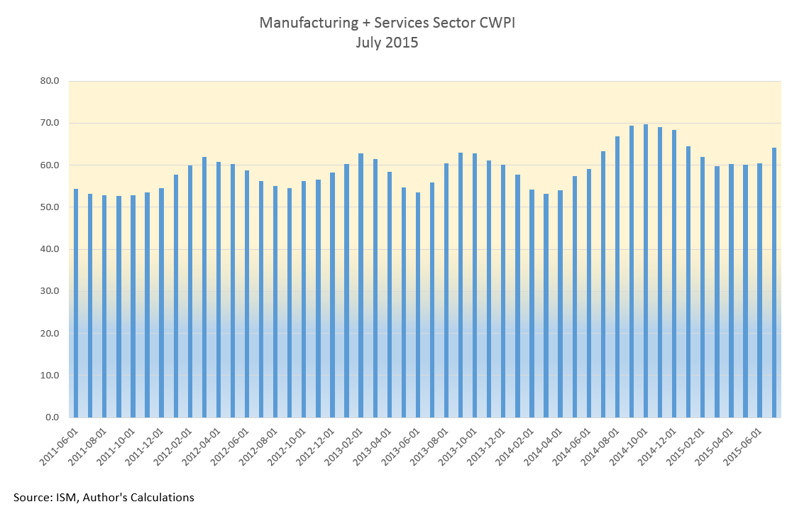
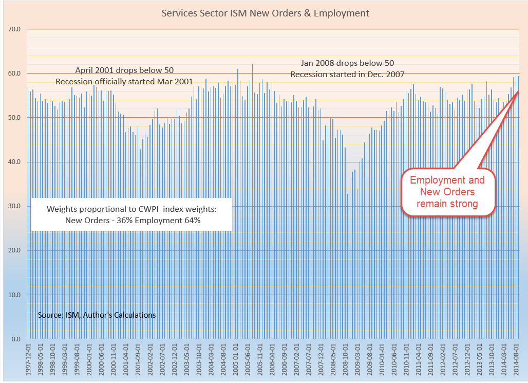
Purchasing Manager’s Index
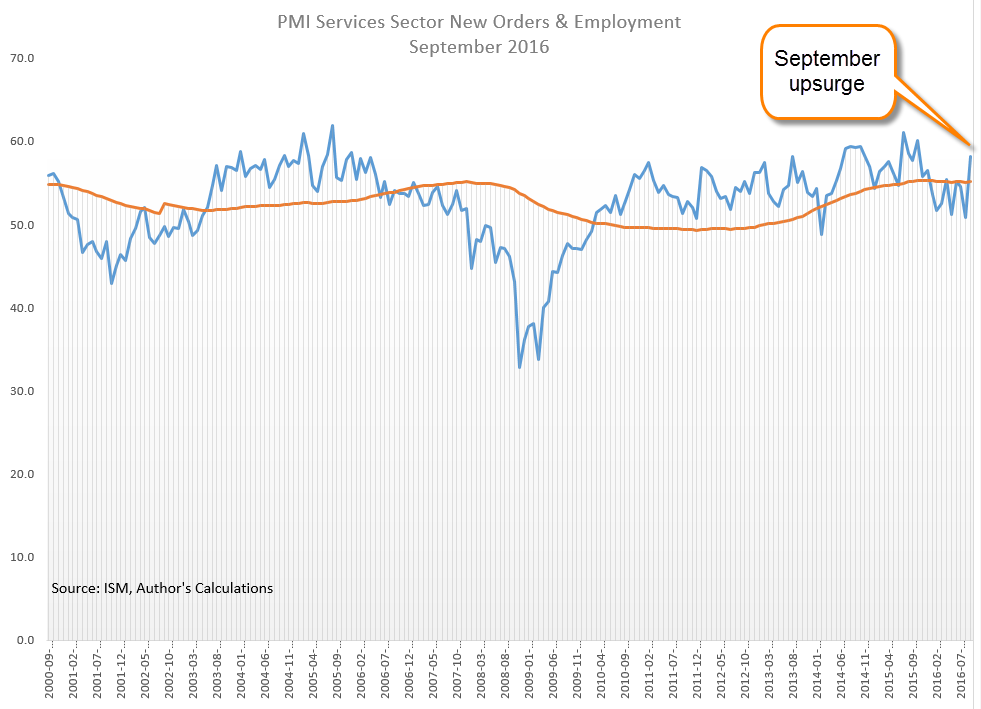
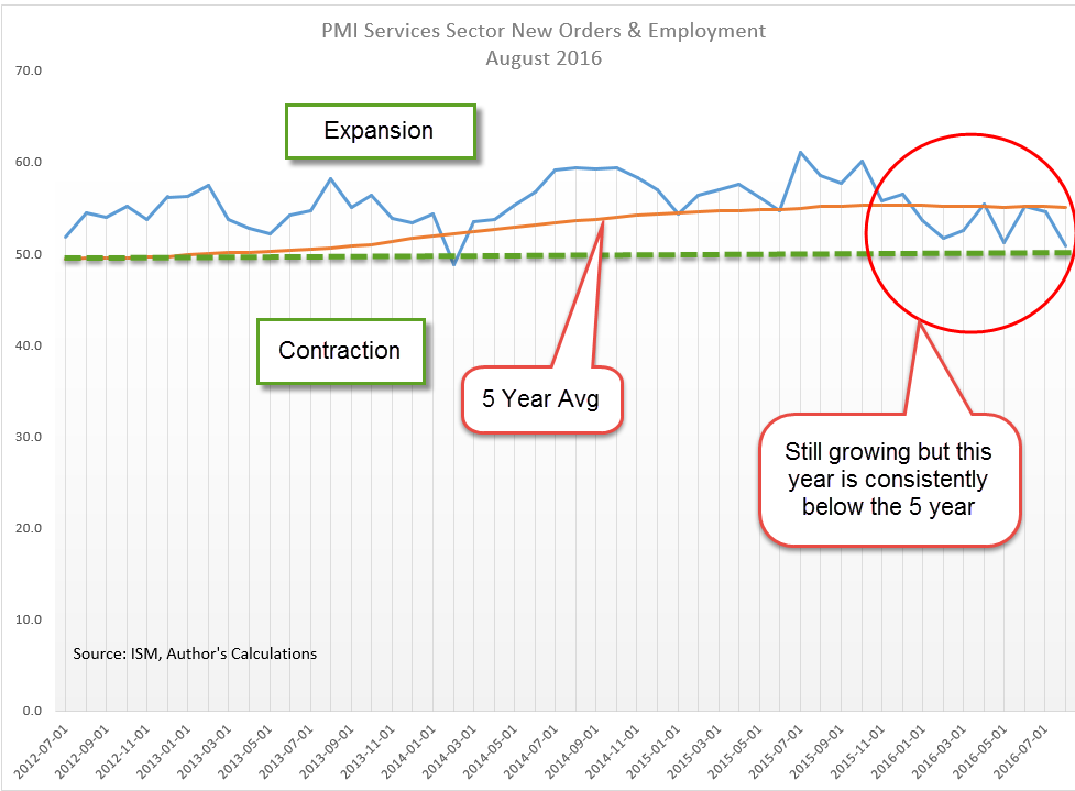
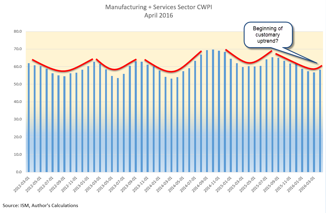
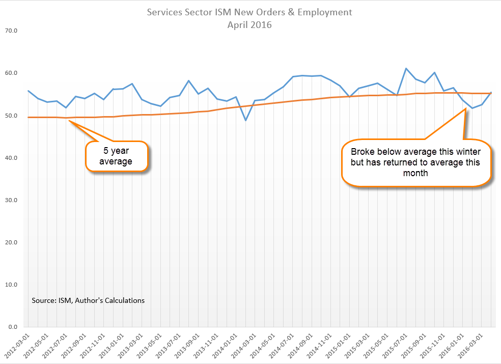
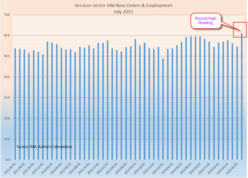
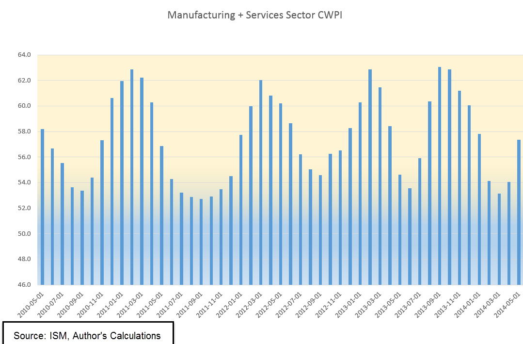
The latest Purchasing Manager’s Index (PMI) was very upbeat, particularly the service sectors, where employment expanded by 5 points, or 10%, in November. There hasn’t been a large jump like this since July and February of 2015. For several months, the combined index of the manufacturing and service sector surveys has languished, still growing but at a lackluster level. For the first time this year, the Constant Weighted Purchasing Index of both surveys has broken above 60, indicating strong expansion.
The surge upward is welcome, especially after October’s survey of small businesses showed a historically high level of uncertainty among business owners. This coming Tuesday the National Federation of Independent Businesses (NFIB) will release the results of November’s survey. How much uncertainty was attributable to the coming (at the time of the October survey) election? Small businesses account for the majority of new hiring in the U.S. so analysts will be watching the November survey for clues to small business owner sentiment. Unless there is some improvement in small business sentiment in the coming months, employment gains will be under pressure.
////////////////////////////
Productivity
Occasionally productivity growth, or the output per worker, falters and falls negative for a quarter. Once every ten or twenty years, growth turns negative for two consecutive quarters as it has this year. Let’s look at the causes. Productivity may fall briefly if businesses hire additional workers in anticipation of future growth. Or employers may think that weak sales growth is a temporary situtation and keep employees on the payroll. In either case, there is a mismatch between output and the number of workers.
During the Great Recession productivity growth did NOT turn negative for two quarters because employers quickly shed workers in response to falling sales. The last time this double negative occurred was in 1994, when employment struggled to recover from a rather weak recession a few years earlier. For most of 1994, the market remained flat. In Congressional elections in November of that year, Republicans took control of the House after 40 years of Democratic majorities. The market began to rise on the hopes of a Congress more friendly to business. Previous occurrences were in the midst of the two severe recessions of 1974 and 1982. As I said, these double negatives are infrequent.

////////////////////////////
The Next Crisis?
The economies of the United States and China are so large that each country naturally exports its problems to the rest of the world. The causes of the 2008 Financial Crisis were many but one cause was the extremely high capital leverage used by U.S. Banks. A prudent ratio of reserves to loans is 1-8 or about 12% reserves for the amount of outstanding loans. Large banks that ran into trouble in 2008 had reserve ratios of 1-30, or about 3%.
Now it is China’s turn. Many Chinese banks have reported far less loans outstanding to avoid capital reserve requirements. How did they do this? By calling loans “investment receivables.” It sounds absurd, doesn’t it? Like something that kids would do, as though calling something by another name changes the substance of the thing. 70 years ago George Orwell warned us of this “doublespeak,” as he called it. Reluctant to toughen up banking standards for fear of creating an economic crisis, the Chinese central bank is planning a gradual move to more prudent standards that will take several years. However, it is a crisis waiting for a spark. Here’s a Wall St. Journal article on the topic for those who have access.
/////////////////////////