Portfolio Mix

October 23, 2016

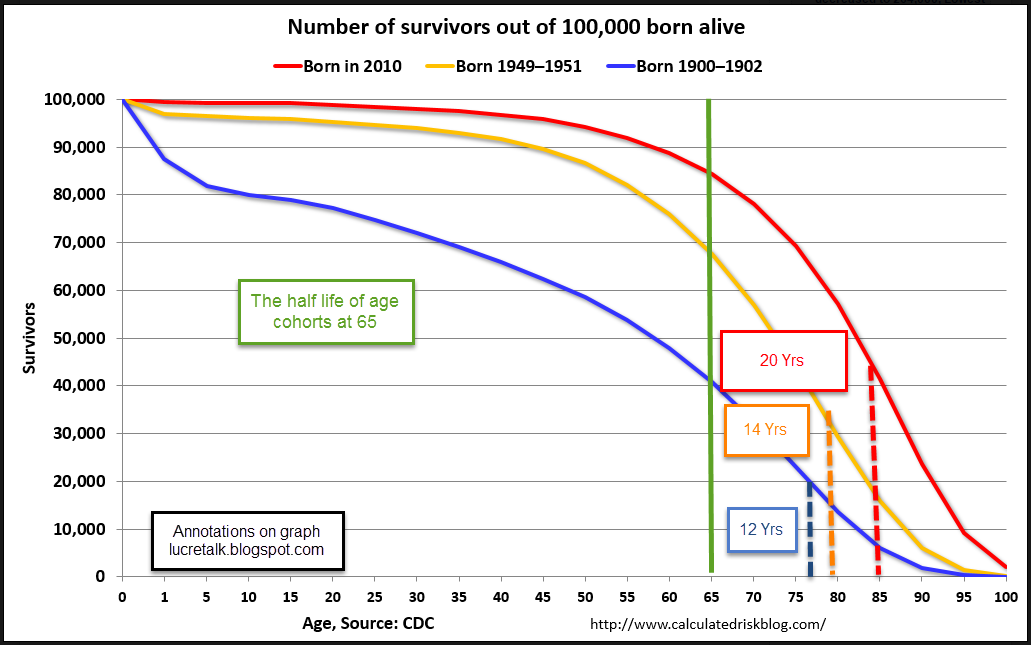
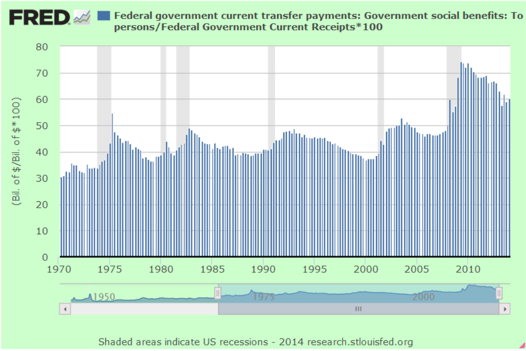
About 30 years ago, after a series of social security and income tax increases in the early ’80s, I had a spirited discussion with my dad about what I thought was a transfer of money from my generation to his.  Extremely low interest rates for the past eight years have reversed that process.  Millions of older Americans who have saved throughout their working years are getting paid almost nothing on that part of their savings held in safe accounts.  Older Americans take less risk with their savings and it is precisely these safer investments that have suffered under the ZIRP, or Zero Interest Rate Policy, of the Federal Reserve.  That money is implicitly transferred to younger generations who pay less interest for their auto loans, for their mortgages, for funds to start a business.

The chairwoman of the Fed, Janet Yellen, is at the leading edge of the Boomer generation born just after WW2.  No doubt she and other members of the FOMC are well aware of the difficulties ZIRP  has had on other members of her generation. Because the Boomers have been a third of the population as they grew up, they had a consequential effect on the country’s economy and culture.  Their income taxes have funded the socialist policies of the Great Society.  They have funded the recovery from the Great Recession.  Ten years from now politicians will regretfully announce that, in order to save Social Security, they must means test Social Security benefits to reduce payments to retirees with greater assets.  Once again, politicians will tap the Boomers for money to fund the policy mistakes that politicians have made for the past few decades.

//////////////////////////

Portfolio Mix

Each year Warren Buffett writes a letter to shareholders of Berkshire Hathaway, the holding company led by Buffett.  His 2013 letter made news when Buffett recommended that, after this death, his wife should invest their personal savings in a simple manner: 90% in a low-cost SP500 fund, and 10% in a short term bond fund, an aggressive mix usually thought more appropriate for younger investors.  Earlier this year, a reader of CNN Money asked if that would be a practical idea for an older investor approaching or in retirement.

After running several Monte Carlo simulations, the advice was NO, but the reason here is interesting.  The 90-10 mix does quite well but has a lot of volatility, more than many older investors can stomach.  An investor in their late 40s or early 50s who is making some good money might relish a market downturn.  Could be twenty years to retirement so buy, buy, buy while stocks are on sale.  If they go down more, buy more.

The sentiment might be entirely different if the investor is ten years older.  Preservation of principle becomes more of a concern.  Why is this?  Let’s look at a sixty year old woman who plans on working till she is seventy so that she can collect a much bigger Social Security (SS) check.  During her retirement years she will have to sell some of the equities she has in a retirement fund or taxable account to supplement her SS check.  However, the majority of those sales won’t take place for 15 – 20 years.  Why then is she more concerned about a market downturn than she might have been at 50 years old?  Do we simply feel more fragile at 60 than we do at 50?  I suppose it’s different for each person but, in the aggregate, older investors are more cautious even if the probability math says they don’t have to be as careful.

With two weeks to go before the election, the stock market has lost some of its spring/summer fire.  Looking back 18 months, the market has had little direction and is now about the same price it was in January 2015.  Companies in the SP500 have reported five consecutive quarters of losses, and the analytics firm Fact Set estimates that there will be a small loss in this third quarter of the year, making six losses.  Energy companies have been responsible for the bulk of these losses, so there has not been a strong reaction to the losses in the index as a whole.

BND, a Vanguard ETF that tracks a broad composite of bonds, is just slightly below a summer peak that mimicked peaks set in the summer of 2012 and again in January 2015.  However, this composite has traded within a small percentage range for the past two years.  In fact, the same price peaks near $84 were reached in 2011 and 2012.  Once the price hits that point, buyers lose some of their enthusiasm and the price begins to decline.  Most of us may think that bonds are rather safe, a steadying factor in our portfolio.  Few people are alive that remember the last bear market in bonds because this current bull market is about thirty years old.

Oil has been gaining strength this year.  An ETF of long-dated oil contracts, USL, is up about 15% this year.  Because it has a longer time frame, it mitigates the effects of contango, a situation where the future price of a commodity like oil is less than the current price.  As the ETF rolls over the monthly contracts, there is a steady drip-drip-drip loss of money. Short term ETFs like USO suffer from this problem.  Of course, long term bets on the direction of oil prices have been big losers.  In 2009, USL sold for about $85.  Today it sells at about $20. Here is a monthly chart from FINVIZ, a site with an abundance of fundamental information on stocks, as well as charting and screening tools. The site gives away a lot of information for free and there is a premium version for those who want it.

These periods of low volatility may entice investors into taking more chances than they are comfortable with so each of us should re-assess our tolerance for volatility.  In early 2015 there was a 10% correction in the market over two months.  How did we feel then?  The last big drop was almost 20% in the summer of 2011, more than five years ago.  The really big one was more than eight years ago and memories of those times may have dimmed.  If you do have easy access to some of your old statements, a quick look might be enough to remind you of those bad old days when it seemed like years of savings just melted away from one monthly statement to the next.

Yes, we are due for a correction but we can never be really sure what will trigger it and these things don’t run on schedule.  On a final, dark note – price corrections are like our next illness. We know it’s coming.  We just don’t know when.

The Fed Feints

September 18, 2016

This week I’ll cover several topics, most of them concerning personal finances.

Social Security and COLA

 Sometime in mid-October the Social Security Administration (SSA) will announce the cost-of-living adjustment (COLA) for social security benefits in 2017 and it will probably be less than 1% (History of previous COLA adjustments).  The COLA is based on the year-over-year increase in the Consumer Price Index (CPI).  In 1982, Congress specified that the SSA use the CPI version for urban workers, called CPI-W. (Info from SSA).  Each month the BLS releases their estimate of inflation, and this week they published their calculation for August – a yearly increase of just .66%.  September’s inflation number may be slightly different but the reality for the average SS recipient is a monthly increase of less than $10 in the average benefit of $1340.

Gas prices fall

For years senior advocacy groups like AARP have argued that a different CPI measure should be used to calculate the COLA.  The alternative measure, the CPI-E, puts more weight on health care expenses and less weight on gasoline and transportation costs because seniors don’t drive as much. So far, Congress has not adopted any changes to the methodology of calculating inflation for retirees.

In late 2014 gasoline prices began to fall and this had a significant impact on measured inflation in 2015, as we can see in the chart below. Although gas prices remain low, they have stabilized so that they will have less of an impact on yearly inflation growth in the future.

Reaching For Yield

Investors who are reliant on the income from their investments, including giant pension and endowment funds, typically desire fairly safe investments that will give them a decent return while preserving their principle.  These include high grade corporate bonds (Johnson and Johnson, for example), Treasury bonds, CDs and savings accounts. Abnormally low interest rates have made those traditional investment choices less desirable.

Like a stream diverted, investors have wandered to riskier assets, bidding up the prices of stocks which are considered more likely to retain their value because they pay dividends.

Dividend ETFs 

 As one example, Vanguard’s VIG is a Dividend Appeciation ETF containing of stocks that  have a consistent record of dividend growth of almost 5% per year.  The growth rate is 5%, not the dividend yield. The companies in this basket are household names: Johnson and Johnson, Microsoft, Pepsi, McDonald’s, and Walgreens, to name a few.  Vanguard has an added benefit: a very low expense ratio.  At the end of August, the Price-Earnings (P/E) ratio on this basket of stocks was 24.5 (see here). In the first two weeks of September, the prospect of an interest rate hike in the next few months has put a small dent in the price, and lowered the PE ratio slightly.  Clearly, investors are willing to pay extra for income, and extra for reliability.  The yield on this basket of reliability is 2.1%, just .4% more than a 10 year Treasury.

DVY

iShares’ DVY is a popular dividend ETF that has a less selective basket of stocks.  This basket also includes oil and energy companies that have a 5 year record of paying dividends but may not have a consistent record of dividend growth because of declining oil prices.  Because the criteria is less restrictive, this ETF is cheaper – it has a higher yield of 3.2% and a lower PE ratio of 20.8.

The Fed

After eight years of near zero interest rates, the Federal Reserve has put itself in a corner. Whatever actions or adjustments it takes must be in small increments to avoid causing a sudden repricing of the very asset prices it has helped lift by maintaining a low interest rate environment.

The financial crisis was so severe that the Fed thought it must lower rates to near zero, which choked income flows from savings.  Such a policy could be justified as an emergency measure. The economy had suffered the equivalent of a heart attack and the Fed need to shock it alive.  However, the recovery that followed was so weak that the Fed thought it must continue to keep rates low.  After eight years of ZIRP (Zero Interest Rate Policy), the Fed finds that it has effectively been picking winners and losers. Debtors win, savers lose. The Fed was forced into the role by the inability of a bitterly divided and ineffective Congress to pass fiscal policy solutions.

To fully grasp the effects of Fed policy, let’s take a trip up into the mountains.  Imagine a high mountain lake reservoir with a dam at one end to contain the water.  On the mountains surrounding the lake falls snow and rain that drains into the reservoir.  The dam is opened enough so that it releases a measured stream of water for users downstream.  The lake is a stock. The release of water is a flow.

Now let’s say that there is a drought for a year or two.  The water level in the reservoir begins to fall.  The dam operators reduce the amount of water released and this has a negative impact on downstream farms and businesses who depend on the water. The price for water rises as farms and businesses bid to get more water, a simple case of supply and demand. Land, another store of value, decreases in value because the lack of adequate water has made the land less productive. Assuming the same demand, prices for produce from the land rises.  This is the flow from the land, So the flow from the land rises while the stock value of the land falls.  Water is a different kind of asset, a consumable.  In the case of water, both the flow and the stock value rise during a drought.

Eventually the rainfall increases and the reservoir refills with water.  Now the dam operators release more water and the price per unit of water naturally declines. Now the stock value and the flow value of the water have declined. A greater supply of produce leads to price declines in the flow of produce from the land, while the price of the land itself, the store of land’s value, increases in anticipation of more productivity from the land.

After the crisis is over, flows from both types of assets declines.  The extra stock value of the water is transferred back to the land. The flow of water from the reservoir has been the catalyst for this transfer of value.

Let’s take this simplified situation and use it as an analogy to understand the Fed.  When the Fed adjusts interest rates, it transfers a store of value from one asset class to another. (It involves a number of asset classes.  I’ll keep it simple.) That’s the transfer of stock value.  But there is also a raising or lowering of the price of the flows from each of those assets.

Now let’s imagine that the Fed raises interest rates by 1%, effectively opening up the dam’s sluice gates a little more.  The flow of income shifts from debtors, who must pay more for borrowed money, to savers, who receive more for their savings.  Debt is a store of value and this is where the transfer of value happens.  New debt competes with old debt and lowers the price of existing debt, both corporate and government, so that old debt can generate the same income flows as new debt. Assets like bonds, which generate income flows at lower interest rates are now worth less.  Why buy a safe bond paying 2% when I can buy a safe bond paying 3%?  Dividend paying stocks are worth less unless they can realistically increase their dividend to compete with higher interest rate expectations. Buyers and sellers of these instruments adjust the prices to reflect the new expectations.

The change in flows acts as a catalyst for the transfer of the stock values between assets.  When we are younger and working, we don’t pay much attention to income flows from our savings.  We look at our portfolio statements, check our 401K or savings balances to see how much of a stock of assets we have built up.  We measure these assets in dollars, not value and may come to think that dollars and value are the same.  Income flows are measured in dollars.  The stock those flows come from are measured in value.  In the future, I hope to explore the ways that we try to convert value to dollars.

Building Or Not

March 13, 2016

There are some upcoming changes to claiming rules for Social Security (SS) that take effect at the end of April.  A few weeks ago, Vanguard posted an article explaining some of the changes.

1) The end of “file and suspend,” the strategy where one half of a married couple, “John” we’ll call him, files for SS, then requests that those benefits be suspended.  The spouse, “Mary”, claims a spousal benefit while John’s benefits continue to grow at 8% per year until John is 70 years old.

2) The end of the “restricted application” strategy that allowed a person between the ages of 62 and 70 to collect benefits based on either their work history or their spouse’s history.  This allowed married couples to suspend taking benefits so that they could grow as under the file and suspend strategy.

////////////////////

You Didn’t Build That
In a 2012 campaign speech, President Obama infamously said, “If you’ve got a business — you didn’t build that. Somebody else made that happen.”

With the aid of teleprompters (only $2700) Mr. Obama  is a stirring orator, unlike his predecessor, Mr. Bush, who struggled with pronunciation, cadence and tone.  In contrast to his sweeping rhetoric, impromptu remarks by Mr. Obama are notoriously equivocal or inartful.  This remark was one of those.  Later on in the speech, Obama clarified his sentiments, “we succeed because of our individual initiative, but also because we do things together.”

In the 2012 election, Republican nominee Mitt Romney used Obama’s own words against him many times.  Many small business start-ups fail and when they do, the bank does not say, “you don’t need to pay your business loan back.  Somebody else made that failure happen.”  In Obama’s philosophy, failure is our personal responsibility but success is not?  It doesn’t play well in the small business community.

In response to February’s job report released last week, Mr. Obama is quite willing to take credit for the jobs created in the past seven years: “the plans that we have put in place to grow the economy have worked.” (Video and transcript) Mr. Obama doesn’t specify what plans.  The President and Congress, Democratic and Republican, have failed to enact fiscal policies that will help American businesses grow.  These leaders, these lifeguards of the economy, can not swim.  The Federal Reserve has had to implement extraordinary monetary policy to keep Americans from drowning.  0% interest rates for SEVEN years and $4 trillion of asset purchases by the Fed have reinflated the stock market and housing prices, the life raft of wealth for most Americans.

A fundamental theme of many elections is “It’s the economy, stupid,” a core mantra of the 1992 Clinton campaign coined by strategist James Carville.   Race and bigotry, defense and security play a part in a candidate’s appeal, but jobs, wages, benefits and taxes motivate voters to pull the lever in a voting booth.  The two outsider candidates, Bernie Sanders and Donald Trump, play to these economic concerns by promising jobs, or free college and medical care. Both candidates have been accused of being unrealistic and dangerous.

Once in office, most Presidents come to realize the reduced power they have in a Constitutional framework of checks and balances.  Each President must cooperate with a Congress easily swayed by lobbying interests, and fifty state legislatures with varying priorities and interests.

FDR exerted king-like powers during the multiple tenures of his Presidency thanks to the unprecedented majorities in both the House and Senate during the 1930s.  In the 1937-38 session, the Senate was dominated by 76 Democrats out of 100 members.  334 Democrats overwhelmed the 88 Republican members in the House.  During those years, the Supreme Court radically shifted the permissible Constitutional role of the Federal government in our lives.  The four generations that have lived since those policies were enacted continue to struggle with the social and financial consequences of those policies.

We are unlikely to repeat the lopsided majorities of that era simply because we recognize that unrestrained legislative power is dangerous and unhealthy for both our society and economy.  The Parliamentary systems of other developed countries allow a minority of citizens to have it their way, to dominate the policy choices of the majority.  The republican (small ‘r’) and federalist values embedded in the U.S. Constitution make it so much more difficult for a group of American citizens to get their way.  While this is often a source of frustration to policy advocates, we don’t veer off center as easily as other countries.

Focused on the 2016 election, voters may not notice the creeping dangers implicit in the extraordinary monetary measures and debt accumulation of the past twenty years.

Risky Biz

December 13, 2015

How low can crude oil prices go?  Older readers may remember the Limbo, a party dance popular in the early 60s.  After breaking through the “limbo stick” of $40 per barrel, gas prices sank even lower when the IEA indicated that the supply glut will continue through 2016 (Story).

A popular energy ETF, XLE, has fallen 11% in nine trading days.  Yes, an entire sector of the economy has lost more than 1% per day this month. Some oil service companies lost more than 3% on Friday alone. The large integrated oil companies like Exxon (XOM) and Chevron (CVX) say they are committed to maintaining their dividends (Exxon now near 4%, Chevron near 5%) but investors are concerned that continuing price pressures will make that ever more difficult. This article provides a good overview of the structure, revenue and profit streams of large integrated oil companies.

So we lie around at night worried about our stock portfolio.  Why would we do that?  Because someone – who? – is going to pay us a little extra to worry about our stocks.  Or, at least, that’s the way it’s supposed to go, isn’t it? The extra return we are supposed to get for our worries is called a risk premium, or the plural – premia.  One measure of that premium is the total return on stocks minus the total return on a safe long term bond like a ten year Treasury bond.

In his book Expected Returns, An Investor’s Guide to Harvesting Market Reward,  Antti Ilmanen reviews the historical returns of several types of assets during the past century. He wrote a free summary of the book in 2012 (Kindle version  OR PDF version).  Mr Ilmanen presents an investing cube (pg. 3) as a visualization of the factors or choices that an investor must consider.   On one face are assets categorized into four types of investment.  On another face are four styles of investment.  On the third face of the cube are four types of risk.

A surprising find was that the risk premia of stocks over bonds was only 2.38% (p. 12) during the past fifty years.  Investors are not being paid much for their worry.  When the author compared the returns on stocks to longer term twenty year Treasury bonds (an ETF like TLT, for example), the risk premium has been negative for the past forty years.

The author emphasizes that “a key theme in this book is the crucial distinction between realized (ex post) average excess returns and expected (ex ante) risk premia.” (p. 15)  Historical averages of risk premia may be exaggerated by high inflation, which hurt the returns on bonds in the 1970s and part of the 1980s, and made returns on stocks that much better by comparison.  In a low inflation environment such as the one we have now the risk premia for owning stocks may be rather muted.

Ilmanen’s analysis of past returns reveals several historical trends that can help an investor’s portfolio.    Value investing tends to produce higher returns over time.  So-called Dividend stocks also generate additional return.

I was surprised at the relative stability of per capita GDP growth over 100 years.  We wring our hands in response to a crisis like the dot-com meltdown or the Great Recession but these horrific events barely show in the average aggregate output of the country over a person’s working years. Here is a table from the PDF summary.

A mutual fund QSPIX was formed last year based partly on the research in the book.  However, the minimum investment is $5,000,000.    The fund is currently 28% in cash.

*********************************

Social Security Strategies

A resource on the right side of this blog is Maximize My Social Security (MMSS), a personally tailored – and inexpensive – advisory service to guide older people to better informed Social Security choices.  The site does not use your social security number.  If you already have an online account with the Social Security Administration, you can complete the forms at MMSS and get some results in under twenty minutes.

Old people who used to talk about the latest Pink Floyd or Led Zep album when they were younger now talk about Social Security, Medicare and their aches and pains.  Always a popular topic:  hey, what do you think about waiting to file for Social Security?

Pros of waiting:

1.  Where else  can any of us earn a guaranteed 8% on our money each year?  Sign me up!  For each year we wait, our Social Security annual benefit increases by 8%.

2. Inflation adjusted:  On top of the additional 32% we get from SS when we start collecting SS at age 70, we are getting an inflation adjustment on that higher amount.

3.  If we need to borrow money to get by during the 4 years we wait, we may be able to borrow the money using our house as collateral.  Depending on our tax circumstances, the interest we pay on the borrowed money could be deductible, reducing the net cost of borrowing.

4.  If we are a guy, we will probably die before our spouse.  Wives who may have a lower benefit will get their benefit amount bumped up to what we were receiving.

Cons of waiting:

1.  We could die before the “payoff” age, between 79 and 82.  This is the age when the inflation adjusted benefits we receive by delaying our benefit matches the total we would have collected by claiming at an earlier age.  However, we often don’t factor in the advantage of the #4 Pro above in which our spouse collects a higher amount till her death.

2.  Congress could change SS payments and rules.  The institution does not have a good track record for keeping its promises.  The swelling ranks of the Boomer generation contributed far more than recipients of earlier generations took out in benefits. Congresses of the past few decades have spent all the extra money accumulated in the Social Security coffers.  After 2020 the system will come under greater cash flow pressure as the Boomers continue to retire and claim benefits.  If Congress does reduce benefits,  then those of us who waited to file for benefits will probably regret our decision.  By the way, MMSS allows users to estimate the long term impact of such a reduction.

3.  We may have to borrow to make ends meet while we wait to collect benefits.  Banks don’t usually loan money to retirees with no job income, necessitating some asset-backed mortgage. Older people may be averse to assuming any new debt.

4.  Withdrawing money from savings while we wait will reduce our savings for a time, which will lessen the “endowment” base of our lifetime wealth.  While the additional 8% per year from SS should more than offset that loss, we can never be certain.  As an example, let’s imagine a retiree at the beginning of 1995 who decided to draw down savings and wait four years to start collecting SS benefits.  The stock market had gone nowhere during 1994.  She sold some stocks and bought a 4 year CD “ladder” for the amount she would need to tide her over till she started collecting benefits.  During those next four years, the SP500 index rose from 459 to 1229, a 167% gain – more than 25% annually excluding dividends.  Even with the additional money our retiree was making each month in SS benefits because of her decision to delay, it was the worst time to get out of the stock market!

Credit Spreads

November 22, 2015

The behavior of bonds, their pricing and their yields (the interest or return on the bond), can seem like a mystery to many casual investors.  As this Money magazine writer notes, the language is backwards.  Yields rise but that’s bad because prices are falling.  Prices rise but that’s bad for new buyers who are getting a low yield on their investment.   The article mentions a little trick to help keep it straight – convert the yield to a P/E ratio, something more familiar to many investors.

In Montana, a “spread” might be a large ranch but on Wall Street the term often refers to the difference in yield between a safe investment like a 10 year Treasury bond and an index of lower rated corporate bonds, or “junk” bonds. Investors want to be paid for the extra risk they are taking.  As investors get more worried about the economy and the growth of profits, they worry about the ability of some companies to pay their debts.  Debts are paid from profits.  Less profit or no profit increases the chance of default.

Some call the spread a “risk premium,” and when that premium is less than 5 – 6%, it indicates a relatively low to moderate sense of worry among investors.  Anything greater than 6% is a note of caution.  In the chart below a rising spread above 6% often signals the coming of stock market swoons.  When I pulled this chart earlier in the week, the rate was 6.19%.  On Friday, the rate was climbing toward 6.3%.

This 2004 paper from the research division of the Federal Reserve gives a bit more depth on credit spreads and their movements.

*********************************

Inventory-To-Sales Ratio

In a September blog post I noted the elevated inventory to sales ratio, meaning that manufacturers, merchants and wholesalers had too much product on hand relative to the amount of sales.  There is a bit of lag in this series; September’s figures were released only a week ago.  At 1.38, the ratio continues to climb.

*******************************

The Social Security Annuity

In the blog links to the right is an article by Wade Pfau comparing the “annuity” that Social Security provides with those available on the commercial market.  He also analyzes the extra return one can achieve by delaying Social Security until age 70.

Oh My Gawd!

November 8, 2015

There is the famous Tarzan yell by Carol Burnett and the iconic “Oh my Gawd” exclamation of Janice Lipman in the long running TV series “Friends.”  That’s what Janice would have said when October’s employment report was released this past Friday.

Highlights:

271,000 jobs gained – maybe. That was almost twice the number of job gains in September (137,000).  Really??!! ADP reported private job gains of 182,000.  Huge difference.  Job gains in government were only 3,000 so let’s use my favorite methodology, average the two and we get 228,000 jobs gained, awfully close to the average of the past twelve months.  Better than average gains in professional business services and construction.  Both of these categories pay well.  Good stuff.

At 34.5 hours, average hours worked per week has declined by 1/10th of an hour in the past year.  The average hourly rate rose 2.5%, faster than headline inflation and giving some hope that workers are finally gaining some pricing power in this recovery.

For some historical perspective, here is a chart of monthly hours worked from 1921 to 1942.  Most of those workers – our parents and grandparents – have passed away.  At the lows of the Great Depression people still worked more hours than we do today.  They were used to hard work.  There were few community resources and social insurance programs to rely on.

The headline unemployment rate fell slightly to 5%.  The widest unemployment rate, or U-6 rate, finally fell below 10% to 9.8%, a rate last seen in May 2008, more than seven years ago.  This rate includes people who are working part time because they can’t find a full time job (involuntary part-timers), and those people who have not actively looked for a job in the past month but do want a job (discouraged job seekers).  Macrotrends has an interactive chart showing the three common unemployment rates on the same chart.

The lack of wage growth during this recovery, coupled with rising home prices, may have made owning a home much less likely for first time buyers.  The historical average of new home buyers is 40%.  The National Assn of Realtors reported that the percentage is now 32%, almost at a 30 year low.

2.5% wage growth looks a bit more promising but the composite LMCI (Labor Market Conditions Index) compiled by the Federal Reserve stood at a perfect neutral reading of 0.0 in September.  The Fed will probably update the LMCI sometime next week.  This index uses more than twenty indicators to give the Fed an in-depth reading of the labor market.

**********************************

Bonds and Gold

The strong employment report increased the likelihood that the Fed will raise interest rates at their December meeting and this sent bond prices lower.  A key metric for a bond fund is its duration, which is the ratio of price change in response to a change in interest rates.  Shorter term bond funds have a smaller duration than longer term funds. A short term corporate bond index like Vanguard’s ETF BSV has a duration of 2.7, meaning that the price of the fund will decrease approximately 2.7% in response to a 1% increase in interest rates.  Vanguard’s long term bond ETF BLV has a duration of 14.8, meaning that it will lose about 15% in response to a 1% increase in rates.  In short, BLV is more sensitive than BSV to changes in interest rates. How much more sensitive?  The ratio of the durations – 14.7 / 2.7 = 5.4 meaning that the long term ETF is more than 5 times as sensitive as the short term ETF.

What do we get for this sensitivity, this higher risk exposure?  A higher reward in the form of higher interest rates, or yield.  After a 2.5% drop in the price of long term bond funds this week, BLV pays a yield close to 4% while BSV pays 1.1%.  The reward ratio of 4 / 1.1 = 3.6, less than the risk ratio.   On September 3rd, the reward ratio was much lower, approximately 3.27 / 1.3 = 2.5, or half the risk ratio.

Professional bond fund managers monitor these changing risk-reward ratios on a daily basis.  Retail investors who simply pull the ring for higher interest payments should be aware that not even lollipops at the dentist’s office are free.  Higher interest carries higher risk and duration is that measure of risk.

The prospect of higher interest rates has put gold on a downward trajectory with no parachute since mid-October.  A popular etf  GLD has lost 9% and this week broke below July’s weekly close to reach a yearly low.  Investors in gold last saw this price level in October 2009.  Back then  gold was continuing a multi-year climb that would take its price to nosebleed levels in August 2011, 70% above its current price level.

**********************************

CWPI (Constant Weighted Purchasing Index)

Manufacturing is hovering at the neutral 50 mark in the ISM Purchasing Manager’s Index but the rest of the economy is experiencing even greater growth after a two month lull.  No doubt some of this growth is the normal pre-Christmas hiring and stocking of inventories in anticipation of the season.

The CWPI composite of manufacturing and service sector activity has drifted downward but is within a range indicating robust growth.

Employment and New Orders in the non-manufacturing sectors – most of the economy – rose up again to the second best of the recovery.

Economists have struggled to build a mathematical model that portrays and predicts the rather lackluster wage growth of this recovery in a labor market that has been growing pretty strongly for the past few years.

*************************************

Social Security

The Bipartisan Budget Act of 2015, passed and signed into law this past week, curtails or eliminates a Social Security claiming strategy that has become popular.  (Yahoo Finance – can pause the video and read the text below the video).  These were used by married couples who were both at full retirement age.  One partner collected spousal benefits while the “file and suspend” partner allowed their Social Security benefits to grow until the maximum at age 70.  On the right hand side of this blog is a link to a $40 per year “calculator” that helps people maximize their SS benefit.

************************************

Tax Cuts Anyone?

Former Senator, Presidential contender and actor Fred Thompson died this past week.  The WSJ ran a 2007 editorial by Thompson arguing that the “Bush tax cuts” that the Republican Congress passed in 2001 and 2003, when he was a Senator, had spurred the economy, causing tax revenues to increase, not decrease, as opponents of the tax cuts claimed.  Like others in the tax cut camp, Thompson looked at a rather small slice of time to support his claim: 2003 -2007.

Had tax cut advocates looked at an earlier slice of time – also small – in the late 1990s they would have seen the opposite effect.  Higher tax rates in the 1990s caused greater economic growth and higher tax revenues to the government, thereby shrinking the deficit entirely and producing a surplus.

Tax cuts decrease revenues.  Tax increases increase revenues.  That tax cuts or increases as enacted have a material effect on the economy has been debated by leading economists around the world for forty years.  At the extremes – a 100% tax rate or a 0% tax rate – these will certainly have an effect on people’s behavior.  What is not so clear is that relatively small changes in tax rates have a discernible impact on revenues.  A hallmark of belief systems is that believers cling to their conclusions and find data to support those conclusions in the hopes that they can use that to help spread their beliefs to others.

The evidence shows that economic growth usually precedes tax revenue changes; that tax policy advocates in either camp have the cart before the horse.  A downturn in GDP growth is followed shortly by a decline in tax revenues.

Thompson’s editorial notes a favorite theme of tax cut advocates – that the “Kennedy” tax cuts, initiated into law in memory of President Kennedy several months after his assassination in November 1963, spurred the economy and increased tax revenues. Revenues did increase in 1964 but the passage of the tax act occurred during that year so there is little likelihood that the tax cuts had that immediate an effect.  Revenues in 1965 did increase but fell in subsequent years.  A small one year data point is all the support needed for the claims of a believer.

The question we might ask ourselves is why do tax policy and religion share some of the same characteristics?

Crossings

September 6, 2015

I am not going to say a lot about the August employment numbers, reported at 173,000,   since August’s numbers are routinely revised.  The BLS survey was 20,000 less than the ADP survey of private payrolls.  The revised figure will probably be closer to 210,000 jobs gained in August.  We can see the more important trends when we look at the annual job gains averaged over 12 months.

The slowdown in China and other markets and the selloff in markets around the world inevitably prompts talk of recession.  Since WW2 there has been only one recession – the one that followed the 1973 oil embargo –  that occurred when monthly job gains were above 200,000.   There have been 12 recessions since WW2. The work force was very much smaller fifty years ago.  There has been only one exception to this “rule” and when we look at this exception in closer detail we see that it was very much like the prelude to other recessions. Averaged monthly job gains were declining sharply as they do before every recession.  Job gains are NOT declining sharply today.

******************************

Resource Countries On Sale

Monday came the news that the Canadian economy was officially in recession.  California, the most populous of fifty U.S. states, has two million more people than all of Canada, whose economic vitality relies on its vast stores of timber, oil, gas and minerals.  Australia, Russia, Norway and New Zealand also ride the roller coaster of commodity prices. (WSJ article )  An ETF that captures a composite of Canadian stocks, EWC, is down almost 30% from its high of August 2014.  The 50 week (not day, but week) average is about to cross below the 200 week average.

These long term downward crossings are often bullish, indicating that prices are near a low point in the multi-year cycle.  An ETF composite of Australian stocks, EWA, is down a bit more than 30% and its 50 week average just crossed below the 200 week average.

A Vanguard ETF composite of energy stocks is near the lows of 2011.

********************
Subprime Mortgages

Conventional wisdom: subprime mortgages started the recent financial crisis in 2008.  A recent National Bureau of Economic Research (NBER) analysis (A short summary ) of home foreclosures overturns that misconception.  The authors found that twice as many prime borrowers lost their homes to foreclosure as subprime borrowers.

********************
Inflation

In 2007, the Social Security Administration estimated that prices would be 20% higher in 2015. Then came the severe recession of 2008-09 and persistently low inflation.  Prices this year are only 15% higher than those in 2007.  Social Security payments will total almost $900 billion this fiscal year (FRED series), more than 20% of Federal spending, and are indexed to inflation.  Low inflation “saves” the Federal government about $40 billion each year when compared with earlier projections.  Sounds good?  Life is a trade-off.  The 60 million (SSA) people who receive social security spend most of it.  That savings of $40 billion is money not spent.  In addition, low interest rates have reduced income for many retirees, who depend on safer investments for an income stream.  These safer accounts, which include savings, CDs, short and mid-term bond funds, have paid historically low interest rates since the Federal Reserve lowered its target interest rate to near-zero (ZIRP) in 2008.

Social Security Age Cohorts

May 17, 2015

Life expectancy (LE) is often measured at birth (CDC).  The great increases in LE during the 20th century can be largely attributed to rapidly declining childhood mortality rates.  Advancements in medical practice have certainly played an important role but clean drinking water and modern sanitation disposal and treatment have had the most effect. Improvements in life expectancy at age 65 have been much less dramatic.

Last week’s Calculated Risk blog presented LE with more clarity – by graphing age cohorts, a group of people born in a particular year or range of years.  If 100 people were born in 1950 – an age cohort – how many of that cohort were alive in 2000?  The chart convincingly illuminates several problems with Social Security funding and payouts in the future.

One of the cohorts shown in the first graph (blue line) are those born in the years 1900 – 1902.  This age group was in their mid–thirties when Social Security was enacted.  Many funded the Social Security system through their working years but only 40% reached the age of 65 to become eligible for Social Security.  Just over 70% of the early Boomer cohort (gold line) born in 1950 is still alive this year, their 65th birthday.  More than 85% of the people born in 2010 are expected to reach 65.

When the Social Security act was written, what if the language of the act reflected life expectancies at that time?  Instead of setting a specific retirement age, it could have specified that every five years, for example, Congress would revise the retirement age based on the half life of an age cohort, that age when half of a generation is alive and half is dead.

For the 1900-1902 cohort, the retirement age would have been 59.  For early Boomers, those who just turned 65, retirement would still be almost a decade away, at 74.  The 2010 generation could expect to retire at around age 83.

As important as the age of eligibility is the number of years that retirees collect Social Security.  What is the half life of an age cohort once they have reached 65?  If 50 out of 100 of a cohort are alive at age 65, how many years before only 25 are alive?  I’ll call this the age-65 half life. I marked up the chart at Calculated Risk to show the current and projected increases in age for these retirees who will be funded by Social Security.

Although life expectancy at birth has increased dramatically, the half life of people who manage to reach the age of 65 shows much slower increases.  The difference between the age-65 half lives of the 1900 and 1950 cohorts is projected to grow only slightly, from 12 to 14 years. That’s just a two year increase for two generations born 50 years apart.  The growth of that half life is projected to quicken for the 2010 generation but we should be suspicious of estimates eighty years in the future.

Of the 76 million boomers born, 65 million were still alive in 2012 (Source) Even though the age-65 half life of people had changed by only two years, that is a lot of people eligible for Social Security payments.   Politicians find it difficult to discuss changes in this program, the “third rail” of politics. People who have paid taxes into the program during a lifetime of work feel that they have earned the payments they receive in retirement.  Any changes have to be done incrementally, like raising the temperature of a pot of water so that the frog doesn’t jump out.  Voters will probably punish lawmakers who suggest wholesale changes.  Former Senator Rick Santorum discovered that brutal truth when he endorsed former President Bush’s proposal to privatize Social Security.  Bush was a lame duck President with little to lose but quickly withdrew the idea in response to the angry response to the idea.  Santorum lost his seat.

Congress might initiate some rules based approach like the half life criteria to setting the retirement age for future decades. This would help avoid political repercussions for any changes to Social Security.  If Congress set the retirement age criteria at 60% instead of 50% (half life), the retirement age would be 69 for this generation, just two years more than current law for the late Boomers.

Homes

July 27, 2014

This week I’ll take a look at the latest home sales reports, a few trends in Social Security, and the latest reading in the Consumer Price Index.  Lastly, I’ll ask whether a home should be included in an investor’s bond allocation.

*************************

Home Sales

Existing home sales rose in June, topping 5 million but are still down 2.3% on  a year over year basis.  The Federal Housing Finance Agency reported that home price increases have slowed slightly, notching a 5.5% year over year gain.

The bad news this week was the 12% year-over-year drop in single family new homes sold in June, falling from 459,000 in June 2013 to 406,000 in June of this year.

The comparison was a tough one because June 2013 was the best month for new home sales in the post recession period.  However, the year-over-year comparison of the three month moving average of new home sales shows a falling trend as well, down 6% from last year.  The decline began in January and shows little signs of improvement.

I will remind readers of a 2007 paper presented by economist Ed Leamer in which he demonstrated that falling new home sales tends to precede a recession by three to four quarters.  I wrote about it in February this year.

************************

Jobless Claims

In contrast to the disappointing report on new home sales, jobless claims fell unexpectedly to 284,000, dropping the 4 week moving average to a post-recession low of 302,000.  No doubt this will raise expectations for a strong employment report next Friday.

*************************
Social Security Trust Funds

When the U.S. Treasury collects more in Social Security taxes than the Social Security Administration (SSA) pays out in benefits, the Treasury “borrows” the money from the Social Security Trust Fund by selling it non-marketable Treasury bonds that the SSA holds.  The interest rate for each new bond is an average of the yields on intermediate and long term Treasuries. The Treasury credits this interest to the trust funds every month.  SSA has a web page where a reader can select a year and month and see the average interest rate that the trust funds were earning on that date.  In December 2013, the average annual yield was about 3.6%, down significantly from the 5.25% being credited at the end of 2005, when interest rates were higher.  At the end of 2012, the trust funds had a balance of about $2.7 trillion, earning about $100 billion annually, enough to make up the $75 billion shortfall each year projected by the Trustees of the fund.

The Disability Insurance (DI) portion of the trust fund is projected to run out of money by 2016.  This Do-Nothing Congress will not resolve the problem in this mid-term election year,  promising to make the issue a contentious one for the 2016 election cycle.  If the problem is not resolved by then, current law requires that benefits be reduced accordingly.  The Trustees estimate that Disability beneficiaries will get about 80% of their scheduled benefit.  Democrats will likely use the issue to paint Republicans as Meanies who care only about the rich and big corporations while Republicans portray Democrats as tax-and-spenders who buy votes with government charity.  It’s all coming to a TV screen in our homes.  Can’t wait.

************************

Consumer Price Index

June’s inflation numbers from the BLS notched a 2.1% year-over-year gain, slightly above the Fed’s 2% target.  The core CPI, which excludes more volatile energy and food prices, is up 1.9% y-o-y.  Gasoline jumped 3.3% in June but year over year gains are at target levels of 2%.

Over the next few years, we will hear increasing calls for a switch to what is called a chained consumer price index, or C-CPI.  The chained index attempts to more closely replicate a cost of living index by taking into account the substitutions that consumers make in response to changes in price.  The CPI may calculate that the Jones Family bought the same amount of hamburger meat even when it rises 20% in price.  The Chained CPI calculates that the Jones Family may buy a little bit less hamburger meat and a bit more chicken if chicken remains relatively stable in price.  The two indexes closely track each other but the CPI tends to be slightly higher than the Chained CPI.

At various times in budget negotiations with the Republican controlled House over the past two years, President Obama has said that he was open to a discussion on transitioning from the CPI as it is currently calculated to the chained CPI.  Social Security payments are one of the many benefits indexed to the CPI.  The current political climate and the upcoming mid-term elections undermine the chances of any adult conversation on the topic.   Republicans are likely to retain the House and want to take the Senate.  A discussion of the CPI invites accusations from Democrats that Republicans – yes, The Cold Heartless Ones – are going to throw seniors under the bus if Social Security payments are decreased by even $5 a month because of a change in the calculation of the CPI.

The reason younger people don’t vote much may be that they hear the rhetoric of most political campaigns and realize that the discussions are much like those they heard in middle school.

***********************

House = Bond?

Let’s crank up the wayback machine and travel to those heady days of 1999 when the stock market was booming.  Current profits did not matter.  New metrics were invented. Customers were revenue streams whose future value could be used to justify the present value of customer acquisition costs. Investments were made to position a company as the dominant player in the sector space of the internet frontier.  These metrics have some validity but the stumbling block was the simple fact that current profits do matter.

About that time some finance professors made the case in a Wall St. Journal editorial (sorry, no link.  WSJ doesn’t go back that far) that most households were overweighted in bonds. How so? A house is like a bond, they argued, relatively stable in price and pays the owner the equivalent of 6% – 7% annually.  House prices do average about 15 – 16 times annual rents according to the real estate analytics firm Jacob Reis.  At the height of the housing boom in the mid-2000s, houses were selling for 25x annual rents.

Secondly, it did not matter whether the house was paid for or not.  To illustrate this rather dubious viewpoint, let’s consider a renter who pays $12,000 annually in rent for an apartment.  She has a $500,000 portfolio, $300,000 of it in stocks, $200,000 in bonds, a 60/40 allocation split.  The bonds generate a 6% annual return of $12,000 which she uses to pay her rent.  A responsible financial advisor would not say “Oh, those bonds don’t count to your allocation mix because the income they earn is used for rent.”

Now, let’s look at a homeowner with the same $500,000 portfolio and the same allocation, 60% stocks, 40% bonds.  She owns a home valued at $200,000 which, if she rented it out, would net her $12,000 annually.  Her PITI  (mortgage payment and taxes) and maintenance repairs is also $12,000 annually.  Like the renter, the homeowner uses the $12,000 in income from her bonds to pay the house costs.  Unlike the renter, she is building some equity in the house by paying down principal.  On average, the value of her house is gaining about 3 – 4% per year based on historical patterns.  In short, the house is generating an unrealized gain that is ignored in conventional allocation models.

So, how would one compute the asset value of the house?  By imputing it from the income and unrealized gains that the house generated.  So, if a homeowner paid $3000 annually toward principal reduction and the house appreciated 3%, or $6000, the house generates a value to the homeowner of $9,000.  Using the historical 6% average return on a house, this would make the asset value of the house $150,000.  Adding that to the stock and bond portfolio gives a new total of $650,000, $350,000 of which is in bonds and the house, a bond-like asset.  Using this method, the allocation mix is 46% stocks, 54% bonds, perhaps more conservative than the homeowner desired.

After reappraising their portfolio in this manner, the professors suggested that homeowners might sell some bonds and buy more stocks to get the desired allocation mix.  To achieve a true 40% bond mix in this example, the target total would be $260,000 in the house and bonds.  Subtracting the $150,000 house value, the homeowner would want to have $110,000 in bonds.  To achieve this, the homeowner would sell $90,000 in bonds and invest in the stock market.  The investor would then have $390,000 stocks and $110,000, slightly above a 75/25 stock/bond allocation mix.  Older readers may shudder at this mix, thinking that it is quite risky.

So, let’s come back to the present day, after the housing bubble.  The calculations are not based on the actual price of the house but 1) on the income that it would generate if it were rented out and, 2) the principal pay down.  The finance professors did not factor in homeowners who were “under water,” i.e. owing more on the house than its current market value, because the debt on a house or any asset did not count in this model.

Let’s say that a homeowner bought at the height of the market in 2005, paying an inflated $300,000 for a house that would later be valued for $200,000.  The principal paydown is so small in the early years of a mortgage that it has only a small effect on the calculation.  Secondly, rent prices were under pressure during the housing boom, making the calculation of the asset value of the house lower.  In fact, a person using this method and contemplating the purchase of a house at that time might have asked themselves “Why am I paying $300,000 for an asset whose income and unrealized gain generates an asset value of $200,000 at most?”

As to the timing, whoa, boy!  What a bad call, selling $90,000 in bonds and putting it into the stock market right before the dot-com bubble popped.  By June 2001, long term bonds (VBLTX as a proxy) had gained almost 10% in value and were paying about 6%.  Our homeowner was not a happy camper.  Over two years, she had lost about $9K in value and another $10K in dividends on that $90,000 in bonds that she sold.  At mid-2001, she had lost an additional  $4,000 in value on the $90K that she invested in stocks near the height of the dot-com boom.

By the end of 2013, twelve years later, she still had not made up for those initial losses.

By including a housing value in the allocation calculations, our investor had an approximately 75/25 mix of stocks and bonds.  During those 14 years, a 75/25 stock/bond mix had about the same total return as a 60/40 stock/bond mix.  There is one clear advantage to the 60/40 mix, however: the risk adjusted return is much better.  The average annual return as a percentage of the maximum drawdown, or the CAR/MDD ratio,  was much higher and the higher the better.

This ratio could be called the sleep ratio.  Let’s say an active investor makes $50K profit in a year on a $500,000 portfolio, but during the year, the investor’s portfolio lost half its value before recovering.  Then the sleep ratio is $50K/$250K, or .2.  Not much sleep for all that activity.  As a benchmark, a buy and hold strategy in the stock market had a CAR/MDD ratio of .2 from 2001 – 2013.

The conventional 60/40 mix had a sleep ratio of .6 during this period.  The 75/25 mix had a sleep ratio of .35, making it the poorer risk adjusted model.  Interestingly, a buy and hold strategy in long term bonds had a sleep ratio of .48, showing that some balance between bonds and stocks produces a better risk adjusted return.

While the rationale for including a house in one’s bond portfolio mix might seem to be a good one, there was a timing disadvantage over this 14 year period.  Long term investors should remember that the past 15 years have been a rather unique combination of two severe downturns in the stock market and a housing bubble.  Such a combination is sure to test even the soundest theory.

***********************

Takeaways

New home sales are down while existing home sales continue their moderate growth trend.  Jobless Claims are at a post-recession low.  Fixes to the Disability trust fund and any transition to a chained CPI are off the discussion table till 2015, at least.  An allocation model that includes a home’s value in an investor’s bond portfolio may have merit over a long time horizon.

Next week come four reports that are sure to fire up the market if any of them surprises to either the upside or downside:  GDP growth for the 2nd quarter, Employment gains, Motor Vehicle Sales, and the Purchasing Manager’s Index for the manufacturing sector.  

Summer Signs

July 13, 2014

Small Business

Optimism has been on the rise among small business owners surveyed monthly by the National Federal of Independent Businesses (NFIB).  Anticipating a growing confidence, consensus estimates were for a reading of 97 to 98, topping May’s reading of 96.8.  Tuesday’s disappointing report of 95 dampened spirits.  The fallback was primarily in expectations for an improving economy.  Mitigating that reversal of sentiment was a mildly positive uptick in hiring plans. The majority of job growth comes from small and medium sized companies.

*******************************
Job Openings and Labor Turnover Survey (JOLTS)

Speaking of job growth…There is a one month lag in the JOLTS report from the Bureau of Labor Statistics so this week’s report summarized May’s data.  The number of job openings continues to climb as does the number of people who feel confident enough to voluntarily quit their job.  Job openings have surpassed 2007 levels. If I were President, I would greet everyone with a hand shake and “Hi, job openings have surpassed 2007 levels.  Nice to meet you.”

Still, the number of voluntary quits is barely above the low point of the early 2000s downturn.  Let’s not mention that.

We can look at the number of job quits to unemployment, or the ratio of voluntary to involuntary unemployment.  This metric reveals a certain level of confidence among workers as well as the availability of jobs.  That confidence among workers is relatively low.  The early 2000s look like a nirvana compared to the sentiment now.  The country looks positively depressed using this metric.

If I were President, if I were a Congressman or Senator, I would post this chart on the wall in my office and on the chambers of Congress where it would remind myself and every other person in that chamber that part of my job is to help that confidence level rise.  Instead, most of our elected representatives are voicing or crafting a position on immigration ahead of the midterm elections.  Washington is the site of the largest Punch and Judy show on earth.  Like the little train, I will keep repeating to myself “I think I can, I think I can…stay optimistic.”

*******************************

Government Programs

Most social benefit programs are on autopilot, leaving Congress with little discretion in determining the amount of money that flows out of the U.S. Treasury.  These programs include Social Security, Temporary Assistance to Needy Families, Food Stamps, Unemployment Benefits, etc.   Enacted over the past eighty years, the ghosts of Congresses past are ever present in the many Federal agencies that administer these programs.

During the recent recession, payments under social programs shot up, consuming more than 70% of all revenues to the government.  Political acrimony in this country switched into high gear as the U.S. government became the largest insurance agency in the world. As the economy improved, spending fell below the 60% threshold but has hovered around that level.

 That percentage will surely rise as the boomer generation retires, taking an ever increasing share of revenues to pay out Social Security, Medicare and Medicaid benefits.  As the percentage rises again toward the levels of the recession, we can expect that social benefit spending will take center stage in the 2016 Presidential election.

*******************************
Indicators

Back in ye olden days, soothsayers used chicken bones and tea leaves to foretell the future.  We now have powerful computers, sophisticated algorithms and statistical techniques to look through the foggy glass of our crystal ball.  Less sophisticated algorithms are called rules of thumb.  In the board game Monopoly, a good rule of thumb is that it is wiser to build hotels on St. James, Tennessee and New York Ave than on the marquee properties Park Place and Boardwalk.

I heard a guy mention a negative correlation between early summer oil prices and stock market direction for the rest of the year. In other words, if one goes up the other goes down. I have a healthy skepticism of indicators but this one intrigued me since it made sense.  Oil is essentially a tax on our pocketbooks, on the economy.  If oil goes up, it is going to drive up supplier prices, hurt the profits of many companies, reduce discretionary income and drag down economic growth. The market will react to that upward or downward pressure in the next few quarters. But a correlation between six weeks of trading in summer and the market’s direction the rest of the year? Is that backed up by data, I wondered, or is that just an old saw?   I used the SP500 (SPY) as a proxy for the stock market, the U.S. Oil Fund (USO) as a proxy for the oil market and threw in Long Term Treasuries (TLT) into the mix.  I’ll explain why the treasuries in a minute.

A chart of recent history shows that there is some truth to that rule of thumb.  When oil (gray bars) has dropped in price in the first six weeks of summer trading, the stock market has gained (yellow bars) during the rest of the year in five out of the past seven years.   A flip of a coin will come up heads 50% of the time, tails 50% of the time. An investor who can beat those 50/50 chances by a margin of 5 wins to 2 losses will do very well.

Whether this negative correlation is anything but happenstance is anyone’s guess.  If you look at the chart again, you’ll see that there is also a negative correlation between long term Treasuries (TLT) and oil the the first half of summer trading. When one is up, the other is down.  The last year these two moved in tandem was – gulp! – in the summer of 2008.  Oh, and this year.  We know what happened in the fall of 2008.  So, is this the sign of an impending financial catastrophe?  Let me go throw some chicken bones and I’ll let you know.

*************************

Takeaways

Small business sentiment eased back from its recent optimism.  Spending on government social programs exacerbates political tensions and aging boomers will add fuel to the fire.  Job openings and confidence continue to rise from historically low levels.  Do summer oil prices signal market sentiment?