Productivity & GDP

March 23rd, 2014

Industrial Production

The week opened with a positive report on industrial production.  The .8% rise offset Janary’s decline and was the 4th month in which this index has been above the level of late 2007, the onset of the last recession.  To give the reader a sense of historical perspective, this index of industrial production has been produced for almost hundred years.  The average recovery period of civilian production is 2-1/2 years.  This recovery period of this past recession, 6 years, is second only to the  7-1/2 year recovery of the 1930s Depression.  I have excluded the 6-1/2 year post WW2 recovery period from war time production, which doubled production to produce goods and armaments for the war.  If that period is included, the average is 3 years.

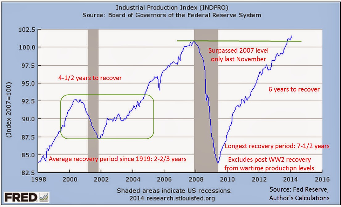
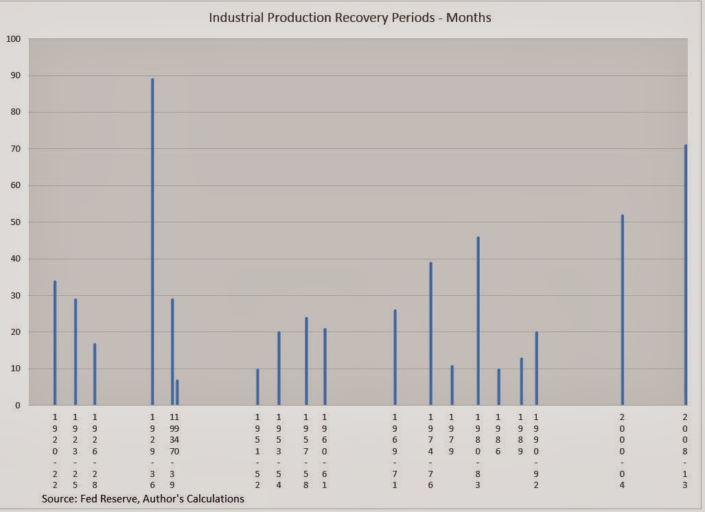
Here is a comparison of the recovery periods since 1919.  The back to back dips of 1979 and 1980-83 were, in effect, one long dip lasting 4 years, making it the third worst recovery period of the past one hundred years.

When industrial production takes several years to regain the ground lost during a recession, it is vulnerable to even minor economic weaknesses.  As production recovered from a 7-1/2 year dip during the 1930s Depression, the Federal Reserve tightened money and production slid once again before reviving to produce arms to ship to British and European forces in the early years of World War 2.  Outgoing Federal Reserve chairman Ben Bernanke, a noted scholar of the 1930s Depression, understands the inherent weakness of an economy when production takes several years to recover.  For this reason, he was reluctant to ease up on monetary support until production was clearly and securely recovered.

The new Federal Reserve chairwoman, Janet Yellen, has decades of experience and is well aware of the fragility that is inherent in an economy that experiences a long period of industrial recovery.  This will be one of several factors that the Federal Reserve watches closely for any signs of faltering.  Those who think that the Fed will make any abrupt changes in monetary policy have not been reading the footprints left by the past.

****************************

Productivity

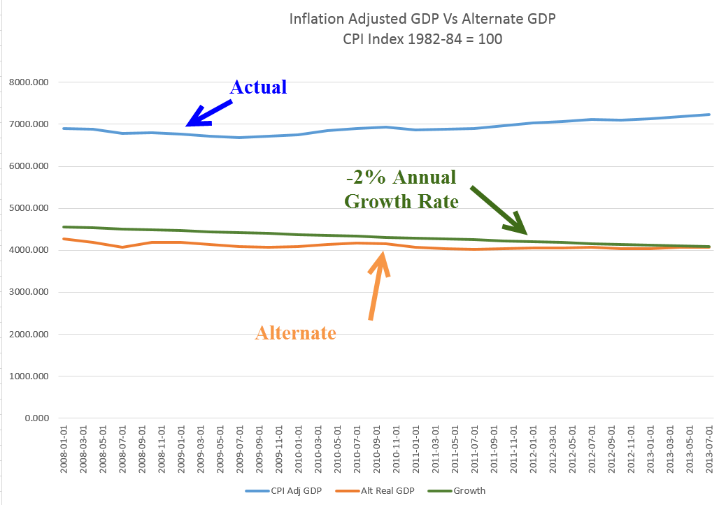
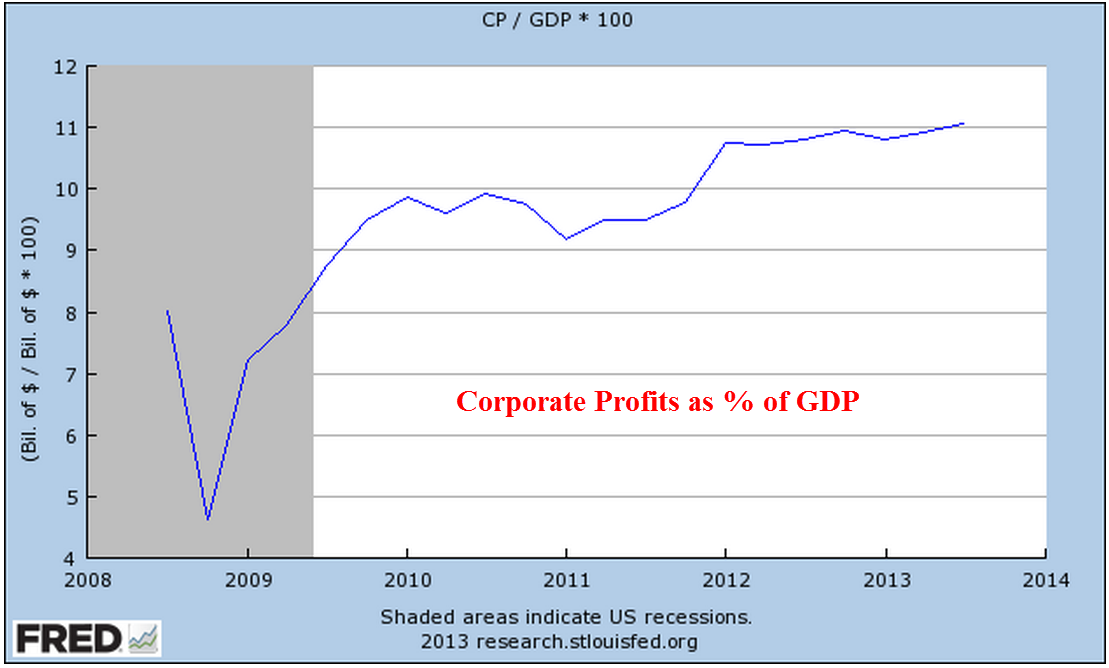
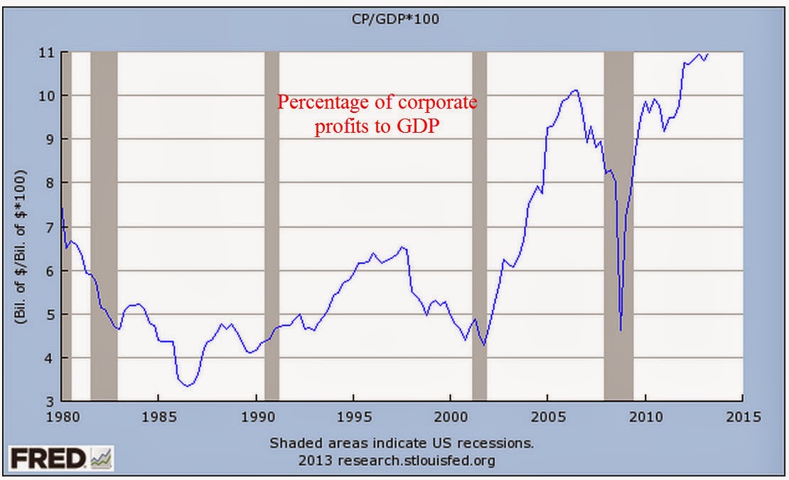
Last August I wrote about the rather slow growth of multi-factorial productivity (MFP) since 2000.  The Bureau of Labor Statistics (BLS) calculates a meager 1% annual rate of growth in that time.  Far down in their historical tables is a revealing trend: Labor’s contribution to production has declined dramatically in the past ten years while capital’s share of inputs has increased.  Capital inputs include equipment, inventories, land and buildings.  In 2011, the most recent year available, labor’s share of input had decreased to 63.9%, far below the 60 year average of 68.1%.

Capital’s share of input had increased to 36.1%, far above the average 31.9%

As I mentioned last August, the headline productivity figures are misleading because they simply divide output by number of hours worked and ignore the contributions of capital to the final output.  As capital’s share of input increases, the contributors of that capital want more return, i.e. profit, on their increased contribution.

In the twelve years from 2000 – 2011, capital’s share of input has increased 20%, from 30% to 36%.  In that same period, after tax profits have grown by 130%, a whopping return on the additional 20% capital invested.  While overall MFP growth has slowed, the mix has changed.

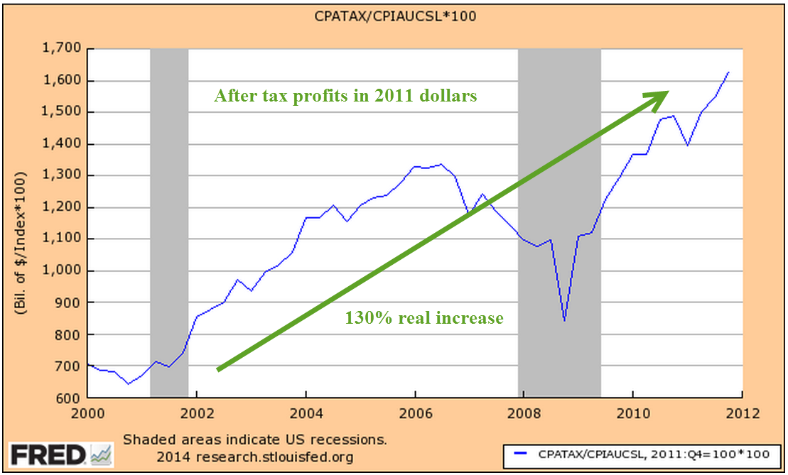
Given such a rich return, we can expect this trend to continue until the growth of profits on ever larger capital investments reaches a plateau and slows.  Until then, labor’s share of productivity gains will be slight, acting as a continuing restraint on family incomes.

*******************************

Existing Home Sales

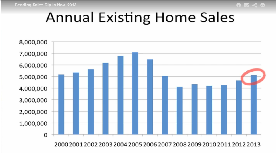
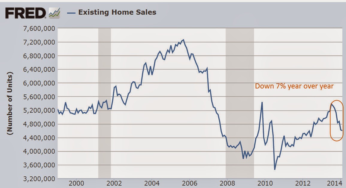
The 5 million sales of existing homes in 2013 was 9% above 2012 levels but the percentage of cash buyers has increased as well, now making up almost 1/3 of existing homes sales. (National Assn of Realtors).  The percentage of first time buyers declined from 30% in December 2012 to 27% in December 2013. For the past half year sales of existing homes have declined and the latest figures for February show a 7% decline from 2013 levels.

In May 2013, the price of Home Depot’s stock hit $80, a 400% rise from the doldrums of the spring of 2009.  Since then, it has traded in a close range around that price.  In May 2013, the price of the stock was 200% of the 4 year average, an indication that all of the optimism had been baked into the stock price.  It now trades at 160% of the 4 year average, rich but more reasonable if expectations for a continued housing recovery materialize.

In January 2000, the stock broke above $50 and was also trading at almost 250% of it’s 4 year average.  After trading in a range in the high $40s for several months, the stock began to fall.  By mid-June of 2000, the stock traded for 150% of its 4 year average.

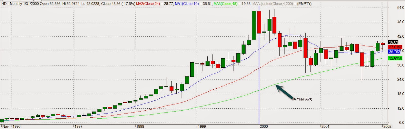
The range bound price of Home Depot’s stock price for 8 months now is a good indication that investors have become watchful of the real estate sector, particularly the existing home market.  The percentage of cash buyers has risen 10%, replacing the similar decline in the number of first time home buyers.  Remember that this stalling is taking place at a time when interest rates are near historic lows.

*******************************

Reader questions

A reader posed a few questions about last weeks blog.

When annualized sales rates are down, but annualized inventory rates are up, is that usually because of prior contracts that businesses must accept?  Or is it usually hope for their future?  In other words, is a higher inventory rate a positive sign or a negative one?

When sales are going down and inventories are going up, it means that businesses were not prepared for the change in sales. This ratio measures the amount of surprise.  Businesses will then reduce their orders to factories, wholesalers, etc.  They may decide to reduce any hiring plans.  On the other hand, they might increase their marketing expense.  Look closely at the Inventory to Sales Ratio (ISRATIO) graph from the Fed.  In the early part of the recession in the first quarter of 2008, the ISRATIO moved up a bit, then down in the 2nd quarter but it was still in the subdued normal range of 1.25 to 1.30 established since 2006.  During the summer of 2008, the ISRATIO rose again but it was not until September 2008 that this ratio began it’s several month upward spike as sales crashed.

Re:  Decline in real personal consumption below 2.5% has ALWAYS led to a recession within a year.  Are there any substantive changes in how the economy is run now than in the past?  For example, has the Fed always been involved with quantitative easing like it is now?  Could that easing create a better economic climate despite personal consumption decline?  When we look at the past, are we generally comparing apples to apples?

The fact that a recession has always happened when inflation adjusted personal consumption falls below 2.5% does NOT mean that it will happen this time.  These are indicators, not predictors and we must remember that indicators of past trends are with revised data.  Investors and policy makers must make decisions with the currently available data, before it is fully complete. Personal consumption for 2013 could be revised higher in the coming quarters.  Some revisions happen as much as three years later.  What it does mean is that the Fed will be watching this sign of weakness in the consumer economy and is unlikely to make any dramatic policy changes.

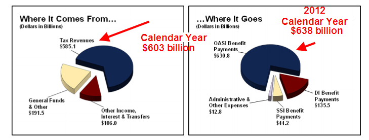
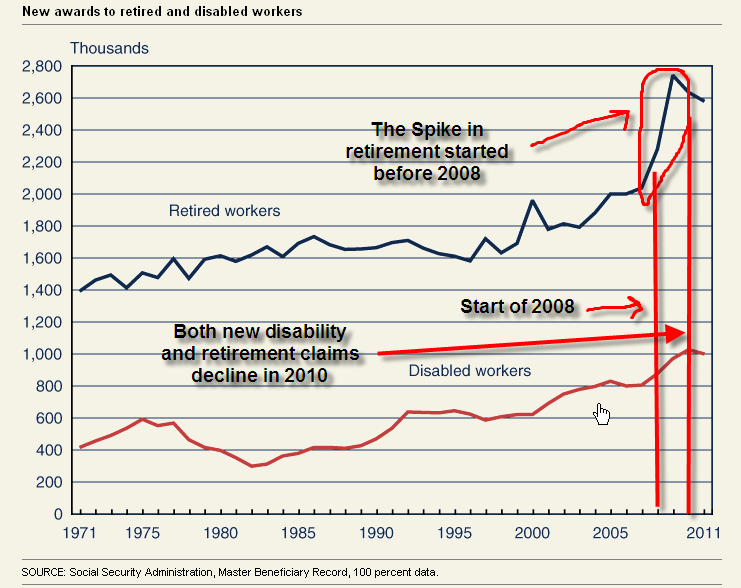
So how do you think our leaders should lead in regards to SS?  Do you think the age should be raised to say 70?  Do you think we will not be able to depend on SS being there throughout our lifetimes?  It must be of great concern to your kids that it may not be there for them, esp. after having contributed over the years.

I think politicians will have to spread the pain on Social Security.  These suggestions are not new.

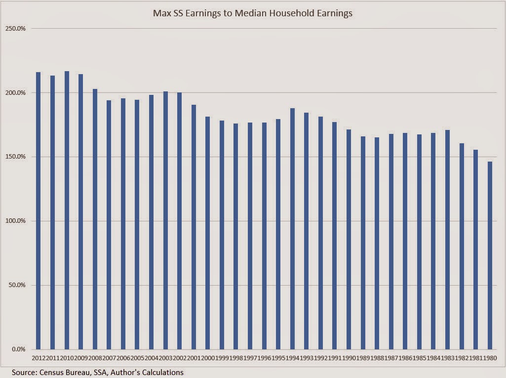
1) Raise the salary level that is subject to the tax so that more tax is captured from higher salaries.  This years maximum is $117K. (SSA) This is a tough sell.  The ratio of the maximum taxed earnings to the median household income (Census Bureau Table H.6) has gone up from 150% in 1980 to almost 220% in 2012.

Well to do people feel like they are already paying their “fair share.”  Senator Bernie Sanders and other Democrats use the ratio of the maximum taxed earnings to the top 10% of incomes to make the case that the maximum should be as high as $175K.  Computers and the availability of so much data enable policy makers and think tanks to produce whatever data set they want in order to support their conviction.

2)  Raise the employee and employer share of the tax .1% each year for the next five years.  Democrats will not like this one because it raises the burden on lower income families.

3)  Initially raise the social security age by two months each year over the next five years and index it to the growth in the life expectancy of a 65 year old so that the official retirement age is 15 years less than the life expectancy.  In 2025, if the life expectancy is 85 years, then the official retirement age would be 70.  Early retirement should be set at 3 years less than full retirement age.  In this case, early retirement would be 67.

All of these are tough choices and most politicians don’t want to touch them.   Voters are not noted for their prudence and are unlikely to pressure pressure policy makers for more taxes and less benefits. In order to sell these difficult proposals, I would add one more proposal.

4) Guarantee the payout of benefits for ten years, regardless of death.  Each retiree would name beneficiaries for their social security and payments would go to those beneficiaries until the 10 year anniversary that retirement benefits began.  This would incentivize retirees who could afford it to delay the start of their retirement benefits until 70, knowing that their heirs would get at least ten years of benefits. This delay would ease some of the fiscal shock as the boomer generation is now retiring.

Currently, the highest social security benefit is paid to a surviving spouse.  If a man dies with a higher monthly benefit than his wife, then the wife gets the husband’s higher benefit amount each month but loses her benefit.  Under this proposal, the wife would get her benefit and the husband’s benefit plus her benefit if her husband dies within ten years of retirement.  Often, a couple’s income is cut in half or by a third when a spouse dies.  Older women are particularly impacted, finding that they can no longer afford the mortgage or rent in their current housing situation. This feature would enhance the popular understanding that Social Security is like an insurance annuity.  It would help particularly vulnerable older surviving female spouses, an emotionally appealing feature that politicians could sell to voters, thus making it more likely that voters would accept the higher taxes and raised retirement age.  Whether the idea is fiscally sound is something that the Board of Trustees at the SSA could calculate.

Sales, Employment, Social Security

March 15th, 2014

Small business

The monthly survey of small businesses showed an abrupt decline in sentiment, below even the lowest of expectations,  and the sixth report since the beginning of the year to come in below the consensus range.  Two factors led the downward change: lowered sales expectations and hiring plans. The majority of business owners surveyed are reducing, not adding to inventory.  The steady but slowly improving sentiment during 2013 has now weakened.

This reading of optimism among small business owners is indexed to 100 in 1986.  The current survey reading of 91.5 is far above the pessimistic level of 80 that the index sank to in the early part of 2009.  In 2006, sentiment broke below the 95 level and has not risen above that since – eight years of below par sentiment among small business owners.

The lackluster small business report early in the week dampened market activity until the release of February’s retail sales report on Thursday.  The retail sales and employment reports that are released each month probably elicit the most response from the market.  A fall in February’s retail sales might have driven the market down at least 1%.  Instead, the report showed an annualized growth rate of 3.6%, offsetting the weakness in January and December.  Excluding auto sales, which accounts for about 20% of retail sales, total sales have formed a plateau.  Even auto sales were up this past month in spite of the extreme bad weather in parts of the country.  Some see this resilience in the face of the extraordinary weather this winter as an indication of an ever strengthening consumer base, a harbinger of solid economic growth.

The reason for the reduction in inventories indicated by the small business survey was revealed by Thursday’s report of the inventory-sales ratio for January.  Inventories rose at a 4.8% annualized rate versus a 7.2% annualized decline in sales.  January’s ratio of inventory to sales is at the same level as the beginning of the recovery in 2009.  Businesses will be cautious buyers this spring until excess inventories are reduced.

****************************
Employment

The number of unemployment claims declined again this week, bringing the four week average down to approximately 330,000, considered by many to be in the healthy range.  As a percent of the workforce, new unemployment claims are near all time lows.  Enacted in 1993, NAFTA had some small effect on employment but the more consequential impact was the admittance of China into the WTO.  As the relatively more volatile manufacturing employment decreased, so too did the surge in unemployment claims.  Note the reduced volatility of the work force today compared to the 1980s.

As a rule, employees quit jobs when they feel confident that another job is readily available.  The Quits rate has been rising since the official end of the recession in the summer of 2009 but is still relatively weak and declined in January.  The current level is at the lows of the recovery from the recession of the early 2000s.

As a percent of the workforce, however, the level of quits has not even reached the lows of that previous recession.

***************************
Income

Now for a disturbing trend: the decline in disposable income below 1% has always marked the start of a recession.  This annual report from the Bureau of Economic Analysis (BEA) covers the period till the end of 2013 and was not affected by the recent cold weather.

Recent price increases in basic food commodities like milk and cereal nibble away at consumers’ pocketbooks.  An ETF that tracks agricultural commodities is up almost 20% in the last six weeks.

Whenever the growth in real, or inflation-adjusted, personal consumption has declined below 2.5%, the economy has always  gone into recession within the year.  In 2013, consumption growth fell to 2.0%.

Well, maybe this time is different.  Eternal hope, persistent denial. Those of us living in the present too often believe that we belong to an elite club with special rules that those in the past did not enjoy.

**************************

Social Security

Several years ago, the Social Security administration (SSA) estimated that 10,000 people would qualify for benefits each day.  Republican Congressman Eric Cantor and Democratic Senator Ron Wyden are two politicians on opposite sides of the political aisle who mention the 10,000 a day factoid.  The actual number of new retirees per day is actually higher.  Using recent data from the SSA, PolitiFact reported that 11,000 new retirees each day qualify for Social Security.  No one mentions the 4,300 who die and drop off the Social Security rolls (2008 data from the Census Bureau).  This number is likely to increase another 15% as the Boomer population swells into old age; the 1.6 million a year who die is likely to grow to 1.8 million who leave the Social Security system while 4 million become eligible for retirement benefits.  The result is an approximate net increase of 2.2 million beneficiaries each year of the next decade.

For now, let’s leave out the growth in the disability and Medicare programs and focus only on retirement and survivor’s benefits, or OASI.

At an average yearly benefit of $14K the benefits paid by the Social Security Administration rise by $31 billion this year, a 4.6% increase on the approximately $670 billion in Social Security and Survivor’s benefits paid out in 2013 (CBO report).  The relatively small deficit of $60 billion last year will grow into hundreds of billions within the decade.  Congress argues at length over $3 billion; efforts at tackling the really big deficits of Social Security are too often met with blowhard rhetoric, not serious negotiation.

The SSA estimates that “By 2033, the number of older Americans will increase from 45.1 million today to 77.4 million.” (SSA Basic Facts) At an inflation rate of 2.5%, less than the 3% average of the past 50 years, the average $14K annual benefit will grow to $23K by 2033.  Multiply that by 77 million people and the total of benefits that will be paid to seniors in 2033 is close to $1.8 trillion, almost triple the benefits paid in 2013.  

The current elderly count of 45 million people is 14% of today’s population of approximately 313 million.  In 2033, 77 million elderly will be 20% of an estimated population of 382 million.  More people getting paid while fewer people will be paying.  The SSA estimates that a little over 40% of the population who are working will be supporting the 20% of the population that is collecting SS benefits.
Independent Senator Bernie Sanders is fond of reassuring us that the Social Security Trust Funds have plenty of money to pay benefits over the next two decades.  What the trust funds have are I.O.U.s from the U.S. Government’s pool of tax revenues.  Where will the money come from?  Increased taxes. 
Politicians rarely lead.  The art of politics is to look like one is a leader, to position oneself at the front of the herd as it flees the pursuing lions.  In this case, the lions are demographics, and decades of promises, unrealistic assumptions and political cowardice.  The question is whether voters will force the leaders to lead before the lions attack.

Transfer Payments

February 16th, 2014

In this election year, as in 2012, the subject of transfer payments will rear its ugly head with greater frequency.  In the mouths and minds of some politicians, “transfer payments” is synonymous with “welfare.”  Don’t be confused – it is not.  As this aspect of the economy grows, politicians in Washington and the states get an increasing say in who wins and who loses.  Below is a graph of transfer payments as a percent of the economy.  I have excluded Social Security and Unemployment because both of those programs have specific taxes that are supposed to fund the programs.

Transfer payments, as treated in the National Income and Product Accounts (see here for a succinct 2 page overview), are an accounting device that the Bureau of Economic Analysis (BEA) uses to separate transfers of money this year for which no goods or services were purchased this year.  The BEA does this because they want to aggregate the income and production of the current year. Because that category includes unemployment compensation, housing and food subsidies, some people mistakenly believe that the category includes only welfare programs.   Here’s a list of payments that the BEA includes:

Current transfer receipts from government, which are called government social benefits in the NIPAs, primarily consist of payments that are received by households from social insurance funds and government programs. These funds and programs include social security, hospital insurance, unemployment insurance, railroad retirement, work­ers’ compensation, food stamps, medical care, family assistance, and education assistance. Current transfer receipts from business consist of liability payments for personal injury that are received by households, net in­surance settlements that are received by households, and charitable contributions that are received by NPISHs.

That settlement you received from your neighbor’s insurance company when his tree fell on your house is a transfer payment.  Didn’t know you were on welfare, did you?  Some politicians then cite data produced by the BEA to make an argument the government needs to curtail welfare programs.  Receiving a Social Security check after paying Social Security taxes for forty plus years?  You’re on welfare.  A payment to a farmer to not grow a bushel of wheat – an agricultural subsidy – is not a transfer payment.  A payment to a worker to not produce an hour of labor – unemployment insurance – is a transfer payment.  Got that?  While there are valid accounting reasons to treat a farmer’s subsidy check and a worker’s unemployment check differently, some politicians prey on the ignorance of that accounting difference to push an ideological agenda.

That agenda is based on a valid question: should a government be in the business of providing selective welfare; that is, to only a small subset of the population?  Some say yes, some say no.  If the answer is no, does that include relief for the victims of Hurricane Katrina, for example?  Even those who do say no would agree that emergencies of that nature warrant an exception to a policy of no directed subsidies or welfare payments.  It was in the middle of a national emergency, the Great Depression, that Social Security and unemployment compensation were enacted.  Government subsidies for banks began at this time as well.  Agricultural subsidies began in response to an earlier emergency – a sharp depression a few years after the end of World War 1.  Health care subsidies were enacted during the emergency of World War 2.  The pattern repeats; a subsidy starts as a response to an immediate and ongoing emergency but soon becomes a permanent fixture of government policy.

Tea Party purists think that the Constitutional role of the federal government is to tax and distribute taxes equally among the citizens.  Before the 16th Amendment was passed a hundred years ago, the taxing authority of the Federal Government was narrowly restricted.  However, the Federal Government has always been selective in distributing  the resources at its disposal.  Land, forests, mining and water rights were either given or sold for pennies on the dollar to a select few businesses or individuals. (American Canopy is an entertaining and informative read of the distribution and use of resources in the U.S.) By 1913, the Federal Government had dispensed with so much land, trees and water that it had little to parlay with – except money, which it didn’t have enough of.  Solution: the income tax.

In principle, I agree with the Tea Party, that the government at the Federal and state level should not play God.  How likely is it that the voters of this country will overturn two centuries of precedent and end transfers?  When I was in eighth grade, I imagined that adults would have more rational and informed discussions.  Sadly, our political conversation is stuck at an eighth grade level on too many issues.

****************************

While most of us pay attention to the unemployment rate, there is another statistic – the separation rate – that measures how many people are unemployed at any one time.  The unemployment can be voluntary or involuntary, and last for a week, a month or a year.  Not surprisingly, younger workers change jobs more frequently and thus have a higher separation rate than older workers.  In the past decade, almost 4% of younger male workers 16 – 24 become unemployed in any one month.  Put another way, in a two year period, all workers in this age group will change jobs.  For prime age workers 25 – 54, the percentage was 1.5%.  In a 2012 publication, Shigeru Fujita, Senior Economist at the Philadelphia Federal Reserve Bank, examined historical demographic trends in the separation rate.

On page five of this paper, Mr. Fujita presents what is called a “labor-matching” model that attempts to explain changes in unemployment and wages, primarily from the employer’s point of view. Central elements of this model, familiar to many business owners, include uncertainty of future demand and the costs of finding and training a new worker.  Mr. Fujita examines an aspect that is not included in this model – the degree of uncertainty that the worker, not the employer, faces.  In the JOLTS report, the BLS attempts to measure the number of employees who voluntarily leave their jobs.  These Quits indicate the confidence among workers in finding another job.  The JOLTS report released this week shows an increasing level of confidence but one which has only recently surpassed the lows of the recession in the early 2000s.

**************************

Labor Participation
In a more recent paper, Mr. Fujita examines the causes of the decline in the labor participation rate, or the number of people working or looking for work as a percentage of the people who are old enough to work.  As people get older, fewer of them work; the aging of the labor force has long been thought to be the main cause of the decline.  That’s the easy part.  The question is how much does demographics contribute to the decline? What Mr. Fujita has done is the hard work – mining the micro data in the Census Bureau’s Current Population Survey.  He found that 65% of the decline of the past twelve years was due to retirement and disability.  More importantly, he discovered that in the past two years, all of the decline is due to retirement.  The first members of the Boomer generation turned 65 in 2011 so this might come as no surprise.  The surprise is the degree of the effect;  this largest  generational segment of the population dominates the labor force characteristics. During the past two years, discouraged workers and disability claims contributed little or nothing to the decline in the participation rate.  Another significant finding is that relatively few people who retire return to the work force.

In this election year, we will be bombarded with political BS: Obamacare or Obama’s policies are to blame for the weak labor market; the anti-worker attitude of Republicans in Congress are responsible.  Politicians play a shell game with facts, using the same techniques that cons employ to pluck a few dollars from the pockets of tourists in New York City’s Times Square.  Few politicians will state the facts because there is no credit to be taken, no opposing party to blame.  Workers are simply getting older.

In 2011, MIT economist David Autor published a study on the growth of disabiliity claims during the past two decades and the accelerating growth of these claims during this Great Recession.  Mr. Fujita’s analysis reveals an ironic twist – at the same time that Mr. Autor published this study, the growth in disability claims flattened.  The ghost of Rod Serling, the creator and host of the Twilight Zone TV series, may be ready to come on camera and deliver his ironic prologue.

*******************************

Lower automobile sales accounted for January’s .4% decline in retail sales. Given the continuing severity of the weather in the eastern half of the U.S., it is remarkable that retail sales excluding autos did not decline.  In the fifth report to come in below even the lowest of estimates, industrial production posted negative growth in January.  By the time the Federal Reserve meets in mid-March, the clarity of the economy’s strength will be less obscured by the severe winter weather.

*******************************

A reader sent me a link to short article on the national debt.  For those of you who need a refresher, the author includes a number of links to common topics and maintains a fairly neutral stance.  I still hear Congresspeople misusing the words “debt,” the accumulation of the deficits of past years, and “deficit,” the current year’s shortfall or the difference between revenues collected and money spent.  Could we have a competency test for all people who wish to serve in Congress?

*******************************

The House and Senate both passed legislation to raise the debt ceiling this week.  The stock market continued to climb from the valley it fell into two weeks ago and has regained all of the ground it lost since the third week of January.

GDP, Profits, Inflation

December 22nd, 2013

Merry Christmas!

Last week I reviewed several decades of trends in corporate profits, as well as the 1990 change in measuring inflation that has helped increase corporate profits as a share of GDP.   (For those of you interested in the inflation controversy, here is an article that provides some additional insight.)  This week I’ll look at patterns in the economic growth of this country that sheds some light on recent events and provides some context to understand ongoing trends.

During the 30 years following World War 2, the economy grew at an annual rate of 3.7% after inflation.  Population growth was about 1% per year.  Productivity growth was about 1 – 1.5%.  Government spending, including debt, grew a bit more than 1%.  The chart below shows the compounded annual growth rate.

But I think the story is more clearly told by a different chart constructed from the same data.  The growth rate trend is more easily visible and it is the change in this trend that I will be focusing on.

During the 1970s, an economic trend known as staflation increasingly took hold. This period of high inflation, coupled with slowing growth and growing unemployment, was not thought possible by economists using theories proposed by John Maynard Keynes in the 1930s, during the Great Depression.  In 1974, economist Arthur Laffer first sketched out a theory that tax cuts would stimulate the economy.  As the Federal debt began to rise in the mid to late 1970s, few wanted to take a chance that lower tax rates would produce more revenue for the Federal Government.

The 1980s began with back to back recessions and the highest unemployment since the 1930s Depression. Big spending and tax cuts during the 1980s dramatically increased the federal debt but did little  to spur growth.

During this 13 year period, profit growth slowed to 2.4%.  The myth that the 1980s was a high growth era continues to live in the minds of political pundits.  In a WSJ op-ed on Dec. 18th, Daniel Henninger referred to “the high-growth years of the Reagan presidency.”  Myths live on because they serve a purpose to those who cherish them.  The cardinal rule of politics is “Disregard the Data.”

In 1990, economists at the BLS adopted what is called a hedonic methodology to computing the CPI.  Used by other OECD countries, this supposedly more accurate assessment of the growth of inflation shows a lower growth rate of inflation.  This naturally increases the growth rate of inflation adjusted GDP. (GDP dollars each year are divided by the inflation rate to get the real growth rate.)

The conventional narrative is that the 1990s was an explosive growth period of new technology and growing globalization.  From the beginning of 1990 to the start of 2000, stock market values grew four times.  After the bursting of the internet bubble, 9-11, and the recession of 2001, the economy recovered.  By the mid-2000s, the unemployment rate was less than 5%.  While that may be the conventional narrative, the growth of the economy from 1990 to 2007 was just as slow as the period 1978 – 1989.

Remember that this slow growth would have been even slower if the BLS had not changed their methodology for measuring inflation.  To recap, the 30 year real growth rate of GDP after WW2 was 3.7%.  The following 30 year growth rate was 2.3%.  But that later 30 period is marked by a sharp rise in consumer borrowing.   Without that escalation in borrowing, growth would have been meager.

Families with two incomes borrowed against their homes, drove up the balances on their credit cards and still GDP growth was slow.  Let’s construct a fairy tale, what economists call a counterfactual.  What if the BLS had not changed to this new methodology in 1990?  What would be the growth rate of GDP using an alternate measure of inflation?

The resulting growth pattern is 0% for the 18 year period and is more consistent with the experiences of many workers and families in this economy.  The change in the measurement of inflation has greatly helped mid-size and large size companies.  An understated inflation rate reduces labor costs by reducing cost of living adjustments to salaries and wages.  In addition, companies can borrow at lower rates since many corporate bonds are tied to the inflation rate.  American companies did not engineer this revised methodology of measuring inflation but they have been the largest beneficiaries of the new policy.

In 2008, the financial poop in the popcorn popper began to pop.  In the past 5+ years, we have experienced less than 1% real growth, not enough to keep up with population growth.  Of course, most people are wondering “what growth? It sure doesn’t feel like growth!”

The story may be told more accurately by looking once again at a comparison of inflation adjusted GDP with an alternate version of GDP, one that more realistically reflects inflationary pressures.  This chart shows a decrease of 2% per year.

Did the BLS adopt this methodology under political pressure?  Perhaps.  More likely, it was an alignment of econometric theory with political and corporate interests.  The reduction in published inflation rates did slow the growth of payments to Social Security recipients and reduced Medicare payouts to physicians and hospitals, thus shrinking budget deficits.  The government saves money, corporations make extra money, but – quietly and slowly – families lose money.

Annual cost of living adjustments to Social Security checks have been reduced but the decreased income has forced more seniors to seek assistance through the food stamp program, now called SNAP.  A politically neutral change in the measurement of inflation thus becomes a way for politicians to introduce a means testing component to Social Security income.  Instead of reducing payments based on income, payments are reduced to all recipients and poor seniors are targeted for additional benefits.  Congress has increased eligibility for the food stamp program so that seniors who are dependent on that extra income can receive it in the form of food stamps.  If the BLS had not changed their methodology, seniors would receive appoximately 60% more each month and many wouldn’t need the food stamps in the first place.

With this history in mind, let’s turn to this week’s revisions of GDP and corporate profits for the third quarter ending in September.  The real, or inflation-adjusted, growth of 3rd quarter GDP was raised to a 4.1% annualized growth rate in the third quarter, largely on upward revisions of consumer spending.  Contributing to stronger GDP growth has been a worrisome increase in company inventories, which probably influenced the Federal Reserve’s decision this week to keep any tapering of their QE bond purchases to a minimum.

Corporate profits for the third quarter were revised higher as well.  As a share of GDP, corporate profits continue to reach all time highs.

How likely is it that economists at the BLS will change their methodology to reflect inflationary pressures before we make choices in response to rising prices?  The subject is not easily encapsulated in a sound bite or a short slogan on a placard.  In the 1992 presidential race, independent candidate Ross Pierot was able to use charts to make a point with many voters but few politicians are very good at the easel and unlikely to bring up the subject in the public forum.  Families and workers will continue to suffer and politicians will create more social benefit programs to help those hurt by problems that politicians themselves have either created or failed to address.  Large and mid sized businesses will continue to enjoy the additional slice of pie.

Retail Sales and Inflation

December 15th, 2013

Retail sales rose .7% in November, posting year over year (y-o-y) gains of almost 5%.  The twenty year average of y-o-y gains is 4.6%.  When we remove the eleven monthly outliers with gains of more than 10% or less than -10%, the average is 5.0%

Now let’s compare the percentage change in GDP with the change in retail sales.

The change in GDP is like a smoothed average of the change in retail sales, so the continuing willingness of consumers to spend is a positive for both GDP growth and the market in the mid-term outlook.

*******************************

In March 2009, incoming President Obama pledged that his administration was going to support small businesses which employ 1/2 the workforce and contribute 40% to GDP. (CBS News article  Note: The article incorrectly states that small businesses employ 70% of the workforce.) A recent report, short and written in plain English, by the Cleveland Federal Reserve compares levels of lending to small businesses in 2013 vs 2007.  Five years after the financial crisis, six years after the start of the recession, loans to small businesses are only 80% of 2007 levels.  Impacting the start up of small companies has been the decline in home values.  Home equity provides the funding for most small business start ups.

A graph from the report illustrates the long term decline of small business lending.  As the banking sector has consolidated over the past twenty years, the mega-banks have less incentive to “take a chance” on small businesses.

As I watch Senate and House hearings on C-Span (yes, I know I have a problem), I am struck by how many members of Congress appear to be on a mission.  While at times Washington seems to be a town of political prostitutes, it may be more accurate to describe it as a town of missionaries.  These dedicated men and women come to Washington with a plan to save the souls of the American people – or at least that’s the way they like to present themselves.  Nancy Pelosi and other prominent Democrats give voice to the plight of the long term unemployed but rarely mention small business owners.  A 50 year old guy who can’t find a job because his skills are out of date is a topic of concern to Democrats.  But what about the 50 year old who can’t start up a business because the drop in housing prices has diminished the equity of many home owners?  Republicans mention small businesses only when bashing Obamacare.  Why has there been so little attention paid to this rather large part of the economy?  Why aren’t the banks being subpoenaed to appear before a Congressional subcommittee?  Many Presidents seem to spend their second terms answering for the broken promises of their first term.  Finally, after eight years, voters turn to a new guy, hoping that this one will be different.  Hope, or foolishness, triumphs in the hearts of voters.

********************************

Now I’ll take a look at a contentious subject, the measurement of inflation.  A comprehensive review of the inflation measurement is far beyond my skills and a blog.  The CPI produced by the Bureau of Labor Statistics is the official measurement of inflation to adjust Social Security payments each year.  I want to come at the subject from a different viewpoint – corporate profits. Starting in 1990, the Bureau of Labor Statistics (BLS) adopted a new way of measuring inflation, introducing what is called a hedonic adjustment. Coincidentally, corporate profits began to surge shortly thereafter.  Below is a graph showing inflation adjusted profits.

Adjusting for population growth, the surge in per capita profits confirms the trend.

As I noted in September, corporate profits as a percent of GDP are at historically high levels.

In a FAQ sheet, the BLS explains their methodology in plain language and refutes the claim that hedonic adjustments have any significant impact on the CPI measurement. I have also discussed another measure of inflation, the PCE deflator.  Here is a working paper by an economist at the Federal Reserve on the PCE measurement.

For years, John Williams of Shadow Government Statistics (SGS) has painstakingly maintained an alternate data set of the CPI.  Here’s a graph from that page to give you an idea.

As you can see, the official measure of inflation is about 2 – 3% below the CPI that Williams produces using the pre-1990 methodology.  Essentially, hedonic adjustments measure inflation after consumers have adjusted to inflationary price pressures.  Let’s say that a family eats steak twice a week.  Steak then goes up in price by 20%.  To stay within their budget, a family might substitute hamburger for one of those meals.  The old method of measuring inflation would capture the 20% rise in the price of steak.  The post-1990 method does not capture all of that rise because it allows for the substitution effect.

Several reasons have been given for the dramatic rise in corporate profits since 1990.  These include globalization, technology, and increased productivity of both labor and capital.  As I wrote about in August, multi-factorial productivity has only increased 12% in the 12 years from 2000 – 2012, an annual gain of less than 1%.  Technological progress occurred in almost every decade of the past century, yet average economic growth is about 3% over those one hundred years – a remarkable consistency.  Globalization has helped and hurt domestic companies, enabling them to reduce costs but also increasing the competition from firms around the world.  Have companies found some magic key in the past twenty years?

The magic key may be the change in the CPI methodology. What if the CPI understates inflationary pressures by 2 – 3% each year?  What effects would that have?  Interest rates would be reduced, lowering the costs of borrowing for companies.  There would be less pressure from labor for wage increases.  These two factors figure heavily in the profits of many large companies. (Interest expense for GE is more than a third of their operating income ).  There is yet another effect: real profits adjusted for this higher inflation rate, would simply not be so dramatic.

Since 1990, per capita corporate profits have risen about 7.6% per year.

Now let’s adjust per capita profits for inflation using the official CPI and a higher inflation rate that is closer to the inflation measures that SGS compiles.

What we see is approximately 3% real growth in per capita profits since 1990.  This is quadruple the .75% growth rate of corporate profits for the thirty year period from 1959 – 1989.

The 30 year average was hurt by the 4% decline in inflation and population adjusted profits during the 1980s.  This decline undermines the conventional narrative that the 1980s were a big growth boom for companies.  The 50 year average of this real profit growth is 2.5%.  As a rule of thumb then, we can guesstimate inflationary pressures on consumers as the nominal rate of profit growth less 2.5%.  Let’s look at a chart I showed earlier.

The 7.6% nominal growth rate of profits less 2.5% gives us an average inflation rate of close to 5% for the past 23 years.  This different methodology lends more credence to the higher CPI calculations that SGS presents. Compare this to the 2.5% average that the BLS calculates for this time period.

Small changes in methodology add up over time.  While this “back of the envelope” method of computing inflation does not meet the rigor that Williams brings to his calculations, it does illustrate the difference in inflationary pressures that many families feel.  Here’s a comparison of the two indexes.

Now comes the juicy part and I will keep my voice low.  There is a conspiracy theory floating around that, in the late 1980s, the politicians in Washington were pressured by businesses to have the BLS revise their methodology to reduce rising labor costs which were hurting profits. Another theory says that Congress wanted to curb the annual CPI increases in Social Security and Medicare payments and secretly ordered the BLS to come up with a way to revise the CPI down.  In 50 years, financial historians may discover that both of these theories have some substance.

Whatever the “real” reason for the change in methodology, those who are dependent on retirement income indexed to the CPI should keep in mind that unmeasured inflationary pressures may eat an additional  2 – 3% out of their retirement savings base and income.

Investment Allocation and Housing

December 1st, 2013

While cleaning up some old files, I found a 1999 “Getting Going” column by Jonathan Clemens in the Wall St. Journal.  That year was rather turbulent, rocked by Y2K fears that the year 2000 might play havoc with older computers still using a two digit date,  and a intensifying debate about the valuation of stocks.  Looking away from the hot internet IPOs of that year,  Clemens interviewed several professors about the comparatively mundane subject of home ownership.

 “A house is not a conservative investment,” says Chris Mayer, a real-estate professor at the University of Pennsylvania’sWharton School. “Any market where prices can fall 40% in three years is not a safe investment.” 

Remember, this is 1999.  At that time, what 40% decline is he talking about?  It would not be till 2009 or 2010 that house prices tumbled down the hill.  In the past, declines of this magnitude were confined to particular areas of the country where a fundamental shift  in the economy occurred.  The Pittsburgh area of Pennsylvania, the Pueblo area of Colorado and the Detroit area of Michigan come to mind. In the first two examples the collapse of the steel industry had a profound effect on home prices as people moved to other areas to find work.  In case a homeowner thinks “it can’t happen here,” I’m sure many homeowners in Detroit felt the same way during the 1960s when the car industry was at its peak.

“William Reichenstein, an investments professor at Baylor University in Waco, Texas, suggests treating your mortgage as a negative position in bonds.”  

What does this mean?  Let’s say a person has $100K in stock mutual funds, $100K in bond mutual funds, owns a house valued at $200K with $100K still left on the mortgage.  Subtract the remaining balance of the mortgage from the amount in bonds and that leaves $0 invested in bonds.  Why do this?  When we buy a bond we are buying the debt of a company, or some government entity.  A mortgage is a debt we owe.  So, if a person were to pay off the mortgage, trading one debt for another, they would sell their bonds to pay off the mortgage.

Should the house be included in the investment mix?  There is some disagreement on this.  An investment portfolio should include only those assets which a person could access for some cash flow if there was a loss of income or some other need for cash.  An older couple with a 5 BR house who intend to downsize in five years might include a portion of the house in the portfolio mix.

For this example, let’s leave the house out of the investment portfolio to keep it simple. Using this analysis, this hypothetical person has 100% of their assets in stocks, not a 50/50 mix of stocks and bonds.

Now, let’s fast forward ten years from 1999 to 2009.  An index mutual fund of stocks has lost a bit more than 20%.

A long term bond fund has gained about 100%.

[The text below has been revised to reflect the above bond fund chart.  The original text presented numbers for a different bond fund.]

Let’s say the mortgage principal has been paid down $60K over those ten years.  Assuming that no new investments have been made in the ten year period, what is this person’s investment mix now?  The stock portion is worth $80K, the bonds $200K less $40K still owed on the mortgage for a total of $240K, with a net exposure in bonds of $160K.  The person now has 33% (80K / 240K) in stocks and 67% in bonds, a conservative mix.  If we didn’t account for the mortgage as a negative bond, the mix would appear to be 29% (80K / 280K) for stocks and 71% for bonds.  What is the net effect of treating a mortgage balance as a negative bond?  It reduces the appearance of safety in an investment portfolio.

Now let’s imagine that this person is going to retire and collect a monthly Social Security check of $1500.  To get a 15 year annuity paying that monthly amount with a 3% growth rate, a person would have to give an insurance company about $220K (Calculator)   There are a lot of annuity variations and riders but I’ll just keep this simple.  Throughout our working lives our Social Security taxes are essentially buying Treasury bonds that we start cashing out during retirement.

If we were to add $220K to our hypothetical investment mix,  we would have a total of $460K: $80K in stock mutual funds, $200K in bond funds, -$40K still owed on the mortgage, $220K effectively in Treasury bonds that we will withdraw as Social Security payments.  The $80K in stock mutual funds now represents only 17% of our investment portfolio, an extremely conservative risk stance.  If we have a private pension plan, the mix can get even more conservative.

The point of this article was that many people in their 50s and 60s may have too little exposure to stocks if they don’t account for mortgages, pensions and Social Security payments into their allocation calculations.

*****************************

In October 2005, the incoming Chairman of the Federal Reserve, Ben Bernanke, indicated to Congress that he did not think there was a bubble developing in the housing market. (Washington Post Source)

In September 2005 – a month before – the Federal Reserve Bank of New York published a report on the rapid housing price increases of the past decade:

Between 1975 and 1995, real [that is, inflation adjusted] single-family house prices in the United States increased an average of 0.5 percent per year, or 10 percent over the course of two decades. By contrast, from 1995 to 2004, national real house prices grew 3.6 percent per year, a more than seven-fold increase in the annual rate of real appreciation, and totaling nearly 40 percent in one decade. In some individual cities, such as San Francisco and Boston, real home prices grew about 75 percent from 1995 to 2004, almost double the national average. 

Remember, these are real, or inflation adjusted prices.  Now it is easy, in hindsight, to go “ah-ha!” but it should be a lesson to us all that we can not possibly hope to consume all the information needed to mitigate risk.  There is just too much information.  A professional risk manager, Riccardo Rebonato, discusses common flaws in risk assessment in his book “Plight of the Fortune Tellers” (Amazon). Written before the financial crisis, the book is surprisingly prescient.  The ideas are accessible and there is little if any math.

*************************************
On Monday, the National Assn of Realtors released their pending home sales index. These are signed contracts on single family homes, condos, and townhomes. The index has declined for five months but is still slightly above normal (100) at 102.1.  At the height of the housing bubble, this index reached almost 130.  At the trough in 2010, the index was below 80.

This chart was clipped from a video by an economist at NAR (Click on the video link on the right side of the page).  The clear and simple explanation of trends in housing and interest rates is well worth five minutes of your time.  Sales of existing homes have surpassed 2007 levels and are growing.

Demographia surveys housing in m ajor markets around the world and rates their affordability.  Their 2012 report found that major markets in the U.S. are just at the upper range of affordable.  As Canada’s housing valuations have climbed, their affordability has declined and are now less affordable than the U.S.  Britain’s housing is in the severely unaffordable range.

*****************************
Next Friday comes the release of the monthly employment report.  I’ll also cover a few long term trends in manufacturing and construction employment that may surprise you.

Jobs, Spending and Income

October 27th, 2013

Before I take a short look at the delayed release of the employment report this week, let’s look at the growth in personal income and spending, which move in tandem.  This is the y-o-y percent change in nominal after tax income and spending.

Income growth can be a bit more erratic than spending, bouncing around the more stable trend of spending.

The anemic growth in both income and spending has dampened hopes of a strong rebound of consumer spending.  The ratio of an ETF composite of retail stocks versus the overall SP500 market index shows the recent doubt.  Retail stocks have not participated in the larger market rebound.

A wholesale clothing sales rep I spoke with a week ago has noticed the caution in her buyers since mid-August.  In September, some in the industry laid the blame at the prospect of a government showdown.  For those of us in private business, the political shenanigans only muddy the water and make it difficult to read the consumer mood.  Reports of sales at major retail centers – about 10% of retail sales – showed strength this week after a month of lackluster growth.  Maybe it was the government shutdown.

However, the U. of Michigan Consumer Sentiment Index released this past Friday showed a sizeable drop in sentiment.

Was this decline in confidence due primarily to the shutdown or is this a forewarning of less than cheery holiday shopping season?  The knuckleheads in Washington are like people who stand up at a concert, blocking the view of those seated behind them.  The business community in general must plan around the politicians on both sides of the aisle in Washington who relentlessly pursue an anti-job agenda.  Politicians can puff and posture on their principles – like so many in government service, they are not subject to the constraints and discipline of profit and loss.  Sure, there are some whose intentions are good, who give their best effort but, unlike private business, their efforts and intentions are voluntary – a sense of personal virtue.  Most will not lose their jobs because of a lack of performance.  There are few incentives to improve efficiency.  In fact, it is the reverse.  The incentives are to promote more regulations, more layers of bureaucracy, as a program of job security and job growth in Washington at the expense of the rest of the country. Many of us in the private sector have the same sense of personal virtue but we also have that profit and loss whip.

Since the temporary resolution of the government shutdown and the raising of the debt ceiling, the market has shot up over 6% in twelve trading days.  The late release of September’s labor report showed less than expected net job gains of 148,000, which dashed any further fears that the Fed might ease their bond buying program this year.  The trends of employment growth have been fairly stable, with a few exceptions – health care, for one.

After six months of little growth, employment in construction rose by 20,000 this past month.

The rise in construction jobs helped the labor force participation rate for men, reversing a decline.

But the participation rate for the core labor force, those aged 25 – 54, shows no signs of reversing the decline of the past four years.

Demographic changes, combined with persistent job weakness among younger workers, is silently eroding the foundations of the Social Security system.  The older half of the population, particularly the Woodstock generation, are growing faster than the younger population, as this table from the Census Bureau shows.

From the Census Bureau report: “the population aged 65 and over also grew at a faster rate (15.1 percent) than the population under age 45.”  At the end of 2012, the Federal Government owed the Social Security trust fund $2.7 trillion (SSA Source)

The number of workers in the core labor force has declined by 5 – 6 million.

Let’s do some math.  [5 million fewer workers paying into Social Security each year] x [$8000 guesstimated combined annual contribution] = $45 billion per year not  collected.  This is just the Social Security taxes, not including the income taxes, on a portion of the population that represents two thirds of the work force.  That $45 billion represents the benefits paid to over 3 million people in 2012. (SSA Source) To put that figure in perspective, Congress is arguing over the medical device tax clause of Obamacare which is projected to raise just $29 billion over the next ten years.

It will take five to ten years for the crisis of funding to develop.  In the meantime, the budget debates will grow more contentious, politicians will pontificate at their podiums with more frequency and the clouds of these dusty debates will make it more difficult for business people to plan ahead.

Bennies From Heaven

May 19th, 2013

During the past several years, a demographic and economic shift crossed below the zero line.  For decades, Social Security taxes collected exceeded Social Security benefits paid.  The Federal Government “borrowed” this excess and used it for other programs.  Since 2010, there has been nothing to borrow.  The Social Security Administration (SSA) has several sources of revenue, but the bulk of its revenues is what we commonly call the Social Security tax, or FICA.  However, this tax has several components.  The largest portion of the tax – the Old Age and Survivors Insurance tax (OASI) – is to pay out social security benefits and it is this component I wanted to look at.  SSA gives a pie chart of its revenue and benefits paid.

I have shown the latest revisions to the pie chart but it gives you a sense of the revenue and expense components.  A table of SSA income and outgo shows only the total receipts and expenditures.  When we look at the OASI component, we can get a sense of the upcoming political debates and financial pressures.  SS benefits paid are already exceeding OASI tax receipts.  Below is a chart of SSA data showing the surplus and deficit for the past ten years.

On January 1st, the Congress let lapse the 2% reduction in payroll taxes.  In the first quarter of 2013, that has meant an additional $245 billion in revenue to the Treasury. (Source).  Since the money all goes into the same Federal pot, the additional revenue has forestalled the debt limit debate till this fall.

The SSA records other income, including income taxes on the SS benefits paid out.  This is a “pencil” income entry: the IRS keeps track of taxes paid on SS benefits and “transfers” them to the SSA.  For decades, this pencil entry has increased the SS surplus and Congress borrowed it.  The SSA charges interest income to the Federal government and records this pencil income as more money that the Federal government owes the SS trust funds.

The bottom line is that SS is a “pay go” system.  Current taxes pay for current benefits.  When benefits exceed the taxes devoted to pay for those benefits, the money has to come from somewhere.  That “somewhere” is the Federal government, but it can only get those funds from you and I and the companies who pay corporate taxes.  More troubling is the ever increasing percentage of federal tax receipts devoted to paying social benefits of one form or another.  These include, SS, Disability, SSI, TANF, SNAP and a host of other programs.

As people become increasingly dependent on the government for their welfare, they will put increasing pressure on politicians to maintain or increase these benefits.  This political pressure only heats up the political debate over how to pay for these benefits.  At the federal level, benefits have increased by $800 billion over the last ten years.

Including the states and local governments, the increase is over $1 trillion.

Any cuts in calculating benefits are met with a firestorm of protest from those who are, or will, collect those benefits.  Few care about the accuracy of calculating cost of living adjustments to these benefits.  Whatever calculation provides the best benefit becomes the most “accurate” calculation.  The current debate is whether to use the CPI or what is called a Chained CPI.  Over several decades, the CPI gives the most increase in benefits.

40% of the calculation of the CPI is housing cost and the calculation of that cost, called Owner’s Equivalent Rent, has almost tripled in the past thirty years, boosting the CPI.

Census data shows that 2/3rds of the 132 million households in this country own their homes.  Before the housing boom, a primary reason for owning a home was to lock in a monthly payment, avoiding rent increases.  Taxes, upkeep, and energy costs do go up, but the majority of a house expense, the mortage payment, is a fixed cost for many homeowners.  However, the Bureau of Labor Statistics, which compiles the CPI, calculates the housing component of the CPI as though a homeowner was renting from herself.

according to the National Association of Realtors, between 1983 and 2007 the monthly principal and interest payment required to purchase a median-priced existing home in the United States rose by 79 percent, much less than the rental equivalence increase of 140 percent over that same period.” (BLS Source)

We will continue to have a lively debate over the calculation of the CPI because it influences millions of Social Security checks each month.  We can anticipate that this debate will be at the forefront of the upcoming 2014 elections.  Why?  Because the debate stirs passions on both sides and that is what politicians need – passion.  Passion provokes people to vote.  Passion promotes donations.  Passion ignites political volunteer efforts.

The trend of worsening deficits between SS contributions and the benefits paid will only worsen as we get into the latter half of the decade.  Before the 2010 elections, we were treated to the spectacle of angry old people – without makeup – yelling at politicians to keep their stinkin’ government hands off their Medicare, itself a government program.  In the upcoming years, the debates over Social Security will make those earlier demonstrations seem rather mild.  Old people vote.  Angry old people vote a lot.

CPI vs Deflator

Dec. 24th, 2012

No, this is not an article about Mexican boxers or Japanese monster movies.  At a time when families come together to celebrate the holidays, the fiscal debate in Washington continues.  One of the issues being discussed is a change in the annual cost of living adjustments made to Social Security (SS) recipients.    Currently, SS payments are adjusted upwards by the annual Consumer Price Index (CPI).  The Social Security Administration (SSA) uses the urban survey, or CPI-U, one of the two major variations of the index and represents the buying habits of 87% of the population.  Each month, the Bureau of Labor Statistics (BLS) surveys a “basket” of goods and services that the typical urban consumer would purchase.  These include food, housing, clothing, transportation, medical care, and education.  The categories are weighted, with housing and monthly utilities accounting for a little more than 40% of the index. (BLS Source)

The index is set to 100, or think of it as $100, as of the period 1982-84.  What the index means is that it now takes $227 to buy what we could buy for a $100 in 1982.

The fiscal year for the Federal Government ends on Sept. 30th of each year.  The SSA uses the CPI for the previous twelve months ending in September to determine the cost of living adjustment for SS recipients.  Over the period of many decades, the rise in the CPI may look uniform but the annual change is fairly erratic.

Do consumers adjust their purchasing as erratically as the CPI changes?  No.  Household incomes don’t vary that much. The contention is that consumers make purchasing adjustments in response to changing prices.  If gasoline prices rise, a family may cut back their travel where they can.  If they can’t cut back in that area, they will cut back in another area, like dining out. If the cost of a strip steak rises over several months, a family may buy a cheaper cut of meat, or buy more chicken or pork.  This process of dynamic substitution on a monthly or quarterly basis is not accounted for by the CPI, which makes adjustments to their market basket much less frequently.

In response to this weakness in the CPI calculation, a measurement tool called the Implicit Price Deflator was invented.

The deflator makes substitutions in response to price rises.  Because the response of the deflator index is more dynamic, it changes less erratically than the CPI.

The deflator also considers utility, a concept which is both a strength and a weakness.  If a basic desktop computer in 2012 costs the same as one in 2006, but has twice the power and disk storage, the deflator will treat that component of its index as though it had fallen by 50%.  The argument, and a valid one at that, is made that someone who needs a basic desktop computer is going to spend the same amount of money and that the index should remain unchanged during that period.  The counter argument is that, since the consumer is getting more bang for the buck, she will need to spend less money on upgrades to that computer.

So, the debate is: 
The CPI overstates the effect of inflation
                            Vs
The Deflator understates the effect of inflation.

The annualized growth of the CPI since 1947 is 3.67%.  In that time, the Deflator index has risen at an annual rate of 3.35% (Source).  Think about that, girls and boys.  The “great debate” over Social Security is over 3/10ths of 1% annually.  That is $3 on a Social Security check of $1000.

Nancy Pelosi, the Democratic Minority Leader in the House, has said that any attempt to base the cost of living adjustment on the deflator rather than the current CPI index is to “destroy” the retirement security of millions of Americans.  Hyperbole is not partisan, however.  John Boehner, the Republican Majority Leader in the House, has said that using the deflator will “save” Social Security.  Armageddon rhetoric over 3/10th of 1%.  No wonder there is a lot of dissension in the halls of Congress.  The real cause of global warming is the amount of hot air blowing from Washington.

It is true that over the course of thirty years, 3/10th of 1% adds up to a 9.4% difference in the growth of Social Security checks, but we are talking thirty years.  Some argue that the difference between the two indexes has grown during the past thirty years.  For this more recent period, the difference is 45/100ths of 1%, or a total difference of 14.4% over the next thirty years.

Although the percentages in the debate over cost of living adjustments are small, the SSA sends out hundreds of billions of dollars annually to recipients.  The tiny difference in the cost of living adjustment is slight to each recipient.  To the Federal Government however, the savings are in the billions of dollars and that is what the argument is really about.  One party would like to take $3 out of one taxpayer’s pocket in higher taxes and put it in the pocket of a person receiving Social Security.  The other party wants to not give the person on Social Security the $3.

Two normal people having a debate about this might reasonably say “Hey, let’s split the difference.”  We could write a law that said that cost of living adjustments would be the average of the CPI and the deflator index.  But these leaders in Congress, and I will include the White House as well, are not normal people.  They might have been normal at one time but they have lost touch with the day to day reality of compromise that constitutes most of our lives.  They have become so consumed with their own importance, with the sanctity of their principles and their positions, that they find rational compromise all but impossible.

Obligations and Entitlements

“Social Security and Medicare are the two largest federal programs, accounting for 36 percent of federal expenditures in fiscal year 2011.”  (Trustee’s annual report)

So how did we get here?

When Social Security was enacted in 1935, President Roosevelt promoted it as an insurance program for the old, widowed and orphaned. The language of the law called the employee portion of the tax an “income tax”, and the employer portion an “excise tax,” not an insurance program. Regardless of the language, Social Security has acted both as an annuity for retired workers and an insurance program for disabled workers and survivors of workers.

Several challenges to the law were brought before the Supreme Court, which issued several decisions in 1937 that confirmed that various components of the Social Security tax were valid. By law, the Social Security reserve fund could invest only in the debt of the U.S., either through marketable Treasury bonds or through special bonds which could not be sold. (A history of the financing of Social Security)  Since 1960, the Social Security funds are “invested” in these special bonds, which are little more than promises that the federal government will pay Social Security benefits. 1960 is also the last year that the federal government ran a budget surplus except for the years 1999 and 2000; in two years out of 52, the federal government has been able to balance its books. In overwhelming numbers, voters send lawyers to Washington; most of them have little if any business experience or education.  We reap what we sow.

The Bureau of Labor Statistics (BLS) estimates the total number of workers at 135 million.  More than 55 million people are currently receiving some form of benefit under the Social Security program, a ratio of about 2.5 workers per beneficiary.  In 2011, 2.6 million applied for retirement benefits while one million applied for disability benefits.  In the past 40 years, the number of retirees receiving benefits has doubled, the number of disabled has more than doubled.  Both disabled and retiree claims have declined since 2010.  (Fast Facts

There is a demonstrated increase in disability applications when the unemployment rate rises.  As one guy with a bad back explained to me, “I’d rather be working scheduling service calls.  I worked in the heating and cooling business for almost 30 years.  After looking for a year, I gave up.  Who’s gonna hire a 60 year old guy with a bad back in this economy?”

(SSA Source)

The number of retirees has doubled but the population has grown only 50%.  The growth of women in the workforce has contributed to the growth in retirees and in disability claims.

Most people receiving Social Security benefits of one type or another feel as though they entered a contract with the federal government.  In return for their Social Security taxes, retirees and the disabled are owed promised benefits from the federal government, just as one would expect from an insurance company. Likewise, veterans also feel that they entered a contract with the federal government when they risked their lives in defense of the country. In exchange for their service, the federal government made promises of benefits to veterans.  Too many Republican politicians are fond of lumping Social Security beneficiaries and veterans under the umbrella term of “entitlement” programs when the more proper term is one of obligation.  When someone buys a Treasury bond, they expect to be paid the value of the bond when it matures.  Is that person part of an “entitlement” program?  No.  The bond is a contractual obligation between the bondholder and the federal government.  Why should a bondholder be treated with any more or less respect than a person who has “lent” the government money throughout their working years through their Social Security taxes?  Neither Paul Ryan or Mitt Romney understand that, to many of us, an obligation is an obligation.  Period.

So I want to distinguish between obligation programs like Social Security, and entitlement programs.

What are more properly called entitlement programs are those programs for the unfortunate and the vulnerable, whose financial circumstances qualify them for some kind of income assistance program.  Many have paid little in income taxes over the years for any number of reasons.  Some are children, some don’t or can’t work, some work but make so little that they owe no taxes.  Some may have paid a good share of income taxes in the past but found themselves in a bad way in recent times.  There are a lot of programs: SNAP(food stamps), SSI (Supplementary Security Income), and TANF (traditionally called welfare), to name but a few.

Let’s look at one program: SSI, an income assistance program for the blind, disabled and aged, whose beneficiaries comprise a mere 2.5% of the population.  The SSI program is paid out of general revenues, not Social Security taxes. In 2011, blind and disabled recipients made up 86% of the total of about 8 million. (Source)  The average monthly benefit is about $500. The cost of the program is about $50 billion, or 1.4% of total Federal expenditures. 2% of the cost of the SSI program includes vocational training and other back to work programs. When some politicians talk about reforms to “entitlement” programs, they know that some of these programs are small but they cite examples of abuse, of someone gaming the system, because they hope that you don’t know that the programs are small.  Vote them into office and what they really want to chop are the big obligation programs, Social Security and Medicare.

However, there are some legitimate concerns in these small programs; the number of SSI recipients has grown 33% in the past 17 years.

The number of disabled, aged 18 – 64, receiving income assistance under the SSI program has tripled in the past forty years, a growth rate six times that of the overall population. 

The SSI program also helps low income retirees, who have declined in real numbers by 15% in the past 16 years.

The percentage decline is explained partially by the explosive growth of the disabled who are younger than 65.  The number of women receiving SSI payments has also increased dramatically. 

Let’s look at another entitlement program that Mitt Romney and Paul Ryan have targeted in their stump speeches: SNAP or Food Stamps.  “45 million people on food stamps!” is the cry of either of these candidates to illustrate the runaway spending in entitlements and the poor economy.  What neither will tell you is that the program cost $78 billion in 2011 (CBO source).  That is 2.2% of Federal spending.  Whatever reforms these guys propose to this program will save a very small percentage of the budget.  In that same report, the CBO summarized the characteristics of those on the program: “three out of four SNAP households included a child, a person age 60 or older, or a disabled person. Most people who received SNAP benefits lived in households with very low income, about $8,800 per year on average in [2010].”  I can excuse Mitt Romney because he may not be aware of the numbers.  There is no excuse for Paul Ryan, who is the “budget-meister” and certainly knows that any savings to a program this small is chump change in a budget of $3600 billion. 

What both of them are counting on it that you don’t know that.  Their ultimate goal is to reform the big guy, Social Security, so that they can short change one type of federal obligation, Social Security recipients, to pay another obligation, the buyers of Treasury bonds.  Many of the large institutions that buy Treasury bonds are not suckers so Mr. Romney and Mr. Ryan turn to those with the least information – suckers who will vote for them.