April 16, 2017
Happy Easter!
Successful investing requires a far sighted vision. At the end of each year Vanguard sends its customers their long term outlook. This last one contained a few caveats: “the investment environment for the next five years may prove more challenging than the previous five, underscoring the need for discipline, reasonable expectations, and low-cost strategies.”
Vanguard’s ten year estimate of annualized returns is about 8% for non-US equities, 6.5 – 7% for the US stock market, 5% for REITs (real estate) and commodities, and 2% for bonds.
Vanguard’s team projects that a diversified portfolio of 60% stocks/ 40% bonds will return 5.6% annually over the next ten years. An agressive 80/20 mix they estimate at a 6.6% return, and a very conservative 20/80 mix at about 3.3%. Insurance companies typically adopt this safe approach. (Source)
/////////////////////////
ANNUITIES vs. MANAGED PAYOUT?
Investors near or in retirement must often turn to their investments for supplemental income. Annuities are sold as a safe “set it and forget it” solution, but they come with upfront fees and currently pay low interest.
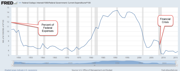
In early 2008, before the fianncial crisis, a 65 year old man could get an average annuity (the average of a 10 year and life) for 5.5% a year. That provided a guaranteed income that was more than the classic 4% “safe” withdrawal rate for retirees. That 4% withdrawal rule would normally ensure that a retiree did not run out of money before they died.
The average annuity rate for that same age is now half that interest rate (Source). For an investment of $100K, a 67 year old male living in Colorado can get a lifetime annuity of $7212 per year (CNN Annuity Calculator) For 14 years, the insurance company providing the annuity is essentially returning the investor’s money to them. If that male investor lived for 20 years till age 87, they would receive a total of $144K, an annual return of only 1.84%. If the retiree lived to 97, their annualized return would increase to 2.5% over the thirty year period. Clearly, an investor is paying for safety.
Wade Pfau is a CFP whom I have cited in previous blogs. Here he compares the advantages and disadvantages of investments vs. insurance. He makes an argument that an annuity that covers one’s essential needs allows a person to take more risk with the rest of their portfolio. The potentially higher return from the investment side of the portfolio can thus make up for the lower returns of the annuity, an insurance product. He does caution, however, that most annuities do not protect against inflatiion. A investor who needed $1000 extra dollars in monthly income in 2017, would need more than $2000 in 30 years at a 2.5% inflation rate.
Managed Payout?
One alternative is a managed payout fund. The Vanguard Managed Payout Fund VPGDX lists the fund’s holdings as 60% stocks with an almost 20% allocation to alternative strategies. Alternatives vary in volatility depending on the intent of the investment but let’s treat them as though they were mostly a stock, giving the fund a simple effective allocation of 75% stock, 25% bonds. This fund lost 43% from April 2008 through March 2009, less than the 50% loss of the SP500 index but not by much. A broad composite of bonds (BND) actually gained 3% in price during that time. Here is some info from the investing giant Black Rock on alternative investments.
The return of the fund since its inception in April 2008 is 4.28%. Vanguard’s broad bond composite fund VBMFX, with far less risk, had a ten year return of 4.12% and gained value during the financial crisis. Although some mutual funds have trade restrictions, the prospectus on this fund lists no such restrictions, so that one could set up a monthly withdrawal from the fund.
A Vanguard target date 2030 fund (VTHRX), which has an allocation of 70% stocks, 30% bonds, had a ten year return of 5.31%. That fund lost 45% during the eleven month downturn in 2008-2009, slightly more than the Managed Payout Fund. The additional 1% annual return is the reward for that slightly greater drawdown. A 1/4 of that additional 1% return can be attributed to lower fees.
The advantage of a Managed Payout Fund – simplicity and regularity of income flows – does not outweigh the disadvantages of volatility and some tax inefficiency. An investor could conveniently set up a monthly withdrawal from a broad based bond fund and enjoy the same return with much greater safety of principal, lower fees, and control over the withdrawal amount, if needed.
When it comes to retirement income, most investors would prefer the simple arithmetic of our grade school years. Both Social Security and traditional defined benefit pension programs use that kind of math. Each year, a retiree gets ‘X’ amount that is adjusted for inflation. No choices needed. However, most employees today have defined contribution, not benefit, plans. A retiree owns their savings, the capital base used to generate that monthly income, and it is up to the retiree to navigate the winding channel between risk and return.