A Lack of Giddyup

May 3, 2015

The first estimate of GDP growth in the January to March quarter was almost flat.  Not a big surprise given the severe winter in the eastern part of the U.S. but an annual rate of just .2% growth was lower than most estimates.  It would be a mistake to attribute all of the slow down to the weather.  Lower gas prices have delayed new drilling projects and idled more costly operations.  Some economists have not fully appreciated the positive influence that shale oil drilling has had on a tepid economic recovery.

Growth has not only slowed. It has shifted lower.  The Shiller P/E ratio, or CAPE, uses a 10 year period as a base.  A common measure of inflation expectations is the 10 year Treasury bond.  Let’s look at the change in real per capita GDP over rolling ten year periods starting in 1970.  Below I’ve graphed the logarithm, or log, of current GDP using the GDP 10 years ago as a base.  We can see a fairly consistent trend over forty years until 2008.

Some economists build models – partial derivatives – in which quantity of output fluctuates as a function of price, or F(p).  The thinking goes that price changes are part of a self-reinforcing mechanism. The problem is that price is a reaction to events, not a cause of them.  Prices distribute the effects of changes in supply, demand, and expectations in an economy or market.

The Fed believes that the economy has too much inventory – of savings, of caution.  Just as any store merchant would do, the Fed has lowered the price of savings, the interest rate, in the hopes that  customers will come in and borrow some of that savings.  Blue light special in Housing, Aisle 3!  The sale has been going on for almost seven years but demand in some sectors, particularly housing, is still very low.   The total of outstanding mortgage debt remains subdued no matter how much the price, or interest rate, is lowered.

Last week I showed a chart of new home sales per 1000 people.  I’ll overlay the thirty year mortgage rate over it.
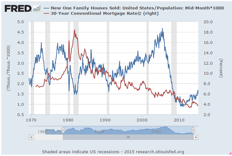
Higher mortgage rates reduce the demand for new homes.  The exceptionally low rates of the past few years should accelerate the demand for new homes.  Let’s do a quick and dirty adjustment by multiplying new home sales by 1 + the interest rate.  This will have a greater effect on sales when interest rates are higher, helping offset the lowered demand.  The actual amounts are not relevant- it’s the comparison.  This chart shows the exceptionally low demand of the past several years.

The total of loans and leases has been growing about 2% annually on average since the end of 2008, from $7.2 trillion to $8.1 trillion, a total of a little over 12% during the period.  To put that in perspective, that total grew by 75% in the previous 6 year period 2003 through 2008, rocketing up from $4.1 trillion to $7.2 trillion.  Since 1995, our economy has shifted and has been running on borrowed money more than in past decades.  These loan totals don’t include the huge, no strike that, call it prodigious, government borrowing that has propped up GDP growth in the past dozen years.

The Fed finished its April meeting this week and decided to keep the fire sale going. “The Committee currently anticipates that, even after employment and inflation are near mandate-consistent levels, economic conditions may, for some time, warrant keeping the target federal funds rate below levels the Committee views as normal in the longer run.” Fed statement 

Even if conditions do meet labor market and inflation targets, the Fed wants to make sure they can stay stable at those targets for a few months before taking action on interest rates.  The sale has been going on for so long now that the anxiety over the end of the sale has acted as a counter balancing force to the sale price.  Models of thinking as well as patterns of behavior are habit forming. One of the greatest scientists of all time, Isaac Newton, continued to believe in the principles of alchemy until he died.  Like other central banks, the Fed believes in the alchemy of interest rates, the price of money – that they can turn a leaden economy into gold.
New Home Sales Sink

April 26, 2015

Housing

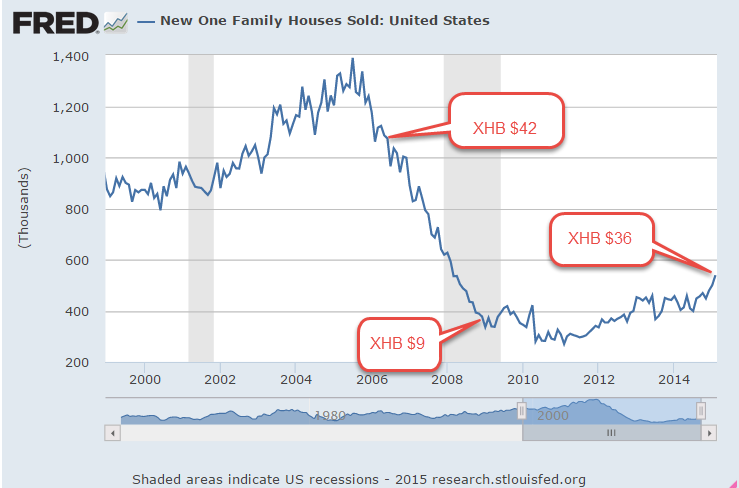
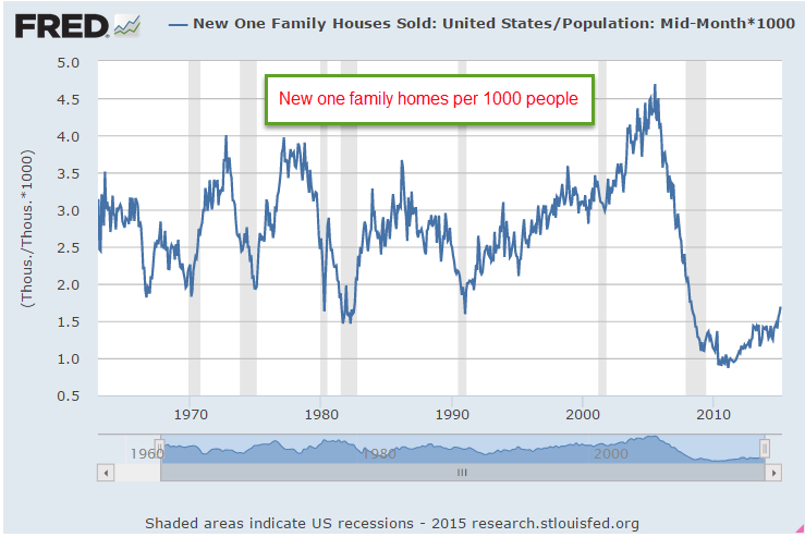
A few months ago sales of new homes per 1000 people climbed above the low water mark set during the back to back recessions of the early 1980s.  In a more normal environment, new home sales would be closer to 800,000, not 500,000.

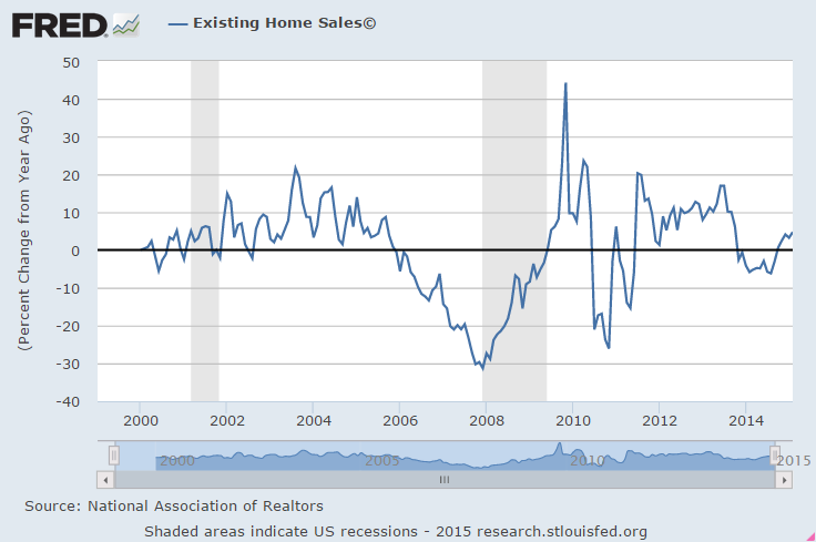
This past week came the news that new home sales fell more than 11% in March.  The good news is that they were up more than 10% over this month last year.  The supply of new homes is still fairly thin, less than half a year of sales, so builders are unlikely to slow the pace of construction.  As new home sales were climbing this winter, sales of existing homes – 90% of all home sales – languished.  The process flipped in March as existing home sales surged, up 10% year over year.

************************

Long Term or Short Term

Somewhere I read that all investment or savings is a loan.  Loans are short or long term, principle assured or not.  When we deposit money in a checking or savings account, we are loaning the bank money, principle assured.  When we buy shares in an SP500 index mutual fund, we are loaning our hard earned money to “Mr. Market,” as it is sometimes called.  Principle not assured. We hope we get paid back with a decent rate of interest when we need to cash in our loan.  Most of us probably think that this type of investing is long term but, in this model, most stock and bond investments by individual investors are liquid, which is by definition short term.  Every month that a person leaves their money in a stock or bond fund, it is a decision to roll over the loan.  The value of our asset loan depends on the willingness of others to roll over their loans to that same asset market.  Occasionally many lenders to the stock and bond markets shift their concern from return on principal to return of principal and call in their loans.  When phrased this way, we come to understand the inherent fragility of our portfolios.

Because pension and sovereign wealth funds may carry a sizeable position in a market, the entirety of their position is not liquid.  Substantial changes in position will probably affect the price of the asset.  Even in a large position, however, there is a certain amount of liquidity because the fund can sell so many thousand shares of an asset without a material change in the price.  A family’s decision to leave their 401K money in a stock fund in any month, to roll over the loan, joins them at the hip with a sovereign wealth fund in Dubai or CALPERS, the California state employee pension fund.  They are all participants in the short term asset loan market.

In March 2000, at the height of the dot-com boom fifteen years ago, many investors were still loaning money to the NASDAQ market (QQQ).  This past month investors who had bought and held QQQ finally broke even on the nominal value of their loans.   The relatively small dividend payments over the years hardly compensated for the 27% loss of purchasing power during those fifteen years.  

***********************

Taxes

Every facet of our culture seems to get a calendar month, so I guess April is tax month.  In that spirit, let’s look at some historical trends in income taxes.  In 2001, the Congressional Budget Office did an assessment of changes in Federal tax rates by income quintile for the years 1979 – 1997.   These are effective, not marginal, rates.  If someone makes $100K gross and pays $15K in Federal income tax, then their effective rate is 15%.

Effective corporate income tax rates went down for all quintiles while Social Security and Medicare taxes went up for those at all income levels.  The top 20% of incomes saw little change in their effective rates during this 19 year period, while everyone else enjoyed lower rates.  The reason why the top 20% saw little reduction was that their income grew faster than the incomes of those in the other quintiles.

The negative income tax rate for the lowest quintile was due to the adoption of the Earned Income Tax Credit and the increasing generosity of the credit given to low income families. (In 1979, a worker with three children received $1400 in 2012 dollars.  In 2012, they received $5,891, a 400% increase)

*********************

International Currencies

This graphic from the global financial nexus Swift com shows just how much the US dollar and the Euro dominate international trade.  For those of you interested in international currency wars, you might like this Bloomberg article.

Bank analyst Dick Bove thinks that it is unlikely that the Fed will raise interest rates this year.  The U.S. dollar has gained so much strength that a raise in interest rates has too many dangerous implications for other economies and would destabilize global trade.

A well written, informative and entertaining read is James Rickards’ Currency Wars (Amazon).  The author, a former CIA agent, weaves a coherent and interesting narrative that connects a lot of information and events of the past one hundred years.

Avoidable Taxes

April 19, 2015

Taxes

Some call them loopholes, tax breaks, or giveaways but the official name for them are tax expenditures.  In August of last year, the Joint (House and Senate) Committee on Taxation detailed  the many gimmes in the tax code.  The Pew Research Center graphed out the largest expenditures including the big banana, tax free employer paid health insurance premiums. (They forgot to include the $38 billion in Sec. 125 cafeteria plans.) That program started during World War 2 when wage increases were frozen by law.  That war ended 70 years ago but the “temporary” tax break goes on and on.

The list of giveaways runs for 12 pages. Those with incomes above $100,000 get 80% of the mortgage interest deduction (page 37), 90% of real estate tax write-offs (page 38),  60% of the child care credits (page 39), and claim 86% of the charitable contributions (page 38).  Reduced rates on dividends and capital gains cost almost $100 billion in 2014.

28 million low income families qualify for the earned income tax credit but the $68 billion cost for that is less than half the cost of tax free health insurance premiums.  Almost 37 million families claim a child tax credit for $57 billion dollars (page 41).

Seniors get $60 billion of gimmes in tax free Medicare benefits (page 32).  In 2015, tax breaks for all types of medical spending will total almost 1/4 trillion dollars in foregone tax revenue.   As spring arrives, let’s lobby for tax deductions for gardening expenses.  Gardening is therapeutic, a genuine medical expense.

*************************

CWPI

As expected, the composite Purchasing Managers Index (PMI) in the manufacturing and service sectors declined further but remains strong. We may see a slight decline for one more month before the cycle upwards starts again.

New orders and employment in the service sectors is strong and growing, offsetting some weakness in the manufacturing sector.

March’s retail sales gain of almost 1% was a bit heartening after the winter slump.  Excluding auto sales, year over year gains have dropped sharply since November and the trend continued in March as the yearly gain was only 1/4%.

************************

Labor Market Conditions Index

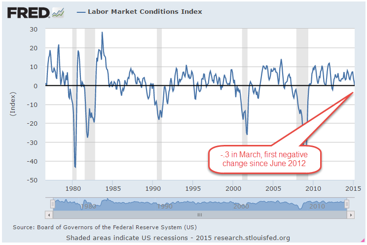
The Federal Reserve takes about a week after the release of the monthly labor report to compile their Labor Market Conditions Index (LMCI), a comprehensive snapshot of the many facets of the labor market.  For the first time in three years, the index turned negative in March.  It barely crossed below 0 but is sure to give some pause, a watch and wait when the FOMC meets at the end of this month.  While some of the FOMC members have been making a more aggressive case for raising interest rates, chair Janet Yellen is sure to point out that the economy is below target in both employment and inflation.

************************

Mortgage Banking

In an April 8th article, the Wall St. Journal reported that loans backed by bank deposits fell from 44% in 1980 to 20% in 2008.  Since 2012, the big banks have fled the mortgage business and now account for only a third of new federally guaranteed mortgages.  Small finance companies, which avoid much of the oversight and regulation in Dodd-Frank, now account for more than half of new mortgages.

************************

Gobs of Jobs

April 12, 2015

Last week I wrote about the recent flow of investment dollars to markets outside the U.S.  This week emerging markets (EEM, VWO, for example) shot up another 4%.  For the first time since last October, the 30 day average in these two index ETFs just broke above the 100 day average.

******************************

Job Openings (JOLTS)

February’s JOLTS report from the BLS, released this past Tuesday, showed that the number of job openings is nearing the heights of the dot com bubble in 2000.

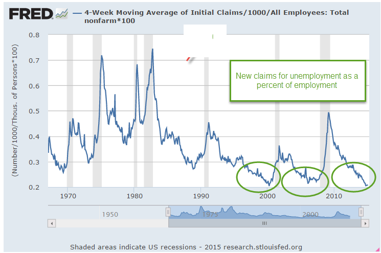
Last week we saw that new claims for unemployment as a percent of people working were at historically low levels.  I’ll show the graph again so I can lay the groundwork for an explanation of why bad things can happen when things get too good.

Here are job openings as a percent of those working. I’ll call it JOE. In 2007, JOE approached 3.5%.  In 2000 and these past few months, it exceeded that.  As openings fall below a previous low point, recessions follow as the economy “corrects course.”  I have noted these transition points on the chart below.  September’s low of 3.3% marks the current low barrier.  Any decline below that level would be cause for worry.

Let’s look at it from another angle.  Below are job openings as a percent of the unemployed who are actively looking for a job.  This metric would give us a rough idea of the skills and pay mismatch.  This looks a bit more tempered. We are not at the high level of 2007 and not even close to the nosebleed level of 2000.

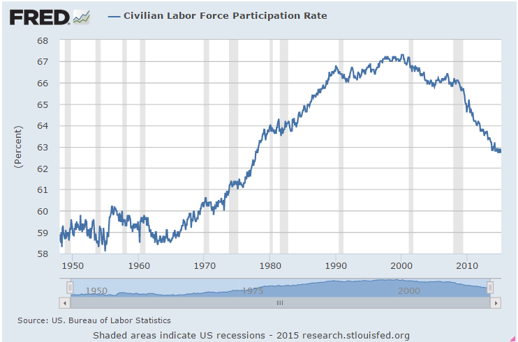
As openings grow, one would expect that some who have been out of the labor force would come back in but that doesn’t seem to be the case this time.  The participation rate remains low.  The reasons for this trend are partly demographic – aging boomers, small GenX population, end of the female labor “wave” into the labor force during the past few decades – but we should expect to see some uptick in the participation rate, some positive upward response to economic growth.

As jobs become harder to fill or applicants want more money to fill those jobs, employers may decide to cut back expansion plans rather than hire people who are are either too costly to train or who might not meet the company’s work standards. Employees who previously tolerated certain conditions or a level of pay at their job now act on their dissatisfaction.  They may leave the job or ask for more money or a change in conditions.  Little by little investment spending ebbs, then declines a bit more, reaches a threshold which triggers layoffs, and another business cycle falls from its peak.

**********************

Bank of Japan

Recently the NY Post reported  that the Bank of Japan (BOJ) was buying equities and the author implied that BOJ was pumping up the stock market. The central bank in the U.S. buys only government bonds, not equities.   Warnings of doomsday are popular in financial reporting because people pay attention. The truth just doesn’t get much attention because it is not exciting. I want to help the reader understand how misleading these kind of cross country comparisons can be.

Here is a comparison of the holdings of the U.S., Japanese and European central banks.  Look closely at the holdings of insurance and pension funds in the U.S. and Japan.  Notice that U.S. pension funds (which are government funds or private funds guaranteed and regulated by the U.S. government) have 9% equity holdings while Japan’s insurance and pension funds have only 2%.   Combining the holdings of the central bank and insurance and pension funds, we find that Japan has 4% in stock assets while the U.S. has 9% of its assets in stocks.  Contrary to this reporter’s implications, it is the U.S. government that is pumping up the stock market far more than the Bank of Japan.

The author quotes a Wall St. Journal article from March 11, 2015: “The Bank of Japan’s aggressive purchasing of stock funds” but only seven months ago, on August 12, 2014, that same newspaper reported: “As Tokyo shares fall back from their recent highs, the Bank of Japan has been significantly stepping up its purchases of domestic exchange traded funds.” [my emphasis]
Note the difference in wording.  The earlier article notes that BOJ is buying domestic equities, particularly ETFs, which are baskets of stocks.  The later article leaves out these important distinctions, leading a reader to believe that BOJ policy might be pumping up the U.S. equity market or any market, for that matter. The data does not support that contention.

What U.S. investors should be concerned about (I mentioned this in last week’s blog) is that federally guaranteed pension plans and government pension plans are finding it difficult in this low interest rate environment to meet their projected benchmark returns of 7% to 8%.  A more realistic goal is 5% to 6% for a large fund with a balanced risk profile.  Pension plans are having to take on more risk at a time when boomers are retiring and wanting the money promised in those pension plans.  These investment pools can not afford to wait five years for asset values to recover from a severe downturn, making them more likely to adjust their equity or bond positions as quickly as they can in the case of a crisis of confidence in these markets.  Be aware of the underlying environment we are living in.

Easter Egg

April 5, 2015

On this Easter Sunday, Christians celebrate the Resurrection of Jesus, Jews observe Passover, basketball fans await the final contest of the Final Four and baseball fans look forward to the start of the new season.  After Friday’s disappointing report of job gains in March, investors might be wondering what will happen Monday when markets in the U.S. reopen following Good Friday.  In overseas markets, yields on the 10 year Treasury bond fell on the employment news.  Job gains that were about half of expectations helped allay fears of a June rate increase.  We may see a positive response from both the bond and equity markets on Monday as the time table for rate increases might start in September.  On the other hand, the weekend might allow more rational judgment to prevail. One month’s disappointment does not a trend make.  Year over year gains in employment are especially strong.

April is usually a good month in the stock   market.  Since breaking the 2000 mark in August, the index has neither gained or lost much ground.  Gains in the technology companies that are included in the SP500 (Apple, for example) have been offset by losses in the oil sector of the SP500 (Exxon, Chevron, for example).  Long term Treasuries (TLT) have risen 10% in the past six months, despite the prospect of rising interest rates in 2015.

ICI reports that domestic long term equity mutual funds had an outflow of about $8 billion in March. Investors have not abandoned equity funds by any means but have changed focus. During this past month, $14 billion flowed into world equity funds.   Bond funds continue to post strong inflows – $10 billion in March.

The boomer generation amassed a lot of pension promises through their working years.  Pension funds must balance both equity and bond risk in their investment portfolios  and yet try to meet their assumed growth rates of 7% – 8%.  Caught on the horns of this dilemma, pension funds straddle both the equity and bond markets.  During the past ten years, many have become underfunded because they have not been able to match their projected growth rates.   This delicate balance of risk and reward sets the stage for a catastrophic decline in response to even a relatively small monetary shock because pension funds can not afford to wait out another three or four year decline.  Too many boomers will start cashing in those promises accumulated during the past decades.

The relatively low number of new jobs created in March was probably due to the severe winter in the eastern part of the country.  The BLS revised downward their previous estimates of employment gains in January and February.  Even with the downward revisions and this past month’s relatively anemic 126,000 gains, the average for the quarter is still about 200,000 per month, a particularly strong figure when one considers the impact that plummeting oil prices have had. In the first 3 months of this year, companies in oil and gas exploration have shed 3/4 of the jobs added during all of last year.  The strong dollar makes U.S. exports more expensive and hurts manufacturing.  The employment diffusion index in manufacturing industries dropped below 50, a sign that there is some contraction in the 83 industries included in this index.  However, March’s Manufacturing Purchasing Managers Index showed some slight expansion still and employment in manufacturing is still strong.  Across all private industries, the diffusion index remains strong at 61.4.

Fed chair Janet Yellen has repeatedly said that interest rate decisions will be based on data.  If the data of subsequent months show a resumption of strong growth, an interest rate increase at the FOMC meeting in late July could still be in the cards.  The CWPI composite built on the PMI anticipated a declining trend in growth this winter and spring before resuming an upward climb.  When the non-manufacturing  PMI is released this coming Monday, I’ll update that and show the results in next week’s blog.  Based on the numbers already released, I do anticipate a further decline in March then an evening out in April.  The particularly strong dollar  has cast some doubt on growth predictions, particularly in manufacturing. Both oil and the dollar have made sharp moves in the previous months and it is the rate of change which can be disruptive in an economy.

**********************

Unemployment

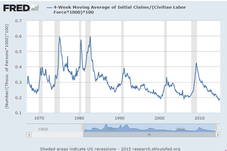
New claims for unemployment were the lowest since the spring of 2000, just as the bubble of the dot-com boom began to deflate.  As a percent of those working, this is the third time since WW2 that new claims have reached these very low levels.  The last two times did not turn out well for the economy or the stock market.

**********************

Oil

Going back through some old notes.  Here’s an October 2009 article where Deutsche Bank estimates the price of oil at $175 in 2016.  2009 was just about the time that newer techniques in horizontal drilling were being developed.  The fracking boom was just about to get underway.  Whether you are an investor or a second baseman, the future is tough to figure out so stay balanced, stay prepared and keep your knees bent.

Income, Housing and Durable Goods

In this week’s downturn, prices of the SP500 almost touched the 26 week, or half year, average of $203.90.  Since August 2012, when the 50 day average crossed above the 200 day average, these price dips have been good buying opportunities as the market has resumed its upwards climb after each downturn.

***********************

Manufacturing and Durable Goods

Preliminary readings of March’s Purchasing Managers’ Index (PMI) showed an uptick back into strong growth.  Survey respondents were concerned about weak export sales as the dollar’s strength makes American products more expensive overseas.  The full report will be released this coming Wednesday.

This past Wednesday’s report that Durable Goods had dropped 1.4% in February caused an already negative market to fall another 1.5% for the day and this marked the close of the week’s activity as well.  New orders for non-transportation durable goods have steadily declined since the fall.  Although the year-over-year comparisons are consistent with GDP growth, about 2.3%, the downward trend is concerning.

***********************
Housing

Existing home sales in February rose almost 5% in a year over year comparison, the best in a year and a half but still below the 5 million annual mark. The positive y-o-y gains during the past six months has prompted some optimism that sales may climb back above the 5 million mark in the spring and summer season.

New home sales in February surged back above a half million.  In a more healthy market, sales of new homes are 6% – 7% of existing homes.  In 2006, that ratio started climbing above the normal range, getting increasingly sicker until it reached almost 18% in May 2010.  February’s ratio was 9%. If the ratio were in the normal range, existing home sales would be over 8 million, far above the current 4.9 million units actually sold.
In a 2014 report the National Assn of Realtors noted that boomers tend to buy new or newer homes to avoid maintenance headaches while younger buyers buy older homes because they are less expensive (page 3).  38% of all home buyers are first timers but the percentage is double for those younger than 33 (Exhibit 1-9 in the report).  As the supply of existing homes is inadequate to meet the demand, prices climb and suppress the demand, forcing first timers to either buy a smaller new home or continue renting.

Sales of new homes and the fortunes of home builders are based on the churn of existing homes.  Since October, the stocks of home builders (XHB) have climbed 20% in anticipation of growing sales, but weak existing home sales may prove to be a choke point for growth.

The larger publicly traded homebuilders also build multi-family units.  Real investment in this sector has tripled from the lows of early 2010 but are still below pre-crisis levels.

The housing market in this country is still wounded.  63% of the population are white Europeans (Census Bureau) but are 86% of home buyers (Exhibit 1-6).  While few will admit to racial prejudice in the current housing market, the numbers are the footprints of this nation’s long history of racial discrimination and socio-economic disparity.  Mortgage companies that made – let’s call them imprudent – credit decisions that helped precipitate the housing crisis are especially cautious, making it more difficult for younger buyers to purchase their first home, despite the historically low mortgage rates.  This market will not heal until mortgage companies relax their lending criteria just a bit and that won’t happen while rates are so low.

**************************
Income

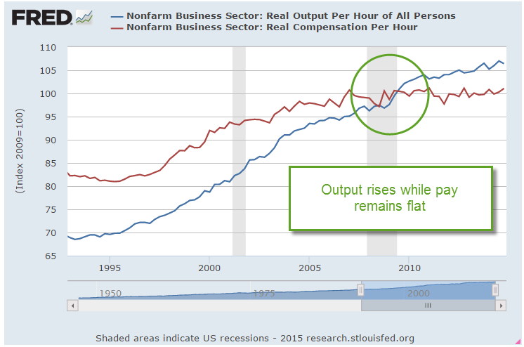
The Bee Gees might have sung “Words are all I have to take your heart away” because they were singing about love, not economics and finance.  Graphs often tell the story much better than words.  A milestone was passed a few years back.  For the first time since World War 2, the growth in income crossed below the growth in output.

This past week, the Bureau of Labor Statistics released a revision to their initial estimate of multi-factorial productivity in 2013.  There is a lot of data to gather for this series.  An often quoted productivity growth rate calculates the GDP of the nation divided by an estimate of the number of hours worked, a statistic that is accessible through payroll reports submitted monthly and quarterly.  The contribution of capital to GDP is much more difficult to assess and is largely disregarded by those like Robert Reich, former Secretary of Labor under President Clinton, who have a political axe to grind.  Truth is on a path too meandering for politics.

Total output in the years 2007 – 2013 was just plain bad, growing at an annual rate of only 1%, a third of the 2.9% growth rate from the longer period 1987 – 2013.  In the BLS assessment, the growth rates of both labor and capital inputs were poor by historical norms but capital input accounted for all of the meager gains in non-farm business productivity.  People’s work is simply not contributing as much to growth as before.  That reality means that income growth will be meager, which will prompt louder political rhetoric to make some kind of change, any kind of change, because voters like to believe that politicians have magic wands.

Steady As She Goes

March 22, 2015

Monetary Policy

The FOMC is a committee of Federal Reserve members who meet every six weeks to determine the course of monetary policy.  A statement issued at the end of each two day meeting is carefully parsed by traders in an orgy of exegesis.  And thus it was so this past week.  Recent statements by the Fed included the word “patient” as in low inflation and some lingering weaknesses in the labor market allow us to take a patient approach with monetary policy.  If the Fed removed the word patient, then it was a good bet that they would start raising rates at their mid June meeting.  By the end of the year, the thinking was, the benchmark Fed funds rate could be 1%-1.25%.

So here’s what happened while you were at work, or at lunch or picking up the kids on Wednesday afternoon when the Fed meeting concluded. The initial reaction was negative, or at least that’s how the HFT (high frequency) algorithms parsed the Fed’s statement.  “Patient” was gone.  Sell, sell, sell. Then some human traders noticed that the Fed was also saying that they did not have to be impatient either – the perfect neutral stance.  Buy, buy, buy.  The SP500 jumped 1.5% in a few minutes.  The neutral stance of  the Fed caused many to revise their estimates of the Fed rate at the end of the year to .75% or less.  The broad market index ended the week at the same level as it was when the month began.  Volatility as measured by the VIX is rather low but there has been a lot of  positioning since Christmas and a net gain of only 1% in those three months.

*********************

Earnings Recession


The analytics firm FactSet projects a year-over-year decline in the earnings of the SP500 companies for this first quarter of 2015.  Here is a good review of the historical response of the stock market to earnings recessions, defined as two quarters of year-over-year declines in the composite earnings of the SP500.

***********************

Oil

Oil is an international commodity that trades on world markets in U.S. dollars.  A prudent strategy for countries which are net importers of oil is to stock up on dollars to pay for its short term oil needs.   As the demand for dollars climbs so does its price in other currencies, a self-reinforcing mechanism.  Half of the drop in the price of oil is due merely to the appreciation of the dollar, which has spiked some 25% since the beginning of the year.

For decades, many in academia and government have advocated the adoption of an international currency called the SDR, already in use by the International Money Fund.   Here is an article from last May, before the price of oil started its slide.  The dollar is the latest in a series of reserve currencies over the past 500 years and has been the dominant currency for almost 100 years (History here). The reliance on one country’s currency works – until it begins to cause more problems than it solves.  The  largest producer and consumer of oil, Saudi Arabia and the U.S., have formed a decades long agreement to price oil in U.S. dollars, binding the rest of the world to the movements in the U.S. dollar.The recent volatility in the dollar in threatening the economic stability of many nations, who are increasing their calls for a change in international monetary policy.

***********************

Sticky CPI

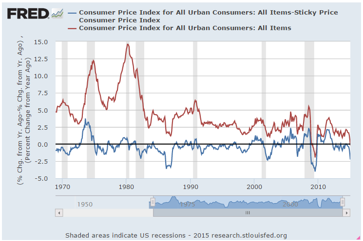
In a survey of newspaper articles, inflation was mentioned more than unemployment or productivity.  In the U.S., inflation is often measured by the Consumer Price Index (CPI).  A subset of that measure is called the core CPI and excludes more volatile food and energy items to arrive at a fundamental trend in inflation.  (IMF primer on inflation ) Critics of the core CPI point out that food and energy items are the most frequent purchases that consumers make and have a fundamental effect on the economic well being of U.S. households.  Responding to some of the inherent weaknesses in the methodology of the CPI, the Atlanta branch of the Federal Reserve began development of an alternative measure of inflation – a “sticky” CPI. (History)  This metric gives a statistical weight to the components of the CPI by how much prices change for each component.  The Atlanta Fed has an interactive graph that charts both the sticky measure and a more volatile, or flexible CPI that is similar to the conventional CPI.  The sticky CPI tends to measure expectations of future changes in inflation and moves rather slowly.

Over a half century, the clearest trend is the closing of the gap between the regular CPI and the sticky CPI.

When we compare all three measures, core, sticky and regular CPI, we see that the sticky CPI is usually above the core CPI.  January’s readings are 2.06% for the sticky index, 1.64% for the core index and -.19% for the headline CPI index.

A private project called Price Stats goes through the internet comparing prices on billions of items.(WSJ blog article here)  This data is more timely and shows an uptick in core inflation that is approaching 2%, the Federal Reserve’s target rate.  When asked why the Fed uses 2%, chair Janet Yellen answered that inflation indexes do not capture improvements in products, only prices, so they tend to overstate inflation as a matter of design and practical data gathering.  Secondly, the 2% mark gives the Fed a statistical cushion so that they are able to take appropriate monetary steps to avoid deflation.

Why is deflation a bad thing?  In answering this question, we discover the true benefit of the core CPI.  Food and energy are regularly consumed.  Demand for these goods is relatively “sticky”.  A family may change what types of foods it buys in response to price changes but it is going to buy food. Deflation in these core purchases can be a good thing as it takes less of a bite out of the average household’s wallet.

On the other hand, deflation in less frequently purchased goods, which the core CPI tracks, is not good because it leads to a self-perpetuating cycle in which consumers delay making purchases in the expectation that tomorrow’s price will be lower than today’s price.  If I expect that the price of an iPhone will be lower next week, how likely am I to buy one this week?  As consumers delay purchases, suppliers lower prices even more to move their goods.  Seeing the price competition among vendors, consumers are even more likely to delay purchases, waiting for prices to come down even further.  As sales drop, vendors and manufacturers begin to layoff employees.  Lower prices no longer entice consumers who become concerned about keeping their jobs and purchase only what they need.

***********************
Indicators

The Conference Board, a business association, released their monthly index of Leading Indicators this week but it has a spotty history of forecasting trends. Doug Short puts together a nice snapshot of the Big Four indicators, Employment, Real (inflation-adjusted) Sales, Industrial Production, and Real Income.

Glootch or Glut?

March 15, 2015

Retail

Indicators of business activity and confidence have all been strong.  The Purchasing Managers Index, the monthly employment report, and the NFIB small business index have shown exceptional strength in the past several months.  A week after a strong employment report came the worrisome news that retail sales declined for the third month.

A 2% drop in auto sales was the primary driver of February’s decline but the lack of demand is evident in the broader economy.  Excluding auto sales this is the second three month period of declining sales since the recovery began.  Following the slump in 2012, the SP500 sagged about 7%.  The market’s response to this slump has been muted so far.

American businesses had hoped that their customers would spend the dollars saved at the gas pump but consumers may be tucking away some of that cash. The slowdown in retail sales may be partly due to the harsh winter in the east, or a lack of income growth.  The strong dollar has made American products more expensive to export so businesses are especially dependent on domestic demand. Since last summer, prices at the wholesale level have declined steadily.  Commodities other than oil are also showing slack demand.

The inventory to sales ratio has climbed abruptly in the last half of the year.  Businesses make their best guess in anticipating future demand.  A capitalist economy is based on the decision making of millions, not a central committee of a few.  If inventories continue to mount, we can expect that businesses will adjust to the new environment and rein in production and expansion plans.

*************************
Retirement

Twenty years ago I read articles on portfolio diversification like this one and was glad that I wasn’t old enough to be concerned about that kind of stuff.  Then one morning I was shaving and noticed that I was developing a slight turkey wattle in my neck, the same thing I had noticed in my Dad. OMG! I was getting old!
A Bankrate.com blog post features a chart of savings goals that a person at each stage of life should have accumulated to ensure that they can maintain their living standard in retirement.  The benchmarks are based on one’s current income.  Many Americans do not even meet these modest goals.  According to the chart, a person making $60K  who retires at 67 should have $500K in savings and investments.  
*************************
Apple
Telephone and radio were the high tech firms of the early 20th century.  In 1916, ATT was added to the Dow Jones Industrial Average (DJIA), acknowledging that the company had become a pillar of the American economy. 
At the close of trading on March 18th, almost a hundred years later, ATT will be dropped from the DJIA and replaced by Apple, a high tech firm of the 21st century.  Apple’s projected earnings growth for this year may cancel out the anticipated negative earnings growth of the DJIA but Apple is a more volatile stock than stodgy ATT so daily price changes in the index are likely to be a bit more dramatic.
*************************
Budgeting
Last week, economist Greg Mankiw wrote a piece in the New York Times explaining the recent change from static to dynamic budget scoring in the new Congress.  These are two different methods for estimating the effects of proposed tax changes on the budget over the following ten years.  Static scoring, the previous system, has been in place for decades and assumes no changes to the economy resulting from the proposed tax changes.  Dynamic scoring estimates changes in GDP and revenues resulting from the tax changes. Several examples illustrate differences between the two types of scoring.  The article is well written and easy to understand without the use of complicated economic models.

Winter Wanders

March 8, 2015

Labor Market

If you are reading this and have not set your clock forward, that’s OK.  March to your own drummer!

On Wednesday, payroll processor ADP released their data for February, showing private payroll gains of 212,000.  This confirmed estimates that total job gains from the BLS would be about 230,000.  The bothersome data point in the ADP report was the huge upward revision of job gains in January, bringing it close to the BLS estimate.  ADP is working with a lot of hard data – actual paychecks – so was this revision a discrepancy in seasonal adjustments?

On Thursday, the BLS issued revised figures for labor productivity in the 4th quarter of 2014. The report includes this: “The 4.9 percent increase in hours worked remains the largest increase in this series since a gain of 5.7 percent in the fourth quarter of 1998.” 4th quarter productivity sagged 2.2% from the 3rd quarter,  and was essentially unchanged from the 4th quarter of 2013.  Labor productivity is often a lagging indicator but it narrowed Thursday’s trading range as investors crossed bets on the Fed’s plans for raising interest rates later in the year.

The BLS report of 295,000 job gains in Febuary was so over the top that many traders punched the sell button.  Government employment increased 7,000, meaning that private job gains as reported by the BLS was almost 290,000, a difference of almost 70,000 between the BLS and ADP reports.  When in doubt, traders get out.

For mid to long-term investors, the continuing strength in the labor market is an optimistic sign.  Employees add to costs and commitments.  If businesses are adding jobs, it is because they anticipate higher revenues in the near future.  Some analysts pointed to the high number of jobs gained in the leisure and hospitality sectors as a sign of weakness in the labor market.  These are jobs that pay on average about 25% less than the average of all production and non-supervisory employees and a third less than the average for all employees.  However, higher paying jobs in professional services and construction also showed strong gains.

As I have mentioned before, the Federal Reserve compiles a Labor Market Conditions Index (LMCI) which summarizes 24 employment trends and one which chair Janet Yellen uses as her gauge for the fundamental strength or weakness of the labor market.  Next Wednesday, the Fed will release the LMCI updated for February but a chart of the past twenty years shows longer term trends.

While the index itself is still in negative territory, the momentum (red line) of the index is strong and consistent.  We can understand Yellen’s cautious optimism when recently testifying before the Senate Banking Committee.  This index was only developed a few years ago so this chart includes revised data and methodology that is backward looking.  If history is any guide, a long term investor would be ill advised to bet against the momentum of this index when it is positive.

A key indicator for Ms. Yellen is the Quit rate, the number of employees who quit their jobs to go to another job or who feel confident that they can find another job without much difficulty.  That confidence measure continues to rise and is currently in a sweet spot.  It is not overly confident as it was at the height of the housing boom in 2006 and the dot com boom of the late 1990s.  It is neither pessimistic as it was in the early 2000s or darkly apocalyptic as in the period from 2008 – 2012.

The number of new claims for unemployment as a percentage of the Civilian Labor Force is at historic lows.  One could argue that new claims are too low.

Wage growth in this month’s report was minimal.  However, wage growth since 2006 has not done too badly, growing more than 25% and outpacing the 16% growth in inflation during the period.

Benefits have grown more than 20% in the same period and showed no decline during this past recession.  Many employees are simply not aware of the costs of their benefits.  They may think that vacations and holidays and health care are the only benefits they get.  There are several mandated taxes and insurance that an employer is required to pay.

Because some benefit costs are “sticky,” and not responsive to changing business conditions, the continued strength in the labor market shows an increasing commitment on the part of employers, a growing confidence that economic conditions are fundamentally improving.  Several years ago, many employers were reluctant to take on new employees because positive news was regarded with a healthy skepticism.  “We won’t get fooled again,” as the Who song lyric goes.  Despite improving fundamentals, the market is likely to be somewhat volatile this year as investors and traders speculate on the timing and aggressiveness of any interest rate moves from the Fed.

**************************

Purchasing Managers Index

Based on the monthly survey of purchasing managers, the Constant Weighted Purchasing Index (CWPI) declined slightly again this month as expected.  The manufacturing sector slid a bit this past month but employment in the service sectors popped up, keeping the composite index up above the benchmark of strong growth.  If the post-recession trend continues, we might see one more month of softening within this growth period.

New orders and employment in the service sectors are the key indicators that I highlight to get a more focused analysis of growth trends.  When this blend of the two factors stays above 55, the benchmark of strong growth, the economy is strong.  Except for a slight dip below that mark (54.4) last month, this blend has been above 55 for ten months now.

We can also see the brief periods of steady decline in these two components in 2011, 2012 and the beginning of 2013, causing the Federal Reserve to worry about a further decline into recession. The Federal Reserve enacted a series of bond buying programs called QE.  Continued economic strength may prompt a slow series of interest rate hikes.  The key word is “slow.”  Under former chairman Alan Greenspan, the Federal Reserve adjusted interest rates up and down too quickly, which produced small shock waves in the financial system.  Banks, businesses and investors may make unwise choices in response to rapid rate changes.  Live and learn is the lesson.

Stock and Housing Valuations

March 1, 2015

There are several popular methods to evaluate stocks.  The P/E ratio is probably the most quoted metric.  This is a stock price divided by its current earnings.  A conservative variation of this popular methodology is Professor Shiller’s Cyclically Adjusted Price Earnings (CAPE) ratio.  The basis for this metric is the observation that all data reverts to its mean.  Professor Shiller’s method adjusts the past ten years of reported earnings for inflation, then averages those earnings and divides the current price by that average to get a CAPE ratio.

Any well-regarded valuation method has its detractors. This Economist blog points out objections to the Shiller CAPE ratio. In a 2014 blog I tackled an objection to Shiller’s methodology: a ten year average can include a severe downturn in earnings that does not reflect current conditions. I massaged away the 2008 to 2010 downturn to show that Shiller’s CAPE ratio was little changed by the downturn.

Some object that the CAPE ratio uses reported earnings, which includes depreciation (lowers earnings) and interest (increases or decreases earnings).  Operating earnings exclude these items and more accurately reflect the profits generated by ongoing operations.   Operating earnings may be a valid basis for evaluating a single company and Warren Buffet uses this method, among others, to get a sense of sustainable earnings.

Some prefer to use forward operating earnings, which are estimates of profits for the next twelve months.  These estimates come in two varieties: top down and bottom up.  Top down estimates are calculated by estimating a growth percentage of profits for the coming year and applying that percentage to the sum of current profits.  Bottom up estimates are painstakenly compiled by taking the forward earnings guidance given by each company.  Top down estimates tend to be optimistic and are usually revised downward with the passage of time.

I prefer Shiller’s method as a more realistic approach for a long term investment in a stock index like the SP500.  Successful businesses should be able to generate enough profit in their operating margins to account for depreciation, which is included in reported earnings.

Another valuation method is the flip side of the Price Earnings or P/E ratio – an E/P ratio, or earnings yield.  As of a week ago, the current earnings yield was 5.02%.  This is then compared to the 10 year Treasury rate, 2.13%, as of Feb. 20, 2015.  The difference between the earnings yield of stocks and a risk-free investment like U.S. Treasuries – currently about 3% – is called the risk premium for owning stocks.  Often, this risk premium is quoted in basis points, which are 100ths of a percent.  So 3% = 300 basis points.  In 2007, the risk premium was over 4%.  The average from 2002 – 2006 was about 2% as stocks climbed out of a prolonged slump following the dot com bust and 9-11.  So, using this method, we could say that stock valuations are somewhere in the middle, neither frothy or pessimistic.
************************
Housing

Sales of New Homes remained brisk at just under 1/2 million.  The supply of new homes on the market indicates historically strong demand.

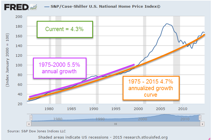
The latest Case-Shiller home price index increased 4.3% year-over-year, below the 4.7% growth curve of the past forty years.  From 1975-2000, home prices increased 5.5% annually.  During the boom years of the 2000s housing prices surged above that growth curve only to fall swiftly in the crash of 2008.  The bust in the housing market has more than taken out the excess, bringing the forty year growth curve to 4.7%.

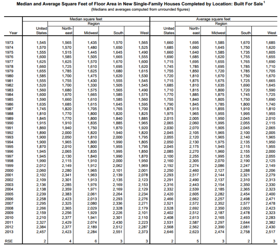
The home price index does not take into account the larger homes being built over the past two decades.  The median square footage of new homes has grown from 1555 SF in 1975 to 2457 SF in 2013. (Census Bureau data)

A greater percentage of today’s homes include air conditioning, extra bathrooms and other amenities that the homes of forty years ago did not have, skewing the long term effective growth curve even lower.  While some metropolitan areas on both coasts may be overvalued, national averages suggest that housing prices are fairly valued.

***********************

Economic Summary

Twice a year the chair of the Federal Reserve testifies before the Senate Banking Committee.  Chair Janet Yellen’s testimony this past week was a concise distillation of economic trends.  Investors bombarded with an avalanche of articles and blogs may sometimes find it difficult to synthesize all the information they absorb.  Ms. Yellen’s initial summary cuts through the clutter:

The unemployment rate now stands at 5.7 percent, down from just over 6 percent last summer and from 10 percent at its peak in late 2009. The average pace of monthly job gains picked up from about 240,000 per month during the first half of last year to 280,000 per month during the second half, and employment rose 260,000 in January. In addition, long-term unemployment has declined substantially, fewer workers are reporting that they can find only part-time work when they would prefer full-time employment, and the pace of quits–often regarded as a barometer of worker confidence in labor market opportunities–has recovered nearly to its pre-recession level. However, the labor force participation rate is lower than most estimates of its trend, and wage growth remains sluggish, suggesting that some cyclical weakness persists. In short, considerable progress has been achieved in the recovery of the labor market, though room for further improvement remains.

At the same time that the labor market situation has improved, domestic spending and production have been increasing at a solid rate. Real gross domestic product (GDP) is now estimated to have increased at a 3-3/4 percent annual rate during the second half of last year. While GDP growth is not anticipated to be sustained at that pace, it is expected to be strong enough to result in a further gradual decline in the unemployment rate. Consumer spending has been lifted by the improvement in the labor market as well as by the increase in household purchasing power resulting from the sharp drop in oil prices. However, housing construction continues to lag; activity remains well below levels we judge could be supported in the longer run by population growth and the likely rate of household formation.